This Week's Sponsor:

Copilot Money

Copilot Money, The Best Money Tracker, Launches on the Web – Limited-Time: Get 26% Off + 2 Months Free


Posts in reviews

Scanner Pro Combines “Post-PC” and “Paperless” In A Single App

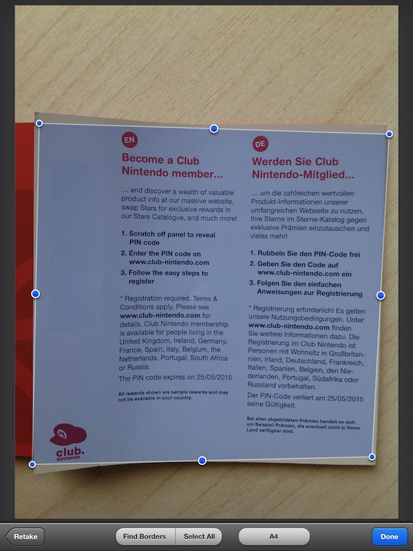
Scanner Pro, a camera-based scanning application for iOS devices by Readdle, has been updated to version 4.0, which adds a number of engine optimizations and new features, as well as support for the iPad. I was able to test the latest update to Scanner Pro, and I’m thoroughly impressed by the degree of independence and reliability Readdle achieved with Scanner Pro 4.0.

Let me explain. Until today, I have exclusively relied on a large, heavy wireless printer/scanner or my portable Doxie Go to scan, manage, and organize documents. In order to achieve a seamless paperless setup that required zero, or at least very minimal effort to be maintained and consistently used, I thought that the Doxie Go would be the solution for all my needs, as it offers a portable and lightweight device that outputs images at great quality in PDF. More often than not, however, the new devices and apps we have available nowadays bring new questions for issues we thought we had already figured out; as I began using the iPad as my primary computer, I realized how the Doxie, albeit well-designed and extremely usable, would still require me to use a computer to import scans, organize them, delete the ones I didn’t like, and upload the rest to Evernote.

I asked myself whether the iPad could even become a scanner. After all, the new iPad got a solid camera update in its latest version, and whilst not on par with the iPhone 4S’ camera, an iPhone 4-like lens – I assumed – could probably be a decent alternative to physical scanners, even the portable ones. The difference was mainly in the software: I wasn’t looking for an iPad accessory to turn the device into a scanner, I was scouting around for great scanner apps that would a) work reliably on the new iPad and Retina display, and b) support various online services, have basic document management features, and an “Open In” menu. Fortunately, Scanner Pro 4.0 by Readdle fits all these requisites, and it does so in a way that allows me to say this is the scanner app to try if you own a new iPad, and plan on going paperless using it. Read more


Everyme Review

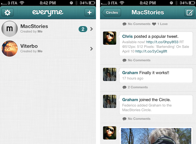
Oliver Cameron thinks there’s something special, intriguing, about the address book. As a personal list that smartphone users have curated over several years, one could wonder about the stories, the people, and the interactions that are part of the creation and curation of an address book. But what can software developers do to leverage the data of our address books to redefine the way we get in touch with our closest friends?

Over the years, digital address books have exponentially increased the amount of data associated with names and phone numbers. First came dedicated fields for email addresses and contact pictures; then, when smartphones gained decent networking and data connections, the address book turned into a richer solution to store people’s information, rather than just addresses, and keep it always accessible on multiple devices through the cloud. Either through Gmail, Exchange, iCloud, or something else, it’s very likely that your address book contains names and phone numbers, but also email addresses, Twitter and Facebook usernames, location data, birthdays, family relationships, and various notes. The address book is, in fact, a people database that’s exclusive to each person. There is no address book like each other.

While the composition of an address book differs from user to user, some interactions and relationships are reflected on multiple instances of the address book, and the cloud can sometimes access a portion of these interactions to create lists of people “you may already know”. If I have you in my address book as a “friend”, maybe I also have your email address, and perhaps you have my information on your address book as well. With the right privacy settings, services like Facebook, Twitter, and just about any app with a social component these days allow us to look up friends that are already signed up by simply matching email addresses. This is a way to leverage the information stored in our address books to facilitate the sign up process for new services. They make it easier for us, using the address book we have been curating over the years.

Sometimes, however, people don’t want social apps that force them to share with everyone. Services like Twitter and Google+ are the polar opposites when it comes to determining how users engage with each other: whereas Twitter’s model of following/unfollowing may result overly simplistic to some people, Google’s insistence on Circles has found users confused by the plethora of options Google+ comes with. And then there’s Facebook, which has been experimenting for years with the concept of private groups, albeit they never really took off, and so Facebook preferred implementing deeper privacy settings, rather than forcing people to manage groups and names and lists. But is there a sweet spot between Twitter’s simplicity, Google’s circle management, and Facebook’s wide adoption both on desktop and mobile? Something that can leverage the data from our address books and social networks we’re already using to build a new platform to bring us closer to the people we know “in real life”? That’s what Oliver Cameron and his team are trying to build with Everyme. Read more


Marked 1.4: A Little Something for Everybody

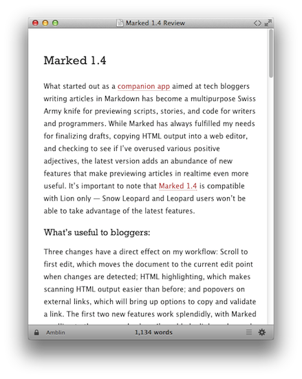
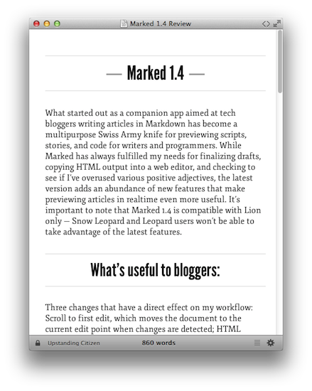
What started out as a companion app aimed at tech bloggers writing articles in Markdown has become a multipurpose Swiss Army knife for previewing scripts, stories, and code for writers and programmers. While Marked has always fulfilled my needs for finalizing drafts, copying HTML output into a web editor, and checking to see if I’ve overused various positive adjectives, the latest version adds an abundance of new features that make previewing articles in realtime even more useful. It’s important to note that Marked 1.4 is compatible with Lion only — Snow Leopard and Leopard users won’t be able to take advantage of the latest features.

What’s useful to bloggers:

Three changes have a direct effect on my workflow: Scroll to first edit, which moves the document to the current edit point when changes are detected; HTML highlighting, which makes scanning HTML output easier than before; and popovers on external links, which will bring up options to copy and validate a link. The first two new features work splendidly, with Marked scrolling to the paragraph where I’ve added a link or changed a sentence once I’ve left the focus of TextEdit (my editor of choice) or save manually with ⌘S.

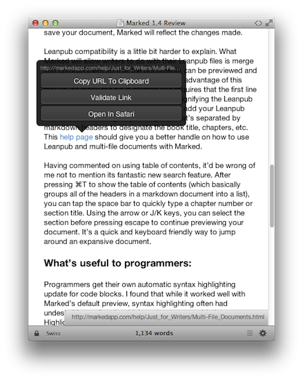
Unfortunately, link popovers don’t work as expected. Instead of hovering the mouse over a link, clicking on the link brings up a popover with the copy, validate, and open-in-Safari options. Link validation in particular is great as it provides a quick way to check a slew of links without having to leave the Marked preview (especially useful if you use [this]: style of link in Markdown). Once the link has been clicked on for the popover, clicking it a second time takes you to the website in your default browser. It seems whether the popover is shown depends on whether the URL has already been checked (document-wide).

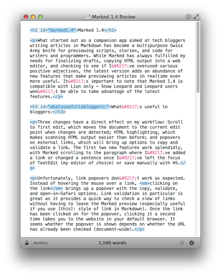
A fourth new feature bloggers will love if they’ve written their own Marked styles to match the format of their websites will be per-document styles. Instead of changing the style through the GUI, you can include a brief piece of metadata at the beginning of your document by adding the following: “Marked Style: Your preferred style here” (without quotes). If you create new documents with shortcuts or triggers, you can further automate how it will look in Marked by adding a snippet of metadata — useful when you publish or want to see output for a specific blog. The metadata you add is excluded from the HTML output. HTML output, by the way, has a new toggle in the titlebar.

Lastly, for bloggers concerned about their HTML output, Marked now gives you the option to disable header ID creation. Unless you have a specific need for styling, there’s no reason to have Marked generate an ID per header. I’ve definitely enabled this one.

What’s useful to writers and screenwriters:

Scrivener 2.x projects and Leanpub files are now supported by Marked. Scrivener projects, like .md or .txt files, can simply be dragged into Marked and compiled to provide a live preview of your working content. Pressing ⌘E (open in editor) will take open .scriv files being previewed in Scrivener if you’re reviewing your script and need to make a live change. As you write and save your document, Marked will reflect the changes made.

Leanpub compatibility is a little bit harder to explain. What Marked will allow writers to do with their Leanpub files is merge and compile them so that the documents can be previewed and navigated via a table of contents. To take advantage of this feature, an Index.md file is created and requires that the first line be “frontmatter:” (again without quotes) signifying the Leanpub format. In the Index.md file, you’ll need to add your Leanpub files as sections using a special syntax that’s separated by Markdown headers to designate the book title, chapters, etc. This help page should give you a better handle on how to use Leanpub and multi-file documents with Marked.

Having commented on using table of contents, it’d be wrong of me not to mention its fantastic new search feature. After pressing ⌘T to show the table of contents (which basically groups all of the headers in a Markdown document into a list), you can tap the space bar to quickly type a chapter number or section title. Using the arrow or J/K keys, you can select the section before pressing escape to continue previewing your document. It’s a quick and keyboard friendly way to jump around an expansive document.

What’s useful to programmers:

Programmers get their own automatic syntax highlighting update for code blocks. I found that while it worked well with Marked’s default preview, syntax highlighting often had undesirable results when high contrast was enabled. Highlighting itself is taken care of thanks to highlight.js.

Programmers will also appreciate the ability to create fenced code blocks, which are delimited by tildes or backticks. Languages can be specified, but highlight.js will try to automatically detect one of its 41 supported languages on its own.

For those creating GitHub readmes, the GitHub style has been updated to reflect the most recent changes on the site. In the preferences, a new option has also been added to preserve line breaks in paragraphs, mimicking GitHub’s style if you choose to enable it.

Other changes:

Two new themes have been added to Marked: Amblin and Upstanding Citizen. Amblin, laid-back and traditional, is a polar opposite of Upstanding Citizen’s bold centered headers and condensed paragraphs. Amblin is great for writing cozily late into the night — it’s ousted Swiss for me as far as the default styles go.

The preferences panes are all brand new — options are easy to find and are nicely separated into convenient sections. If you plan on printing documents, you can force page breaks with a break snippet, by using horizontal rulers, or before H1 and H2 headers (this printing section should give you a quick primer on the options you have available).

No longer catering to just mainstream tech reporters, Marked has expanded its role from a nerdy Markdown utility to a polished, multipurpose tool that’s bent on making sure any craftsman of words can output a good looking document. More than just a preview app, Marked is feature rich without being complex, presenting files as you want them while providing numerous ways to do simple things from copying text to getting HTML output of your files. Support for Leanpub and Scrivener only adds usefulness for authors using Macs to produce upcoming books, and screenwriters can look forward to added compatibility with Fountain in the future.

Marked provides a lot in an accessible package, and for only $3.99 it’s a steal for anyone who works with Markdown files and its derivatives. You can check out Marked online and download it from the Mac App Store.


“Bartending” by Stephen Hackett Shows The Human Side of Apple Retail

In the past months, I’ve read a lot of books about Apple, and in particular about Steve Jobs. Bartending by Stephen Hackett, however, is the only one that struck me as being completely honest and real in the subject it covers: Apple’s retail stores as a genuine, living collection of stories and people. Not just a business.

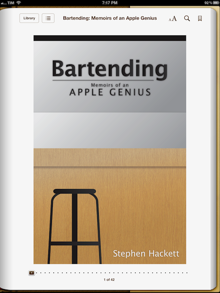
Bartending: Memoirs of an Apple Genius, is short, direct, and entertaining. You can probably finish it in 40 minutes if you’re in the mood of reading about Apple’s retail employees and the stories of customers who happen to swing by the Genius Bar every day. And if you like a style that’s fun, cuts to the point, and isn’t ashamed of recollecting the real thoughts of an Apple Genius who sees all kinds of customers on a daily basis, I bet you will devour Bartending from cover to cover in less than an hour. It is a pleasure to read Stephen narrate how he helped a woman recover the precious photos of her children after her hard drive failed, or how the iPhone represented a major shift both in terms of audience, and at the Bar.

I like to think of Bartending as more than “a book about the Genius Bar”. Whether or not you are aware of how Apple’s retail behemoth works behind the scenes, Bartending provides a fun and enlightening look at the interactions that occur every day on both sides of the business. In front of and behind the Genius Bar. I think Stephen’s greatest accomplishment with this book is that he explains with a human, friendly tone that, in spite of the gadgets and dollars involved with the business, the people ultimately define the stories we remember. And if the rules can be bent a little for the good of the customer – to “surprise and delight” – even better. That’s what makes this book a story of its own that fits in the Apple Community so well.

Bartending is a must-read. Get it today at $8.99 on Amazon (iBooks-friendly ePub version also available here).


Drafts Review

In the past months, there’s been a surge of “launcher apps” – lightweight utilities that allow iOS users to perform common tasks such as calling someone or starting a FaceTime call without having to use Apple’s apps, and thus their entire interfaces. However, while the concept of launchers and shortcuts has been around for years in the App Store – especially on the quick dial side, apps like Favorites first explored the idea of turning contacts into shortcuts – several of the utilities we have recently reviewed have leveraged the simplicity of such concept to build more powerful solutions to help users save time. With a combination of clever interface designs, new APIs and URL handlers, apps like Launch Center, Buzz, and World Contacts+ are redefining the way users think of interoperability and customization on the iOS platform. App Cubby’s Launch Center has especially gained a well deserved spot in many’s iOS dock thanks to its extensive support for third-party apps and a polished UI.

For the past week, I have been able to use Agile Tortoise’s Drafts, a new iPhone app that’s like “Launch Center for text” – a utility that allows you to save short snippets of text – the drafts – and act on them by sharing them through a number of services or system actions.

Drafts is very simple. Surprisingly so, if you expected to find options to enter custom URL handlers for apps that are capable of accepting text inputs. In fact, my mention of Launch Center is only theoretical, as both utilities share the same underlying ideology – to aggregate a set of actions and supported apps for a specific input into a single interface – but the first version of Drafts doesn’t come with the same amount of customization and tweaks you can find in Launch Center. Still, when it comes to text, Drafts has proved to be an invaluable addition to my workflow that, like Launch Center, got its spot in my iPhone dock.

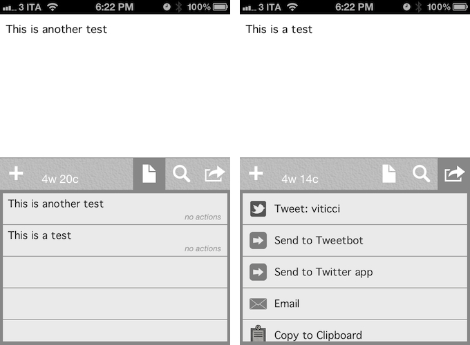
Drafts saves snippets of text. The app displays a word & character count for these snippets, which can be saved locally and accessed at any time by hitting the drafts icon in the app’s toolbar. Because Drafts 1.0 is iPhone-only, iCloud support hasn’t been added yet – your snippets won’t be synced across devices. You can search for any word across your drafts, and add new ones by simply pressing a + button. In the Settings, you can set the app’s Appearance, choosing between 13 fonts (American Typewriter, Baskerville, Cochin, Courier, Georgia, Gill Sans, Helvetica Neue, Hoefler Text, Marker Felt, Palatino, Times New Roman, Thonbury, and Verdana), three font sizes, and four themes. I chose Grayscale.

You can use Drafts as a notepad, a scratchpad of sorts, or a draft manager for your tweets, much like the defunct Birdhouse used to. Drafts sports a nice integration with Twitter, enabling you tweet natively using iOS’ support for Twitter, and letting you directly forward text to Tweetbot or the official Twitter app. If you choose to send text to these apps, the compose screen will open with the text already pasted, and you will just have to hit Send to publish a new tweet. I suspect support for more Twitter apps is coming in a future update.

Drafts isn’t just about Twitter, though. You can pick a draft, and email it to someone using the native iOS mail framework. You can copy a draft to the system clipboard, or, if you like to write in Markdown, preview the formatting, copy the Markdown to your clipboard, or email it. Being a huge fan of Markdown (which I use on a daily basis for my writing on MacStories), this is a nice addition.

Drafts is neither a text editor nor a minimal Twitter client. Drafts is a frictionless way to capture and save ideas that also happens to be integrated with system functions and applications you may be already using to elaborate on those ideas. Drafts can be used as an inspirational notepad to store the genius idea you have while you’re brewing coffee, or when you’re busy writing something else (just fire up Drafts, and quickly dictate your text if you have an iPhone 4S). I would like to see an even faster way to email text (like Captio or Note 2 Self do) as well as support for Evernote and more text-based iOS apps in a future update, so here’s to hoping the feedback on this initial version will be strong enough to encourage Greg Pierce, the developer of Drafts and Terminology (which the app also supports for definitions), to consider more functionalities and an iPad counterpart. In this first version, Drafts supports TextExpander touch, but there is no option to forward text to Apple’s Messages app.

Drafts 1.0 is a very good start, especially if you’ve been looking for a standalone draft manager for Twitter. You can get the app at $0.99 on the App Store.


Gum Max Review

With a 2.1A output and 10,400mAh capacity, the Gum Max is an external backup battery by Just Mobile that works with iOS devices. Anyone who has used iOS devices extensively – perhaps some of you even use the iPad as their primary computer – knows that, for as much as Apple has focused on making iOS devices extremely user-friendly from a battery life standpoint, the battery is going to run out eventually. And if you use a lot of high-speed 3G data, watch some videos, and play a game or two, that battery indicator up in the iOS status bar is going to run out faster.

Just a few days prior to receiving my Gum Max review unit, I waited in line at the Apple Store in Rome to buy the new iPad. There, I had the chance to experience how important it is to be able to rely on iOS devices without a source of power constantly available – sure, Apple employees allowed us to use the store’s MacBooks to charge our iPhones, but it just seemed rude to me to go there every few hours just to grab a USB port without doing anything else. Waiting in line for more than 20 hours, using a lot of 3G and taking several photos of videos with my iPhone 4S, I had to recharge my device multiple times – and when I didn’t want to use the USB ports kindly provided by Apple’s employees, I had to use my friends’ portable battery packs. There, I realized I really needed to get a backup battery for iOS devices for the future. Indeed, power and battery life seem to be two common concerns these days.

The Gum Max is not one of those battery packs that you can use as a case for the iPhone. The Gum Max actually looks (and weighs) like an external drive, only it can charge iOS devices through USB. The device has a green LED indicator to show how much juice it’s got left to power your iPhone or iPad, and input and output (to recharge the Gum Max, and recharge your iOS devices) are separate, but they both use USB (regular and micro) through cables that are provided in the box. As with many Just Mobile products, the Gum Max looks like something Apple would produce, with a clean and elegant design highlighted by a sturdy aluminum shell. I like the design of the Gum Max, but how it works is what matters in critical situations.

I ran a series of tests to see how the Gum Max would recharge my iPhone 4S, iPad 2, and new iPad. Overall, the Gum Max can easily recharge an iPhone 4S from 0% to 100% in two hours, get an iPad 2 from 0% to 90% with a single charge, and recharge half of the new iPad’s bigger battery with a single charge.

Gum Max Tests

iPhone 4S, started at 3:47 AM. From 0% to 37% in 30 minutes; up to 79% after 67 minutes.

iPhone 4S, started at 11:15 PM. From 0% to 68% in 60 minutes; up to 98% in 115 minutes.

iPad 3, started at 1:10 AM. Up to 28% in 100 minutes.

iPad 3, started at 2:09 PM. Device turned on at 2:17 PM. Up to 35% in 122 minutes; 42% in 145 minutes; 51% in 176 minutes; Gum Max turned off at 5:05 PM with device at 52%.

iPad 2, started at 10:14 PM. Device turned on at 10:23 PM, reached 44% at 11:44 PM, Gum Max turned off with iPad at 90%.

At $109, you have to consider whether getting 5 hours of a new iPad back will be worth the expense, assuming you’re getting the 10 hours of battery life promised by Apple, which I have indeed noticed with my iPad (it is a 4G model, and I don’t keep brightness at 100%). Is a full iPhone charge or an iPad going back to 50% going to a considerable improvement for your work, or the way you rely on iOS devices on the go? And is that improvement going to be worth $109 over time? Especially for iPhone users, I think having a full charge back in two hours can be critical in some scenarios (last year, I spent a night at the hospital to help a friend, my phone died at 3 AM, and I couldn’t reach my parents). For third-generation iPad users, the utility of a battery pack like this is more debatable, as the new iPad is slower at charging, and it’ll completely drain the Gum Max while remaining at only 50%. For previous iPad owners, 90% of charge from zero sounds like a good investment in my opinion.

With these differences in mind, the Gum Max is a fine accessory, it’s very portable, and it comes with an elegant black carrying pouch. You can get it here.


Slicy Reinvents Slicing Photoshop PSDs

“Save for Web” – not everyone’s favorite thing to do as a designer, but it’s part of the job. It’s monotonous but not a difficult task to do, it simply takes time. MacRabbit, who created Espresso, has released a new Mac app called Slicy. Its sole purpose is to turn PSD files into images for the web and applications. Slicy examines your .psd files for Layer Groups that are named like a file (.png, .jpg, .tif, .icns) and auto-exports them, no “Save for Web” dialog boxes necessary. “Name layer groups like the files you want to create, and Slicy will extract them individually. Enjoy complete freedom to move, obscure and even hide these named layer groups without affecting the extracted images.”

I can admit that my layers and layer groups are not always properly named; I think all designers can attest to this, so Slicy will also help you do a better job with naming objects within your PSD files. Once your naming is done and file is saved, drag the .psd into the apps’s window and Slicy will do the work for you. If you make changes to the .psd after you run Slicy, the app has an option to auto-export the images when they are re-saved. Delicious! If you want to repeat a job you already did, Slicy saves your previous exports under the “clockwise” icon in the upper right. Slicy, however, cannot guarantee a perfect replica for every .psd – the CMYK color space and some advanced filters are not supported.

Read more


World Contacts+ Is A Quick Dial App with a World Clock

Developed by Caleb Thorson, World Contacts+ is the classic example that, sometimes, good ideas can be remixed and combined to produce something new that’s still fresh and has a place on the market. In the past months, the App Store has seen the rise of “launcher apps” that, through URLs schemes, leverage many iOS apps’ capability of exchanging data and information to facilitate the process of forwarding files, short bits of text, or data. Shortcuts, if you will, collected in a single app that acts as a bridge between the user and all the other apps installed on a device. At MacStories, we’re big fans of Launch Center and Buzz, two apps that take the concept of “quick launcher” and apply it to third-party apps and Address Book contacts, respectively.

World Contacts+ is a bit of both, but stands out on its own because of the very specific approach it takes in regards to quick dials. World Contacts+ keeps a short list of the people you contact the most during the day, and allows you to initiate a call, FaceTime call, send a message or a new email with just one tap. Like Launch Center, it displays a vertical list for your shortcuts. Like Buzz, it allows you to pick contacts from the Address Book, and it uses native iOS frameworks to activate actions like email and iMessages. The app, however, adds a world clock to the mix, allowing you to see the local time for each entry in your list, so you can decide if it’s an appropriate time to call them or text them. The app even cleverly dims contacts that are located in time zones where it’s currently night. To assign a time zone, you simply search for a contact’s location every time you add a new entry to the list.

World Contacts+ isn’t as customizable as Launch Center, or as powerful as Buzz. If you’re looking for more advanced options when it comes to app shortcuts and contacts, go with those apps. But because World Contacts+ cuts the feature set down to a minimum and only adds one very specific feature, I believe the app could have a chance on the App Store for those people, like me, who communicate with people from different timezones on a daily basis. Currently, the MacStories team is made from people living in Italy, the US, Japan, and Australia, and it’s incredibly convenient to know the local time of each person without doing the math every time.

World Contacts+ is available at $0.99 on the App Store.


March 2012 In Review

March was the month of the new iPad, an updated Apple TV and the announcement of a dividend and share repurchase program. It was most certainly a ‘big’ month. If a new iPad wasn’t enough, we also got a lot of new apps (alongside all those being updated for the Retina Display) and big app updates - everything from Angry Birds Space (world productivity took a dive that week) to both iA Writer and Byword iPhone apps launching to Camera+ 3.0 and our eyes were in heaven after Instapaper was updated to support the Retina Display with some truly beautiful new fonts. On the story front, Federico tackled the issue of what was the best aspects of our favourite iOS text editors, talked about the ‘Apple Community’, Cody reviewed the new iPad and I expressed sadness and frustration with lies of Mike Daisey.

Jump the break to get a full recap of March 2012. You can also jump back to see what happened in January and February of this year.

The New iPad

On March 7th, Apple held its iPad keynote - announcing the third generation iPad, simply calling it the ‘new iPad’. It featured a Retina Display, improved rear camera, quad-core GPU with the new A5X processor and support for 4G networks. We posted a review roundup, featuring the highlights from various reviews on the internet, as well as our own review by Cody. Apple announced that in its opening weekend it sold 3 million of the new iPads.

The (updated) Apple TV, iOS 5.1,  iPhoto for iOS and more from Apple’s iPad event

Alongside the new iPad, Apple also released an updated Apple TV with support for 1080p content as well as new UI that was also released for the existing Apple TV. Co-inciding with the release of the new iPad was the release of iOS 5.1 which included some bugfixes and new features such as an improved activation method to use the lockscreen camera. Apple also announced the iOS version of iPhoto which was made available for $4.99 a short time later.

More minor announcements included the availability for AppleCare+ for the new iPad, iTunes 10.6 and the release of the “Apple Configurator” app after the event. Apple also bumped the over-the-air download limit from 20 MB to 50 MB to reflect larger app sizes due to Universal apps that included graphics for the Retina iPad and iPhone - as well as larger download caps that exist today. Finally, you saw Apple update a whole bunch of their own apps for the new iPad and Retina Display.

We also posted a complete round-up of the event and a bunch of minor details about the event that you may have missed. You can also watch the recording of the event here.

25 billion apps downloaded

On March 3rd, Apple announced that 25 billion apps had been downloaded from the App Store. To mark the milestone it revealed a new “All-Time Top Apps” section on the App Store. A few days later, Apple revealed that the 25 billionth app downloaded was ‘Where’s My Water? Free’ by Chunli Fu who is from  Qingdao, China - she won a $10,000 iTunes gift card.

Apple announces dividend and share repurchase program

Somewhat out of the blue, Apple announced on a Sunday afternoon that it would be holding a conference call early the next day (Monday) to announce the result of discussions by Apple’s board on what it would do with Apple’s cash balance. As was widely expected, Apple announced it would begin issuing quarterly dividends of $2.65 per share. It also announced a $10 billion share repurchase program to begin in FY2013.

Fair Labor Association releases preliminary report on Foxconn conditions

The Fair Labor Association released a preliminary report on its findings from inspections at Foxconn that were conducted earlier this year. In what now seems like planned positive PR ahead of the report’s release, Tim Cook visited Foxconn a few days before the report was published and photographs were distributed to media of the visit.

Angry Birds Space

Rovio this month released Angry Birds Space, the fourth in the series (after the original, Rio and Seasons). Unsurprisingly, the game did incredibly well and managed to receive over 10 million downloads in less than 3 days. Particularly awesome was this analysis of the physics used by the game, a great follow-up to the original investigation into Angry Birds physics.

Everything Else


The Really Big Reviews

Everything Else

March Quick Reviews

Retina & Universal

iPhoto for iOS Review

The Essence of a Name

On Reviewing Apps

Getting Your iPad App Ready for the new iPad

Comparing My Favorite iOS Text Editors

Daisey’s Lies Take Us Two Steps Backwards

iPad (3) Review: You Won’t Believe It Until You See It

The Apple Community, Part II

Regarding Apple’s Edge and the new Apple TV Interface

A Series of Clicks

The (Semi)Skeuomorphism

MacStories Reading Lists

MacStories Reading List: February 26 – March 4

MacStories Reading List: New iPad Special Edition