This Week's Sponsor:

Finalist

A paper-inspired daily planner with notes for iPhone, iPad, Mac, and now Apple Watch. A day you design your way.


Posts in reviews

National Parks By National Geographic: A Beautiful Guide To American Nature

Great content deserves great design. In my opinion, this is one of the main principles UI designers have to sought after. If your product features great content, it needs to be highlighted with great design and usability elements around it, or it loses a lot of its advantages and flair. The second principle I truly admire when executed well is the attitude that content always comes first. If the standard tools (in the case of UI design, the standard interface elements) do not fit your app’s purpose, create new ones instead of reducing your feature set.

You do not often stumble upon apps with such interface features (one of the more prominent examples could be the current Twitter app with its “pull to refresh” feature) but if you do, most of the time your jaw just automatically drops. This is also the case with the new National Geographic National Parks app.

The app lets you discover American national parks in a way you’ve never seen before. You can rush through images, park information, secret tips and much more in a trip of pure joy and wonder. Before I focus completely on its tremendous UI, allow me to list the main park guide features the app has to offer as they are summarized in its App Store description:

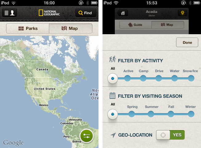
  • Global and interactive map views with filtering by activity and seasonality
  • Personalized user space to track your favorite parks, activities, itineraries, photos, and more
  • Thousands of points of interest, all tagged with GPS coordinates for easy planning and locating
  • The top must-sees and must-dos for each park, curated by National Geographic editors [includes downloadable park guides]
  • Stunning photo galleries for each park, plus rare vintage images from the National Geographic Archive Photo tips from National Geographic photographers
  • Sharing through Facebook, email, and Twitter
  • Collectible park stamps.

Just to get the idea. But mentioning all these features explicitly would have distracted me from writing about what I’m really into: the app’s design and the way this content and feature possibilities are presented. So let’s get into that now.

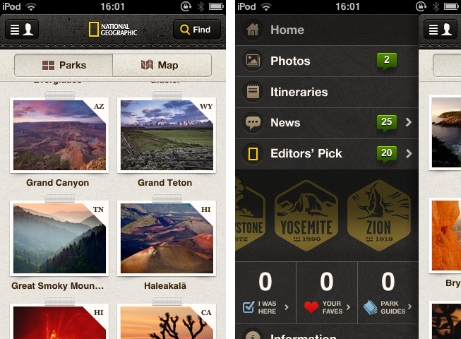
When I fired up the National Parks app I immediately recognized that it’s something very special. The main window contains a beautifully styled photo wall of all parks to choose from or alternatively a map (with fluent Google Maps integration) featuring their hot spots and attractions. This window already shows the designer’s approach with taking common iOS buttons and selectors and re-editing them in order to give them a personal touch. This is most of the time achieved by changing their structure to something that looks wilder, grungy and very often like tanned leather. The app’s look makes you almost feel the park guide in your hands: everything is rounded up with well placed shadows, visual borders and, more importantly, realistic consistency.

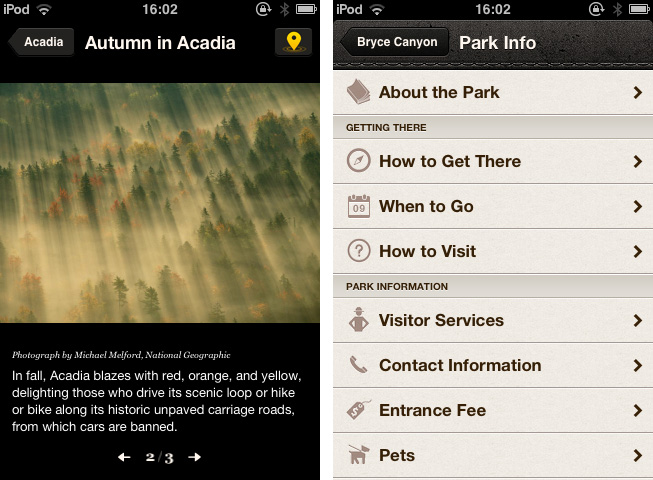
After selecting a park and browsing through its given information, you’ll also recognize a (at least to me) completely new interface effect: if you take a look at its visitor stats or current weather situation, the main window gently slides in the background and up comes a halved screen presenting the selected information.

But National Parks is not just an excellent example for UI innovation: it also makes great use of visual guiding. The app features an immense and advantageous use of well-placed pictograms and especially photography — even on the rather small screen of an iPhone. Professional and beautiful images are flawlessly integrated while discovering the parks, and they give every single park presentation an individual and inspiring touch.

All in all I just can say that this is one of the most inspiring, useful and consistent iPhone apps I’d seen in a while now. There’s a lot more to it than I just highlighted. Although it crashed two times while using it and the enhanced park guides are only available for extra money (the first one is free, the rest is $1.99 each, which is a very fair price) I definitely recommend you downloading it for free. Whether you’re an enthusiastic lover of American National parks and a frequent visitor, hobbyist, professional photographer or just a interested design lover — it’s going to be worth it!


TeleTweet: Tweeting with Morse Code

It’s the week of morse code I guess. After showcasing iToneMaker on Thursday, Federico pointed me to TeleTweet by Shacked Software, a lovely designed iPhone app with a rather bootless set of functions, but a very passionate creation background which was the reason why it drew my attention.

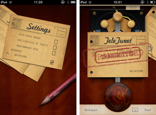
TeleTweet is a Twitter client. It connects to your account, and lets you enter tweets using morse code, publishing them to your account. This is a rather strange approach, but I had a lot of fun with it.

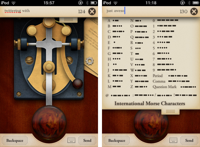
To understand how the app works, let’s take a look at the truly unique design, as it’s the app’s main feature and also the visual door to what it does. TeleTweet is an on-screen morsing station with a big paddle triggering the long and short morse signals and the corresponding sounds. The combinations of the triggered lengths are then converted into characters and appear in the post panel at the top of the screen. For users like me, who never used morse code before, there’s also a dropdown listing of all alphabetic letters and some useful special characters like “@” and their appropriate code. You can also bring up a “normal” QWERTY keyboard if you like — a feature which seems a bit useless to me, since you lose all the special features of the app, not just in usability terms, but also design-wise.

Entering tweets in TeleTweet takes its time, but it’s a lot of fun and, to a certain extent, it serves the goal of teaching the user morse code. This isn’t simply accomplished through the functionality itself but also with the app’s antique, warm look and its lovely animations (like the stamped envelopes when you send a tweet). It really shows a clear love for steampunk design from the IconFactory designers responsible for it, and it made me stick to the app for a long time.

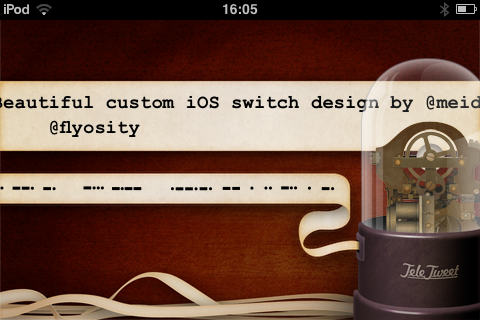
Sometimes completely forgotten, TeleTweet shows a deep attention to sound design: it clatters and squeaks and rumbles everywhere you touch. It’s very authentic. And I didn’t recognize the coolest thing about TeleTweet until I read through the developers’ website for the second time: if you connect to your Twitter account you can turn your iPhone sideways to show your Twitter stream — in real time morse code and its translation in monospace characters. I was just stunned at first, and then literally laughed. It’s hilarious and beautiful at the same time.

You shouldn’t buy TeleTweet if you want a decent Twitter client or a really useful tool to learn morse code. TeleTweet is a nice mix of both but does not completely serve the needs to meet the high feature standards of dedicated apps. What really makes the app attractive is its design.

If you’re a lover of high UI standards or steampunk design, go get TeleTweet for $0.99, and even if you’re not using it at all afterwards, it will surely stimulate your eye’s desire for detailed pixel work. Isn’t that what we’re all after from time to time?

By the way, in less than a week it’s Samuel Morse’s birthday — he’s the inventor of the morse code system.


Iris: A Beautiful and Simple Instagram App for iPad

Instagram may have been acquired by Facebook, but this isn’t stopping third-party developers from coming up with clever solutions to use the Instagram API. If anything, if Facebook will live up to its promise of keeping Instagram alive while growing and improving its network, everyone’s favorite photo sharing service may see even bigger numbers and user adoption. And there’s no better way to use official APIs than building software the developers of the original app are ignoring, at least for now.

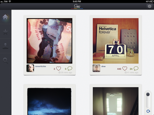
For the past few weeks, I have been trying a new Instagram app for the iPad called Iris. It’s available now on the App Store and it’s optimized for the Retina display. While Instagram has started experimenting with a new API to allow other developers to upload pictures to the service, Iris doesn’t let you upload photos using the iPad’s camera and the app’s custom interface. Instead, Iris is another app focused on providing a beautiful experience for browsing and liking Instagram photos, and, in my opinion, it is the most attractive solution that’s been brought to the market to date.

Iris puts great focus on large thumbnails for photos, a light background to make Instagram’s filters really pop, and a dark sidebar to switch between your feed, popular items, profile, and search. Iris allows you to browse either via large thumbnail previews or smaller ones; the layout change can be activated with a switch in the lower left corner. In the lower right corner, the developers have implemented a “pull to refresh” command, which literally requires you to pull a slider to refresh the main view. You can also hit the associated refresh button if you feel uncomfortable with pulling, but I found the gesture quite clever and fun. Unlike other apps, Iris doesn’t have standard pull to refresh at the top of the view.

To navigate, Iris uses a mix of tabs, “load more” buttons, and panels. For instance, the main feed gives you a vertical list of photos from people you follow, and once you reach the end of the list you can hit a “load more” button to fetch more items. I found the refresh times acceptable, and I like the custom popup dialog that shows up when you load sections or refresh pages. You can tap on a photo to bring it up at its original size; you can like with a double tap (like the original Instagram), or by hitting the heart icon below a photo. In the same area, you can find buttons to comment, and view a photo’s location. Comments are displayed in a panel that loads at the side of the screen and is reminiscent of Loren Brichter’s Twitter for iPad. If you tap on a user’s avatar while viewing a photo, the user’s profile will slide up from the bottom of the screen, and, if I had to point out a minor UI annoyance I noticed, you’ll have to hit a “back” button to make the profile view slide down again. I find the action confusing as back buttons are typically associated with the content area moving to the right.

The Popular section is pretty self-explanatory; I did find some nice touches in the profile view. You can view the people you follow and your followers in dedicated panels; you can follow/unfollow in-app, and of course check out another user’s complete set of photos. In your Profile, you can also hit a globe icon to have a history of your Instagram shots displayed as Iris pins on a Google map – it’s a neat summarization of the places you “visited” with Instagram.

The search function of the app is very basic as well: you can search for people and “tags”. While people results will open in the aforementioned side panel, tags will simply return associated photo results in a regular grid view.

If Instagram were to release an official iPad app, I think it’d be extremely similar to Iris’ approach. A minimal, beautiful interface for the Instagram community that takes advantage of the iPad’s display to lay out large thumbnails and photos. Instagram would obviously want to implement a camera in a (possible) official app – right now, Iris doesn’t let you upload anything, and has to display photos at low resolution on the iPad’s Retina display. The effect, however, is nice (especially thanks to filters, which help hiding some pixellation here and there), and I bet it gets a lot better on older iPad models.

Iris offers a simple, good-looking and enjoyable Instagram experience on the iPad, so if you’ve been looking for a great iPad app to browse your favorite photos, $1.99 should be a no-brainer.


Produce Morse Ringtones With iToneMaker

Some of you who are interested in electronic music may know Moog analog synthesizers and guitar effects. With their big stainless steel knobs, LEDs and very elaborate technology behind them, they create enormously noisy, grungy and disturbing sounds. The company also managed to create a very polished music production app for the iPad, animoog. The UI designer of today’s pick, iToneMaker Morse Code, was definitely inspired by this company’s product design, but nevertheless the app is a very unique and lovely compiled ringtone maker for your iPhone.

As the name might already suggest, the app’s sound production is based on the morse code principle. Hence you have to type in a word or a random letter/digit combination as the basis of your new ringtone into a message panel within the main window. The slightly different sounds of the single characters are played consecutively and result in the final ringtone.

Within this main window you can also change the basic elements of your ringtone: like “normal” analog synths, iToneMaker is based on (in this case obviously digital) oscillatory sound production. You can choose between triangular, saw and square oscillators and adjust their pitch, speed and break length between the morse sounds via custom sliding controls. Just push the central play button and your ringtone is played back, over and over… it can get pretty annoying, I warrant you.

If you are not satisfied with the output of these few controls - which happened to me literally every time I tried to produce an agreeable sound - you can additionally superimpose more editing features via the option button. You’ll find reverb and low-pass filter regulators plus some different effector types and the ability to change pitch while a morse tone is played. Besides that, developers Eiji and Tom kindly created some presets to choose from so that you never have to start from scratch completely and possibly never get to a passable ringtone result.

But let’s go back to the Moog-inspired UI. The knobs marking the advanced features are designed threedimensionally with a reflecting silver tone and are definitely dominating the individual style of the app. Everything else has got a monochromic look to it and the selector buttons feature a very nice custom indicating orange LED-design when their function is active. iToneMaker is coherent in every little detail and works really smooth with iOS 5 on my 3rd generation iPod touch. Even the implementation of the address book in order to use a friend’s name as a morse code pattern and entering longer character lines works as fast as the rest does.

There is just one small problem to the UX which I consider as relatively disadvantageous: if you superimpose the options panel it overlaps the (actually pretty big) play button and you can not stop the playback from there, if your ringtone is still running. But for an app which features such a cool and elaborated interface and is still available for free, this seems like a quite acceptable problem to me.


Shazam Player Now Available for iPad

Shazam Player, the app from the creators of popular music recognition utility Shazam, has today reached version 1.5, adding support for the iPad, Retina graphics, and better display of lyrics on screen. Shazam Player, as I outlined in my original review of the iPhone version, provides an alternative view to Apple’s Music app, enhancing your music library with a plethora of sharing and discovery functionalities for artists and albums.

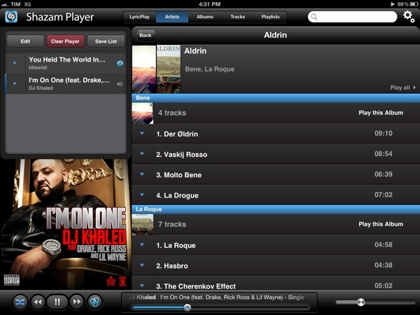
Like its iPhone counterpart, Shazam Player for iPad offers users the ability to create separate playlists from Apple’s Music app and organize songs in “good” and “bad” lists for easy retrieval later. The whole interface has been revised to take advantage of the iPad’s real screen estate, adding a “Player” box on the left side to visualize the songs playing in your queue. These songs can be rearranged for a particular order, and lists can be saved for later or cleared with one tap. You can send single songs or entire albums to the player with a tap or swipe. Tapping on the triangle button next to a song gives you access to a separate popover window containing the same sharing options of the iPhone app: you can share on Facebook and Twitter, check out related YouTube videos, artist information, and activate LyricPlay.

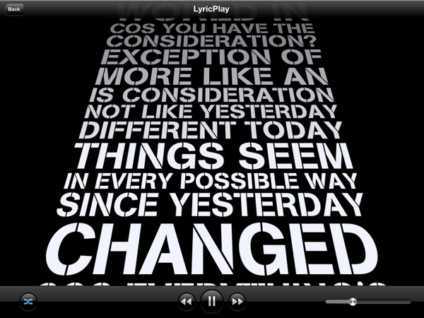
Shazam Player’s standout feature, in fact, is its support for song lyrics visualized on screen through a system Shazam calls LyricPlay. This functionality is only available for tracks that have been “scanned” and matched with Shazam’s servers, and unfortunately I found this new 1.5 version to be mostly hit or miss when it came to, say, matching popular songs from Drake, Oasis, or even The Eagles – all of them available on iTunes and well-known to Shazam (the standard app can fetch song info through the device’s mic). On the iPad, when the feature works, lyrics have been updated for the Retina display and they follow a song’s progression with an animation on screen. Lyrics can now be sent to the Apple TV via AirPlay, and songs that aren’t matched for LyricsPlay usage have also received a new UI for full-screen cover art and music visualizer.

Overall, I still find Shazam Player a solid alternative to the iOS Music app if you’re looking for on-device playlist creation, sharing and queue options, and online lyrics support all in the same package. Keeping in mind that LyricsPlay won’t probably find all your lyrics, you can check out the app for free on the App Store.


Keep An Eye On Your Twitter Followers With Detective

When it comes to research for new subjects to write about, I’m constantly confronted with ones that are at heart too marginal to discuss, but I’m doing it nevertheless, because they have some interesting touch to them. In Apple news, editors know that kind of problem and the question connected to it always sounds like: “Should I post about it or not? Will it be interesting enough?” When it comes to apps and good design, it’s much easier most of the time. Most of the time I can divide UI/UX design in two parts. Either the app works, looks fine and is easy to use or it does not. When I started to test Detective by Notion, I immediately recognized: Oh god, that’s a hard decision; it has got a very nice look but I am not sure about its feature. Is it that good? To go even further, I’m still asking myself if the app has a feature at all. But let’s dive in a bit deeper and you’ll hopefully get my point.

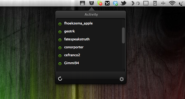
What Detective basically does is list your new Twitter followers and unfollowers in a top-down window from a menu bar icon. That’s it. Yeah, that’s it, really. You’re probably thinking that you could check that by yourself or that perhaps you don’t care at all about who and how many followers you have as long as you can tweet and follow what or whom you want. That’s all understandable, but I thought about it more and came to the conclusion that Detective — and especially its UI design — has got some advantages that may make the use of it legible to some people.

First of all, Twitter doesn’t notify you when people unfollow you at all. Psychologically speaking, that’s a good move, since everyone is more likely to enjoy seeing how he gets more and more famous over time without spending a thought on those who may dislike him (or her). But there are still some serious Twitter users out there, who do still care about their followership, they’re rare but they exist, trust me. They may even like to ask some of them why they stopped following them and what they could do better. For them, Detective could be nice to have. It just serves the need of showing up these people and does that with a polished, gloomy monochrome design only interrupted by the green pluses for new or red minuses for ex-followers, respectively. Apart from the very poorly designed preferences panel — which is in fact offending the rest of the app’s design and looks like it doesn’t belong to the app at all, Detective is minimalist, functional and performs very well.

Which brings us the the second, even more pleasant feature of Detective, at least to me: it’s totally unobtrusive. And I consider that as the main reason for granting this app such a long post. I assume that most of you who are twittering already deactivated the notification mails Twitter sends out if you have a new follower, direct message and so on. Detective on the other hand is faster than those notification mails and its basic approach of notifying you is different. It’s just there, you can check the changes by yourself when you want or you can choose Growl notifications if you’re too lazy to click on the menu bar icon, but even that is still better than those annoying mails which constantly interrupt your workflow and clutter your mail inbox. The rest of the time, when you don’t want to get distracted, Detective is completely invisible (yes, I know, there’s still that icon in the menu bar, but let’s be honest, no one can get distracted by an icon that small).

To me, it is this unobtrusiveness that really makes the app valuable, despite its very limited feature set and purpose. It definitely is an indicator for a knowledge of good design, if a developer is not out to usurpingly bring his work to the foreground just for the sake of making the user aware of it. Unfortunately I consider its price of $2.99 still too high. Although it’s by and large a very decent app, Detective needs way more features (which are promised indeed, but obviously not included in the current version) to justify such an expenditure. Hopefully Notion will keep their promise of implementing stuff like multiple account support or retweet/favorite notifications — because then I could recommend it with no hesitation.


DragonDrop Simplifies OS X Drag & Drop

Ever since Lion’s release last year, I have been looking for ways to improve the system’s support for drag & drop. Lion is so focused on gestures, yet incredibly similar to older versions of OS X when it comes to file management, that I am still surprised the Finder didn’t get new functionalities aimed at increasing our efficiency with working with files on trackpads. A number of utilities have sprung from many users’ need to have a simpler drag & drop, such as Yoink.

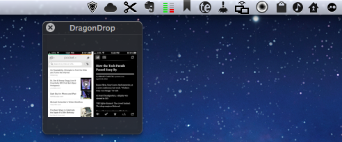
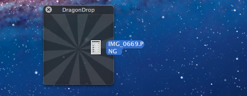
DragonDrop, another take on simplified drag & drop for the OS X Finder, offers a solution that’s somewhat in between the aforementioned Yoink and Quick Look previews. DragonDrop lets you “pause” the drag & drop action by temporarily placing a file – being it an image, text document, webclip, or just about anything OS X can drag & drop (even colors) – in a floating shelf. When you’re ready to “resume”, you can pick up the file and drop it on your destination as it came from the original source.

While this concept is nothing new, DragonDrop provides a unique implementation – a feature that caused the app to take some time to be approved by Apple for sale on the App Store. DragonDrop can be activated by dropping files onto its menubar icon, or by performing a “shake” gesture with your finger while dragging. Apple didn’t like this feature – which is optional in the app’s Preferences – but eventually decided to approve DragonDrop as other Mac App Store apps already modify system functionalities.

Not everyone’s going to like the possibility of bringing up DragonDrop’s shelf with a shake gesture, but I’ve been using it extensively over the past weeks to quickly copy text from webpages and emails (without having to perform a long, precise drag & drop) and folders from the Finder. I like how the shake gesture makes the floating shelf appear next to the mouse cursor, rather than up in the menubar.

At $4.99, DragonDrop is a very focused utility (it also supports cut/copy/paste in the menubar) aimed at enhancing one core functionality of OS X. I recommend it, but if you’re not sure you might need it, there’s a free trial available on the developers’ website.


Read It Later Reborn: Pocket Saves Everything “For Later”

In the past five years, reading on the web has fundamentally changed. Read It Later, the first popular service to pioneer a certain kind of “bookmarking” for web articles, is reborn today as Pocket, and it promises to change the way users think of web content to “save for later”. Most importantly, Pocket wants to address what has become the scarcest resource of web citizens: time.

Read Later

People never had time to check out all the cool stuff that happens on the Internet every day. As blogging platforms started taking off in the past decade, sometime during 2006 some people began to realize they didn’t have time to read every article that was posted online. The digital publishing revolution had already happened, but the explosion of blogging was just starting to produce high-quality, journalistic and well-informed pieces that, due to a simple scarcity of time and intuitive tools, people didn’t have time to read in their entirety. Whilst the act of “bookmarking” something on the Internet goes back to several years ago, the more focused, practical act of “saving an article for later” can actually be traced back in the form of popular consumer software to somewhere in between late 2006 and 2007.

Nate Weiner was one of the first developers (and avid web readers) to understand that the bookmarking systems in place at the time (Delicious, magnolia, or simple browser bookmarks) weren’t cutting it, from a technical and psychological perspective, for those users that just wanted to put off an article for later.

The difference between “bookmarking” and “saving for later” is both practical and conceptual: a regular bookmark is usually archived for good, as bookmarking services place great emphasis on letting users store bookmarks – links to webpages – forever in their accounts. There are some exceptions today, but the underlying philosophy has pretty much stayed the same. The action of “saving an article for later”, on the other hand, takes a more pragmatical approach: an article a user wants to read today or tomorrow isn’t necessarily representative of a webpage he wants to store and archive for eternity. The terminology itself – “for later” – indicates that something is going to happen ”later”. Once an article is read, most users tend to go on with their lives and forget about it. Like I said, it’s different today, and there are some specific use cases in which someone might want to archive articles – but the original concept lives on. People don’t have time to read every web article ever published.

Back in 2007, Nate Weiner set out to create a simple Firefox extension that would allow him to keep articles he found at work (and wanted to “read later”) in a different place than its browser bookmarks. On August 6, 2007, he launched the aptly-named Read It Later, a Firefox extension that did one thing well: it kept articles in a cozy little extension, saved for later. Users could hit a button to quickly save an article, and they could even save multiple browser tabs at once. As the extension started taking off, Nate began adding more features to Read It Later, such as offline support in December 2007.

Meanwhile, Marco Arment, developer at Tumblr, was facing a similar problem himself in 2007. He was constantly coming across news or blog articles he didn’t have time to read at the moment, and he needed something to read while on the bus or waiting in line. Arment discovered that there was no easy way to save links from a computer and access them later from the iPhone – we’re talking mid-2007 here, when the iPhone was getting in the hands of the first millions of customers, and when there was no SDK for developers to build native apps. So Arment decided, as he would later explain, to build just the service for that: Instapaper, a webpage that collected links saved from a bookmarklet, was launched publicly in January 2008. Like Read It Later, Instapaper solved a twofold issue: it allowed users to quickly save articles, and retrieve them later. Unlike Weiner’s app, though, Instapaper saved links in a webpage that could be easily accessed from the iPhone – mobile reading, in fact, seemed to be one of Instapaper’s primary features from the get-go. As Arment’s service became popular, he also went back to the drawing board – or in his case, programming tools – to implement new functionalities for Instapaper. The service’s hallmark feature, a text mode that strips unnecessary content out of web articles, was released in April 2008.

The rest is history. As Apple kept improving its mobile ecosystem with new devices, OS upgrades, and the App Store, Read It Later and Instapaper evolved, and iteratively became two fantastic services that serve millions of users every month. Over the years, we have followed both Instapaper and Read It Later closely at MacStories. Read more


Gemini Lovingly Finds Duplicates Of Your Files

Spring-cleaning is not much fun to do. Especially when talking about cluttered hard drives like mine. We all know with big hard drives comes big responsibility, but let’s be honest, just a few of us are constantly paying heed to delete useless duplicates. This problem can’t be tackled with apps which just provide good functionality — the task of decluttering your computer is that boring, you need great pixels as well to keep up the user’s interest and motivation.

Gemini is the first app I ever saw solving this necessary combination of design and usefulness with ease and bravour. The guys at MacPaw did a great job with it. When firing it up, Gemini is just a input screen on which you can simply drop folders or whole drives to let the app analyze and scan them. Unfortunately, this process takes some time but at least it’s subtitled with entertaining words (e.g.; “I, Gemini, am actually a duplicated file magician”). Afterwards the found duplicates are presented in a Finder-like, slightly modified window. Besides a list with the file names and paths it contains a pie chart showing up the media types of the useless files. The app comes with Quick Look support as well. Browsing your files is very intuitive, and I literally laughed when I saw the animation after finally deleting all my futile used data - it rushes through a virtual paper shredder falling down as shred.

The rest of Gemini’s look has got the same intuitive, almost magical touch to it. The rounded edges, warm colours and simple UI structure immediately appealed to me. It’s modern, minimalist, functional and — most important — it works. The design concept ends exactly where functionality begins, something I like very much. I could not find any unpolished detail in it, maybe the path information shown with the Quick Look preview is implemented a bit improperly, but I am sure that if there’s something you can not polish in order to make it beautiful, then it’s path information, as I think you’ll agree.

Apart from that, Gemini is a pretty good example of how good design can be both intuitive and functional. It really simplifies the process of cleaning up your computer, making it accessible for everyone from laymen to expert. And besides that, the price of $7.99 is more than just inexpensive when it comes to free hard drive space, it’s an excellent value for the money, so purchasing Gemini should be a no-brainer.