Nearly a month ago, Cody reviewed Clear. It was a new todo app from Realmac Software and Impending, and we called the app “delightful and clever” thanks to its refreshing take on how a todo app could work. Around that time I was let into the beta of another new todo app for the iPhone, and for the past month I’ve been using it intermittently — between giving Clear a go myself, using Things, and using nothing (as I so frequently revert to). That new todo app, Steps, debuted on the App Store last week and it shares many similarities to Clear - particularly in its minimalistic design and strong colour scheme.
Whilst preparing this review, I found myself in a bit of a dilemma. See, I kept constantly and subconsciously comparing Steps with Clear. As I said, they are quite similar because they both target the segment of the todo app market which aims to be super simple and minimalist. I felt as if I wrote this review as a comparison between the two, I would belittle the accomplishments of Steps, because whilst I think it’s a great little app, I also like the “delightfulness” of Clear a lot. But I think because the two apps are so similar in purpose and goal, it would be remiss of me to just ignore the excellence of Clear. So jump the break to see how Steps compares and how the two apps do diverge in some details.
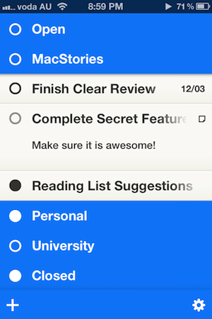
I’ll start with where the two apps diverge the most. In Clear you have three distinct navigation levels: the menu, the lists and the items. Steps skips all of this and just has the one level that displays all your lists, which act like folders that open up to show the individual todo items. The folders work like the iOS Home screen folders, pushing away content to reveal items underneath. You don’t go to a new level, window, or pane, instead, part of the screen just slides away to reveal your items. I must admit that I initially preferred the way Clear worked, mostly because it was just so damn cool, but I eventually got the recurring feeling of being a little lost at where I was (which list was I in at the moment?) and became indifferent at the idea of constantly pulling the app back to the list level, tap into another list and then pull back up and so on. So whilst it’s a little more bland and not that innovative, I prefer the way that Steps works – simplicity prevails in this aspect.
I also preferred that Steps had a list that had every item that was yet to be done (they call it the open list – more on that in a bit), as well as one that lists all your ‘done’ items. That said, Clear does have some advantages in the way it does things. Perhaps the biggest is that because each list is its own ‘pane’, you can purely focus on what you have to do in that area of your life without the noise of the other lists appearing. I also like that you can see a numeric figure for how many items are left in each list – although this seems like an easy thing to add to Steps.
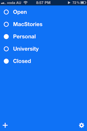
Focusing back on Steps, one big idea that the developers have pushed is the idea of something being “open” and something being “closed” – in fact the whole design is based upon this idea. You don’t see any tick marks in Steps, just circles that are either open (no fill) or closed (solid circle filled in completely). Both your lists and tasks receive a circle indicator. If you have a list with unfinished tasks, it will be marked as open – but once you have completed them all (or there are no tasks), it will be closed. A simple tap will open or close any task or list (as an aside, closing an item yields a very nice animation) and you can even close an entire list by just tapping its circle, all items inside the list will mirror that action.
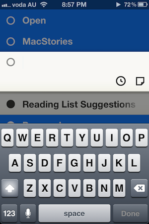
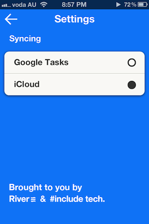
Adding a todo in Steps is as simple as tapping the ‘+’ button located in the bottom-left hand corner. Simply make sure you have expanded the list you want to place the task in and press that button. Once that is done, simply type the todo name and, optionally, a completion date and a short note. Both will be viewable alongside the name of the todo task - there is no separate pane for individual tasks. To add a new list, you just need to make sure you close all your existing lists (by close I here mean “minimise” so that you can’t see any individual todo items) and press that same ‘+’ button and literally just give it a name — nothing else. Deleting a task is as simple as swiping left on the particular item and if you want to sort your items, simply long tap and wait for the sorting “grips” to appear. Finally, that little settings cog you spy in the bottom-right corner will give you the option of choosing either Google Tasks or iCloud for syncing your tasks.
So which is better, Clear or Steps? Honestly, I’m not sure I could give a proper answer to that question because whilst they are both very similar, they also diverge enough to each have distinct benefits over the other. Nevertheless I’ll put it this way: Steps is undoubtedly the “simpler” of the two apps, and I mean that in both a positive and negative sense. I prefer that it gets rid of the levels metaphor that Clear uses, but it is also very spartan compared to Clear, which is a simple but in a delightful way (yes, Cody summed Clear up well by describing it as a delight). Steps accomplishes everything that it promises too, works well and looks quite nice, but it isn’t exciting like Clear is. In the end, I think it is up to personal preference to decide which of the two apps is superior – there is no clear winner or objective assessment to say which is better. I myself am still torn between the two and will probably go back to Clear for a week or so and see how I like it. But both of these apps are available for insanely great prices, so if you want to be sure, compare my review of Steps and Cody’s review of Clear with your own experience of trying out both apps yourself.
Steps is available on the App Store for $0.99.


