iPadOS
Following last year’s platform split with the introduction of iPadOS 13, an old doubt crept back into the iPad community: with iPadOS now its own entity, could Apple keep up the pace of annual updates? Or was the separation from iOS a mere marketing ploy?
A year later, we have our answer: iPadOS 14 doesn’t revolutionize key aspects of the iPad experience such as multitasking or the Home Screen, but it’s not devoid of new features either. Apple is committed to the iPadOS platform, and it shows in the larger vision looming over this year’s update. And if you consider iPadOS 13.4 and its systemwide pointer as part of the “iPad in 2020” storyline, it’s pretty clear that Apple is, more than ever, pushing iPad as a new breed of portable computer.
A trait of iPadOS 14 that immediately stands out is how this year’s changes to the iPad experience do not come in the form of shiny new pro apps or reimagined multitasking. Apple didn’t showcase iPad-specific versions of Xcode, Final Cut, or Logic at WWDC, nor did they address longstanding criticisms related to how the iPad operates in multitasking and multiwindowing contexts. They didn’t, for instance, rethink the role of drag and drop as the sole mechanism to activate Split View or introduce new menus to manage multitasking and multiwindowing. As we’ll explore later, these areas of iPadOS are now ripe for reinvention, and they stand out as sore omissions this year.
Instead, iPadOS 14 is all about refinements to the core iPad experience, with changes in the design department aimed at increasing information density, speeding up interactions by reducing taps and modality in apps, and taking better advantage of the iPad’s large canvas. In many ways, iPadOS 14 is setting the stage for the iPad’s next big functionality jump, and it does so by once again borrowing interaction principles from macOS and adapting them to the device’s modular computing nature.
Last year’s iPadOS 13 was both a statement and declaration of intent: Apple knew the iPad was more than a large iPhone and different from a Mac, but the company had to break with the past to find out what, exactly, the iPad experience was going to be. Even if the end result wasn’t drastically different from iOS versions of years past, Apple had to draw a line; they started moving past the platform’s iPhone origins with multiwindowing and, months later, the native pointer.
The quest to find the iPad’s new identity continues in iPadOS 14, only this time Apple seems to be asking: what does a truly modern iPad app even look like?
Apple’s Goals
To properly evaluate the new functionalities and potential of iPadOS 14, it’s important to understand Apple’s goals and the scope of their ambitions. After spending the past four months using iPadOS 14 on my iPad Pro, I think there are two major themes at play in iPadOS 14.
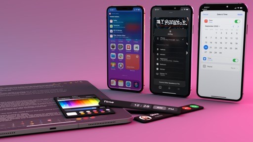
First is the idea of rethinking information density and taking better advantage of the iPad’s display. Since the iPad’s introduction in 2010, tablet apps were largely rooted in the iPhone’s existing interface guidelines. As much as Apple wouldn’t miss taking a shot at Android tablets (which were also a thing back then) and Google’s blown-up smartphone apps, it was also undeniable that iPad apps – even, and especially, those designed by Apple itself – shared many of the same visual and interaction traits of their iPhone predecessors. From Apple’s perspective, the play was to optimize for familiarity and consistency: millions of users already knew how to use an iPhone, and what better way to carry them over to a new platform than ensuring they’d already know how to use iPad apps?
As a result, the initial wave of iPad apps did offer new, tablet-specific UI elements such as popovers and sidebars, but by and large, everything else was based on existing iPhone conventions: most apps relied on tab bars at the bottom of the screen to deal with navigation across different sections and the idea of more UI complexity was generally frowned upon. iPad apps could only run in full-screen, had more space available for extra content, but ideally they had to remain as straightforward and uncomplicated as iPhone apps. This underlying assumption stuck for many years, putting Apple in the awkward spot where most of their iPad apps were turning into the very things they made fun of in years prior.
In looking back at the iPad’s evolution, you can see how 2015 was a pivotal year for the platform: with the introduction of the iPad Pro, Apple effectively started a second chapter in the iPad’s history, accepting the reality that some users wanted to elect the device as their primary computer. With such newfound responsibility for the device came Apple’s concessions to complexity. iOS 9 brought deeper multitasking with Split View and Slide Over; two years later, iOS 11 revamped multitasking entirely with the addition of drag and drop, a proper file manager, and a more powerful dock; with last year’s iPadOS 13, Apple adapted the Mac’s multiwindowing system to the iPad, blending the desktop and tablet worlds in a fascinating, if somewhat confusing, UX experiment.
Which brings me back to the idea of information density as a core theme in this year’s iPadOS 14. For the past five years, it’s been clear that Apple is unafraid of taking ideas that worked on the Mac and rethinking them for a device that supports multiple input methods. But while previous software updates were aimed at rethinking the experience around apps – Split View, drag and drop, windows, the pointer – iPadOS 14 gets to the root of the issue itself: why do so many iPad apps still look like enlarged iPhone versions with tab bars, nested menus, and sparse content that feels like a waste of space? Apple’s answer is a combination of elements that are, once again, inspired by the Mac but rethought for iPad: sidebars, multiple columns, and new toolbar menus aren’t a groundbreaking novelty in app design, but in the context of iPadOS’ growth, they show how Apple is willing to rethink the very foundations of apps.
The second high-level iPadOS 14 theme is also related to information density, and it’s the idea of reducing modality in apps. This isn’t as easily explained as “iPad apps have a sidebar now” – it’s a more subtle effort to balance the relationship between UI elements and content in iPad apps. As we’re going to explore later in this chapter, this strategy shares many of the same objectives as compact UI: Apple is prioritizing the retention of context when using apps – UI is more compact and it doesn’t block or hide what you’re doing. Various apps have received updates throughout their interface to follow these principles, such as popup menus that are automatically dismissed when scrolling or view filters that update an app’s displayed content without blocking interactions. These sort of changes may not be glamorous or easily marketable, but they add up, and they fit the aforementioned broader vision – Apple wants to rid the iPad of UI conventions that are better suited for iPhone.
In a fun twist of fate, iPad apps are coming full circle: once inspired by the iPhone, and progressively updated with classic Mac features reimagined for touch, these are the same apps that will be ported to macOS via Catalyst and run natively on Apple Silicon Macs. The standard look of iPad apps is fundamentally changing in iPadOS 14, and the ramifications of this will be one of the most fascinating topics of the upcoming year.
Let’s dive in.
Made for iPad
The most notable updates to iPad apps in iPadOS 14 fall under the Made for iPad initiative, which describes Apple’s efforts to rethink the default look and behavior of tablet apps. At a high level, Made for iPad encompasses three app-specific enhancements and one native system feature; all of them contribute to making iPadOS a more versatile platform for everyday work, with interesting repercussions on the iPad app ecosystem as a whole.
Sidebars
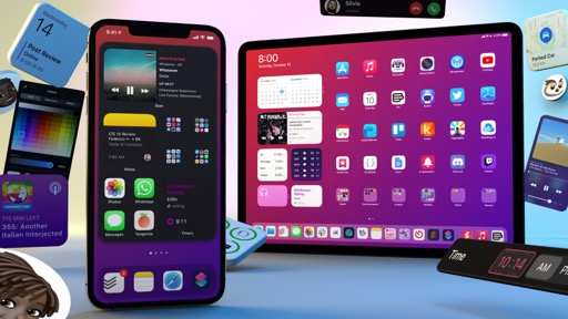
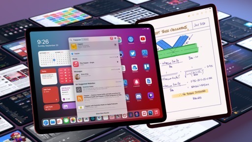
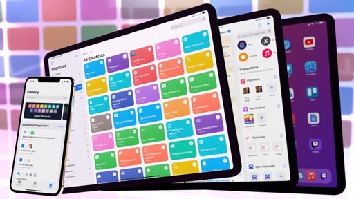
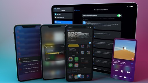
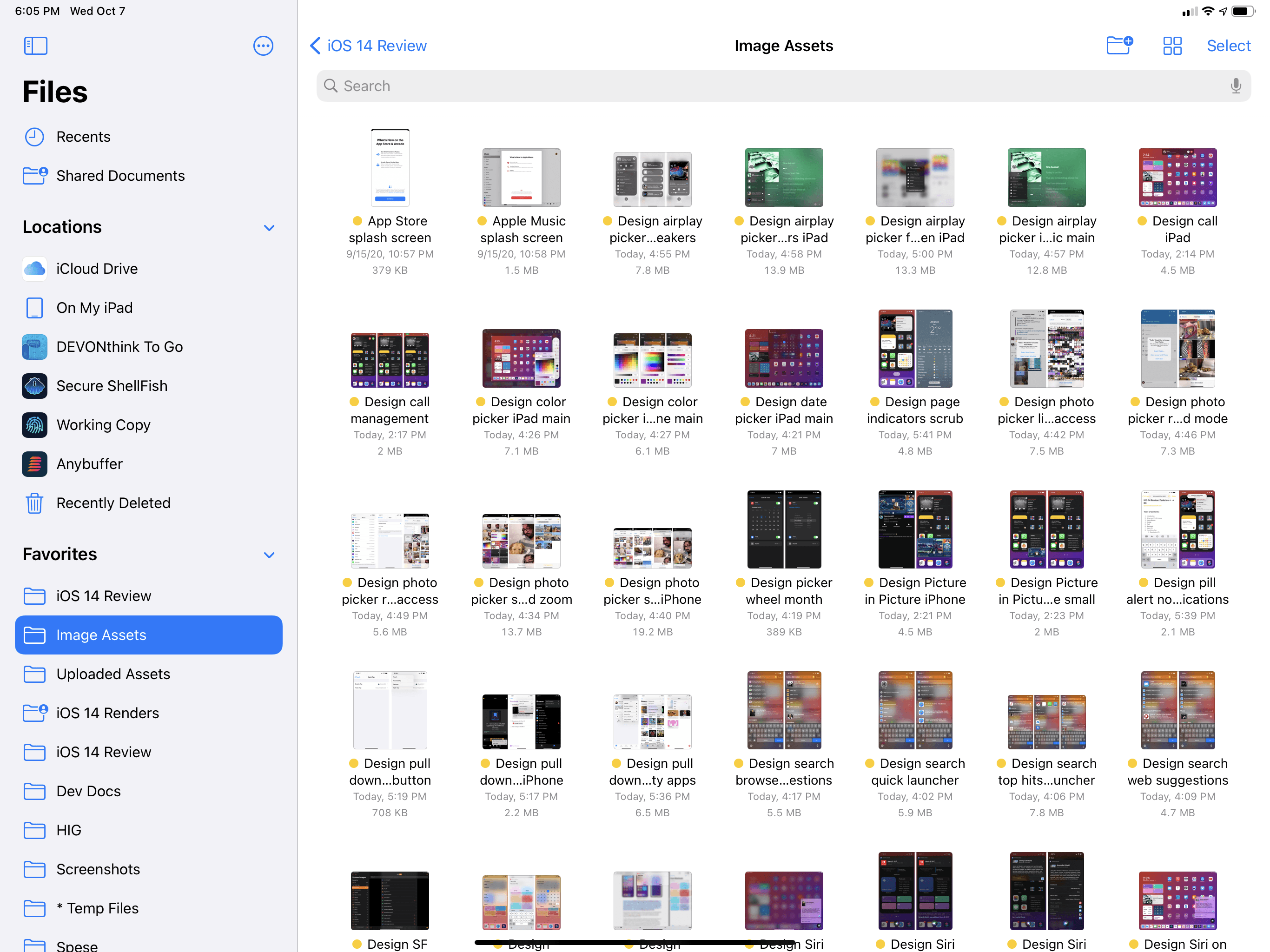
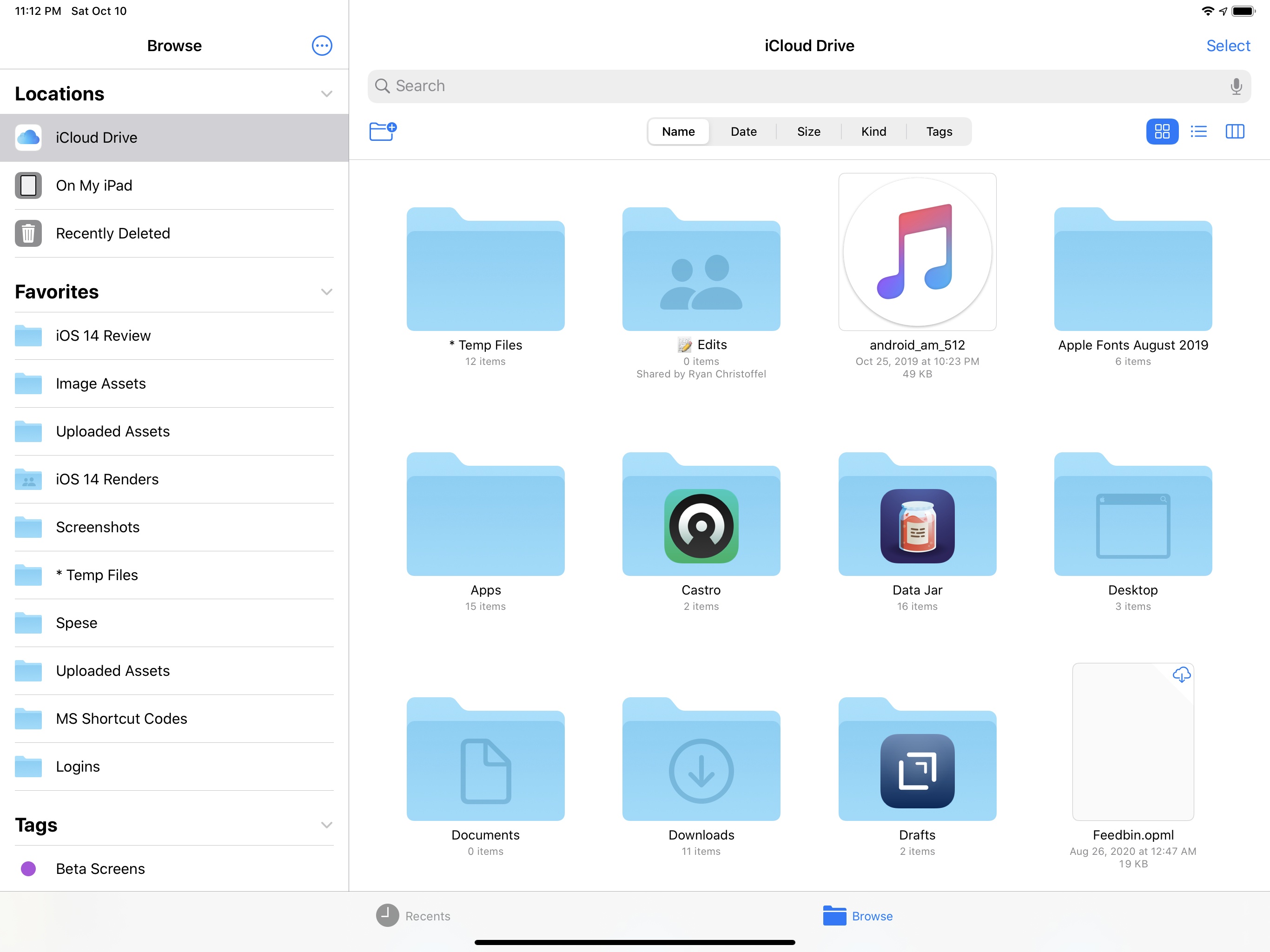
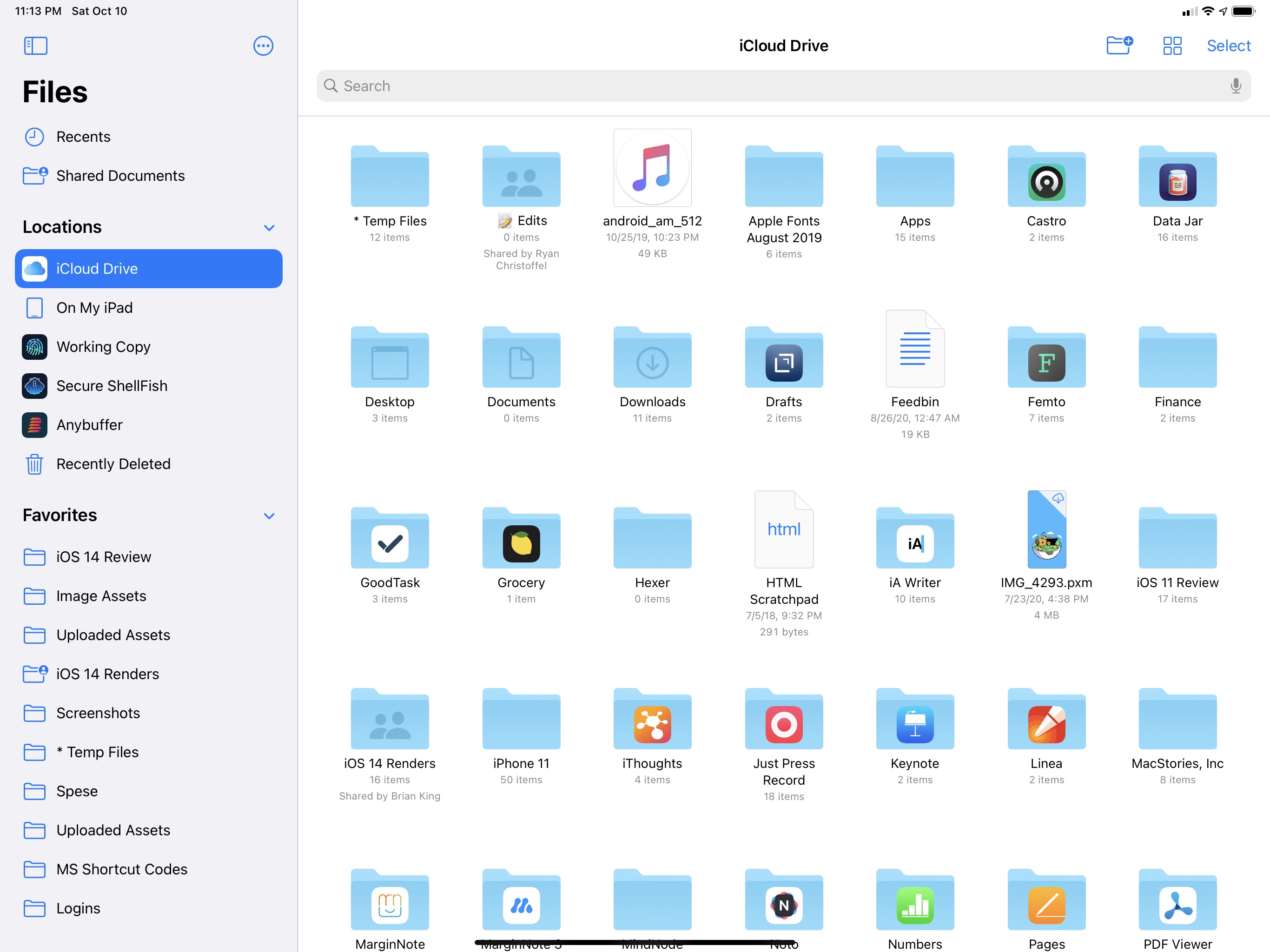
Nowhere is Apple’s push for better widescreen-optimized apps more apparent than the new system sidebars – by far the standout addition to several built-in iPad apps in iPadOS 14. Apps like Photos, Music, Calendar, and Shortcuts sport a new multicolumn layout with a sidebar that dramatically simplifies navigation by putting different sections and modes just one click or tap away. In Apple’s own words, sidebars “provide the same quick navigation as tab bars while making better use of the large display”; Apple is advising developers to replace tab bars with sidebars and split views (i.e. columns) in their iPad apps, and they’re leading by example with a roster of sidebar-laden app updates in iPadOS 14.
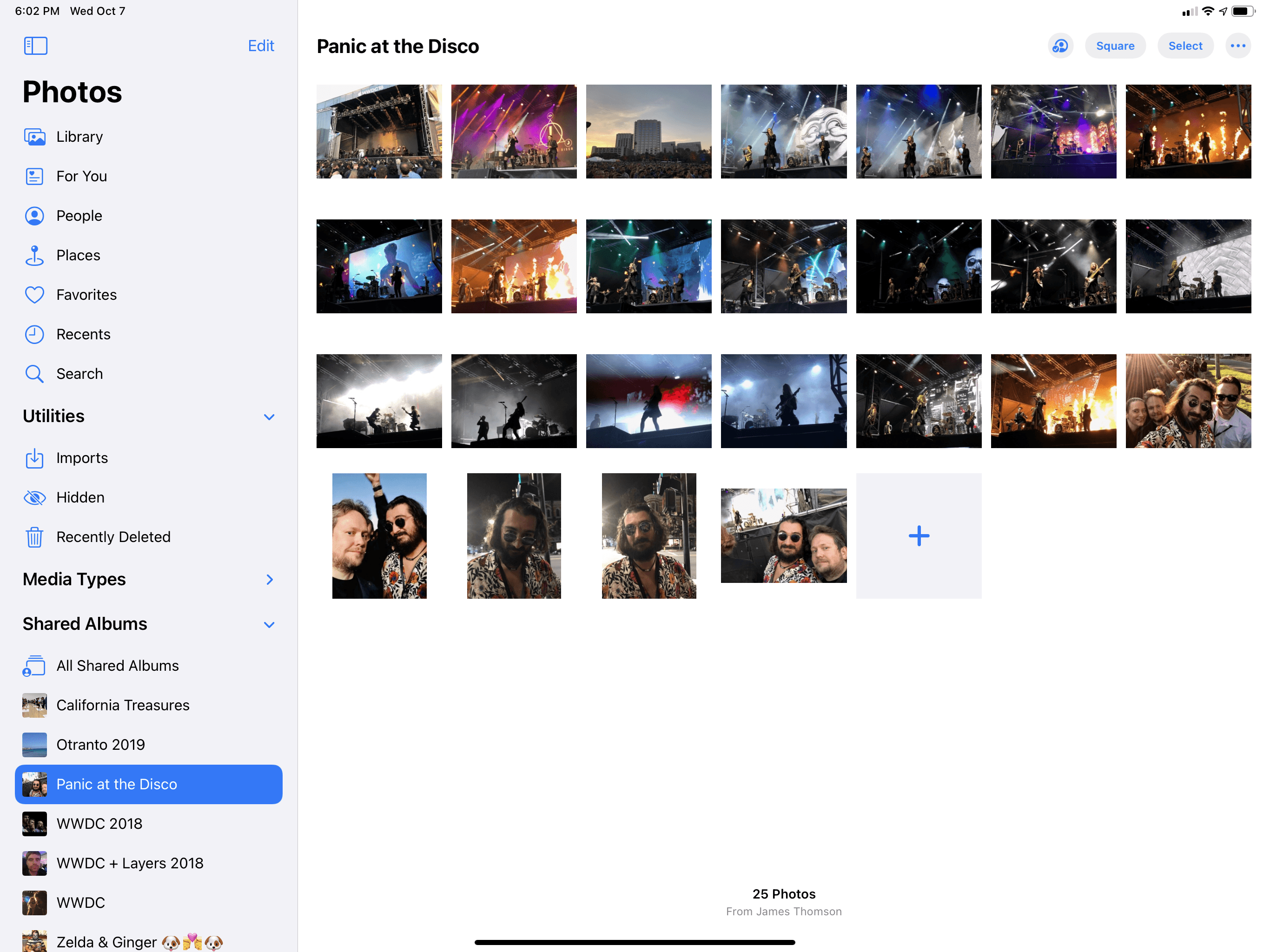
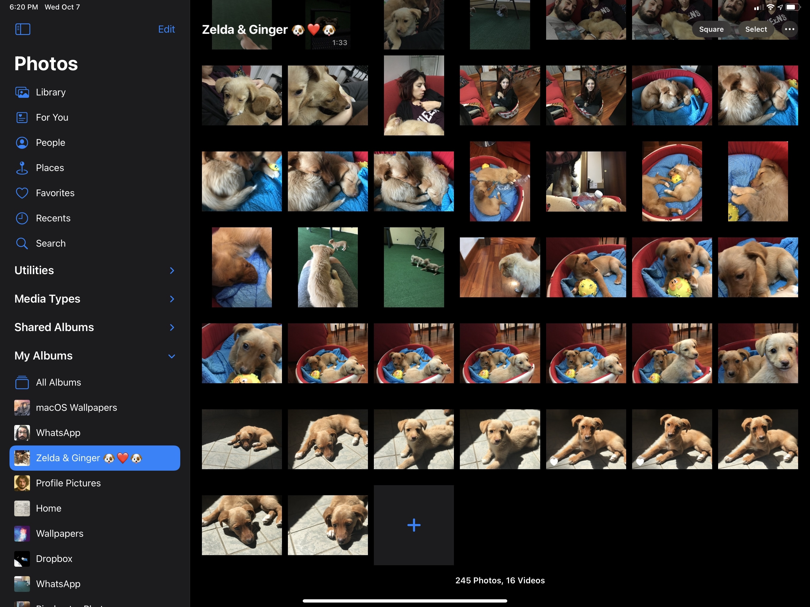
Photos
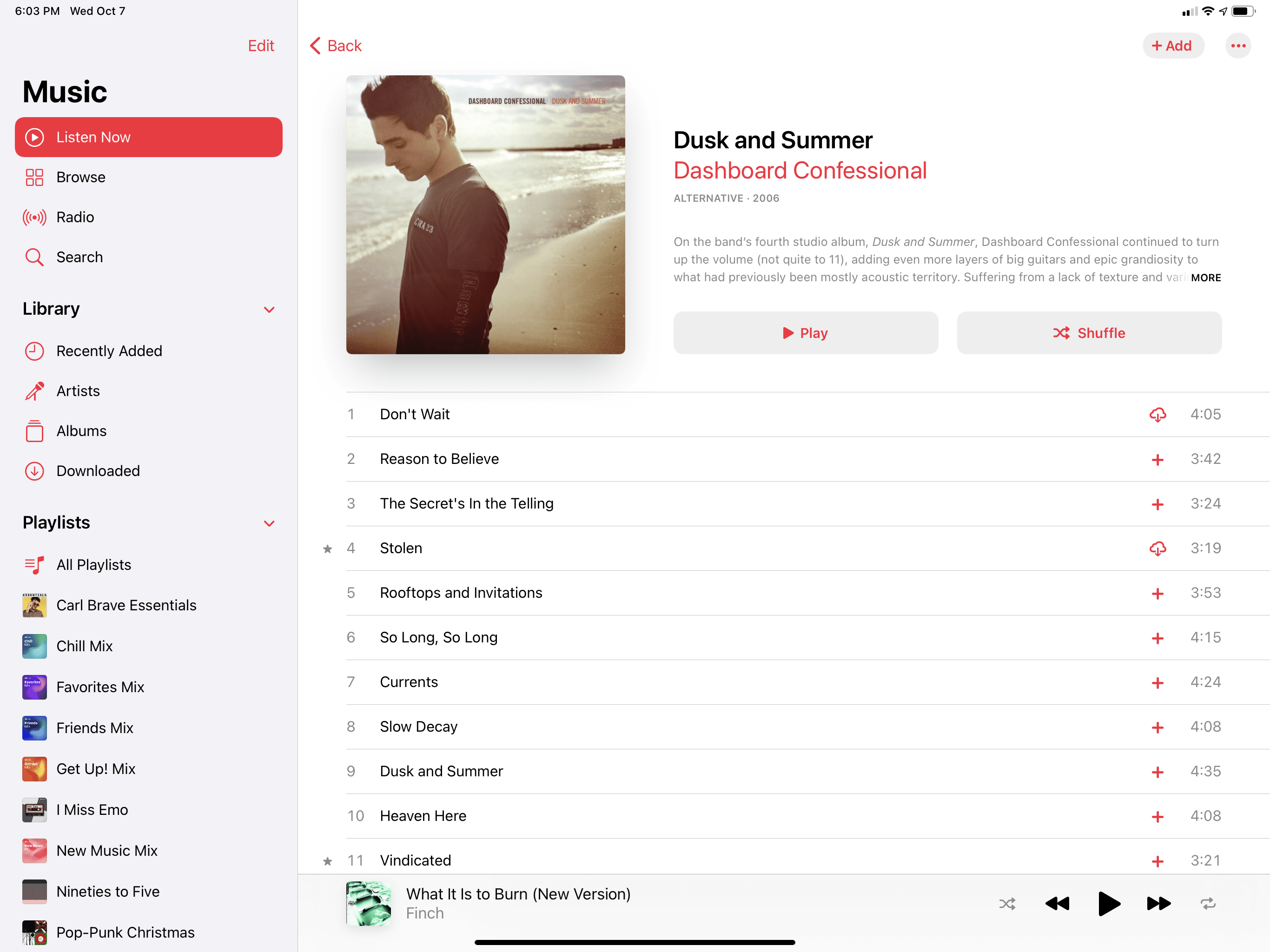
Music
Shortcuts
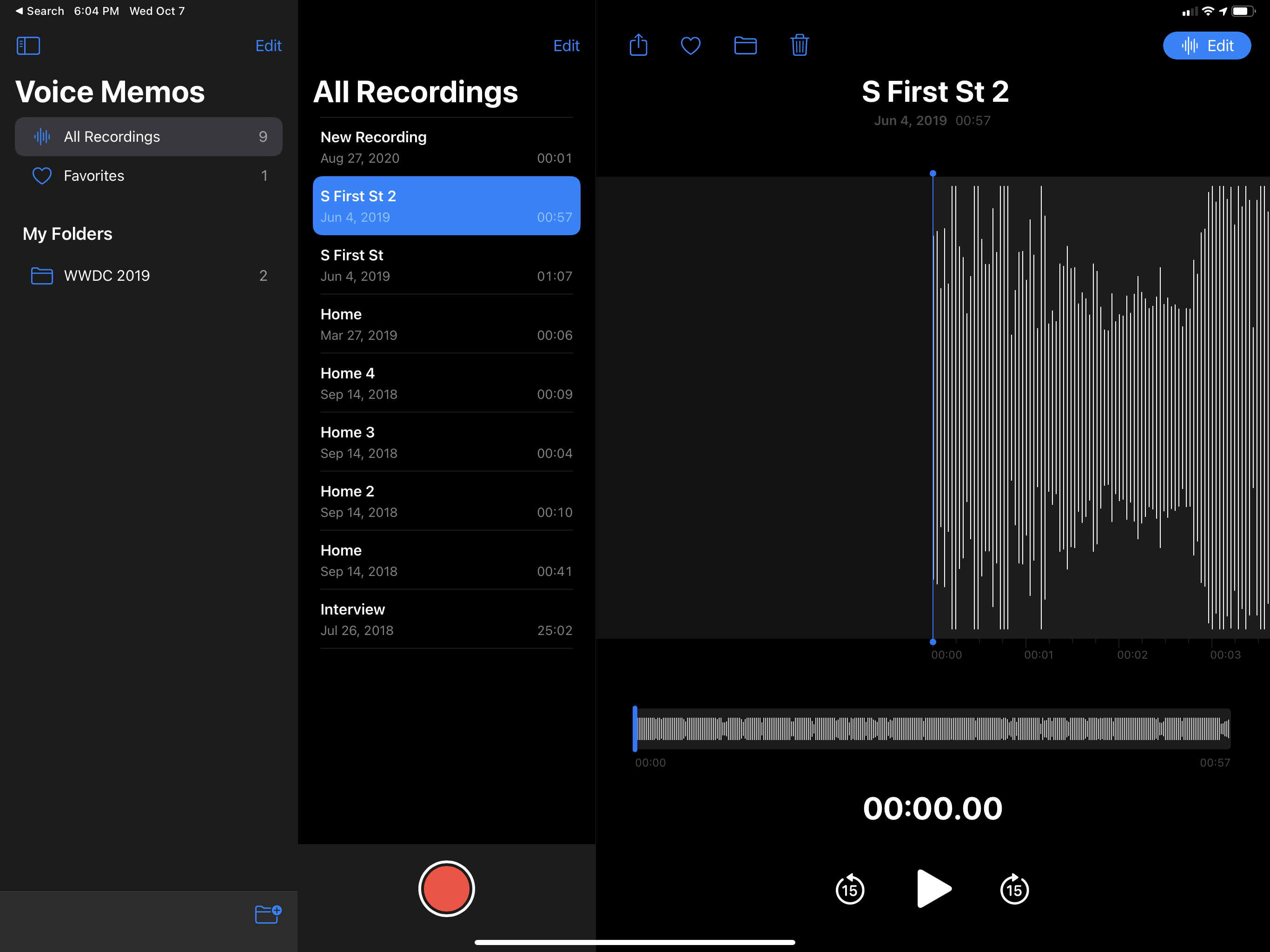
Voice Memos
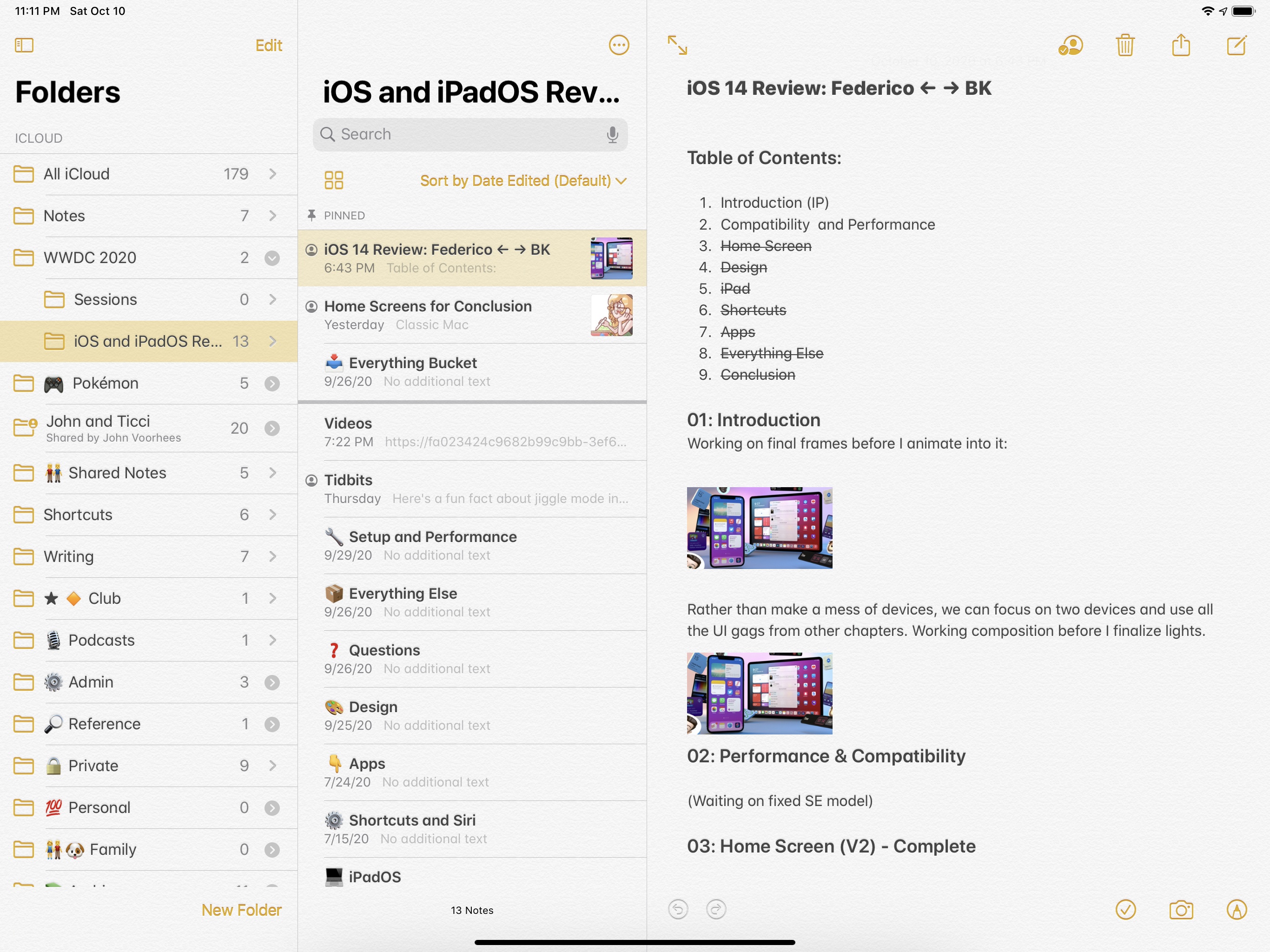
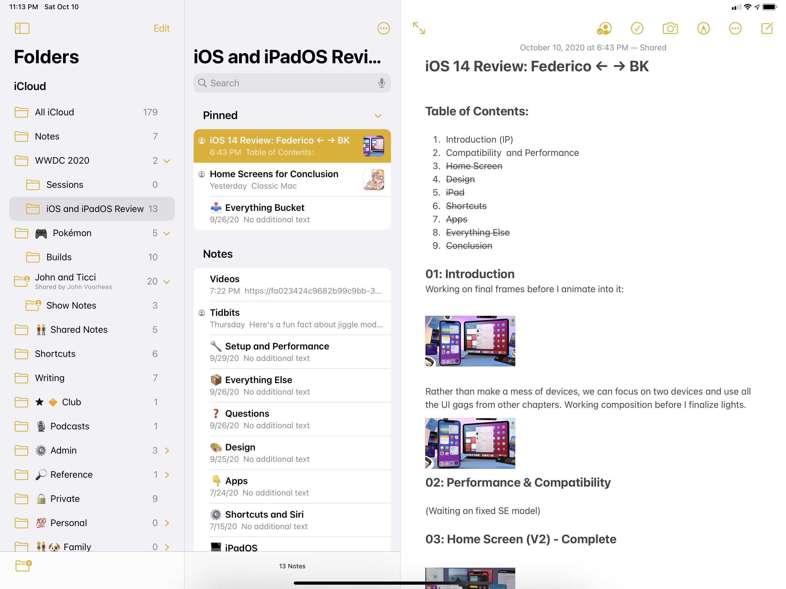
Notes
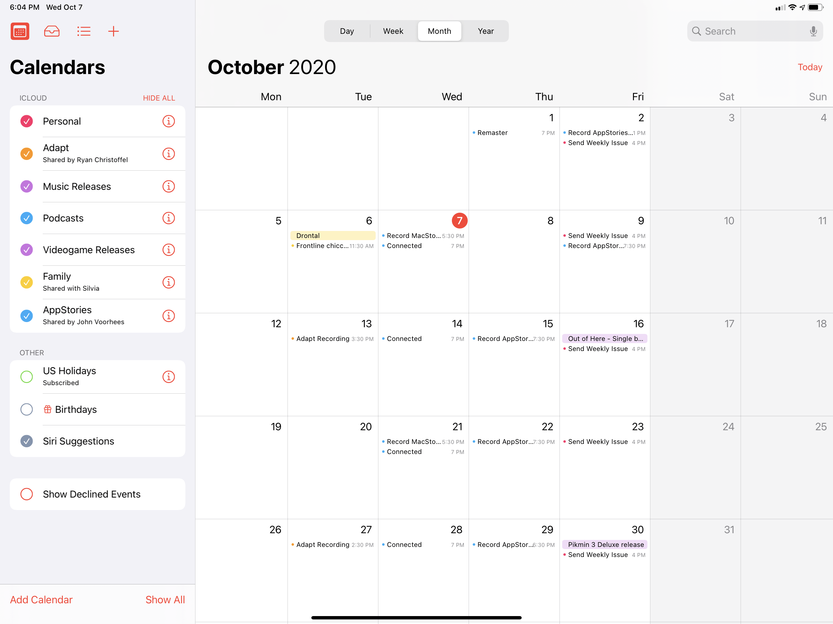
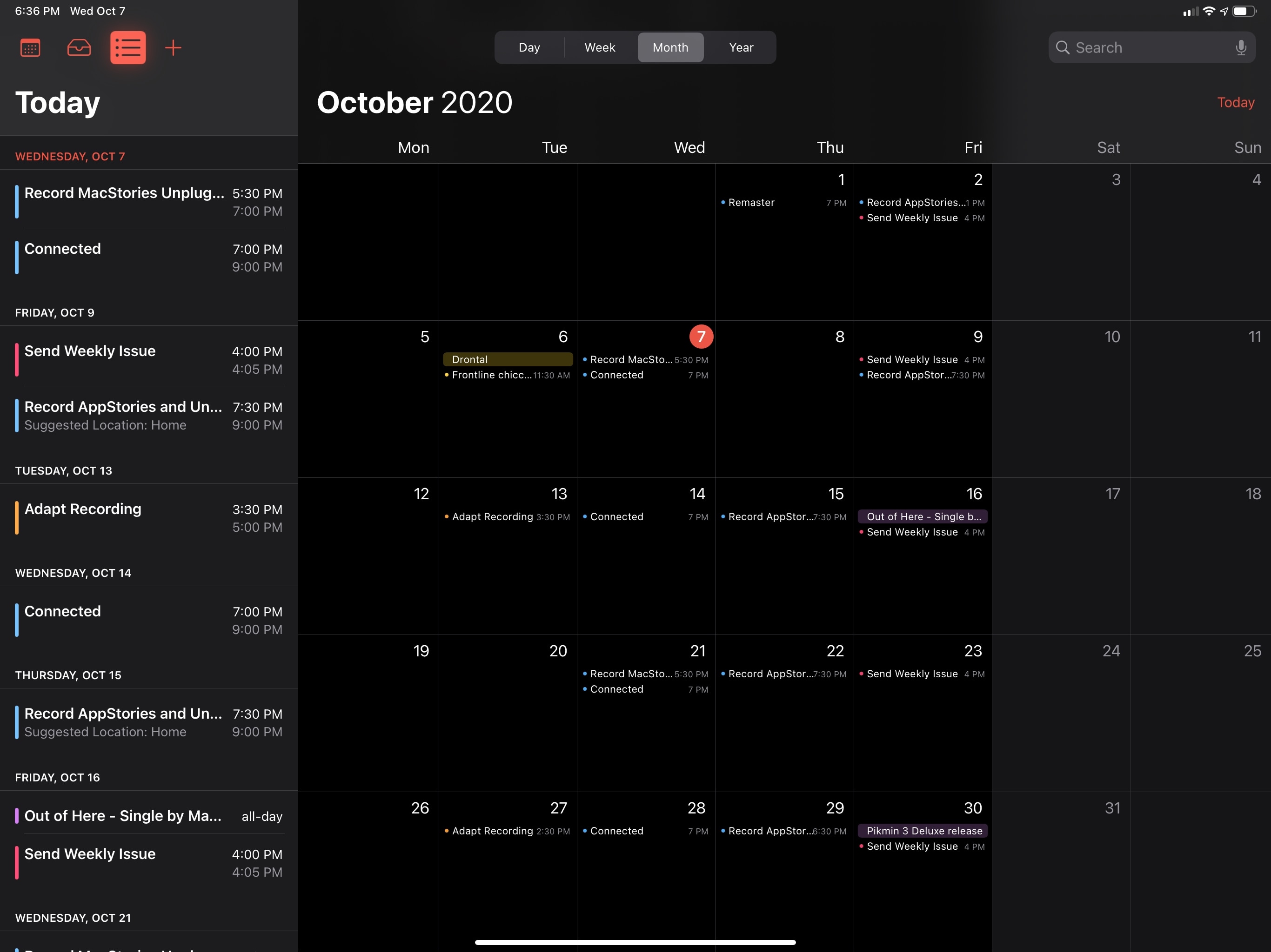
Calendar
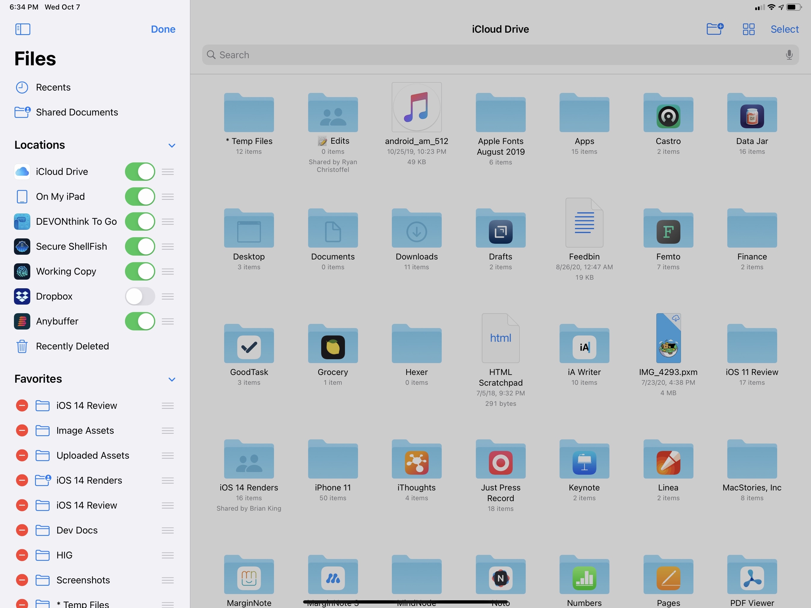
Files
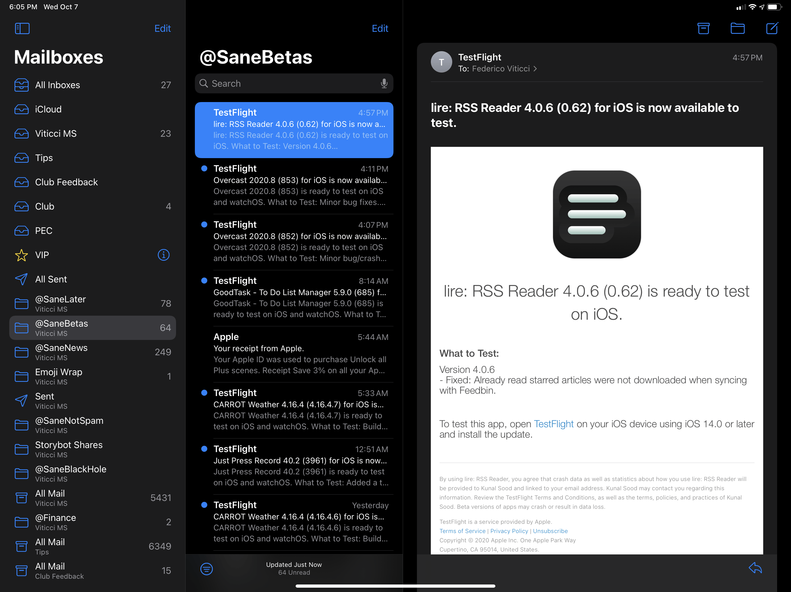
For third-party developers, the sidebar is now a native iPadOS UI element available with a dedicated API; Notes and Files, which featured a sidebar before, have been updated to use the new one provided by iPadOS 14, along with its new default behaviors.
Let’s talk about some of those new behaviors and default capabilities for sidebars in iPadOS 14 that weren’t supported back when sidebars were exclusive to a couple Apple apps only.
Native iPadOS 14 sidebars support an “outline mode” that lets them offer collapsible groups that collect related app categories or sections together, letting you easily hide or show them. A good example of this is the Photos app, where you now have a sidebar that collects all sections and albums in a single list. There are top-level sections for key functionalities such as For You and Search; everything else is grouped under four additional sidebar sections you can expand and collapse at any time depending on what you want to see in the sidebar. In a nice touch, the expanded/collapsed state of outline mode sticks across app relaunches, so you can customize sidebars to your liking and rest assured your preference will remain saved over time.
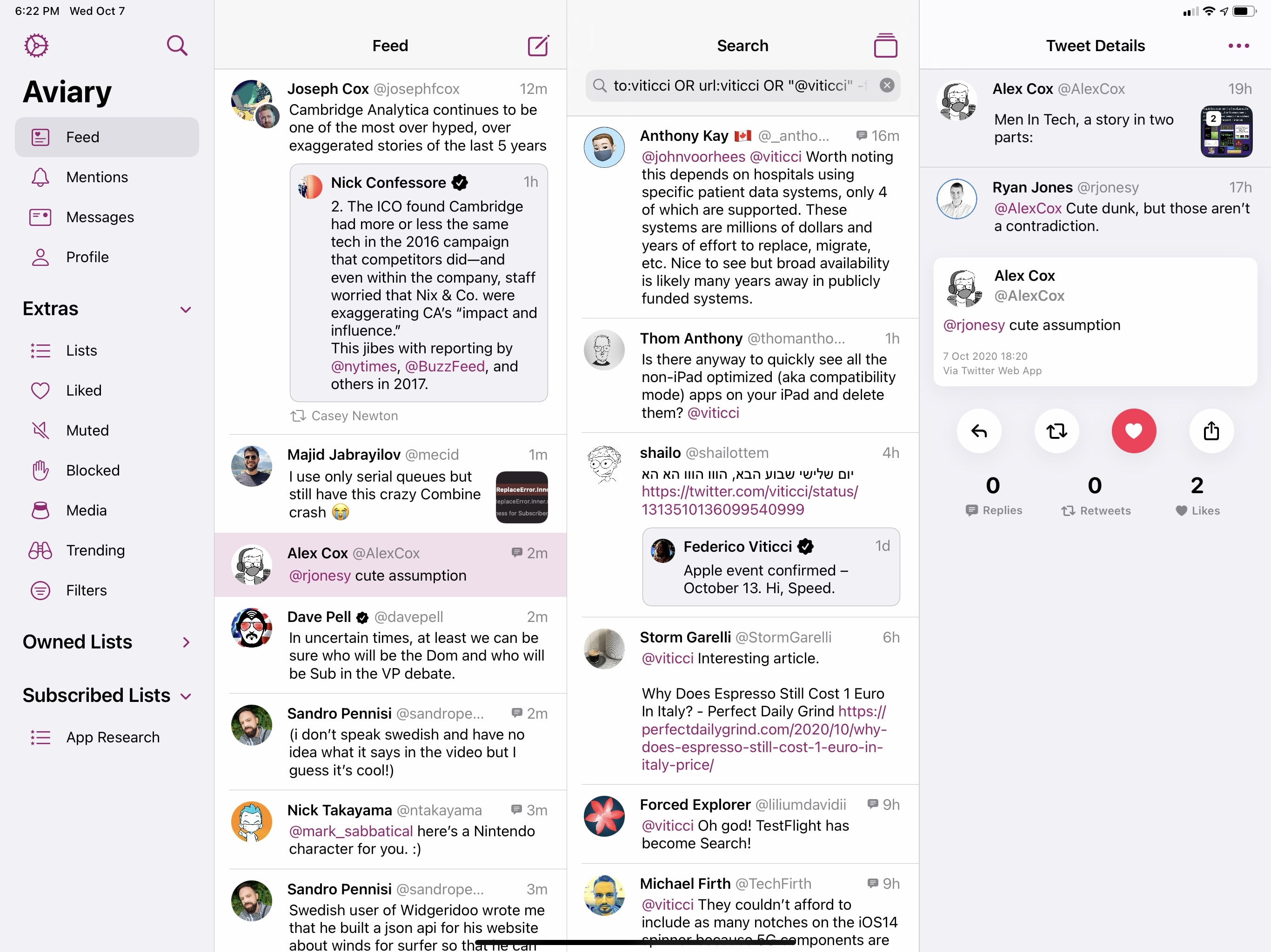
Outline mode is also supported in Mail (for different accounts), Shortcuts (which finally offers folders in iOS and iPadOS 14), Files, and Notes. The behavior is consistent everywhere, and third-party developers can take advantage of this, too. Aviary, a new Twitter client by indie developer Shihab Mehboob, uses a sidebar in iPadOS 14 and makes extensive use of outline mode to group extras and lists, which you can easily hide or show with a single tap or click on the trackpad.
Similarly, Anybuffer – one of the most powerful clipboard managers and shelf apps for iPad – has switched from a custom sidebar to the new system one in its iPadOS 14 update. In the new version, the developers implemented outline mode as a way to differentiate between regular and smart shelves:
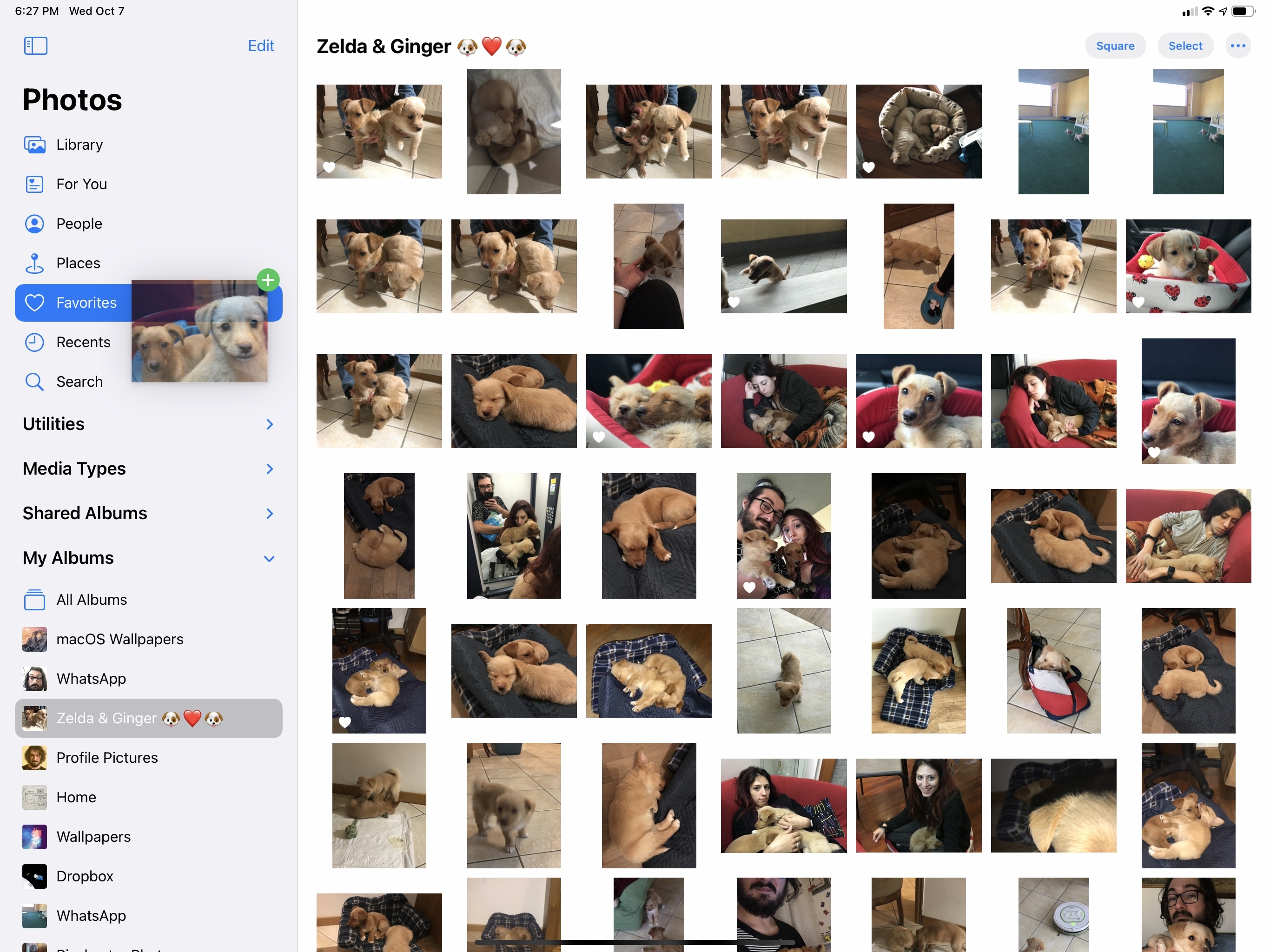
Spring-loading is another default behavior supported by sidebars in iPadOS 14. As previously seen on the Mac and in older iPad apps with their own custom implementations of sidebars, spring-loading is a drag and drop feature that lets you move an item into a specific category by hovering and pausing over the destination until it loads. If an app supports sidebar spring-loading in iPadOS 14, you’ll be able to grab an item – either via touch or the trackpad – hover over the location you need in the sidebar, and watch it spring open so you can drop the item there. You can try this yourself in Photos: grab a picture, drag it over to the ‘Favorites’ section or an album in the sidebar, wait a second, and the page will spring open, allowing you to drop the photo there:
Spring-loading in Photos.Replay
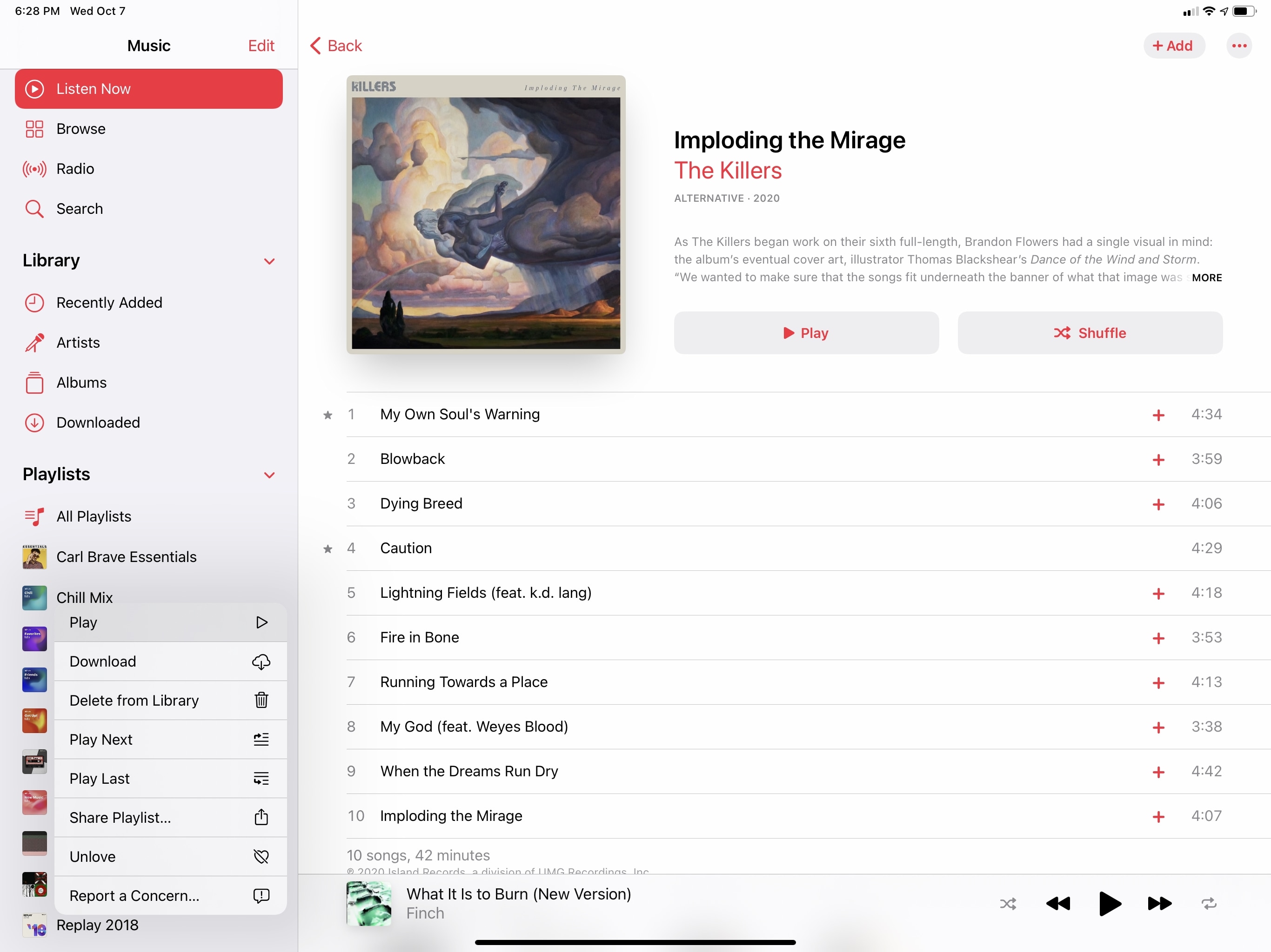
Another good example is Music: Apple replaced tab bars with a sidebar in the updated app for iPadOS 14, and in addition to outline mode for multiple sections, Music’s sidebar supports drag and drop with and without spring-loading for both songs and entire albums. Spring-loading is optional in Music: if you just drag a song over a playlist, it’ll get highlighted (with a new rounded and padded selection style) and the classic green ‘+’ badge will appear next to the drag item, suggesting you can let go of the song to add it to the playlist. It’s kind of silly, but I love the visual effect caused by rapidly hovering over multiple playlists in the sidebar – I can almost feel what it would be like with haptic feedback even though the iPad doesn’t come with a Taptic Engine.
Spring-loading for playlists in Music.Replay
The same drag and drop technique has been implemented in Mail: Apple’s email client now uses iPadOS 14’s native sidebar, so you can drop messages into different accounts or folders in a way that’s consistent with other apps updated for iPadOS 14. You can even spring-load collapsed mailboxes if you want to drop a message into a folder in a different account.
In my experience using iPadOS 14 on my iPad Pro for the past few months, I’ve realized that drag and drop and the system’s native sidebar perfectly complement each other. While previously I had to pick up items with one finger, use another finger to switch locations, then drag the item and drop it somewhere else, now I can just grab it, drop it in a section of the sidebar, and I’m done. The fact that this interaction works equally well with touch and the trackpad is yet more proof of Apple’s modern approach to designing iPad features: they can’t be limited to one input method or mode; they have to support both the pointer and touch, and remain equally accessible and intuitive for both novice and experienced users.
There’s more interesting tech worth mentioning about the sidebar. Items in the sidebar can invoke their own context menus: as seen in Music, you can long-press/right-click playlists in the sidebar to reveal a context menu with various playback options.
In Notes, the same menu lets you share, move, or rename folders:
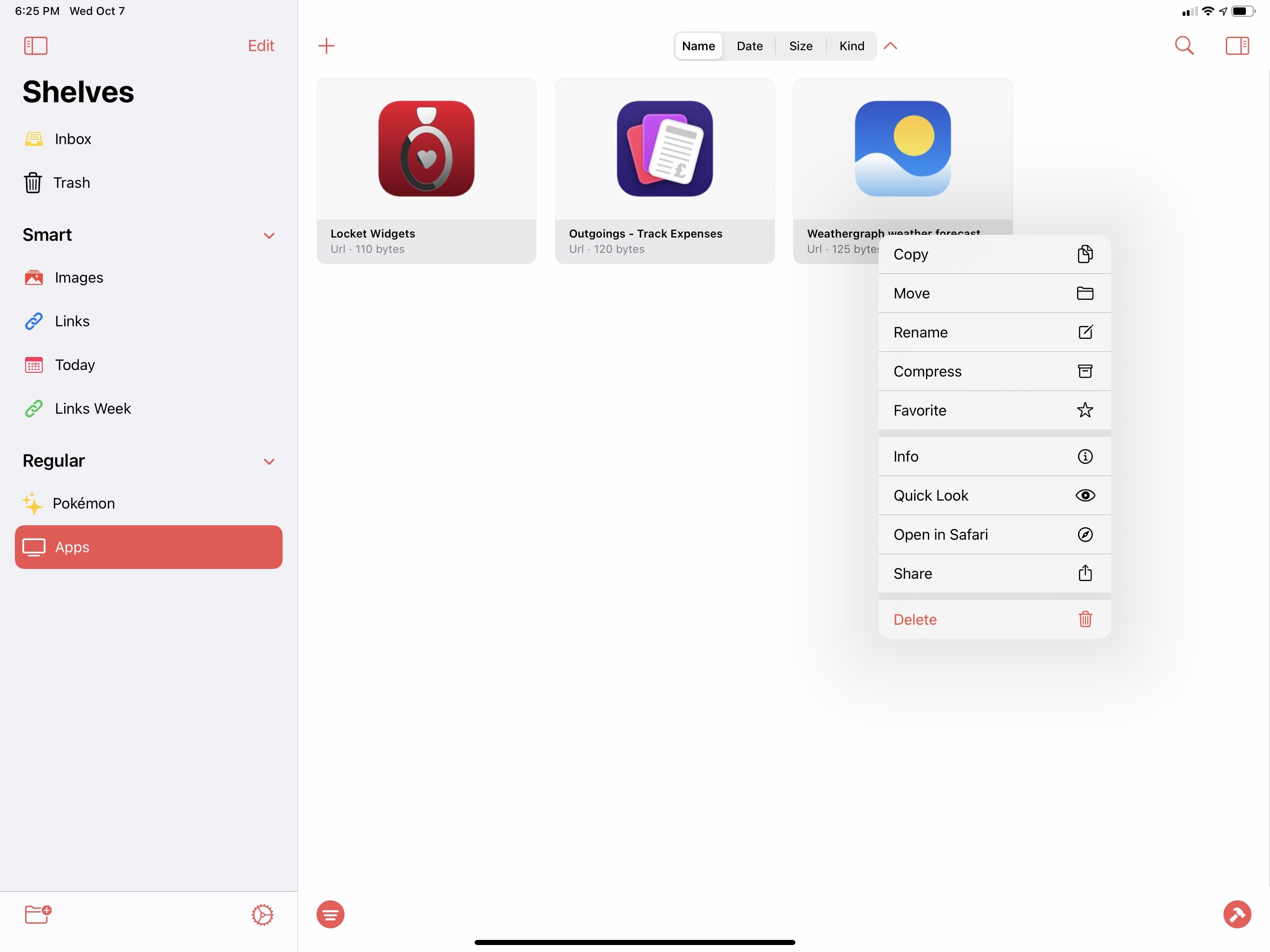
In the clipboard manager Anybuffer, you can long-press individual shelves in the sidebar to access a host of related options:
And in the popular RSS reader Lire, the sidebar features a mix of colorful icons, collapsible sections, and context menus:
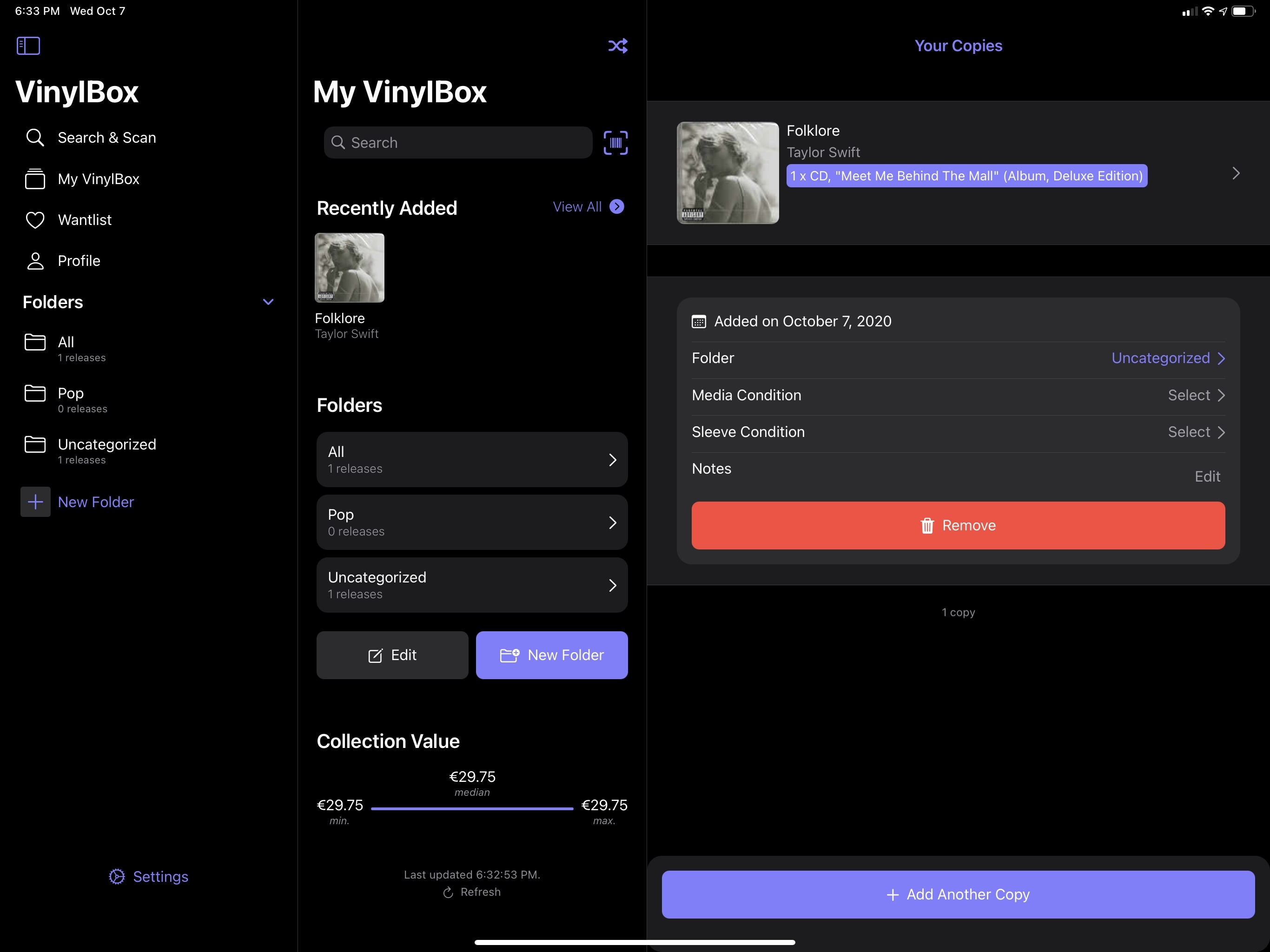
Sidebars also support “accessories” in the form of checkboxes, reordering, swipe actions for individual rows, or just about any custom button or element added by developers. In the music collection app VinylBox, which I want to use to catalog my CD collection via its Discogs integration, the app’s native sidebar features a button to create a new folder for your collection:
Item reordering is seen in Files, which – like Notes and Mail – has been updated to use the system’s native sidebar instead of a proprietary one. In iPadOS 14, you can reorder favorite folders either via drag and drop or by entering a manual editing mode.
As I mentioned before, the Calendar app has also been updated with a sidebar this year, and this is Apple’s most intriguing implementation of the technology in iPadOS 14. Calendar’s sidebar can switch between three modes, one of which lets you select which events you want to see in the secondary view on the right19 by clicking the calendars you prefer.
The most important aspect of iPadOS 14’s sidebars and the reason why I believe all developers should adopt them, however, is the consistency of the feature. Aside from the custom elements that developers can embed in them, native sidebars share an underlying consistency in activation and behavior: sidebars can be invoked and dismissed with swipes from the edge of the display or with the trackpad by swiping with two fingers over an app’s title bar at the top. Sidebars were designed to play well alongside size classes and different device orientations (more on this below); most of the time, you’ll always find the same button in the upper left corner of a title bar that lets you easily dismiss or show a sidebar with one click.
The sidebar button.Replay
This, I believe, is the true advantage of Apple’s new API over custom sidebars third-party developers (and Apple itself) may have used in the past: in becoming a systemwide UI element shared across apps, the iPadOS 14 sidebar’s consistent functionality has created a common denominator that users will come to expect in all iPad apps. This happened to me over the past few months: after using Apple’s built-in apps and a handful of third-party ones with updated sidebars, custom sidebars such as the ones seen in Dropbox, 1Password, Reeder, and DEVONthink started slowing me down since they weren’t behaving as I’d expected them to. This isn’t without precedent, either. Think about share sheets and context menus: how often do you see apps with custom versions of those nowadays? And if they do use them, do you like them, or do you just wish they’d use the standard system controls instead? That’s how I feel about sidebars in iPadOS 14: I hope all iPad apps will adopt the system-provided sidebar in lieu of custom alternatives.
The more I use them, the more I think the spawning of sidebars all across iPadOS is going to be terrific for the iPad app ecosystem. Apps such as Photos are dramatically faster to use since the sidebar makes destination targets always available. The mere addition of a sidebar makes certain apps, like Music and Shortcuts, feel brand new – like they’ve finally graduated into desktop-class experiences that are fully supportive of folders, drag and drop, and other features that are now part of the iPad’s interaction vocabulary.
Considered in isolation, a sidebar may feel like a trivial, inconsequential addition that’s so obvious, one could wonder why we’re even talking about it. But in practice, the sidebar adds a new dimension to apps, unlocking a new level of functionality for iPad apps that are no longer constrained by typical iPhone layouts.
And yet the sidebar is only one part of a bigger restructuring for iPad apps this year.
- "Secondary" is the name used for content areas in Apple's developer parlance. ↩