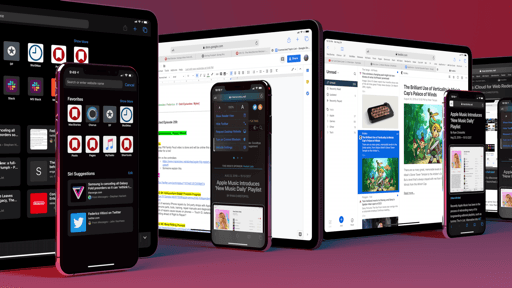
The Complexities of Multiwindow
Multiwindow in iPadOS 13 is an evolution of the multitasking framework of iOS 11; as such, it is heavily influenced by drag and drop and requires a fair amount of eye-hand coordination to tell the differences between various multitasking conditions. As we’ve seen before, not everybody likes this. Multiple windows bring new variables into the fold, and I don’t think Apple has hit the mark on all of them quite yet.
It was impossible to avoid this, but the new features in iPadOS 13 have brought an increase in cognitive load: now in addition to thinking about apps and the spaces they’re in, users may have to account for the state of individual windows, just like on a traditional desktop computer. This was bound to happen the moment Apple decided the iPad should support multiwindow, and I wouldn’t worry about it too much: multiwindow is optional; it’s never forced upon the user as a requirement to get work done; and it’s perfectly fine to keep using an iPad without opening multiple windows. With great power comes great responsibility; if you choose to work with multiple windows, it shouldn’t come as a surprise that you’ll have to manage them too.
There’s an argument to be made, however, regarding how windows are created and the gestures required to operate multitasking and multiwindow in iPadOS 13. If you thought that long-press gestures were overused before, you’re not going to like how iPadOS 13 builds upon iOS 11’s system without substantial alterations. Drag and drop remains the chief method of turning app icons, and now any drag item, into windows; Apple has somewhat improved the timing of the gesture (so it’s more clear when an item has “bounced back” and is ready to be dragged), but the fundamental concern shared by others remains: a long-press on a touchscreen is, by nature, a delayed gesture that requires users to hold their finger, visually assess the state of an icon, then continue. For power users, this is not an issue; for younger users or people with motor disabilities or other physical impairments, the fine gestures employed by Apple continue to be a problem.
It could be easier if Apple allowed you to replace, or at least supplement, these touch interactions with commands issued from an external keyboard – such as the one made by the company itself. But that’s also an area where iPadOS 13 sees no meaningful improvements over iOS 12: neither multitasking nor multiwindow can be operated from a keyboard at all; if you’re working with an iPad Pro connected to a Smart Keyboard Folio and want to create a Split View or manage your open windows from Exposé, you’ll always have to lift your fingers off the keyboard and touch the screen. I understand that Apple may be facing tough challenges with mapping a touch-based environment to external keyboards; however, four years after iOS 9 and the Smart Keyboard’s debut, I have to believe that Apple’s issue is more political than technical; I find it surprising, to say the least, that the company couldn’t figure out how to add an app from Search results to Slide Over or resize a Split View from an external keyboard.
Aside from longstanding limitations that haven’t been fixed yet, my primary concern with multiwindow in iPadOS 13 is that the whole system sometimes feels over-engineered and disorienting. And I wonder if even folks who have used a Mac before, but may be new to the iPad, will actually know how to apply their sense of agency and control iPadOS without reading a manual first.
Consider these numbers, for example: in iPadOS 13, there are five different ways to open windows:
- Drag and drop
- Context menus
- Custom buttons in apps
- Exposé
- Exposé window picker
There are three different ways to open Exposé:
- ‘Show All Windows’ button in context menu
- By tapping once on the icon for the frontmost app (in the dock)
- In the main app switcher, by tapping the icon (in the dock) of the most recently used app
And there are four different app/window pickers:
- The main app switcher
- The new Slide Over app switcher
- Exposé
- Exposé window picker
On one hand, I appreciate the flexibility granted by the system, which lets me create and manage windows in a variety of ways. I know how to use these features. On the other though, I wonder if the only reason I can understand the small differences between each of these elements is because it’s my job to do so; I grasp them by writing extensively about them, not because they’re inherently discoverable.
In taking on more serious window-related responsibilities historically exclusive to a Mac, I don’t think Apple struck a perfect balance between the iPad’s simplicity and multiwindow’s complexity yet. The slight visual differences between these UI elements, combined with the precise gestures required to activate them, may result in a steep learning curve for users; I’m not sure what the solution is, but I know how I felt for the first few weeks of using iPadOS 13. That initial confusion took a while to subside.
The sense of disorientation caused by multiwindow can also be ascribed to how the system doesn’t always meet your expectations or fails to communicate sufficient details about the state of windows. For example: let’s say you want to add the Notes app to a Split View, but after dropping its icon on one side of the screen, you’re presented with the window picker to choose whether you want to add an existing window or a new one to the Split View.
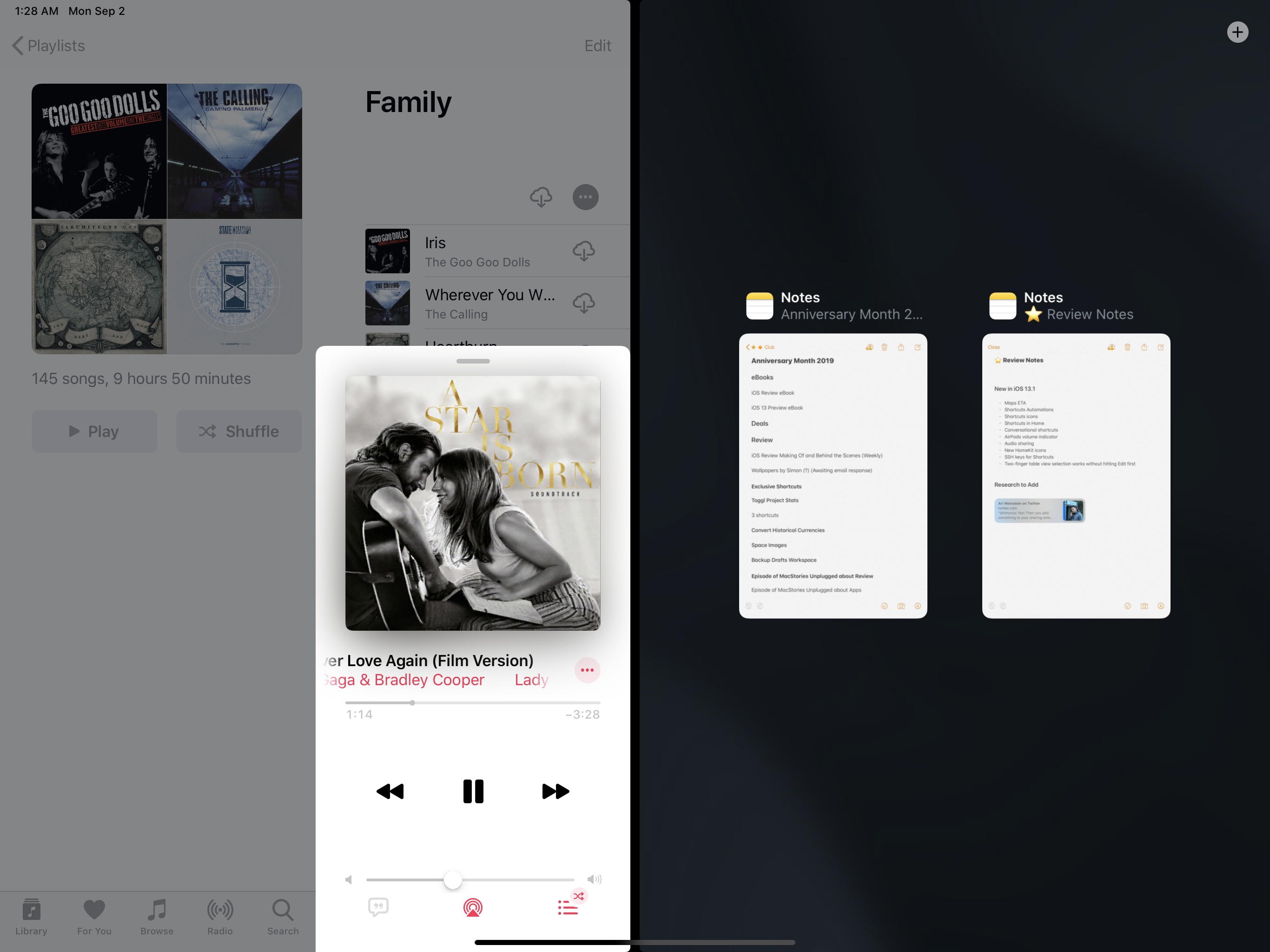
Now, you wouldn’t know this because the system doesn’t show it, but one of the open Notes windows is already participating in another Split View space elsewhere in the system. Here it is:
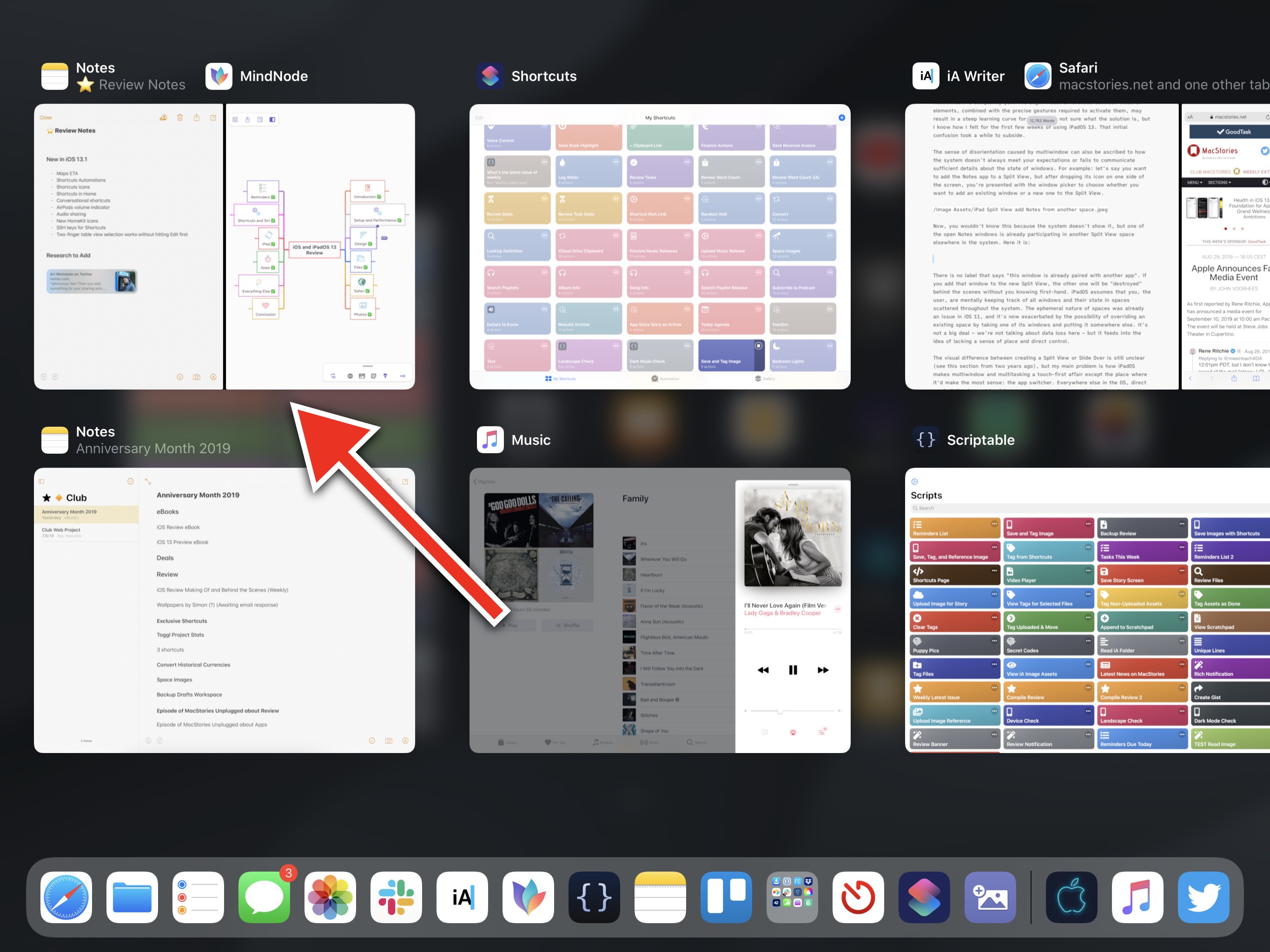
There is no label that says “this window is already paired with another app”. If you add that window to the new Split View, the other one will be “destroyed” behind the scenes without you knowing first-hand.
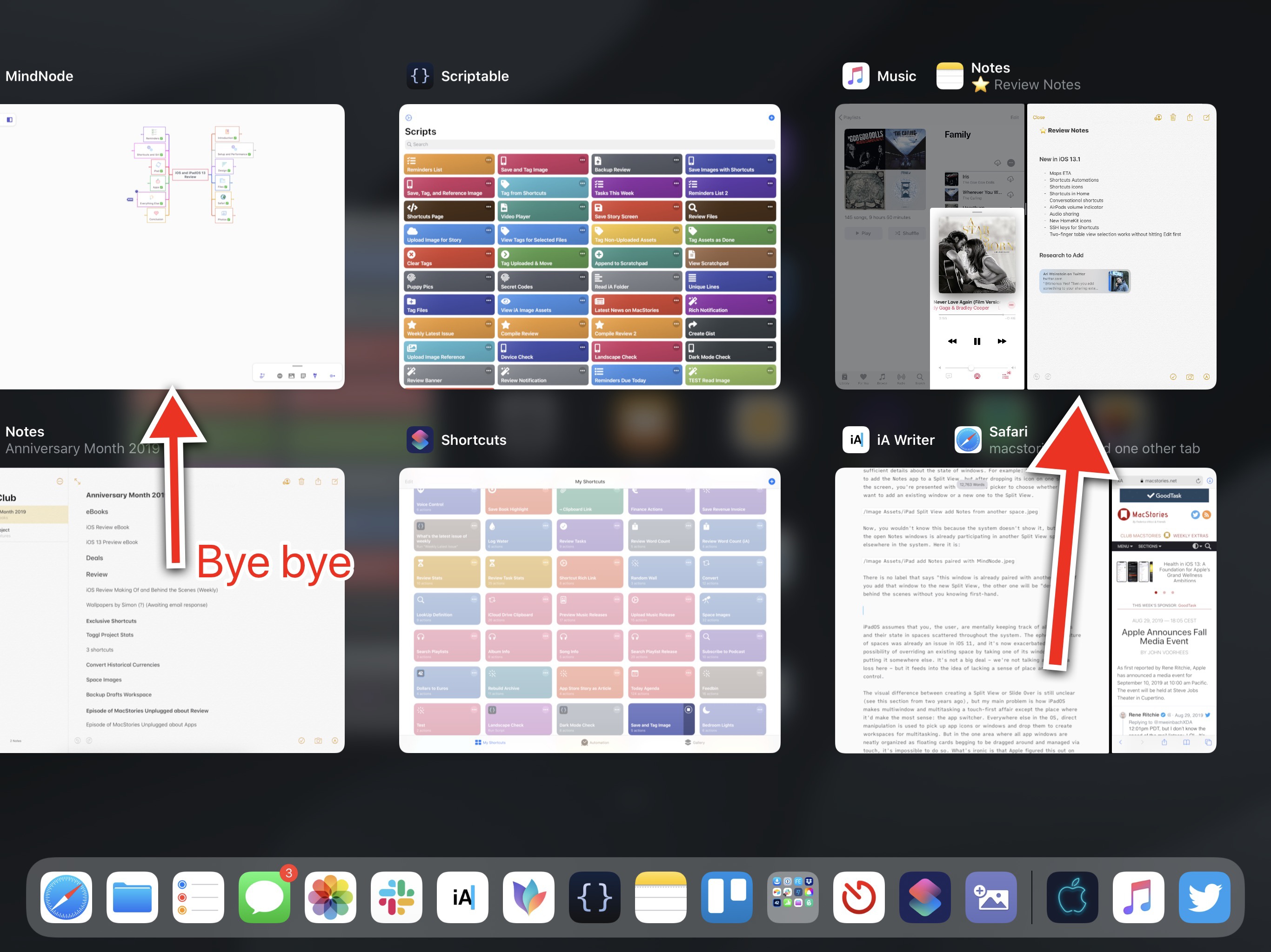
iPadOS assumes that you, the user, are mentally keeping track of all windows and their state in spaces scattered throughout the system. The ephemeral nature of spaces was already an issue in iOS 11; it’s now exacerbated by the possibility of overriding an existing space by taking one of its windows and putting it somewhere else. This is not a catastrophe – we’re not talking about data loss here – but it feeds into the idea of lacking a sense of place and direct control over windows.
The visual difference between creating a Split View or Slide Over is still unclear (see this section from two years ago), but my main problem is how iPadOS makes multiwindow and multitasking touch-first affairs except the place where it would make the most sense: the app switcher. Everywhere else in the OS, direct manipulation is used to pick up app icons or windows and drop them to create workspaces for multitasking. But in the one area where all app windows are neatly organized as floating cards begging to be dragged around and managed via touch, it’s impossible to do so.
What’s ironic is that Apple figured this out on the Mac – which has no direct touch control whatsoever – by letting users drag a window on top of another in a space to create a Split View; in iPadOS, where multitouch is the control system for all types of windows, you can’t manipulate or recombine windows from the app switcher.
As I’ve argued several times in the past, the ability to create favorite, permanent workspaces could help users not second-guess the decision to drop a window somewhere else at the risk of unpairing a previously created space. Plus, it would just be convenient to have permanent combinations of your favorite apps that you could easily reopen or recreate with one tap. Multiwindow lends itself to the idea of favorite workspaces, but they’re not here yet. I’ve been able to sort of replicate the functionality by creating shortcuts that reopen specific documents or sections of apps, but users shouldn’t have to do this. I keep thinking that favorite spaces would be a fantastic addition to the app switcher for all kinds of users, but Apple seemingly disagrees.
Lastly, I ought to mention how some necessary window controls are missing from iPadOS 13. In the app switcher, despite the fact that windows now feature subtitles that describe their view, you can’t search for windows by name; especially once you have dozens of open windows on your device, it would be helpful to filter them by typing into a search bar.
Due to how multiple app windows can be scattered across the app switcher, flicking an app upwards to close it doesn’t necessarily mean you’re force-quitting the entire app anymore: you may just be closing one of its open instances. There should be a shortcut to close all windows with a couple of taps; to do this right now, you have to reveal Exposé for an app and close each window manually. I wonder if Apple could speed up this interaction for power users.
There’s a single lesson that can be learned from all these criticisms: perhaps there’s only so much you can do to reinvent window management without running into the same problems tech companies – including Apple – have been trying to solve for the past 30 years. Window management in iPadOS isn’t as complex or daunting as it can be on a Mac: I think Apple has done a good job getting rid of superfluous options that wouldn’t make sense for the platform (i.e. traffic light controls, freely resizable windows) and focusing on the core benefits of multiwindow, adapting them to touch. But that’s the issue: no matter how much it’s simplified, made touch-friendly, or slimmed down, it is the very idea of managing multiple app windows that, for some people, is a bridge too far that just doesn’t fit their mental model.
At some point, it comes down to making compromises for the greater good of the majority of users: there absolutely are productivity benefits to multiwindow, and users who rely on iPads for professional tasks have long been demanding the ability to create multiple instances of apps. If bringing multiwindow means adding a layer of complexity for those who seek it, so be it. The concerns I’ve shared so far involve the implementation of the idea, which I think could be improved, not the idea itself. I appreciate that Apple tried to imagine a computing era without traditional file or window management; I appreciate it even more, however, that the company has faced reality and understood how, as a human species, we still have to come up with a better concept than folders and windows to get work done on our computers.
Ultimately, what matters to me is that Apple is still translating classic computing ideas to the iPad by redesigning and reimagining them for touch – not just by carbon-copying how they work on a Mac. What they’ve done with multiwindow in iPadOS 13 isn’t perfect, and it’s not going to be mastered by everyone; but it’s more than good enough, and it’s the new beginning for iPad multitasking that iPad users deserved.