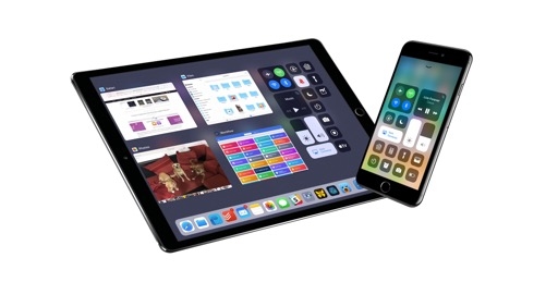
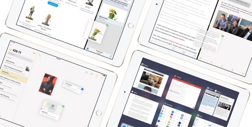
Split View
The defining attribute of Split View and Slide Over in iOS 11 is their lack of a dedicated app picker. Pulling down from the grabber on top of the right side of Split View now switches the app to Slide Over, putting the app on the left back in full-screen.
Swipe down on the top indicator to turn an app into a Slide Over.Replay
The refreshed mechanism hinges on the assumption that most users are going to keep their frequently used apps in the dock, which requires drag and drop to put apps in Split View or Slide Over.
This is the trickiest aspect of iOS 11’s multitasking, which Apple should have communicated more clearly. When you hold an icon in the dock, it lifts up and you can start dragging it out; when the in-progress drag exits the dock area, the icon morphs into a platter that, by means of different shapes, hints at what it’ll become once it’s dropped.
Using the dock to enter multitasking in iOS 11.Replay
There are three states for an app that is being dragged out of the dock to engage Split View or Slide Over, represented with five types of platters. Generally, a tiny platter with rounded corners means it’ll end up in Slide Over, whereas a bigger rectangle that dims the app underneath will replace that app in Split View.
In more detail:
Large rectangle. The new app will replace the larger one in a 70/30 Split View layout. The foreground app is dimmed to suggest it’ll be superseded by another one.
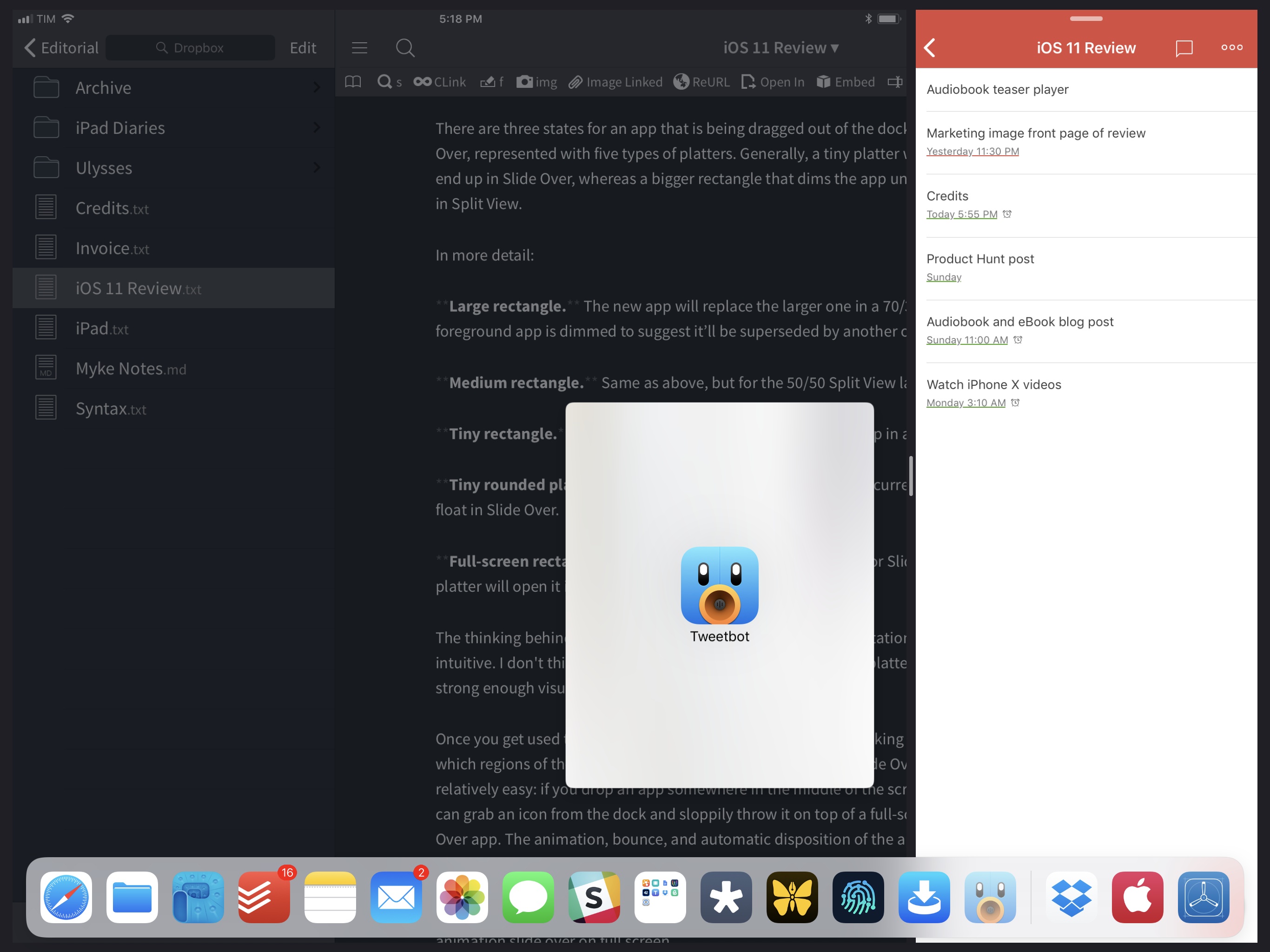
Medium rectangle. Same as above, but for the 50/50 Split View layout.
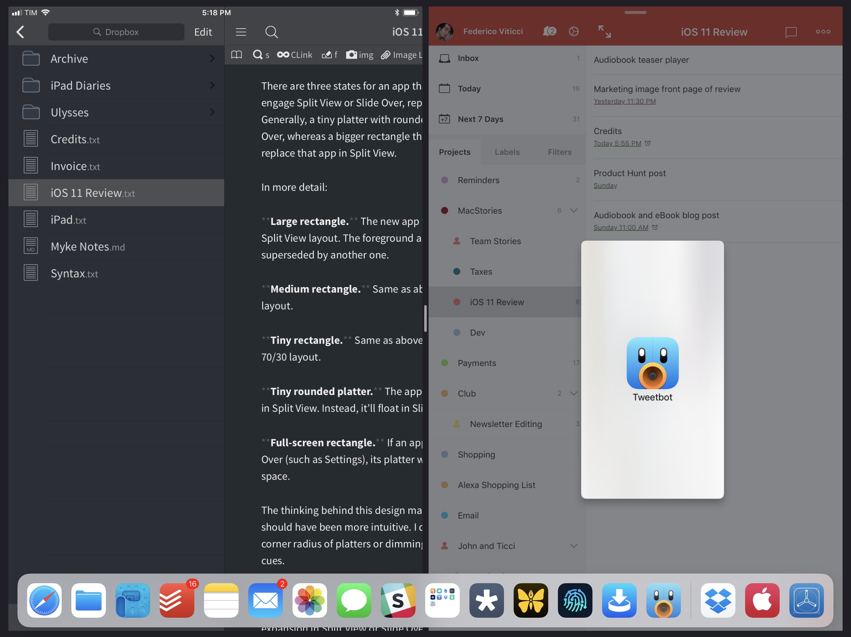
Tiny rectangle. Same as above again, but for the smaller app in a 70/30 layout.
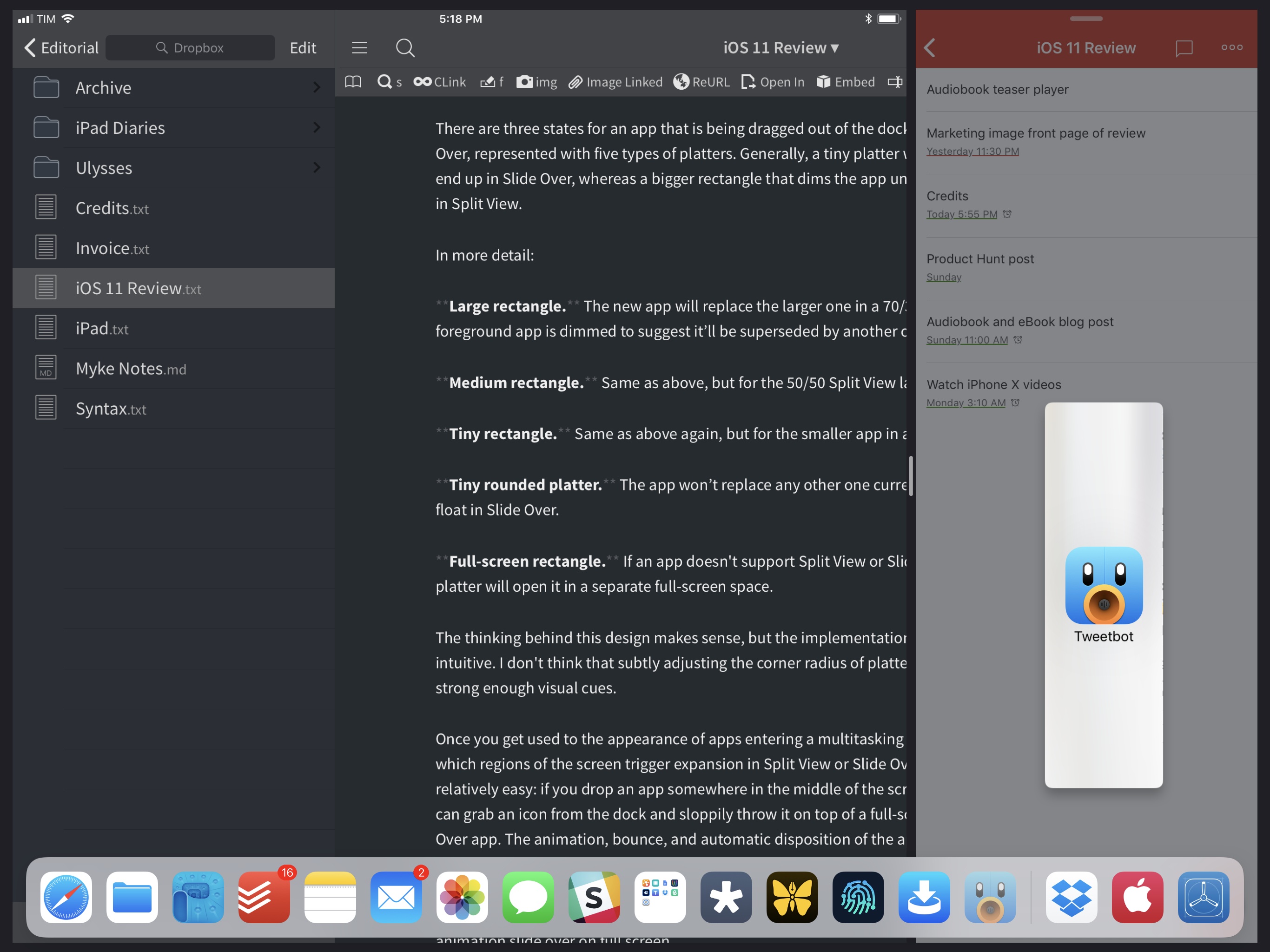
Tiny rounded platter. The app won’t replace any other one currently in Split View. Instead, it’ll float in Slide Over.
Full-screen rectangle. If an app doesn’t support Split View or Slide Over (such as Settings), its platter will open it in a separate full-screen space.
The thinking behind this design makes sense, but the implementation should have been more intuitive. I don’t think that subtly adjusting the corner radius of platters or dimming app UIs are strong enough visual cues.
Once you get used to the appearance of apps entering a multitasking environment, you need to know which regions of the screen trigger expansion in Split View or Slide Over. For a full-screen space, it’s relatively easy: if you drop an app somewhere in the middle of the screen, it turns into Slide Over. You can grab an icon from the dock and sloppily throw it on top of a full-screen space to generate a Slide Over app. The animation, bounce, and automatic disposition of the app on the right side are oddly satisfying. Notice how the full-screen app is “pressed” into the background, creating two black stripes on both sides:
A full-screen app can also be resized to accomodate a second app in Split View. You can do this by holding an app icon and dragging it towards the edges of the screen, where the aforementioned black drop areas are. As you get closer to the edge, the full-screen app shrinks on one side, letting you know that you can drop to enter Split View.
The third method requires more dexterity and finer motor skills. If you want to open a third app in Slide Over on top of two apps in Split View, you have to drag its platter towards the invisible area surrounding the Split View separator. When the platter gets smaller and more rounded, and if both apps in Split View aren’t dimmed, you can safely drop it to enable Slide Over without altering the apps in Split View.
Hover over the Split View divider to activate Slide Over.Replay
The iPad’s new visual and tactile vocabulary takes longer to explain than be learned with practice, but, admittedly, these affordances aren’t accessible enough. Particularly in Split View, where there are double the variables for a dropped app, replacing apps or entering Slide Over increases the user’s cognitive load, requiring a higher level of precision that could be a hurdle for some users. From a design perspective, Apple should have firmly denoted the transformation between drop-to-Split and drop-to-Slide, and perhaps even considered a special area fixed onscreen as a drop target for Slide Over.
However, more precision results in more control over multitasking, which is why I ultimately prefer iOS 11’s approach to iOS 9’s. There’s a sense of direct manipulation permeating the new Split View experience that was absent from iOS 9. With iOS 11, I can rearrange apps in Split View, bring up the dock and replace one of them, close it by returning to full-screen, then bring in something else with Slide Over. iOS 11 multitasking takes advantage of the iPad’s entire canvas: it’s not relegated to a couple of predictable, but limiting, options.
There’s room for a more accessible design, and I still wonder if a standalone app picker will ever return, but Apple’s on the right path with Split View.
Slide Over
Slide Over’s transformation from a modal popover to a semi-windowing system is remarkable. The new Slide Over necessitates slightly more management, but its versatility makes a convincing argument for tapping into the iPad’s multitasking potential with multitouch and more concurrent apps.
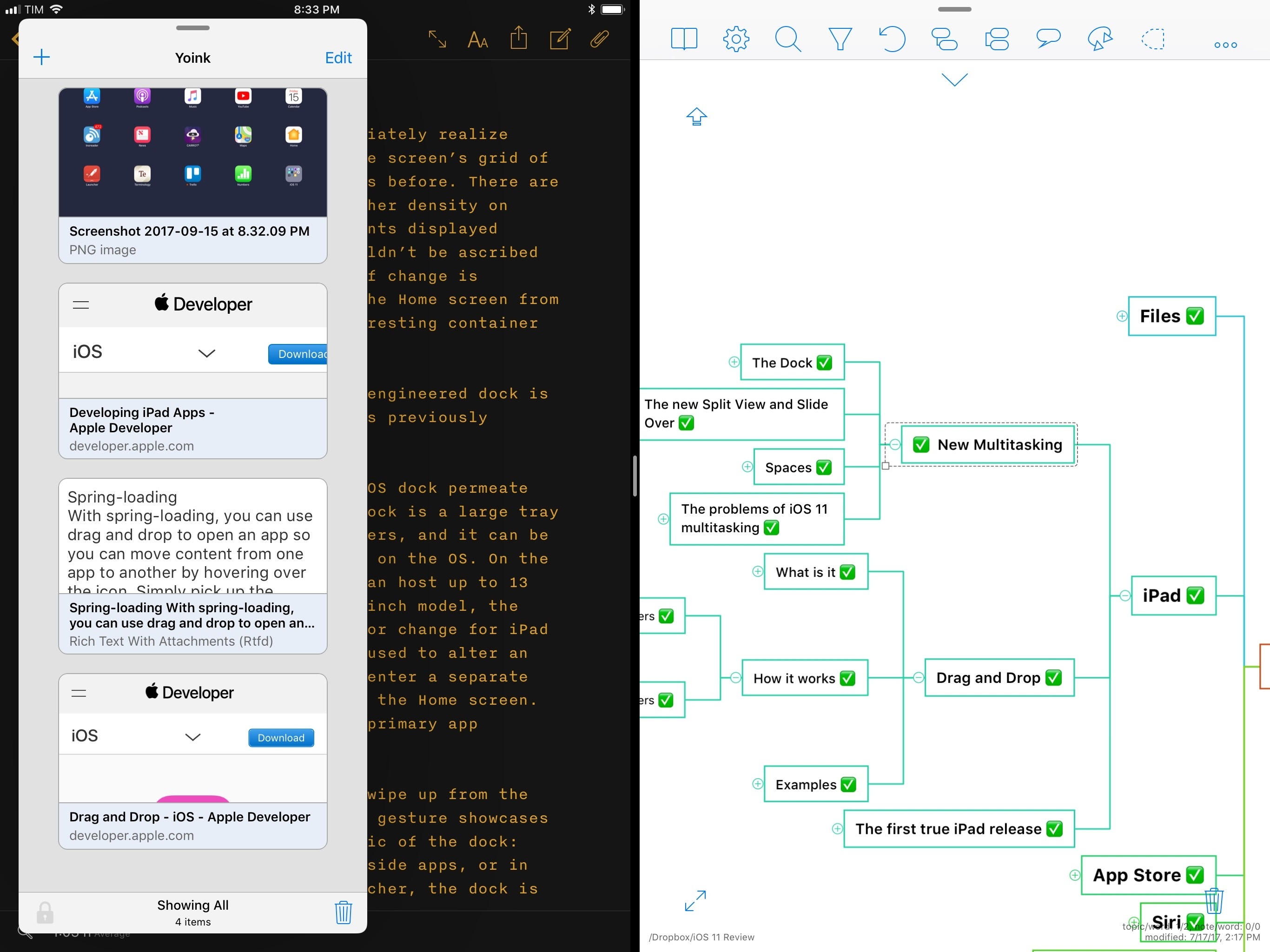
On compatible hardware, Slide Over doesn’t prevent interactivity with the primary app. You can type with the keyboard (both hardware and software) while Slide Over is shown or browse the web and watch a video while Messages is in Slide Over. When I was writing this review, I always kept Ulysses and iThoughts in Split View, saving bits of reference material and other files in Yoink, a drag and drop clipboard manager that works well in Slide Over.
The beauty of iOS 11’s Slide Over lies in how it can be a permanent fixture of your multitasking setup or appear on demand. Like Split View, it can be thrown to either side of the screen by holding its pulling indicator at the top and making it glide across apps.
On the 12.9-inch iPad Pro with a 70/30 Split View, you can comfortably use Slide Over, a large app, and another compact app in Split View at once. The iPad’s multitasking experience isn’t hindered by this additional complexity; it gets even better if you add a Picture in Picture video to the mix and connect an external keyboard to maximize the viewing area. Want to keep two work-related apps in Split View without losing the ability to chat with your friends on iMessage? That’s possible with iOS 11.
When you don’t need Slide Over, you can hide it into the right side of the screen with a swipe. You can bring it back at any time by swiping from the right edge of the display. As in iOS 9 and 10, a swipe from the center of the bezel (for reference, where the Home button and FaceTime camera are located) immediately pulls in the Slide Over app; otherwise, you’ll reveal a pulling indicator that you need to grab to open Slide Over.
At its core, Slide Over is still intended as a transient multitasking view, but now its state is persistent. As there’s only one active Slide Over in iOS 11, it’s always the same app across multiple spaces – there’s no concept of space-based Slide Over instances. Once an app is in Slide Over, even tapping its icon in the dock or following a link to it will make it automatically slide back in.
Going back to the Home screen and tapping the app’s icon doesn’t reset its Slide Over status on the system; head back to a space, swipe from the right, and the same app will still be in Slide Over. The only way to remove an app from Slide Over is to either add it to a Split View (pull down on its top indicator to replace the primary app58) or drag in another Slide Over app as a replacement.
Swipe down to convert a Slide Over into a Split View.Replay
Interestingly, a Slide Over app doesn’t appear in the ⌘Tab and multitasking app switchers. Furthermore, an app that is already in a Split View can also be used in Slide Over elsewhere without breaking the pair. This may seem like a complication of iOS’ spatial model, but think about it this way: if you’re not using that space anyway, why shouldn’t you be able to use one of its apps in Slide Over?
Slide Over has evolved from a stopgap solution to achieve some degree of multitasking into a key feature that lets you use three apps simultaneously. I have a hunch that iOS 11’s Slide Over will turn out to be a sleeper hit among iPad Pro users: it’s a competent aide for Split View, and it pairs well with drag and drop.
Spaces
Changes to Split View and Slide Over work in unison with the new app switcher, where multitasking, Control Center, and the dock team up for a Mac-like Mission Control reimagined for the iPad. But don’t let appearances fool you: app spaces in the switcher still behave as you’d expect from iOS.
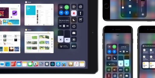
The new switcher is divided into three main areas: spaces, Control Center as a vertical dashboard on the right, and the dock at the bottom.
As I argued before, the desire to integrate three features in one interface possibly rose as a consequence of the dock replacing Control Center on the iPad as the first element you see when swiping from the bottom edge of the screen. The approach works well: iPad system toggles aren’t needed as often as on the iPhone, and the new modular design gave Apple some leeway to spread Control Center along the right side of the switcher without compromising its utility.
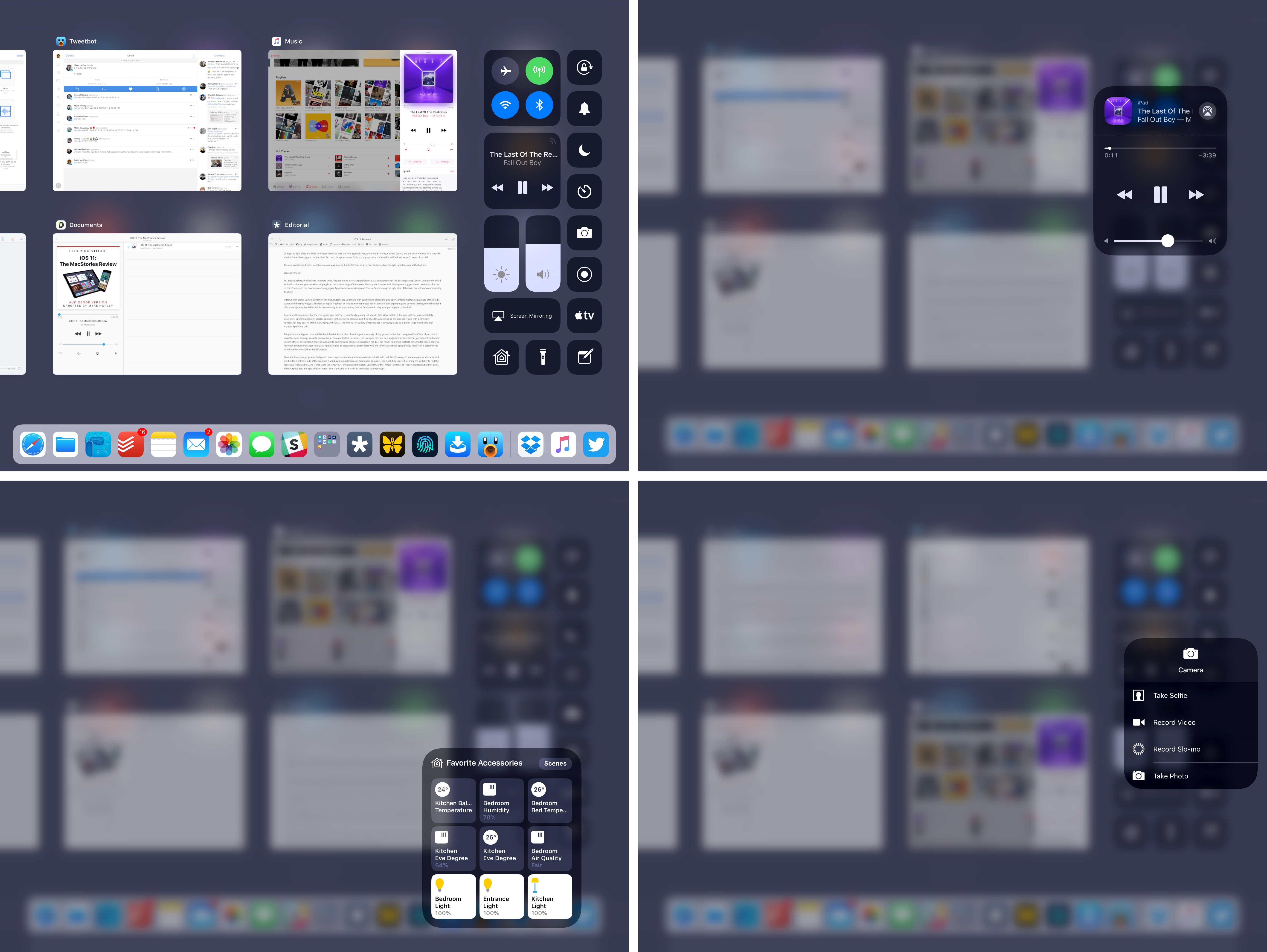
In fact, I even prefer Control Center on the iPad. Buttons are larger and they can be long-pressed to pop open controls that take advantage of the iPad’s screen with floating widgets. The lack of haptic feedback on iPad somewhat mutes the response of tiles expanding and buttons shaking when they don’t offer more options, but I think Apple made the right call in assuming Control Center could play a supporting role to the dock.
Spaces are the main event of the redesigned app switcher – specifically, pairings of apps in Split View. In iOS 10, the app switcher was completely unaware of Split View: it didn’t display app pairs in the scrolling carousel and it went as far as covering up the secondary app with a comically nondescript gray box. All of this is changing with iOS 11: the iPhone-like gallery of recent apps is gone, replaced by a grid of large thumbnails that includes Split View pairs.
The prime advantage of this model is that it feeds into the idea of working with a variety of app groups rather than one global Split View. If you tend to keep Slack and Messages next to each other for communication purposes, the two apps can now be a single unit in the switcher, permanently attached to each other. For example, I find it convenient to pair Mail and Todoist in a space; in iOS 11, I can return to a setup that lets me simultaneously process my inbox and turn messages into tasks. Apple created an elegant solution for users who like to work with fixed app pairings; there isn’t a better way to visualize this concept than iOS 11’s spaces.
Given the focus on app groups that persist across app relaunches and device reboots, I find it odd that there’s no way to mark a space as a favorite and pin it to the rightmost side of the switcher. If you buy into Apple’s idea of permanent app pairs, you’ll still find yourself scrolling the switcher to find the space you’re looking for. And if that takes too long, you’ll end up using the dock, Spotlight, or the ⌘Tab switcher to reopen a space; but at that point, what purpose does the app switcher serve? This is the only wrinkle in an otherwise solid redesign.
I see two potential fixes: either users should be able to drag a space to a section of the switcher dedicated to their favorite spaces, or iOS should offer shortcuts to instantly recreate a combination of apps in a space. Not only would this speed up the process of launching apps via spaces, it would also deepen the spatial context provided by app pairs that are always in the same position – just like buttons in the new Control Center. Imagine a physical workspace where your favorite tools are rearranged every time you use them. Even if it would work against the order of recent apps, the iOS 11 switcher needs a way to mark certain spaces as favorites.
Adding drag and drop support for apps in the switcher could also unlock more ways to generate new spaces from the switcher itself. Currently, the only available gesture is the usual vertical swipe to force-quit apps. It‘d be nice to hold an app and drop it on top of another to create a Split View.
A refrain I’ve heard from some Mac users testing iOS 11 is that the iPad’s spaces don’t work like the homonymous feature on macOS. Indeed, iOS 11 does not allow users to open multiple, separate instances of the same app and pair them with different spaces. That is, I believe, a wise decision by Apple, as the traditional interpretation of app windows would only recreate the desktop’s complexity without the proper controls to manage it. How would you reconcile an app that already has three “windows” elsewhere? And where would each state be saved? If you want to create a Slide Over for that app, would you need to pick which window goes in floating mode? For now, it’s probably best to keep spaces tied to a single instance of each app.
Another take on this argument is that iOS shouldn’t have independent windows for the same app, but an app – the same instance of it – should be able to appear in multiple spaces. Our usage of Split View, the idea goes, is fluid, and we don’t always use the same combination of apps.
To an extent, I understand the premise: sometimes we use Mail and Safari together; other times we want to have Tweetbot and Safari side by side. However, for the sake of clarity in this initial release, I think Apple made the right decision here as well: if you see a space, that’s the only place where an app can be.59 The idea of multiple instances for the same app in spaces is reasonable, but it’d present challenges that are currently solved by the dock with drag and drop.
In over three months of running iOS 11 on my iPad Pro, I’ve used the app switcher more as an extension of drag and drop to spring-load content into apps than as a launcher to switch between spaces. In everyday usage, I’ve found the dock to be a more effective way to launch my favorite apps than the system switcher. The dock always displays my essential apps in the same predictable spot every time I open it; the switcher has bigger, more tappable thumbnails, but they are constantly rearranged.
Moreover, icons in the dock can be tapped to relaunch a space (tapping one app in an existing Split View pair will open the entire space) or dragged to initiate Split View and Slide Over. Even with spaces, the app switcher continues to be skewed towards simply getting you back to what you were recently using. Because I deem my favorite apps as more important in a launcher, and given the ability to change spaces by tapping on app icons, I prefer the spatial, integrated approach of the dock. Switching between recent apps becomes less of a necessity when you gain access to 15 apps across the entire system.
That said, the app switcher is moving in an interesting direction that could potentially replace some of my dock usage in the future. Adopting large thumbnails with persistent spaces feels perfect for the iPad’s screen. The integration with Control Center and drag and drop in a single view is fantastic, and there’s the impression that Apple could add even more functionality to the switcher without sacrificing any of its qualities. I may not use the switcher as Apple intended for now, but I’m curious to see where they’ll take it next.
Multitasking in iOS 11 establishes several new themes. The Home screen has turned into a supporting character for the dock and spaces – the co-protagonists of a fresh take on launching and managing your favorite apps. Split View, no longer a novelty, is more flexible than ever. Slide Over graduates from a nice workaround to a modern implementation of windowing without any of the desktop’s baggage.
With iOS 11, Apple went beyond fixing what didn’t work in iOS 9. They molded complex multitasking paradigms into a new class of productivity tools, inspired by the Mac but radically rethought for iOS and multitouch. The execution isn’t without flaws: the app switcher is incomplete and gestures to open apps in different modes can be hard to tell apart. Unlike iOS 9’s Split View though, iOS 11’s multitasking feels like a mature product that’s been carefully planned for a long time. The result is equivalent to upgrading from a great bicycle to a spacious, powerful car with tons of options: iOS can go more places now.
And yet, this only tells half of the story.