iPhone Drag and Drop
While I’ve referred to drag and drop as an iPad feature so far, the same framework and API also works on the iPhone, with one crucial difference. On the iPhone, drag and drop only works within the same app; it doesn’t let you move items between different apps.
iPhone drag and drop looks and behaves just like on the iPad as long as you stay in the app you’re currently using. In apps that support drag and drop, you can long-press content to lift it, drag it around, and move it somewhere else. There’s support for rich item previews, multi-select, custom animations, and spring-loading. There’s no separate, iPhone-only API for drag and drop; developers that update their iPad apps with drag and drop will be able to do the same on the iPhone.
Being limited to dragging inside the current app changes the impact of drag and drop on the iOS experience. On the iPhone, drag and drop is just a better way to rearrange content in an app. This is great because it allows iPhone app developers to get rid of clunky or proprietary interfaces to perform the same functionality in favor of a more powerful, intuitive, and consistent system framework. But it’s not the full-featured drag and drop that opens up communication between apps. It’s half-baked.
Apple’s sporadic adoption of drag and drop in their iPhone apps suggests that they also primarily see it as an iPad feature. I was positively surprised when I selected some text in Notes, tapped the Back button while holding the drag item, and dropped text into a different note. Files also supports drag and drop, which simplifies management as you can pick up items and file them in different folders or sections of the app’s sidebar. But the good examples end here: other apps that support drag and drop on the iPad either don’t react to a long-press at all on the iPhone, or they revert to the old copy and paste action menu.
These constraints aren’t stopping developers from coming up with ways to enhance their iPhone apps with drag and drop though. Castro, the podcast client by Supertop, is my favorite example I’ve tried to date. In version 2.5 of Castro, which is an iPhone-only app, drag and drop complements the experience by letting you drag episodes around, rearrange them in the listening queue, and even batch select them to move them across sections of the app.
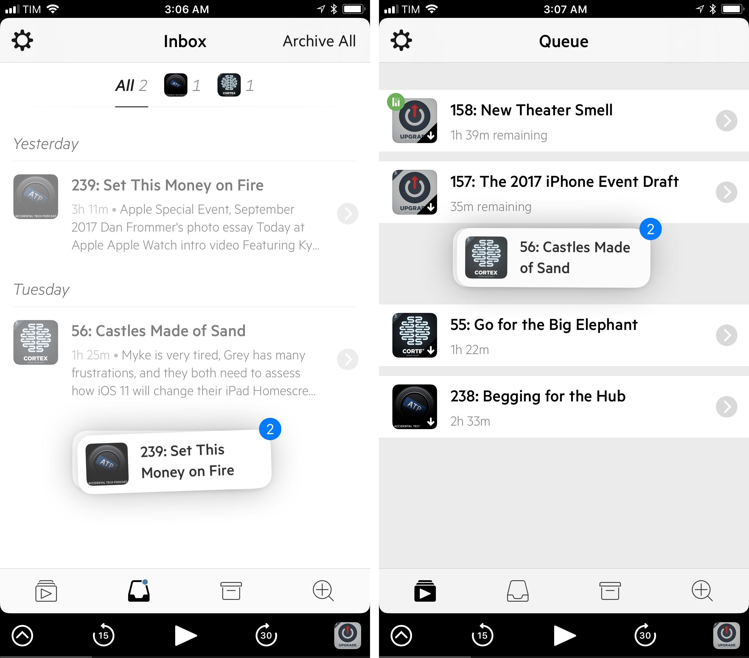
Castro was already based on the idea of a podcast inbox that you triage on a regular basis; drag and drop is the perfect interaction paradigm for it – especially because it’s been combined with the Taptic Engine to make you feel items you’re moving around. Now instead of using buttons and menus, you can just drag episodes, save them in the queue, and archive them. Supertop didn’t have to come up with a custom drag and drop engine on their own. They can rely on a powerful multitouch framework provided by Apple for free to make the app’s triaging experience even faster and more pleasant.
Castro for iOS 11 supports multi-item drag & drop, spring-loading, and live reordering of items.Replay
Drag and drop in Castro feels great (Supertop’s use of animations, spring-loading, and haptic feedback is superb), and it convinced me that the feature is not a gimmick on the smaller screen; it can bring substantial benefits to any iPhone app. After getting used to drag and drop in Castro 2.5, I want it everywhere.
It’s not clear why Apple decided to impose this limitation on the iPhone, though there are some potential explanations that allow us to speculate.
From a user experience standpoint, perhaps Apple didn’t want to release an iPhone feature that couldn’t be operated with one hand. On the iPhone, the lack of Split View would make inter-app drag and drop a two-handed operation: one hand to hold the phone, the other to drag the item. It might be that Apple is philosophically against that notion. Or maybe they’re waiting until the iPhone has an area that can work as a resting point for one-handed drag and drop – a shelf, or a discrete function area to drop items and pick them up later. The problem with any of these arguments is that Apple already contradicted itself: in-app drag and drop requires two hands to be effective on the iPhone anyway, and it works well.
Which brings us to the most likely explanation: the marketing strategy. Making the full-featured drag and drop iPad-only at launch amplifies the message that iOS 11 is an iPad-focused release, with drag and drop being the leading addition to the platform. Bringing complete support for drag and drop to the iPhone might have diminished its impact on the iPad, so Apple settled on a compromise for developers and users.
Whatever the motivation, here we stand today: drag and drop can be exceptional on the iPhone as well, and I hope Apple finds a way to support it across apps like on the iPad. Its advantages over the clipboard and extensions for sharing, managing files, and manipulating content in apps are too important to be passed up.
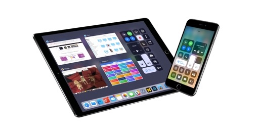
Tactile Multitasking
The dock, app switcher, and traditional Home screen aren’t the only ways to launch apps in iOS 11, which showcases a variety of multitouch gestures to grab app icons and bring them into multitasking contexts.
The Home screen now supports three kinds of taps: a single tap to open an app as usual; a long-press to lift an icon and drag it away; and a longer-press to enter wiggling mode.
Different levels of taps open up a variety of actions you can perform with app icons on the Home screen. For document-based apps, the long-press shows a Recent Files popover, allowing you to pick up important documents from the Home screen.
In wiggling mode, you can either delete an app or pick up an icon, start dragging it, then tap other icons to create a stack of apps, which you can drop on another page or inside a folder.
My favorite change, however, is that you can use the Home screen as a companion to Split View and spaces in iOS 11. While you’re holding an icon, use a second finger to launch another app, then drop the one you’re holding to create a Split View or Slide Over. A useful way to take advantage of this, I think, is to grab an icon, double-click the Home button to open spaces, then return to the last used space and drop the app in Split View.
I also like the idea of not using the Home button at all and relying on multitouch instead: exit the current space with a four-finger pinch, pick up an icon from the Home screen, swipe up with four fingers again, and drop the app in Split View or Slide Over.
Dragging apps from the Home screen isn’t as fast as summoning the dock, but it illustrates how multitouch gestures can boost multitasking. The timing of the new Home screen taps could be tweaked to avoid any potential confusion, though.
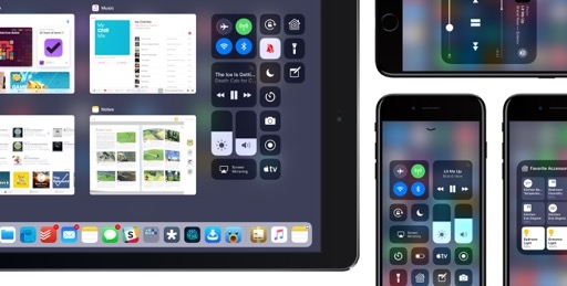
You can also drag apps from Spotlight search results. This is the fastest way to bring an app you don’t have in the dock into your current space. The method is only supported when an external keyboard is connected to the iPad: hit ⌘Space, search for an app, then start dragging its icon. Spotlight is automatically dismissed and you can drop the app either in Split View or Slide Over.65
I’ve been using this feature a lot, but Spotlight’s current iPad UI is a strong argument in favor of a redesign modeled after the Mac. A popup for search results that doesn’t take over a space and that shows you where apps can be dropped seems like a better solution than the current approach. I also think Apple should offer keyboard shortcuts to add an app to a Split View or put it in Slide Over directly from Spotlight.
The bigger theme behind these lesser known methods to open apps in multitasking is that Apple had to find some alternatives to the old Split View app picker. For better or worse, the picker exposed a longer selection of apps that went beyond the choices currently offered by the dock. To provide a solution to this problem, Apple opted for making the Home screen and Spotlight compatible with drag and drop.
I don’t miss the Split View app picker much, but I believe Spotlight has the potential to become a quicker Split View launcher external keyboard users would benefit from. With a less intrusive design and support for keyboard shortcuts, a powerful, multitasking-enabled Spotlight could make a lot of pro iPad users happy. I hope that’s the direction Apple sees for it too.
A New iPad OS
This review was entirely researched, written, and edited on an iPad Pro running iOS 11. Over the past three months, I also relied on the iPad Pro (as usual) to manage other parts of my business, which involved communicating and coordinating with the MacStories team, producing content for Club MacStories, and researching for Relay FM shows and AppStories. Working on the iPad with iOS 11 demands a fundamental adjustment of expectations, muscle memory, and workflows. The result, however, is an unambiguous improvement over iOS 10 and an ongoing decrease of frustrations. iOS 11 lets me work faster and use fewer automations to get my job done.
Understanding the capabilities of drag and drop and knowing where to use it have been pivotal aspects of the experience. But now that most of my favorite apps can exchange data and files with others with a mere swipe of my finger, the old tools I was familiar with – the clipboard and extensions – feel anachronistic and cumbersome. Drag and drop transforms working on the iPad inside out – within an app and between multiple apps.
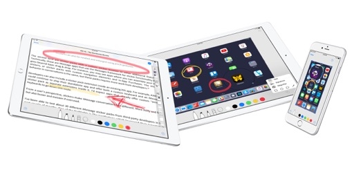
In Notes, I can rearrange text and images from the same note just by lifting them and dropping them somewhere else. This allows me to eschew the copy and paste menu as the only way to easily reformat a document.
The best part, though, is the fact that Notes accepts anything you drop in from other apps. When I’m researching a topic in Safari, I can select a paragraph of text in a webpage, and as I’m holding the text snippet, swipe in from the side to open Notes and drop it. Thanks to drag and drop, rich text from Safari keeps its formatting (including links and images) when it’s added to a note.
This has been true for my feed reader66 and Safari View Controller sessions from apps too, which I’ve used along with Safari to save links to interesting articles in Notes. In iOS 10, I’d use the Notes extension to append URLs to my Weekly Links note because it was the only way to end up with a rich link snippet in the app. With iOS 11, I can keep my RSS reader in full-screen, open Notes in Slide Over, and drop one link after the other in a couple of seconds. The link is automatically expanded and I don’t have to interact with the Notes extension every time.
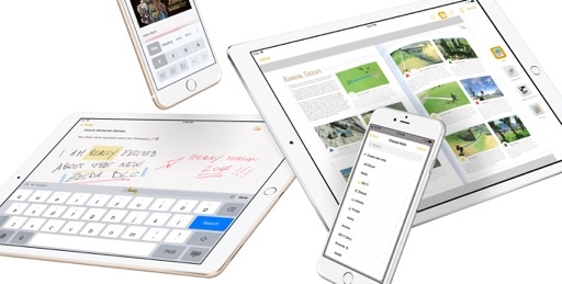
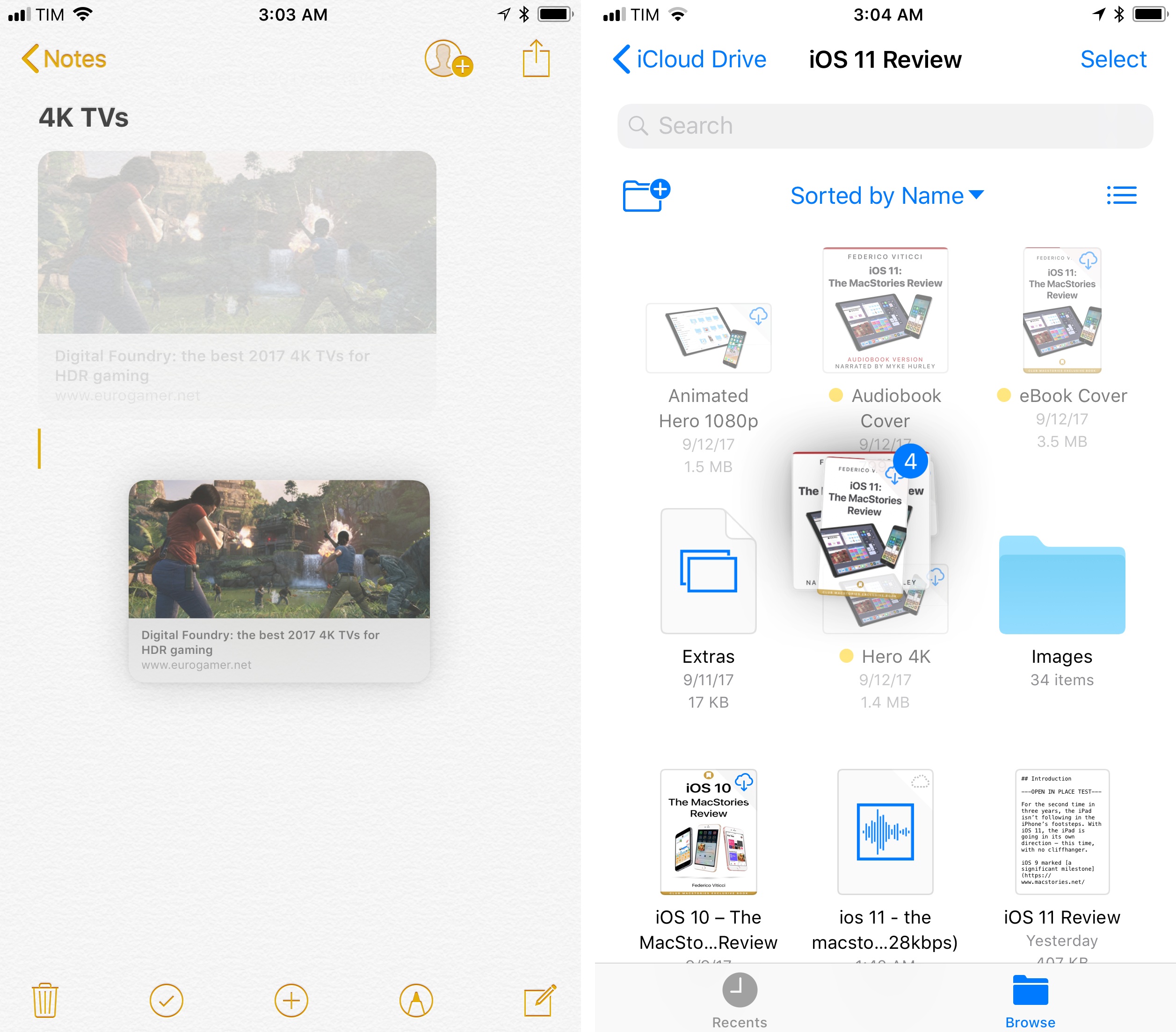
Notes has been the perfect showcase for drag and drop because you can throw anything at it. Using Files and Photos, I dragged a dozen attachments I needed to assemble MacStories team guidelines and dropped them into my shared notes. I dragged .zip archives, screenshots, videos, and PDF documents from multiple apps and collected them all in Notes; I never had to deal with a document picker. I did the same with my accountant: when he requested several documents and spreadsheets for tax purposes, I kept Mail in Slide Over and switched between Files and Notes to drop the receipts and scanned documents he needed into my reply.
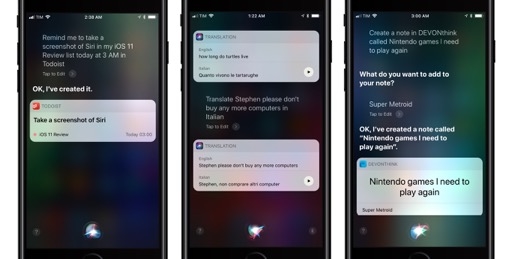
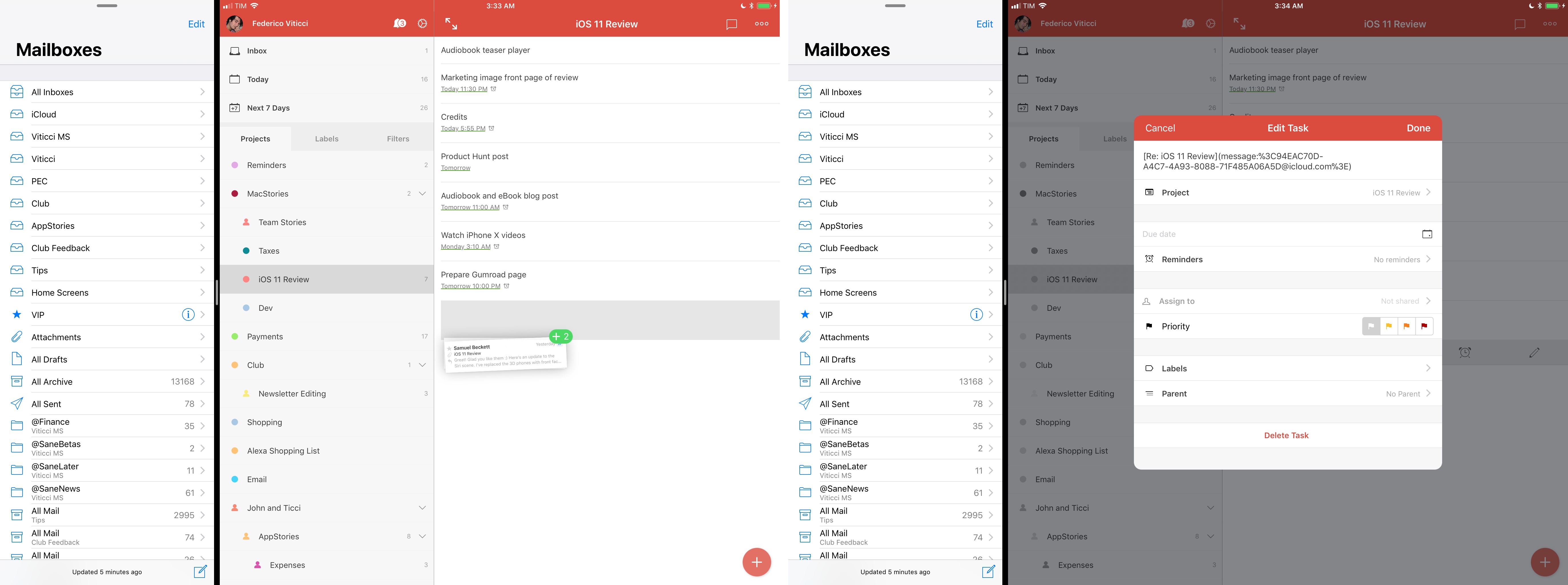
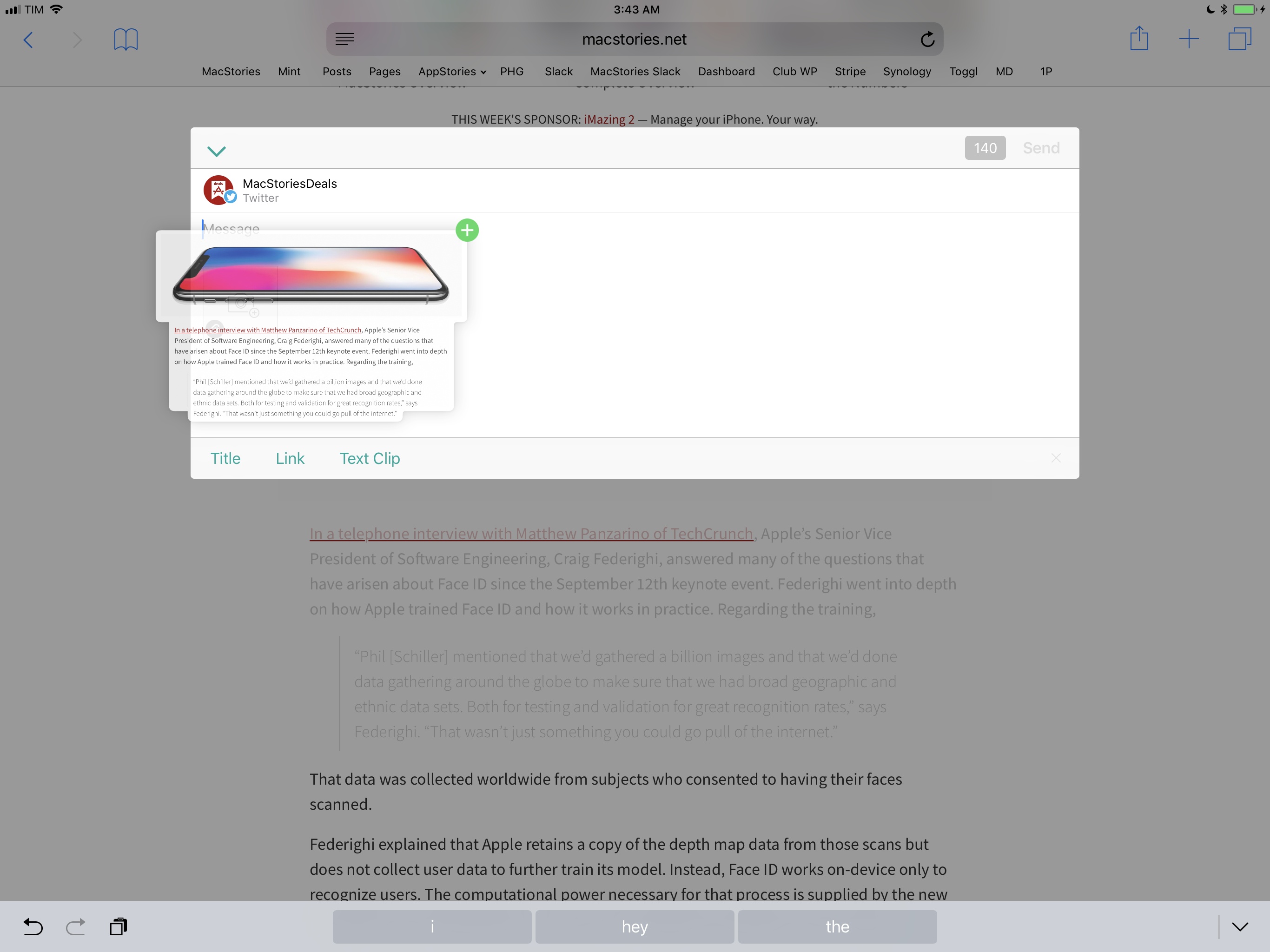
Speaking of Mail, iOS 11 has reinvented how I make messages actionable in Todoist, which has been updated with drag and drop support. From Mail, I can drag an entire message into Todoist, where it becomes a task that uses the subject of the message as its title. Furthermore, because Mail exposes multiple representations for its messages, Todoist can also use the message:// URL to let me tap on a task and reopen the message in Mail. This is now my favorite way to process email on a daily basis.
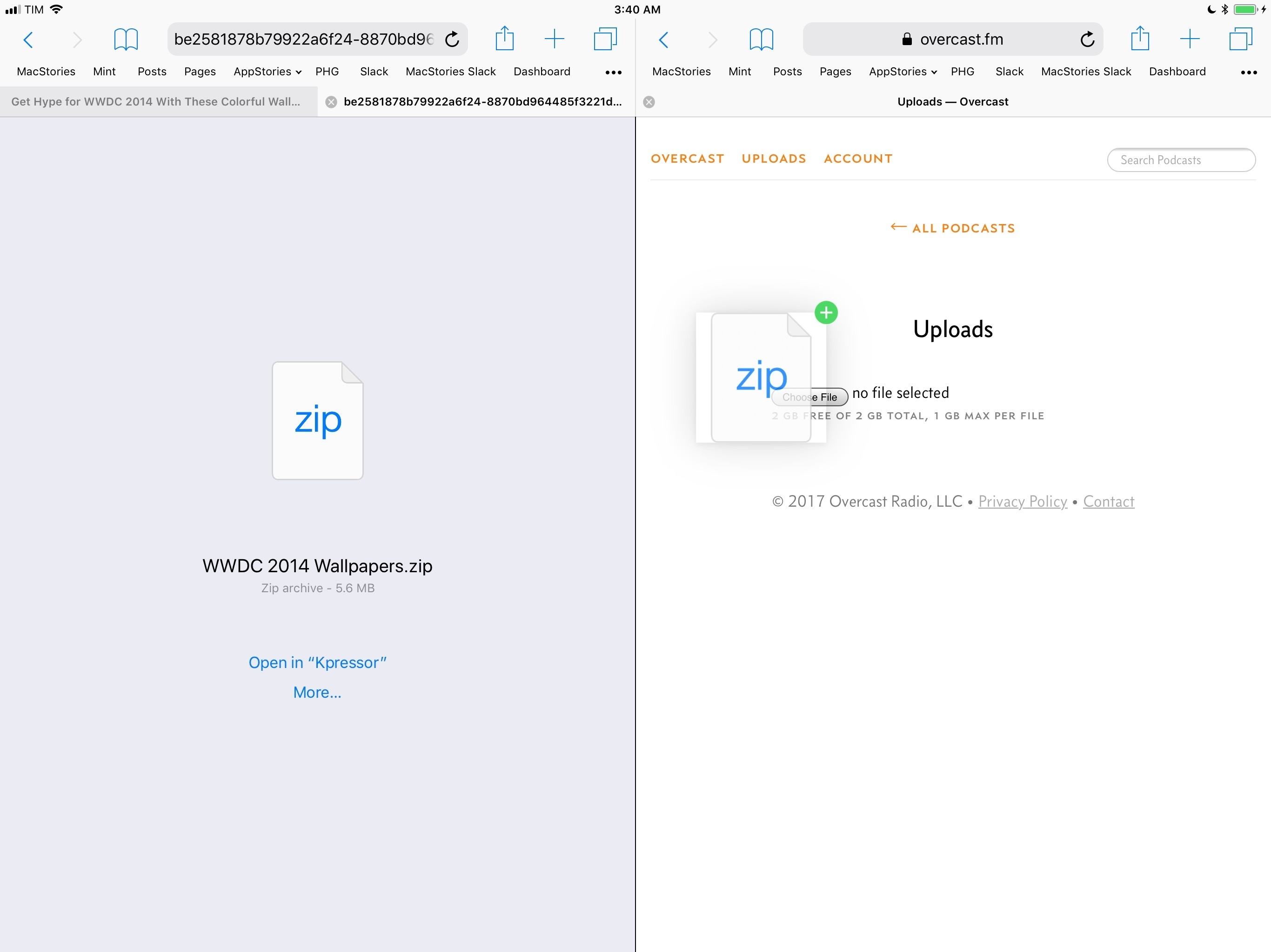
Another of my favorite implementations of drag and drop involves Safari and Files. Safari still doesn’t offer a dedicated file downloader, but iOS 11 lets me drag an item’s thumbnail from a download webpage to save it elsewhere. It also works the other way: if you need to upload a file to Safari, just drag an item from Files and drop it onto an upload form on a webpage. Dealing with file downloads and uploads has never been so intuitive on iOS.
Mac users might roll their eyes at what I just described, while iPad users are likely ecstatic and thinking about all the upcoming possibilities offered by third-party apps. Drag and drop liberates content on iOS 11. It’ll make you second-guess everything you know about working on the iPad, changing the way you use multiple apps every day.
There are a few downsides I’ve noticed. It’s disappointing to realize that you’re long-pressing an item and nothing is happening. Developers will have to update their apps for drag and drop, and, if history can teach us anything, change won’t happen overnight.
Moreover, drag and drop can sometimes be too undiscoverable: on a few occasions, I didn’t think I could drag something until it was too late and had already used an extension. Presumably, force of habit and wider adoption by developers will mitigate this issue: when every item in every app can be dragged, we won’t think twice about using drag and drop.
It’s also hard to tell at this point how well drag and drop’s multi-flavor system to represent drag items can scale to hundreds of iPad apps. For instance, there have been times when I wanted to drag a Mail message into another app and expected to drop a message:// link, but instead got a rich text copy of the message because the destination assumed that’s what I wanted, and I couldn’t control it. I do believe iOS 11’s UTI-based approach is the right one, but I wonder how quickly developers will come up with mutually agreed-upon standards for importing data in a representation the user expects.
Historically, iOS has been never been good at working with multiple items at once. iOS 11 changes that with Files and drag and drop. The Files app has naturally fit into my workflows and I see it as an obvious evolution of how I was using the iPad before. To me, Files is the least surprising addition to iOS and I’m using it considerably more than I ever used iCloud Drive.
Working with multiple documents or bits of content, however, is often a transient operation that doesn’t require saving a permanent file. And as I imagined earlier this year, it’s nice to be able to temporarily park items in a shelf, do something else, then grab them again and drop them in another app. The only difference is that Apple didn’t create a Shelf feature for iOS 11; third-party developers did – sort of.
So far, I’ve been testing six different shelf-type apps for iOS 11. All of them are optimized for Slide Over usage; they’re meant to be used as temporary resting spots for content you don’t want to keep holding while you’re interacting with apps. Apple’s multitouch implementation of drag and drop is amazingly well done, but from a pragmatic and ergonomic perspective it’s often easier (and more comfortable) to pick up multiple items, put them in a shelf for a few seconds, then pick them up again and discard them.
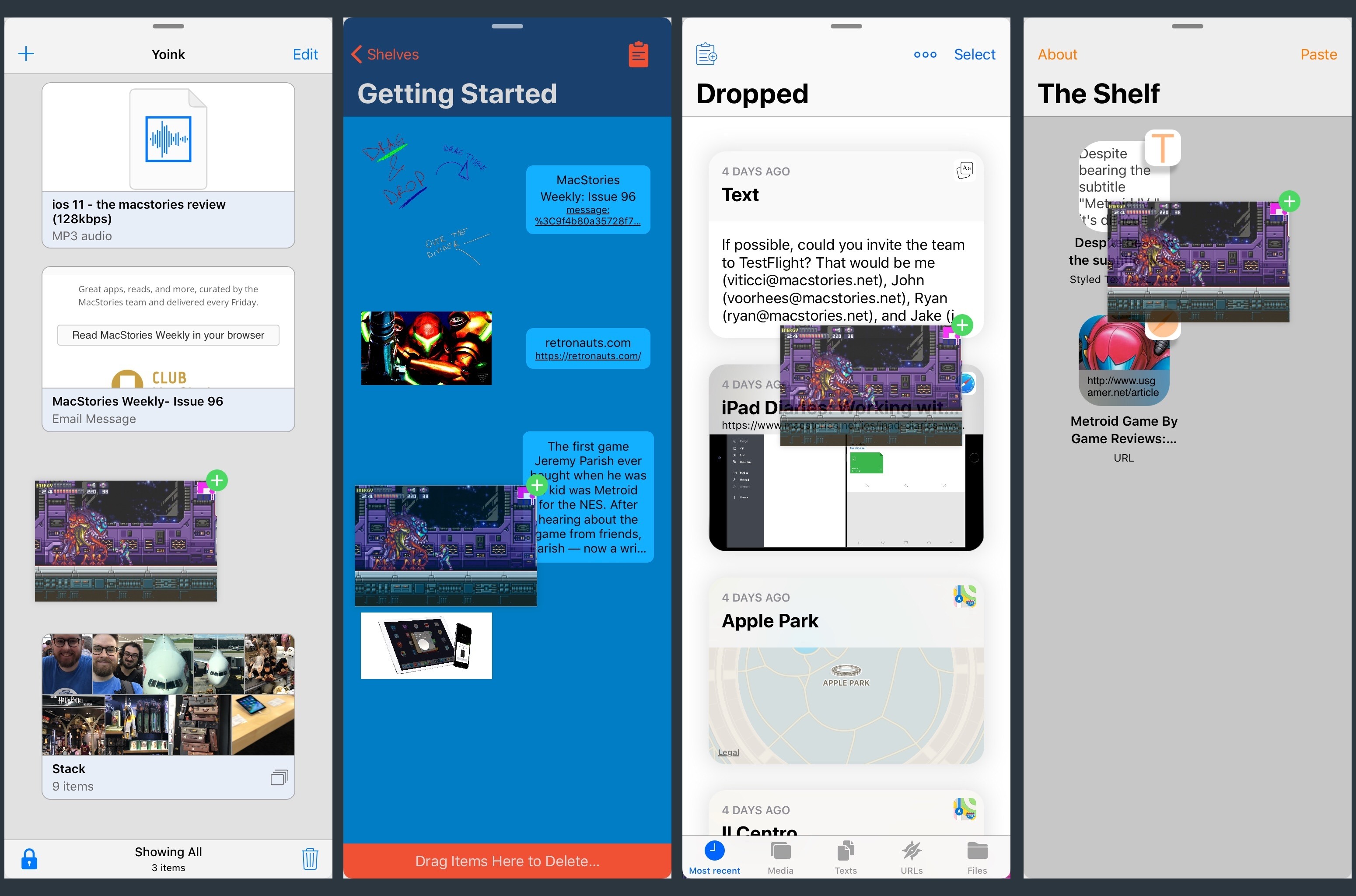
I’ve been using one of these shelf apps, Yoink, on a regular basis, and it makes drag and drop less stressful. Yes, a shelf adds another layer of complexity and management, but it also enables you to collect multiple items across the OS without the mental burden of having to immediately decide where they should go. Forcing drag and drop to be a single, continuous stream of swipes and taps seems unfeasible in the long term. Hopefully the success of third-party shelf apps will convince Apple that a better solution is needed – potentially, as an extension of the dock.
Multitasking on iOS 11 makes more sense to me than iOS 10’s old structure. The dock is enough to hold my most used apps, but more than that, it integrates with drag and drop for spring-loading content into apps and it’s also an efficient way to switch between spaces. Fully embracing the dock as the superior multitasking switcher takes time: you have to let go of the idea of a single Split View, and rely on the dock for your must-have apps instead.
While I thought I’d be lost without the ability to quickly put any recent app into Split View, that turned out to be more of an issue on principle than in practice. The 15-20 apps I constantly switch between are well served by a combination of the dock and spaces.
iOS 11’s Slide Over is an acquired taste. I was used to seeing Slide Over as a workaround to multitask in a limited fashion. But now that Slide Over can become a third app on top of Split View, I’m rethinking the role of several apps in my workflow.
Working with iOS 11 feels like Apple isn’t holding our hand anymore.
We can now drag and drop content around apps, set our favorites in the dock, switch spaces, manage files, and even use three apps at once. It’s somewhat intimidating at first, but after taking the time to learn iOS 11, I’ve ended up with iPad workflows that are veritably easier and more powerful than iOS 10 could ever be.
The rules of the sandbox have been rewritten. Working on the iPad with iOS 11 is an open field. Unshackled and stronger than ever, the iPad is finally free to explore its true nature: a canvas cut from the iPhone’s cloth, inspired by the Mac’s best traits.