The Dock
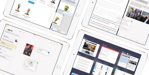
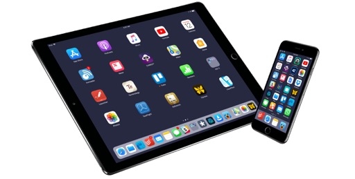
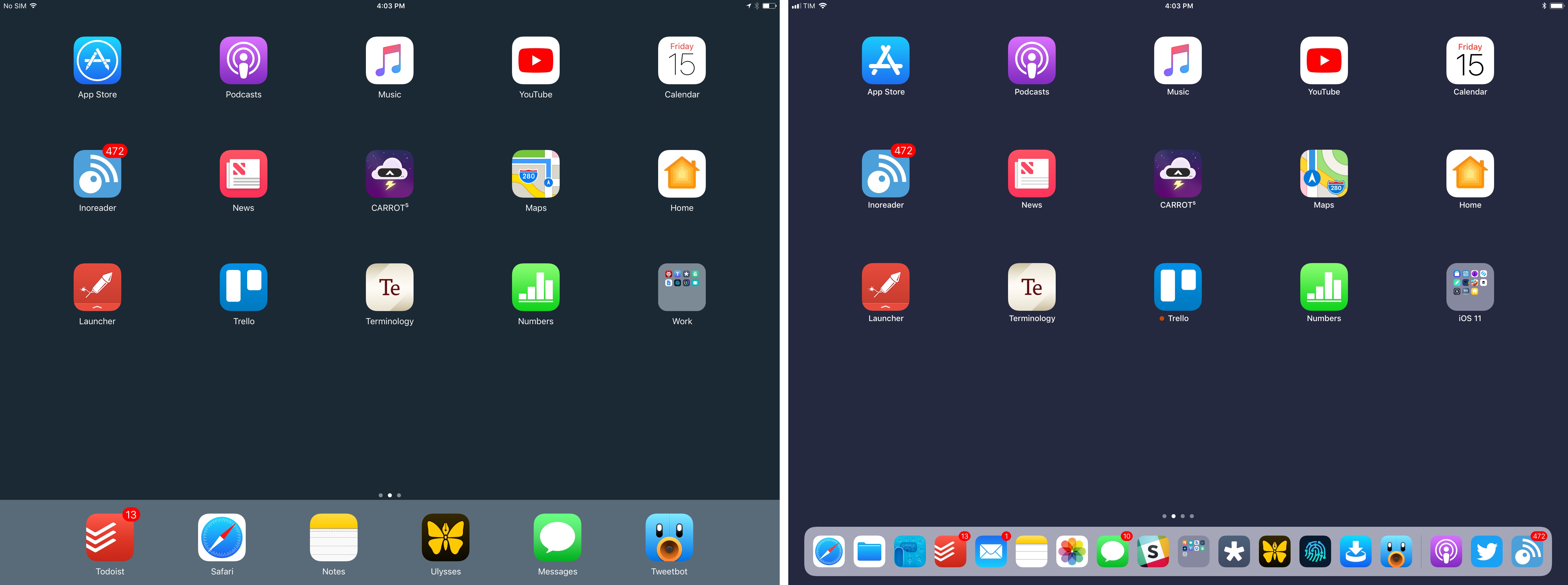
There’s something you’ll immediately realize about iOS 11 for iPad: the Home screen’s grid of icons looks exactly the same as before. There are no optimizations targeting higher density on larger iPads, and no new elements displayed alongside app icons. This shouldn’t be ascribed to pure negligence: the lack of change is symptomatic of a demotion of the Home screen from primary app launcher to uninteresting container of icons.
An entirely redesigned and re-engineered dock is taking on the majority of roles previously belonging to the Home screen.
The same principles of the macOS dock permeate the iPad version: the iOS 11 dock is a large tray for users to pin apps and folders, and it can be invoked from nearly everywhere on the OS. On the 10.5-inch iPad Pro, the dock can host up to 13 user-added items; on the 12.9-inch model, the number goes up to 15. In a major change for iPad multitasking, the dock can be used to alter an existing Split View layout or enter a separate workspace without returning to the Home screen. The dock is, effectively, the primary app launcher on iOS 11 for iPad.
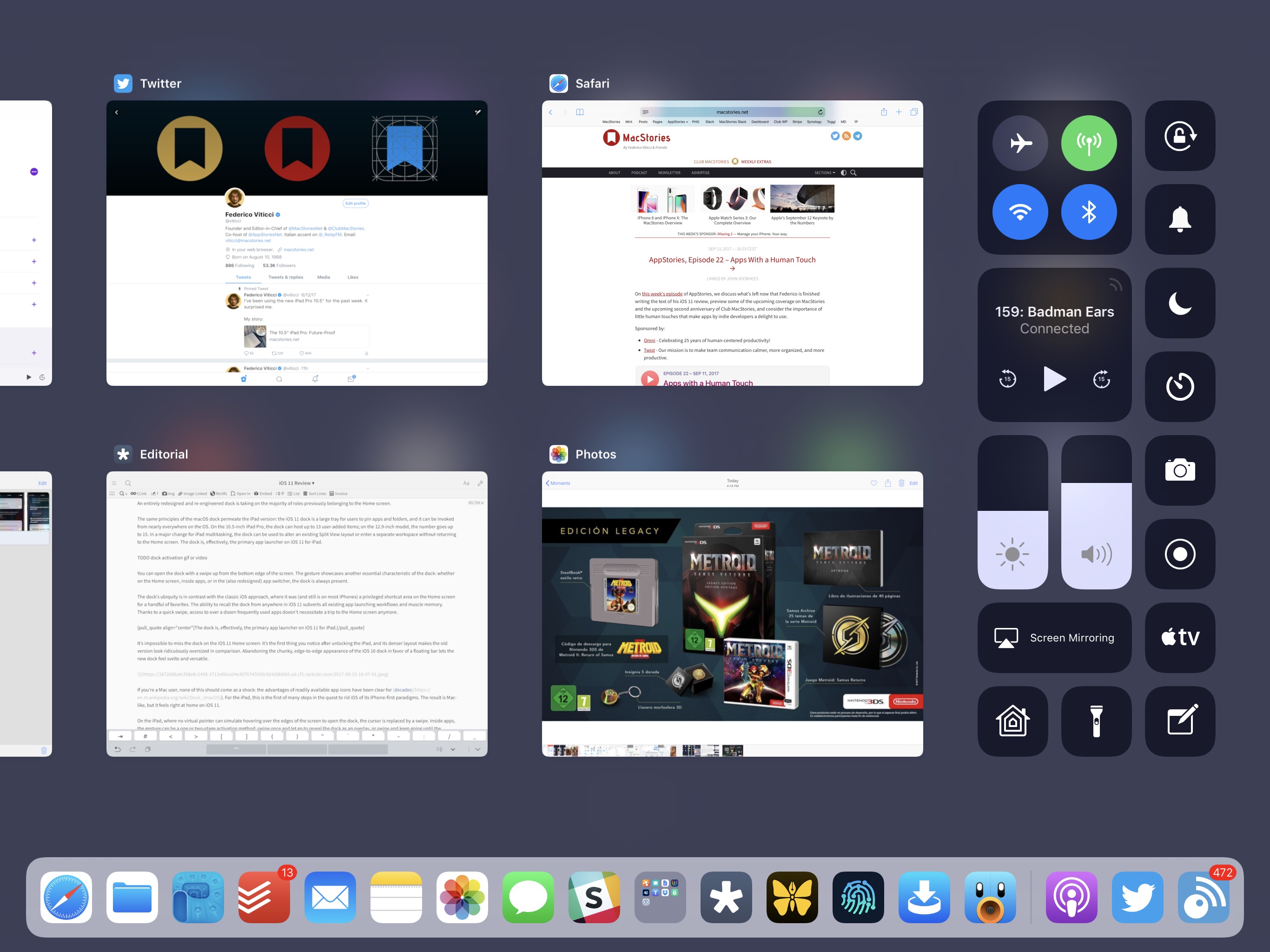
You can open the dock with a swipe up from the bottom edge of the screen. The gesture showcases another essential characteristic of the dock: whether on the Home screen, inside apps, or in the (also redesigned) app switcher, the dock is always present.
The dock’s ubiquity is in contrast with the classic iOS approach, where it was (and still is on most iPhones) a privileged shortcut area on the Home screen for a handful of favorites. The ability to recall the dock from anywhere in iOS 11 subverts all existing app launching workflows and muscle memory. Thanks to a quick swipe, access to over a dozen frequently used apps doesn’t necessitate a trip to the Home screen anymore.
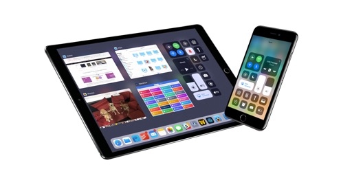
It’s impossible to miss the dock on the iOS 11 Home screen: it’s the first thing you notice after unlocking the iPad, and its denser layout makes the old version look ridiculously oversized in comparison. Abandoning the chunky, edge-to-edge appearance of the iOS 10 dock in favor of a floating bar lets the new dock feel svelte and versatile.
If you’re a Mac user, none of this should come as a shock: the advantages of readily available app icons have been clear for decades. For the iPad, this is the first of many steps in the quest to rid iOS of its iPhone-first paradigms. The result is Mac-like, but it feels right at home on iOS 11.
On the iPad, where no virtual pointer can simulate hovering over the edges of the screen to open the dock, the cursor is replaced by a swipe. Inside apps, the gesture can be a one or two-stage activation method: swipe once and let go to reveal the dock as an overlay, or swipe and keep going until the frontmost app recedes and becomes a thumbnail in the new app switcher, which integrates dock, spaces, and Control Center.
This is a fascinating change of priorities: even though, technically, a continuous swipe can still open Control Center, the gesture is skewed towards activating the dock. The momentum required to “cross” the first half of the swipe takes a longer commitment than its iOS 10 equivalent. We can then infer that Apple sees switching between apps easily as a more compelling enhancement for iPad users than quickly reaching Control Center. To accomodate both use cases, they came up with a gesture split in two parts and an integrated app switcher design, with the dock being the only constant. The system works well.
Swipe up from the bottom edge of the display to reveal the iOS 11 dock.
Keep swiping up…
…and the app becomes a space in the new app switcher.
Deeper dock personalization introduces new challenges for the Home screen, insofar as Apple has maintained a policy that all app icons should be the same size. That’s not the case anymore with iOS 11. The dock automatically scales to fit as you add and remove apps; icons shrink until they’re nearly half the size of the less fortunate ones that wait on the Home screen, undocked. The effect is somewhat hilarious in portrait mode: apps stay in place, but they become so small, their notification badges are difficult to read.
The dock’s touch targets require more attention and dexterity to ensure you’re tapping the right icon. This sharpens the importance of great icon design on iOS: because apps in the dock are unlabeled (likely for the same reason – a lack of space), having a unique, strongly recognizable icon that can stand out in the dock at all sizes is more important than ever.
The trade-offs of portrait mode seem to suggest the dock was primarily designed for landscape usage, and particularly for the largest iPad Pro, where a dock filled to the brim with icons doesn’t look absurdly tiny next to apps on the Home screen. I see two possible explanations for this. As a feature inspired by the Mac, the dock is rooted in the use of widescreen displays rather than vertical monitors. More importantly, Apple must have the numbers backing up the claim that most users work with their iPads in landscape, whether that can be attributed to the superior Split View interface or the fact that the company heavily pushes the Smart Keyboard as a complement to the iPad Pro.
The last point makes the limited integration of keyboard shortcuts in the dock quite perplexing: all you can do is hit ⌘⌥D to show or hide the dock. Given the convenience of the dock as an app launcher and the prominence of productivity tweaks in this release, I would have expected a variation of Spotlight’s keyboard control to cycle through apps in the dock and launch them with the keyboard instead of touching the screen.53
How iOS 11 deals with text input from an external keyboard while the dock is onscreen may explain the lack of keyboard shortcuts. If you invoke the dock via ⌘⌥D, input in the current text view remains active so you can continue typing on an external keyboard. This means that iOS 11 listens for keyboard shortcuts in the active app while the dock is shown.
It’s possible that Apple considers keyboard control for the foreground app and the dock as mutually exclusive; I wonder if a future version of iOS could bring a non-destructive way to operate both at once without losing focus in the active app. For now, the dock is mostly a touch-only affair.
Given the dominance of touch interactions, it’s not surprising that apps can only be added to the dock by dragging them into it. There is no settings screen to manage the apps that appear in the dock. To add an app, just hold it, drag it away from the Home screen, and drop it into the dock.
Managing apps in the iOS 11 dock.Replay
This process is powered by iOS 11’s new drag and drop framework: if a gap opens between two apps while you’re dragging an icon, you can drop it there; otherwise, the dock will subtly bounce to indicate that you’ve reached the maximum number of included apps.
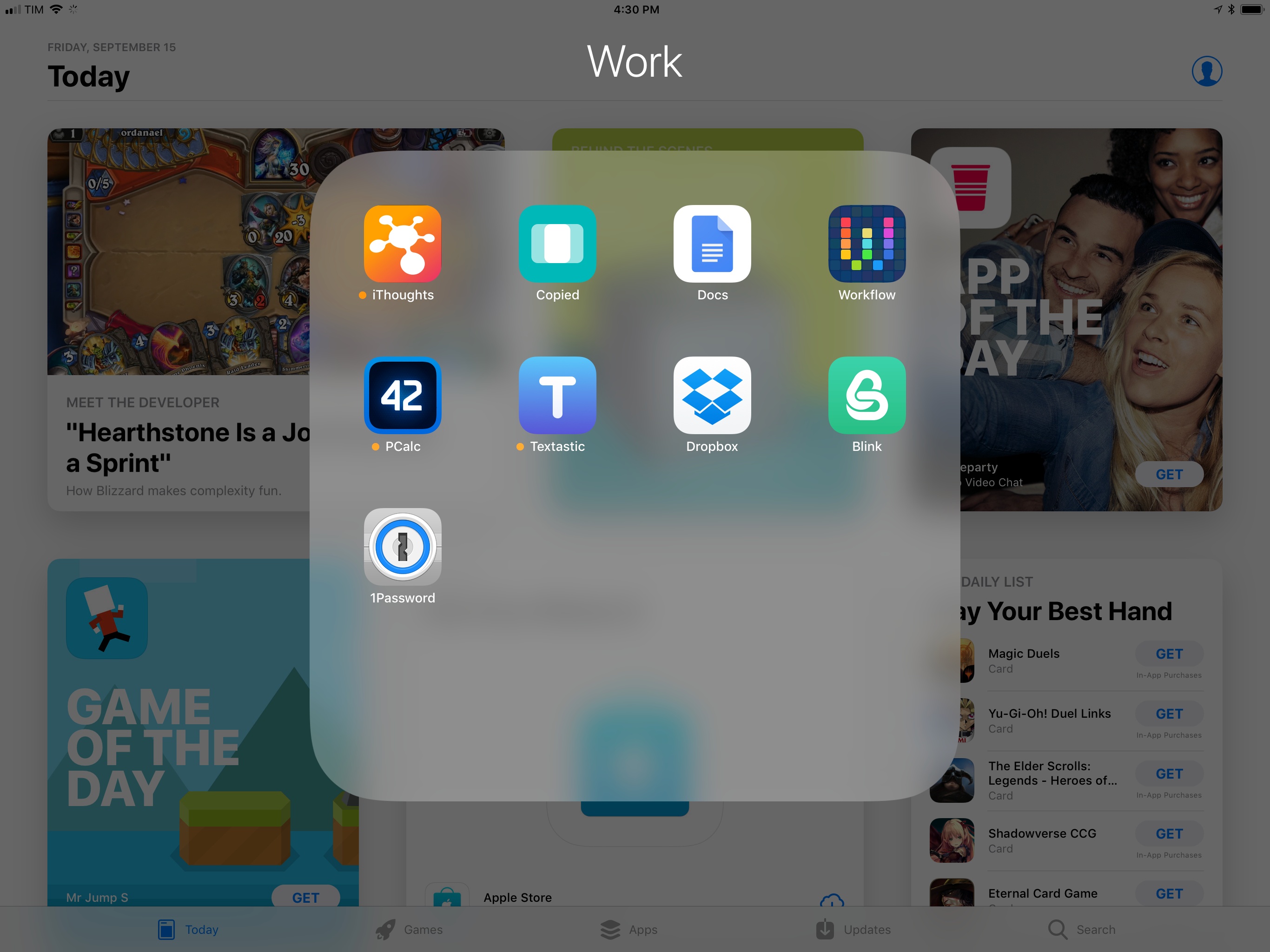
As a workaround to bring more apps into the dock, you can add folders. Doing this allows you to have virtually infinite apps at your disposal at all times, but it comes with a higher interaction price. A docked folder – which opens modally on top of apps – adds an extra step: before you can tap an app’s icon or drag it into Split View or Slide Over, you need to open the folder. Still, I have a feeling that keeping a folder of additional, semi-important apps in the dock will become common practice for those who juggle more than 15 apps on a daily basis.
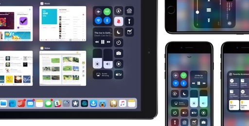
There’s another similarity between the macOS dock and its iOS offspring: by default, the right side is dedicated to apps that haven’t been manually added by the user. This special area (delimited by a vertical separator) gives you access to recent apps – a set of up to three apps you recently used that are not already in the dock.54
These app launchers take on some of the functionalities previously handled by the Split View app picker, which has been removed in iOS 11. The dock’s recent apps rip out all the quirks of iOS 9’s inscrutable picker design by providing an obvious feature: in that corner of the dock, you either see recent apps or Continuity shortcuts for nearby devices.
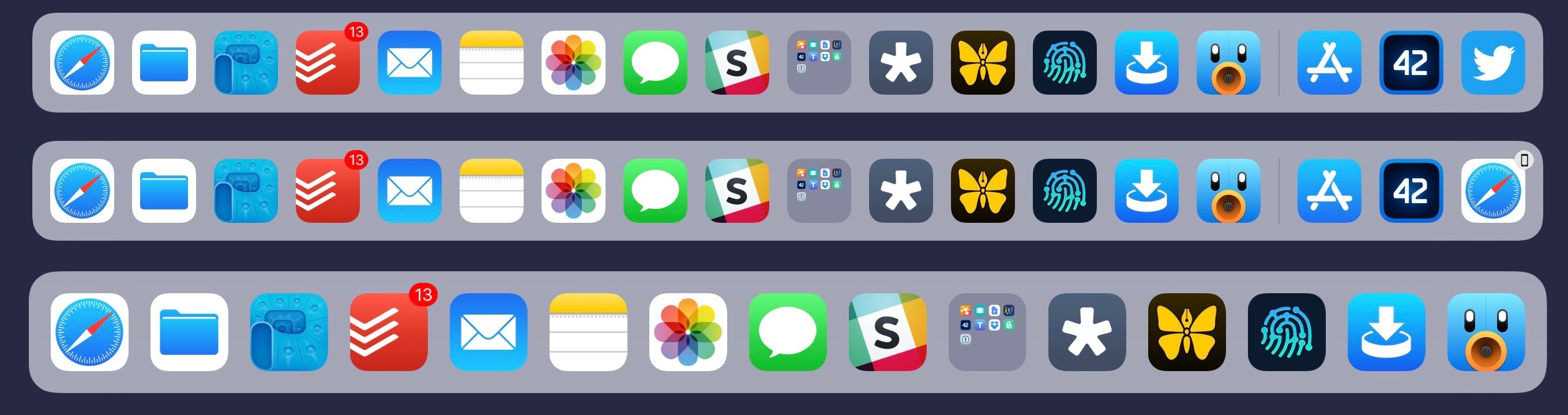
From top to bottom, on the right side of the dock: recent apps; recent apps with a Continuity shortcut; dock with recent apps disabled.
It could still be argued that iOS 9’s Split View picker, despite its idiosyncratic layout and clunky list of apps, offered more recent apps than iOS 11. This is a topic we’ll discuss later on, but the straightforwardness of recent apps in the new dock wins out in the end. If you don’t want them, recent and suggested apps can be disabled in Settings ⇾ General ⇾ Multitasking & Dock.
After going back to iOS 10 for a short period of time this summer, I instantly wondered how we ever used an iPad without the iOS 11 dock. It’s one of those features that is so effective, it becomes second nature in a matter of days.
The essence of the dock may have been borrowed from the Mac, but it feels utterly needed on the iPad as a bridge between apps. In iOS 11, the dock is an intermediary between multitasking and your favorite apps – the lynchpin of an improved Split View experience, supercharged with drag and drop.
Apple didn’t just port a horizontal app launcher from the Mac to iOS. The iPad’s dock has grown into an extension of the Home screen – a multitasking command center towards which everything gravitates.
The Spatiality of iOS 11 for iPad
The dock and drag and drop are the foundation of an improved Split View, which has been liberated from constraints introduced in iOS 9 that no longer have reason to exist.
There is no standalone Split View app picker anymore. Apps can still be launched from their Home screen icon, the ⌘Tab switcher, or Spotlight search, but most of the time you’ll find yourself tapping apps in the dock to open a space or dragging them out to modify the current Split View.
There are several themes at play here. First and foremost, iOS 11 eliminates the notion of primary and secondary app in Split View. Both apps in Split View are now on equal footing: neither can automatically replace the other by launching a different one. They’re both primary apps. If you tap a link to another app, iOS 11 will maintain the existing Split View setup and launch the third app in a separate space.
Which gets us to the second major difference from iOS 10: there is no longer one “master” Split View shared across the system that you constantly alter by inserting different apps into it.
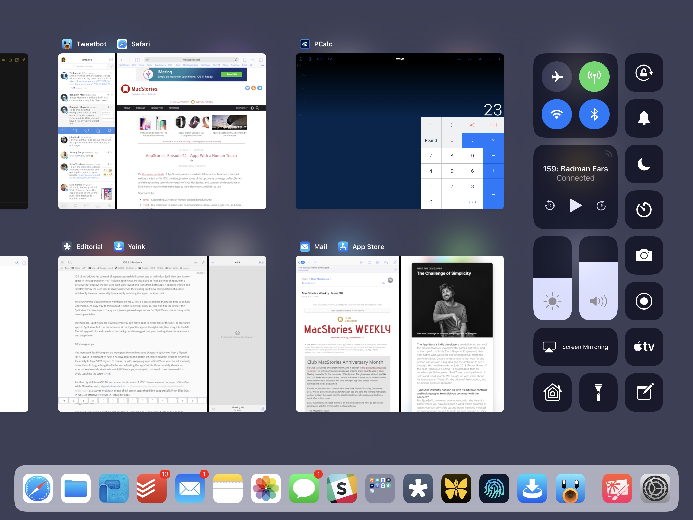
iOS 11 introduces the concept of app spaces: each full-screen app or individual Split View gets its own space in the app switcher.55 Multiple Split Views are visualized as fixed pairings of apps, with a preview that displays the last used Split View layout and icons from both apps. A space is created and “destroyed” by the user: iOS 11 always preserves the existing Split View configuration of a space, which only the user can modify by manually switching the apps contained in it.
For anyone who’s built complex workflows on iOS 9, this is a drastic change that takes time to be fully understood. An easy way to think about it is the following: in iOS 11, you won’t be looking at the Split View that is unique in the system; two apps used together are a Split View – one of many in the new app switcher.
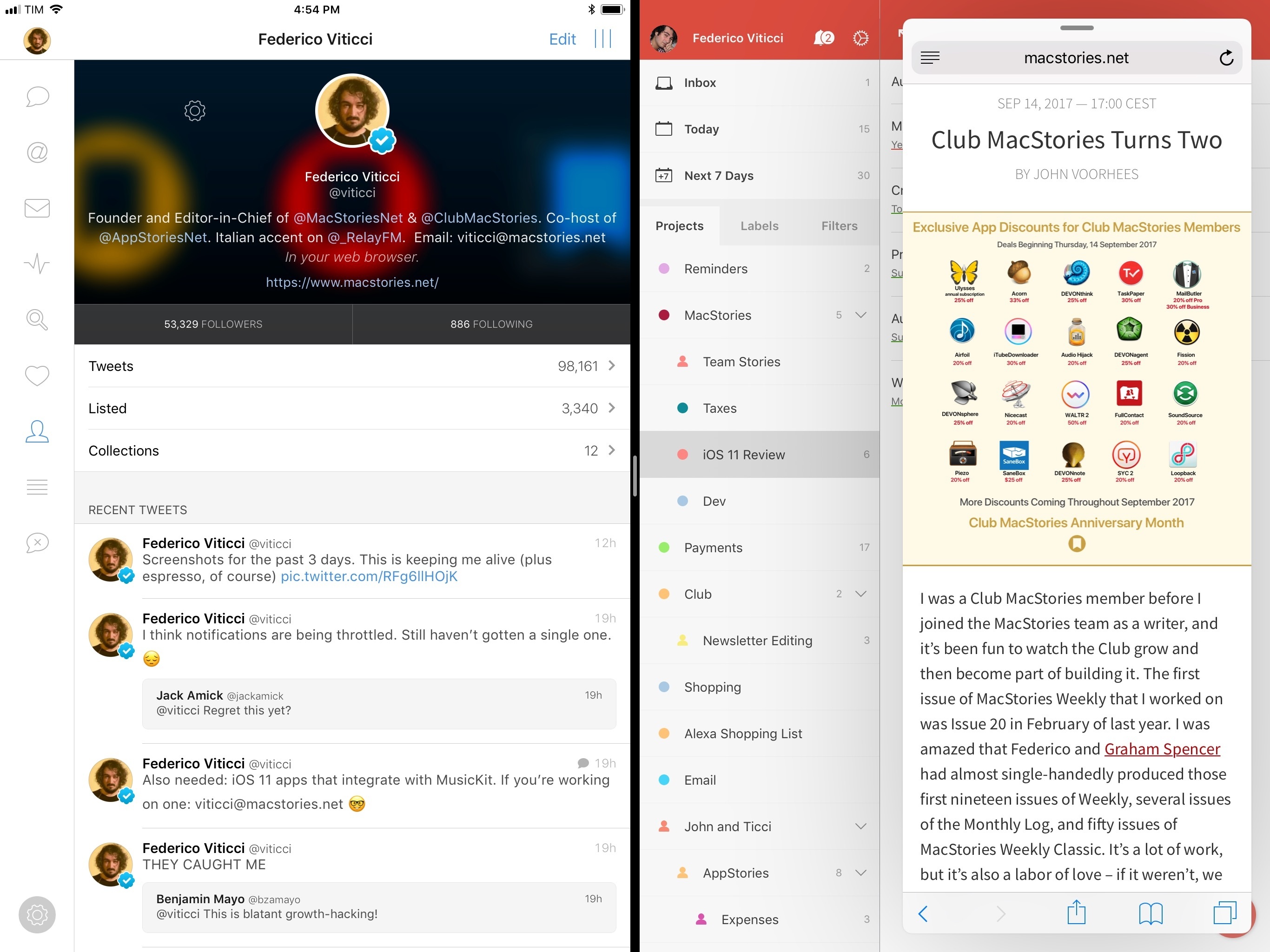
Furthermore, Split Views are now bilateral: you can move apps to either side of the split. To rearrange apps in Split View, hold on the indicator at the top of the app on the right side, then drag it to the left. The left app will dim and recede in the background to suggest that you can drag the other one over it and swap them.
Grab the indicator in the top right and swipe left to swap apps in Split View.Replay
Of course, besides swapping apps in Split View, you can still manually resize the split by grabbing the divider and adjusting the apps’ width. iOS 11’s increased flexibility opens up more possible combinations of apps in Split View, from a flipped 30/70 layout (if you want to have a narrow app column on the left, which couldn’t be done before) to the ability to flip a 50/50 layout. Unfortunately, there’s no external keyboard shortcut to invert Split View apps; once again, that would have been useful to avoid touching the screen.56
Another big shift from iOS 10, and where the structure of iOS 11 becomes more baroque, is Slide Over. While Slide Over was originally intended as a way to multitask on top of full-screen apps that didn’t support Split View, Slide Over in iOS 11 is effectively Picture in Picture for apps.
The new Slide Over is a floating, self-contained, compact app window that floats on top of apps. Unlike Split View, there is one Slide Over that is shared across all spaces in iOS 11. It is activated, as before, by swiping from the right edge of the screen. You can create an instance of Slide Over with the same drag and drop mechanics of Split View, but once an app is in Slide Over, it’s not attached to any particular space.
The new Slide Over blends a lightweight form of windowing with limited control over its placement that makes it ideal for utilities you want to quickly access on iOS 11. But it doesn’t stop there. On the latest iPad Pro models, Slide Over can be used alongside apps in Split View as it doesn’t block their ability to receive touch input.57 This means that on the 10.5-inch iPad Pro and 2017 12.9-inch model, iOS 11 lets you use three apps at once (two in Split View, one in Slide Over) – four if you consider Picture in Picture for videos as well.
The effect of these structural changes can be disorienting at first. Over the past two years, we acclimated ourselves to the quirks and limitations of iOS 9’s Split View: we learned its implementation of primary/secondary app and accepted its app picker. We mastered the system and built workflows around its constraints. It was comforting to know there was nothing more we could try.
By contrast, iOS 11 takes the reins off multitasking and sets it free. For the first few weeks of usage, the combination of all the multitasking features in iOS 11 will feel daunting – not too dissimilar, I bet, from the scary sense of vastness Breath of the Wild elicited in longtime Zelda players. Only in this case, our Hyrule is an open field of app icons and gestures.
There are several moving parts to iOS 11, but there’s also a common thread that runs deep inside them – a unifying theory that makes iOS 11’s multitasking a different beast than iOS 9: a more scrupulous adoption of multitouch.
Let’s dig in.
-
Here’s my proposal: while the dock is shown, start navigating with the arrow keys from the leftmost edge of the dock; hit Enter to launch the selected icon. Use
⌘←and⌘→to quickly select the first and last app of the dock, respectively. ↩ - Even if an app is in a folder you put in the dock, it'll show up among these shortcuts. ↩
- Which is still accessed by double-clicking the Home button, swiping up with four fingers, and, new in iOS 11, extending the dock upwards. ↩
- Nor did Apple add a proper indication of “focus” to communicate which app in Split View is actively receiving keyboard input. ↩
- Unless the app doesn't support Split View, in which case Slide Over will be modal and block touch interactions with it. (Looking at you, Settings app.) ↩