Slide Over
Apple’s first big change to iPad multitasking requires a single swipe from the right edge of the screen.19 Called Slide Over, this is what you’ll want to use to view and interact with another app without leaving the app you’re in.
Slide Over works by putting a secondary app on top of the app you’re currently using, called the primary app. It’s based on compact and regular size classes, and it works in both portrait and landscape orientations. Slide Over is supported on the following iPad models:
- iPad mini 2
- iPad mini 3
- iPad mini 4
- iPad Air
- iPad Air 2
- iPad Pro
Slide Over can be activated from any app, regardless of whether the app you’re using has been updated for iOS 9 or not. The fact that the app you’re in may not support Slide Over in iOS 9 doesn’t have any influence on the secondary app that you’ll be able to invoke. Slide Over is all about the secondary app and cycling through apps that support it.
There are two ways to activate Slide Over with a swipe from the right edge of the screen. You can swipe from the area around the middle of the screen (vertically centered) to open Slide Over directly; or, you can swipe from above or below the center of the screen to reveal a pulling indicator that you can then grab to fully reveal Slide Over.
The pulling indicator is the same that is used for Control Center and Notification Center when the app you’re in is running in full-screen mode (a common occurrence for games and other video apps). Slide Over joins Control Center and Notification Center in being a UI layer that is activated by swiping from the edge of the screen and that sits atop any running app.20
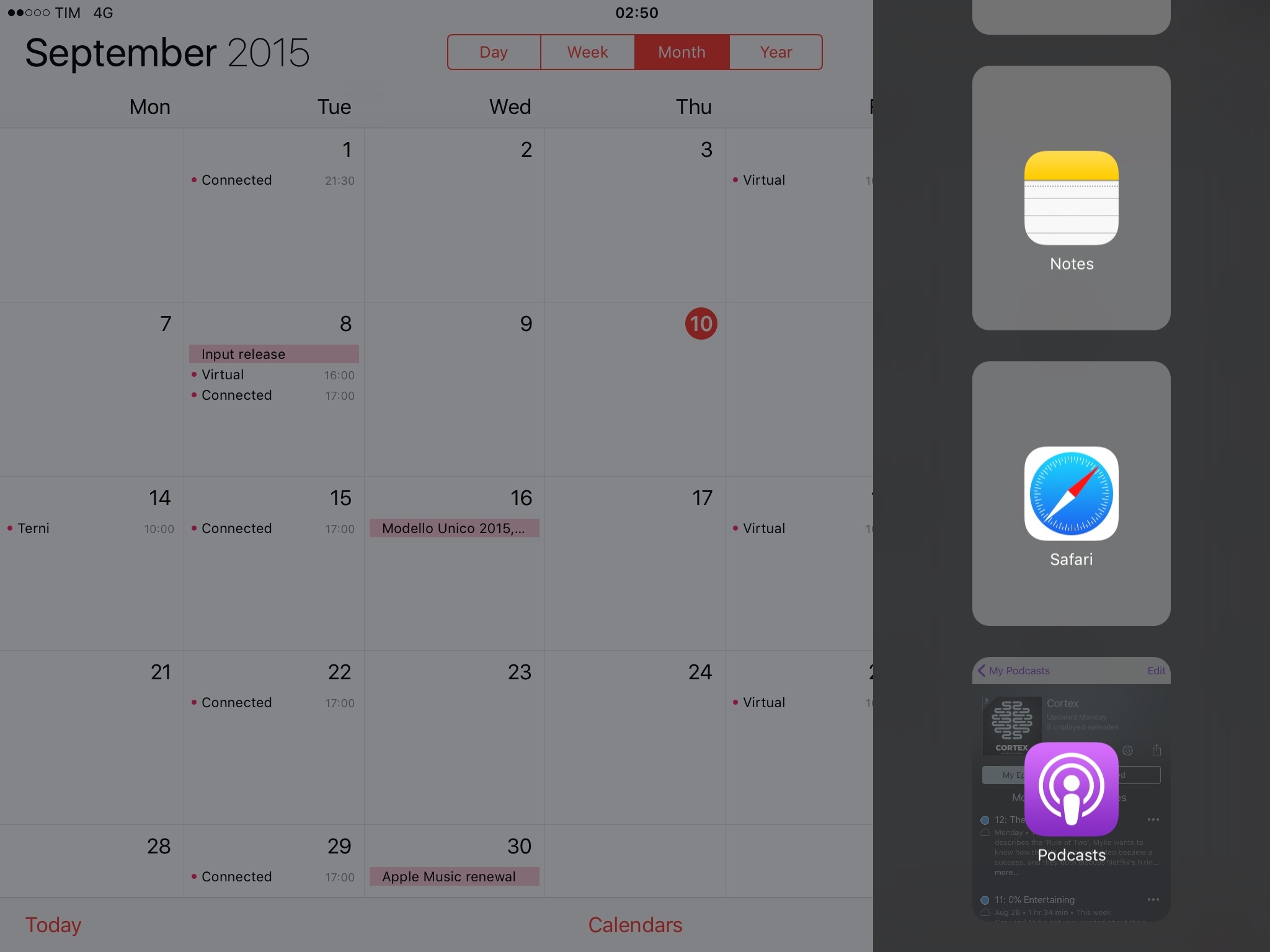
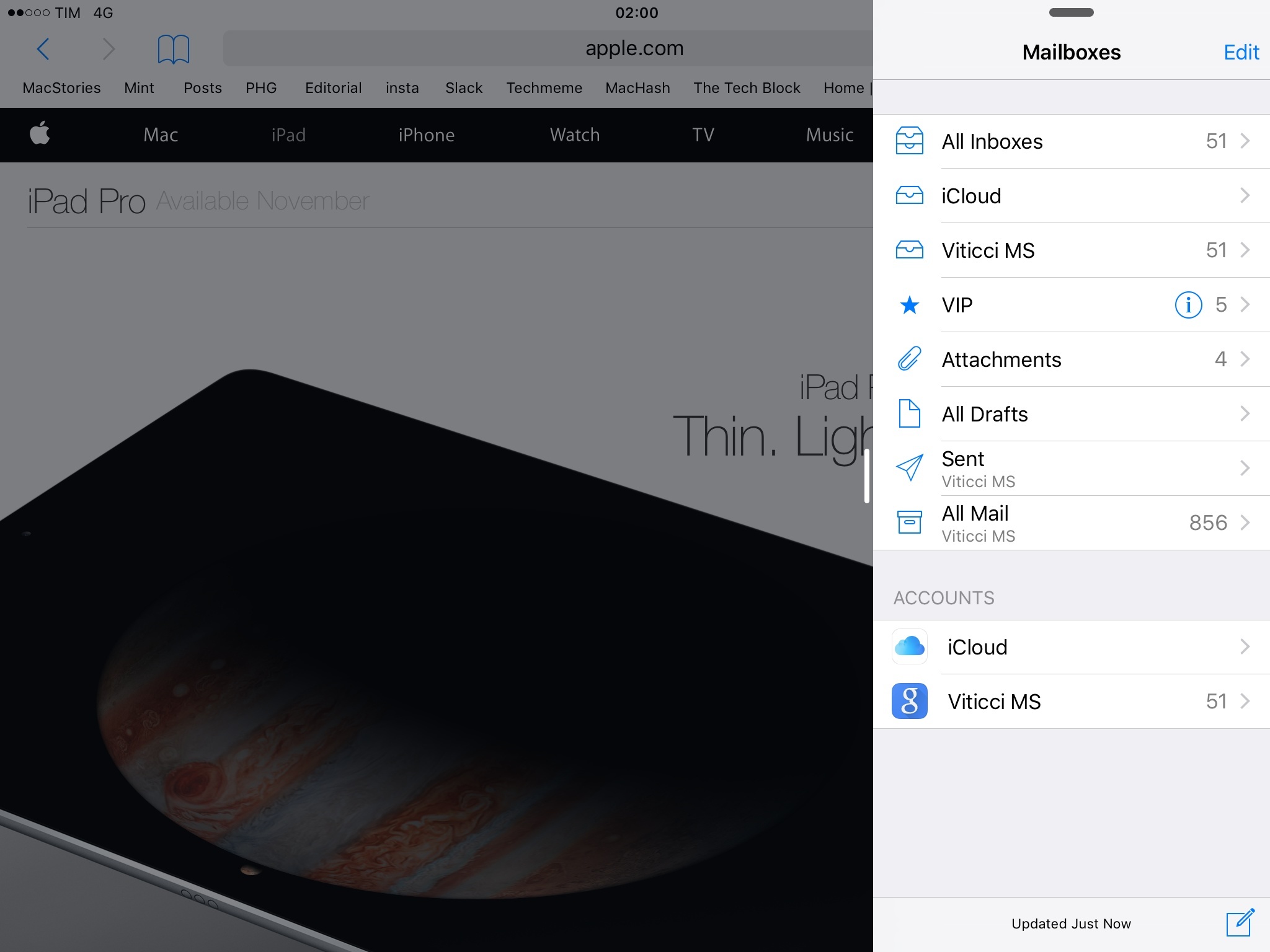
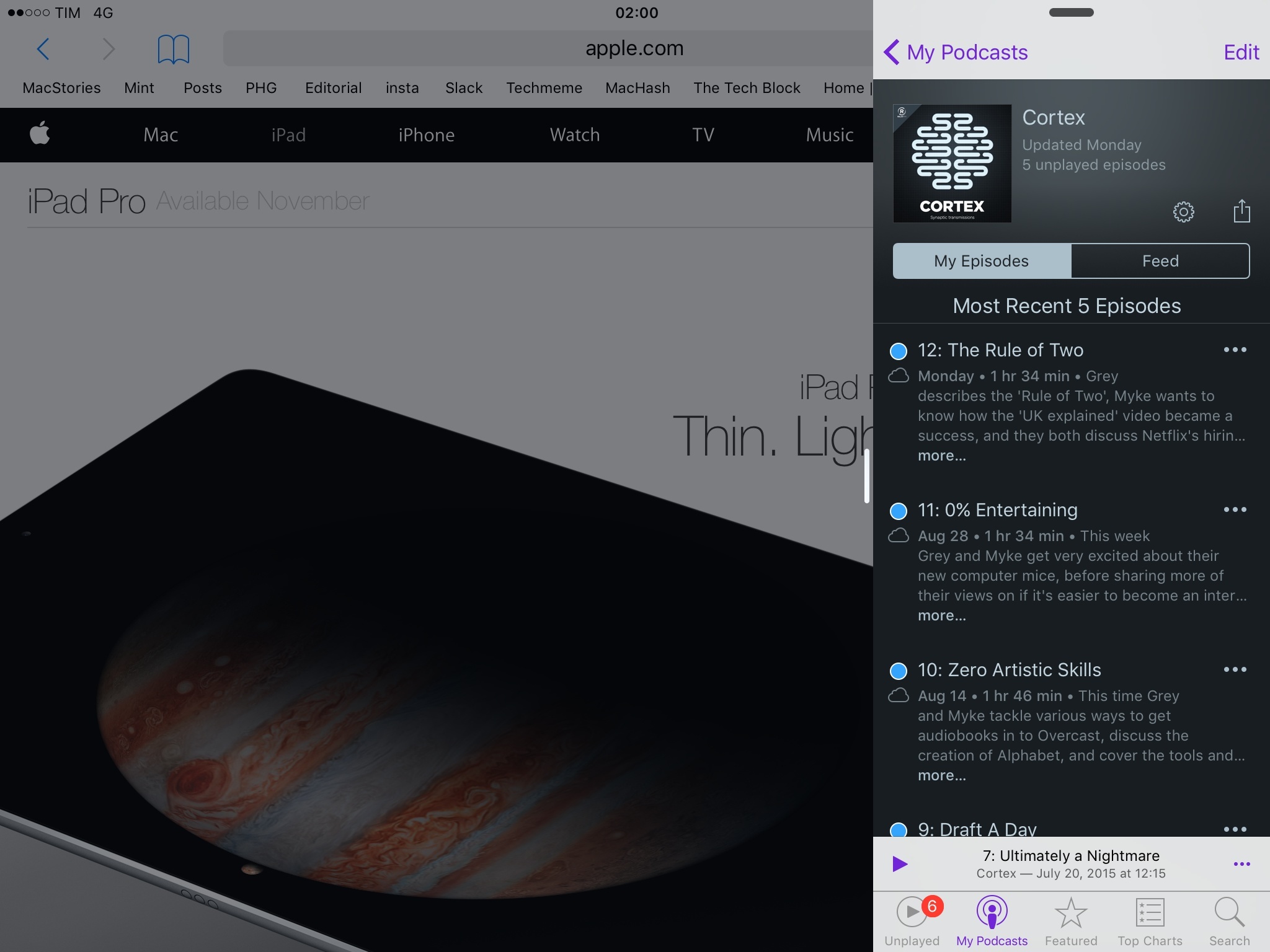
Slide Over also comes with its own app switcher to cycle through apps. Slide Over’s app switcher is a dark overlay with app icons contained inside light gray boxes; only apps that support Slide Over will be shown in this view.
Think of Slide Over as a subset of recently used apps, specifically (and exclusively) those updated for iOS 9 multitasking. You can’t quit apps in Slide Over: you can only tap to open an app and make it the secondary app running on top of an app you’re already in.
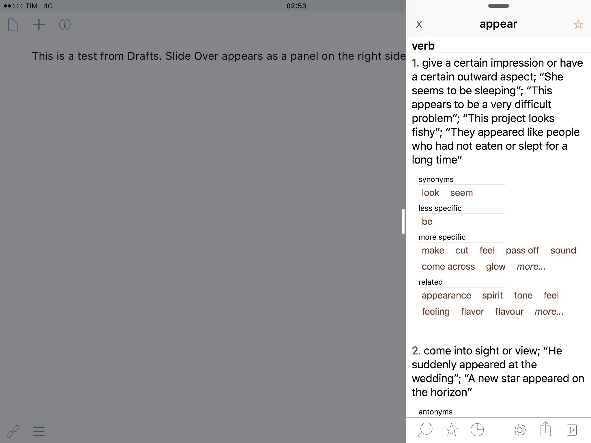
The cleverness of Slide Over lies in how its design dictates the experience of using it. When you pick a secondary app, it opens in what may be described as an iPhone app layout, stretched up vertically to fit the iPad’s screen. In both landscape and portrait mode, a secondary app is resized to a compact size class that resembles an iPhone app: in Slide Over, Safari moves the top toolbar buttons to the bottom of the screen like it does on the iPhone; Messages, Mail, and other Apple apps look exactly like their iPhone counterparts, only taller.
To achieve this, iOS 9 uses size classes (a technology that developers have started supporting to make iOS apps responsive for multiple display sizes) to show a UI that’s appropriate for a narrow and elongated mode. This makes Slide Over easy to use and familiar (most apps feel and work like iPhone apps) and a great way to interact with another app without taking it full-screen.
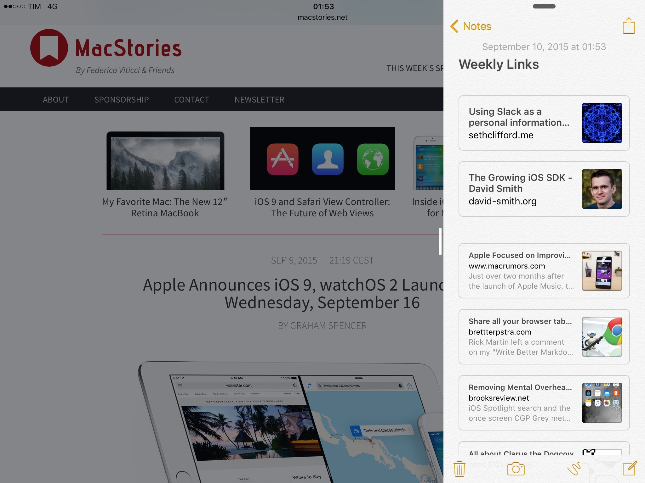
Design serves the experience in Slide Over, and it works. If you swipe to reveal Mail in Slide Over, you’ll be presented with a familiar view of messages in your inbox, resized to fit the Slide Over panel. If you open Notes, you’ll see a list of your notes; if you tap one, Slide Over will move to the subview required to display the note. Mail, Messages, Calendar, and other Apple apps rely on adaptive UIs and compact size classes to split app sidebars and navigation points into layouts that can be displayed in a single column with Slide Over.
To truly appreciate Slide Over, we need to look back at Apple’s past iOS SDKs. Since 2012, the company has been advocating for APIs to create apps capable of responding to any screen size, orientation, or localization. With a greater matrix of iOS screen sizes available to customers in more countries, Apple felt it was appropriate to rethink the design and development process with a focus on adaptivity: Auto Layout, Dynamic Type, and Size Classes were seen as signs of smaller iPads and bigger iPhones back then; today, they provide the context necessary to understand iPad multitasking in iOS 9.
Developers who have been paying attention to Apple’s announcements and advice have already done most of the work required to support iPad multitasking: Slide Over uses the same compact size class that developers have grown accustomed to using on the iPhone. It’s not just easier to support Slide Over this way: it’s the best option when you’re dealing with this type of layout.
Slide Over rethinks the idea of looking up information or acting on something without leaving an app. Think of it as having an iPhone next to any app you’re using without the inconvenience of juggling multiple devices. Need to look up a word on Google while you’re reading a document? Open Safari in Slide Over, search, and return to what you were doing. Want to type out an email without closing Twitter? Slide Over, Mail, compose, send. Same for keeping a conversation going on iMessage, checking your schedule in Calendar, or glancing at how many emails are in your inbox.
Thanks to the iPad’s large screen, you no longer need to launch apps to interact with them. A swipe is all it takes to get things done and be more efficient. This is Apple’s pitch for Slide Over.
An important aspect to note about Slide Over is that while a secondary app doesn’t take over the primary app visually21, it does take over functionally. When Slide Over is open, you can’t interact with the primary app and the secondary app simultaneously: only the secondary app is active and able to receive touch input, with the primary one being dimmed in the background. A single tap outside the Slide Over area immediately dismisses the secondary app22. When Slide Over is shown, the software keyboard is exclusive to the secondary app. From a user’s perspective, the primary app is inactive underneath Slide Over.
Keyboard input is another interesting decision Apple had to settle on when designing Slide Over. When you tap into a text field that shows the keyboard in a Slide Over app, you’ll get the full-screen iPad keyboard, but it’ll only work with the secondary app. The layering makes sense – having a smaller, iPhone-sized keyboard just for Slide Over would be terrible on an iPad – but it introduces a new level of visual complexity that poses new challenges for Apple and developers.
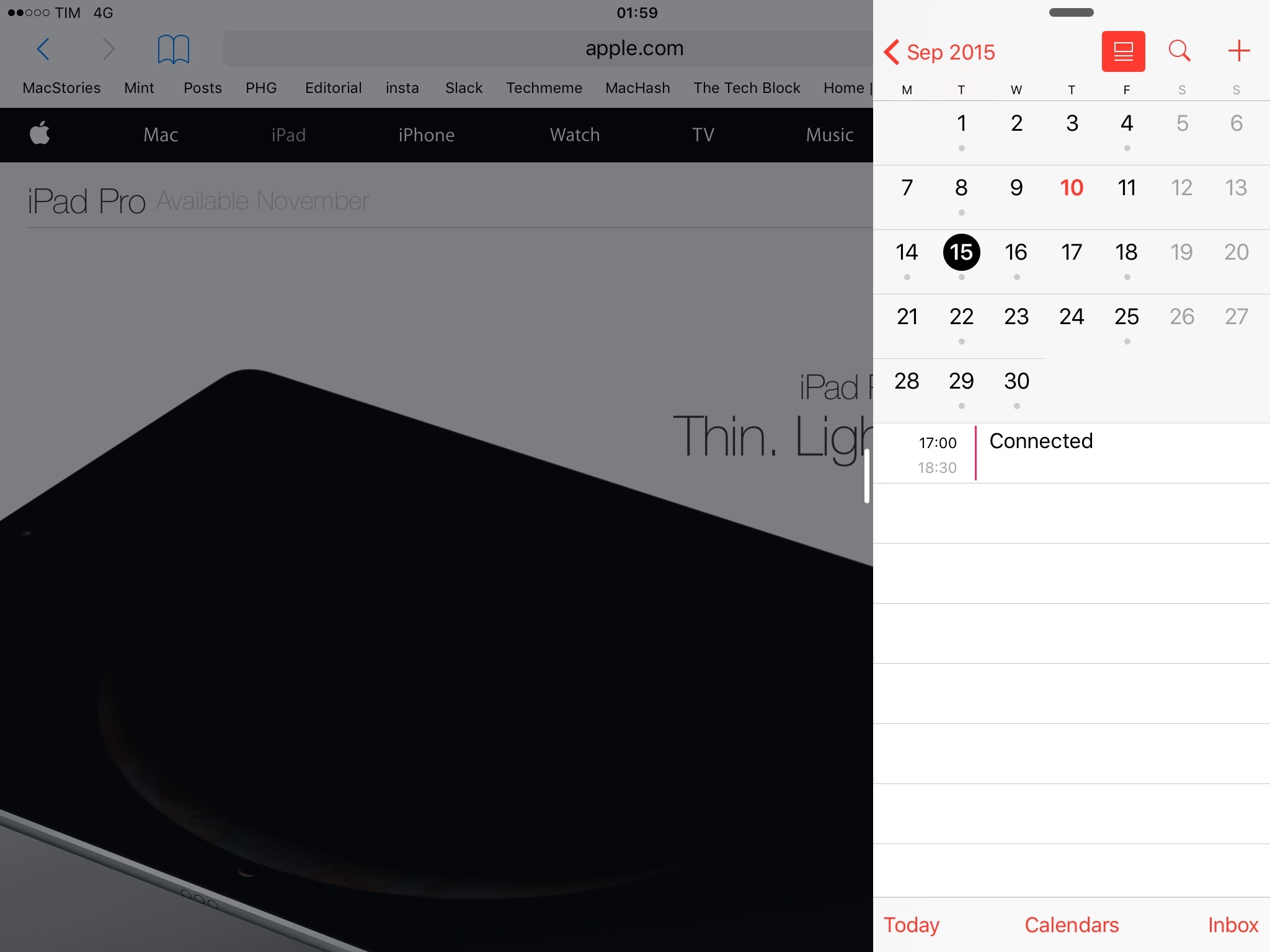
Slide Over’s app switcher can be activated by swiping down from this indicator (pictured: Twitterrific).
Slide Over grants surprising freedom in terms of app switching. Slide Over uses a persistent app switcher indicator that can be dragged to move between the secondary app and the picker for other apps that support Slide Over. The indicator is aligned with the clock in the status bar and it can be swiped to move from app to app switcher. Effectively, this is another status bar indicator: this portion of the screen behaves like a traditional status bar in that you can tap on it to scroll to the top of lists in apps. The similarities end here, as you’ll primarily interact with the Slide Over status bar to swipe it and switch between apps.
The animation to move across apps in Slide Over is some of Apple’s finest visual work in iOS 9. As you begin to pull down, the secondary app starts shrinking while following your gesture – first by adopting rounded corners, then by fitting the contents of the screen to a smaller box that sits below more app icons that come down from the top of the app switcher. It’s a smooth, rewarding animation that is fast and intuitive – exactly the kind of sloppy and comfortable gesture that can be performed in a second without looking. It feels right, and it doesn’t skip a single frame on the iPad Air 2.23
An inconsistency I’d point out is that some Apple apps haven’t been updated with support for Slide Over. I can accept App Store and iTunes not having a compact mode (although it would be welcome), but why doesn’t Music support Slide Over? It’d be a good showcase of the feature’s raison d’être: swipe to open Music, pick a song, play, and you’re back in the primary app. This is an oversight that I’m expecting Apple to rectify soon.
Slide Over is a terrific addition to iPad multitasking. It’s easy to activate and it doesn’t compromise on the full functionality of a secondary app: when you open it, you’re not presented with a lite version of another app – you’re given the whole experience, with its full feature set, only in a compact layout.
This is a powerful idea, as it noticeably cuts down the time required to jump between apps on an iPad. It makes the iPad’s screen feel like a large canvas of opportunities rather than a wasteland of bright pixels.
Slide Over is so good, I wish notifications could always open in it, and I wish I could have it on my 6 Plus as well. Double-clicking on the Home button feels so passé when you can swipe to peek at apps.
Slide Over is only a sliver of the iPad’s multitasking rebirth. What Slide Over enables is an even bigger change for iPad users, and a drastic new approach to app interaction on iOS.
- Or the left edge, if you're using iOS 9 with a right-to-left language. In iOS 9, Apple has introduced support for completely mirrored interfaces thanks to enhancements to UIKit; as a result, Slide Over will appear on the left side of the screen for right-to-left languages. ↩
- The main difference is that Notification/Control Center can be fully revealed with a swipe from anywhere at the top or bottom (not just the center), and they also work on the Home and Lock screens. It's not totally obvious that Slide Over can be activated by swiping just around where the vertical center of the screen may be; this decision makes sense when you consider the potential conflicts with apps that already rely on swipe gestures from the right edge. ↩
- With one notable exception: the rightmost area of the iOS status bar. Slide Over's own title bar covers the space where iOS displays the battery, Bluetooth, and location icons. I believe this was a deliberate design choice, as it reinforces the idea that Slide Over is meant for temporary, brief interactions to get in and out of apps (because you wouldn't want your status bar to be always covered by something else). ↩
- But both Control Center and Notification Center can be opened without dismissing Slide Over. ↩
- If you want to have a good time, swipe up and down in the Slide Over app switcher to watch app icons grow and shrink again. ↩