Notes
Whenever Apple announces new features and improvements for iOS’ built-in Messages app, they like to brag about its status of “most used” app on the iPhone and iPad. While that’s probably true given the popularity of iMessage and the importance of mobile messaging in our lives, I wouldn’t be surprised to see another Apple app as the runner-up in a daily usage chart: Notes.
Everybody takes notes, but the concept of a “note” varies deeply from user to user. A note can be exactly what the name says – a short text annotation jotted down for later – but it can also be intended as a list of things to remember, a collection of products to buy, reference material, and more. The versatility of apps and data types supported by iOS has spurred the creation of an entire ecosystem of note-taking apps that can serve different purposes. There are apps to save notes as text, locations as notes, images as notes, and even create notes you can share with others or automate for yourself. In the age of iOS, a note is more than text.
For all the third-party apps that promise a superior management of notes, though, I’m willing to bet that Apple’s pre-installed Notes app takes the crown for the note-taking app used by millions of users on a daily basis. And unsurprisingly so: the Notes app offers basic formatting and note creation functionalities that most people are okay with, and the integration with the system (namely through Siri) and cross-platform availability via iCloud makes it a good-enough choice for the average iOS user. I couldn’t use Apple’s Notes app for what I needed to do in the past year with MacStories and Relay FM, but I understood why most of my friends were perfectly content with it. In spite of its awkwardly retro interface, Notes is dependable.
With iOS 9, Apple has taken aim at note-taking apps that allow users to expand notes beyond text and is supercharging its Notes app with brand new features that make it a serious player in the game and a better option for all users. While it was Messages’ turn to receive an overhaul with iOS 8, Notes is getting much deserved attention this year, with some surprising and unexpected results. I’ve switched to Notes full-time since the first beta of iOS 9, and I don’t see myself having to use another note-taking app any time soon.
The first visible change in the new Notes app is the ability to organize notes in folders13 and, like the Photos app, access recently deleted notes for 30 days with an option to restore them.
The organizational revamp is made possible by Apple migrating from the old, IMAP-based backend of Notes (which relied on an email protocol to sync notes across devices) to a modern, faster CloudKit-enabled infrastructure that gives the company more control and flexibility.
While it’s still possible to sync Notes with an email account configured in the iOS Settings, the ability to organize notes in folders is only exposed to users who set up Notes in local mode (no sync) or iCloud. It’s safe to assume the latter will turn out to be the most popular option: once migrated to the new Notes app, iCloud accounts will be able to create folders and keep them in sync between devices – which is obviously not available with local mode.
The possibility to create folders for notes is hinted in the main screen of the app: named ‘Folders’ and featuring a ‘New Folder’ button at the bottom of the account list, this is where you’ll be able to create a new folder, give it a title, rename it, and delete it when it’s no longer needed. In the Folders page, accounts are grouped by name and they list each folder contained inside them. In this review, I’m going to use iCloud as the main example as it’s what I’ve been using for the past three months and what I believe the majority of iOS users will upgrade to after iOS 9.
iCloud puts every note in the ‘Notes’ folder – the default destination for new notes created via Siri (this can’t be changed as there’s no setting for a different default folder) and a top-level folder that can’t be deleted. Notes can be moved across folders by swiping on an individual note and revealing a Move menu. The interface for this is simple enough and gets the job done, but it lacks the polish of Mail’s swipe menu.
From an organizational perspective, folders in Notes are likely to serve most users sufficiently well. I’ve created folders for Home and MacStories, and I found myself being okay with the ability to have notes in distinct places and access them with one tap from the main screen of the app. For the average iOS user who relies on Notes for short bits of text, folders will be a small revolution – and yet another case of iOS users deriving the greatest joy from the simplest features adopted from OS X.
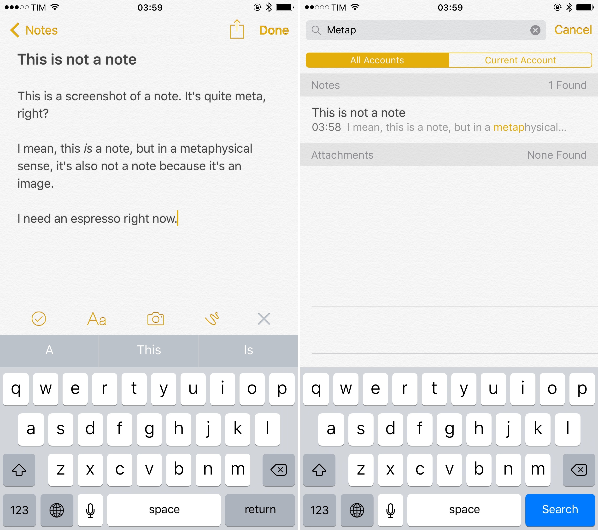
This doesn’t change the fact that folders in Notes will be too limiting for advanced users who are accustomed to deeper management in alternative note-taking apps. Most notably, Notes’ search feature (available by swiping down on a folder to reveal a search bar) can’t restrict search to a single folder, and even when looking for a string of text that belongs to a note in a folder, the app will simply match that text as part of the top-level ‘Notes’ folder.
Perhaps more perplexingly, Notes’ search always looks for every note across every folder and every account. Typing into the search bar of the general All iCloud “folder” (a filter that is created by default and that collects all notes from all folders in iCloud) has the same effect of trying to search in a folder that only contains a subset of notes.
While I understand why Apple may not want to put advanced search options in the search bar, starting a new search from inside a folder should at least attempt to limit the scope to that folder. The ability to view recent searches and limit search to the current account somewhat helps in retrieving specific notes more quickly, but the aforementioned misreporting of the source folder in search only adds insult to the injury for users who are going to keep several dozens of notes. This is only one of the many issues with Notes for users who would like to do more with the app.
In the grand scheme of things, where you can move notes is, after all, one of the less significant changes in the Notes app. Apple has put great emphasis on what you can do with Notes in iOS 9, and that’s where the update feels most impressive – in some cases, even when compared to third-party alternatives.
A note in iOS 9 can contain images, lists and checklists, sketches, link snippets, files, and more. The new Notes app wants to be more than a single-purpose container of text – it aims to become an everything bucket for the iOS user who doesn’t want to forget anything. This is accomplished with a refreshed set of controls and system integrations, with a few missteps along the way but, overall, with a new direction for the app that feels like the right move at the right time.
Formatting
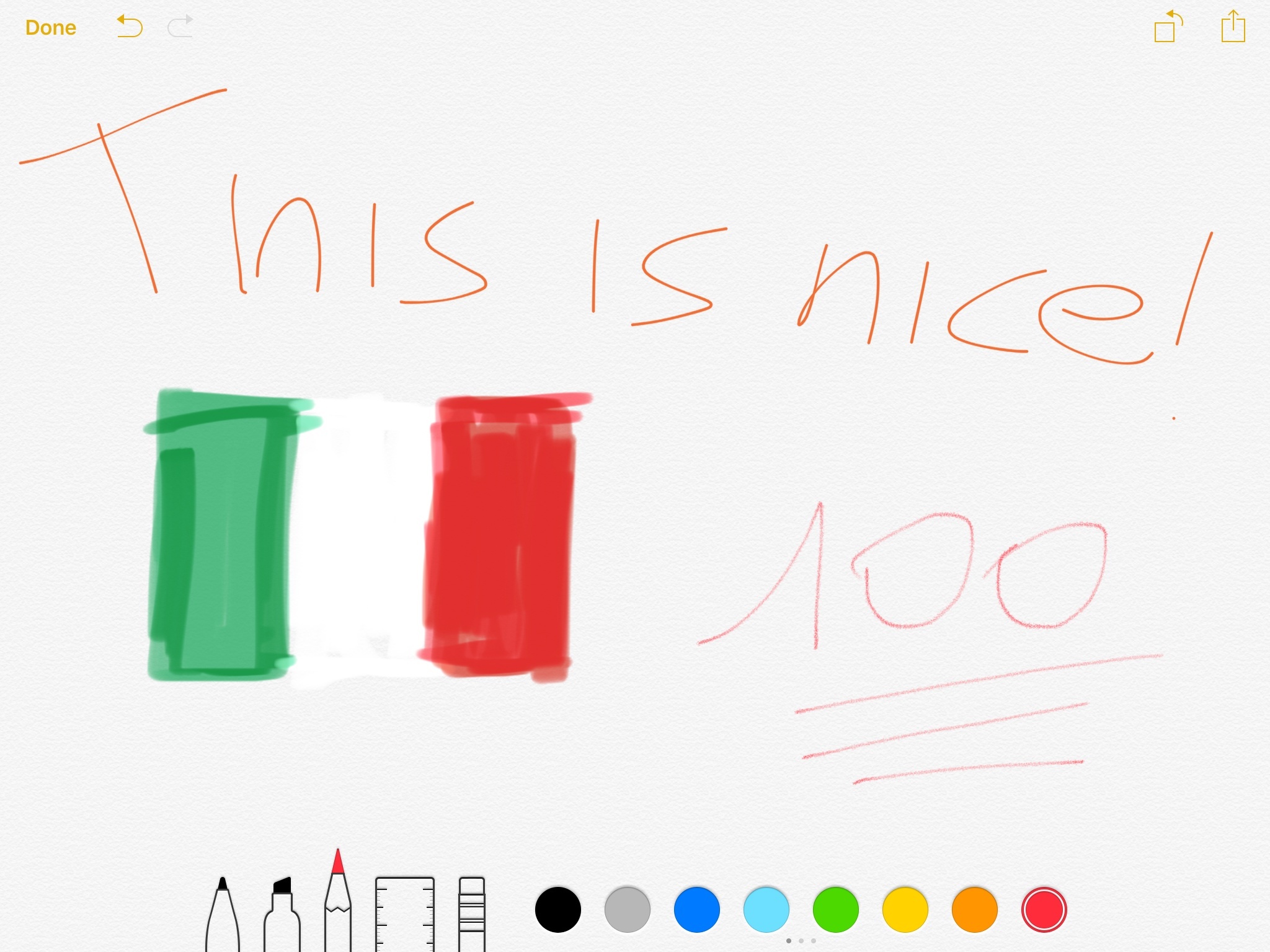
Since version 5.0, iOS has provided system-wide formatting controls for text in the copy & paste menu to make text bold, italic, or underlined in any app that supported rich text, including Mail and Notes. In iOS 9, Apple is taking a page from its iWork suite (specifically, Pages – no pun intended) to offer a brand new formatting view on the iPhone and iPad that considerably extends the text style options available in Notes.
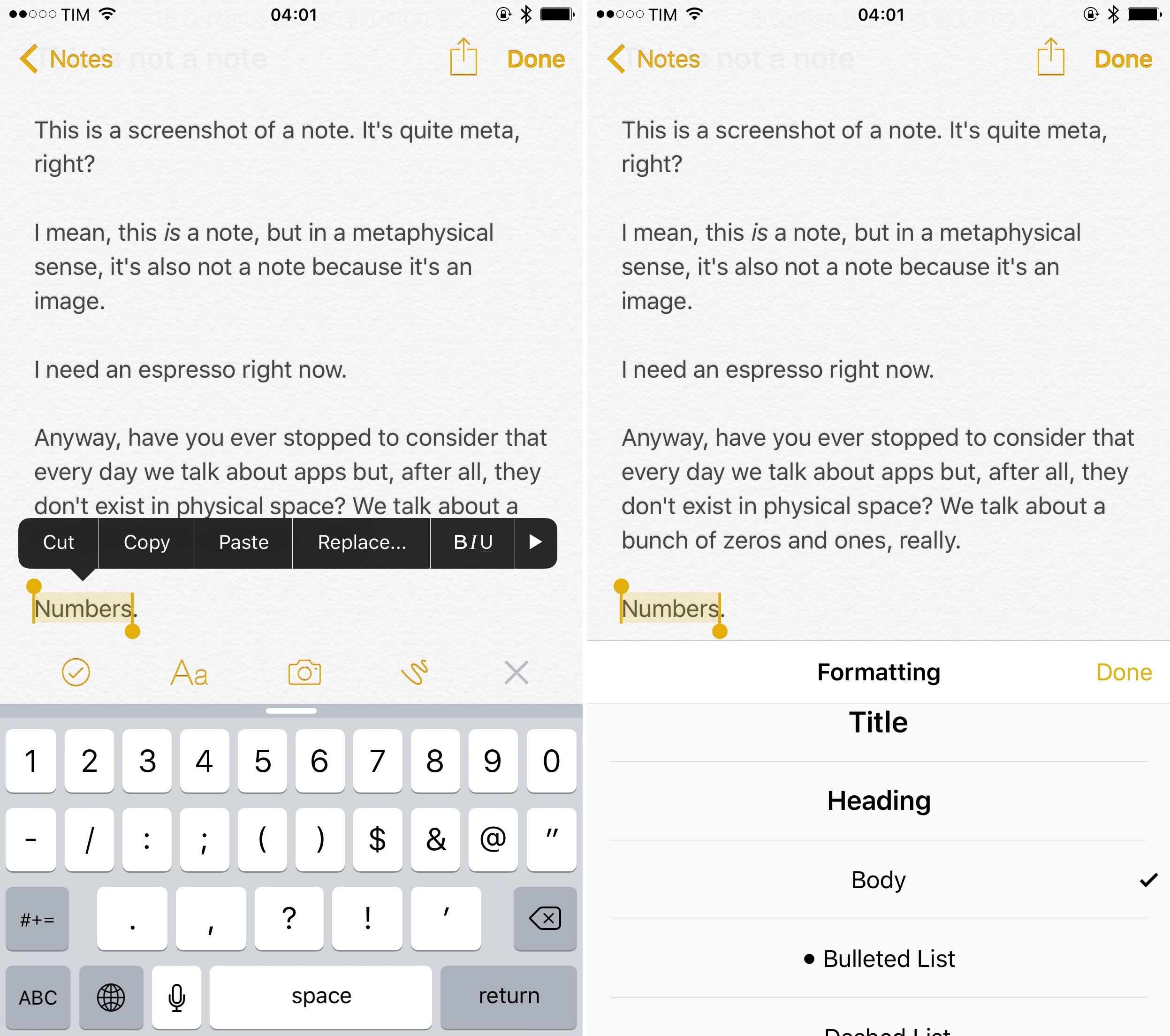
On the iPhone, new formatting controls are revealed by tapping a “+” button above the keyboard that turns into a special row with a cute animation reminiscent of Dashboard’s +/x transition of yore.14 This bar contains additional controls for checklists, photos, and sketches (more on this in a bit); on the iPad, it’s integrated as part of the new Shortcut Bar that features customizable shortcuts on both sides of the keyboard’s QuickType bar. On both devices, the Formatting view is accessed by tapping the “Aa” button next to checklists.
Formatting options in Notes include Title, Heading, Body, three types of lists (bulleted, dashed, and numbered, which can be indented), plus shortcuts for bold, italic, and underlined text. On the iPhone, these controls are displayed in the lower half of the screen like Pages, with a scrollable list of styles and visible shortcuts for bold, italic, and underlined. While it’s fairly apparent that Apple modeled this screen after Pages and the old Google Docs app, there are some key differences.
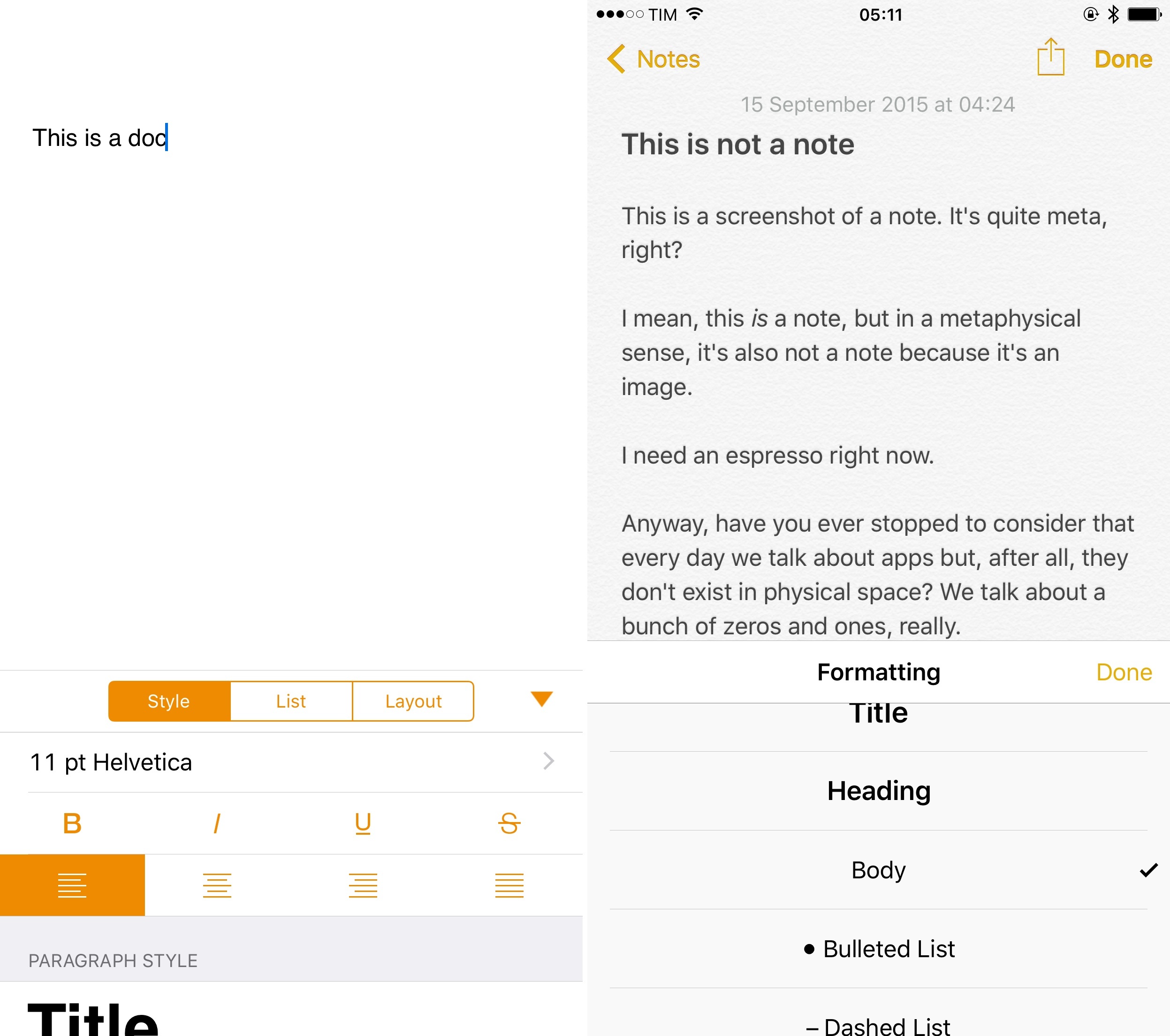
First, Notes doesn’t have the same wealth of controls available in Pages and Docs – Apple doesn’t believe users should be able to tweak the font size of body text or the line spacing in Notes, which is meant to be a one-size-fits-all note-taking app for quick interactions and no concept of custom layout whatsoever. Secondly, Apple seems to have learned from its mistakes and put the formatting button towards the bottom of the UI (just above the keyboard) instead of opting for the title bar as they did with Pages. It’s clear that Notes has been rethought for the age of big screens, while Pages shows the last vestiges of a pre-iPhone 6 era. The result is that accessing formatting controls in Notes on an iPhone 6 Plus is easier than trying to do the same in Pages.
On the iPad, formatting controls are displayed with a popover floating on top of the Shortcut Bar.
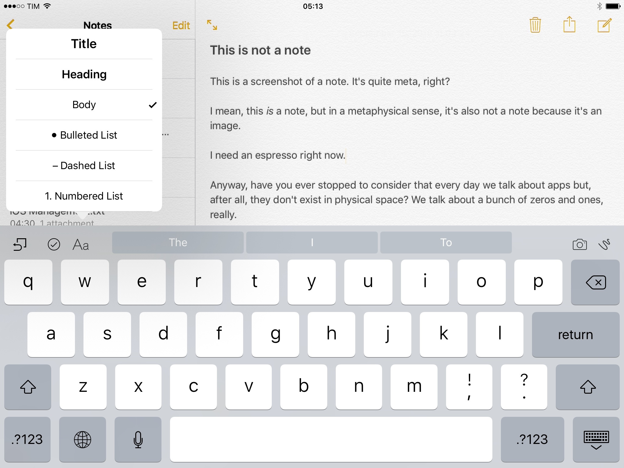
While bold, italic, and underline still require text selection to change the appearance of a text string, making some text a heading or a list can be done by tapping next to it and picking an option in the formatting list without selecting it first. In the months I’ve spent using Notes for research and personal notes, this has dramatically sped up the process of going from a list of plain text lines to a nicely formatted note with a clear structure. In the new Notes, I can start typing to get thoughts out of my head, then open formatting, tap to place the cursor next to lines I want to make different, and tap away on titles, headings, and lists to make something more relevant or structured.
Notes may not have all the formatting options of Pages, but that’s the point. By not being too complex, Notes can appeal to users who don’t want or need Pages but that would also like the ability to mark up notes easily.
Checklists
Something I’ve always noticed when taking a look at how people I know in real life use iOS is that a vast portion of them uses the Notes app as a todo system. In spite of iOS having its own Reminders app with support for alerts and geofences, a lot of people jot down things they have to do or remember in Notes. With iOS 9, Apple is catering to this use case with the ability to create checklists.
The implementation of checklists is straightforward: a new button next to formatting controls allows you to start a checklist or convert selected lines of text into one. As you’re adding items to a checklist, Notes offers automatic list continuation and it can also convert other types of lists into a checklist. You can check off items in a checklist, which gives you an indication of things that have been completed.
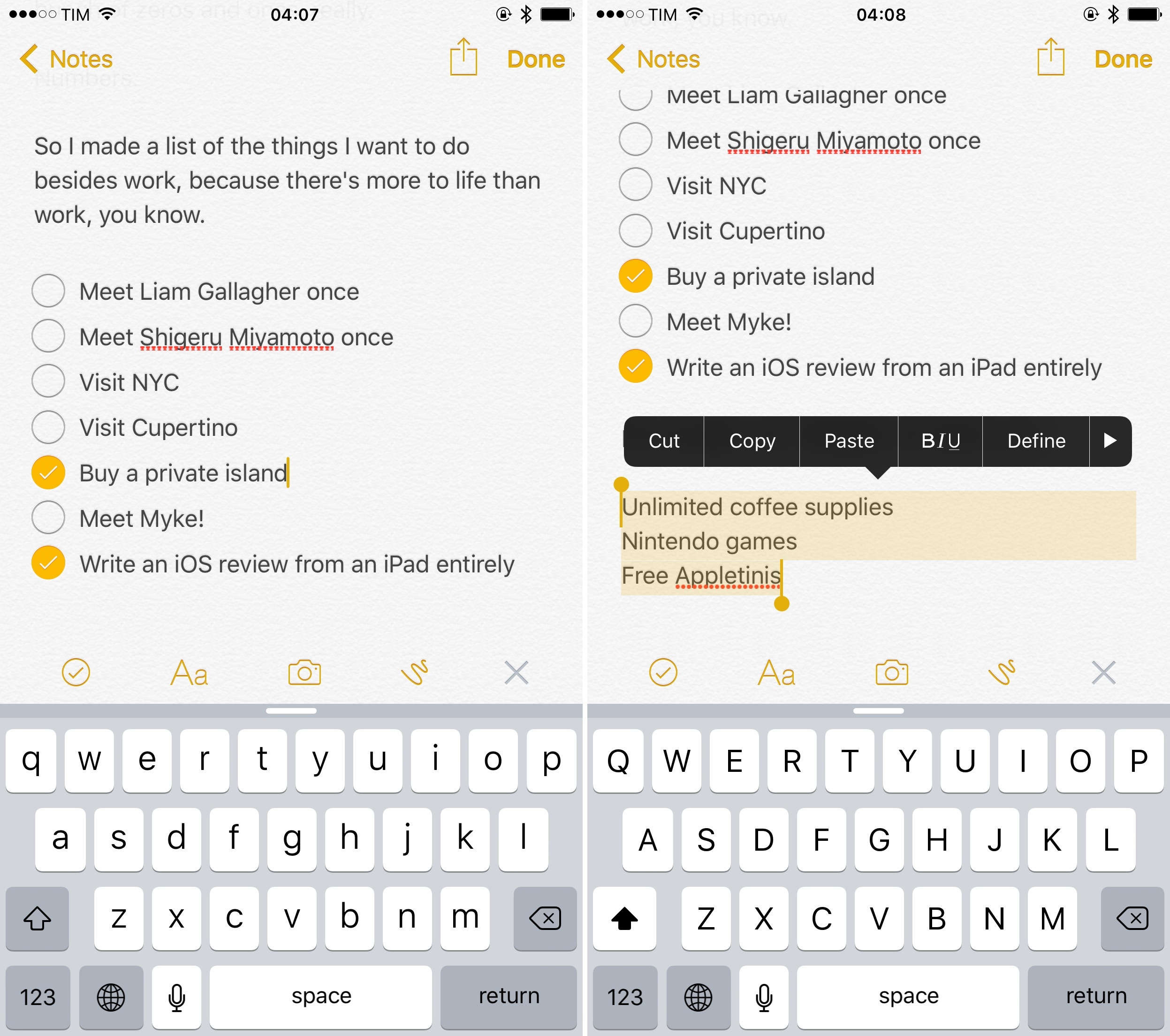
The way Notes treats checklists isn’t similar to how any todo app would work with lists and tasks. There’s no concept of dates or reminders in Notes. It’s not a smart database that remembers completed items when you convert back and forth between formats and styles. Checklists are just another formatting option in Notes with a stronger visual cue that makes text lines look like a todo list even if, after all, it’s just text with a checkbox.
The key difference to keep in mind is that Apple isn’t seeking to replace Reminders with Notes in iOS 9. Checklists in Notes can’t be given dates or any type of task-related metadata – if you want to organize your todos in proper lists with alerts and sharing settings, you’ll still need Reminders.
That is precisely why I believe checklists are such a clever, cunning idea. Apple may not be looking to replace Reminders directly, but a lot of people are going to be ecstatic about the addition of checklists in Notes. Those people already use the app to save things they need to act on, but until iOS 9 they’ve saved them as lines of text that later needed to be manually selected and deleted. This may sound absurd to tech-inclined folks (myself included) who often use multiple dedicated reminder and task management apps, but the reality is that millions of people don’t need the overhead of our systems.
I’d be willing to bet that a lot of folks don’t want or have to attach metadata like priorities, locations, dates, and notes to tasks; they just want to type them out and get to them eventually. What better system than an app where there are no strict format requirements and where a note can be an image, a list of rich text, a drawing, or an interactive checklist?
For those people, I’d argue that the richness of Notes in iOS 9 will be superior to Reminders, with checklists being the epitome of Apple adjusting to unexpected use cases and the way people use their apps. By definition, something that needs to get done should be saved in Reminders, even without a date. But if millions of customers prefer to mix and match notes with text that loosely represents a todo and if that system can scale to incorporate nicer formatting for todos alongside other media, then it’s only fair to make Notes more versatile and yet easier to use than Reminders.
Images and Sketches
Notes’ improved text abilities are complemented by a set of image and video-related features aimed at letting users capture more types of information.
Photos and videos can be interspersed between text and lists in Notes for iOS 9: at any point during editing, you can tap the camera button to choose an item from your photo library or take a new photo or video. Whatever you pick will be displayed inline between text and other media in a note, so you can tap on a video to play it back inside Notes or tap an image to view it in full-screen.
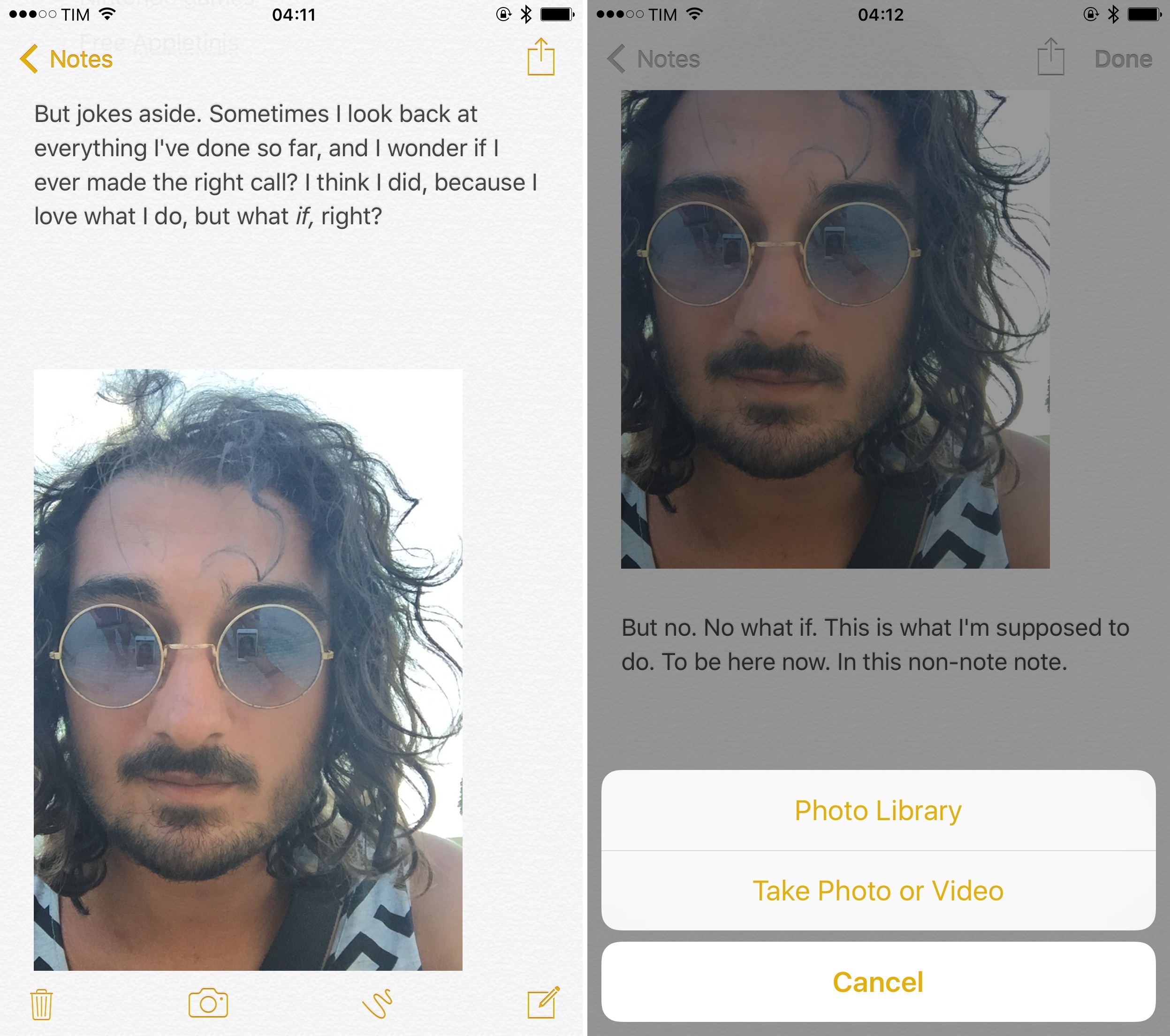
Notes is smart enough to reformat text when an image is inserted (for instance, a checklist is discontinued if you insert an image after some text) and you can also paste images copied from other apps – thus making Notes an ideal companion for Safari when you want to reference images from the web without saving them to Photos.
To keep things simple, Notes doesn’t have any sort of image resizing or text reflowing options to build more complex layouts as you can in Pages and other word processors. Again, Apple’s goal is to offer a more powerful note-taking app and not necessarily a slimmer Pages, so this makes sense to me. I didn’t miss such options in my tests, and I like that I can’t go wrong by inserting a bunch of pictures alongside text in a note.
Alas, the image picker itself leaves a lot to be desired: rather than adopting the useful picker found in Messages (which displays recent media in a swipeable tray), Notes comes with a dull menu to open a picker or take a new picture.
More interestingly, Apple has built a sketching mode into Notes, enabling users to mix text, media, and other content with interactive sketches that can be updated at any time and exported as images.
Sketching is accessed by tapping the drawing icon in the bottom toolbar, which will kick Notes into a drawing screen that offers a pen, a sharpie, a pencil, a ruler, an eraser, and a color picker. A drawing’s background defaults to the same paper texture used throughout the app, and pages can be flipped horizontally or vertically. Sketches can be shared with other apps by tapping the share icon in the top right, which will export a static image.
When playing around with sketches in Notes, you’ll likely notice two things: the limited tools available when compared to standalone apps like Paper, and the solid performance of drawing on screen in Apple’s app.
Simplicity shouldn’t come as a surprise: the entire app hinges on the idea of enriching a traditional note-taking environment with just enough more stuff, and, overall, Apple is doing a pretty good job at covering the basics. Performance, though, is a whole other topic.
In any form of interactive video output, latency is an issue to consider. Whether it’s controlling videogames with buttons or touching an iPad’s screen to tap something, the relationship between humans and software depends on latency – the delay in how long it takes for input to translate to output. And because our fingers are better input methods than we tend to believe, even the slightest amount of higher latency can lead to a disruptive user experience when the human eye is able to discern a visible delay.
Ever swiped quickly on a multitouch display and noticed virtual ink struggling to catch up with your finger sliding across the screen? That’s latency.15
Visual latency can be ascribed to various factors, but most notably in modern software, CPUs are to blame for the delay we observe between our actions and the expected result. With iOS 9, Apple has set out to drastically reduce latency to make apps more responsive, cutting down the amount of time required to compute user touches and render them on screen. This initiative – which comes with new APIs for developers – will have the biggest impact on games (which are heavily reliant on fast multitouch gestures) and drawing apps – not to mention the upcoming Pencil for iPad Pro.
One of the downsides of drawing apps on iOS (and particularly on iPad) is the noticeable delay between swiping and seeing ink come up on screen. While developers have written entire custom engines dedicated to making ink appear as naturally as possible, laws of physics and intrinsic iOS limitations have made it nearly impossible to replicate the feeling of a real pen on a multitouch display.
Apple’s goal with iOS 9 isn’t to make drawing on iOS exactly like using a physical pen, but to get very close to it.
Apple is introducing Touch Coalescing, an API that leverages the iPad Air 2’s twice-as-fast 120Hz touch scan update rate to double the number of touches registered by the OS and therefore the touch information exposed to apps. Thanks to the higher touch scan rate of the Air 2 (other iOS devices can scan for touches at 60Hz), iOS 9 can accumulate twice the number of touches per second, but also coalesce those updates without wasting computational work in an app. Coalesced touches enable a single frame on the iPad Air 2 to scan for two touches, which are available to developers on demand via an API.
But that’s not all. On top of doubling the number of touches iOS can recognize on each refresh, Apple has built a predictive touch engine that can look into the future of user touches and guess where a user’s finger may be going next. Using some highly tuned algorithms, iOS 9 can provide developers with a fresh set of predicted touches all the time, which can be used to further decrease latency as they’re added to the iOS graphics pipeline, preceding the work needed to scan for touches, animate them, and pass them to an app. Built into UIKit, predicted touches are independent from coalesced touches, but together they can be used to make latency on iOS even lower to get closer to the idea of direct manipulation and fast performance.
By Apple’s estimates, the work done on iOS 9 has allowed input recognition to go from four frames to a frame and a half. If the above paragraphs are too technical: this is a massive performance improvement for drawing apps and games on the iPad Air 2, and it bodes well for the iPad Pro and Pencil accessory.
Drawing in Notes for iOS 9 is fast, smooth, and natural. As you swipe across the screen using the pen tool or the pencil, ink renders smoothly (this is the only area where the app’s paper texture is justified) and, more importantly, animates quickly and follows the tip of your finger unlike any other drawing app. In testing Notes drawing on my iPad Air 2 and iPhone 6 Plus, I noticed no visible difference between the two, with solid performance on both devices in terms of rendering speed and animations. What Apple has done for advanced touch input in iOS 9 can be noticed when drawing in the Notes app, even if saying “it’s fast” doesn’t do justice to the fascinating complexity behind it.
As a user, it seems clear that drawing in Notes isn’t aimed at artists. Notes doesn’t want to replace Paper: rather, sketches are used as complements to text and images, useful in those occasions where the human finger can express shapes and ideas that would take too long with apps and images.
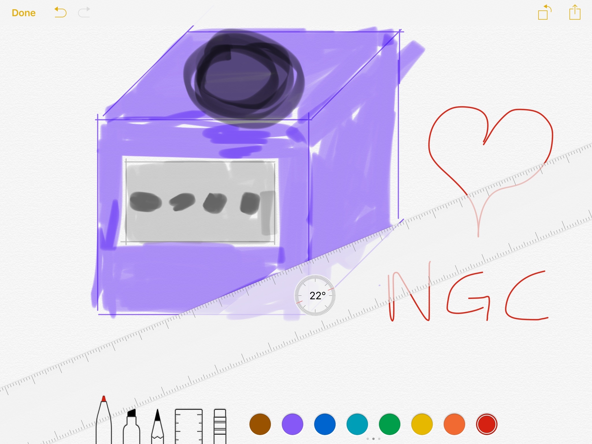
The ruler is an obvious candidate for education and for whoever is seeking to use an iPad to plan future house redecorations: once placed on the screen, the ruler can be rotated with two fingers to tilt its angle, then you can pick a tool and swipe across it to draw a straight, precise line that wouldn’t be possible without it. It’s an incredibly fun and reliable implementation and one of Apple’s finest details in iOS 9.
Sketches in Notes are a good example of why Apple likes to control the entire stack. If the company wasn’t in charge of every single aspect of its hardware and software, it wouldn’t have been able to optimize iOS to take advantage of the display of the iPad Air 2 and build a predictive touch engine aimed at reducing latency.
When you control every facet of the experience, you can focus on seemingly unimportant aspects of software such as going from four frames to one and a half for input recognition, even if most users only want to produce crummy drawings in Notes. And that’s okay, because knowing how that works and why it performs so well is part of the fun in these articles, and I’m excited to see what developers do with it.
Share Extension and Links
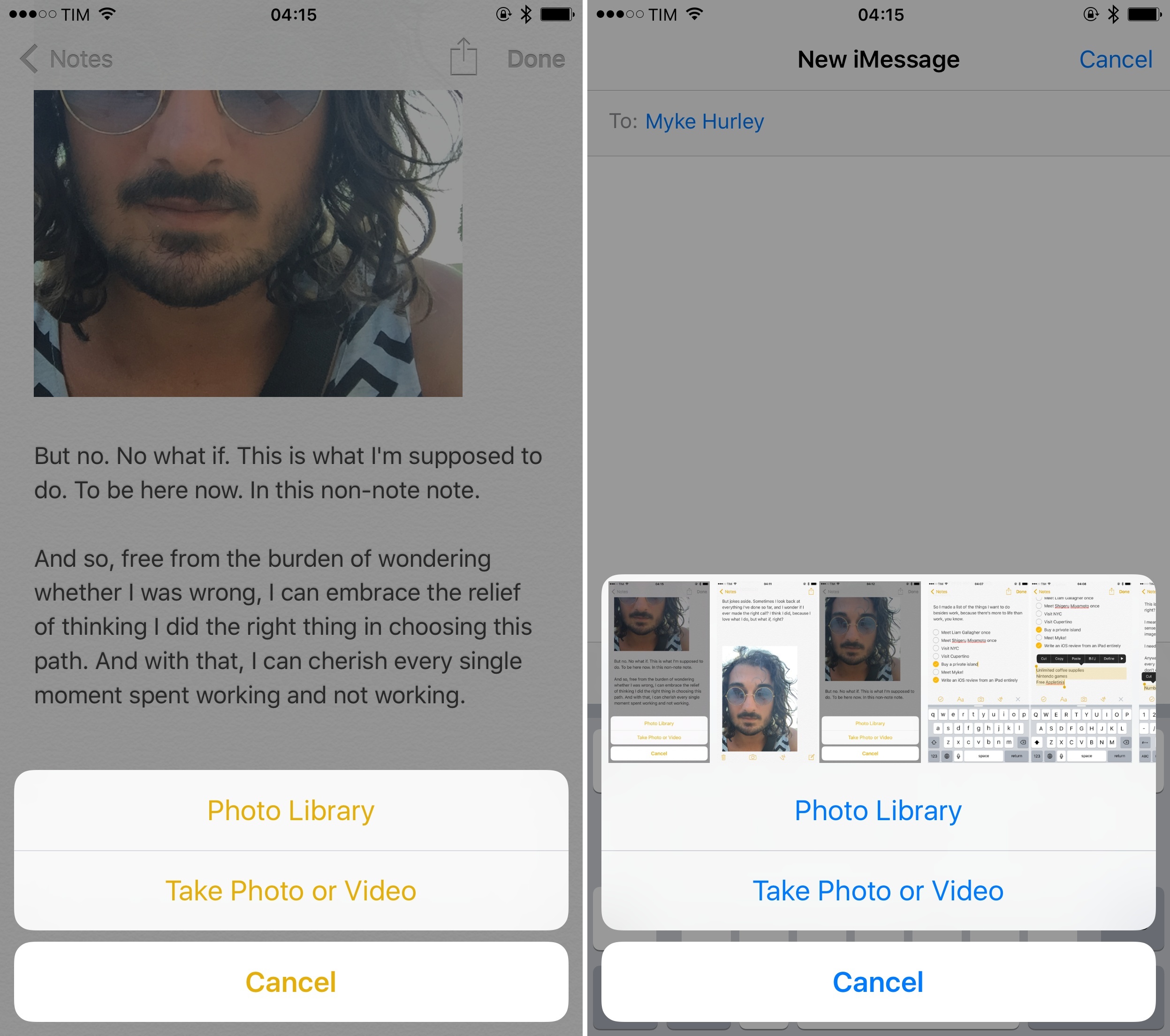
Apple’s willingness to turn Notes into iOS’ everything bucket is perhaps best exemplified by its new share extension. From anywhere on iOS, you can now capture text, links, and files and save them into a new note or, even better, append them to an existing note. This is, alongside iPad multitasking, one of my favorite features of iOS 9 and it has allowed me to drop several workflows I built for iOS 8.
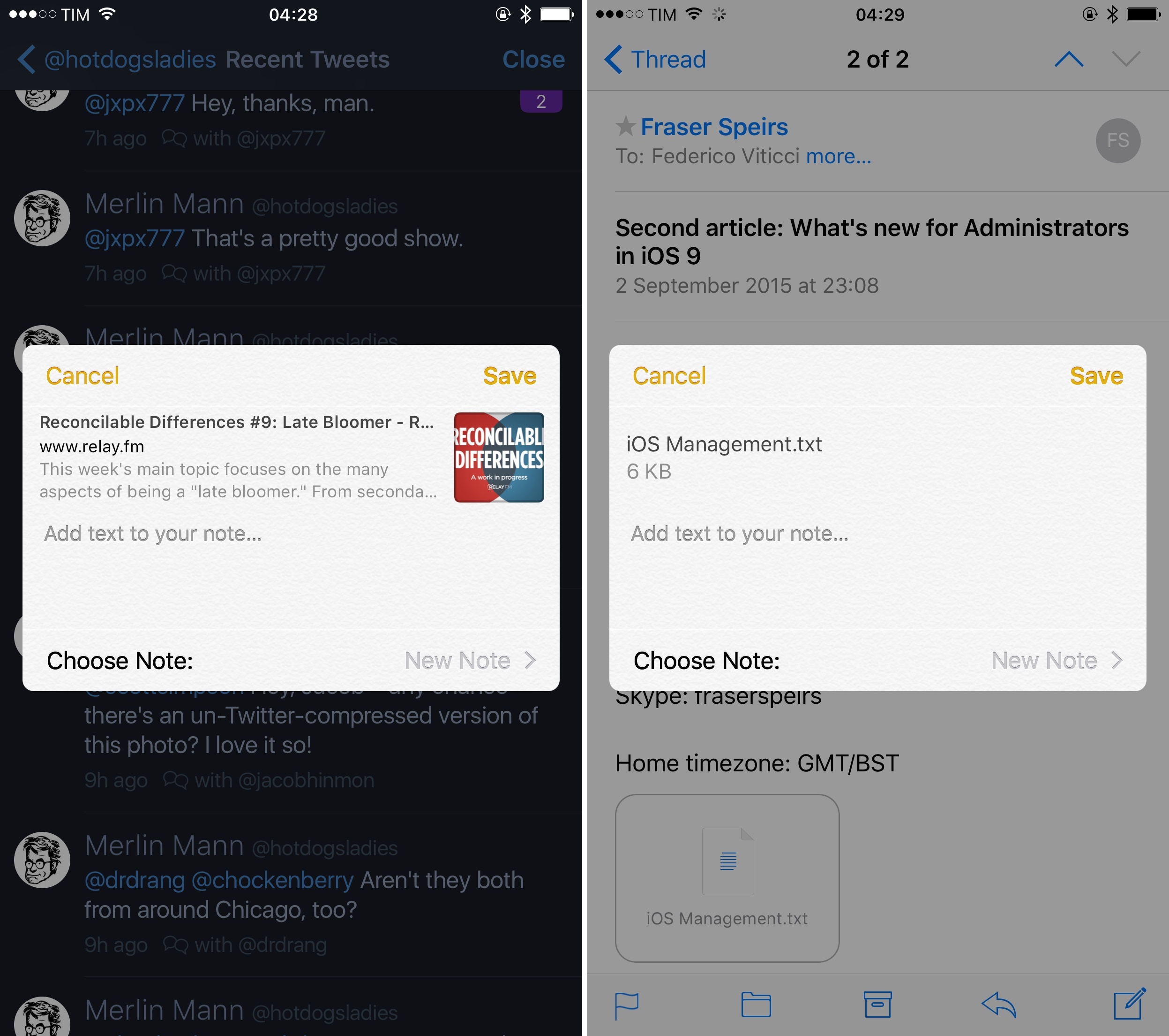
iOS 9’s Notes extension lives in the share sheet, and it’s a share extension that lets you capture anything you come across that can be shared by an app. The extension is a floating popup that carries the same paper texture of the Notes app, with the same yellow UI accents and letterpress effect on text. The Notes extension defaults to saving shared items in a new note, but you can tap the “Choose Note” button at the bottom to pick an existing note where you’d like to save something into. The extension will also remember the last note you saved an item into if you bring it up after a few seconds.
If you’ve used extensions such as Evernote’s or 2Do’s since their debut last year, you’ll be familiar with the thinking behind the Notes extension. Any text, URL, or file you can share on iOS through the native share sheet can be passed to the Notes extension, which will preview it inline whenever possible. If you’re sending text to the extension, it will prefill the Notes sheet; an image will get a thumbnail preview on the right; a web link will get a nice snippet preview with a title and the first image found on the webpage.
There are two ways the Notes extension will attempt to save content in a note. For data that can be rendered inline such as videos, images, and text, the extension will either show an editable text field (text can always be edited manually upon saving through the extension) or a thumbnail preview. You can try this out by saving a photo or a video from Photos, or some text selected from Mail via the new Share button in the copy & paste menu: both media and text will be tappable or editable in a note – as if you created them from Notes in the first place.
Alternatively, Notes will save links or files it can’t render inline as small units of content that appear as standalone, tappable items in between body text. In some cases, tapping these note attachments will show a Quick Look preview, or it’ll open Safari, or – and this is where the extension and the app get more creative – it’ll adjust the UI to preview the attached content with native media controls.
Links
Let’s start with web links. For me, saving links from apps like Twitter clients or news readers accounts to one of the activities I perform the most on a daily basis on my devices. I save links because I want to cover them on MacStories, or because I need to share them with someone, or perhaps they’re reference material I’ll have to find again in the future. The apps I use to manage this daily avalanche of links tend to treat them for what they are: hyperlinks that open Safari. This is the case for apps like 2Do, Messages, Mail, NewsBlur, and countless others. The richness of the web doesn’t apply to its resource locator, which is just a link.
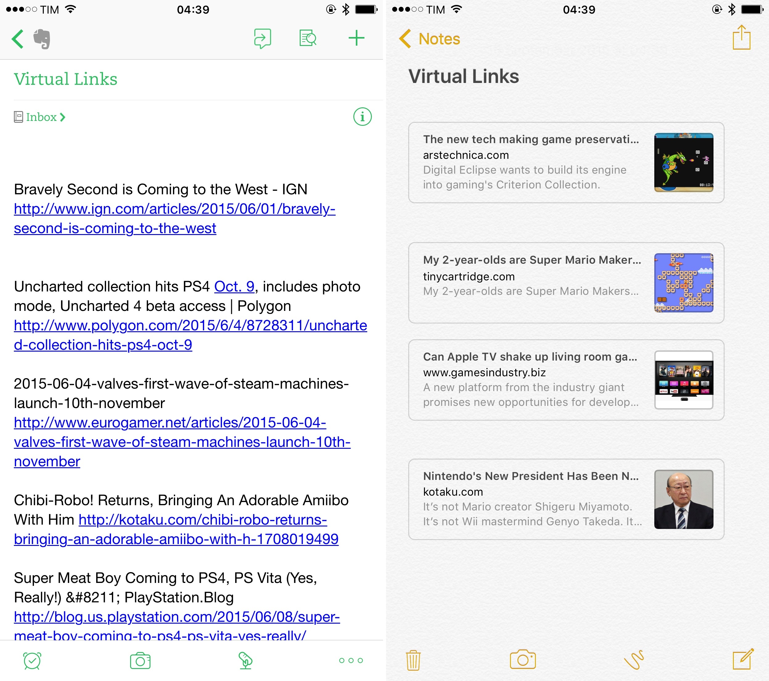
Notes’ extension doesn’t work like that. In the new app, Apple has devised a way to offer a basic preview of the information available at the source URL with rich link snippets that display the associated webpage’s title, description, and lead image. Web link previews in Notes are further proof of Apple’s commitment to web metadata technologies such as Open Graph16, and they provide a fantastic way to give meaning to a URL.
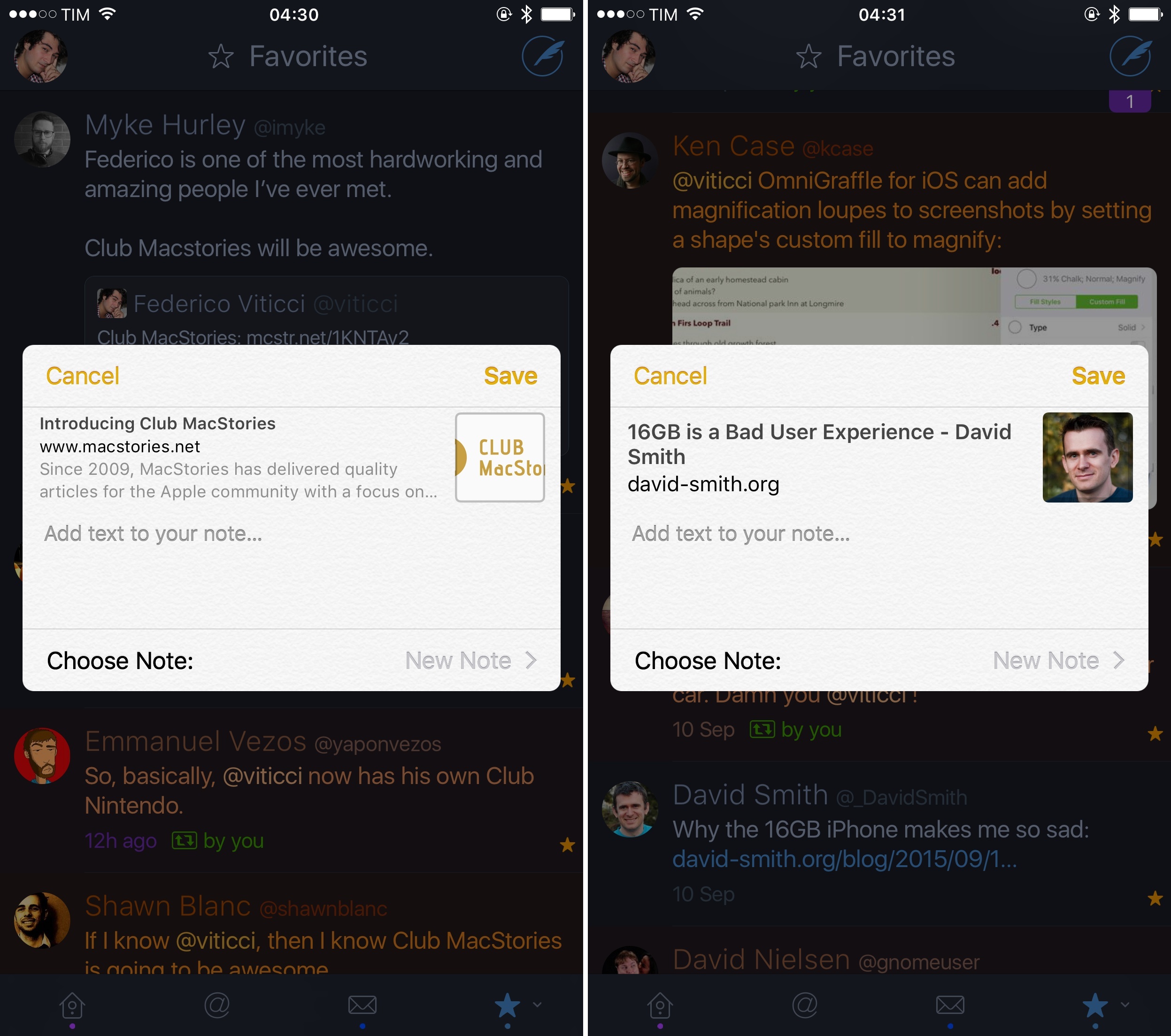
When saving a link with the Notes extension from any iOS app capable of sharing URLs (it doesn’t have to be Safari), the extension will fetch the link’s metadata and display them in the compose sheet. This is a good way to preview URLs without opening a web view: if you’re in, say, a Twitter client and want to know what a link is about without giving the website a page view, you can send the link to the Notes extension and it’ll fetch the webpage’s title and description for you.17
The extension’s parser is capable of following multiple domain redirects, too: if you give the extension a shortened URL, it won’t try to resolve it to its source domain, but it’ll still follow all redirects until it can preview the final webpage’s information. In my tests, the extension took less than a second to present a link snippet for unfurled links, but it could take a couple of seconds for shortened links with multiple redirects (such as Bitly or Buffer links).
As far as I know, no other note-taking app on iOS offers a smart web capture feature that can parse a link’s metadata to give more context to a link. Apple’s implementation could have used an indicator to show when Notes is trying to parse a link’s title and thumbnail preview18, but, overall, it’s an invisible, it-just-works kind of feature that performs admirably.
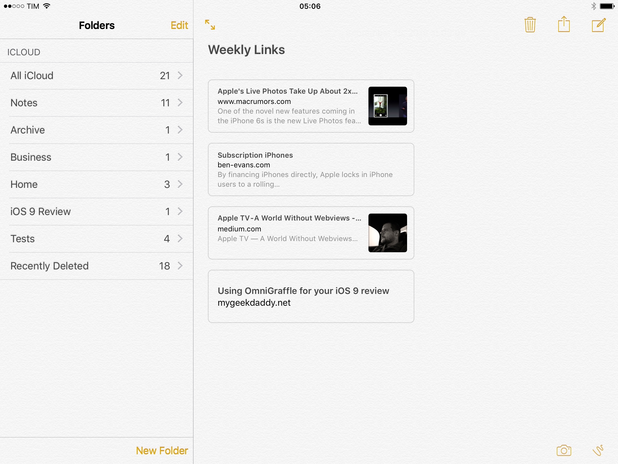
I’m in love with the way the Notes extension saves links. As a writer on the web, the link is my currency, but sometimes its value can’t be easily assessed because URLs are fundamentally meaningless. With the Notes extension, I can assemble a note with a bunch of links and be presented with a series of small previews that have titles, two-line descriptions, and image thumbnails. And because the Notes extension can create new notes or append content to the bottom of an existing note, I can keep my lists of links as separate notes where web previews are saved in chronological order, without formatting issues, without having to create complex workflows to manage it all.
This seemingly minor addition fixes a serious annoyance of mine. Every week, I collect links in separate lists for this site, our MacStories Weekly newsletter for Club MacStories members, Connected, and Virtual. Until a few months ago, I used to go through each list to evaluate the importance of each link, which usually meant reopening it in Safari to recall what it was about. This was a time-consuming process, especially because apps like Evernote would sometimes fail at opening a link in Safari when tapping it.
With Notes, I now keep lists of links in the main Notes folder and going through the list simply involves taking a look at a link preview, then long-tapping to delete or copy. Thanks to the built-in link previews, my workflow has been reduced to a nimble visual reassessment and a tap & hold, which is better than what I used to do to process links.
I didn’t think having a preview of a link’s title and a thumbnail would do much, but, in practice, the way Notes presents links saved from the extension is a superior solution to other note-taking apps for iOS in every way. I’ve been spoiled by web link previews in Notes, and now I want them everywhere.
And that’s exactly the problem: this new behavior is exclusive to Notes, and specifically to the Notes extension. If you copy a link from, say, Messages (which, like other Apple apps, still doesn’t display the system share sheet for tap & hold) and paste it into a note, it won’t be expanded to become a rich snippet – it’ll be an old fashioned tappable URL. Similarly, while Apple has built a way to better preview URLs by attaching visual metadata to them, this system isn’t used across other Apple apps on iOS 9, which are still limited to displaying links as URLs with no extra information.
As services such as Twitter, Slack, and Facebook have shown, there’s value in presenting URLs as cards of content that push information from the web to the user. Apple is thinking along these lines with rich snippets in Notes and Spotlight for iOS 9, but while the results are commendable, such effort isn’t consistent throughout the OS. I’m hoping iOS 10 will offer new APIs to present URLs as rich snippets like Notes does today.
Files
The other benefit of a smarter, more versatile Notes app is a wider array of options for saving attachments into it. Images and videos aside, the Notes extension is capable of accepting any file that can be shared via the share sheet on iOS 9, making it an intriguing solution for folks who have relied on database-style apps such as OneNote and Evernote for similar workflows. I have some reservations on Notes’ attachment handling, which ranges from “very good” to “mysteriously half-baked”.
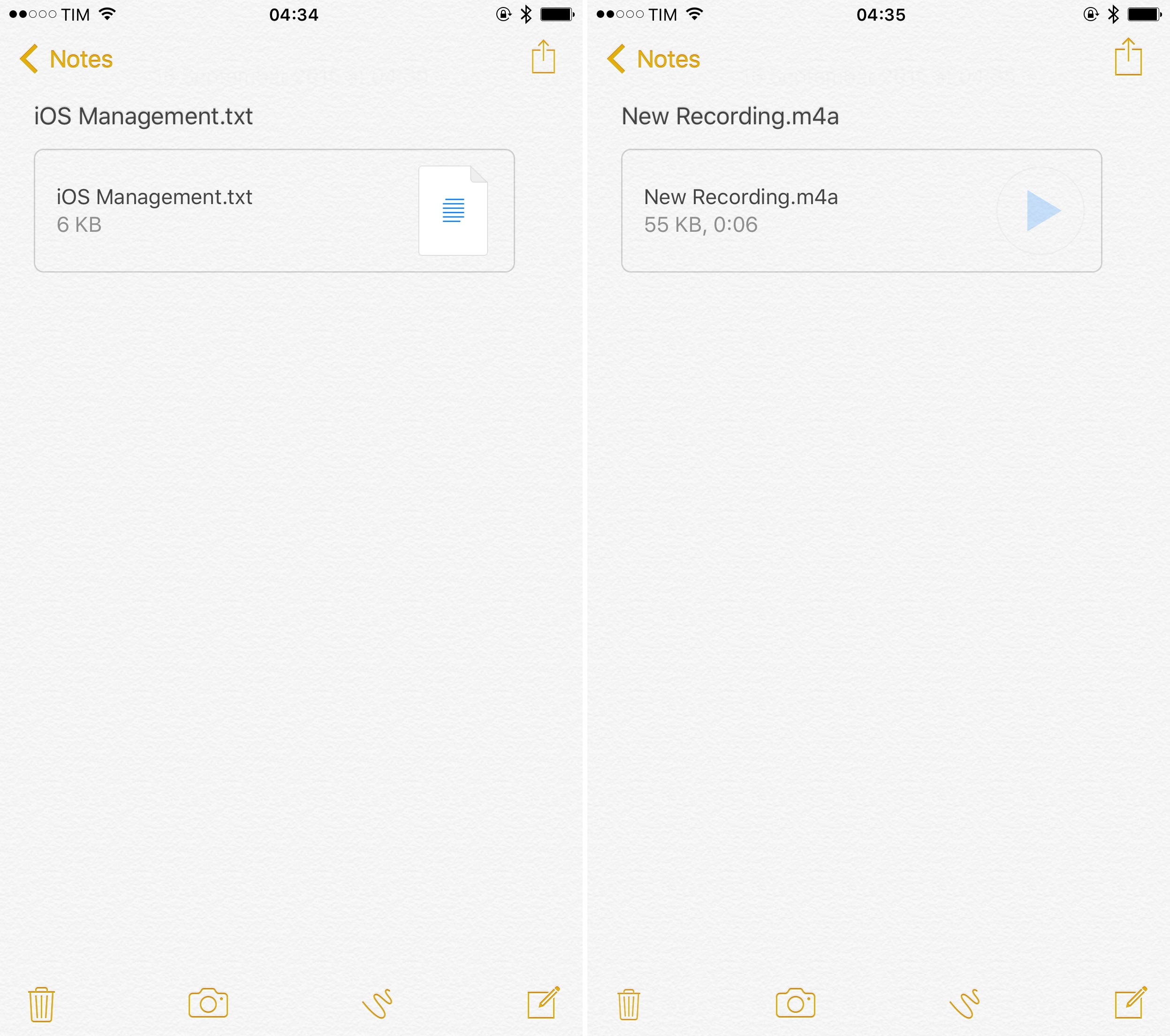
In theory, you should be able to send any file to the Notes extension and choose whether you want to create a new note for it or append it to an existing one – all while retaining the ability to add a text comment from the share sheet. Files saved to Notes via the share extension will appear as links: units displayed inline within a note, with filename, size, and a thumbnail preview whenever possible. In spite of Notes’ rich engine, some file types will be rendered as Quick Look attachments that need to be previewed in a separate modal window. A .txt file won’t be attached with text, but you’ll get a .txt icon you have to tap to view plain text in Quick Look; PDFs will be previewed in the body of a note, but you’ll have to tap them to swipe through pages.
What’s even stranger is the inconsistency of the attachment/preview system and fantastic little touches pitted against glaring omissions. You can search for text contained in PDFs saved in Notes, but you can’t use Markup from Quick Look previews. iOS has an underlying engine to render rich text consistently between apps, but selecting some formatted text in Mail to share it with the Notes extension will strip all formatting and save it as plain text in the app.
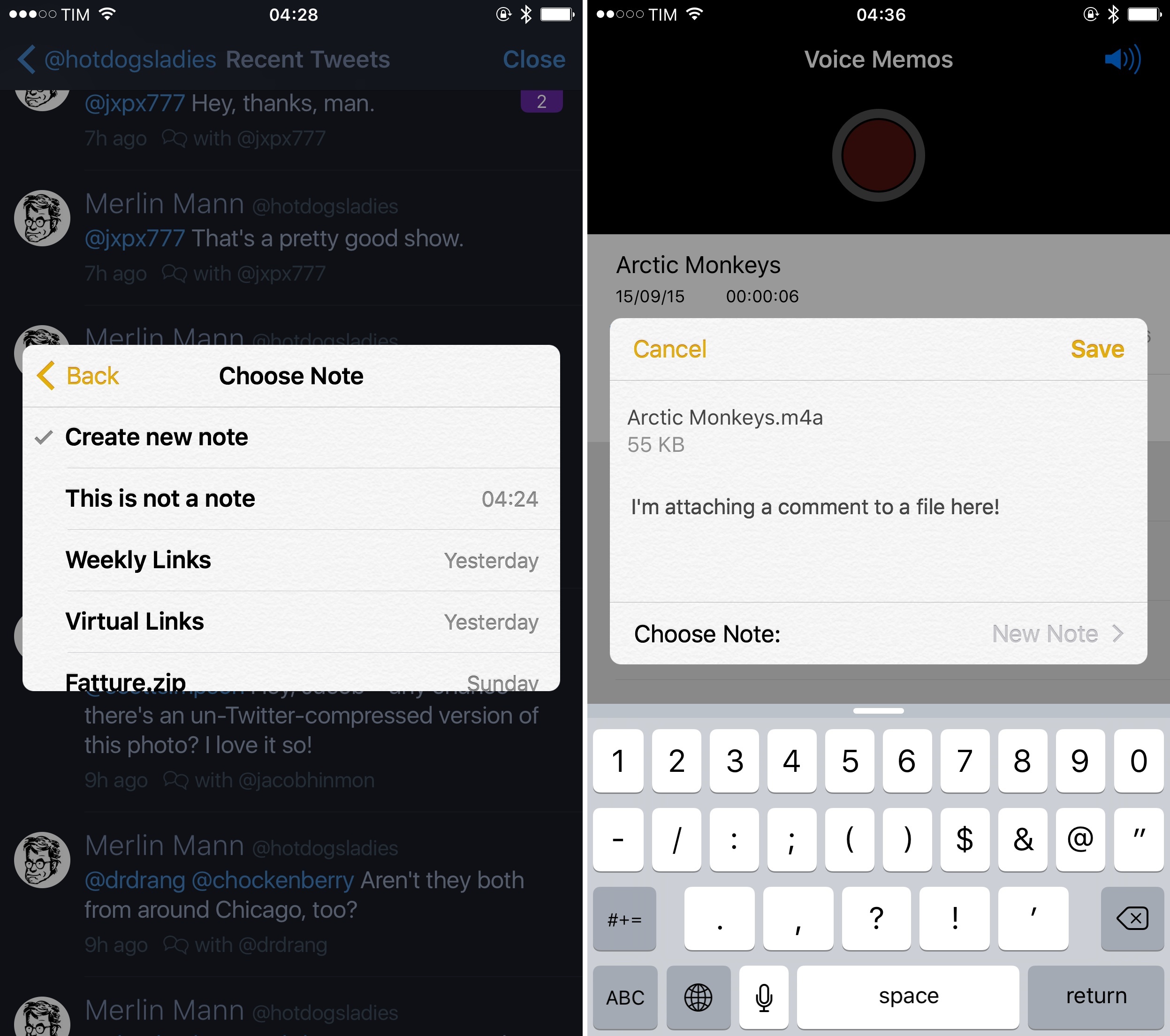
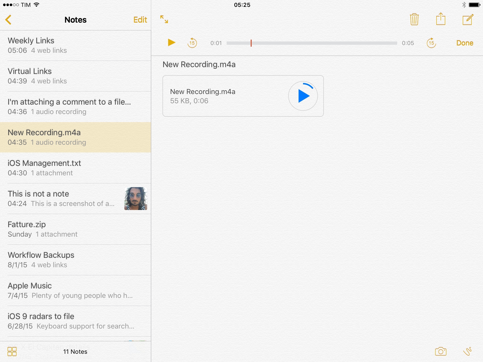
Then, you come across voice memos, which can be saved into Notes as attachments and that have a Play button that transforms the app’s title bar in a media player with playback controls.
I understand why Apple may want to rely on extensions to extend Notes beyond its advertised capabilities. In avoiding buttons to attach voice recordings, documents, and other files from apps, Apple isn’t only ensuring the Notes UI isn’t too cluttered (unlike Evernote) – they’re also reducing the potential cognitive load of having to know what all those buttons do.
This argument doesn’t preclude Apple from having some basic consistency for Quick Look previews in Notes or properly teaching users that they can save a variety of file types into the app. How should a college student know that a voice memo can be saved (and played back) inside Notes? Why do PDFs come with different preview features in Mail and Notes?
Apple has done good work with the Notes extension in iOS 9. It’s been a fantastic addition to my workflow for saving links and appending content to existing notes. But if Apple truly wants to make Notes a versatile repository for all kinds of user content without an overbearing UI, the extension and Quick Look frameworks need to be reworked to always maintain formatting and have better previews for files inside Notes. Today, you can save files to Notes, but its previews are lacking in several ways.
Attachments Browser
With Notes taking on new attachment-handling duties, Apple has chosen to give the app an additional view to browse all attachments saved across all folders. Accessed by tapping the grid icon in the bottom left corner of the notes sidebar, the Attachments Browser lets you view a cluster of photos and videos, sketches, websites, audio clips, and documents in a single screen.
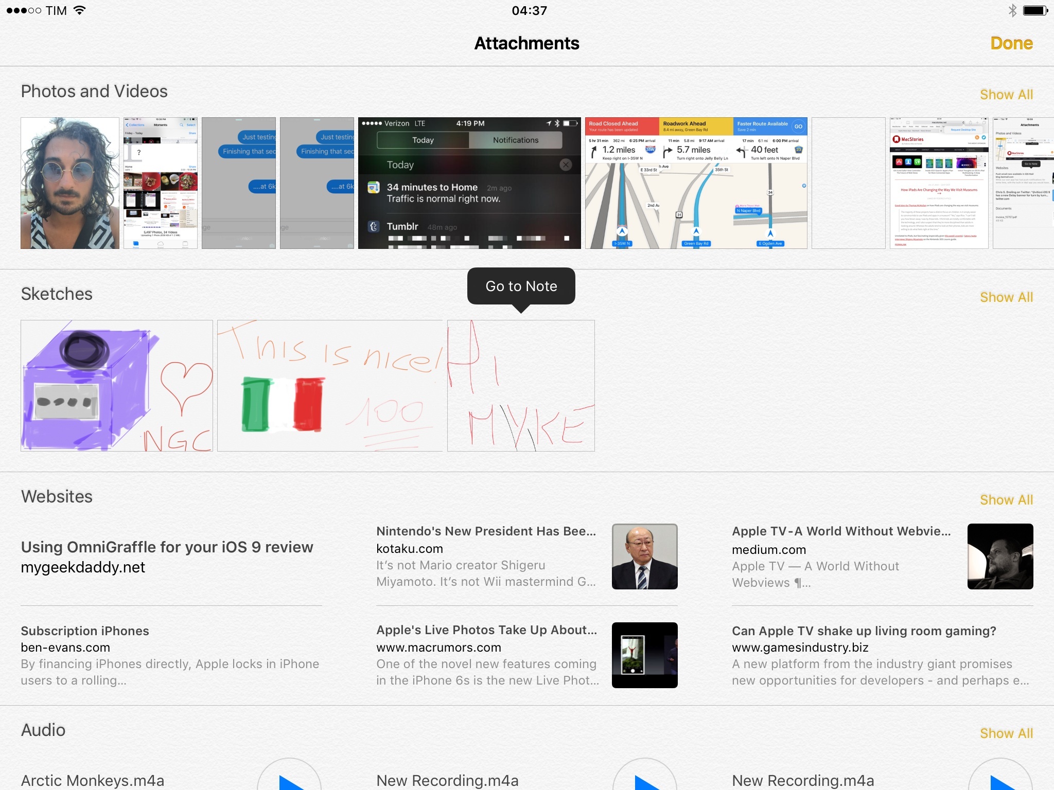
You can tap each item to preview it and go to its associated note, or you can tap & hold it to go to the note directly. The main screen displays the most recent attachments for each category, with a ‘See All’ button on the right to view the full grid in a separate view.
I have mixed feelings about the Attachments Browser. On one hand, it’s the perfect showcase for Notes’ attachment abilities as it can cull non-text items from all notes and present them in a view that brings them front and center. On the other hand, that’s also its biggest downside: you can’t view attachments per folder – you can only view all attachments from all notes. If you’re the kind of user who adds a lot of images to notes and would like a way to filter them by folder, you won’t be able to do that in this version of Notes.
The Attachments Browser also shares the same limitations of the extension when it comes to file types it doesn’t understand: .zip archives saved from other apps will be categorized under ‘Documents’, for instance. On the other hand, audio clips are playable from the main view of the browser by tapping a large Play button (cool) and links can be opened in Safari with a single tap.
In spite of its shortcomings, the Attachments Browser is a clever addition to Notes. While the entire app relies on blurring the difference between text and non-text content for a seamless experience, the Attachments Browser allows you to filter out everything that isn’t text and that you can interact with.
Notes as Rich Documents
The few issues I have with Notes’ search and the extension don’t change my overall take on this update. With iOS 9, Notes isn’t just a powerful alternative to third-party note-taking apps – it joins Safari on the podium of Apple’s best work on iOS, period.
I’ve been an Evernote user for years. I’ve often talked about the service’s adaptability to rich text and file attachments. I’ve relied on integrations with external apps through the Evernote API. I’ve shared notes and entire notebooks with others. Notes doesn’t have any of this. There’s no API for third-party apps and services to plug into; no sharing of notes and folders, not even with family members; no sorting options, no tags, no subfolders. From a power user’s perspective, Notes is the wrong choice. So why all this enthusiasm?
At some point, consistency and reliability trump automation and feature richness. Should I use something that offers the potential benefit of dozens of features, or am I better served by an app that covers the basics elegantly, works expectedly, but that has very clear limitations for automation and advanced use cases? Do I like the thought of power user features in my notes more than their actual practicality?
After years of Evernote changes, feature additions, and Work Chat prompts, the simplicity of Notes is refreshing. It doesn’t cover many aspects of what Evernote is capable of, and many will be perfectly happy to stick with Evernote because they truly need all of its features.
But I don’t. In using Notes for iOS 9, I realized that I’m okay with the ability to intermix rich text and images, file attachments and sketches, all while taking advantage of one of the best share extensions on iOS, Siri integration, Spotlight search, and multitasking on iPad. All the workflows I created to append links to a note pale in comparison to the effectiveness of Notes’ extension and link previews. Evernote’s sync can’t be as fast or frequent as Notes’ iCloud backend. The bloat that Evernote accumulated through the years has been replaced by a basic yet powerful note-taking app that does everything I need, and I feel relieved knowing I no longer have to fight Evernote’s tendency for more. This is all there is, and it’s okay.
That’s not to say Notes can’t get better. Besides the aforementioned problems with search, the extension, and file attachments, I miss a way to pin specific notes at the top of my list, or to sort them alphabetically when I want to. Siri can’t delete notes, which I don’t understand. The entire app is still stuck on a paper texture and letterpress text that makes sense for sketches, but that, like Reminders, no longer has a reason to exist on iOS and that makes text harder to read sometimes.
It’s been three months since I started using Notes on iOS 9, and I can’t imagine going back to any other app for my needs, which involve rich text, images, links, and documents. As users increasingly rely on iPhones and iPads as their primary (and often only) computers, the decision to turn Notes into a central location for all kinds of content was a good one. Notes on iOS 9 is an extremely intelligent, focused, and useful update.
- Previously only available on a Mac. ↩
- Longtime Mac users will remember this as one of Apple's finest touches on OS X, often brought up as an example of the company's attention to detail. ↩
- In overly simplistic terms and broad strokes. ↩
- Apple relies on Open Graph for its web crawler and search, and it's my assumption that Notes parses similar meta tags (including, possibly, Twitter Cards) to build its web link previews. ↩
- This has been very useful to avoid rickrolls and other silly links on Twitter. ↩
- At least a network spinner up in the status bar! ↩