The State of Share Sheets
Last year’s most notable addition to iOS – action and share extensions – came from an unsuspected place: the share sheet Apple had long used to let users share photos and text with preinstalled actions.
It wasn’t an optimal solution, though: the one-size-fits-all approach of the share sheet meant developers had to cope with issues related to how different inputs were passed to extensions; the share sheet’s design caused discoverability concerns as many users couldn’t understand how to enable extensions. Apple built a framework for action and share extensions, tied it to the share sheet, and left developers and users to deal with figuring out how it worked.
iOS 9 only partially addresses these issues. For developers, iOS 9 has a new dictionary API that lets extensions show up even if they only accept one of multiple input representations shared by an app. This is aimed to fix the paradox of developers who, to be good platform citizens, made their apps share data in multiple formats and ended up punishing users because iOS 8 extensions had to support every single input format to appear in the share sheet.
Imagine an app that can share text in multiple formats such as TXT, PDF, and HTML. In iOS 8, an extension needed to support all formats to be an option in the share sheet triggered in the host app; in iOS 9, the new dictionary API enables extensions to be available in the share sheet even if they only support one of multiple representations shared by the host app.
If adopted by developers (the feature is opt-in), iOS 9 extensions should be available in more places. For users, this could mean fewer mysterious disappearances of icons from the share sheet depending on the app they use. Alas, I wasn’t able to test this during the summer as I couldn’t get my hands on enough betas of apps with support for the new extension dictionary API.
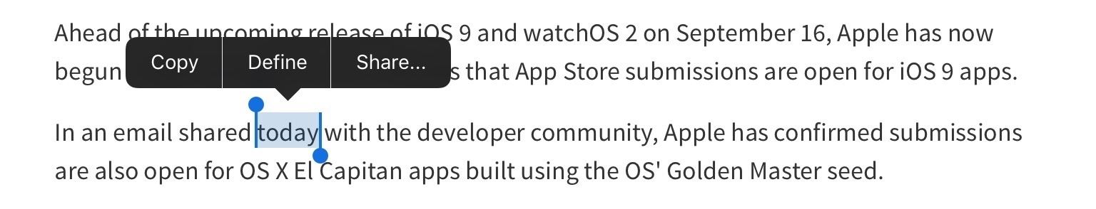
Another share sheet-related change in iOS 9 is the ability to open it from a new “Share” option of the copy & paste menu. This way, apps that chose to avoid share sheet integration in iOS 8 (such as Apple’s own Mail and Reminders) will feature extension support in iOS 9 as long as they allow users to select text. It also makes it more obvious that it’s possible to share selected text through extensions instead of having to reach for a separate share icon.
This is a welcome tweak, with some reservations. The new menu-triggered share sheet doesn’t expose all the information that is available from the regular share sheet. For instance, if you select some text on a webpage in Safari and hit the share icon in the top toolbar, extensions will be able to see a variety of data about text selected on the webpage, the URL, HTML code, and more.
If you select text in a webpage and share with the new menu button, only selected text will be passed to extensions as plain text, with no additional webpage information embedded in it. The same happens for any app that works with formatted text: you can try this yourself by sharing some rich text from an email message to the Mail extension itself (Mail inside Mail is now possible, too).
Apple isn’t backing away from the share sheet, nor are they making considerable changes to the way extensions can be discovered, managed, and activated. Developers still have no way to programmatically trigger specific extensions or take users directly to the share sheet’s configuration screen; users need to manually open the share sheet’s setting view to toggle action and share extensions on and off.
Extensions remain one of the most powerful technologies of iOS. But as I’ve argued before, they’ll have to break out of the share sheet sooner or later to embrace a wider audience. I was hoping iOS 9 would mark the framework’s maturity with the ability to customize how extensions are activated while keeping everything safe and consistent, but I’ll have to postpone my hopes until next year.
The State of Reminders
Apple’s Reminders app hasn’t witnessed a meaningful alteration in iOS 9, carrying over the same design introduced with iOS 7 in 2013 (paper texture included) and keeping a structure based on lists. What Reminders does gain in iOS 9, though, is a new way to capture any kind of information from apps through a universal interaction layer – Siri.
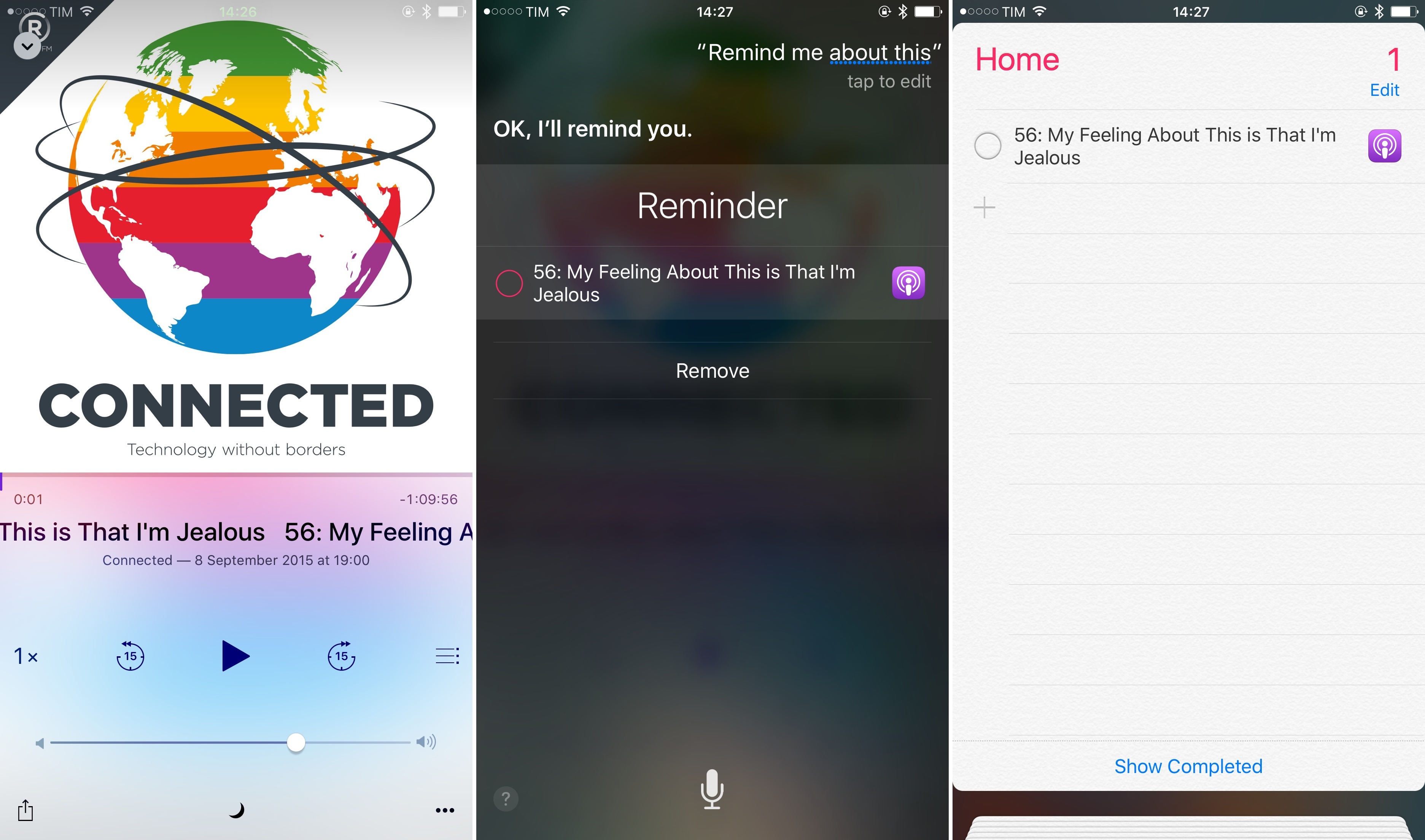
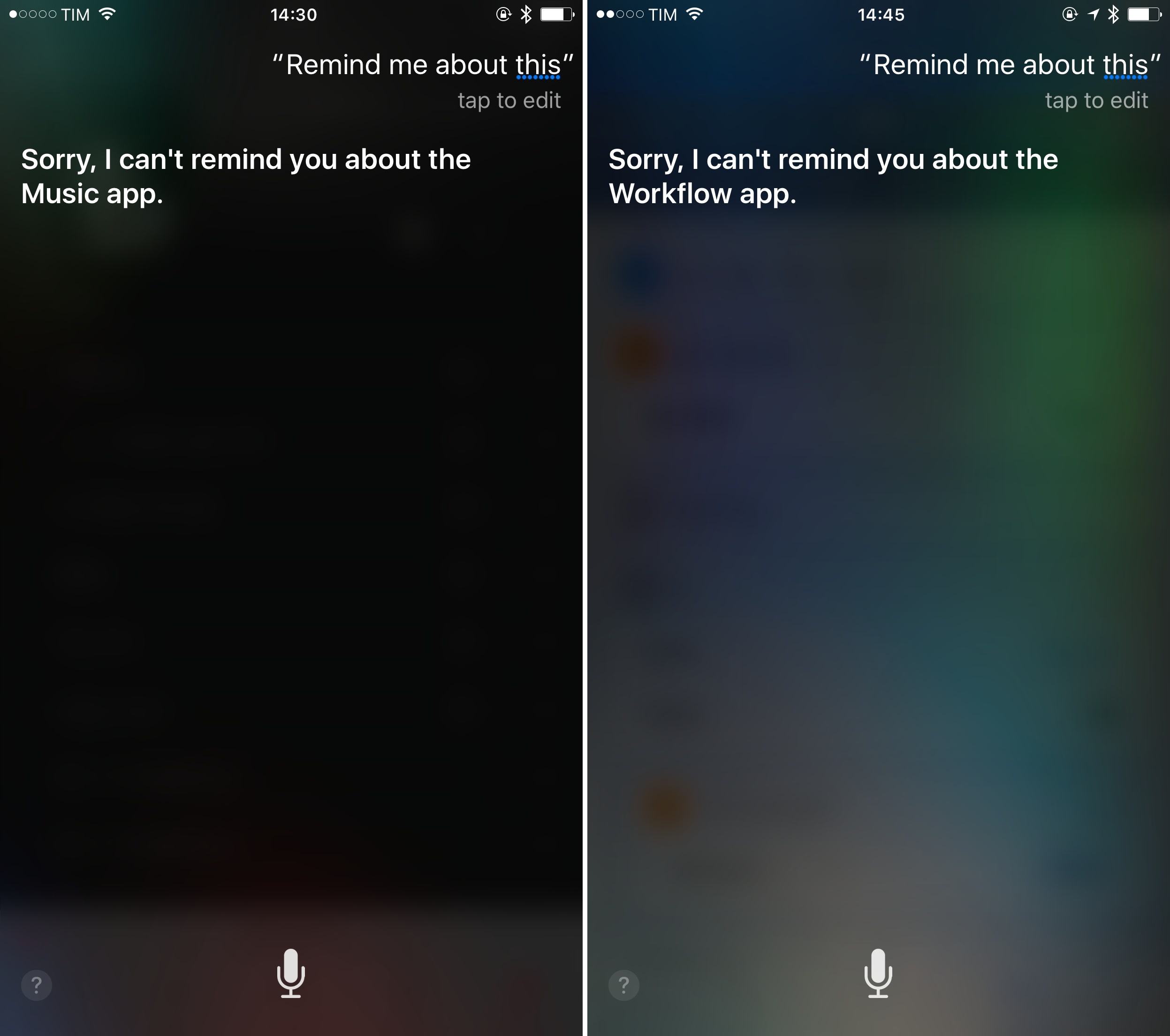
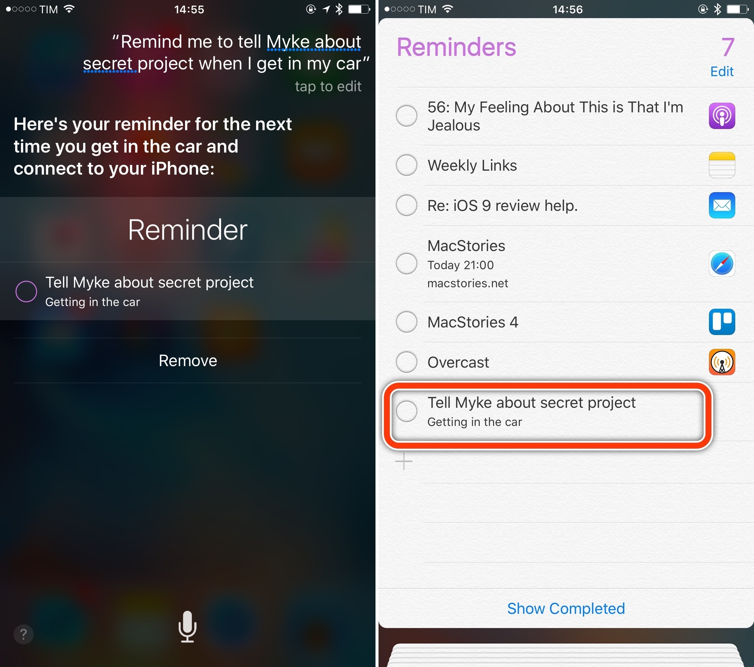
In iOS 9, you can create smart reminders in any app by summoning Siri and saying “remind me about this”. Through that sentence, Siri will capture the state of your current app activity – a webpage in Safari, a message in Mail, a view in a third-party app – and it’ll save it as a reminder that includes the app icon and a link to reopen the view from the originating app. Smart reminders are supported across every iOS app, and a due date or time can be appended to the Siri query, too. After issuing the command, Siri will immediately display the newly created reminder, carrying the icon of the app where you’ll want to go back to.
The way Apple has implemented this feature is clever, and it shows quite a bit of foresight on their part. Smart reminders via Siri use Handoff, introduced in iOS 8, to capture app state through the NSUserActivity API: the same technology employed to continue an activity from one device onto another can now be used to save that activity as a reminder that contains a deep link to an app.
Developers that started supporting Handoff last year have already done most of the work required to expose their apps to Reminders via Siri: the app icon and relevant section are fetched by NSUserActivity; optionally, developers can add a title to any activity available to the API. The title will become a todo’s name in Reminders if the activity is captured via Siri.
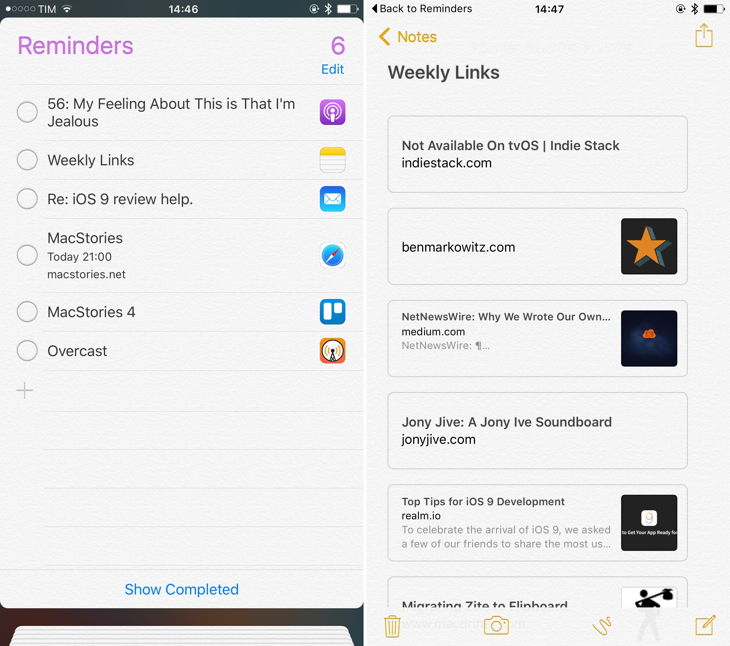
The beauty of this system is that iOS 9 makes virtually any app interaction a potential source for Reminders. Any app view can (theoretically) be an indexable user activity. The latest message in an iMessage conversation can be saved as a reminder. A user profile in Twitterrific is an activity you can save. A point of interest in Maps is something you can be reminded about. An article from Pocket or Instapaper is a view that Siri understands because it’s a user activity. The list goes on and on, and developers don’t have to adopt any new technology to restructure their apps around this concept. As long as they use Handoff and set the right properties, apps can give Siri a way to create reminders off of them.
As a user, it’s nice to be able to open Siri, create a reminder for anything I’m doing in an app, and rest assured that it’ll be easy to get back to it later. In the Reminders app, todos created this way display an app icon on the right, which can be tapped to reopen the app in the view you asked to be reminded about. Similarly, if a smart reminder has a due date, its alert will have a button to launch the app with one tap.
Smart reminders won’t work everywhere7, but they’re as close to being a universal glue between Reminders and apps as they can possibly be. I don’t use Reminders as my primary task management system (I like Todoist, and I’ve been experimenting with 2Do lately), but I recognize the utility of capturing the context of my activity for a task.
Treating app views as points of interest that can become todos and restored at any time is a powerful idea, unavailable to other todo apps on iOS. It facilitates a new type of interaction: rather than saving some generic text as a task, you’ll be saving a reminder that takes you back to the rich experience of an app.
I have two problems with smart reminders in iOS 9. The first one is that you can only create them with Siri: if you find yourself in a situation where you can’t talk to Siri but still want to create a smart reminder, you can’t. It’s an odd omission, especially given the new Reminders share extension available to any app that wants to use it.
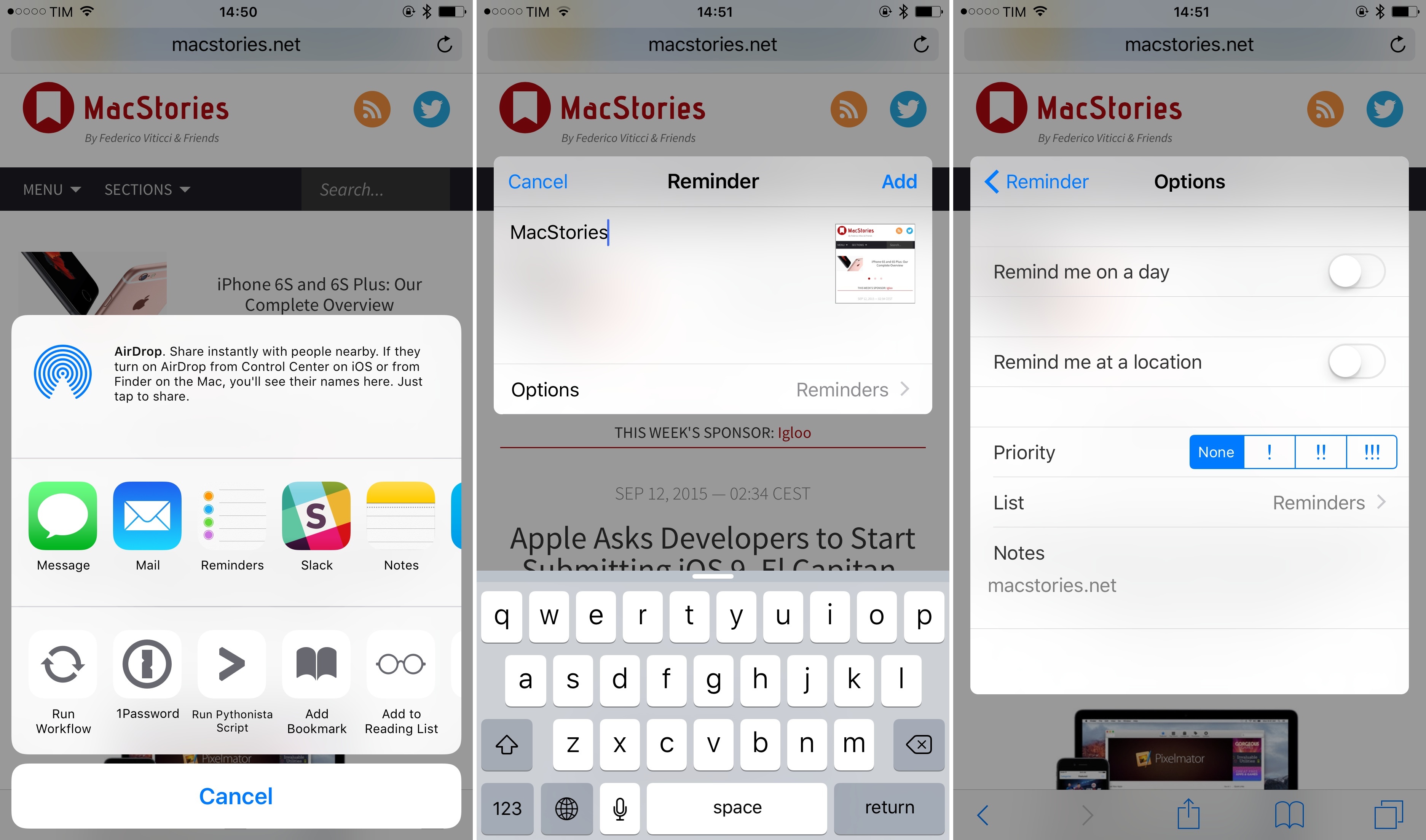
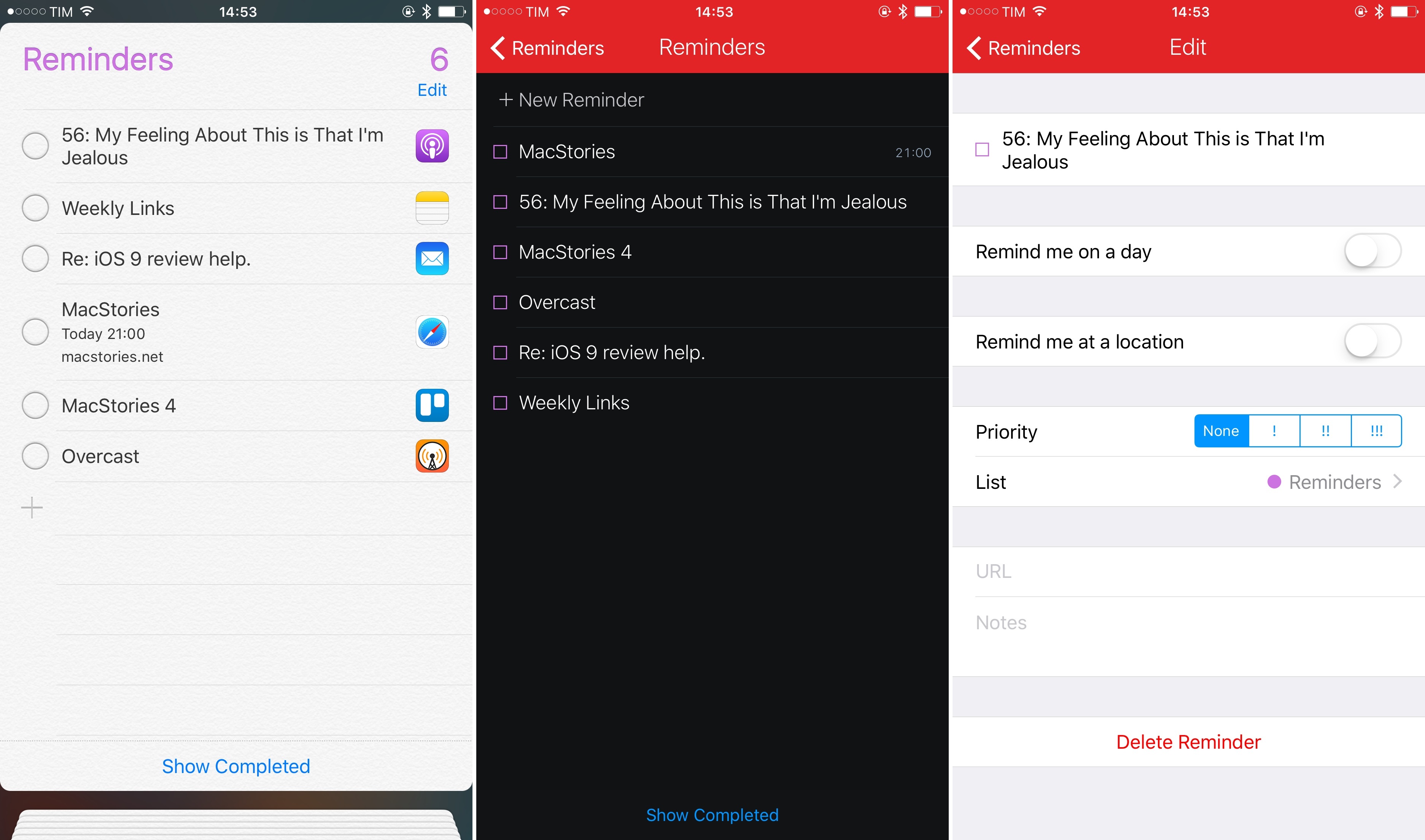
The new extension can create normal reminders with the same details screen (for dates, location, etc.) of the Reminders app, with no concept of captured user activities and deep links whatsoever. Creating new reminders from Safari through the extension does put a Safari icon in the reminder, but it’s an exception.
This leads me to my second problem. The deeper Safari integration of the Reminders extension and a lack of public APIs for smart reminders suggest that the feature is exclusive to Apple’s app.
Developers of Calendar and Reminders clients such as Fantastical or Sunrise won’t be able to read the deep link information (app icon and linked activity) stored in smart reminders; instead, they’ll display them as text-only items. There might be workarounds8, but they’re not official solutions – which makes the entire system a little less useful if want to use the Reminders backend without the Reminders app.
The other addition to Reminders in iOS 9 is the ability to create reminders for when you’re getting in or out of your car. These reminders use a Bluetooth connection in your car to determine when your device has entered or left the vehicle, which can be useful to remember to do something before driving or immediately after stopping. To this day, Apple hasn’t clarified whether car reminders in iOS 9 require CarPlay or can work with generic car Bluetooth and third-party accessories.
In my tests and informal polls on Twitter, iOS 9 car reminders didn’t work with Bluetooth dongles used to add Bluetooth support in a car (such as my Aukey one), but they work with built-in Bluetooth configurations (by the car manufacturer) as well as CarPlay ones (of course).
I wasn’t able to test this feature, but I’m intrigued by the idea of Reminders getting more savvy about user context and location. I wouldn’t be surprised to see HomeKit devices, iBeacons, and Apple Watches from friends nearby becoming future “reminder points” for the app.
Reminders continues to be a basic todo app that works for a lot of people but that falls short of advanced options for users like me. That’s okay: Apple doesn’t need to provide a full-fledged task manager for the majority of iOS users. The idea of turning app activities into reminders is interesting, and I guess that it’ll become a fixture of many people’s habits going forward. It hasn’t been enough to lure me back into Reminders, but, between Siri reminders and car alerts, its smart simplicity is starting to look a lot more attractive.
iCloud Drive
For years, certain circles of tech observers argued that Apple should have added a visible filesystem on iOS to make it more like OS X. And for years, Apple went in the opposite direction, doubling down on sandboxing and secure communications between apps.
Last year, we saw the culmination of those efforts with document provider extensions and a revamped document picker that enabled users to pick (via an extension) any app as a storage service. Even so, don’t be fooled by the new iCloud Drive app in iOS 9: this is not Apple relenting and bringing a Finder to iOS. It’s an app with a document provider extension – and even a mediocre one.
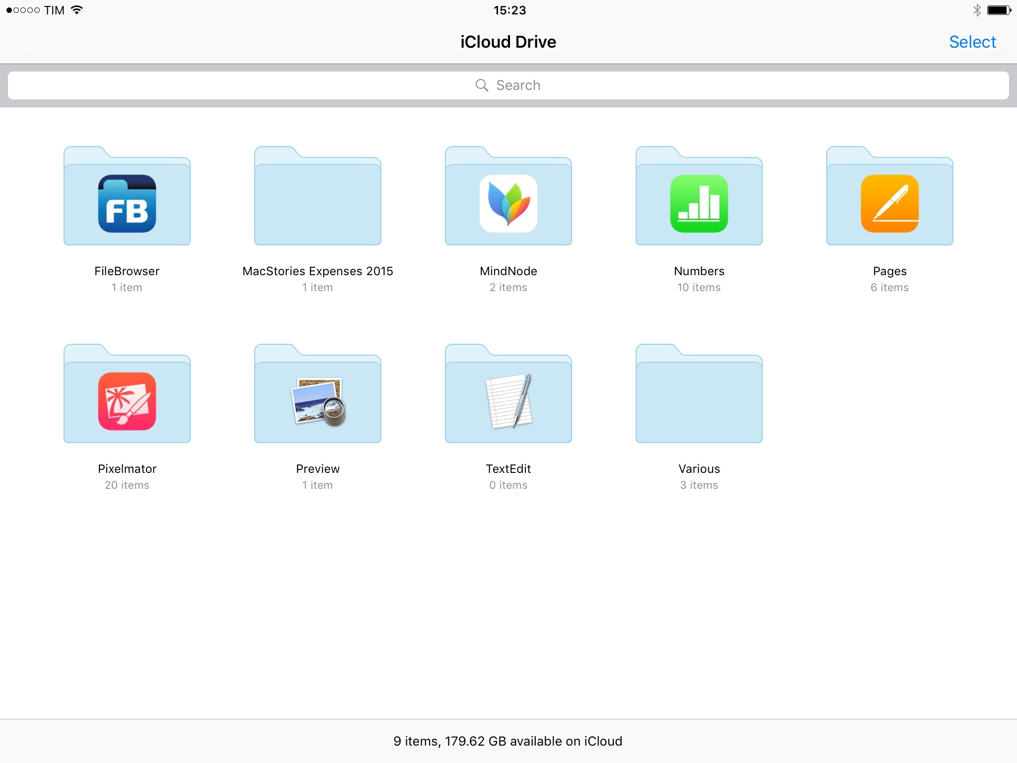
The iCloud Drive app in iOS 9 is a wrapper for the iCloud Drive documents that users have been able to view in the iOS document picker since last year. There is nothing new or surprising about it: it’s the same interface you know from iOS 8 document pickers and OS X, with app folders, various sorting options, and buttons to create folders and move files around. The app is installed by going to Settings > iCloud > iCloud Drive > Show on Home Screen, but in testing I also received a prompt to install it as soon as I made a modification to a file on my Mac and the change propagated to iOS.
I guess the reason the app exists is to give people a simple way to view and manage iCloud Drive documents – and that’s good, given Apple’s baffling decision not to offer an iCloud Drive app last year. But everything else in the app is mostly unsurprising, confusing, or frustrating.
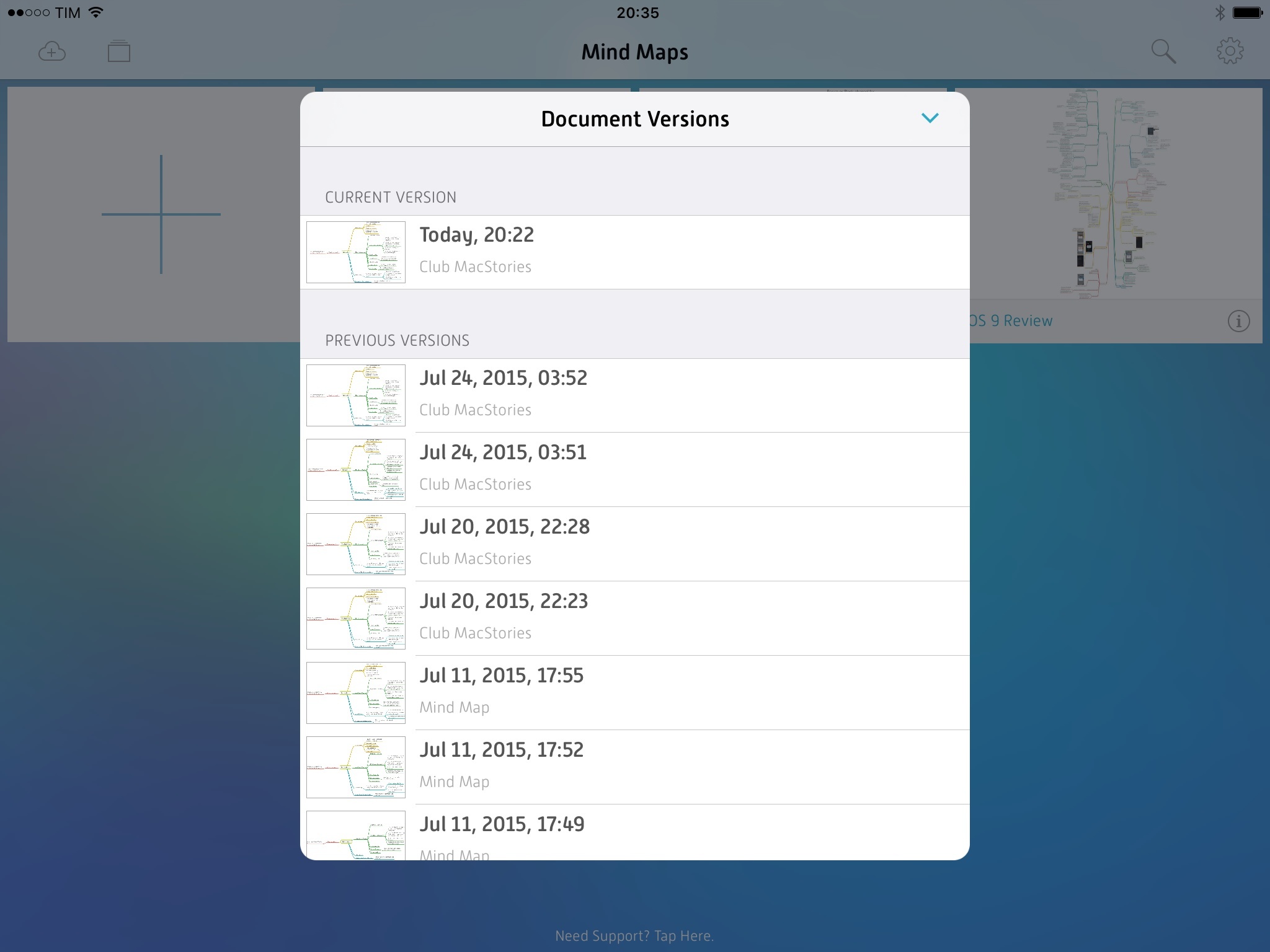
The app is extremely basic: it doesn’t let you search from the root view into subfolders, there’s no way to view and restore versions of files9 (or recover deleted files, for which you’ll need the iCloud website), and you can view tags, but you can’t create them because they’re still exclusive to OS X.
To my knowledge – and I’ve looked around – there is no way to add photos from the Photos app to iCloud Drive. If you take a screenshot and want to organize it in a folder outside of Photos, I don’t know how you would do it. This stems from the fact that there is no system-wide iCloud Drive extension to save files from anywhere. Well, there is one, but it’s only available for some types of attachments in Mail, and you can’t use it anywhere else.
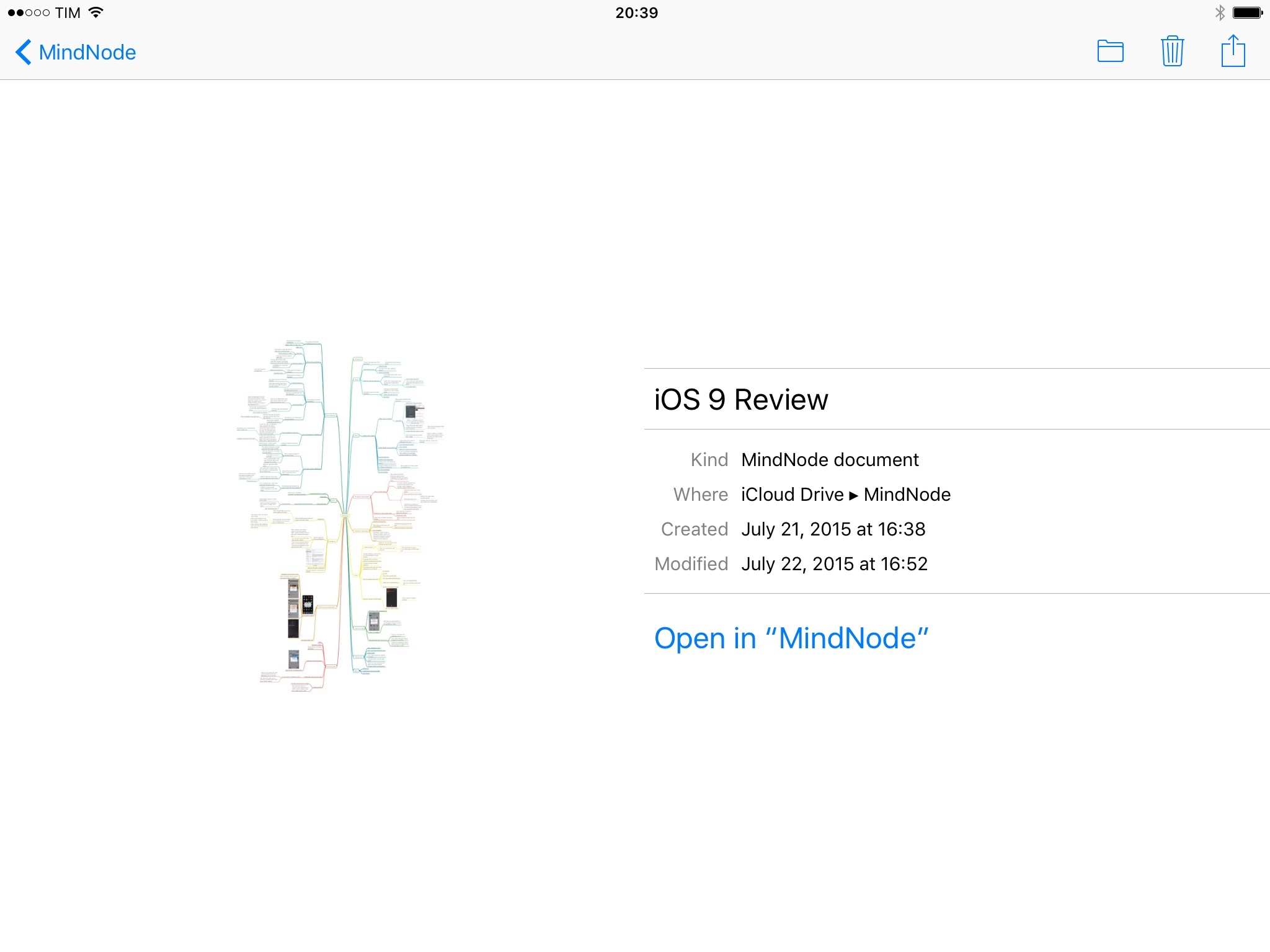
In iOS 9, document-based apps can support a new LSSupportsOpeningDocumentsInPlace property that adds the ability to open files from other apps “in place” to edit them without creating a copy. For the iCloud Drive app, this means that documents from iCloud-enabled apps can be tapped in iCloud Drive and they’ll automatically open in the associated app without generating a duplicate file.
I ran some tests with an iOS 9 version of MindNode, a popular mind-mapping app for iPhone and iPad. When tapped in iCloud Drive, MindNode documents opened the MindNode app in-place, taking me straight to editing. This can also be done by long-pressing a file and tapping the ‘Info’ button to open a file in an associated app.
However, soon after installing MindNode, iCloud Drive started automatically opening Numbers files into MindNode. My understanding is that, given the lack of an iOS 9 version of Numbers, iCloud Drive sent Numbers documents to an app that supported the file format and the open-in-place feature. What’s going to happen once multiple apps support open-in-place and the same file type? Will iCloud Drive display a prompt to pick an app for each file? I had no way to test this.
Ideally, this is a good user experience. The iCloud Drive app is a container of files that lets users jump to editing documents in other apps, avoiding copies and confusion with duplicates. Will the system work once (and if) more developers adopt the open-in-place functionality? It’s a good addition, but it’s too early to tell.
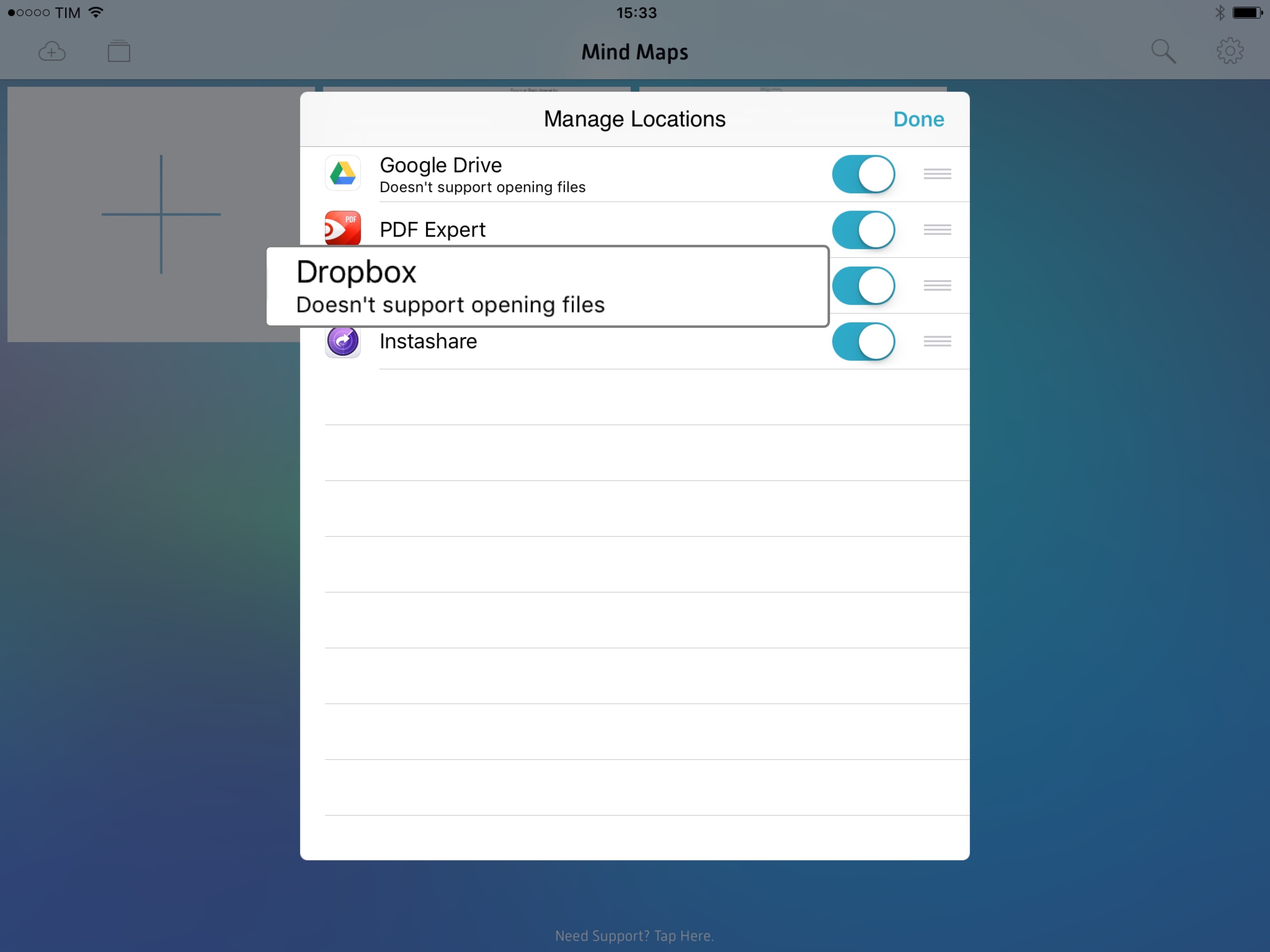
The user experience of document provider extensions is still problematic, with too many steps required to install and navigate external services and a confusing mix of modes for copying and opening files. In addition to open-in-place, another change in this area of iOS is a new label for document providers that don’t let other apps open and edit their documents (such as Dropbox and Google Drive). I’m not sure, though, that users will understand what this means, and, like open-in-place, I haven’t been able to properly test this functionality with different apps.
The iCloud Drive app joins a complicated array of features, and it does little to improve iOS file management workflows except being an icon on the Home screen and supporting new search APIs in iOS 9.
Apple has a lot of work to do with iCloud Drive on iOS – for both the app and the extension. iOS 9’s iCloud Drive doesn’t offer the same document management and search features of the Finder of OS X or the clarity and reliability of competing services such as Dropbox, Google Drive, and OneDrive. I know I’m not going to put critical work documents – such as this review – in iCloud Drive any time soon. The tools it offers aren’t enough to make me feel safe about it.
Don’t believe anyone who says the iCloud Drive app for iOS 9 marks the arrival of proper file management on iOS: the road ahead is long and winding.
Podcasts
Since moving past tape reels and realistic buttons in 2013, Apple’s Podcasts app has received a variety of incremental updates that have made it a decent solution for people who are not seeking the advanced options of third-party clients such as Overcast and Pocket Casts. Apple’s work on Podcasts culminated in September 2014 with the app being pre-installed on iOS 8, further cementing it as the default option for millions of people looking for a way to listen to their favorite shows. Apple’s Podcasts didn’t destroy the market for third-party alternatives – many of which are still thriving – but it brought a good-enough solution for everyone.
With iOS 9, Apple seems to acknowledge that the renaissance of podcasting has to be sustained by a more capable listening experience, and they’re enhancing the Podcasts app with welcome improvements on both the iPhone and iPad, particularly for viewing new episodes and controlling playback.
The main addition to the app is a Music-inspired mini player that is available at the bottom of the screen and that can be used to pause and play episodes, see what’s playing, and access options without going into the full-screen Now Playing view. The mini player has worked well for iOS 8.4’s Music app in that it provides a convenient shortcut for playback controls; on big iPhones, it’s easier to reach the mini player than stretching your thumb to tap a Now Playing button at the top.
The mini player works well for Podcasts, too: it can be tapped or dragged to reveal a modal Now Playing view, which, just like Music, comes with a semi-translucent bottom half and a tappable artwork in the upper part that contains episode descriptions and show notes (what would be lyrics in Music). Like Music, Podcasts for iOS 9 offers queue management with Up Next/Play Next to build a list of episodes that can be controlled separately.
The sleep timer has been moved to center of the Now Playing screen, sitting between a share icon and a contextual menu to save an episode or remove it from downloads, view its description, and share it.
Unfortunately, Podcasts also borrows the bad parts of Music’s Now Playing view: there are two ways to share an episode’s link (with an obnoxious “Check out this cool episode” prepended message), the progress bar is too thin to be dragged comfortably on smaller screens, and the view doesn’t take advantage of the iPad’s big screen. Episode descriptions aren’t displayed next to an episode’s artwork or below it on the iPad, so you’ll still be tapping a large artwork in the middle of the display to show a small box containing text and links – not exactly a good use of the device.
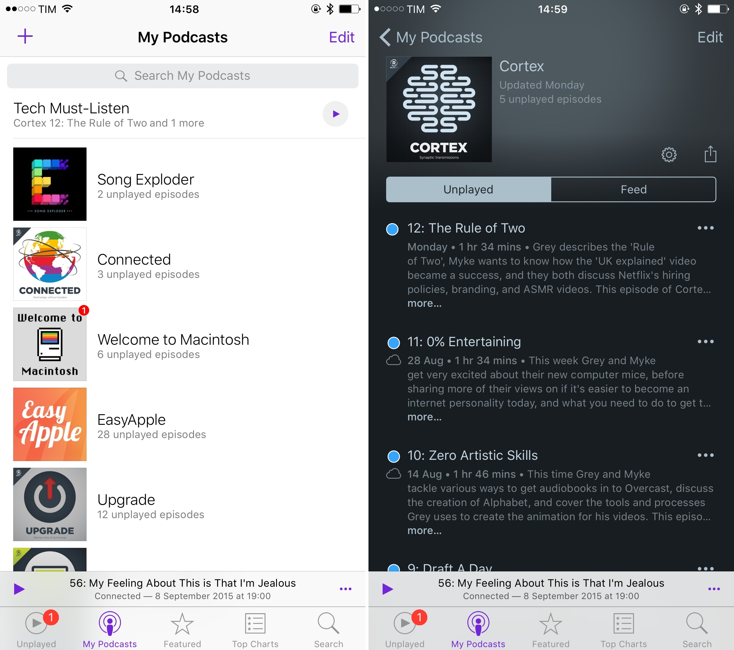
Music-based changes aside, the second major addition to Podcasts is in the show organization department with a cleanup of the My Podcasts and My Stations views. In iOS 9, Apple has removed the ability to show all podcasts in a grid view and it has rolled stations into My Podcasts. List view will be the only option in the app now, and any station will be available at the top of the list with a play button to start listening. You can still tap a station to view episodes inside it and tweak settings, which offer the same options of iOS 8.
With stations becoming part of My Podcasts, Apple freed up a slot in the app’s tab bar, which is now used by an Unplayed view that is my favorite change in this release. Like other podcast clients before, Podcasts defaults to showing a reverse chronological list (newest to oldest) of all episodes from all podcasts, grouped by day, regardless of their download status.
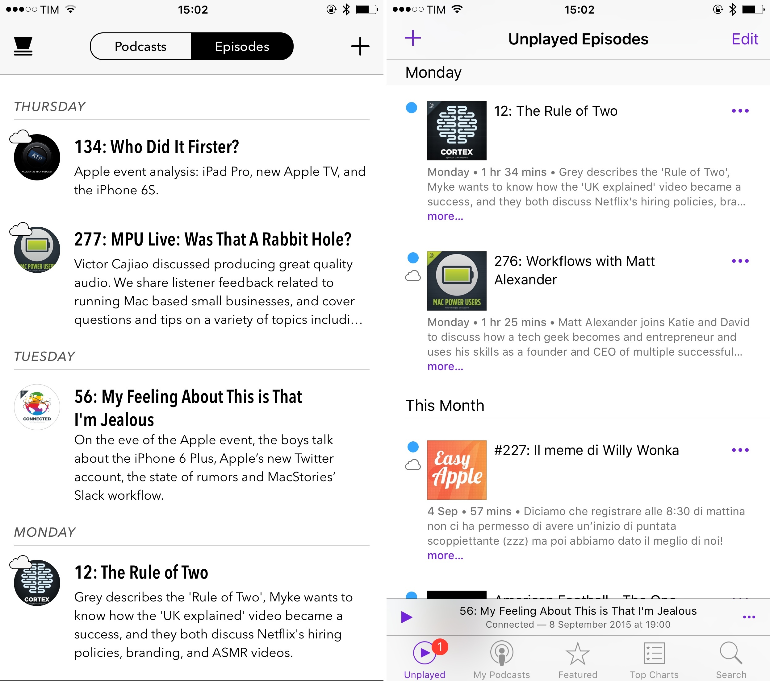
Heavily inspired by Supertop’s Castro, the Unplayed view of iOS 9 provides an easy way to view what’s new and Unplayed without dabbling in stations and search. As a result, finding episodes to play is faster and their presentation is better as they indicate what’s already been downloaded with an icon.
A nice touch of this view is that, as you keep scrolling into past episodes, they will be grouped by extended periods of time such as This Month, Last 3 Months, Last 6 Months, and This Year instead of standalone weeks and days. Also, I like how you can search for text in descriptions – a great option for those who often remember specific episodes by links mentioned in it.
To cap it all off, Apple has refreshed individual show pages with more options as well. When a podcast has downloaded episodes on the device, a Saved tab will sit next to Unplayed and Feed to group all episodes stored locally. Podcast and storage settings can be accessed with a new gear icon, and you can choose to remain subscribed to a podcast without receiving notifications of new episodes from it.
I love Marco Arment’s Overcast, and I find its many thoughtful details and listening features unparalleled in any podcast app for iOS. After using Podcasts extensively, though, I admit that I’m liking the mix of simplicity and moderately advanced options it has. The Unplayed view is a terrific addition, and the Music-inspired design and interactions create a cohesive audio experience on iOS 9 that make the two apps feel as part of the same ecosystem. Even when searching on the iTunes Store, iOS 9’s Podcasts displays a new tab to get individual podcast episodes, which is fairly similar to Apple Music in that you can start streaming or download right there from search.
I’ve been listening to my favorite shows with the Podcasts app since June, and I’m fine, but I’ll probably go back to Overcast because of its audio effects and upcoming features. The temptation to keep using Podcasts and its system integrations – like Siri, or controls on Apple Watch – is strong, and I can safely recommend the app to anyone looking for a default podcast client. Apple’s work on Podcasts for iOS 9 is solid, and the app is a good option for everyone at this point.
Mail updates in iOS 9 are far from what I wished for, but there are two changes worth mentioning.
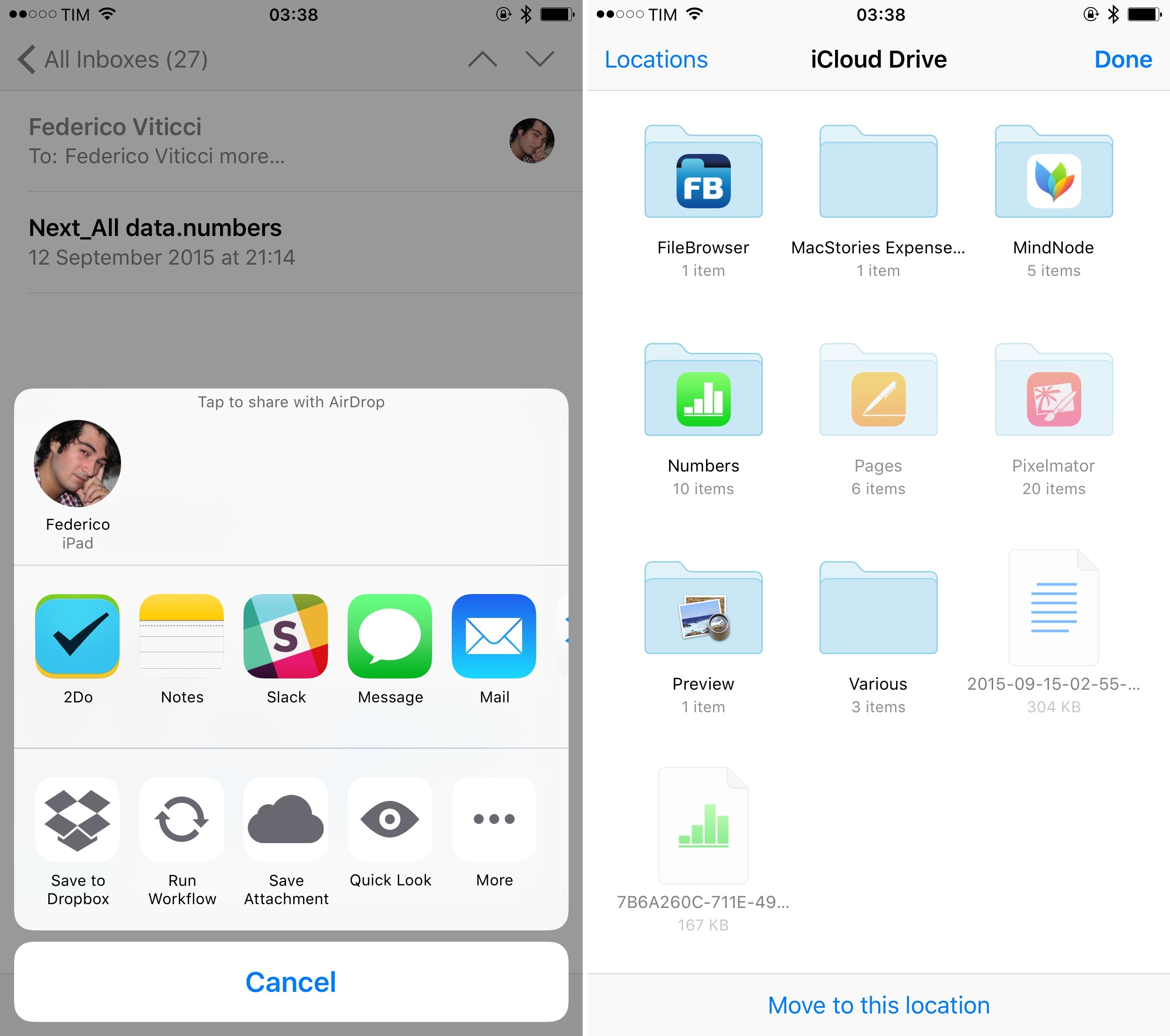
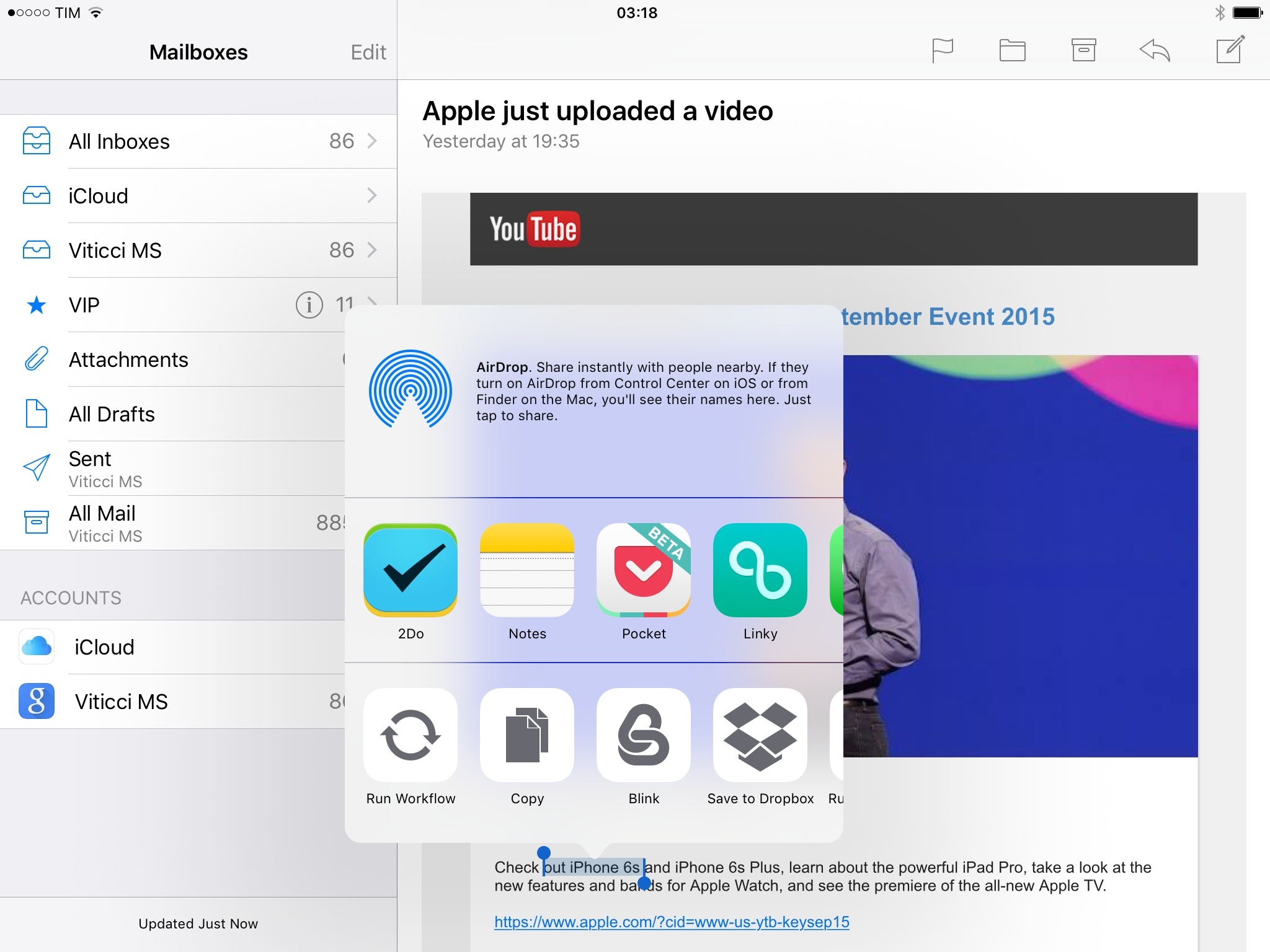
You can now add attachments to new messages from any document provider extension on your device, including iCloud Drive. To do so, you need to tap & hold in the message body to show the copy & paste menu and choose the new ‘Add Attachment’ option.10 This will show the document picker to select files from installed apps such as Dropbox and Google Drive, which will be inserted as inline attachments in a message.11 It’s another example of the idea that, in lieu of a traditional filesystem, extendible apps are the modern filesystem of iOS.
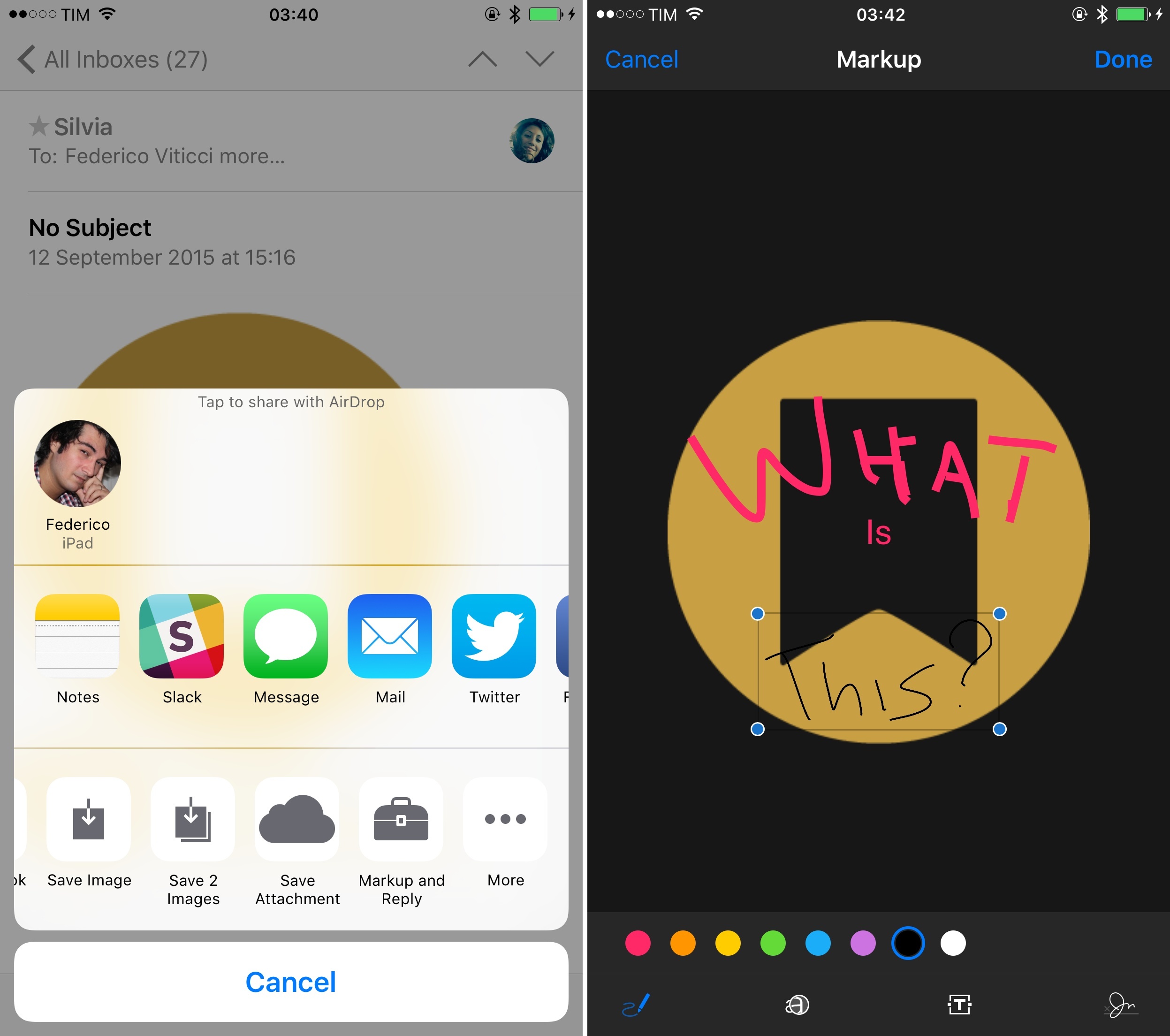
The second addition is Markup, a feature borrowed from OS X that brings the power of Preview annotations to iOS. Available for PDF files and images and exclusive to Mail, Markup lets you annotate a file when sending a message or reply with Markup to a file sent by someone else. To annotate a file, you can select it or place the cursor next to it and choose Markup from the copy & paste menu; for replies, you can use an action extension or hit the toolbox icon in the lower right corner of a Quick Look preview in Mail.
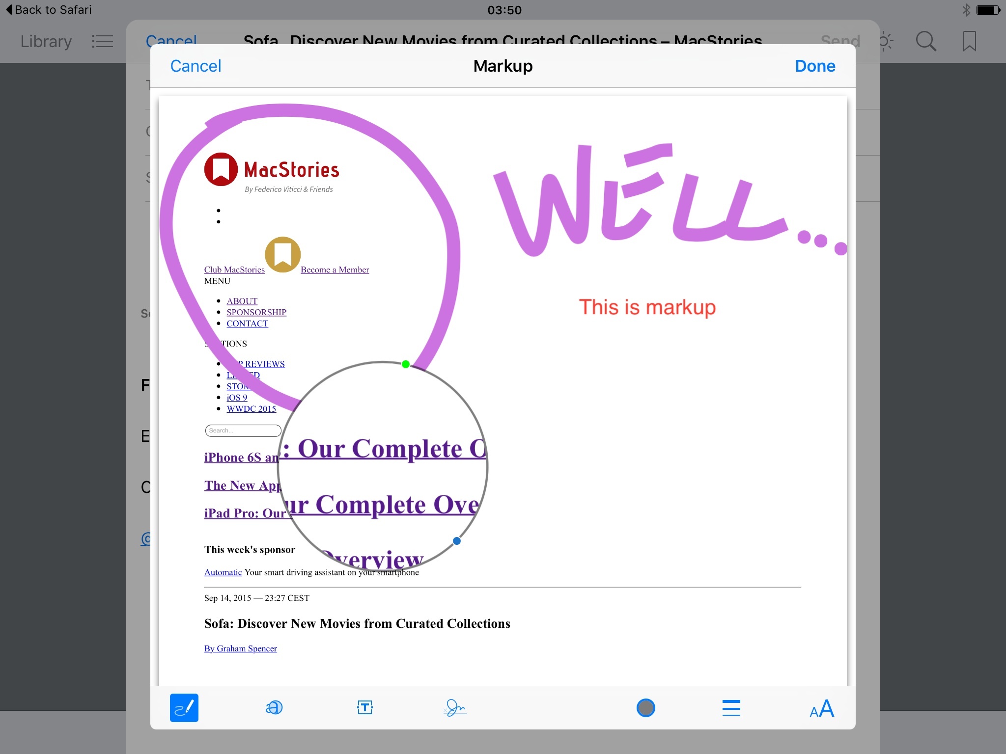
Markup works like the eponymous feature introduced in Yosemite last year: you can add text and shapes, choose between various colors and stroke sizes, add a magnification loupe with adjustable size and zoom, and add a signature. Two nice details that I appreciate: iOS detects freehand shapes and it offers to replace them with a precise version; and, multiple signatures can be added to Markup and they’ll be previewed in a menu so you can choose one. Markup signatures will also be synced with iCloud across devices.
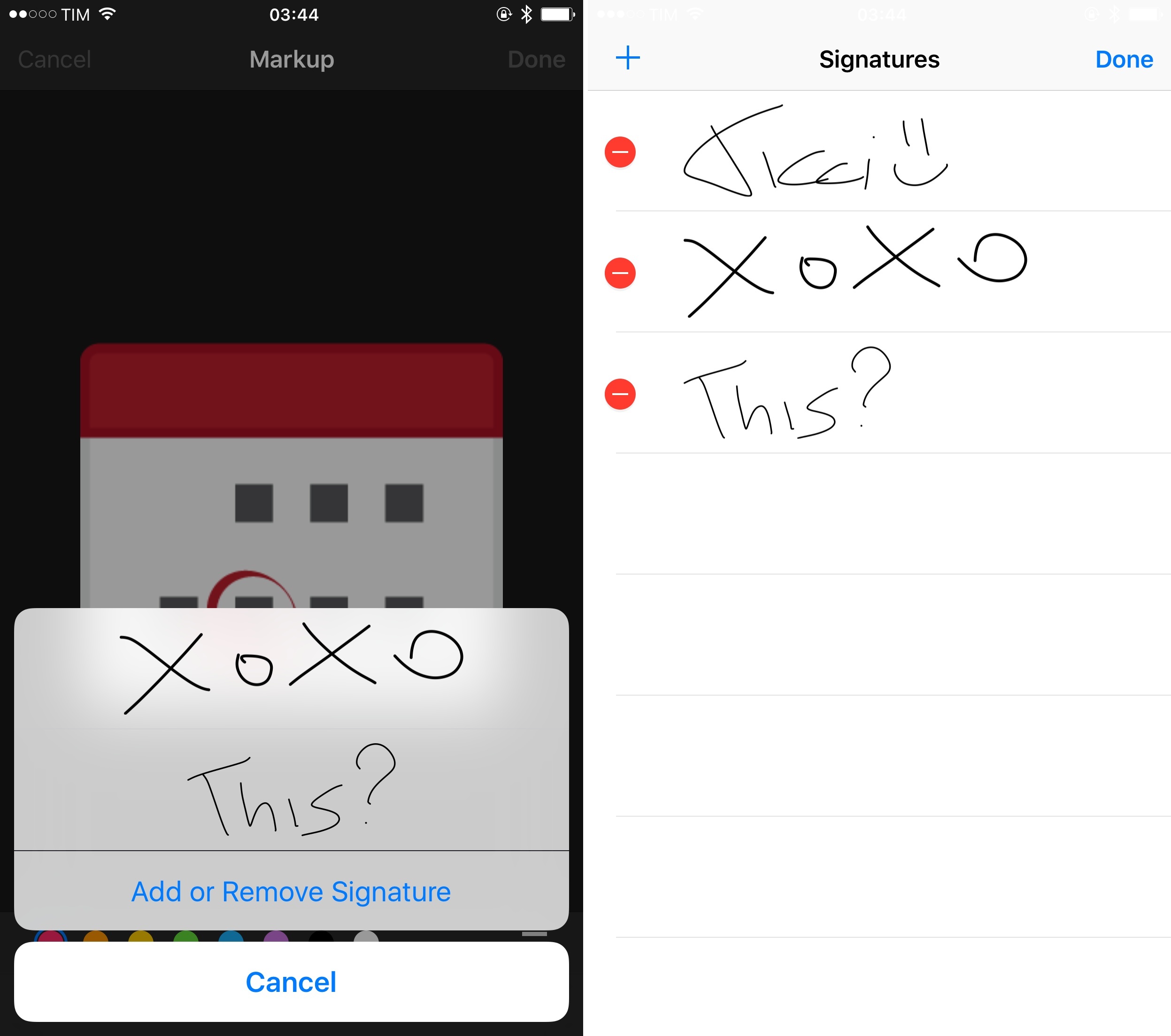
Markup on iOS 9 is good and it works well for annotating images and documents, pointing out ideas and issues to someone over email. The feature has been built with collaboration in mind: annotations won’t be flattened onto the document after sending it, so you’ll be able to remove Markup annotations from another person, add your own, and send the document back with your notes.
The only problem of Markup, in fact, is that it’s too good to be limited to Mail. Apple needs to make Markup compatible with Photos, and even better it should be an option of native Quick Look previews or an action extension for system-wide annotations. I wish I could use Markup anywhere, but I can’t.
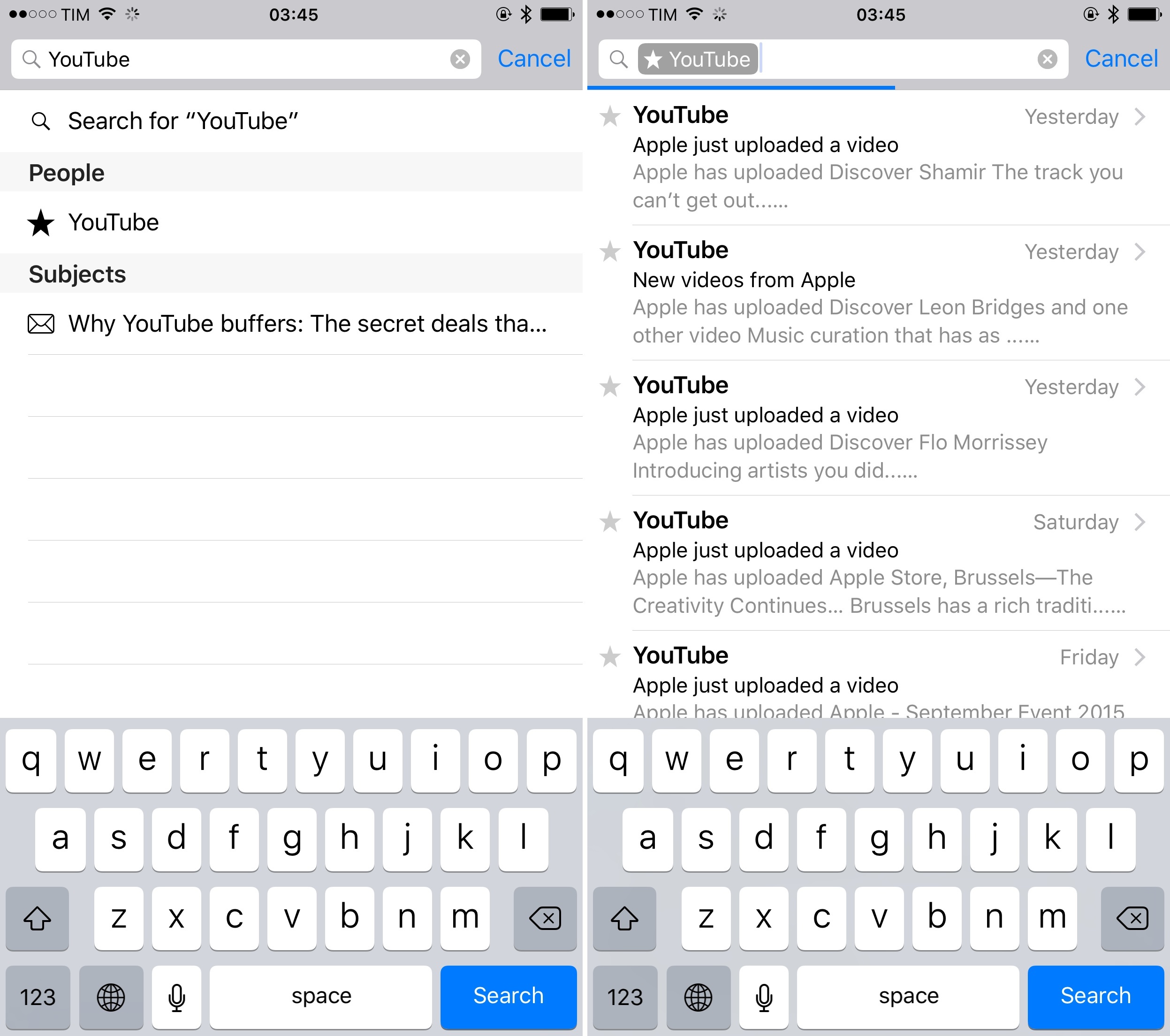
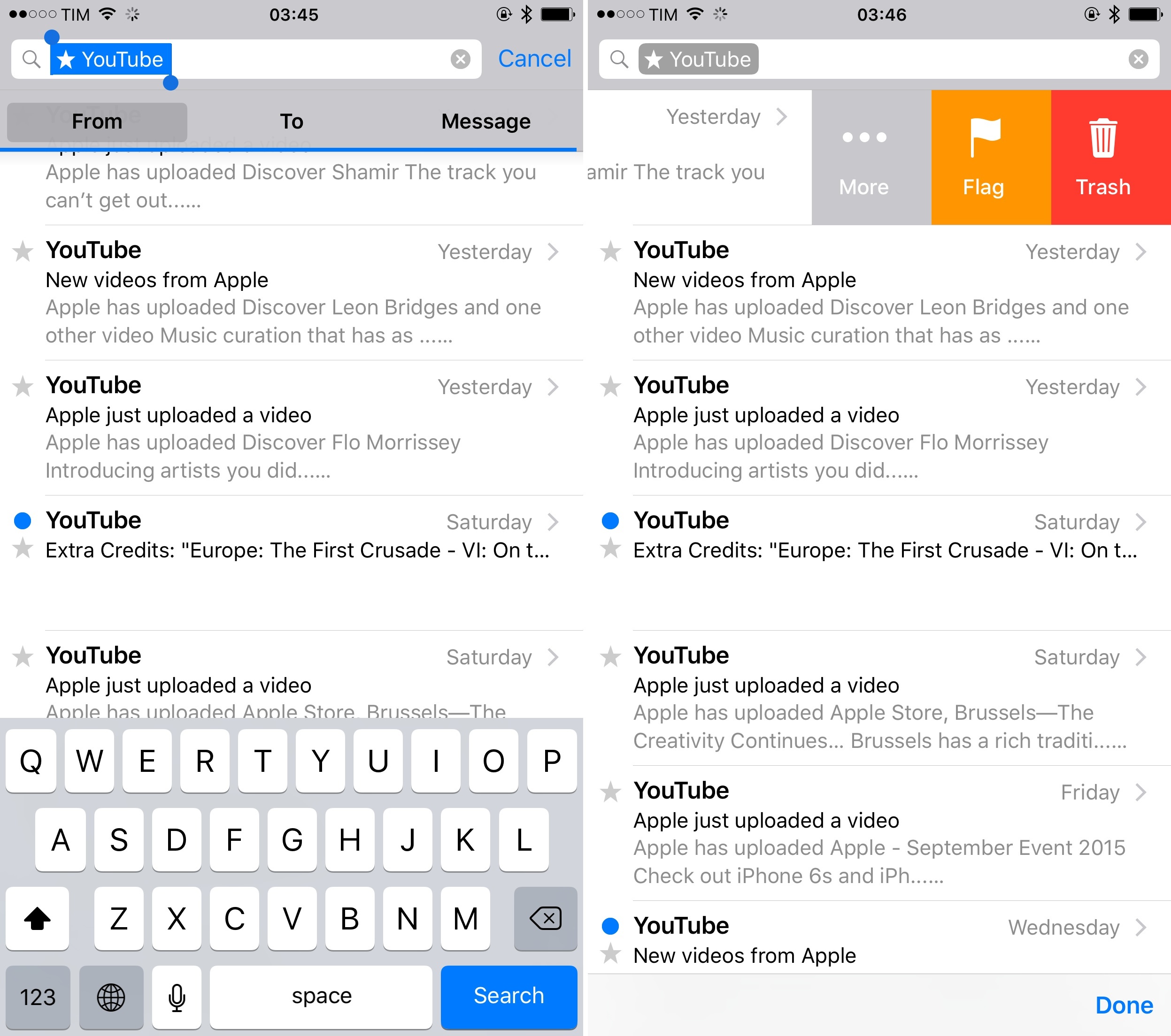
In terms of minor enhancements, Mail’s swipe gestures have received new icons to more easily distinguish actions. In-app search has been slightly updated as well, with new search tokens that can be tapped to reveal additional filters. There’s also a progress bar that indicates when search is loading (unfortunately, it’s still slow for Gmail accounts).
Mail is a fine default client, affected by the same problems I’ve been covering for the past two years. Search inside the app is slow, there’s no way to make messages actionable with extensions, and the inbox lacks the smart organizational tools found in popular third-party clients such as Outlook, Spark, Inbox, and CloudMagic.
Mail for iOS is a desktop-class app, but that’s starting to become a liability. I’m hoping to see more iOS-first features next year.
Apple News
Apple News, the company’s vision for the future of Newsstand mixed with a response to Flipboard and Instant Articles, is launching this week in the U.S., U.K., and Australia. While I was able to try the service in Italy by changing my device’s region format to American, that’s proven to be utterly inconvenient12, and I’ve chosen to leave the job of reviewing Apple News to my Australian colleague Graham Spencer. I still have a brief thought on the app, though.
Apple News lets you follow individual sources (websites) and topics; the latter is reminiscent of Zite (acquired by Flipboard). Supposedly, the app learns from your reading habits by monitoring what you read on-device, but it also syncs your data via iCloud for convenience. Thanks to machine learning, Apple News should, in theory, understand what an article is about, leading to further exploration of topics via tags, and it should also give you more articles to read in a Music-inspired For You section. The majority of websites in News work by sharing an RSS feed with the service (like MacStories does), which is reformatted to look nice in the app; others are composing special articles for Apple News with a native format that offers more control and customization.

In my experience, Apple News has been comically bad at recognizing topics from articles and it has provided me with recommendations that rarely piqued my interest. At one point I thought it was getting better, but that was just the luck of two interesting articles that appeared in For You. Unlike Apple Music, you can only like stories in Apple News with no way to say “I don’t like this”, and that’s proven to be a major issue for me. I can easily ignore 80% of the content recommended to me in the For You section, but there’s no way to tell the app about it.
It’s not like I haven’t tried to like News or use it every day. I have added dozens of blogs and topics to my favorites. I have read articles on both the iPhone and iPad, liked them, and shared them with people. I have explored topics and checked out native articles, which are pretty cool (but the examples were limited). In spite of my dedication, Apple News just didn’t get any better as a recommendation engine. And if I have to use it as an RSS reader, then I’m just going to keep using NewsBlur, which gives me more control over my sources.
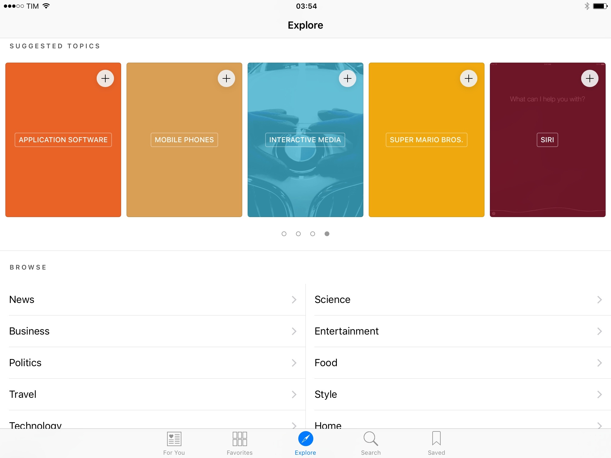
I am an RSS power user, but the problems I noticed in Apple News aren’t minor annoyances that only people who subscribe to 200 feeds will notice. You can’t reorder items in the Favorites view. You cannot teach the app what is good and what’s not interesting. You come across awkwardly computer-generated topics such as Central Processing Unit, Mobile App, Interactive Media, and the all-encompassing Business, which is often complemented by a cover photo of an American businessman with a peculiar hair style. The app doesn’t use Safari View Controller for viewing articles on the web, which means that Content Blockers aren’t supported either.
There may be a market for Apple News, but this first version feels too unfinished, slow, cluttered, and computer-y for me to take it seriously when it comes to my daily news workflow. I suppose you could appreciate Apple News as a way to browse a few favorite sites and topics in a simple, visual fashion, and I continue to be intrigued by the Apple News Format, which I’ll experiment with for MacStories. But for now, I’m back to my trusted NewsBlur.
- If user activities aren't supported in an app, Siri will create a reminder called "This". ↩
- According to developers I spoke with, the deep link information can be accessed when reading smart reminders via CalDAV, as it's hidden metadata stored in a base64 archive. ↩
- Third-party apps like MindNode (which I tested for this review) can use an iCloud Drive version API to show and restore versions. However, Apple isn't using this API in their iCloud Drive app. If you want to browse versions of files in iCloud Drive, you'll need an app with support for that feature. ↩
- Or, you can tap a dedicated button in the Shortcut Bar on iPad. ↩
- For most file types, you can also save an attachment elsewhere with a new action extension. ↩
- If you convert this article to American units, it's only 10,000 words long. That's how it works, right? ↩