I concluded last year’s assessment of iOS 8 on a positive note:
The scope of iOS 8’s changes will truly make sense as developers keep building brand new experiences over the coming months. iOS has begun to open up, and there’s no stopping at this point.
For some Apple observers, it’d be easy – and justifiable – to argue that Apple is “done” with improving iOS given the software’s maturity and sprawling app ecosystem. With long-awaited technologies such as action extensions, widgets, custom keyboards, folders for iCloud, and external document providers finding their way to iPhones and iPads, iOS has seemingly reached a zenith of functionality, an ideal state with no low-hanging fruit left to lust for.
Except that iOS 8 wasn’t a culmination aimed at ending on a high note. As I wrote last September, the changes introduced with iOS 8 laid the foundation for a more flexible, customizable, and ultimately more powerful mobile OS that would pave the road for the next several years of iOS updates.
There’s always going to be new low-hanging fruit in iOS. And 2015 is no exception.
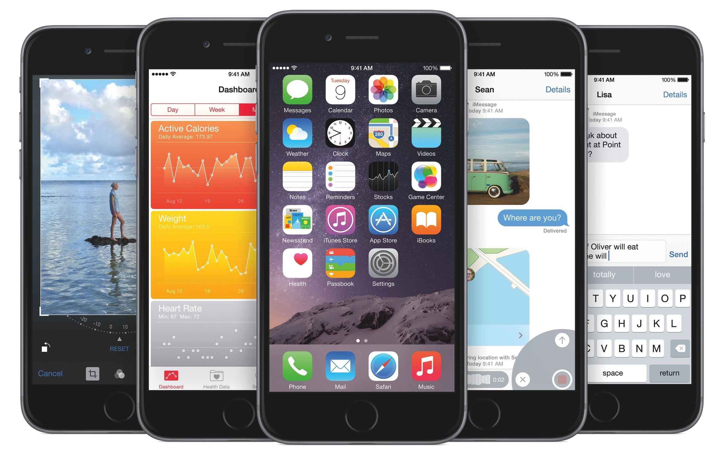
iOS 8 changed how I work on my iPhone and iPad. For years, I had been entertaining the idea of going all-in with iOS, but I was never able to take the leap. I couldn’t manage to leave my MacBook behind and let my workflow rely on iOS apps. My lifestyle dictates being able to write, communicate with others, and manage MacStories from anywhere, free from the constraints of a MacBook. Thanks to iOS 8 and the improved hardware of the iPad Air 2, I chose the iPad as my primary computer – and instead of being cautiously concerned about the trade-offs of iOS, I just felt relieved.
The iPad, for me, is a product of intangibles. How its portable nature blurs the line between desktop computers and mobile. How a vibrant developer community strives to craft apps that make us do better work and record memories and enjoy moments and be productive and entertained. The iPad, for me, is a screen that connects me with people and helps me with my life’s work anywhere I am. Transformative and empowering, with the iPad Air 2 being its best incarnation to date. Not for everyone, still improvable, but absolutely necessary for me. And, I believe, for others.
Liberating. The iPad is a computer that lets me work and communicate at my own pace, no matter where I am.
Beyond the conceptual implications of using a portable 10-inch screen as a computer every day1, extensions and widgets had the strongest practical effect on me. The ability to push select pieces of information to widgets and the objectification of apps through extensions have allowed me to augment the apps I use with functionalities taken from other apps. I can automate Safari with the Workflow extension; I can copy multiple bits of text in a row and trust that a clipboard manager will hold them all for me. For someone who works on iOS, version 8.0 was a massive change with far-reaching potential for the future.
As with every year, I’ve been pondering where I’d like to see iOS go next. Software is never done, but iOS 8 made a compelling argument for the maturity of the platform – if anything, from a feature checklist perspective. That’s not how I look at it, though: I suspect that the next major version of iOS – likely to be called iOS 9 – will use the visual and technical foundation of iOS 7 and iOS 8 to unlock new levels of integration and communication between apps, iCloud, gestures, and voice input.2
While it’s possible that Apple will bring some of the design expertise and taste acquired when finalizing the Watch UI back to iOS, that won’t be the focus of this article. Instead, like every year since 2012, I’ll elaborate on the software additions and corrections I would like to see on iOS, from the perspective of someone who works from an iPad and even came to appreciate the iPhone 6 Plus.
For context, you can check out my old wishes for iOS 6, iOS 7, and iOS 8 to reflect on my motivations and what Apple ended up announcing at past WWDCs.
Extensions
Surface extensions more. Technical missteps aside, one of the issues that has affected extensions over the past year is discoverability. This is particularly the case with action and share extensions: most users don’t know they exist or what they can do with them.
This, I believe, stems from Apple’s decision to limit the number of extension points for the technology’s debut in iOS 8. Apple chose to relegate action and share extensions to the share sheet, a panel that used to contain native iOS share features in the pre-iOS 8 days and that is activated by tapping a share icon most users rightfully associate with the idea of sharing, not acting upon.
The look of the share icon can be customized by third-party developers, but extensions always have to be triggered from the share sheet. This has been a carefully considered design choice on Apple’s part: to limit the potential harm extensions could do to a user’s workflow, they devised a system that would take three taps to activate any extension. This has somewhat hindered the visibility of action and share extensions in iOS 8, hiding a powerful new feature behind the safety of the share sheet. Extensions need to grow up.
In iOS 9, I’d like to see more activation points for extensions, as well as a way for users to call specific extensions directly with custom buttons.
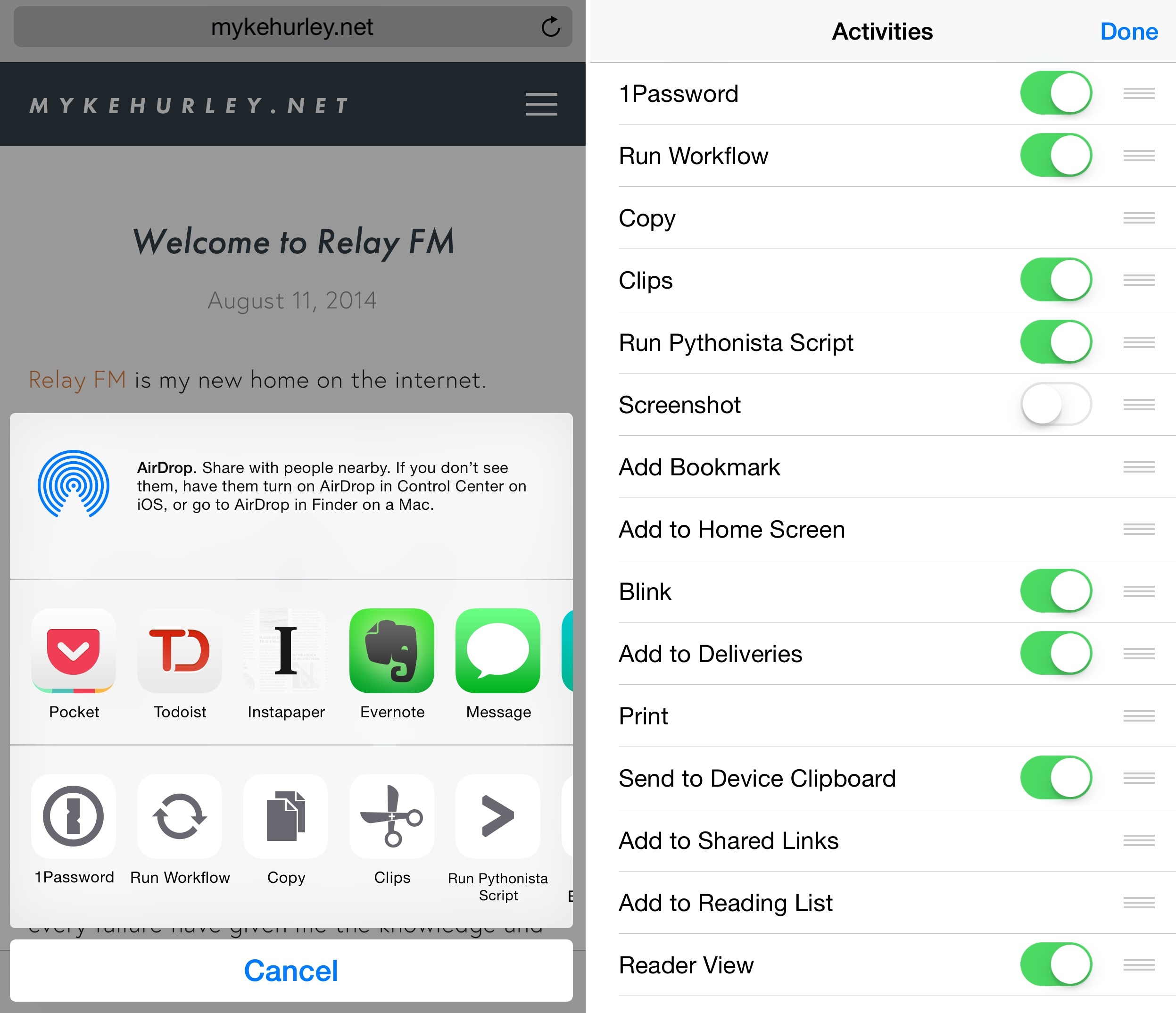
While widgets and custom keyboards (also considered part of the Extensibility framework) would feel out of place outside of their current confines, action and share extensions could use an expansion to different areas of iOS. Apps that deal with text selection such as Safari or Evernote could benefit from the addition of extensions as contextual accessories to the text that is being selected.

Pocket’s share sheet can act on a text selection, but that wouldn’t be obvious by looking at this screenshot.
However, Apple’s apps don’t allow users to configure extension shortcuts in the copy & paste menu. While Safari does enable users to act on a text selection with an extension, the detachment between text selection and the share sheet makes this process invisible and clumsy. Third-party apps that enhance the copy & paste menu with a Share button, such as Instapaper and Pocket, are, again, limited to simply triggering the share sheet, which requires scrolling and tapping to activate an extension.
Together with a way to configure the placement and availability of extensions, iOS could become considerably more flexible for people who work on their iOS devices and casual users alike. With the proper security mechanisms in place, developers could offer users choice of the extensions they want to use: perhaps I want to have an Instapaper icon in the Safari address bar – just like on the Mac – that automatically runs the Instapaper extension with no share sheet in the middle; or maybe I want Drafts to offer a Workflow button in its copy & paste menu to run workflows for selected text. Cut the share sheet middle man out of the equation, and make extensions front and center.
I’m not saying that the unified, one-size-fits-all approach of the share sheet was a bad idea. But as we’ve seen with developers having to explain where to find share sheet options, extensions are too hidden to become a massively popular iOS feature. That’s too bad, because they could help users save time and yield better results when apps communicate with each other.
By allowing developers to trigger specific extensions programmatically (after a user’s consent) and attach extensions directly to other parts of iOS beyond the share sheet, iOS 9 could fix the discoverability problem of extensions and make the technology more consistent, useful, and approachable at the same time.
Fix share sheet reordering. If Apple sticks to the share sheet as the primary way of dealing with extensions, I hope they will fix its reordering issue and make extensions appear consistently in the same order across multiple apps. This problem has affected every release of iOS 8 to date; while it seemed to be resolved in iOS 8.1.1, it was only mitigated and continues to be an issue for several users on iOS 8.3.
I’d even go one step further and suggest that managing the share sheet from the sheet itself is not a good idea, as its Settings are difficult to find and have clearly been tucked onto an old feature that predates the versatility of iOS 8. A new Settings page to manage installed extensions (just like you can manage keyboards from Keyboard settings) would go a long way in helping users with an easier UI to manage extension order, control where they show up, and what they can access. But I’d be happy with a simple fix to the share sheet reordering bug, too.
Better extension and widget performance. In using extensions on a daily basis on my iPhone 6/6 Plus and iPad Air 2, I often noticed how they were slow or prone to crash under higher memory pressure. Widgets and action extensions should be capable of handling more serious and memory-intensive tasks in the future: if I’m combining four images with the Workflow extension on my iPhone, the extension shouldn’t crash because four images at once is too much. iOS should do a better job at allocating memory to extensions when necessary, which would make them suitable to more complex tasks and use cases.
Third-party keyboard consistency. Custom keyboards were part of Apple’s plan to open up iOS by letting users pick their favorite keyboard from the App Store. The underlying technology needs several improvements to make third-party keyboards first-class citizens on the iPhone and iPad. Today, custom keyboards are limited in the native iOS functionalities they can access, they suffer from severe performance issues, and they’re inconsistent in how they’re designed and activated.
From an integration perspective, it feels like Apple is doing third-party developers a favor by letting them create custom keyboards instead of treating them like real alternative solutions to the company’s official keyboards. Custom keyboards can’t access Siri dictation, they can’t show the popup menu to switch to another keyboard with tap & hold, and they can’t implement the system auto-correct dictionary. With a proper set of permissions and performance considerations, I’m hoping all this will be enabled in iOS 9.

Switching between keyboards has been problematic in my daily usage, which I’d attribute to performance and design issues in Apple’s framework. iOS 8 is unreliable when moving between keyboards: sometimes, it forgets which custom keyboard I last opened; other times, cycling through keyboards by repeatedly tapping the globe icon leads to a different order of keyboards. iOS 9 needs to have a reliable, consistent way of switching between keyboards, without hacks or tricks necessary.
Furthermore, third-party developers and Apple must figure out a way to use the keyboard switcher button so that it has a consistent appearance and placement. I don’t know how this would be possible, but change needs to come from one side or the other.3
, so they faked it.")
We’ve witnessed tremendous innovation in third-party keyboards for iOS 8, far beyond what Apple could have imagined. Today, we can install clipboard managers, visual text snippets, and even GIF dashboards right alongside a standard keyboard to enhance our communications and do more with less app switching.
But there’s a lot of work left to do on custom keyboards for iOS. The simple truth is that if you want to use a third-party keyboard reliably and with iOS features you’re grown used to, you just can’t. You can try to use a custom keyboard as your only keyboard on iOS, but the experience is not ideal and still somewhat primitive. Hopefully, this will be addressed in iOS 9.
Personalization
Set different default apps. Seven years into the App Store, I struggle to find a reasonable motivation for not allowing users to set different default apps on iOS. I believe Apple should accept that they can’t make the perfect email client or web browser for all kinds of users, and, just like custom keyboards, they should let users choose their favorite app for a specific set of core tasks. If personalization of a user’s iOS device has truly become a priority at Apple, then it should be extended to activities that users frequently perform on an iPhone or iPad.
I have identified four types of apps that, in my mind, could provide alternative defaults to users:
- Web browser
- Calendar
- Maps
- Email client
These four app types share some notable similarities: they all come with a vast selection of possible alternatives from the App Store; OS X users can already configure different default apps at a system-wide level for three out of four of these categories (all except Maps); all of them can also be activated by tapping special bits of text that are recognized by iOS with data detectors: hyperlinks, dates, locations, and email addresses.
The last point is important to consider the implications of setting a different default app on iOS. The feature (which has been requested for years) goes beyond the simple request of “just let me use Chrome instead of Safari”: Apple’s default apps for these four tasks have enjoyed a deep native integration over the years that has allowed them to span several areas of the iOS interface. You can tap a link in an iMessage conversation and open it as a new tab in Safari; you can tap a date in an email message and create a Calendar event (without switching apps) with that date and time already filled-in.
A system capable of handling different default options would have to associate data detectors with the UI and UX of other apps; similarly, developers would have to conform to the requirements of data detectors to advertise an app as an alternative to the default one. In the example mentioned above, iOS 9 would gain the ability to show a Fantastical popup when tapping a date in an email message if you’ve selected Fantastical as your default calendar app. This would also involve triggering extensions outside of the share sheet, as I’ve argued above.
But there’s more. What happens to Settings, Siri queries, or Spotlight suggestions when you set a different default app? If you pick a third-party calendar client over Apple’s Calendar, does it carry the same settings you’ve already configured in the Settings app? Does Siri return information about your schedule from the new default calendar app thanks to a new Siri API, or does the functionality remain exclusive to Apple’s native apps? If you pick a different Maps app, do you get suggested results from that app in the Safari address bar, or do you still get those from Apple? Would Apple allow you to use a new default calendar app that doesn’t implement iCloud Calendar as a service?
Setting different default apps on iOS is not an easy problem to solve. There are dozens of moving pieces that have been built on top of native integrations over the years. I believe that Apple has refrained from offering this ability because they needed to get other technologies in place (notably, WKWebView and extensions) to build a solid foundation for a future where users can also pick alternative default apps.
The time is right for Apple to start offering the ability to replace default iOS apps with third-party alternatives. The company’s continued effort in improving built-in apps through the years is laudable, but it’s not reasonable to assume that everyone likes Safari or Mail. Apple knows this is the case on OS X, but they wanted to build a safer, more integrated environment on iOS. At what point, though, does aggressive integration become detrimental to a practical user experience for millions of users?
This shouldn’t be about politics, but about a better user experience. If Apple can build a framework to allow users to set different default apps for key tasks and if that system can make a user’s device more personal and useful, then they should do it.
Customizable Control Center. Since iOS 7, Apple has kept a Control Center page in the Settings app. On iOS 8, that page has two toggles: Access on Lock Screen and Access Within Apps. Continuing down the line of user personalization, I’d like for Control Center’s settings page to come to fruition with the ability of customizing shortcuts and toggles.
There are two rows of shortcuts in Control Center: hardware and software toggles at the top, and app shortcuts (four on the iPhone; two on the iPad) at the bottom. While these buttons have done a good job at speeding up common tasks on an iOS device such as activating the flashlight or opening the camera, they’re not for everyone. Personally, I don’t need to have persistent access to Apple’s Calculator and Clock apps; someone else may not need the Bluetooth or Rotation Lock toggles. Imagine if you couldn’t switch the icons in your OS X dock with the apps you use and care about, or if you couldn’t rearrange the items in the menu bar. Shortcuts are only as useful as their relevance, so, by the same standard, Control Center’s convenience is lost if the shortcuts it provides aren’t personal and customizable. It turns into a wasted opportunity.

I never adjust my brightness level. The presence of the slider actually causes accidental changes every once in a while.
I envision two ways of customizing Control Center. For toggles (top row), Apple could set up an expanded collection of commonly-accessed options to be swapped with the current toggles. Settings such as disabling cellular data, location services, Personal Hotspot, and Background App Refresh. Apple would pick new toggles suitable for Control Center; the user would just swap them in.
Customizing app shortcuts would be tricky. Part of Apple’s decision to close off Control Center to external modification is to set the appearance of icons and make the UI aesthetically pleasant. By opening up shortcuts to third-party apps, they’d allow contamination from less appealing icons to find its way into Control Center. While that made sense two years ago with the feature’s debut, the potential benefit of versatility now trumps the ideological stance on the beauty of icons. Let developers provide a Control Center-styled glyph in their apps, and let the users choose what shortcuts they want.
Files
A central location for files and document pickers. Last year, Apple introduced iCloud Drive and a revamped document picker that allowed users to load files from other apps. I want to think that this initiative laid the groundwork for a new app by Apple aimed at unifying files and document locations in a single place.
I like the concept behind iCloud Drive and document providers, and, especially for iCloud, I don’t think Apple should move away from the app-based representation of files. Apps literally are the new folders for iOS users. The problem is, I shouldn’t have to download an app to browse the contents of my iCloud Drive. When you buy an iPhone or iPad and set it up from scratch, there’s no app to use iCloud Drive4 and view your files. You have to know where to look on the App Store, finding an app that can show document pickers so you can browse your files. This needs to be rectified.

For as much as Apple may dislike the idea of an app meant to browse files, there has to be a way to browse document providers and iCloud Drive natively on iOS without relying on a third-party app. I’d be happy to have a central Files app where I could save files and documents locally (so it doesn’t default to consuming space on iCloud), load iCloud Drive, and browse external locations such as Dropbox and Google Drive. Safari and Mail would be able to save downloads and attachments in this app; users would gain the ability to manage their files locally and on iCloud Drive without having to get an app from the App Store.
More flexible iCloud Drive and document providers. I like the basic principle behind iCloud Drive: after years of not using OS X as my primary computer, I don’t necessarily think in terms of traditional folders and file paths anymore. The way iCloud Drive organizes files works for me, but it needs more flexibility to accommodate users who are switching from a desktop to mobile setups and workflows.
Currently, you can’t pin specific iCloud Drive folders to other apps and browse their contents without going through the full iCloud Drive UI. Let’s say I’m a designer and I keep all my assets in Documents and I want to do my work in Pixelmator. I can’t create a Documents folder bookmark in Pixelmator for quick access to my files – I need to tap the iCloud Drive button, browse all app folders, find the Documents one, and load a file. This process, each time, for any file I want.
Similarly, I can’t browse versions of files or assign tags on iOS. Both of these features have long been available to Mac users, which makes OS X an objectively better platform if you work with several files and documents on a daily basis. The best part is that iOS 8 even added support for versions of files in iCloud, but Apple isn’t taking advantage of the feature in their own apps.
Did you know there is public API since iOS 8.0 to access older versions of iCloud documents? pic.twitter.com/hIOVBaNj7v
— MarkusMüllerSimhofer (@fafner) May 4, 2015
Last, switching between third-party document providers through the document picker gets annoying quickly. I see why Apple went with this approach – make sure to ask users every time if they really want to browse files stored elsewhere – but it’s been a year, and there should be a way to load a specific document provider quickly without interacting with the picker interface every time.
Apple needs to get rid of the notion that iOS is for less serious work. Improvements to file management and storage would be strategic to that.
Siri
Siri API for third-party apps. For Siri to become a ubiquitous assistant intelligent enough to help us every day, it’s time to open up its intelligence to third-party apps.
Four years since Siri’s debut, there have been welcome improvements in terms of performance and Apple-sanctioned plugins, but Siri still feels like a cool addition for a subset of iOS functionalities. With Google and Microsoft ramping up the list of compatible third-party apps and services in their virtual assistants, Apple could leverage its rich App Store ecosystem to turn Siri into a capable, flexible assistant that can fit more people’s lives – no matter the app they use or the country they live in.
A Siri API for third-party apps would be a massive undertaking for Apple. Think about all the variables that would need to be accounted for: parsing custom dictionaries for commands associated with thousands of apps5; translating those commands to different languages; showing custom interfaces inside Siri for progress/status/feedback from an app; the ability for apps to update their data in the background, handling successful commands from Siri (as well as errors) gracefully and contextually. For instance, imagine asking Siri in iOS 9 “What’s my OmniFocus schedule today” and then following up with “And what about tomorrow”; apply that to 30 languages, and you get a rough idea for one type of app.
The arduous challenge that lies in a Siri API doesn’t mean that this wouldn’t be the right thing to do, though. It would be shortsighted for Apple to believe that Siri can retain its value over time if it continues to work only if you use Apple apps or web services that partner (slowly) with Apple behind the scenes, such as Wikipedia and Bing. Everyone’s mobile lifestyle is different, and yet the lack of a Siri API makes Apple’s voice technology limited to a specific kind of user.
With an API, Siri could talk to third-party apps to create data inside them as well as read data from apps to display information when you ask questions. Developers could add support for Siri through a framework (possibly based on Apple’s built-in dictionary) that defines supported language queries; there would be strict guidelines on the UIs that third-party apps could show in Siri, but those would work well for apps that involve text, emails, messages, events, images, locations, notes, and more.
Furthermore, a Siri API would be instrumental to create a deeper connection between Apple Watch and apps. The smaller screen of the Watch doesn’t lend itself well to touch interactions, with voice being a more natural input method for quick tasks and questions. With a Siri API, apps would fit more seamlessly in the voice-oriented Watch ecosystem, making Apple Watch even more personal and useful.6
Textual Siri. I often can’t use Siri because I can’t talk to it. The situations where I’d mostly benefit from Siri’s ability to respond to natural queries are public ones, and, four years after its launch, I still don’t want to be the guy who talks to Siri in public. If Siri wants to be an everyday assistant that can look up information and perform tasks for you, there needs to be a way to send texts to it.
Apple has built an entire cloud service dedicated to parsing speech, translating it to textual commands, and returning information with spoken messages. I’m asking to offer an option to avoid audio altogether, both on the sender and receiver’s ends, allowing users to ask Siri questions by text and receive responses without Siri speaking at all. Microsoft has built this feature in Cortana, and I strongly believe it would be useful for all those who want Siri’s intelligence without the voice.
If I’m in a hurry and I don’t want to hunt around for apps and tap buttons, I’d prefer to quickly type ‘my schedule tomorrow’ in silence and have Siri find and display all my activities for the next day. Or I could use Siri to quickly text a contact without creating a conversation from scratch in the Messages app; send queries to WolframAlpha while I’m waiting at the doctor’s office; or check out the reviews for a restaurant nearby without talking to my phone and grabbing everyone’s attention. Or, even better, I could send quick commands to any third-party app through the Siri API without actually talking to Siri or finding the app and navigating its user interface.
All I’m saying is that Apple has built an incredibly advanced and natural virtual assistant that can only be useful if you can talk and listen to it. Text, with its silence and discretion, could be just as convenient, too.
Music
A new music streaming service. I was a fan of Beats Music when it launched, and I have big hopes for a native integration in Apple’s upcoming refresh of its Music app. I don’t know if streaming will be included in iOS 8.4 or postponed until iOS 9, but, in any case, I’m hoping that it’ll carry over several aspects of the old Beats Music app.
Unlike other streaming services (and I’ve tried many over the years, from Rdio to Google Play Music and even Tidal), Beats Music felt human and personal. Spearheaded by industry veteran Ian Rogers, Beats Music had assembled a team of music journalists, curators, and experts who applied their knowledge to aid the algorithm behind playlist generation and music recommendations. The result was a unique mix of computer-generated picks and human-made playlists that was different from any other streaming service I had tried before. As a user and music lover, I could see that the music Beats was recommending had a meaning and had been chosen by other people like me.
I’d like to see a real music streaming service by Apple in the future, but I’d also like it to be reminiscent of Beats Music, with adjustments where necessary. Keep the human factor, but make it easier to start listening to a radio station with fewer taps. Recommend curated playlists on the front page, but create a full-featured New Releases section as well.7
With Apple’s scale, iTunes Store experience, and Beats Music acquisition, I’m looking forward to seeing what their take on music streaming will be like. Streaming services are still imperfect enough for Apple to bring something unique to the table.
Better lyrics support. Apple has supported song lyrics in their Music app for a long time, but that won’t work for a streaming service where everything is in the cloud and on-demand. It would be fantastic to see Apple work out a deal to offer official lyrics for all songs on their streaming service, giving users the ability to sing along their favorite artists with the tap of a button from an iPhone and iPad (and imagine the possibilities for an Apple TV and Apple Watch). Spotify has shipped excellent Musixmatch integration on the desktop, and Apple should be able to take on this aspect of music as well.
Safari
Download manager. Apple’s browser is one of my favorite apps for iOS, with one major caveat: it still isn’t capable of downloading files with a GUI.
Let me explain: Safari can download files, and it can open a downloaded file in other apps if it can’t preview it with the native Quick Look. Unlike OS X, though, Safari can’t show progress for files that are being downloaded: if you’re browsing a webpage and you tap a link to a .zip file, at one point the current tab will refresh with the option to open the file in other installed apps. Not only is this antiquated – if you don’t pay attention to what you tap, you can easily consume precious cellular data with these accidental downloads. The feature is mysterious and kludgy.
I guess that Apple didn’t want to have a Safari download manager when iOS devices didn’t have much storage and there were no extensions to let apps communicate with each other. But there’s no reason why iOS users shouldn’t be able to download files of any kind with a proper UI now, have those files saved in a unified place, and decide what they can do with them.8
Extend Mail. These days, people who need to get work done on an iPhone or iPad tend to spend a lot of time managing email. With iOS 8, Apple introduced extensions for text, documents, and media, but they left Mail surprisingly secluded and incapable of interacting with action and share extensions. I wrote about the topic in detail here.
I now understand Apple’s possible motivation for excluding extensions from Mail last year. Unlike a note or a URL, an email message is an entity comprised of different bits of metadata, each relevant in its own way and part of a bigger whole. When we think about share sheets for email, do we refer to the plain body text of the email message? Attachments? What about sender information and date received? Do we also want to be able to save a full thread as a viewable conversation elsewhere?
An email message has a rich subset of information that would be lost (or misrepresented) in the transition to a one-way approach of plain text and URLs in the iOS 8 share sheet. Simply adding extensions on top of email messages without intelligent adjustments won’t cut it.
Instead, email messages should become actionable pieces of data retaining their entire context and set of information. They should be treated for what they are – messages made of multiple pieces of data – and exposed to other iOS apps without altering their nature. They should become a new data type.
Look no further than Apple’s previous work on iOS Mail for a relevant example. On iOS, when you receive an email message that contains a date, you can tap on that date and create a calendar event for it. When you do, the entire message is referenced in the note field of event; this reference is a link to the full message, which, when tapped, will open in the standalone Mail app. This is just a link that yanks you out of the Calendar and takes you to Mail directly. Can Apple do more than this in iOS 9?
Let’s start from the basics: people deal with emails on a daily basis and there is value in turning email messages into references, actions, reminders, documents – you name it. While Apple could extend Mail in the way that Dropbox and Google do – by adding proprietary reminder and location features inside their email clients on top of messages – there’s far more potential in opening up a user’s email messages to communication with apps from the App Store.
With a new email message data type, Apple and other developers of email clients could conform to a common structure and format to make messages capable of interacting with apps.9 This wouldn’t require a new email protocol – just a different representation of messages on a local client so that iOS apps would know how to talk to messages. A PDF editor that provides an extension would know that you want to turn an email message into a nice-looking document. A reminder app could assume that you want to attach an alert or a note to a message, which would be previewable in the context of the app. A location app triggered from an email client would be able to parse addresses found in the message and give you directions. File managers would find attachments and offer to save them elsewhere for you.
Even if opening up the data type to third-parties would turn out to be unfeasible this year, there would be value in making this exclusive to Apple’s Mail app while still ensuring communication with other iOS apps. Instead of building a modern email client with locked-in features that can’t please everyone, Apple could let apps provide modern email features for Mail.
Email extensions based on an open email message data type would leverage the richness of the App Store to make working with email more efficient. After a year of using iOS 8 extensions, I’m convinced that the solution for extending Mail isn’t to simply add share sheets on top of messages. A new structure is required, and I’d like to see a system that preserves the information-rich nature of email.
Attach files to messages. Mail on iOS could also use an overhaul in the composing department, particularly when it comes to attaching files to new messages. I’d like to see a document picker in Mail for iOS 9.
It was surprising to see that Apple didn’t consider this feature for iOS 8 last year. Currently, if you need to attach a file to a new message, all you can do is bring up the copy & paste menu in the body text and pick a photo or video from your library. That’s convenient and straightforward, but it’s fundamentally useless if you need to send any other document. Sure, you can send files using the Mail extension from third-party apps, but that only works for new messages and it doesn’t let you attach multiple files to the same message. Mail itself needs a file picker.
iOS has the technology already in place. By adding a new attachment icon/field to Mail, iOS 9 could allow users to pick a file from their favorite document providers and attach multiple files in a row whenever they need. Apple could use the existing Quick Look preview capabilities to make attachments viewable inline, and, with email extensions, allow a third-party app to feed files directly to Mail when sending a message without creating a duplicate in the local filesystem (which would consume storage). On the recipient’s end, the opposite would also be true: with the same Mail extension framework, a third-party app could read the file directly from Mail without creating another copy in its own sandbox.
Spotlight
Spotlight search for content inside apps. Like Siri, I believe Spotlight should turn into a universal utility capable of deep interactions with all apps on a user’s device. I want to see Spotlight grow from a simple launcher and search app to a global search tool that can look into any app that offers content I’m looking for.

For years, Spotlight on iOS has been able to launch apps and look for content stored in Apple’s native apps. You can, for example, find specific messages in Apple’s Mail or todos from Reminders using Spotlight. With iOS 7, Apple redesigned Spotlight and made it available on any page of the iOS Home screen. Alongside a new look, they also added the ability to look for content from Wikipedia and Bing search results without having to install those apps on a device. And they recently brought support for @usernames in Spotlight to open a user’s profile in the native Twitter app. All this is welcome – I’m a fan of Spotlight suggestions, launched last year – but Spotlight could help us save even more time if it knew how to look for content in any compatible app.
With a Spotlight API, developers could choose which data they want their apps to advertise in Spotlight as previewable and reachable with a tap. To minimize latency and preserve battery life and performance, all data would have to be available locally – you would be able to find downloaded podcast episodes in Overcast and notes from Evernote, but you wouldn’t have the ability to search for any other online content through Spotlight. I can see why Apple would like to keep web-based plugins (like Wikipedia and Bing) exclusive to their special partnerships, leaving developers with an API that can return results from local data that doesn’t require an Internet connection.
On the user’s side, managing new Spotlight sources would mirror the current Spotlight setting screen, only with the addition of third-party apps at the bottom. For instance, I’d like to use Spotlight to look for files in Dropbox and documents in Editorial, but I’d turn off search for Instapaper articles and Fantastical because I wouldn’t need it. From an interface standpoint, third-party app content in Spotlight would be modeled after the iOS 8 design: a small snippet of data as a preview that you can tap to open the complete item in its associated app.
Add unit conversions and recent documents. In addition to new technologies to make app content searchable on iOS, I’m hoping that Apple will bring some of the changes from Yosemite’s Spotlight to iOS this year. It would be nice to convert units of measure and currency directly from Spotlight on an iPhone and iPad10 and open recent documents from apps to make the process of switching between apps and files less tedious. With a new streaming service, Apple could even make Spotlight a quick way to start listening to any song you’d like – which could be a major advantage over third-party streaming apps on iOS.
Notifications
Quick reply for third-party apps. With iOS 8, Apple introduced the ability for notifications to display actionable buttons. Developers have taken advantages of this feature to enable users to complete actions from a notification itself – you can mark emails as complete from an Inbox notification, or snooze a reminder without opening Todoist. What Apple also added but only to their Messages app is a quick reply box to reply to texts directly from a notification, and I’m hoping that this feature will be extended to third-party apps in iOS 9.

Quick reply for third-party notifications would go a long way in helping users save time and act on notifications instantly. Send a quick reply to your friends on WhatsApp. Type a quick message in response to a Slack notification. Respond to an email without being taken to your full inbox. This would require additions to the networking and notification underpinnings of iOS, but it needs to happen.11
Clear all notifications at once. The Apple Watch lets you press firmly on its notification screen to clear all notifications. I don’t know if Apple plans to bring Force Touch to future iPhones and iPads and launch a Force Touch API for developers, but I’d be happy with a simple ‘Clear All’ button in the Notification Center of iOS 9. I suppose it could be placed at the top of all notifications, hidden by default, and revealed only if you swipe down on the Notifications list.
iPad
New multitasking. For a long time, the idea of using one app at a time on iOS has been sacred at Apple. Since its debut in 2010, this was especially the case on the iPad, which, depending on the app it ran, could easily transform in a book, a musical instrument, or a newspaper. The familiarity of physical objects recreated in a digital UI helped the masses understand what the iPad could be.
In the past few years, Apple has displayed a remarkable willingness to eschew dogmas and reinvent longstanding traits of its hardware and software for the sake of a greater, modern user experience. In the arc of two years, Apple moved past the limitations of realistic interfaces and small screens to embrace clarity and adaptive layouts. Five years after the original iPad and a series of iOS releases that always felt like an afterthought on the tablet, the next step is to reimagine what the iPad can do. And I believe that a revamped multitasking experience should be one of the tent poles of such effort.
Reimagining iPad multitasking would be a tall order for Apple: how do you keep iOS simple while allowing users to perform multiple tasks (presumably with multiple apps) at a time? Can Apple devise a multitasking environment on the iPad that’s far superior to the complexities of Samsung’s multitasking for the Galaxy tablet line? Can the company consider modern multitasking implementations such as Microsoft’s Snap and build one that makes sense for iOS?
I’ve been thinking about this problem for years, sharing my dissent with people who claimed Apple should have shipped split-screen multitasking for iPad. Ultimately, I’ve come to the conclusion that something new is needed to make the iPad a better computer through multitasking, but I’m not sure a traditional approach is what Apple should strive for.
Therefore, bear with me as I disentangle my thoughts on multitasking.
The first question is: would modern iPad hardware and software be ready for a more capable multitasking experience? In both cases, Apple appears to have laid the foundation with iOS 8 and the iPad Air 2 past year.
The iPad’s latest hardware offers 2 GB of RAM, which makes switching between apps and resuming activities considerably faster and more reliable than the iPhone 6 family. Combined with a desktop-class CPU, I’d argue that, in most cases, the iPad’s hardware is underutilized by its software. The iPad Air 2 is an incredibly powerful portable computer that feels constrained by apps.
With iOS 8, Apple has built an entire framework dedicated to extending apps beyond their availability on screen. You can browse a webpage and bring up a clipboard manager; you can start reading a PDF, activate an extension, and save a few notes without leaving your document. Despite the reliance on an intermediary step (the share sheet), with extensions Apple has shown that there is potential for a system that lets users perform a task while they’re doing something else.
Over the years, Apple has improved iOS by removing friction. They add new apps and features not to win a checklist war, but to make the OS faster, more approachable, and more capable without being complicated. With this in mind, better multitasking is the natural next step: there is demand for the ability to do multiple things at once on an iPad, which is already sort of possible with extensions.

I’m not sure how Apple could reimagine multitasking without resorting to a clunky split-screen/windowing approach, but I have a few ideas. Start simple: introduce the ability to glance at another app simultaneously and use a gesture to quickly trigger the new multitasking mode. Apple could retool the existing four-finger swipe gesture (currently assigned to move across recently closed apps) to allow an app to come in from the side of the screen and be “attached” to the app you’re using.
In theory, this would be limited to the same order of recent apps of the multitasking tray, as it would retain its spatiality. Apple could present the feature as a way to join apps you’re switching between at the moment. I imagine it could use fluid layouts to present sidebars and larger panels (the longer you pull with the gesture, the wider a second app becomes), which developers were advised to start using last year. I could see myself benefitting from Safari next to a notepad, a webpage alongside an email message, or a Twitter client next to a TV app.
My issue with requesting a new multitasking experience is that I don’t know if it would be possible to make one that doesn’t put too much stress on the user. I think that I’d like the ability to see parts of two apps at once, but what if there simply isn’t a way to make that work well? What happens when you bring up two apps that require keyboard input – how do you understand which app you’re typing into if you have one keyboard and two apps? Can two apps receive touch input simultaneously? Can you open two camera apps at once? What about audio output? I’m not sure why anyone would want to do that, but, in theory, should you be able to run two games at the same time? Would this new mode only work in landscape?
The iPad needs new multitasking features, but they need to be different from the Mac. There’s no point in bringing decades of complexities to the iPad. Given a new opportunity, I want to see Apple reimagine multitasking with gestures, comfort, ease of use, and performance in mind. At no point during a potential new iPad multitasking mode should you be confused by what you’re looking at. Better multitasking on the iPad ought to be obvious and useful. I’m not convinced that traditional split-screen is the way to go.
This is why I’m leaning towards thinking that there are two possible outcomes for new multitasking on iPad. Either Apple is saving a full-blown multitasking mode for an even larger iPad model, or they’re going to announce the new feature at WWDC as a limited mode for the current iPad Air 2 generation. In the second case, new landscape multitasking would allow you to dock a second app to either side of the screen to view information while you’re doing something else. You would be able to scroll and tap in the second app, but any further interaction (showing the keyboard, a camera view, picking a photo, etc.) would require the full app experience, out of the multitasking UI.
The idea of looking at a second set of information while performing a primary task is fundamentally a good one. iOS devices aren’t capable of this and the iPad’s large canvas is still ripe for exploration. But instead of retrofitting an old multitasking metaphor with iPad support, I’d like to see Apple start from the purest version of this idea – look at two things at once – and design it from the ground up for the modern tablet age.
More apps in folders. With the iPad’s large screen, there’s no point in showing only 9 apps per page in folders. This is just another example of Apple making iOS for iPad an enlarged version of its iPhone counterpart. From a design standpoint, there’s an enjoyable consistency in having folders always display 9 apps on each page across all devices. But from a practical point of view, folders on iPad are a wasteland. I’d like to be able to put more apps in a single page of a folder on the iPad, or, at least, have the ability to show two pages at once like you can in the iPhone 6 Plus’ landscape Home screen.
Updated keyboard. The keyboard is another case of Apple prioritizing iPhone innovation over the iPad. On the iPhone 6 Plus, the landscape keyboard comes with special buttons to manage text selection and cursor placement, copy & paste, and even formatting. I’d argue that these shortcuts would make more sense on an iPad, which is where most iOS users tend to write long documents and emails that involve text editing. The iPad’s original keyboard was envisioned as a laptop-like, full-size keyboard, but it’s time for some customization, inspired by the 6 Plus.
Messages
Granular settings for read receipts. This is an obvious one: how is it possible that iOS still doesn’t have per-contact read receipt settings? I keep my read receipts off because I don’t want most people to know I’ve read their messages and I’m not replying immediately, but the same isn’t true for my parents or my girlfriend. I want them to know I’ve read their messages, but I can’t override the read receipt settings just for them. There has to be a way to set up special read receipt settings for select contacts in iMessage. It’s way overdue.
Better support for multiple languages. With iOS 6, Apple introduced the ability for iMessage conversations to remember the last keyboard used and switch to it automatically. The option has never been publicly acknowledged by Apple, but, for international users, it has been a handy way of moving between threads that use different languages.
With iOS 9, I’d like to see even better support for people who speak more than one language. We live in a highly connected world, and our global economy and communications increasingly involve talking to someone who doesn’t speak our same language.
The ability to remember the last keyboard used in the Messages app has gotten worse since iOS 8; besides bug fixes so the last keyboard is never forgotten, it would be useful to have a menu to manually mark a conversation in a specific language so the same keyboard is always used for that thread. Apple has a full Details page for iMessage conversations where these settings could live, and the same options would automatically carry over to dictation on Apple Watch with no further setup necessary. For the company’s millions of international users who speak multiple languages on a daily basis, this would be a terrific addition.
New share extension. Apple’s Messages share extension was okay years ago when iMessage was a new toy to play with, but we tend to stay in touch and carry daily conversations with the same people these days. We don’t type phone numbers or email addresses every time we want to text someone; we tap a thread or profile picture and continue a conversation where we left off. So why does Apple’s Messages share extension default to a blank ‘To:’ field that forces us to type a contact’s name instead of showing the same list of recent threads from the Messages app?

Apple’s Messages extension mirrors the behavior of the company’s Mail extension, but iMessage conversations aren’t like emails. We mostly continue the same conversations over and over. Apple should take a look at the share extensions featured in Group Text+ and WhatsApp: they offer visual, friendly profile pictures to easily choose a conversation where you want to share something. They don’t require you to type before sharing, and they’re faster and more intuitive than Apple’s default Messages sharing system.
Visual previews for links. Messaging services like Slack and Messenger have proven the utility of automatically generating previews for content shared in conversations such as direct links to images, tweets, or web articles. Considering Apple’s integration with Twitter and Safari’s Reader capabilities, I’m surprised they didn’t consider richer previews for content shared over iMessage before. Compared to the aforementioned messaging services, sharing links to web content on iMessage feels primitive, without the context granted by snippets of information embedded directly in a conversation. It’s time for a refresh.12
Health
More graphs and visualizations. As someone whose lifestyle has been profoundly altered by Apple’s HealthKit and Health app, I would welcome additions in iOS 9 to make health features more visually pleasant and friendlier.
I don’t think Apple has done a terrible job with the Health app: it covers the basics well, with graphs that show the progression of individual data points over time. In iOS 9, Apple could explore different visualizations to go beyond individual graphs: pie charts for breakdowns of entire groups (such as Nutrition) to better visualize your carbs and fat intake; the ability to plot two categories against each other, showing, say, how heart rate relates to caffeine intake and steps taken; a timeline view, coalescing Health data for a single day in a vertical timeline that shows what data was registered when (and possibly where) with an easy-to-scan interface. iOS 8’s Health app feels like a functional but barebones beginning, with plenty of room to help users better understand their habits.
Correlations and practical advice. Speaking of understanding health data, numbers and charts can’t be the only way to explain people how they’re doing. Sometimes, plain language provides the best advice: show me correlations between Health categories and tell me what I’m doing. Am I sleeping less when I drink more caffeine? Show a message that says so; don’t leave that up to me to figure out by looking at charts. If I’m wearing an Apple Watch and my heart rate is constantly registered, is it possible that it gets higher when my calendar is full of meetings and I tend to get stressed out and nervous? Surface that data and help me take action against it. I could go on with dozens of examples.

All this sounds futuristic, but it’s already happening. Apps like Addapp can look into data from the Health app and figure out my habits and give me meaningful, daily advice. Apple already knows lots of stuff about my life: my iPhone can keep track of my location, it has my calendar and reminders, and, more importantly, it’s a health and fitness companion that knows how much I move, exercise, eat, sleep, and more. Using this trove of information just for charts feels like a wasted opportunity when Apple could leverage its deep access to iOS data to become a virtual coach perfectly tailored for each one of us.
Other
Improve iWork collaboration and speed. Every time I try Apple’s collaboration features in iWork (namely Pages), I’m disappointed that they’re not as capable, fast, or reliable as solutions like Google Docs and Quip. I want to use Apple’s iWork apps because I prefer their design and feature set, but their collaboration options pale when compared to other services.
New media player. The iOS media player is still an all-or-nothing affair. You either watch a video or you listen to audio, and I’d like to have an option to choose to keep multiple sources playing in the background (like I can on OS X) for all those times when I can watch some videos without volume while still listening to a podcast or a song.13 If they really want to outdo themselves, Apple could also add support for video minimization in Control Center, allowing you to keep playing any video in the background, glance at a live preview from Control Center, and resume it at any time.
Faces recognition in Photos. You can find and organize Faces in the new Photos app for OS X, but you can’t do the same on iOS. I’d argue that, at this point, way more people take pictures on their iOS devices than those who import them from DSLRs on Macs, and it’d make sense to bring native Faces recognition to the camera millions of people use. iOS users should be able to assign Faces, organize them, and browse just like it’s already possible on Yosemite.
Force Touch API. I have big hopes for Force Touch coming to the displays of future iPhones and iPads later this year. If it does, I hope we’ll see Force Touch shortcuts and an API available to developers. It’s easy to consider possible use cases in Apple apps and third-party ones: press firmly on a photo to share it, or do the same on a piece of selected text in Safari to activate extensions. Force Touch could also be used by developers to speed up their apps through shortcuts scattered across different parts of an app’s UI. While I’m obviously not expecting any Force Touch announcements at WWDC, I hope it’ll be added to iOS 9 later this year.
iOS 9
Freed from the preconceptions of “things they’d never do”14, iOS 9 gives Apple the opportunity to continue extending iOS. To make iOS more personal, useful, and flexible for all kinds of users and apps.
With iOS 8, Apple started breaking down barriers that had long prevented iOS devices from being used as primary computers. Millions of people are now using iPhones and iPads as their only window into the digital world; new ideas for improvements and use cases surface every year.
Now is not the time to take the foot off the pedal. Anyone who uses iOS regularly enough can see how, beyond its advancements and changes, iOS 8 left clear unmarked spots. Those areas are the new low-hanging fruit. There’s no point in stopping iOS innovation now, for it would slow down an OS that still has plenty of catch-up ahead of it.
I don’t want to see Apple have “a Snow Leopard year”. Our fast-changing lives are better served by a mobile company that can adapt quickly and, at the same time, iterate judiciously and with a care for details, stability, and user privacy. That’s a much higher goal, but one that should be expected from Apple: to have new features and a relatively stable iOS at the same time.
iOS 7 revolutionized the design of iOS. With iOS 8, Apple reimagined its functionality. This year, it’s time for maturity.
- I feel oddly out of place when I have to use OS X now. ↩
- Too bad Apple has already used the ‘Spring Forward’ tagline in March. ↩
- Maybe the addition of the keyboard switcher popup would suffice and in the end everything will work itself out with developers always putting the switcher in the same spot, with the same icon. ↩
- You can only view and manage storage in the Settings. ↩
- Here’s how Microsoft is doing it with Cortana. ↩
- It would also be a major Accessibility feature. ↩
- I’ve talked about my experience with music streaming services in this recent episode of Connected. ↩
- As a thought experiment, it’d also be fun to imagine a ‘Safari Downloader’ as an action extension for iOS apps. ↩
- Let’s call it MailKit. ↩
- Would that be considered another case of Sherlocking? ↩
- In the process, I’m also hoping that Apple will allow external keyboards to type into the quick reply box of notifications, which isn’t currently possible. ↩
- If Apple’s concern is a higher usage of cellular data for images, at least allow iMessage to fetch titles and summaries of tweets and webpages – just text that would still add useful context to conversations otherwise filled with blue hyperlinks. ↩
- Some third-party apps like Twitter do this right, not pausing whatever’s already playing in the media player when they display a native video or Vine. This is one of the reasons why I like the official Twitter app. ↩
- Action extensions, custom keyboards, widgets, iCloud Drive, Beats. Never say never with Apple. ↩