Design
Aside from two app redesigns, iOS 11 doesn’t introduce the all-encompassing refresh of its user interface that many predicted on the heels of last year’s Apple Music update. iOS 11 continues to iterate upon the foundation set in iOS 7, polishing rough edges and recalibrating the principles of clarity and color usage established in 2013.
There are some elements of last year’s big, bold, and beautiful strategy in iOS 11, but their impact is somewhat muted. Apple’s heart may be in the right place, but iOS 11’s visual changes still paint an incomplete picture.
Large Titles
The theme of this year’s iOS design is wayfinding: helping users find and interact with the content they’re looking for. Apple wants to accomplish this through a more defined hierarchy that magnifies the user’s sense of place in navigation. This idea is grounded in the use of bolder, thicker UI elements and a new large title property of UIKit.
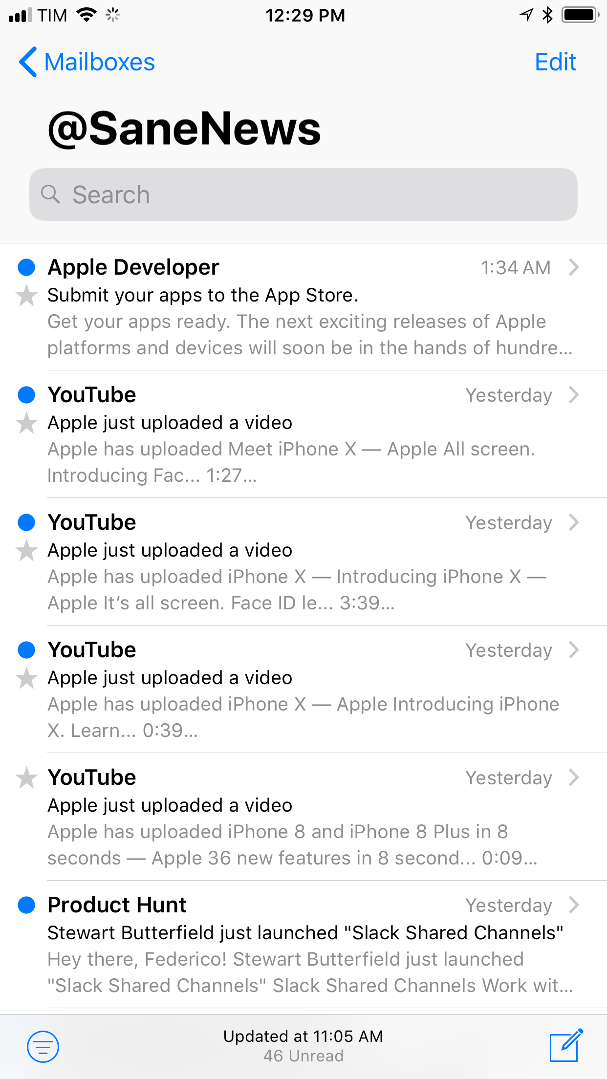
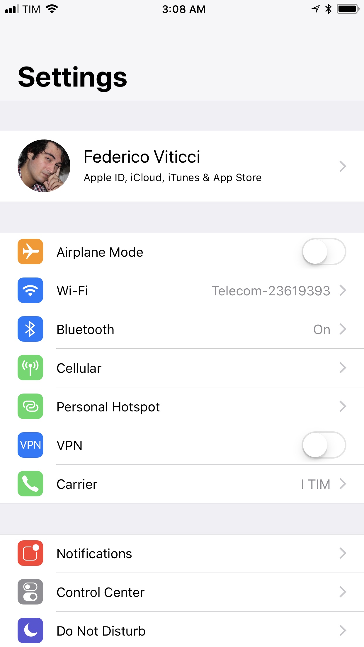
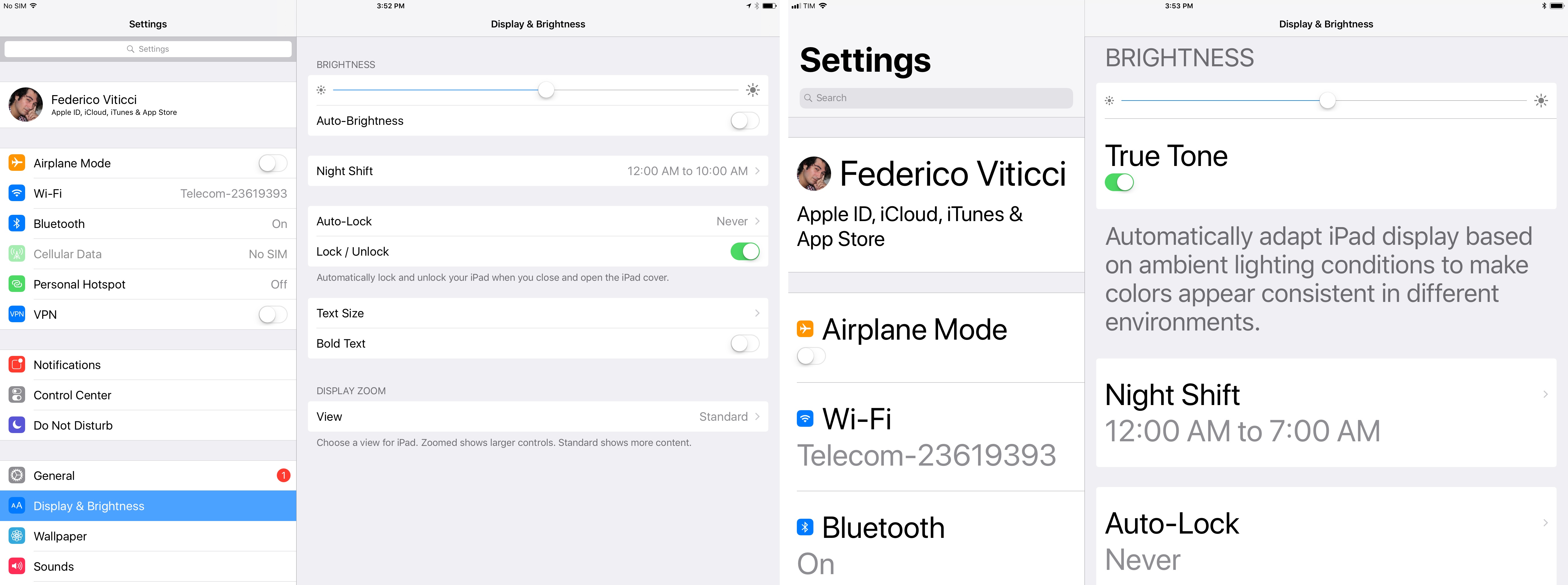
Large titles are modeled after iOS 10’s bold headlines in Apple Music. Third-party developers can choose to use them always, never, or have them only display in certain contexts; they can also set attributes such as custom colors, shadows, and sizes. Apple itself has switched to large titles in several of its built-in apps such as Mail, Messages, Settings, and Photos.
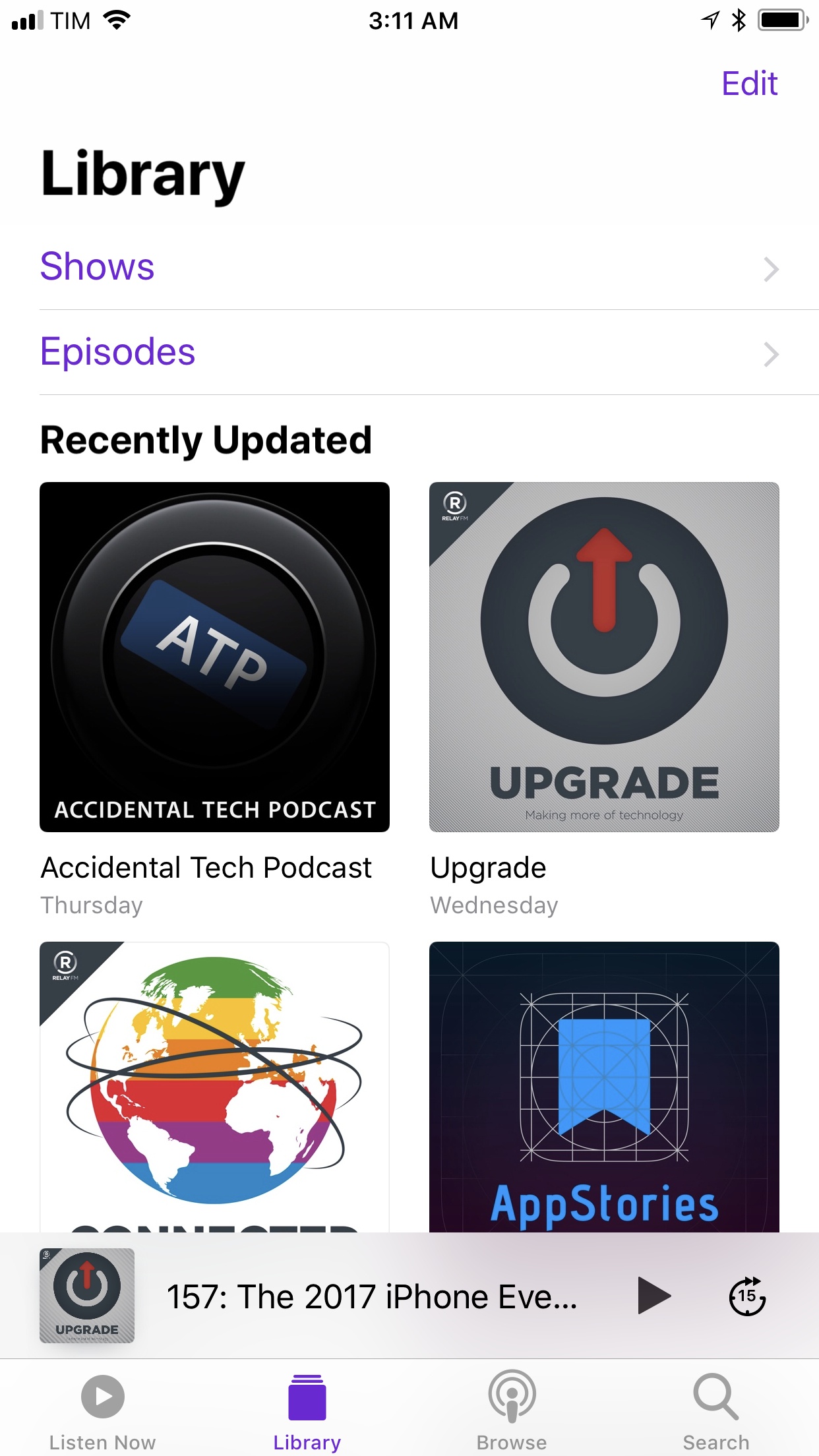
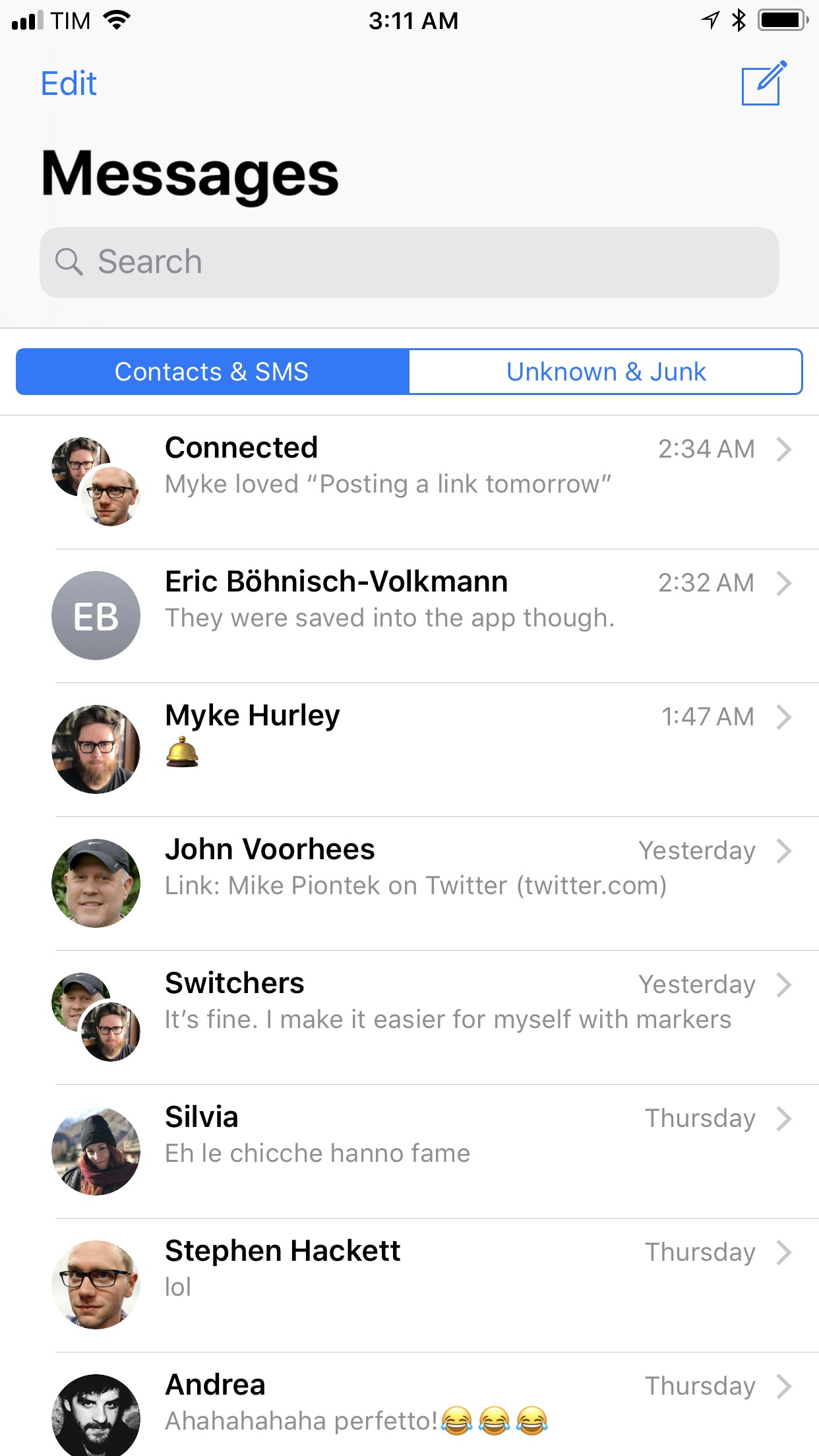
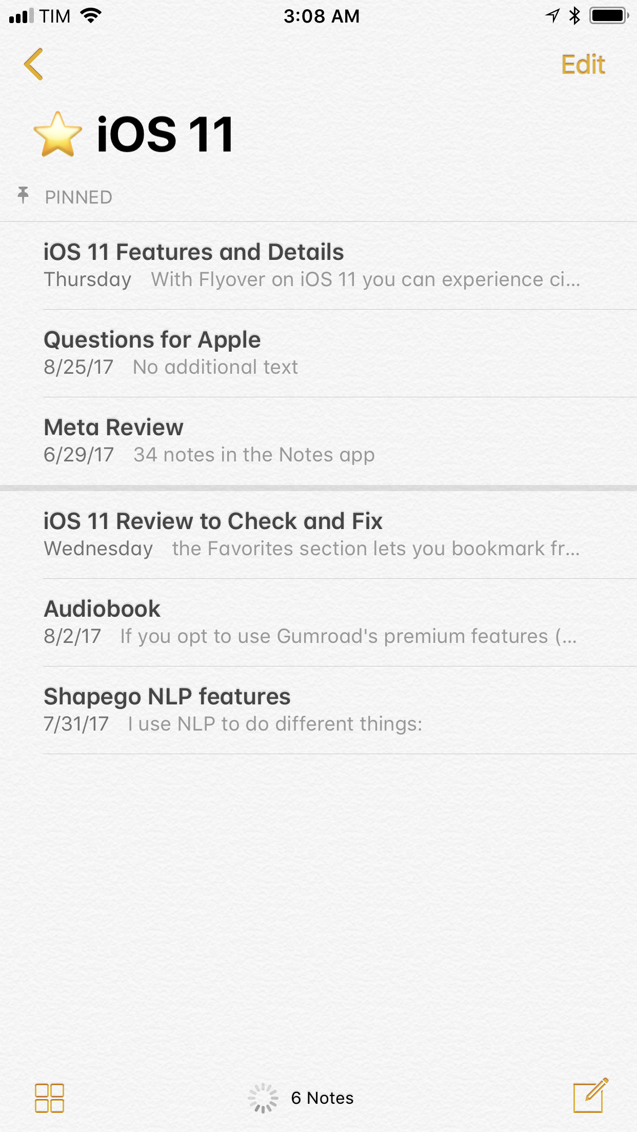
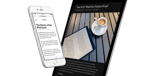
DEVONthink’s new large titles in iOS 11. Note the custom font weight.
Just Press Record’s new large titles in iOS 11.
The difference from iOS 10 is striking: the traditional title bar has grown taller to host a heavy variant of San Francisco that unmistakably defines the active view. When an app uses the new large title property in iOS 11, it can’t be missed.
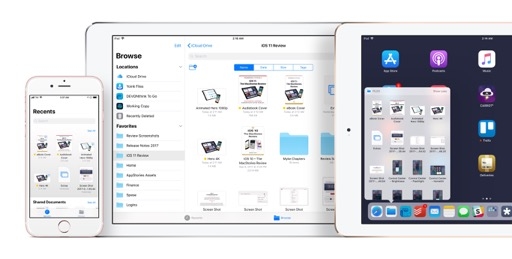
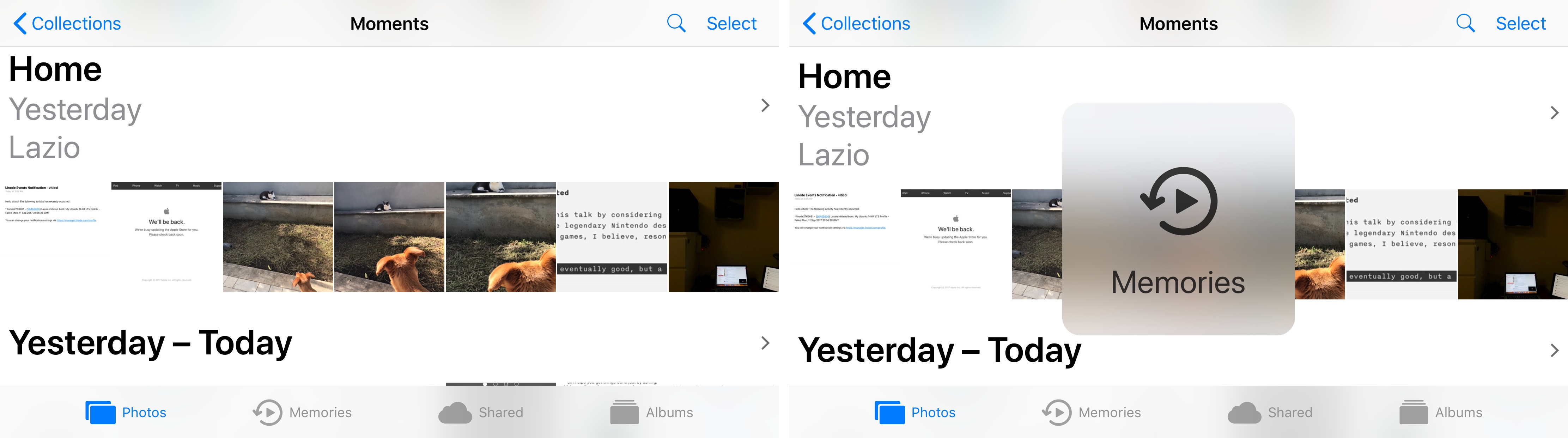
In most cases, large titles are used at the root level of an app to indicate the starting screen – the Settings app, for instance, features a bold Settings title in the main list, but uses the classic title bar when drilling down into individual setting pages. It is possible, however, for large titles to be implemented at secondary levels of an app’s navigation, especially if each section contains enough distinctive properties. In Photos, for example, the Years, Collections, and Moments views are all indicated with large titles, as each view can be browsed and interacted with differently. In Mail, the large title describes the primary Mailboxes view and specific folders as well. Apple has also used large titles to better denote selection of multiple items in lists and collection views.
There are a couple of interesting behaviors bundled with large titles. As you start scrolling, content in a view pushes the large title back into the navigation bar, minimizing it to achieve the same visual effect and weight of traditional, center-aligned title bars.
Furthermore, a search bar can be hoisted into the bottom of the title bar and revealed by pulling down at the top of a view. The integrated approach feels like a better use of the extra space.2
This brings me to my issue with large titles and taller navigation bars: at a glance, large titles take room away from content. I understand the principle behind large titles, and I do believe they look great (thanks to San Francisco’s scaling abilities) and add personality to iOS design. At the same time, I wonder if the empty space between the status bar and the large title is the best solution Apple could have come up with.
With large titles, it feels like Apple is overshooting in the opposite direction of iOS 7’s title bars. It’s worth debating if the same benefits of large titles – which, again, look terrific in isolation – could have been combined with a compact navigation bar for a more pleasing overall effect.
Bolder Elements
Several discrete parts of the iOS interface have been tweaked in iOS 11 to accomodate slightly bigger icons, more tappable buttons, thicker strokes, and heavier text weights. This is another instance of modern iOS design trickling down into iOS without a system-wide UI refresh.
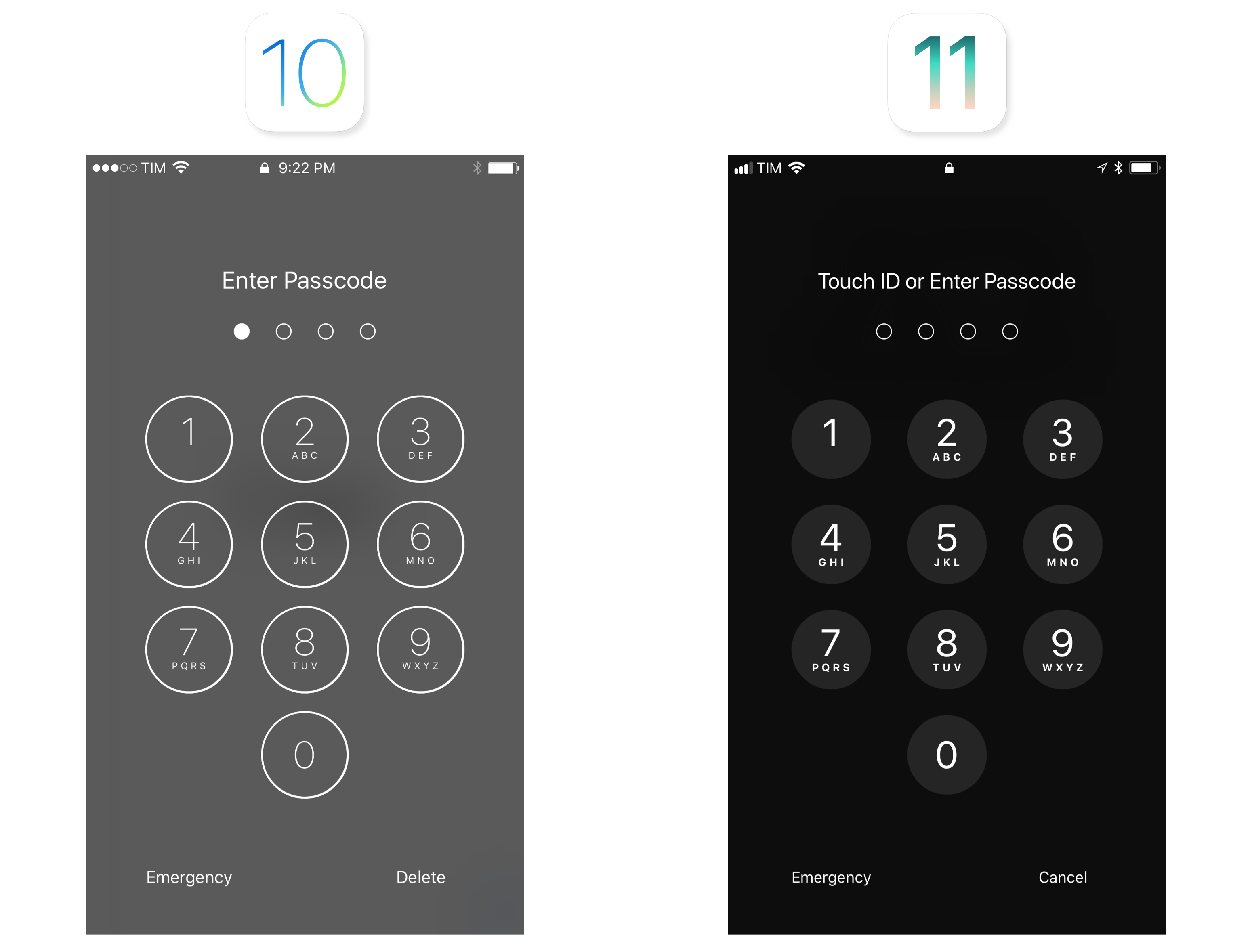
It begins with the setup process, where every screen is bolder than before:
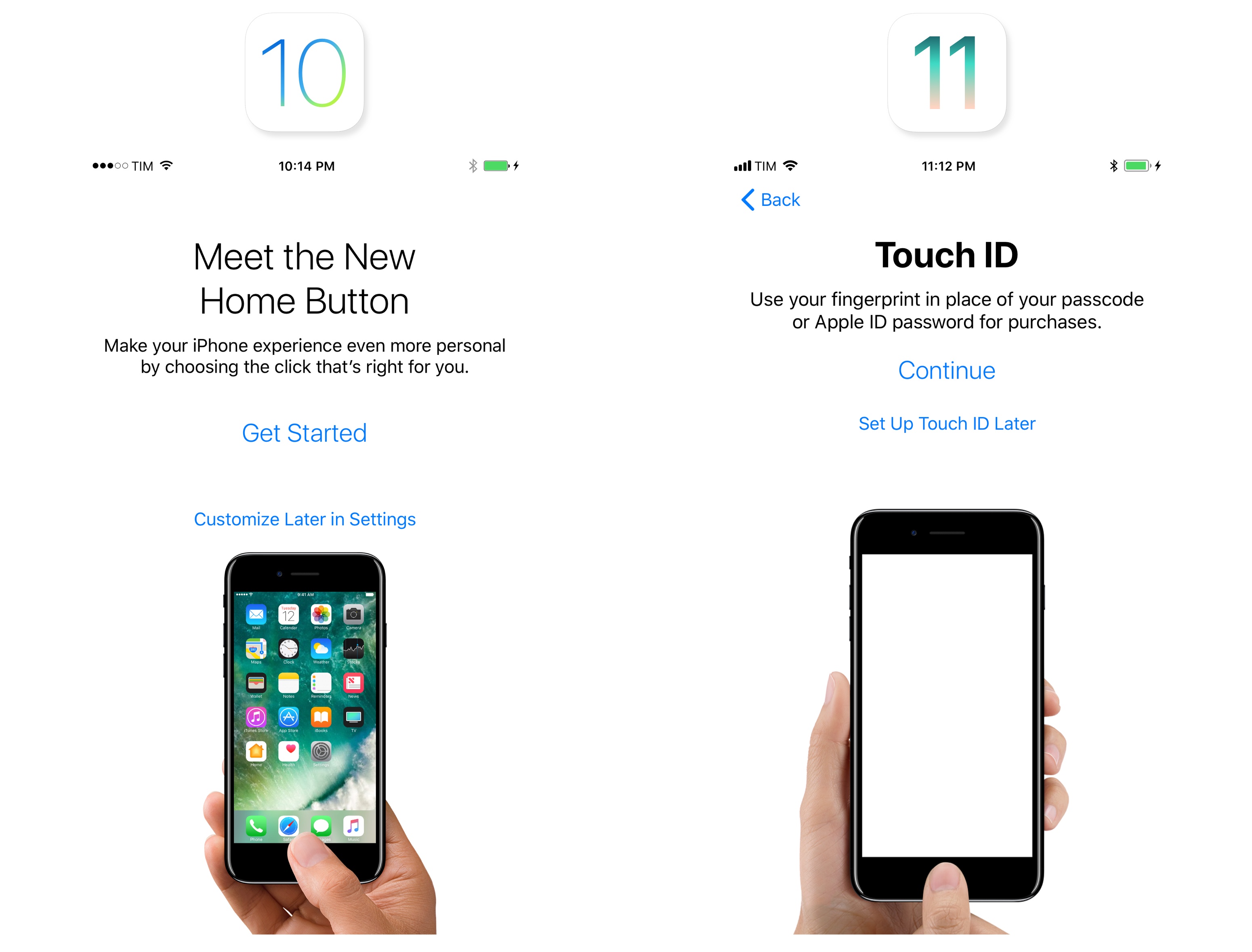
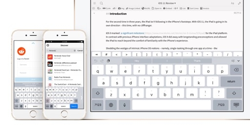
Numeric keypads and the passcode input interface have received a makeover in iOS 11. Number keys have gone from full-bleed to self-contained buttons; with a different color and texture, they could almost be mistaken for pre-iOS 7 buttons.
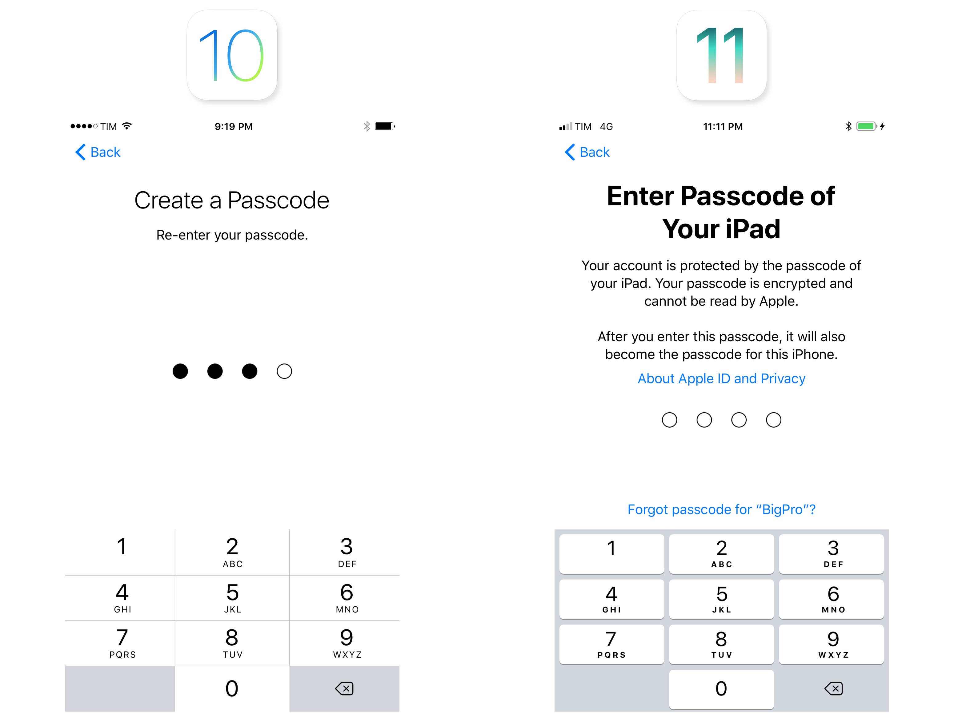
Passcode buttons, on the other hand, feature bold text and filled shapes – another departure from the hairline outlines typical of iOS 7. The look is more friendly and text is easier to read.
Bigger and bolder text is a trend in Apple’s apps for iOS 11: section headers in Photos (for dates and locations) are more legible; the month’s name in the Calendar app has turned bold; the Weather app sports increased text weights. These examples share the common vision of aiding app navigation through a more intelligent use of San Francisco. The effect is subtle and sensible; you’ll get used to it quickly because it’s simply better than iOS 10.
The move towards thicker elements applies to icons too, albeit inconsistently. In tab bars, icons have a thicker stroke, their shape has been filled, and text labels are displayed alongside them (rather than below them) in landscape mode. This is most noticeable on the iPad, where tab bars of apps such as Photos and App Store are now similar to Apple Music.

On the iPhone in landscape mode, labels are bigger and icons are smaller. This was done to compensate for a tab bar that can’t grow taller in landscape as it would take up valuable screen real estate. To allow users of the Larger Text feature in Accessibility to discern these glyphs, Apple has added a long-press gesture that brings up a HUD with a bigger icon and label when the user holds down on a tab bar item. The same gesture is also supported for other interface elements, such as toolbar buttons in Notes.
There are two potential problems with the new tab bar icon direction. For one, there’s an inconsistent use of new tab bar glyphs and toolbar icons that are still following the iOS 7 aesthetic of thin, angular outlines. Compare, for instance, toolbar icons from Mail and Safari with the softer tab bar icons from Photos and the App Store:
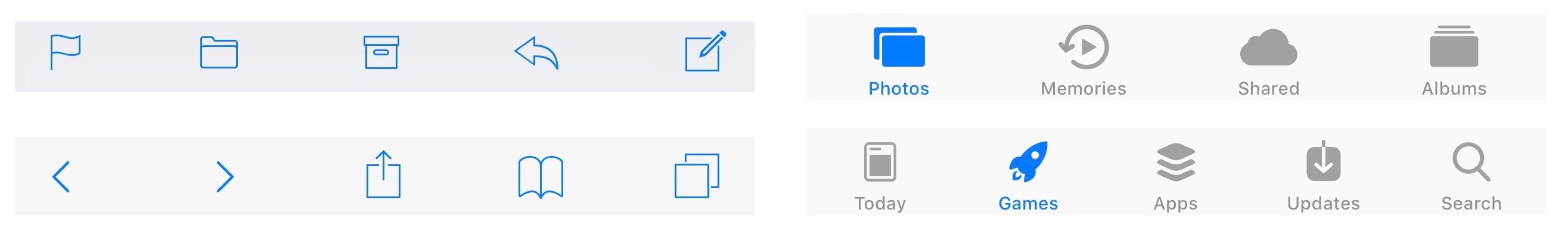
Toolbar and tab bar icons serve different purposes – tabs establish a sense of place; toolbar icons are actions – but, holistically, they feel like assets produced by two different companies at two different points in time. They don’t go well together.
The second, more important point relates to the accessibility of tab bar icons. By adopting an always-filled style where selection is only communicated through color, Apple is making it harder for colorblind users to identify which tab is currently selected in an app. The old tab bar approach was superior in this regard: an unselected glyph was gray and hollow; a selected tab was colored and filled – an important visual cue for people who can’t tell colors apart. iOS 11 tabs are losing that accessibility trait.
Fortunately, a key element of iOS’ inclusive design is getting a hefty upgrade in iOS 11. Support for Dynamic Type has improved across the system: system apps do a better job at implementing all accessibility sizes (12 in total) and optimizing their layouts for bigger text without sacrificing usability and good UI design. This is possible because all of San Francisco’s styles conform to Dynamic Type now (including the Larger Text options).
Improvements to Dynamic Type can be appreciated all around iOS 11. Calendar, which previously offered limited support for bigger type, scales to every Dynamic Type size; at the largest setting, the Month view (which didn’t support Dynamic Type at all in iOS 10) uses a completely different layout where only days are displayed to show an entire month.
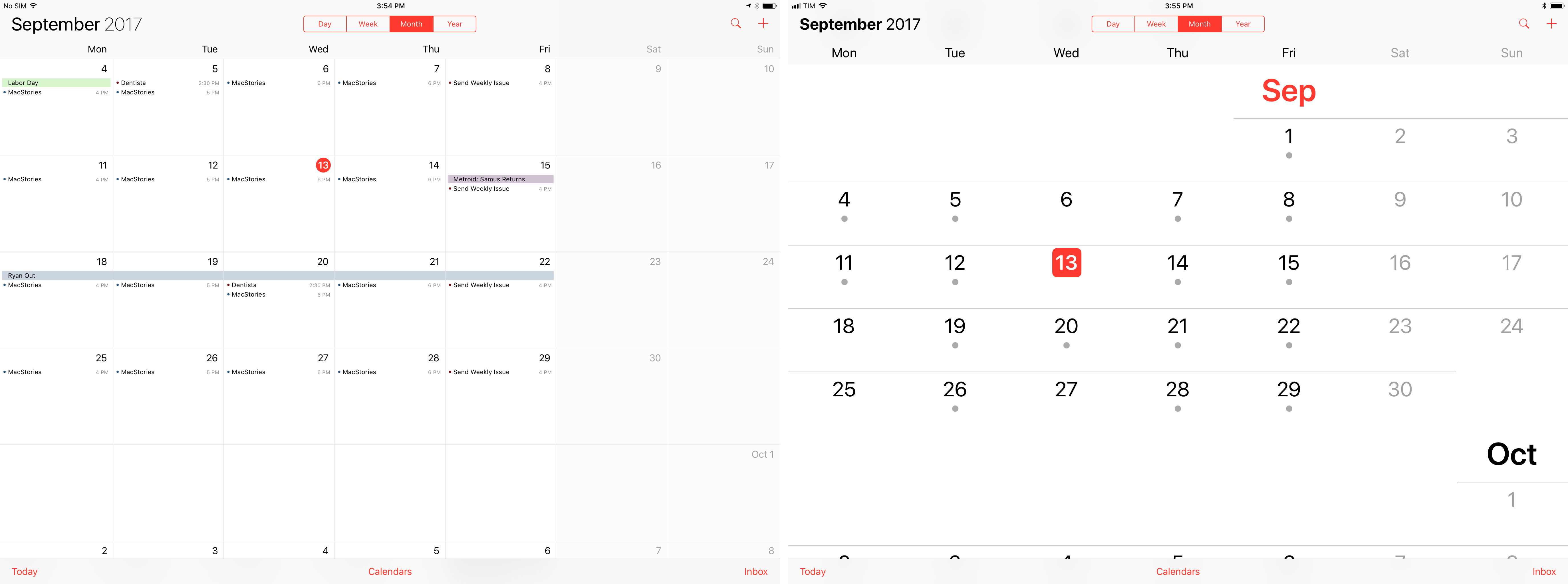
Calendar’s Month view at the largest text size on iOS 10 (left) and iOS 11. The layout has been entirely redone for iOS 11.
Settings is also a good showcase of the new Dynamic Type APIs available to developers: icons are nicely laid out next to text labels, and controls like switches can be displayed on a separate level within the same element. You’ll even find proper support for Dynamic Type in unexpected places like the Safari address bar, or the ‘Delete Event’ button in Calendar popovers.
Dynamic Type is one of the most powerful aspects of iOS’ design architecture. It empowers and benefits everyone – not just visually impaired users – and it’s a lesser known feature that can make a big difference. The changes in iOS 11 are a highlight of this release.
Video Player
Apple’s default video player has been heavily criticized over the past couple of years as the likes of YouTube and Instagram implemented superior video control interfaces optimized for touch and smaller screens.
While Apple’s player was rooted in the tradition of QuickTime and desktop players, YouTube shipped an unobtrusive volume bar (now commonplace in various social and video apps) and incremental skip controls based on quick taps. A video player may seem like a trivial problem compared to other tentpole features in an OS, but as watching video constitutes a large piece of the daily iOS interaction pie, getting it right is a big deal for Apple.
iOS 11’s solution is better than the old video player interface. Apple has split controls in three floating elements: minimize and close controls in the top left; an expandable volume button in the top right; and a progress bar with playback and AirPlay controls at the bottom.
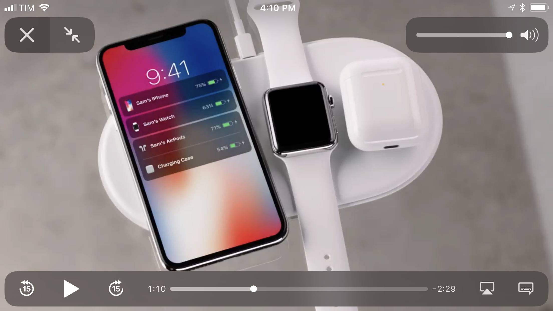
Because elements are translucent and aren’t fixed to corners of the screen, they reveal a portion of the video underneath, but I still think they get in the way of video too much – especially when compared to YouTube’s excellent player and gestures.
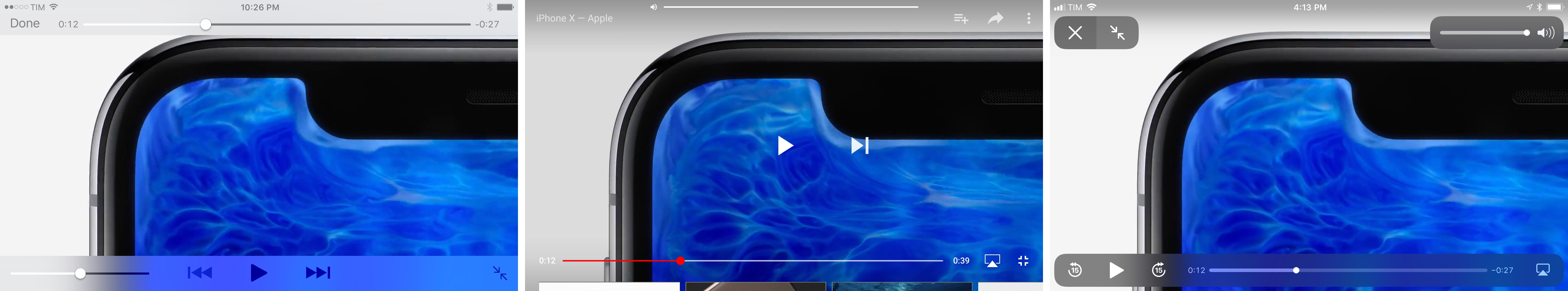
I appreciate the functional changes, though: permanent 15-second skip controls are convenient3, and you can now swipe down on a video to close the player altogether. It takes time to get used to it, but having the progress bar at the bottom rather than the top simplifies one-handed usage on an iPhone – although I wish there was more padding between skip controls and the Play button in portrait mode.
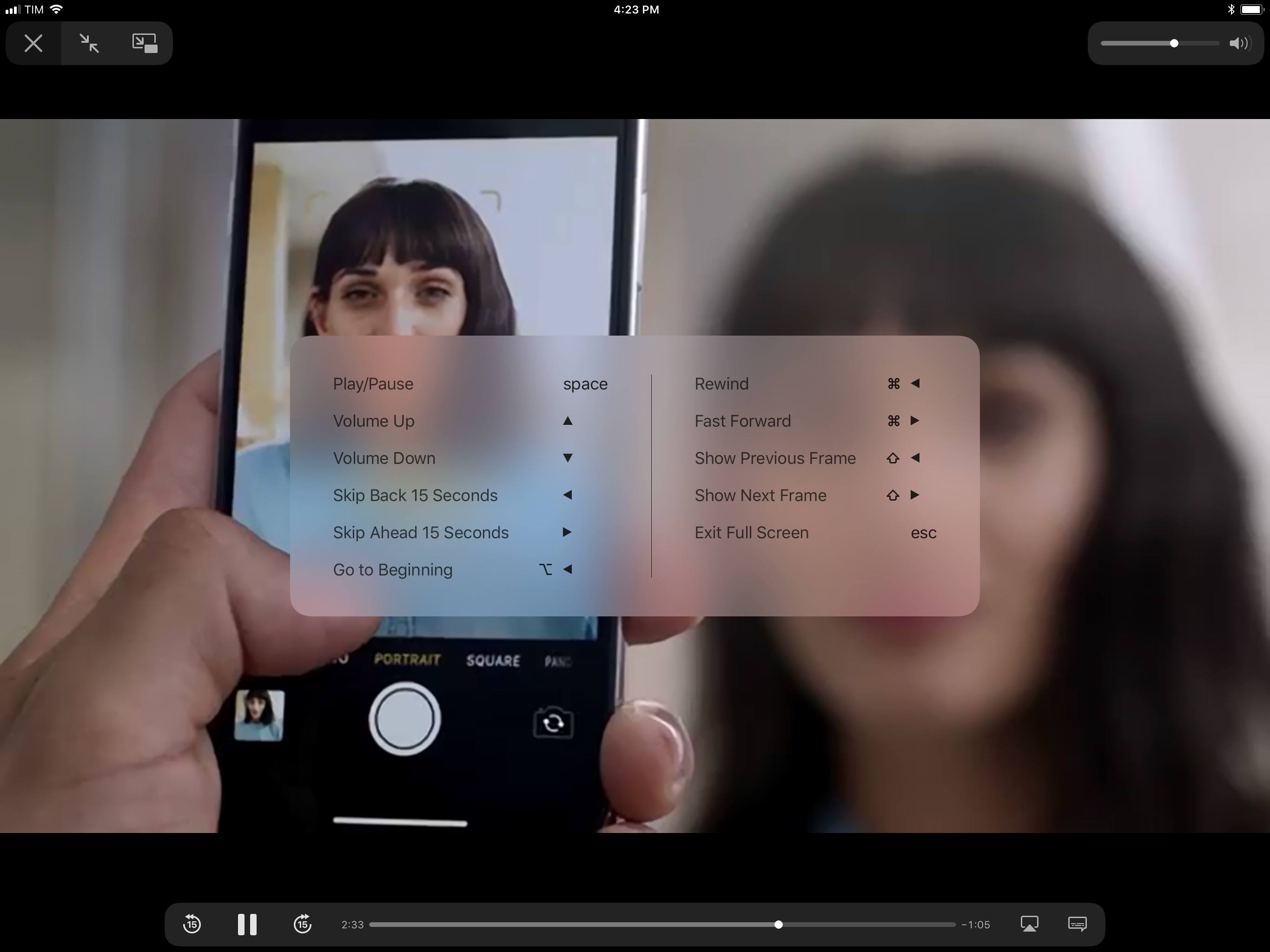
Playback controls don’t get in the way too much on iPad. There’s also excellent support for external keyboard shortcuts.
iOS 11’s volume control is a button that expands into a slider with a smaller footprint than the old volume bar. When a video is playing inline within a page, the button can be tapped to instantly mute or reset the previously selected volume level. In full-screen, you can long-press the button to turn it into a slider; as you’re holding down, you can swipe to manually adjust the volume without lifting your finger – a gesture that is consistent with Control Center’s volume. There’s even subtle haptic feedback when you reach the leftmost edge of the slider.
The best part of the new volume control design is that it gets rid of the annoying HUD when pressing the physical volume buttons. When you’re watching a video in full-screen, pressing your device’s volume buttons will trigger the player’s volume slider instead of the system’s volume HUD.
It should also be noted that the video player sports a degree of liveliness in the interface that would be great to see elsewhere on iOS. The AirPlay and skip buttons bounce slightly when tapped; the volume puck glides across the slider while the icon‘s beams shrink and grow as needed. Other parts of iOS could use these kind of fun, informative animations to contextualize user interactions.
Overall, while iOS 11’s video player may not offer the helpful skip gestures or inconspicuous volume bar of YouTube, it’s a superior video player design than iOS 10 with room for future improvements. I’m a fan.
Still Moving
We’re now four years into iOS 7-era design, and Apple is still dialing back decisions that have made iOS harder to use for many. Some of the choices in iOS 11 may be merely stylistic or the result of new trends; others show that Apple is accepting the reality that people don’t understand design without affordances, even if it’s apparently captivating and sleek.
Particularly over the past two years, it almost feels as if Apple is gradually redesigning iOS without us noticing – changing the living room’s layout without asking everybody to leave. Some UI elements are getting thicker and bolder again; drop shadows, gradients, and pastel colors have returned in different areas of the OS; buttons have shapes and borders around them.
But at a high level, that’s also the problem: some of iOS’ design is changing while the rest clings to the past. Like last year, there’s a sense of two design philosophies coexisting on iOS and often clashing with each other. Even with its initial shortcomings, it’s clear that one should prevail over the other – the one that feels fresh, usable, and inclusive. As long as this transition remains in flux, no subtle hint or implicit reversal will feel as decisive as a full commitment by Apple to a new design language. And as a result, iOS’ interface will continue to contradict itself, leaving users and developers confused as to what the future of iOS design holds.
If Apple truly wants to move iOS design forward, perhaps at some point we’ll have to notice.