Design
From an aesthetic perspective, iOS 9 doesn’t drift away from the focus on clarity, content, and color that debuted in 2013. iOS 9’s design builds upon the new course of iOS 7, with some notable differences that epitomize Apple’s penchant for refinement this year.
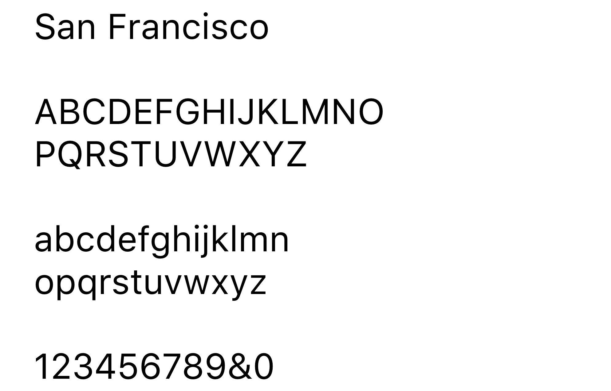
San Francisco
After a short and public affair with Helvetica Neue, iOS 9 brings a new system font called San Francisco.
Designed in-house by Apple and introduced at WWDC as a family of typefaces that is both “inconspicuous and beautiful”, San Francisco is a sans-serif typeface which unifies the typographic voice of iOS, OS X, and watchOS, bringing visual consistency with two distinct sub-families and new APIs for developers to enhance the textual presentation of their apps.
From an average user’s perspective, the change to San Francisco may not appear as a drastic modification to the iOS interface. To people who are not familiar with the intricacies and details of type design, San Francisco may look subtly different, but mostly in line with the neutral and utilitarian nature of Helvetica Neue. This isn’t meant to sound as a slight to design experts and type connoisseurs, but a lot of people won’t notice the technical detail and years of work behind San Francisco.
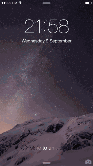
From the look of the clock and date on the Lock screen to the time in the status bar and bold labels in title bars, San Francisco refreshes the textual appearance of iOS without clamoring for undivided attention. With San Francisco, iOS 9 doesn’t suddenly look like a jailbreak tweak that changes the system font to impractical typefaces just for the sake of customization. San Francisco looks nice – and it is objectively better than Helvetica Neue in some cases – but it doesn’t stand out and shout “Look at me, I’m new!”, and I believe that’s exactly what Apple set out to attain in their effort to craft a modern typeface for all their platforms.
With iOS 7 (and 2014’s work on OS X Yosemite), Apple’s design team strove to build a structure that could forgo realistic representations of objects and textures in favor of a new hierarchy of text and color. While different colors and the interplay of layers have been used to suggest interactivity and depth, the job of communicating hierarchies and relationships between interface elements has largely fallen upon text weights and sizes.
That’s why, for instance, title bars feature non-tappable bold titles and regular-sized colored buttons next to them, or why the same font used across three lines, but in different weights, can lay out an email’s sender, subject line, and body text preview. Apple discovered that once you get rid of shadows and textures to embellish UIs and push people towards interaction, text itself can be the texture; possibly an even more versatile one, because of its programmability, scalability, and widely recognized properties.
We’ve seen how third-party apps such as Overcast and Twitterrific gained an identity of their own thanks to the typefaces they employed. From this standpoint, is it really a surprise that Apple – a company with a knack for controlling the primary technologies of their products – chose to design a new family of typefaces to use everywhere?
That’s where San Francisco is worth exploring. Understanding its technicalities can help us comprehend Apple’s decisions and appreciate the details that will be shared between the OS and apps.
San Francisco comes in two sub-families: San Francisco, used on iOS 9 and OS X El Capitan, and San Francisco Compact, used on Apple Watch. The two variants are related but not equal, with similar designs but different proportions and shapes that can adapt to multiple screen sizes and UI needs.
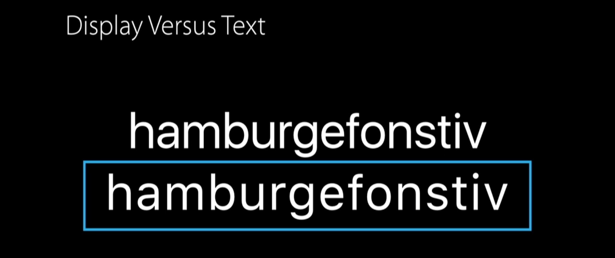
Each family has, in Apple’s parlance, two cuts – Text and Display – with six weights for Text and nine weights for Display. Apple’s goal with San Francisco is to bring a consistent voice and reading experience to all platforms; while the typeface stems from a shared set of rules and guidelines, each flavor of San Francisco has been designed and engineered for the platform it’ll be displayed on.
As an artistic expression and software feature, fonts stand at the intersection of craftsmanship and engineering. In designing San Francisco, Apple was tasked with creating a typeface that looked good and was consistent in and out of itself, but that could also scale across three OSes and, more importantly, provide users and developers with controls over font size and readability.
This is one of the core aspects of San Francisco: with an increasing array of screen sizes and ways to personalize the appearance of fonts on iOS, a new family of typefaces ought to solve a problem bigger than nice looks. Text is everywhere, but there’s no perfect font size or style that can fit everyone.
Consider Dynamic Type, an Accessibility feature introduced in iOS 7 that allows users to change the size of the system font. With a single slider available in the iOS Settings, users can make text bigger or smaller at a system-wide level, achieving a more comfortable reading experience in Apple’s apps but also third-party apps which integrate with Dynamic Type.
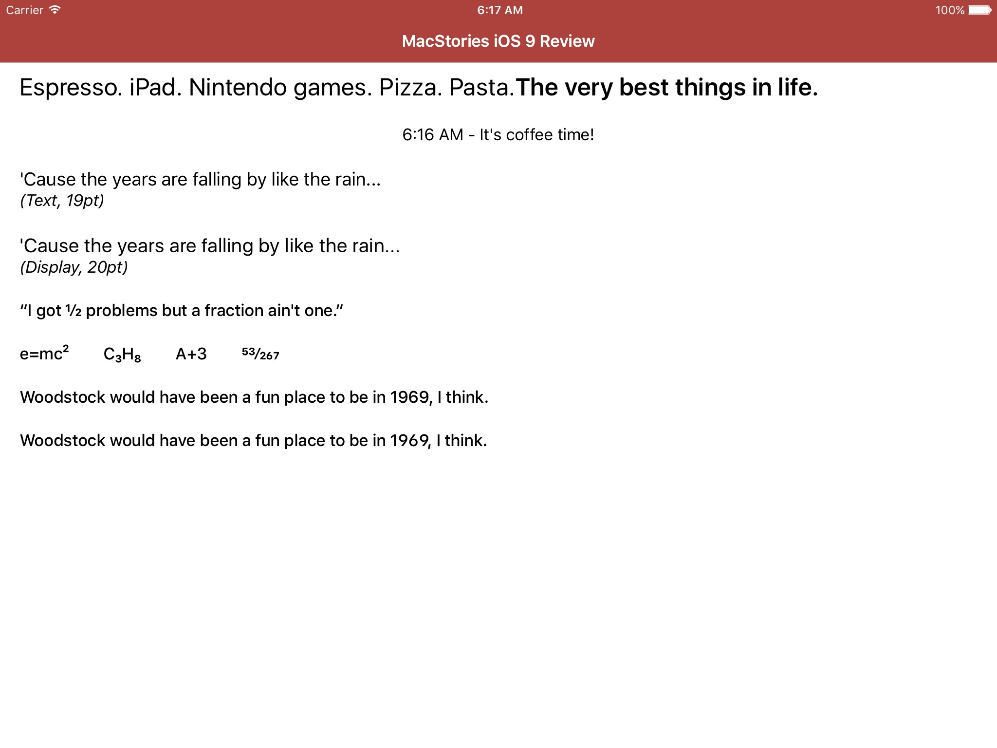
San Francisco expands upon the idea of ever-changing font sizes with Text and Display, two cuts which are intelligently applied by the system when needed. The main trick employed by Apple is that iOS 9 switches automatically from Display to Text at 20 points. When this threshold is met, Apple “cheats” by altering the font ever so slightly so that it remains readable at smaller sizes. This makes Text suitable for text content displayed at 19 points and below, and Display the best option for labels and other text content displayed at 20 points and above.
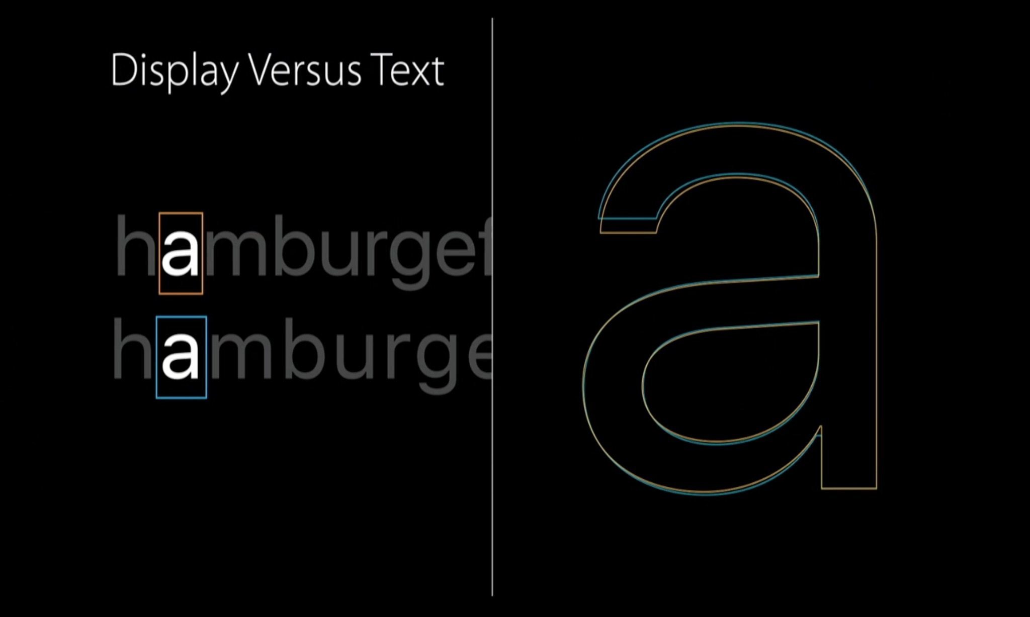
The difference between Text and Display is subtle and it likely won’t be noticed by most users, but it contributes to keeping San Francisco readable at any size, in any app, with any Dynamic Type setting. This also means that Text and Display are not equal: when text gets smaller, details of round shapes (such as the terminal of a lowercase “a”) get shorter and simplified, while the arm of a lowercase “t” and the shoulder of a lowercase “r” get slightly wider or longer to ensure shapes of letters can be quickly identified when reading. Then, size-specific tracking (the space between letters throughout an entire word, not to be confused with kerning) makes text further spread apart, in order to avoid confusion when reading sentences at a smaller point size.
Apple explained the decision as having to adjust visual perception through illusion. Sometimes you have to cheat to make text look good to the user, and altering some details of San Francisco Display in its dynamic transformation to Text allows the same font to always produce readable text no matter the size.
If you really want to spot the differences, you can go into Settings > General > Accessibility > Larger Text and have fun moving the slider to see how San Francisco adapts to smaller and bigger sizes. Or, you can pick San Francisco in the new Safari Reader and tweak its size to see how Display and Text come into play and change according to your preference.
To understand the importance of increased detail at a smaller size in a different context, think about the setup process of videogame consoles or accessories like a Chromecast or an Apple TV. When viewed from a distance, lowercase text on TV keyboards can be hard to recognize, especially when your eyesight isn’t as good as it used to be. Now, consider that millions of people with visual impairments or low vision may come across similar readability problems on their iOS devices on a daily basis. When bigger text or zoomed UIs aren’t an option, having smaller text that is still recognizable and legible becomes essential.
San Francisco’s smaller optical size feels airy and with fewer or more details depending on the anatomy of a character. Some of its subtleties will be lost to the average user, but that’s the point. People don’t have to know how fonts work. They just have to find them readable. And this is true for all kinds of people, with all kinds of needs.
In my tests with apps updated to support the new system font, I found San Francisco to be more comfortable and readable at smaller sizes than other sans-serif typefaces like Helvetica Neue and Avenir. More importantly, San Francisco strikes a good balance of adding fresh personality to the system and keeping an underlying familiarity with previous versions of iOS. It feels more lively, it’s not too sharp and geometric, and I find it legible enough at any size.
For developers, San Francisco offers APIs and features that can be enabled in apps without having to resort to Unicode tricks or fall into limitations of previous system fonts.
Features are behaviors embedded in San Francisco via code; developers can choose to use them or opt out. Some of these features include built-in support for fractions (so developers aren’t limited by the choice of fractions as Unicode glyphs and don’t have to write custom code to display them), native superscripts and subscripts, alternate 6 and 9 symbols for smaller sizes, proportional numbers by default (but developers can opt into monospaced if they want to), uppercase forms for various math symbols, and a vertically centered colon.
On top of this, San Francisco has comparable vertical metrics to old system fonts for basic compatibility with existing third-party apps and UIKit; it covers Polish, Hungarian, Cyrillic script, Greek script, and more, allowing for consistent localization of apps for international users; and, developers have been given new APIs to access all of the weights available in San Francisco.
I’d like to point out three of the features available in San Francisco, as they have nice, observable properties that anyone can appreciate with enough attention.
The vertically centered colon is used by Apple in typesetting the system clock, and it can always be seen in action in the iOS 9 Lock screen and timestamps in Messages. This is a nice detail which makes for a pleasing viewing experience.
Alternate symbols for 6 and 9 are also interesting as they’re already in use by Apple in the Stopwatch app for Apple Watch and on the back of the Watch itself for the serial number. At smaller sizes, the similarly curved shape of these two numbers can be easily confused, and the alternate look (opt-in for developers) enables flatter, discernible shapes with lower cognitive load.
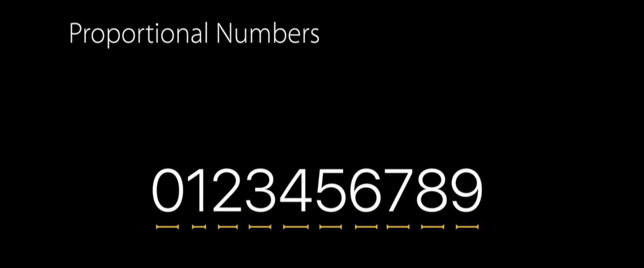
Monospaced and proportional numbers aren’t exactly new in iOS 9: Helvetica Neue supported switching from monospaced to proportional in iOS 8, but the default behavior has changed in iOS 9. Now, the system defaults to displaying proportional numbers: in most cases, proportional numbers (with variable width) are more evenly spaced with fewer unusual gaps between them than monospaced (fixed width) counterparts. If a series of numbers is rendered proportionally, a skinny “1” won’t take up the same width of a larger “5”, leading to a more pleasant effect.
There are instances in which monospaced numbers would be preferable (such as columns in spreadsheets or animations in progress bars), but for most cases of body text and labels (and the system clock), proportional numbers as the default option is the right move.
To better showcase the capabilities of San Francisco in iOS 9, I asked Daniel Breslan, an independent developer who works on Departure Board for iPhone, to create a sample app for iOS 9 and compare San Francisco to the same text strings and layout of an iOS 8 app with Helvetica Neue.
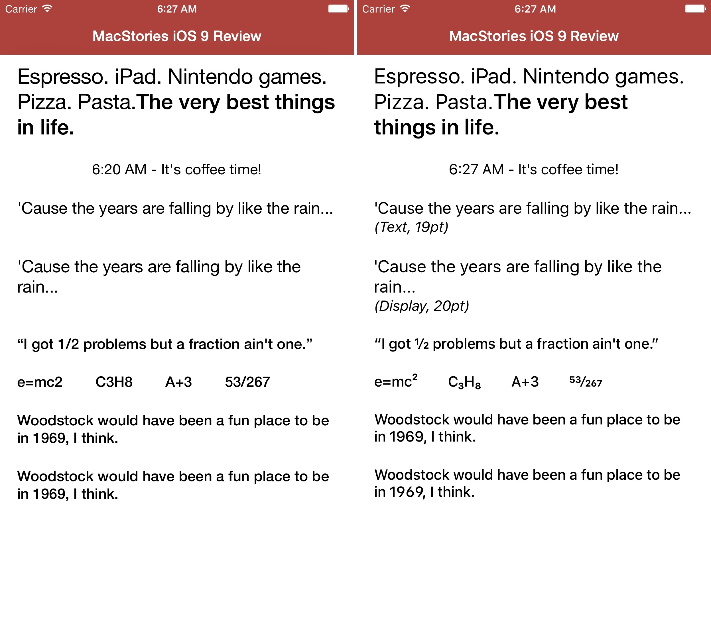
This was a fun experiment as it shows how tracking, Text and Display cuts, and font features affect apps in practice. In the screenshots above, you can see how San Francisco adds a bit of personality to an otherwise neutral typeface, with details such as fractions, superscripts, subscripts, and alternate 6 and 9 making for a superior reading and formatting experience in iOS 9.
Today, it seems obvious that Apple wanted to control the typographic destiny of its ecosystem. Our experience with iOS devices primarily involves reading text. Whenever we pick up an iPhone or iPad and we look at something, text is part of it. Text is communication, texture, and call to action. Text has established a new visual hierarchy since iOS 7, but Apple wasn’t directly in control of its appearance and functionality. With San Francisco, Apple has set out to design a typeface that’s familiar, flexible, elegant, and accessible.
The details of San Francisco may go unnoticed in the general public, but by claiming control of the system font, Apple is allowing developers to spend less time dealing with code required to build features that are native in San Francisco, letting them focus on other parts of their apps. This is a common thread in iOS 9, and an expected next step given the maturity and reach of the iOS ecosystem in 2015.