Keyboard
Another San Francisco-related change in iOS 9 that demands a standalone section is Apple’s response to criticism on the Shift key design of iOS 8.
The solution proposed by the company in iOS 9 is twofold. As far as the Shift key is concerned, iOS 9 introduces a simpler design that makes its On/Off state more obvious. When turned off, the Shift key has a gray background with a hollow glyph that matches the adjacent keys. When turned on, the entire key turns white with a black, filled glyph.
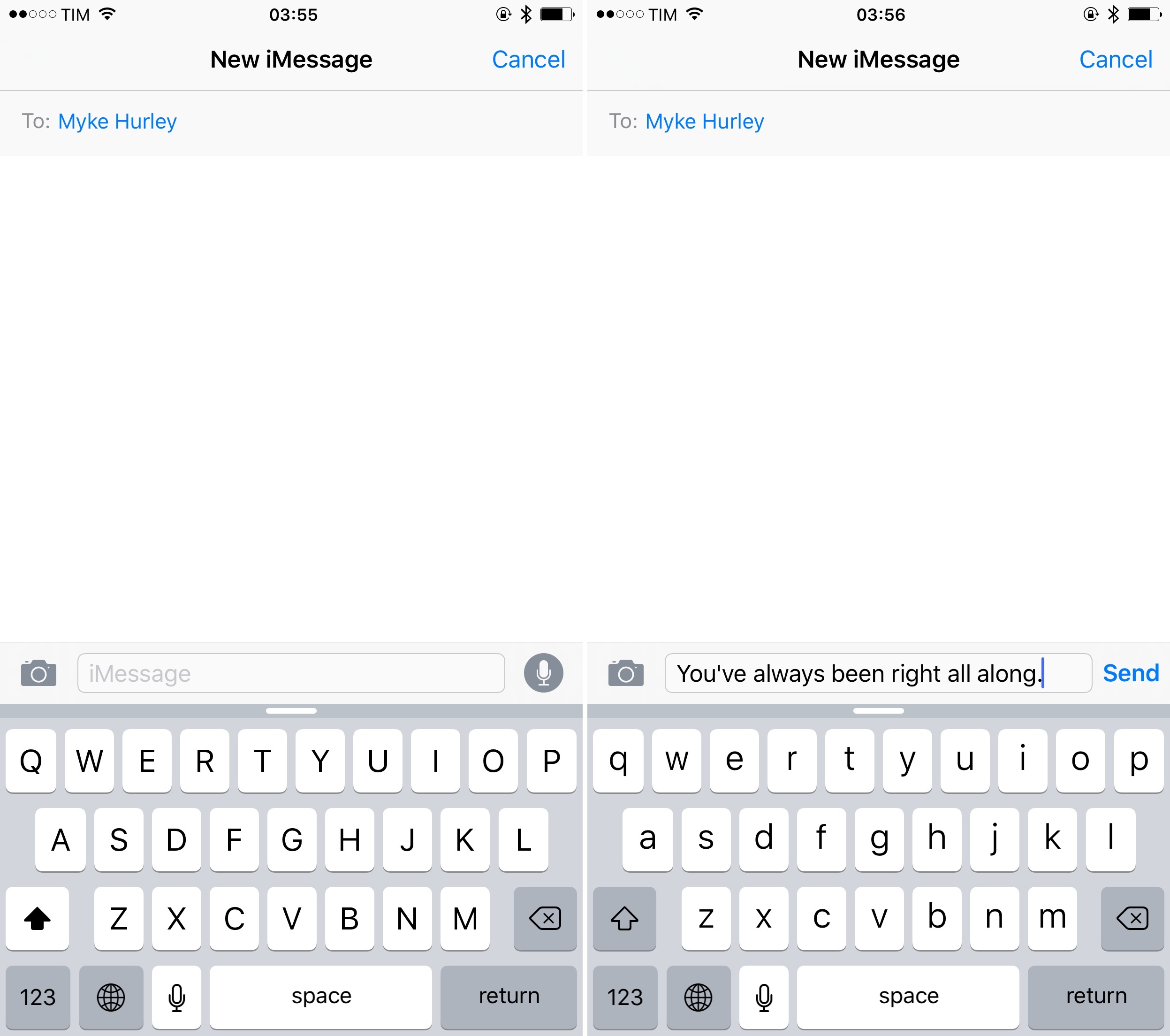
The new design clearly indicates the activation state of the Shift key, and it goes a long way in removing doubts on whether Shift is enabled or not, solving a major usability issue of the iOS 7/8 keyboard.
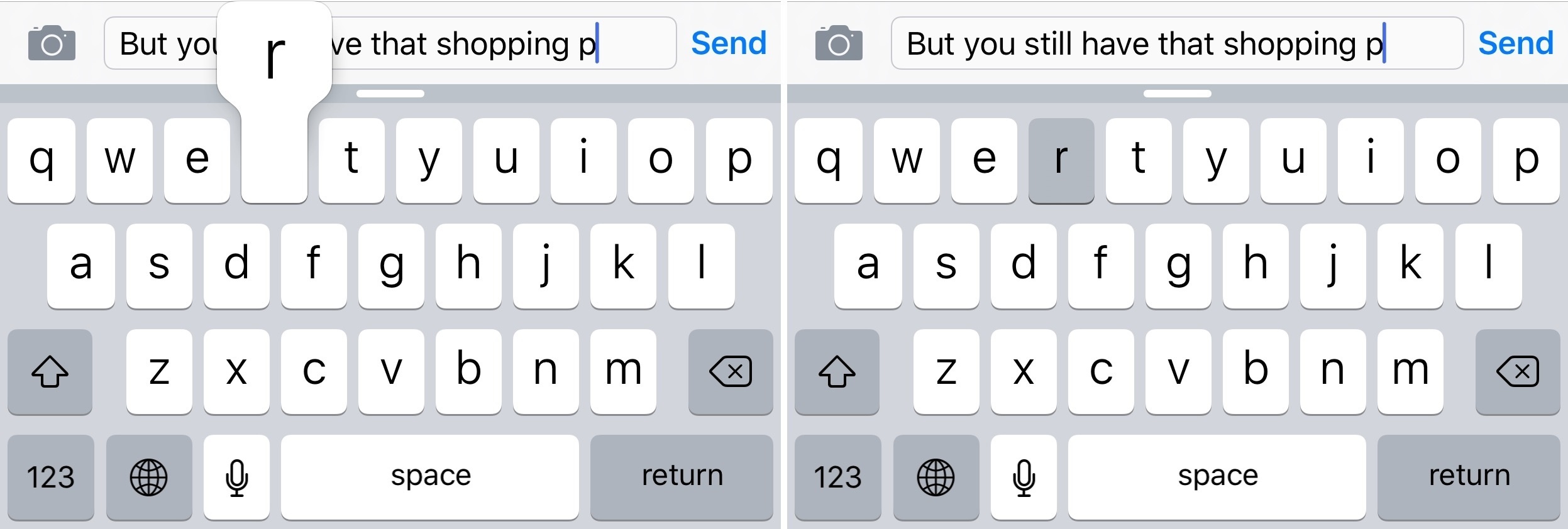
iOS 9 also brings a feature which has been a staple of keyboards on Android, other OSes, and even videogame consoles for decades: lowercase and uppercase letters on the keyboard.
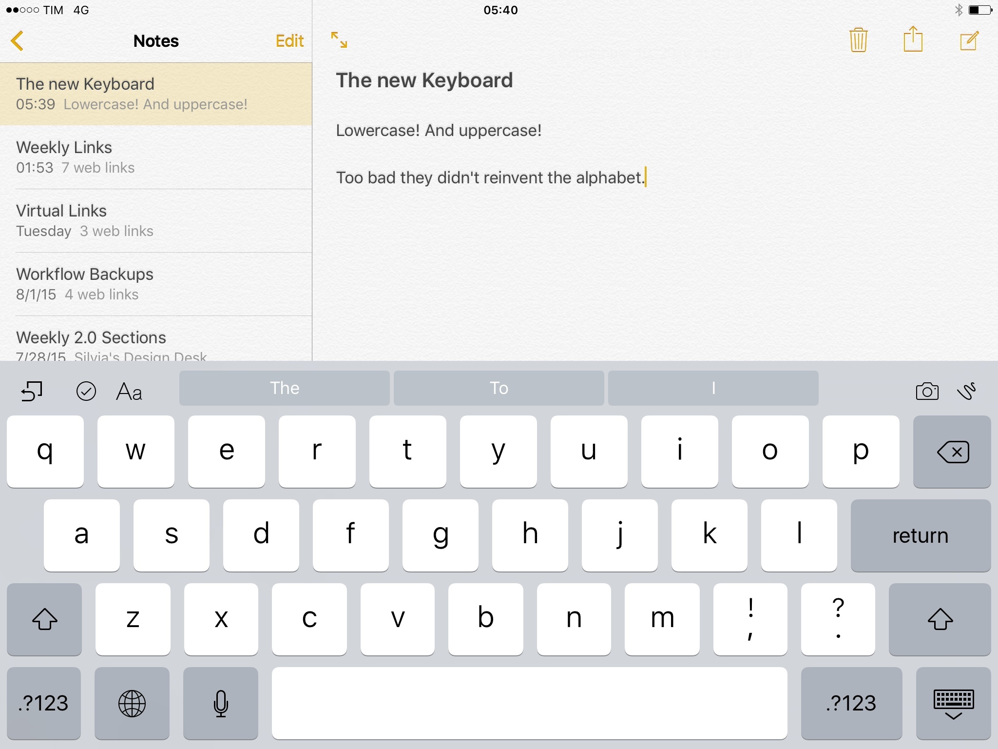
Apple has added lowercase and uppercase variations of San Francisco letters to the iOS keyboard, turning on the option by default. With a default configuration, this means that when typing on iOS 9 – on either the iPhone or iPad – keys will constantly switch from uppercase to lowercase letters.
Critics of this design choice will argue that switching between uppercase and lowercase characters looks garish and fiddly, that Android has featured a similar behavior for years, and that such keyboard design loses the purity of the original iPhone’s keyboard. I understand the conceptual premise of this argument, but it dismisses the actual benefit of the new keyboard design in iOS 9.
Animating characters between uppercase and lowercase transitions may not look as polished and precise as an always-uppercase keyboard, but it’s more practical. I’m used to looking at uppercase and lowercase characters every day, and I don’t mind seeing this on the iOS keyboard. The affordance is simply stronger and more natural.2 It’s faster to look at lowercase keys and expect lowercase characters to be entered on screen as a result of my direct manipulation than having to guess the output of my typing based on the Shift key alone.3
This is the very advantage of software keyboards: they can be updated via software. For eight years, the iPhone’s keyboard was stuck on imitating the hardware keyboards of Macs, with uppercase keys that look bigger and better but that can’t be updated or changed dynamically. Alternating between lowercase and uppercase characters is just another case of a right thing to do because iOS doesn’t have to be like a PC.
Apple is making this an option, at least for now. If you’re unhappy with the new keyboard design in iOS 9, you can go into Settings > General > Accessibility > Keyboard and turn off ‘Show Lowercase Keys’. This will turn off alternate lowercase and uppercase letters, but it won’t apply to third-party custom keyboards from the App Store.
Apple has also added an option to disable Character Preview, the little popup that appears every time you tap a letter on your iPhone’s keyboard. This is likely a consequence of having lowercase and uppercase letters – it’s no longer of paramount importance to confirm the character that is being typed when you’re looking at a keyboard that adapts to each case.
If you’re okay with this option, you can turn off Character Preview in Settings > General > Keyboard.4
Rounded Corners
With the exception of San Francisco, the overall look of iOS isn’t changing in version 9.0, but floating menus and sheets have received rounder corners and stronger drop shadows that make them stand out against the background of an app.
As a result, buttons in menus are taller and they look more like buttons, inviting users to tap on them.5
The change is subtle but noticeable, and I’ve been thinking about why Apple has decided to bring this to iOS 9 when there doesn’t seem to be any official update to the design guidelines of iOS.
The explanation I came up with is that every major Apple software redesign tends to overshoot and dial back over time, dampening the most radical aspects to readjust what was probably exaggerated in the first version. Alerts and sheets had a serious depth problem in iOS 7 and iOS 8, and they could be confused with the rest of an app.
But I also believe the iPad motivated this change: with the device now capable of showing multiple apps and sheets on screen at the same time, making each element independent from what’s underneath it is going to be crucial for clarity. Bigger, rounded menus with drop shadows look nicer and they also serve a purpose. I wouldn’t be surprised to see more updates along these lines in future versions of iOS.
- Although Apple didn't go as far as the popular Teehan+Lax concept, the result is close. ↩
- Not to mention that, for visually impaired users, being able to discern character status when the entire keyboard changes is a stronger visual cue than a single, confusing Shift key. ↩
- Personally, I chose to keep it off, as having lowercase letters on the keyboard is enough for me now. ↩