Notifications
The Lock screen went through a significant overhaul in iOS 10: with Raise to Wake and a new two-step unlocking mechanism, it became an area where users could spend time to interact with notifications and widgets. iOS 10’s Lock screen didn’t have to be locked at all times anymore to be useful. And today we can assume that all that work was in preparation for the iPhone X’s facial recognition and iOS 11’s unification of the Lock screen and notifications.
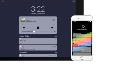
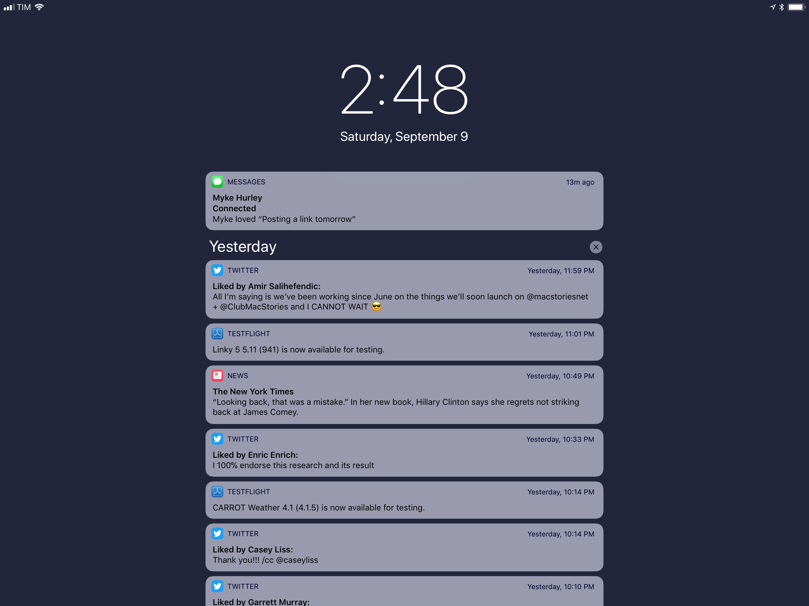
After six years of honorable service, iOS 11 gets rid of Notification Center and replaces it with Cover Sheet. When you swipe down from the status bar in iOS 11, you’ll no longer be presented with a dedicated notification view; instead, you’ll be taken to an already-unlocked version of the Lock screen displaying all your unread notifications.
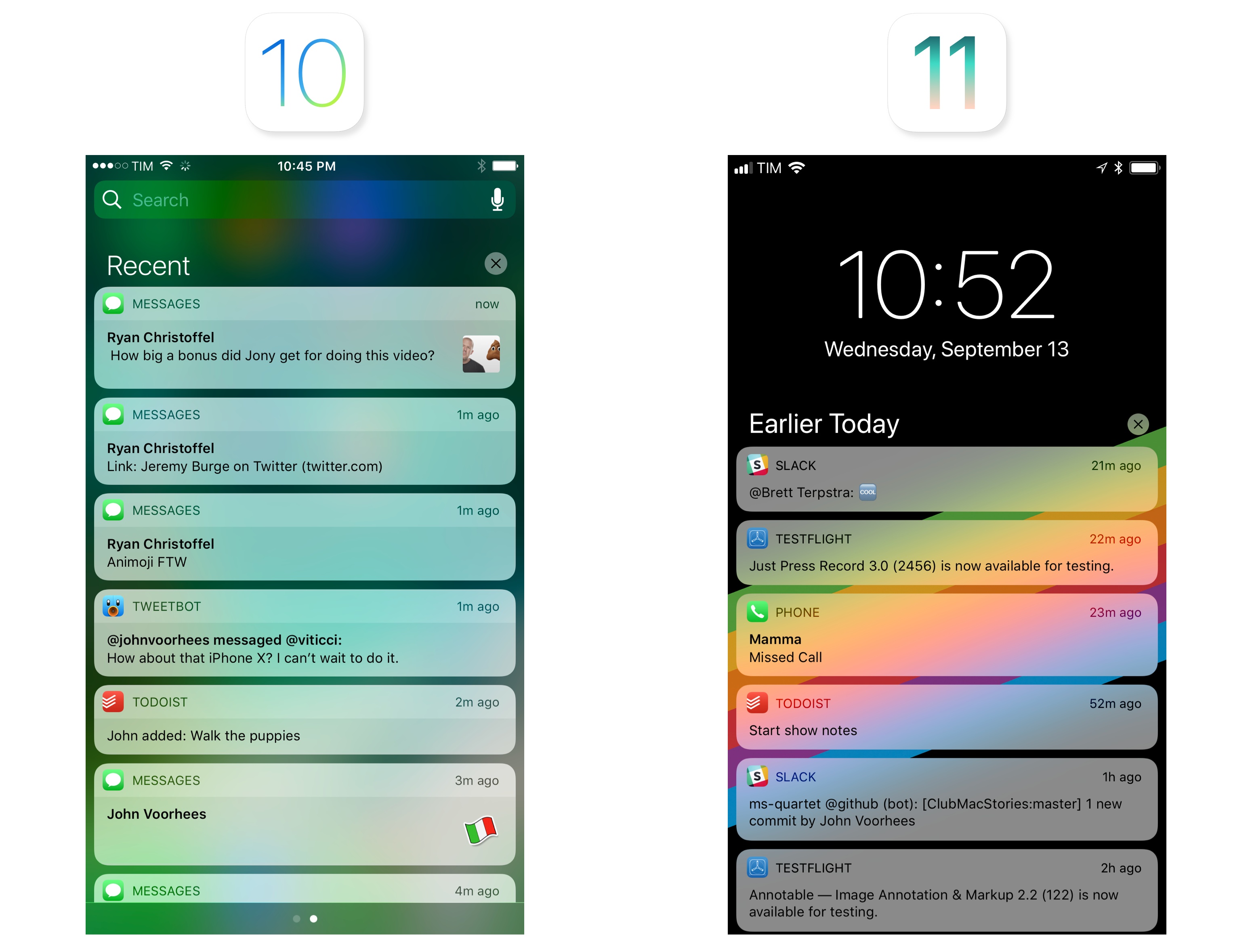
This flavor of the Lock screen is what Apple refers to as Cover Sheet: it’s consistent with what you see when you first pick up an iPhone, but it’s unlocked by default as indicated by the lack of a padlock icon in the status bar. Cover Sheet looks like the Lock screen, but it doesn’t immediately lock your device. Instead, it adheres to the system’s auto-lock setting.
It’s important to make this clear: opening Cover Sheet is not akin to pressing the sleep/wake button to lock your device; it’s just a way to view notifications in a Lock screen-like environment.
Conversely, not much has changed as far as triaging notifications goes. Similarly to iOS 10, you can press an individual notification with 3D Touch4 to open a rich preview; the preview can be dismissed by flicking it down or with a close button.
There are options for users who don’t like 3D Touch, too. With a swipe to the left, you’ll reveal buttons to expand or clear the notification; keep swiping to the left, and the notification will be instantly cleared (with a nice haptic confirmation tap).
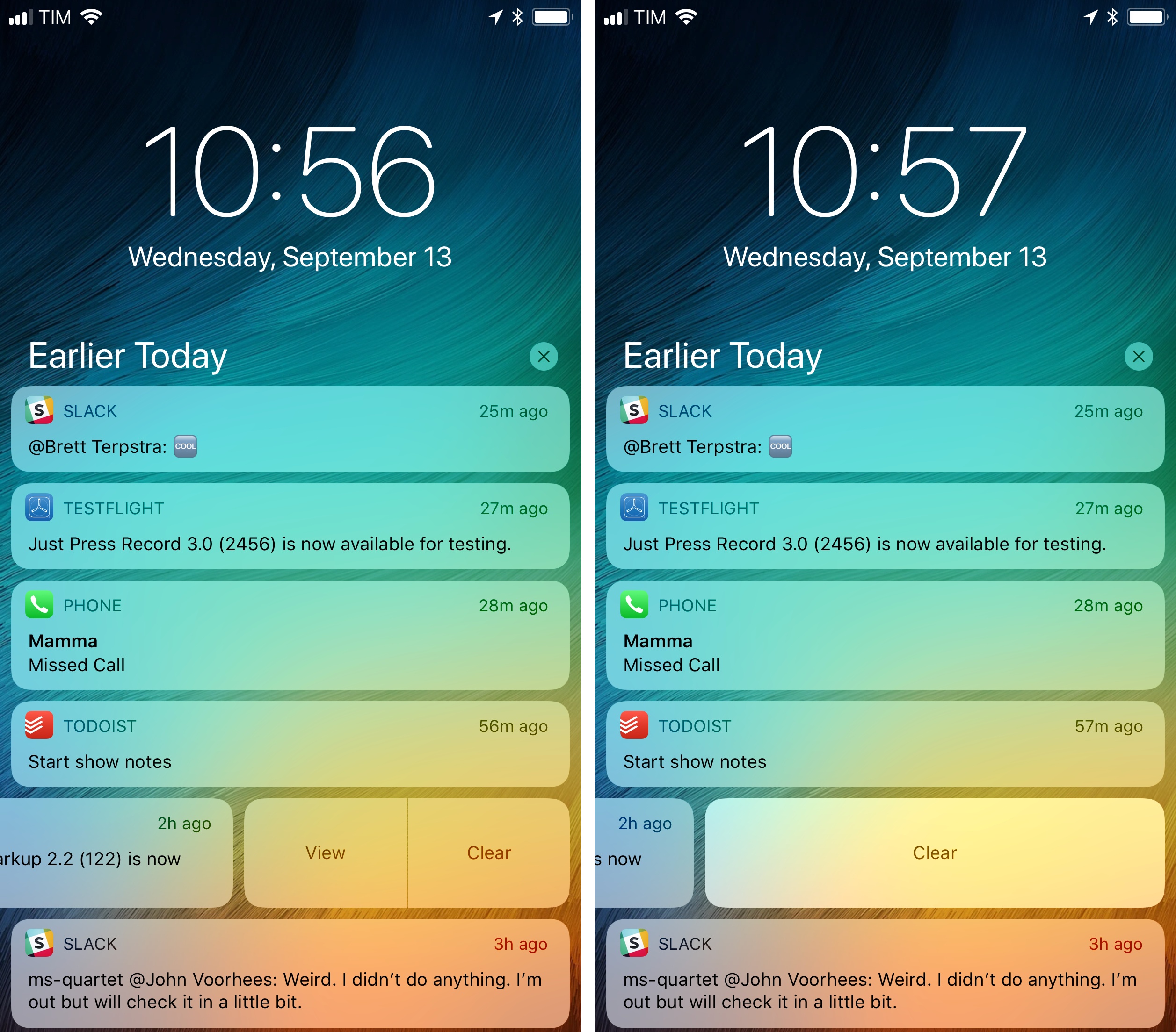
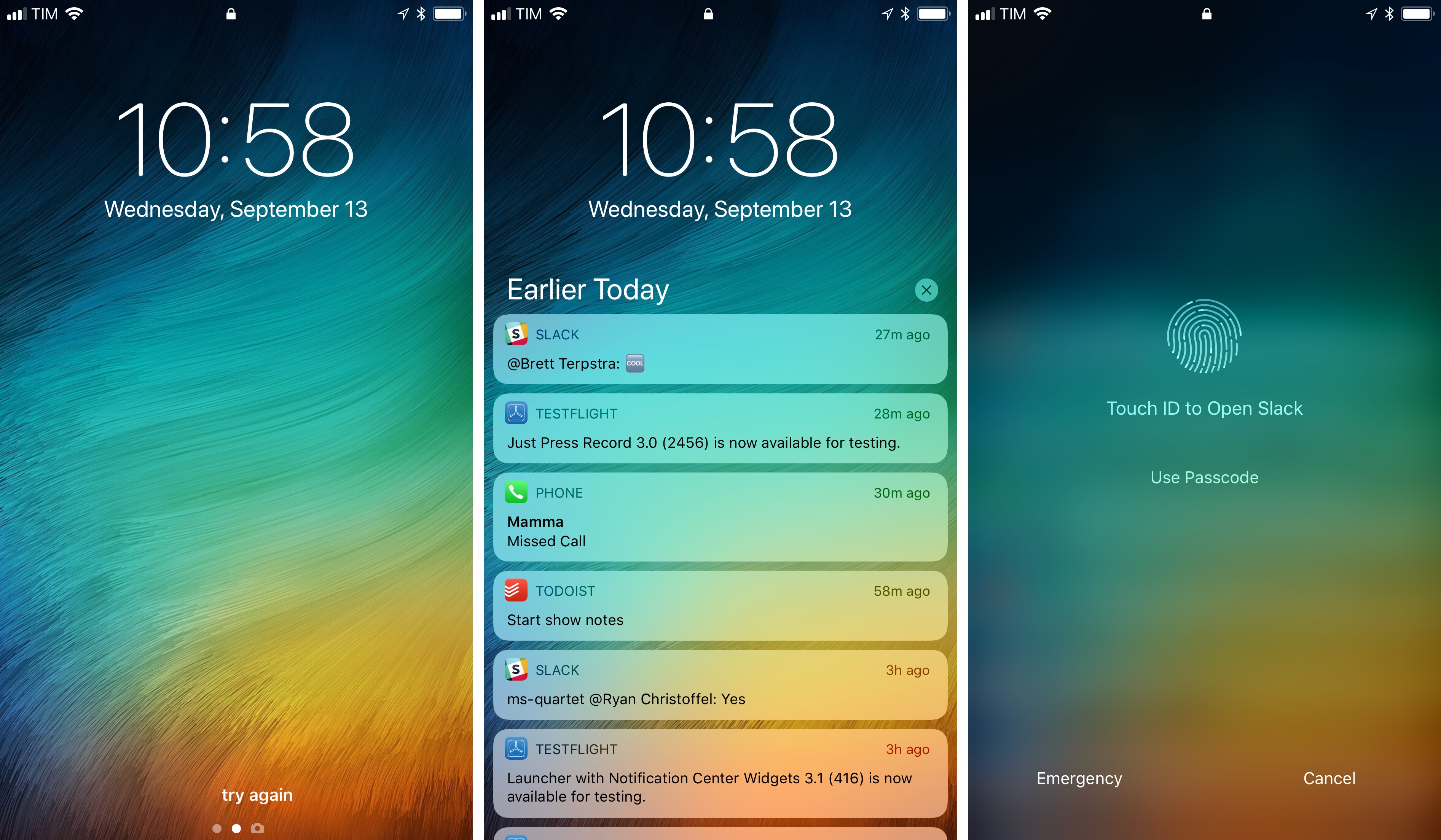
To open a notification, you can swipe to the right and select Open, or tap the notification once. Doing this on the Lock screen will bring up a new Touch ID authentication dialog with the name of the app you’re about to open. As in iOS 10, you can also authenticate with Touch ID before interacting with notifications, so they will open directly once tapped.
Alas, Apple hasn’t jumped on the opportunity to rethink group notification management altogether. An option to group notifications by app (originally removed in iOS 10) hasn’t been reinstated yet; iOS 11 introduces an API for developers to coalesce similar notifications by thread identifier, but the feature will probably only be used by messaging apps. There‘s still no great way to deal with multiple notifications at once: dismissing one after the other is a tedious process that doesn’t benefit from any of the interaction changes in iOS 11. Whether it should be a system powered by drag and drop or some other kind of smart grouping, iOS badly needs superior notification triaging.
Consistency seems to be the primary driver of Apple’s decision to unify notifications and widgets with Cover Sheet.
First and foremost, the Lock screen and Cover Sheet share the same design. If some users found Notification Center’s standalone interface confusing, they shouldn’t have any issues with Cover Sheet: it looks just like the Lock screen they see every day. This means that other Lock screen features are available from inside apps as well: if you swipe down to open Cover Sheet, you can then swipe left to quickly open the Camera, or swipe right to open widgets, just like you would on the Lock screen.
In blurring the lines between Lock screen and notifications, however, Apple had to make some adjustments to the structure and flow of iOS.
Spatially speaking, the layers that comprise iOS’ interface have decreased: the Lock screen and Cover Sheet now always sit on top of everything else and there’s no intermediate Notification Center layer anymore. To hint at this, the Lock screen raises when you unlock a device, revealing the Home screen underneath; and when you swipe down, the Cover Sheet literally covers the Home screen or current app, returning to the upper layer.
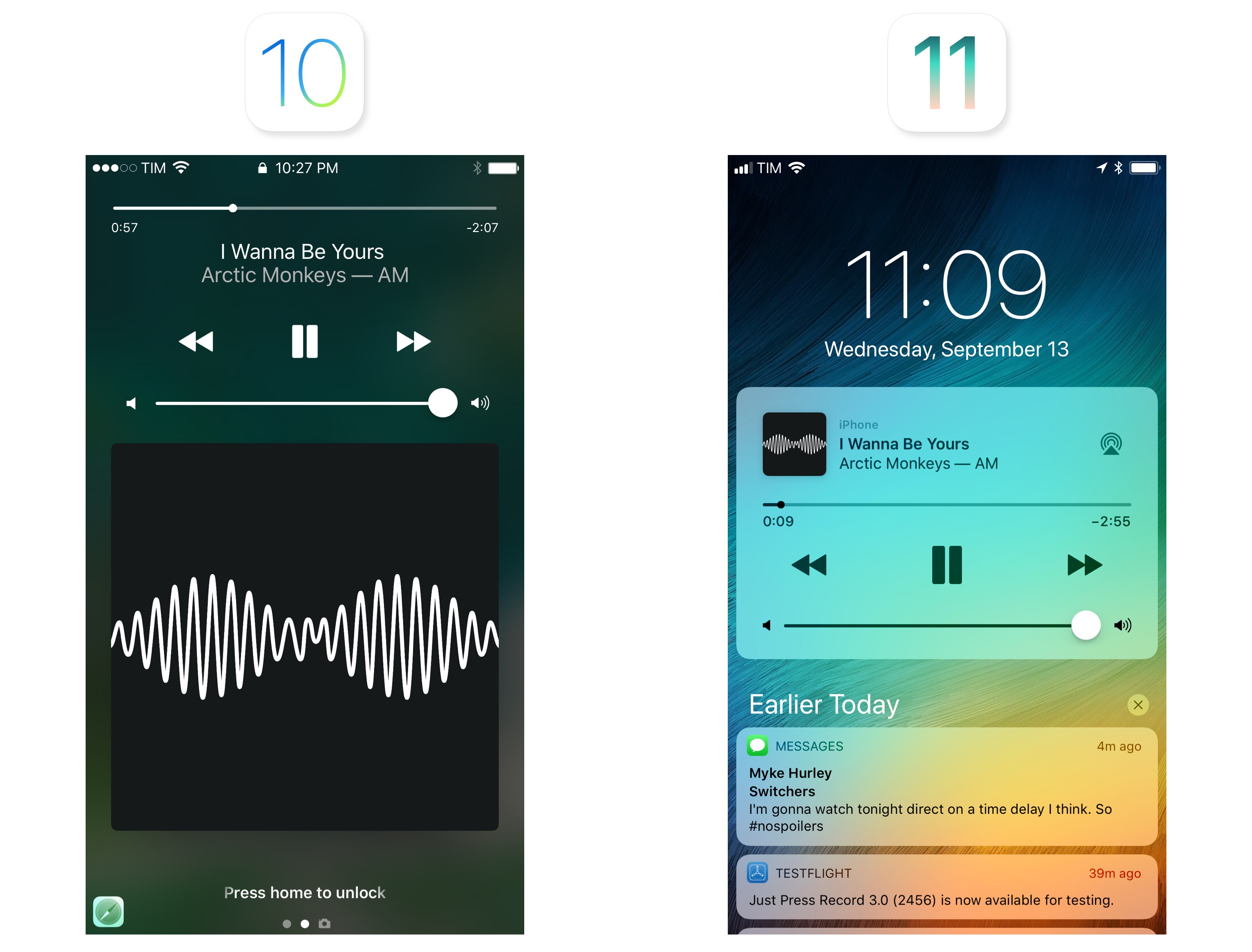
Cover Sheet also brings a quicker way to interact with the Now Playing widget: swiping down to open Cover Sheet is faster than opening Control Center and expanding the Now Playing tile. To blend in with notifications, the Lock screen’s Now Playing panel is now a compact widget, which works better than a full-screen view.5
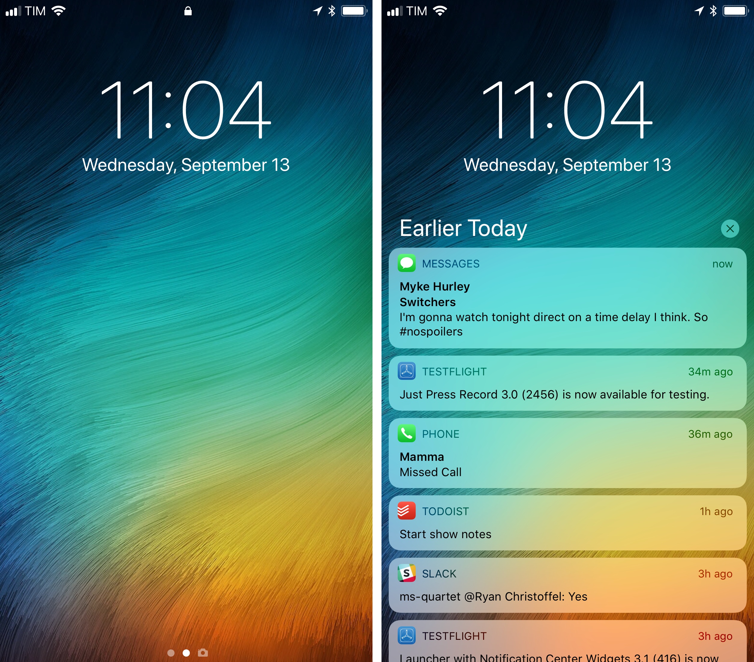
There’s another difference between Lock screen and Cover Sheet that Apple had to compensate for: what is shown as soon as you open them. The Cover Sheet always displays all previous notifications that haven’t been cleared; the Lock screen, by default, only shows the ones you’ve missed since the last time you’ve unlocked your device. Thanks to iOS 11’s unification of the two areas though, the Lock screen can turn into the Cover Sheet and show you all earlier notifications: simply swipe up in the middle of the Lock screen, and iOS 11 will load the same list of notifications you’d see in Cover Sheet. This wouldn’t have been possible without merging the Lock screen with Notification Center, or at least it wouldn’t be as obvious as it is in iOS 11.
Consistency always introduces some trade-offs, and Cover Sheet is no exception. For one, it has made Spotlight search harder to access from apps: a swipe from the status bar opens Cover Sheet, which doesn’t have a search box; you have to swipe to the right and view the widgets page to find Spotlight. This is particularly annoying on the iPhone, which, unlike the iPad, isn’t usually connected to an external keyboard that can invoke Spotlight via ⌘Space.
Apple had to cut some corners with widgets too. Cover Sheet doesn’t remember your last-viewed screen; if you use widgets a lot while in apps, prepare to be swiping right every day to switch pages in Cover Sheet. Oddly enough, Apple chose to remove the useful two-column layout for widgets on the iPad. We’re back to one column now, and I can’t help but wonder if this is a temporary regression because Apple has bigger plans for Home screen widgets next year.
There’s no way around it: blending the Lock screen and notifications with Cover Sheet makes more sense on the iPhone X, where facial recognition effectively turns the Lock screen and Cover Sheet into one. From an iPhone X perspective, it’s just easier to always be looking at the same screen, in a constantly unlocked state, and view a stream of notifications without moving between two separate layers.
It takes some time to get used to it, but I think Cover Sheet is a reasonable change for owners of other iOS devices, too. The entire system is less confusing for people who are used to viewing notifications from the Lock screen: everything is at the same OS level, with different degrees of unlocking depending on the hardware you’re using. Once you get used to how things have been rearranged, there isn’t much else to learn in Cover Sheet. Notifications are now always displayed in the same place, which can either be locked or unlocked.
In the future, I’d like to see Apple improve triaging of multiple notifications and rethink the role of widgets as permanent accessories to apps on the Home screen. And if that happens, perhaps we’ll look back at Notification Center and realize that it had to go for the Lock screen to grow into something bigger.