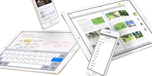
Control Center
Designing a single page of shortcuts can be surprisingly challenging.
Consider Control Center. It should be optimized for speed and efficiency because millions of daily interactions revolve around tapping its flashlight icon or pausing music playback. It should also be flexible (no one uses the same shortcuts, in the same order, or with the same frequency) and it should account for new roles attributed to our devices, which can now be smart home remotes or controllers for wireless earbuds. And in all this, Control Center should also have an attractive yet recognizable design that doesn’t indulge in sophisticated visual minutiae.
It’s really hard to design a great Control Center for everyone, but this isn’t stopping Apple from trying to achieve the trifecta of an ideal Control Center: fast, simple, and versatile. For the second year in a row, an upward swipe from the bottom edge of our screens6 reveals a new Control Center design – this time, with a single-page mosaic of buttons and tiles of various shapes, sizes, and behaviors.
I was a fan of last year’s Control Center. Splitting functionalities across multiple pages made each feature simpler to use as it stood out on its own, with elegantly laid out controls and delightful transitions. Looking back at iOS 10’s Control Center now, I understand why it wasn’t as popular as I assumed: it only met two of three essential requirements. Control Center in iOS 10 was intuitive and versatile, but it wasn’t fast. Even though iOS 10 remembered the last-used page when re-opening Control Center, it still increased cognitive load: you had to swipe and briefly pause to locate your position, which made everything slower.
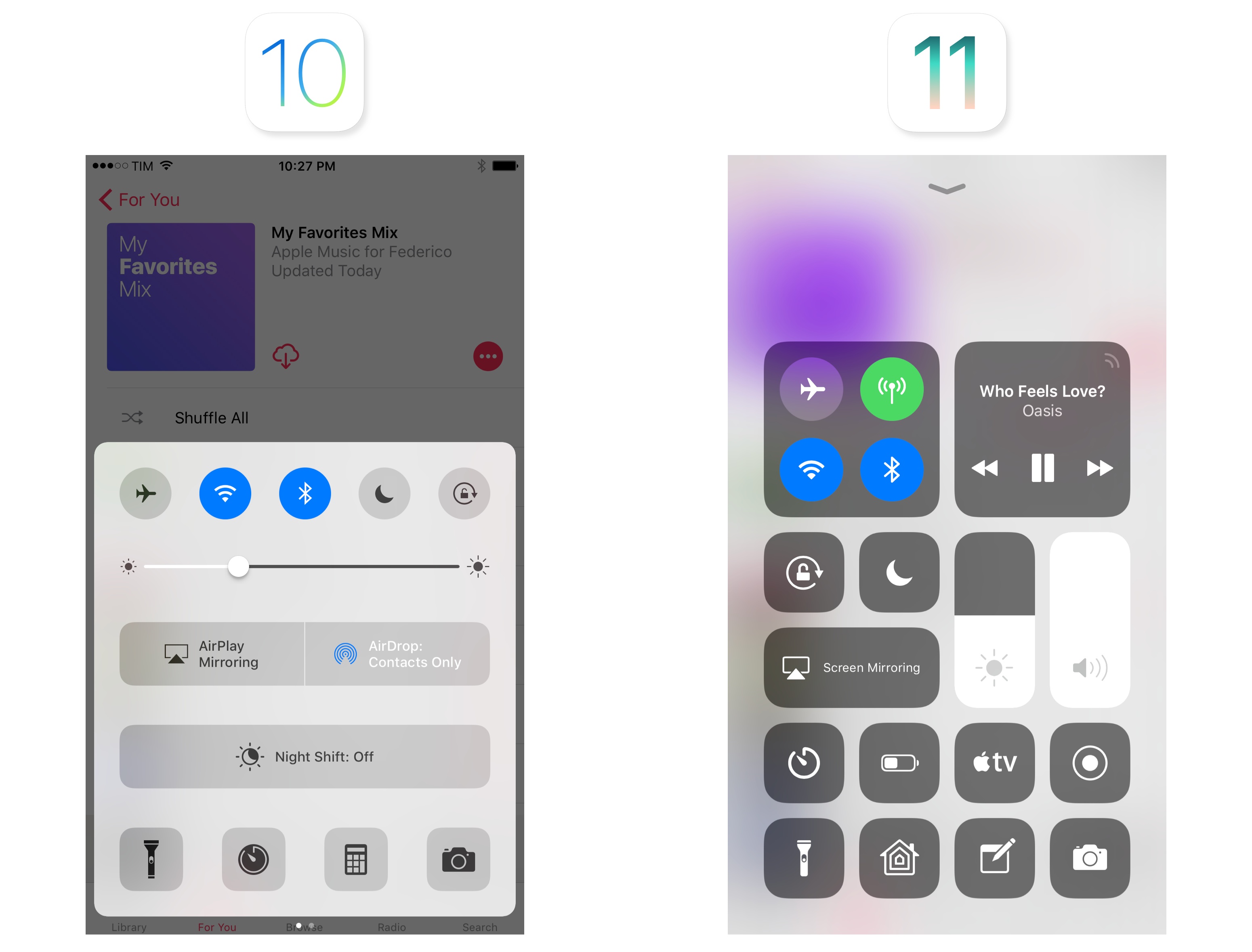
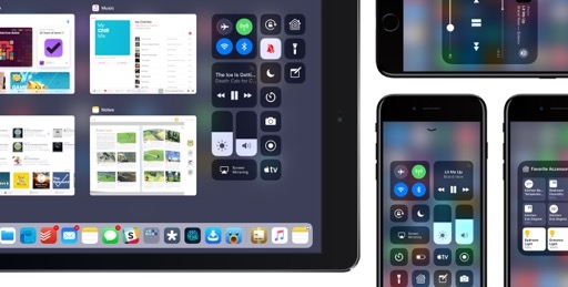
iOS 11’s Control Center abandons the multi-page layout for an “irregular grid” of controls. While the look is strikingly different from last year, Apple has dealt with the problem of packing several options into limited space in the same way. In iOS 10, controls were separated with pagination; on iOS 11, minimized controls are on the same screen, but they require a second gesture to be expanded in contextual popups. We still have multiple “pages” in Control Center – only they’re stacked vertically instead of horizontally, and they’re easier to reach. Because of this, I think iOS 11’s Control Center will accomplish what last year’s version ultimately didn’t.
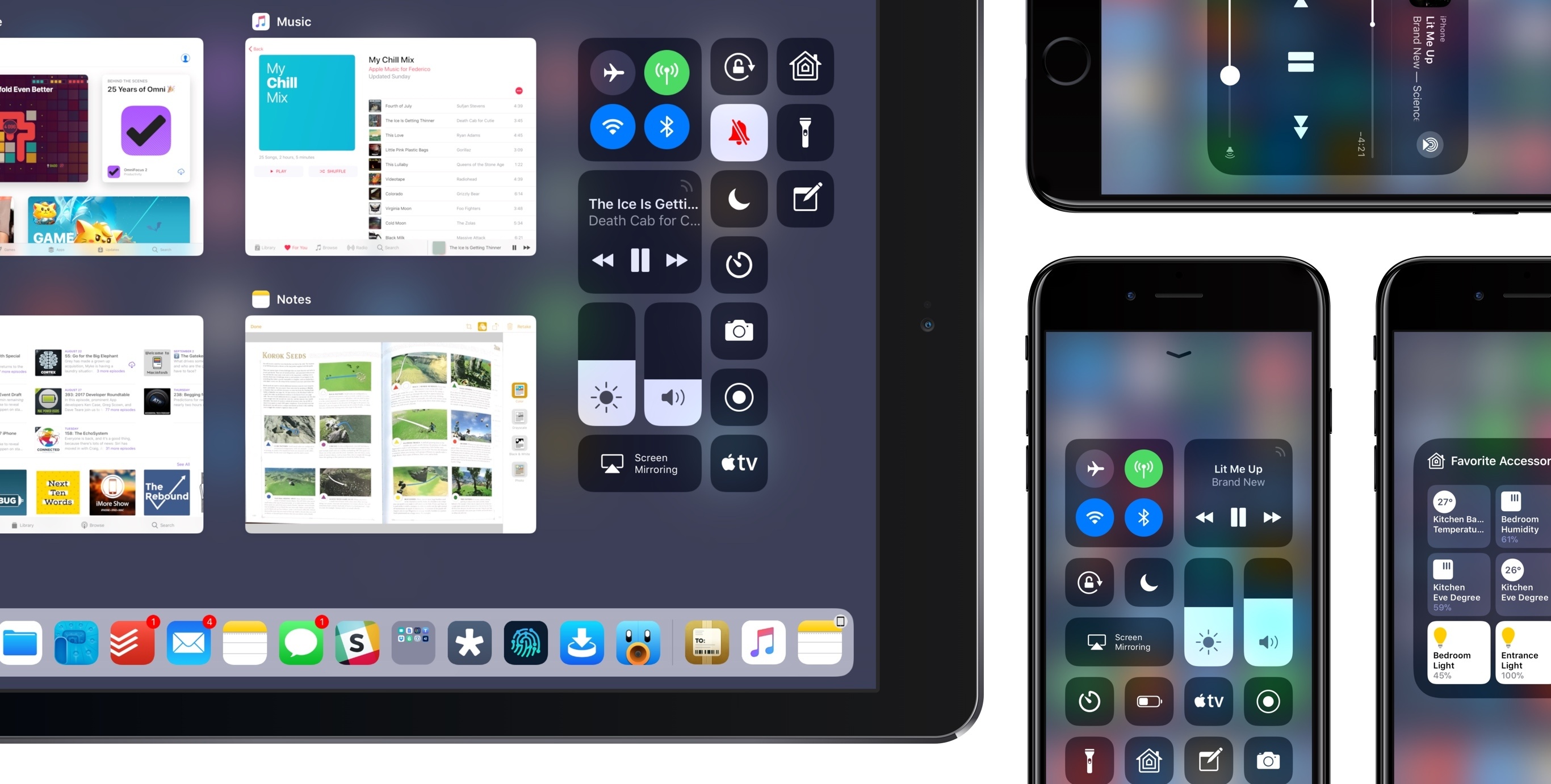
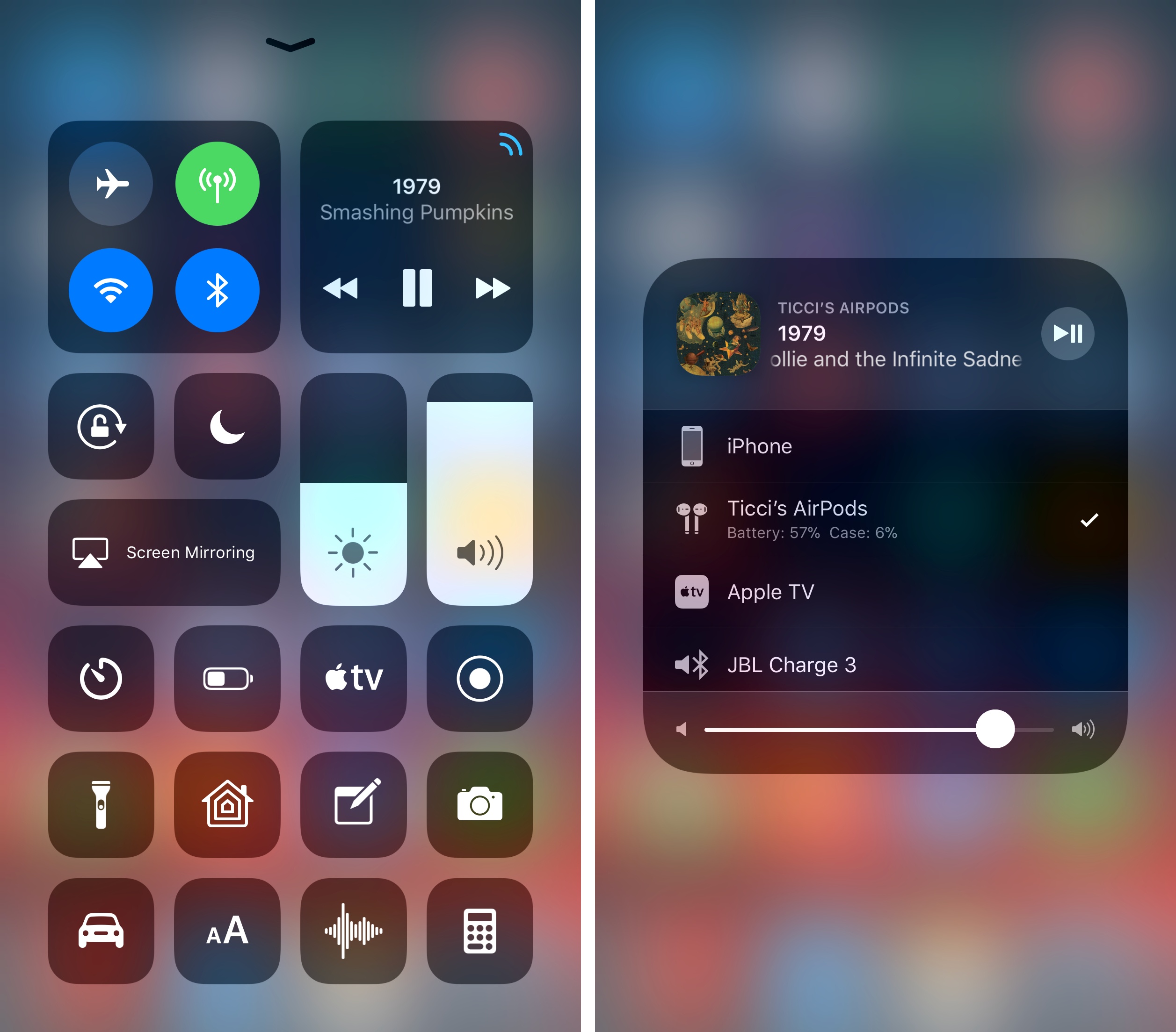
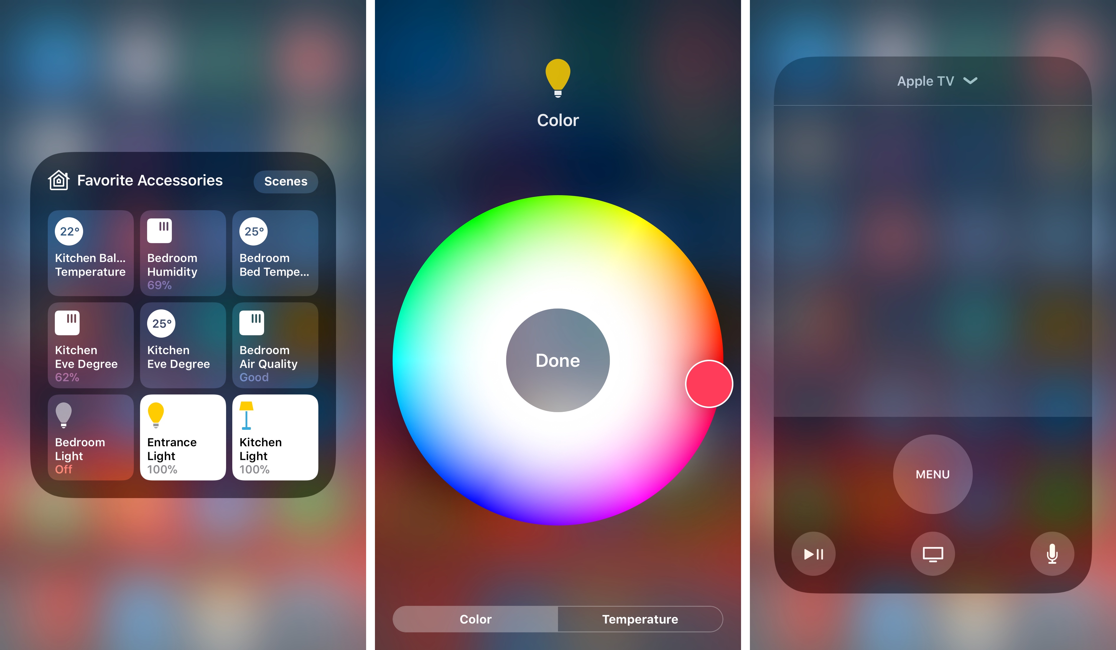
The new Control Center is split in two macro areas: a top half with system controls and a bottom area where, for the first time, you can add and rearrange additional controls. System controls are a mix of tiles, sliders, and buttons, while user-selected ones are buttons in the shape of app icons. The UI employs blur and translucency to hint at content below; glyphs are white and thicker than ever, and they use animation and color to denote activation or state.
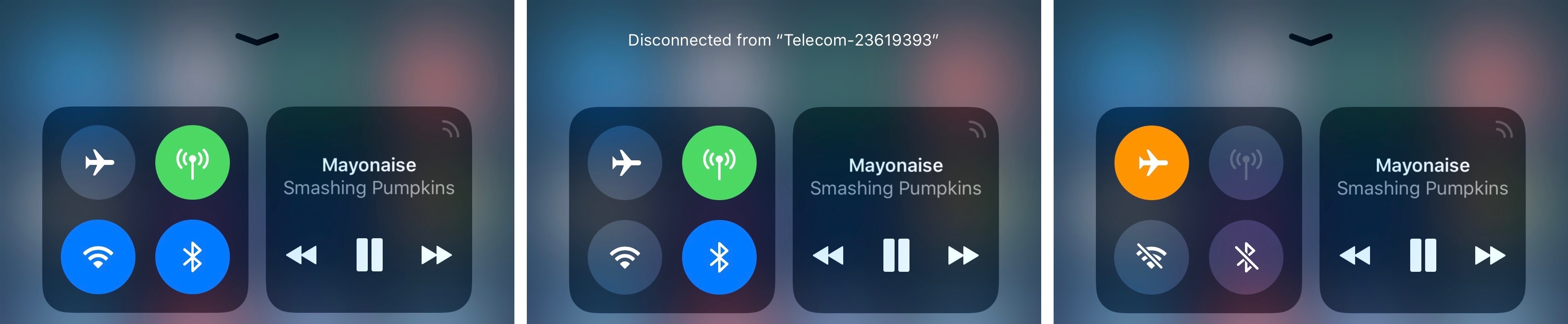
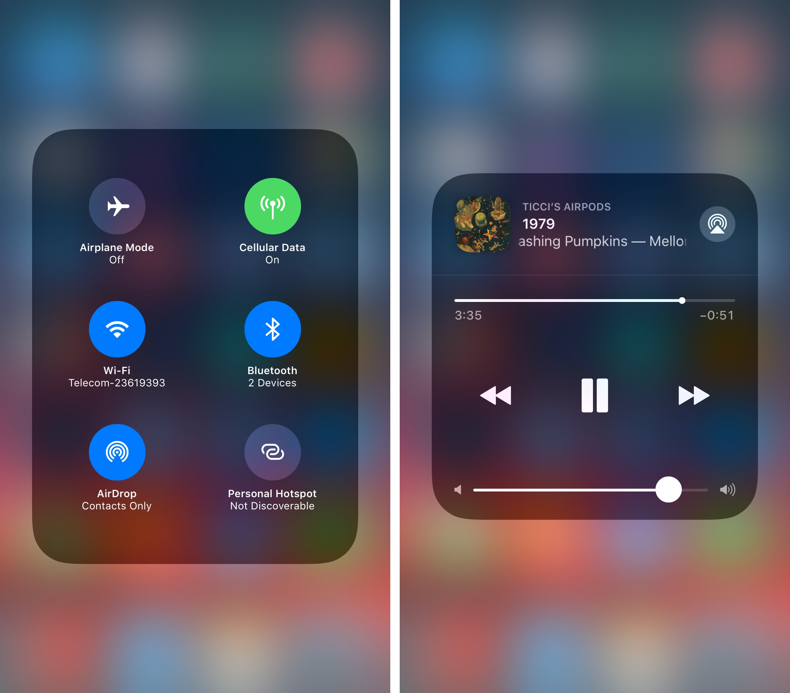
System controls are then organized in two sub-sections. At the top, there are two tiles for radios and audio playback. The minimized radio tile contains four toggles: Airplane Mode, cellular data, Wi-Fi, and Bluetooth. You can tap each one in the compact layout, which will enable or disable the selected function, with a twist.
Unlike in iOS 10, disabling Wi-Fi won’t turn off Wi-Fi altogether – it’ll only disconnect from the current network and disable auto-join for new connections, leaving the Wi-Fi radio on. The same is true for Bluetooth. The only way to completely turn off Wi-Fi and Bluetooth is by opening Settings. Also unlike in iOS 10, it is now possible to keep a device in Airplane Mode and re-enable Bluetooth and Wi-Fi separately. As for the cellular toggle, I’m glad that Apple is finally offering a quick option to disable it without having to dig into Settings.
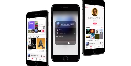
The audio playback tile lets you control audio and features adaptive skip controls with a scrolling ticker for the currently playing item. The tile shows a pulsing signal icon in the top right: this is a shortcut to open the expanded view with a list of available outputs (speakers and headphones), which is otherwise accessed with a button in the full audio card. Surprisingly, Apple still hasn’t added a Love button to Control Center for Apple Music tracks.
Like other elements in Control Center, the audio tile subtly bounces when tapped. The bounce is a nod to the functionality hidden within most shortcuts of the new Control Center: inline expansion.
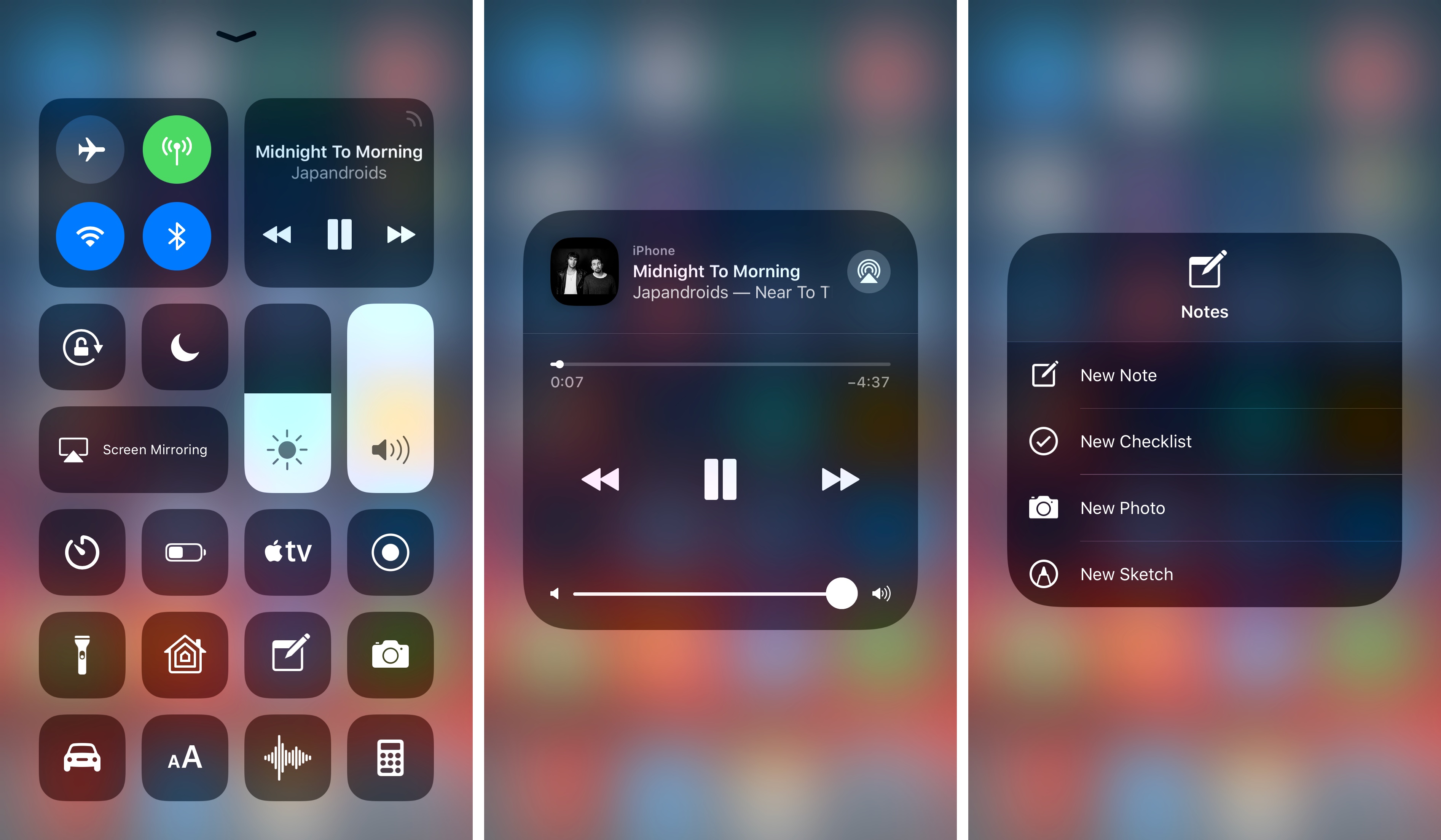
As an alternative to page navigation, iOS 11 relies on 3D Touch (or long taps on non-3D Touch devices) to expand tiles and reveal more controls in larger modal “platters”. These popups are similar to last year’s 3D Touch menus in the HomeKit page, and they’ve been implemented for different features in iOS 11’s Control Center.
The wireless radio tile can be expanded to show a folder-like panel with text labels under each toggle, plus two buttons for AirDrop and Personal Hotspot. Again, it’s useful to have these shortcuts available in Control Center without hunting for them.
Expanding the audio playback tile opens a smaller version of iOS 10’s audio page. Album artwork is displayed alongside a progress bar and playback controls can be more comfortably tapped. Because audio controls aren’t flanked by additional pages, you’ll no longer accidentally switch screens when adjusting the volume.
Inline interactivity and tile expansion yield some fascinating interface choices. Combined with the additional controls offered by iOS 11 (which can be configured in Settings ⇾ Control Center ⇾ Customize Controls), these show us a glimpse of what an even more personal Control Center might look like in the future.7
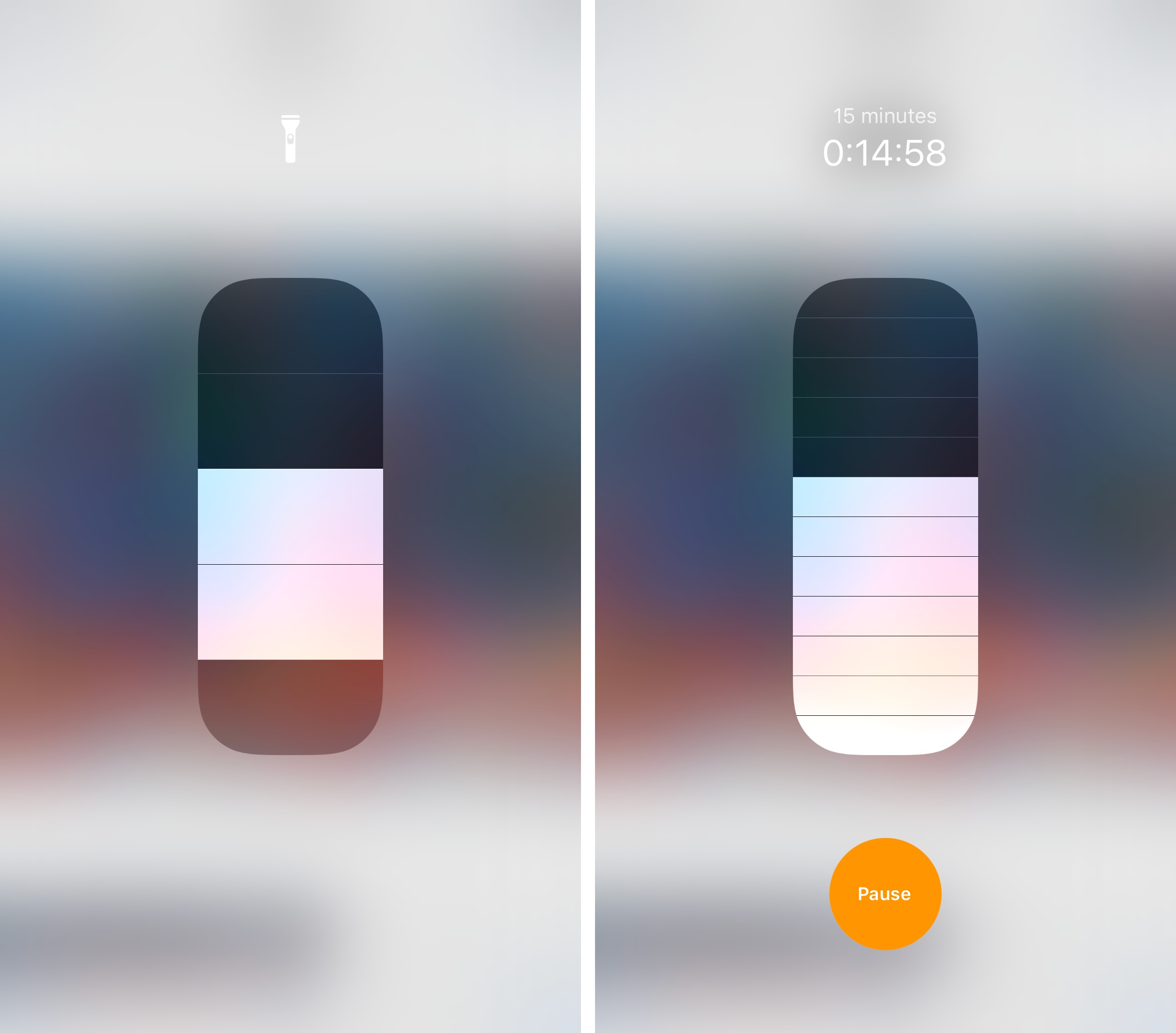
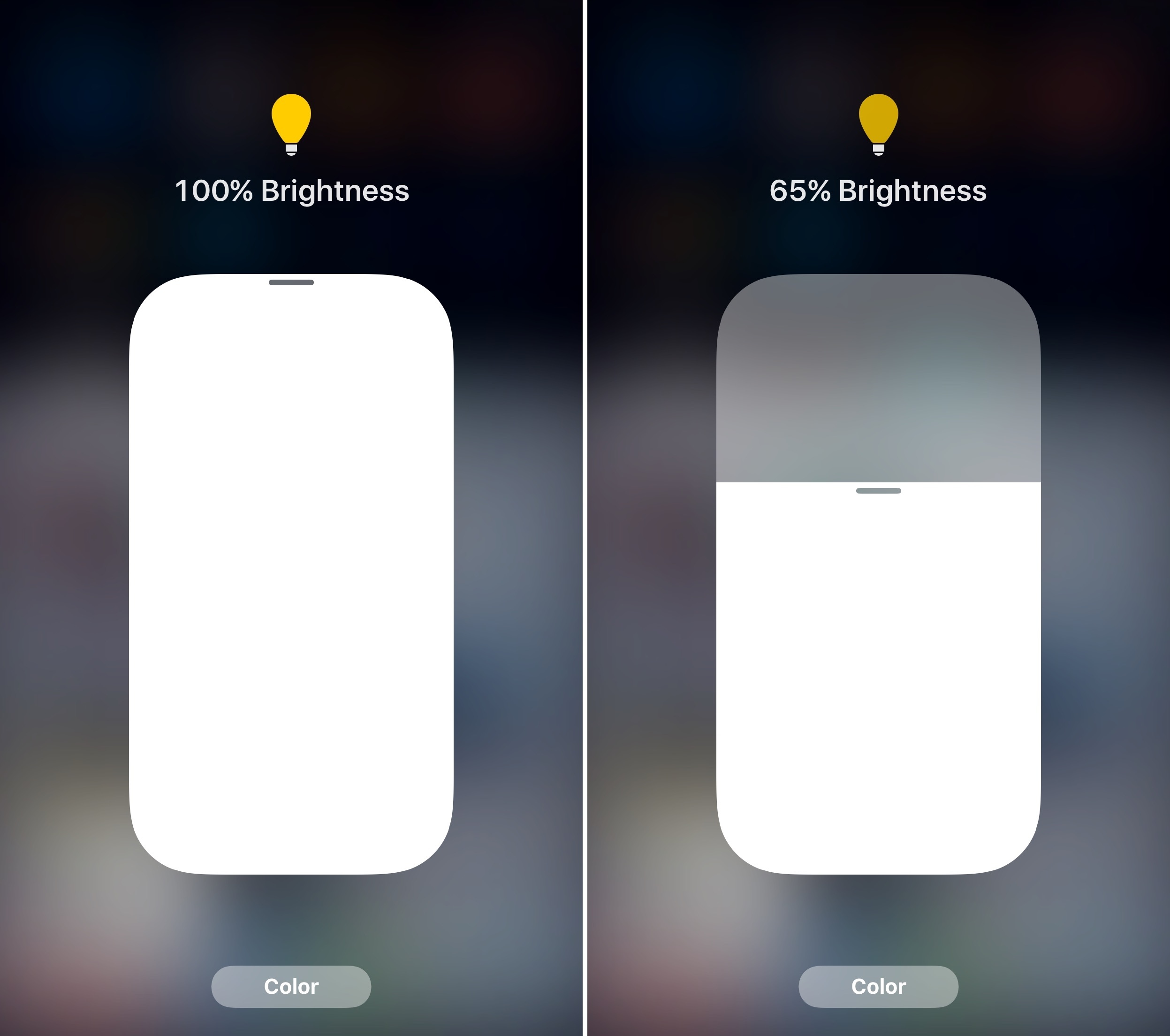
Volume and brightness sliders can be swiped in minimized mode from the main view, or you can press them to pop open a bigger slider similar to iOS 10’s HomeKit light controls. After pressing on the mini slider, you can keep holding your finger down to continue swiping – a continuous gesture perfect for one-handed usage.
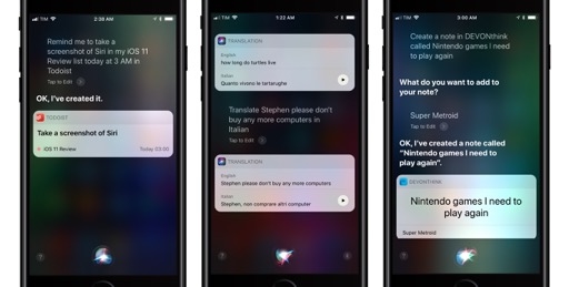
There are also stepper-style sliders, which can only be used when expanded. Flashlight contains four notches for different intensity levels; Text Size (one of the new configurable controls) lets you pick one out of six Dynamic Type settings from anywhere on iOS.8 The Timer button grows into a stepper with 1, 5, 10, 15, and 60-minute increments for starting timers from 1 minute to 2 hours. Once you start a timer here, the stepper will progressively lose color until it’s done. If you set a timer via Siri or from the Clock app, the Control Center button acts as a quick indicator and access point for that as well.
There are plenty of riffs on the idea of lists and buttons revealed by pressing on shortcuts. Notes and Camera bring up a list of quick actions; Wallet lets you open an Apple Pay card; Screen Mirroring shows a list of nearby Apple TVs to connect to.
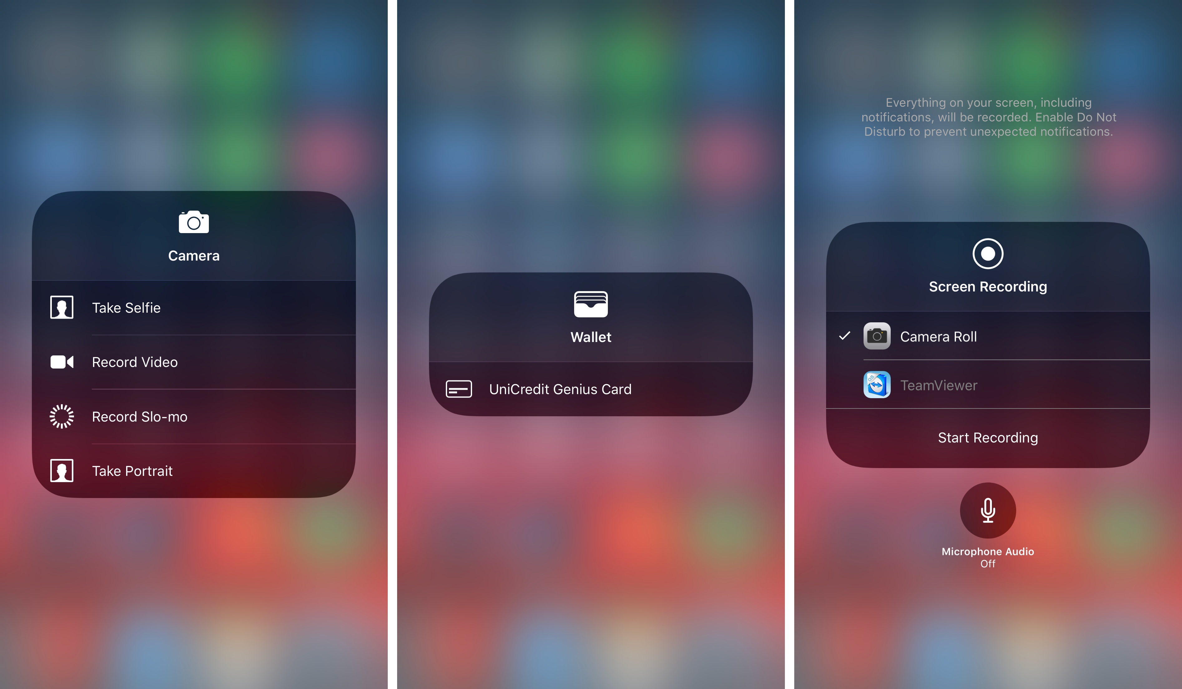
There’s also room for more specialized UIs with richer interactions. The Home button replicates iOS 10’s dedicated HomeKit page with a popup: you can turn accessories on and off, open brightness sliders, and even navigate into color and brightness settings – in total, three nested levels of navigation hidden behind a single button in Control Center.
The embedded Apple TV control is remarkable, too. There’s a full virtual remote available in Control Center that includes a Menu shortcut, playback and microphone buttons, and a large trackpad at the top to swipe through the tvOS UI from your iPhone or iPad. In many ways, this is better than the Apple TV’s physical Siri remote – at least its touch controls are always oriented correctly.
There are some delightful little details in the new Control Center, most of which are made possible by the consistent use of iconography and animation. When adjusting the volume and brightness sliders, the sound and sun icons shrink and grow based on the selected level. The rotation lock button wiggles and locks the padlock when activated, then rotates and unlocks it once you disable it. The bell shakes and stops when Silent Mode is engaged. And as always, the flashlight’s button switches on and off when you use it. I’d like to see more of these details and glyph animations throughout iOS and especially in toolbar buttons, which feel static and could be livened up a little.
With additional toggles, Apple is giving up some control and letting users prioritize the features they value most. This is a powerful idea, and a fresh start for an aspect of iOS that almost lost itself over the past couple of years. At the same time, it’s also clear that there’s more to come in terms of Control Center personalization down the road.
Because additional controls can only be placed in the lower section of the UI, you can’t fully tweak the shortcut presentation to your needs and taste. For example, I would have liked to keep audio controls towards the bottom for easier thumb access, but that’s not possible.9 This feels like another instance of Apple slowly opening up to complete user customization; perhaps if the new Control Center is successful and people get used to it, we’ll see the ability to completely rearrange and replace controls next year.
The elephant in the room, however, is the lack of third-party extensions for Control Center. The same argument applies: Apple has come up with a series of interaction models and interfaces that are being tested in a redesign this year. If it works – if people come around on the idea of a single page with a variety of semi-customizable controls – I don’t see why Apple shouldn’t open up the system to third-party apps.
iOS 11’s Control Center is a vast improvement over the pretty, but fundamentally flawed look introduced in iOS 10. It feels like iOS 11 for iPad dictated the new Control Center: the integrated multitasking and Control Center view on iPad surely made it necessary to switch to a modular design where shortcuts are standalone components of a bigger whole rather than a gallery of discrete pages.10
But the origin story doesn’t matter: Apple has found a way to design a Control Center that aptly scales across devices, leaving the door open for future extensibility. From now on, whatever new system feature Apple conjures, they can also add it as a Control Center option without having to redesign it again.
Initially, iOS 11’s Control Center looked like controlled chaos to me. I wasn’t sold on the aesthetic and I wasn’t sure I’d ever be able to learn its layout. But not only has my Control Center become muscle memory at this point – I can see why Apple wanted to redesign it. Control Center is growing beyond single-tap shortcuts; it’s becoming a collection of personalized mini interfaces that can do more, and more quickly. The goals that Apple has set for Control Center in iOS 11 represent the essence of the feature; they would have been impossible to realize with multiple pages.
Control Center is going back to being simple and fast; finally, it’s customizable too. Designing a single page of shortcuts can be easier after all: Apple just had to embrace function over form.
- Or, on the iPhone X, a swipe from the right side of the status bar. ↩
- If you add every supported shortcut, you'll have to scroll Control Center vertically to interact with them. ↩
- Conveniently, this control has a Text Size title at the top, which you can use as reference to preview Dynamic Type sizes. Clever. ↩
- I do understand why audio controls are fixed to the top of Control Center: they’re the first ones you see when you swipe up from the bottom of the iPhone’s screen. This is one of the unique characteristics of the new Control Center: like Cover Sheet, it supports multitouch, allowing you to tap controls with one finger while another is still swiping to fully reveal them. On the iPhone, this means you can “peek” at Control Center and pause music without full expansion, making it quicker than iOS 10. ↩
- Another welcome change: the iPad’s Control Center now lets you use the device’s camera flash as a flashlight. ↩