App Store
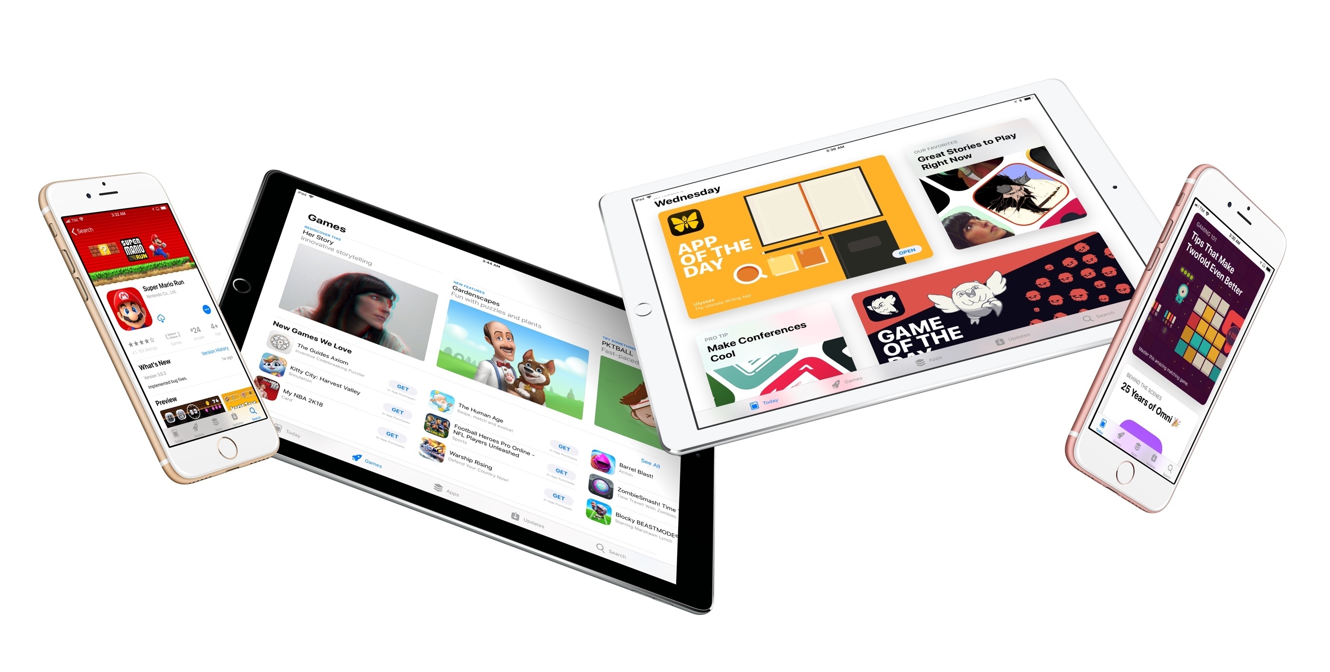
The most impactful meta-change in iOS 11 is the relaunch of the App Store as a heavily curated storefront. With its tenth anniversary on the horizon, the App Store is leaving its iTunes Store legacy behind to grow into something bolder and, to an extent, riskier: a collection of stories about apps and games, updated daily.
For years, the App Store followed a music-like approach in highlighting noteworthy releases and emphasizing top charts. The App Store’s weekly refresh and prominent placement of charts were relics of the iTunes Music Store which, both in terms of infrastructure and executive decisions, predated the App Store and provided most of its foundation. Lessons from the music industry, however, don’t necessarily apply to the app economy as well. Given the cultural and economic impact of apps on our society, treating the App Store as a mere extension of the iTunes Store is unwise and shortsighted.
Apple realized this and put Phil Schiller in charge of the App Store in late 2015. Under his tenure, the App Store and iTunes Connect teams have shipped major improvements such as renewable subscriptions for all apps, developer responses to customer reviews, more control over TestFlight betas, and they bumped the App Store’s refresh cycle from once a week to multiple times per week. This assiduous release schedule was an acknowledgement of the App Store’s longstanding limitations, providing the context to evaluate the complete reimagination of Apple’s record-breaking digital store in iOS 11.
There are some key concepts behind the new App Store. First, Apple is doubling down on curation and editorial recommendations. Second, they’re recognizing the significance of games by giving them a separate front page, splitting them from apps (which also get a dedicated space). Third, there’s a deeper emphasis on the elements of modern iOS apps, such as standalone In-App Purchases, preview videos, subtitles, and reviews. Lastly, a fresh design language inspired by other Apple services creates a superior hierarchy and presentation in the App Store. Together, these serve as the building blocks for a new app shopping experience and, potentially, a remarkably better way to discover apps and games.
Today
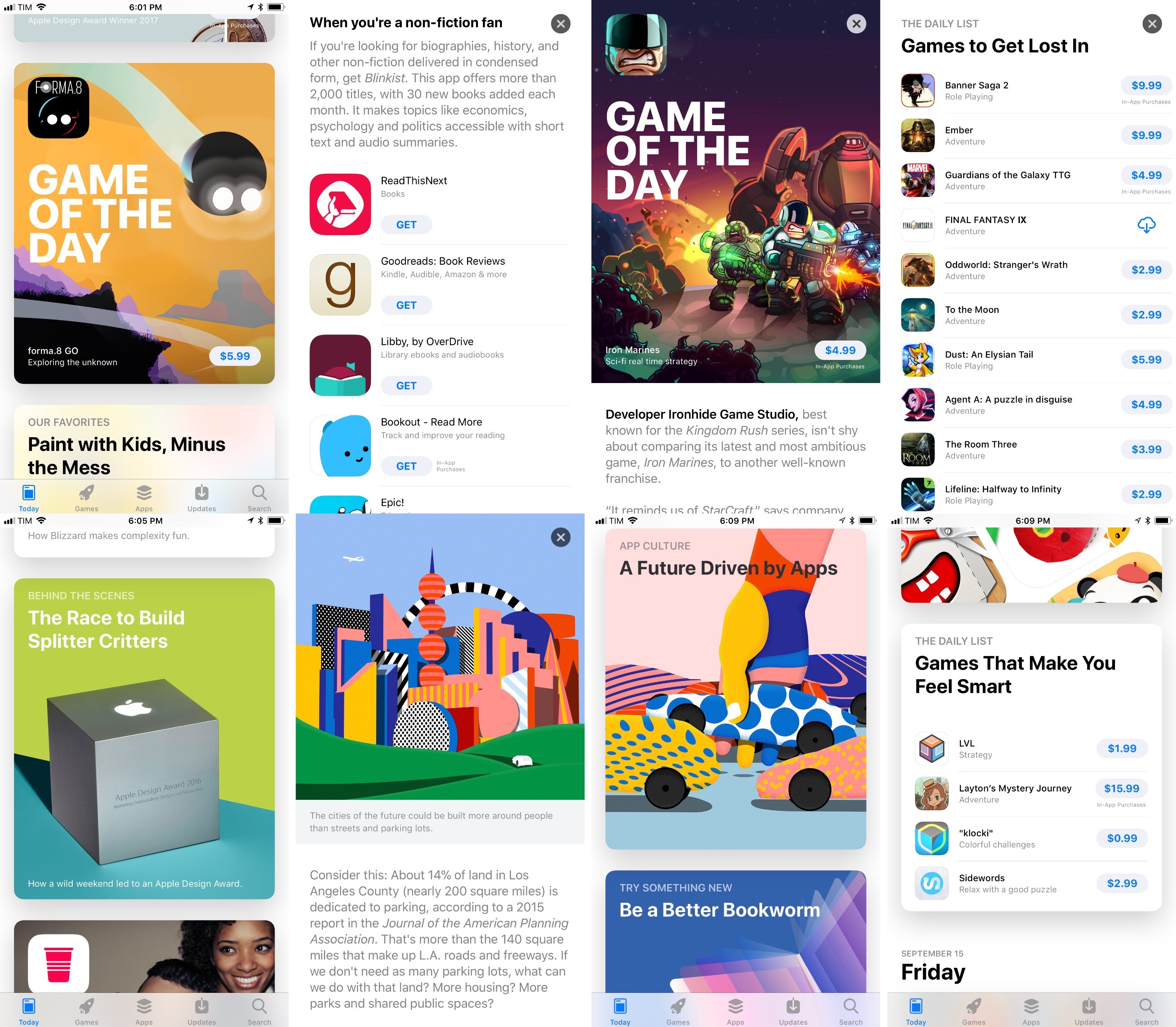
The Today tab is the App Store’s new home. In this daily updated page, Apple wants to showcase editorial recommendations with articles, videos, and galleries that present a narrative around the best apps and games. Every day, the Today tab refreshes with new cards that can be expanded to read the story behind an app, get some tips on how to play a hot new game, or check out the latest App and Game of the Day. This is a massive change for the App Store’s editorial team, who are committing themselves to producing original content about apps and app culture every single day.
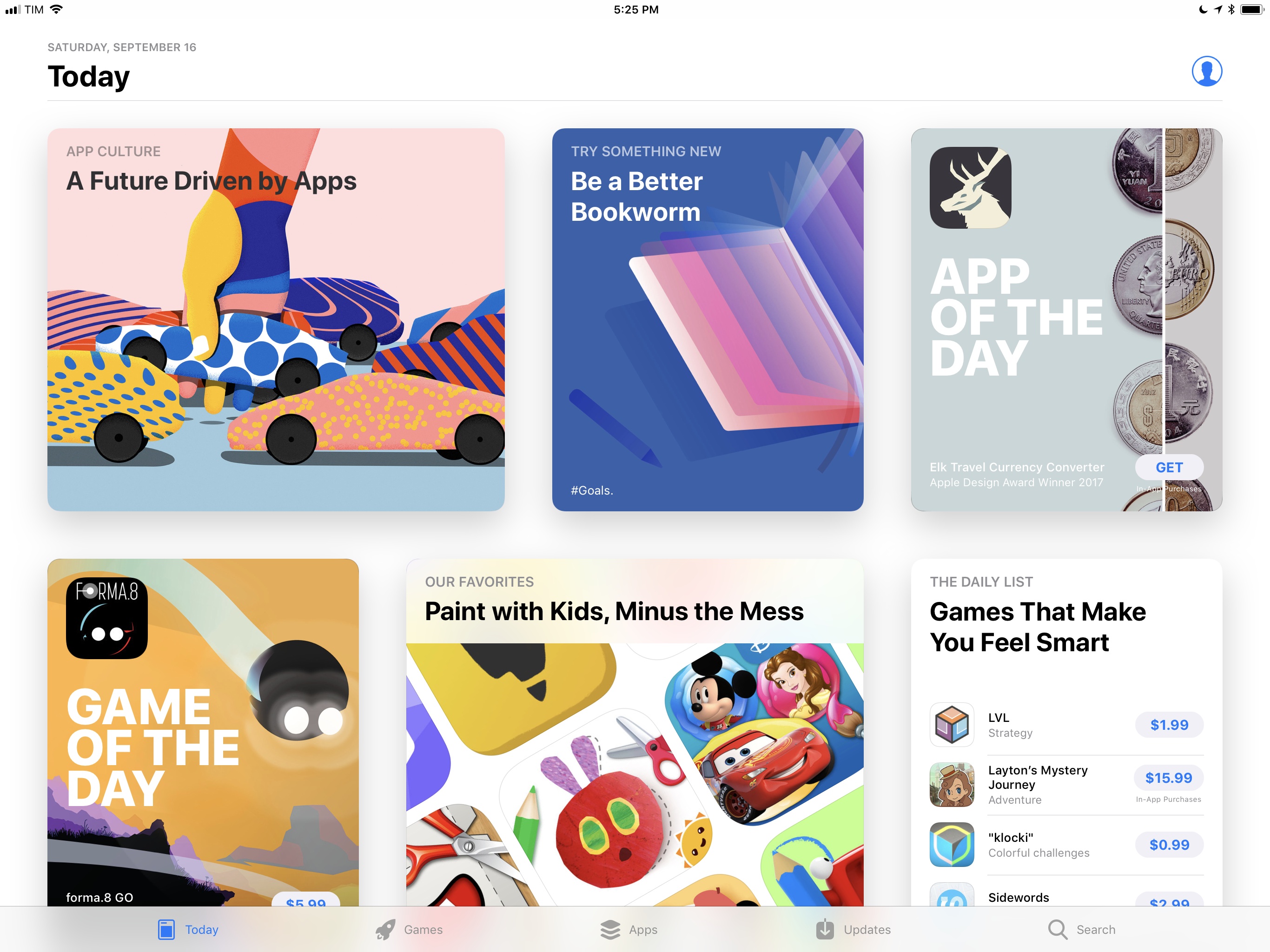
Apple calls the modules in the Today tab “stories” – a name that reflects their nature as miniature blog posts. Think of the Editor’s Choice blurbs from the old App Store – Apple’s new stories are an extended, richer version of those, enhanced with beautiful full-screen graphics and a healthy dose of personality.
The story format has allowed Apple to experiment with multiple layout options. Some stories are simple posts with a gallery of apps embedded at the bottom, which you can use to download the editor’s picks; others are lists of games, such as 15 Inspired Indie Games; App and Game of the Day are usually the richest modules in terms of graphics, with edge-to-edge artwork, large screenshots, and other media embedded in the body of the story. Unlike the old App Store, the fluid structure of the Today tab enables Apple to play with multiple types of stories at once. Combined with the modern design language used throughout the new App Store, the result is a lively, colorful homepage that feels new and captivating every day.
Apple’s bet with the Today tab is that instead of opening the App Store for a few seconds to see what’s trending in the top charts, users will read, watch, and interact with recommendations made by human editors. Thanks to stories’ eye-catching visuals and embedded download buttons, users should easily jump from a story directly to a new game available on their Home screen.
As someone who’s been advocating for more editorial curation on the App Store for years, I think the Today tab is exactly what the App Store needed to move forward. Apple had already increased the amount of editorial recommendations under Schiller in 2016, but iOS 11’s App Store works at an entirely different scale: it’s as if Apple is producing a mini tech/lifestyle blog, which is going to be updated every day, localized in multiple regions, and read by millions of people.
Apple now has the ideal avenue for explaining why a specific app deserves everyone’s attention, rather than just featuring its icon on the front page. With algorithms out of the equation, human editors will get a chance to feature apps big and small, putting large companies and indie developers on the same playing field for the sake of one underlying idea: helping iOS users discover and download quality apps and games.
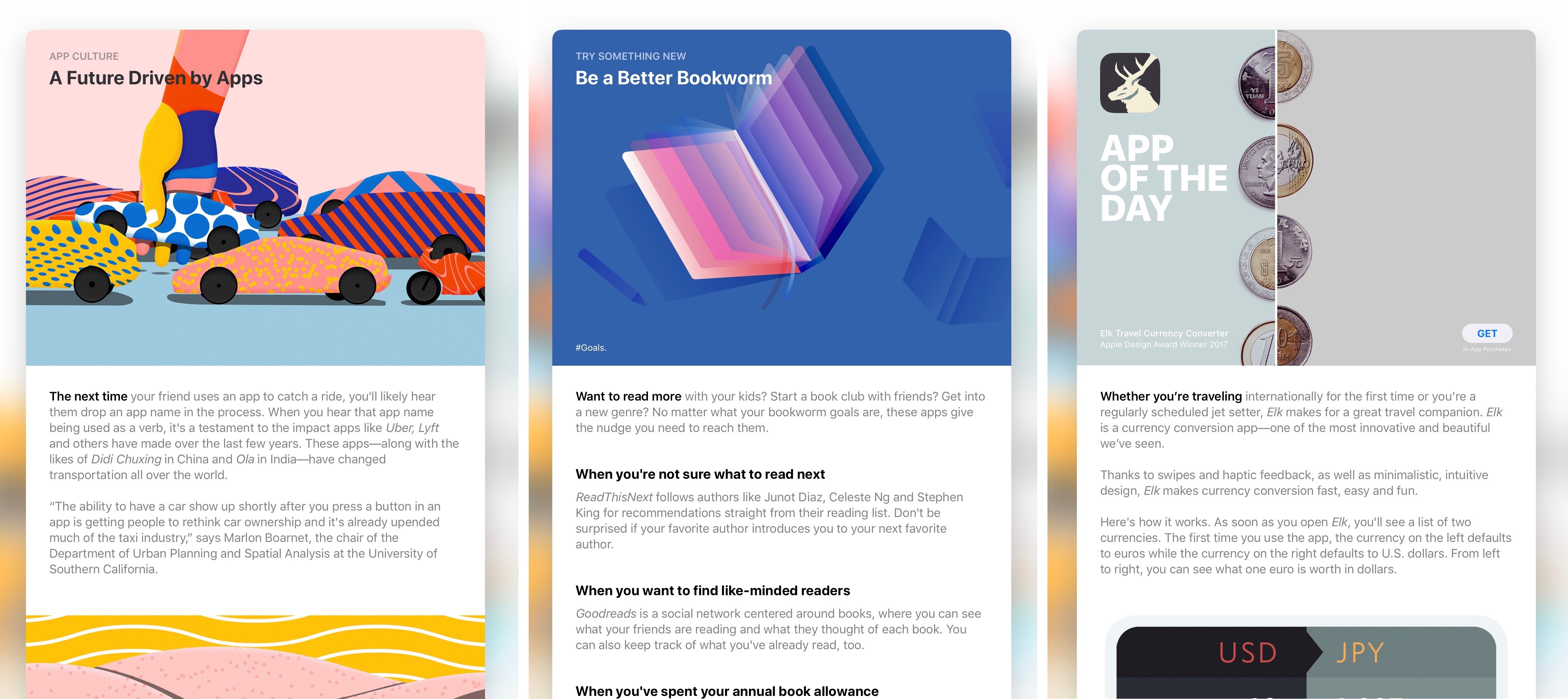
Elk, an indie currency converter, is featured alongside a story about modern transportation and a collection of book reading apps.
There are some challenges for Apple. It is somewhat odd, for instance, that recommendations or interviews don’t come with bylines for individual editors. Understandably, Apple wants to establish a “voice of the company” with Today, but I wonder if the lack of identification with editors (and their particular taste and writing styles) could be problematic in the long run. Mostly though, I’m curious to see if the App Store team will be able to keep up with a daily update pace for several months in a row without decreasing the frequency of stories or slimming down the format to easier collections and lists of apps.
When it comes to creative work, there usually isn’t enough money to throw at the problem of writer burnout. Can the App Store produce stories every day of the year, in multiple countries, all while keeping recommendations timely and culturally aware? And how well can Apple’s stories appeal to both App Store novices and more demanding pro users? It’s going to be tricky for the company to balance all this, but I’m feeling optimistic about the initiative.
As the past two months have demonstrated, Apple has been able to ramp up the Today tab from monthly to weekly, then daily updates. Stories have always been fun and informative, with a good mix of apps and games, lesser known titles and tips for popular hits, and fascinating behind-the-scenes articles on apps I wasn’t familiar with. I don’t doubt Apple’s ability to craft unique stories with a mass-market focus that can also appeal to more sophisticated App Store customers. My only question is whether this will continue for years to come, or ultimately fizzle out.
Editorial curation was always the best way to explain the richness of the App Store ecosystem. If Apple keeps it up, the Today tab can entice users to learn more about apps, explore more, and create a better App Store platform for all of us – both app developers and users.
Apps & Games
The separation of apps and games in the App Store has been a long time coming, and Apple is delivering with iOS 11.
Apps and Games are now two tabs in the App Store, each with its own front page and carousel of featured titles, charts, and collections. As a result, each page is richer and more focused as Apple doesn’t have to account for two product types at once.
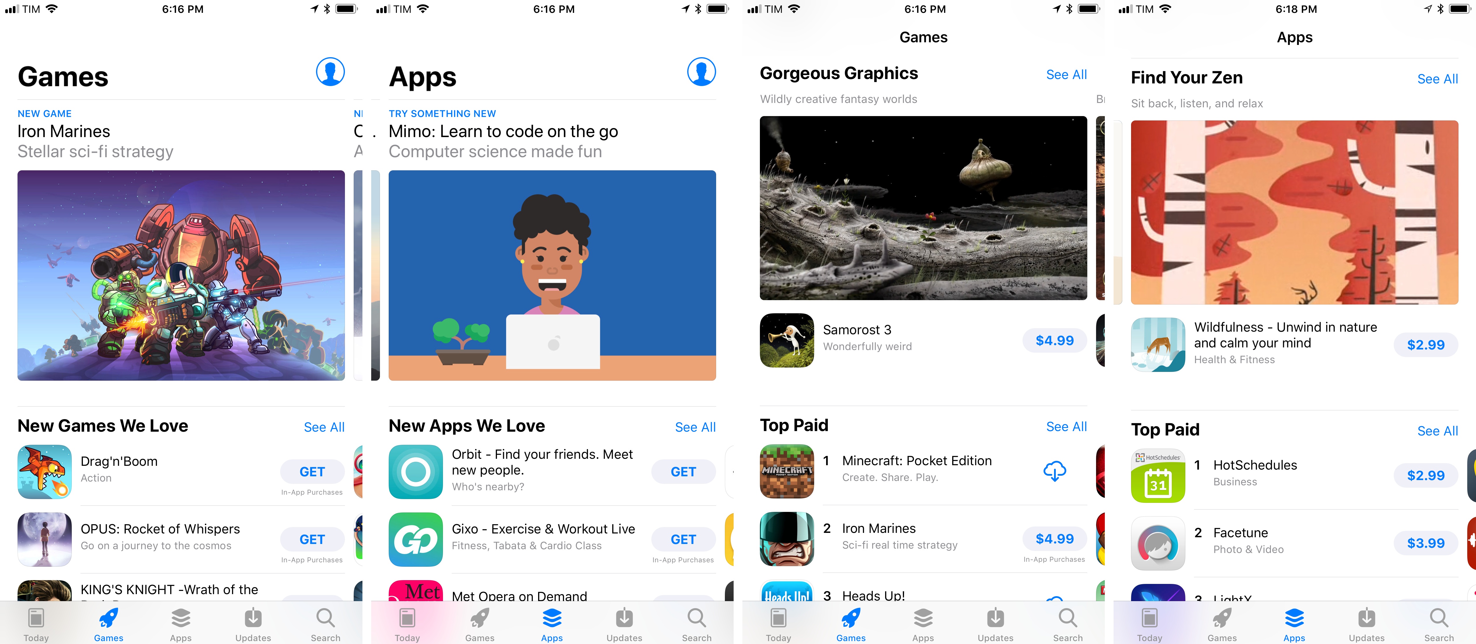
In addition to featured sections, Apple is including app previews with auto-play on both front pages; videos (which have sound disabled by default and can be set to not auto-play in Settings ⇾ iTunes & App Store67) bring the App Store’s front page to life; they’re a great way to showcase a diverse group of titles.
Because apps and games are two separate entities in the iOS 11 App Store, categories and top charts don’t depend on each other anymore. Top charts for apps are useful again as they’re not inundated with games: it feels like we’re back in 2009, when an interesting app could be discovered in the Top Paid charts without scrolling down to #150.
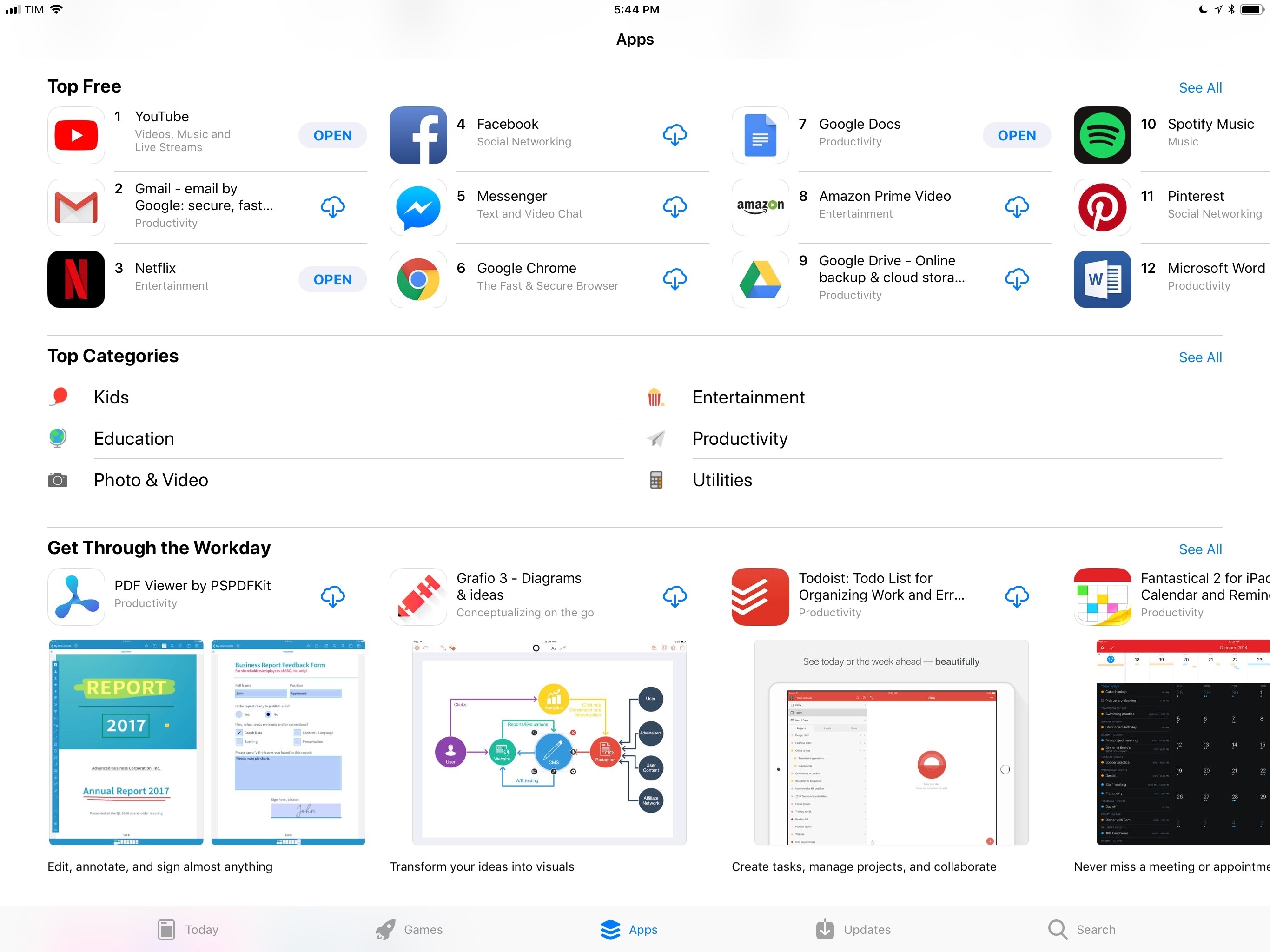
Categories are presented on the front page as Top Categories accompanied by new custom icons. The overall disposition of sections on the front page is similar to the old App Store, but because games are no longer intermixed with apps, each page is richer and optimized for the content it showcases.
Years ago, I argued that Apple should have considered a Games Store to give apps more room to breathe. That idea is coming true in iOS 11: technically, apps and games are still part of the same App Store, but distinct front pages and dedicated curation should incentivize different kinds of customers to browse and download more of what they typically look for on the App Store.
Product Pages
The App Store’s new design covers product pages as well, which now pack more information about apps and games than ever before.
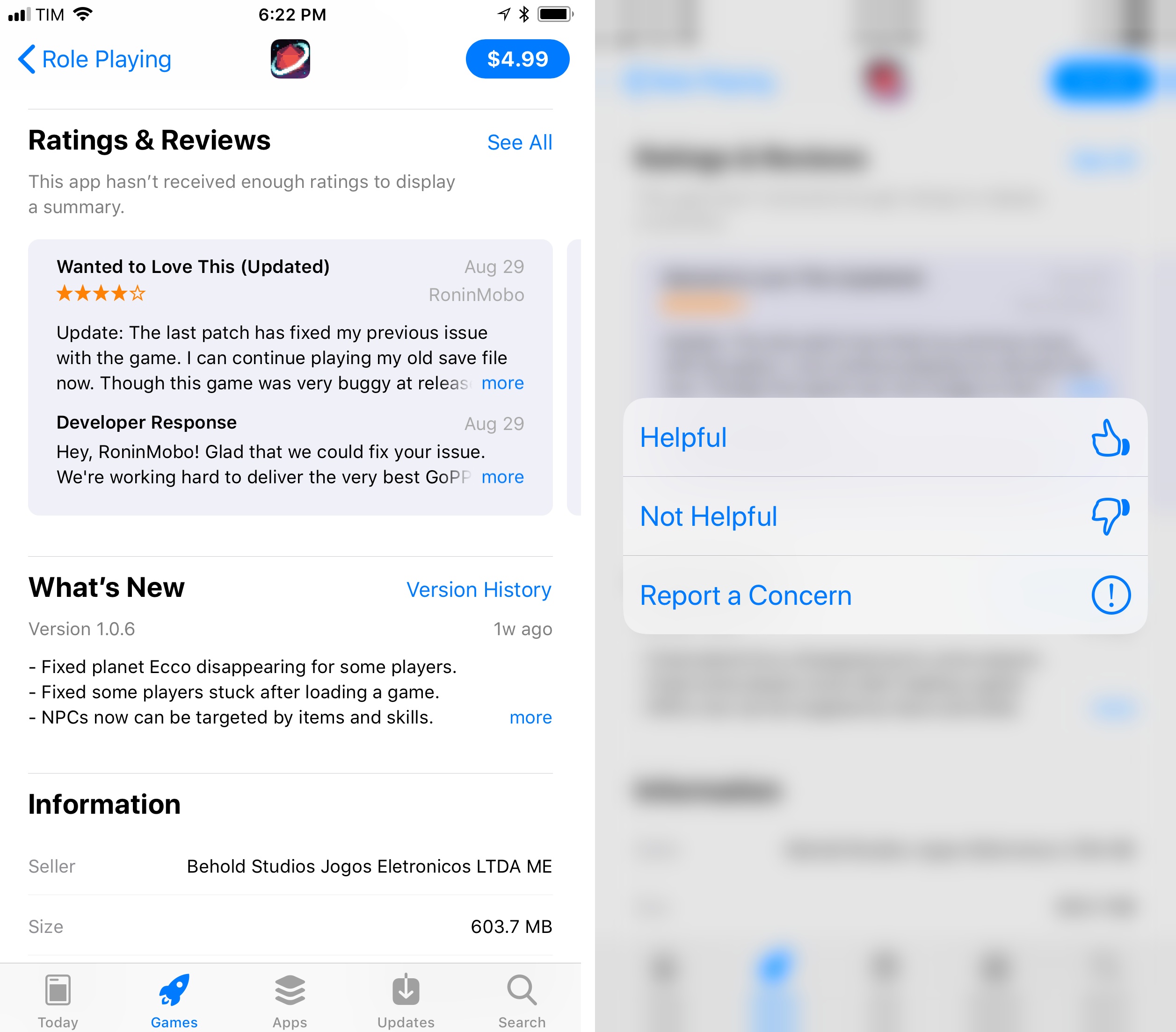
Large titles and various elements borrowed from Apple Music’s interface define the sections that make up an app’s product page in iOS 11. Reviews, ranking, and age ratings have been moved to the top of the page to give you an idea of the title’s popularity. The What’s New changelog box has also been bumped higher in the page: it sits above video previews and screenshots, making it easier to spot apps that are frequently updated with new features and fixes.
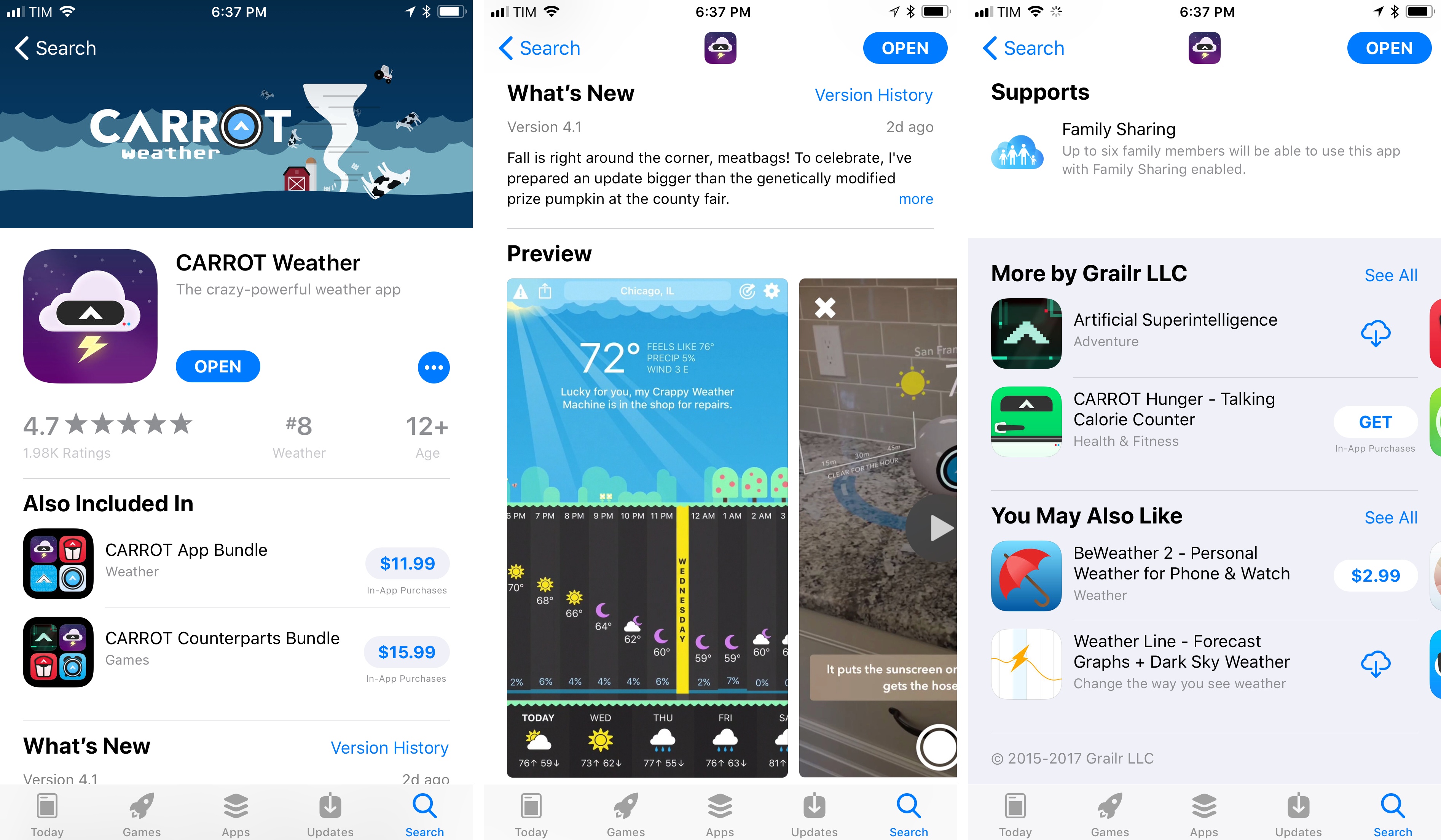
The top of the product page reveals two of the changes for developers in the iOS 11 App Store: app titles are limited to 30 characters, and the App Store now supports subtitles to succinctly describe an app. Moreover, developers can take advantage of a promotional text box that allows them, in 170 characters or less, to write anything they want about an app without having to submit an update. Expect developers to advertise special deals, upcoming features, and other direct communications in this section.
In iOS 11, developers can feature up to three video previews for a single app. Switching from 30 seconds of footage to a minute and a half across three previews is a fantastic way to understand the functionality of an app before committing to a download. Developers can also localize video previews.
As the App Store sprawls across several device families, Apple has improved the display of supported platforms. Below screenshots and previews, you’ll find a summary of all the versions an iPhone app includes, such as iPad, Apple TV, iMessage, or watchOS counterparts. This section can be expanded to view screenshots for all platforms in one place.
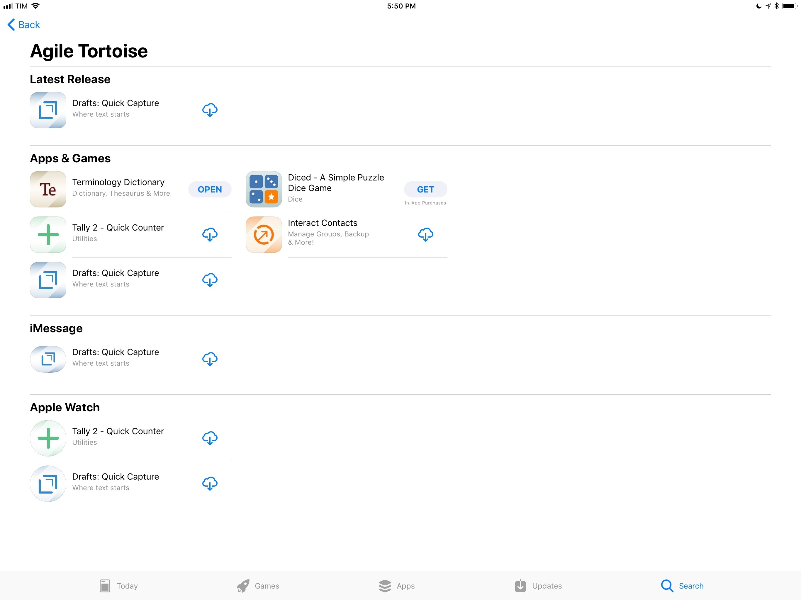
Developer profiles have been redesigned too. Now when you tap on a developer’s name from an app page, you’ll be taken to a revamped profile where apps are organized by platform and the latest release is showcased at the top. This makes it easier to browse profile pages of developers who make a living on the App Store with multiple apps.
Ratings and reviews have received a bold new look with a large average score and swipeable boxes to read what other customers say along with developer responses to them. You can press a review box with 3D Touch to mark it as helpful or not, as well as report a concern with it.
As you scroll further down the product page, you’ll notice a revamped Information panel with more details that can be expanded inline. In a nice touch, iOS 11‘s App Store displays the app’s icon and download button persistently in the title bar, so you can decide to download it at any time while reading the product page without scrolling back to the top.
The lower end of the page is dedicated to Wallet and Family Sharing details, more apps by the same developer, and suggestions for similar apps you may like. In contrast with the old App Store, every section is clearly laid out and buttons are rounded, outlined, and comfortable to tap.
App product pages in iOS 11 reflect the essence of the new App Store: everything’s larger, more colorful, and legible. iOS 11’s design language perfectly fits the App Store’s new goals.
More Changes
There are some other interesting tidbits and optimizations to the App Store worth noting.
In-App Purchases can be promoted everywhere. With iOS 11, Apple wants to make In-App Purchases more discoverable and accessible for users, and in the process help developers sustain their apps with an easier way to sell additional content. To do this, they’ve turned In-App Purchases into standalone items that can be browsed directly from product pages, search, and the Today, Apps, and Games tabs.
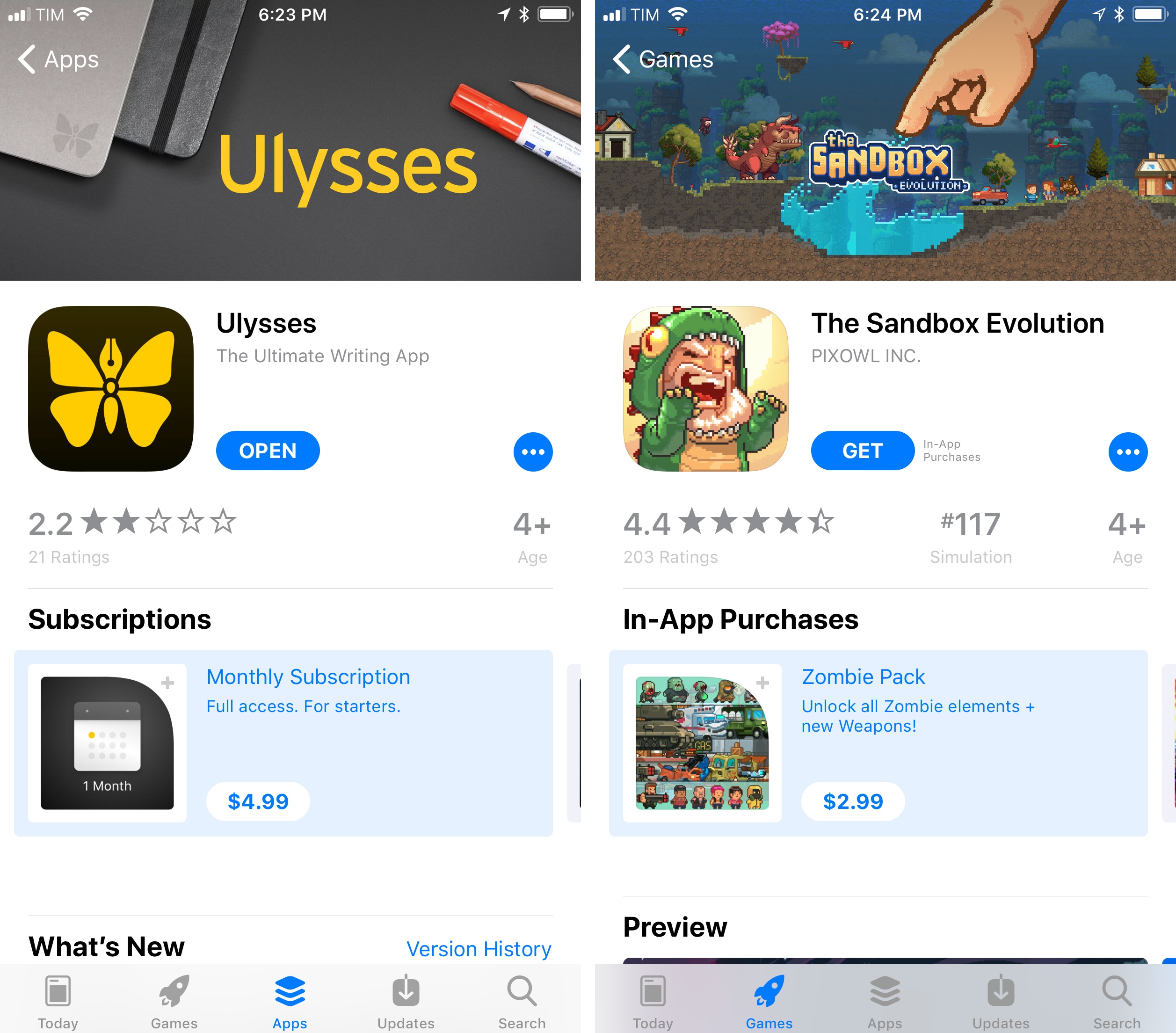
Developers have been given a lot of control here. They can choose to promote up to 20 In-App Purchases on a product page; each In-App Purchase can have custom metadata and artwork attached to it. Because with this system an In-App Purchase might be bought before the user even installs the main app, Apple created an API that can continue an In-App Purchase transaction inside the app only after it’s been downloaded. If it wasn’t clear that Apple thinks developers should consider In-App Purchases, there’s very little doubt now.
Richer search. The App Store in iOS 11 can search for more types of content: in addition to apps, you’ll be able to find revamped developer profiles, editorial stories, curated collections, and In-App Purchases directly in search.
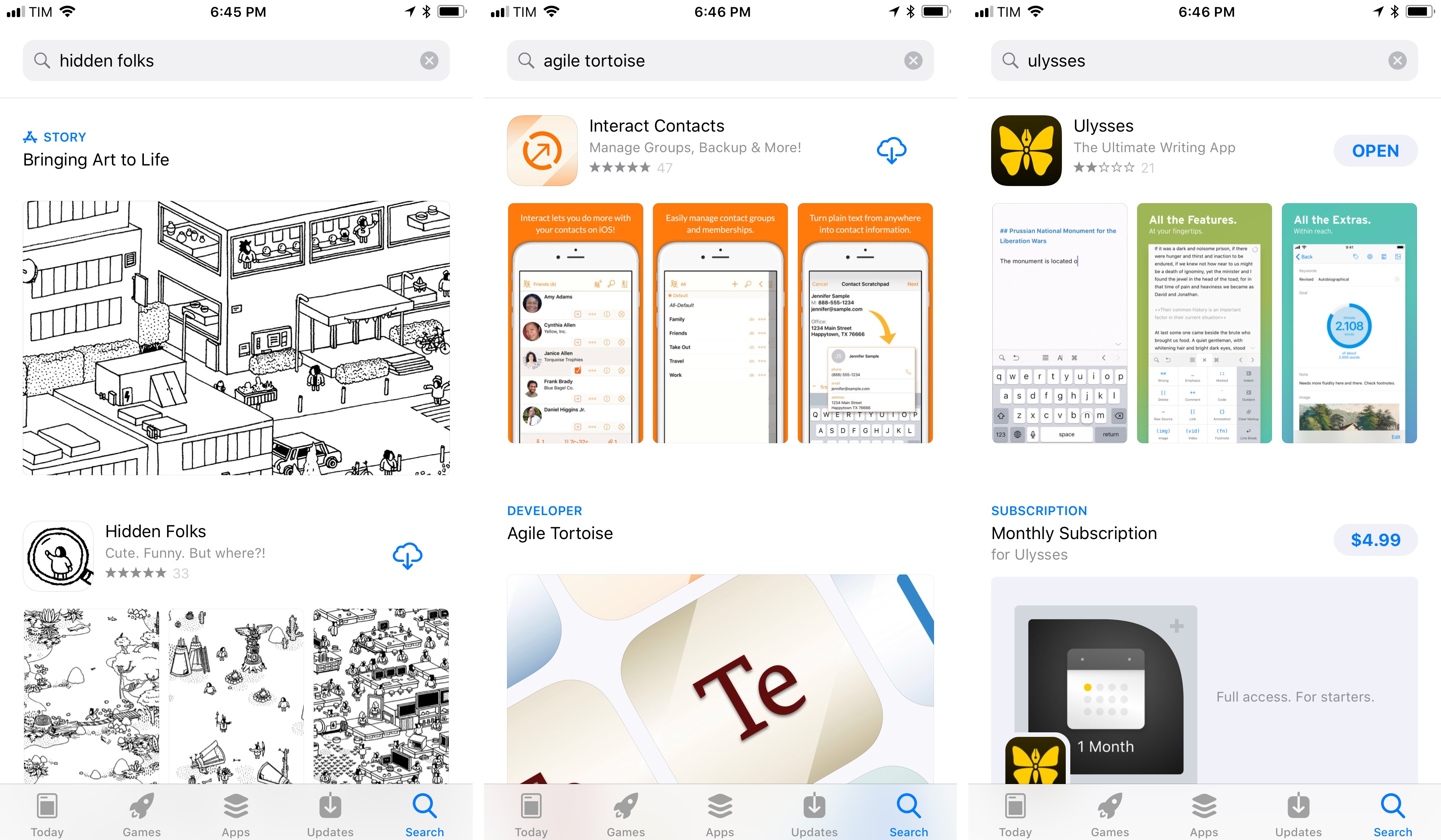
I’ve long wanted Apple to make their editorial collections searchable, and I think this is the right move. Unfortunately, one of the major issues of App Store search remains: if a new app has just launched, it still takes a few hours for it to show up in search results.
A new purchase dialog. The App Store’s purchase dialog has been redesigned to look like an Apple Pay confirmation sheet.
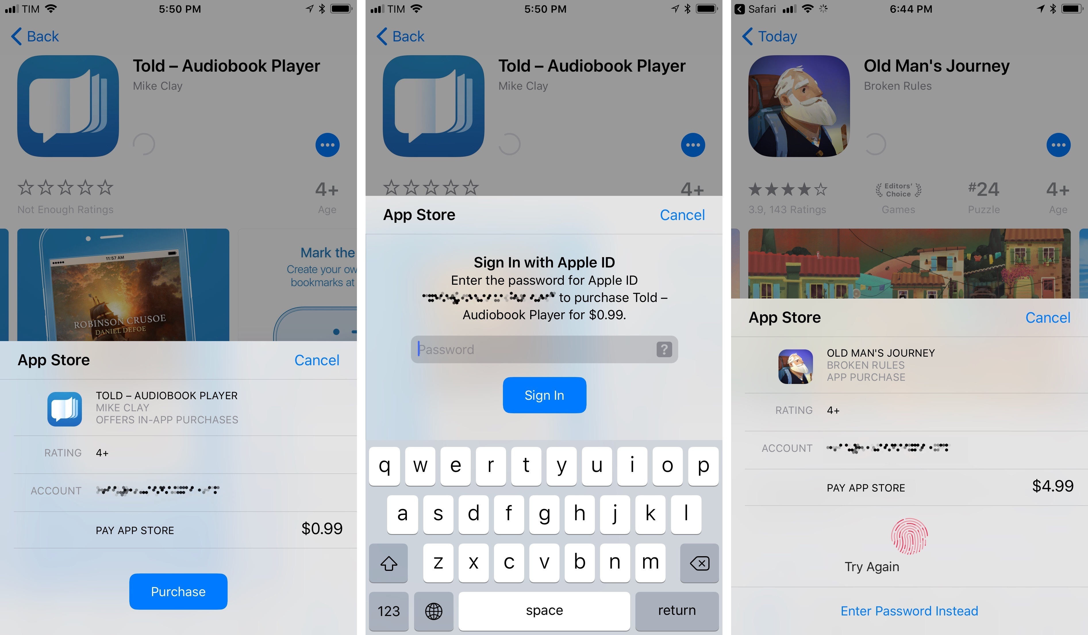
On one hand, the more “serious” look of the dialog might discourage some purchases, but I also appreciate the clarity of the breakdown provided in this UI. However, I’m surprised that the App Store still doesn’t offer Apple Pay as a payment method.
Pull to refresh for updates. If you’re anything like me and keep automatic app updates disabled but have always wanted an easier way to manually check for new versions – rejoice! You can now pull to refresh on the Updates tab to see what’s new and waiting to be installed.
View iPad and Mac apps on the iPhone App Store. You still can’t buy iPad or Mac apps while browsing the App Store from your iPhone (nor can they be searched), but at least iOS 11 allows you to open a non-iPhone app’s product page and read more details about it.
Share stories. While the Today tab won‘t have a web presence, you can copy links to individual stories and share them with friends. On other iOS 11 devices, these links will open in the App Store.
iOS 11’s new App Store is the achievement of a team that doesn’t want to look back. With an all-encompassing redesign, Apple is both bringing a fresh look to app discovery as well as highlighting new business models and technologies. In-App Purchases, app previews, subscriptions, multi-platform apps – developers who will consider and incorporate these elements in their apps will have a higher chance of finding success in the modern App Store.
Apple has changed the conversation around the App Store by giving more resources and attention to what makes it unique: their editorial team. More than a storefront, the goal of the Today tab is to provide Apple with an editorial voice, leveraging curation as a differentiator from other mobile app stores. No other company can handpick titles from such a vast pool of quality software, and in a wide range of prices and formats. If the Today tab succeeds – and it looks like it just might – it’ll reshape the way developers and users think of app premieres, exclusives, and the simple act of checking out what’s trending on the App Store.
The new App Store is a risky bet: Apple is making drastic changes to a well-oiled machine that, by all accounts, has been a runaway success for the company. But if it pays off, the entire iOS app ecosystem will be better because of it.
- You can also choose to enable video autoplay on Wi-Fi only. Autoplay is temporarily turned off if you're running low on battery or have a slow Internet connection. ↩