
A great man once said that we should look up at the stars, be curious, and keep asking questions. With the App Store now a five-year-old business, I would like – allow me to paraphrase that great man for a much more trivial endeavor – to look ahead and trying to imagine what the next five years of the App Store could look like. I already wrote my in-depth App Store retrospective last year, and I touched upon the changes introduced with iOS 6 back in September 2012. Now, it’s time to think about what’s next. The past can be functional to contextualizing the future, but eventually somebody has to think of that future. This is my humble, brief attempt.
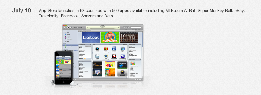
The App Store will soon hit the impressive milestone of 1 million apps available for iPhone and iPad. In fact, I wouldn’t be surprised to know Apple is figuring out a way to time the announcement of 1 million apps with the release of iOS 7 (and possibly new iPhone hardware) this Fall. The App Store’s soon-to-be-millionaire catalogue pales in comparison to the iTunes Store’s music offerings, but it’s still impressive when considering that the modern concept of app was born only five years ago, whereas music goes, euphemistically, “a long way” back in human history.
I don’t think that the App Store’s growing catalog will ultimately change the nature of the Store itself: if you look back at the past 10 years of iTunes, you’ll see that, in spite of new releases and additions, the iTunes Store’s core mechanics haven’t changed much. Customers go to iTunes, they buy music, and they enjoy that content on their devices. With the App Store, I think we’ll keep seeing a front page, categories, charts, and a download/purchase mechanism that will go unchanged for the foreseeable future. Apple doesn’t need to alter the simplicity of the App Store model, but they must enhance it and modernize it.
I discussed many of my ideas for a better App Store in my piece from February, and I’ll revisit them today with a knowledge of the announcements Apple made with iOS 7.
A New App
Ever since the release of iOS 6 last year, I mentioned how the redesigned App Store for mobile devices had become a slow, unresponsive storefront prone to crashes and unacceptable loading times:
The App Store app is slow and buggy. Things have gotten better since the release of iOS 6 last year (September 19, 2012), but the Updates & Purchased section still leads to frequent crashes and/or “blank screens” whenever the App Store tells you to install updates…that don’t show up at all. The Purchased section was a great addition back in the days of iOS 4.3, but it’s never been fast enough. It was slow with iOS 5, and iOS 6 made it more prone to crashes and glitches. This needs to be fixed.
This is the first area that I’m pleased to see Apple is directly addressing in iOS 7. The new App Store isn’t too dissimilar from the old one in terms of layout and presentation, but the app has been completely rewritten to not be a wrapper for a web view anymore. This means that, on iPhones and iPads, the App Store will be fast when navigating categories and charts, or when looking for specific apps. A seamless App Store browsing experience can be beneficial for customer engagement and daily usage – and there is no reason to believe that, at this point, Apple will ever go back to a slower App Store.
Discovery
I agree with the notion that apps are instrumental to device sales, and especially great apps that Apple can highlight and promote as exclusive to iOS. The problem with over a million apps is that, unsurprisingly, people don’t have time (or money, or willingness) to check out each one of them. Apple will need to develop better, more proficient discovery tools if they want to ensure that the excellence of the App Store platform is not only editorially curated by Apple every week, but also organically discovered by users based on factors such as immediate needs, tastes, or social recommendations.
Near Me
With iOS 7, Apple has announced “Near Me”, a new section that will try to show popular apps for a specific location. For instance, the Near Me tab could recommend educational and reference apps when it notices you’re visiting a museum, or photography apps and a city guide when it understands you’re in Paris as a tourist. There is potential about Near Me, but I’ll leave my final judgement for when the feature will be public later this year.
Today, I can speculate that Near Me seems like the sort of feature that would come in handy for the occasional trip with the family out of town, or the summer vacation that you take once a year. I would also add that it’s interesting to think about the possibilities of Near Me getting special content for events and from media partners – imagine if Apple could collaborate with Coachella or the NFL to suggest apps that are popular at a location and during a specific event.
Near Me, from what I’ve seen so far, isn’t targeting the user who stays at the home or at the office for the better part of his/her day, and, more importantly, seems heavily skewed towards iPhone users who tend to carry their devices with them – not necessarily iPad users or customers who prefer to buy apps using iTunes on a Mac or PC. So while Near Me may prove to be a notable addition to the iOS 7 App Store, I don’t expect it to become a new pillar of app discovery.
Near Me, as the name implies, is intrinsically tied to a user’s location, whereas I believe that, as new millions of users will enter the post-PC era in the next five years (presumably with iPhones and iPads as their primary devices), Apple should focus on discovery based on required task. How can users discover apps they may need for work or enjoy for their entertainment without having to change location? I think we’ll see a renewed focus of Apple in this area with a mix of Genius recommendations, improvements to search result presentation, Siri queries, and editorial curation.
Again, some thoughts that I shared in the past:
The App Store team in charge of curation has been doing great work with handpicked sections, app and game collections, rebranded categories, weekly (relaunched) Editor’s Choice and App of the Week initiatives, and – let’s not forget this – international versions of all of the above. Still, curation is not enough if users can’t find out about it.
The one area that’s obviously lacking any sort of curation and increased discovery is search. Apple has been collecting hundreds of apps for common activities such as “news”, “writing”, or “doing taxes”, and yet these sections don’t show up in search at all. Imagine being a new iOS user looking for some apps for “work” (a section Apple currently maintains) or “multiplayer games”: the iOS 6 App Store search wouldn’t show anything besides obscurely ranked search results.
In the past year, the App Store team has done a good job in handpicking apps and games to feature on the front page, organize in custom sections, and promote with banners that are periodically rotated across the front page and the also-redesigned Category pages. Still, based on my conversations with several third-party developers, conversion rates for apps featured in Categories have been modest, suggesting that users still prefer checking the front page rather than viewing individual categories, or the Top Charts over a careful analysis and research of apps included by Apple in App and Game Collections.
Frustration with the difficulty of breaking into the Top Charts has lead many developers to suggest that Apple should outright remove the charts, for they only benefit free apps, developers who employ questionable In-App Purchase tactics, or those who “game the system” to be listed in the Top 50 and gain “download velocity”. I wrote:
The AppGratis removal sheds light on the fact that, by design and technical limitations, success in the App Store is still too skewed towards Charts. If the algorithm powering Charts can’t be improved to filter apps that are being downloaded because of “forecasting” tactics, than it’s time for Apple to find other ways to ensure more developers can make a living on the App Store without having to enter the Top 50. And this is true for Apple as well: their “Free App of the Week” initiative puts a different app in the Top Free chart on a weekly basis (but, at least, you can trust Apple’s App Store team to pick quality apps, not the highest bidders).
While all these issues may appear unrelated to each other, I think they all go back to a single common denominator: users want an easy way to find out about new apps, and the Top Charts are easy enough to consult and sift through. This is why I have doubts about the friction of Near Me as opposed to the instant gratification of free apps in the Top Charts that are often downloaded mainly out of curiosity and, put simply, because they don’t cost any money. How can Apple beat this proven system?
Leaving the (legitimate and reasonable) debate on Apple’s intentions and App Store economics aside, I wonder about ways Apple can enable users to discover more great apps with a frictionless App Store.
Genius and Search
A new Genius recommendation system could take into account data points that Apple has so far seemingly ignored or downplayed: a user’s purchase history; friends’ recommendations from Facebook and Twitter; apps that have been featured by Apple and included in custom collections; apps that a user may need in the future based on data from the Calendar and Reminders (imagine the new iOS 7 Today View, and how Apple could match a “Meeting” event with a series of meeting-related apps); games that are “hot right now” because friends are playing them. For consistency with Near Me, Apple could even call the Genius-powered feature “For Me”.
There’s a variety of ways in which Apple could use personal and aggregate data to algorithmically sort and prioritize recommendations, and I believe that it only makes sense to be thinking about these sorts of data-driven discovery services for the next million of apps. And if we consider the new features that iOS 7 will bring, such as background app refresh, Apple could understand a user’s patterns (does he tend to need content in the evening or the morning? On weekdays or sporadically in the weekend?) and recommend apps that match those new criteria. Genius, suspiciously absent from iOS 7’s current marketing material, could be a good candidate for a new App Store recommendation engine that isn’t afraid of leveraging data and personalized algorithms.
I’ve often argued that Apple’s own custom sections (the ones that are listed in App Collections) could become search results for groups of apps. The average App Store user – the one who doesn’t know about Drafts or Badland specifically – doesn’t open the App Store and search for “Drafts” or “Badland”. He launches the App Store, consults the front page and the Top Charts, reads a couple of reviews, and maybe taps on one of Apple’s suggestions in New & Noteworthy and Editor’s Choice (not before having grabbed the Free App of the Week, though). He doesn’t know about app names, but he may look for “work apps”, “office apps”, “diary”, “puzzle game”, and “advanced calculator”: these happen to be exactly the kind of names that Apple uses for their curated sections, and yet those sections are completely hidden from search.
If you think that my idea of injecting sections (curated by humans) into search results matching simple queries is crazy, look no further than Apple itself in times of public debacle: when the world was about to get the pitchforks and march to Cupertino over Maps, Apple cleverly issued an apology and injected its own “Maps” app collection into search results for the “maps” query. The (great) work of the App Store’s editorial team is mostly hidden right now, and search is a good (and technically possible) fit for results that include a “best match” section (whenever possible). I don’t think that promoting App Collections to the Categories menu is enough (and neither do the developers I’ve talked to in the past months).
Speaking of search, I can’t avoid a special mention for Apple’s obscure decision to switch to a cards layout in iOS 6. From last year:
And then there’s Search. In a somewhat curious attempt to bring a mix of Genius UI and Chomp to search, results are now displayed as “cards”. These new cards show the first screenshot of an app inline, giving an immediate idea of the kind of software a user is about to check out. Alongside the screenshot, icon, name, and ratings are also displayed, as well as a button to Buy/Download (or Open, if the app is already installed on the device).
The conceptual problem with cards:
The issue I have with this new interface for searching App Store apps is both conceptual and technical. Firstly, I believe that, on the iPhone, limiting a page to displaying only one result goes against the very idea of searching: for instance, imagine if Google only displayed one link per page, or if iTunes on the computer only visualized the “top hit” result, forcing you to swipe to see more. On the iPhone, the new App Store search interface has an information density problem that, at the moment of writing this, still hasn’t been given an option to return to the classic list view. Whereas the old App Store search visually suggested that, yes, various results were available for your query, the new search UI forcibly puts the focus on the first result alone. We’re moving from 5–6 results displayed on a screen to just one, and I’m not sure swiping horizontally will be as intuitive as simply scrolling to load more results. Surely, it’ll be more tiring.
The technical one:
Second, the new search interface just doesn’t work as advertised from a technical standpoint. Perhaps Apple will improve it with fixes on its remote servers (again, just like the other annoyances mentioned above), but as of right now, swiping between results is far from an optimal experience. On iOS 5, the “infinite scrolling” Apple used for search more or less worked as expected: if you had a decent Internet connection, you could see results (app names and icons) load within seconds. On iOS 6, cards are slow to swipe through, animations sometimes fail to finish properly, and, depending on your Internet connection, it’ll take a few seconds to load results next to the first few cards you’ve loaded. Overall, swiping between cards isn’t nearly as fast as scrolling through a vertical list of results.
And my assumption:
I think I get why Apple is switching to the cards layout for search. By turning results into cards, they’re enlarging tap areas making it, in theory, easier for the user to tap on a result without accidentally loading another one. Simultaneously, by placing the first screenshot of an application inline with search results, they are trying to somewhat increase the “recognizability” of apps – which, to date, have always been associated with their icons on the App Store.
Ten months later, I still don’t get why Apple decided to switch to cards for search in the iOS 6 App Store. It’s been a risible attempt to revitalize search by “enhancing” it and turning it into a system riddled with terrible performance and user experience, a dubious focus on app screenshots (usually too small and cluttered to be really useful), and one last drip of skeuomorphism. Combined with Apple’s notorious, mysterious search algorithm, iOS 6’s App Store search is an example of some things that Apple makes and just don’t work (or are worse than the previous solution).

It’s not a surprise that, with iOS 7, Apple is switching back to vertical lists for Near Me and Top Charts. Lists are easier to scan as they present multiple results at once and are better suited for a user’s view, which, if I’m not mistaken, should be the point of a search feature. It’s not clear whether the Search tab will also switch back to vertical lists; my hope is that, in the process of finalizing iOS 7, Apple will bring back clarity to search results. I almost wonder if cards were a byproduct of iOS 6’s poorly realized App Store: to save users a slow navigation back and forth between apps, Apple tried to convince us that cards were better for search results.
Kids and New Markets
With iOS 7, the App Store will gain a new Kids section where parents will be able to find apps and games suitable for their children thanks to age ranges and the omnipresent custom sections and editor picks. This is a smart move considering that Apple needs to look at the next generation of customers that will grow up with iOS devices – the next billion of people that won’t even know what a mouse is.[1] By making it easier to discern apps for kids from everything else and adding its own curated recommendations on top of browsing and searching, Apple will make it easier to foster a new generation of iOS users who will grow up with great mobile software.
With Apple supposedly moving into emerging markets with new devices and stronger interests, it makes sense for the company to focus its App Store efforts on localized apps and local editorial features. Developer evangelists at Apple will have to do a good job in advising developers on how to properly localize their apps and target potential new markets with apps intelligently priced for an era where the App Store is in over 150 countries. As Dave Addey noted in his research, the first results of Apple’s international App Store curation are already observable, and I suspect they will only increase in the next few years. Features exclusive to certain international App Stores wouldn’t be a surprise either.
“Made for iOS 7” Apps
iOS 7 won’t just bring “some” new features and enhancements – it’s a complete re-imagination of iOS’ structure and interface principles that will force developers to redesign their apps and rethink all the features that could simply be adapted and augmented with previous iOS transitions (iOS 4 to iOS 5 to iOS 6). I’ve already discussed how this summer will see developers rushing to create new apps and reimagine existing ones. On the other end of the spectrum, I find it hard to believe Apple won’t find a way to clearly promote and highlight apps that have been designed for iOS 7.
Apple isn’t new to custom sections and features for apps that have been enhanced for new system features, OS releases, or new devices. iOS 7, however, will effectively split the App Store in two: apps that were built before iOS 7, and those from developers who care about supporting this major change. This wouldn’t be a problem if every app on the App Store was updated regularly; unfortunately, cleaning the App Store’s back catalogue isn’t a new topic of discussion – today, there are apps on the Store that haven’t been updated in 2 or 3 years (I found apps last updated in 2008) and that will likely remain unchanged with iOS 7. Does Apple want to treat those “classic” apps in the same way that modern iOS 7 apps should be treated?
I’m not saying that Apple should remove old (and possibly not functioning) apps for sale, but I’m suggesting ways to better separate apps that were released when iOS 4 was around from apps made by developers who care. Instead of a custom section that disappears after two weeks because it’s replaced by another section, Apple could launch a new area for “Made for iOS 7” apps that’s permanently promoted on the front page similarly to New & Noteworthy; search could (and should) rank apps that take advantage of modern features higher than apps that haven’t been updated in years; a possible Genius feature could primarily suggest apps made for iOS 7 to users running iOS 7.
The App Store is already full of outdated apps, and Apple should seize the iOS 7 opportunity to provide users with better ways to find great apps that are modern and powerful.
Promotions and Sales
Apple likes the idea of free apps, customers love free apps, and developers want users but also revenue dollars. How does Apple balance these interests? I think that, in the next five years, we’ll keep seeing paid and free apps, a steady rise in adoption of In-App Purchases from developers, but also more promotions and sales coordinated by Apple with third-party developers.
Recent examples include the App Store’s fifth anniversary promotion and the Mac App Store’s productivity sale. Especially with the ongoing “5 Years of the App Store” promotion, it’s interesting to consider the possible “halo effect” that such promotion may be having on In-App Purchase revenue and companion apps from the same developer. Of 10 apps picked by Apple, 3 of them offer In-App Purchases and at least 2 come with counterparts for other devices (Day One for Mac and Tiny Wings HD for iPad). I’d love to know the effect that the promotion is having on In-App Purchase revenue and if developers of apps that will return to a paid price tag will be satisfied with the results and exposure granted by Apple.
A consequence of the App Store’s promotion that we can note today is how new iOS users who downloaded Day One for free are likely buying the Mac version as well, which has broken into the Top 10 on the Mac App Store:

I suspect that, alongside Free App of the Week, we’ll see more of these promotions and sales on a regular basis – if Apple can launch and market them in a way that will give developers more than just temporary exposure and an ephemeral outburst of users.
And More
Here are more ideas, theories, and suggestions for App Store improvements that I would like to see in the next five years.
- Enhancements to In-App Purchase receipts in iOS 7 will allow developers to more easily migrate to freemium models and transition users while keeping content they have previously purchased. I suspect we’ll keep seeing more apps leveraging IAPs and more apps going free. This may also explain Apple’s reticence in offering trials and demoes for paid upgrades, although I believe those are still necessary.
- “App Store Notes” are a nice way to let the App Store’s editorial team comment on apps that they are featuring and promoting. This is still far from the idea of a Michelin Guide for apps from Apple, but it’s a nice and subtle start. I would love to see weekly “Developer Spotlights” to tell the story behind app makers (they would be reminiscent of Apple’s Business profiles).
- iOS 7 requires, more than ever, videos and interactive promotional material to show an app’s use of animations, transitions, layers, physics, and dynamics. I don’t know if Apple could ever allow developers to host long, detailed videos on the App Store, but short, Vine-like videos similar to the ones Apple is using for iOS 7 are an intriguing concept.
- If Apple will ever launch App Stores for new devices like a smartwatch or a television, I suspect they will be available as standalone apps or websites and won’t be bundled into iTunes – just like the Mac App Store.
- Games will continue to disrupt the low-end of gaming, and with the addition of optional game controllers supported by iOS 7 Apple will also start tackling the issue of precision controls for more “serious” games. Hence I wonder about Apple’s interest for the App Store as a gaming platform going forward – I posted my thoughts recently here.
The Next Five Years
It’s hard to make predictions with the fast pace of the technology world, and it’s especially difficult with a company like Apple, not afraid of challenging its own status quo.
Assuming that, five years from now, we’ll still have a variety of devices with access to a unified app marketplace, I think the App Store of 2018 will be similar to the one we have today. There will be new designs, tweaked layouts (then again, this was the App Store in 2008), new device and OS names (iPhone 8 and iOS 12 sound…strange), and new categories created by new problems people will want a solution for – but the basic idea will remain the same.
The concept of the App Store is, like iTunes, strong enough to last for a decade and more. The App Store service and apps were built and designed in 2008, and they can’t stand the weight of a million apps anymore. Apple will need to focus on discovery, improved search, personalized recommendations, developer relations, and new markets if they want to bring the App Store to the next level.
As I wish happy birthday to the App Store, I see incredible potential for the next five years. I am excited for a future where a new generation of app makers will empower more people, solving new problems with the power of apps.