Design
While iOS 10 hasn’t brought a sweeping UI redesign, changes sprinkled throughout the interface underscore how Apple has been refining the iOS 7 design language. On the other hand, a new direction for some apps appears to hint at something bigger.
Bold Typography, Larger Controls
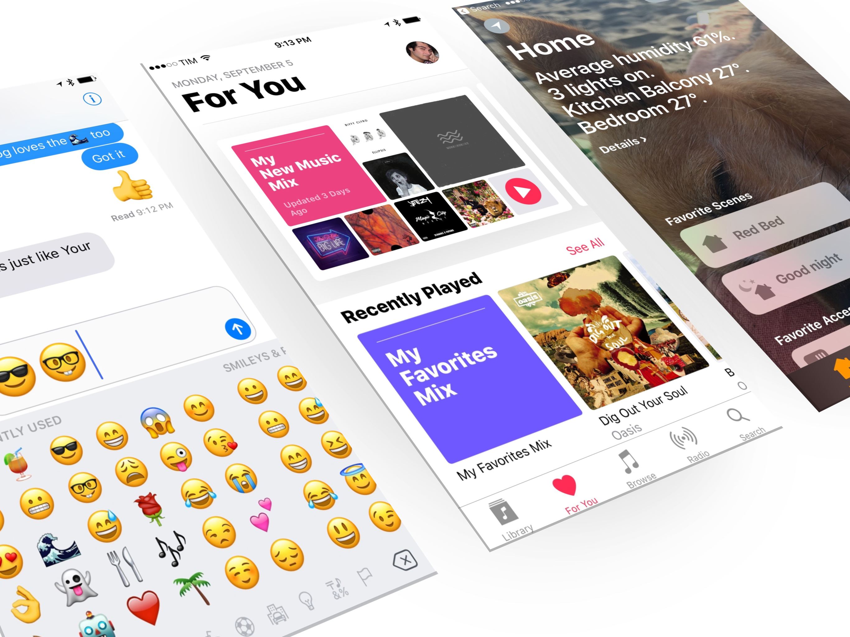
Apple Music epitomizes a strikingly different presentation of full-screen views, content grids, and affordances that hint at user interaction.
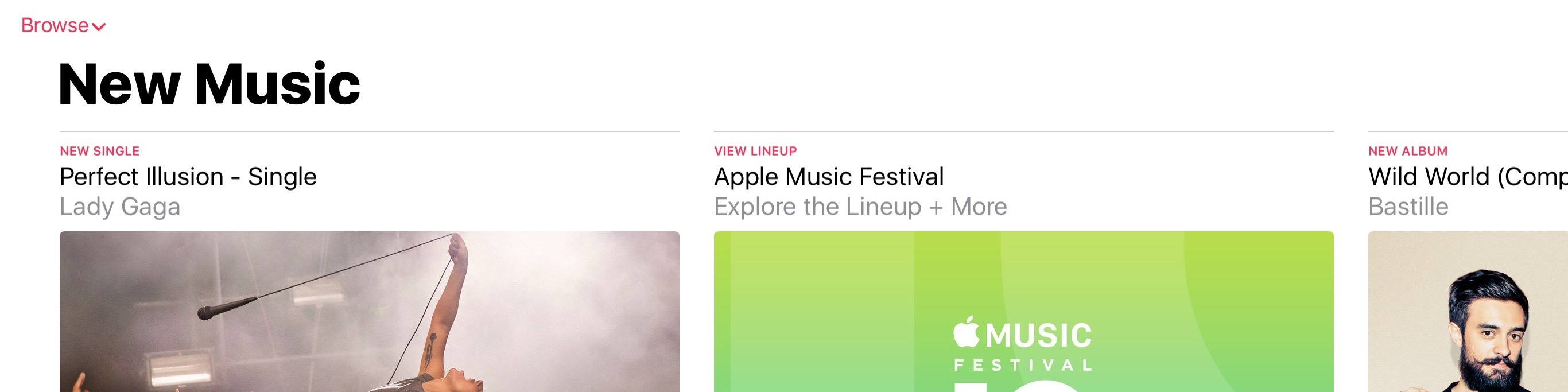
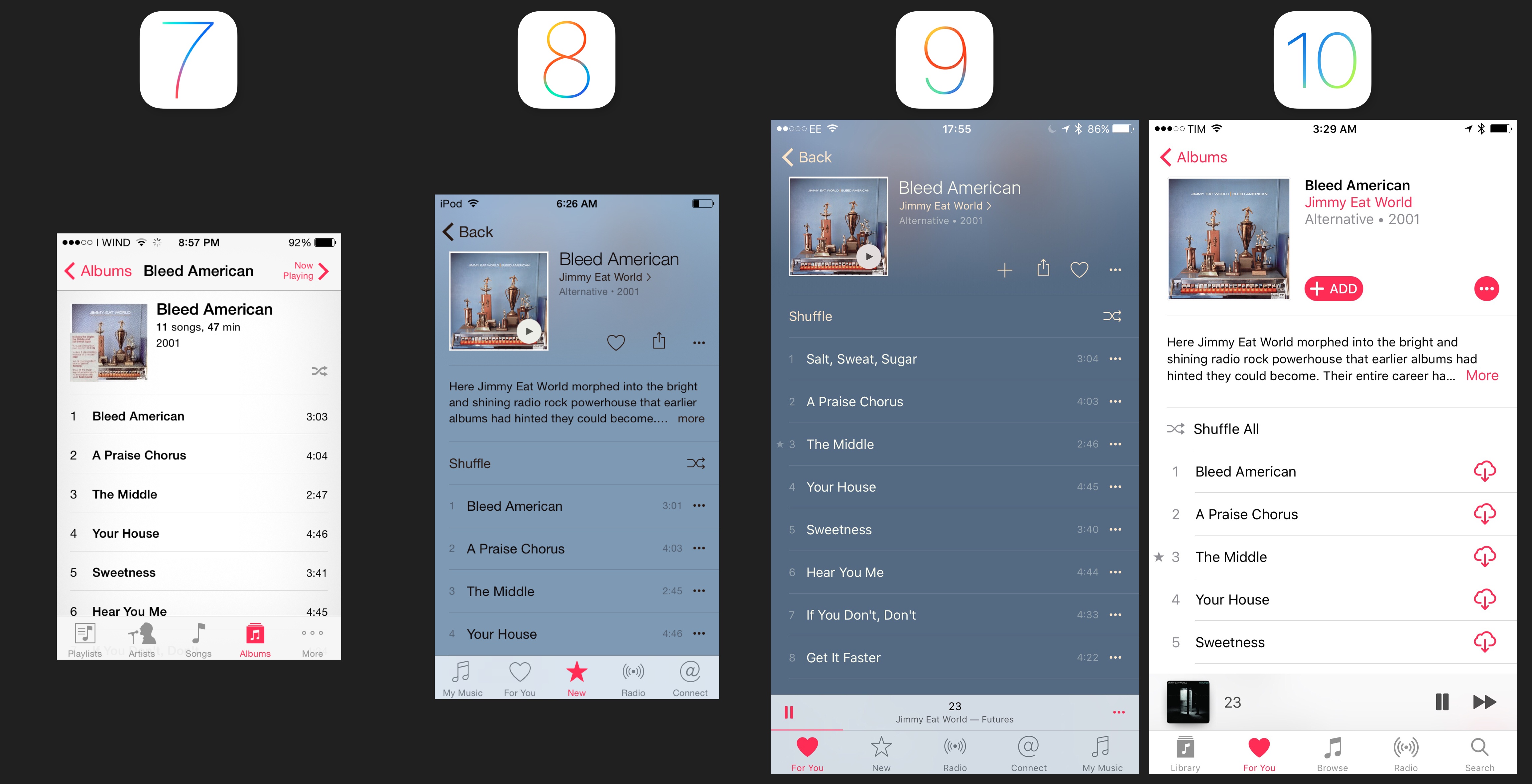
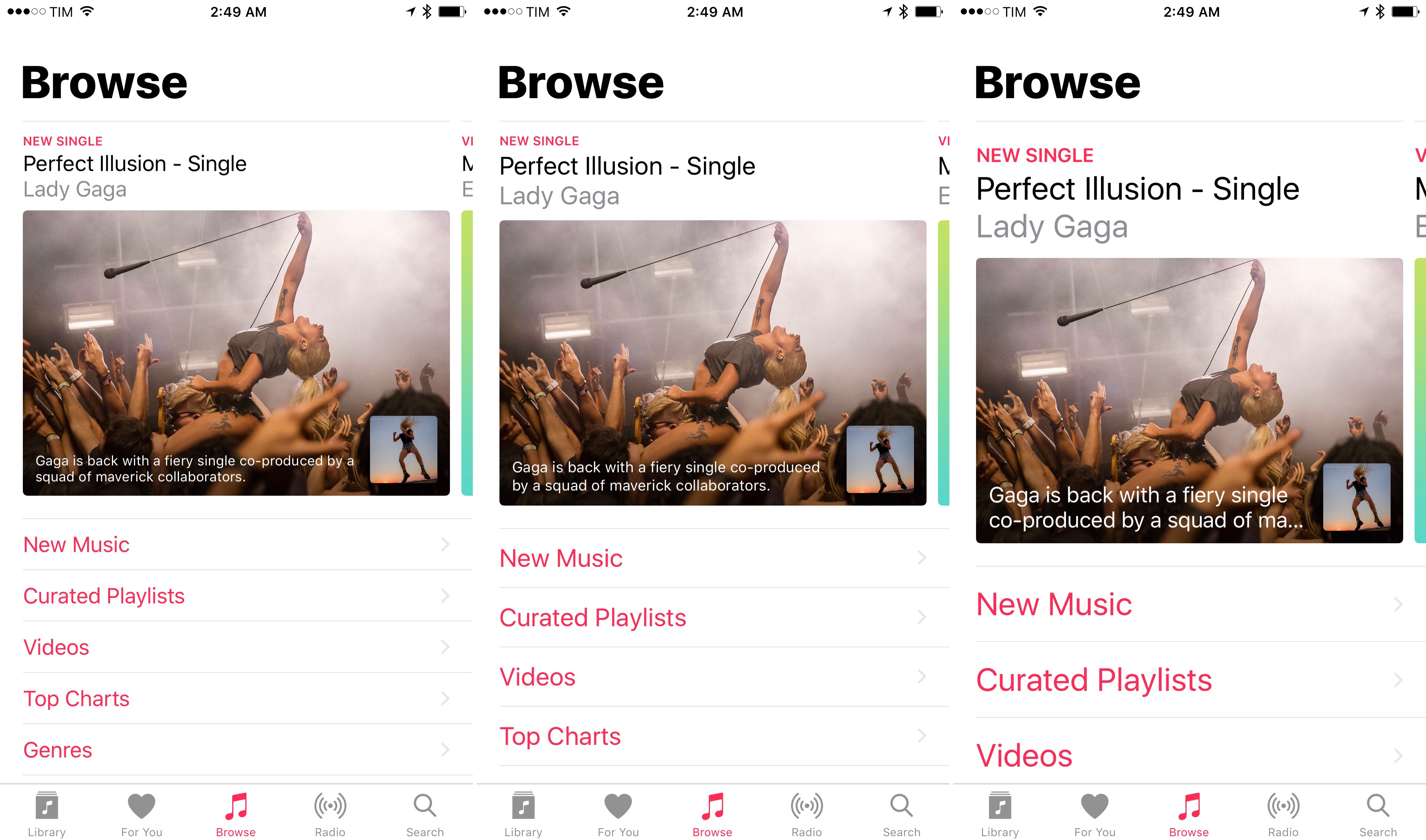
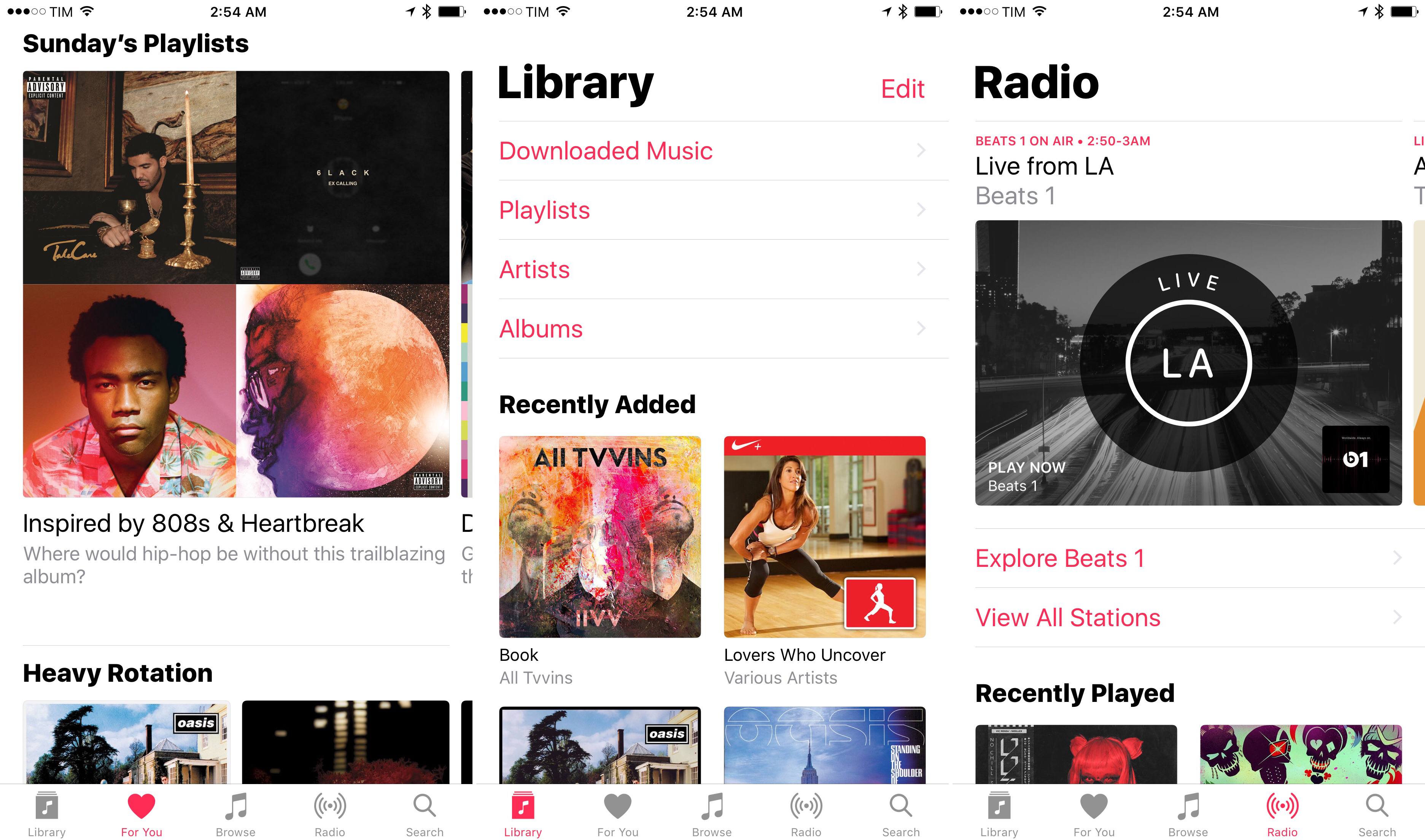
In iOS 10, Apple Music eschews the traditional title bar in favor of large, bold headlines for first-level views such as For You and Browse.
The use of San Francisco bold in lieu of a centered title bar label is similar to a newspaper headline. The heavy typeface sticks out as an odd choice initially, but it clarifies the structure and increases the contrast of Apple Music – two areas in which the company was criticized over the past year.
To group content within a view, or to label sub-views in nested navigation, Apple relies on Dynamic Text to scale text at different sizes. Dynamic Text doesn’t affect headlines.
The text-based back button at the top of a sub-view isn’t gone, but titles are always displayed in bold next to the content the user is viewing. An album’s name, for instance, isn’t centered in the title bar anymore; instead, it sits atop the artist’s name.
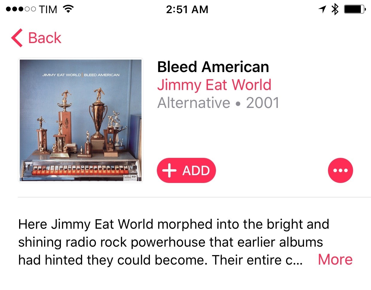
The combination of multiple font weights, color, and thicker labels provides superior hierarchy for content displayed on a page, separating multiple types of tappable items. By doing less, the result is a set of stronger affordances.
The visual statement is clear: when you see a black headline or sub-title, it can’t be tapped. You’ll have to tap on the content preview (artwork, photos) or colored label (artist names, buttons) to continue navigation or perform a task.
This goes beyond fonts. To further limit confusion, Apple Music now displays fewer items per page. Every element – whether it’s an album, a text button, or a collection of playlists – is also larger and more inviting to the touch.
The trade-off is reduced information density and the perception that Apple is babysitting their users with albums and buttons that get in the way too much. It’s a case of over-shooting in the opposite direction of last year’s button-laden Music app; Apple has a history of introducing new design languages and intentionally exaggerating them in the first version. The new Apple Music is a reset of visual expectations.
This is best exemplified by the Now Playing widget at the bottom of the screen: besides being taller (and hence more tappable), the contextual menu it opens blurs the background and is filled with large, full-width buttons that combine text and icons.
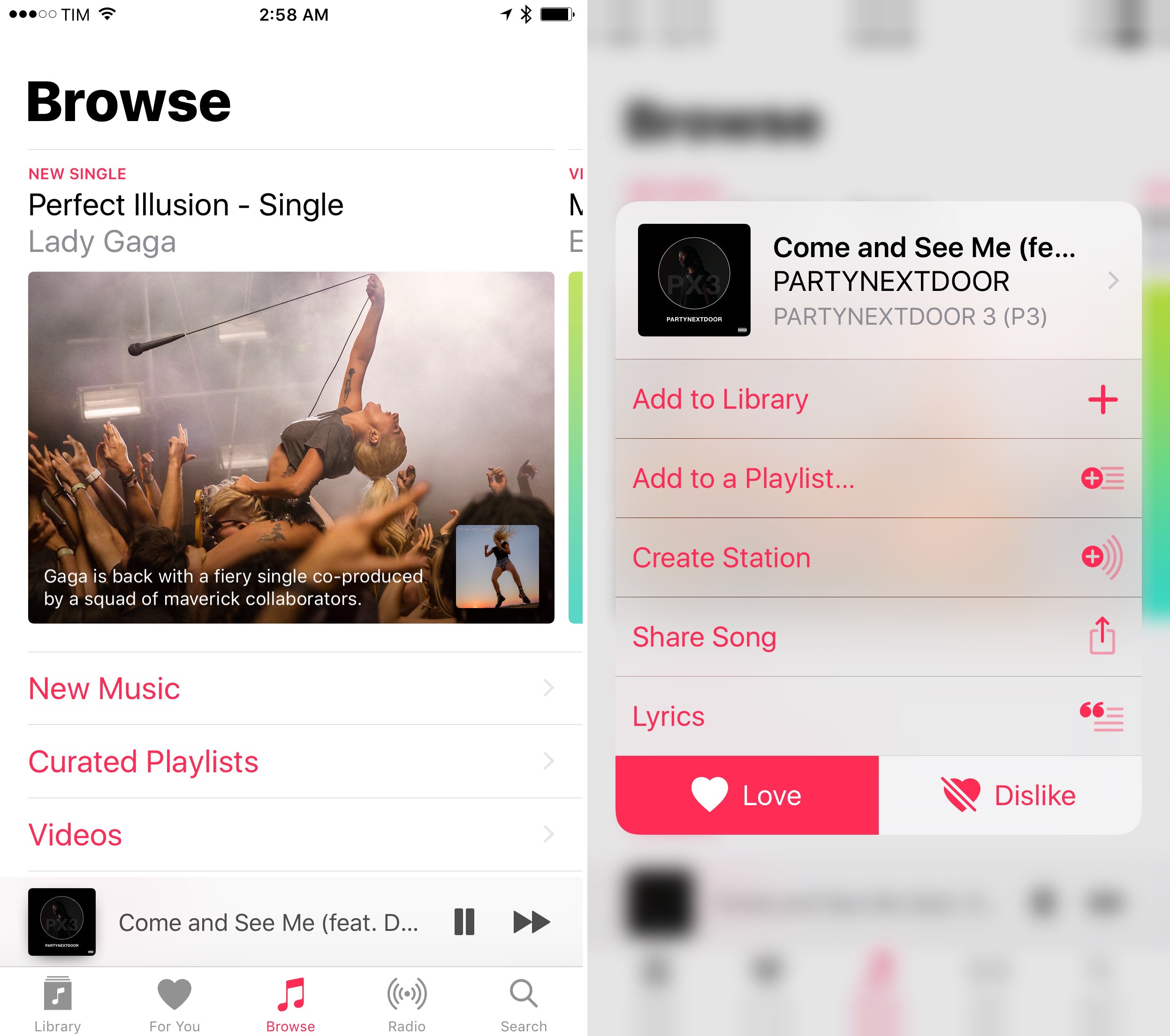
It’s impossible to misunderstand what each of these do, and selecting them doesn’t feel like playing a tap lottery, as was the case with the old contextual menu of iOS 9. Apple doesn’t appear too worried about breaking design consistency with other share dialogs on iOS as long as Apple Music’s works better.
The company’s newfound penchant for big titles and explaining functionalities ahead of interaction doesn’t stop at Apple Music. Apple News makes plenty of use of bold headlines for article titles (where they feel like an appropriate fit) and multiple colors to distinguish sections.
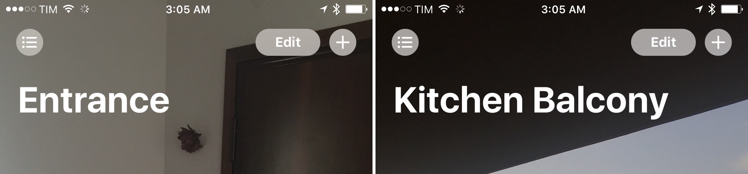
The Home app adheres to similar principles. There’s no fixed title bar at the top of the screen; rather, a customizable background extends to the top of a view, with a large title indicating which room is being managed.
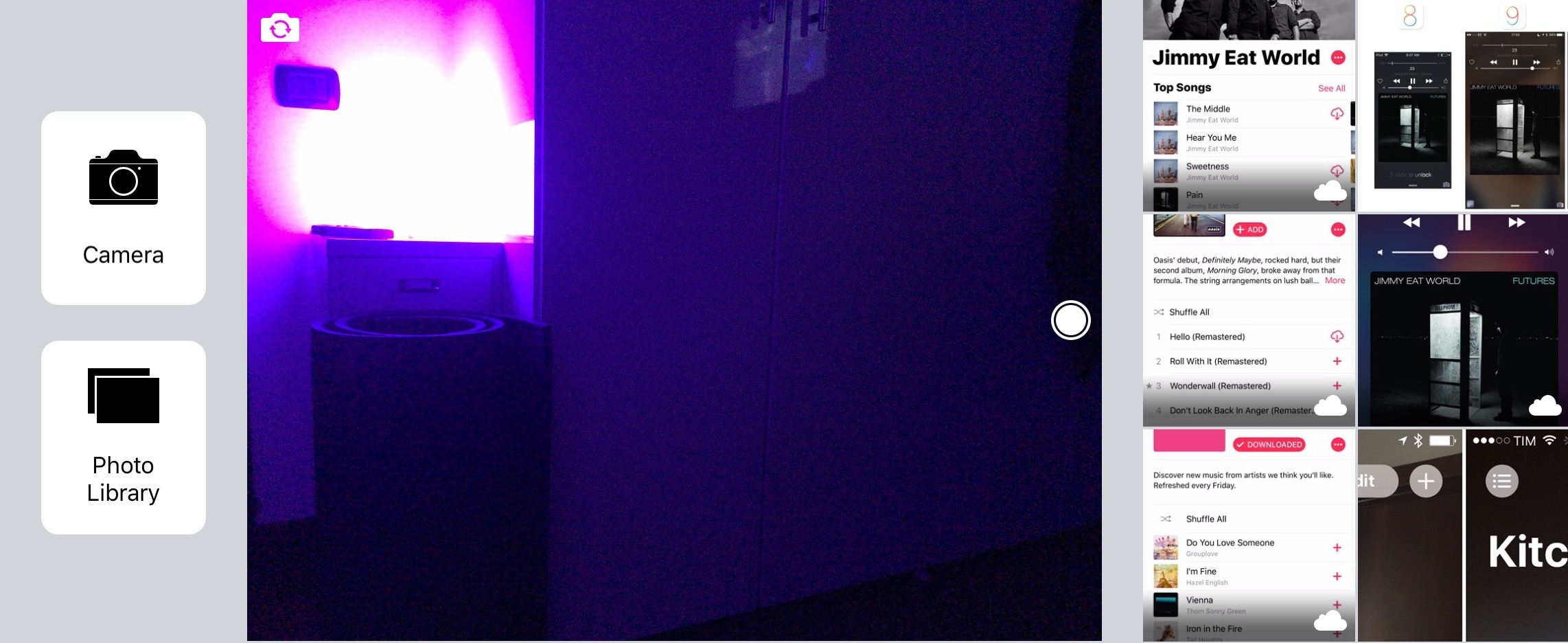
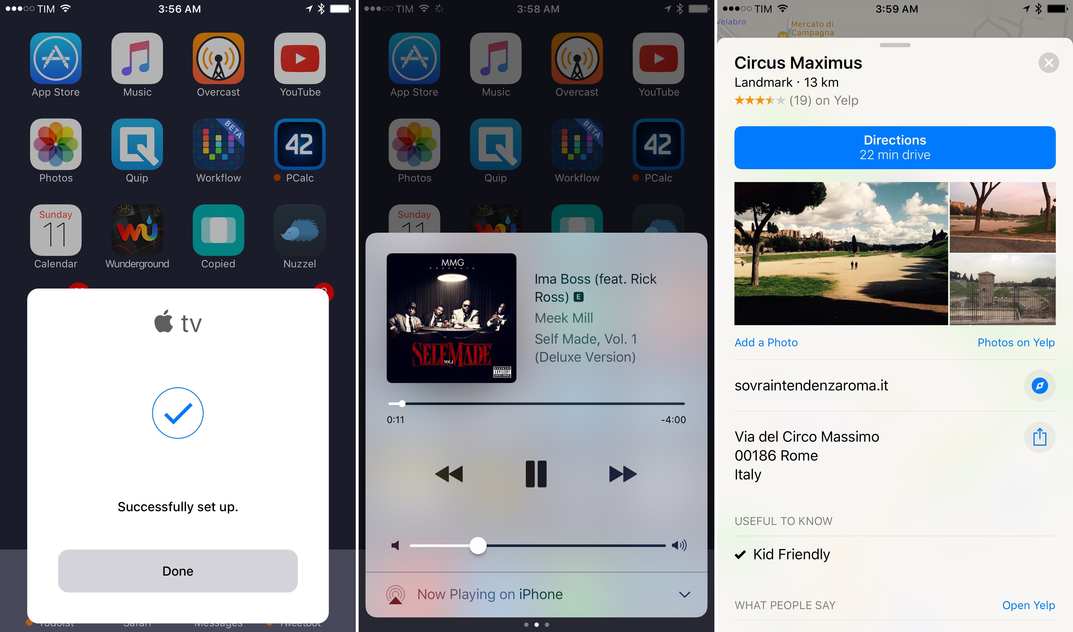
We can also look outside of apps for a manifestation of Apple’s bold design sentiment. In Control Center, splitting features across three pages lets functionality stand out more with bigger, comfortable buttons that aren’t constrained by a single-page design. This is evident in the music control page, where album artwork can be tapped to open the app that is currently playing audio.
Finally, let’s consider the Lock screen. In addition to redesigned notifications and widgets (which can be simply pressed for expansion), Apple is using thicker fonts and expanded audio controls.
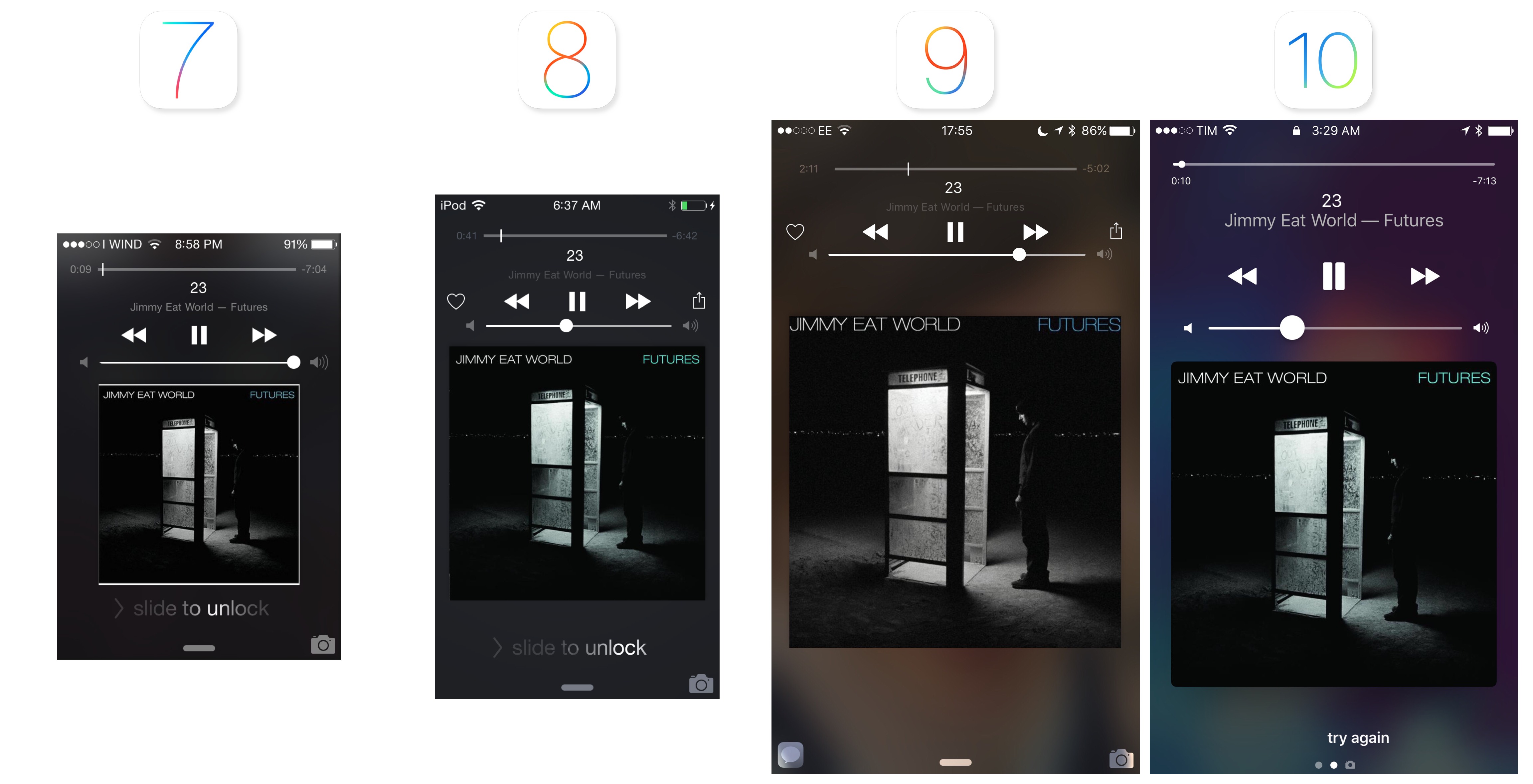
Bigger song information, larger buttons, and a volume nub that can be grabbed effortlessly. I see these as improvements over the iOS 9 Lock screen.
Buttons
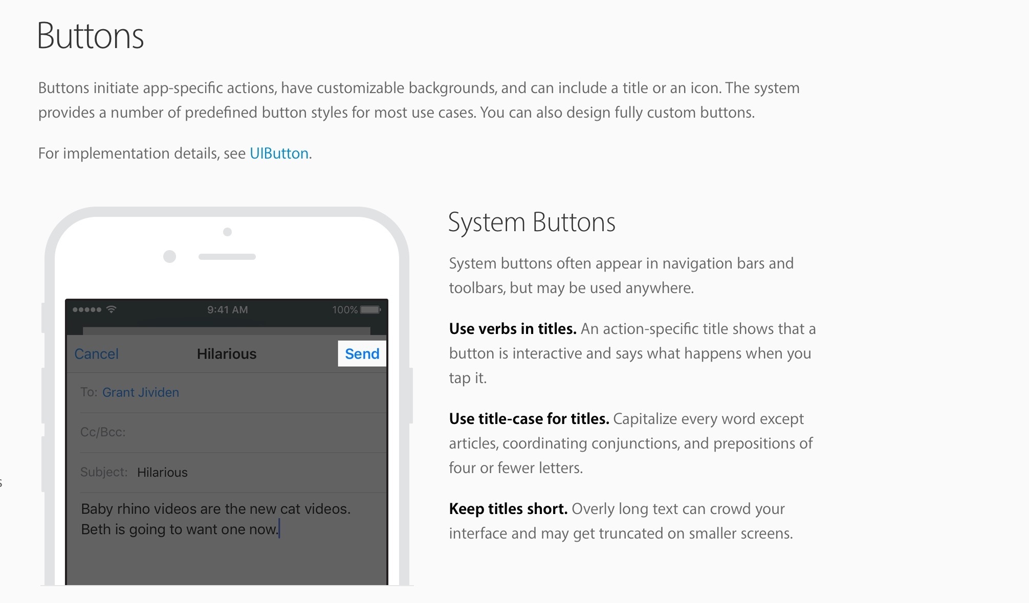
Ah, buttons. The much contested, derided aspect of the iOS 7 design isn’t officially changing with iOS 10. According to the iOS Human Interface Guidelines, this is still the default look of a system button in iOS 10:
Across iOS 10, however, we can see signs of Apple moving back to eye-catching buttons with borders and filled states in more apps.
Let’s start with Apple Music again. In the iOS 10 version, there are numerous instances of button-y buttons that weren’t there in iOS 9.
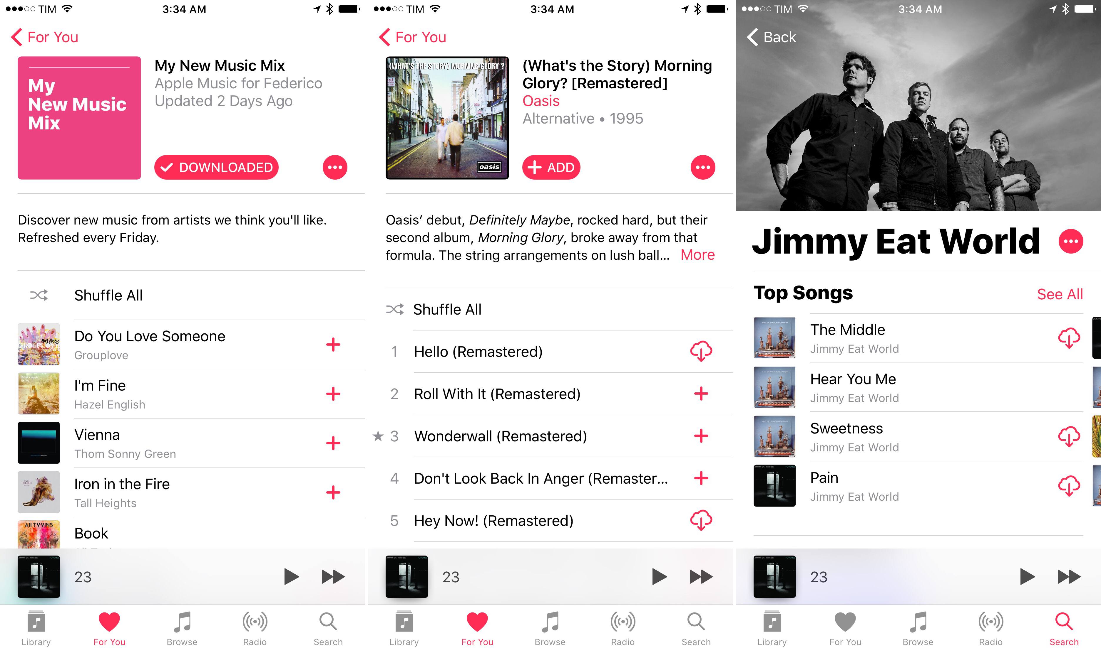
Buttons that don’t have borders or a filled state are still present, but most of them have been redrawn with a thicker stroke to increase contrast with the app’s white background.
Messages has an interesting take on buttons. Most of them are consistent with iOS 9, but the two buttons to open the Camera or a pick a photo from the library are displayed as icons inside a square with rounded corners.
These replace the textual buttons of the iOS 9 photo picker, where one of them could be confused as the label of the scrollable gallery shown above it.
The same look is used for HomeKit accessories. Device icons are contained in a square that shows the accessory’s name, its icon, and intensity level.
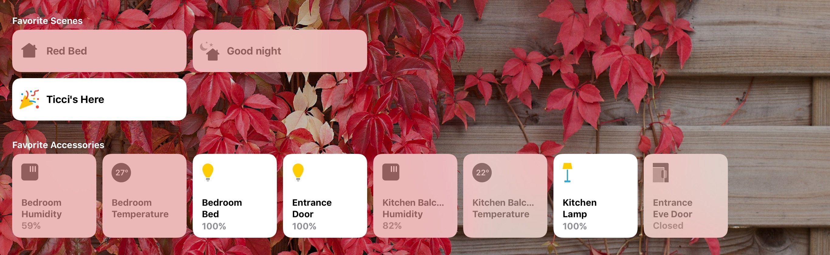
The use of highlights and colors helps discerning on-off states for devices that are turned off (black text, translucent button) and on (colored icon, white-filled button).
Filled circles with glyphs are a recurring button type in iOS 10. They’re used in a few places:
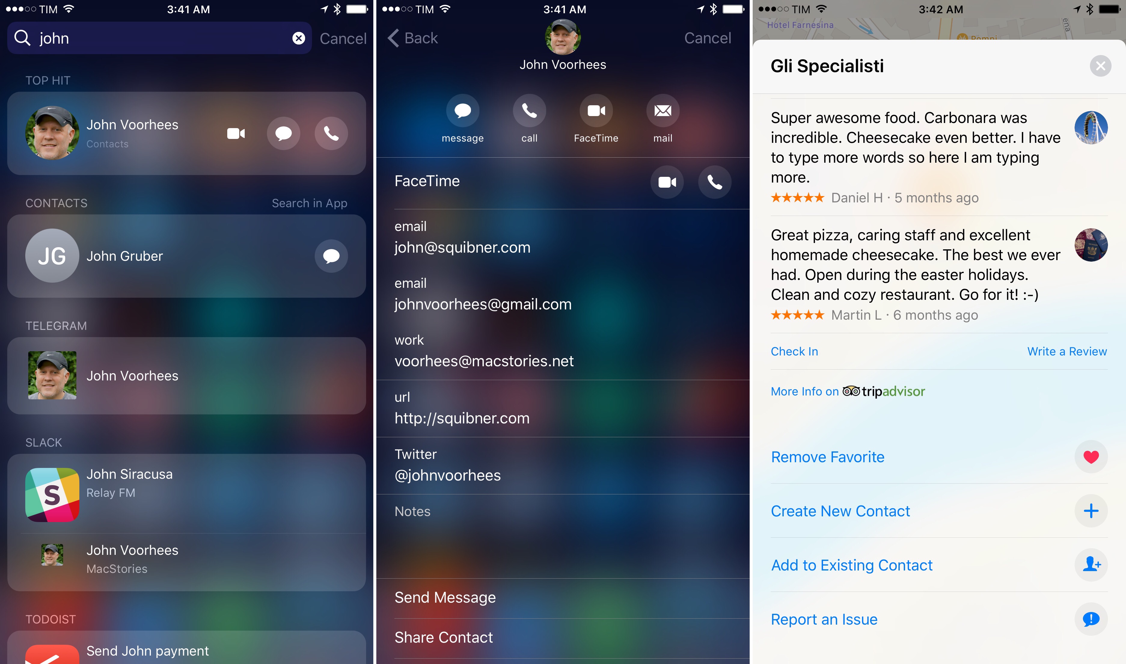
- Spotlight: search shortcuts to FaceTime, message, or call a contact;
- Camera on iPad: the HDR, timer, and iSight buttons have been updated with the new circular design;
- Contact cards: this is a notable change given the the ability to add third-party messaging and VoIP app shortcuts for contacts. Apple has moved buttons to get in touch with a user to the top of the card;
- Maps: the detail card of a point of interest/address has new buttons to call, share, mark as favorite, and add to Contacts.
Other examples of buttons redesigned for iOS include the back button in the status bar to return to an app (it’s got a new icon) and variations of ‘Get Started’ buttons for apps like Calendar and Apple News, which are now filled rectangles.
Updates to buttons in iOS 10 may indicate that Apple heard feedback on text labels that many don’t know can be tapped to initiate an action, but we’ll have to wait until next year for further proof.
Cards and Stacked Views
In Apple Music, Messages, and Maps, the company has rolled out new types of views that could be interesting if ported to other apps.
First, stacked views. In Music’s Now Playing screen and the iMessage App Store, iOS 10 features stacked panels that open on top of the current view, keeping a tiny part of it visible in the background. There’s a nice animation for the view that recedes and shrinks from the status bar.
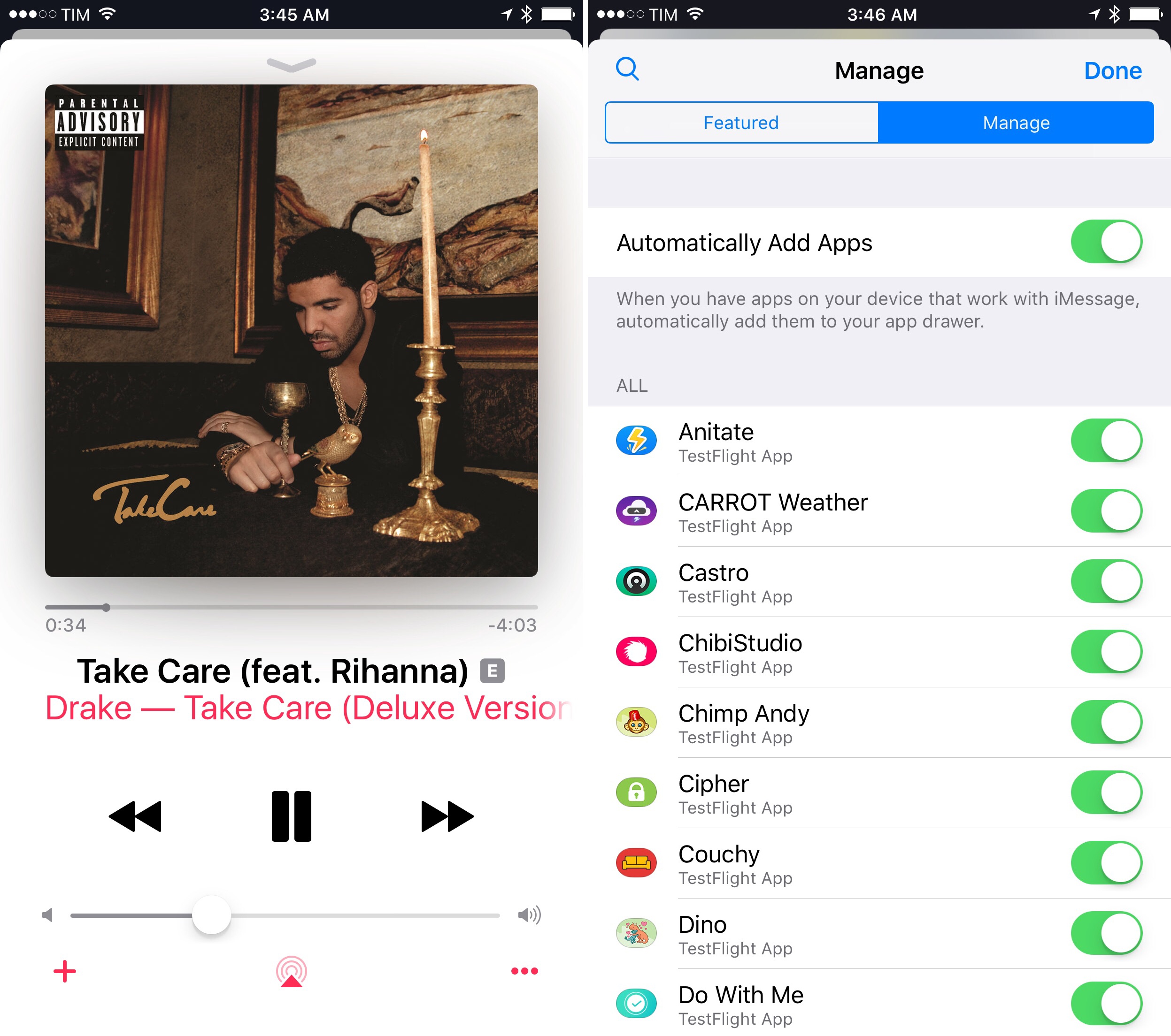
Stacked views are an intriguing way to show nested navigation. I wonder if more full-screen views that use a back button in the top left could be redesigned with this layout, perhaps using a vertical swipe to dismiss the foreground panel.
There are plenty of card-like interfaces being used in iOS 10 to supplant full-screen views, popups, and other kinds of panels.
From Maps’ search suggestions that slide up from the bottom of the map to Control Center’s pages, the Apple TV (and AirPods) setup card, and, in a way, expanded notifications, it feels like Apple has realized it’s time to take advantage of bigger iPhone displays to drop modal popups and full-screen views.
Cards enhance usability with definite boundaries and a concise presentation of content. I like where this is going.
Animations
Contextual animations and transitions have always been part of iOS’ visual vocabulary. Several improvements have been brought on this front with iOS 10, including APIs that allow for interactive and interruptible animations.
If developers support the object-based animation framework added to UIKit with iOS 10, they’ll be able to have deeper control over interrupting animations and linking them with gesture-based responses. These improved animations (based on UIViewPropertyAnimator) can be paused and stopped, scrubbed (moved forward and back), and reversed at any point in their lifecycle. In short, it means apps no longer have to finish an entire animation if they want to react to other changes.
Apps can feel more responsive – and faster – with interruptible animations. It’s not a major change per se, but it’s a welcome response to iOS 7’s indulgent animation curve.
Emoji Updates
New emoji from the Unicode 9.0 spec aren’t available in iOS 10.0 (they’ll likely be added in a point release in the near future), but Apple still found a way to ship notable emoji updates that will entice users to upgrade.
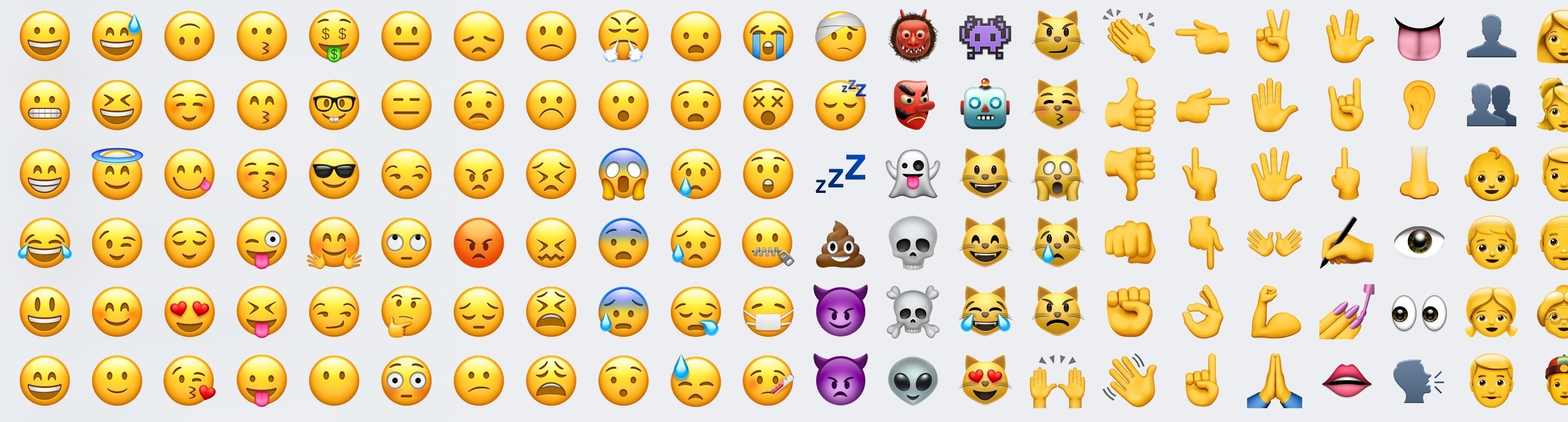
Several emoji have been redesigned with less gloss, more details, and new shading. This is most apparent in the Faces category where characters have a more accentuated 3D look. They remind me of emoticons from the original MSN Messenger, redrawn for the modern age.
Apple has implemented the ZWJ technique to add more gender-diverse emoji. Technically, these are combinations of multiple existing characters (codepoints) joined in a ZWJ sequence. To users, they’ll look like new emoji added to the system keyboard, and Apple didn’t miss the opportunity to announce them with a press release.
Alas, Apple’s emoji keyboard still doesn’t have a search field. If emoji suggestions fail to bring up the emoji you’re looking for, you’ll still want to keep Gboard installed as a fast way to search for emoji.
Sound Design
In addition to visual tweaks, Apple did some work in the aural department as well.
The keyboard in iOS 10 has distinctive new “pop” sounds for different kinds of keys, including letters, the delete key, and the space bar.73 Some people will find these sounds distracting and cartoon-ish; I think they add an extra dimension to typing on the software keyboard. Because the keyboard has multiple layers of “popping bubbles”, you can now hear what you type besides seeing it. I’m a fan.
It is the lock sound, though, that takes the crown for the most surprising sound effect of iOS 10. I still can’t decide what it is, but I like it.
Sound design is often underrated. An intelligent use of sound effects can augment the visual experience with context, personality, and just the right amount of whimsy. Whoever is behind the sound-related changes in iOS 10, I want to hear more from them.
A State of Flux?
Apple is continuing to iterate on the design language they introduced two years ago, but they’re doing so inconsistently across the system, experimenting with new ideas without fully committing to them. There are multiple design languages coexisting in iOS 10. At times, it’s hard to reconcile them.
The most notable changes mentioned above – the bold look of Apple Music and the revised look of buttons – aren’t new guidelines for a system-wide refresh. They’re isolated test-drives scattered throughout the system without a common thread.
Music, News, and Home have little in common from a functional standpoint, and yet they share the same aesthetic. Does Apple consider these apps the baseline of iOS interfaces going forward? Or should we prepare for an increasingly diversified constellation of Apple apps, each built around a design specifically tailored for it? What types of apps should adopt the “big and bold” style? Should developers read the tea leaves in Apple’s app redesigns this year and prepare for updated guidelines twelve months from now?
Taken at face value, what we have in iOS 10 is a collection of design refinements. We also have a clique of apps that look different from the rest of Apple’s portfolio, which may portend future change.
Ultimately, we’re left asking: where do we go from here?
- Scrolling date pickers have received a subtle new sound effect, too. ↩