Lock Screen Widgets
Technically, Lock screen widgets predate iOS 10. On both the iOS 8 and iOS 9 Lock screens, users could swipe down to reveal Notification Center and its Today view. However, iOS 10 adds an entirely new dimension to the Lock screen, as well as a refreshed design for widgets throughout the system.
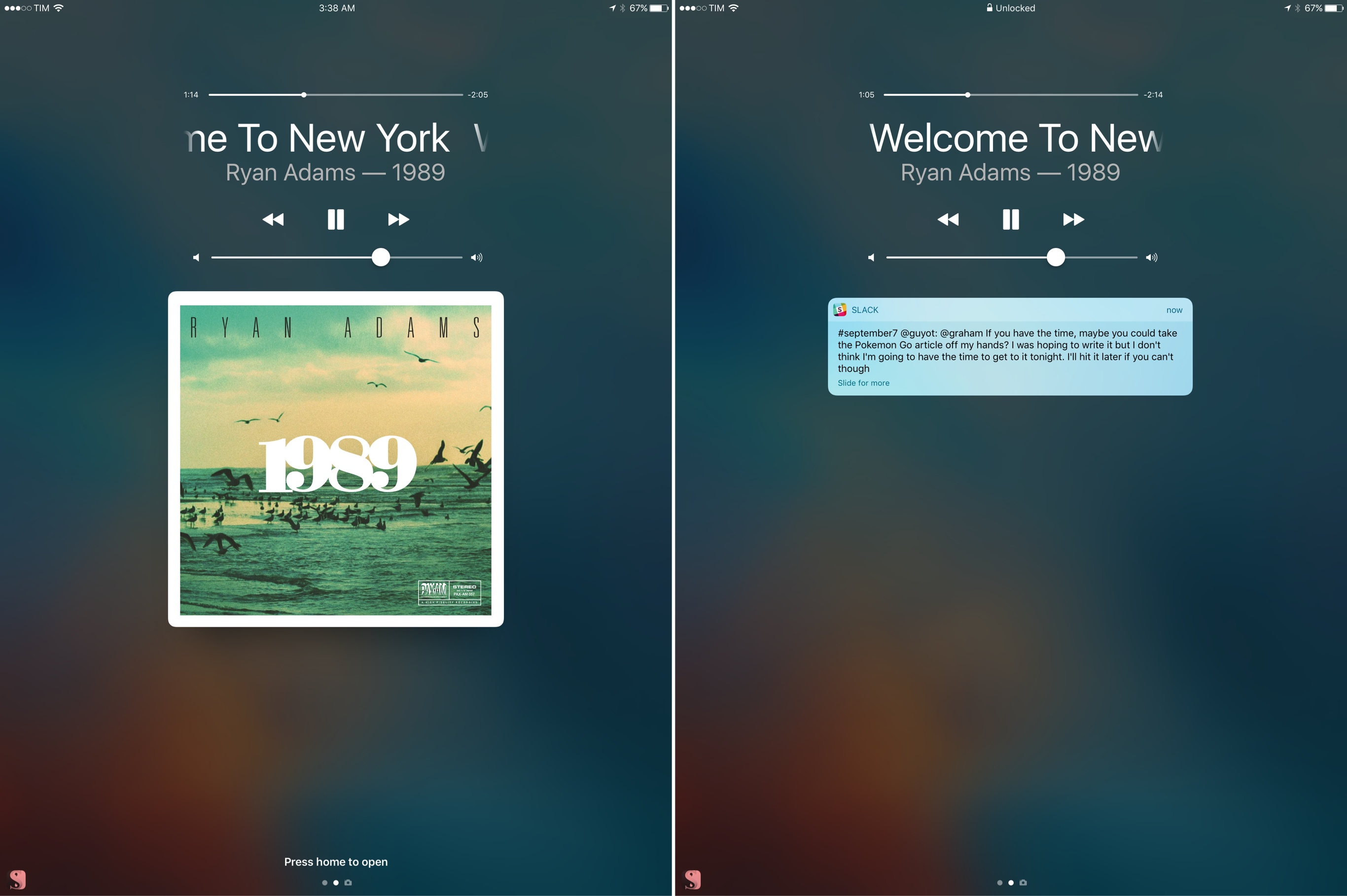
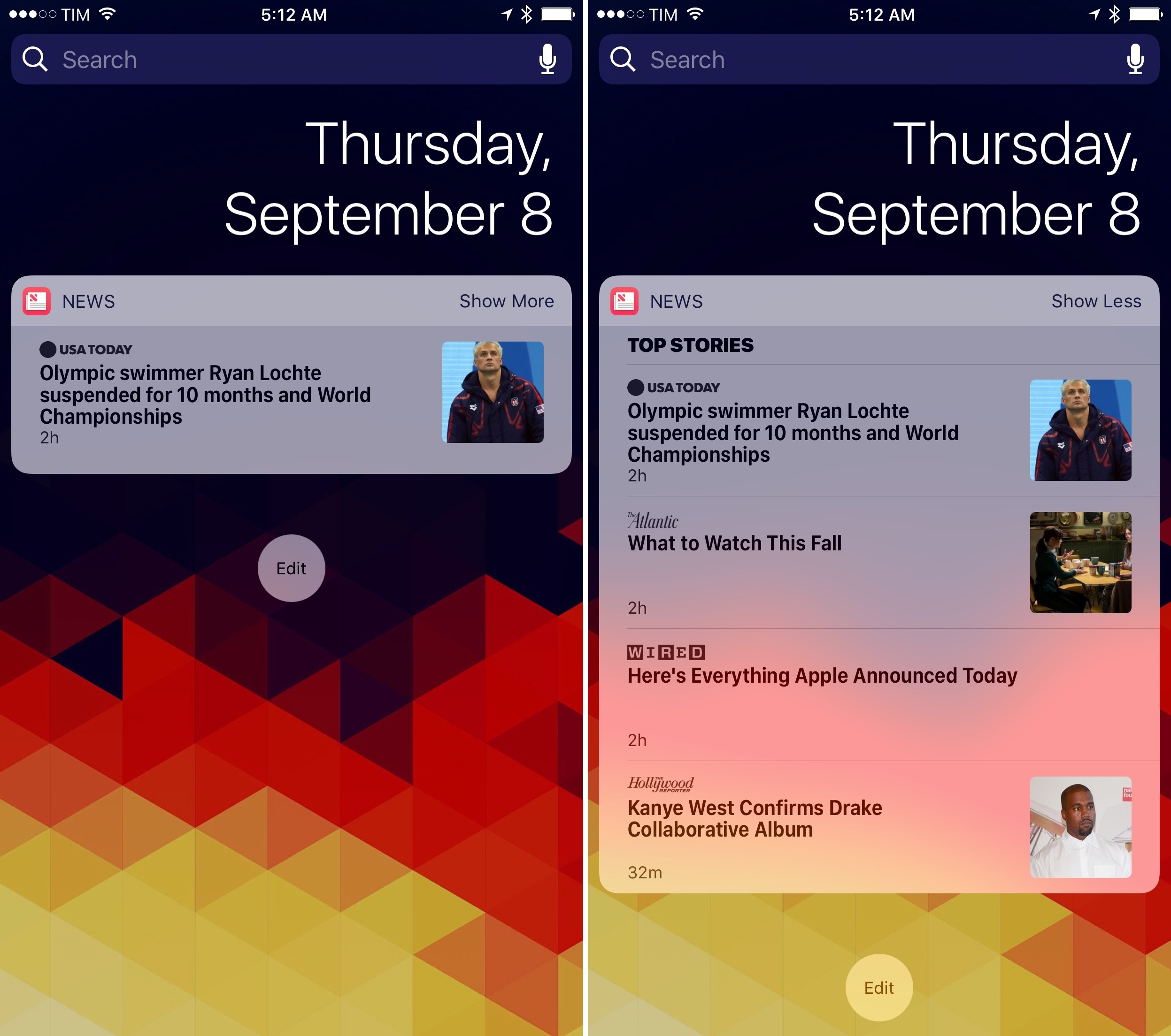
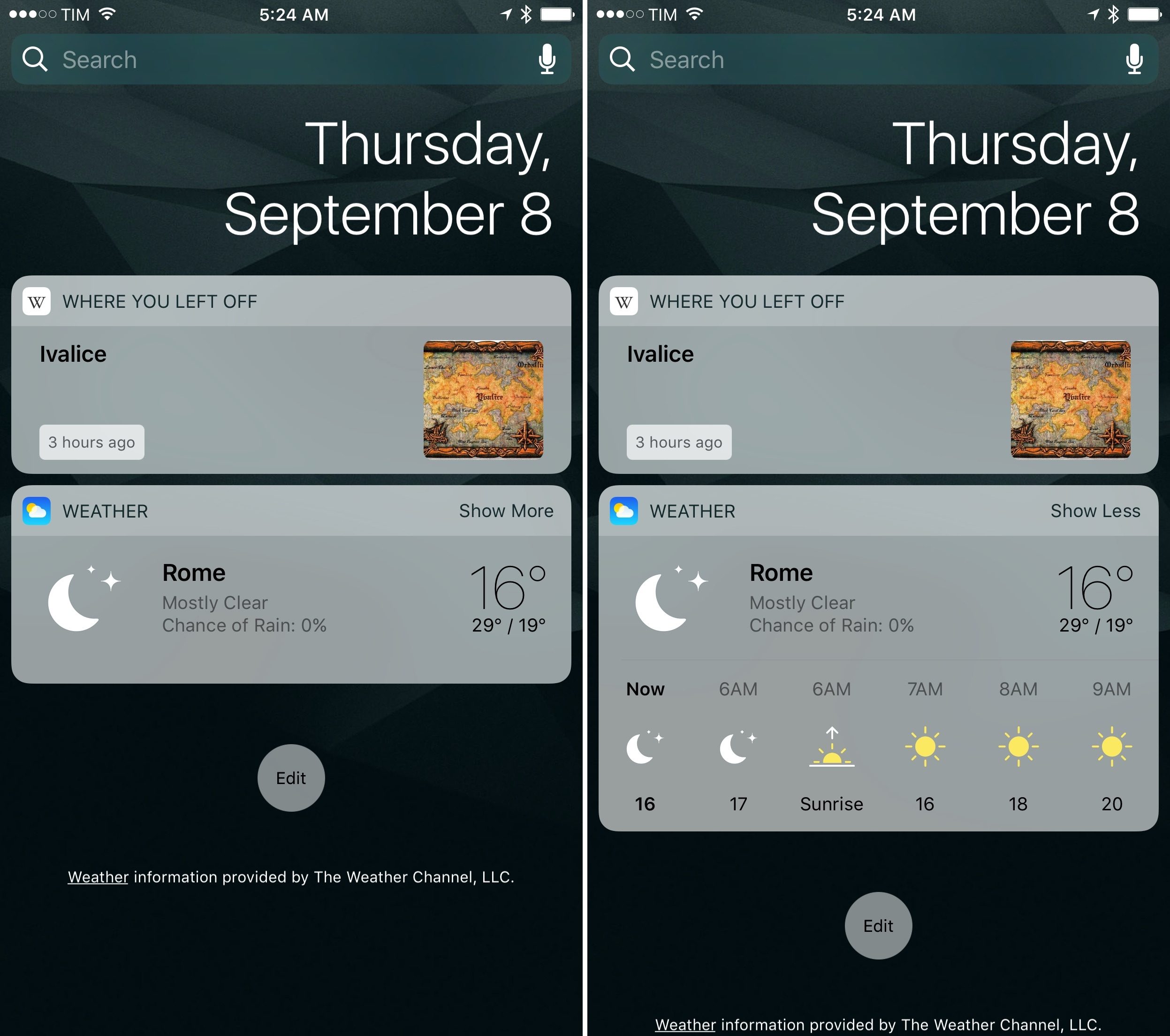
The Lock screen’s renovation in iOS 10 starts with three pages: widgets and search on the left, the Lock screen (with notifications and media controls) in the middle, and the Camera on the right. You can swipe to move across pages, as suggested by pagination controls at the bottom of the Lock screen.
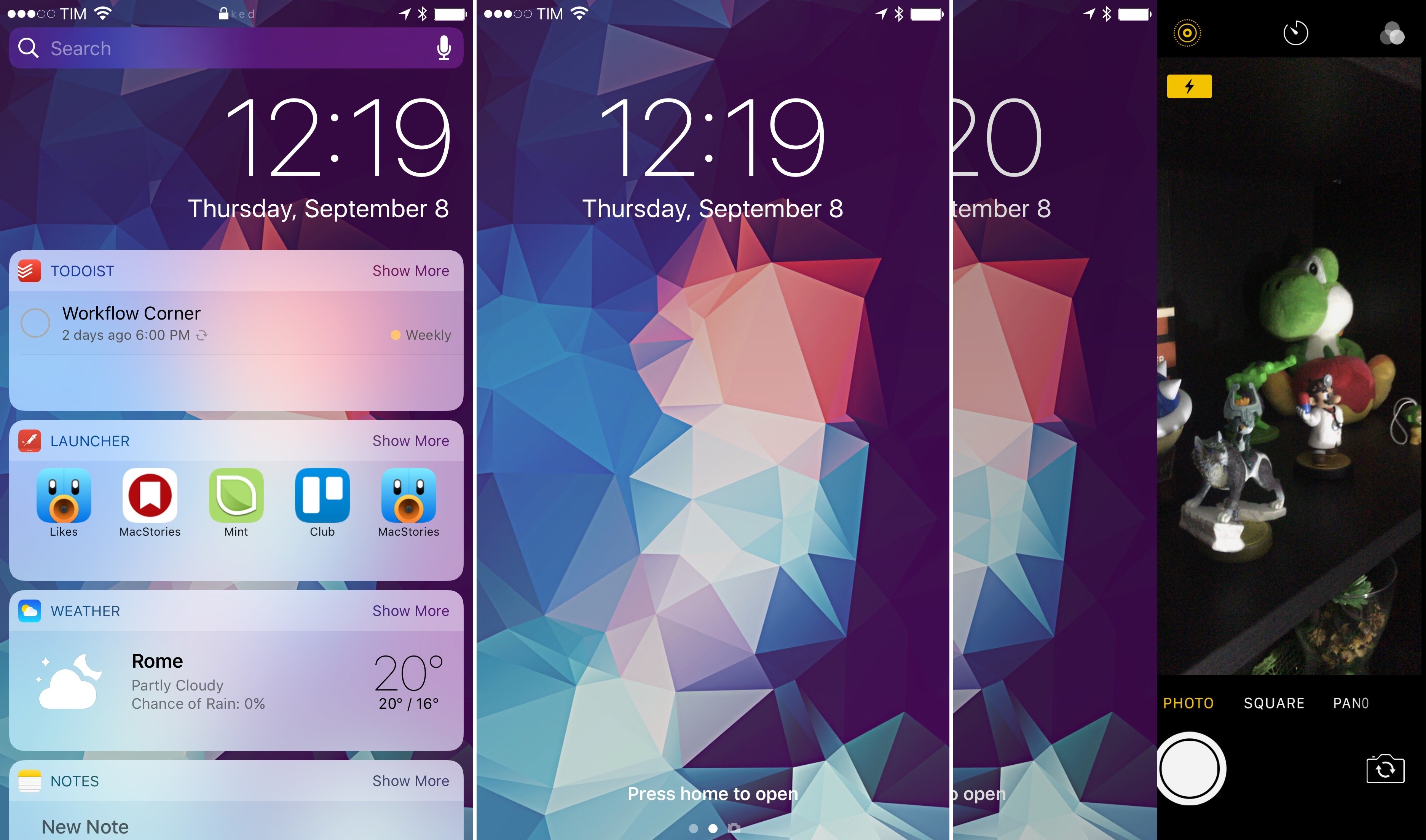
The leftmost page, called the Search screen, isn’t completely new either. Apple took the functionality of Spotlight search and Proactive of iOS 9, mixed it up with widgets, and made it a standalone page on the iOS 10 Lock screen (and Home screen, too).
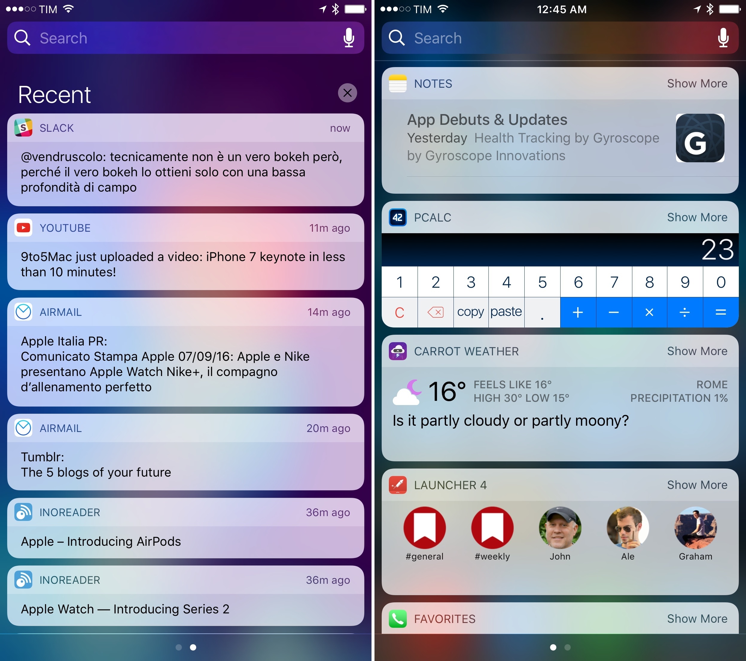
From left to right: Lock screen widgets on the Search screen; Notification Center; widgets in Notification Center.
Notably absent from iOS 10’s Lock screen is the Camera launcher button. By getting rid of the tiny shortcut in the bottom right corner, Apple has made the Camera easier to launch: swiping anywhere to move between Lock screen and Camera is easier than carefully grabbing an icon from a corner. I’ve been taking more spontaneous, spur-of-the-moment pictures and videos thanks to iOS 10’s faster Camera activation on the Lock screen.
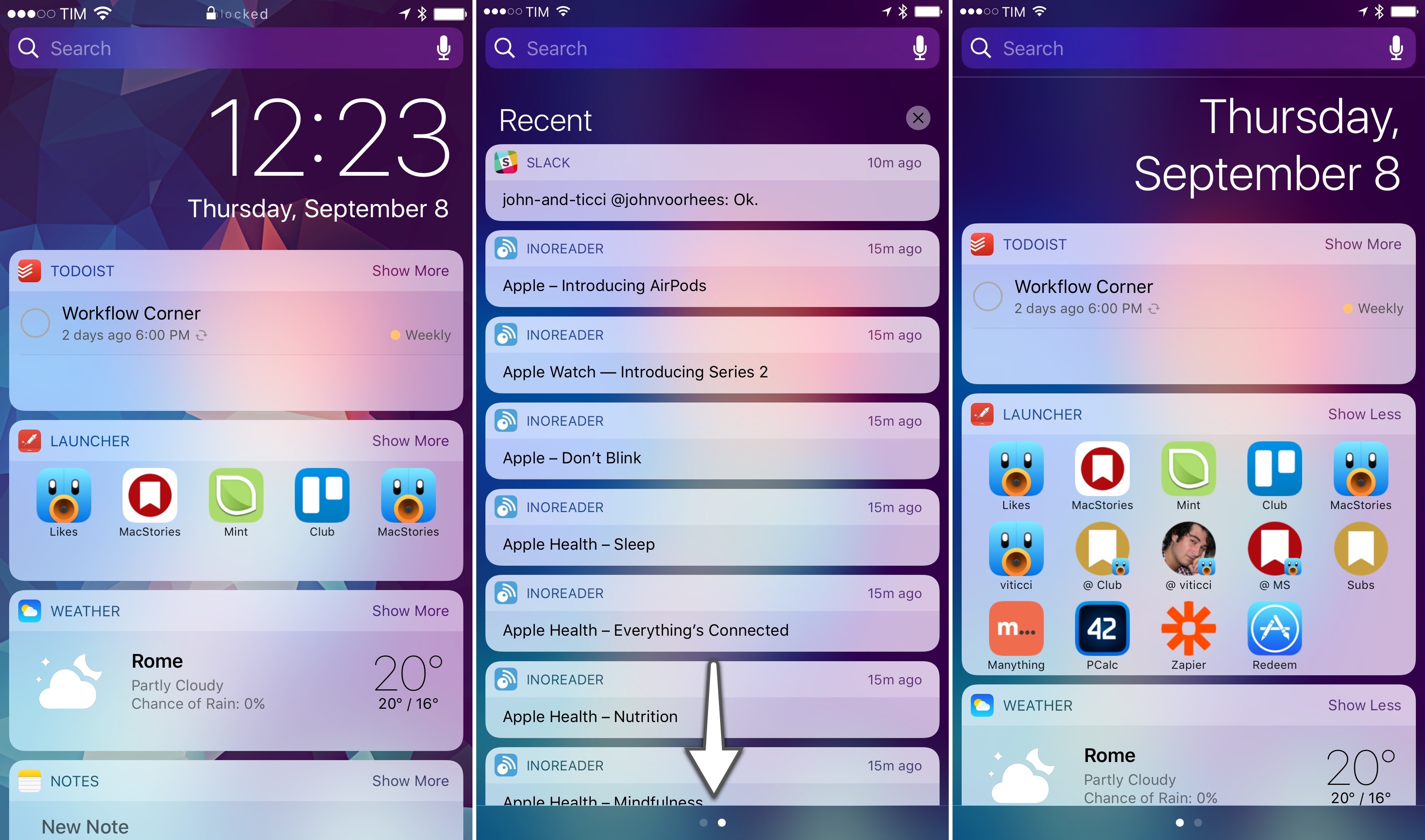
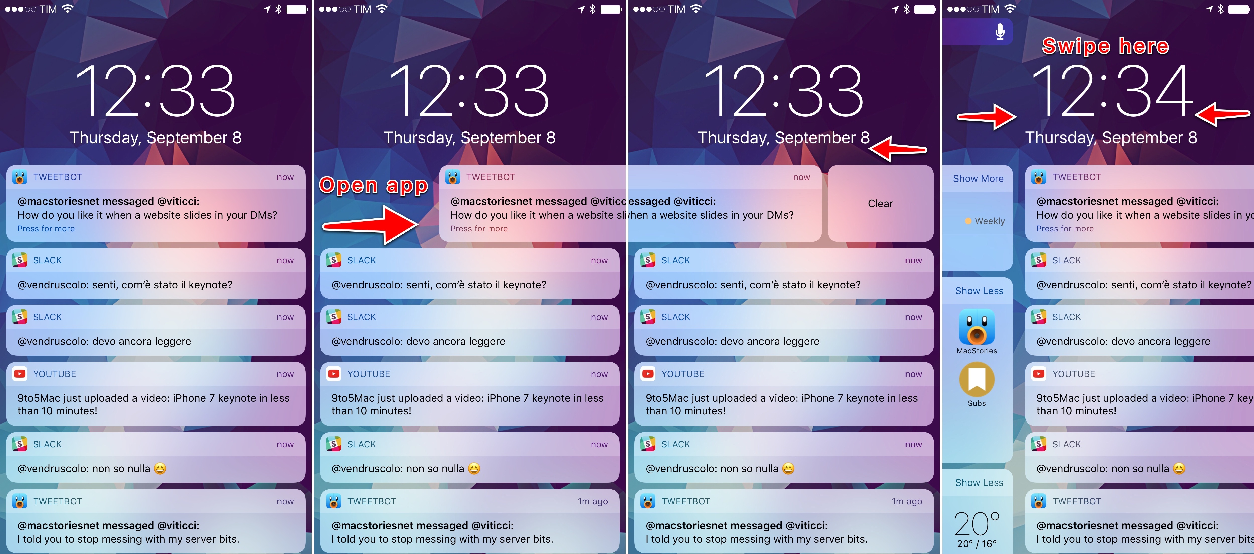
Apple’s sloppy swiping for Lock screen navigation has one caveat. If notifications are shown, swiping horizontally can either conflict with actionable buttons (swipe to the left) or open the app that sent a notification (swipe right). You’ll have to remember to swipe either on the clock/date at the top or from the edge of the display; such is the trade-off of using the same gestures for page navigation and notification actions.
Three changes stand out when swiping right to open the Search screen:
- There’s a search field at the top, shown by default;
- The clock2 stays pinned to the right3;
- Widgets have a new design that favors richer, bigger content areas.
Unlike their predecessors, widgets in iOS 10 don’t blend in with the dark background of Notification Center. This time, Apple opted for standalone units enclosed in light cells with an extensive use of custom interfaces, buttons, images, and dark text.
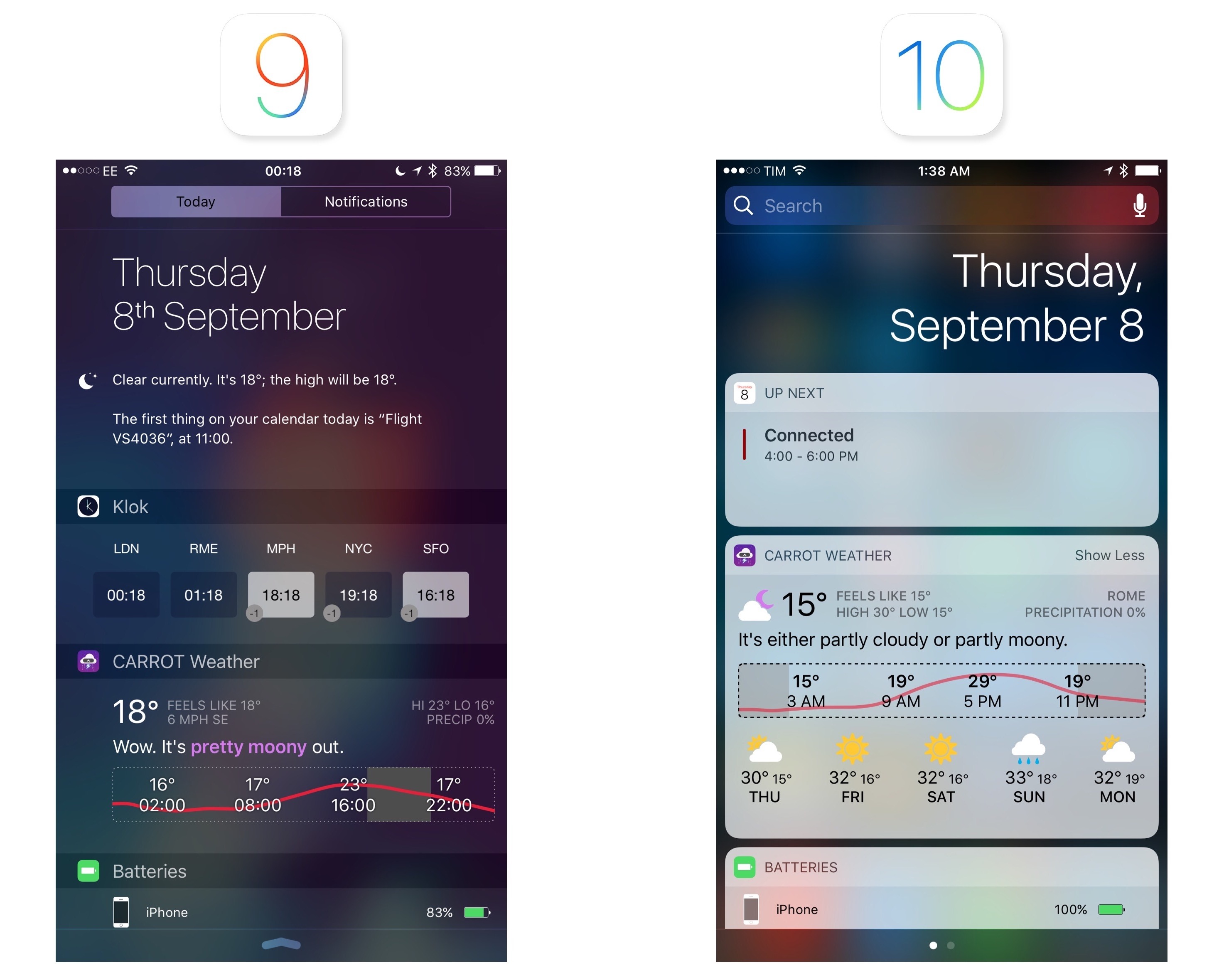
There’s a common thread between widgets and notifications (also redesigned in iOS 10): they’re self-contained boxes of information, they sit on top of the wallpaper rather than meshing with it, and they display an app’s icon and name in a top bar.
The new design is more than an aesthetic preference: the makeover has also brought functional changes that will encourage users and developers to rethink the role of widgets.
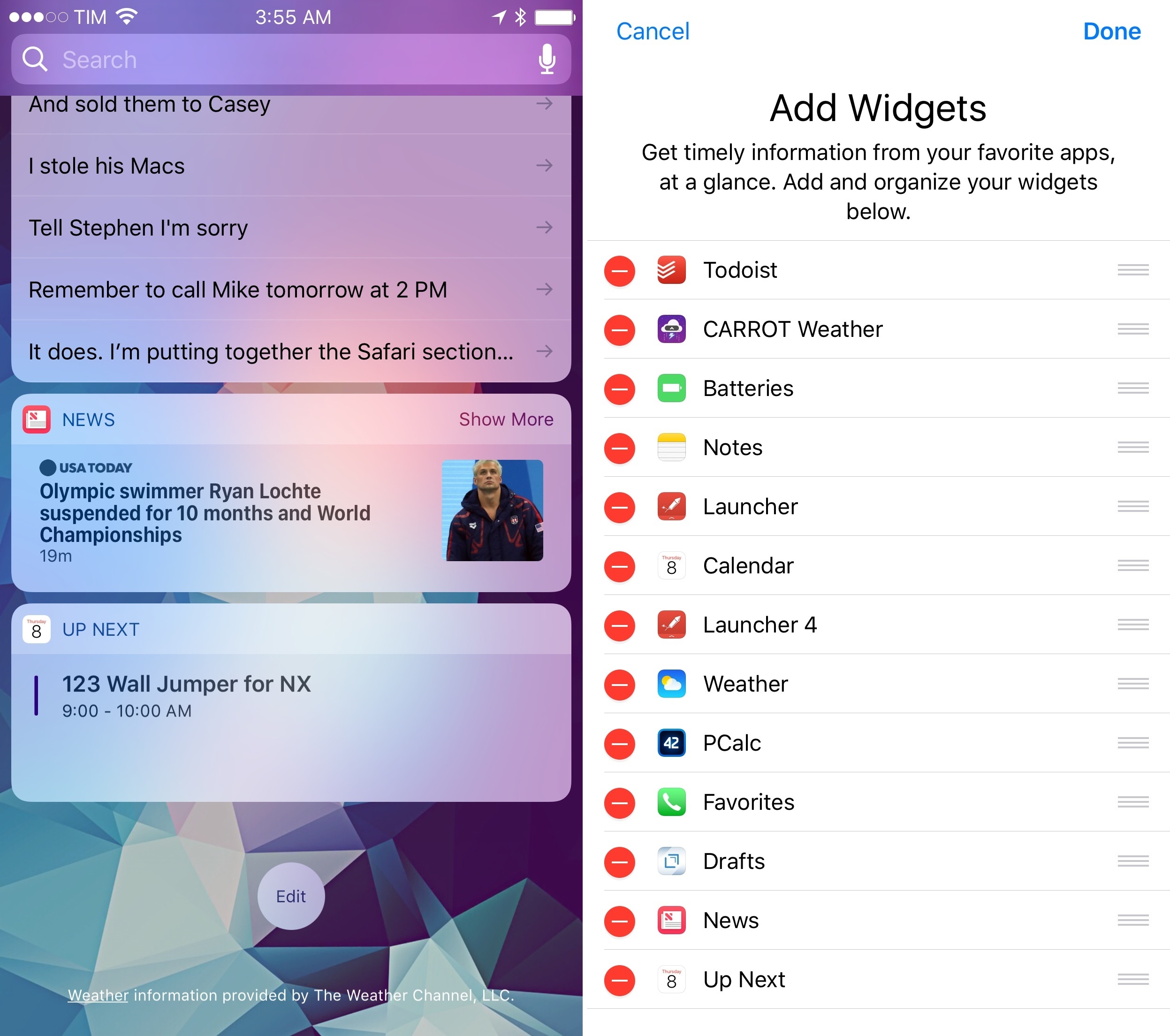
A widget in iOS 10 supports two modes: collapsed and expanded. The system loads all widgets in collapsed mode by default, which is about the height of two table rows (about 110 points). All widgets compiled for iOS 10 must support collapsed mode and consider the possibility that some users will never switch to the expanded version. Apps cannot activate expanded mode on the user’s behalf; switching from compact to expanded is only possible by tapping on a ‘Show More’ button in the top right corner of a widget.
This is no small modification, as it poses a problem for apps that have offered widgets since iOS 8. Under the new rules, apps updated for iOS 10 can’t show a widget that takes up half of the display as soon as it’s installed. Any widget that wants to use more vertical space for content – such as a todo list, a calendar, or even a list of workflows – will have to account for the default compact mode.
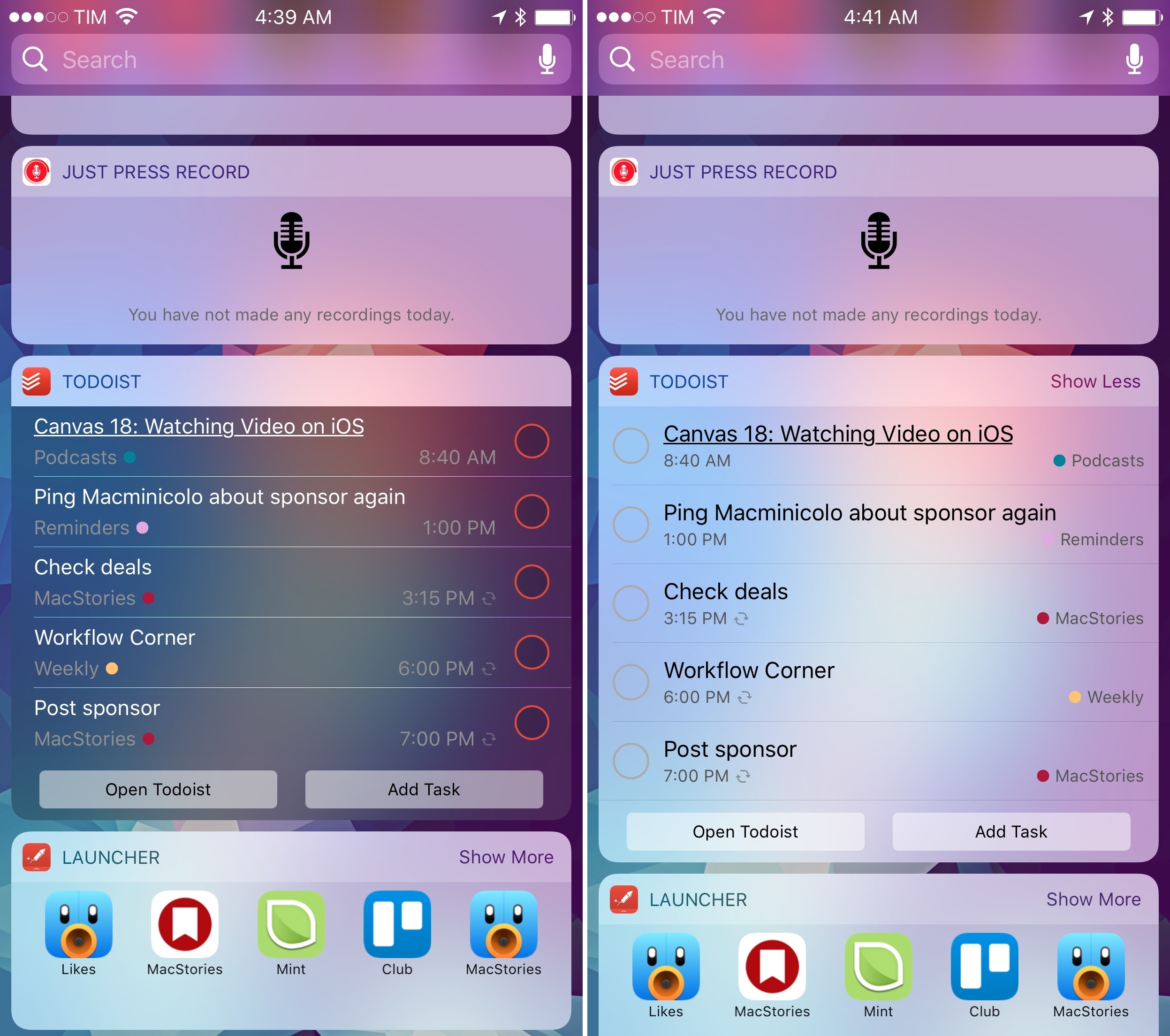
For some developers, this will mean going back to the drawing board and create two separate widget designs as they’ll no longer be able to always enforce one. Others will have to explain the difference to their users. Workflow, which used to offer a widget that could dynamically expand and collapse, is updating the widget for iOS 10 with a label to request expansion upon running a workflow that needs more space.
There’s one exception: legacy iOS 9 apps that haven’t been updated for iOS 10. In that case, the system won’t impose compact mode and it won’t cut off old widgets (which keep a darker background), but there’s a strong possibility that they won’t look nice next to native iOS 10 ones.
I don’t see how Apple could have handled this transition differently. Design updates aside, there’s an argument to be made about some developers abusing Notification Center with needlessly tall and wasteful widgets in the past. Compact mode is about giving control to the users and letting them choose how they prefer to glance at information. Want to install a widget, but don’t need its full UI? Use it in compact mode. Need to get more out of it? Switch to expanded.
Apple’s decision to adopt compact and expanded modes in iOS 10 is a nod to developers who shipped well-designed widgets in the past, and it provides a more stable foundation going forward.
I’ve been able to test a few third-party iOS 10 widgets that illustrate the advantages of these changes.
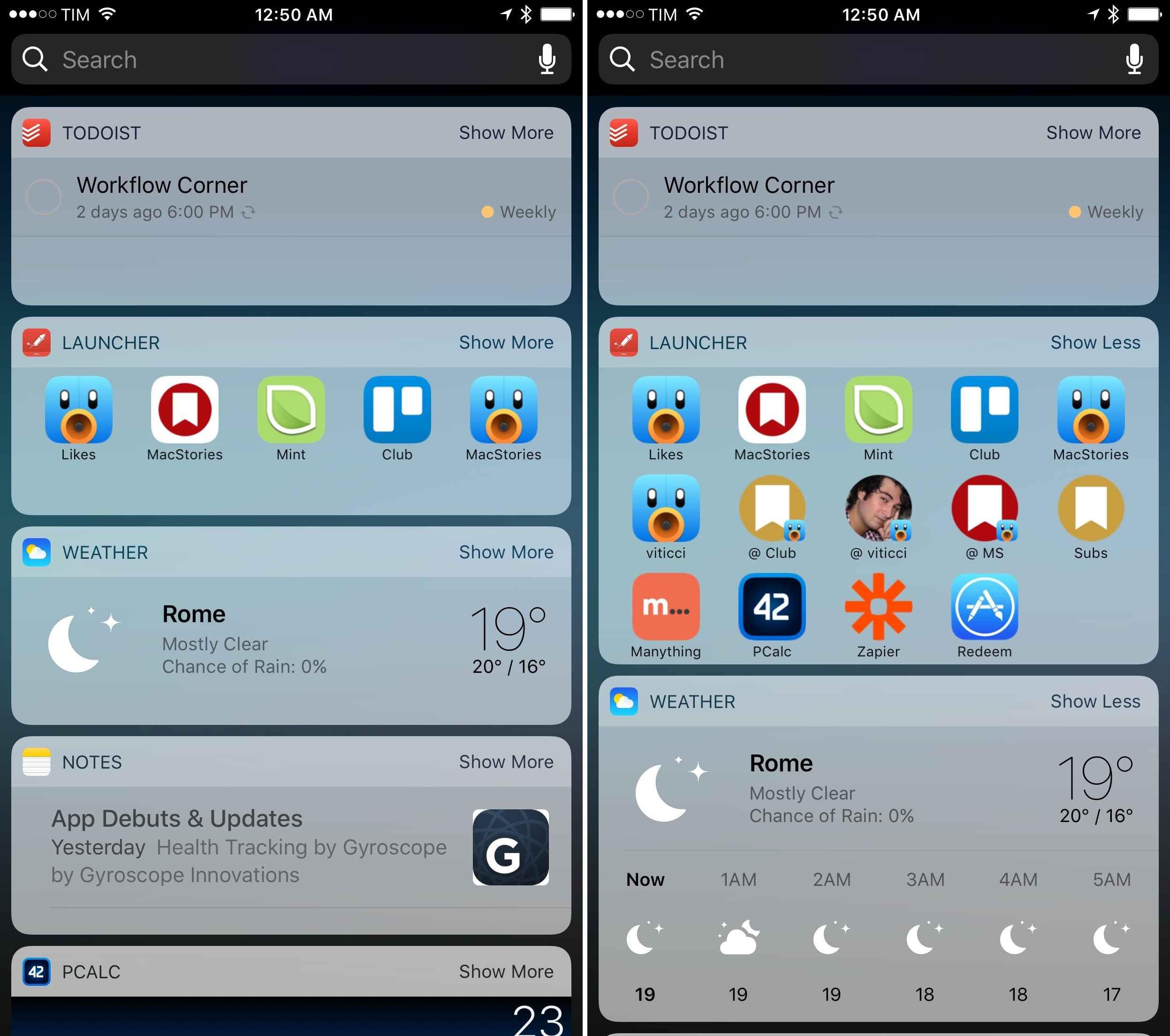
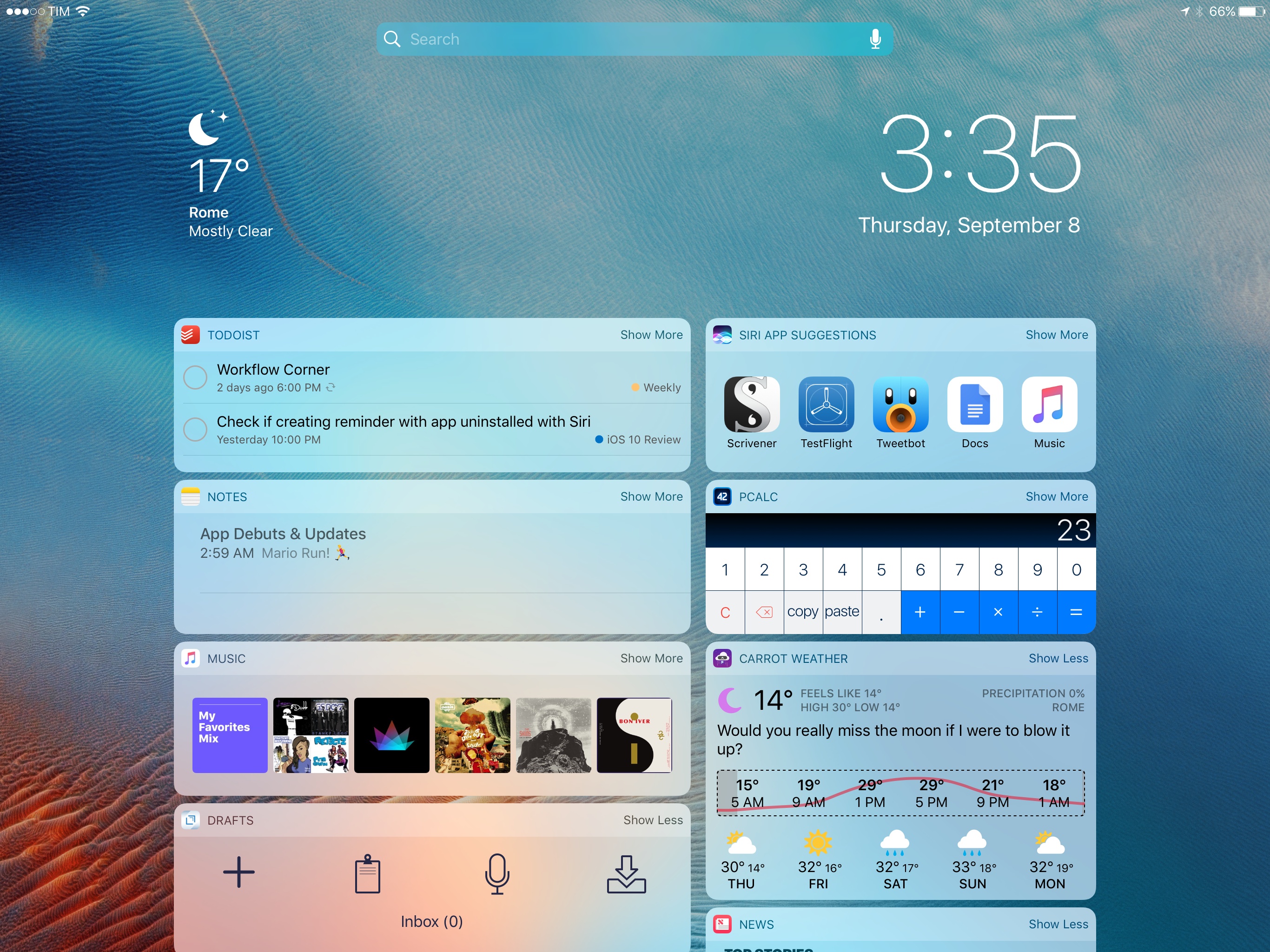
PCalc, James Thomson’s popular iOS calculator, has a new widget that displays a mini calculator in compact mode with numbers and basic operations split in two rows.
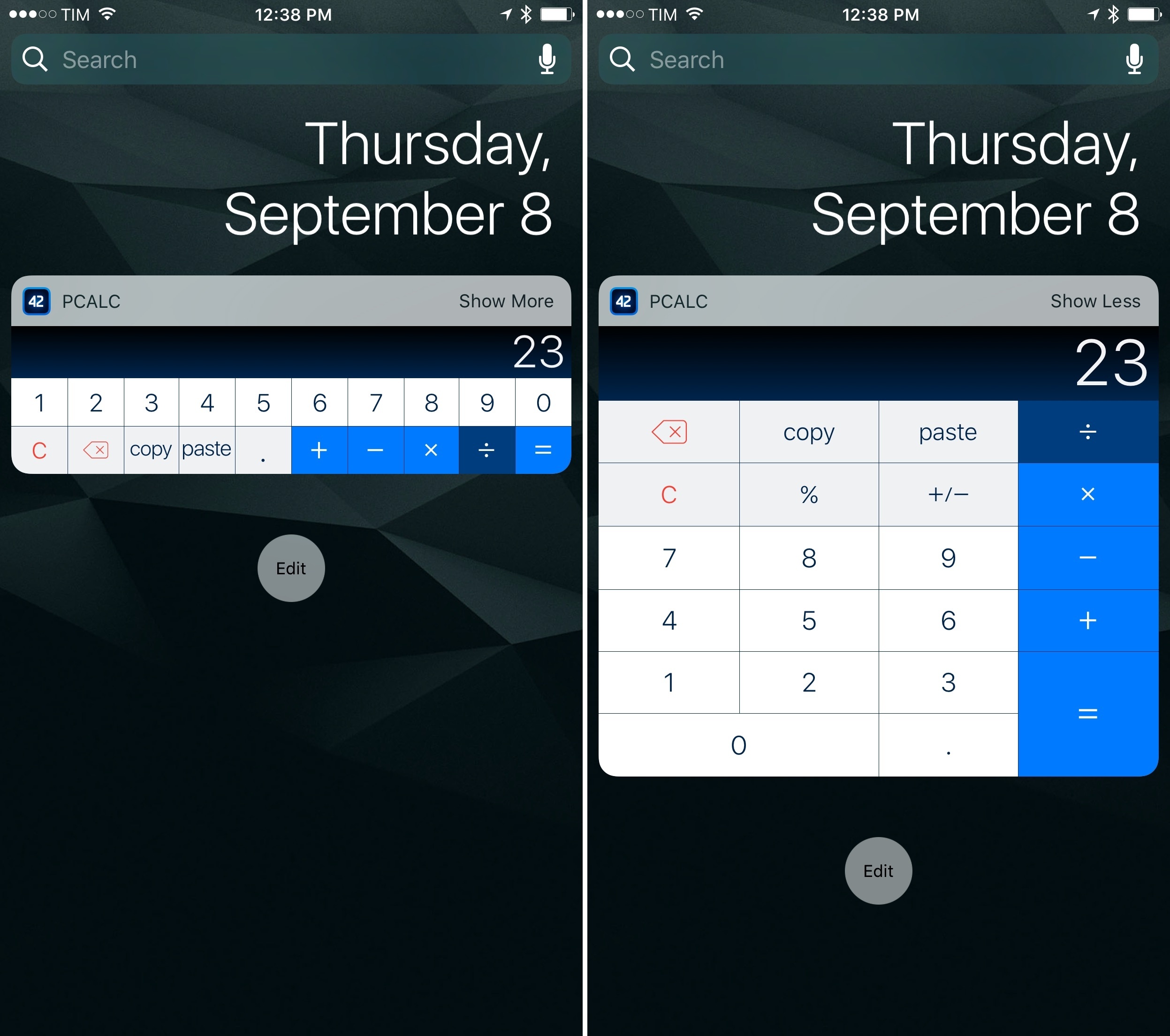
Despite the small touch targets, the compact interface is usable. If you want bigger buttons and a more familiar layout, you can switch to expanded mode, which looks like a small version of PCalc living inside a widget – edge-to-edge design included.
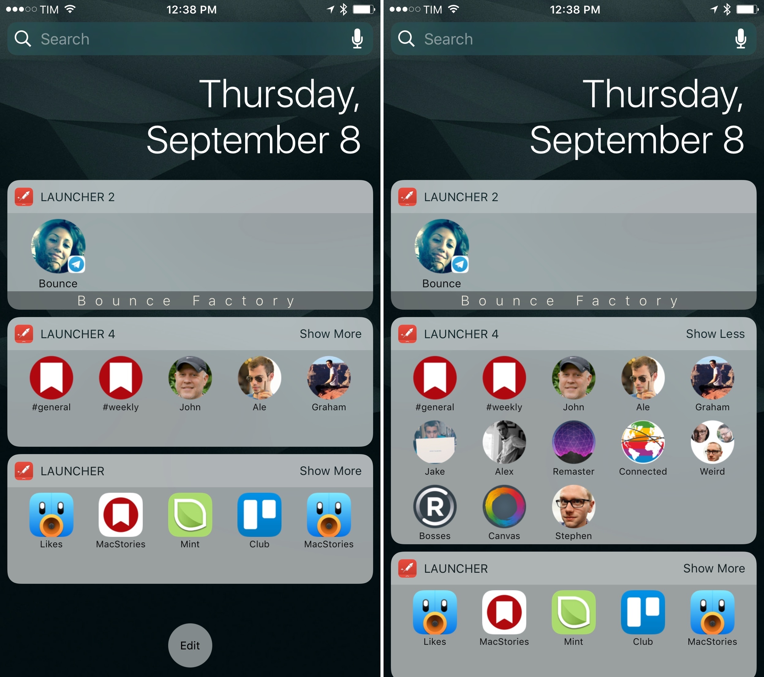
Launcher doesn’t modify its widget’s interface when toggling between compact and expanded, but the constraints of the smaller layout force you to prioritize actions that are most important to you.
Using compact mode for summary-style UIs will be a common trend in iOS 10. CARROT Weather is a good example: it shows a summary of current conditions when the widget is compact, but it adds forecasts for the day and week ahead when expanded.
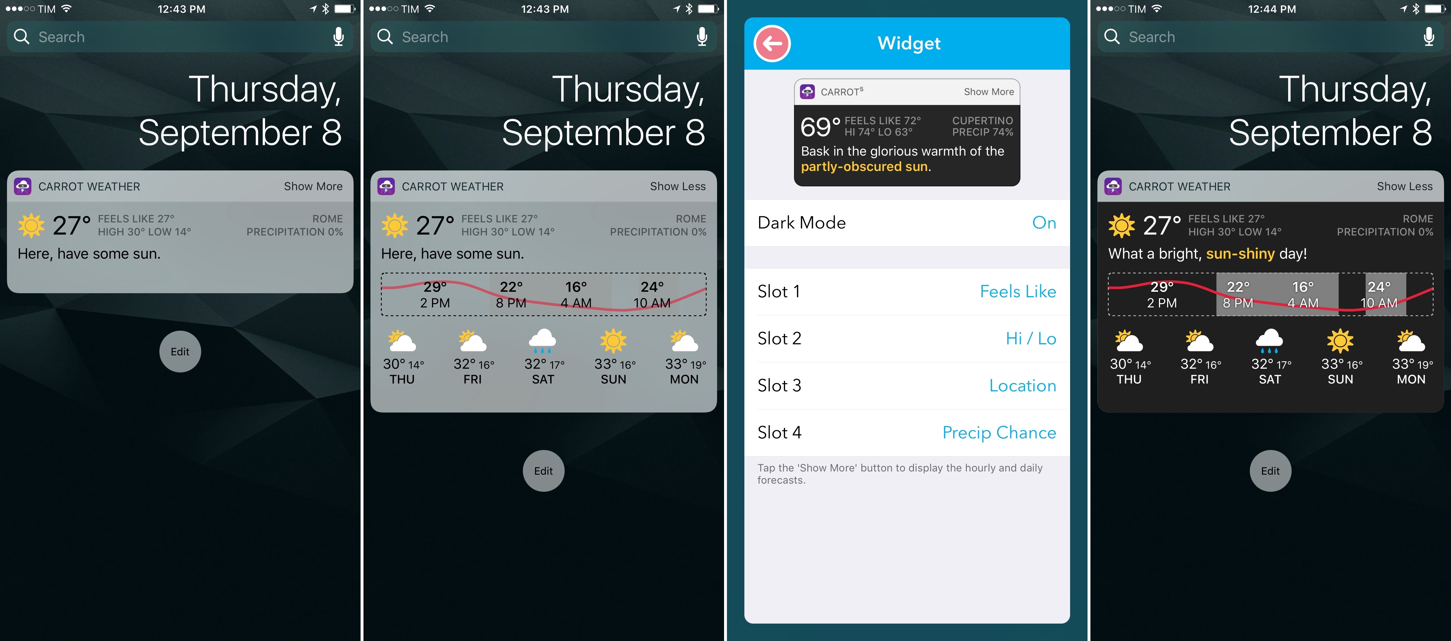
Even better, slots in the compact layout can be customized in the app, and you can choose to use the widget in light or dark mode.
Drafts has an innovative implementation of compact and expanded layouts, too. In compact, the widget features four buttons to create a note or start dictation. When the widget expanded, it grows taller with a list of items from the app’s inbox, which can be tapped to resume editing.
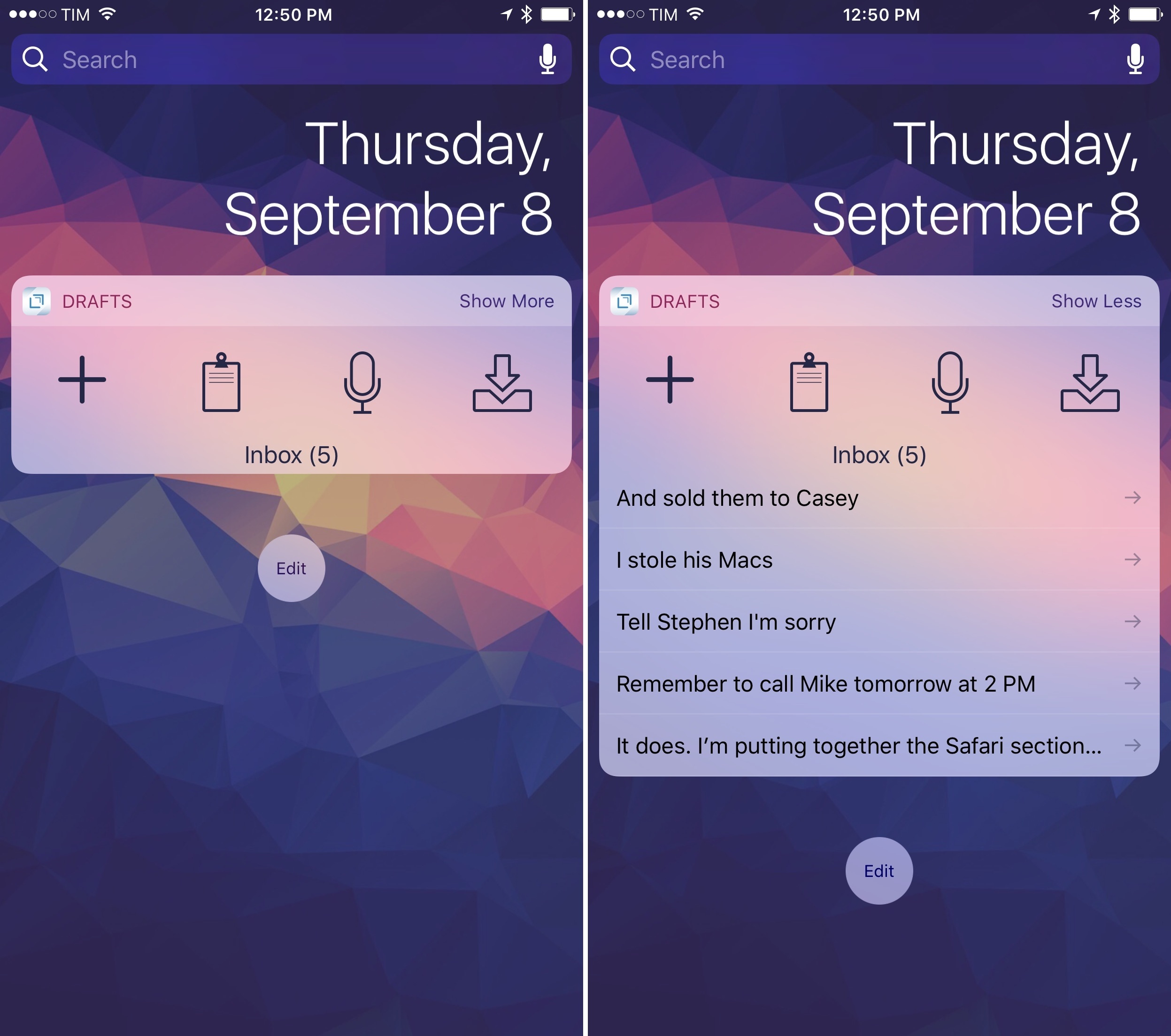
In the past, developer Greg Pierce would have had to ask users to customize the widget or make it big by default; in iOS 10, they can switch between modes as needed.
Widgets’ ubiquitous placement pushes them to a more visible stage; as soon as more developers adapt4, iOS 10 has the potential to take widgets to the next level.
I believe the new design will play an essential role in this.
The Design of Widgets
Apple advertises legibility and consistency as core tenets of widgets in iOS 10, and I agree: widget content and labels are easier to read than iOS 9. Standalone light cells separate widgets with further precision; I haven’t found translucency with the Lock screen wallpaper to be an issue.
In addition, the light design brings deeper consistency between apps and widgets. Most iOS apps have light backgrounds and they employ color to outline content and indicate interactivity. In iOS 10, widgets are built the same way: the combination of light backgrounds, buttons, and custom interfaces is often consistent with the look of the containing app.
In this regard, widgets feel more like mini-apps available anywhere rather than smaller, less capable extras. The line between widget and full app UIs is more blurred than ever in iOS 10.
Apple’s new Notes and Calendar widgets showcase this newfound cohesiveness. The Notes widget displays the same snippets of the list in the Notes app. Buttons to create new notes and checklists are also the same. The widget looks and feels like a small version of Notes available anywhere on iOS.
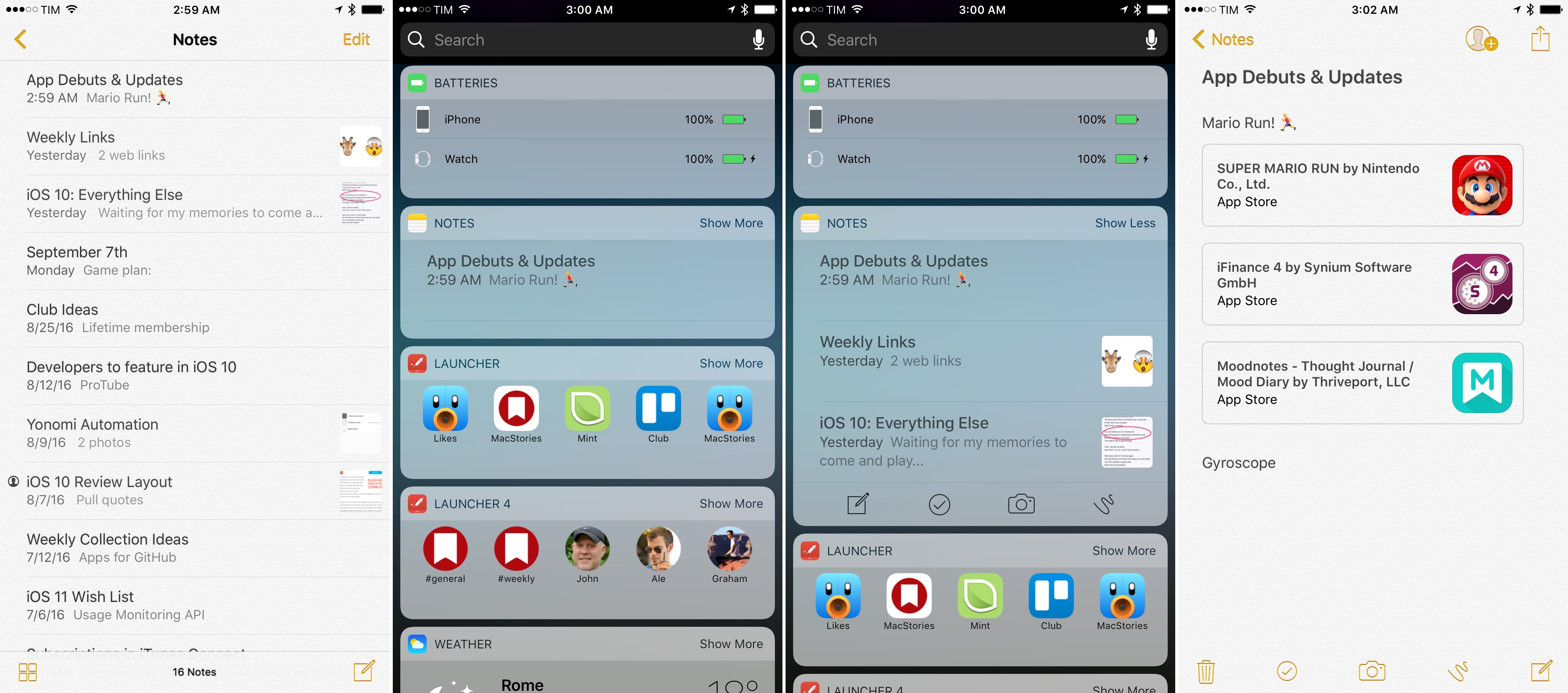
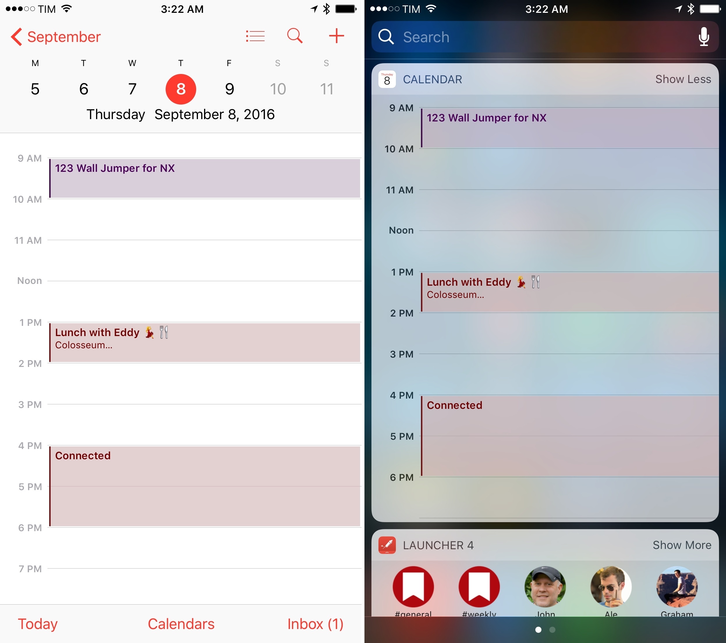
The Calendar widget is even more indicative. Glancing at events and recognizing their associated calendar wasn’t easy in iOS 9, as they only had a thin stripe of color for the calendar to which they belonged.
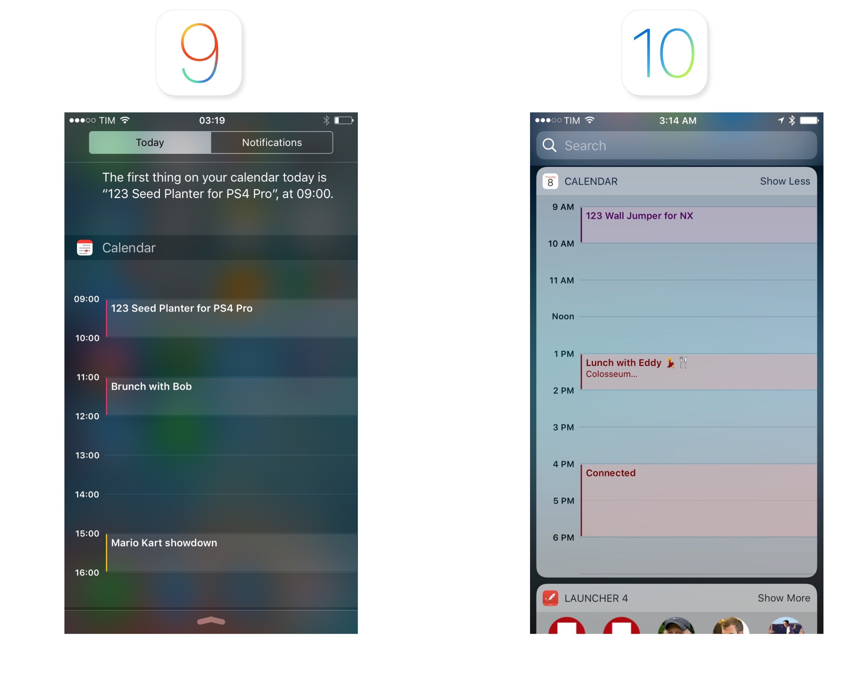
In iOS 10, forgoing a dark background has allowed Apple to show Calendar events as tinted blocks matching the look of the app. Discerning events and the calendars they belong to is easier and familiar.
I wouldn’t expect every app to adopt a widget design that exactly mirrors the interface users already know, but it can be done. Switching to a light design has given Apple a chance to reimagine widgets for consistency with apps and lively combinations of color, text, and icons. They are, overall, a step up from iOS 9 in both appearance and function.
The new direction also opens up a future opportunity: what is light can be more easily converted to dark. I could see a system dark mode working well for widgets.
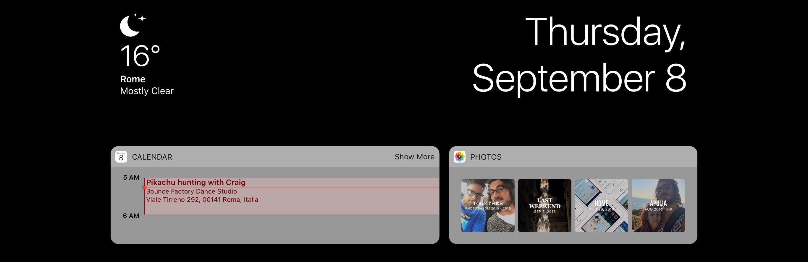
The iPad Lock Screen
The iPad’s Lock screen doesn’t break any new ground, but there are some differences from the iPhone.
On the iPad, notifications are displayed on the left side of the screen when in landscape. They’re aligned with the system clock, and they leave room for media controls to be displayed concurrently on the right. Dealing with notifications while controlling music playback is a task well suited for the iPad’s larger display.
Unfortunately, Apple doesn’t think portrait orientation should warrant the same perks. If a notification comes in while album artwork is displayed on the Lock screen, the artwork will be hidden. Apple decided against using a two-column layout in portrait, which I don’t understand: they’re already doing it for widgets on the iPad.
Furthermore, if no music is playing on an iPad in landscape, having notifications aligned to the left for no apparent reason looks odd and seems…unnecessary.
Widgets fare a little better. Apple has kept the two-column design first introduced in the Today view of iOS 9; you can still scroll the two lists of widgets independently.
I would have appreciated the ability to further control the resizing and placement of widgets on the iPad, and the Lock screen design seems uninspired. We’ll have to make the most of this bare minimum work for now.
Apple’s Widgets
iOS 10 sports an increased modularity of widgets. Apple has done away with grouping multiple types of content under Siri Suggestions – most Apple apps/features have their own widget, which can be disabled from a revamped configuration screen.
Here’s an overview of what’s changed.
Activity
Your Activity rings from the Apple Watch, with a summary of Move, Exercise, and Stand statistics.
Calendar
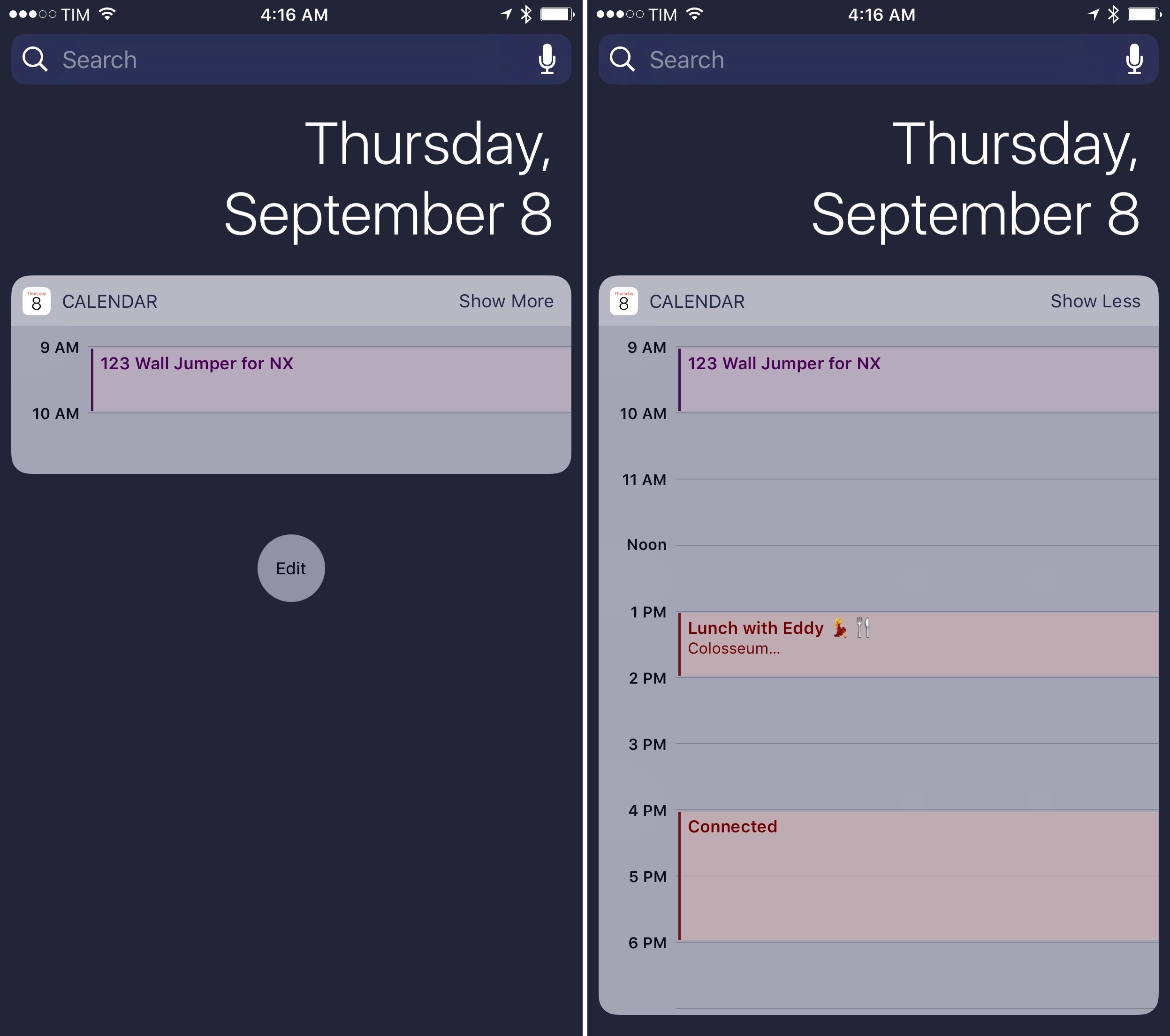
A mini calendar interface. Events are displayed as colored blocks matching the calendar they belong to. You can tap on an event to open it, and expand the widget to reveal more events.
Favorites
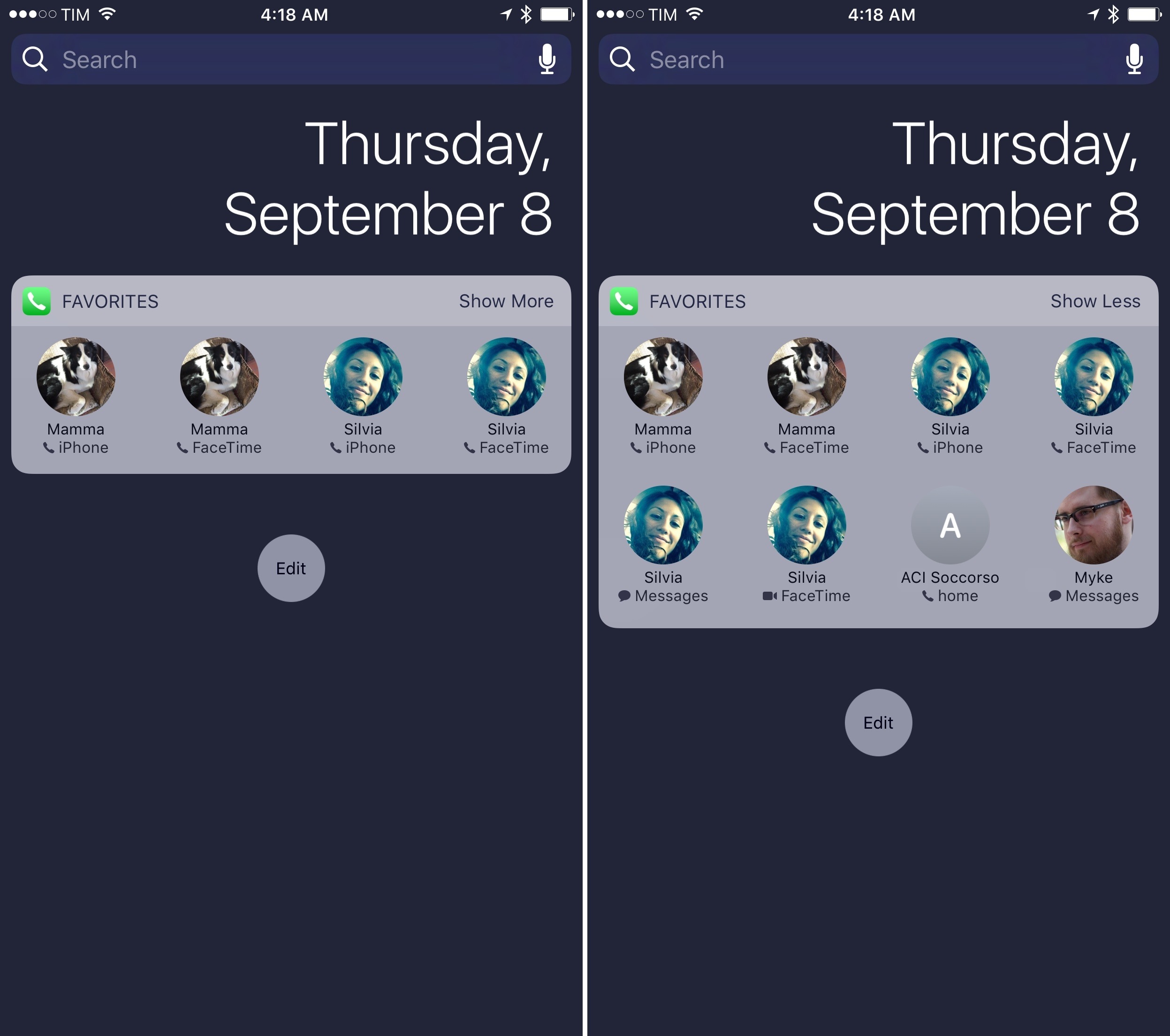
Shortcuts to your favorite contacts with different ways to get in touch with them. New in iOS 10, you can assign iMessage as well as third-party communication apps (messaging and VoIP) to contact entries in Favorites, which will be displayed in the widget.
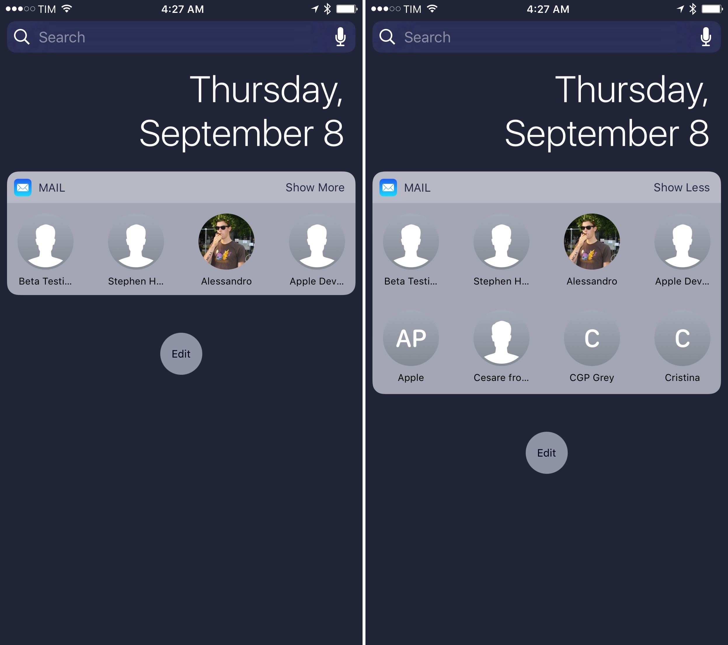
The Mail widget is the weakest of the bunch: it only displays shortcuts for VIP contacts. I would have preferred to see a preview of the unified inbox, or perhaps an option to show flagged messages.
Maps
Maps has three widgets: destinations, nearby, and transit. While the latter isn’t available for my area (Rome, Italy), the other two have worked inconsistently. I’ve never seen a nearby recommendation in the widget, despite being around places rich in POIs. The Destinations widget usually tells me how much time it’ll take me to drive home, but it doesn’t proactively suggest other locations I frequently visit.
Music
The Music widget is an odd one. It displays a grid of what appears to be either recently played music or your all-time most listened albums. The widget doesn’t clarify whether it’s showcasing albums or individual songs; it uses album artworks with no text labels, and it plays either the most played song from an album, or an entire album starting from the first song.
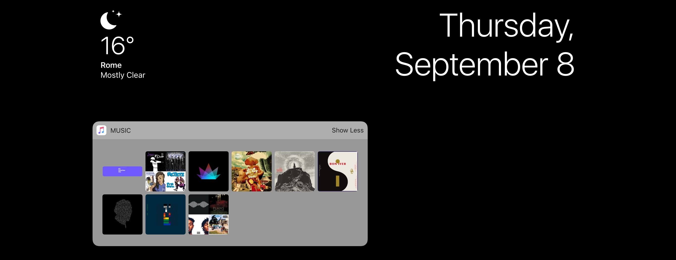
A nice perk: music starts playing after tapping the widget without opening Apple Music. But it always feels like a lottery.
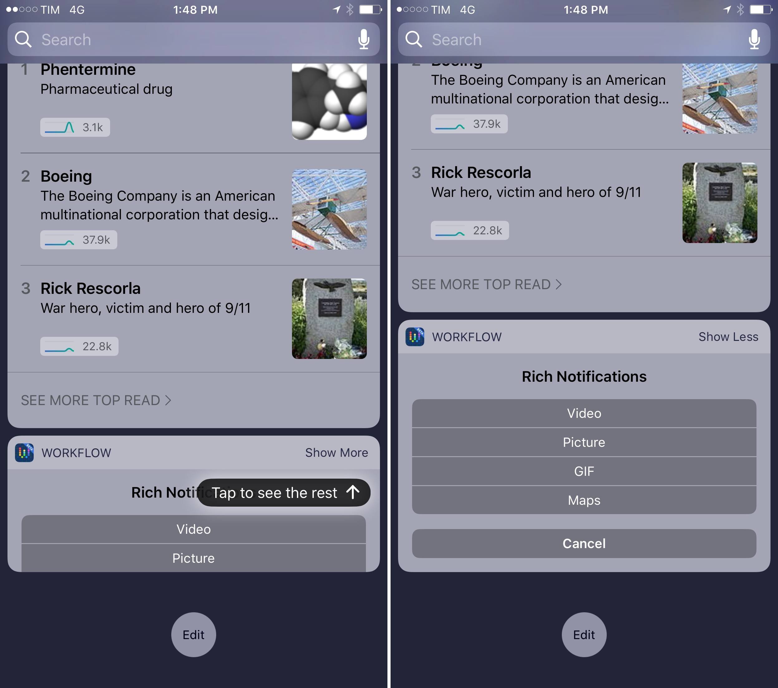
News
Top Stories from Apple News (shown even if you mute the channel). The widget uses image thumbnails and custom typography matching the bold font of Apple News for headlines.
The best change from iOS 9: news can be disabled by removing the widget.
Notes
A preview of your most recent notes. In compact mode, the widget only shows the last modified note. In expanded mode, you get more notes and buttons to create a new note, a checklist, snap a picture, and create a drawing.
Photos
A collection of Memories created by the new Photos app in iOS 10. Each one can be tapped to view the associated memory in Photos.
Siri App Suggestions
iOS 9’s proactive Siri Suggestions are now smaller in scope and they’re called Siri App Suggestions. The widget displays 4 app shortcuts (8 in expanded mode), and it doesn’t suggest other types of content.
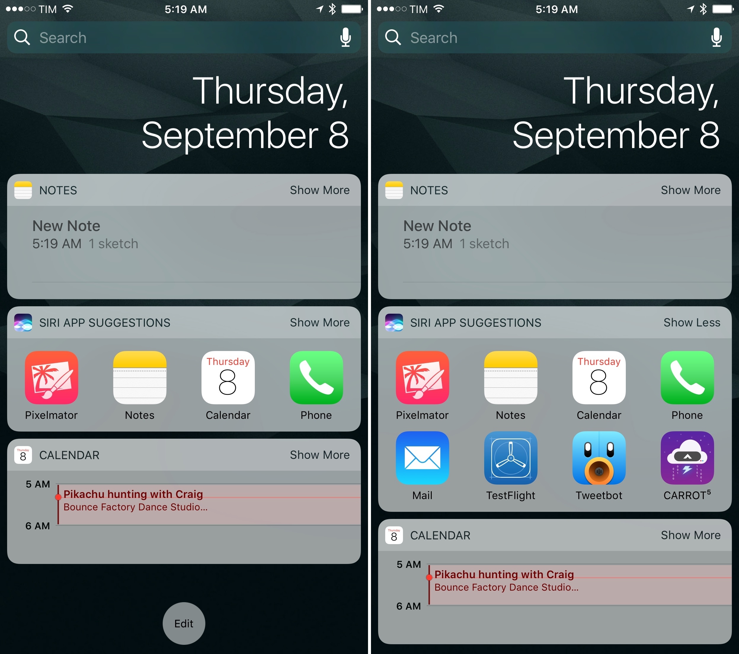
Like News, it can also be removed and be placed anywhere on the Search screen.
Tips
You’d think that the Tips widget is useless – everyone likes to make fun of Tips – but hear me out. In compact mode, the widget shows a tip’s snippet; you can tap it and open the Tips app. Switch to expanded mode, though, and you’ll be presented with a custom interface with an explanation of the tip and a large animation at the top to show you the tip in action.
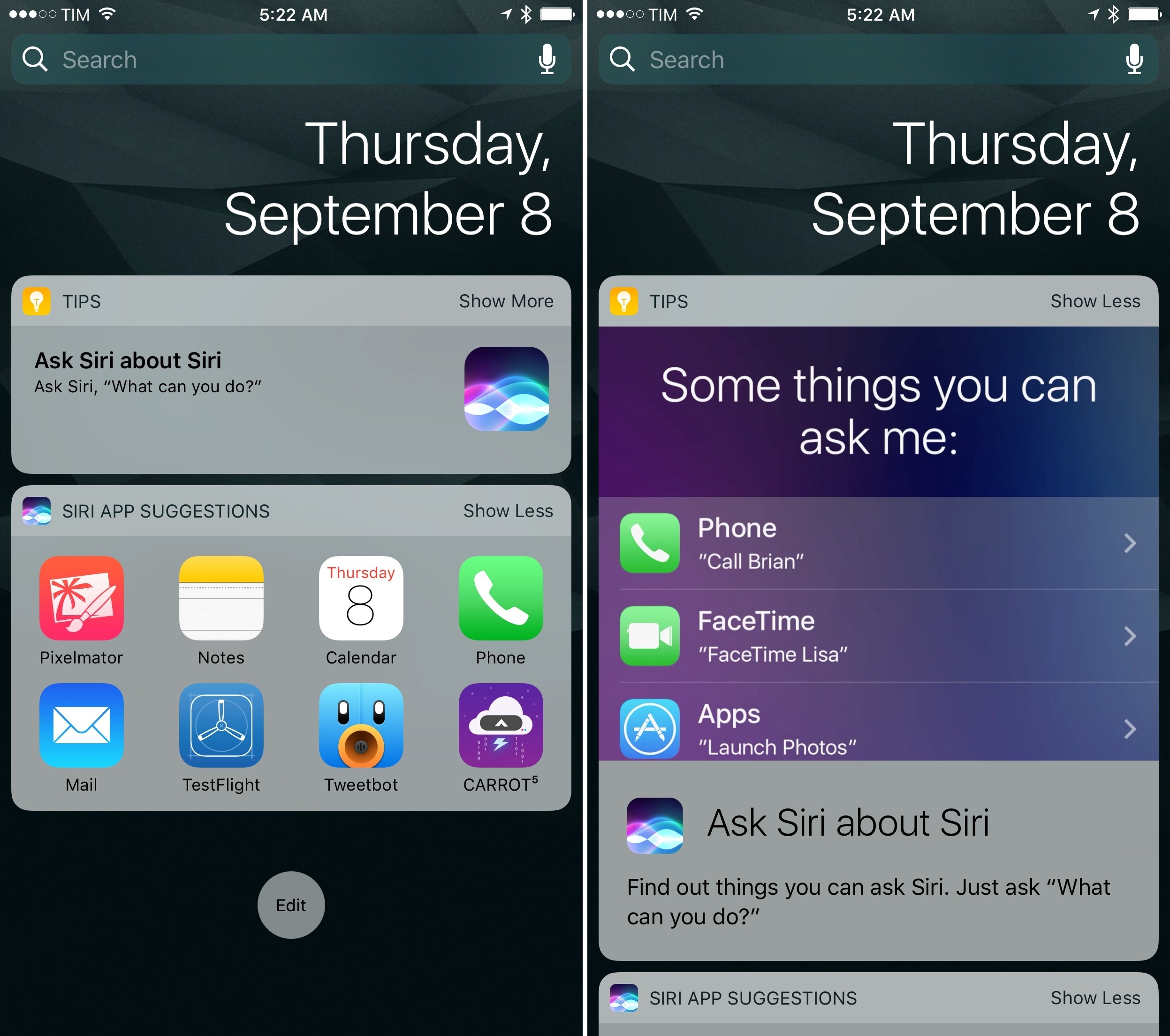
The Tips widget looks great, and it’s the most technically impressive one on iOS 10.
Up Next
The old Today Summary widget has been renamed Up Next. It displays a smaller version of your next event without the full UI of the Calendar widget. Alas, the Tomorrow Summary widget is gone from iOS 10.
Weather
Perhaps the best example of how widgets can use compact and expanded modes, Apple’s Weather widget shows weather conditions for the current location when compact, and a forecast of the next six hours when expanded.
Weather is the widget I’ve used the most in the past three months to look up forecasts from the Lock screen in just a couple of seconds.
Slide to Glance
The move to apps as atomic units scattered across the system is everywhere in iOS 10, with widgets being the foremost example.
Noticeably absent from iOS 10’s widgets is a push for more proactive recommendations. As we’ll see later, Apple has shifted its Proactive initiative to run through the OS and inside apps rather than distilling it into widgets.
3D Touch is another illustrious no-show. While notifications have been overhauled to make good use of 3D Touch, pressing on a widget will result in a disappointing lack of feedback. 3D Touch would be a perfect fit for widgets – imagine previewing a full note or reading the first paragraphs of a news story from the Lock screen.
The new widget design and Search screen placement make an iPhone more useful without having to unlock it. Apple has done a good job with their built-in widgets; it’s up to developers now to rethink how their apps can take advantage of them. I’m optimistic that everything will turn out better than two years ago.
I unlock my iPhone less thanks to iOS 10’s more capable Lock screen. Raise to Wake, Press to Open, widgets, search, and rich notifications make the entire Lock screen experience drastically superior to iOS 9.
Easier to navigate, better structured, less prone to unwanted unlocks. I wouldn’t be able to go back to the old Lock screen.
- It has a thicker font in iOS 10, a subtle but noticeable change from iOS 9. ↩
- A detail you can't miss: swiping up on the Search screen will make the clock move to the status bar, next to the padlock. Simple and tasteful. ↩
-
There is one technical aspect I wish Apple handled differently. There's no way for apps to request a temporary exception to programmatically expand a widget when it would be appropriate, collapsing it again when a task is finished.
As an example, consider the Workflow widget and running a workflow from compact mode. If the workflow needs to display a longer list of items while it's executing, it won't be possible for the app to ask iOS to temporarily expand the widget until the workflow is complete, reverting it back to compact in the end. The user will have to tap a workflow, notice that the list is being cut off by compact mode, and manually toggle expanded mode. As of iOS 10.0, compact and expanded modes aren't dynamic, and I think Apple could add some flexibility to the API without taking control away from the user. ↩