Apps
As is often the case with new versions of iOS, Apple added a variety of improvements to its suite of apps – some of which, for the first time, can also be deleted from the Home screen.
On the 12.9-inch iPad Pro, Mail has received a three-panel mode that shows a mailbox sidebar next to the inbox and message content in landscape.
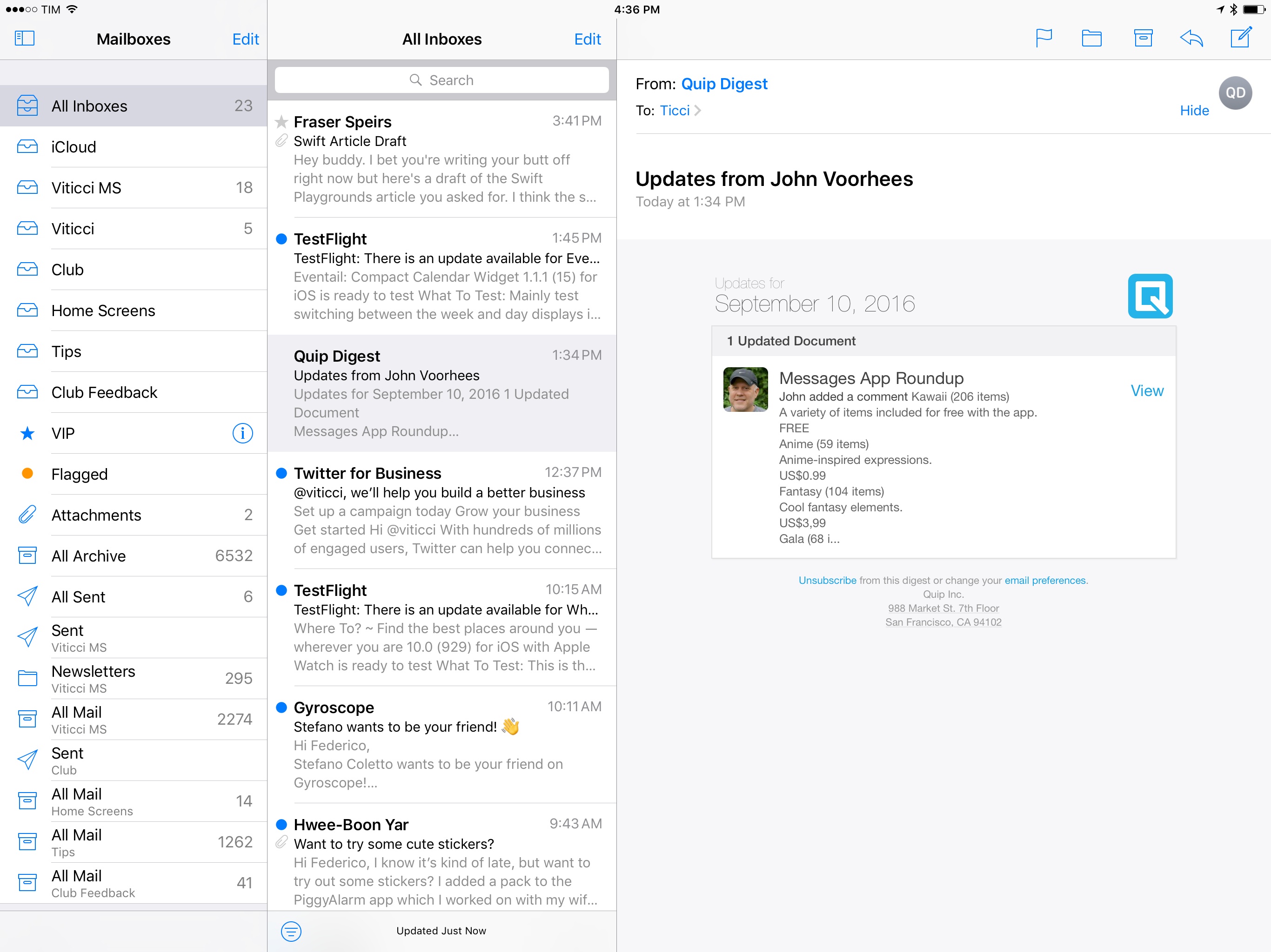
This extended mode is optional; it can be disabled by tapping a button in the top left of the title bar. If you were wondering why iPad apps couldn’t show more content like on a Mac, this is Apple’s answer. It’s the right move, and I’d like it to propagate to more apps.
Conversation threading has also been updated in iOS 10 to resemble macOS’ conversation view.
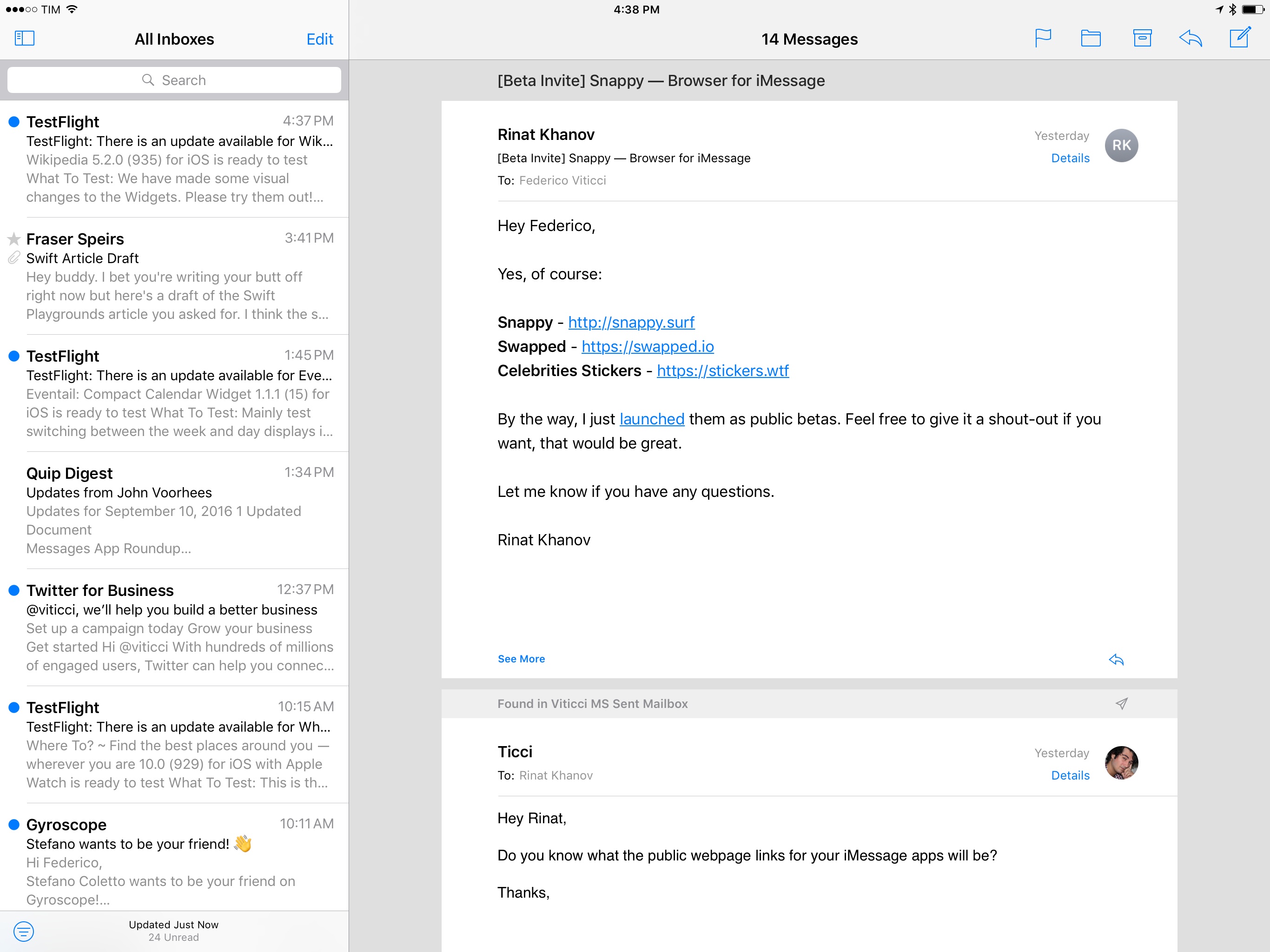
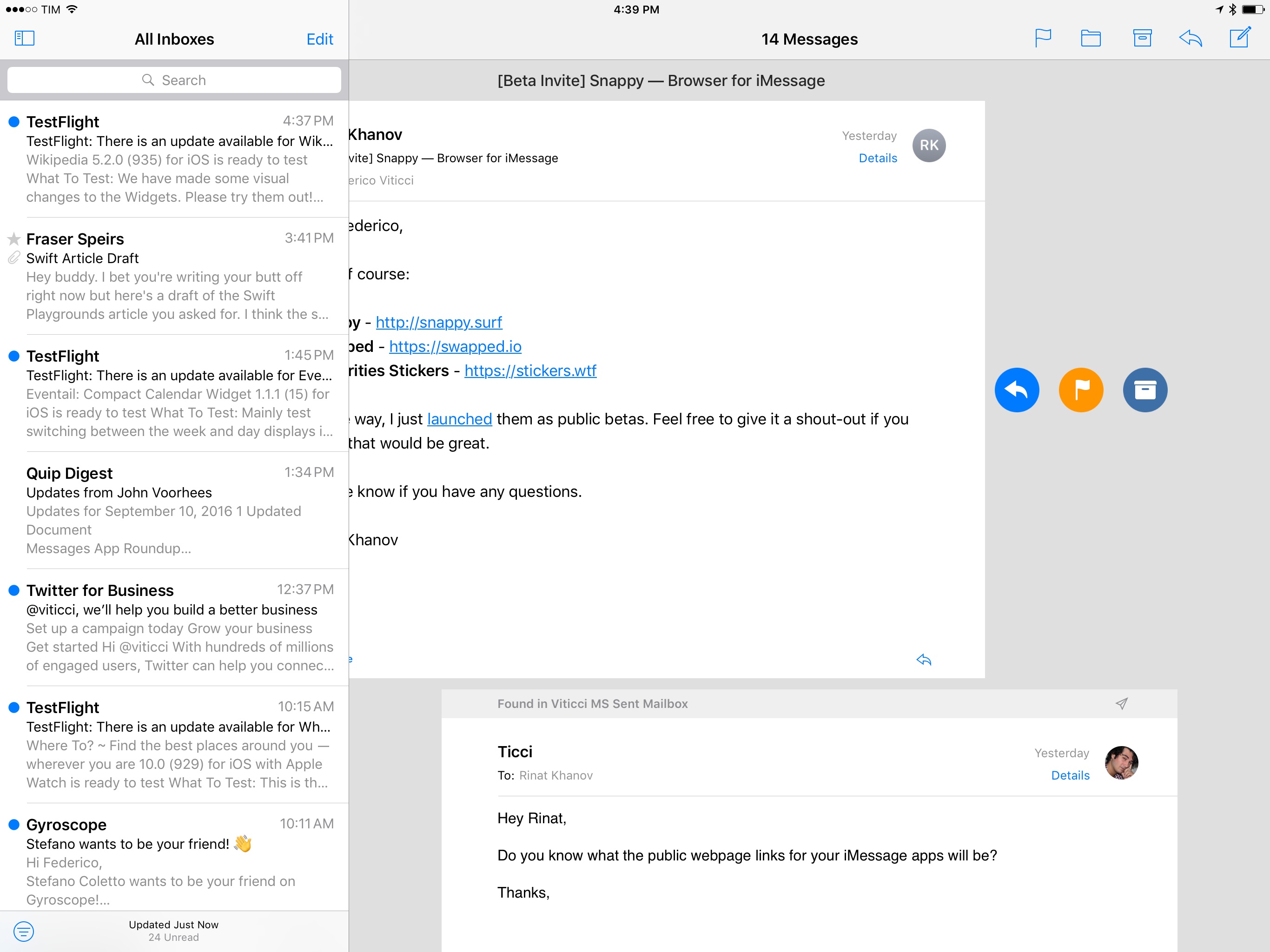
In iOS 10, messages in a thread are shown as scrollable cards. Each message can be swiped to bring up actions, and it can be taken in full-screen by tapping on its header (or ‘See More’ at the bottom).
You can control the appearance of conversation view in Settings > Mail (Contacts and Calendars have received their own separate setting screens, too). Mail lets you complete threads (load all messages from a thread even if they’ve been moved to other mailboxes) and display recent messages on top. Conversation view makes it easier to follow replies without having to squint at quoted text. It’s nicer and more readable; I wish more third-party email clients had this feature.
This willingness to make Mail more desktop-like doesn’t apply to smart folders, which are still nowhere to be found on iOS. Instead, Apple hopes that filters will help you sift through email overload.
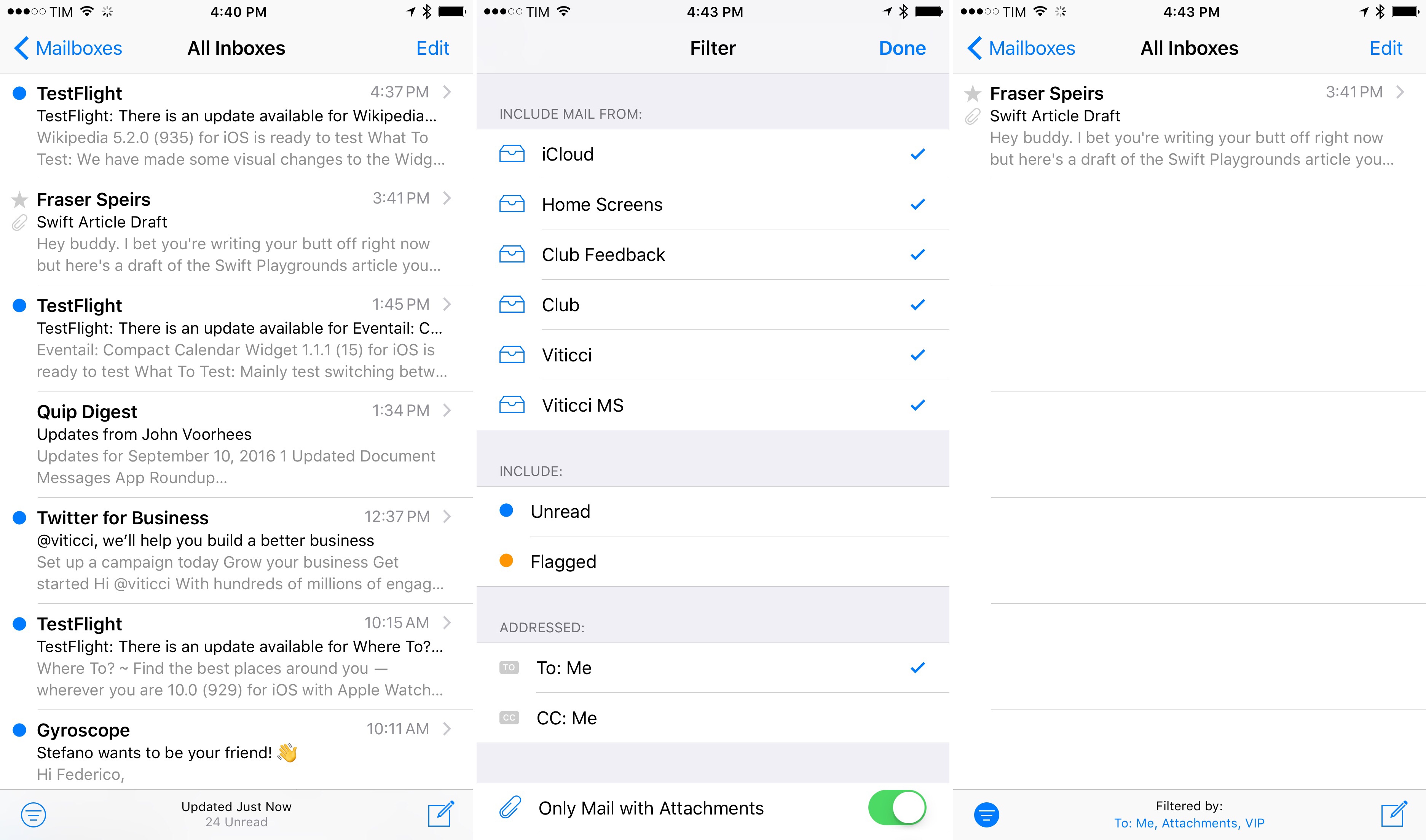
Filters can be enabled with the icon at the bottom left of the inbox. You can customize them by tapping ‘Filtered By’ next to the icon. Filters include accounts, unread and flagged messages, messages that are addressed to you or where you’re CC’d, and only mail with attachments or from VIPs.
Filters aren’t a replacement for smart folders’ automatic filing, but they can still provide a useful way to cut down a busy inbox to just the most important messages. I wish it was possible to create custom filters, or that Apple added more of them, such as a filter for Today or the ability to include messages from a specific address (without marking it as VIP).
Last, like Outlook, Mail now recognizes messages from mailing lists and lets you unsubscribe with one tap without opening Safari.
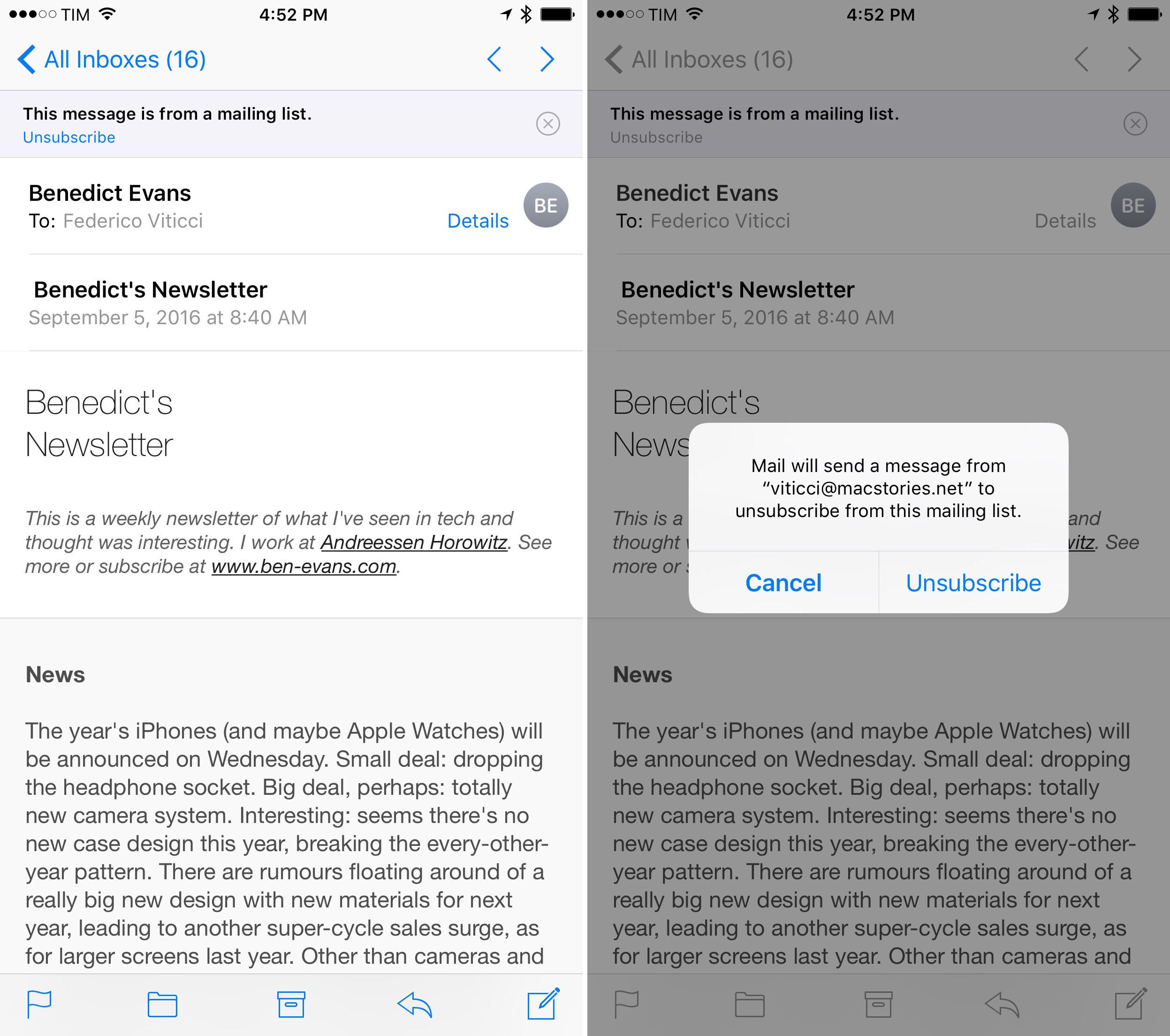
Tapping the Unsubscribe button will send a an unsubscribe request as a message on your behalf, which you can find in the Sent folder. In my experience, Mail has done a solid job at finding newsletters and putting its Unsubscribe banner at the top.
Compared to apps like Outlook, Airmail, and Google Inbox, Apple is advancing Mail at a deliberately slow pace. You can’t send an email message to extensions with the share sheet (more on this problem here); several macOS Mail functionalities are still missing from the iOS app; and, Google is way ahead of Apple when it comes to smart suggestions and automatic message categorization.
Mail is a fine client for most people, but it feels like it’s stuck between longing for desktop features and adopting what third-parties are doing. There’s a lot of work left to do.
Look Up and Dictionary
Apple’s system dictionary – built into every app via the copy & paste menu – has been overhauled as Look Up, a more versatile interface meshing Spotlight and Safari search suggestions.
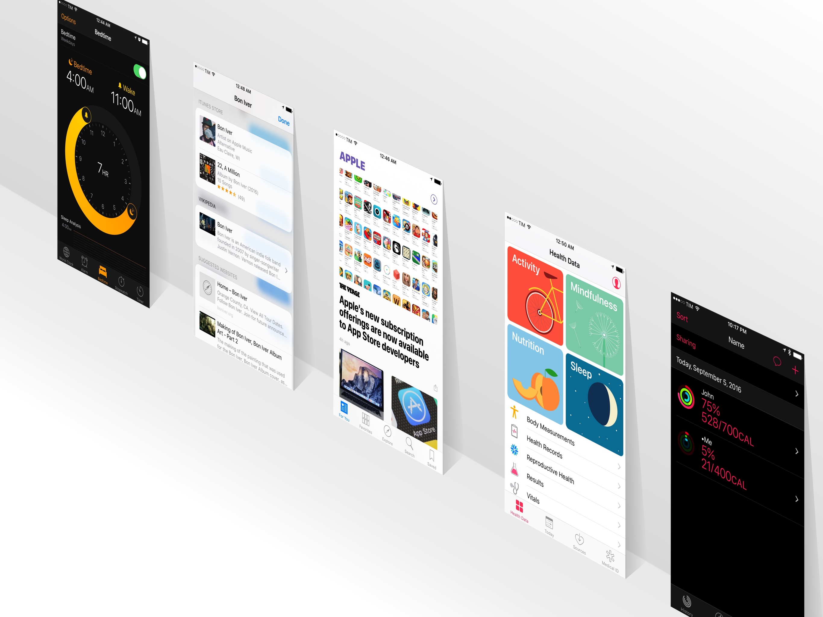
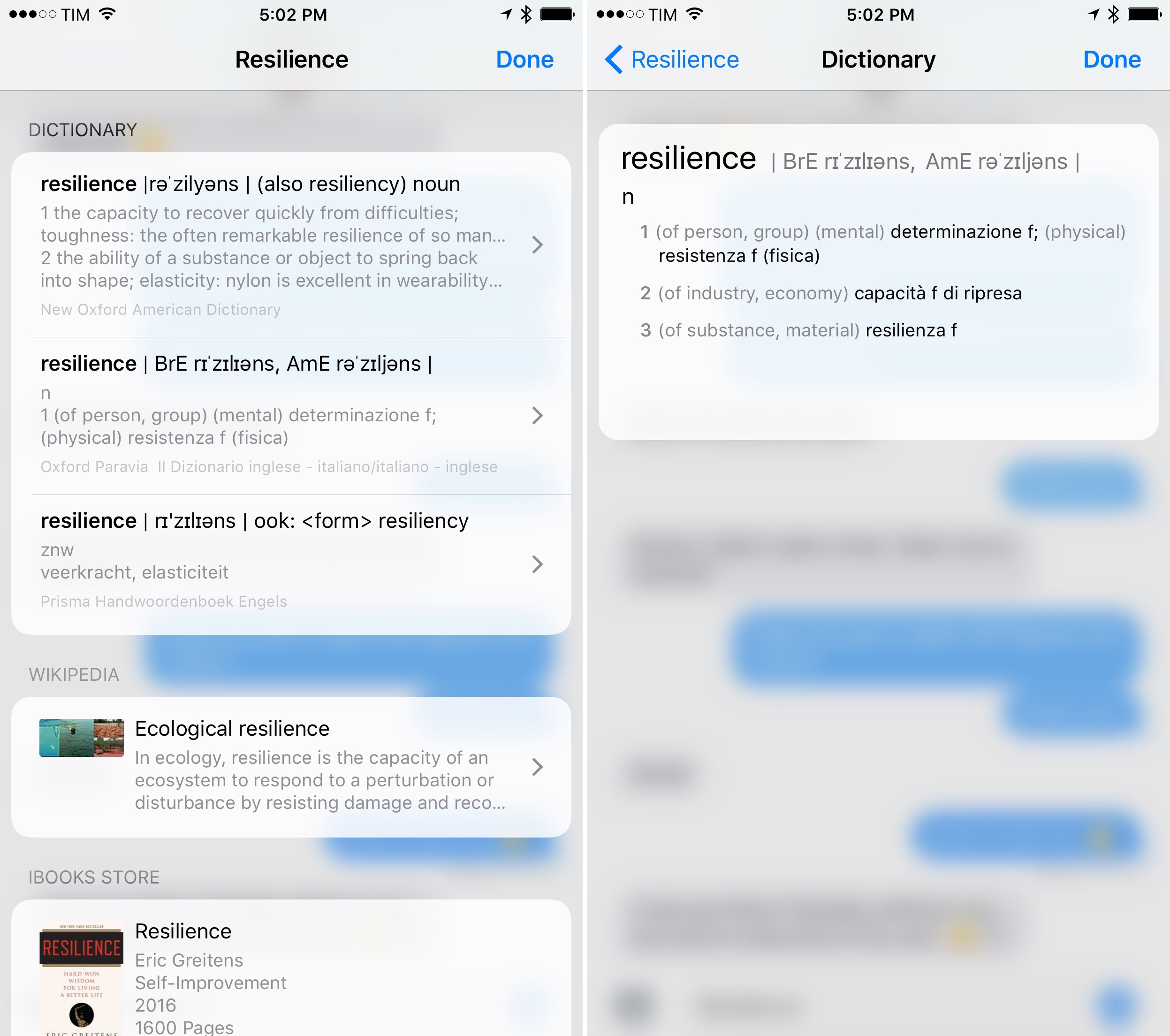
Look Up still provides dictionary definitions for selected words. The dictionary opens as a translucent full-screen view on the iPhone (a modal window on the iPad) with cards you can tap to read thorough definitions. New in iOS 10, the Italian and Dutch dictionaries can display multilingual translations in English, which I’ve found useful to expand my vocabulary without opening Google or a third-party dictionary app.
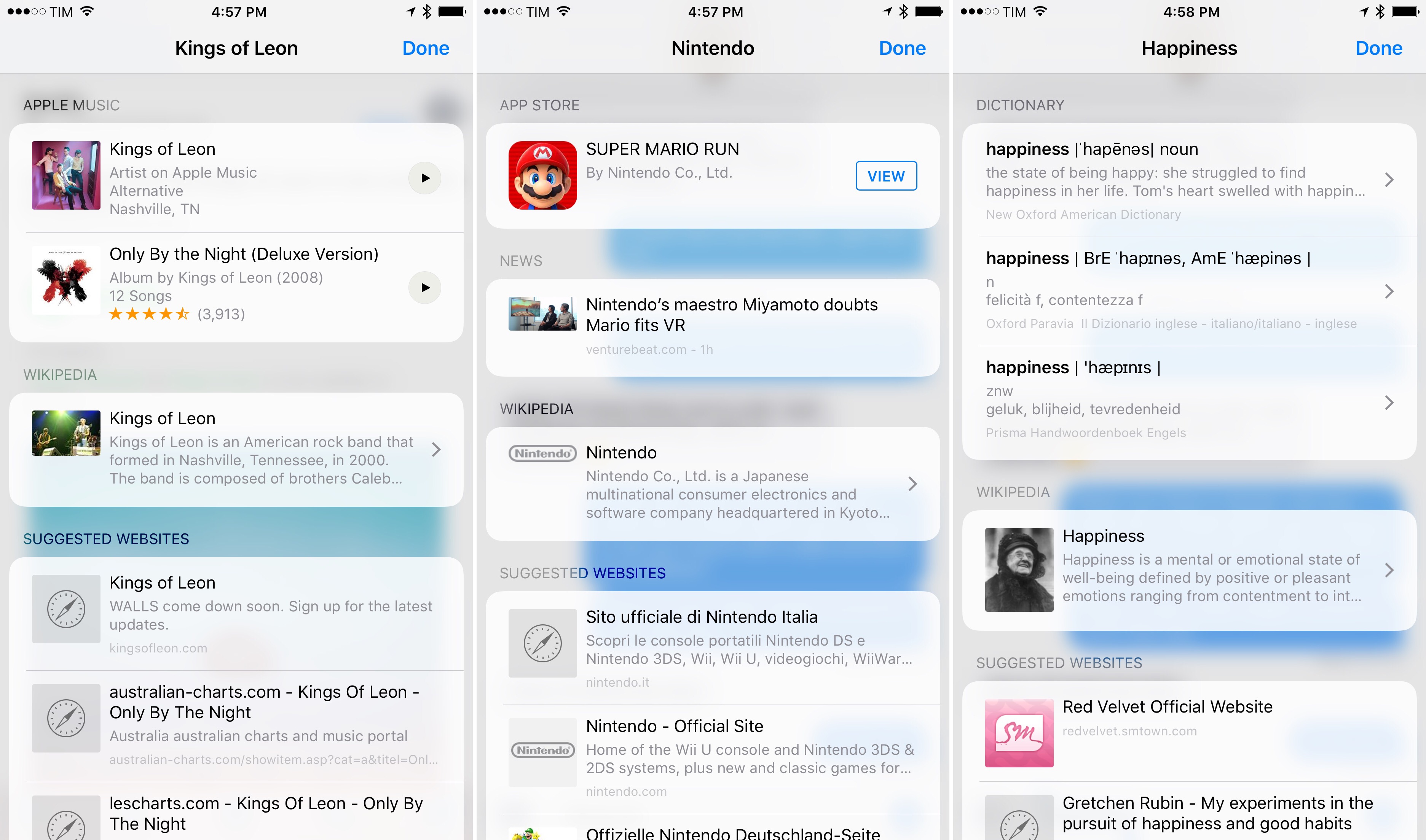
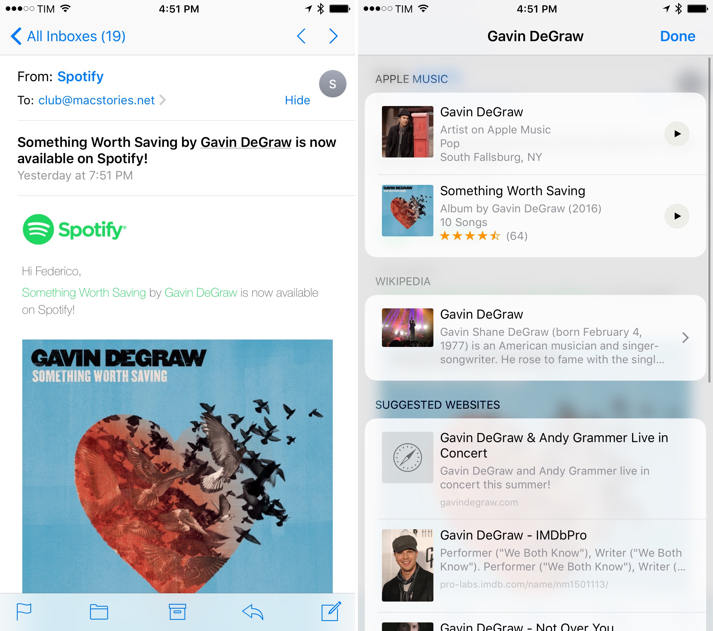
What makes Look Up one of the best additions to iOS 10 is the expansion of available sources. Besides definitions, iOS 10 shows suggestions from Apple Music, Wikipedia, iTunes, suggested websites, web videos, news, Maps, and more. These are the same data providers powering suggestions in Safari and Spotlight, with the advantage of being available from any app as long as you can select text.
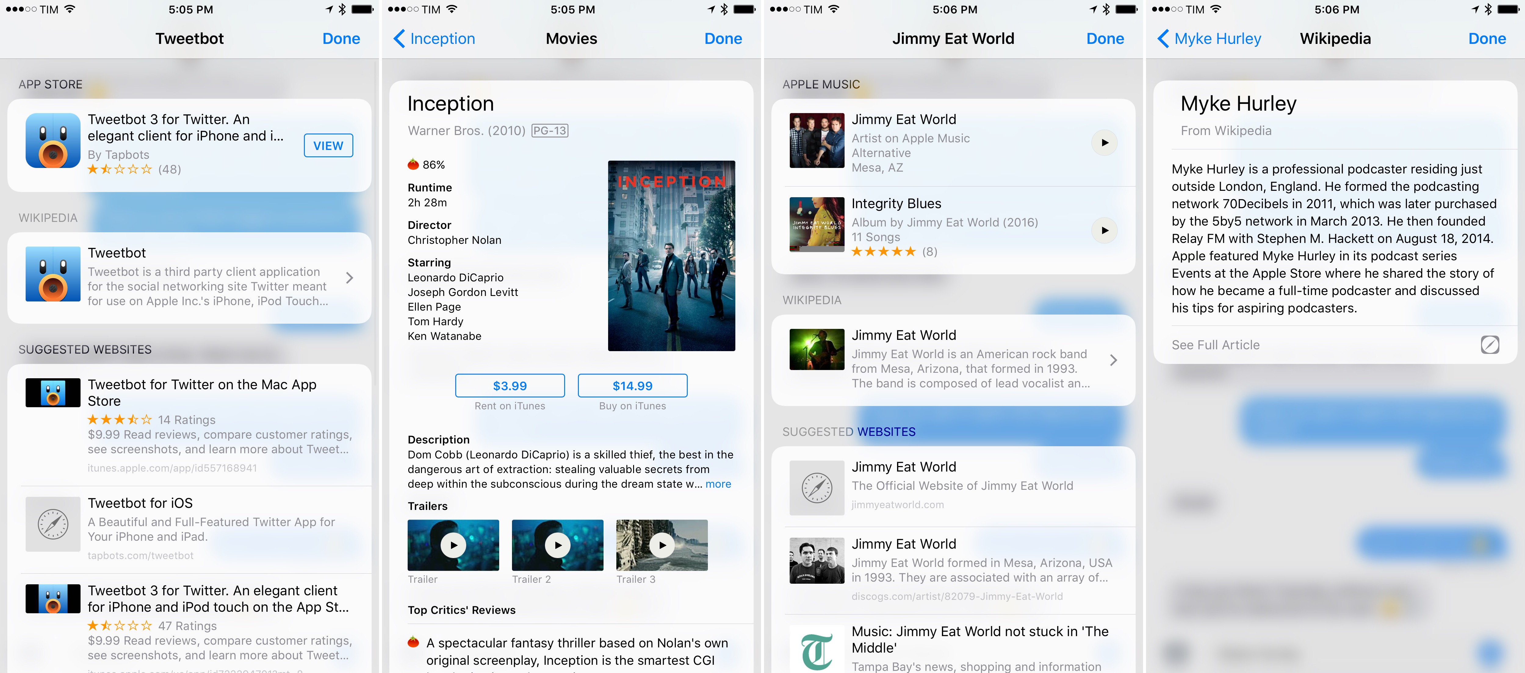
Like in iOS 9, some results can be expanded inline, such as Wikipedia summary cards, while others take you to a website in Safari. The presentation style is also the same, with rich snippets and thumbnails that make results contextual and glanceable.
Smart data detectors have also been updated with Look Up integration. If iOS 10 finds a potential result in text, it’ll be underlined to suggest it can be tapped to open Look Up.
In my tests, Look Up suggestions in text showed up in apps like Messages and Mail, and they often matched names of popular artists (e.g. “Bon Iver”) or movies.
By plugging into a broader collection of sources, Look Up is more than a dictionary. It’s Spotlight for selected text – an omnipresent search engine and reference tool that can take you directly to a relevant result without Google.
I’ve become a heavy user of Look Up for all kinds of queries. I look up topics on Wikipedia54 from my text editor or Notes without launching Safari. I even use it for restaurant reviews and Maps directions: iOS can pop up a full-screen Maps UI with the location, a button to get directions, and reviews from TripAdvisor. Look Up is a useful, clever addition, and I wish it worked for more types of content. It’d be nice to have POIs from Foursquare and Yelp in Look Up, for example.55
We first saw the potential for deeply integrated search with Spotlight in iOS 9. It’s not only a matter of competition between Apple and Google – any suggestion that requires fewer interactions is a better experience for Apple and its users. Look Up makes web search a feature of any app; it’s an intelligent continuation of the company’s strategy.
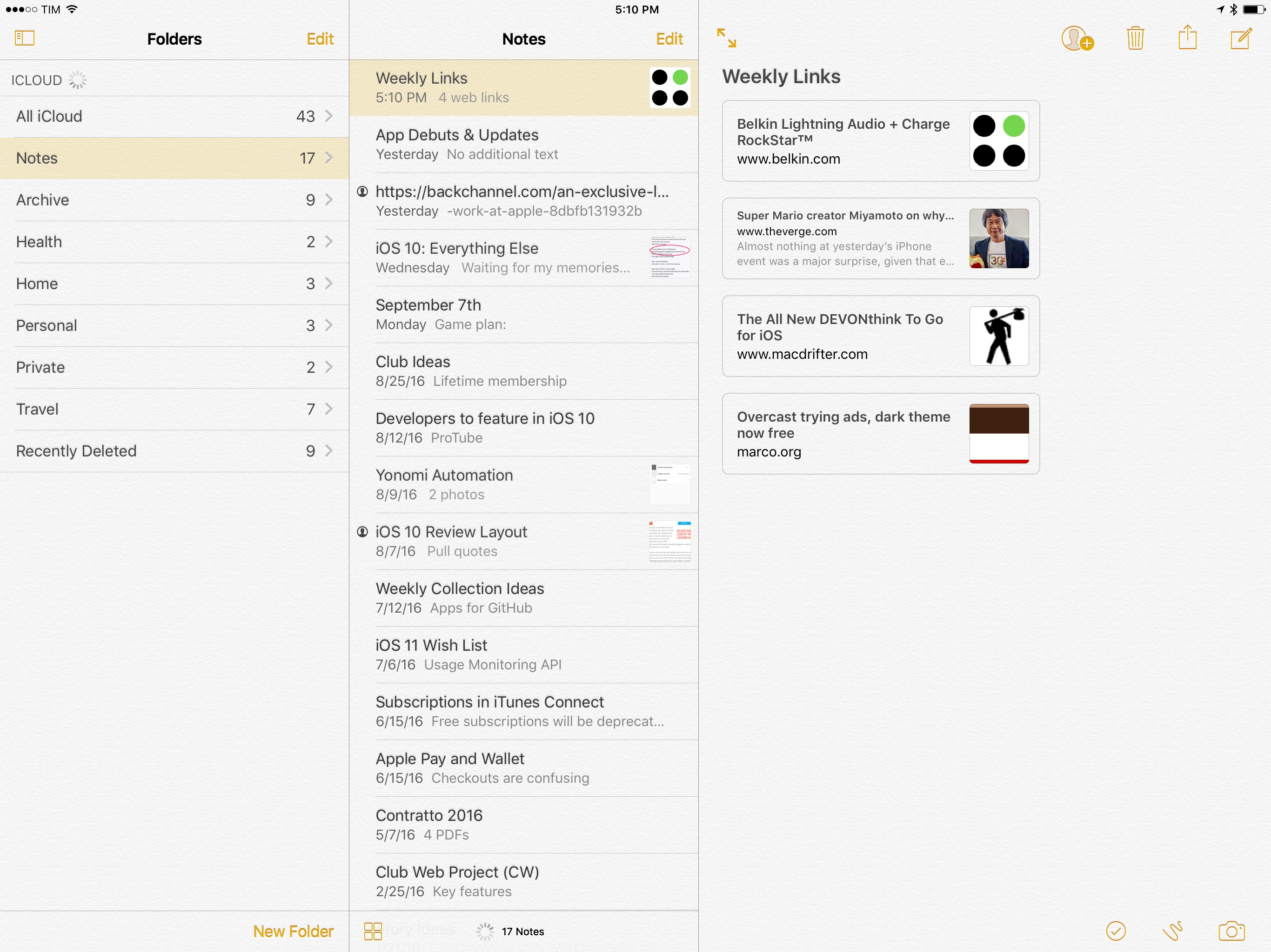
Notes
Notes was, together with Safari, the crown jewel of Apple’s app updates in iOS 9. This year, Apple is building upon it with subtle refinements and a new sharing feature.
Like Mail, Notes on the 12.9-inch iPad Pro offers a three-panel view. If you spend time moving between folders to manage notes, this should be a welcome change.
When using an external keyboard, you can now indent items in a bulleted list with the Tab key. The same can be done with the copy & paste menu; curiously, Apple labeled the opposite behavior ‘Indent Left’ instead of ‘Outdent’.
When a note refreshes with content added on another device, the new bits are temporarily highlighted in yellow. This helps seeing what has changed when syncing with iCloud.
Note sharing is the big change in iOS 10. Arguably the most requested feature since the app’s relaunch in iOS 9, collaboration puts Notes on the same playing field of two established competitors – Evernote and OneNote. In pure Apple fashion, collaboration has been kept simple, it’s based on CloudKit, and there’s an API for developers to implement the same functionality in their apps.
In iOS 10, every note has a button to start collaborating with someone. Tapping it opens a screen to share a note, which is done by sending a link to an app like Messages or Mail (you can also copy a link or send it to a third-party extension). Once you’ve picked how you want to share the note’s link, you can add people by email address or phone number.56 As soon as the recipient opens the iCloud.com link for the note and accepts it, the note will gain an icon in the main list to indicate that it’s a shared one.57
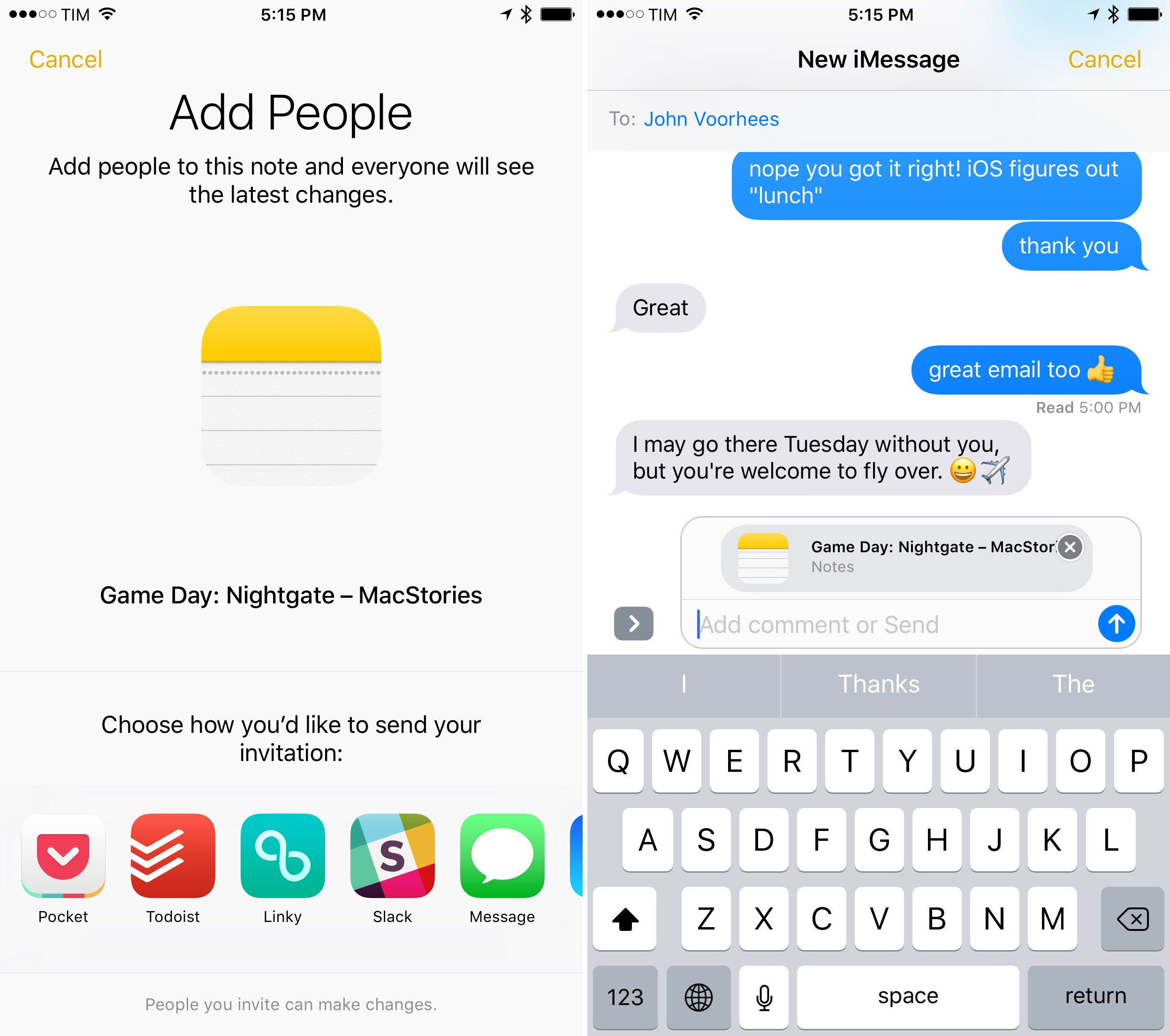
Collaborating with someone else on the same note doesn’t look different from normal editing. Unlike more capable collaborative editing environments such as Google Docs, Quip, or Dropbox Paper, there are no typing indicators with participant names and you can’t watch someone type in real-time. The experience is somewhat crude: entire sentences simply show up after a couple of seconds (they’re also highlighted in yellow).
Apple doesn’t view Notes collaboration as a real-time editing service. Rather, it’s meant to offer multiple users a way to permanently store information in a note that is accessed regularly.
I believe Notes collaboration will be a hit. I can see families sharing a grocery list or travel itinerary in Notes without having to worry about creating online accounts and downloading apps. Colleagues keeping a collection of screenshots and links, teams sharing sketches and snippets of text – the flexibility of Notes lends itself to any kind of sharing in multiple formats.58
Even without the real-time features of Google and Dropbox (and the upcoming iWork update), Notes collaboration works well and is fast. In my three months of testing, I haven’t run into conflicts or prompts to take action.
I was skeptical, but Notes collaboration works. In a post-Evernote world, Notes is still the best note-taking app for every iOS user.
Apple News
Like last year, we’re going to have a separate story on Apple News. I wanted to briefly touch upon a few changes, though.
Apple News is the third iOS 10 app to sport a redesign centered on bold headlines, sizeable sections, and a more varied use of color.
The app launches to a For You view that does away with a traditional title bar to show the date and local weather conditions. Top Stories is the first section, highlighting 4-5 stories curated by Apple editors. These stories tend to be general news articles from well-known publications, and there’s no way to turn them off even if you mute the channel.
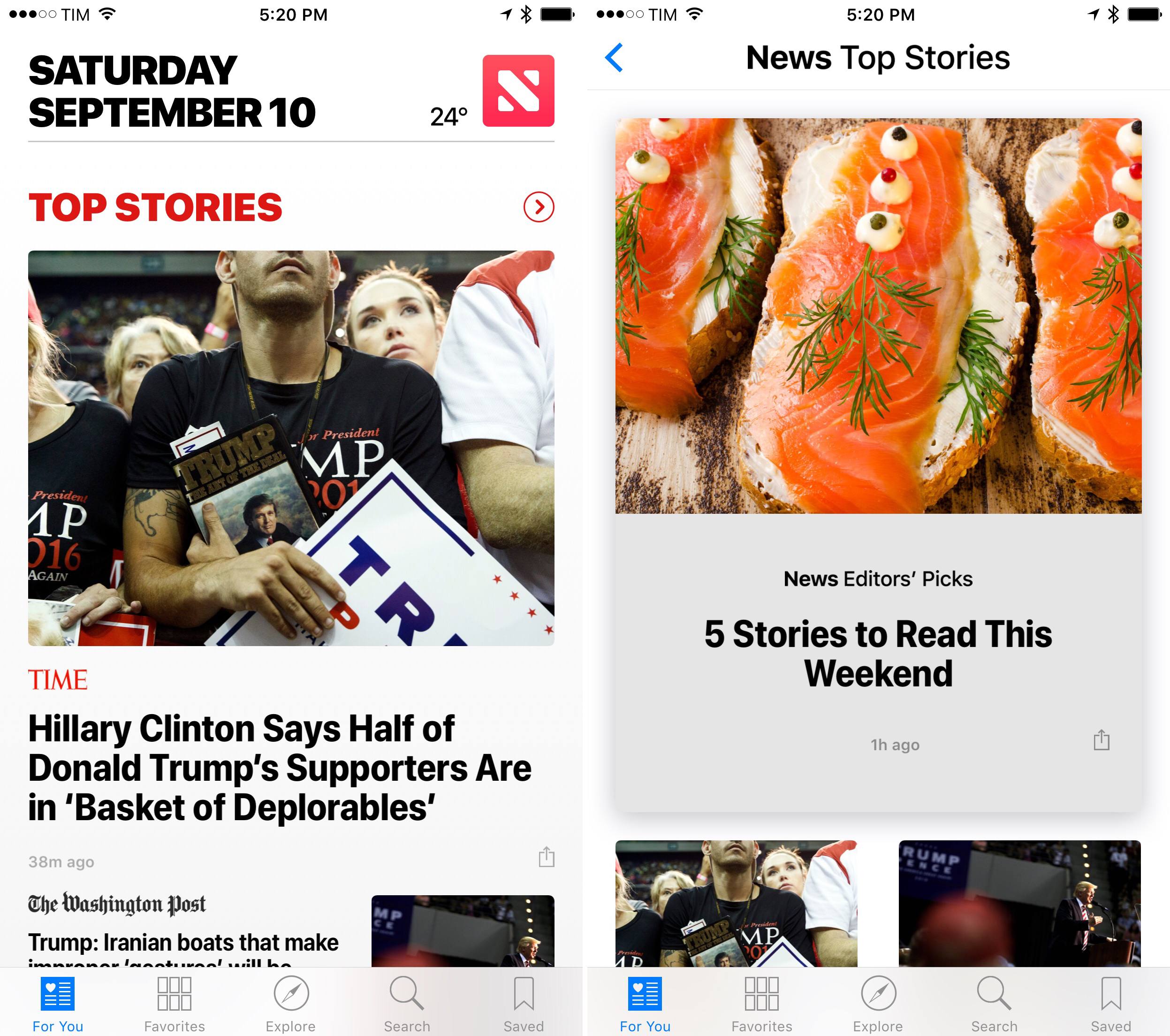
Sections in the main feed are differentiated by color, whether they’re curated by Apple (such as Trending or Featured) or collected algorithmically for your interests. Bold headlines don’t help information density (on an iPhone 6s Plus, you’ll be lucky to see more than four headlines at once), but they don’t look bad either. The large, heavy version of San Francisco employed in the app makes it feel like a digital newspaper.
Because of my job and preferences in terms of news readers, I can’t use Apple News as a replacement for Twitter or RSS. I want to have fine-grained control over my subscriptions, and the power-user tools offered by services like NewsBlur and Inoreader aren’t a good fit for Apple News. There are also editorial choices I don’t like: the more I keep muting and disliking certain topics (such as politics and sports), the more they keep coming back from Apple’s editors or other publications. Apple’s staff believes those are the stories I should care about, but I’ve long moved past this kind of news consumption. I don’t have time for a news feed that I can’t precisely control and customize.
As a general-purpose news reader, Apple News does a decent job, and the redesign gives sections and headlines more personality and structure. At the same time, Apple News still feels less inspired than Apple Music; the changes in iOS 10 aren’t enough to convince me to try it again.
- I've noticed that Wikipedia results aren't always suggested, even for topics that are available on Wikipedia. My understanding is that Look Up (and other search suggestions on iOS) attempt to find the most popular/relevant result for the current query. For instance, Look Up will suggest an artist, but not always an artist's album or single. ↩
- These sources would have to be sanctioned by Apple. ↩
- Oddly enough, Family Sharing hasn't been baked into Notes collaboration at all. ↩
- There's a yellow badge in the note's list to tell you that a shared note has been modified since you last opened it. ↩
- Shared notes can't be locked with passcode or Touch ID. ↩