Maps
Without new exploration and location editing modes (transit launched in September 2015, and it’s slowly rolling out to more cities; crowdsourced POI collection is still a no-go), Apple is making design and third-party apps the focal points of Maps in iOS 10.
Maps’ new look removes UI chrome and enhances usability on large iPhones through lowered controls, intuitive buttons, and more proactive suggestions. There are floating buttons to find your position and open Maps’ settings. Apple has gotten rid of the search bar at the top and replaced it with a card at the bottom (a floating “sidebar” on the iPad). You can swipe up the card to reveal suggestions below the search field.
The sense is that Apple wanted to ship a smarter, more conversational search feature, which now offers proactive place suggestions. Instead of a handful of recent addresses, Maps now curates a richer list of locations based on recently viewed and marked places, favorites, places you’ve been to, and addresses you probably want to go next based on proactive iOS features.
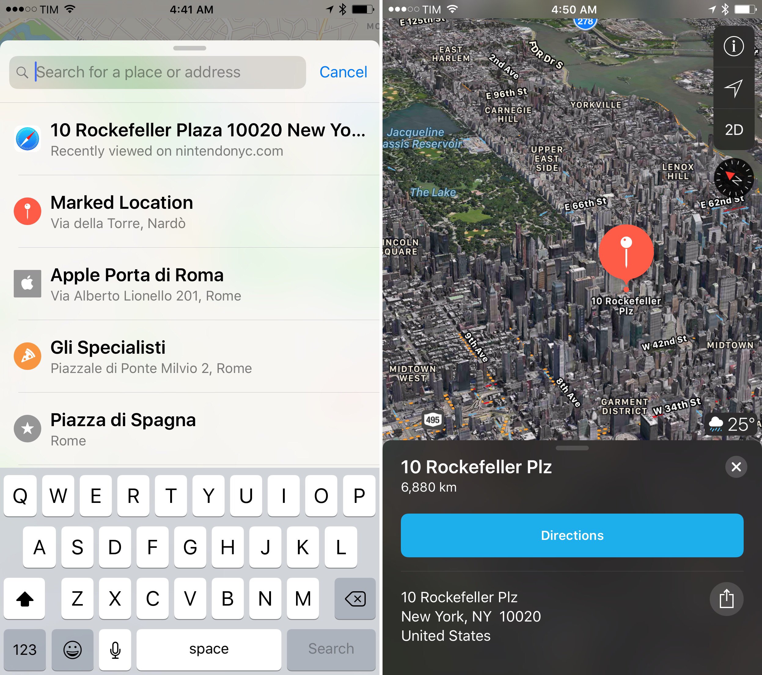
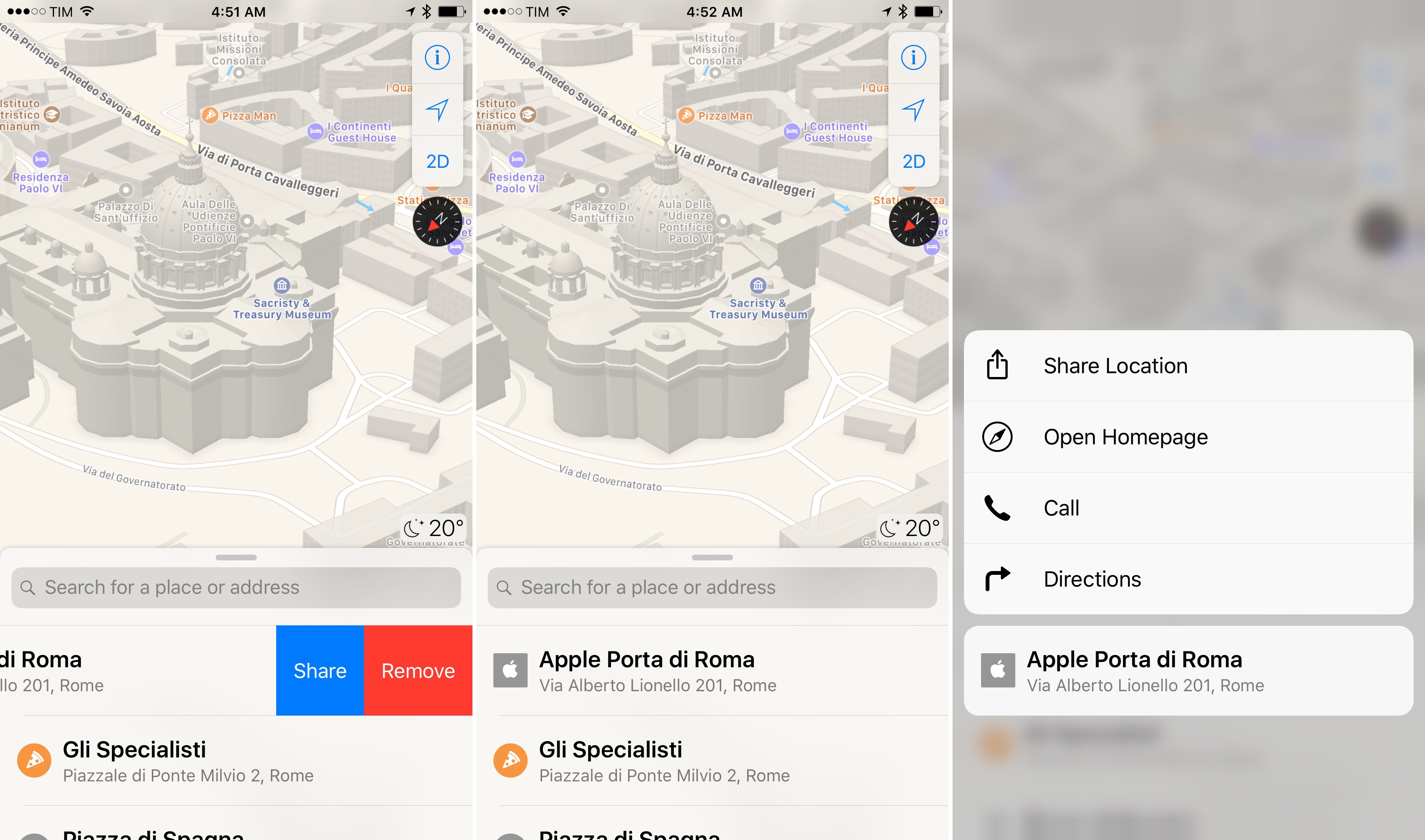
Each suggestion is associated with a relevant icon, so they’re prettier and easier to identify. You can even swipe on them to remove them from the list or share them with other apps.
Colorful business and landmark icons are used in search results, which are more lively than iOS 9 and include more Nearby categories. In selected regions, Nearby results can be filtered with sub-categories in a scrollable bar at the bottom of the screen.
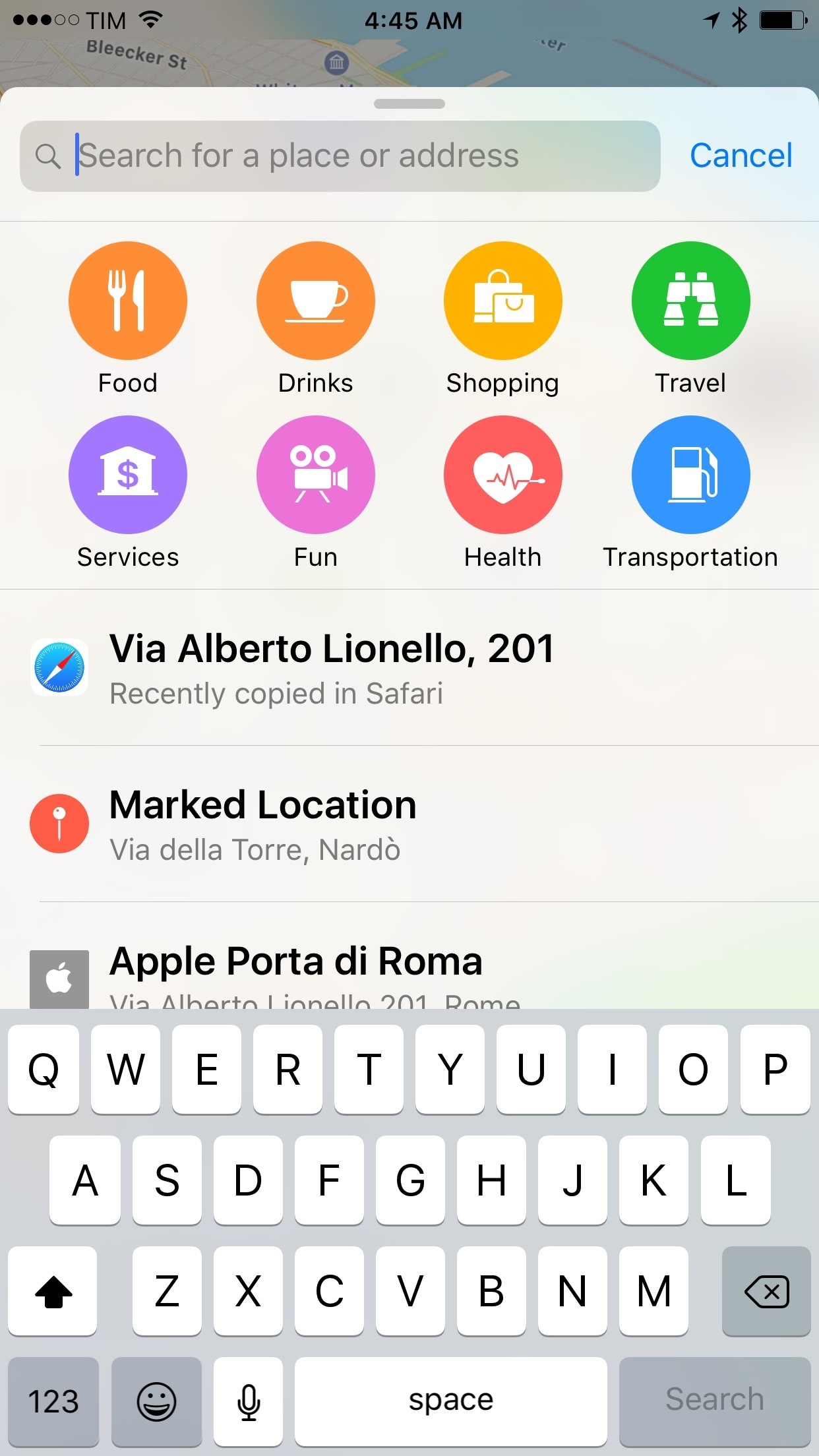
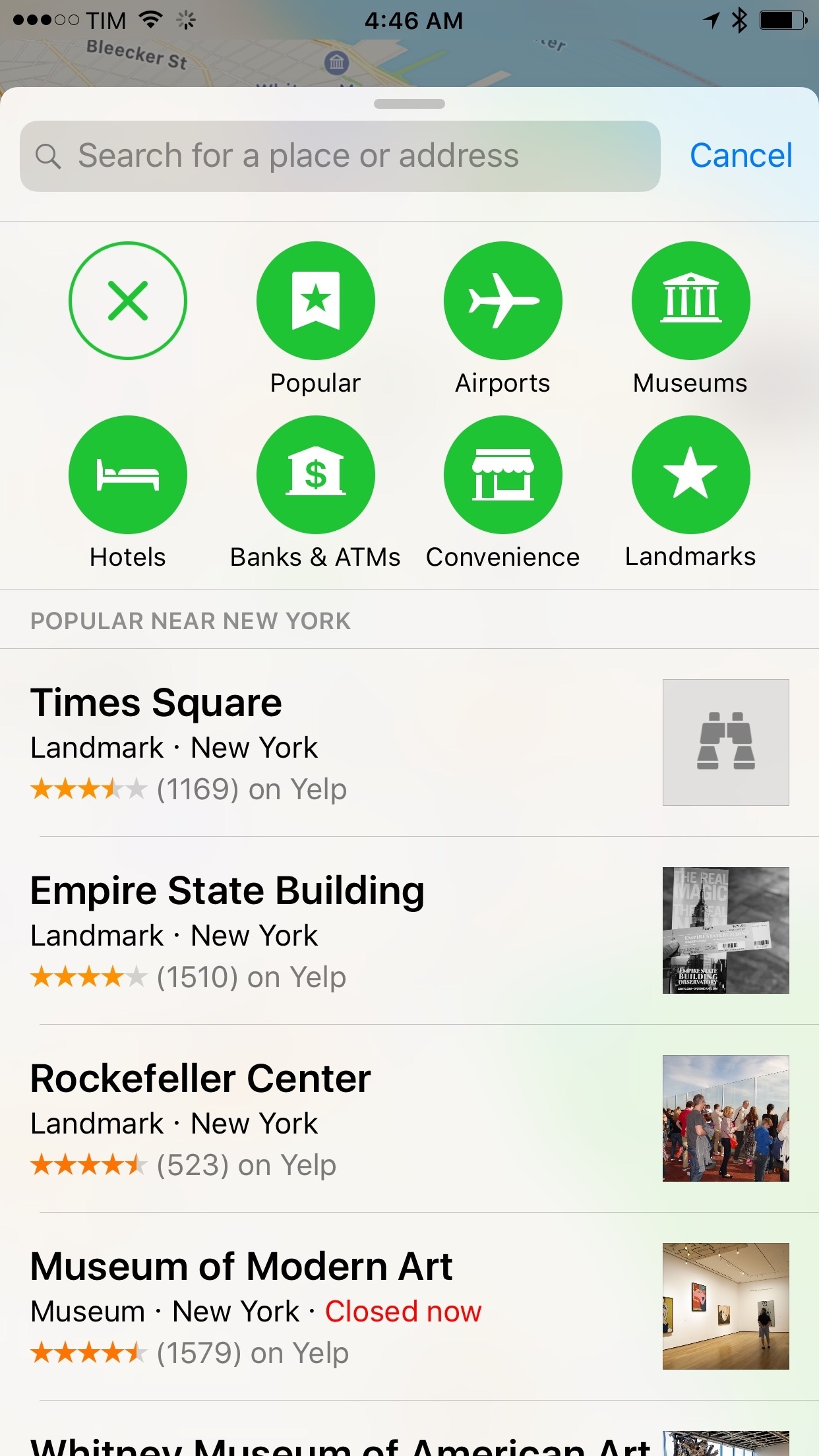
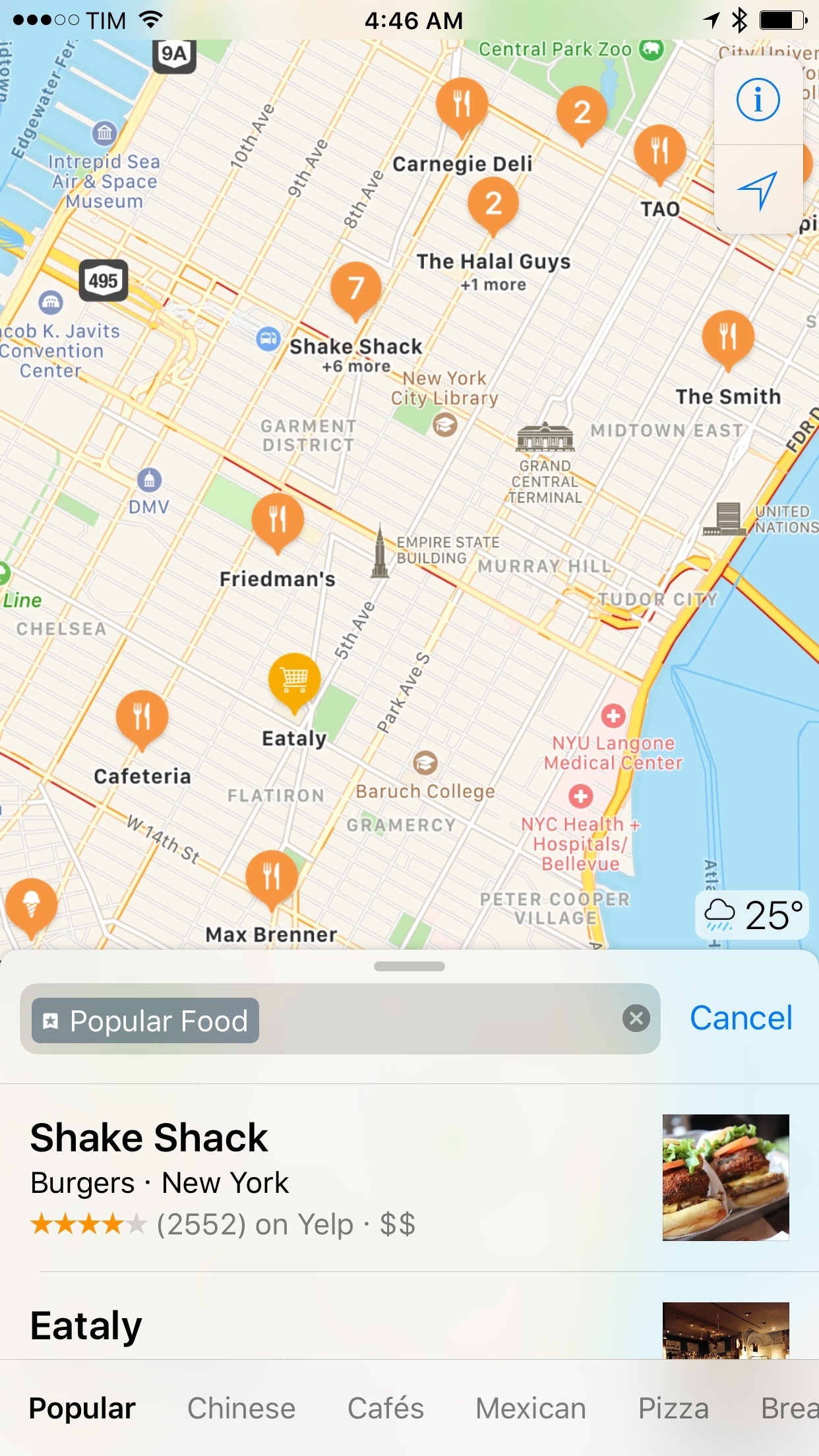
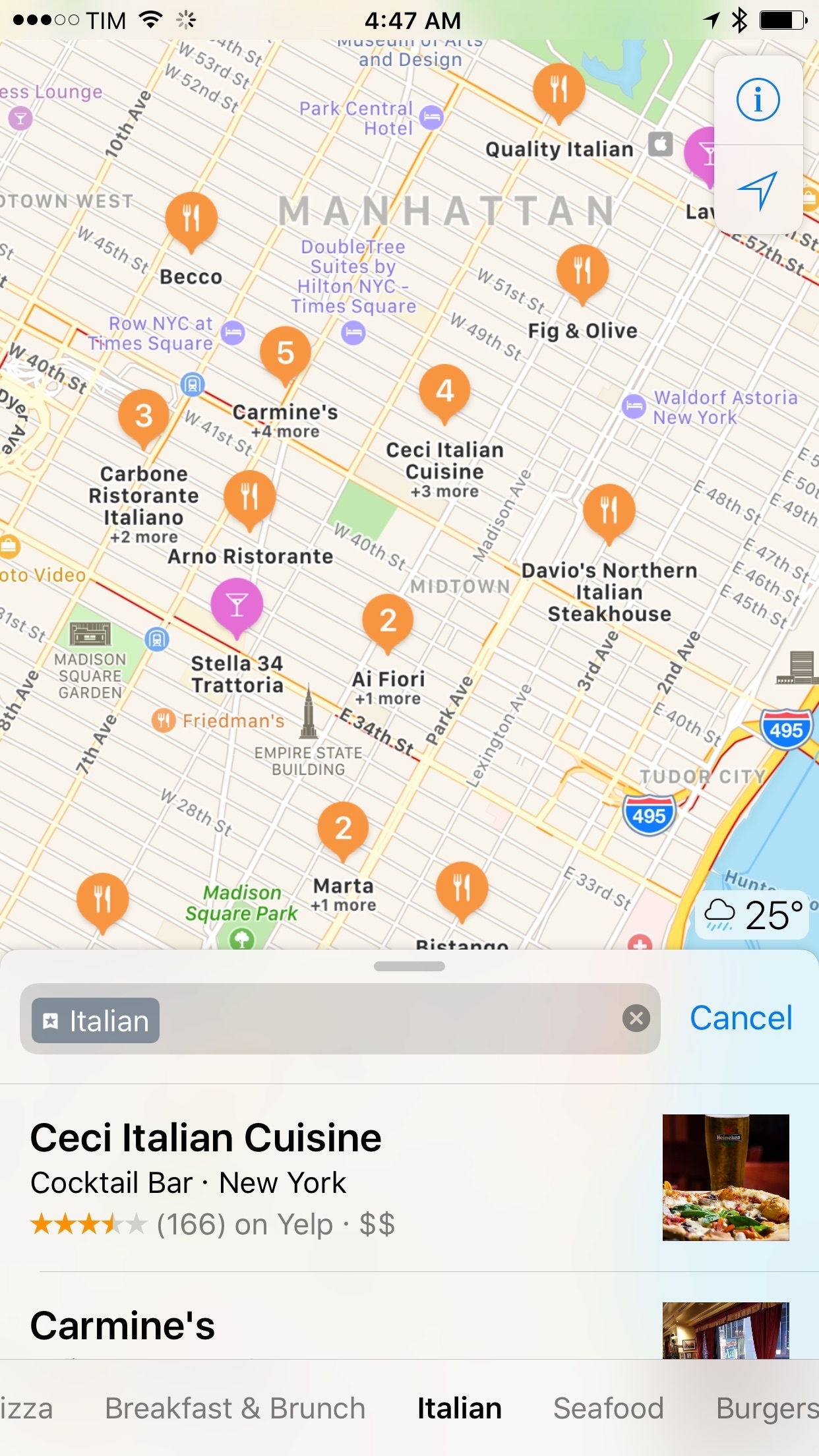
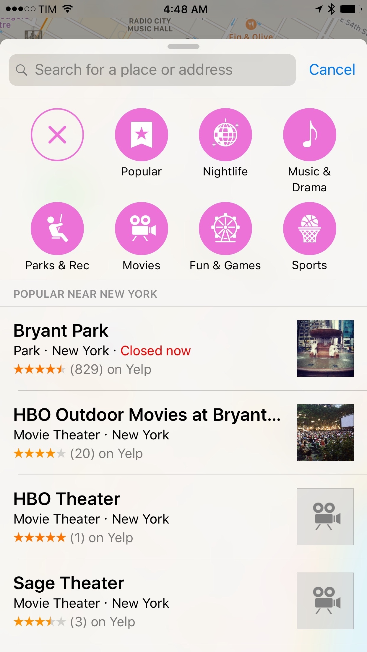
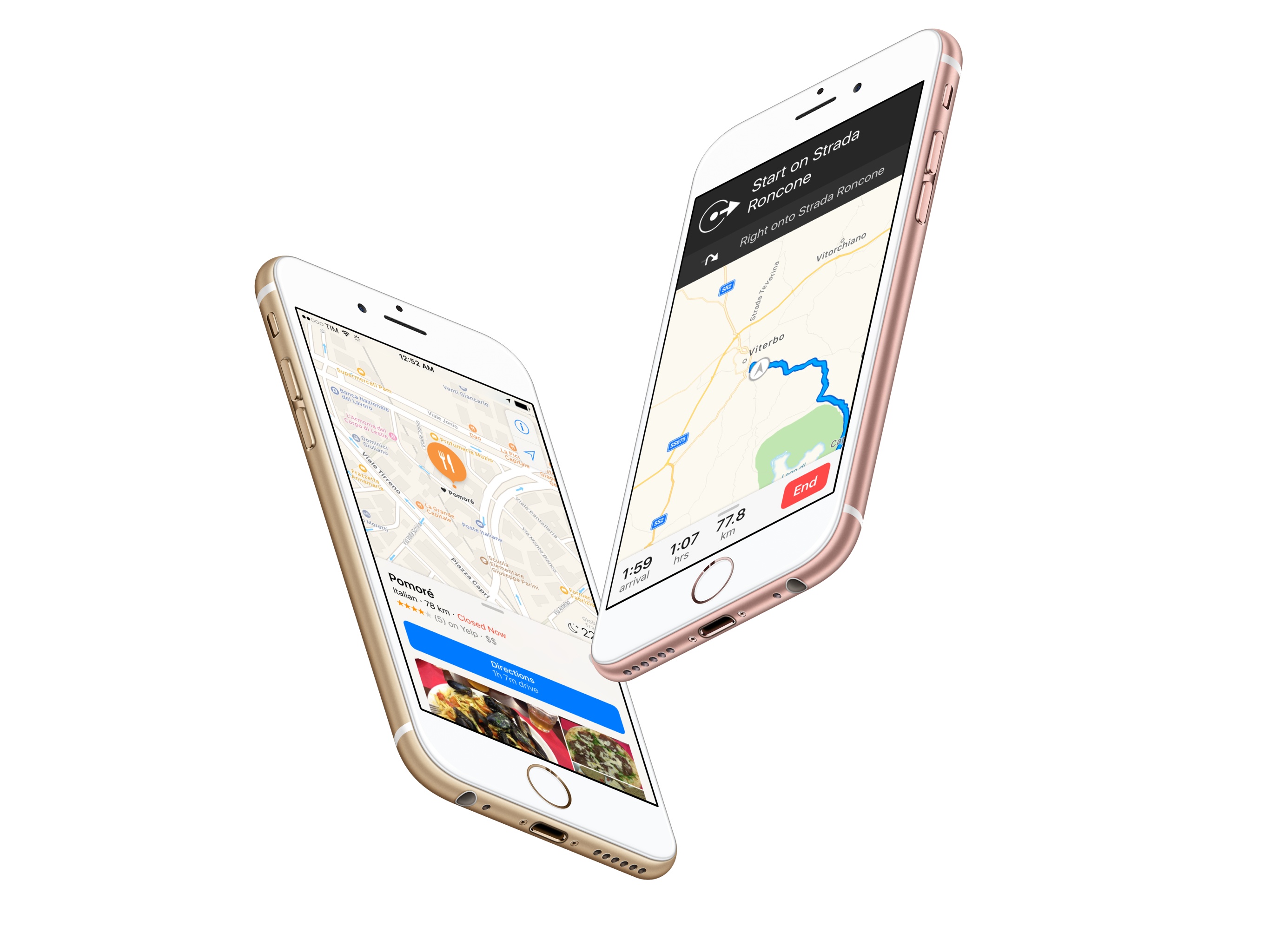
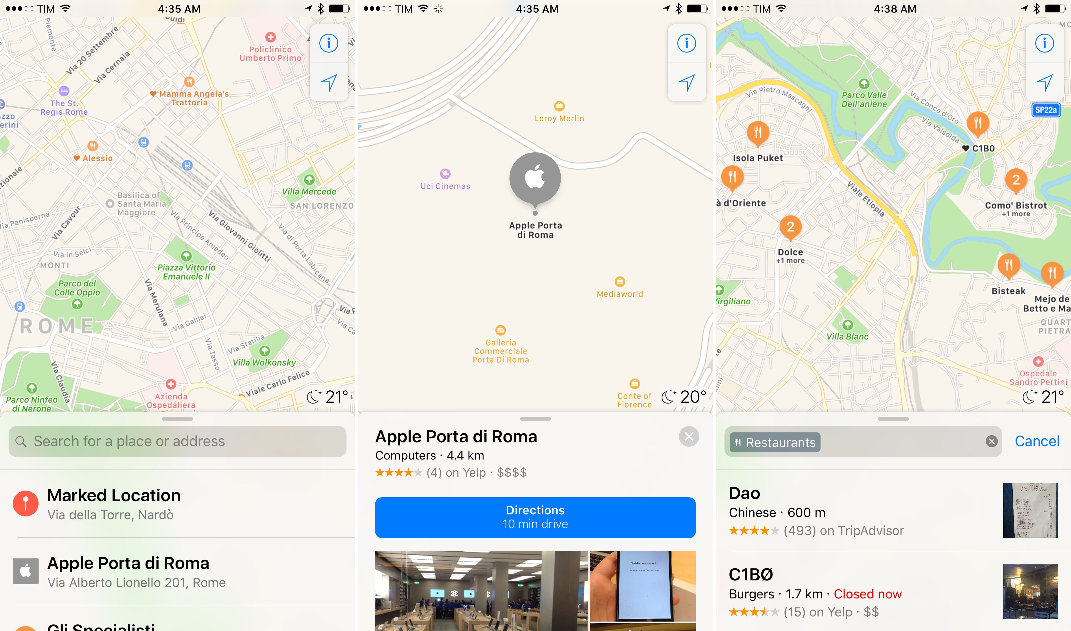
Iconography has always been one of the strong suits of Apple Maps, and the company is doubling down on it with iOS 10. Previously, when searching for places that pertained to a specific category such as Restaurants, Maps would drop generic red pins on the map, requiring you to tap on them to open a first popup, then tap again to open a detail view with information about the place. It was a slow, unattractive process that hid useful details from the first step of search results.
iOS 10 improves upon this in two ways. Instead of red pins, multiple search results are dropped on the map with more descriptive pins that suggest what a result is before tapping it. In the restaurant example, you’ll end up with icons that contain pizza slices, hamburgers, or a fork and knife, for instance. If two results are close to each other on the current zoom level, they’ll be grouped in a numeric orange pin that you can tap to choose one result.
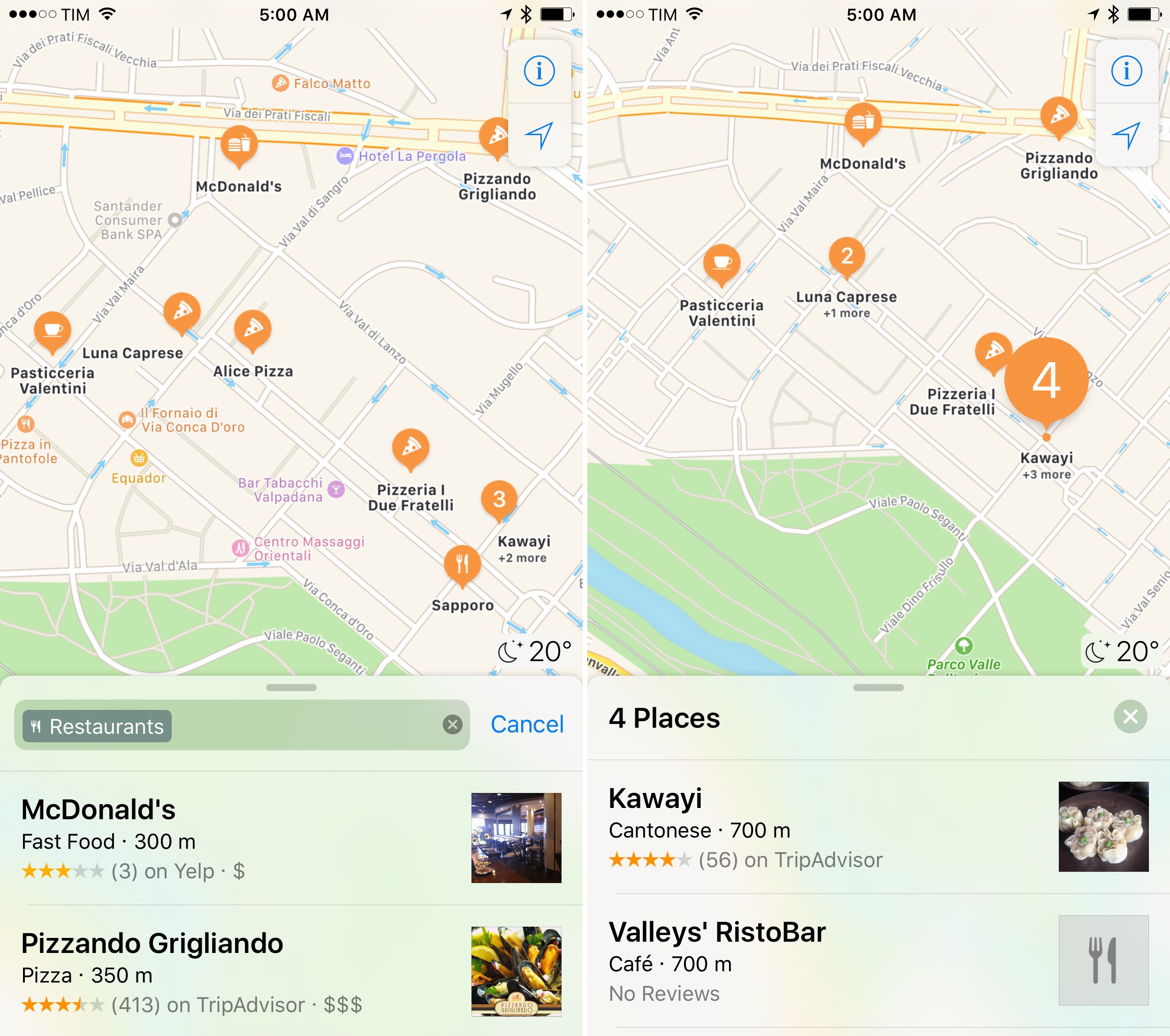
Second, choosing a result uses the iPhone’s search panel as a split view to display business information and the map at the same time. As you tap through results, you can preview place details with a card UI at the bottom that shows ratings, distance, and a button to start directions.
The interaction is similar on the iPad. Instead of managing result cards on the vertical axis, they’re overlaid horizontally in a sidebar on the left.
Maps results on iPadReplay
By combining these elements with cards that are more comfortable to reach, iOS 10’s Maps feels like it’s been optimized for humans and nimble exploration. By comparison, the old Maps feels static and arbitrary.
The same philosophy has been brought to navigation. In iOS 10, you can pan freely on the map and re-center navigation with a button.
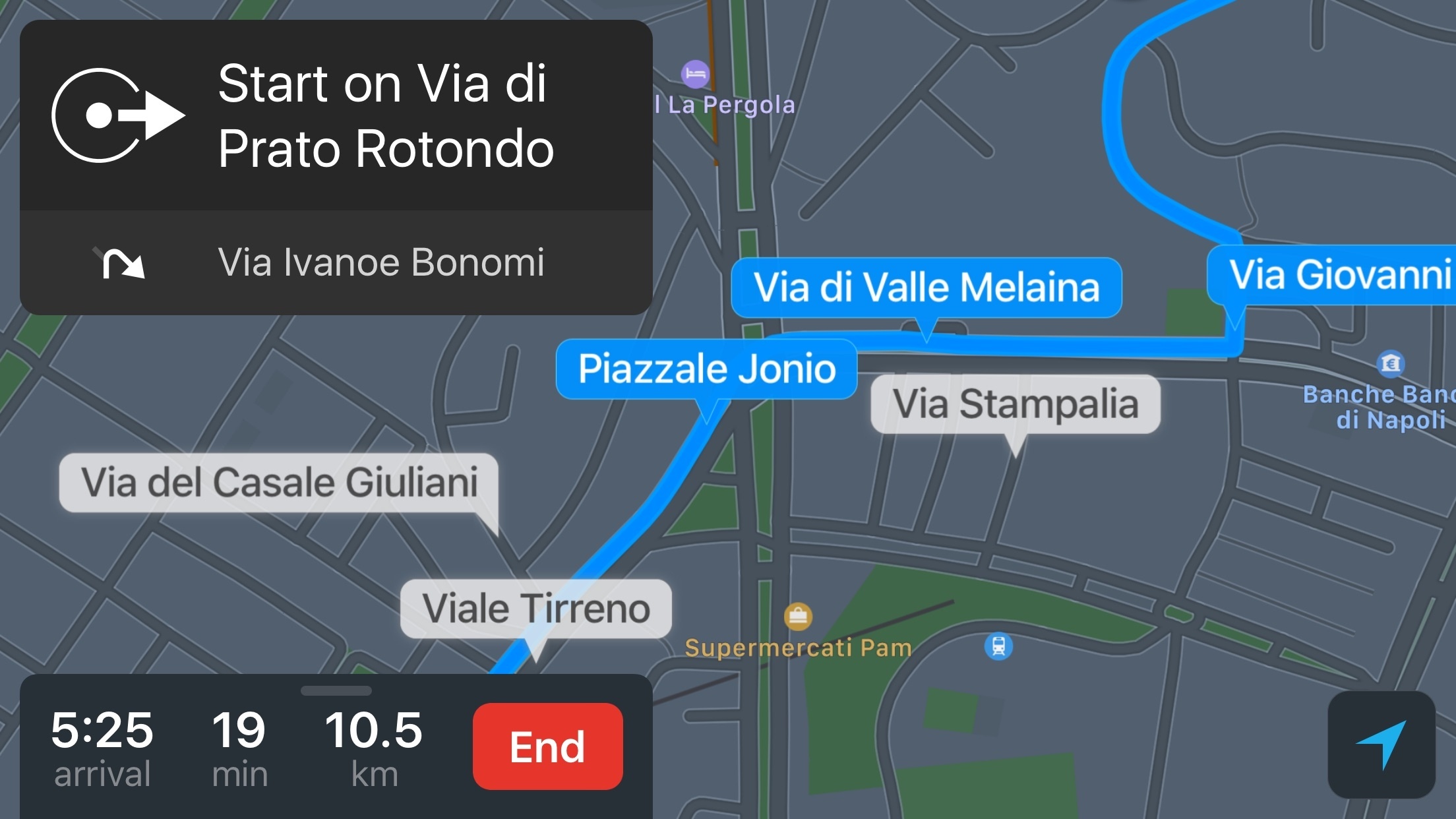
Details for the current trip, such as estimated arrival time and distance, are displayed in a bottom card, which, like results, can be swiped up to access more options. These include audio settings, turn-by-turn details, an overview, and, for the first time, en-route suggestions for places you might want to stop by, like gas stations or coffee shops.
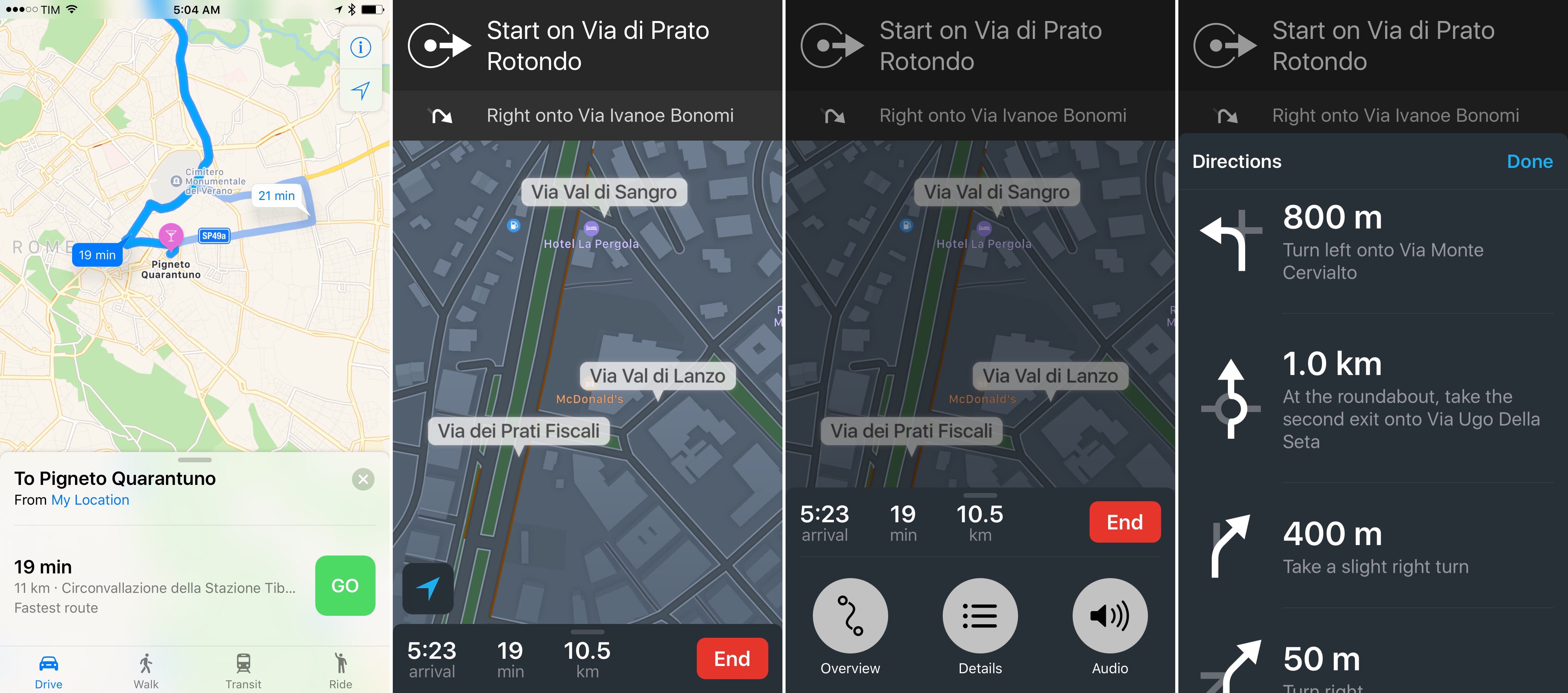
After selecting a category of suggestions during navigation, Maps will return a list of nearby results and tell you how many minutes each will add to your trip. Select one, confirm that you want to stop by, and Maps will update directions for the new destination. When you’re done, you can resume your route to the first destination with a blue banner at the top.
Apple is also going to let developers plug into Maps with extensions. If an app offers ride booking, restaurant reservations, and “other location-related services”, it can embed its functionalities in Maps.
Maps extensions, like SiriKit’s, are based on intents and developers can provide custom interfaces with an Intents UI extension. The same extensions that allow users to hail a Uber and track status with Siri can be used from Maps to get a ride to a selected place.49 Maps extensions contained inside iOS apps are disabled by default; they have to be activated from Settings > Maps > Extensions.
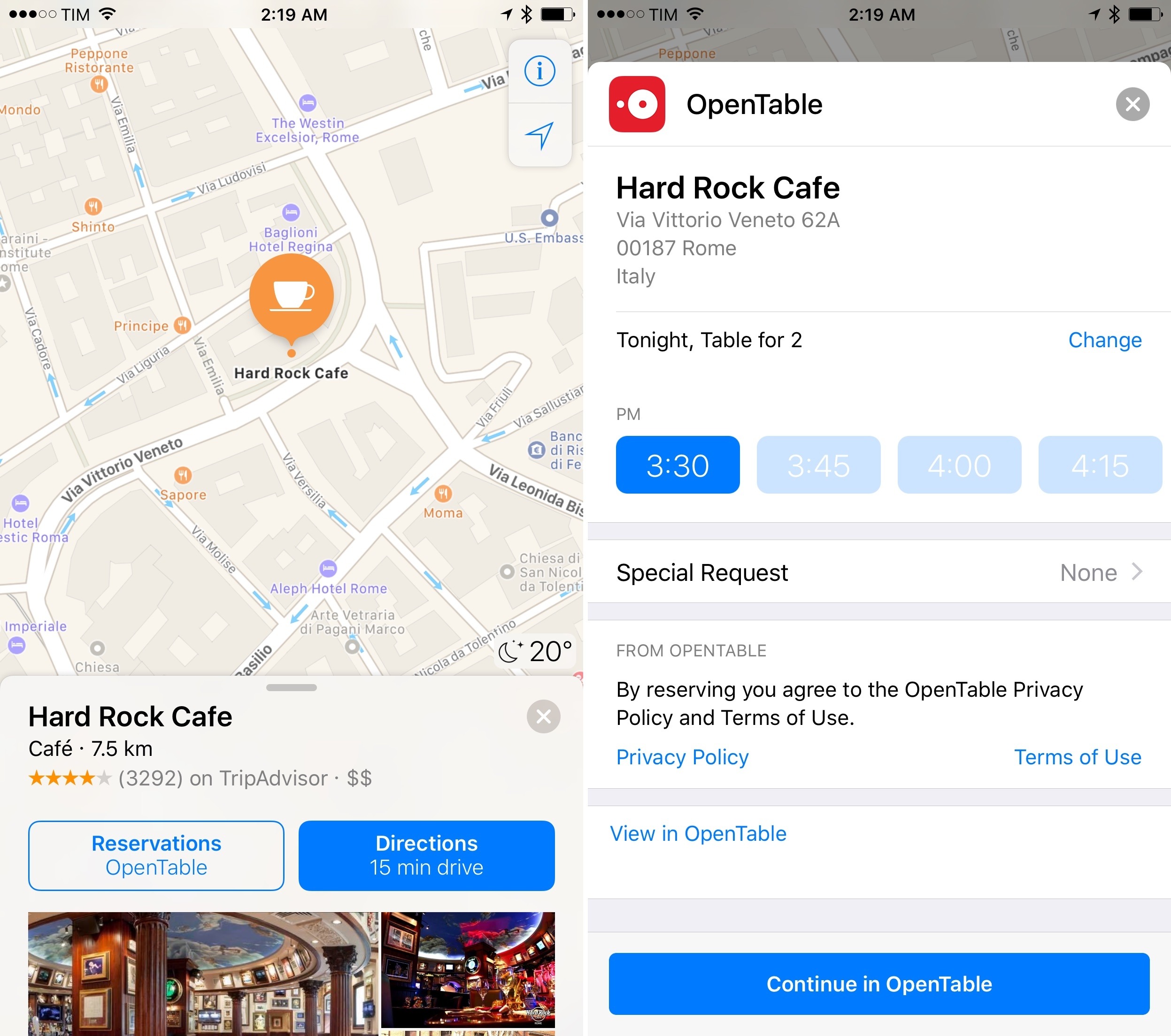
I’ve only been able to test OpenTable’s Maps extension earlier this week, which has limited integration in Rome for a few restaurants. Once enabled, OpenTable’s extension adds a button to view more information about a restaurant and make a reservation. You can set table size, pick available times, and enter special requests in Maps. OpenTable will ask you to continue the task in the main app to confirm a reservation, but it’s nice to have a way to quickly check times and availability without leaving Maps.
I’m curious to see how ride-sharing and other location-based services available in Italy will implement Maps extensions.
The quality of Apple Maps data for my area still isn’t comparable to Google Maps. Apple Maps has improved since iOS 6, but I still wouldn’t trust it to guide me through a sketchy neighborhood in Rome at night. At the same time, I prefer the design of Apple Maps and its many thoughtful touches to Google Maps. From my perspective, Apple has created a more intuitive, better designed app without the data and intelligence of Google. It’s an odd predicament to be in: while I appreciate Apple Maps’ look in iOS 10, I also want navigation to be reliable and trustworthy.
There’s a lot to like in Maps for iOS 10 and great potential for developers to elevate location-driven apps to a more contextual experience. The revised interface imbued with proactive suggestions is a step forward from iOS 9; the richer presentation of results makes Maps friendlier and informative. Maps in iOS 10 feels like someone at Apple finally sat down and tried to understand how regular people want to use maps on a phone. The redesign is outstanding.
Apple has perfected Maps’ interface and interactions, and now they have a developer platform, too. An underlying problem remains: when it comes to data accuracy, your mileage with Apple Maps may vary.
- The user retains the ability to preview a Uber car arriving to their location on the map and make a payment with Apple Pay. ↩