Apple Music
Of all system apps, Apple Music is the one that got a dramatic makeover in iOS 10.44
With a redesign aimed at placating concerns about an overly complex interface, and with new algorithmic discovery features, iOS 10’s Apple Music is streamlined and more powerful. Beneath a veil of astonishing simplification, the new Apple Music packs significant enhancements to the discovery and listening experience.
It’s Dangerous to Go Alone
If you had to list the shortcomings of Apple Music since its debut in iOS 8.3, a hodgepodge of features tacked onto a crumbling pre-streaming foundation would easily sit at #1. With iOS 10, Apple wants its music streaming service to be more accessible and intuitive for everyone who’s moved past iTunes.
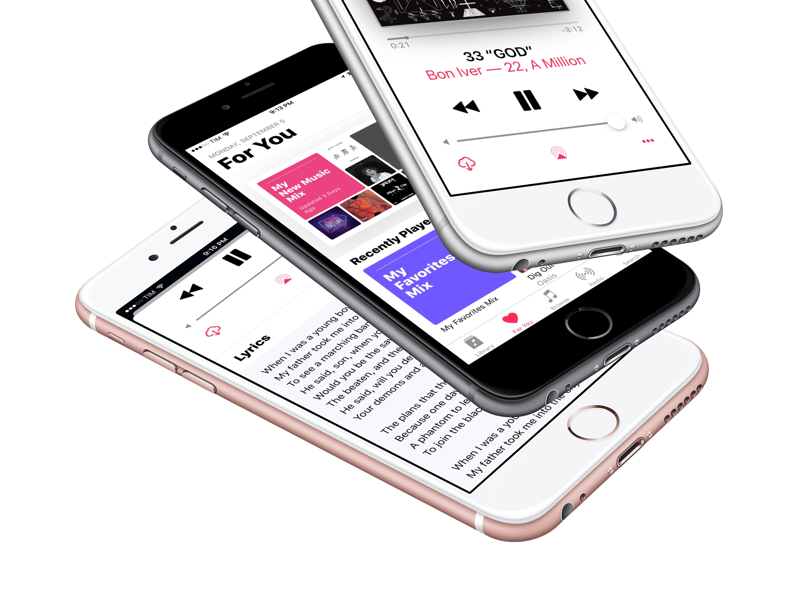
Part of this effort has resulted in a modern design language that does away with most iOS UI conventions in favor of big, bold headlines, larger buttons, and a conspicuous decrease of transparency in the interface. If you’re coming from Apple Music on iOS 9 and remember the information-dense layout and translucent Now Playing screen, prepare to be shocked by iOS 10’s rethinking of the Music app.
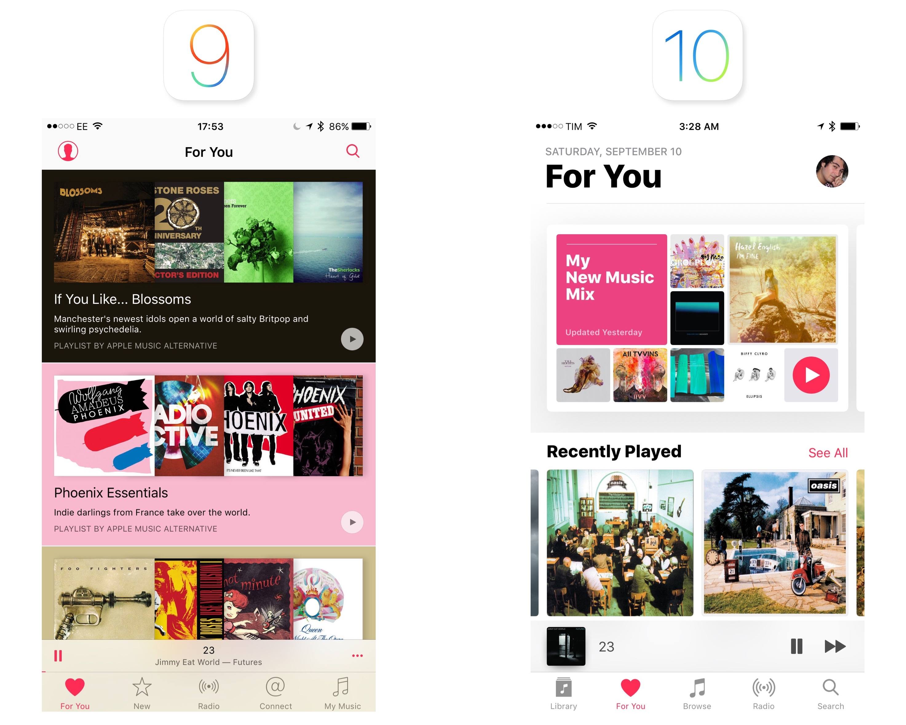
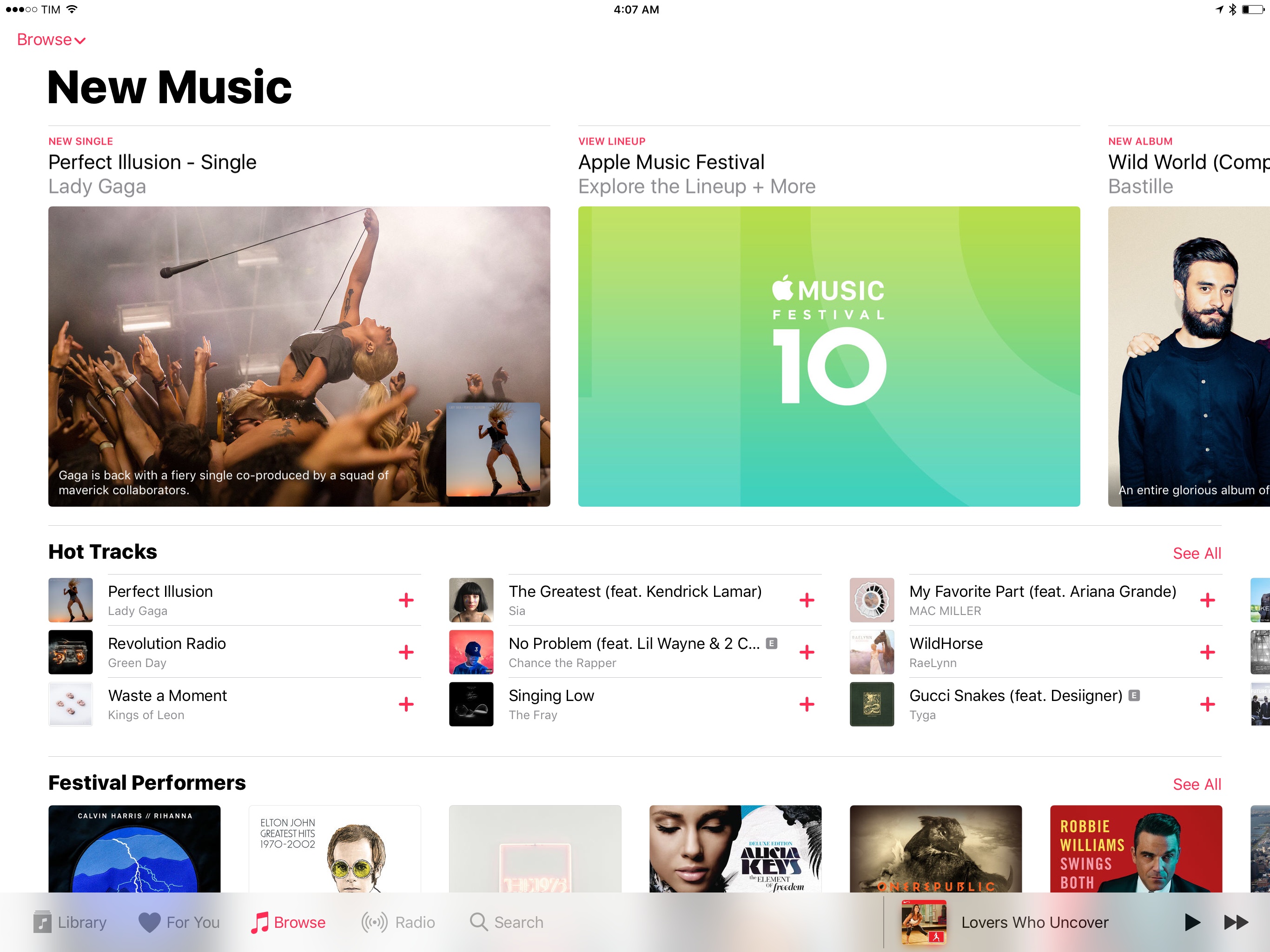
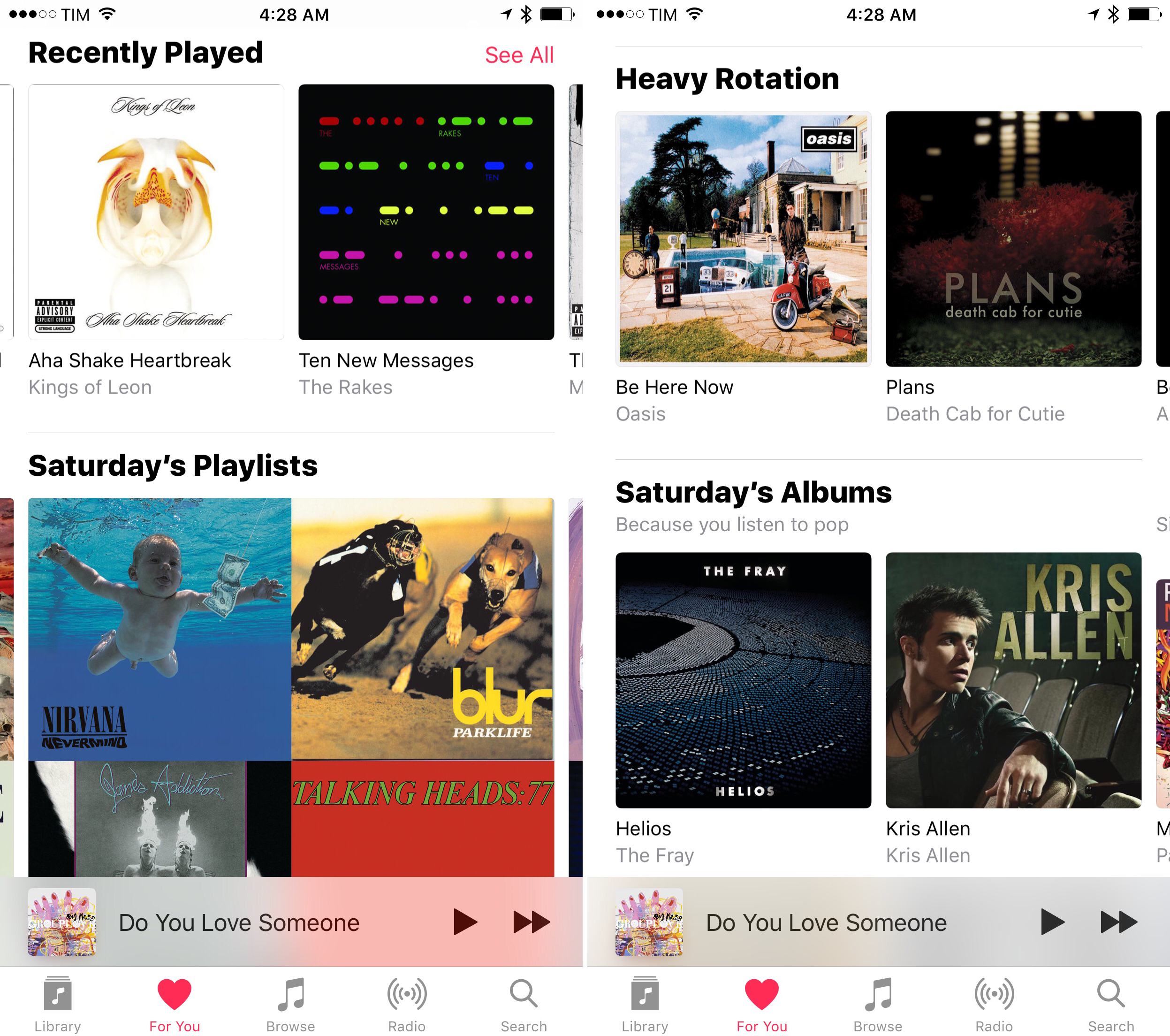
While the bold design has intriguing consequences for the overall consistency of iOS’ visuals, its impact on usability is just as remarkable. The new Apple Music is no longer following the interaction paradigms of the iTunes Store and App Store: there’s no front page highlighting dozens of top songs and curated recommendations. Instead, it’s been replaced by a simplified Browse page with a handful of scrollable featured items at the top and links to explore new music, curated playlists, top charts, and genres.
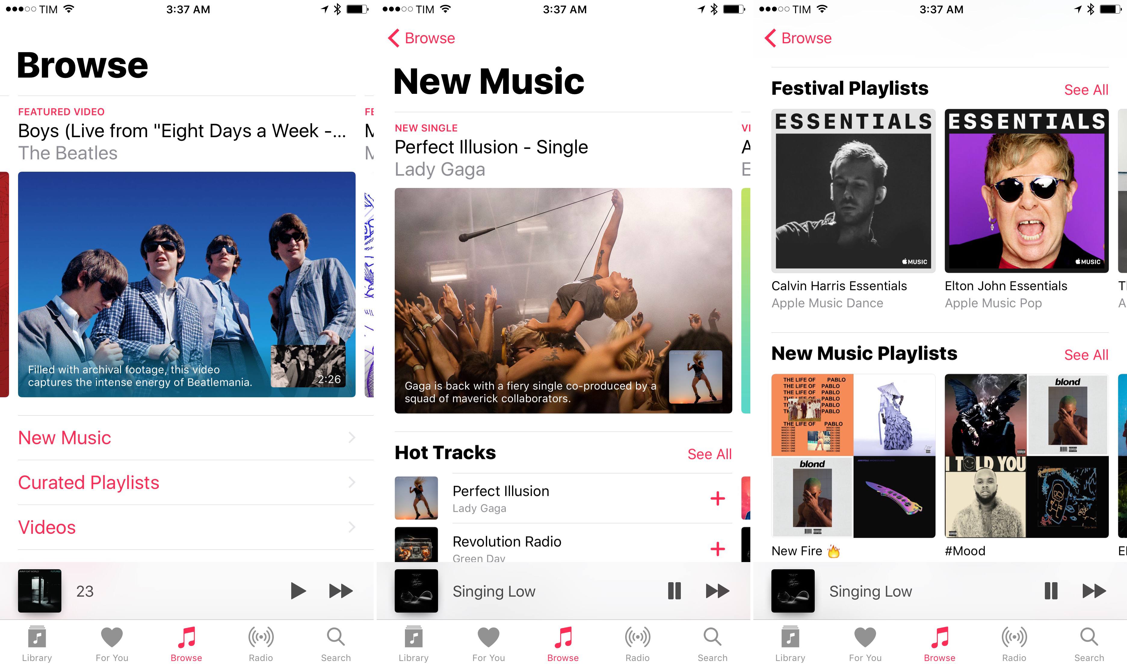
Removing new releases and charts from the Browse page helped Apple accomplish two goals: give each section more room to breathe; and highlight the most important items (singles, albums, videos, etc.) with a big cover photo that can’t be missed.
Being able to discern items with an effective sense of place is the underlying theme of navigation in the new Apple Music. On the one hand, information density has suffered and Apple Music can’t show as much content on screen as it used to. On the other, bold headlines, fewer items per page, and larger controls should prevent users (who aren’t necessarily well versed in the intricacies of the iTunes Store UI, upon which the old Apple Music was based) from feeling overwhelmed. Apple’s new design wants to guide users through Apple Music’s vast catalogue, and it mostly succeeds.
This is evident in the Library page, where Apple’s has switched from a hidden View menu to a set of vertical buttons displayed underneath the “title bar”. If you were confused by the taps needed to browse by Artist or view downloaded music in iOS 9, fear no more – Apple has created customizable buttons for you this time.
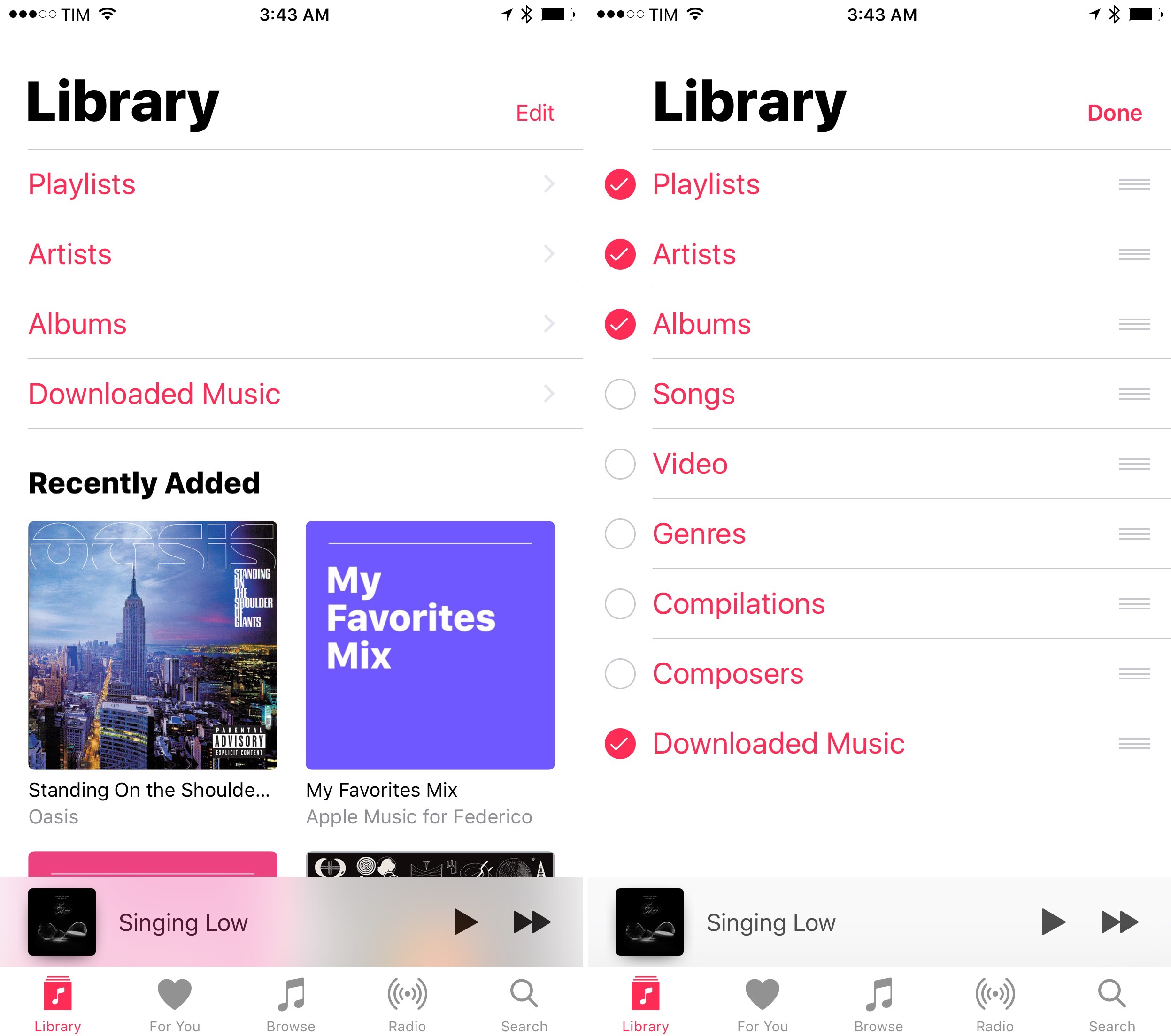
The same philosophy is shared by every other screen in Apple Music. Radio, search, even For Your recommendations – they’ve all moved on from the contortions of their iTunes-like predecessors to embrace clarity and simplicity through white space, large artworks, and big buttons.
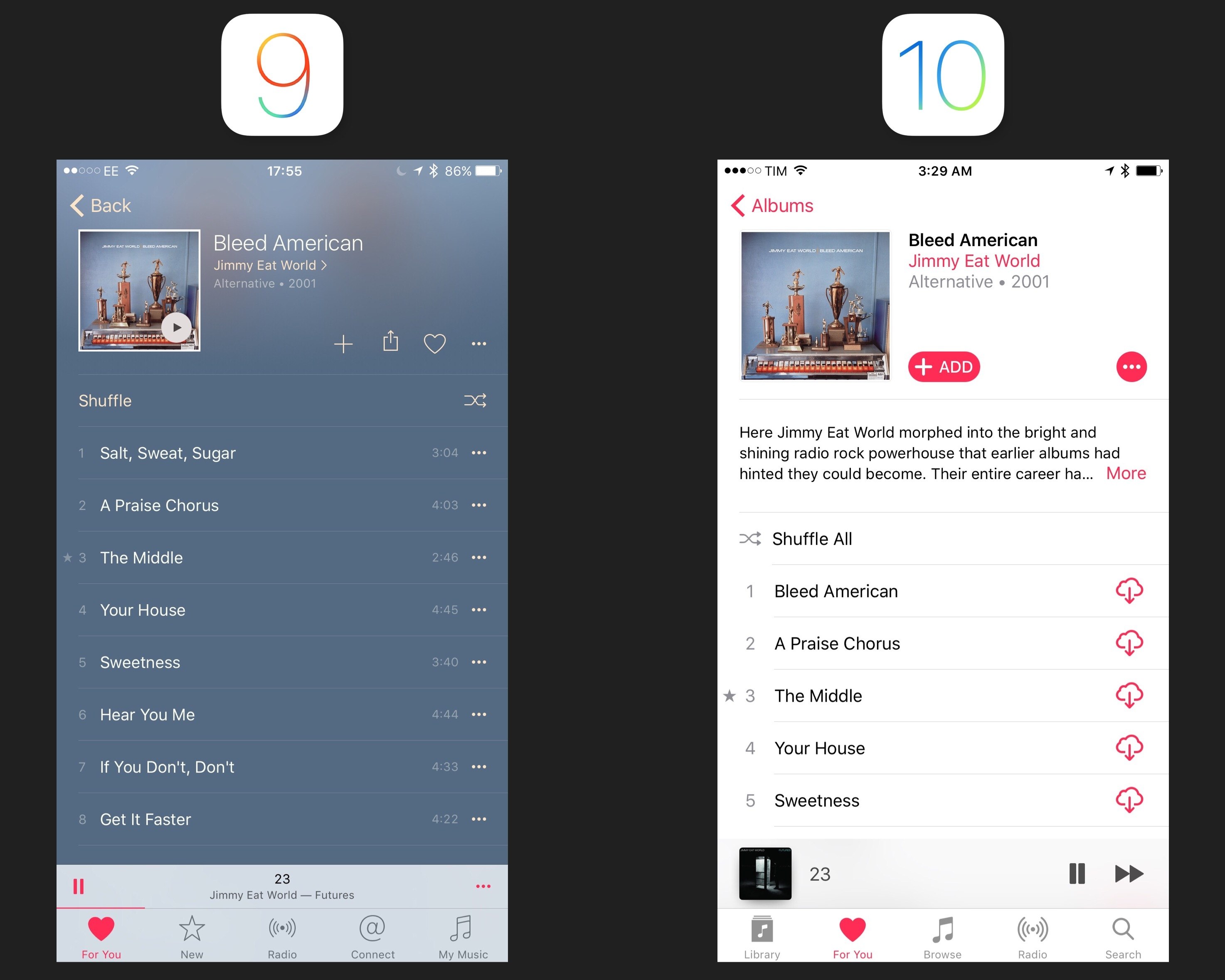
Another prominent change from iOS 9 is the removal of translucent panes of glass in the interface. Transparency effects look great in screenshots, but unpredictable color combinations don’t make a good case for legibility and consistency.
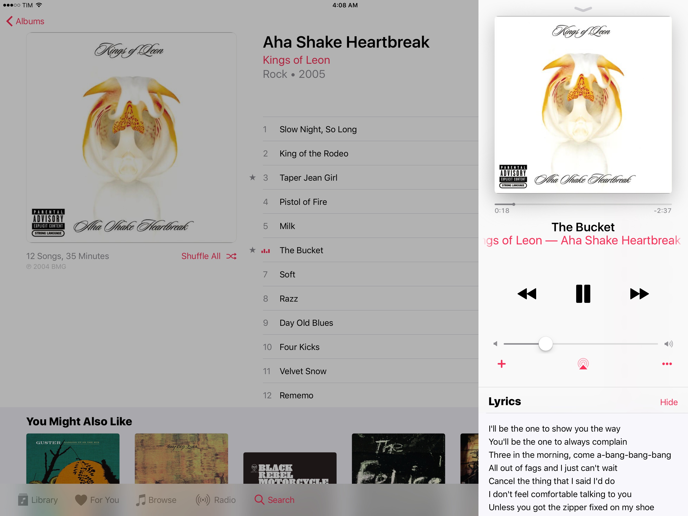
Apple is ditching translucency in the Now Playing screen altogether. In iOS 10, they’ve opted for a plain black-and-white design that lays out every element clearly and keeps text readable at all times.
It’s not as fancy as iOS 9, but it’s also not as over-engineered for the sake of beauty. Album artwork stands out against a white background; buttons are big and tappable; there’s even a nice, Material-esque effect when pausing and resuming a song. Alas, the ability to love a song with a single tap from the Now Playing screen is gone.
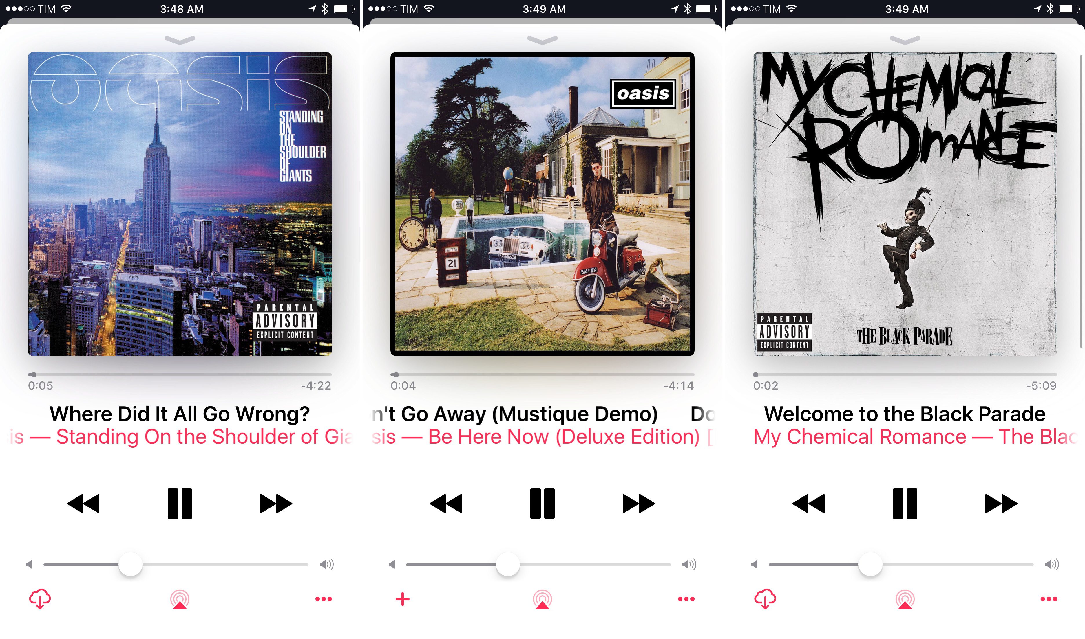
The new Apple Music is equal parts appearance and substance. The bottom playback widget45 has been enlarged so it’s easier to tap, and it also supports 3D Touch.46 Pressing on it reveals a redesigned contextual menu with options for queue management, saving a song, sharing, liking (and, for the first time, disliking), and, finally, lyrics.
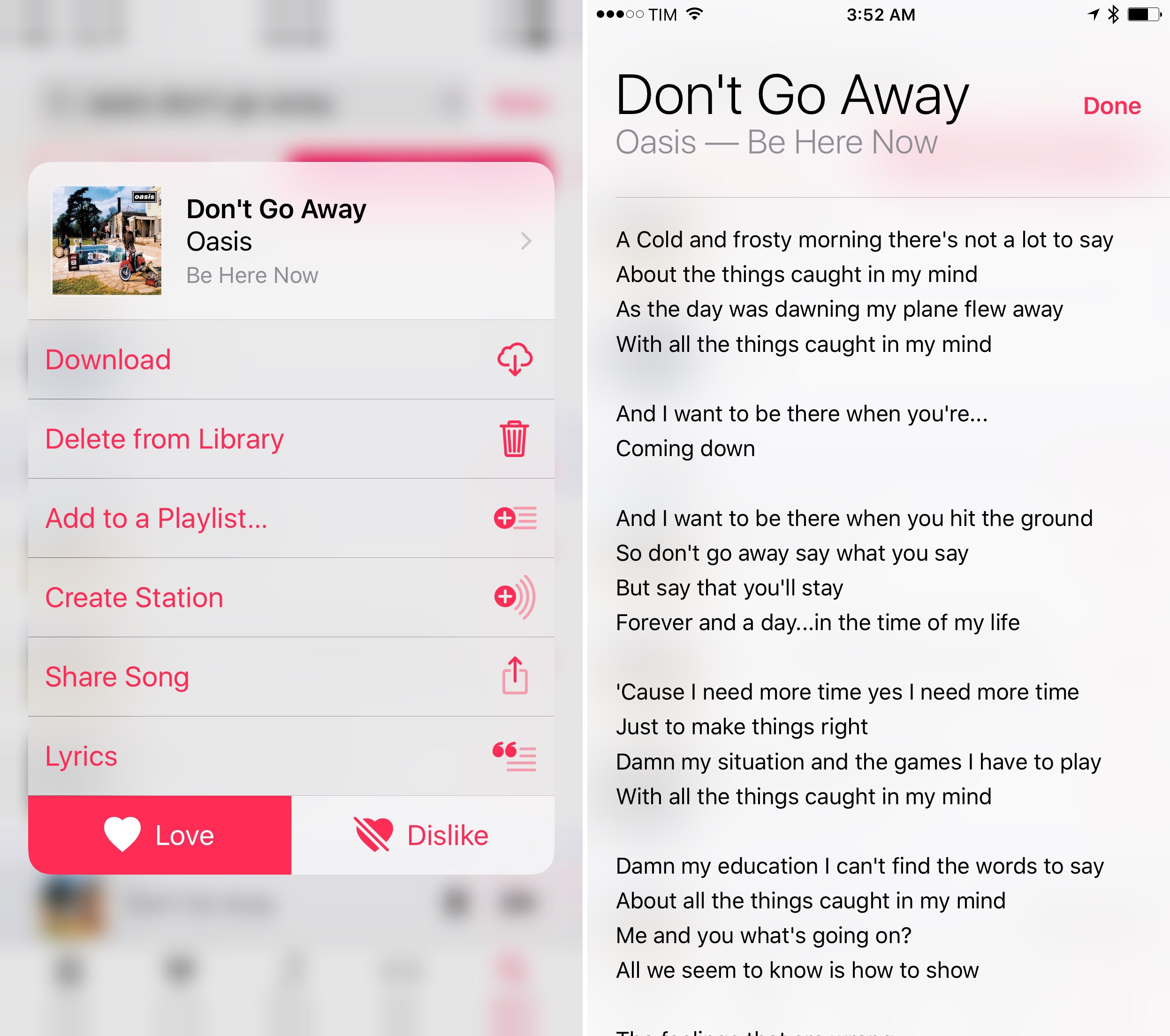
Apple Music integrates officially licensed lyrics in the listening experience. Apple has struck deals with rightsholders to make this happen; even if lyrics aren’t available for every song on Apple Music yet, they’ve seemed to grow during the beta period this summer, and I expect more lyrics to become available on a regular basis for new and old releases.
When lyrics are available, you’ll see an additional button in the contextual menu as well as a new section when swiping up on the Now Playing screen. This is where shuffle, repeat, and the Up Next queue live now; I wish Apple had done a better job at hinting this space exists below what you can see. There’s no indication that you can swipe up to reveal more options.
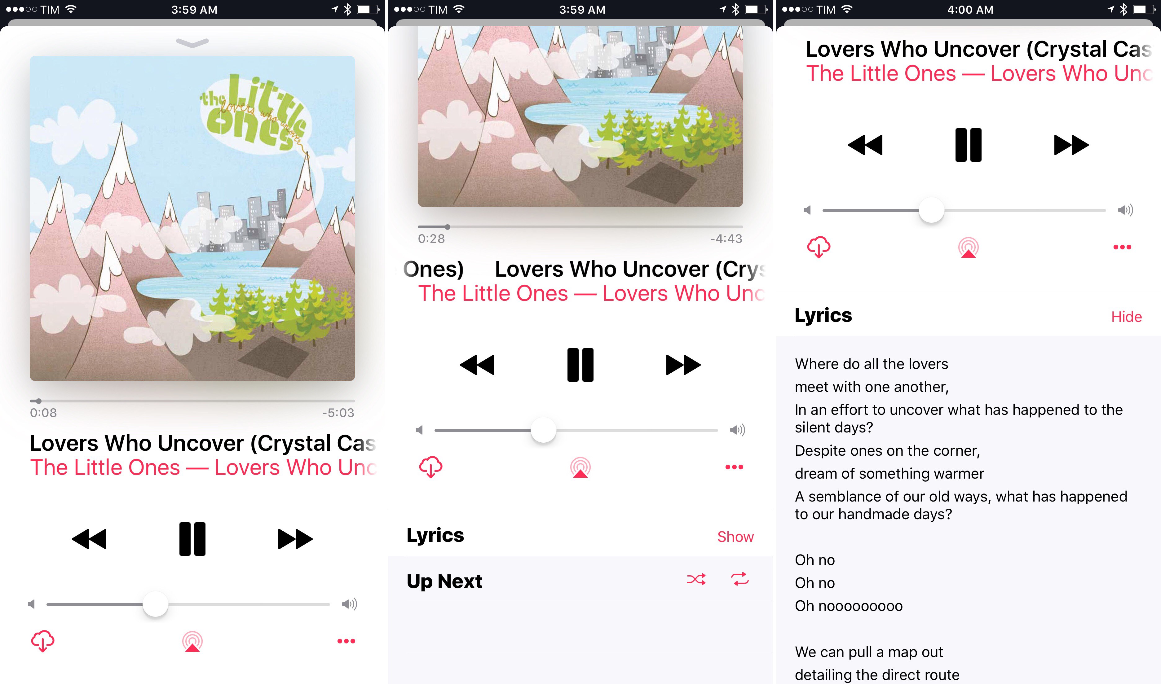
Lyrics, unlike Musixmatch, don’t follow a song in real-time. They’re either displayed in a full-screen popup (if opened from the contextual menu) or above Up Next in plain text.
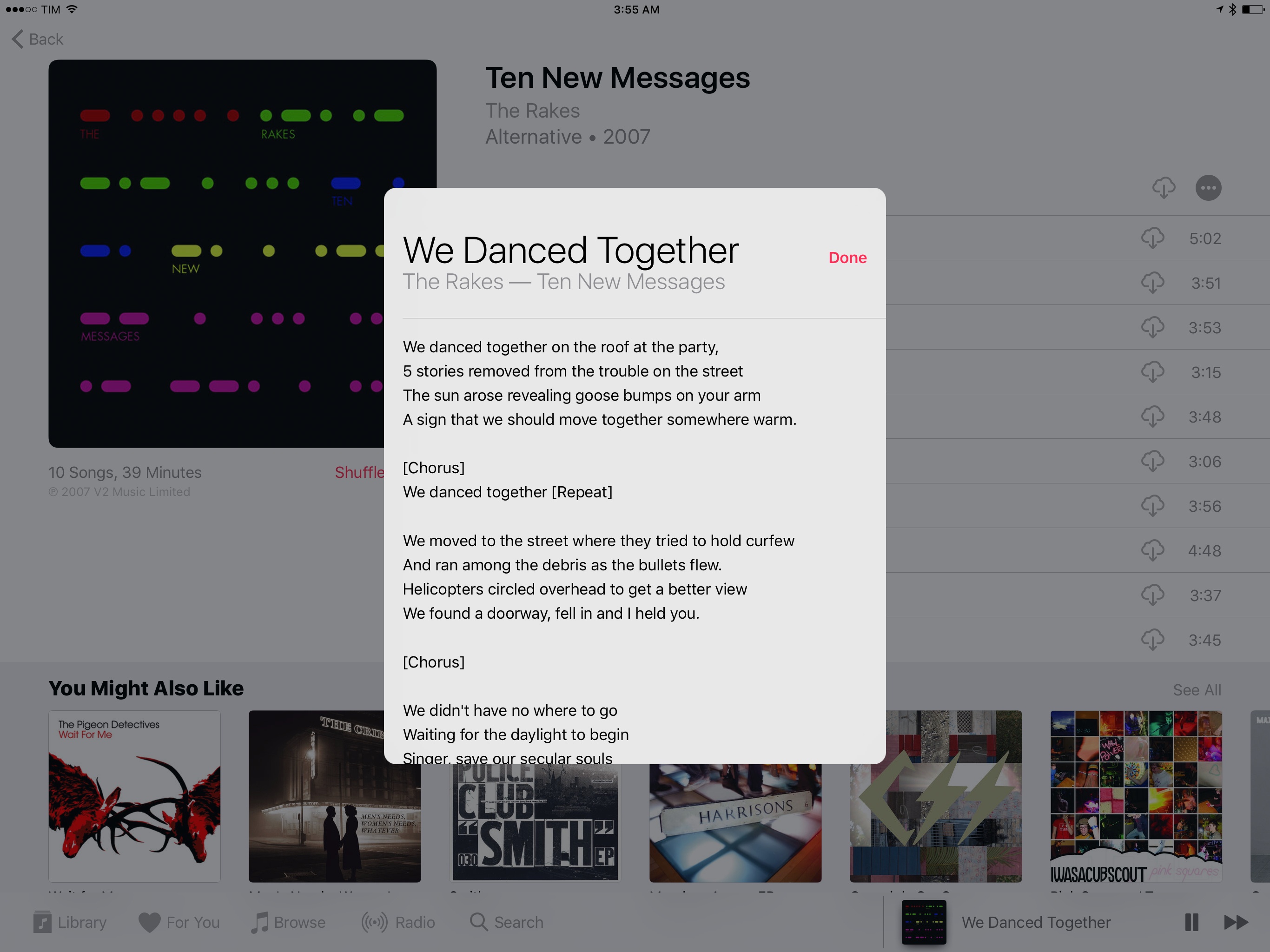
That’s not a deal-breaker, though. As a lyrics aficionado (I’ve also learned English through the lyrics of my favorite songs), this is a fantastic differentiator from other streaming services. Not having to Google the lyrics of what I’m listening and being taken to websites riddled by ads and often incorrect lyrics? I’m not exaggerating when I say that this feature alone might push me to use Apple Music every day again. I was hoping Apple would eventually bring native lyrics to Apple Music, and they delivered with iOS 10.47
Another functional improvement to the Now Playing screen is a built-in menu to control audio output. Taking a cue from Spotify, Apple Music sports a button in the middle of the bottom row of icons to switch between the iPhone’s speaker, wired and Bluetooth headphones, and external speakers with just a couple of taps.48
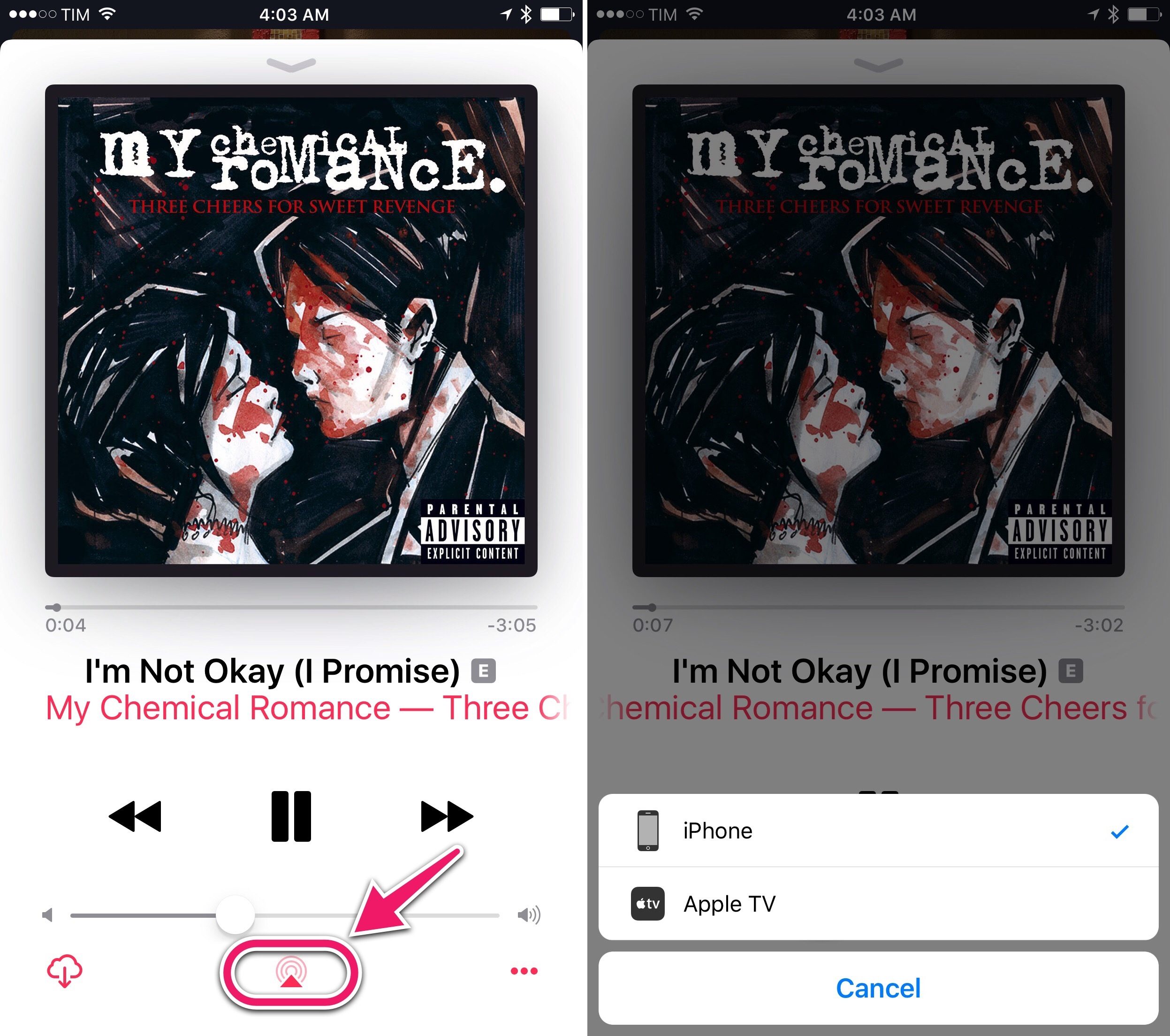
You don’t have to open Bluetooth or AirPlay settings to stream music to different devices. This was probably built with the iPhone 7 and AirPods in mind, but it’s a feature that makes managing audio faster for everyone.
Available in Settings > Music, a new Optimize Storage option lets iOS automatically remove music from your device that you haven’t played in a while. Unlike the similar setting for iCloud Photo Library, you can control the minimum amount of songs you want to keep downloaded on your device with four tiers. On my 64 GB iPhone 6s Plus, I see the following options:
- 4 GB (800 songs)
- 8 GB (1600 songs)
- 16 GB (3200 songs)
- 32 GB (6400 songs)
If you have an older iOS device with limited storage, this should be useful to ensure a compromise of available space and offline songs.
Music on iPad
Apple Music for iPad doesn’t diverge from the iPhone counterpart much, but there a few differences worth noting.
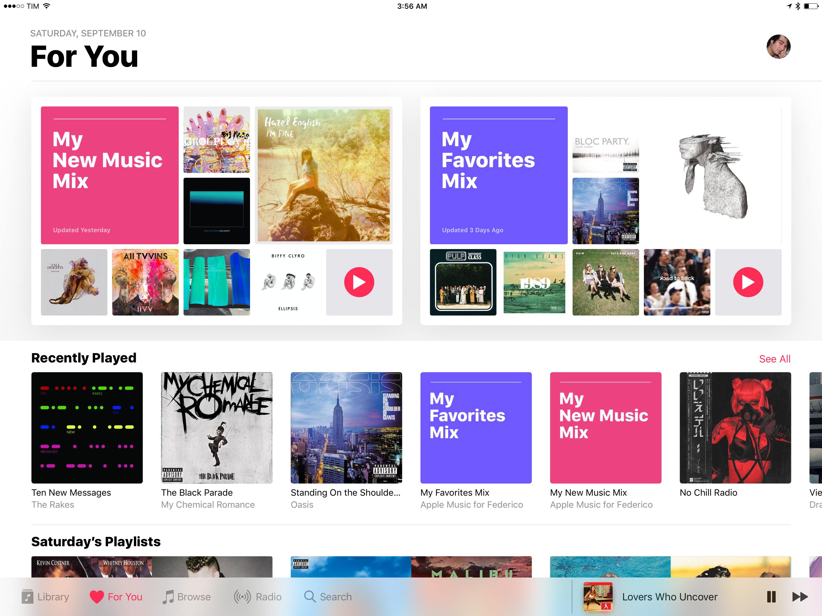
The Browse page collects featured items, hot tracks, new albums, playlists, and more within a single view, with buttons to explore individual sections placed in a popover at the top.
Instead of taking over the app in full-screen, playing a song opens a Now Playing sidebar. The view is launched from a tab bar split between icons and the playback widget.
The sidebar feels like having Slide Over within Music: it doesn’t behave like Safari or Mail’s in-app split view, where you can interact with two views at the same time; instead, it’s modal and overlaid on top of content.
It’s not immediately clear why Apple didn’t stick to a full-screen Now Playing view on the iPad if the sidebar still prevents interactions on the other side. Perhaps they realized giant-sized album artwork didn’t make sense on the iPad Pro? Maybe the vertical layout lends itself better to peeking at Up Next and lyrics below playback controls? The sidebar is fine, but I’d rather have a real in-app split view in Music too.
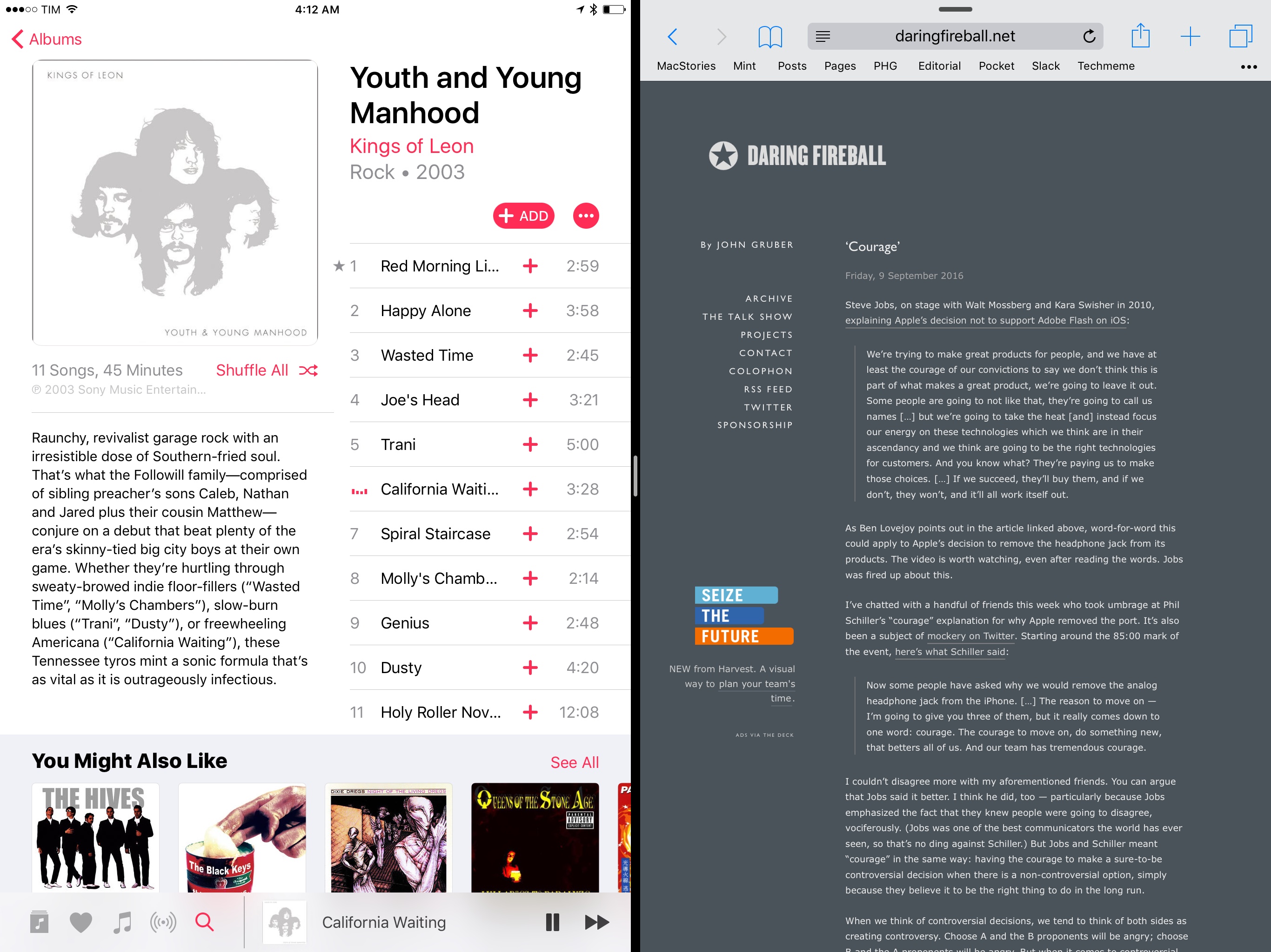
The Split View that Music does have on iOS 10 is the system-wide multitasking one. On the 12.9-inch iPad Pro, Now Playing is a sidebar in both Split View layouts when Music is the primary app, but it turns into a full-screen view when Music is the secondary app in Slide Over.
New Discovery
iOS 10 brings discovery features that pit Apple Music against Spotify’s algorithmic playlists and personalized curation.
Apple Music’s For You page features two personalized playlists in a carousel at the top – My New Music Mix and My Favorites Mix. Both are automatically refreshed every week and are personalized for each user based on their listening habits and favorite songs.
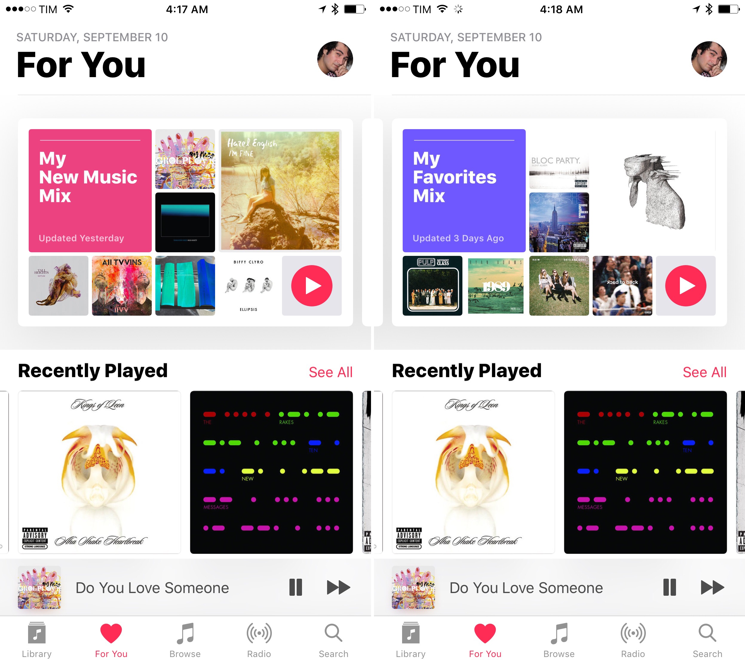
My New Music Mix, refreshed every Friday, showcases new music Apple Music thinks you’ll like; My Favorites Mix is a collection of hit singles, deep cuts, and songs related to your favorite artists that is refreshed every Wednesday.
The idea of a personalized mixtape refreshed on a weekly basis isn’t new. Spotify was a pioneer in this field with their excellent Discover Weekly, which recently expanded to Release Radar. Spotify’s system is powered by a neural network (its inner workings are utterly fascinating) and, as I previously wrote, it delivers impressive personalized picks that almost feel like another person made a mixtape for you.
It’s too early to judge Apple’s efforts with personalized playlists in iOS 10. They only rolled out two weeks ago, and, in my experience, such functionalities are best evaluated over a longer span of time after judicious listening and “loving” of songs.
My impression, however, is that Apple has succeeded at launching two great ways to discover new music and re-discover old gems every week. My first two My Favorites Mix playlists have been on point, collecting songs (both hits and lesser known ones) from all artists I knew and liked. Apple Music’s first two My New Music Mix playlists weren’t as accurate as Spotify’s Release Radar, but, to be fair, I have been religiously using Spotify for over 9 months now, whereas I just came back to Apple Music. Accuracy may still be skewed in Spotify’s favor given my listening’s history.
Still, we don’t need to wait to argue that algorithmically-generated playlists refreshed weekly are a fantastic addition to Apple Music. As I noted in my story on Spotify’s Discover Weekly earlier this year, human curation is inherently limited. Apple has been at the forefront of human-made playlists, but it was missing the smart curation features of Spotify. Apple’s two personalized mixes seem more – pardon the use of the term – mainstream than Discover Weekly, but that isn’t a downside. Easing people into the idea of personalized playlists made by algorithms and then launching more specific types focused on music aficionados might be a better consumer approach than Spotify. I’d wager Apple is considering a product similar to Spotify’s Discovery Weekly – a playlist that highlights back-catalogue songs you might like from artists you’re not familiar with.
My New Music Mix and My Favorites Mix already seem very good, and they show that Apple can compete with Spotify when it comes to personalized music curation. As with other algorithmic features launched in iOS 10, Apple’s debut is surprisingly capable and well-reasoned.
There are other changes in the For You section. Connect, already an afterthought in iOS 9, has been demoted from standalone view to a sub-section of For You.
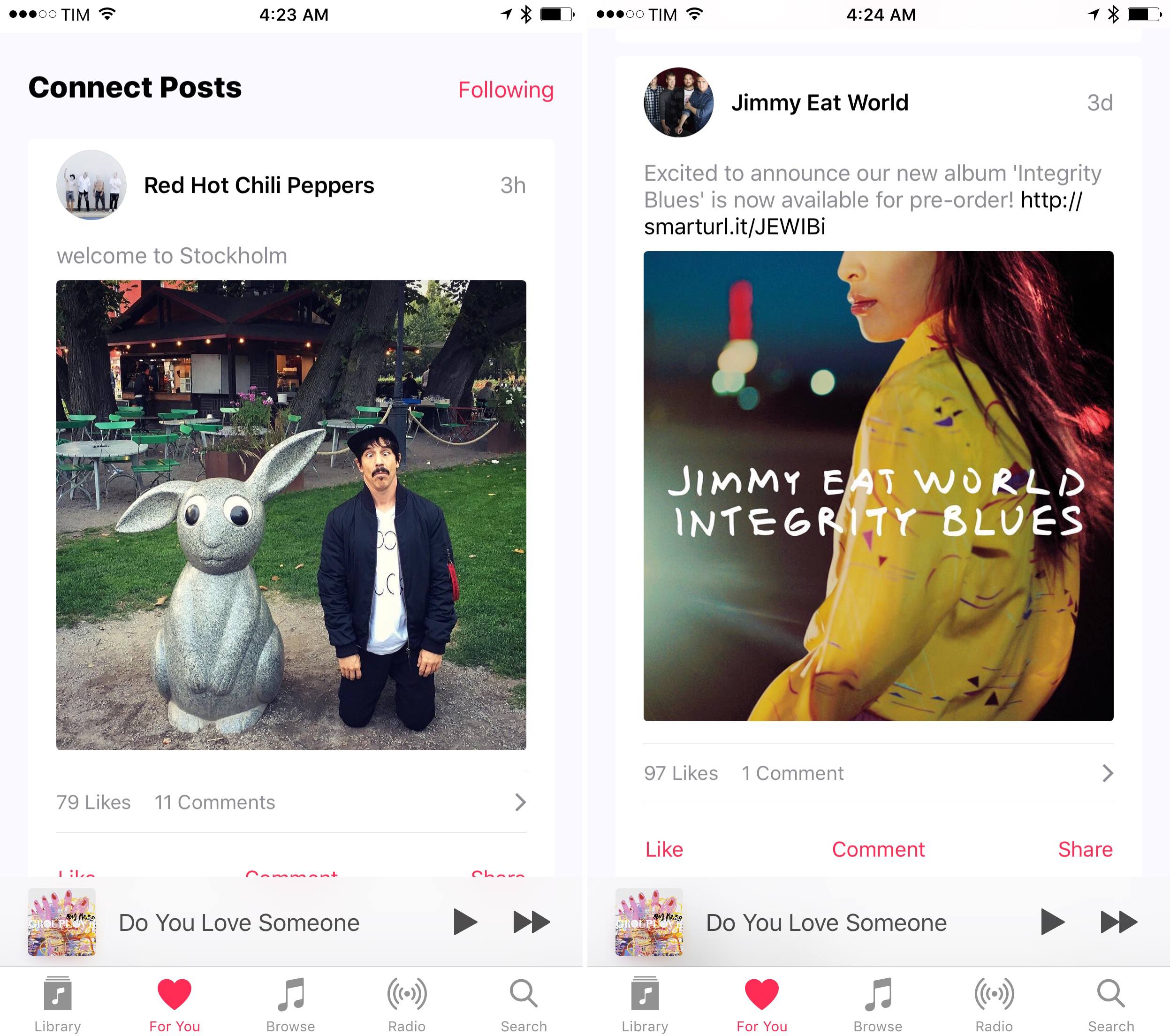
Some people must be using Connect (who’s leaving those comments?), but I just don’t see the incentive for artists to post on it and for users to subscribe. Apple doesn’t seem to care about it as a social network, and everyone is better off engaging with fans and following artists on Twitter and Facebook. Unless Apple gives it another try, I don’t think Connect can suddenly gain relevancy. Rolling Connect into For You feels like Apple’s version of “going to live in a farm upstate”.
Playlists and sections recommended in For You have been redesigned and shuffled around. Every section can now be scrolled horizontally to reveal more content; Recently Played and Heavy Rotation tend to float towards the top for easier access; and there’s the usual mix of artist spotlights, essentials (they’re not called “Intro To” anymore), human-curated playlists, and a new section called New Releases For You.
If you liked Apple’s For You section before, you won’t be disappointed by iOS 10’s refresh. But I believe My New Music Mix and My Favorites Mix will steal the show for many.
I’m still not sure if I want to give Apple Music another try – I’ve been truly satisfied with Spotify since I moved back to it in January. Apple’s updates in iOS 10 are compelling, though. I got used to the “big and bold” design quickly, and I find it easier to parse and more fun than Spotify’s boring black and green. Apple Music may sport lower information density, but, at least for me, it’s easier to use than Spotify. Personalized playlists are solid already, and I’ve been keeping My Favorites Mix synced offline for fast access to a collection of songs I know I’m going to like. And then there’s lyrics, which is nothing short of a game changer for me.
Apple’s firing on all cylinders against Spotify and others in the music streaming industry. It might be time to take Apple Music for a spin again.
- I'll refer to the app as Apple Music, even if it can be used without the streaming service, because I've been streaming music for years and I no longer have a local music library to manage. ↩
- The only place where translucency lives on, given how content scrolls under it. ↩
- Unfortunately, Apple removed the progress bar from the bottom widget, which makes it harder to see your position in a song at a glance (you have to either use Control Center or open Now Playing). ↩
- I'm nitpicking, but I've found some mistakes in Apple's lyrics. Nothing major – things like inverted prepositions or abbreviated verbs that shouldn't have been – but worth mentioning. I noticed it about 10 times out of hundreds of songs I tried. It's probably something Apple can't fix because they're licensing lyrics (I'd love to know from whom). ↩
- When recording an iOS device's screen with QuickTime on macOS, the menu says "System Capture". ↩