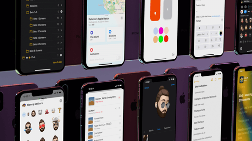
Share Sheet
After somewhat of a false start in the beta period earlier this summer, iOS 13’s redesigned share sheet has turned out to be one of my most appreciated improvements to the system. I was very skeptical of Apple’s ideas at first; by listening to feedback and iterating the design over the span of multiple betas, I believe they’ve managed to ship the best version of the share sheet the platform has seen to date.
The new share sheet revolves around two key concepts that have influenced its refreshed design: there is a new section for intelligent sharing suggestion based on your contacts, and action extensions have been reorganized with favorites, app-specific actions, and shortcuts.
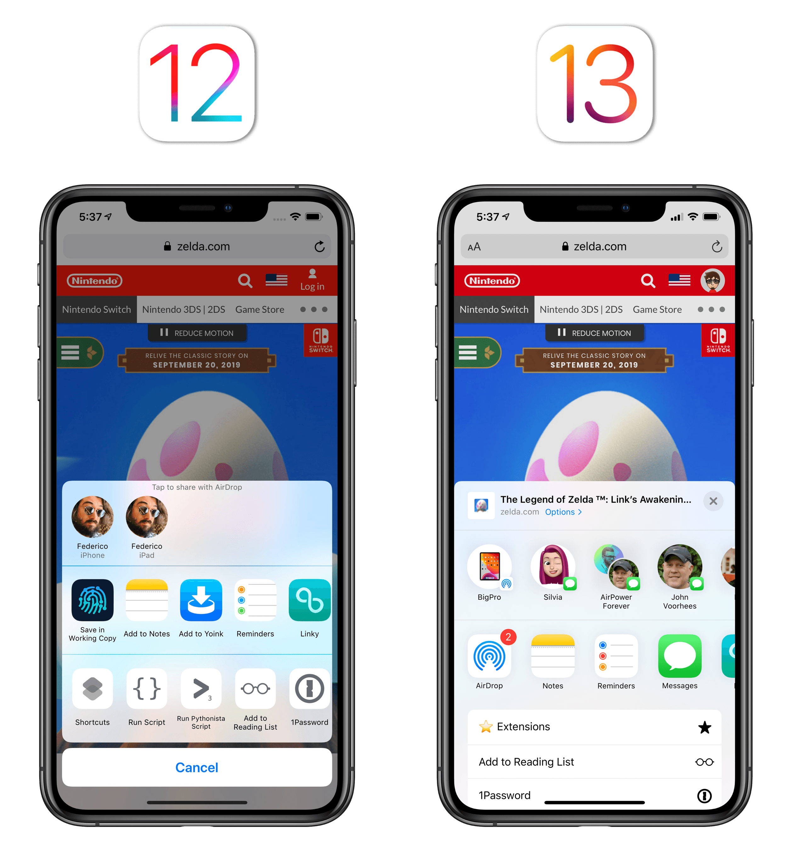
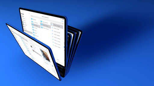
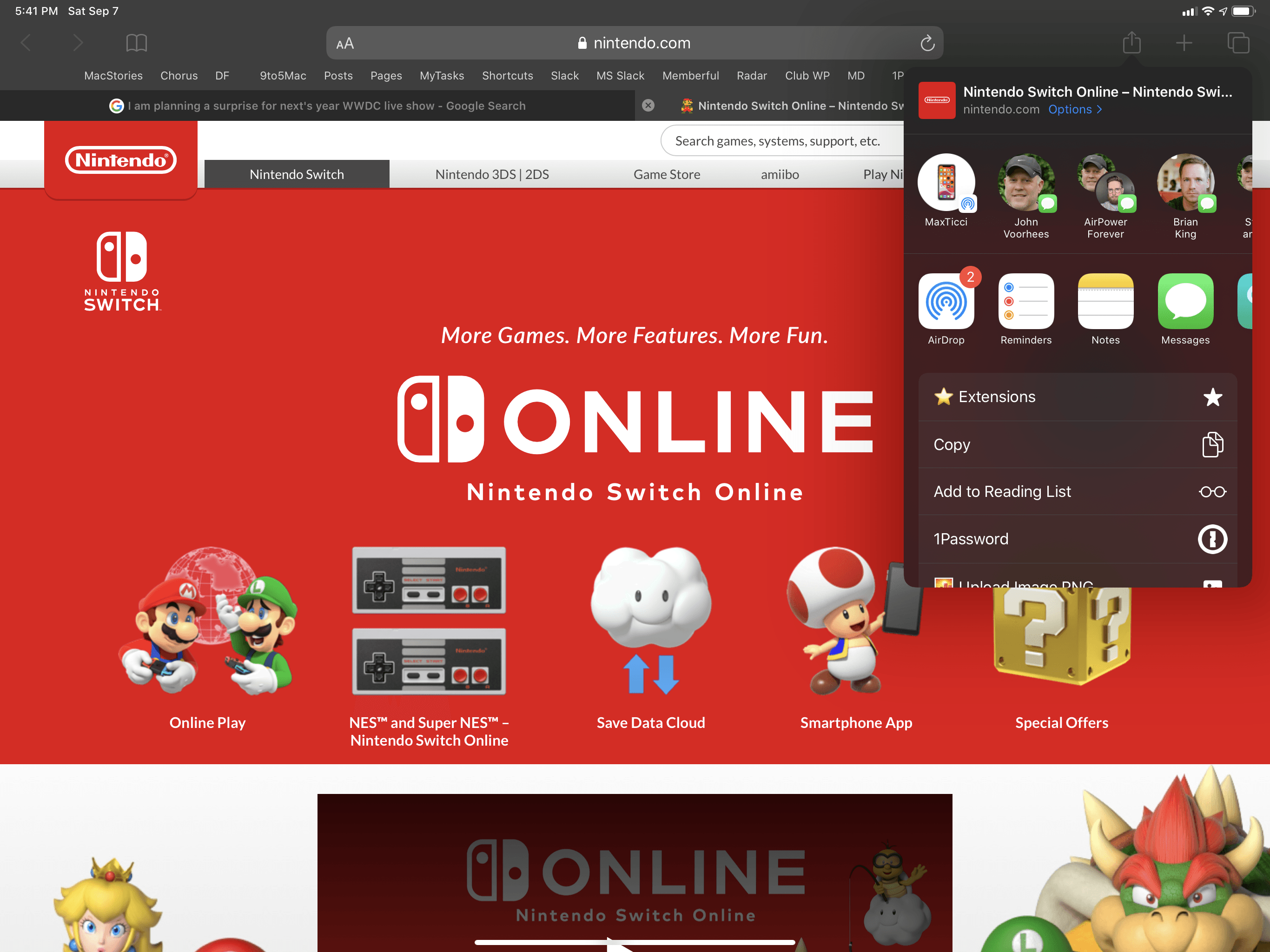
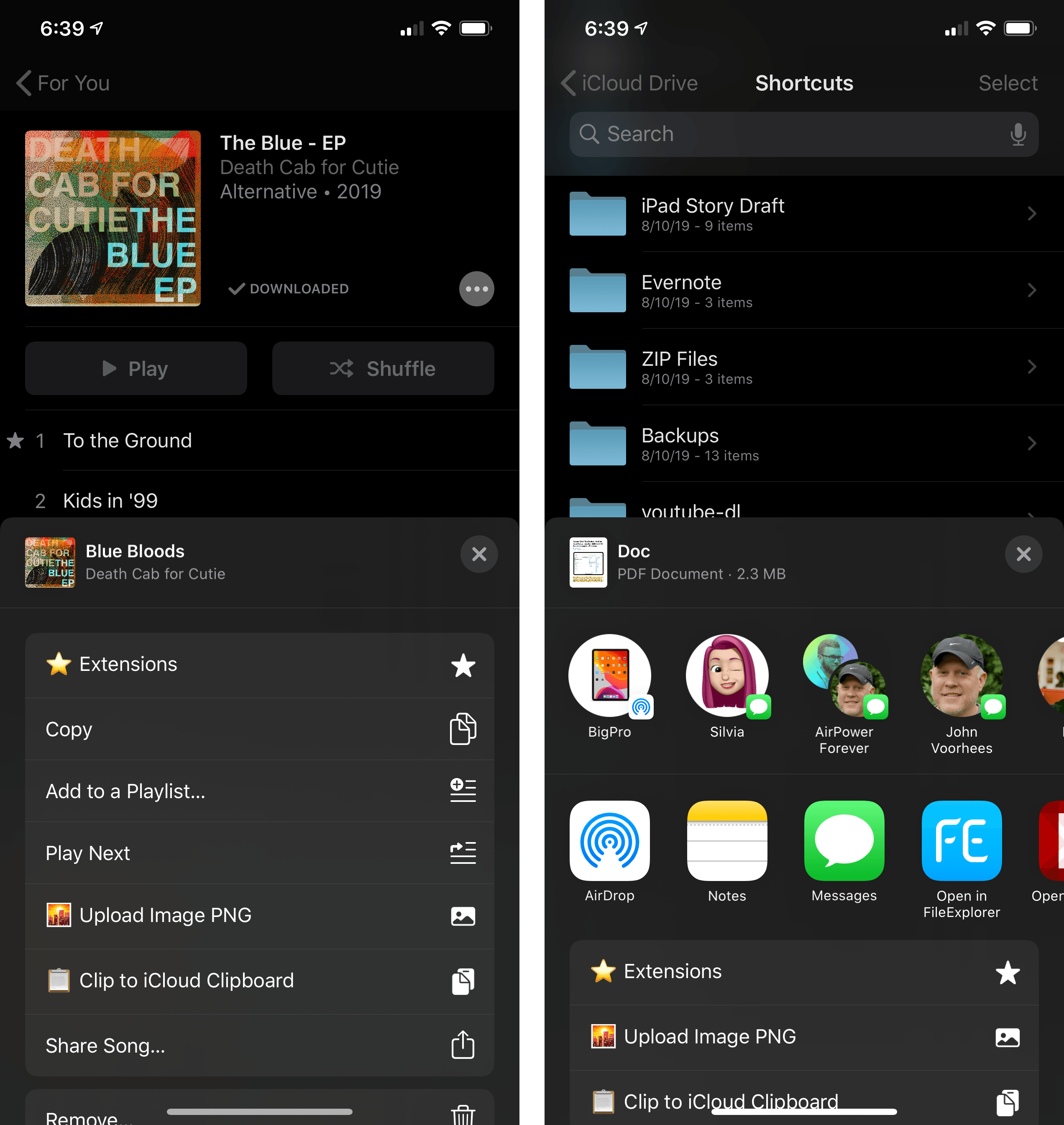
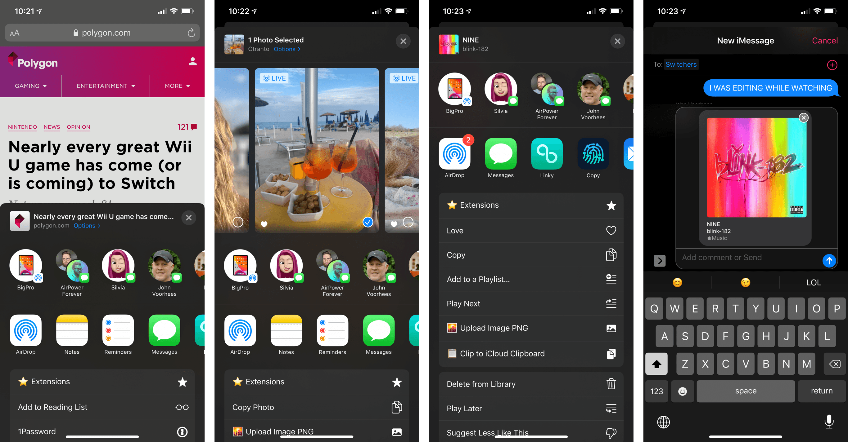
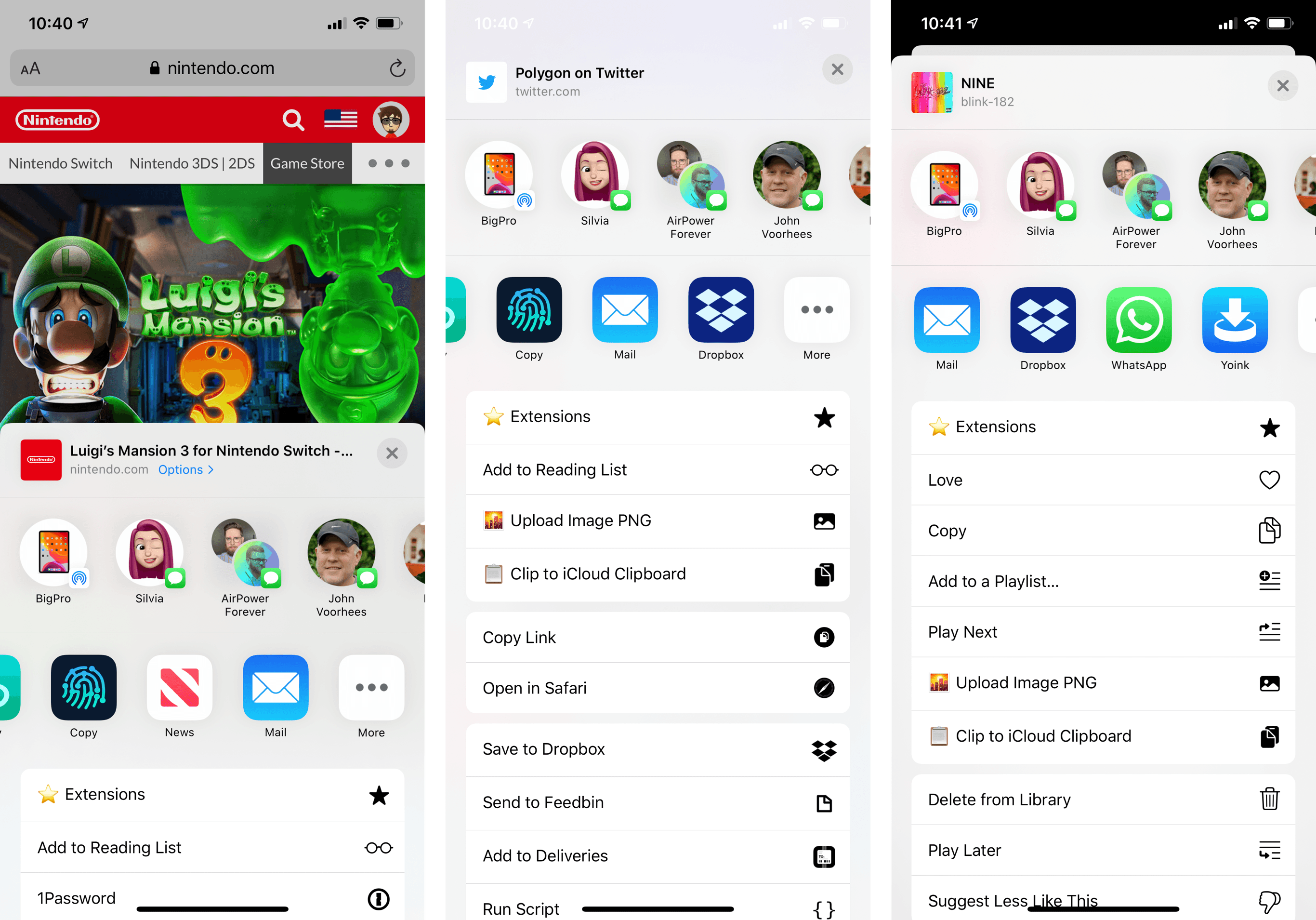
By default, the share sheet is presented as a card that slides up from the bottom to cover roughly half of the screen. The sheet features a header that displays the type and name of content being shared, and it’s followed by contact suggestions and share extensions laid out in two horizontal, scrollable trays. Upon first glance, the rows of icons are consistent with the scrolling behavior of the old share sheet, resulting in a familiar experience for those seeking to share a photo or link with friends or on social networks.
The new share sheet’s big change lies in where action extensions are located and how they’re presented to users: instead of a third row of icons, actions are now a vertical list, which is divided into favorites, actions specific to the current app, and other extensions. Actions are grouped in sections using padded table views (more on this later) and they’re displayed with a left-aligned text label and a small glyph on the right side. By default, only a couple items from your favorite action extensions are displayed when the share sheet comes up as a half-sized panel; you can reveal the full share sheet by swiping it upward, thus turning it into a full-screen card.
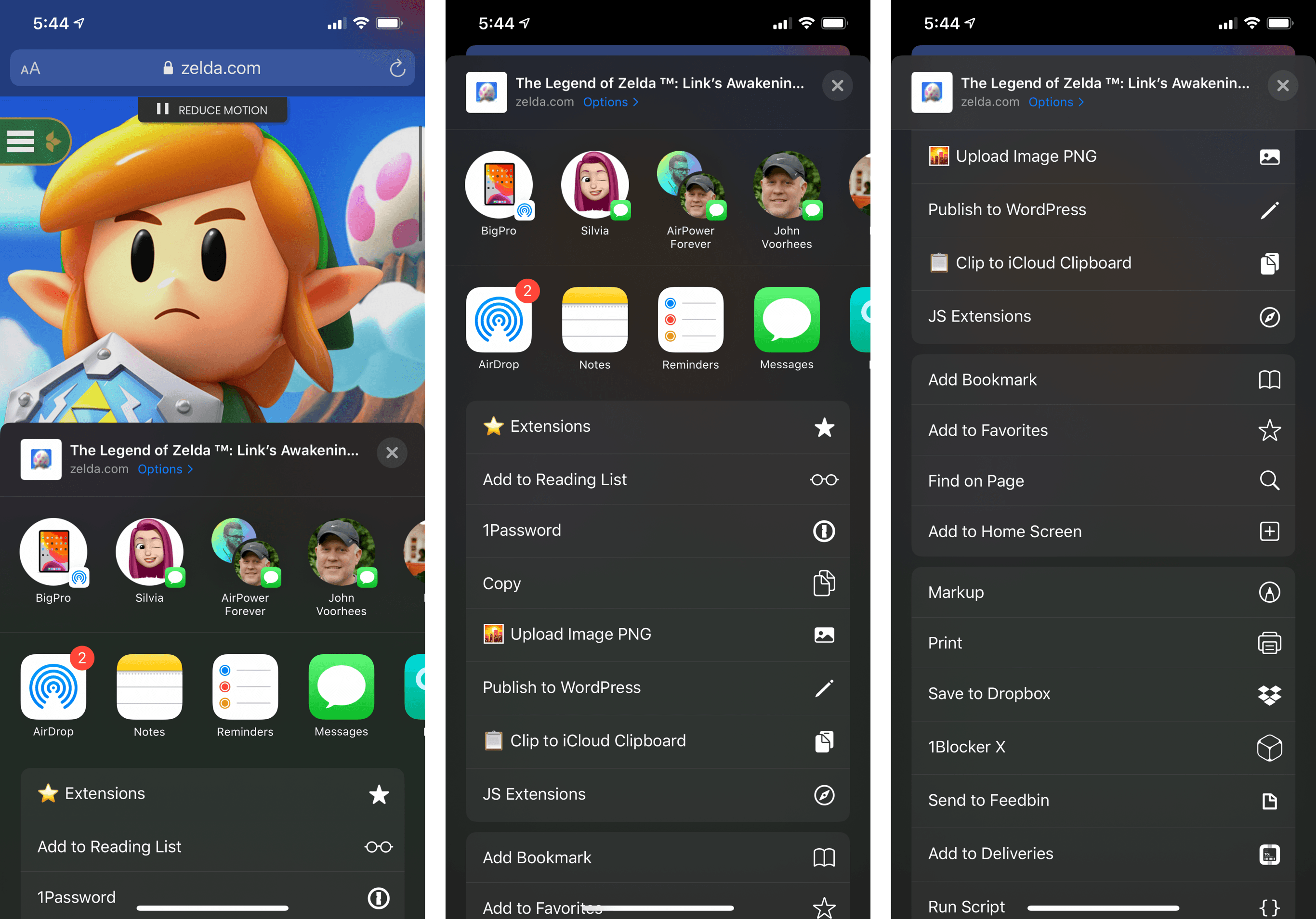
The new vertical list of actions in the share sheet. App-specific actions (such as Safari’s ‘Find on Page’) are contained within a section in the middle.
On iPad, the share sheet features the same design and organization of sections, but, unless the current app is in a compact size class, it’s a popover rather than a card.
There’s a lot to digest here, so let’s go over each section individually.
The header section addresses one of the most frequent criticisms of the old share sheet: after it was invoked, it was impossible to confirm which type of item was being shared with extensions, nor was there any control to modify the item in-place before sharing it. The new header remedies these shortcomings with a handful of nice touches.
First, there’s a thumbnail that apps can use to preview the content that was passed to the share sheet. In Safari, for instance, you’ll see a webpage favicon as the thumbnail; in Photos, you’ll get a small preview of the image you’ve selected; if you select some text anywhere in the system and hit ‘Share’ from the copy and paste menu, the thumbnail will show you a ‘Text’ icon to indicate you’re sharing a plain text item with apps. Developers can customize the appearance of the thumbnail for content shared from their apps; the thumbnail is loaded asynchronously from the rest of the share sheet, so custom images can be fetched from the Internet without blocking interactions in the sheet.
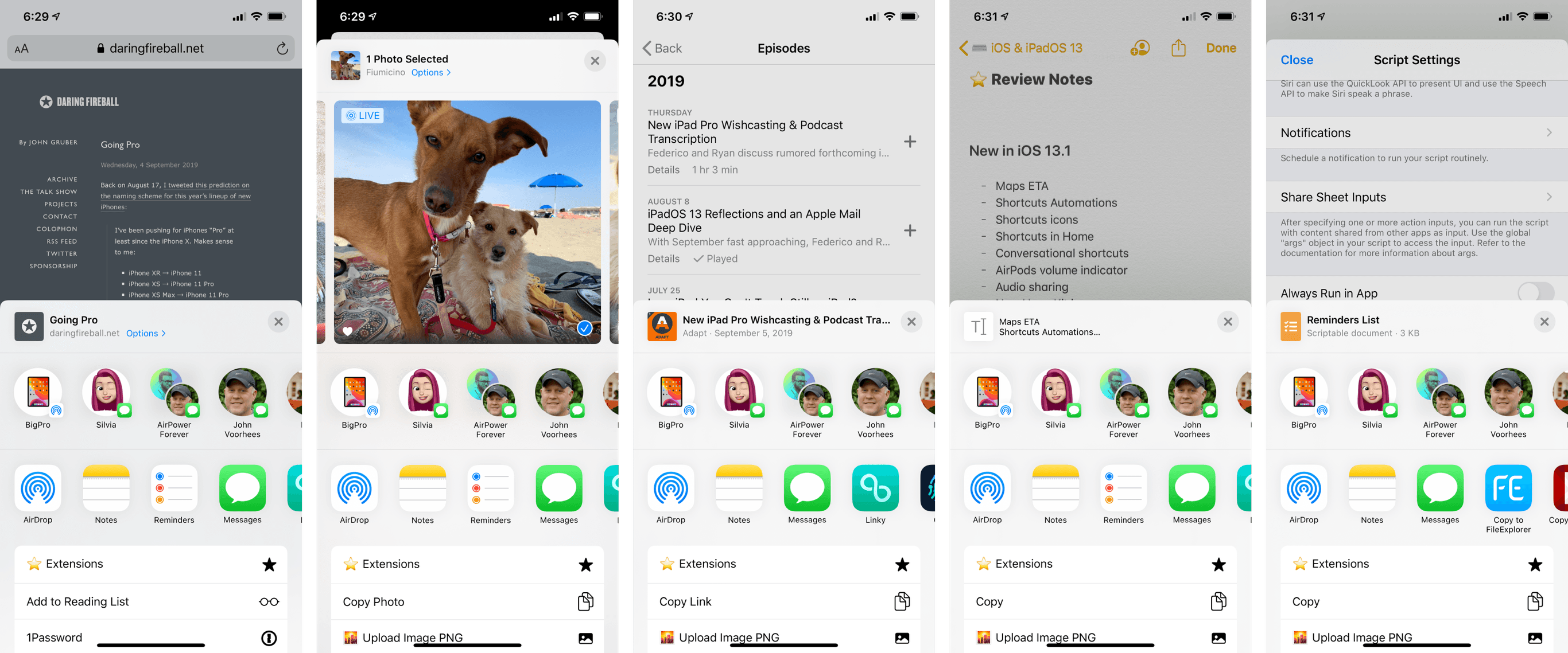
Different thumbnails for the share sheet’s header. Scriptable (right) can pass a custom thumbnail when sharing a script.
The share sheet offers two fields – title and subtitle – to describe the shared item. In Apple’s apps, the title tends to be the name of the document, page, or content type being shared; the company was more creative with its implementation of subtitles. In Safari, the subtitle shows you the current webpage’s domain; in Files, you’ll get file type and size underneath a document’s name; in Music, a song’s name is the title and the artist goes into the subtitle field. In my experience, I’ve found these two fields useful descriptors of the item the share sheet is processing – information that was entirely absent from the old share sheet, which forced developers to rely on custom solutions that weren’t nearly as elegant or integrated with the share sheet as Apple’s new header.
But that’s not all the share sheet’s header offers in iOS 13. For webpage links, photos, and, according to Apple, iWork documents2, the header comes with an ‘Options’ button that lets you configure an item’s format or metadata before sharing it.
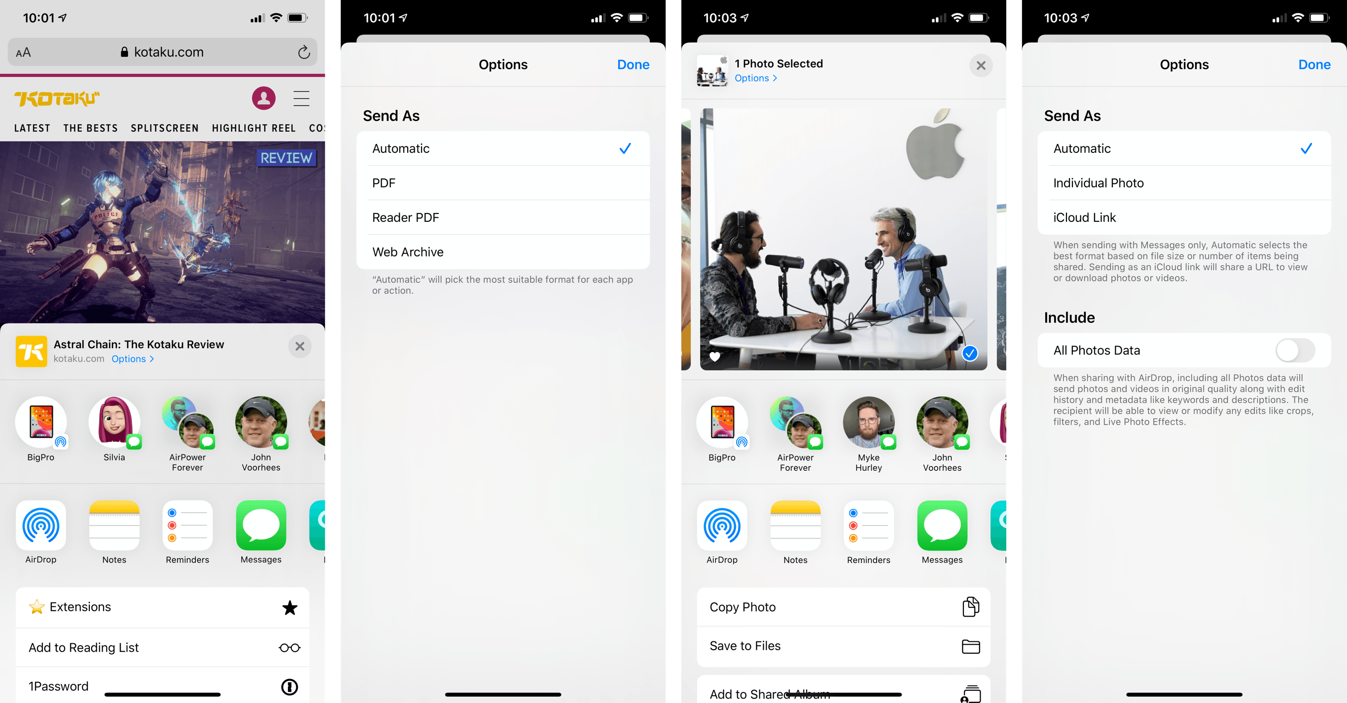
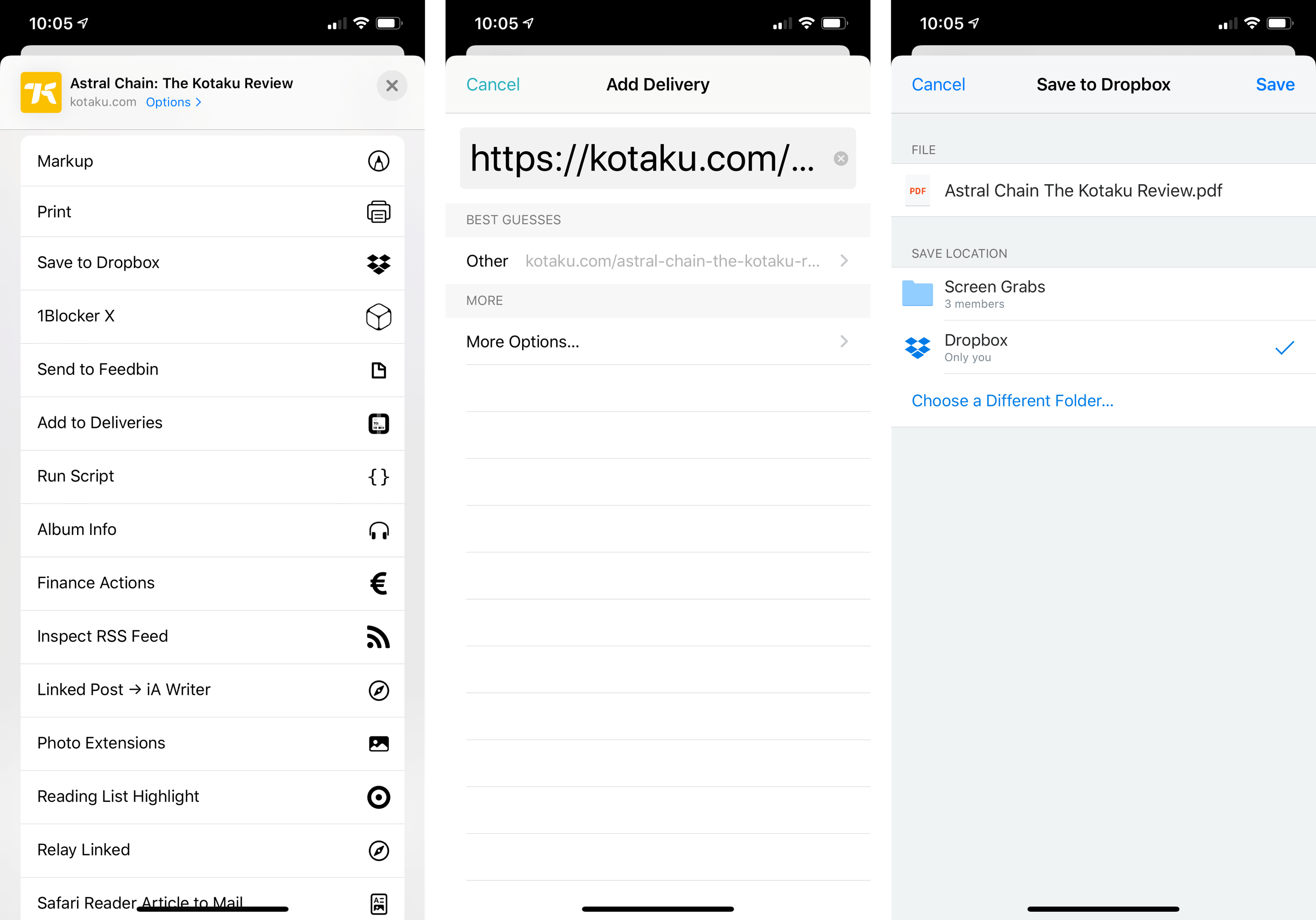
For webpages shared from Safari or Safari View Controller, tapping the ‘Options’ button in the share sheet provides the ability to share a webpage with an automatic format choice, as a PDF, a web archive, or, in the case of articles, a PDF version of the webpage’s Safari Reader view. The ‘Automatic’ option picks the “most suitable format” depending on the app or action you share a webpage to. For example: if you share a webpage with the Deliveries action, iOS 13 will share it as a URL for the Deliveries extension to track it as a shipment; pick the ‘Save to Dropbox’ action, however, and the system will automatically pass the PDF version since Dropbox has marked PDF documents as files that can be uploaded from the extension to your account.
In most cases, you should keep the ‘Automatic’ sharing option enabled; in my tests, iOS 13 has done a great job intelligently adjusting the format based on the selected app or action extension, saving me time I would have otherwise spent printing a Safari webpage, pinching it open to get a PDF file out of it, and sharing that version with apps.
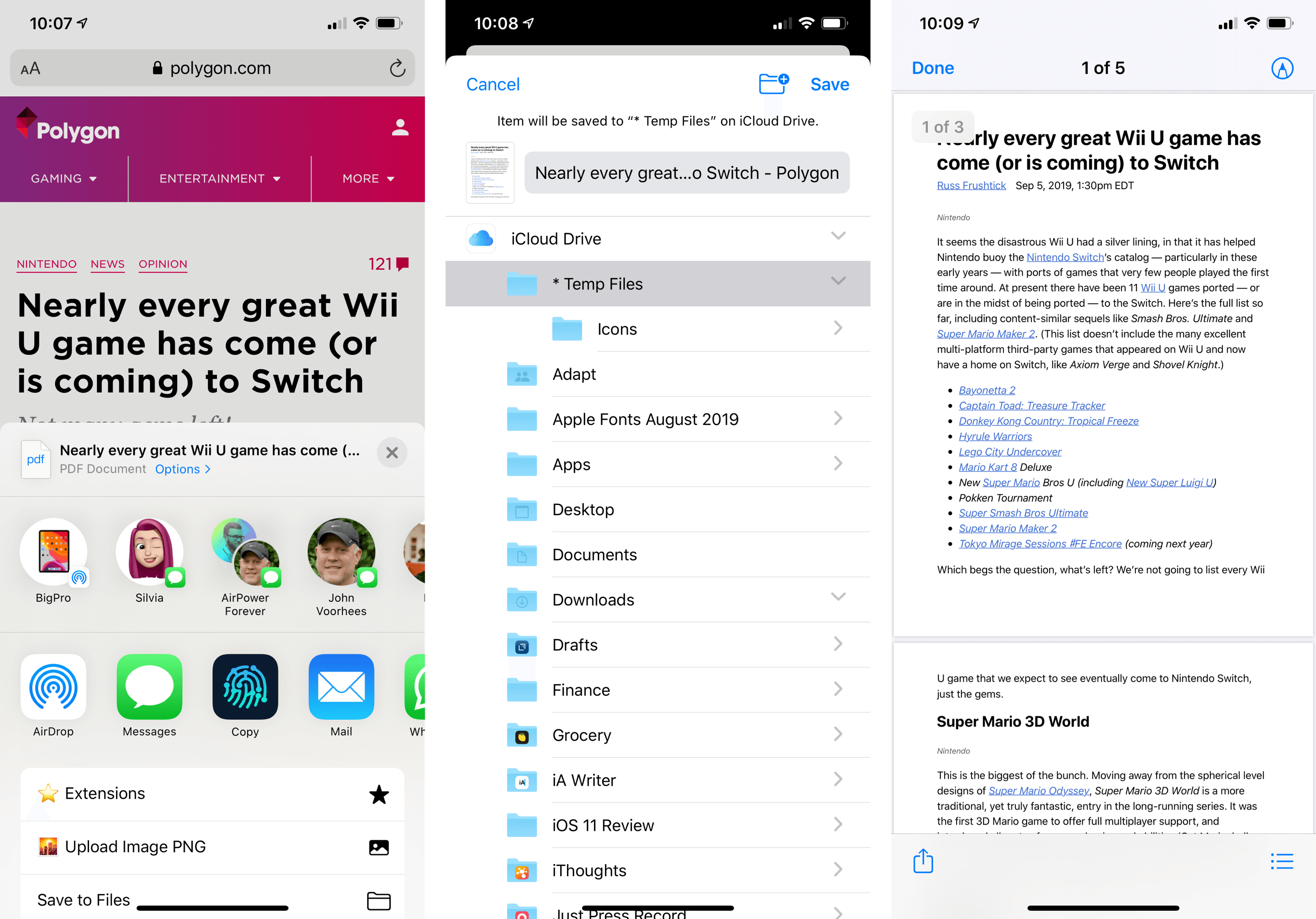
Select ‘Reader PDF’ and you’ll be able to save nicely-formatted versions of articles from Safari via the share sheet.
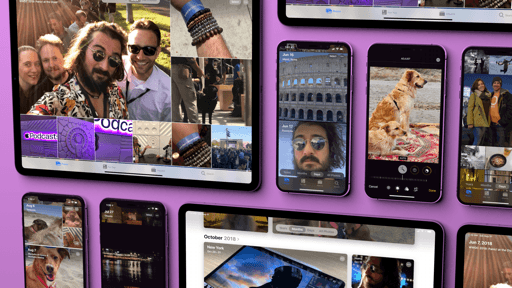
The ‘Options’ view is even more impressive in the Photos app, where Apple has built settings to control file format and metadata included within a photo. For starters, you can now force the share sheet to always share a photo either as a file or an iCloud.com link; interestingly, if you leave the default ‘Automatic’ option enabled and share photos with the Messages app, the system will look at the number of items you’re sharing and decide whether it should send them as files or create an iCloud.com link instead. In my tests, when ‘Automatic’ was enabled, sharing up to 9 photos would send them as files with location metadata attached; with 10 photos, iOS 13 always uploaded them to iCloud first to share them as an album expiring in a month. If Apple was looking for a way to spur adoption of its iCloud/Messages-based photo sharing system, direct share sheet integration is a clever option to try.
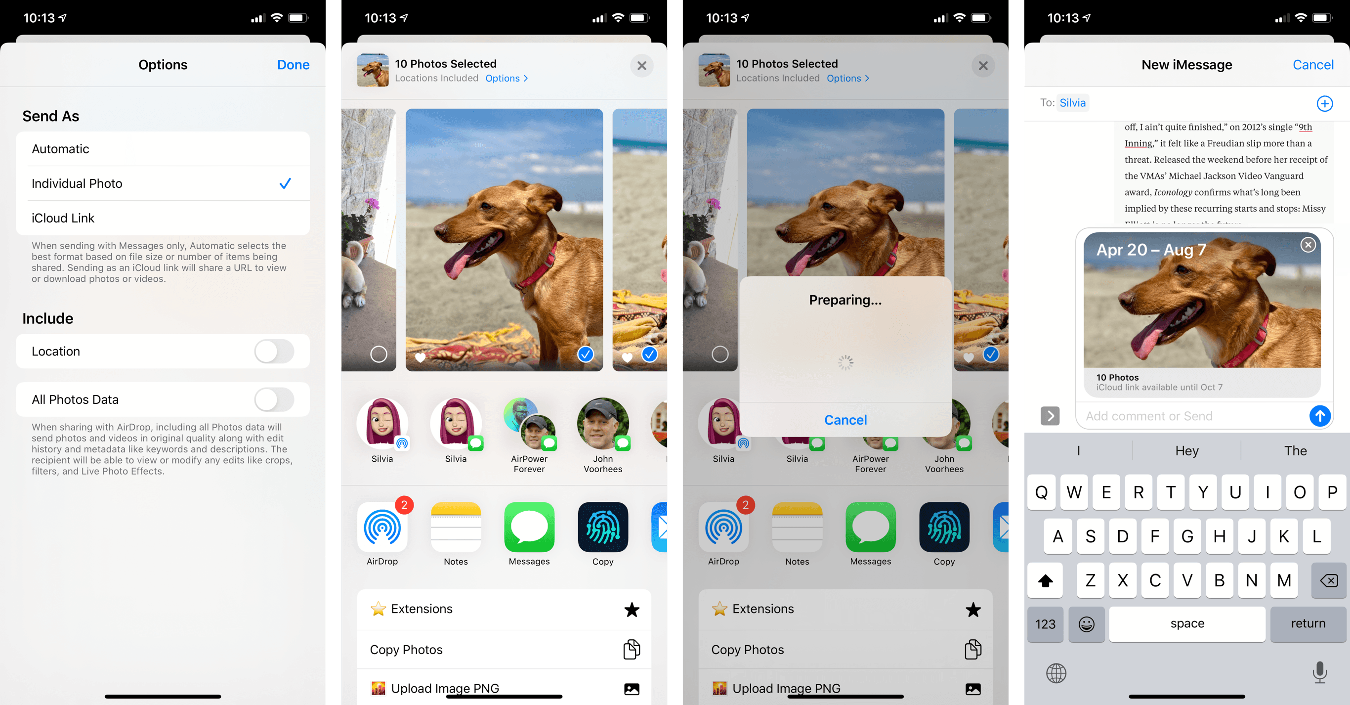
In addition to file format and iCloud sharing, you can also choose whether you want to include location metadata and all Photos data when sharing a photo with apps or actions. Besides geolocation information, all Photos data means a file will be sent in its original quality along with edit history and metadata such as keywords or descriptions. If you leave the ‘All Photos Data’ toggle checked and share photos via AirDrop, for instance, the recipient will be able to access the full edit history of an image, including filters and crops, which you may not necessarily want other people to see. On the other hand, if you do want to share all data contained within a photo with a close friend or family member, the share sheet now makes it extremely clear thanks to settings you can adjust at will. Personally, I keep ‘All Photos Data’ disabled so that most apps and contacts don’t get access to photo metadata, but I enable it when I want to share a photo in original quality with my close friends or family members.
Most of the new share sheet options were available in iOS before either as hidden settings or via third-party utilities. For this reason, I believe making these options front and center was a good decision, especially because they’ve been integrated with an automatic sharing system that removes much of the friction involved with picking the best file formats for apps. Not to mention how, by exposing location and all Photos data as visible settings, Apple is also raising awareness of the perils of sharing photos with personally identifiable information. My only wish is that third-party developers could provide their own options for the share sheet.
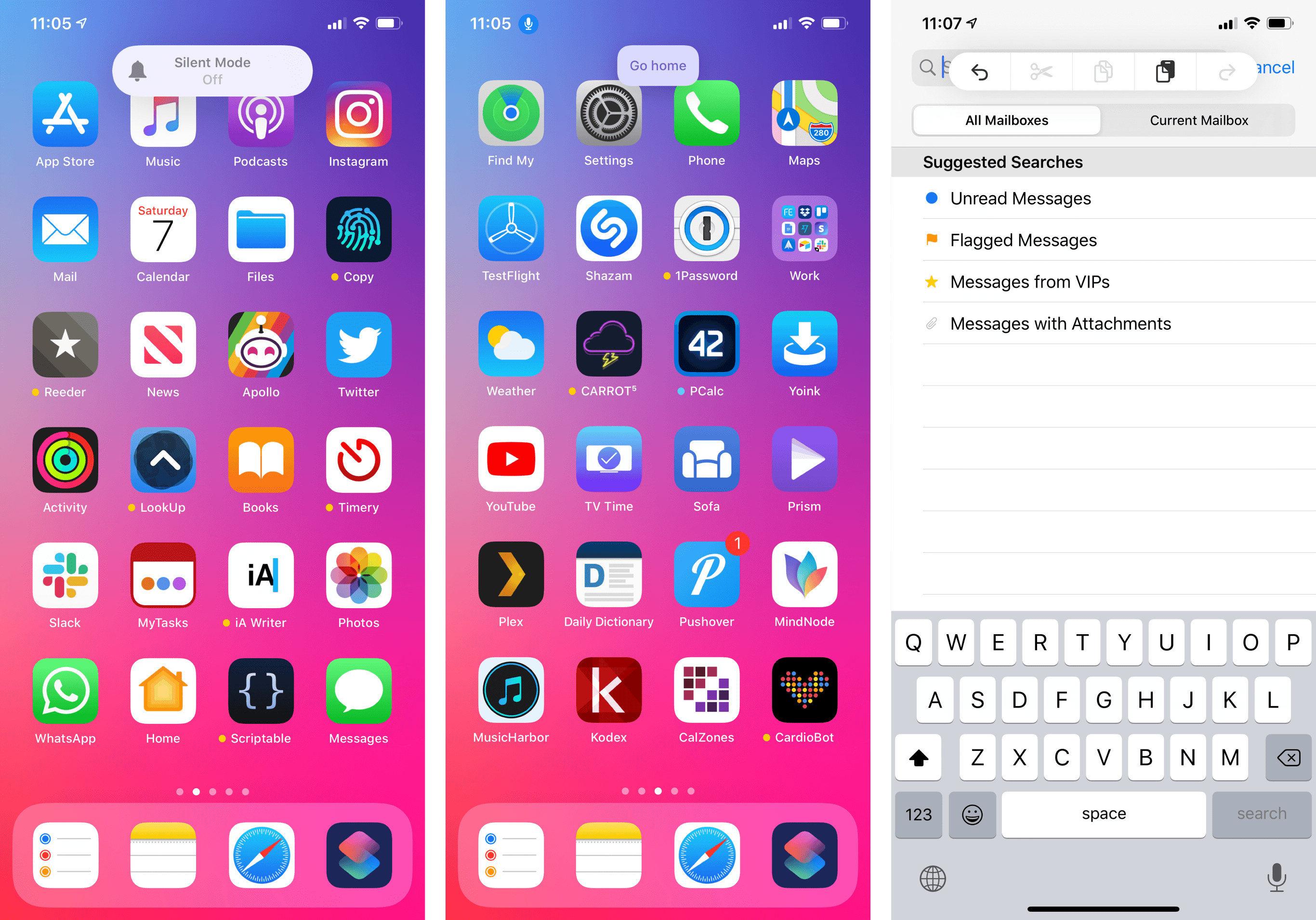
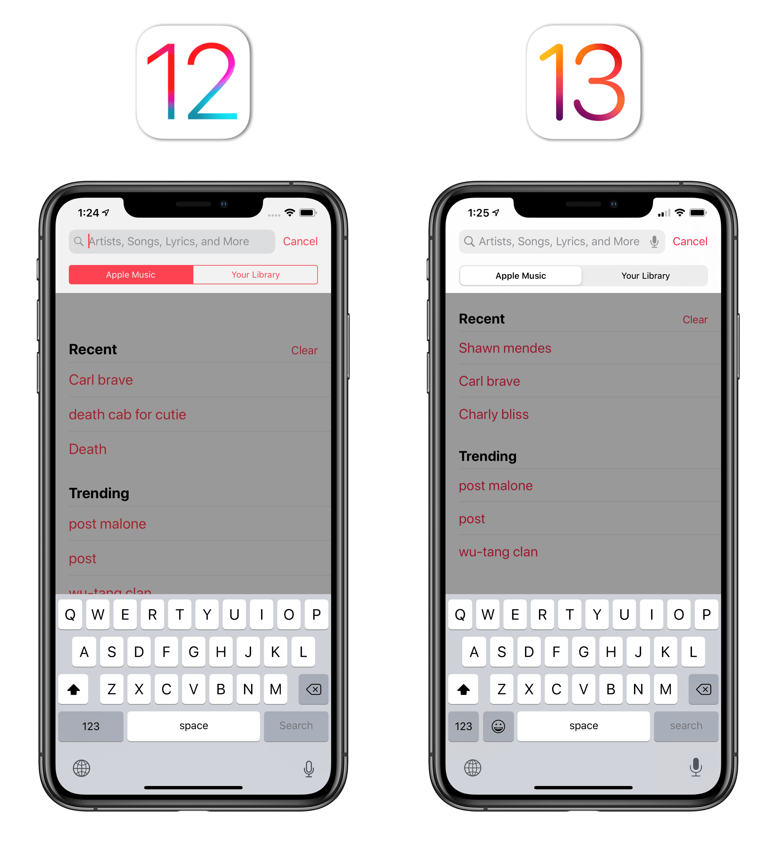
For most iPhone and iPad users, the inclusion of one-tap contact suggestions in the share sheet will likely turn out to be the most important change. And rightfully so: with one tap, you can now share to the nearest AirDrop device for someone in your contacts or instantly send something via iMessage. According to Apple, iOS 13 populates the contacts row by using machine learning to suggest different people or iMessage threads based on the content you’re sharing. In practice, you’ll find yourself having one-tap access to the contacts you text the most: tapping a profile picture brings up a Messages composer window for the selected recipient, and all you need to do is confirm by tapping ‘Send’. No more having to type in the ‘To:’ field to look up a contact by name, no more remembering what the custom name of an iMessage thread is.
If you’re an iMessage user, I can’t stress it enough: this integration is glorious, vastly eclipsing what utilities such as Group Text+ did in the past as third-party extensions. Messages has to be one of the most common destinations for content shared from Safari, Photos, and other social apps; as a result of Apple’s integration of individual iMessage chats with the share sheet, I’ve found myself sharing links and photos over iMessage even more, creating a positive feedback loop reinforced by the new search tools available in the Messages app this year.
But there’s more: while your share sheet is likely going to be populated by Messages-specific contact suggestions, it appears that third-party messaging apps can integrate with the share sheet as well. I haven’t been able to test this integration myself yet, but my understanding is that if a third-party messaging app integrates with SiriKit, supports messaging intents, and ships with an updated configuration file for iOS 13, its conversations will be eligible for share sheet integration too. If this is the case, I’m curious to see whether the share sheet will provide an incentive for companies like Facebook and Twitter to further integrate with SiriKit and how well Apple’s intelligent system will be able to suggest contacts with profiles on different social networks. For now, the Messages integration is superb, but I’m keen to experiment with third-party integrations.
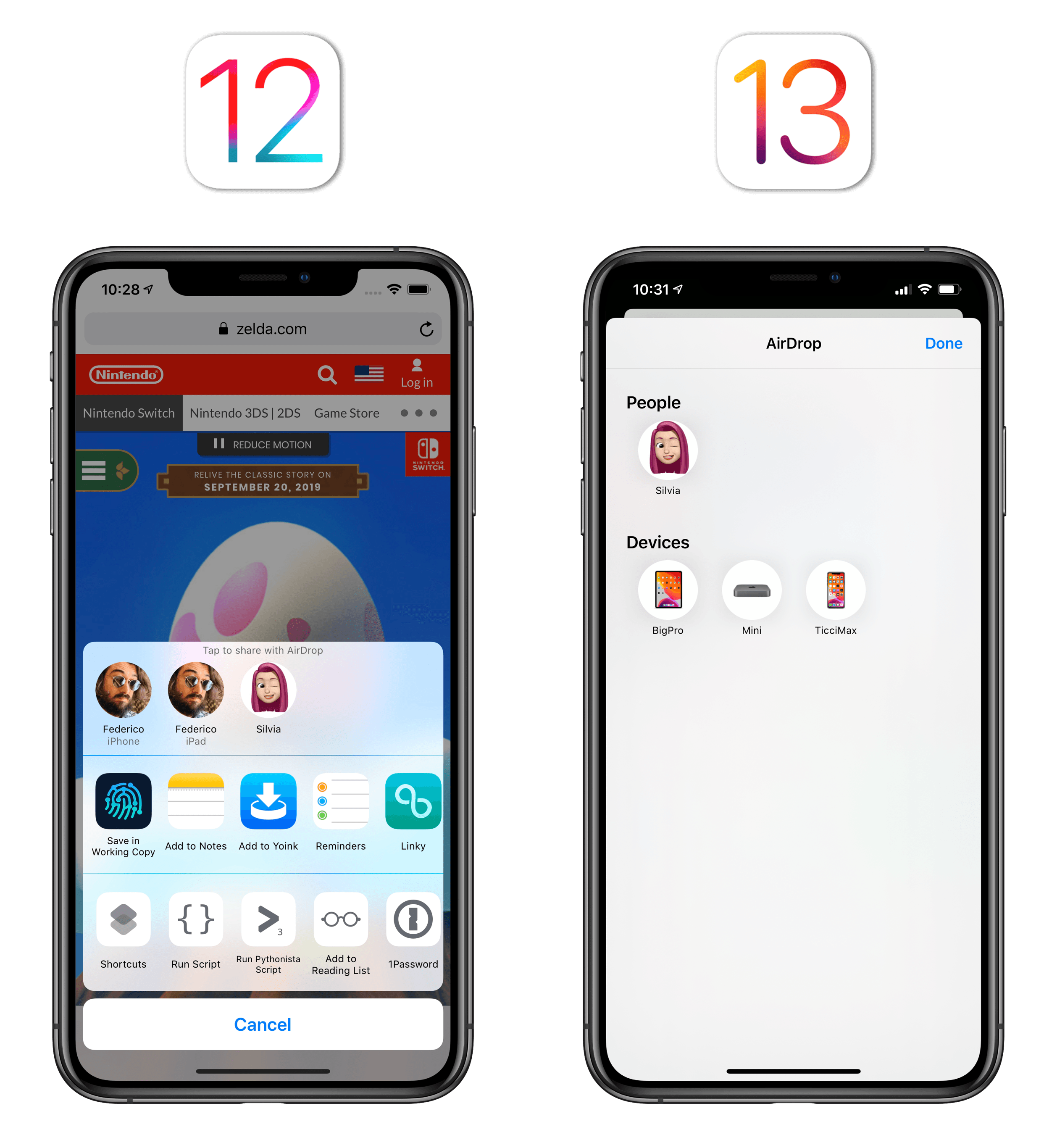
Moving on to the share extension row, there are two notable changes in iOS 13: AirDrop has finally received its own icon as if it were an app, and there’s a new way to access and configure additional share extensions from apps.
In order to leave room for the contact suggestions row in iOS 13, AirDrop sharing was moved to an icon that brings up a grid of ‘People’ and ‘Devices’ that can receive items via AirDrop (‘Devices’ are Apple devices associated with your Apple ID that are also nearby). I was fine with Apple’s previous implementation of AirDrop, but I prefer having the extra row for iMessage suggestions and AirDrop as a standalone “app” given my usage habits. Plus, the AirDrop panel now fits more contacts and devices in a single screen, which is a nice benefit.
The row dedicated to share extensions is now split into ‘Favorites’ and ‘Suggestions’, which you can configure by scrolling to the end and tapping the ‘More’ button.
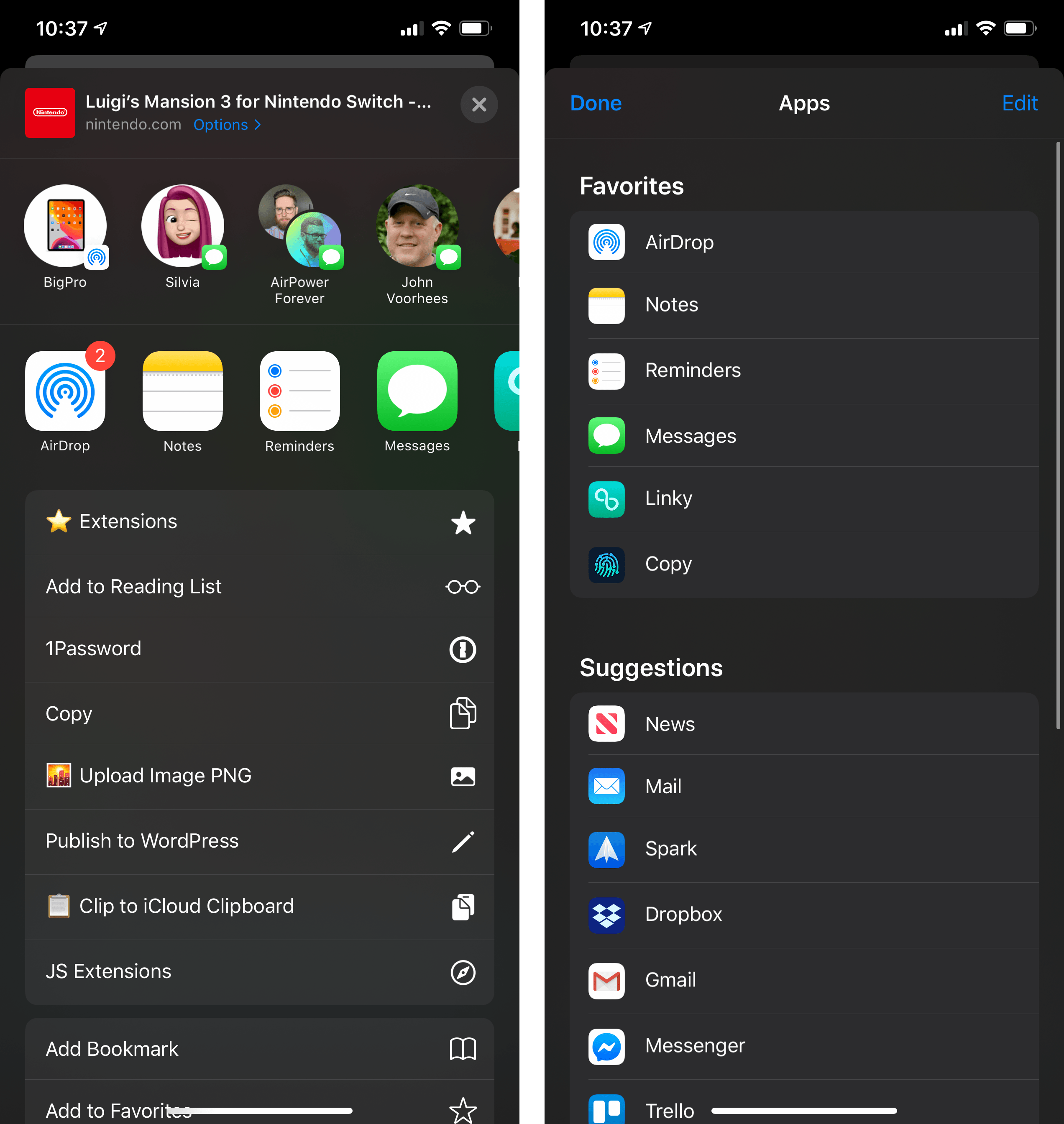
There are a handful of conceptual differences with iOS 12’s share sheet worth considering here. In iOS 12, you either had an app extension enabled or you didn’t. You could put extensions in the order you’d like, but there was no visual or functional difference between them. Two things have changed in iOS 13: the system can intelligently suggest extensions based on the content you’re sharing (thus switching their order in the share sheet), and the screen you access by tapping the ‘More’ button isn’t just a configuration tool – you can tap on extensions from this screen as well.
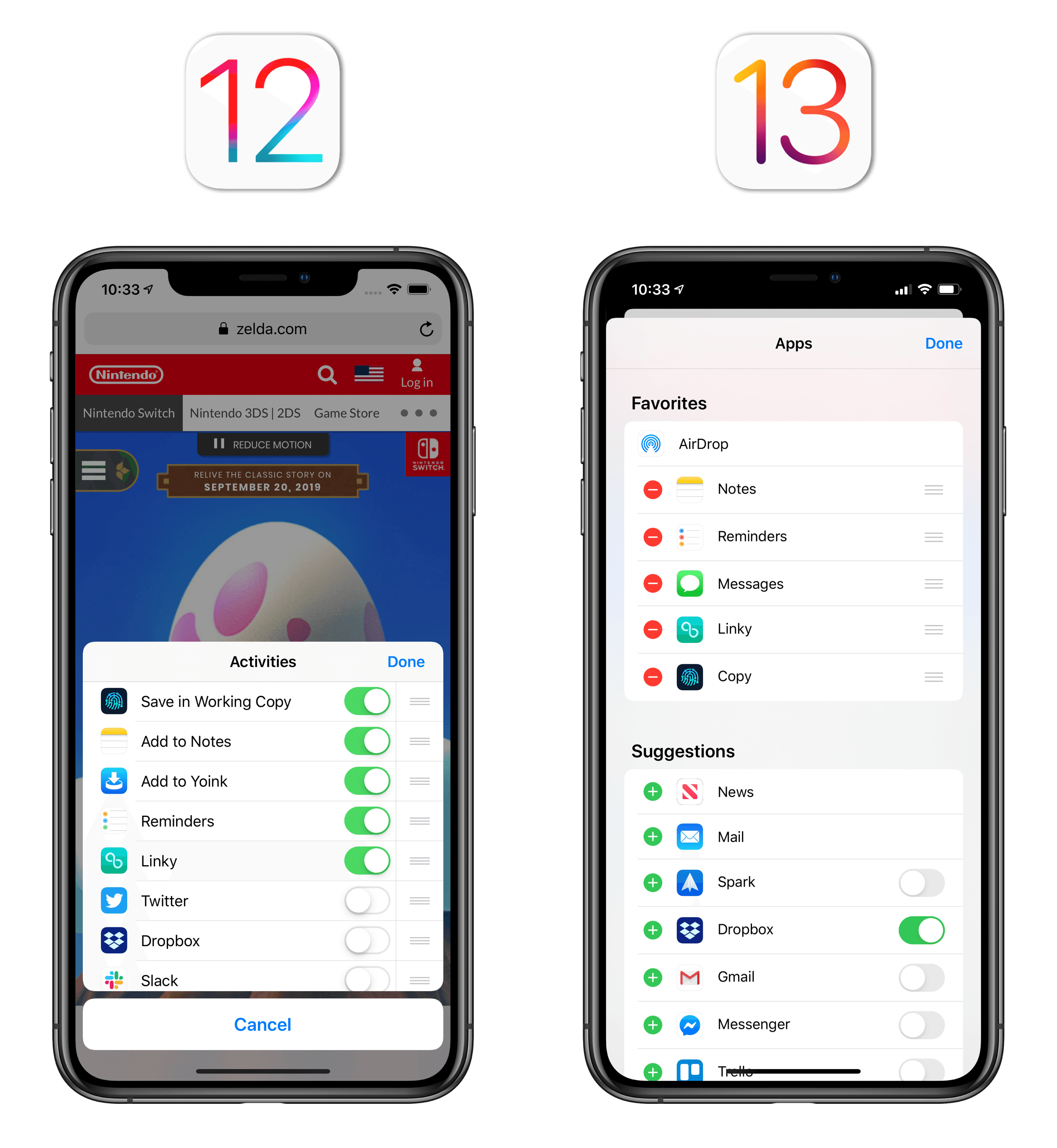
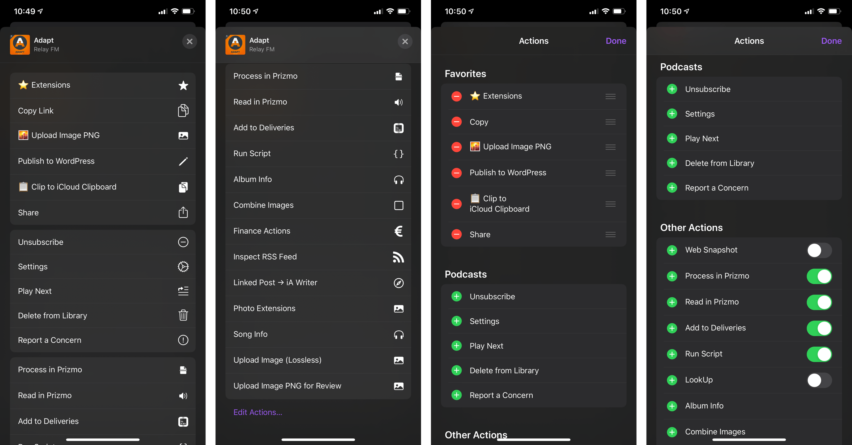
Here’s how this works: if you want to have fast access to share extensions you frequently use, you add them to your favorites by tapping ‘Edit’ and the green plus button. Favorites are always presented first in the share sheet, and they’re always in the order you’ve set. AirDrop is the only default favorite item that can never be deleted or reordered.
All other available extensions fall under the ‘Suggestions’ category, where they can be disabled with an on/off toggle, but not manually reordered because it’s iOS that dynamically switches their position based on the item being processed by the share sheet. iOS 13, however, only shows up to three suggested extensions after your favorites; to view others and use them, you’ll have to tap the ‘More’ button and open the resulting panel, which is now labeled ‘Apps’.
App suggestions are indeed dynamic, and iOS 13 does a reasonably good job at surfacing them: in Safari, for instance, the News, Mail, and Dropbox extensions are typically suggested after my favorites, but WhatsApp replaces News when I share something from Twitter.
My favorites end with the Working Copy extension. The rest are all dynamic suggestions by the system.
This new system of favorites and suggestions takes a while to get used to: there are multiple layers of organization now, and if you’re someone who cares about the exact position of your extensions, you’re going to have quite the day assigning favorites and disabling suggestions on all your devices. It’s worth remembering, however, that the majority of iOS users will likely only assign a couple of favorites, never bother with fine-tuning settings for each extension, and leave it up to the system to decide which extensions to suggest. From this perspective, I think Apple’s done a good job at finding a balance between power and casual users alike with a blend of deeper controls and intelligent suggestions.
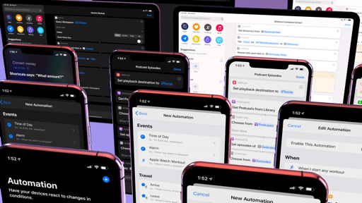
The Actions portion of the new share sheet follows the same organizational principles as share extensions, with some differences. Actions are displayed vertically as monochromatic buttons that are not dynamically suggested by the system – they always follow the order you’ve set. As with share extensions, you can assign favorites, which are always displayed at the beginning of the list, and view all other available action extensions, which are now simply labeled ‘Other Actions’. Actions specific to the current app, such as ‘Add to Home Screen’ in Safari or ‘Copy Link’ in Twitter, lie sandwiched between these two sections. When the share sheet is expanded as a full-screen card, these sections are not separated by headers – they’re grouped with padded table views instead.
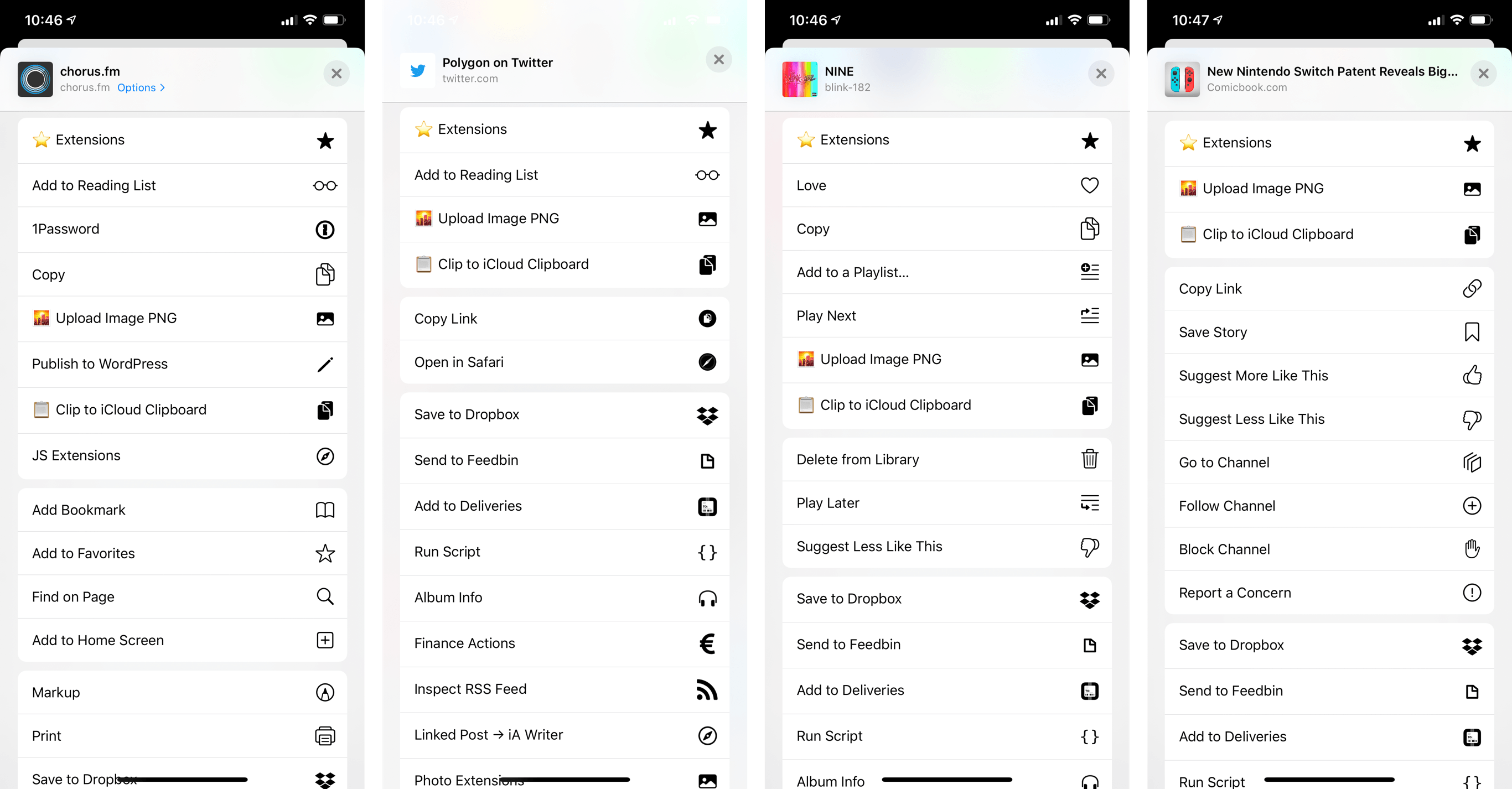
The action list in Safari, Twitter, Music, and Apple News. The middle section contains app-specific actions; everything else is shared system-wide.
To customize actions, you need to tap an ‘Edit Actions…’ button at the bottom of the list. Unlike share extensions, this screen is only used for configuration purposes. When configuring actions, you can assign favorites both for system-wide actions as well as actions exclusive to the current app, and you can disable other actions with toggles. In a somewhat odd omission, app-specific actions cannot be reordered.
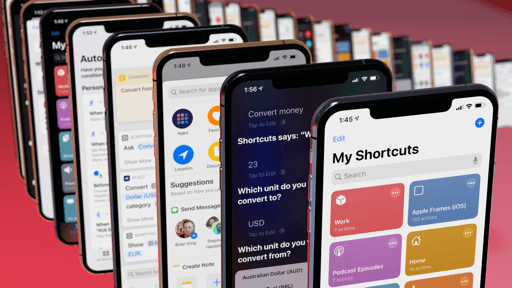
The wildcard of this section is Shortcuts. In iOS and iPadOS 13, the Shortcuts app is built into the system and no longer needs to be manually installed from the App Store. Among the many privileges this deeper integration affords, one that directly affects the share sheet is the removal of the standalone ‘Run Shortcut’ action extension. In iOS 13, all your custom shortcuts are now top-level actions in the share sheet: they’re not contained in a “master” extension anymore, and you can freely rearrange them anywhere in the action list.
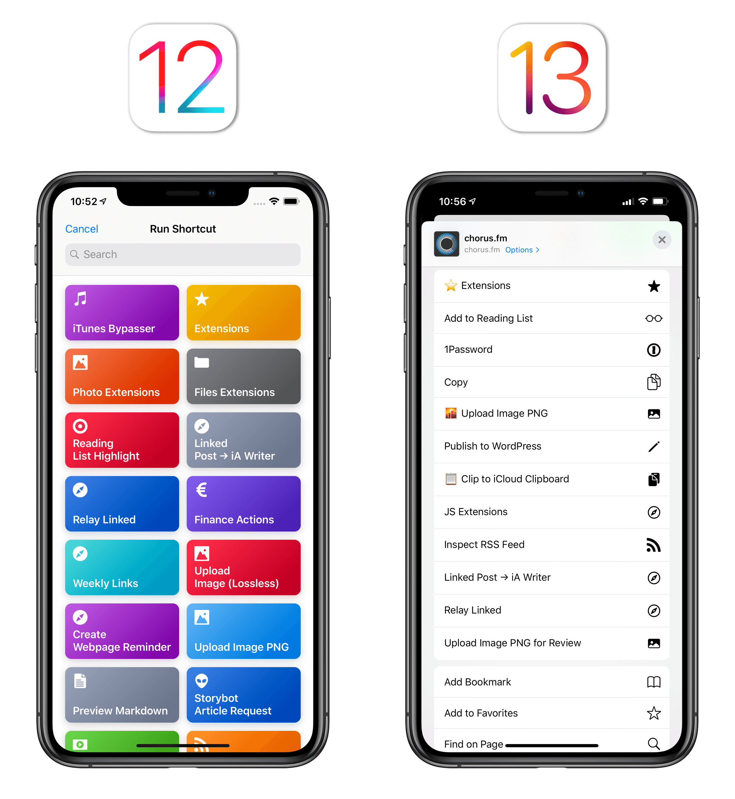
In iOS 12, you had to open a separate extension to view your shortcuts. In iOS 13, your shortcuts are top-level items that can be intermixed with other actions.
The chief advantage of this new system is the time users are going to save when running their favorite shortcuts: instead of having to tap an extension, find a shortcut, then run it, individual shortcuts can now be executed immediately from the share sheet. The ability to mix and match app-related actions with individual shortcuts is great news for those who want to fine-tune the share sheet in their favorite apps to their exact needs; by configuring the input types for individual shortcuts in the Shortcuts app, I’ve been able to customize the share sheet for actions that show up only when sharing photos, in Safari, or in the App Store. In each of those apps, I now have a custom Favorites list that contains fast access to shortcuts and app-specific activity items, which wasn’t possible in iOS 12 and saves me a considerable amount of time in iOS 13.
There’s a change of mindset worth pointing out for heavy Shortcuts users though. In older versions of Shortcuts, its action extension carried the same design of the app’s main library: shortcuts were always arranged in the same order you had previously assigned in the app and were presented with the same custom colors. The old extension fed into the user’s muscle memory by extending the Shortcuts library UI to the system-wide share sheet. iOS 13 requires you to start thinking of shortcuts as standalone components of the share sheet rather than part of a single “source” extension. It takes a while to learn this, especially if you’re a power user with dozens of shortcuts now living as individual actions in the share sheet, but eventually the benefits of customization and control exceed any possible annoyance caused by this change.
What I believe leaves much to be desired is the complete lack of color for shortcuts in the new share sheet: what used to be a vibrant, colorful visualization of the user’s shortcut library is now a dull list of items that aren’t visually differentiated enough from each other due to the small monochrome glyphs (based on SF Symbols). In Workflow and Shortcuts, my eyes were able to scan the extension’s grid using shortcuts’ colors as visual coordinates, and that’s not possible in iOS 13.
Furthermore, by aligning actions’ text labels to the left and placing their glyphs on the opposite end of the cell, it takes me longer to scan each item: my eyes can’t associate a text label with its glyph as quickly as before, which slows down my interaction with the share sheet as I need more time to scroll a list of extensions and read their titles because color is gone and the glyph is too far away. The increased cognitive load and lack of information density is a problem of the entire Actions section of the new share sheet, not just shortcuts; however, it’s been most apparent for custom shortcuts since I have over 30 shortcuts I regularly use in the share sheet. I don’t think the current design scales well for users who, like me, don’t have 10 items in the Actions list, but more like 60 or 70.
It took me several weeks to warm up to the new share sheet design in iOS 13, and the design of the lower action list is the only aspect I think Apple hasn’t entirely figured out yet. By and large, the company has succeeded in everything else they set out to achieve: the addition of one-tap contact suggestions for message sharing is a fantastic time-saver, as is the simplified AirDrop access; the separation between favorites and suggested extensions has brought welcome simplification to app management in the share sheet while still enabling deeper personalization for advanced users; the ability to run shortcuts with one tap is a boon to productivity, and managing app-specific actions is easier than ever. After months of usage, I’m a fan of the new share sheet and I think Apple’s headed in the right direction.
Other Design Changes
It wouldn’t be a modern iOS release without a cornucopia of other smaller, yet interesting design tweaks that inform our understanding of Apple’s recent design ethos. Let’s take a look.
UI elements that descend from the top of the screen. This particular design element first appeared as part of the Apple Pencil charging/pairing animation with the 2018 iPad Pros, and it’s now used in a variety of contexts in iOS 13.
On iPhone, toggling the ringer switch displays a similar popup; Voice Control shows hints and recognized commands through these pill-shaped messages as well; new gestures for copy, paste, and undo reveal a segmented menu of the same shape and placement. In the future, I wouldn’t mind if Apple used this “transitional popup” design as a new minimized mode for notifications that occupies less space than a banner.
Padded table views. New in iOS 13, developers can set UITableViewStyle with an “inset grouped” property that marks the return of padded table views. Examples of these can be seen in Home’s accessory settings, the share sheet’s Options screen, Settings, and Reminders’ list sidebar:
Opener, a handy utility by Tim Johnsen to open links in third-party apps, has been updated to use the new inset style for table views:
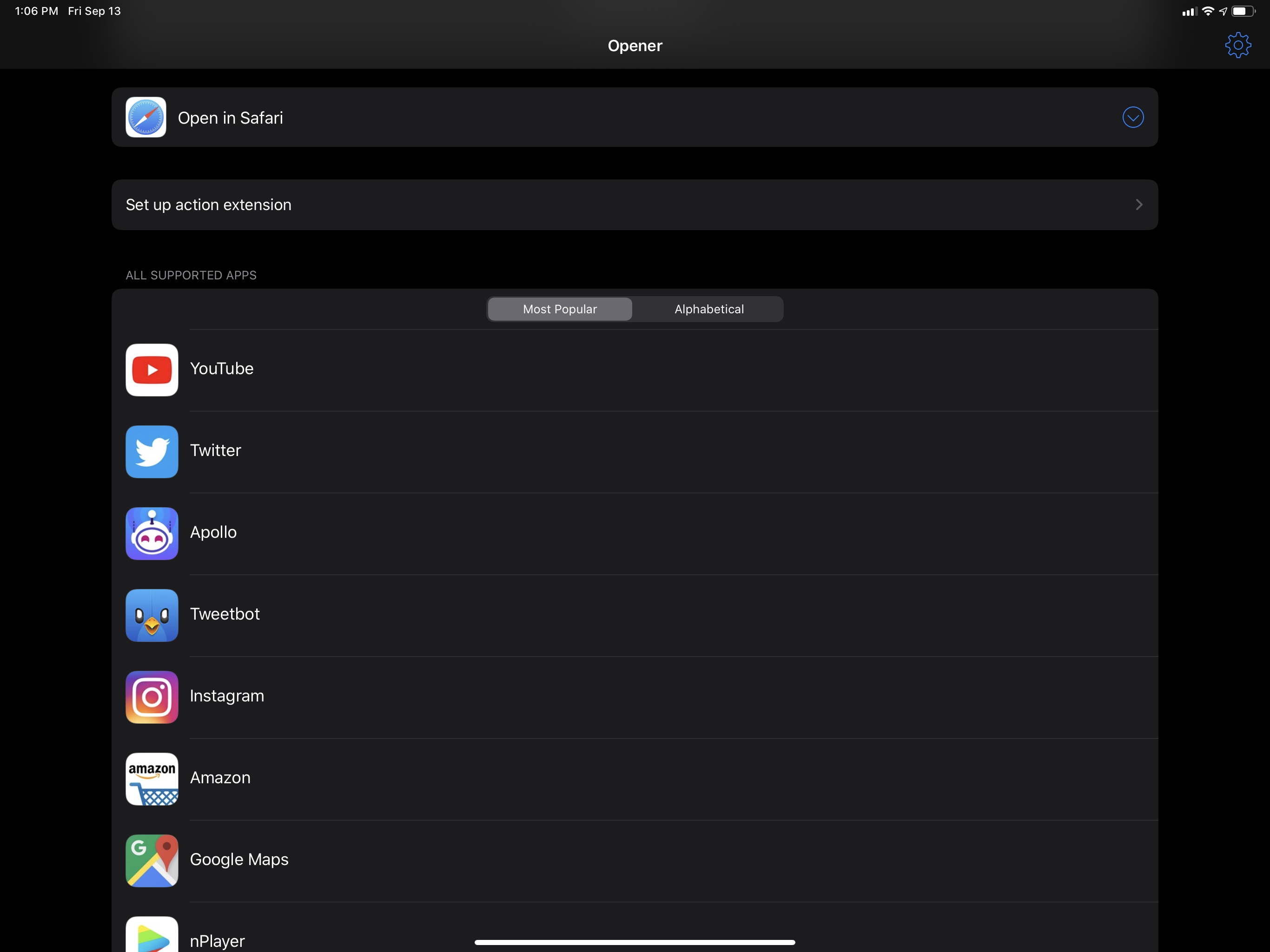
Padded table views have a pleasant retro feel to them that looks nice with modern iOS design. Most of all, they do a better job than edge-to-edge tables at grouping related items together.
New segmented controls. Speaking of design elements that harken back to iOS’ first design era, segmented controls in iOS 13 have shed their flatness in favor of – you guessed it – depth to indicate an active selection. There’s even a subtle animation when switching between controls in the same segment.
I like the new look. It’s not as heavy-handed as iOS 6’s impressed style, and developers can tint segments with color. The result strikes a nice balance between old and new, making the control’s selected state easier to interpret for colorblind users who can’t rely on color alone.
Rich link previews for every app. This isn’t a design change per se, but it’s a new API that allows developers to enhance their apps’ appearance by easily supporting rich link previews with titles and cover images.
Up until iOS 13, rich links in Apple’s apps were only available in Notes (where they launched in iOS 9) and Messages (since iOS 10). Even then, the implementation between the two apps was different and inconsistent across platforms: Messages supported rich links featuring inline videos and tweets; Notes didn’t support rich tweets on iOS (but did on macOS) and offered a thumbnail option that was absent from Messages. If third-party developers wanted to adopt rich links modeled after Notes or Messages, they’d have to write a custom implementation based on crawling Open Graph meta tags from a linked resource, which explains why so few of them ever bothered to do so.
With iOS 13, Apple has built a LinkPresentation framework that developers can use in their apps to present rich link previews, and they’ve also done a better job at unifying rich links between Notes and Messages while also bringing them to another system app.
The LinkPresentation framework generates rich link previews with a standard design (which developers can customize) and provides an asynchronous API that abstracts the process of crawling a server for metadata such as title, hero image, or video URL (if any). Developers have a simple solution to request the different components of a webpage, which can then be assembled into a preview in their apps. This removes a lot of work that would typically be involved with generating rich links; hopefully, it’ll lead to more third-party apps adding them, using a design that mirrors Apple’s apps. The framework supports “specializations” such as videos and tweets with multiple images; it should even work with local file URLs to generate rich previews for documents stored on-device.
The latest version of Yoink uses the LinkPresentation framework to generate custom rich previews for URLs saved in the app.
Notes and Messages still implement link presentation in slightly different ways, but at least the same links are supported across both apps now; plus, Reminders is joining them in supporting rich link previews in iOS 13. In Notes and Reminders, it’s possible to choose between large and small previews (long-press a link and choose ‘Small/Large Images’ from the context menu) and links to tweets now show the tweet’s text while in compact mode; in Messages, link previews support inline video playback and tweets with multiple images, and they continue to be expanded by default.
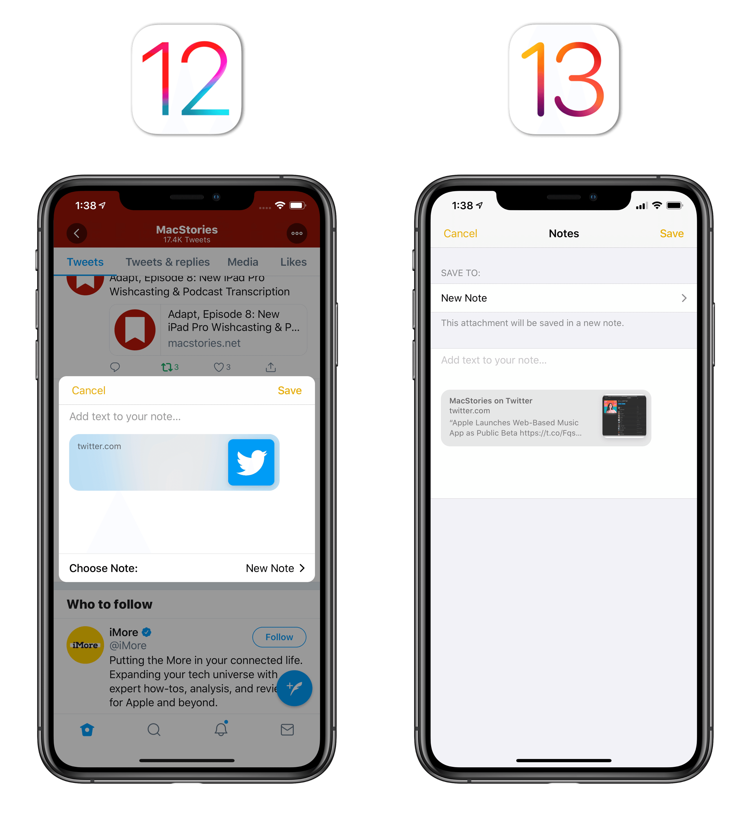
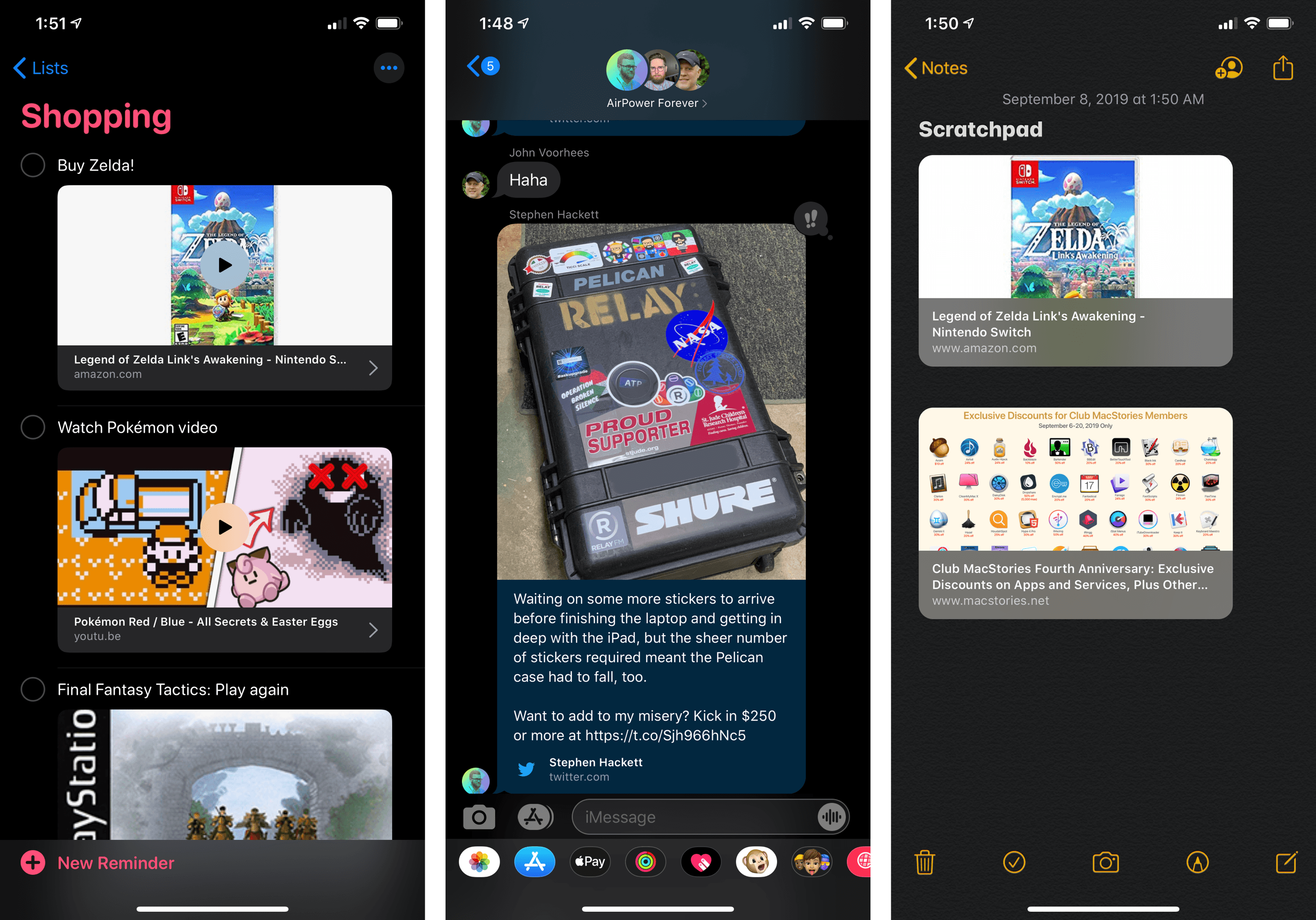
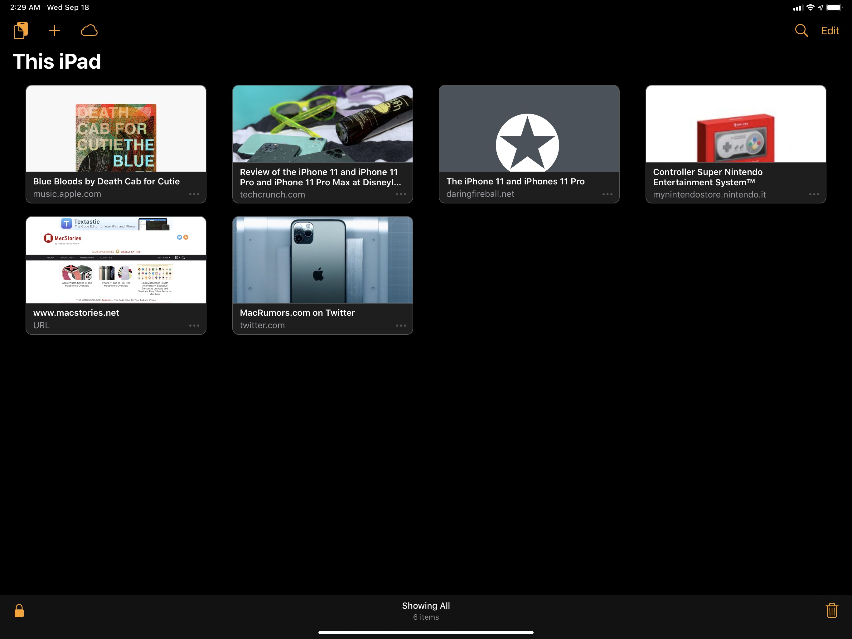
Rich links in Reminders, Messages, and Notes. You can even play videos inside Reminders via rich links.
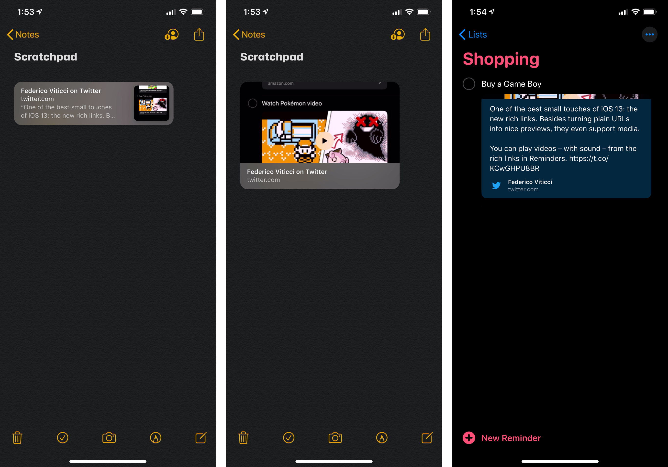
Unfortunately, there are still some inconsistencies in how Apple’s apps treat links to tweets. In Notes, the small thumbnail size shows a tweet’s text, but it’s a truncated version of it; when you switch to the large thumbnail size, the attachment only shows a large version of the author’s profile picture (or media attached to the tweet). In Reminders, which now supports link attachments thanks to a new ‘URL’ field in the task inspector, large attachments show the tweet’s full text – including multiple images in a grid – just like Messages does.
Rich links also show up at the bottom of Safari’s updated start page, which features suggestions for links shared in Messages, saved in Reading List, or open on other devices via iCloud Tabs.
I’m glad to see Apple make it easier for developers to add rich link previews to their apps. I would have liked to see more consistency between Messages and Notes still, or perhaps automatic link expansion in Mail and Contacts, but it’s a solid start.
San Francisco Rounded and New York. The rounded version of San Francisco that made its iOS debut a few months ago is now used in the new Reminders app. It’s got personality, and it looks good with the different colors of Reminders’ lists.
Furthermore, Apple has released New York, an all-new typeface “based on essential aspects of historical type styles” that was “designed to work on its own as well as alongside San Francisco”. I’m pretty sure it’s the same typeface Apple used in last year’s redesign of the Books app, but the only implementation of it I could find in iOS 13 was in Safari Reader. Perhaps it could be added as a font option in a Pages update.
In terms of developer adoption, there’s also a new API for apps to use the system’s rounded, serif, and monospaced fonts.
New ‘More’ button and buttons inside circles. Various apps in iOS 13 now come with an ellipsis button (the classic three-dot icon to reveal more options) available in the top-right corner of their UI. This can be seen in Notes, Messages, and Reminders; as some have noted, the use of this button is not entirely consistent across apps.
Additionally, Apple has made certain call-to-action buttons more obviously tappable by enclosing them in circles, such as Messages’ compose button and Reminders’ ‘New Reminder’ button.
A refreshed look for widgets. Widgets in iOS 13 have a slightly updated appearance: the header of the widget has been removed, allowing the app’s icon and name to be unified with the rest of the widget’s panel:
It’s a minor visual tweak, but it lets widgets blend in with surrounding elements better – which helps on the new iPadOS Home screen, where widgets can coexist with app icons in landscape mode.
New volume hud. I saved the best for last: adjusting the volume in iOS 13 no longer brings up a large hud message in the middle of the screen. In its place, Apple is using a small vertical volume slider that swoops in from the left side of the screen and quickly collapses into an even thinner bar as you keep clicking the volume buttons. It’s much less obtrusive than before, and it no longer gets in the way of watching videos or playing games thanks to its quick transition.
The new iPhone volume slider.Replay
You can also grab the volume slider with a finger: if you do so, you’ll be able to adjust the volume by swiping and both edges of the bar will trigger a subtle haptic tap when you reach either mute or max volume level. The transition between levels is very nicely designed here; in iOS 13.1, the slider features different icons based on where audio is currently playing.
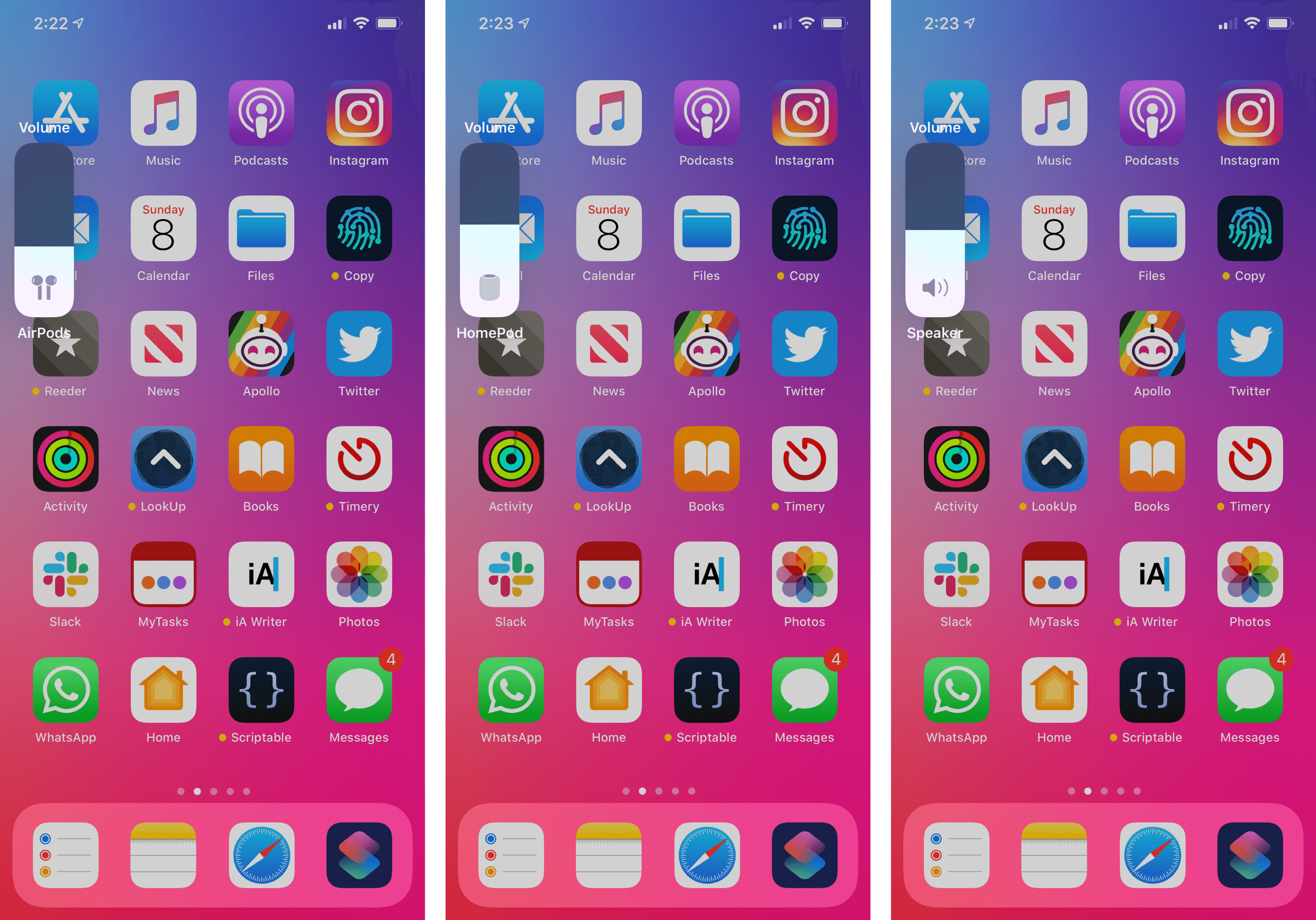
Pressing and holding the volume buttons to lower or raise volume will play a series of haptic taps that grow or decrease in intensity until the slider reaches one of its edges. The custom haptic was designed to give you the illusion of “filling” a bar by pouring volume into it, and it succeeds: these taps remind me of one of the mini games in Nintendo’s 1-2 Switch game, which also leveraged the haptics provided by the console’s HD Rumble feature. The Taptic Engine gets close to that same feeling with the volume slider.
On iPad, the volume slider pops down from the top of the screen and also collapses into a thinner bar while the volume is being tweaked. The placement of the slider is ideal on iPad: since the system’s clock moved to the left, no content is usually displayed in the center of the status bar anymore.
The new volume slider strikes a nice balance of being informative and not too clever with its design (such as by tucking a small slider in the iPhone’s notch) while clearing out room for content and supporting both mechanical and gestural adjustments. This one deserves a proper, unanimous finally.
iOS 13’s design language is the most consistent Apple has been in a while, offering refreshed visual elements that bring a welcome sense of novelty as well as more features for casual and professional users alike. And because a mobile OS’ design is only as consistent as the tools made available to developers who write apps for it, iOS 13’s UI updates come with APIs and frameworks that should allow for rapid adoption among the developer community.
For the first time in a few years, it feels like Apple’s iOS design is being driven in one direction with a consistent voice behind it. Even without a redesign, there’s a clear sense that iOS design is evolving in iOS 13, which is great news for developers and, ultimately, users.
- I assume an update to the iWork apps for iOS will be required to bring this new share sheet functionality. ↩