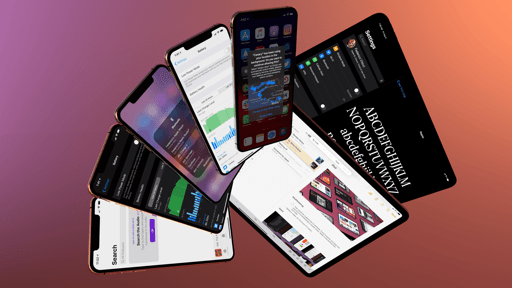
Reminders
For the past year, I’ve been using Reminders as my primary and only task manager. Or, I should clarify: I’ve been using the Reminders service as my task management system accessed via a third-party client, GoodTask. With iOS and iPadOS 13, as well as macOS Catalina and watchOS 6, Apple is debuting a completely redesigned and enhanced Reminders app, and, at least for the foreseeable future, I’m going all-in.
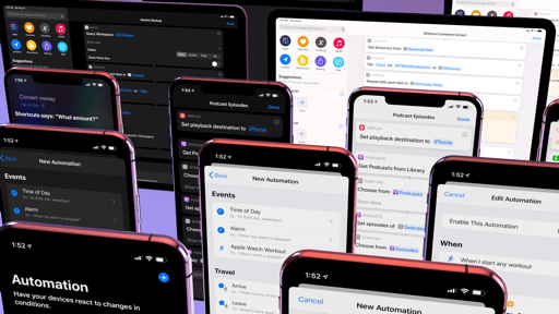
Those who follow my writing at MacStories know that I’ve had a…turbulent relationship with task managers over the years. I’ve tried many, and I’ve switched between wildly different apps on several occasions, only to later realize that those experiments were dictated by changing priorities in different moments of my life. When I first got into iOS automation with URL schemes years ago, I was fascinated by 2Do’s power-user features; years later, when I bought an Amazon Echo and started dabbling with web APIs in Workflow, I was lured by Todoist’s appeal as a web service. But for the past couple of years, as the MacStories team has stabilized and my responsibilities have shifted once again, I’ve learned to appreciate the comfort of Apple’s ecosystem, which includes access to reminders from any Apple device, whether it’s a HomePod, a cellular Apple Watch, or an iPad Pro with custom shortcuts. When it comes to integration between multiple platforms and native automation, nothing beats the pervasive nature of Reminders across the Apple ecosystem.
I like Reminders because my life has changed enough over the past couple years that I don’t need anything more complex than a handful of lists and tasks with due dates. Reminders is perfect for that, particularly if you enjoy the convenience of creating and managing your tasks in a multitude of contexts: I can ask Siri to quickly create reminders on my Watch while I’m at the dog park, but I can also query my HomePods about my schedule when I’m doing chores around the house; and when I need to process dozens of tasks at once, I can turn to Shortcuts’ built-in Reminders actions. Because Reminders is built into the OS, Siri doesn’t require a custom syntax to interact with it, nor does it suffer from the limitations that third-party task managers often run into. Ultimately, as I argued last year, it all comes down to comfort and a lack of friction: at this point in my life, I value not having to think about my task manager. Reminders is the only system that grants me that peace of mind.
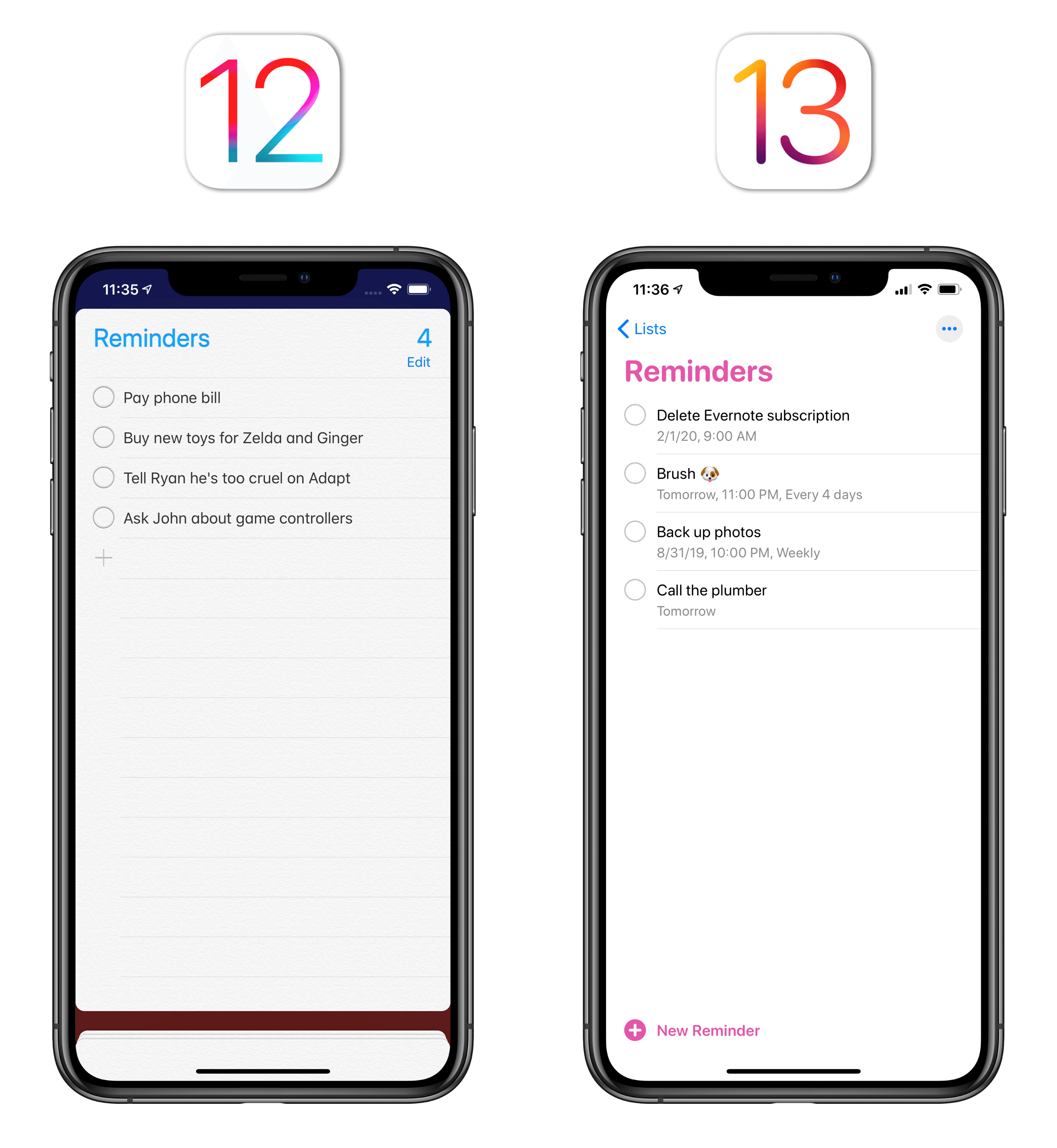
The problem is, since its last redesign with iOS 7 in 2013, Apple’s native Reminders app has been a subpar experience at best. Its card-based navigation made it slow to use; besides personal aesthetic preferences, its design was clunky, with simple actions such as attaching dates or locations requiring several taps to complete. Reminders had been designed in an era when Apple still hadn’t found its stride in terms of creating apps that could scale from simple needs to advanced workflows. Consider Notes and Safari: both apps are used by millions of users on a daily basis, but since iOS 9 Apple has progressively improved them so they can accommodate different degrees of functionality for different users. Reminders, on the other hand, was seemingly abandoned, leaving the market open for third-party developers to build on top of the Reminders framework and offer superior, more flexible experiences.
All of this is changing with iOS and iPadOS 13: just like they did for Notes in iOS 9, Apple has gone back to the drawing board and reimagined Reminders with a modernized look and features that magnify what was already good about the app, making it faster, more intuitive, and more powerful. The new Reminders app doesn’t aim to replace power-user alternatives such as GoodTask and OmniFocus, but it also doesn’t need to: instead, Apple focused their efforts on finding the balance that can help an app scale across a variety of use cases, for millions of users across a family of devices.
With the new Reminders, Apple has kept what worked, redesigned what wasn’t working so well, and added new features that enhance its speed and customization. The result is not without flaws, but it’s what I was hoping Apple would do to Reminders in 2019, and perhaps even more. Let me explain.
A New Look
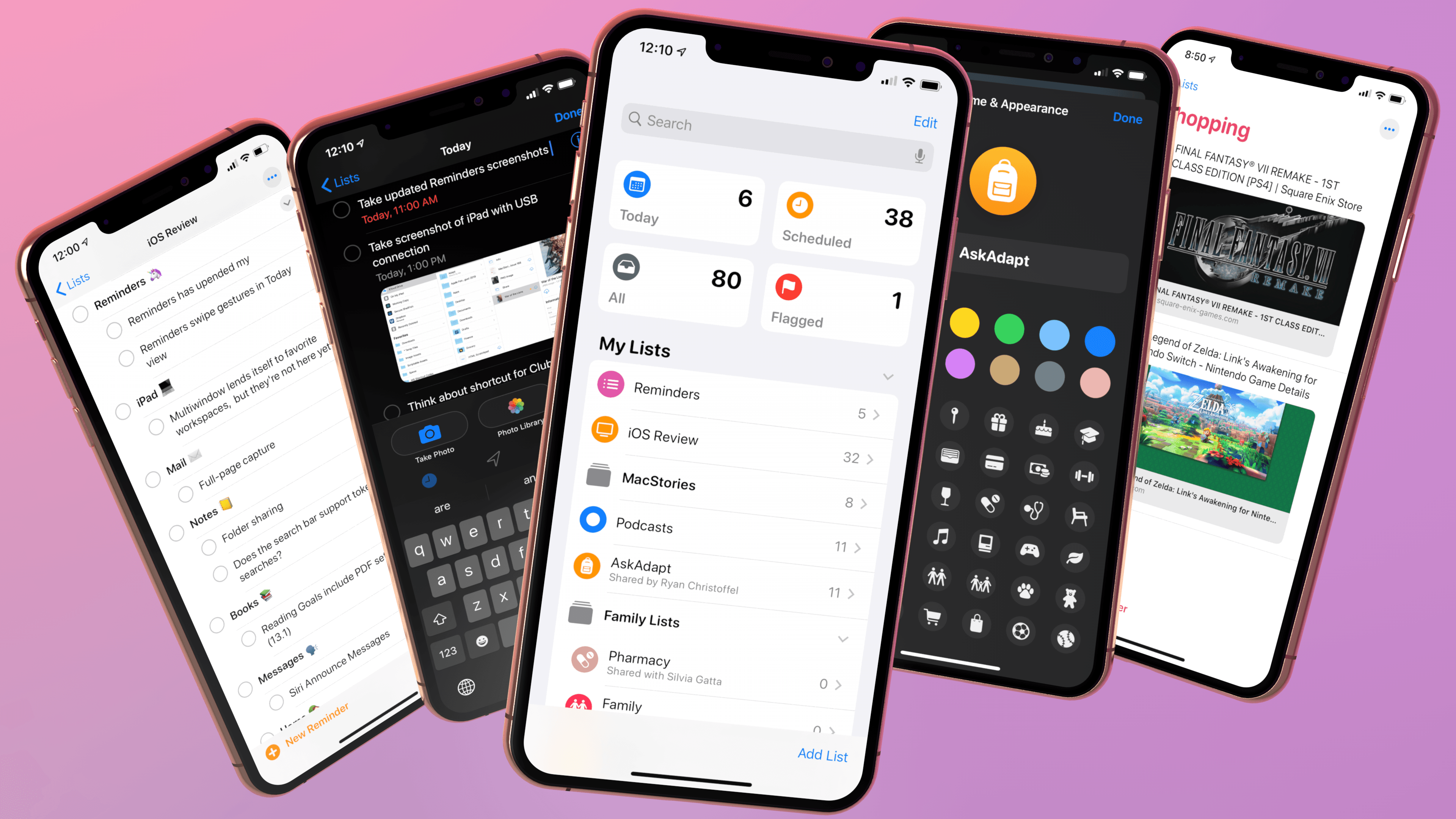
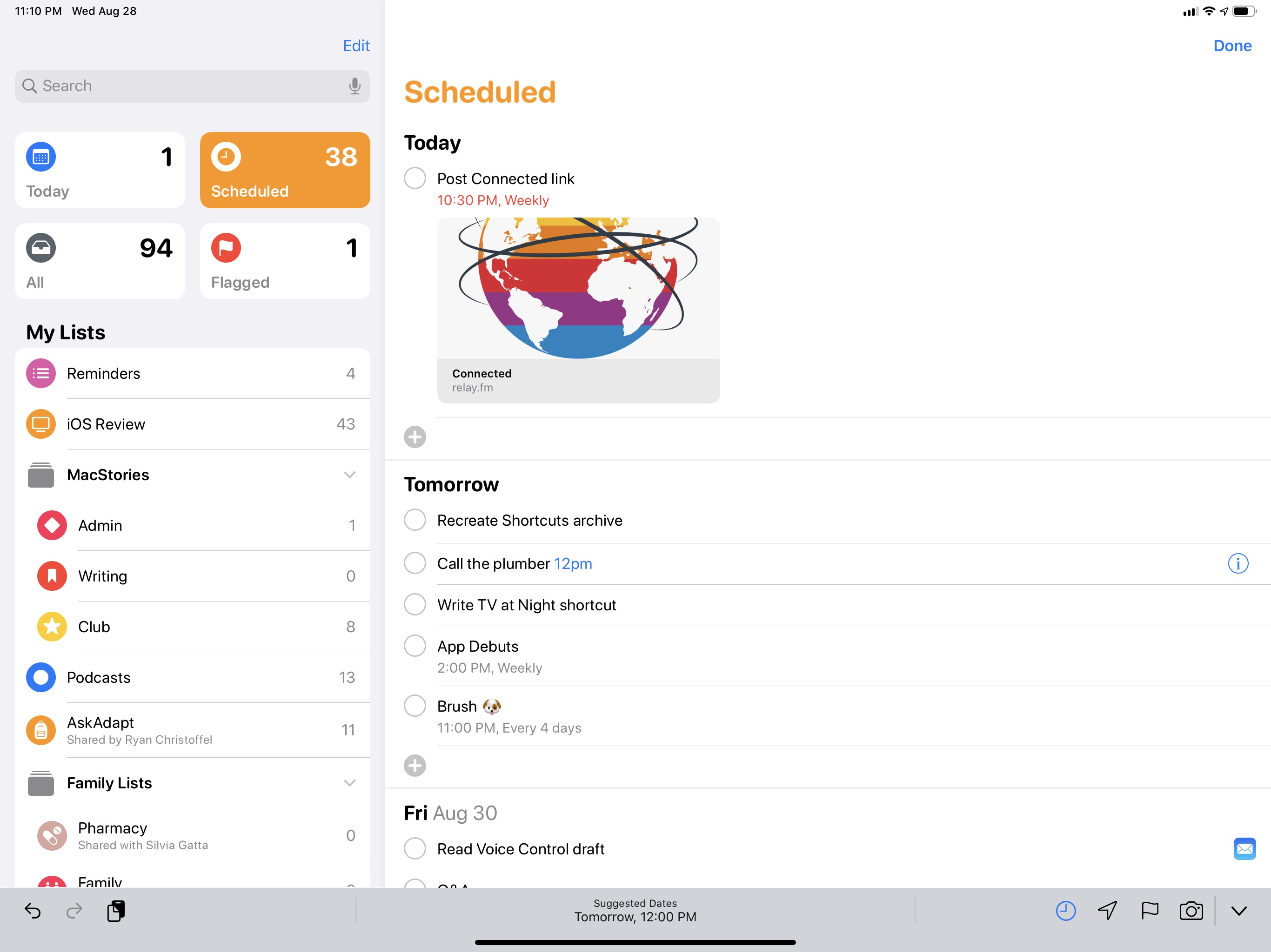
Reminders in iOS 13 carries a new design that revolves around the use of a sidebar (a page on iPhone) with colorful icons and two layers of organization. At the top, Apple has added four “smart lists”, which are large tappable buttons to quickly view reminders due today, all your scheduled tasks, all your reminders, and your flagged ones. Underneath smart lists, you’ll find all your lists, which can now be customized with new colors, glyphs, and groups. Obviously, the new app supports both light and dark modes in iOS 13.
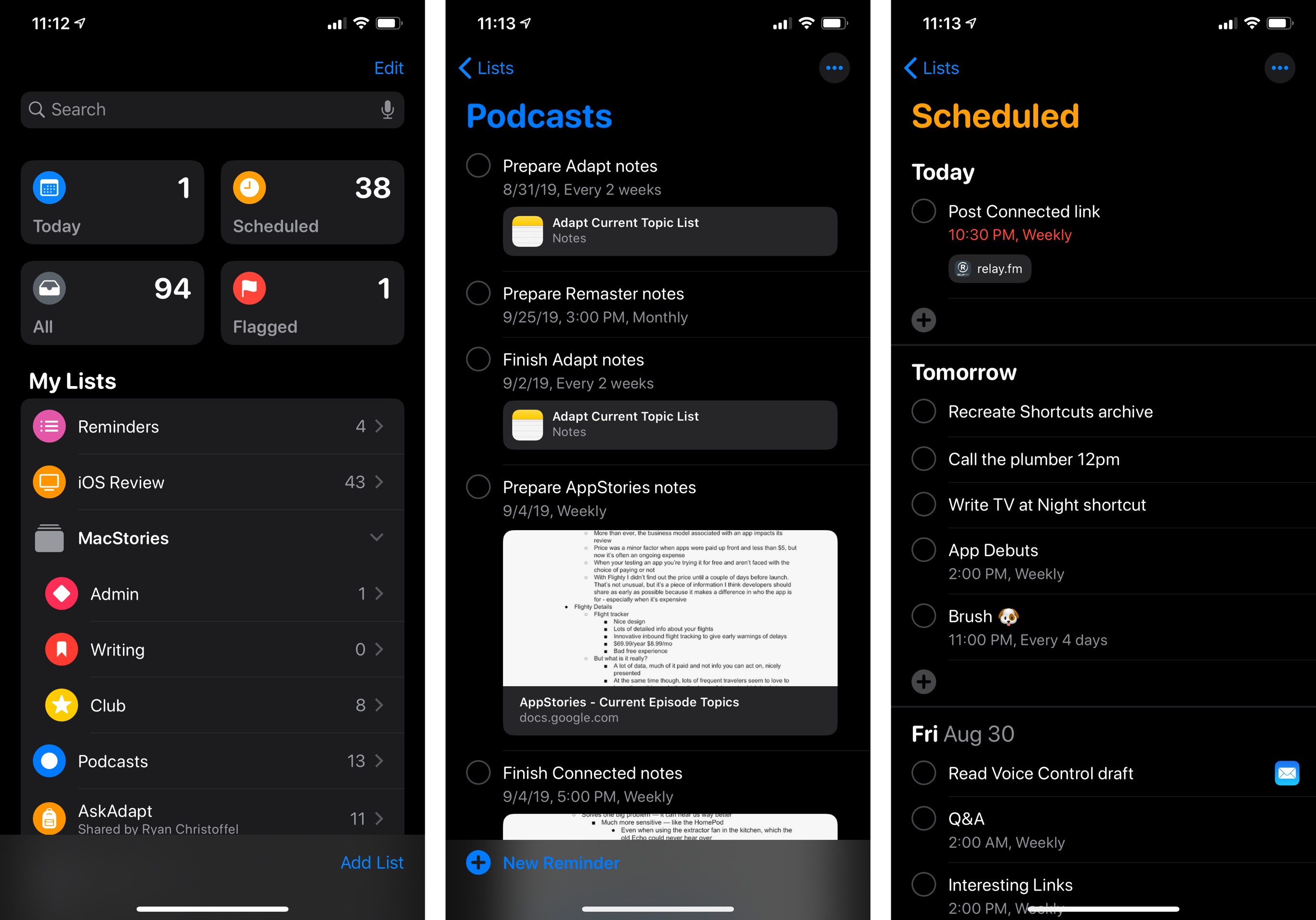
The lack of a “master view” for all your lists was one of the biggest drawbacks of the old Reminders app on iPhone, which forced you to view your lists by flicking through a stack of cards. On iPad, the app did offer a sidebar for lists, but there wasn’t nearly enough contrast between them.
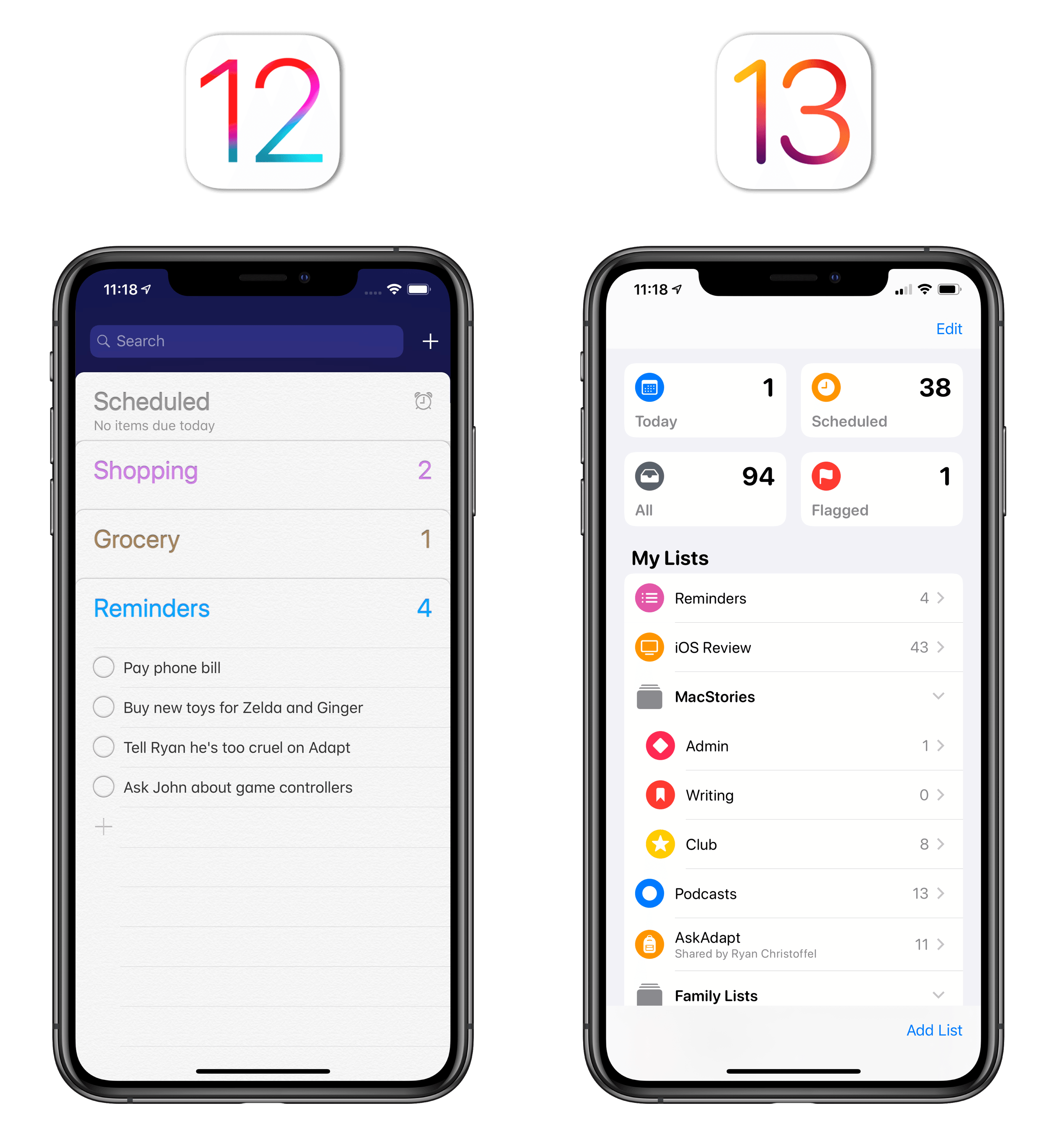
Not only does the new Reminders provide you with a unified ‘My Lists’ view, but it also lets you customize each list by choosing among 12 colors and 60 unique glyphs based on SF Symbols. To customize a list, you just need to swipe on it, tap the ‘i’ button, and pick colors and icons from the new appearance panel. While I would have liked to see even more color options and a wider set of symbols (I mean, Apple has 1,500 to choose from now), these new personalization features have been enough to bring a renewed sense of order and ownership to my lists. I love that my ‘Grocery’ list has a carrot icon now, while the ‘Family’ one has a dog paw (of course) and, appropriately, the ‘Writing’ one is red and features the classic MacStories bookmark.
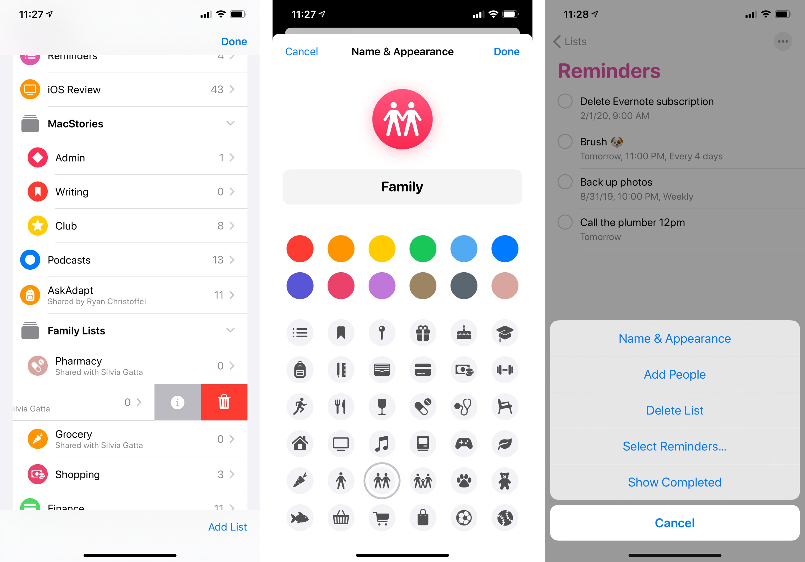
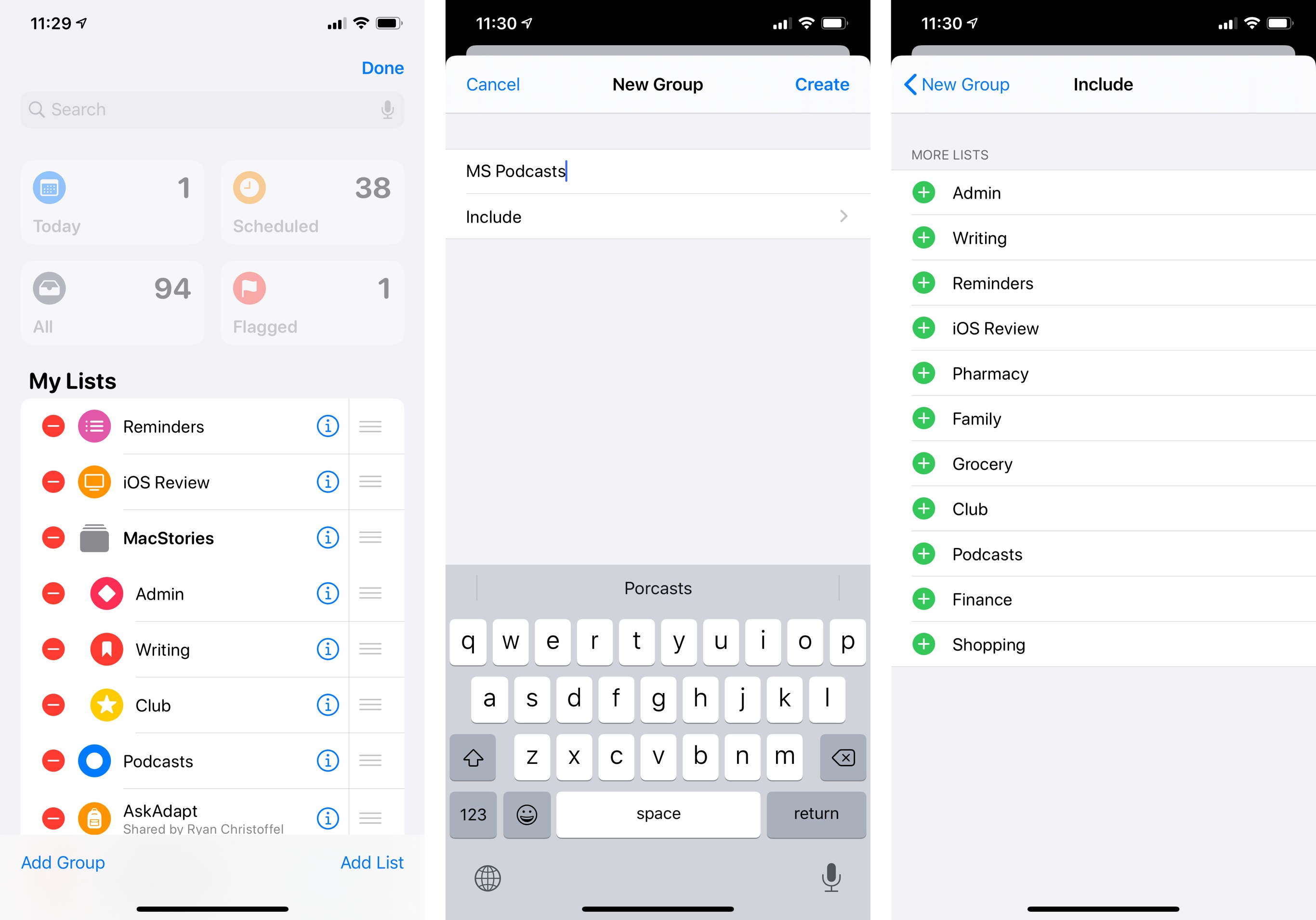
Speaking of order: lists can be re-arranged with drag and drop (even on iPhone) and you can create groups (effectively, folders) to keep related lists together and visually separate them from others. To create a group, hit ‘Edit’ in the upper right corner, select ‘Add Group’ in the bottom left corner, give it a name, and choose which lists to include. Lists contained in that group will be indented, and you can tap a chevron next to a group’s name to collapse or expand the group.
Alas, you can’t customize icons for groups, and you can’t tap on a group and expect to see a view of all tasks for all lists contained in a group (sort of how projects work in Things). Groups are intended for basic organization of your lists only for now, and I’m fine with it. I’ve created two groups for ‘MacStories’ and ‘Family’, and I like that I can collapse either of them in the sidebar.
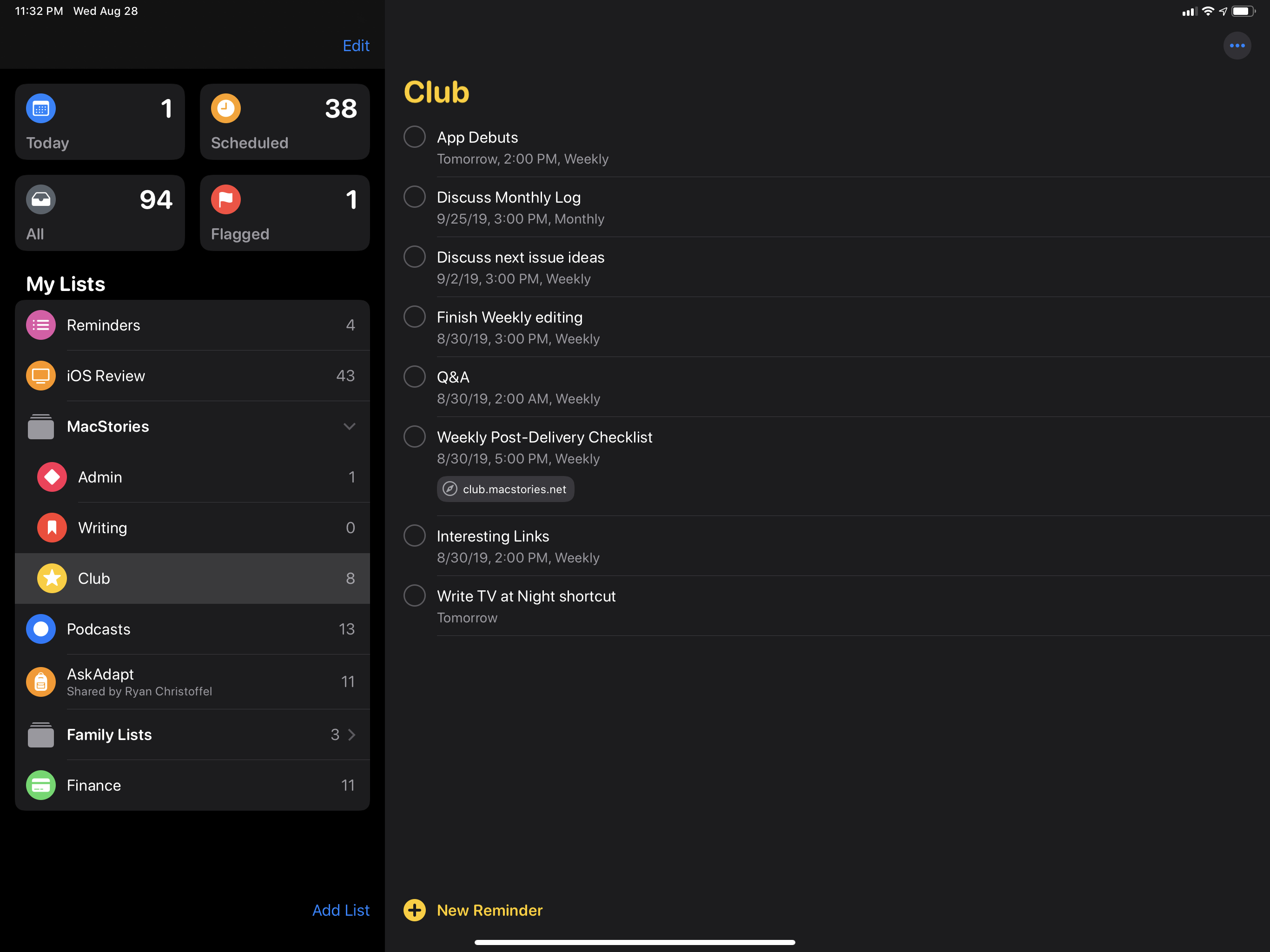
Aside from the visual changes related to new features I’ll describe later, the lists themselves have a cleaner, bolder look when you’re browsing your reminders. The list’s name is displayed in SF Rounded at the top of the screen; lists have abandoned their card-like appearance, paper texture, and letterpress effect for a standard white/black background that scales across light and dark mode. The ‘New Reminder’ button looks friendlier and occupies a more obvious place than before: it used to be a single ‘+’ button at the bottom of a list in iOS 12; now, it’s a colored button with an encircled glyph and thicker font, which makes it easier to reach with one hand.
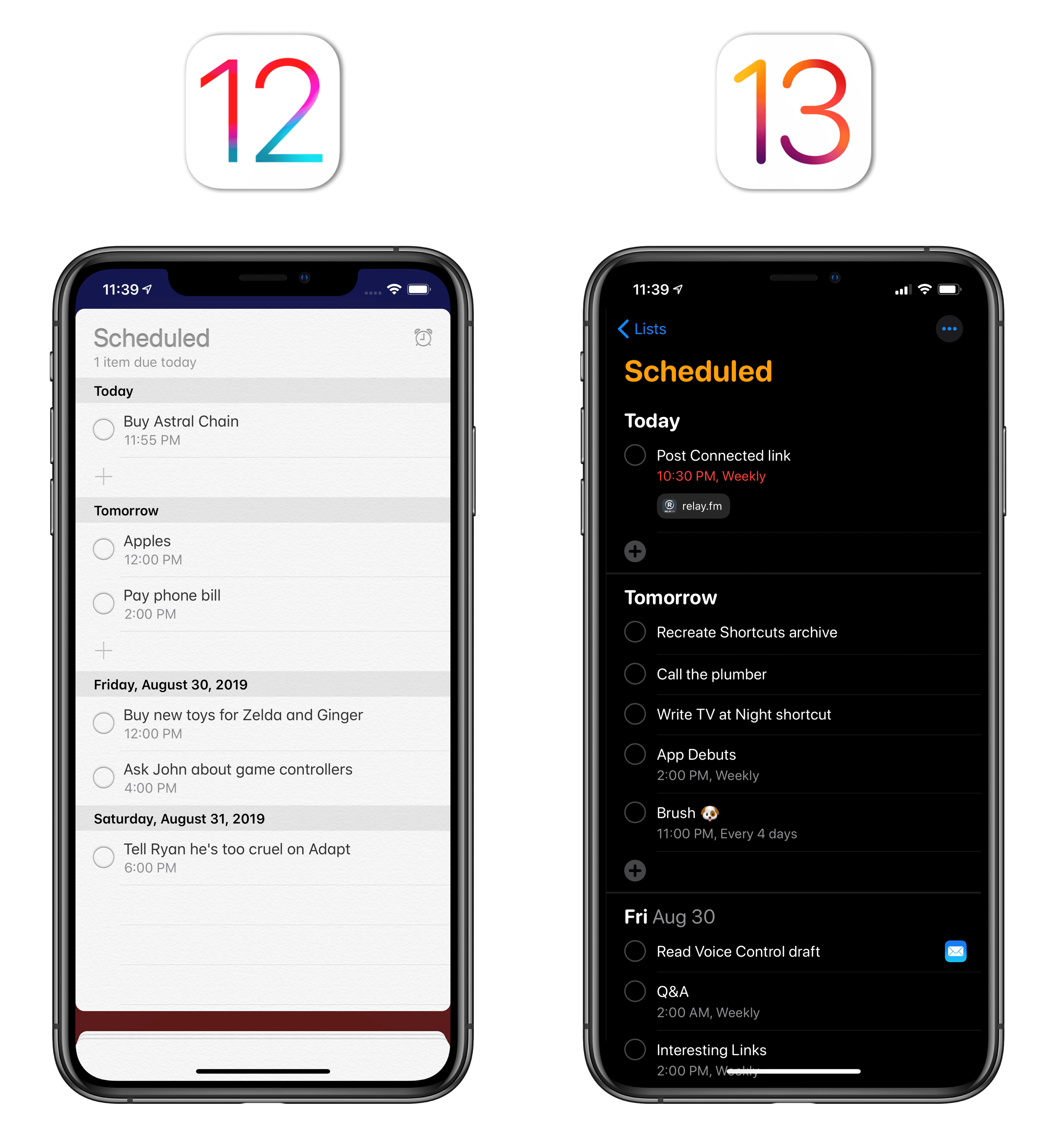
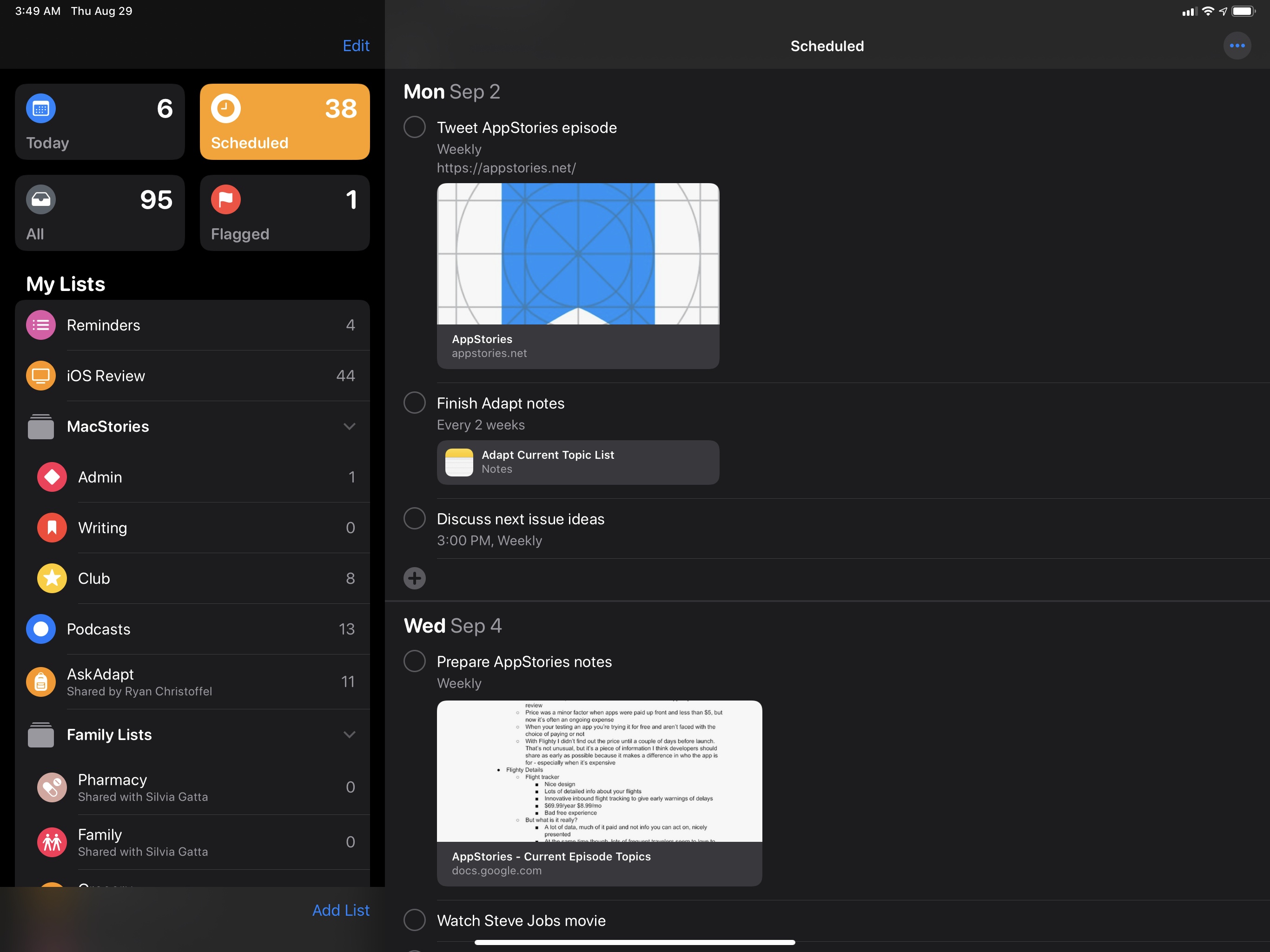
Another good comparison is the Scheduled view: in the new Reminders app, each day has its own bold subheading, which separates scheduled tasks more clearly.
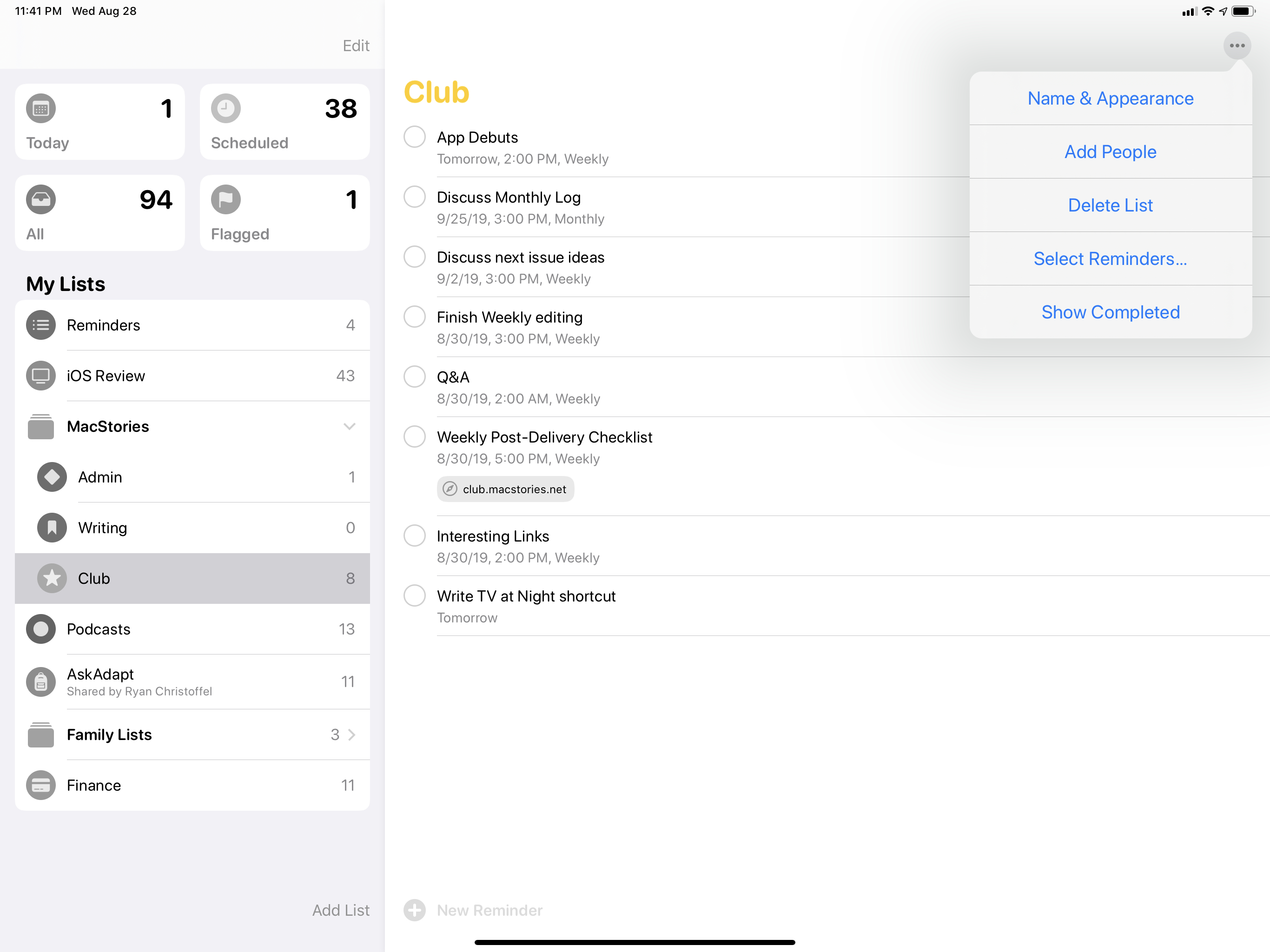
Apple has also employed the ‘More’ button in the upper right corner of the screen – a recurring design element of iOS 13 – to provide users with access to list-related options: this menu is how you can customize the appearance of a list, edit reminders, share a list with other people, and show completed reminders; the latter filter works on a per-list basis.
Generally speaking, the new Reminders has a friendly, bolder look that meshes well with other Apple apps in iOS 13, but it’s also got its own personality thanks to SF Rounded and SF Symbols. The app’s visual flair, however, is only instrumental to its navigational changes and new functionalities, which have far greater impact on day-to-day usage than icons or colors alone.
Smart Lists
When Apple mentioned they were adding ‘smart lists’ to Reminders, four fixed rectangles at the top of a sidebar were not exactly what I had in mind. For years now, I’ve wished that Apple would take inspiration from GoodTask or Things to let you tag tasks and filter them by tag; in my mind, creating a “smart list”, like in GoodTask, would have entailed a way for users to assemble their own views with different filtering criteria, including tags, to easily find a subset of tasks.
Instead, smart lists in the Reminders app are four buttons that cannot be customized nor hidden. If you were expecting Reminders to offer some kind of true saved search or smart list functionality, you’ll be disappointed.
The bigger topic here is Apple’s institutional aversion to any kind of moderately advanced filtering feature for its iOS apps. I talked about this idea in an episode of AppStories last year: while third-party apps such as GoodTask, iA Writer, Keep It, and – guess what – Workflow have shown that it is indeed possible to adapt Mac-like filtering UIs to iPhones and iPads in the name of “desktop-class” experiences, Apple has long ignored this aspect of productivity apps.
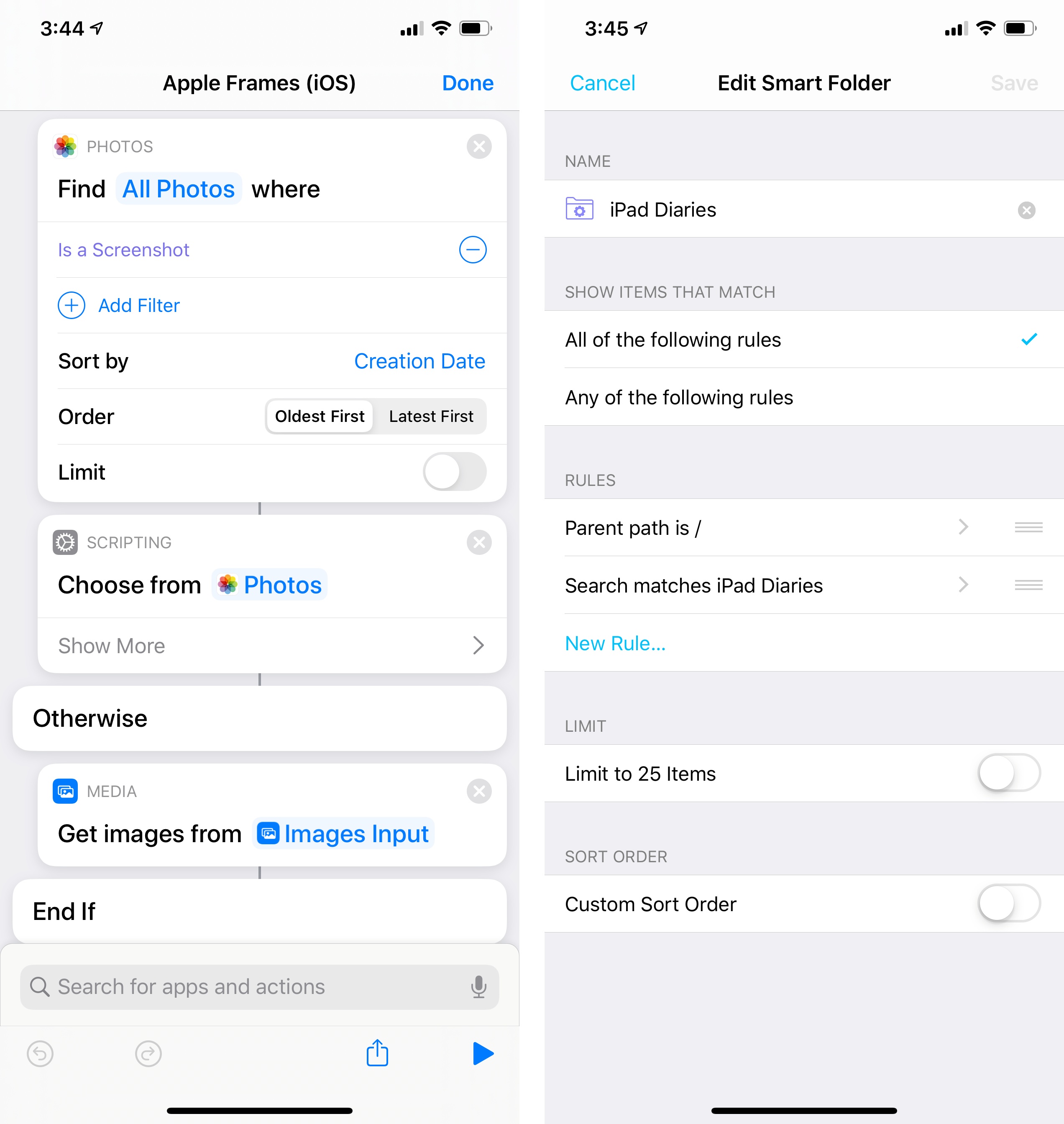
Just like we still can’t create smart folders in Files, Music, or Mail for iOS, we also can’t create our own smart lists in Reminders. I have no idea why this is the case – especially if you consider how smart lists and saved searches are one of those inherently good ideas and solved problems that the Mac figured out decades ago, and which are ripe for an iOS reinterpretation. If the issue is not a deeply-rooted conviction that smart lists should never exist on iOS, then I have to believe it’s a matter of prioritization – that Apple still hasn’t found the time to build this feature for iOS. Read into this what you want; at the end of the day, Apple’s apps are worse because of this functionality’s absence, leaving room for third parties to innovate.
This is not to say I don’t like or use what Apple has shipped with Reminders’ smart lists this year. Tapping the Today and Scheduled views has become second nature for me when I open Reminders now; I believe both views are excellent time-saving tools if you need to see what’s on tap for the current day or upcoming week. I use both smart lists a lot, and I appreciate how they can be navigated with keyboard shortcuts on iPad. The Scheduled list is where I spend most of my time managing tasks these days.
At the same time though, I can’t shake the feeling that smart lists in Reminders could have been so much more: imagine if you could create custom lists for, say, “reminders from my Family lists due today” or “reminders from shared lists that are due this week”. Not to mention how additional filtering criteria could play into this: if Apple were to build a true smart list creation feature in Reminders, they could let you filter reminders that have attachments (a new option in iOS 13), those with subtasks (also new), or even reminders that have due dates but no due times. The possibilities are endless, and when you factor in the ability to give lists a color and unique icon, you end up with a potential system where you’re effectively designing your own sections for a task manager.
And maybe that is why true smart lists aren’t part of Reminders: despite Apple’s many improvements in iOS 13, which I will detail below, there’s still a fundamental tension between Reminders as a simple todo list app and Reminders as a task manager; I’m not sure Apple wants to steer the app in the direction of power-user features such as customizable smart lists yet. For now, I’m making my own “smart lists” for Reminders in Shortcuts, but I look forward to Apple figuring out how to rethink this functionality for iOS and iPadOS.