Apps
Although not as substantial as Files, Photos, Reminders, or Safari, iOS 13 features an array of updates to other built-in apps, bringing quality-of-life improvements that positively affect the daily experience.
I was expecting to lead this section arguing how, for yet another year, Apple’s built-in email app was left languishing without any updates. While Mail hasn’t received the same amount of attention Apple paid to Safari or Reminders this year, and even though I still believe Mail is in dire need of that kind of rethinking, I can’t complain too much: this year, Mail does come with some noteworthy enhancements on both iOS and iPadOS.
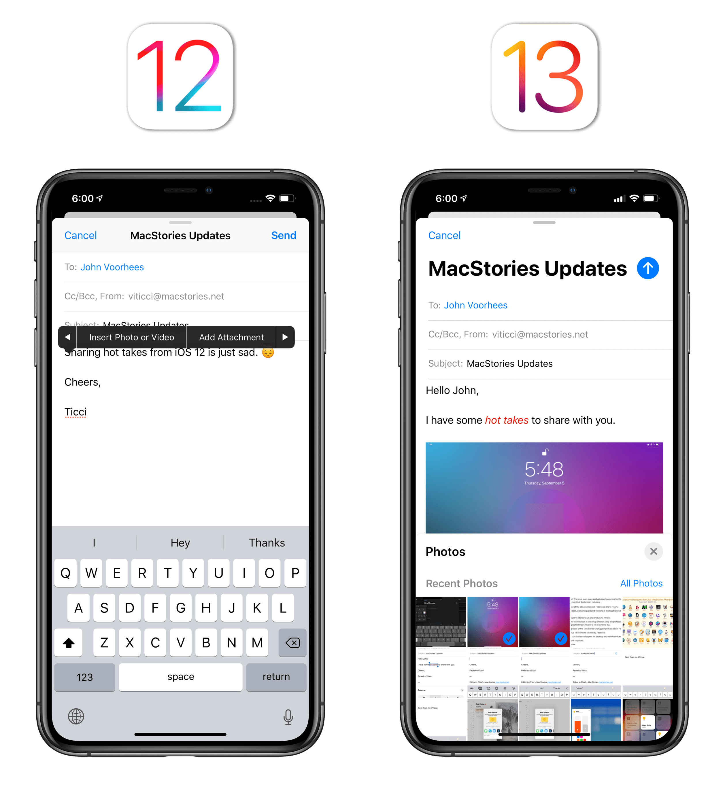
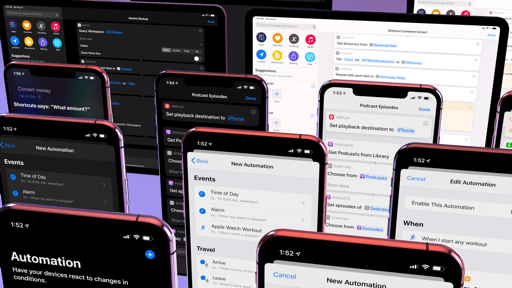
First up is the message composer, which now hosts a large title for an email’s subject field and a conspicuous upward-pointing arrow in lieu of iOS 12’s plain ‘Send’ button. “Hey kids, email is fun!”, Apple seems to be saying with this bolder compose window, and I like it.
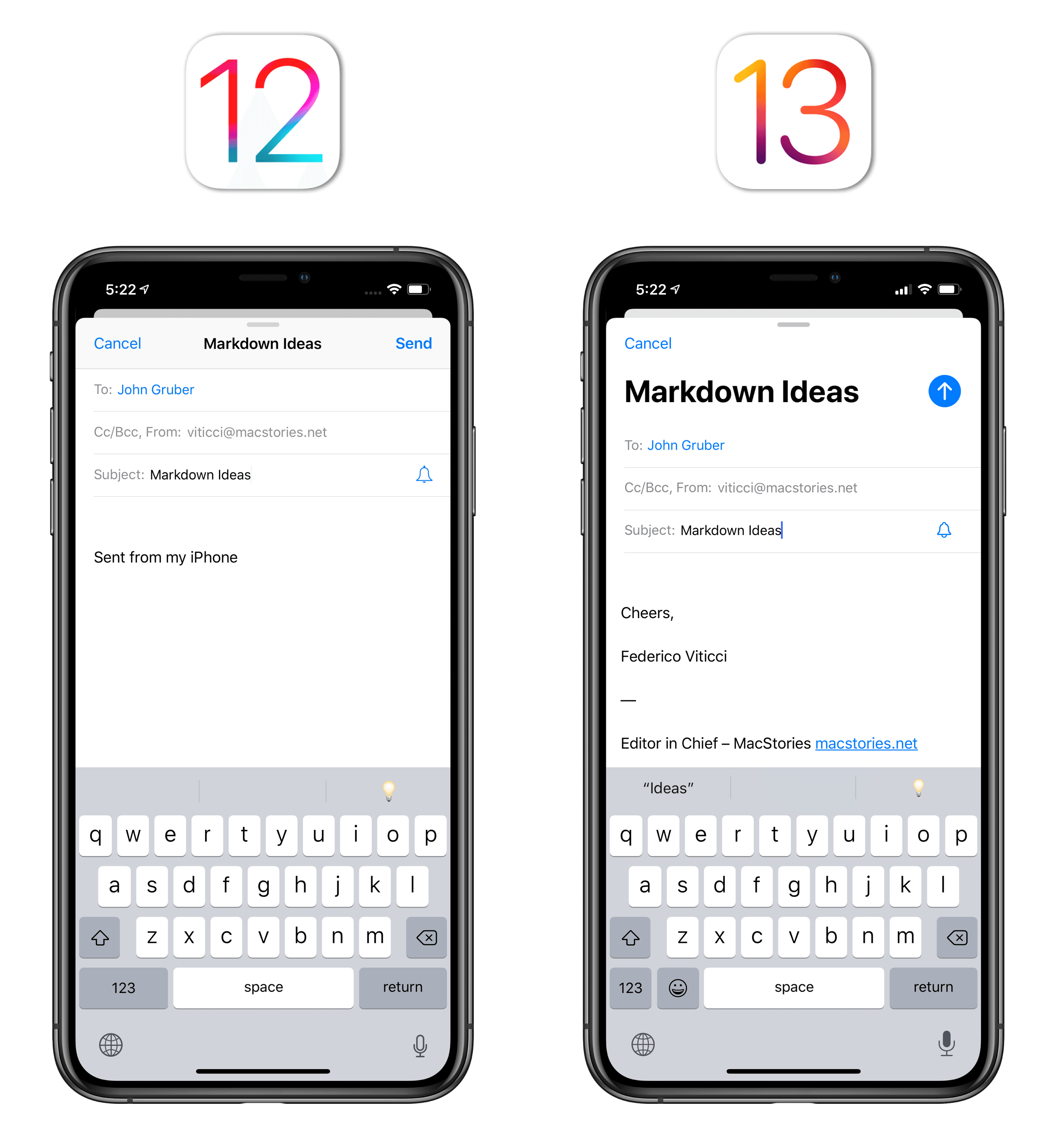
The big news around the new composer involves the functionalities Apple removed from their secluded location in the copy and paste menu and surfaced as part of a new toolbar that handles both formatting controls and attachments. In the process, not only did Apple swap locations for existing features, but they also revamped how you can format your messages and added new options for sending attachments over email.
The new toolbar, available by tapping the chevron on the right side of the QuickType bar (on iPhone; it’s always shown on iPad), offers buttons to show formatting controls, attach images or files, scan documents, and create sketched annotations. While Mail provided some basic formatting options in the past, they were few, tucked away in the copy and paste menu, and a far cry from the bevy of options available on macOS; for the first time since its inception over a decade ago, Mail now comes with a proper formatting palette.
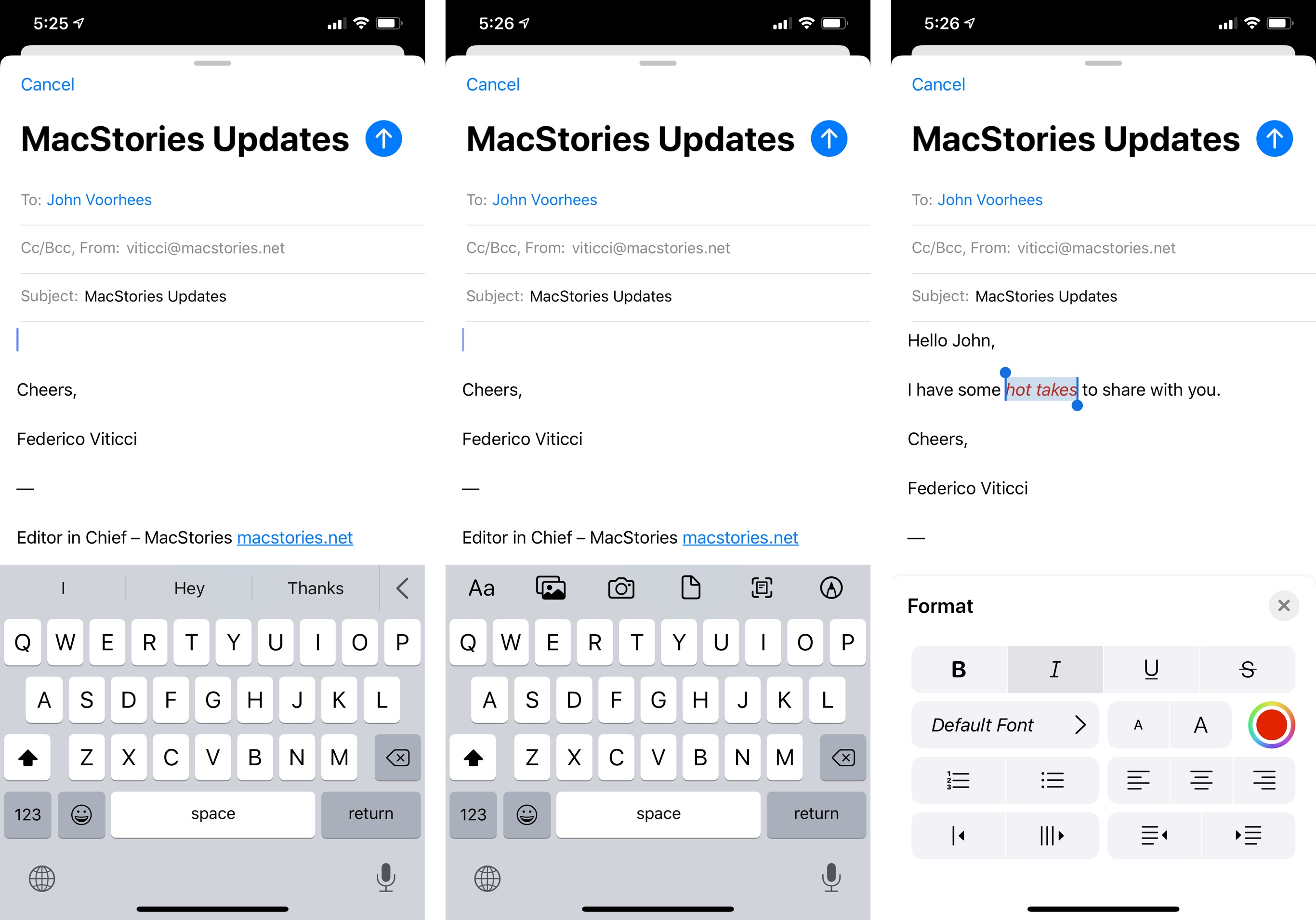
Besides the existing basic formatting options, you can choose fonts with a native system picker (also new in iOS 13), change colors, create lists, increase and decrease quote levels, and modify text alignment. I’m not the type of user who likes to format their email messages like Word documents, but I’ve always found it ridiculous that Mail – a ten year-old product – couldn’t let me tweak fonts in a response to a long email. Although they’re not as extensive as on the desktop (where’s the option to create hyperlinks?), it’s great to have a built-in formatting tool in Mail, which used to be one of the most common criticisms of the app. I also like how the panel is presented on iPhone at the bottom of the screen.29
The photo picker has also been integrated with the new toolbar and redesigned to be presented as a panel; unlike formatting controls, it can be expanded to reveal more items in your recent photos, which is the default view of the picker.30 In a welcome touch, you can attach multiple images to a message by just tapping on them – no need to go back and forth between the picker and the message composer as was the case in iOS 12.31 If you often send photos to colleagues over email, the efficiency granted by this improvement alone might be good enough a reason to upgrade to iOS 13.
The other icons in the formatting toolbar provide a more obvious location for features that were previously hidden in the copy and paste menu (which still has them, but it’s much easier to access them via the toolbar). You can take a new picture and insert it in the message; pick a document with a native Files picker; new in iOS 13, you can scan a document to PDF using the system’s document scanner; and you can enter markup mode to start drawing something and send it over email as an attachment. If you ever feel compelled to start drawing your next masterpiece in Apple Mail, you know where to find the feature now.
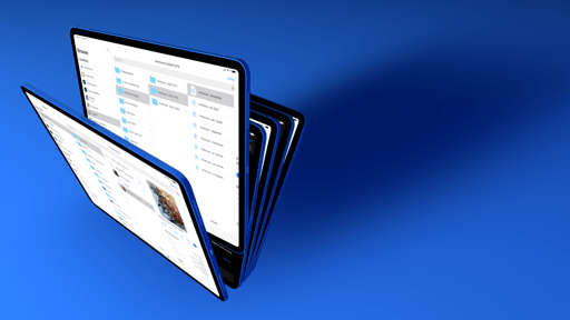
That’s not all that Apple has done to the composer in Mail, however. In iPadOS, the composer is treated as its own scene, meaning it can be dragged away to become its own window. Owing to the fact that multiple scenes can coexist for the same app in iPadOS, you can thus pair different Mail composer windows with different apps in Split View and Slide Over – useful if you’re writing email messages for different work-related projects on your iPad.
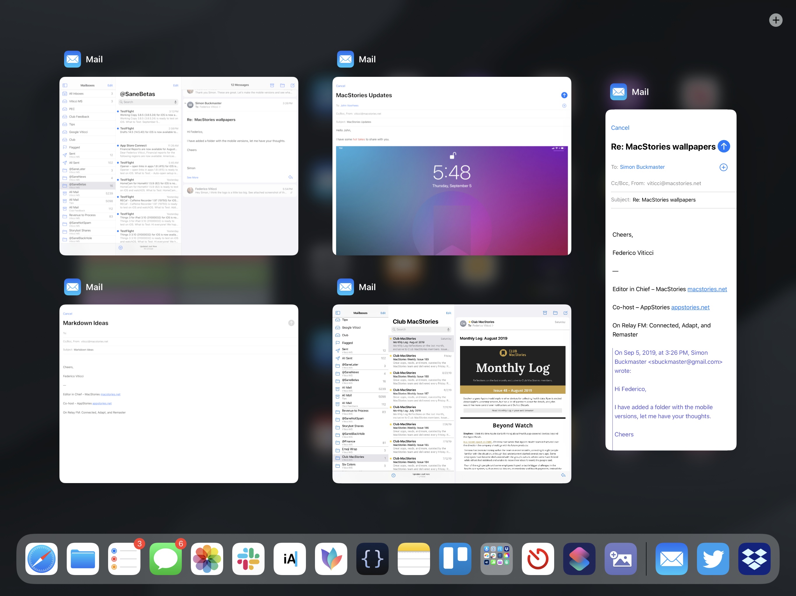
Based on the same principle, every message can become its own standalone Mail window in iPadOS: pick up a message, drag it to the side of the screen, and let go to generate an auxiliary Mail window for that specific message. When you’re done working with it, tapping the ‘Done’ button in the upper right corner will dismiss the message and close the window.
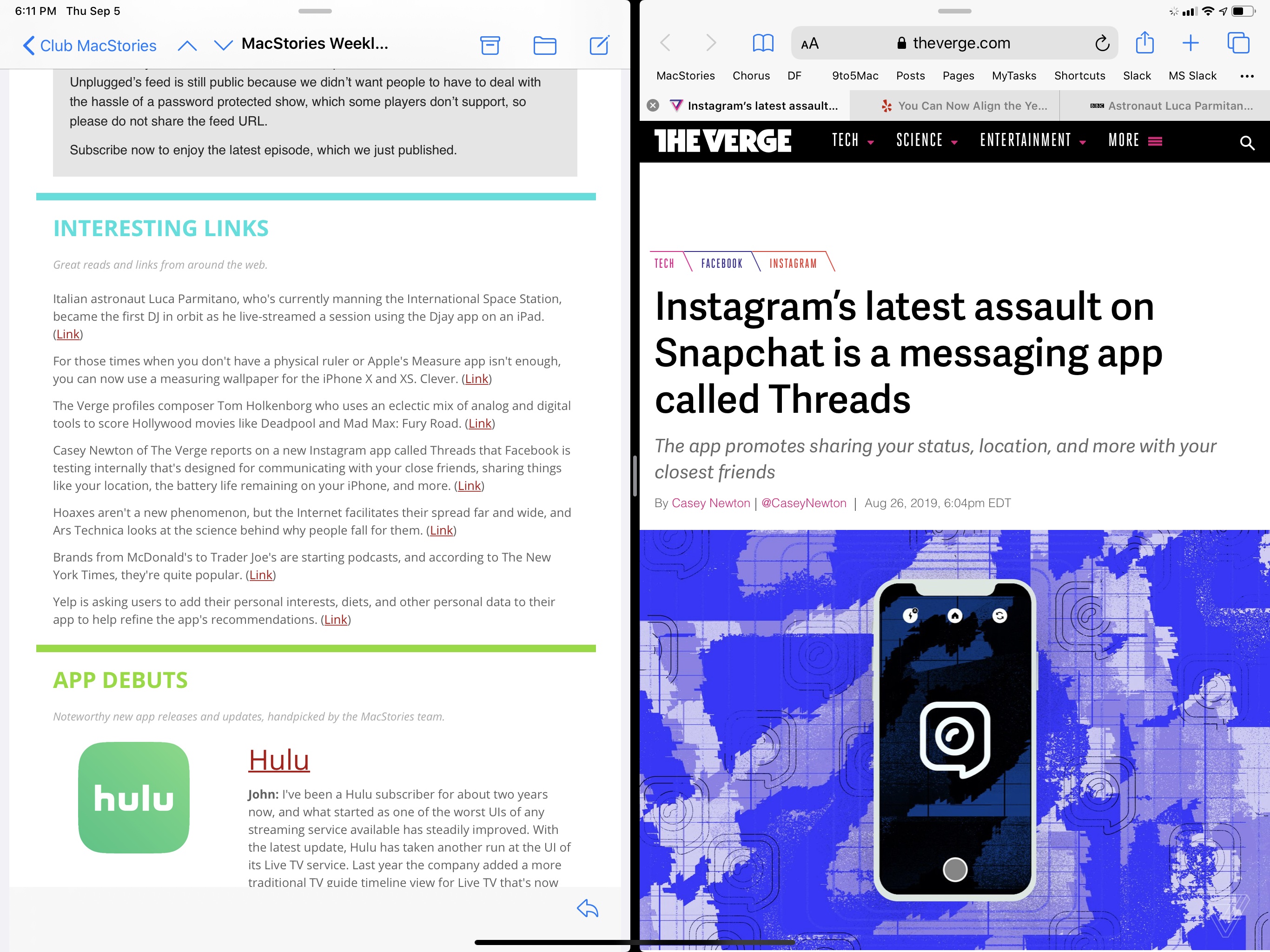
My email needs are too basic for this to be a common occurrence, but, thanks to this system, it’s possible to create separate workspaces for specific message threads, composer windows, or other app windows. If, for instance, you’ve received a new issue of MacStories Weekly and want to check out the links we’ve posted in a standalone Safari instance dedicated to the newsletter’s links, that kind of workflow is now supported via Mail and Safari’s multiwindow capabilities in iPadOS.
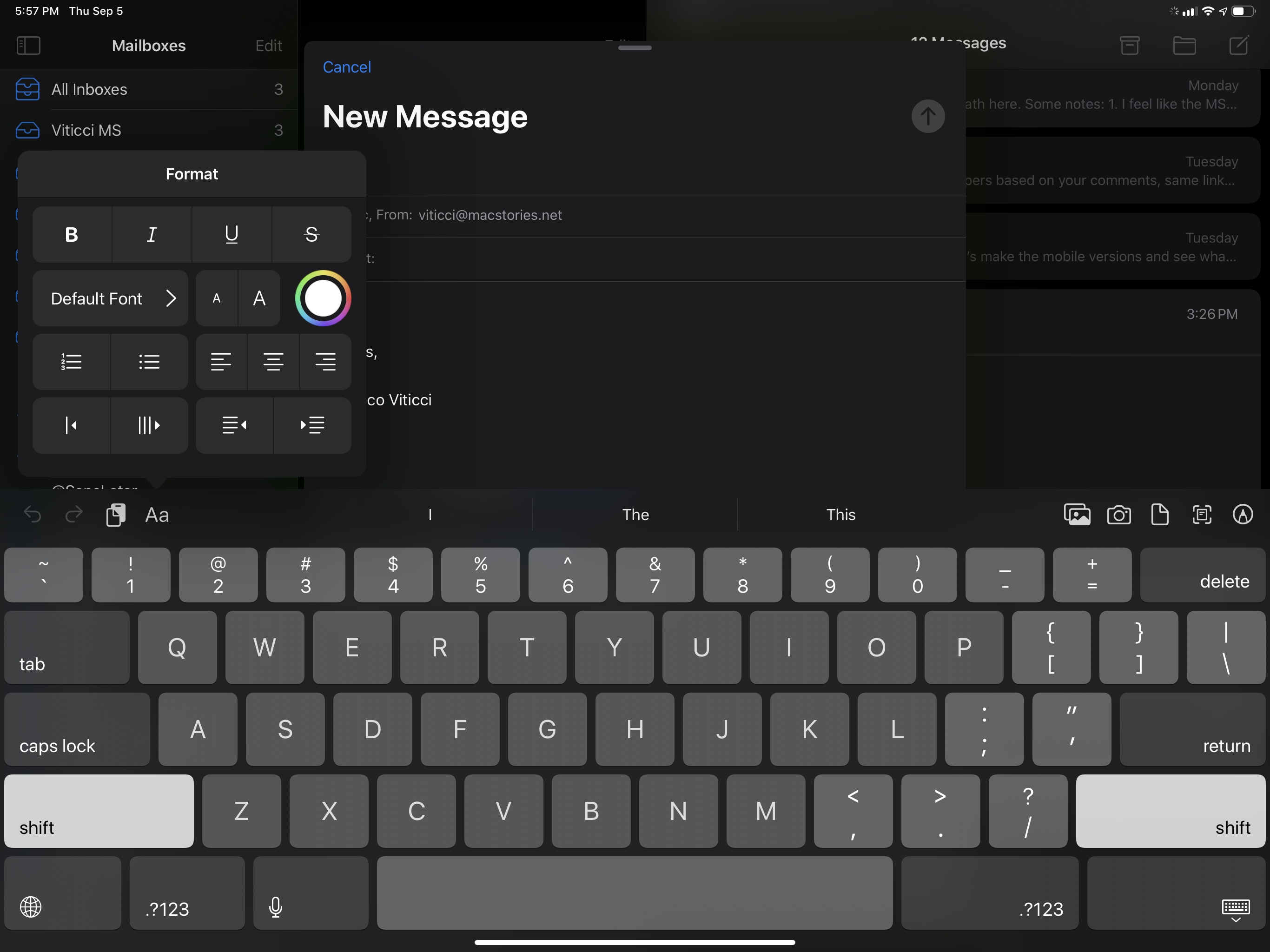
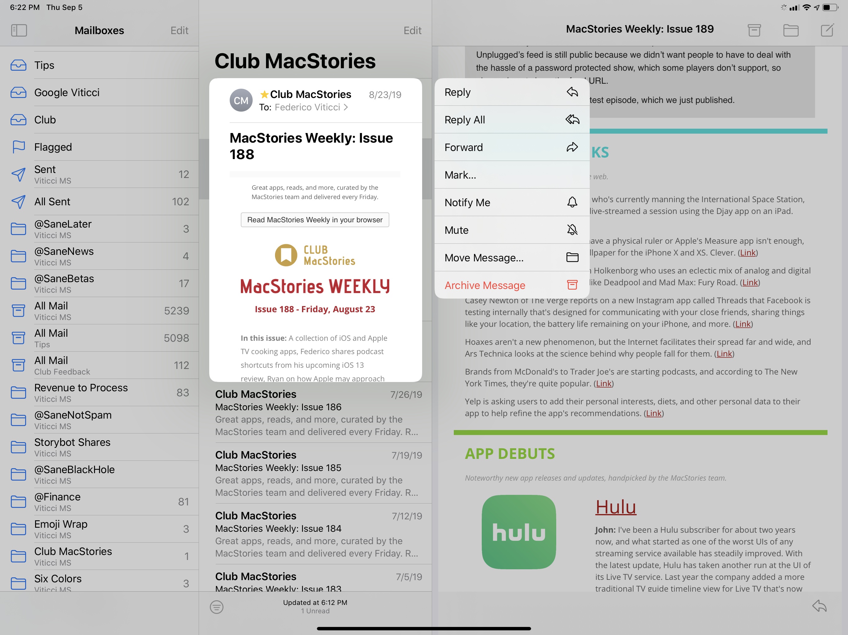
Beyond the refreshed composer interface and multiple windows, there are other improvements Apple brought to Mail this year to bolster its (somewhat dwindling) desktop-class reputation. The message viewer has been redesigned32 so it now features two actions: the archive/delete button (depending on your preferences) and reply. The reply button, however, spawns a new panel that’s like a custom share sheet for Mail: along the top edge, you’ll see large buttons laid out horizontally to reply, reply all, forward, and archive; underneath those commonly used actions, you’ll find a vertical list of options including flag (which can now have multiple colors in iOS 13), move, mute, and thread notifications.
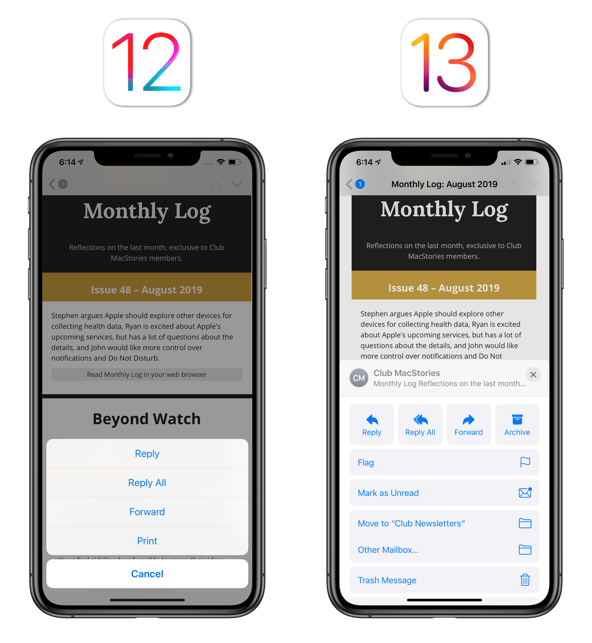
I like to spend as little time in Mail as possible, and most of my “triaging” these days happens from swipe gestures in the inbox (where the ‘Archive’ action has a new purple color), so I don’t use the extended reply menu often. I think it’s a good idea to group related options together in a dedicated panel; I wonder, though, if less adventurous users will have trouble finding actions that used to be visible in the viewer’s toolbar, and which are now hidden behind a button that ostensibly looks like a reply function, not a multi-purpose menu. Mail still doesn’t offer third-party app integrations like clients such as Spark or Airmail, but if Apple ever opens Mail up to third-party extensions, they should probably live in this contextual menu.
Moving on to the smaller, but still welcome, enhancements to Mail this year, you now have the option to mute specific threads. By muting a thread, you’ll stop receiving notifications for new messages belonging to it, and you’ll also be able to configure an action to be performed automatically for each new message in a muted thread. Under Settings ⇾ Mail ⇾ Threading ⇾ Muted Thread Action, you’ll find the option to archive/delete or skip the inbox. This is not as powerful as creating your own rules for automatic message processing in macOS’ Mail, but it’s also more intuitive for newcomers and, arguably, just as effective if all you care about is silencing your cousin Dave, who keeps replying with unrelated emoji to the ‘Family Vacation 2019’ email thread. Seriously, Dave: it’s time to stop.
If mute isn’t enough, Mail also integrates with your block list in iOS and iPadOS: the same email addresses you’ve blocked for calls and texts can be blocked in Mail too, and you can decide how to dispense of their messages. You can automatically move them to the trash, mark them as blocked and leave them in the inbox, or do nothing. It would have been interesting to have an option to bounce the message back to the sender, but these options will suffice for now.
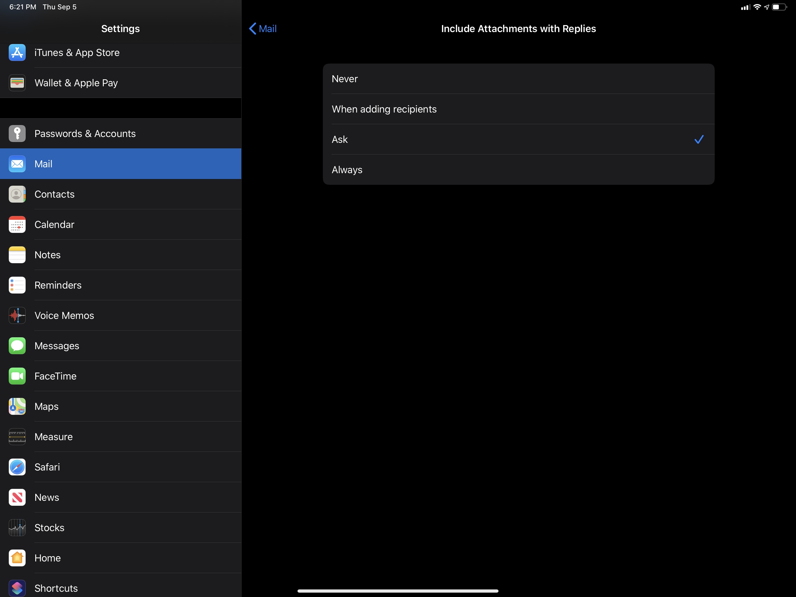
Lastly in terms of new settings, you can now configure Mail’s behavior for replies to messages that contain attachments, choosing from four options as pictured below.
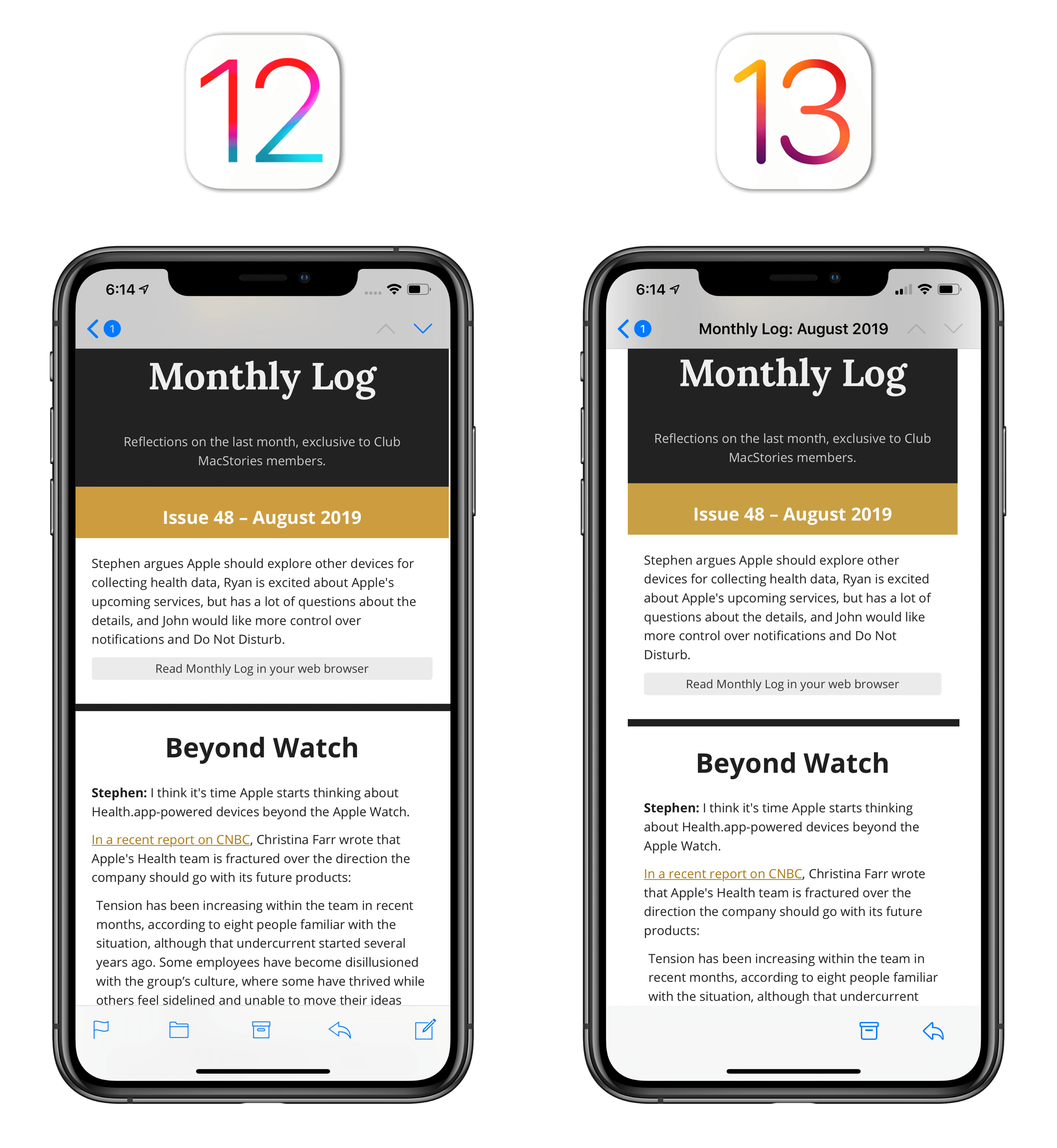
In case it wasn’t clear from the screenshots above, the entirety of Mail’s interface has been slightly refreshed: Apple’s using SF Symbols everywhere in the app, colors have been updated to play nice with dark mode, and fonts are a bit bigger and thicker in various places. Peek and pop has been replaced by context menus, which contain most of the actions you’d otherwise see in the action menu inside the message viewer.
My favorite tweak to Mail in iOS 13 is one that Apple hasn’t mentioned anywhere, and which is hidden enough to make you wonder if an Apple engineer was able to sneak it in without their boss knowing. In iOS and iPadOS 13, if you select some text in a message, hit ‘Share’ from the copy and paste menu, then choose the Reminders extension, you’ll create a reminder that carries the message’s subject as title and a deep link to the message that will reopen it in Mail. Even if you archive the message or move it to a different folder, tapping the Mail icon in the reminder will continue working, taking you from Reminders to the original message with one tap.
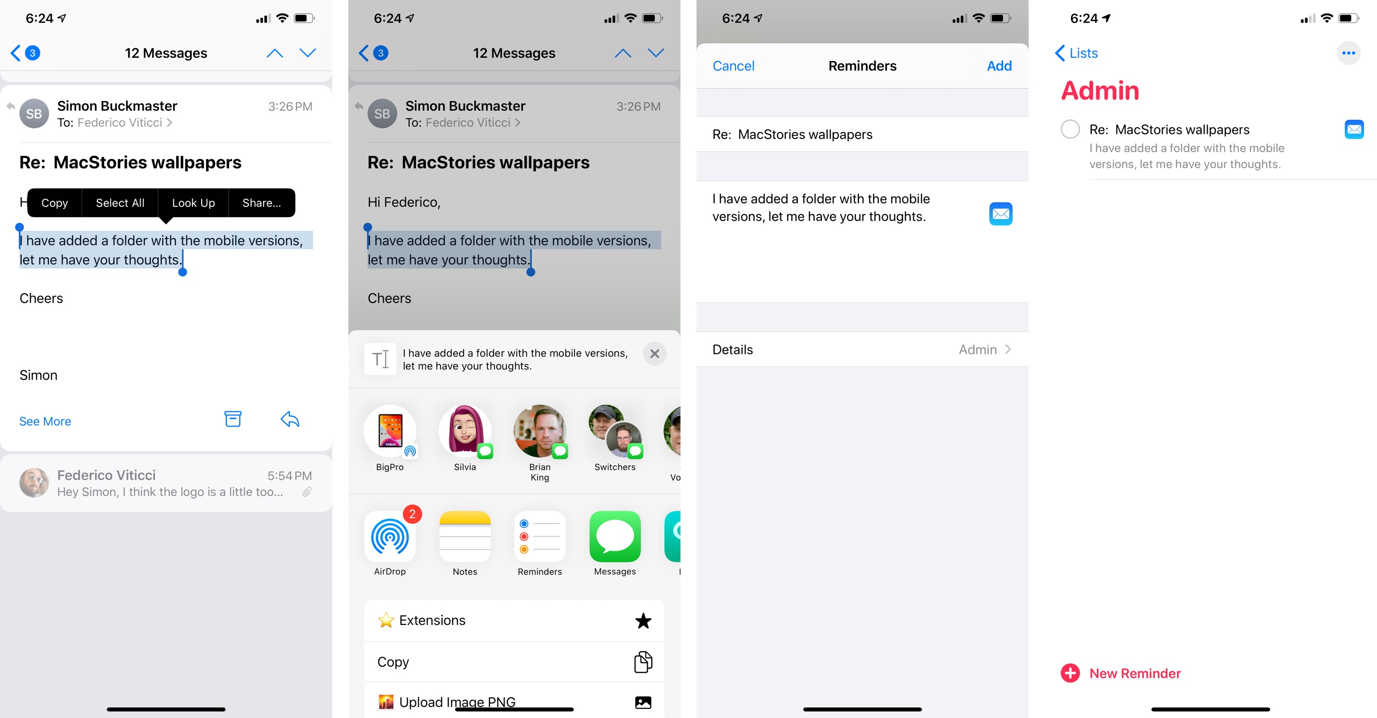
The ability to create message reminders with Mail deep links was previously exclusive to voice interactions with “Hey Siri, remind me about this” on iPhone; on iPad, they could also be created by dragging a message from Mail into the Reminders app. Creating a deep-linked reminder with the share sheet is easier and faster than both methods; as a result, I now save messages to Reminders more frequently, and my Mail inbox is cleaner because I archive messages as soon as they’re saved in Reminders for future processing.
As much as Mail has grown in iOS 13, there’s still plenty of work to be done on two fronts: Mail still isn’t quite as desktop-class as Apple’s desktop client, lacking rules and smart folders; and, Apple still hasn’t implemented features that have become a staple of the modern email experience in third-party apps such as snoozing and app integrations.
However, Apple fixed several of Mail’s longstanding limitations with this year’s revision, and, more importantly, they’ve shown signs of life for an app that has too long remained anchored to its iPhone origins from the last decade. I’m trying Apple Mail again as my default email client: there’s something inherently nice about its elegant design and interface fluidity, and I’ve found its hidden Reminders integration perfectly suited for my email workflow. For the first time in years, I feel kind of optimistic about Mail’s future.
Notes
Having reached a relative degree of maturity following years of major feature upgrades, Notes in iOS 13 sports a variety of quality-of-life improvements that extend the app, bring feature parity with macOS, but don’t subvert the experience Apple’s been fine-tuning for the past few years.
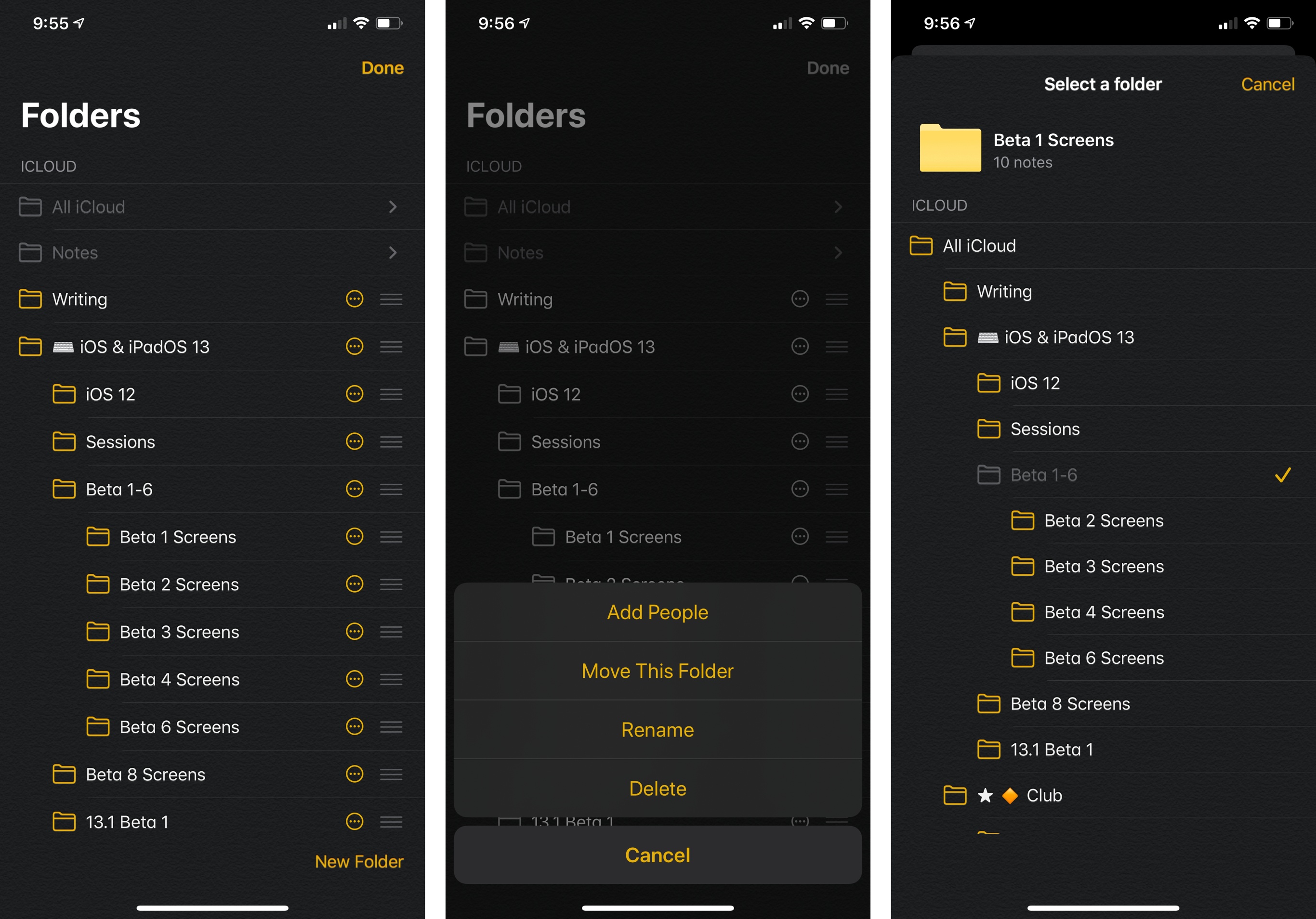
There are two significant additions to folder management in Notes this year: it is now possible to create and manage sub-folders on iOS, and you can share and collaborate on entire folders with other people.
Sub-folder management and creation had long been available in the Mac version of the Notes app, and it was one of the features I kept mentioning as an example of the iPad’s ongoing limitations compared to desktop computers. The limitation is no more: folders can now be put inside other folders via drag and drop, or you can hit the ‘Edit’ button at the top of the Folders list, tap the ellipsis button next to a folder, and select ‘Move This Folder’. You can go as deep into a nested folder structure as you want (you can put sub-folders inside sub-folders inside sub-folders); you can expand and collapse folders by tapping a disclose button next to their name.
As someone who keeps ~450 notes in the Notes app, being able to organize them all directly on my iPad or iPhone without turning on my Mac mini is yet another way Apple has freed me from the desktop this year. I just wish Notes would remember the state of expanded/collapsed folders across app relaunches.
Also in the folder department, Apple is following up one of iOS 10’s best features, note sharing, with the ability to share entire Notes folders with other people. The feature works exactly as you’d expect: in addition to sharing an individual note with others, you can now share a folder too.
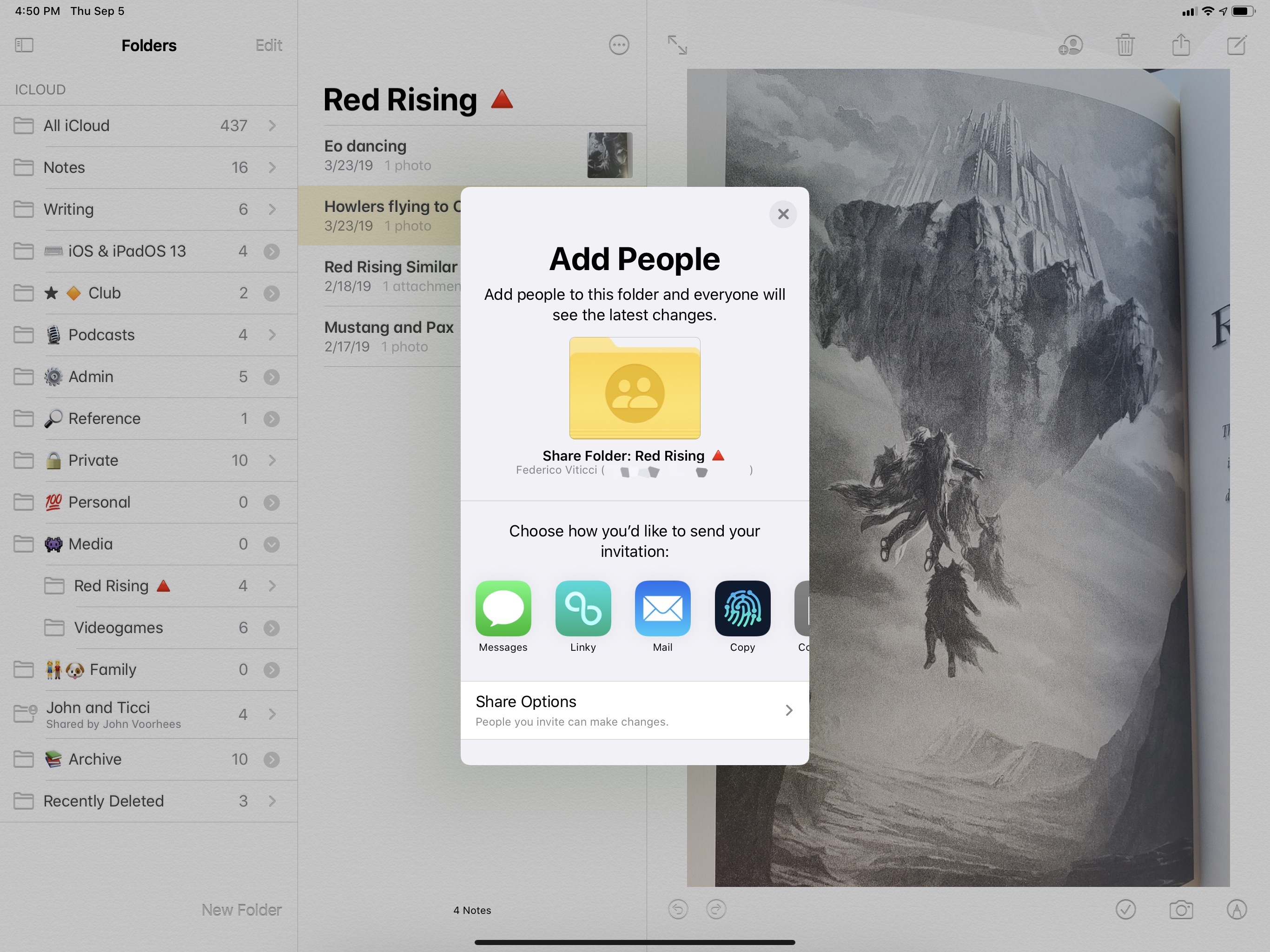
When a folder is shared, all the notes contained inside it are automatically shared too. In my limited tests this summer (I was only able to collaborate on shared folders with two people), the feature behaved like an extension of traditional note sharing, and I couldn’t have asked for more. In the three years since Apple launched CloudKit-based sharing for notes, I’ve come to depend on this functionality to collaborate with colleagues on work documents; for instance, we use Notes’ sharing to prepare the show notes for our iPad podcast Adapt. I’ve rarely had issues with sharing in Notes, and for this reason I’m happy Apple is extending the functionality to folders. Once I’m back to my regular writing routine, I know I’m going to rethink my folder organization in Notes around sub-folders and shared folders.
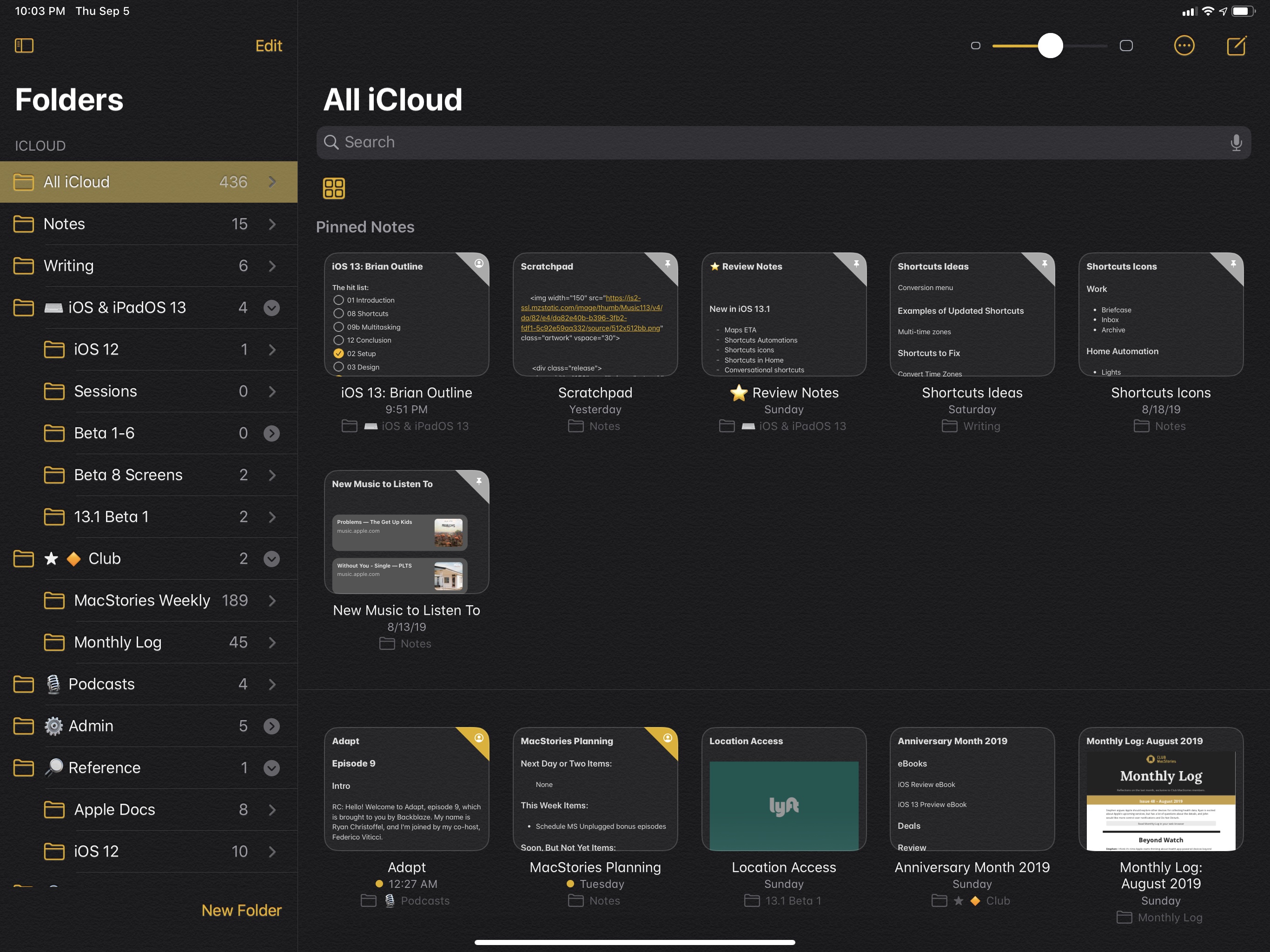
After tackling folder management and sharing, Apple focused on evolving Notes by building upon its existing feature set and rich text environment. One of Notes’ peculiar traits is its flexible support for attachments within notes, so Apple added a new gallery view that turns a folder into a grid of thumbnails. Gallery view33 displays all your notes as thumbnails, each using either the first attachment (image, PDF, drawing, etc.) or first lines of text in a note as its preview.
You can customize the size of thumbnails in the iPad’s gallery view. On iPhone, the size cannot be customized.
Gallery view is reminiscent of grid views in Photos and Files; it’s the ideal tool to browse collections of notes heavy on attachments, such as those that contain photos or drawings, but text inside thumbnails is surprisingly readable too.
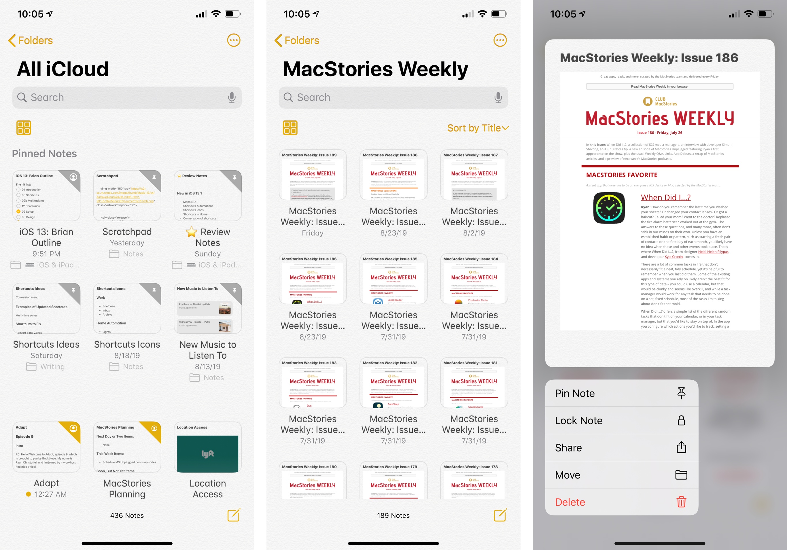
Gallery view works well for notes that contain attachments (center) and supports the new context menus in iOS 13 (right).
I don’t use gallery view much myself because most of my notes are text-based, and I generally prefer seeing longer note titles rather than thumbnail previews. I understand, however, why Apple added this view option: it works especially well for annotations and drawings, which is Notes’ forte for iPad/Pencil users. In a disappointing limitation of the app, while it is possible to set sorting options per-folder, gallery view is an app-wide setting – you can’t enable it for specific folders only. I hope this changes in a future update.
Those who spend way too much time carefully crafting consistent outlines of sections in their notes (this is not self-referential at all) may be happy to know that a new ‘Subheading’ formatting option has been added in iOS 13.
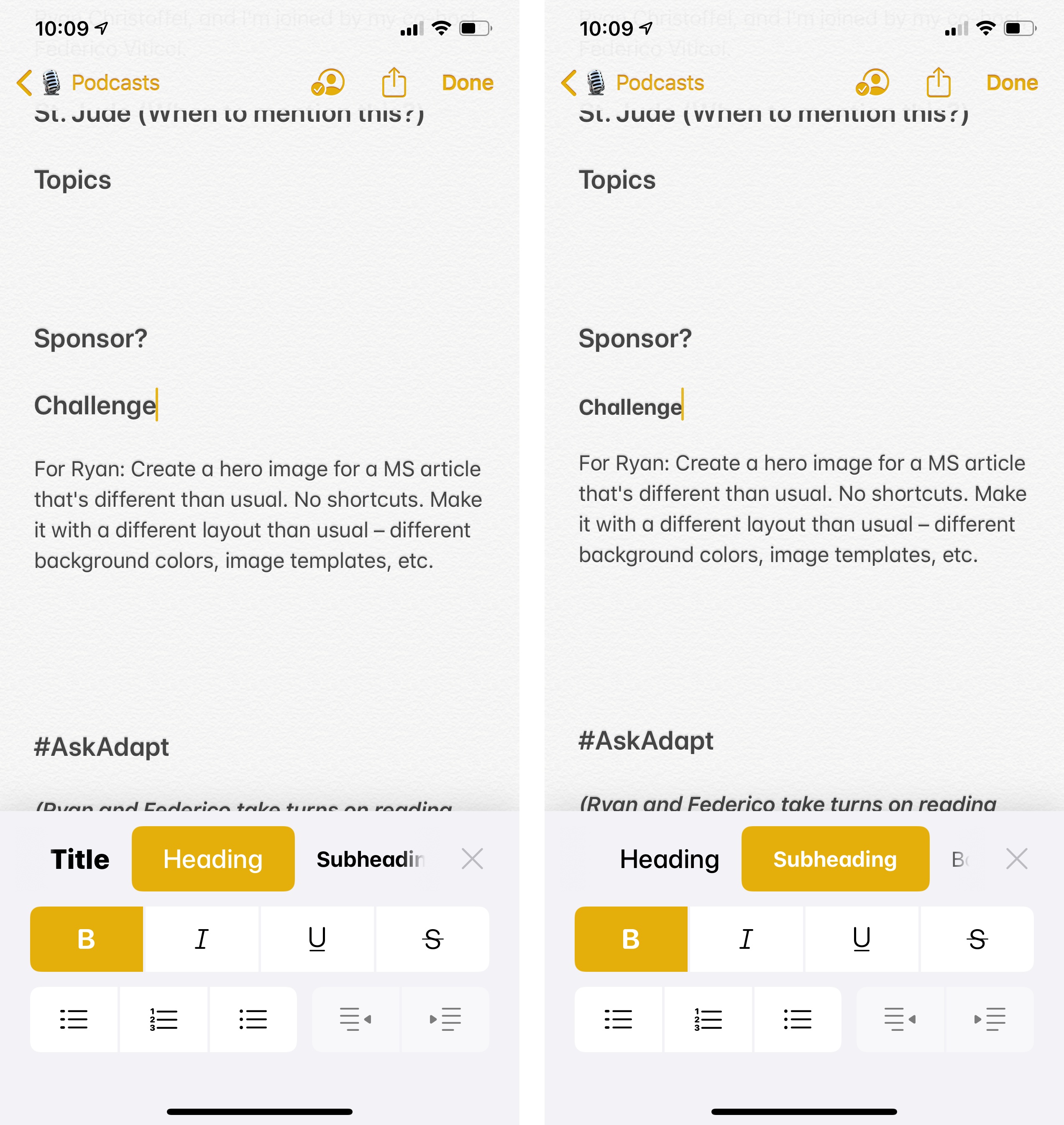
Subheadings are designed to mark up sub-sections contained inside a bigger heading; they’re essentially Body-sized elements with a bold font applied, and they serve their purpose well. I wish I could tell you that I didn’t spend hours reorganizing my longer notes with headings and subheadings to make them prettier and better organized, but then again I did it “for science”.
Speaking of changes to sections inside notes: if you’re a checklist user, you can now reorder checklist items with drag and drop, and there’s a new option in Settings ⇾ Notes ⇾ Sort Checked Items to automatically move checked items to the bottom of a checklist. Additionally, for both checklists and regular lists, you can now indent and outdent lines by swiping across them with your finger, which is a delightful addition to Notes’ text editing environment. Unfortunately, just like in Mail, there’s still no way to create rich text hyperlinks in Notes besides pasting one previously copied from another app.
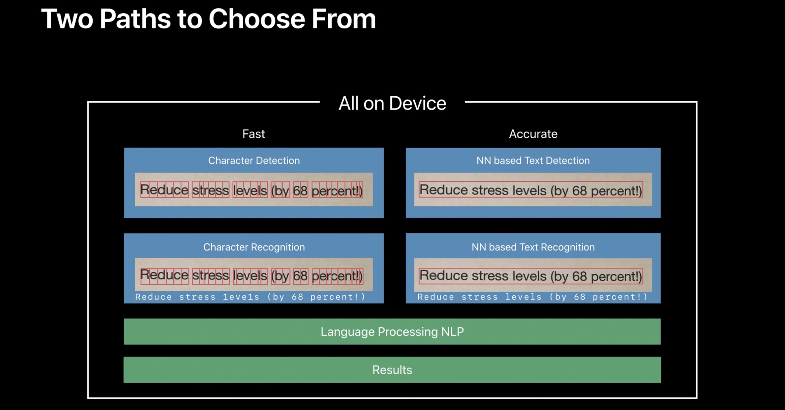
Lastly, Notes in iOS 13 features two powerful additions to search. Thanks to improvements to the Vision framework this year, Notes can now recognize text inside images and allow you to search for it. In my tests, results were astounding: the image analysis powered by the Vision API (which is private, runs on-device, and is open to developers with separate “fast” and “accurate” recognition modes) took less than a couple seconds to run (entirely in the background) and find text in images I dropped in the app as new notes.
There’s nothing you need to do for image OCR to be applied, no setting to enable: just search for text you think was in an image, and Notes will display the note containing the matching attachment in search results.
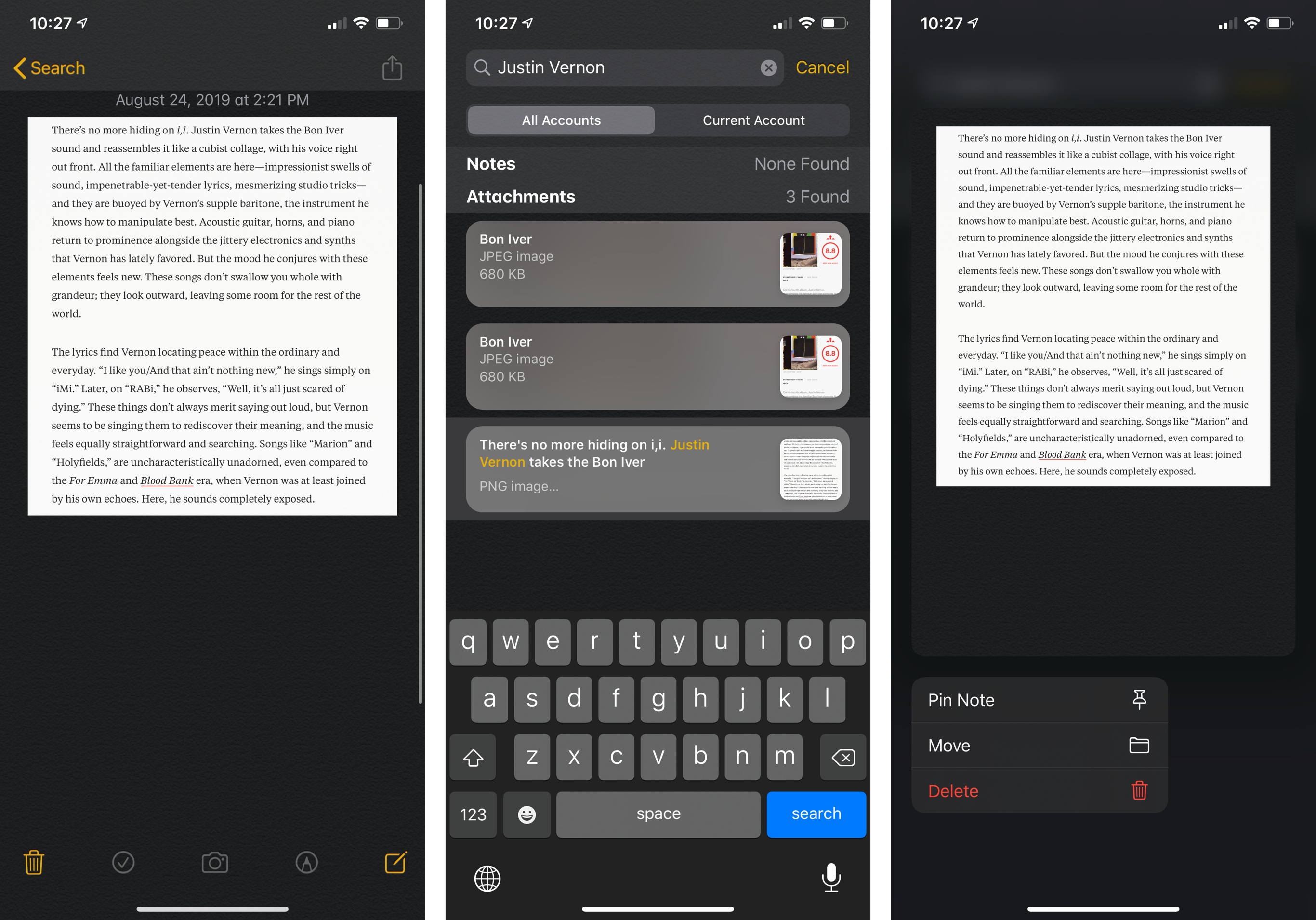
The feature’s not perfect yet as Notes doesn’t highlight the found text inside an image, but Apple’s off to a great start thanks to the high performance and inherent privacy granted by the Vision framework, which is proving to be one of Apple’s smartest investments in terms of developer technologies in recent years.34 I feel a lot more comfortable taking screenshots of articles and webpages knowing that they’ll be searchable in Notes.
As for search itself, tapping into the search bar reveals new suggestions to filter notes by type, which include:
- Shared Notes
- Locked Notes
- Notes with Checklists
- Notes with Drawings
- Notes with Scanned Images
- Notes with Attachments
Surprisingly, Apple hasn’t added support for tokenized searches with custom criteria (as seen in Files) to Notes yet. I hope that’s in the cards for future updates later in the iOS 13 cycle.
- If you want to have some silly fun for a few seconds, try expanding the panel by swiping up on it. Squishy! ↩
- You can tap 'All Photos' to navigate between albums. ↩
- It's similar to the photo picker seen in Apple's Photos extension for Messages. ↩
- There's a large subject here as well. ↩
- Not to be confused with the existing Attachments view, which can now be accessed from gallery view by tapping the ellipsis button at the top. ↩
- iOS 13's hottest API is Vision. It has everything: image classification; OCR for text recognition; heat maps for images to identify parts that are likely to draw attention; the ability to find "important" areas of an image; animal recognition; a way to find humans in photos. Like NSUserActivity before it, Vision is the gift that keeps on giving. ↩

