Messages
Messages’ iOS 13 update largely focuses on expanding Memoji adoption across the system, with a handful of other enhancements to Animoji and message search.
Let’s start from the other additions. There are three new Animoji characters in iOS 13: mouse, octopus, and cow. The mouse and cow are fine; I don’t know why – I think it’s the detail of the skin that gets me, or perhaps it’s the moving tentacles – but I find the octopus deeply disturbing. Its hollow eyes haunt me every time I open the Animoji app in Messages, and I wish there was a way to wipe it from existence. It’s creepy, it’s got tentacles, and this monstrosity belongs in the ocean, not iMessage. I’m willing to bet the octopus Animoji played a heavy role in Jony Ive’s departure from Apple.
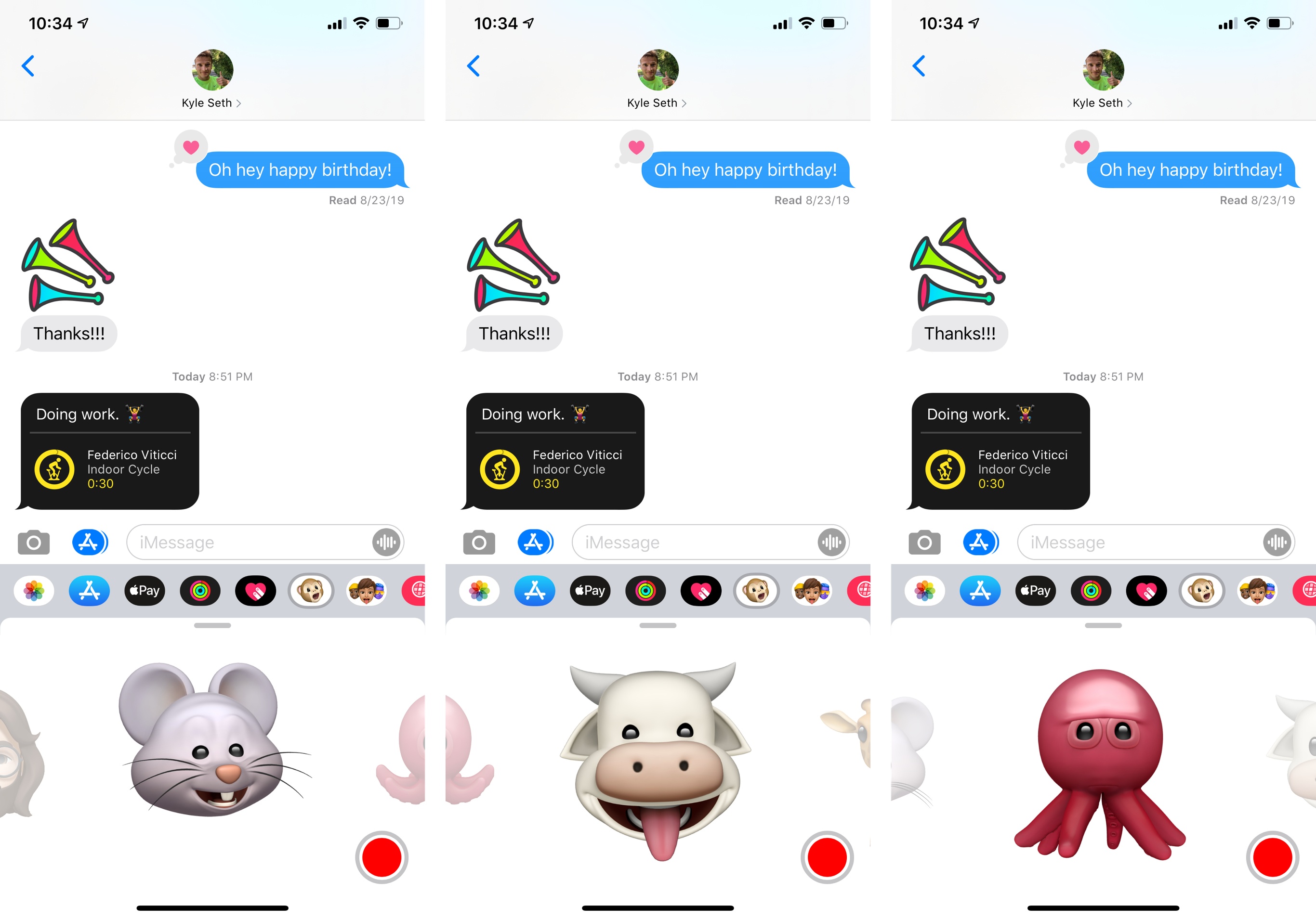
On a more positive note, much to the disappointment of Casey Liss, the Messages app now comes with an option to automatically share your name and profile picture with other iMessage users. The ‘Share Name and Photo’ feature is available in Settings ⇾ Messages (it’s also brought up by Messages the first time you open it in iOS 13) and it’s presented as a way to share the name and profile picture of your iCloud account when sending messages. You can set a name and choose a photo from iOS’ intelligent suggestions, which include a selection of your own photos over the years, your initials in different colors, and Animoji/Memoji, which will let you “strike your favorite pose” before assigning a picture.
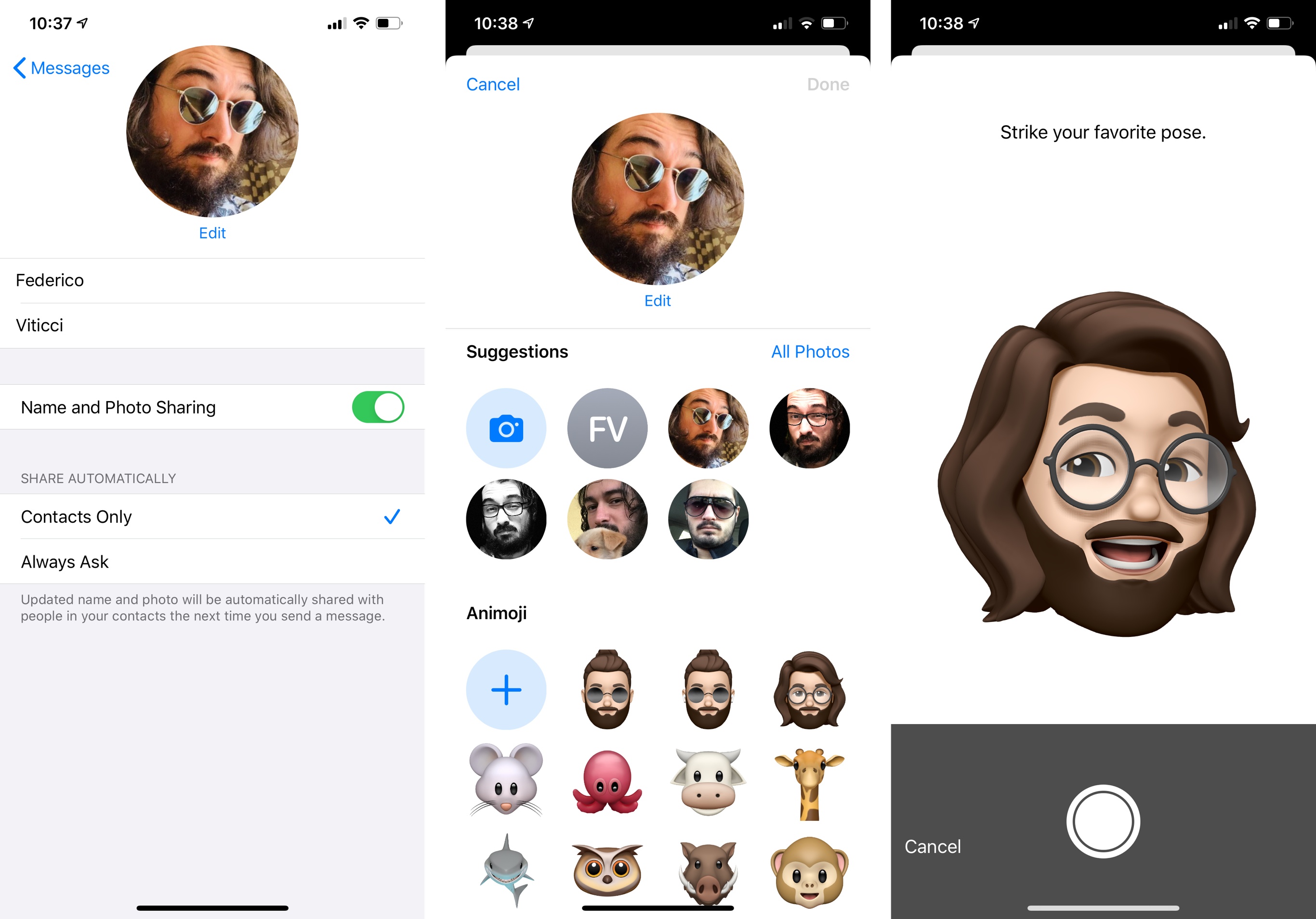
The picture you set via this tool will update your online iCloud profile in addition to your iMessage one. You can also choose to share your name and photo with contacts automatically or to be asked every time you’re texting someone. In the Messages app, when somebody has a new name and profile picture available, you’ll see a helpful banner to update their contact information, which will be saved to the Contacts app.
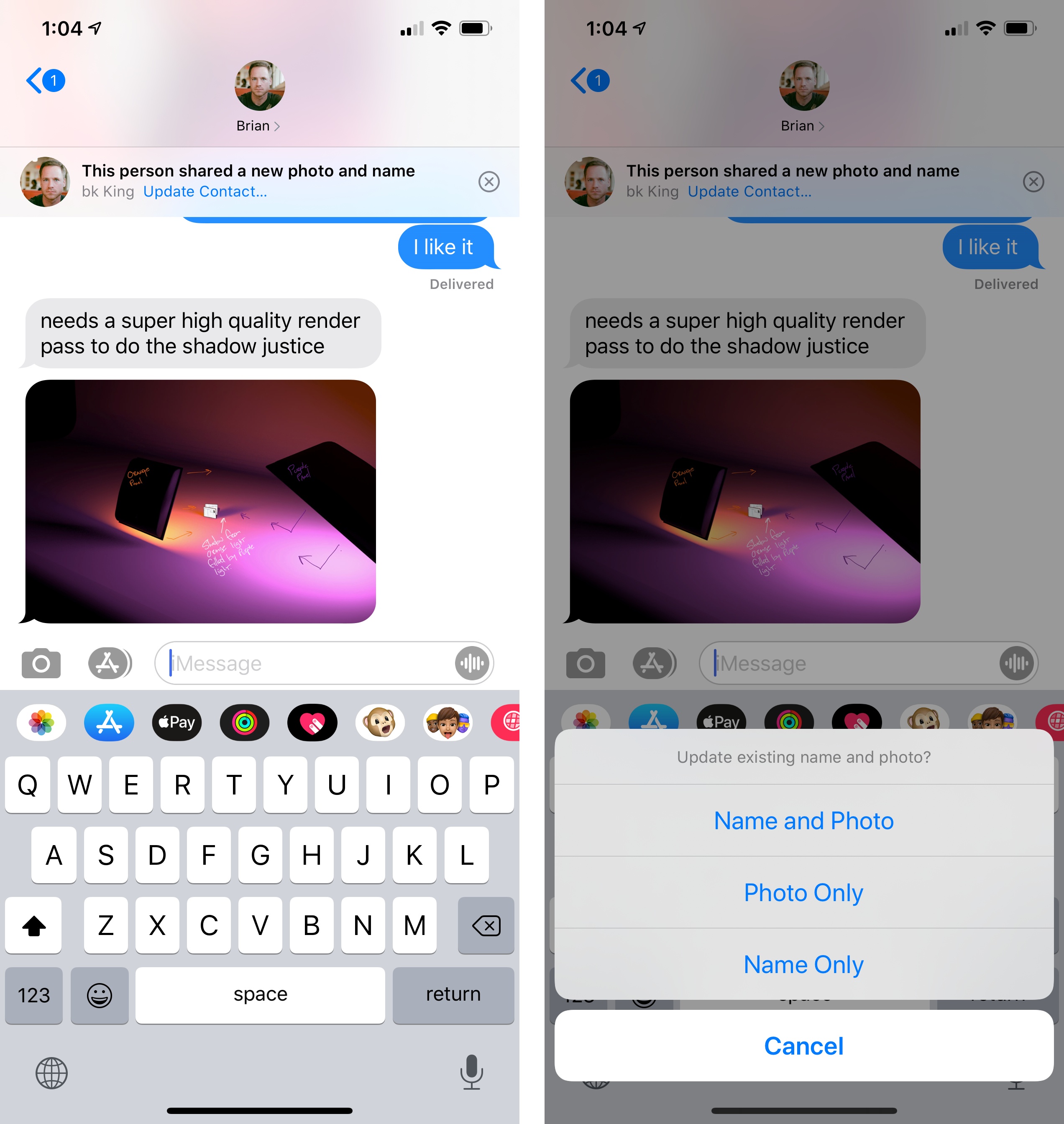
When one of your contacts has updated their name and profile picture, you’ll be able to choose which one to update on your end.
I’m still using Vignette to routinely update profile pictures for contacts who don’t use iMessage (Liss’ app also supports a variety of data sources, and iOS 13 does not), but I’ve enjoyed the ability to update iMessage contacts with one tap. I think it’s going to be fun to switch things up every once in a while with a new Memoji or Animoji character.
Search used to be one of the worst features of the Messages app; it’s been entirely rebuilt in iOS 13, and it’s now an incredible tool to find old conversations and content shared inside them.
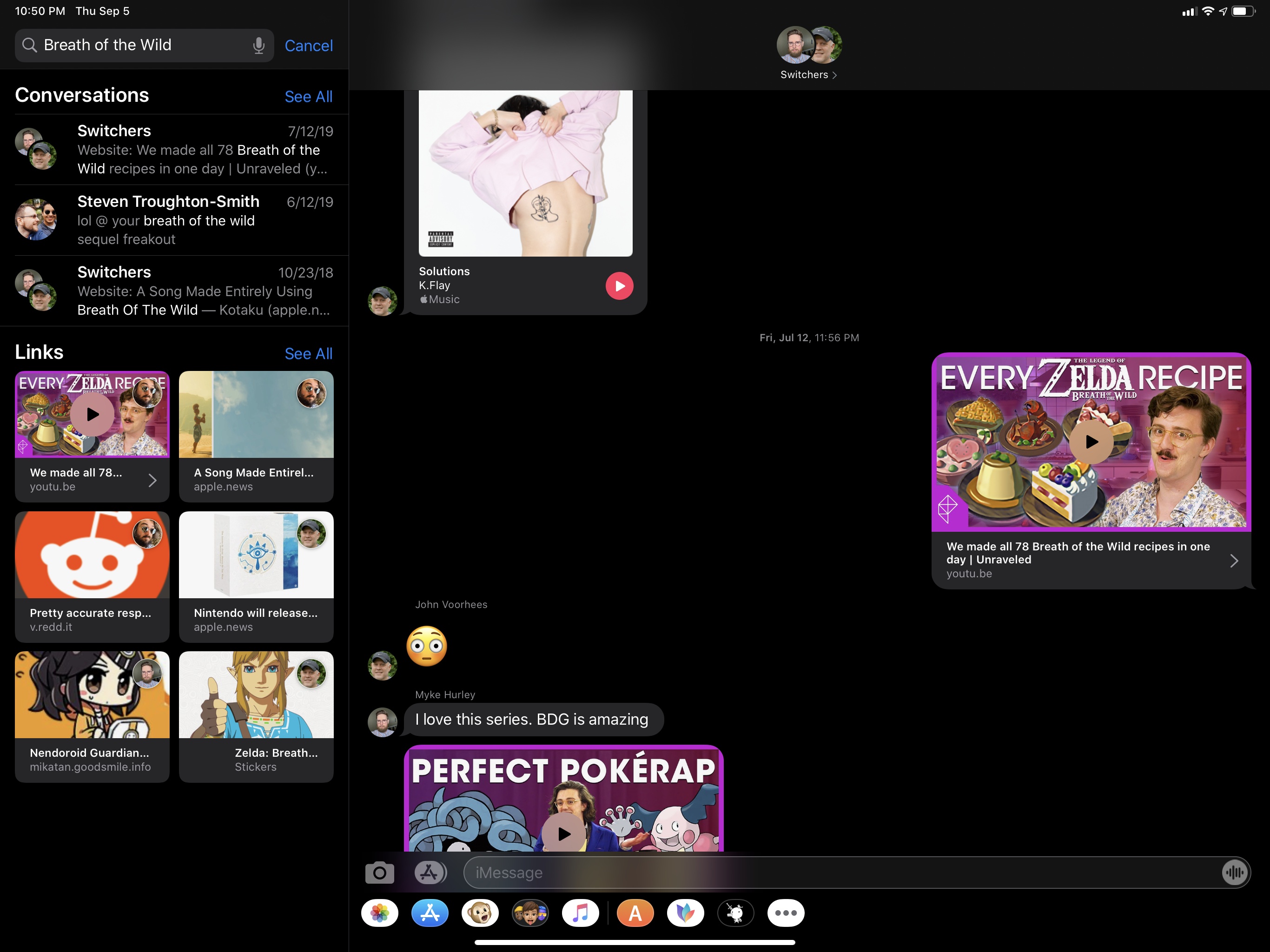
There are a couple aspects to message search worth noting. Detail views inside threads now collect all photos, links, locations, Wallet passes, and attachments ever shared in a conversation, allowing you to go back in time and check out an old article or tweet you shared with your friends. There’s virtually no lag when scrolling through links that go back several years in a conversation, which is an astounding performance achievement. I was able to find links and photos going back to over three years ago in the Messages app for iOS 13, which I didn’t think was ever going to be possible. In a nice touch, it’s even an option to pick between photos and screenshots when looking for old images, and you can press on links to reveal a preview and associated context menu.
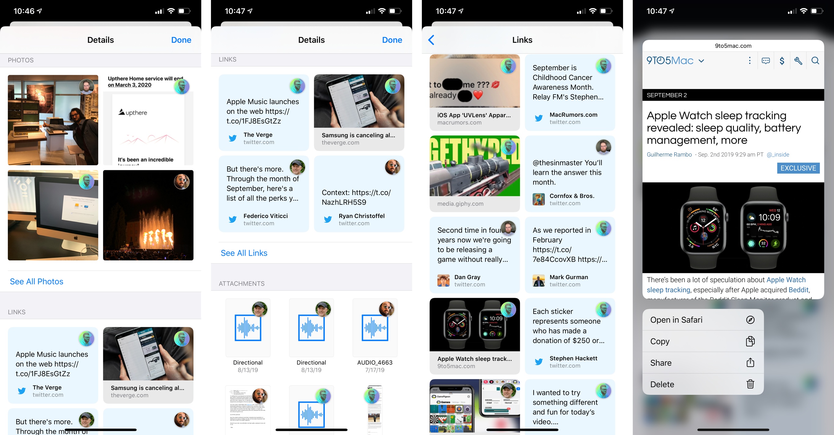
There’s more: because all this content has been indexed by iOS, it can be searched as well. And when you search, not only does Messages surface individual messages and attachments that match your query, but you can choose to preview an attachment with a long press or tap it to jump back to the moment in time when it was originally shared in a thread. Remember a Breath of the Wild screenshot that someone sent you back in spring 2017? You can now search for it, find it, preview it, and load the transcript for the original conversation in just a few seconds. Imagine this, but applied to photos, PDF documents, tweets, or articles from Safari shared in a thread, plus individual messages, and you get the idea.
From both a design and performance standpoint, Messages’ new search feature is amazing, and it’s helped me find documents and links I thought had been forever lost to Messages in iCloud. I now feel more comfortable knowing that everything I share on Messages can be easily found and re-exported later. I wish that search in Mail were as powerful as it is now in Messages.
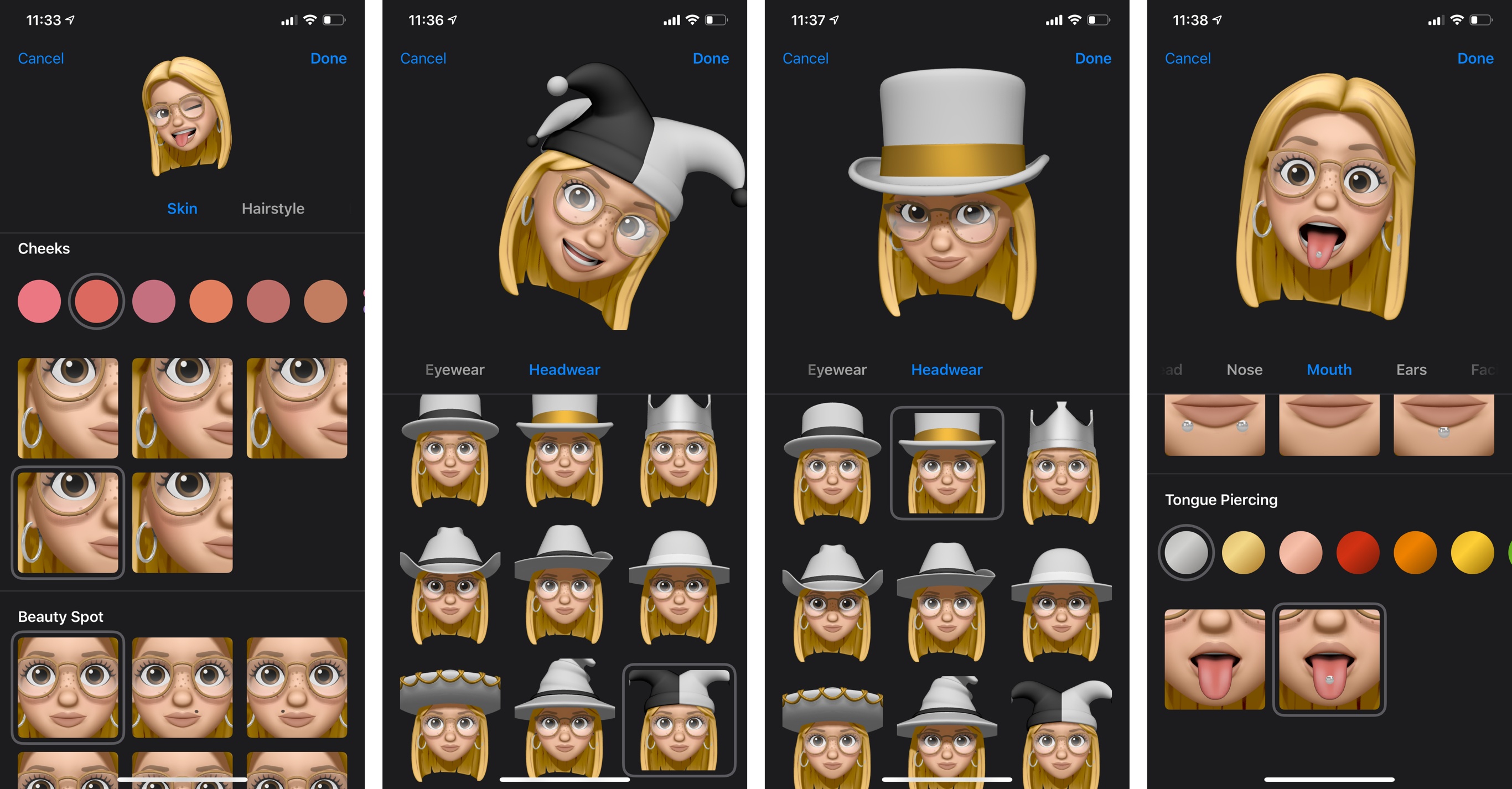
The vast majority of users upgrading to iOS 13 today will likely be interested in the new features available for Memoji, of which there are plenty. You can now customize eyeliner and eyeshadow with editing tools to get the look just right. There are new options for teeth such as braces and a gold grill; you can add piercings to your nose, mouth, tongue, and eyebrows; there are 30 new hairstyles, over 15 new pieces of headwear, additional earrings and glasses, and, yes, even AirPods. One of my Memoji criticisms last year was that Apple didn’t offer nearly enough personalization features, and I’m glad they’ve listened.
You can create and manage your Memoji from the Animoji app in Messages (the one with the monkey icon), but there’s also a new Memoji Stickers app in iOS 13 to send pre-made stickers featuring a variety of poses, contexts, and expressions using your Memoji or Animoji as characters. The feature was clearly inspired by the success of Bitmoji; even though Apple’s selection of scenes is ridiculously limited compared to Snap’s creation tool, the stickers included in iOS 13 are fun and cover the basics well. Obviously, many more will be needed in the future for Apple to compete at the same level as Bitmoji.
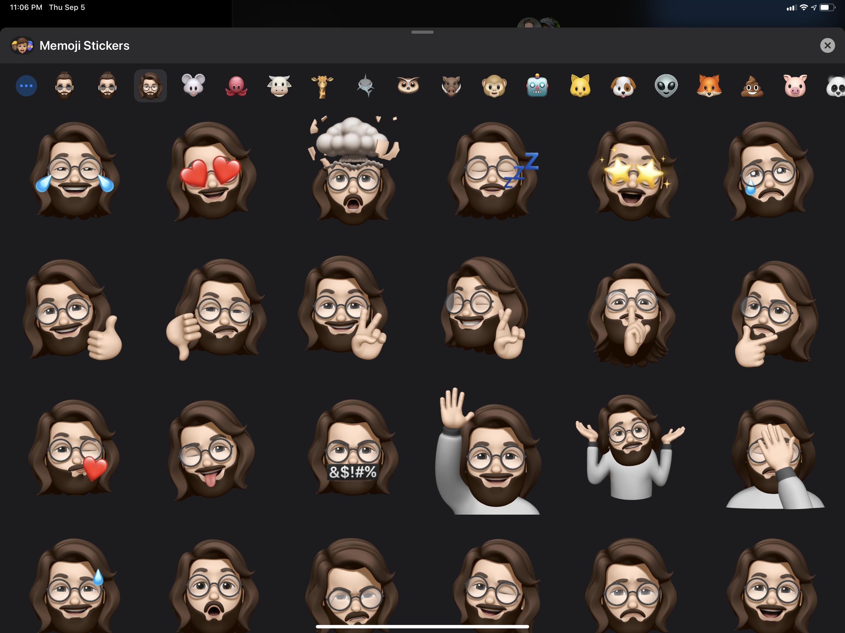
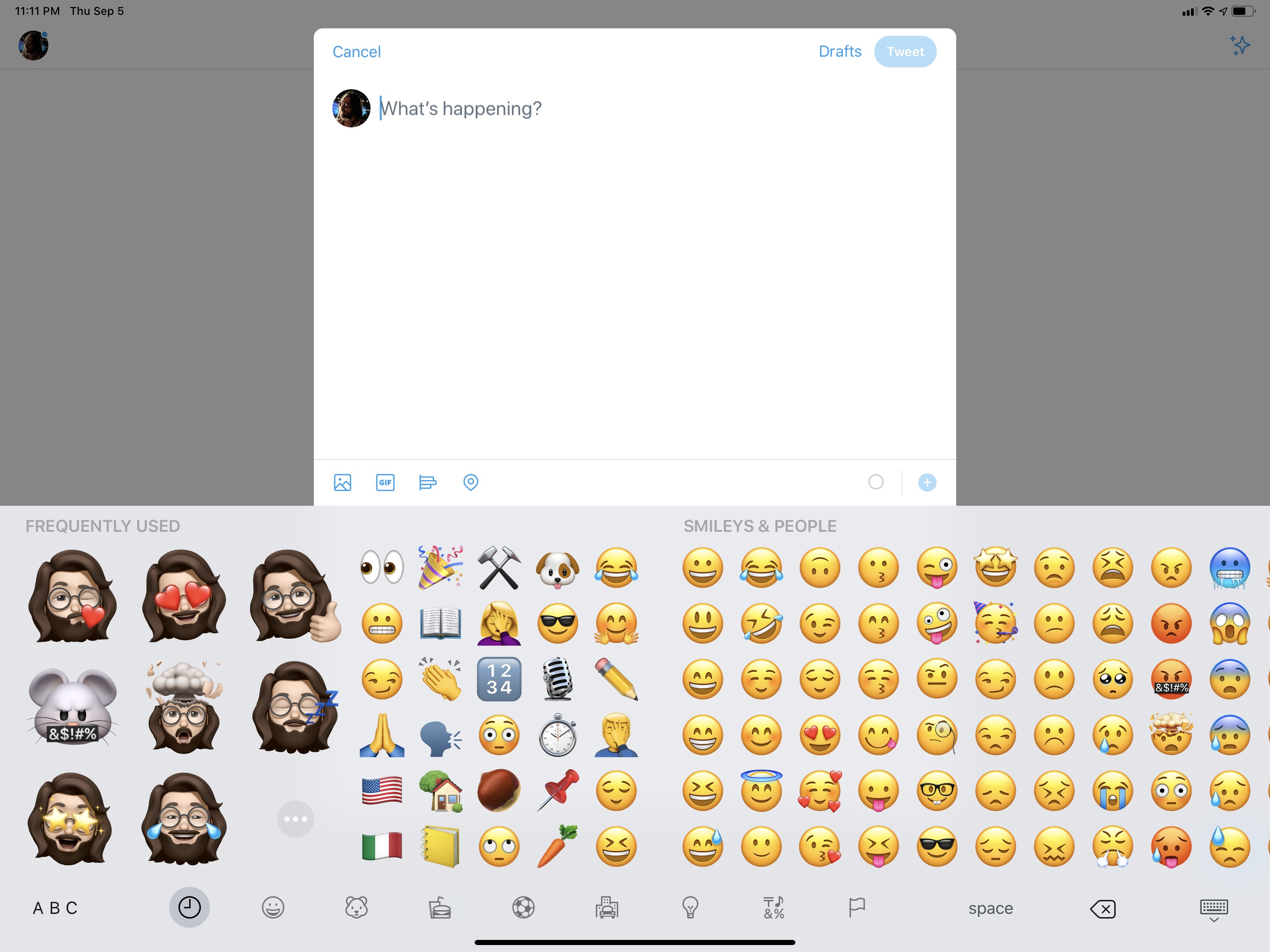
Memoji stickers can be attached like any other sticker pack to conversations in the Messages app, but Apple has also integrated them with the emoji keyboard in iOS 13, even though they’re not technically emoji (Memoji aren’t part of Unicode). In the emoji keyboard35, you’ll now see a selection of frequently used Memoji stickers on the left side of “real” emoji.36
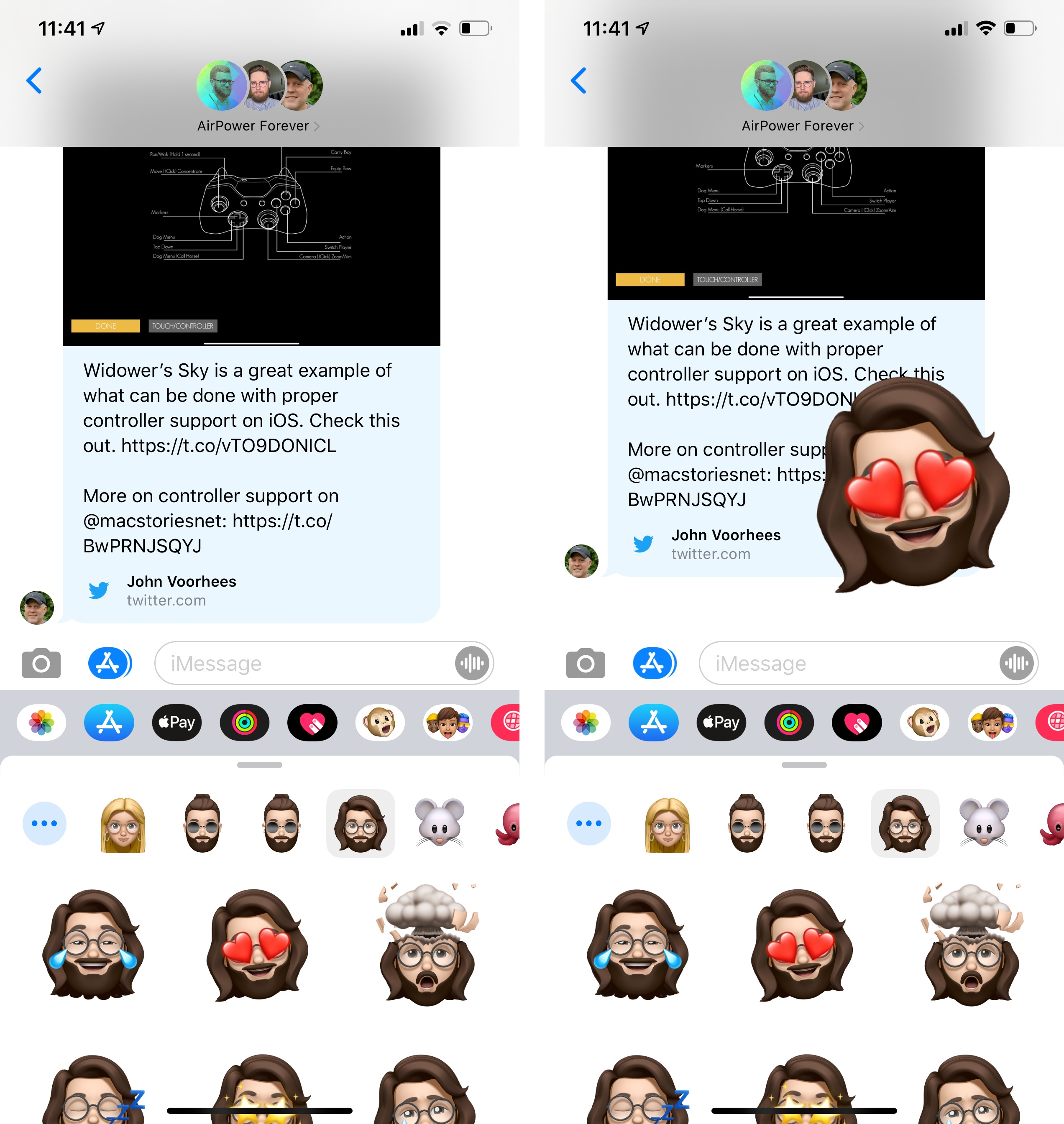
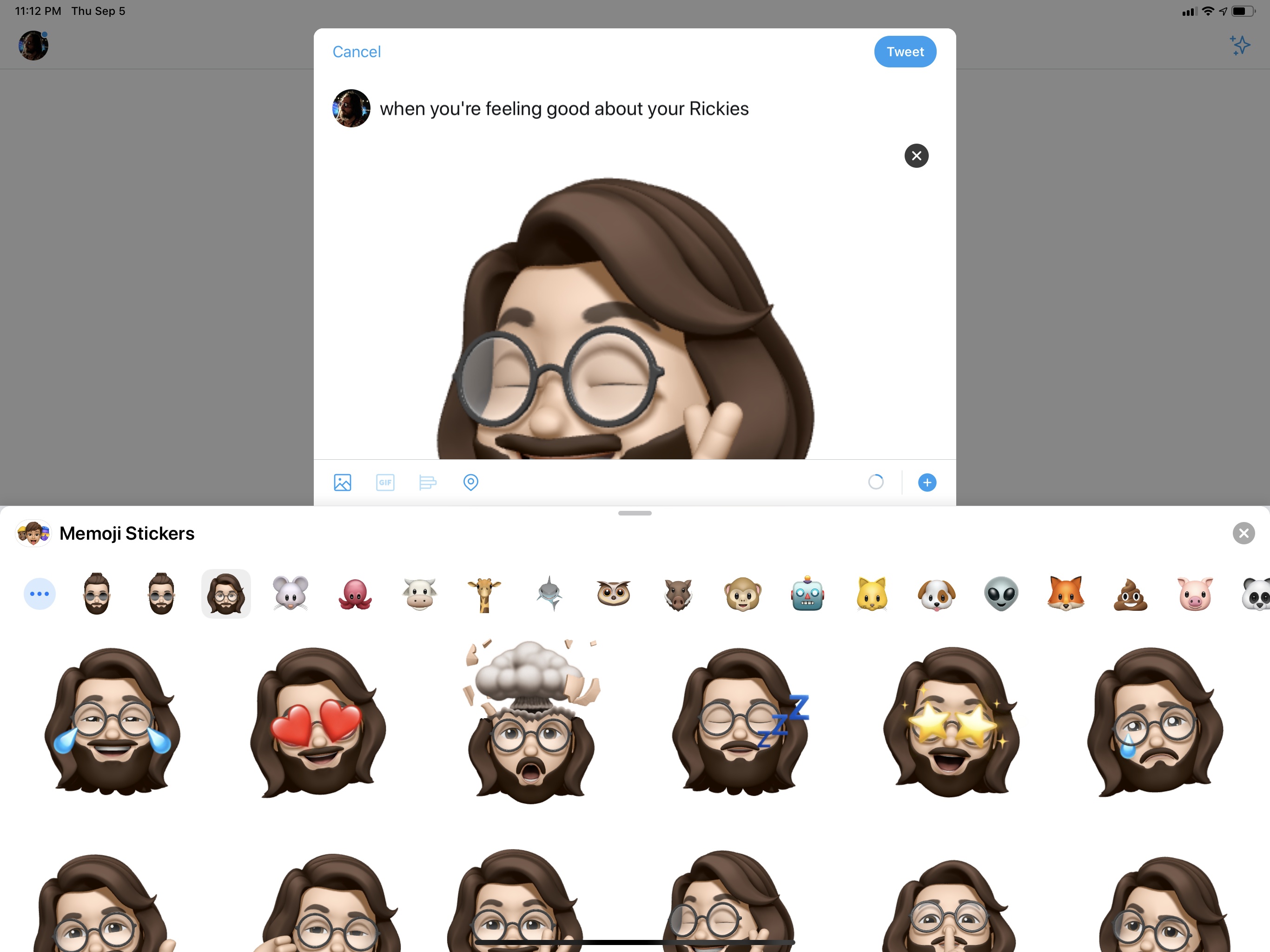
Because Memoji stickers are not fonts – they’re images – iOS is proactive enough to hide them altogether when the keyboard is focused on a text field that doesn’t support image input, such as Search or the Safari address bar. In other apps such as Twitter, Notes, Instagram, or WhatsApp, Memoji stickers will be inserted as image attachments (PNGs).
On a philosophical level, I dislike the intrusion of Memoji stickers in the emoji keyboard: Memoji are Apple’s take on custom characters and they do not belong to the standardized, cross-platform world of emoji. On the other hand, I understand Apple’s desire to expand Memoji and make them useful across other apps besides Messages, leveraging them as yet another selling point of the iOS ecosystem. The emoji keyboard was the most obvious candidate for this kind of advertising push; considering how most people buy into the idea of “celebrity emoji” that aren’t really emoiji at all, I think Apple will be fine, and the integration will instantly make sense for folks who, unlike us, do not bother with the technicalities of Unicode code points. I just wonder if Jeremy Burge will ever be able to forgive Apple for this.
Home
It’s been a busy year for the HomeKit and AirPlay teams at Apple: earlier this year, the company launched a new initiative to integrate their HomeKit and AirPlay 2 frameworks into third-party television sets from the likes of Samsung, LG, and Vizio. The move is likely geared at gaining a foothold in the video streaming ecosystem ahead of the launch of Apple TV+ in November; independently from Apple’s secondary motivation, the net result is that more users can now manage their TVs (as well as AirPlay 2 speakers, which are also growing in number) inside the Home app for iOS, iPadOS, and macOS.
In addition to the automation changes I covered in the Shortcuts chapter, there are other new features coming to the Home app in iOS 13 that can’t be evaluated at this stage, for they necessitate software updates that haven’t been released yet.
Later this year, users will be able to configure HomePods and AirPlay 2 speakers to participate in scenes and automations. I wasn’t able to test this functionality as it requires a new version of audioOS, and Apple doesn’t run a beta program for the HomePod’s software. I’m excited about the idea of using my HomePod as a speaker for my HomeKit security system as well as other Shortcuts-based automations, but I’ll have to report back on this later.
Also later this year (after iOS 13.1), Apple is launching HomeKit Secure Video, an iCloud hosting plan for videos recorded by HomeKit cameras, which are encrypted and sent to Apple for online storage. Presented at WWDC, HomeKit Secure Video was pitched as a secure alternative to proprietary cloud storage services implemented by manufacturers of cameras that often store your private videos in a cloud somewhere (with dubious security practices) in order to perform cloud-based image analysis. In an unsurprising move given its privacy stance, Apple’s taking advantage of its integrated ecosystem with a different approach: when a camera detects something in your home, videos will be analyzed by HomeKit hubs (Apple TVs, HomePods, and iPads) locally, encrypted, and sent to Apple for storage in iCloud.
With HomeKit Secure Video, you’ll be able to configure local video analysis so that a camera records only when motion is detected and people, animals, or vehicles are present. You’ll get up to 10 days of recording history in iCloud to review your footage, but you’ll be required to have a 200 GB iCloud plan for one HomeKit Secure Video-enabled camera, or a 2 TB plan for up to five cameras. According to Apple, both Logitech and Netatmo are already on board with HomeKit Secure Video and will release software updates to enable it on their cameras in the near future.
I own three Logi Circle 2 cameras, which are set to become compatible with HomeKit Secure Video, but I can’t comment on the feature yet as I wasn’t able to test it. I will say, however, that having signed up over the years for various camera subscription services to unlock motion detection with push notifications, and having felt somewhat uncomfortable about them, I welcome Apple’s entrance in this space. I’ll feel better knowing that videos recorded in the intimacy of my home will be end-to-end encrypted locally and stored on a service I trust and already pay for. I’m curious to see if Apple’s person and animal recognition will be smarter than third-party versions, and I look forward to integrating these deeper controls with my existing HomeKit automations. On paper, HomeKit Secure Video sounds like a terrific addition to the Home app for owners of HomeKit cameras.
Unfortunately, for all the promising features on the horizon, I believe the Home app shipping today in iOS 13 is a regression of the user experience due to a single feature implemented by Apple in this release: service grouping.
In iOS 13, accessories that contain multiple sensors or data points (what Apple calls services) are automatically grouped as a single item in the Home app. If a temperature sensor exposes both temperature and humidity, those services will no longer be two separate tiles in the Home app; similarly, outlets that feature multiple plugs will be grouped under a single object in the Home app.
Logically speaking, the decision feels reasonable enough: if different services belong to the same “master” accessory, they should be grouped together, and the user must navigate to them by opening a separate page as if they were navigating into a sub-folder of related files. The problem is that the actual experience of using the Home app in iOS 13 defeats Apple’s logic and poor design choices.
In iOS 12, services were presented as individual “accessories”, each with its own tile. It may not have been conceptually accurate to represent services as accessories – but that’s a different discussion regarding the overall design of the Home app. For better or worse, users could see multiple data points at a glance just by navigating into a room. By comparison, service grouping in iOS 13 only shows you how many services are available within a single tile, removing useful information from the main screen. The structure is more logical and technically accurate, but, practically speaking, it’s an inferior design that adds an extra step to the experience.
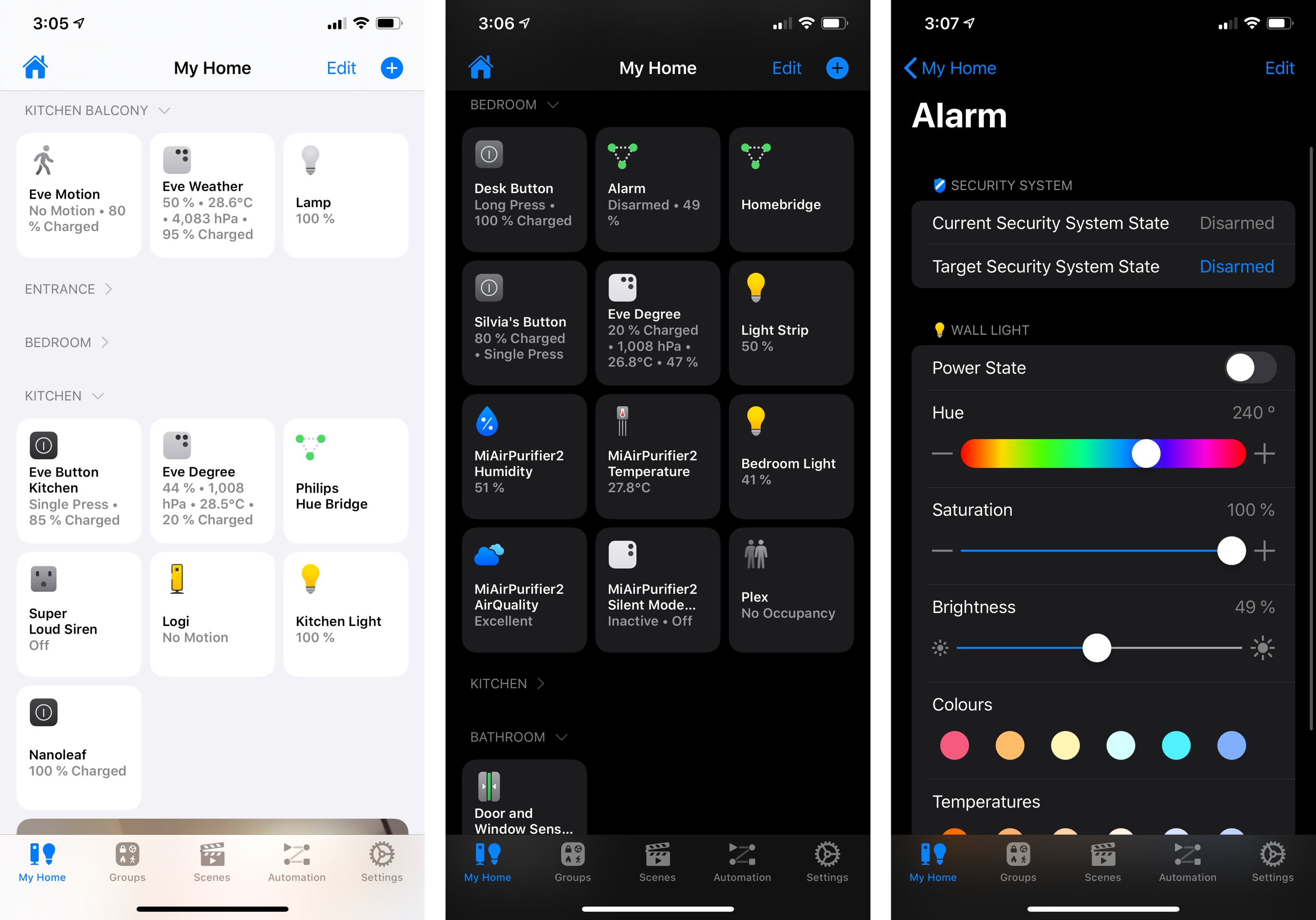
Let’s take a look at a few examples. Here’s what the ‘Kitchen’ room of my Home configuration looks like in iOS 12 and iOS 13:
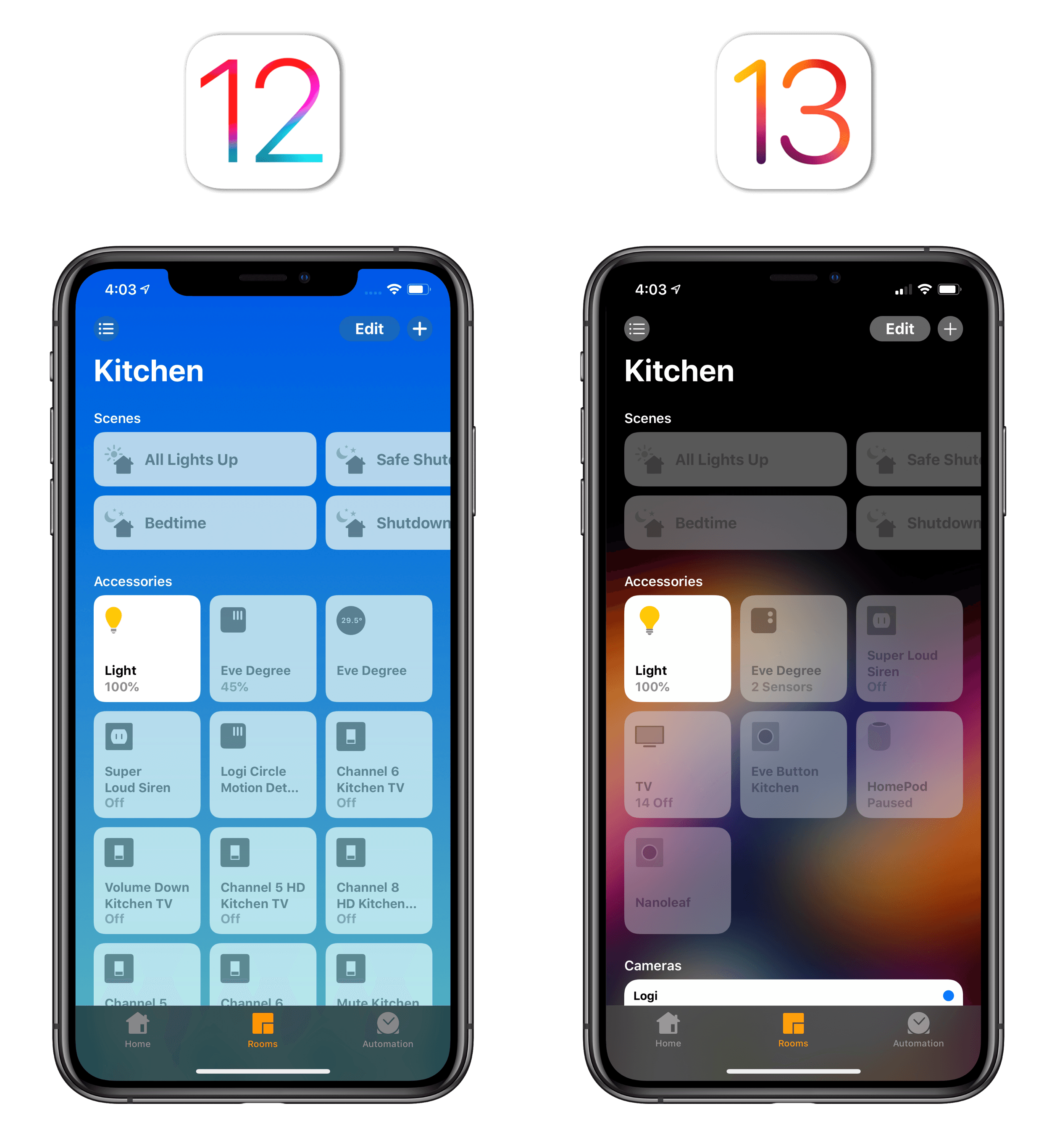
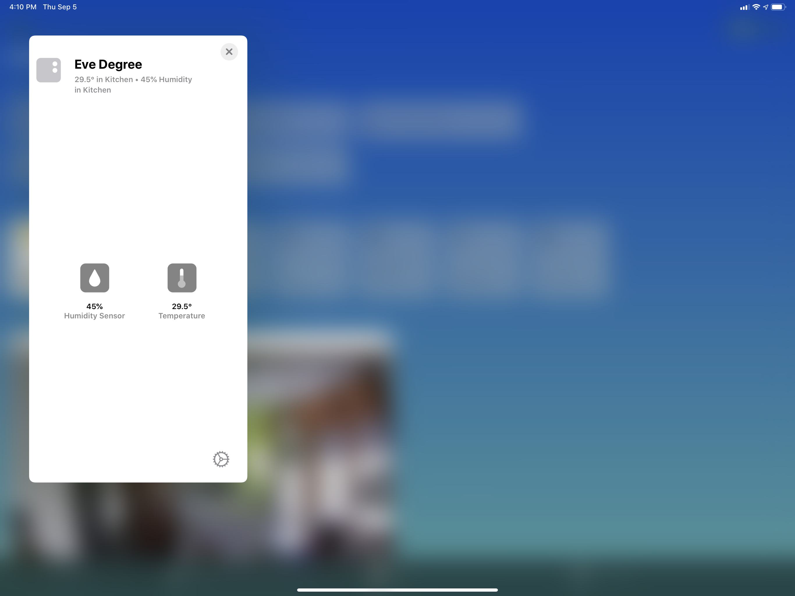
As you can see, I used to be able to open the room, glance at the top row of tiles, and see the current humidity and temperature levels; in iOS 13, there is a single ‘Eve Degree’ tile that just says “2 sensors” with no actionable information. To see those data points now, I have to press on the tile to reveal a dedicated card, which makes a particularly poor use of screen real estate on iPad:
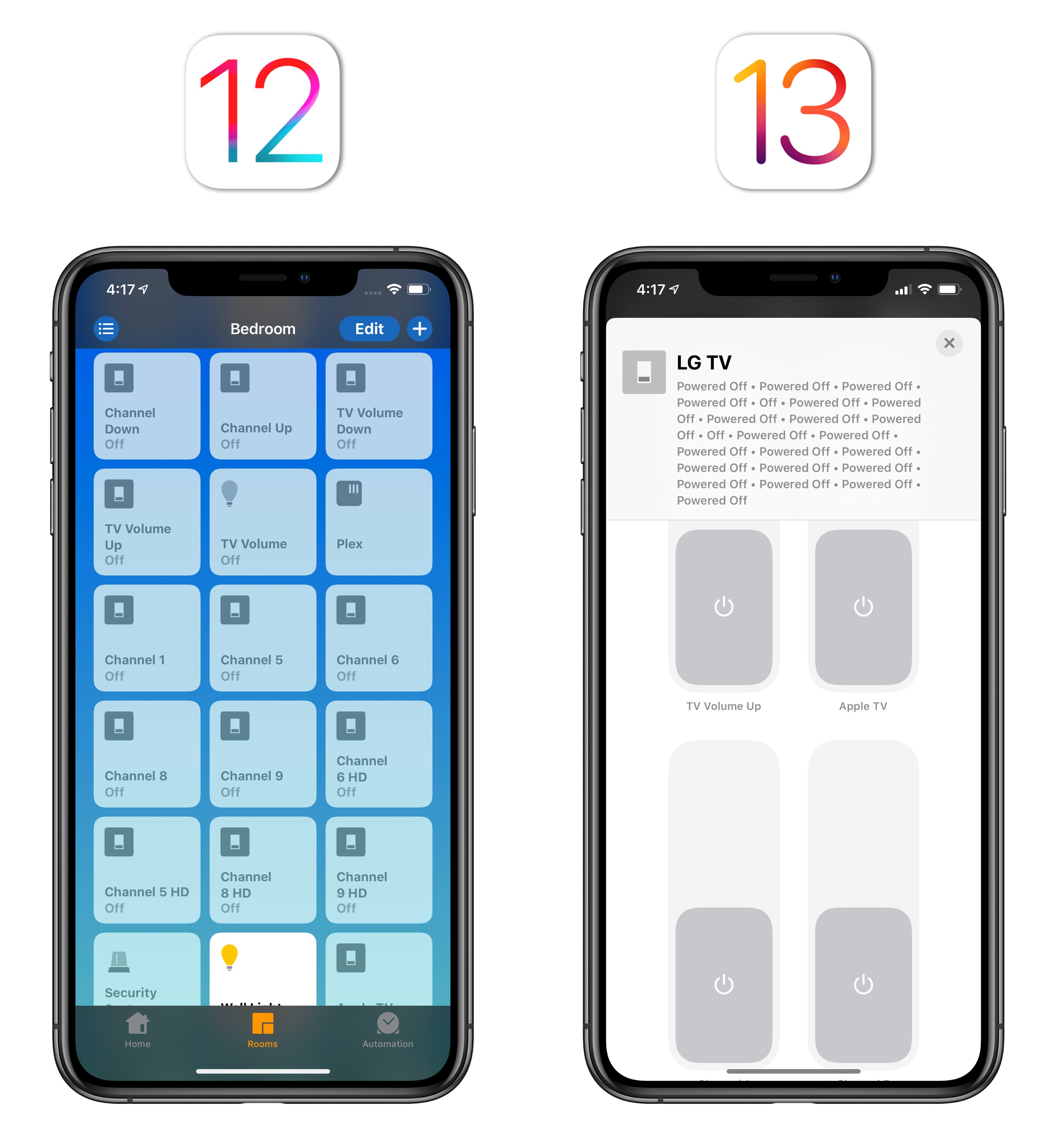
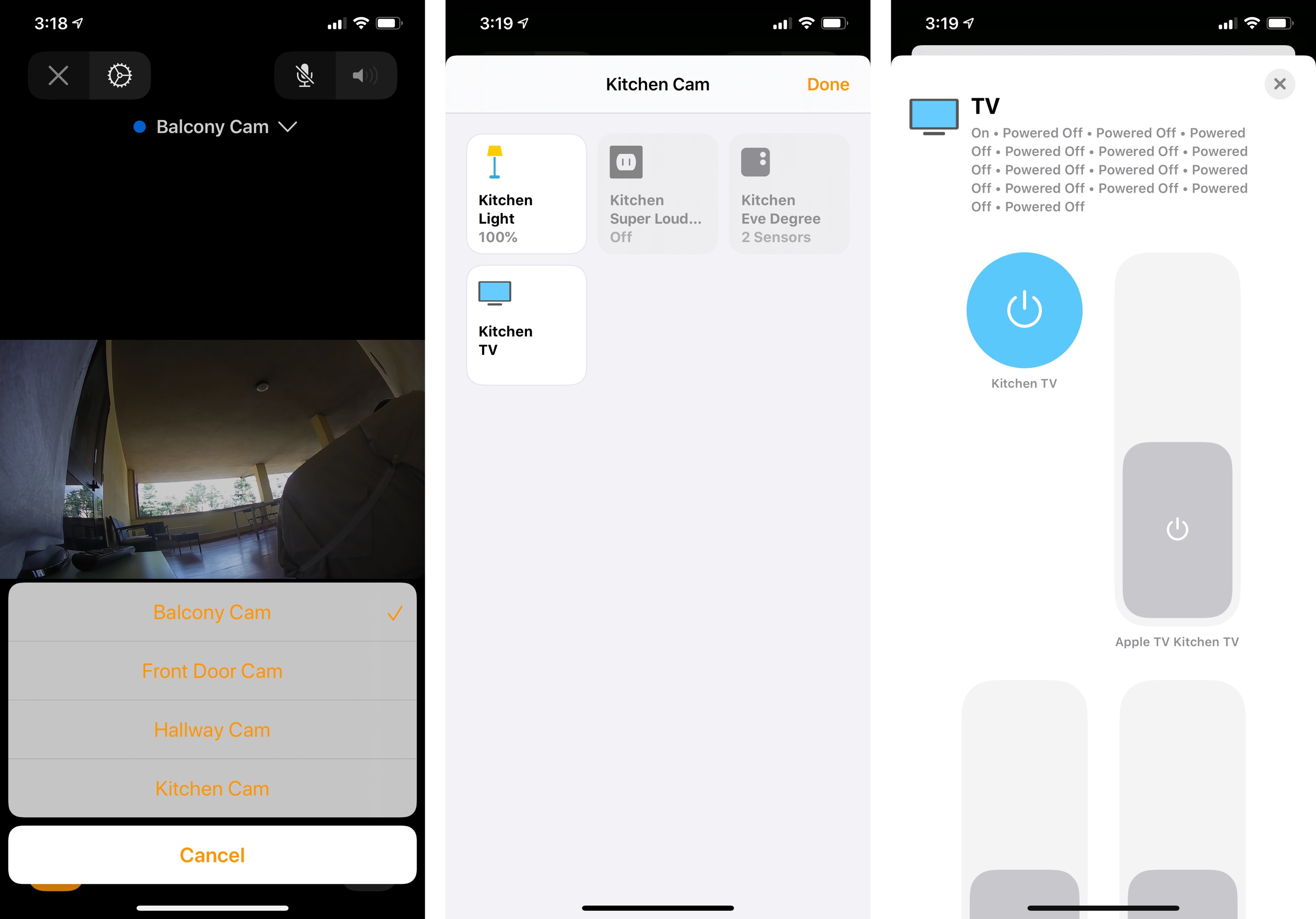
It only gets worse from here. Thanks to homebridge, I’ve been able to add HomeKit capabilities to my Samsung and LG televisions, which do not officially integrate with Apple’s framework. In iOS 12, I could see the multiple services belonging to each TV as individual accessories that supported one-tap actions; in iOS 13, all those services have been merged under one tile:
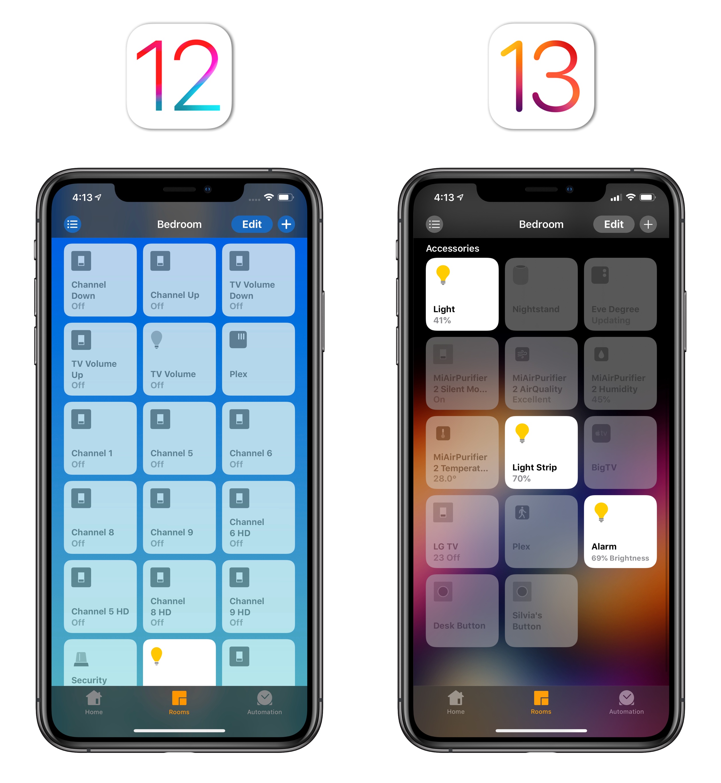
To interact with the services (in this case, switches) available for a single accessory in iOS 13, you have to open a page that contains a list of giant switches to scroll through. I wish I was kidding, but you can take a look at the screenshot below. My favorite part is the very helpful summary at the top of the page, featuring 23 instances of ‘Powered Off’ for my TV in iOS 13.
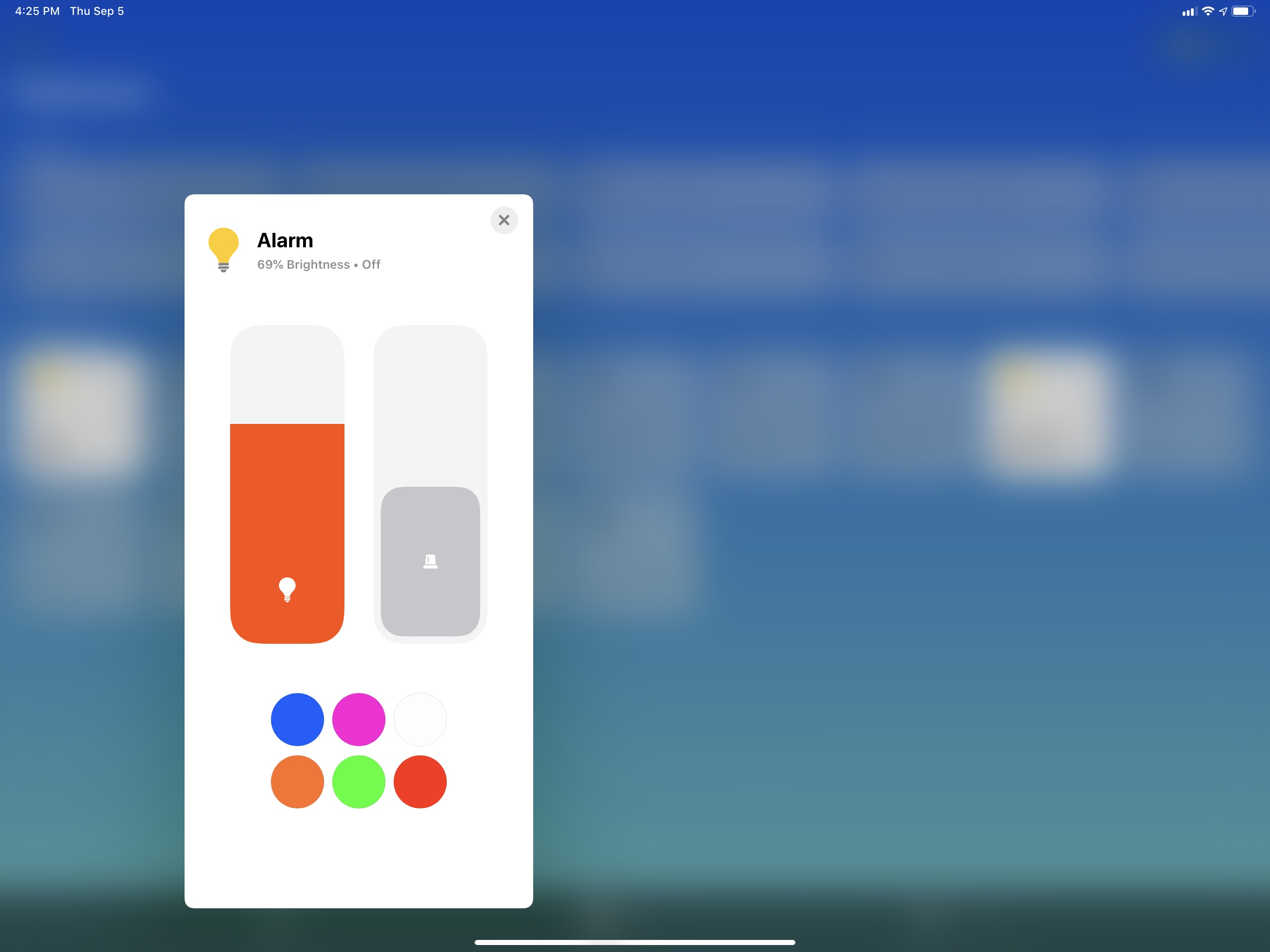
This design affects all kinds of accessories that contain multiple services – it’s not a homebridge-related issue. Case in point: some officially licensed HomeKit accessories often embed vastly different services within the same physical product. For example, you may find a ceiling fan that also has a light built-in or, in my case, a HomeKit security system with a built-in light. In iOS 12, that product – an Aqara hub – was clearly indicated with two separate tiles in the Home app, each presenting different information and controls; due to service grouping in iOS 13, a security system with a light has become one tile. Therefore, when I open the Home app now, I see that my alarm has…69% brightness and is displayed as a lightbulb.
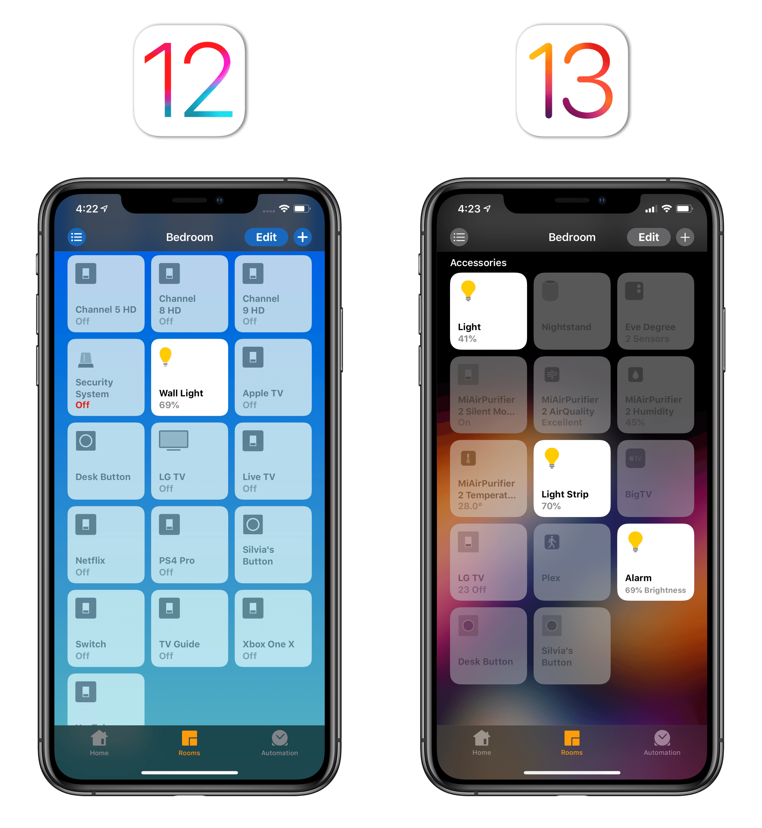
Of course, to interact with the light and security system, you have to open a separate page that puts the two accessories next to each other:
You get the idea. As I mentioned above, I find Apple’s implementation of service grouping to be a regression from the Home app’s design in iOS 12. It feels like grouping was designed by engineers to reconcile HomeKit’s technical spec with the Home app, and that design falls short of understanding how people think of interactions with smart accessories.
There are ways Apple could mitigate this: service grouping could become optional, for instance, and tiles in the Home app should expose key data points for accessories such as temperature sensors. I’m still using Apple’s Home app to create and manage my automations, but until service grouping gets fixed, I’m moving my main interactions to Shortcuts and Matthias Hochgatterer’s Home app.
An example of service grouping done right: the third-party Home app features larger titles that let you preview key data points at a glance.
If anything, Apple’s disappointing implementation of service grouping in iOS 13 confirms one thing: it’s time for a radical rethinking of the Home app. A collection of squares isn’t cutting it anymore.
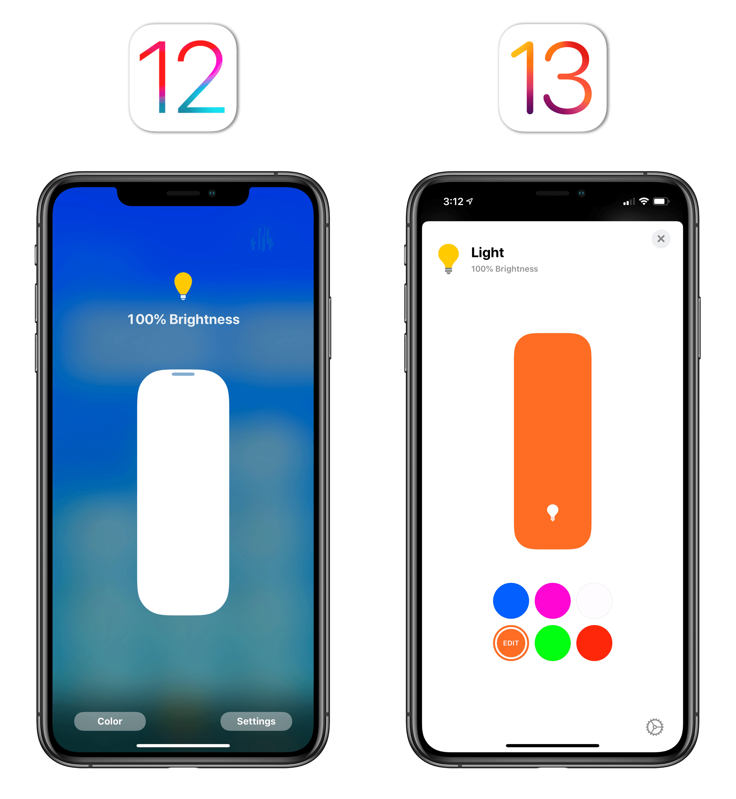
There are some good changes in the Home app, but they can’t do much to offset the annoyance caused by Apple’s poor grouping implementation. As we’ve seen above, detail screens for accessories (shown after long-pressing on them) have been redesigned in iOS 13, and Apple added some useful shortcuts to them. Lights, for instance, show a colored slider along with a grid of six color shortcuts that can be customized for fast access. Changing colors requires one tap less in iOS 13 – there’s no comparison with the old screen in iOS 12:
In iOS 13.1, there are also new accessory icons to choose from, which animate slightly when you interact with them. It’s a nice touch.
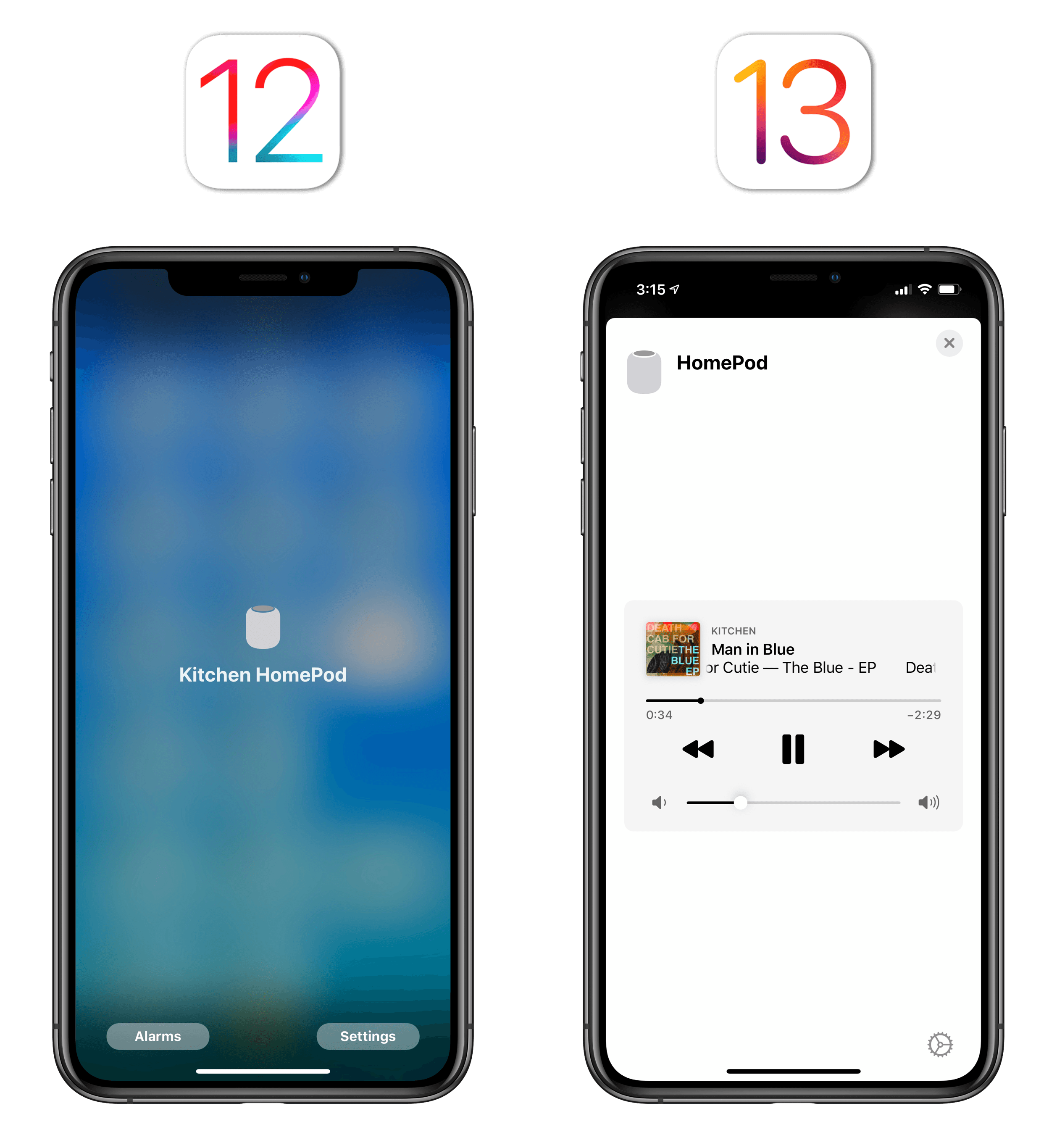
Same for HomePods and Apple TVs: while iOS 12 displayed a useless full-screen modal view with the device’s name in the middle, iOS 13 shows a playback widget so you can control what’s playing on a HomePod or Apple TV from within the Home app.
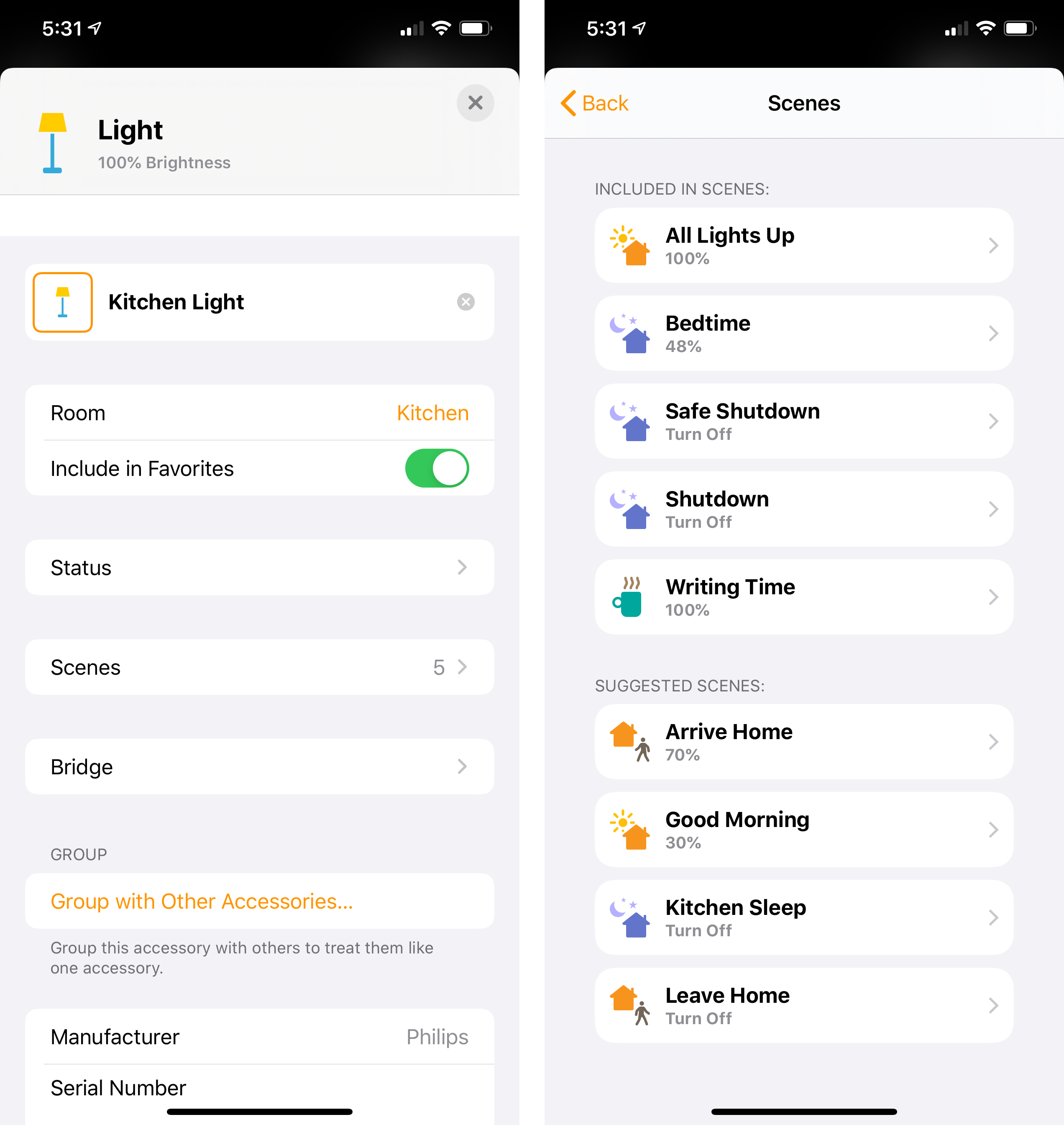
When viewing an accessory’s detail screen, you can see which scenes the selected accessory is already participating in. Furthermore, iOS 13 displays suggested scenes in this screen; scenes are also suggested when first adding a new accessory to your Home configuration.
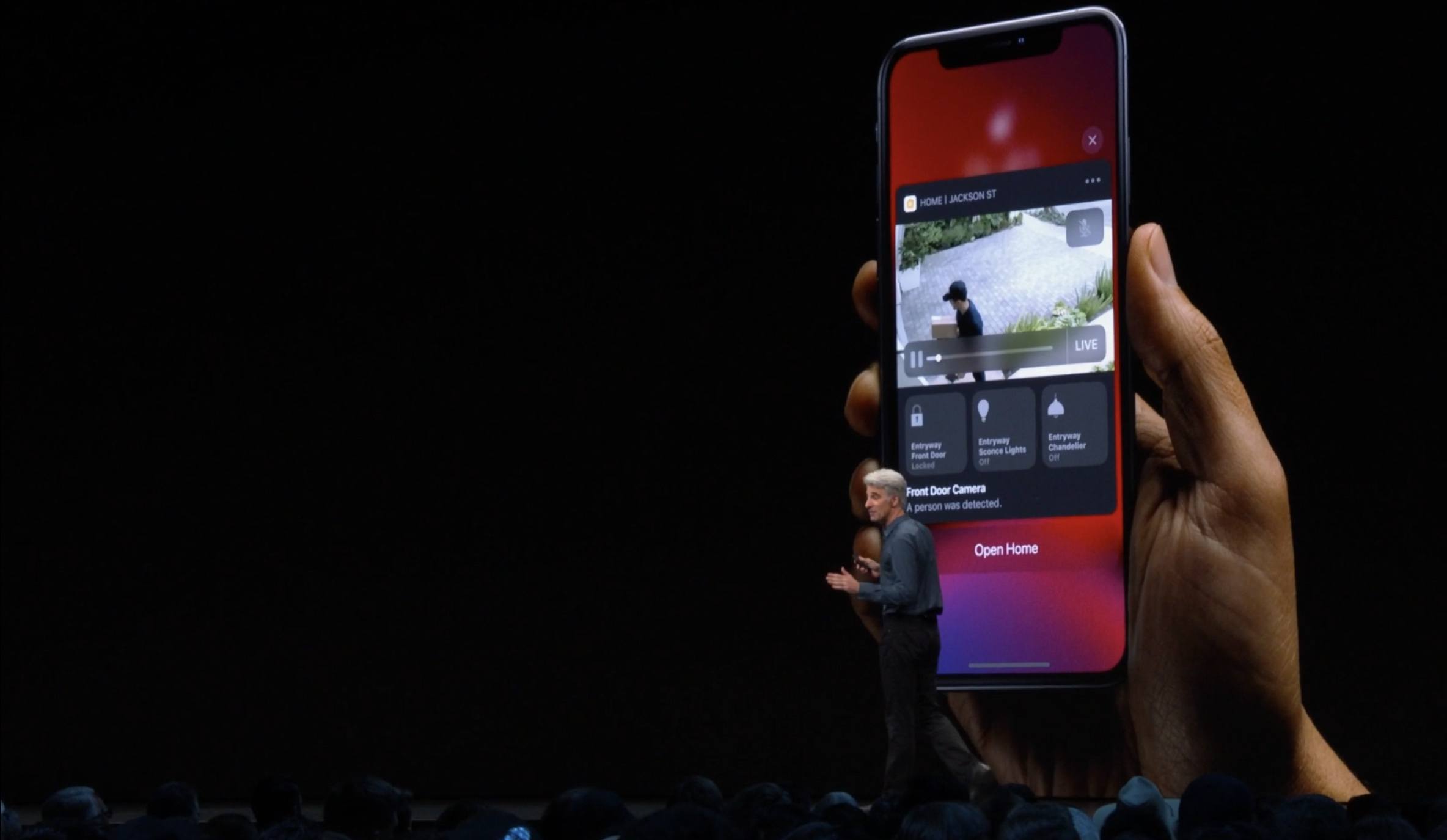
In a move likely inspired by Aaron Pearce’s excellent HomeCam, the camera video screen has been redesigned in iOS 13 with a new switcher menu to navigate between multiple cameras as well as a button to quickly control accessories located in the same room as the camera you’re currently viewing. As I argued when I reviewed HomeCam, which was first to the market with this feature, I find it convenient to check on a room’s temperature level or quickly turn on a nearby light when I’m viewing its camera feed.
I wonder how much time Pearce has until Apple copies his camera grid view at this point.
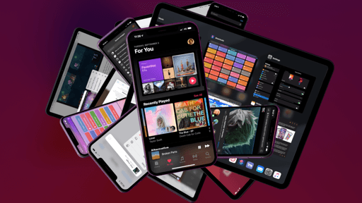
Music
As the gateway to a service used by over 60 million customers, iOS’ Music app doesn’t abide by Apple’s traditional app development timeline anymore: changes are frequent, deployed at a massive scale, and encompassing different facets of a service which goes beyond the app on our iPhones and iPads.
In the past year alone, Apple has iterated on Apple Music’s personality by commissioning custom artwork for its most popular playlists, collaborated with artists on exclusive perks for album releases, expanded its celebrity outreach with playlist curators and rebranded playlists, and leveraged its Shazam acquisition for discovery of new artists. None of these changes would fit anywhere on a WWDC slide for a new version of iOS, yet their influence on the overall Apple Music experience can be felt on a daily basis. Such is the nature of a service-oriented business which requires constant updates, experimentation, and a departure from monolithic app releases.
From this standpoint, it shouldn’t surprise you that browsing the Music app in iOS 13 feels very different from last year, but that’s mostly because of new sections and playlists that have been added to the service over the last 12 months. That said, there are two major new features in the Music app itself in iOS and iPadOS 13, one of which fulfills a longstanding dream of mine regarding modern music streaming services: time-synced lyrics.
Available today for an undisclosed segment of the songs in Apple Music’s catalog, time-synced lyrics can be accessed from the app’s updated Now Playing screen (more on this in a bit) by tapping the quotes button in the lower left corner. If time-synced lyrics are available, rather than being presented with paragraphs of text for the whole song at once, you’ll see a new UI where each line of text is bigger and follows the music, allowing you to better comprehend lyrics and, most importantly, sing along.

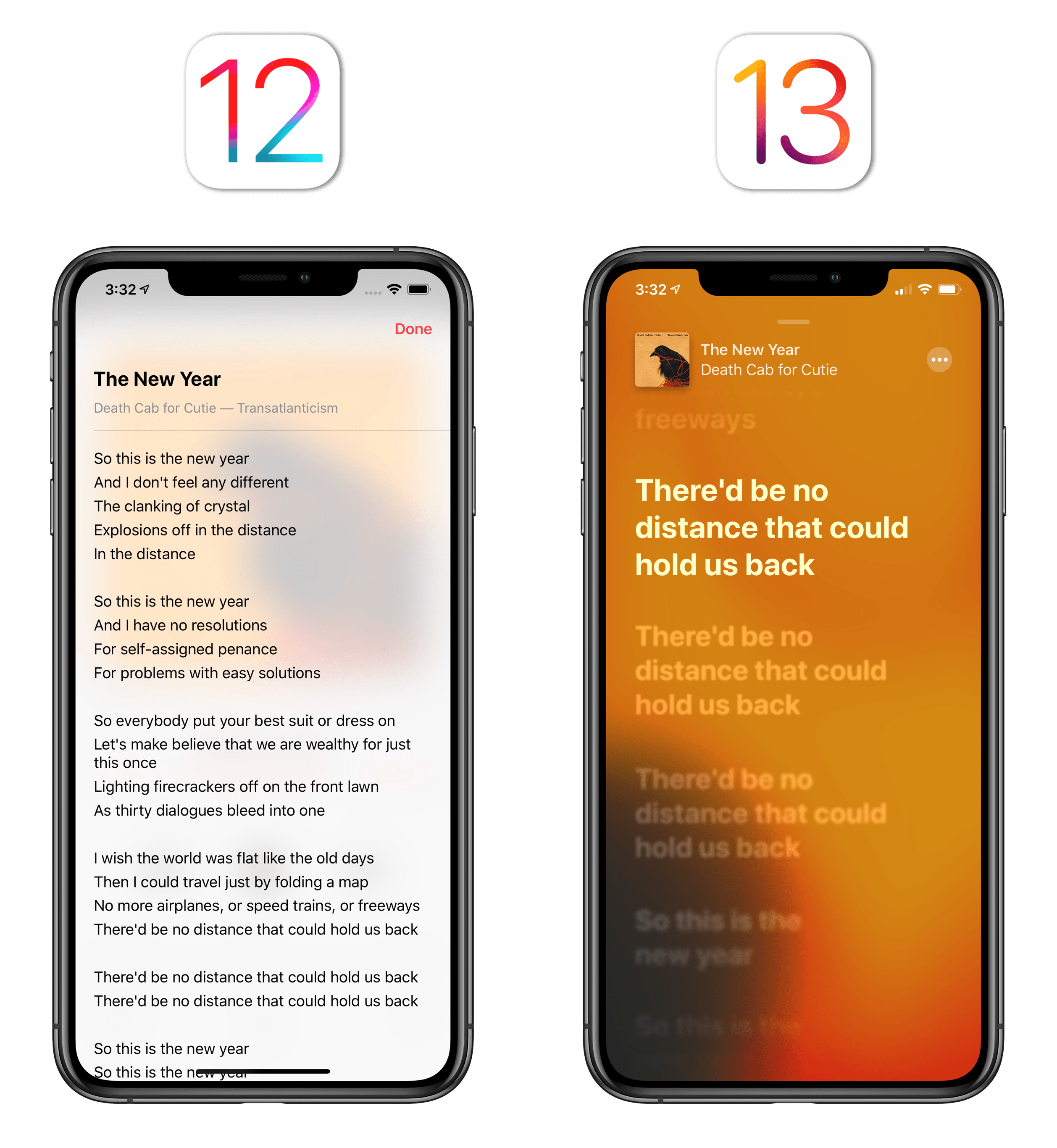
If you’re familiar with karaoke, that’s exactly what this feature is, only it’s been integrated with a music streaming service in a way that, to the best of my knowledge, only Musixmatch and Amazon Music (via X-Ray) did before. But while Musixmatch required using a third-party utility to view time-synced lyrics for Apple Music and Amazon Music required, well, listening via the Amazon ecosystem, time-synced lyrics are natively integrated with the Apple Music experience and they’re helping me enjoy my favorite songs even more.
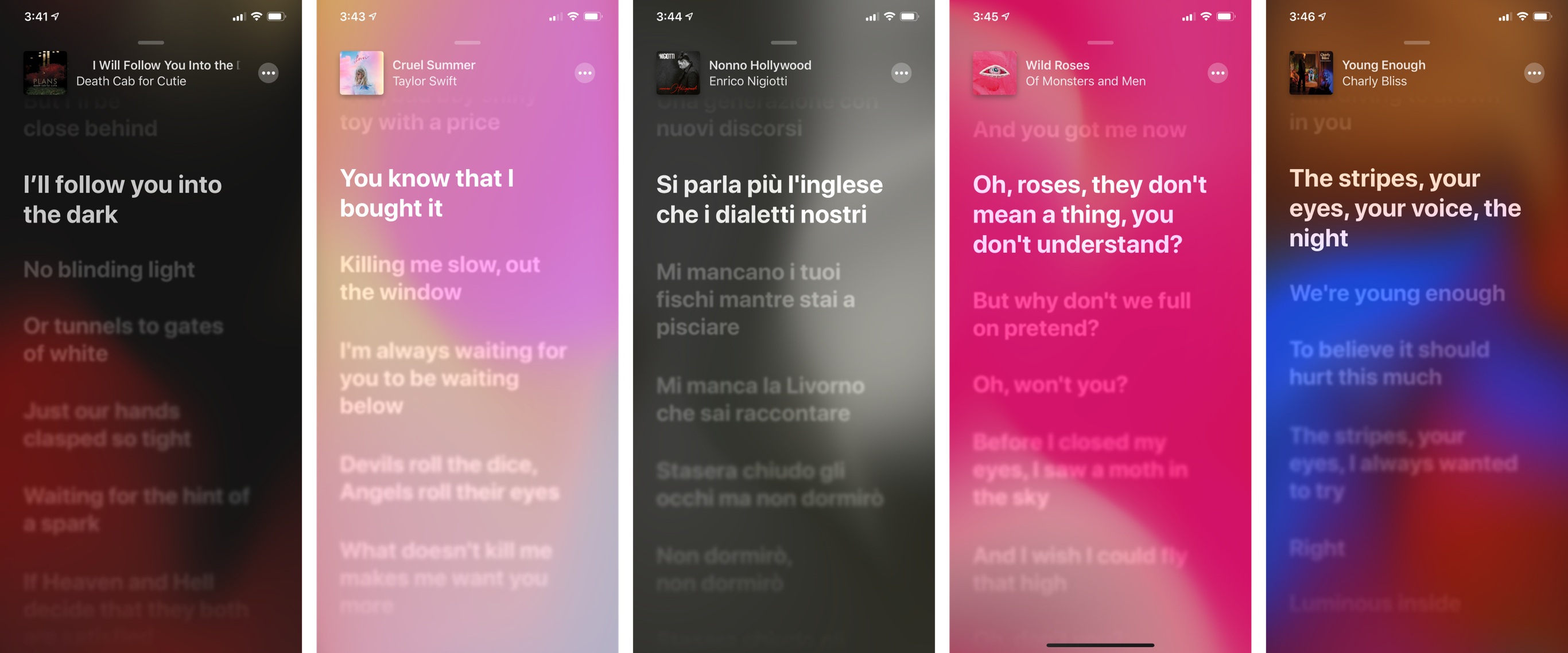
When they’re available, time-synced lyrics scroll on their own within the Now Playing screen, which features a dynamic blurred background that blends key colors from the song’s artwork and lets them slowly float underneath text. The visual effect is pleasant and fun; it’s like a combination of iOS’ motion wallpapers and Apple Card’s dynamic coloring, and it makes the lyrics screen unique for each song.
You can tap on lyrics to automatically advance to a specific part of a song; if you don’t touch the screen for a few seconds, controls will disappear and time-synced lyrics take over.37 To go back to the rest of the app, you can either swipe the lyrics view down or tap the artwork in the upper left corner, which will return you to the standard Now Playing screen without lyrics shown.
If time-synced lyrics are not available, the Now Playing screen will retain the dynamic background coloring, but you’ll be presented with a regular plain text view for lyrics instead. Unlike iOS 12, song credits in this view are displayed at the very top before lyrics, which is a thoughtful detail.
As someone who cares deeply about the craft of songwriting and the meaning of songs, I consider time-synced lyrics one of my all-time favorite additions to Apple’s Music app. The ability to learn a song’s lyrics by reading and singing along is a spectacular improvement to Apple Music’s offering. This feature is helping me develop a newfound appreciation for music as a delivery tool for personal, emotional messages: it’s one thing to read Death Cab for Cutie’s What Sarah Said as a block of text, and it’s another to sing alongside Ben Gibbard’s “Amongst the vending machines and year-old magazines in a place where we only say goodbye” line. If you care about the art of songwriting, time-synced lyrics in Apple Music might be worth the price of admission to the service alone.
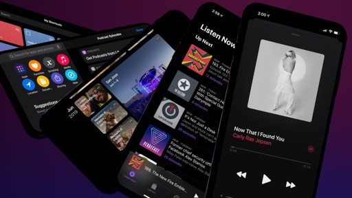
As I hinted above, iOS 13 also brings a refreshed look for the Now Playing screen, which had been mostly left unchanged since its last redesign in iOS 10. The song’s title and artist name are now left-aligned and they sit above the progress bar; this makes the Now Playing screen feel more spacious and has the practical benefit of letting the app fit more text onscreen without truncation. The system-wide encircled ellipsis button has been placed on the right side of a song’s title, leaving room for a new button along the bottom edge of the screen.
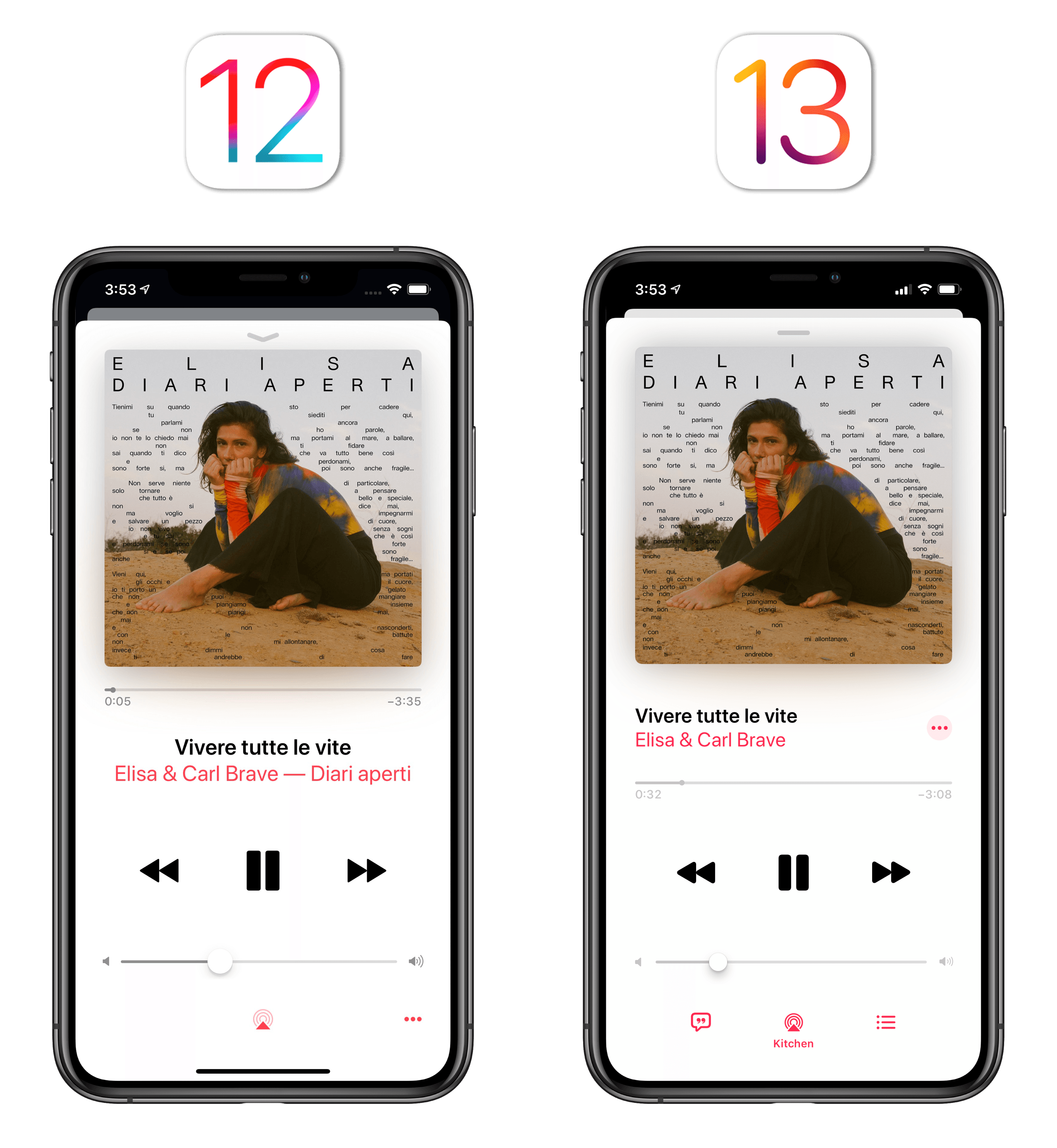
The new button in the bottom right corner of Now Playing opens Up Next: Apple has finally decided to provide a solution for the long national nightmare of having to scroll to find out what’s coming up next or simply trigger shuffle and repeat. In iOS 13, the Now Playing screen can no longer be swiped vertically and Up Next is a standalone screen that you can toggle with the press of a button, which is considerably faster than its old activation method in iOS 12. Not only is the new Up Next easier to reach and operate, but it also shows where songs are playing from (an album or a playlist) and you can tap the ‘Playing From’ label to instantly jump to the source item.
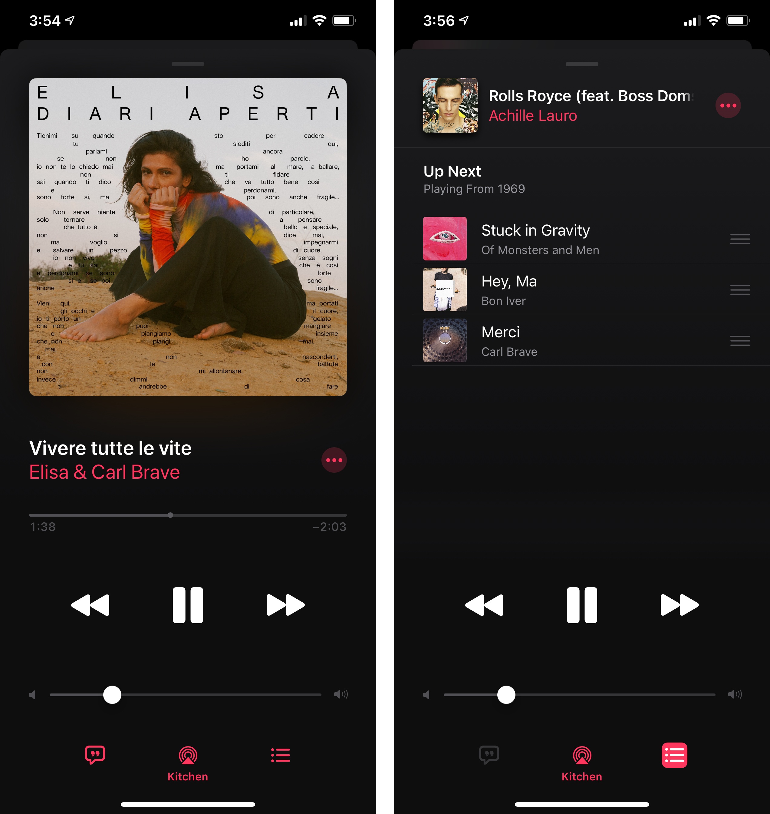
The Now Playing screen now comprises two buttons that open separate screens atop traditional player controls – lyrics and Up Next – and I think this is an overall smarter design than iOS 12’s scroll-based approach. In the old Music app, you had to carefully swipe to open lyrics or reach Up Next; now, you can just tap, check on your queue, and dismiss the screen with one tap. Shuffle and repeat can also be engaged from Up Next by activating their icons at the top of the list.
On iPad, the Now Playing screen features the same design and interactions, and it still is displayed as a modal element on the right side of the screen; oddly, however, its window has been redesigned to resemble a detachable, floating panel, even though it can neither be detached from its location nor float atop other apps.
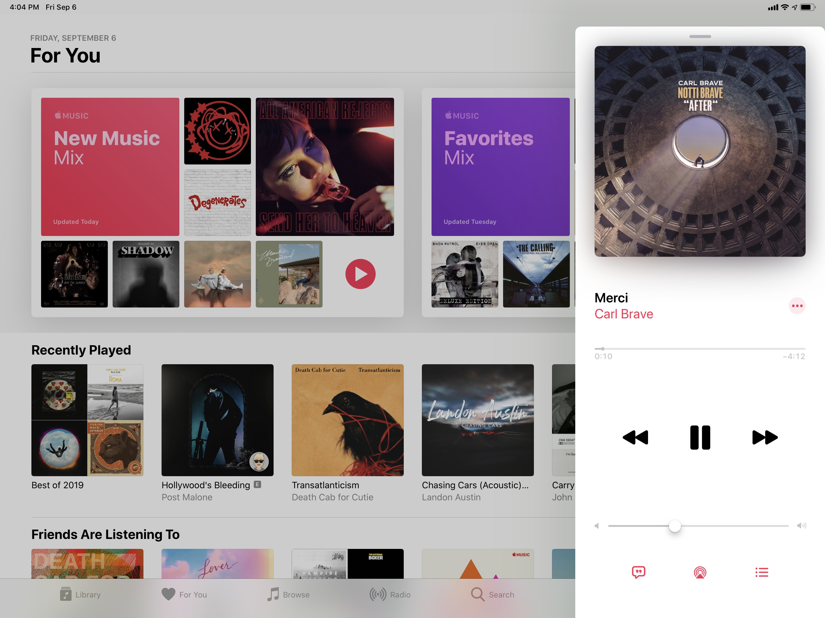
The iPad’s Now Playing window is a perplexing design decision: it’s almost as if Apple thought of making it a standalone window, sort of like the message composer in Mail, but then gave up on the idea halfway through the process, leaving us with an empty shell of the floating Now Playing screen that could have been. Apple should at least allow us to swipe the Now Playing screen to either side of the Music app; alas, the Music app for iPad still doesn’t take advantage of the device’s screen real estate – something that even the beta web app does.
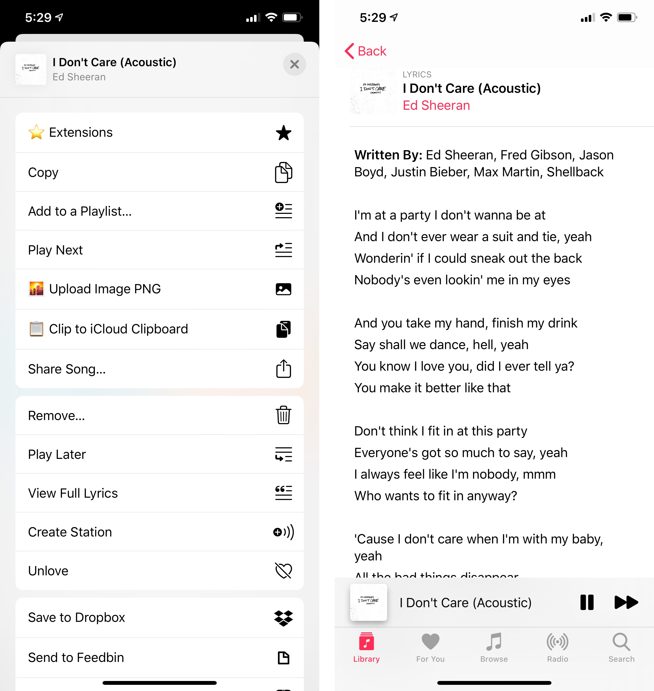
In unifying custom app actions and extensions with the new share sheet, Apple also revised Music’s action sheet: Music-specific actions (Love, Play Next, Add to a Playlist, etc.) no longer have their own menu, separate from the share sheet; instead, everything lives in a share sheet that, however, only shows vertical actions when it’s first invoked. Essentially, Music has fully embraced the share sheet in iOS 13, but only half of it comes up when you first press on a song or album.
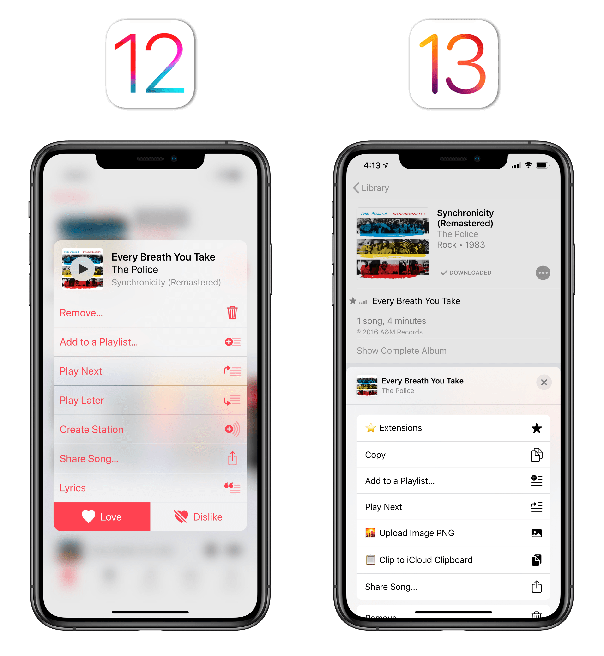
To view the complete share sheet with contact suggestions, AirDrop, and share extensions, you still have to tap a separate ‘Share’ action first:
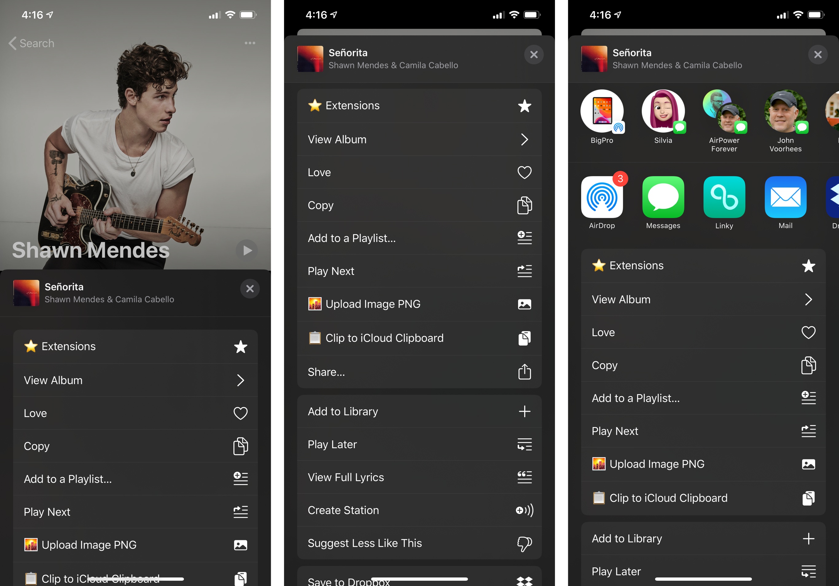
I don’t know why Apple stuck with hiding share extensions from Music’s share sheet by default (are they afraid people are going to…checks note…share links with their friends?), but I can’t say I disagree with the idea of ridding Music of its custom action sheet. Thanks to the share sheet in iOS 13, I was able to create a custom list of favorite actions that include both my custom Music shortcuts and often-used Music in-app actions; other Music actions remain accessible by scrolling down into the sheet. I miss the custom placement of the Love/Dislike buttons in Music’s old custom sheet, but the new one grants me the flexibility of creating my own menu, which is worth the trade-off.
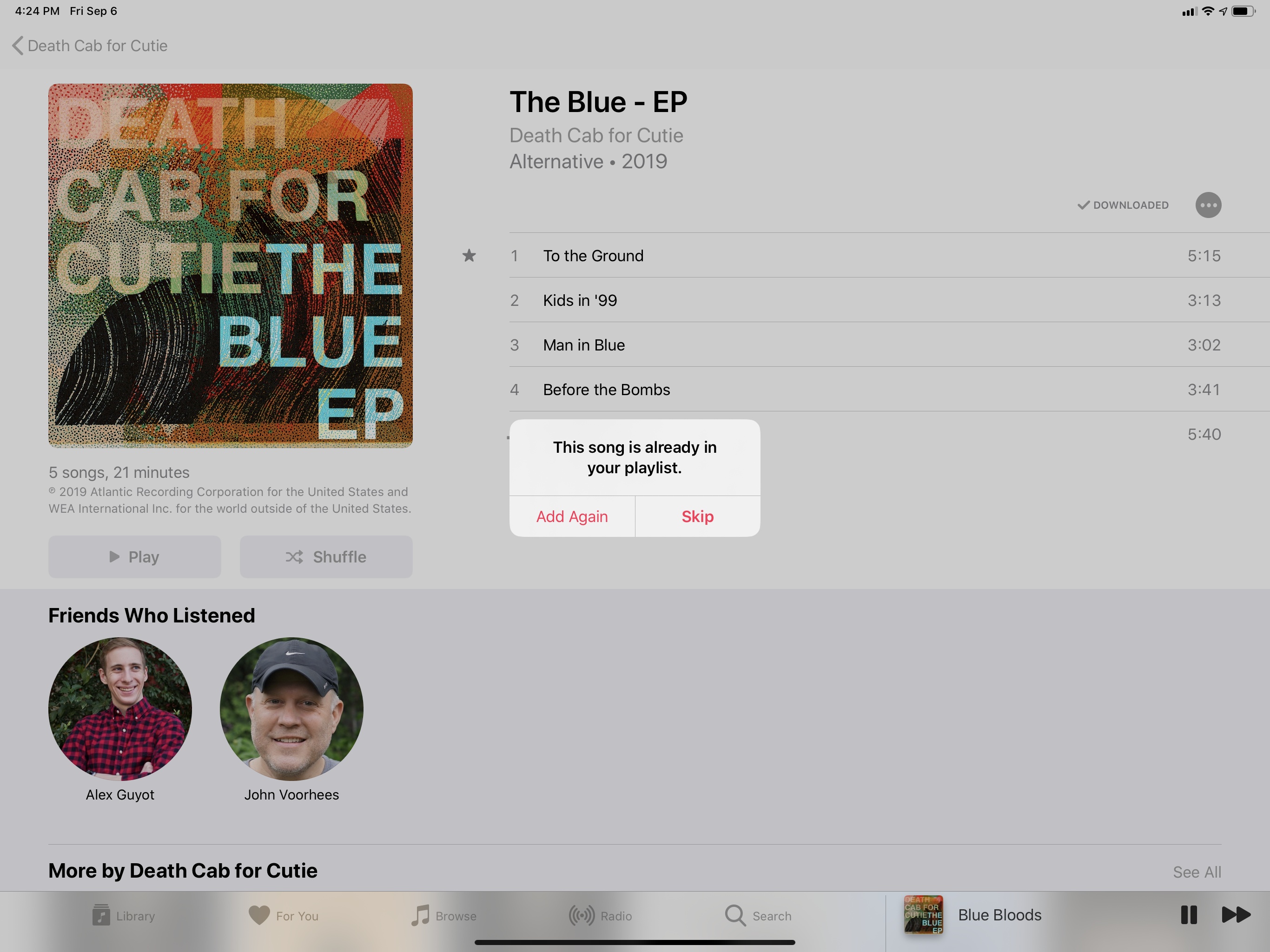
I want to conclude this section by mentioning one last enhancement to the Music app, an obvious, long-awaited tweak that Apple shipped in iOS 13: Music now warns you when you’re adding a song that’s already in a playlist.
- The emoji keyboard can be accessed from an emoji button on the left side of the space bar, which is always separate from the globe button to switch between keyboard layouts. This is one of my favorite small changes in iOS 13. ↩
- Memoji are hidden by default and you need to swipe to see them. ↩
- With a beautiful animation that matches the corner radii of the Super Retina Display. ↩