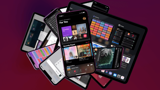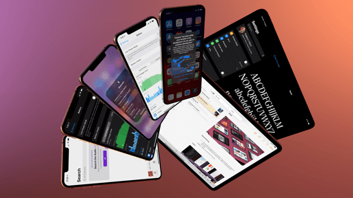
iPadOS
For as long as iOS has born its name, the iPad has shared the platform’s spotlight with the iPhone. Over the course of (nearly) a decade, both devices have advanced in lockstep, with iOS evolving to accomodate the unique needs of each. This isn’t changing with iPadOS 13, but Apple is ready to acknowledge a reality that’s been apparent since iOS 9 and the original iPad Pro: while the underlying platform may be the same, the iPad is marching forward at a different pace, advancing on a more deliberate schedule, and tackling problems that don’t affect the iPhone at all.
On a superficial analysis, splitting iOS and iPadOS into distinct entities carries the aftertaste of a pure marketing play from Apple. After all, the iPhone and iPad were always two branches of the same tree: united at their roots, yet extending in different directions. By design, the iPad was always similar enough to the iPhone to feel like a familiar experience for newcomers, but also differentiated to take advantage of interactions on a larger screen. This design philosophy was true with iPhone OS 3.2 – a fork of iPhone OS that launched on the original iPad – and it worked with iOS 9 and iOS 11, when the iPad gained functionalities such as Split View, Slide Over, and drag and drop. Despite its unique traits, the iPad still ran iOS and shared key technologies with the iPhone and the rest of Apple’s ecosystem. For this reason, some might argue that slapping an “iPadOS” monicker on what was already an optimized version of iOS is just semantics at this point.
Here lies the core of Apple’s proposition with iOS and iPadOS though: semantics matter. Even if iPadOS is “just a name”, it means something. And taken at face value, iPadOS is exactly what its name implies: a literal expression of the fact that the iPad experience has become sufficiently distinct from the iPhone to justify having its own brand. Considered through the lens of Apple’s growing ecosystem, it’s not a surprising move: just like watchOS, tvOS, and CarPlay are iOS-based systems with their own design guidelines and feature sets, so does the iPad deserve a name of its own too. If anything, my only criticism is that Apple should have introduced this rebrand years ago.
As a name, “iPadOS” is merely stating the obvious; as an idea, however, the decision to draw a line in the ecosystem with iPadOS seems to imply major changes afoot for the iPad’s software growth.
First and foremost, iPadOS signifies a renewed commitment to a device that has often acted as a sidekick to the iPhone; a revamped hardware lineup followed by an OS rebrand feels like a strong message of hope from a company that’s been inconsistent at best with its iPad-focused software updates. Particularly given how “great hardware, lackluster software” has been a common refrain regarding every new iPad model since the iPad Pro’s debut in 2015.
Furthermore, by separating iOS and iPadOS as distinct platform names, Apple may have more freedom to release iPad-specific features without the looming presence of iOS: if the plan is to take the iPad in a new direction from the iPhone, it’d make sense to put a different label on such an endeavor.
The first fruits of this labor are already showing in iPadOS 13: more than ever, Apple seems fine with designing features that only iPad power users will discover and master over time, from advanced gestures to new multitasking controls. Along the same lines, iPadOS proves Apple’s acceptance of the fact that the Mac figured out how to solve certain problems decades ago: whether it involves multiple app windows, a desktop-class web browser, or access to USB accessories in Files, iPadOS is a first step toward a hybrid computing environment that has outgrown its iOS origins to become something else entirely.
But are these features enough to let the iPad’s software feel as advanced as its hardware? And how far can Apple take iPadOS without betraying the iPad’s intuitive, nimble nature?
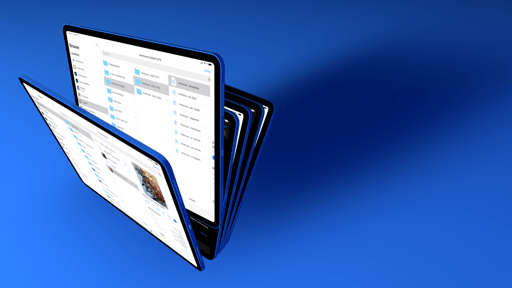
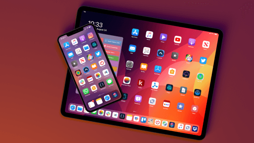
New Home Screen
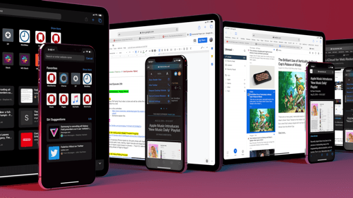
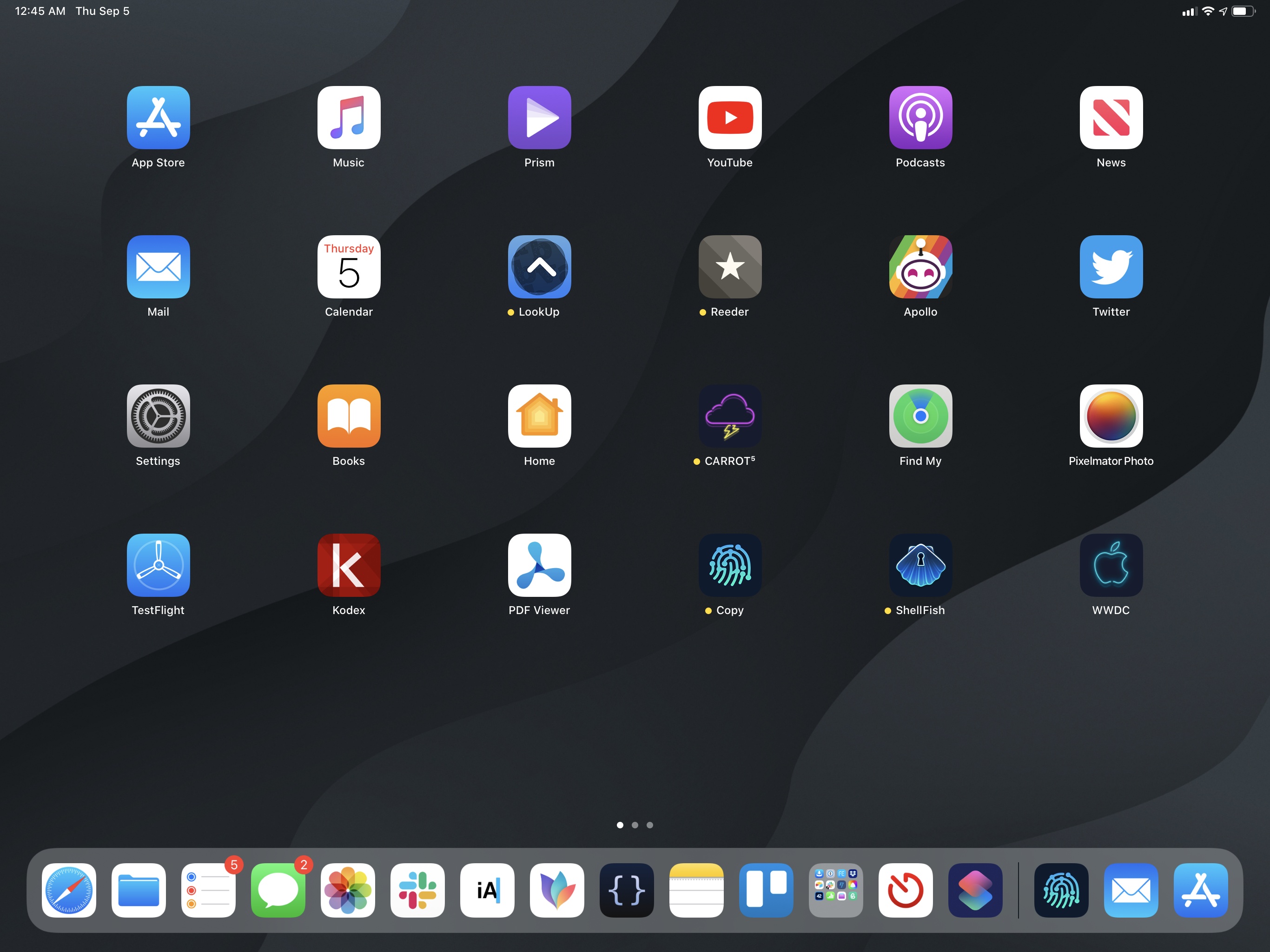
iPadOS’ first order of business was to bring a visual and functional refresh to one of iOS’ sacred locations: the Home screen. For the first time in the iPad’s history, you can now choose to display more apps on a single screen by making their icons smaller; in doing so, you’ll have the option to access widgets from a side of the Home screen itself without opening a separate Today view. When the Today view is shown on the Home screen, the current date and time are also displayed more prominently on top of it, giving the iPad’s Home screen a fresh, modernized look that feels less like a simplistic collection of apps and more like a dashboard.
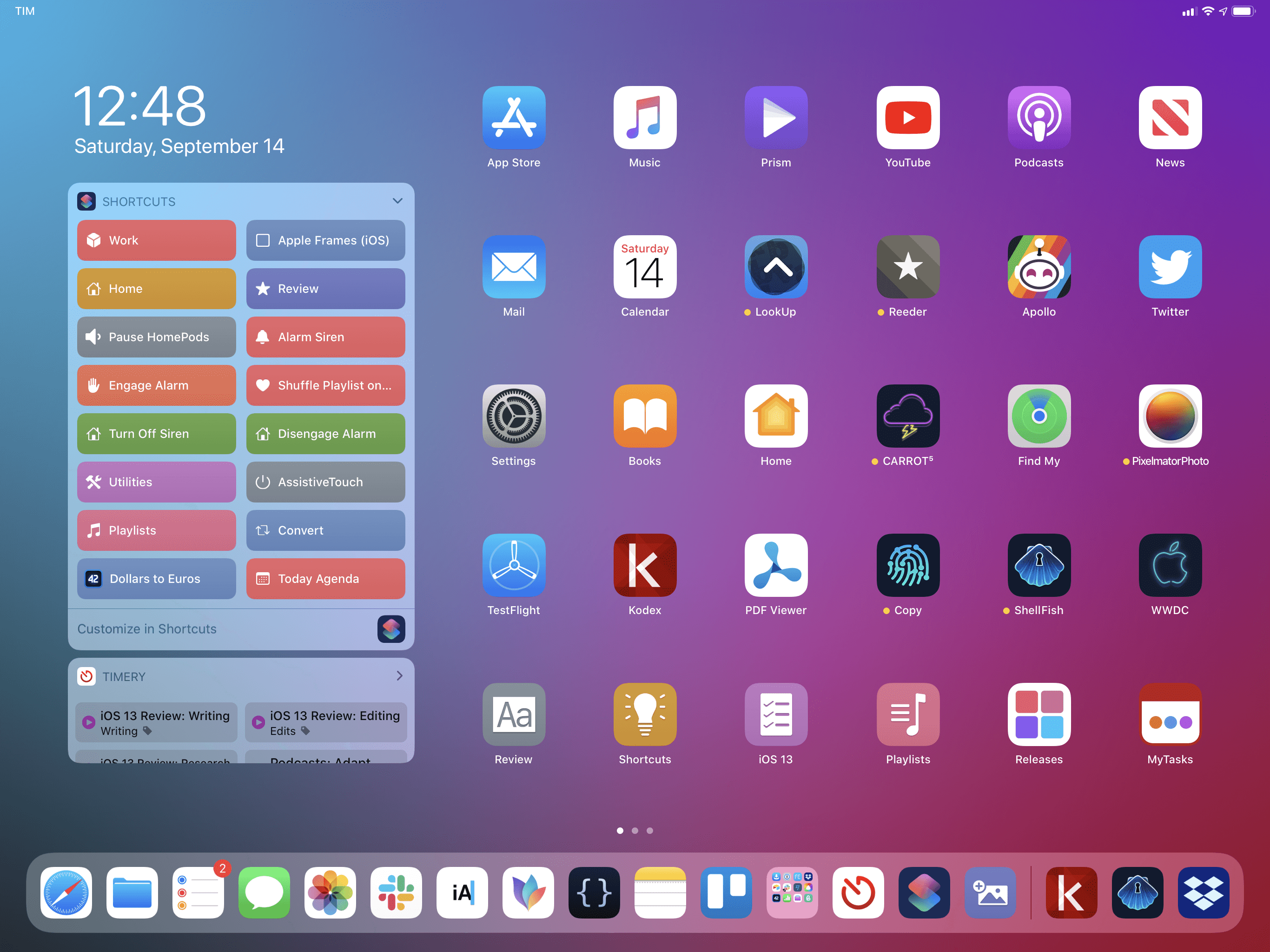
For years, I’ve wondered whether Apple should have taken a clue from Android and allowed iPad users to freely intermix app icons and widgets on the Home screen, enabling the creation of custom layouts to go beyond the app icon grid. The approach chosen by Apple in iPadOS is different: the Today view (which used to be a standalone page) is now a column on the left side of the Home screen, which can only be displayed simultaneously with app icons (on the first page of the Home screen) while in landscape mode; if you’re using the iPad in portrait mode, the Today column disappears and can only be invoked as a modal view with a swipe from the left edge of the display.
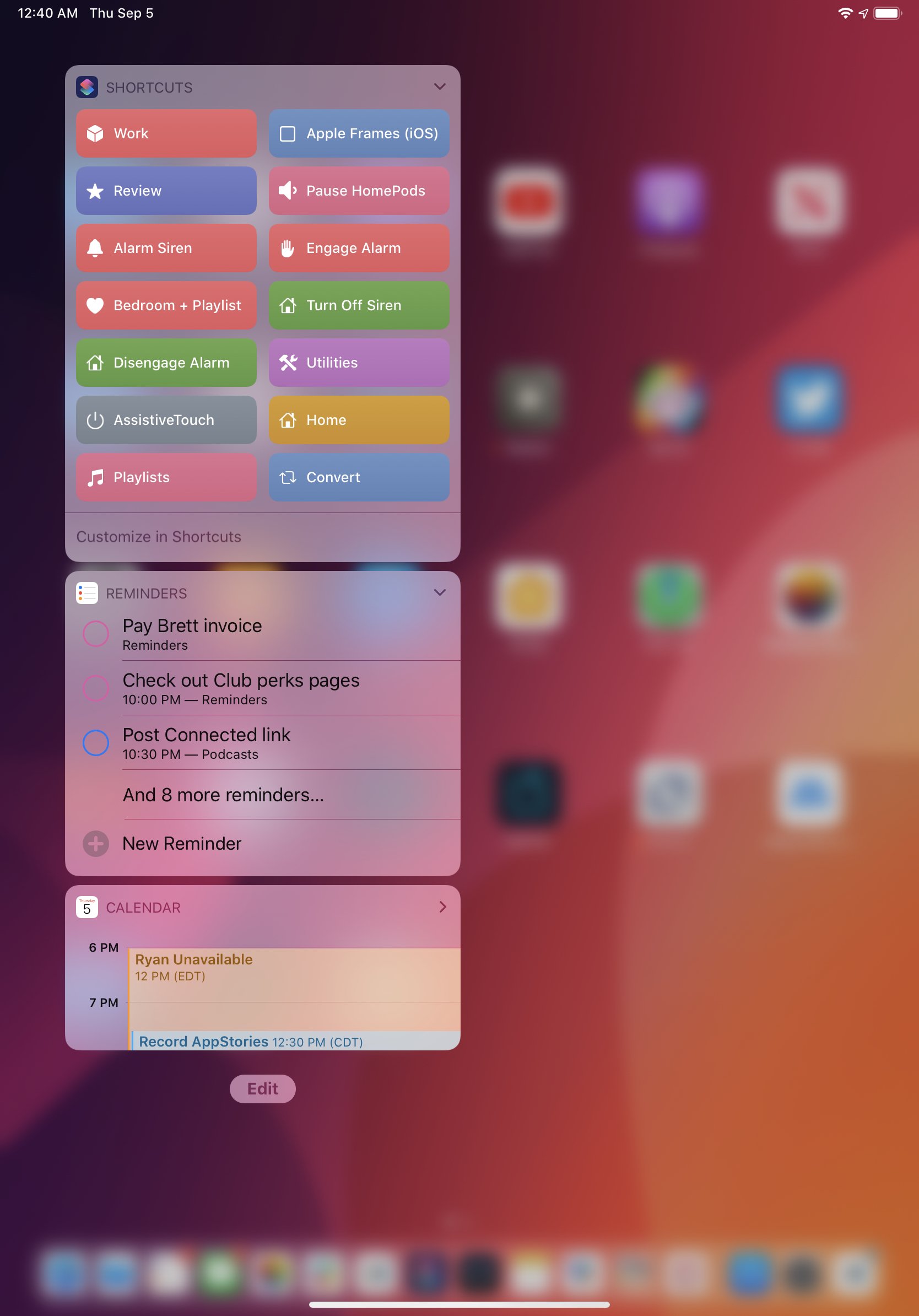
Additionally, widgets cannot be placed elsewhere: the Home screen, even though it can be denser than before, is still based on a grid layout strictly reserved for icons; widgets have to be contained in the Today column. As was the case with the old Home screen, widgets can be expanded or collapsed to a compact layout if you want to see less information inside them. Old limitations still apply: widgets can’t display a system keyboard and only a small amount of memory is allocated to them, so don’t expect complex interactions to take place inside a widget.
In rethinking widgets as an integral component of the iPad Home screen, Apple brought a new layer of organization to the Today view in iPadOS 13. Widgets can have two separate levels of importance: your “favorites” are all the widgets you choose to enable on your iPad, but “pinned favorites” are the ones that are always shown on the Home screen next to app icons; they sit above favorites in the Today view. To go beyond pinned favorites to see all the other widgets you’ve installed, you have to swipe vertically on the Today view: doing so will reveal additional widgets with a pleasant 3D accordion-like transition that gives a sense of depth to your installed widgets, letting you easily scroll through them.
Scrolling widgets in iPadOS 13.Replay
The UI to pin and organize widgets (which can be accessed from the ‘Edit’ button at the bottom of the widgets list) reflects the structural changes of iPadOS 13, with separate groups for pinned favorites and favorites reminiscent of sections in the new share sheet.
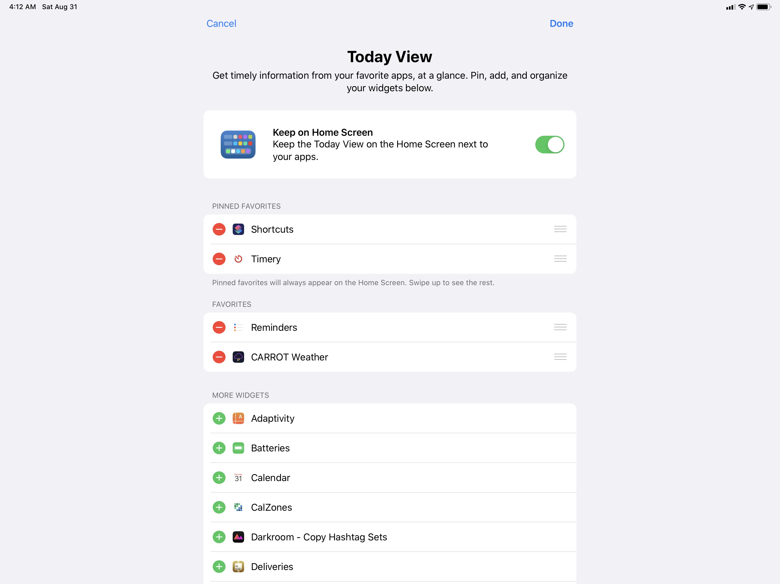
This screen also reveals the ability to use a tighter app grid without seeing the Today view at all times: if you disable the ‘Keep on Home Screen’ setting, go back to the Home screen, and swipe to the left on the first page, the Today view will disappear, icons will expand, and you’ll end up with a denser Home screen without widgets.24
You can hide widgets on the Home screen.Replay
By granting the ability to disable persistent widgets altogether, it appears that Apple wanted to strike a balance between providing power users with new options and keeping the iPad’s classic simplicity for those who don’t need more advanced modes. This flexibility – which, as we’ll see shortly, permeates nearly every aspect of iPadOS 13 – has resulted in the option to completely ignore the denser icon grid and revert to the iPad’s bigger Home screen layout.
In Settings ⇾ Display & Brightness ⇾ App Icon Size, you’ll see two options for ‘More’ and ‘Bigger’ Home screen layouts. The former uses smaller app icons to form a 6x5 grid that lets you keep 30 apps on a single screen; the ‘Bigger’ option, which does not support widgets on the Home screen in landscape mode, switches to larger icons and alternates between a 5x4 or 4x5 grid (depending on orientation) to put 20 icons on the Home screen.
Aside from visual preferences, there’s another distinction to be made about the two icon layouts: unlike the old grid, the tighter 30-icon grid has a permanent 6x5 arrangement that rotates across landscape and portrait without switching the position of your icons. Ever since the original iPad, the automatic reflowing of app icons has been one of the most annoying aspects of the experience: the whole point of the Home screen is to build a launcher where your favorite apps are in a predictable, consistent spot; the old iPad Home screen prevented that due to device rotation and the old grid design. The new grid option, which Apple rightly treats as default, ticks all the boxes: it supports widgets in landscape, allows for more icons on a single screen, and doesn’t force icons to reflow when the iPad’s orientation changes. For me, this is an ideal Home screen structure on the iPad; if you’re skeptical today, I recommend playing around with it for a few days.
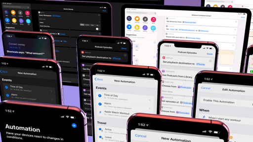
Quick Actions
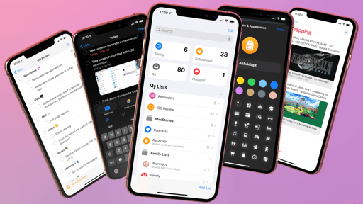
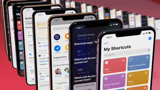
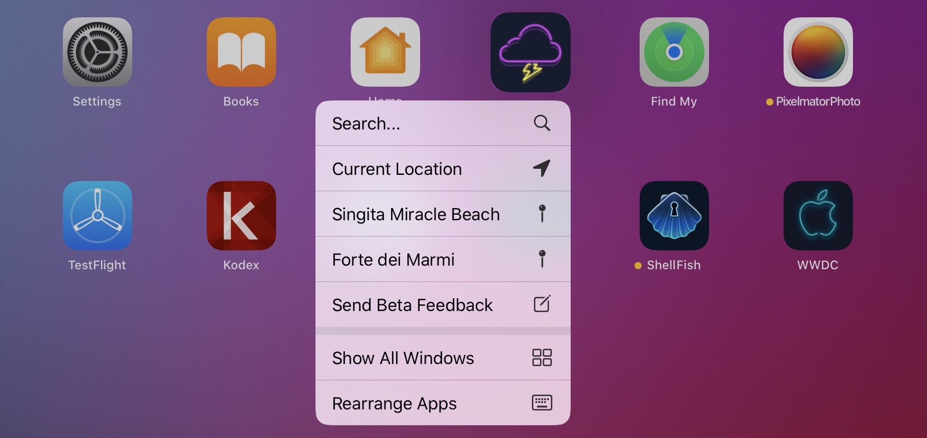
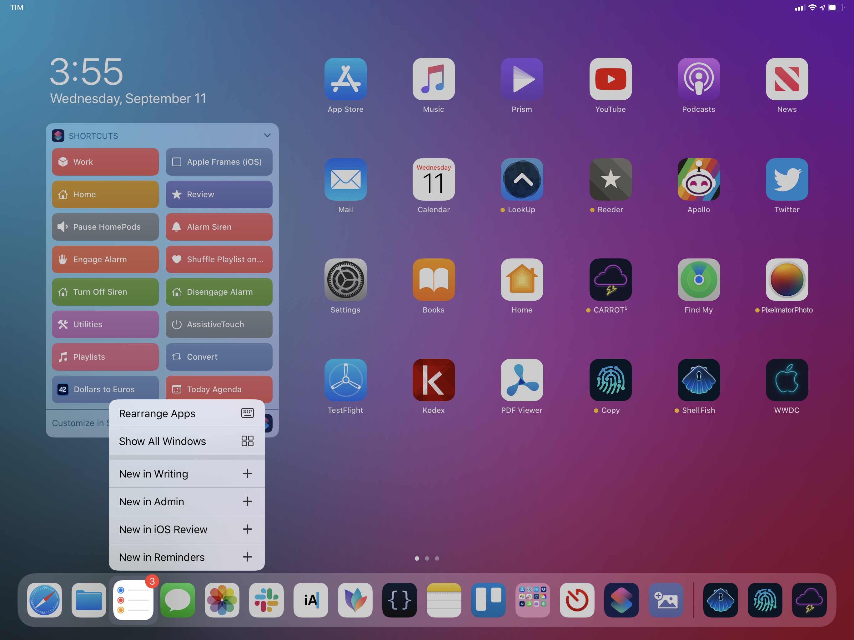
There’s more to app icons in iPadOS 13 than their size and placement. Keeping with the idea of enabling interactions that were exclusive to iPhones with 3D Touch, Apple has brought quick actions for app icons to the iPad Home screen in iPadOS 13.
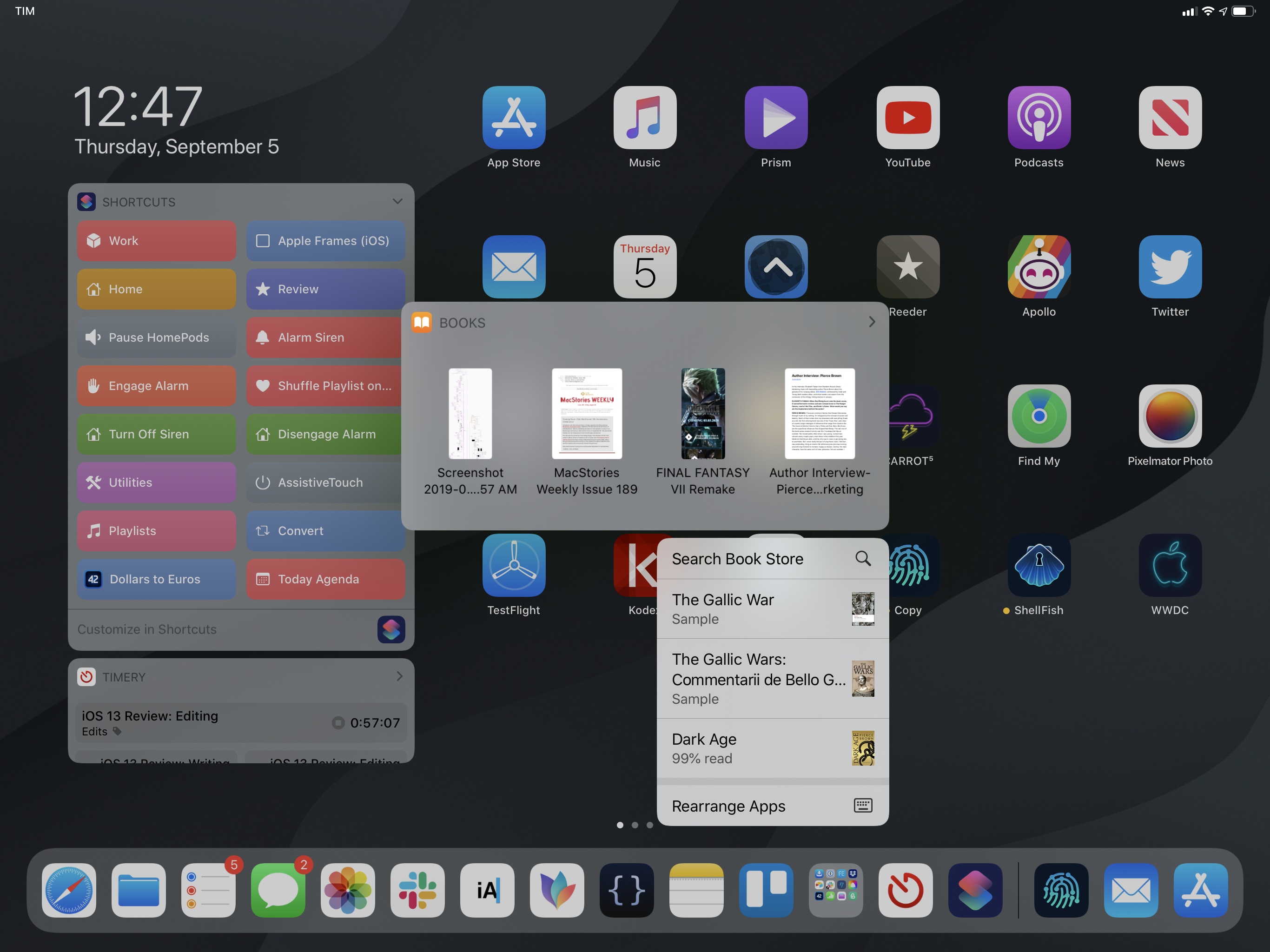
Modeled after the same design and physics of context menus, quick actions appear after long-pressing an icon; they integrate with the special “widgets” of document-based apps, so both elements can be displayed onscreen at the same time after a long-press; and, both on iPhone and iPad this year, quick actions contain a new option to rearrange apps on the Home screen.
Quick actions on the Home screen.Replay
Let’s start from the feature available on all iOS devices as it may help explain the challenges Apple faced with quick actions and the long-press gesture. As I’ve noted with context menus, one of the common criticisms of iOS 11 was Apple’s reliance on long-press gestures that required fine precision from users to know the differences between a short press and a longer press. Personally, I think power users could figure out multitasking gestures with some trial and error; I’d argue that the feature that suffered most because of iOS 11’s gesture design was wiggling mode on the iPad Home screen. Everybody needs to enter wiggling mode sooner or later; however, due to iOS 11’s implementation of long presses to drag app icons into multitasking, wiggling mode became harder to access. Ever since iOS 11, the iPad Home screen has dealt with two different layers of icon-dragging – multitasking and wiggling mode – and I can see how the average iPad user may have struggled reconciling them. But how can two distinct interactions based on the same long-press gesture be visually communicated without cluttering the Home screen with buttons or tooltips?
Apple’s answer in iOS and iPadOS 13 is going all-in with context menus and their Home screen variation, quick actions. These are not new on iPhone, but they replace the previous 3D Touch implementation and have a refreshed design that’s consistent with context menus on all devices.
Quick actions have a separator at the bottom that divides app-related actions from the system’s ‘Rearrange Apps’ button; on iPad, an additional ‘Show All Windows’ button is one of the ways you can access the Exposé functionality of multiwindow. The action to rearrange apps is Apple’s best shot at easing the learning curve of long-press gestures on the Home screen: by default, a long press now reveals quick actions; if you want to rearrange your icons, you can tap a button to enter wiggling mode.
This leaves us with an obvious question: what about drag and drop? The answer: quick actions behave like context menus insofar as you can either start dragging right after initiating a long-press or tear the actions menu away to continue dragging the icon. The interaction is especially nice once you realize how you can long-press an icon, scroll through its actions without lifting your finger off the screen, then decide to drag the icon away in one seamless motion.
From quick actions to drag and drop.Replay
I’ll be honest: it’s hard for me say whether iPadOS’ revamped long-press gestures on the Home screen are a clear-cut improvement over iOS 11 because I don’t use an iPad like most people. It is my job to know the intricacies of advanced gestures, and I’ve grown to master the fine differences between long and longer presses in the two years that drag and drop has been available on iPad. But I’ll say this: iOS’ long-press gesture has never been as consistent and reliable as it is this year with context menus, which have been designed with all kinds of devices in mind. As an extension of context menus, quick actions blend the benefits of 3D Touch with the simplicity of a long-press gesture, and in the process have brought a welcome sense of order to the iPad’s Home screen.
Ultimately, both context menus and quick actions are opinionated design choices: Apple believes that a long-press should quickly display a menu in iOS and iPadOS 13, which can optionally be dragged away; everything else (wiggling mode, drag and drop for multitasking) is a subset of that. Having used the iPad Home screen for the past three months, I find myself increasingly nodding in agreement.
There’s a thought I keep going back to regarding the new Home screen in iPadOS 13: I would have liked to see more substantial changes, but what we got has been enough to make me appreciate and use the Home screen more.
In many ways, the Home screen is the identity of an iPhone and iPad – the launchpad for experiences represented by app icons. Bringing drastic changes to a formula that has worked well for over a decade may be too dangerous a risk even for Apple, a company that’s not new to introducing changes that feel ahead of their time (until they’re the new industry norm). In this case, the iPad Home screen is still missing key features that would propel it forward for power users: there should be a way to create fully custom icon layouts, with blank spots, going beyond the constraints of a grid; I’d like to see document bookmarks, or perhaps even app shortcuts, become elements that can be pinned directly to the Home screen; advanced users should have the option of freely intermixing icons and widgets within a page; it should be possible to navigate the Home screen and select apps from an external keyboard. Arguably, such advanced features shouldn’t be enabled by default for all users; however, for those who seek more power, iPadOS should make that power available to them through deeper customization options. Frankly, I’m surprised that all Apple was able to come up with in the two years since iOS 11 was a sidebar for widgets and quick actions.
One of my most used quick action menus is the Reminders one. I use it to view Reminders windows and open specific lists. (The wallpaper is exclusive to Club MacStories members.)
That’s not to say I’m not enjoying the new Home screen features in iPadOS 13. Quick actions have greatly simplified how I can access specific sections of apps (such as my favorite subreddits in Apollo), create tasks in specific Reminders lists, or check for updates on the App Store. I’m still getting used to them, and they’ve yet to become a second-nature interaction like 3D Touch on my iPhone XS Max, but I think I’ll get there as more iPad apps start supporting them.
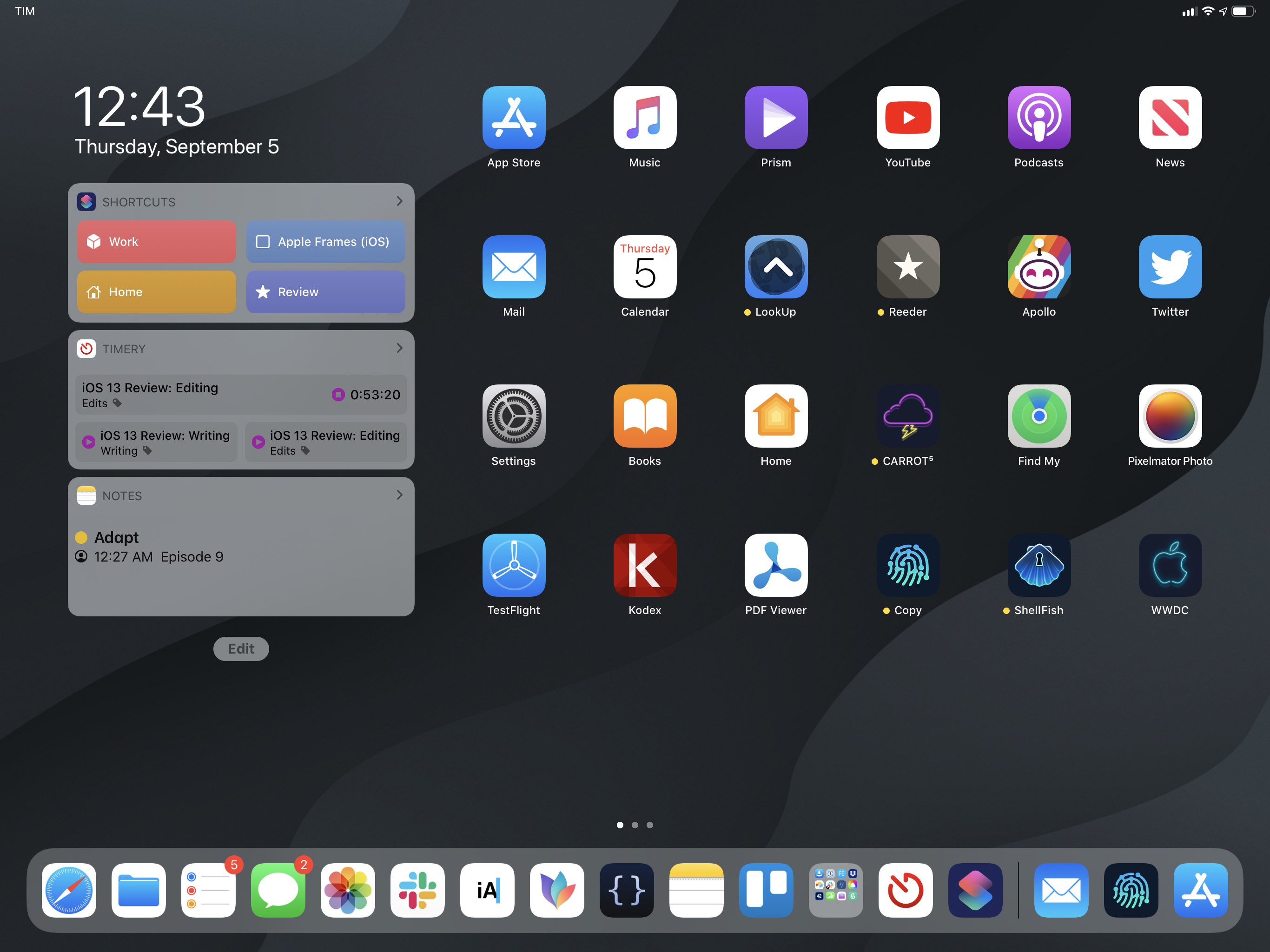
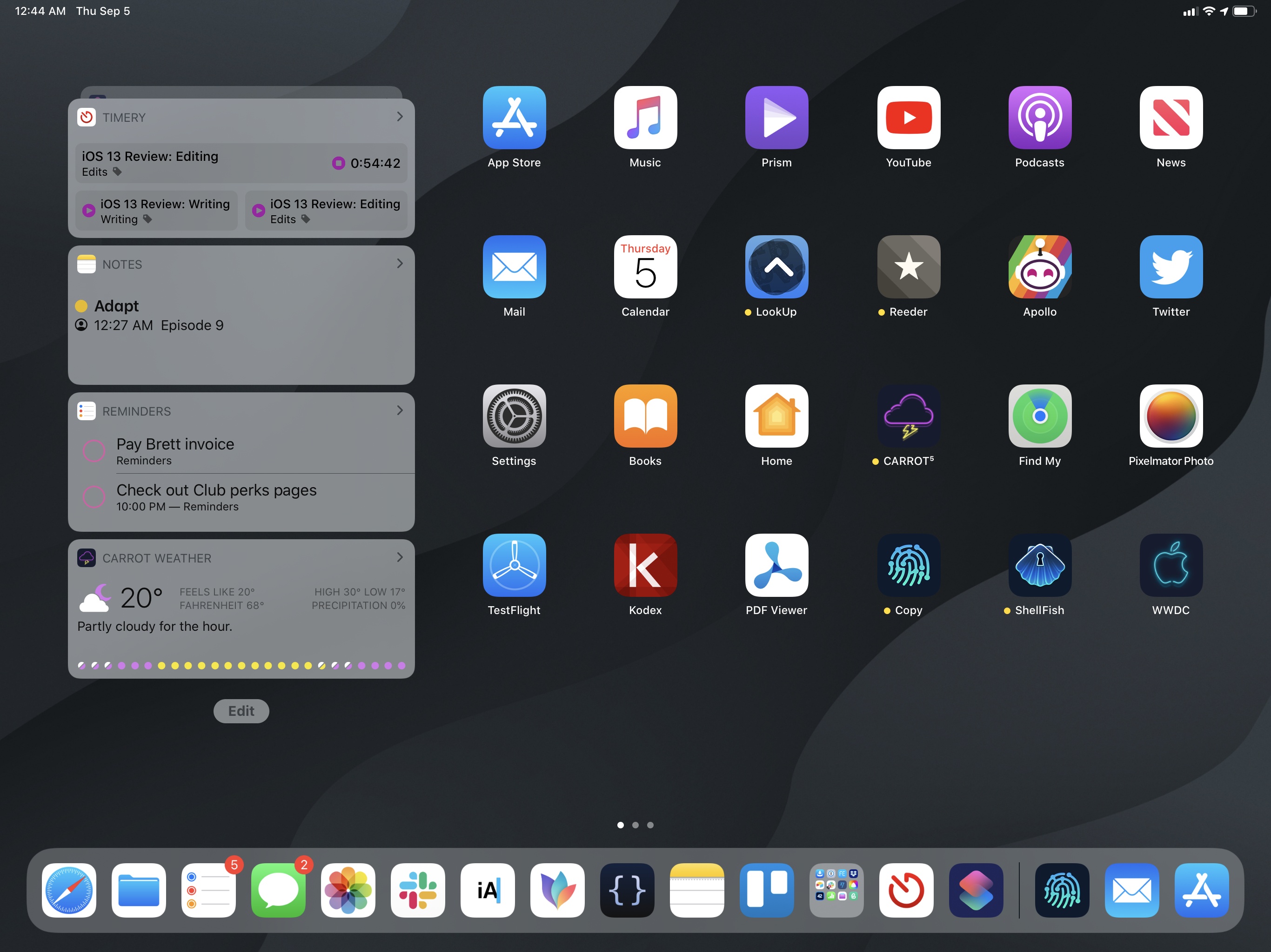
The Today column for widgets has been a terrific addition in terms of running shortcuts from the Home screen: while I could already run my favorite widget shortcuts from iOS 12’s Today page, the extra swipe required to open widgets added friction to the experience. That’s gone with widgets on the Home screen: now whenever I need to convert between units, check time zones, or activate a HomeKit scene, shortcuts to perform those tasks are only a tap away. The Today column has increased my usage of Shortcuts’ widgets, but it’s also pushed me to reconsider third-party ones. After much experimentation, I’ve landed on Shortcuts and Timery as my pinned favorites (with Timery in compact mode so I can always see both widgets at the same time), plus Reminders and CARROT Weather in my favorites. This setup works well for me as it puts frequently used shortcuts plus time-tracking actions and stats directly on the Home screen, allowing me to jump back into a specific workspace and start a related timer in seconds.
Even though I was hoping for more, the iPad Home screen is growing up, and that’s a good sign. Apple has been relatively conservative with its Home screen alterations in iPadOS 13; multitasking, on the other hand, is a completely different story.
- However, the number of app icons will be the same as the standard Home screen layout. Even if you disable widgets, you can't make the Home screen any denser. ↩