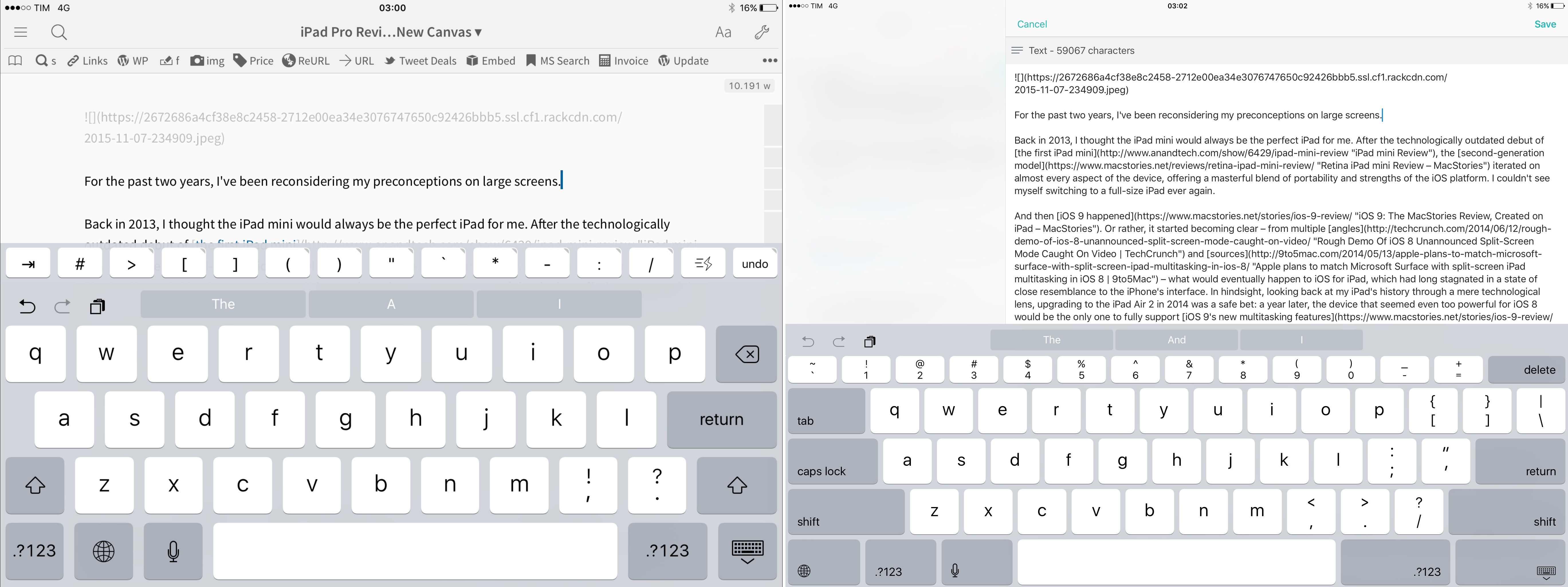
For the past two years, I’ve been reconsidering my preconceptions on large screens.
Back in 2013, I thought the iPad mini would always be the perfect iPad for me. After the technologically outdated debut of the first iPad mini, the second-generation model iterated on almost every aspect of the device, offering a masterful blend of portability and strengths of the iOS platform. I couldn’t see myself switching to a full-size iPad again.
And then iOS 9 happened. Or rather, it started becoming clear – from multiple angles and sources – what would eventually happen to iOS for iPad, which had long stagnated in a state of close resemblance to the iPhone’s interface. In hindsight, looking back at my iPad’s history through a mere technological lens, upgrading to the iPad Air 2 in 2014 was a safe bet: a year later, the device that seemed even too powerful for iOS 8 would be the only one to fully support iOS 9’s new multitasking features on day one.
I was uncertain about switching from the iPad mini to the Air 2 as a future-proofing tactic for my iOS experience, but the decision paid off. I didn’t know I’d be able to get work done faster and more comfortably on the bigger iPad Air 2 until I got one. The iPad Air 2 became my primary computer.
On both the iPhone and iPad, I’ve discovered that I like big screens and I’m not affected by portability concerns. Moving to the iPad Air 2 and upgrading to the iPhone 6 Plus has been instrumental to assemble a setup that makes me more efficient on a daily basis.
It’s with this mindset that I approached the iPad Pro, which I’ve been using for the last eight days since getting a review unit from Apple last week. Announced in September alongside the iPhone 6s, the iPad Pro has been presented by the company as the future of computing, promising to deliver desktop-class performance in a tablet form factor and expanding the range of input sources beyond multitouch with new accessories.
More practical questions have been making me ponder my taste in iPads again for the past two months. Is the iPad Pro too big for me? Can it really take another leap and outclass the iPad Air 2 in my daily usage of iOS 9? And with an iPad this big, are the portability perks of the 9.7-inch tablet inevitably lost?
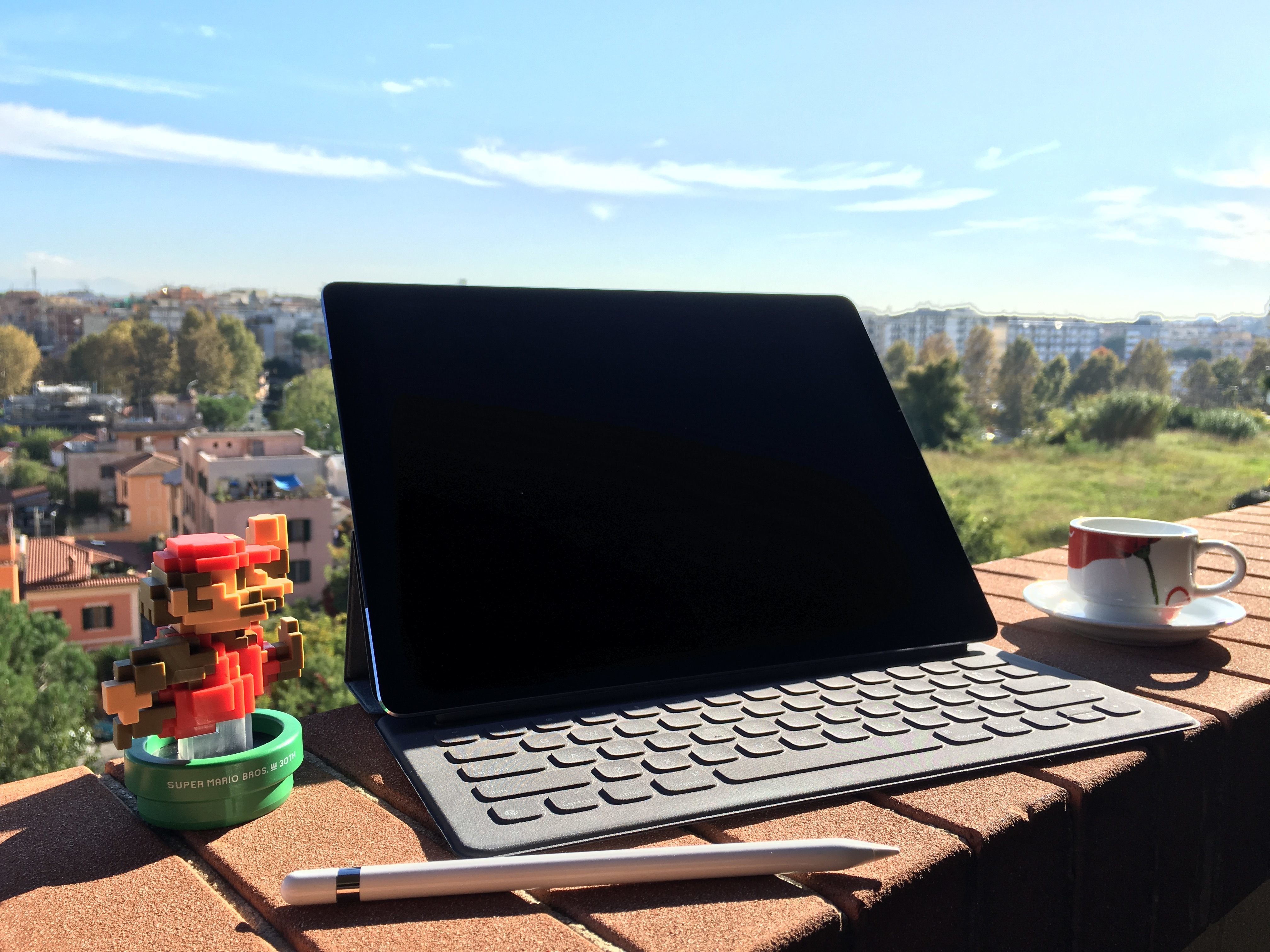
I’ve spent the past week trying to find out. I set up a clean installation of iOS 9.1 on the iPad Pro with the apps I use every day (Editorial, Tweetbot, 2Do, Slack, Newsify, Outlook, and Notes – just to name a few), tested several third-party apps with iPad Pro-specific optimizations, and used accessories Apple gave me alongside the review unit – a Pencil, a Smart Keyboard, and the new Logitech CREATE keyboard case. I’ve used the iPad Pro as my only computer in lieu of the iPad Air 2, and I’ve observed how its hardware and software changes altered my workflow and physical interactions.
There’s a lot to discuss about the iPad Pro, and I’ll have to continue unwrapping the nature of this device for weeks to come. But I want to make one thing clear from the outset:
This is less of a “just for media consumption” device than any iPad before it. The iPad Pro is, primarily, about getting work done on iOS. And with such a focus on productivity, the iPad Pro has made me rethink what I expect from an iPad.
iPad Pro Review: Connected Episode & Making Of
We’ve also discussed my iPad Pro review and my experience with the device in a special episode of Connected on Relay FM. You can listen here.
In addition, Club MacStories members will get access to a ‘Making Of’ post about my iPad Pro review in a special issue of MacStories Weekly later today. You can become a Club member here.
If you sign up after the newsletter has been sent, email us at [email protected] and we’ll send you the issue manually.
Table of Contents
- Weight and Portability
- A Bigger iOS
- Software Keyboard
- Upscaled Apps
- Benchmarks and Performance
- Four Speaker Audio
- Multitasking and Working on iPad Pro
- A Note on Accessories
- Miscellaneous Observations
- A Canvas for your Work
Weight and Portability
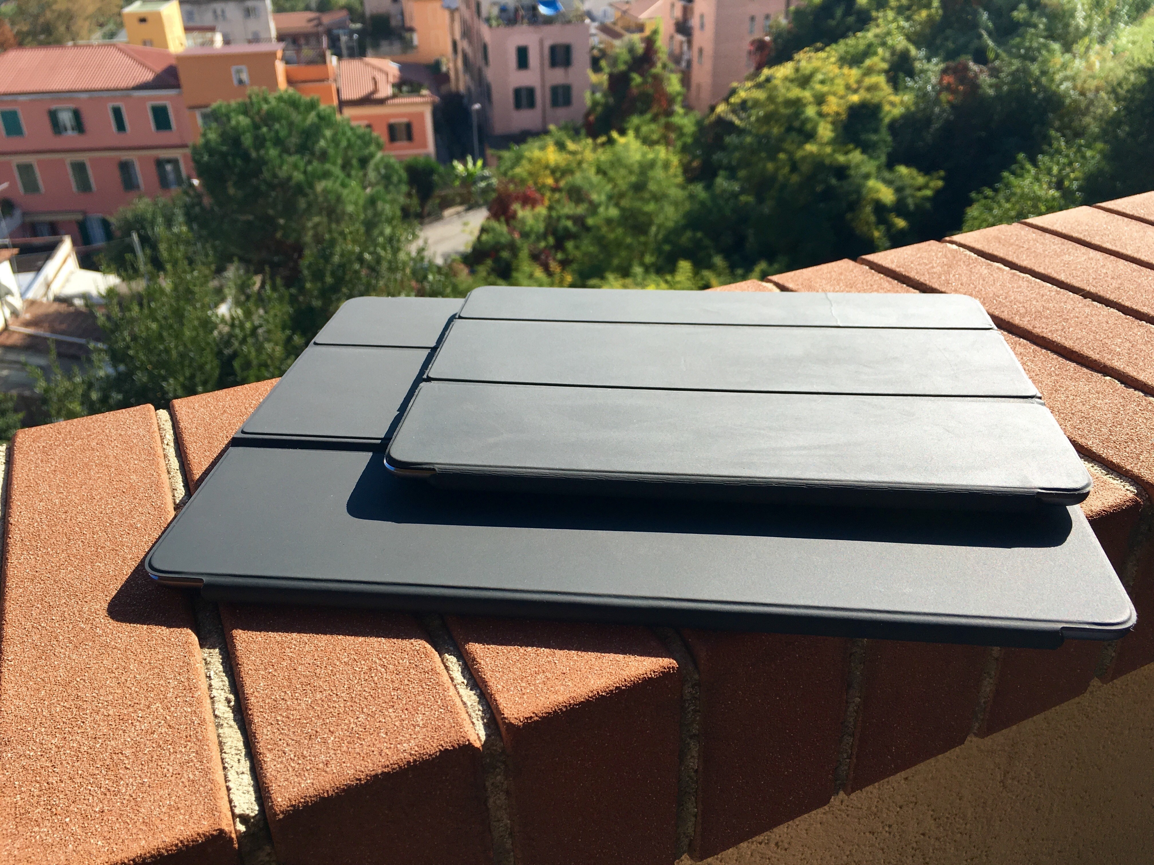
The iPad Pro is big. When I first saw the device lying flat on a desk, my first thought was that it looked like a MacBook’s display without the keyboard. At 723 grams1, the iPad Pro is 62.8% heavier than its iPad Air 2 counterpart; when used in landscape, its 12.9-inch Retina display is roughly 6.5 centimeters wider than the iPad Air 2, and it’s 5 centimeters wider than the Air 2 in portrait mode. The difference between the two devices is obvious at a glance and palpable when using the iPad Pro.
Such observation shouldn’t necessarily be regarded as a pitfall of the iPad Pro. The device is noticeably heavier than the iPad Air 2, but not too heavy: upon picking it up for the first time, I noted how I was expecting it to be much heavier – again, looking at the Pro’s body tricked my brain into thinking I was about to pick up an object as heavy as my 13-inch MacBook Air.
Instead, the iPad Pro is surprisingly well-balanced: its weight distribution doesn’t make the device annoyingly bottom or top-heavy – in portrait and landscape orientations, both sides of the Pro feel equally balanced and sturdy. The iPad Pro is slightly thicker than the iPad Air 2 (6.9 millimeters versus 6.1 millimeters), but the increase is negligible and didn’t have a meaningful impact on my usage2.
The feeling of a bigger-than-usual but lighter-than-I-imagined device has stuck with me. Every time I pick up the iPad Pro, I realize that it’s much bigger than the screen I’ve held every day for a year, but also not as heavy as I thought it would be.
As I detailed in my review of the iPad Air 2 earlier this year, the iPad is, for me, a device that combines the benefits of a traditional computer with the intrinsic portability of iOS. I use the iPad at my desk when I’m writing and responding to emails, but my lifestyle also requires moving around with it a lot. I have to walk around the house to stretch my legs (as part of my post-treatment routine) every few minutes, so holding an iPad means I don’t have to stop what I’m working on. I often find myself waiting in line or for my girlfriend to finish class, and in those times the iPad – with its large screen and cellular connection – enables me to work from anywhere.
All my MacStories articles are produced and edited with an iPad and a mobile workflow that doesn’t tie me to a desk. I take the portability of my iPad very seriously: my livelihood depends on the ability to carry it around and use it in different contexts and places.
After a week of intense usage, various trips in my car, and numerous walks around the house, I’m glad to acknowledge that the iPad Pro is still a portable iPad. I can hold it with two hands when walking around for a few minutes without feeling excessive wrist fatigue, and I can even hold it with one hand (usually my left one) if I want to interact with an app on screen with my right hand. I know that it sounds ridiculous – and I couldn’t believe Apple’s marketing shots either when I first saw them – but holding the iPad Pro with one hand in a corner is possible.
The aforementioned weight distribution plays in favor of the iPad Pro: because it’s evenly balanced across sides and orientations, holding it with two hands when I cannot rest my elbows on another surface (or placing the iPad on my lap) hasn’t been a problem for me. I can hold the iPad Pro with one hand while I stir my pasta sauce with the other one, and I can still sit in my car, holding the iPad with two hands in portrait mode when catching up on RSS and email.
The iPad Pro’s form factor works for me from a physical standpoint. The device is heavier and larger, but in my everyday scenarios these differences haven’t been an issue. I’ve never found myself being unable to work from the iPad Pro while on the go because it was too heavy or bulky, or not enjoying the experience and wishing I had an Air 2 instead. The increase in physical size is an acceptable trade-off with no disruptive consequences. The iPad Pro doesn’t cross my threshold of “not portable anymore”.
The obvious disclaimer here is twofold. First, I’m used to working on the iPad, and my arms have adjusted to the daily pattern of picking up the device, holding it, switching to one-handed usage for a couple of minutes, and sitting back and holding it upright on my lap. Second, as I explored in my review of the iPhone 6 Plus, I’ve got big hands and I’m okay with large screens. If you don’t find yourself in either of these two categories, I’d recommend going to your local Apple Store and trying an iPad Pro. Similarly, while the iPad Pro barely fits in my Tom Bihn Ristretto, it’ll no longer fit in most of my girlfriend’s purses; I’m going to keep using my Ristretto bag for now, and I’d suggest checking the size of existing bags and carrying cases to anyone who’s looking to upgrade from an iPad Air 2.
I keep thinking of the iPad Pro as a screen that’s been detached from its main computer and put in my hands. But that’s not accurate. This screen is the computer itself. That was true of all iPads before, but the dualism of multitouch screen and computer is stronger than ever on the iPad Pro.
A Bigger iOS
In considering the potential for optimizations to the iOS interface on the iPad Pro, I’ve spent a lot of time wondering whether Apple would create a fork of iOS tailored for the iPad’s bigger screen. iOS 9 features such as Picture in Picture and Split View have shown how a larger content area can breed a different kind of iPad experience. I was curious to see if Apple could take its iPad software a step further in its transition to Pro users and a bigger display.
The first version of iOS for iPad Pro isn’t a fork of iOS that dramatically differs from the iPad Air 2. Instead, Apple has introduced some minor (but welcome) customizations, and they’ve mostly left the larger UI to speak for itself. Effectively, the intent is to demonstrate how bigger apps based on the same sets of menus and content can be more comfortable and efficient on a 12.9-inch device. This approach mostly works, and it brings some nice surprises, but I’ve got a few reservations.
Generally speaking, iOS for iPad Pro is iOS 9 blown up to a bigger size – and this isn’t necessarily a negative. Navigation controls and toolbar icons are in the same place; sidebars are wider; all over the OS, more content is shown at once and there’s more whitespace between interface elements. For the most part, it’s an expected and unassuming adaptation of iOS 9 for a wider and taller display, but there are some pros and cons worth a deeper examination.
Bigger apps mean more content displayed in a single screen. In Notes, I can see an additional paragraph of text; I’d have to scroll to see it on the iPad Air 2. Conversations in iMessage and Slack can display more messages simultaneously, which is useful in busy threads where several people are typing. Slack calls other enhancements “super-jumbo mode, where nothing is tucked away in drawers” – the app feels comfy and powerful on the big screen (also thanks to good support for external keyboard shortcuts).
In Outlook, the wider inbox allows me to read a longer preview of each message, and Calendar’s month view can show more events for each day. As I noted when I switched from the iPhone 6 to the 6 Plus, you quickly get used to expecting more content to be available in individual app screens and timelines, and the iPad Pro is no different.
I’m enjoying the ability to see more at once; particularly in portrait mode, additional vertical space allows me to see more tweets, music recommendations, and, overall, more of everything at a glance.
Picture in Picture deserves a special mention. The floating media player of iOS 9 is able to grow considerably bigger on the iPad Pro, and I’ve found this to be the best take on Picture in Picture yet. On the iPad Air 2, Picture in Picture is a nice way to keep watching a video in a smaller popup; on the iPad Pro, it’s like having an iPhone 6s Plus-sized media player inside the device.3 I love it.
In terms of quantity of information and visual comfort, scaling the iPad’s interface to a bigger size works: it keeps the same conventions but fits more content on the screen. That may be obvious, but its pragmatic effect is worth pointing out.
It’s when such consistency doesn’t have an evident upside that the iPad Pro’s UI becomes questionable.
On the Home screen, the iPad Pro keeps the same 5x4 grid (in landscape, excluding the dock) of smaller iPads, only app icons are more spaced out. It’s odd to look at when coming from an iPad Air 2, and I think users should be able to keep more apps on the same page. The Home screen hasn’t been updated to take advantage of the iPad Pro at all, so even folders carry the same four-apps-per-row limitation of the Air 2 (same with the dock).
Control Center is an exact copy of its smaller iPad counterpart, with even more oddly-looking spaced out icons that are begging for more options to be included in there. It would be great to add more shortcuts to Control Center given the Pro’s size and available space, but that isn’t possible today.
The Slide Over app picker is the leading example of how scaling some UI elements to the bigger screen isn’t going to cut it. Five months into iOS 94, I believe that the way apps are found and picked in the Slide Over interface is aging badly – you can’t search for a specific app in the tray, and if you realize that you need to re-open an app that you last used a few days ago, you’ll have to scroll all the way back to the top to launch it. This is starting to be problematic on the Air 2, and the issue is exacerbated by the iPad Pro.
Finding apps in the Slide Over app picker is already a slow and tedious process, and the larger icons of the iPad Pro make the list even longer and slower to scroll. Ideally, Apple would add a search bar to type the name of an app and switch to a more compact grid that doesn’t show only three apps at once. I hope this screen will be revised in a future iteration of iOS.
On the other hand, Apple has brought some iPad Pro-only optimizations to iOS 9; while minor in nature, I want to believe they’re a harbinger of more to come as Apple designers understand what users expect from the larger iPad.
The Today view of Notification Center, for instance, shows a monthly calendar at the top in landscape mode. This isn’t available on the iPad Air 2, and it’s already become my favorite way to quickly check on upcoming weeks, replacing the need for dedicated widgets.
Also in landscape, Safari Reader generates a cleaner version of articles from the web in a page layout (like on OS X) that isn’t particularly useful but nicer to look at when the browser is in full-screen.
Perhaps more interesting is the flexibility of the new Shortcut Bar granted by the iPad Pro. On the iPad Air 2 and iPad mini, shortcuts that can’t be displayed next to QuickType suggestions due to space constraints are placed inside small popovers. On the iPad Pro, I haven’t found a single app that requires an additional tap to view shortcuts inside popovers – they’re always shown at the same time because the keyboard is bigger, which speeds up app interaction and text editing.
In Pages, controls to indent and outdent text are displayed as individual shortcuts above the keyboard; in Notes, undo, redo, and clipboard shortcuts don’t have to be grouped in a popup because the Shortcut Bar has room for all of them at once.
Software Keyboard
The software keyboard has been a major area of focus for Apple on the iPad Pro, and it’s the iOS feature that changes the most in the transition from iPad Air 2 to iPad Pro. It’s also the area that’s taken me the most time getting used to, and where I’d like to see Apple revise some decisions and add more settings.
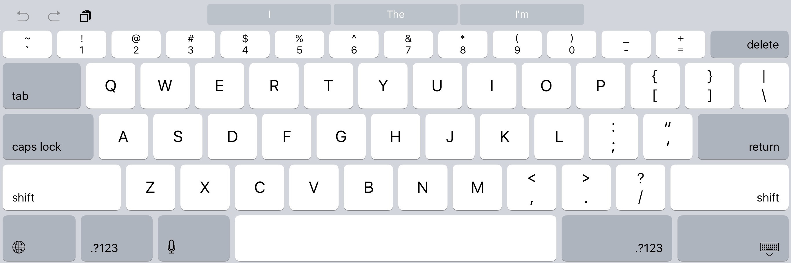
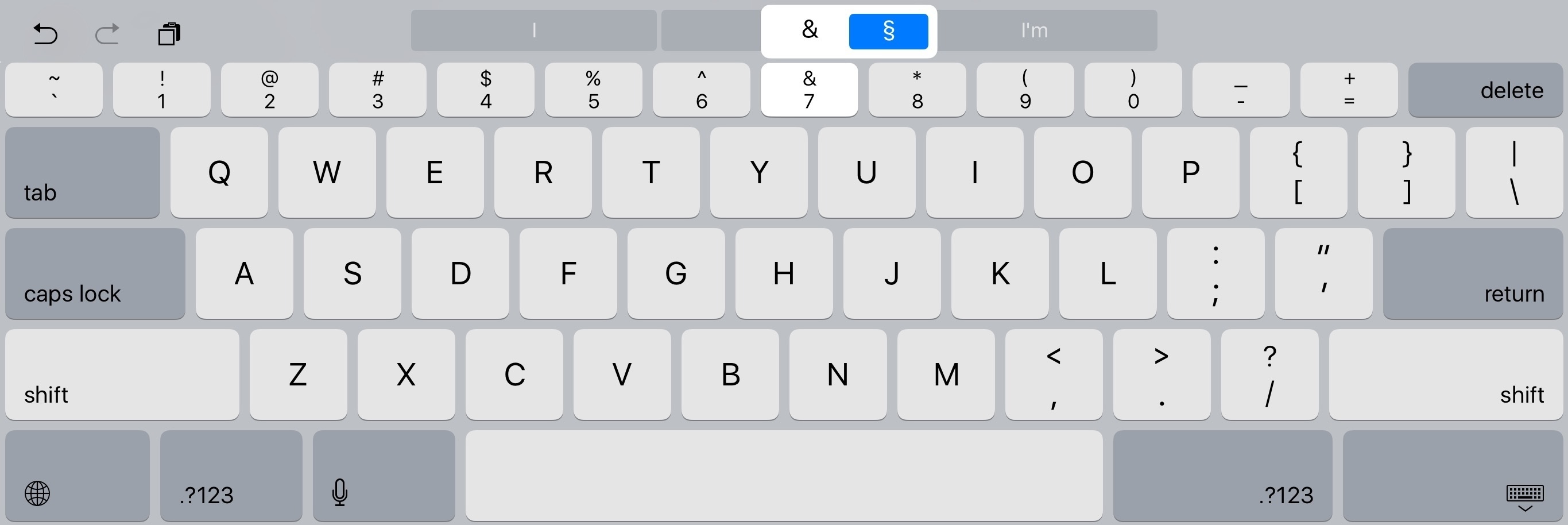
When the iPad launched in 2010, Apple took great pride in introducing its keyboard as a full-size, PC-like software keyboard that blended the comfort of a MacBook’s typing experience with the versatility of software. The iPad Pro continues this tradition with a revamped software keyboard which adds a number row, special characters, and more keys on both sides of the keyboard. Apple’s goal has been to use the additional screen real estate to replicate the layout of a physical Magic Keyboard, recreated in software with the unique shortcuts and multitouch features of iOS.
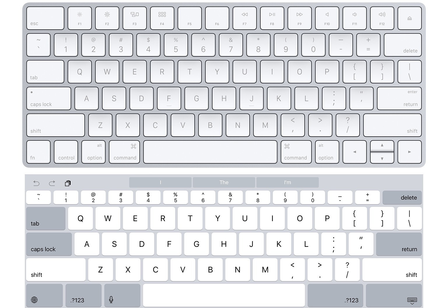
For American Mac users who will switch to an iPad Pro, this is great. In both portrait and landscape, the iPad Pro’s software keyboard looks like one of Apple’s desktop keyboards – same special characters on top of numbers, same characters between the Delete and Return keys on the right side. It’s quite apparent that the iPad Pro’s software keyboard was designed with familiarity with laptops in mind: particularly for the enterprise market and educational institutions looking to upgrade from older MacBooks or PCs, a consistent keyboard can make the transition smoother and require minimal adjustment in terms of muscle memory.
A problem in the version of iOS 9.1 for iPad Pro I tried is that US English was the only keyboard layout available, even when switching to international keyboard layouts such as Italian or UK English. In the European hardware keyboard layout, the Delete key sits atop the Enter (Return) key, which is also shaped differently than its American counterpart.
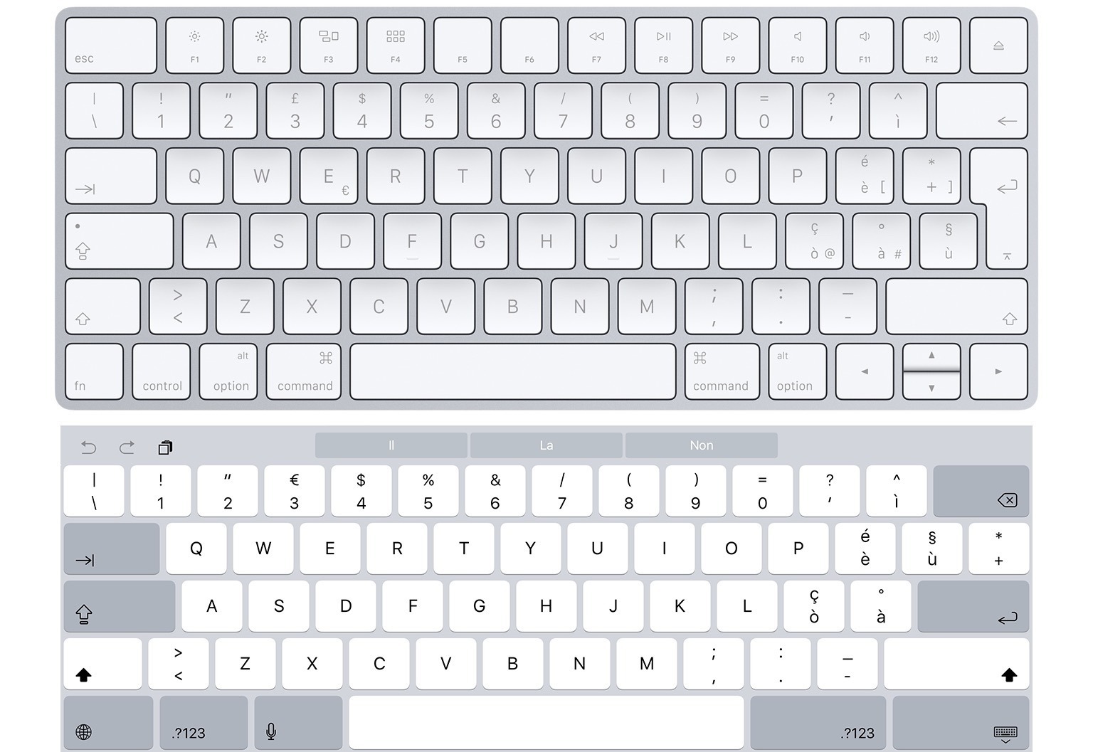
An Italian Magic Keyboard, and the Italian software keyboard on iPad Pro. Notice the Delete key is in the wrong spot on the software keyboard.
On the iPad Pro – and I brought this up to Apple – the American layout is also used across international keyboards, so the (narrow) Delete key is never directly above Enter – which is causing me to type a bunch of unwanted characters when I want to delete some text. The glyphs on keys change when switching across international keyboards; the layout and shapes of the keys don’t.
There are two other changes I found curious. The globe icon – the key used to switch between keyboards – has been moved to the leftmost side, so it’s no longer in the second spot after the ‘123’ key. This is not consistent with the placement of the same key on iPhone and iPad Air 2, and you can also see the difference when using the software keyboard on an app compiled for the iPad Pro, and one that hasn’t been optimized yet.5
Secondly, the split keyboard option is gone from the iPad Pro. An option to Undock the keyboard remains, but typing is now always a full-size affair. I understand why Apple wants to move away from an arguably semi-unknown feature that never got the attention it probably deserved – I just find it curious that they’re doing it now, with an iPad Pro that could have used a split keyboard to make thumb typing easier in portrait mode. Overall, though, I don’t personally care about the removal of the split keyboard. I never used it.6
The good news about the keyboard problems I mentioned is that a) I’m so used to typing on the iPad Air 2, even the slightest tweak can take me a few weeks to adjust and b) it’s a software keyboard, which can be updated and improved with time.
Today, after a week of usage, I’d say that I’d like to see Apple add an option to bring the simpler, pre-iPad Pro keyboard back without all the extra characters and keys. But, five years of iPad muscle memory are clouding my judgment, and I don’t know how proportions could be kept without making fewer keys on a bigger keyboard feel comically huge. I’d probably just be happier with a keyboard that adopts the Italian layout correctly.
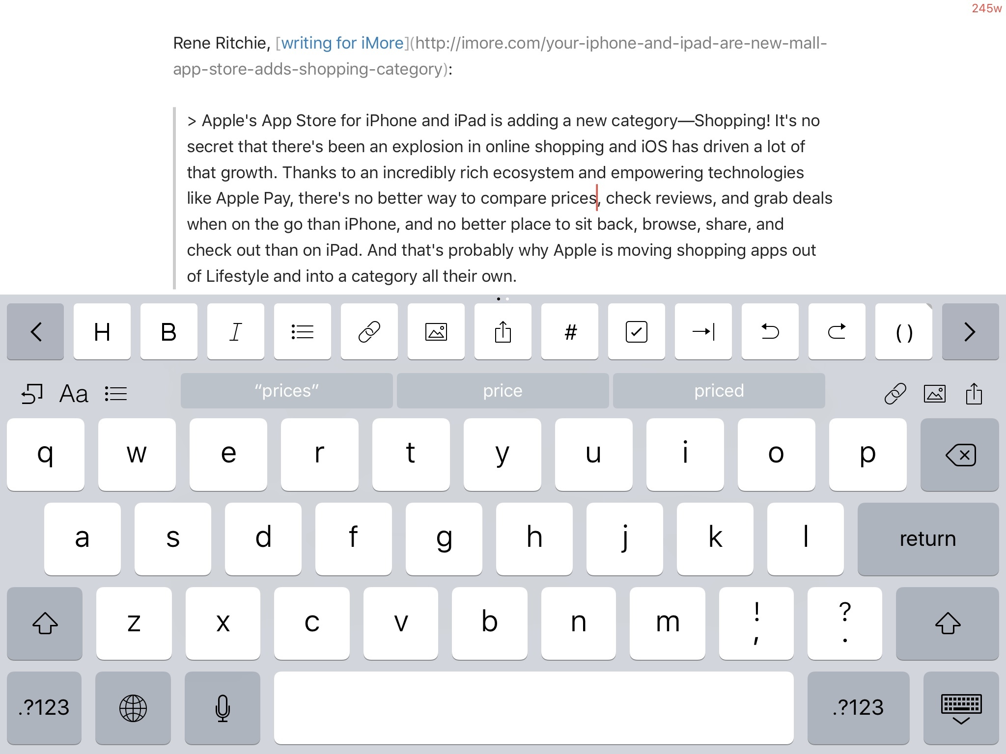
I am getting used to typing on the iPad Pro’s software keyboard – as a heavy iPad Air user, it’s just taking me longer than I expected. Once you get how the desktop-like layout applies to the iPad Pro, the time savings made possible by keys available in the main keyboard screen are obvious. I switch between keyboard views less because commonly accessed characters are just a tap away. Particularly for writing prose and editing in Markdown (as was the case with this review), having commas, quotes, and square brackets available on the QWERTY keyboard without switching to another view is a terrific time saving.
With time and a few tweaks from Apple, I think I’ll grow to like the iPad Pro keyboard a lot. I want to check back on this in three months.7
Upscaled Apps
In my tests over the past week, I’ve only come across two apps that were running in upscaled mode on the iPad Pro, and both apps hadn’t been updated for iOS 9.8 Every other app I downloaded from the App Store – even those that didn’t mention iPad Pro specifically in the release notes – ran in full resolution mode.
If you remember how iPhone 5 apps which hadn’t been updated for the iPhone 6 and 6 Plus were upscaled last year, you’ll get the idea of what an upscaled app looks like on the iPad Pro. If an app hasn’t been updated for the new device, it gets blown up to fit the larger screen – which results in bigger (and fuzzier) interface elements and an iPad Air keyboard without the extra keys of the new keyboard for iPad Pro apps. It doesn’t look good when it happens, but it’s not as bad as the similar behavior for iPhone 5 apps running on the iPhone 6 last year.
If what I’ve seen so far is of any indication, you’ll rarely come across apps that don’t support full resolution on the iPad Pro. Developers who have adopted size classes and iOS 9 multitasking have already done the work required to have proper iPad Pro apps. This hasn’t been an issue in my experience.
Benchmarks and Performance
The iPad Air 2 was already a fast and responsive device, but the iPad Pro is faster. In everyday usage, some animations are snappier and activating multitasking is quicker on the Pro, but I noticed more considerable improvements when running processor-intensive tasks such as complex Python scripts for image processing and chart generation.
The iPad Pro has 4 GB of RAM (as reported by Geekbench), which has the side effect of making the act of switching between apps more pleasant. Safari keeps more tabs in memory than the Air 2, extensions and apps in Split View run without slowdowns, and, in general, it feels like you can throw any task at this device without having it skip a beat.
Alongside more RAM, at the heart of the iPad Pro is the Apple A9X chip, the third-generation 64-bit CPU from the company and the successor to last year’s A8X chip on the iPad Air 2. With the A9X, Apple promises nearly double the CPU and double the graphics performance of the A8X, and while I couldn’t directly assess graphics, Geekbench 3 scores for single core benchmarks confirm Apple’s data.
Geekbench Scores
| Device | Single Core | Multi Core |
|---|---|---|
| iPad Pro | 3213 | 5480 |
| iPhone 6s | 2550 | 4442 |
| MacBook Air 13-inch (Mid-2011) | 2129 | 4500 |
| iPad Air 2 | 1840 | 4580 |
| iPhone 6 | 1607 | 2912 |
(Higher is better. Here’s how you can interpret Geekbench 3 scores. Benchmarks were performed with the currently shipping version of Geekbench from the App Store.)
I don’t typically care about these numbers in my reviews, but they are a simple metric to get an idea of performance on a new Apple device and how fast it is compared to previous generations. Just by looking at benchmarks, it’s incredible to see how the iPad lineup has advanced over the past few years, and how the iPad Pro compares to the iPad Air 2 and this year’s iPhone 6s architecture for CPU performance.
Numbers don’t just indicate that Apple’s delivering double the performance on an annual basis on iOS – they’re also on par with MacBooks from a couple of years ago, they’re just behind last year’s MacBook Pro in single core scores, and they’re likely outclassing the majority of consumer notebooks sold by the PC industry. It’s fascinating to imagine what Apple could deliver two years from now with an iPad Pro 3 and an A11X CPU.
Personally, I tend not to obsess over benchmarks too much – the overall iOS experience and the interplay of hardware and software in everyday tasks is what matters to me. In my tests, I’ve never felt that the iPad Pro was struggling to keep up with what I was trying to do to get my work done. As I noted above, for speed and memory management alone, the iPad Pro is faster than the Air 2.
In fact, the two complaints I have about hardware impact the speed of the iOS user experience. The iPad Pro doesn’t use the second-generation Touch ID sensor employed on the iPhone 6s (Apple confirmed this to me) and the device doesn’t have a 3D Touch display. Lack of second-generation Touch ID makes the unlocking and authentication experience in apps a bit slower than the latest iPhones, but equal to Touch ID on the iPad Air 2. I’d like to see Apple adopting the crazy fast Touch ID sensor on the iPad Pro as well. As for 3D Touch, I struggle to imagine how the one-handed operations of peek and pop would scale to a 12.9-inch tablet, but I know I’ve been missing the ability to access 3D Touch shortcuts on the Home screen.
As for battery, Apple’s promised 10 hours of battery life still hold true. On a typical day of work for MacStories (which includes a lot of writing, browsing the web, podcasts, music, and some videos), the iPad Pro often exceeded 10 hours of battery life before needing to be charged (usually when it was approaching 11 hours of uptime). And that’s in spite of the much bigger screen, more frequent multitasking, superior CPU performance, and the new speaker system. I’m happy with what’s been achieved here.
With the iPad Pro sitting at desktop-class levels of performance for graphics and computational power, it’ll be interesting to see what developers will come up with in their apps. The iPad Pro’s hardware demands to be used by apps that go beyond the typical expectations of iOS software, which – despite what some still like to think – can yield the same results as most laptops for a lot of people.
At this point, some iOS apps can be more powerful than their desktop counterparts because of sensors, the Retina display, multitouch, and cellular connectivity. With the new iMovie for iPad Pro, for example, Apple has demonstrated how editing multiple streams of 4K video is possible on a device that you hold in your hands and carry around with you. How will the improved CPU, faster graphics, and increased RAM be employed by developers to create more powerful app experiences on the iPad Pro? Which apps will take advantage of the Pencil not for drawing, but to simulate desktop-level precision for user input and control on a tablet?
I’m curious to see how Apple and third-party developers will leverage the iPad Pro’s hardware in the next few months.
Four Speaker Audio
One of my favorite hardware-related surprises on the iPad Pro is the new four speaker audio system. I genuinely wasn’t expecting the iPad Pro to deliver sound as rich and loud as it does.
For the first time on an iPad, four speaker housings have been machined directly into the unibody enclosure and sealed with a carbon fiber cap. There’s a speaker on each corner of the iPad Pro – two at the top, and two at the bottom (there are no speakers across the long sides of the device). In addition to putting more speakers into the iPad, Apple has made them intelligent and capable of working in tandem with iOS: all of them produce bass frequencies, but the topmost ones are dedicated to mid and high frequencies. And because an iPad can be used in any orientation, every time you rotate the device the OS will automatically orient the sound and balance it accordingly – so the bottom speakers can switch to mids and highs, while the topmost ones can turn to handle bass frequencies.
In practice, the system works very well and it delivers an impressive soundstage for a portable device. It doesn’t matter if you prefer to use the iPad in portrait or landscape or if you like to change orientation while watching a video – the iPad Pro will adjust the speaker system when it detects physical rotation and output a well-balanced sound that is louder and richer. Apple says that this new configuration delivers three times the output of an iPad Air 2; in my experience, these claims are accurate, with the iPad Pro producing a warmer, more immersive sound that is dramatically superior to the speaker system of the Air 2.
I tested the four speaker audio system with Apple Music, Overcast, and videos from YouTube and iTunes. The iPad Pro sounds great, with bass layers that were lost on the iPad Air 2 and that make songs and recorded voice warmer, richer, and always balanced. I’m no audiophile, but I’ve been listening to music on the iPad Pro instead of using my Bose SoundLink Mini, and I enjoyed how my favorite artists sounded on the new iPad speakers. My girlfriend can also confirm that, at the highest volume, music from the iPad Pro can be comfortably heard around the house and that it makes for a nice background system during dinners and other family gatherings.
The new speakers also sound great for games9, movies, and TV shows, which I’ve been watching in bed with the iPad Pro on a Smart Keyboard on my lap. More practical advantages of speakers on each corner of the iPad: if I place the device in portrait on my lap when I’m in bed, I can still hear sound coming out of the topmost speakers when the bottom ones are obstructed by my body; and the iPad Pro is loud enough to let me listen to podcasts over the noise of tap water when washing dishes. All in all, a big thumbs up.
Multitasking and Working on iPad Pro
As I imagined when I was working on my iOS 9 review, new iPad multitasking features were designed with the iPad Pro in mind. The iPad Pro brings the true expression of iOS 9 multitasking, which is glorious on the 12.9-inch screen.
From a functional standpoint, nothing has changed from iOS 9 on the iPad Air 2. You can still invoke Slide Over by swiping from the right edge of the screen and you can switch to the more capable Split View by tapping a divider and resizing apps as needed. Everything is consistent with the iPad Air 2 and iPad mini 4 – you get two Split View layouts in landscape mode, and one in portrait.
The major difference between multitasking on the Air 2 and the Pro is that the larger screen enables apps to eschew compact layouts and use regular size classes more often. Where the iPad Air 2 tends to switch to compact layouts in Split View by moving certain app controls to bottom toolbars or by hiding sidebars and other subviews, the iPad Pro’s Split View (especially in landscape mode) shows more of two apps at the same time.
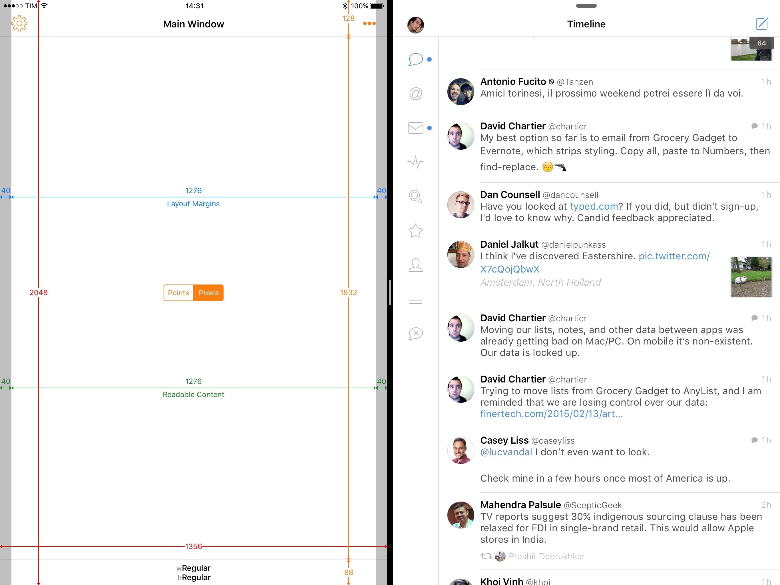
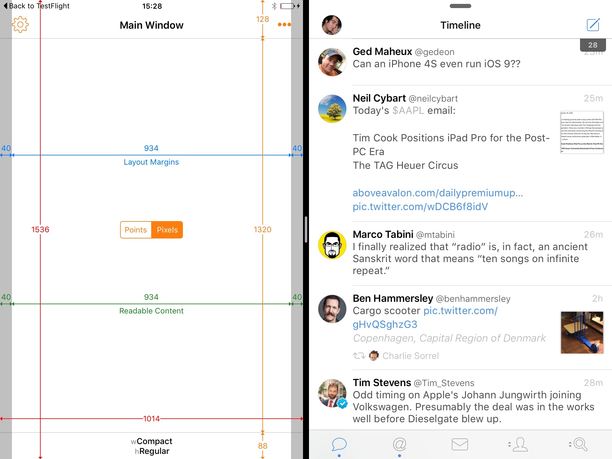
The feeling is that you’re not using two mini apps simultaneously – you’re interacting with two full-size apps on a single screen, with more room for app content and controls. If you do the math, it’s almost like stacking two iPad Air 2s in portrait mode next to each other: at 2732 x 2048 pixels10, the iPad Pro’s 50/50 Split View layout gets you two apps at 1356 x 2048 pixels (20 pixels are dedicated to the black divider between apps), which is close to the iPad Air 2’s 1536 x 2048 resolution. This allows iOS 9 to leverage size classes and perform minor modifications to regular layouts when in Split View. The end product feels exactly like using two iPad Air portrait apps at the same time.
Adaptivity, an upcoming iOS app by Geoff Hackworth, illustrates the size class changes between the iPad Pro and iPad Air 2 quite well. On the iPad Pro, Split View’s 50/50 layout generates two apps at 1356 x 2048; on the Air 2, the same layout ends up at 1014 x 1536 pixels per app – a noticeably smaller content area than the iPad Pro.
Thus, working with Split View on the iPad Pro is true multitasking. When I’m researching something in Safari and I need to keep Notes next to it, Safari shows tabs below the address bar and buttons in the top toolbar, instead of hiding tabs in a subview and moving buttons to the bottom like it does on the Air 2. Because the iPad Pro has a wider Split View, apps like 2Do can default to showing the sidebar next to a list of tasks.
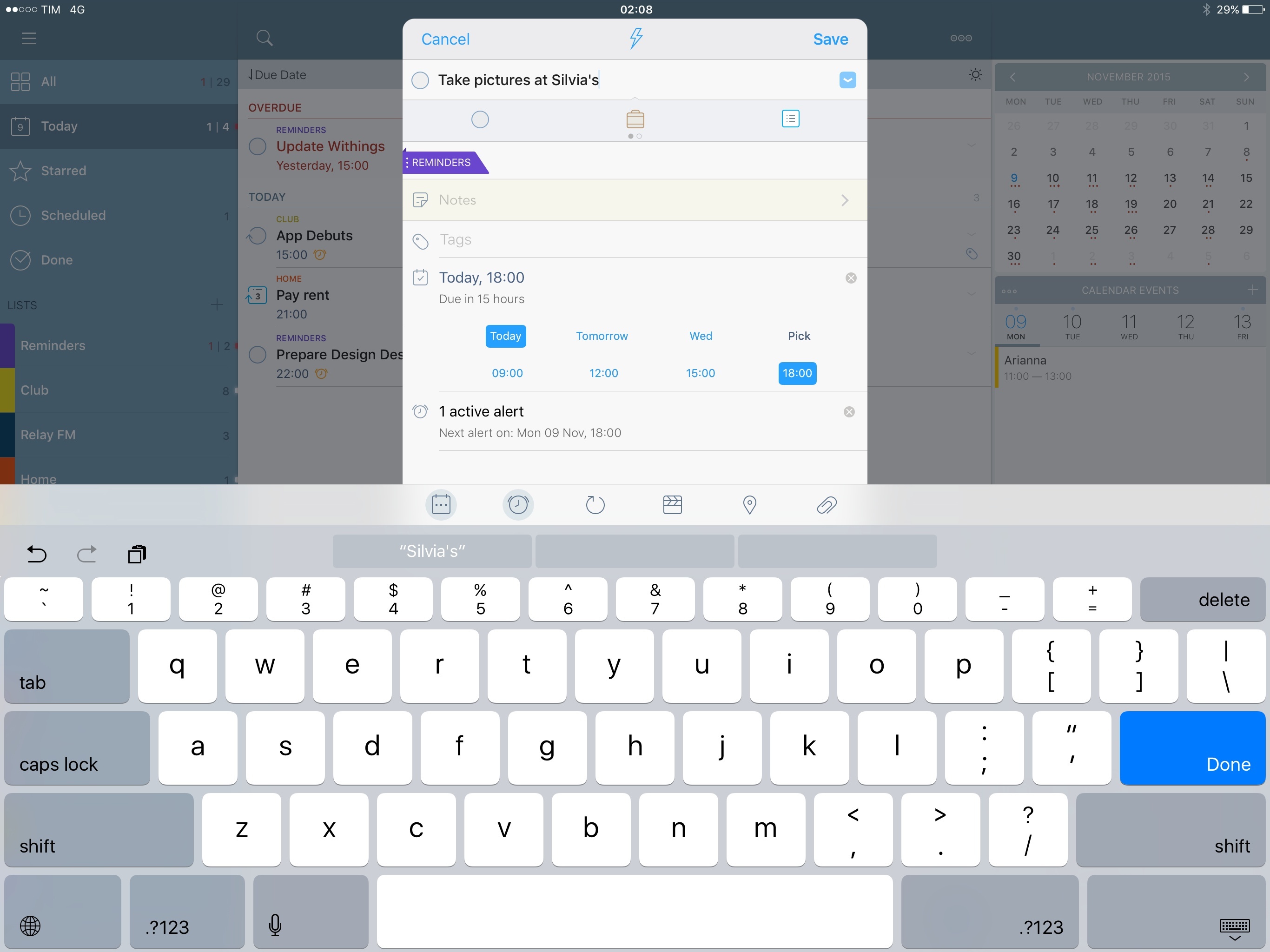
This is the case for other apps, too. When used in Split View in landscape, Messages shows the conversation list on the left side and an individual conversation on the right, which is great to multitask across apps and within Messages. Slack can display the channel sidebar alongside a thread on the right instead of forcing you to swipe constantly to bring it up. When adding a new event, Calendar uses a popover instead of a full-screen view, so you can see some of your events underneath when adding a new one.
To give you an idea of the capabilities of the iPad Pro with multitasking and other iOS 9 features, I collected some examples of how I work on my iPad and what some tasks I had to get done looked like on the iPad Pro and the iPad Air 2.
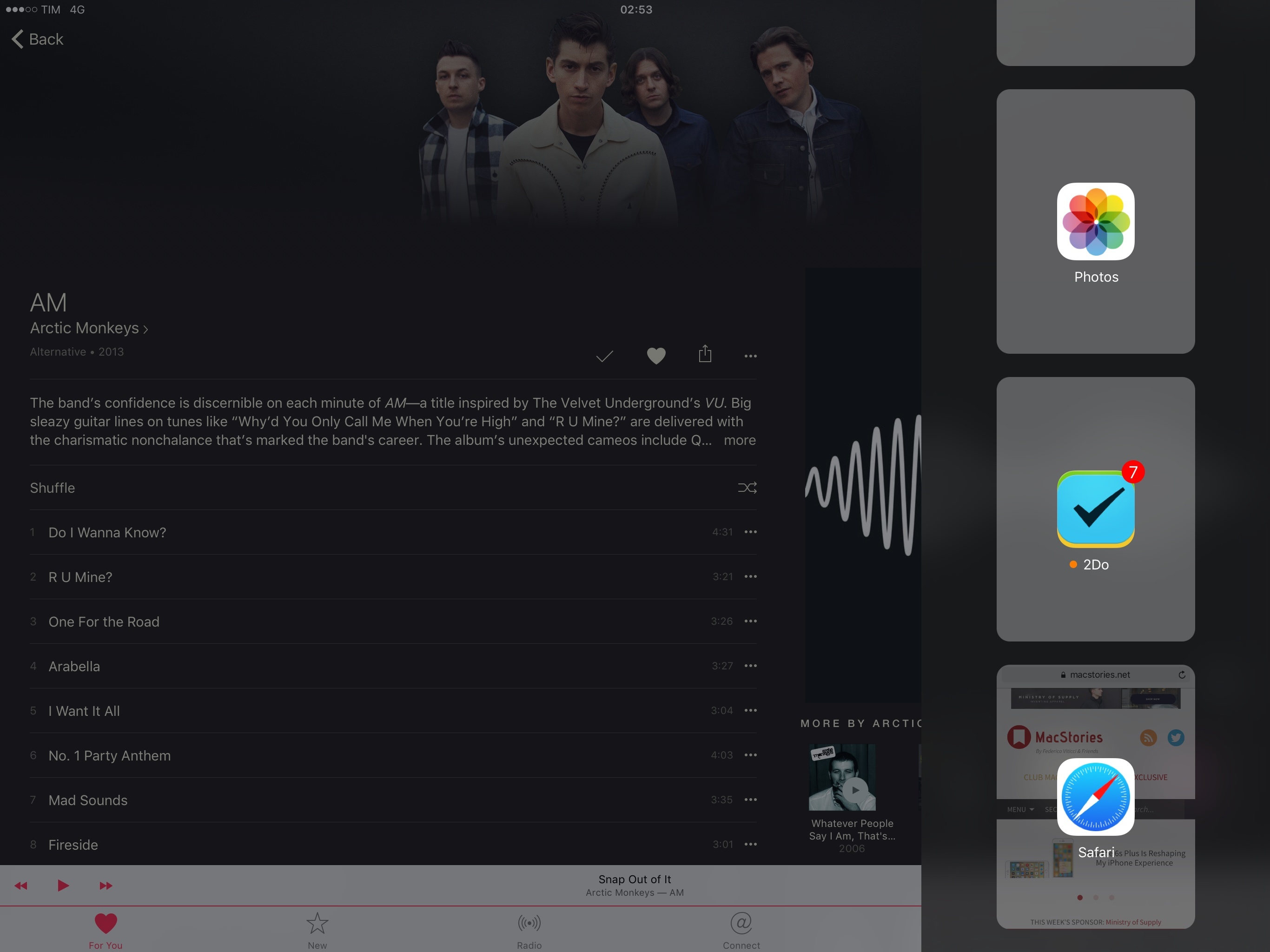
Last Friday night, after a solid day of writing and an evening spent relaxing with my girlfriend, I sat down to catch up with Twitter and see what had happened in Apple news while I was away. Tweetbot is my client of choice on iOS now, and on the iPad Pro it’s a good example of the optimizations developers can apply to target the new screen size.
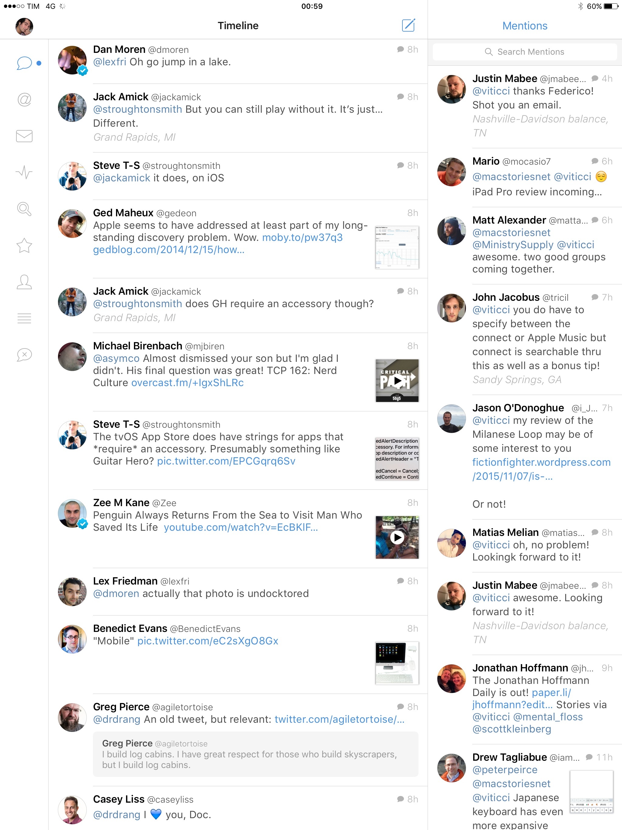
On the big screen, the app can show its second column in portrait mode too. I like scrolling my Twitter client in portrait so I can see more tweets, but because the second column was exclusive to landscape on the iPad Air 2 due to screen constraints, I had found myself using Tweetbot in landscape just to see the second column. On the iPad Pro, this isn’t a problem: I can hold the device in portrait to see a lot of tweets at once (about 12-13 in the main timeline) and also keep a stream of mentions (about 8-9) in the secondary column. This lets me scroll Twitter and stay in touch with followers in the iPad orientation I like best.
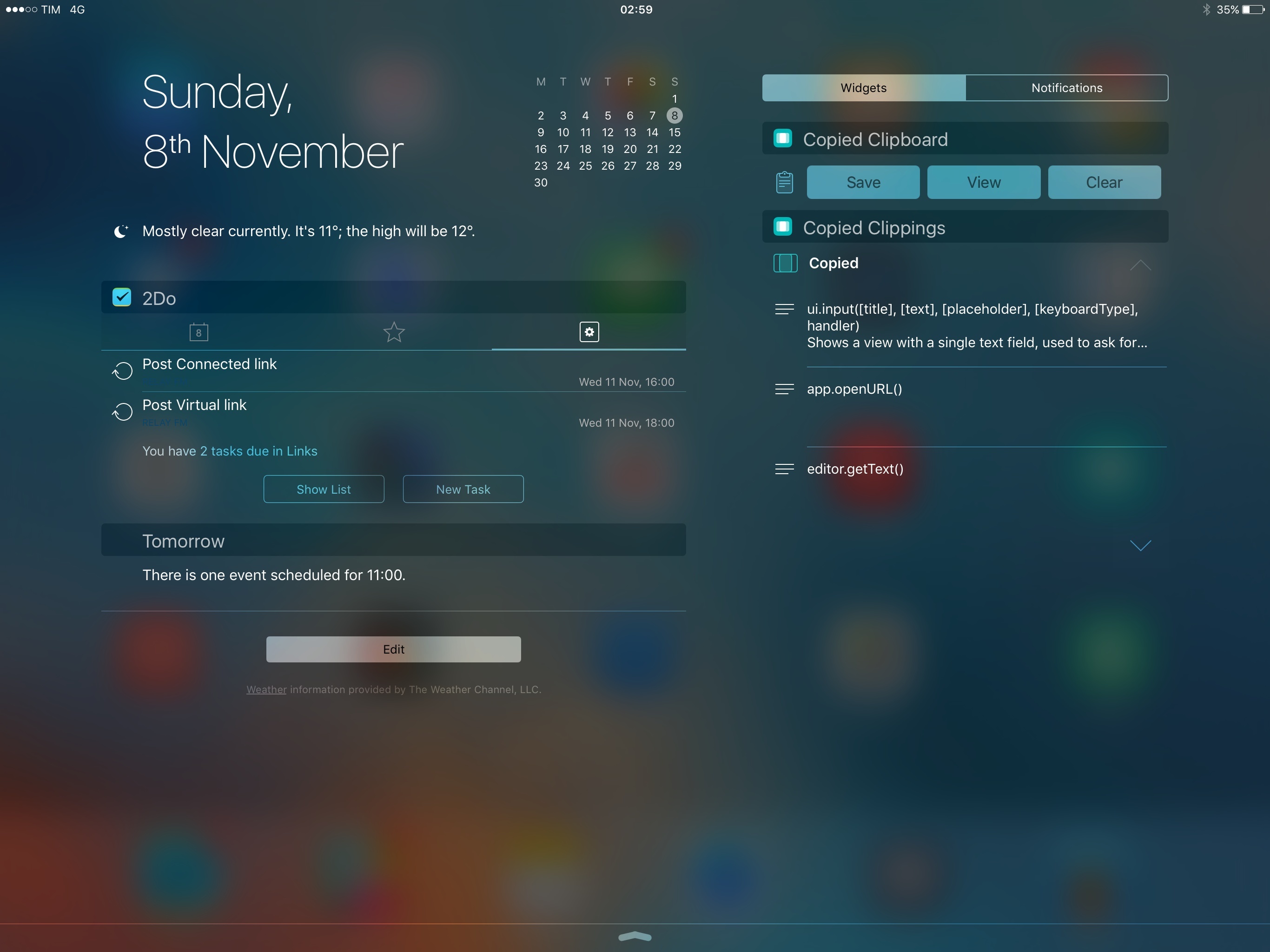
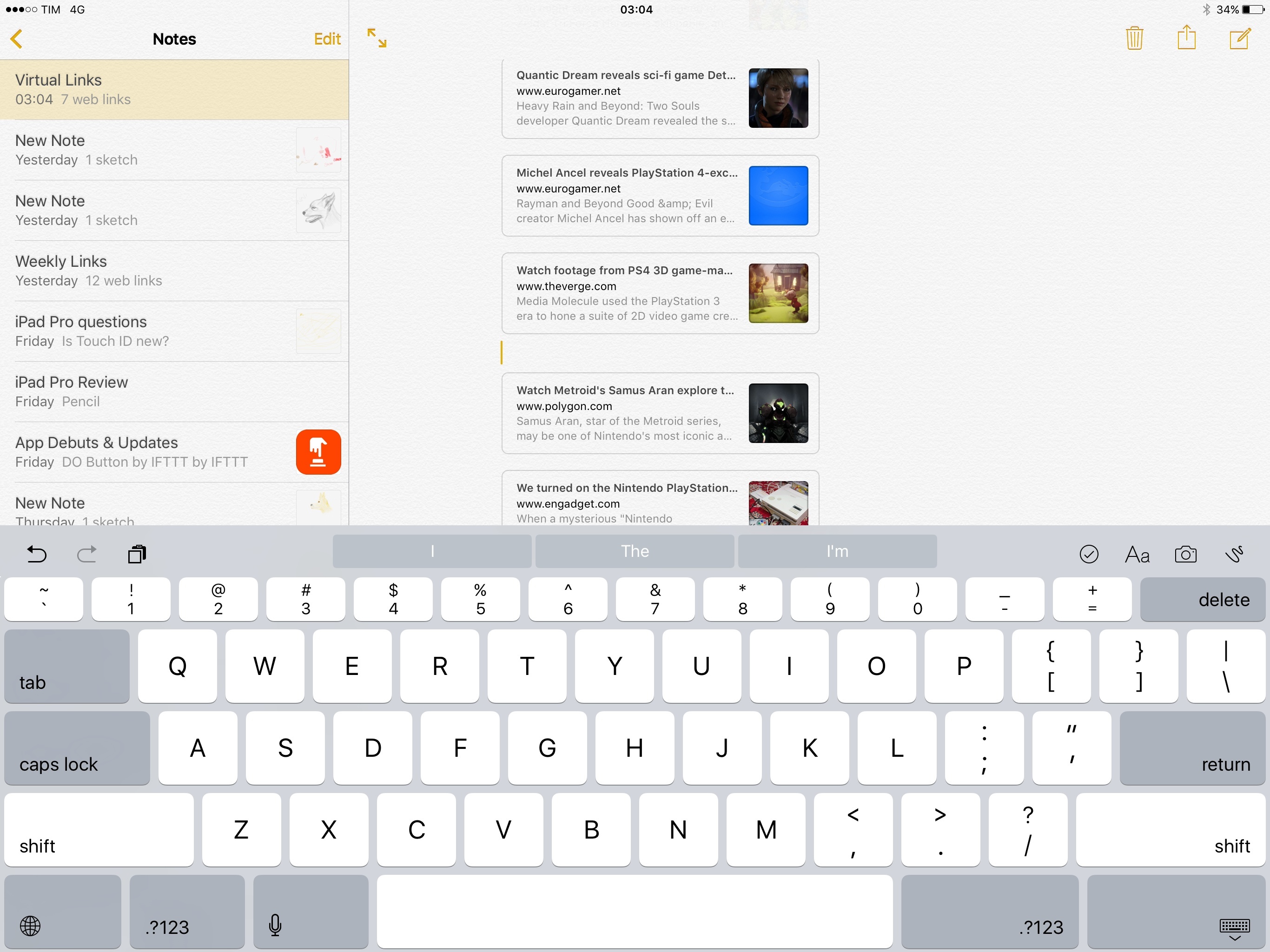
As I was catching up with my timeline, I started saving some links in a note I keep to organize MacStories Weekly coverage, and others with 2Do to post them later on the site. In both cases, I used extensions to save links from Tweetbot; 2Do is extremely convenient for me as it lets me filter tasks that contain URLs through a smart list. After I was done reading Twitter and saving links, I opened 2Do in Split View, switched to my ‘Links’ smart list, and checked the subset of articles I wanted to publish on MacStories as linked items.
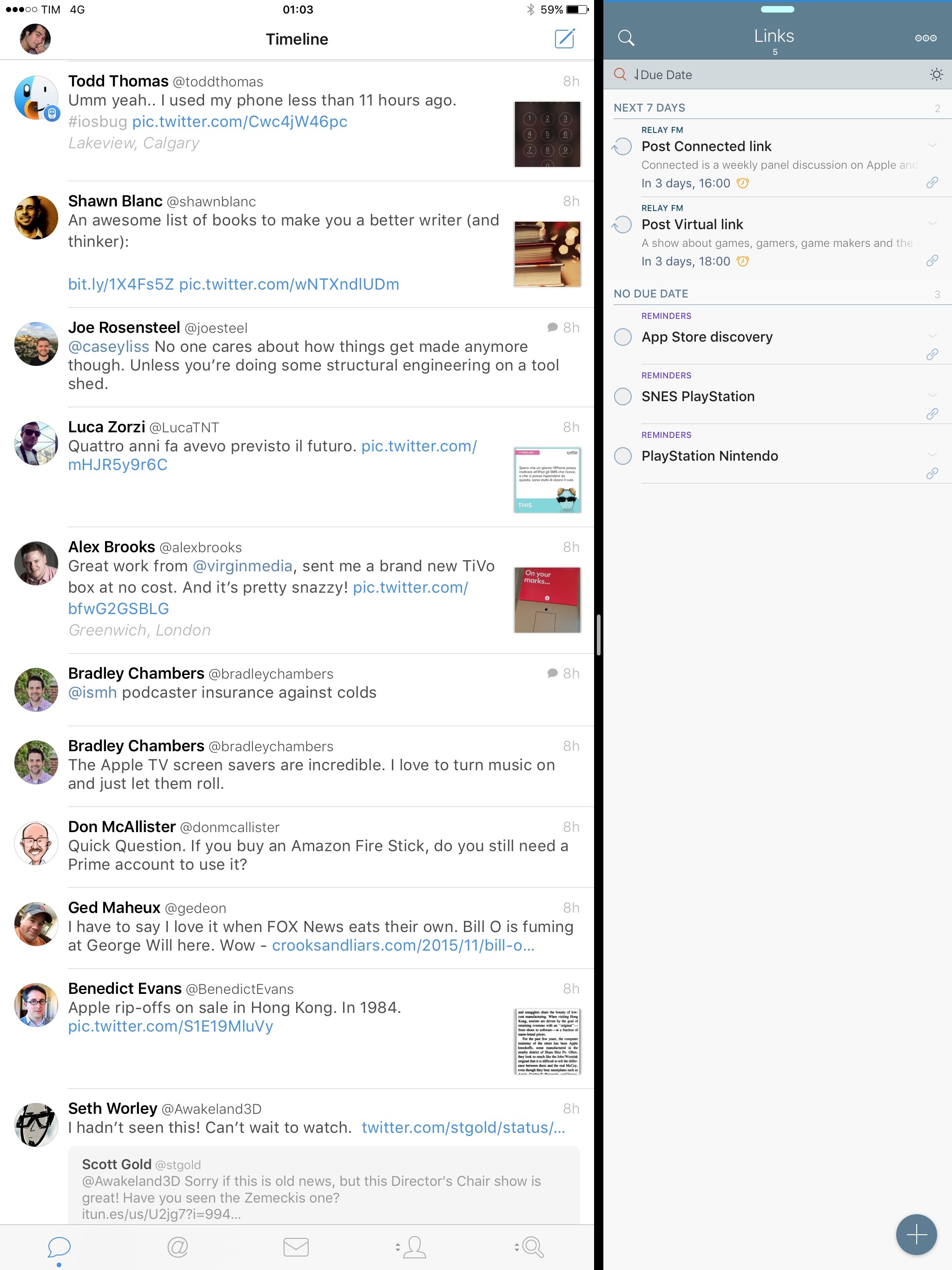
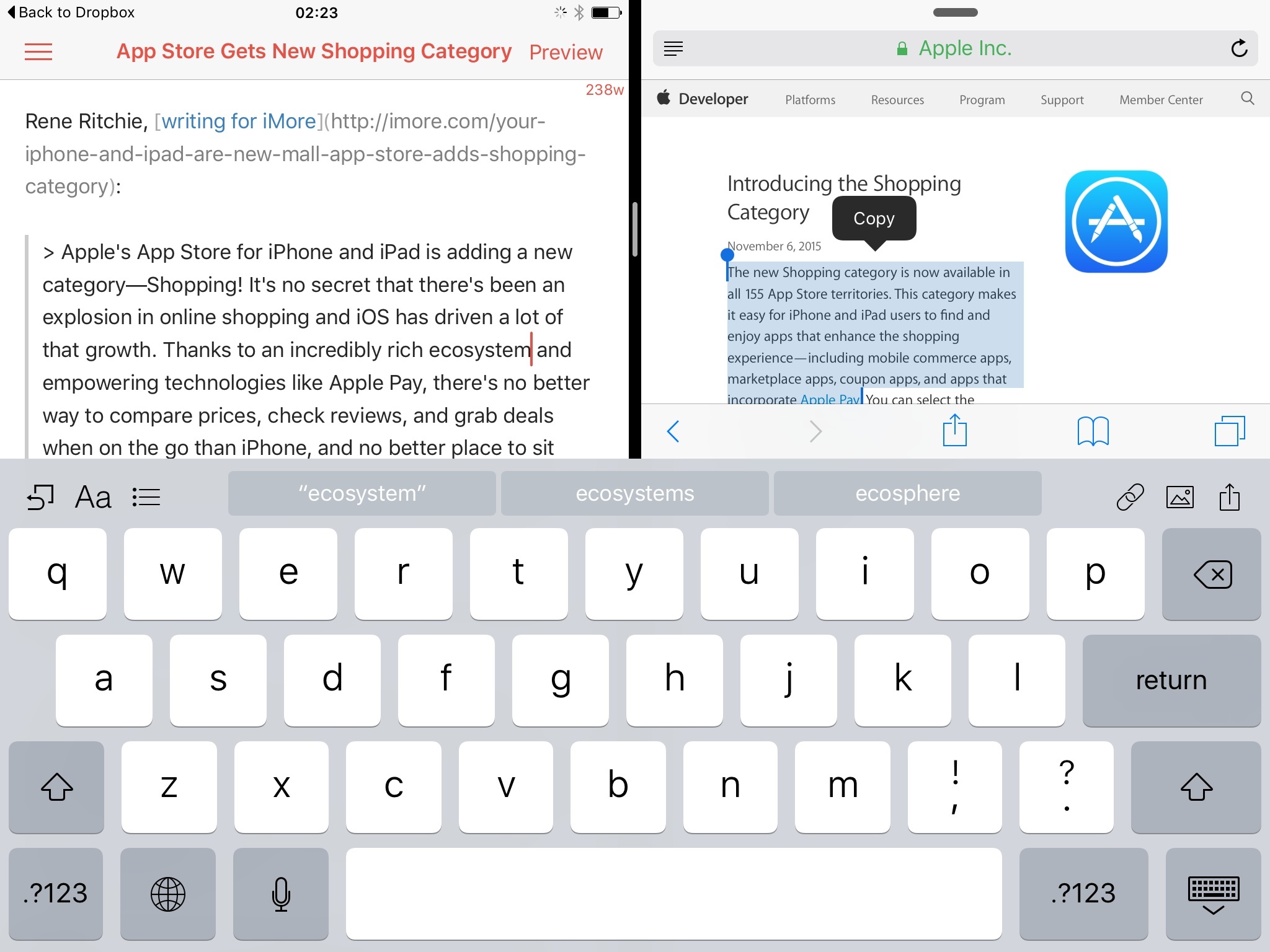
At this point, I usually put Safari and 2Do next to each other so I can tap & hold a task, open its URL in Safari, and repeat this action for all the links I’ve saved so I can read them all in the browser before posting them. On the iPad Air 2, this instance of Split View gets the job done: 2Do defaults to showing the last selected list, while Safari switches to a compact layout by hiding tabs and moving some controls in a bottom toolbar. It doesn’t show a lot of content on the webpage, but it’s okay.
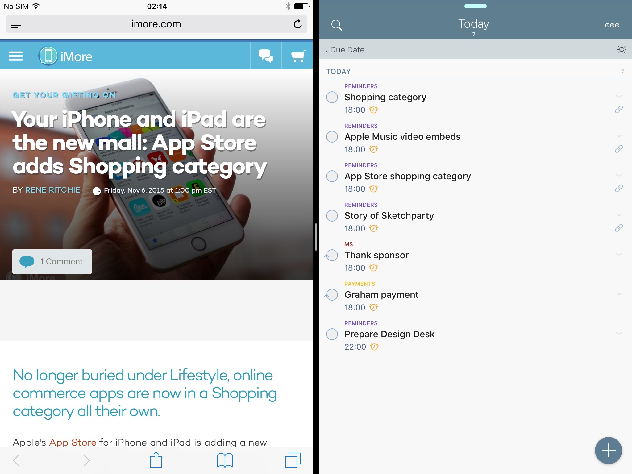
On the iPad Pro, it’s a completely different story. 2Do shows the sidebar by default, allowing me to more easily switch to another list if I need to see other tasks; Safari not only shows more text (the first paragraph of the article pictured below is entirely readable) – it retains a regular layout with controls at the top (where I’m used to seeing them) and, more importantly, tabs below the address bar. If I want to switch between a couple of webpages (as I often do when I’m preparing a linked post for the site), Safari on the iPad Pro lets me do so with normal tabs in Split View.
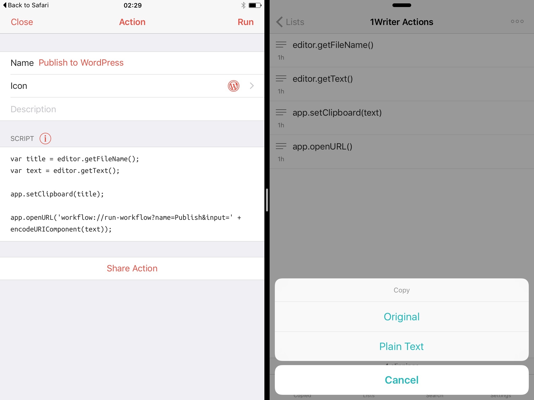
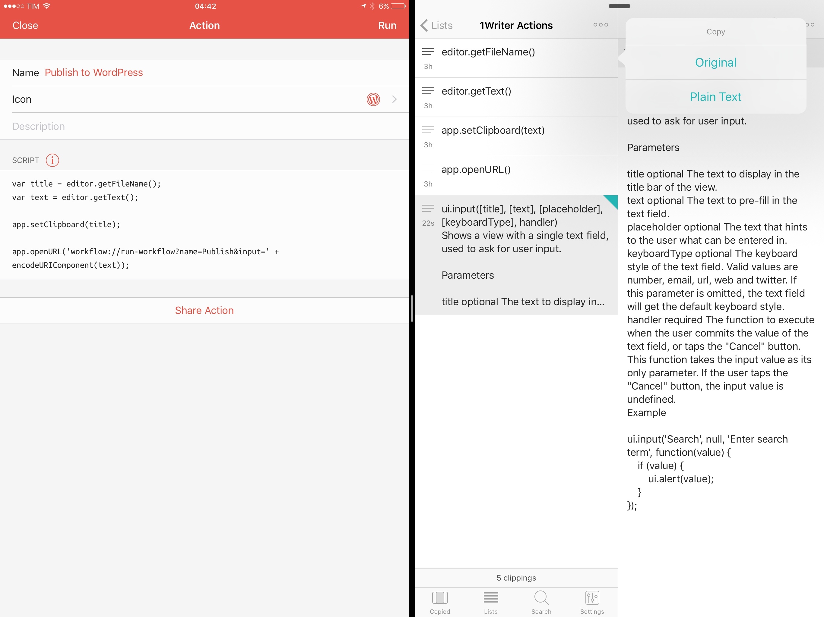
When it was time to prepare the first linked post for MacStories, I realized that the app I had been using alongside Editorial as a Markdown text editor, 1Writer, didn’t have an automated action to send text to Workflow to publish an article to WordPress (I’m using a beta version of Workflow with an epic new WordPress action). And because I’m not an animal, I needed to automate the process of publishing Markdown like a sane person does.
1Writer supports JavaScript actions, and I knew that what I had in mind required interacting with a few of the app’s commands, so I decided to make a snippet list in Copied, a new clipboard manager I’m trying on iOS. I saved JavaScript functions as individual snippets in the app, as I felt they might be needed again in the future.
On the Air 2, Copied in Split View shows the list of snippets and, when you try to re-copy an item, it displays an action sheet at the bottom.
On the iPad Pro, each snippet’s detail view is shown alongside entries in the list, and when you try to copy an item iOS brings up a popover, not a sheet that obscures the content you’re looking at. This makes Copied more useful on the Pro – the app works well when used alongside other apps to save everything I copy.
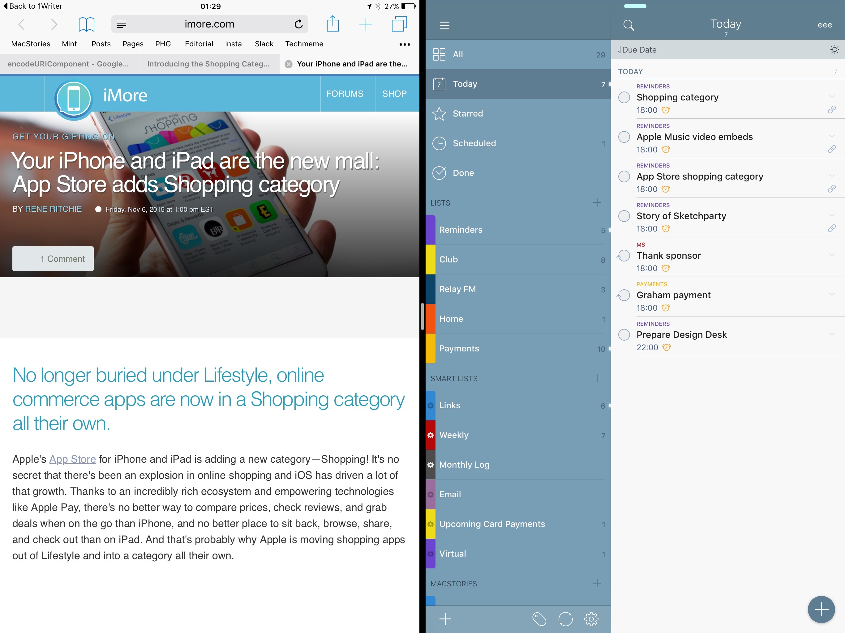
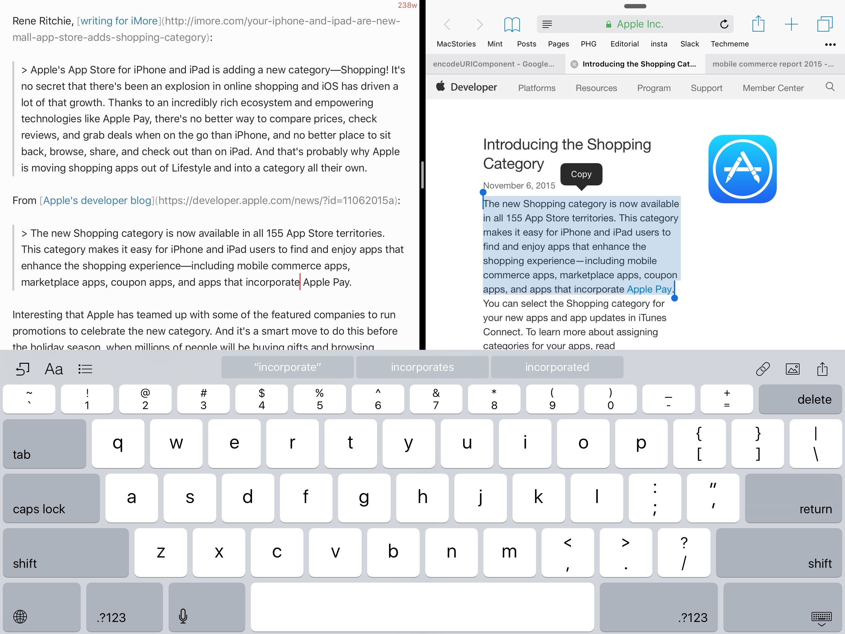
With the action ready to go, it was time to put together the linked post. As you can imagine, things were going quite differently between the iPad Air 2 with 1Writer and Safari in Split View…
…and the same apps on the iPad Pro.
Editing the final post in full-screen also helped surface the advantage of the Pro besides Split View – more vertical space in landscape. While the Pro showed a bunch of paragraphs…
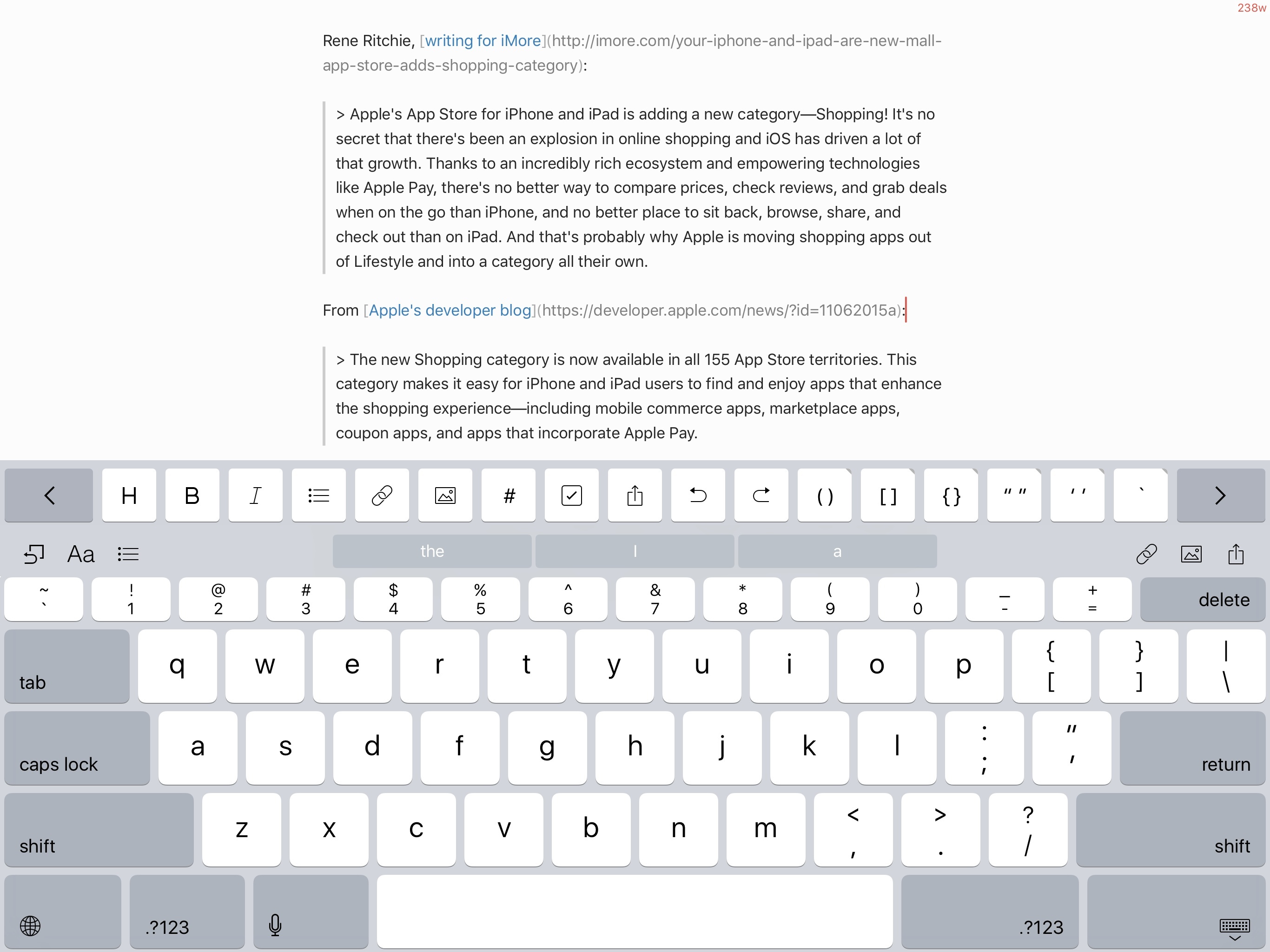
…the Air 2 was limited to a portion of the document.
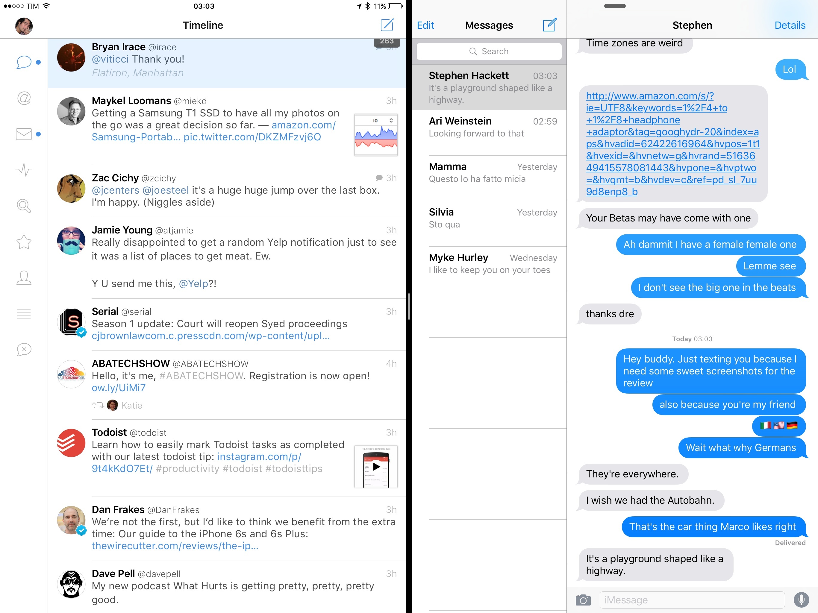
After publishing the linked post, I went back to Tweetbot to retweet it, and I also started texting Stephen. Messages has been one of the apps I’ve used the most in Split View on the iPad Air 2; I like how it lets me keep a conversation going while I’m doing something else without letting the other person think I’m ignoring the thread completely.
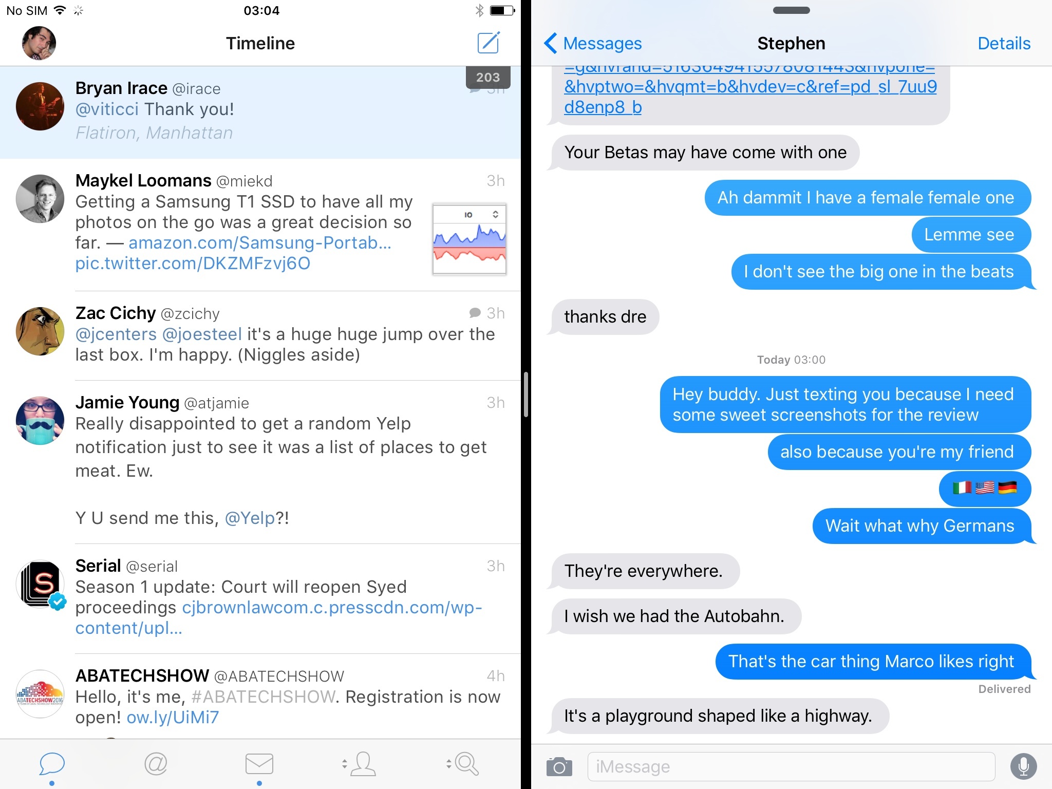
The same setup on the iPad Pro, however, transforms Messages in a multiple conversation machine for Split View, with a conversation sidebar always shown next to an individual thread. With it, I can move across multiple threads and chat with more people at once, so all of them can think I’m a nice guy and I reply to their messages quickly (Hi, mom).
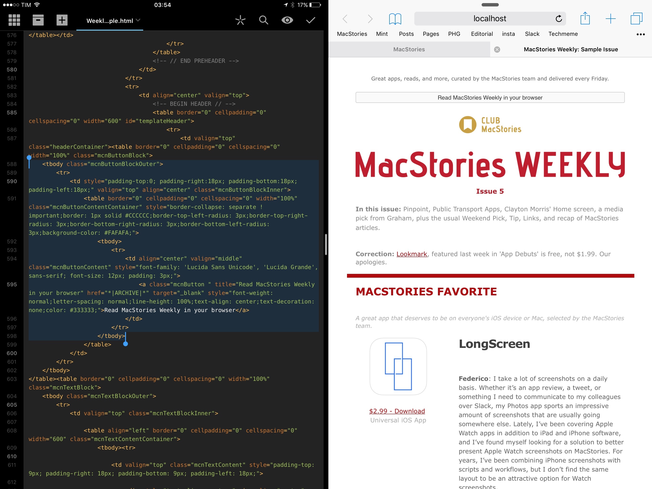
You’d think that editing raw HTML code doesn’t make for the best way to cap off a Friday night, but, in my defense, the folks at Panic have done an awesome job with Split View on iOS 9. In the latest version of Coda, Panic has introduced the ability to preview changes to a local document with Safari in Split View. And because it just so happened that I needed to make some modifications to the MailChimp-generated HTML version of a sample newsletter we want to offer as a web preview, I decided to start editing the file on my iPad Pro at 4 AM.11
The feature itself works great: as you edit code locally, you can long-press the preview icon in Coda, choose to view in Safari, and, if both apps are in Split View, you’ll be able to keep saving changes and watching them update in the browser. On the iPad Air 2, the responsive newsletter on the right side of the screen shows an acceptable section of the content, while Coda displays a tree of HTML code on the left.
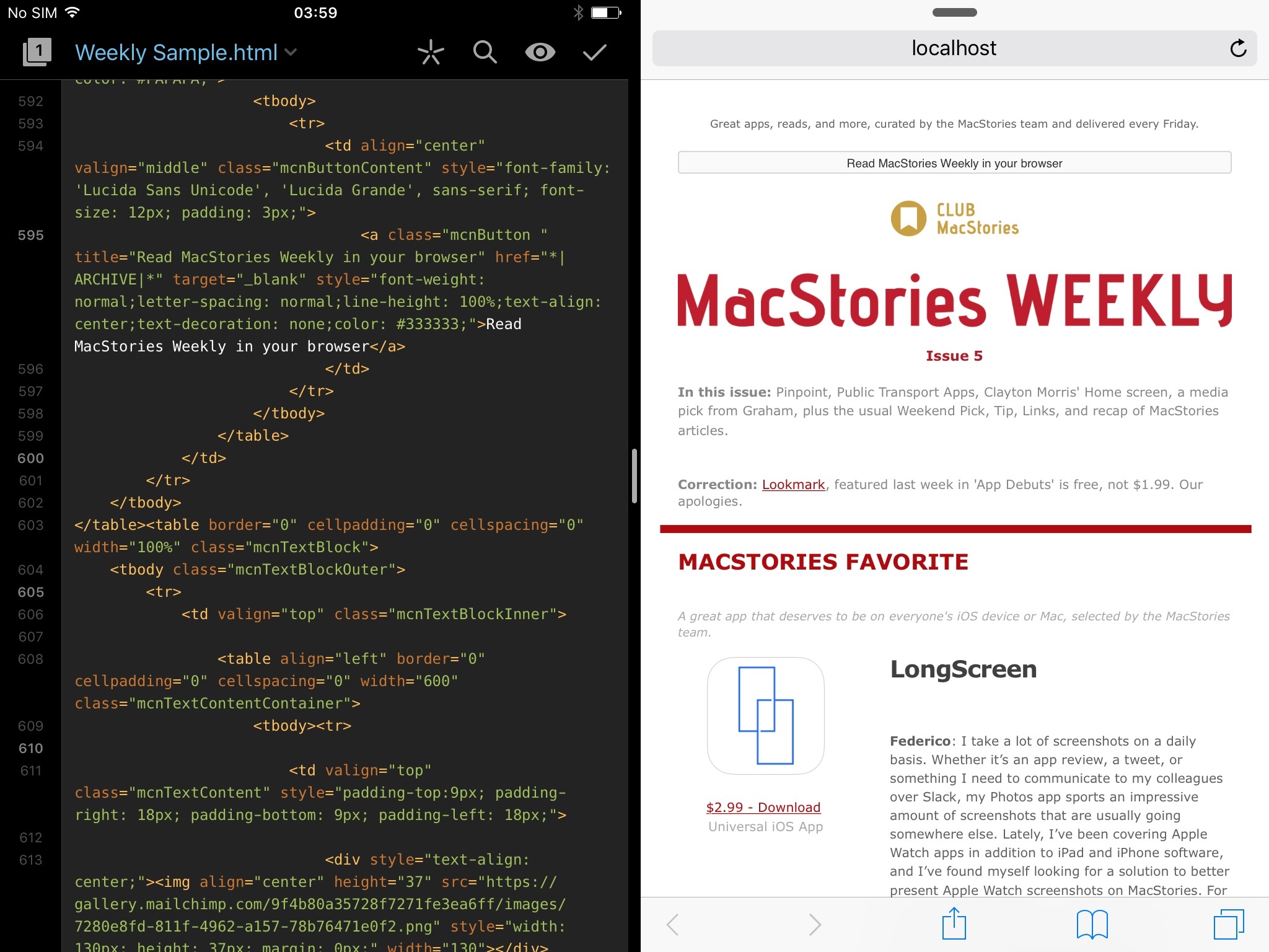
On the iPad Pro, I can see more of everything, with the biggest gains in Coda, which shows a lot more code in the editor so it’s easier for me to find the section I’m looking for and make changes. I believe that, for people who plan to take their web development workflows on the go with an iPad, an iPad Pro is the better choice thanks to the larger screen.
That was Friday night. Generally speaking, I’ve found myself in other scenarios that, either because of superior multitasking or other features of iOS 9, made me faster in getting work done on an iPad Pro. Comparing and referencing screenshots, for example: on the iPad Air 2, if I put 1Writer and Photos side by side to look at an image while writing, I get a small preview in Photos and I need to constantly zoom in and out to to get an overview of the image and see details. Photos on the iPad Pro – besides showing beautiful photography in full-screen – is able to display screenshots at a sufficiently big size. This enables me to pull up a screenshot on the right side of the screen and write on the left without having to constantly zoom and pan around to see details.
I’ve also had the chance to try iPad Pro support for multitasking in Microsoft’s Office apps. The charts that we post for Apple earnings calls each quarter are based on an Excel spreadsheet where I can include numbers from Apple’s data sum to generate charts. I then have to copy charts from Excel, and upload them as images to our CDN using Workflow. On the 12.9-inch screen, using Excel and Workflow simultaneously is a great experience: instead of jumping back and forth between two apps, I can use them both at the same time at a comfortable size. With this setup, I can generate and upload dozens of charts in just a couple of minutes.
There are two last examples I want to cover. On the iPad Pro, Instapaper is fantastic. Typography is crisp and images are terrific, but the feeling of holding so much text in your hands is what sells the experience. It’s not even like holding a book anymore – that would be reductive. It feels like holding an entire piece of work right in the palm of your hand. It’s impressive.

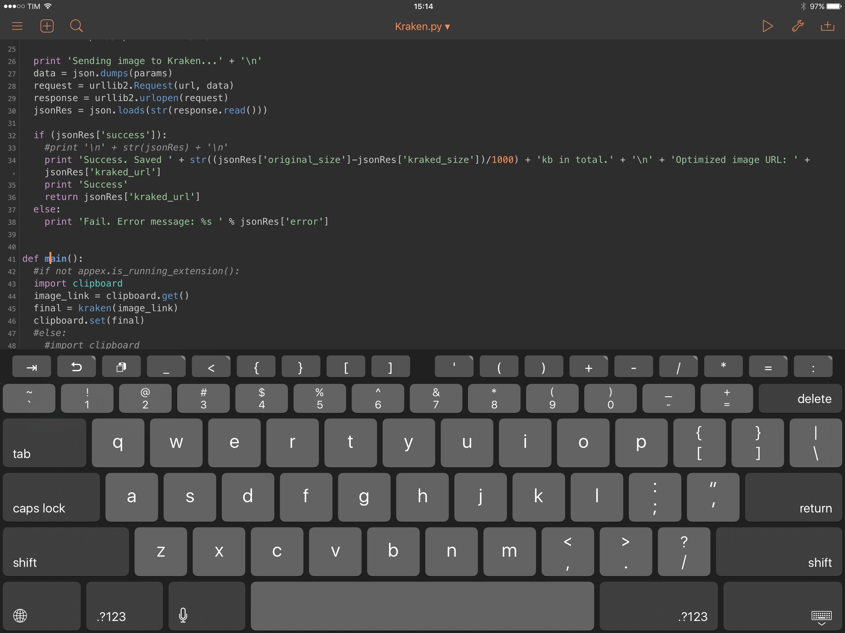
And last, Pythonista. Ole Zorn’s Python interpreter for iOS (of which I’m testing a beta version), benefits from the iPad Pro’s screen for two reasons: the ability to see lots of code at a glance (like Coda), and the new software keyboard. With a combination of the app’s own custom keyboard row and iOS’ additional number row and special characters on the main keyboard view, I can edit scripts faster and save a few seconds each day.
The way I work from my iPad has been dramatically improved by iOS 9 multitasking, and the iPad Pro’s bigger screen takes it up another notch. Using two full-size iPad apps at the same time is a dream come true from a productivity perspective. The practical gains of bigger apps in Split View result in fewer taps to switch between views, consistency with regular layouts, and an overall more powerful multitasking environment.
After trying Split View on the iPad Pro, I can’t go back to the iPad Air 2.
A Note on Accessories
Alongside an iPad Pro review unit, Apple also provided me with an Apple Pencil, a Smart Keyboard, and, to my surprise, a Logitech CREATE keyboard case that connects to the device with the new Smart Connector. Because I don’t plan to use these accessories on a daily basis (I’m not an artist, I rarely have to sketch or annotate documents, and I mostly use the software keyboard when writing articles), I have collected a few thoughts in a standalone article. You can find it here.
Miscellaneous Observations
Below, I’ve compiled a list of miscellaneous tidbits and interesting details I’ve collected when testing the iPad Pro.
It comes with a longer Lightning cable. The cable is a 2-meter one, and my guess is that Apple is including a longer cable as lots of people will be using the device at a desk with a keyboard, always plugged in.
More Smart Keyboard layouts are coming. Apple told me that they’re working on more international layouts for the Smart Keyboard, but I have no additional details at this stage.
Italian (Euro) pricing for iPad Pro and accessories. Prices for iPad Pro and accessories are as follows:
- iPad Pro 32 GB WiFi: €919
- iPad Pro 128 GB WiFi: €1099
- iPad Pro 128 GB WiFi + Cellular: €1249
- Smart Keyboard: €179
- Apple Pencil: €109
- Logitech CREATE backlight keyboard case: €154,99 ($149)
Note how these are the same prices Saggiamente correctly reported a month ago. I don’t understand why Apple isn’t offering a 64 GB version – especially for the WiFi and Cellular model, the 128 GB model is quite the expense, and I’d argue that 128 GB of storage is overkill for a lot of users. But then again, if you plan to use an iPad Pro as a computer full of files, games, and media, you’re going to need as much storage as possible, so maybe that’s the answer I’m looking for.
iPhone apps can still run in compatibility mode. You can change between 1X and 2X resolutions, and I’ve noticed some glitches with icons from iPhone apps (some showed up with a black border around the icon, others showed a blank default icon on the Home screen). They still work as usual.
The ‘.com’ domain key is always shown in the URL-type system keyboard. A nice time saver when typing URLs in Safari so you don’t have to tap & hold the period to get a list of domains anymore (you can press the key once for the default domain extension, tap & hold for more options).
You can tap & hold keys in the number row to access other characters. I’m still learning this, but it’s already come in handy a few times.
The Retina display looks fantastic. I look at the iPad Pro’s screen when I hold it, and I’m impressed by its Retina display and crispness of images on it. Photos look terrific at Retina quality on a 12.9-inch surface; text is always legible and color reproduction in on par with the iPad Air 2 and iPad mini 4.
Smart Connector-powered accessories don’t show up in battery statistics. Apple says that the power consumption of keyboards is minimal to not be a concern, but if more accessories start coming out in the future that require more power from the device, I think they should show up in the list under Settings > Battery.
The Smart Connector itself isn’t magnetic. Apple explained this to me – the pins of the Smart Keyboard and third-party accessories don’t attach magnetically to the Smart Connector. Instead, Apple is using the magnets around both sides of the Smart Connector to automatically align the cover as they’ve done since the iPad 2, which now also ensures the pins and Smart Connector are aligned and in contact. That’s pretty cool.
A Canvas for your Work
A week after I started using the iPad Pro, I picked up my old iPad Air 2, and it felt like an iPad mini.
The device I’ve used every day for a year to get my work done for this site now seems tiny and limited, with small apps, less content shown on screen, and a constrained multitasking interface. I know that it’s only been a week, and I do believe that the Air 2 is a great device for lots of people, but I feel like all the work I’ve done on the iPad and iOS has led me to this point. I’m ready to take my iPad setup to the next level, and I think my workflow can benefit from improved hardware and a more capable version of iOS.
I’m going to switch to the iPad Pro.
The week I’ve spent using the iPad Pro more than 15 hours a day has been enough to show me how I can work better on this device than any other iPad model. Those who have been reading MacStories for the past few years know that I take my iPads very seriously, and that I’ve gone through an interesting evolution in terms of preferences, projects, and responsibilities. The iPad Pro sacrifices some of the portability of the Air 2 without being a deal-breaker for me, and in return it offers a canvas of opportunities for my favorite apps.
And the best part is – while many will argue that the iPad Pro further blurs the line between laptop and tablet, this device is still very much an iPad at its core. It’s a bit heavier and it’s bigger, but I can pick it up, walk with it around the house, take it with me in the car, and read articles in bed. iOS 9 is able to express its full potential on the iPad Pro’s large screen, with features such as Picture in Picture, Split View, and the Shortcut Bar having more room to coexist with the rest of the system.
Those who will only compare the iPad Pro to a laptop will miss the big picture – this is a large tablet that can be used at a desk and that runs iOS. The richness of the iOS ecosystem is what sets the iPad Pro apart, and the reason why, ultimately, people like me will prefer it over a MacBook. It can be used at a desk, but it’s also portable, and it runs iOS.
For developers, it’s time to be bold with their iOS apps and understand that they can be more than single-purpose utilities. There are millions of people who aren’t buying PCs anymore because mobile devices are their only computers. This may be tough to accept for app developers who live in Xcode, but it has been true for the past few years. In so many ways, “mobile software” no longer has a pejorative connotation. I believe the iPad Pro will only accelerate this trend.
There’s still room for improvements that could make the iPad Pro an even better work device. As far as hardware low-hanging fruit goes, faster Touch ID and a 3D Touch display are obvious candidates to speed up everyday interactions. In the software department, Apple should consider a few tweaks for the software keyboard, and update it with proper international layouts. Looking ahead, it’d be nice to see the iOS interface make better use of the bigger screen and have a deeper integration of multitasking features and external keyboards.
If you use your iPad primarily for watching movies, playing games, and casual web browsing, then size, better speakers, and price – not efficiency and speed – become the key differentiators between the Air 2 and the iPad Pro. Consider the trade-offs you’re willing to accept in this case; all I can say is that watching videos feels great on a 12.9-inch tablet on your lap, and that games look and sound amazing on the bigger display.
The iPad Pro is positioned as a more productive take on the iPad for those who need to get work done on it. My recommendation couldn’t be more straightforward: if iOS is your main computing platform, or if you plan to turn an iPad into your primary computer, you’ll want an iPad Pro. Its powerful hardware, multitasking interface, and extensible nature are superior to every other iPad. I don’t see myself using a Mac as my primary computer ever again.
By letting me see more and do more while still being portable, the iPad Pro offers a new way to work from iOS. With the heart of a computer, and the body of a tablet. More powerful, and still liberating. And obviously, this review has been entirely produced on it.
The iPad Pro is the iPad I didn’t know I was waiting for.
- For the WiFi + Cellular version I’ve been testing – the one with 128 GB of storage. ↩
- I never put my iPads inside a case, so the increase in thickness wasn’t a problem for me. ↩
- In my tests with YouPlayer, I’ve seen it get even bigger than that for old videos in 4:3 format (see screenshot above). ↩
- I installed the first beta of iOS 9 on my iPad Air 2 in June. ↩
- On apps built for iPad Pro, the globe icon is the first one on the left; on older apps, the UI is upscaled, including the keyboard with the globe in the second spot. As someone who switches between keyboards a lot (for Italian conversations and emoji) this change (and inconsistent behavior with other iOS devices) is tough to overcome in daily usage, as I keep switching keyboards when I don’t want to. ↩
- Although I know a few people who used that feature a lot. ↩
- I also noticed a bug in iOS 9.1 that would occasionally force the software keyboard to not be dismissed when the Smart Keyboard was connected. I encountered this issue a few times, and I was always able to fix it by pressing the Globe key to cycle between configured keyboards and tell iOS I was connected to the Smart Keyboard. I’m guessing this will be fixed with a software update. ↩
- Oh, and Google apps. I don’t use any of them on my iPad right now, but only Chrome (I believe) supports iOS 9 multitasking, so all the other ones run in upscaled mode on the iPad Pro. ↩
- I’ve been playing some games with the Nimbus controller on iPad Pro. It’s like having a mini high-res TV on my desk. Oceanhorn looks fantastic on it. ↩
- At 5.6 million pixels, the iPad Pro has more pixels than a Retina MacBook Pro, which seems crazy to me. The entire screen on this device is a wonder. ↩
- This is also what I meant by “15 hours a day of testing”. ↩