Home Screen
For as long as we’ve had the iPhone, there’s been one common denominator for novice and power users alike: when you unlock the device, you see a grid of icons on the Home Screen.
The iconic (pun intended) grid has been a staple of the iPhone experience since its introduction in 2007; when Apple announced the iPad in 2010, they also used the Home Screen as its default app launcher. Later, when the company sought to bring popular interaction methods from iPhone and iPad to OS X with the “Back to the Mac” initiative, they also traced a direct line from the classic Home Screen to Launchpad. Arguably, few interface paradigms have had the same impact on the way we use computers today as the Home Screen did.
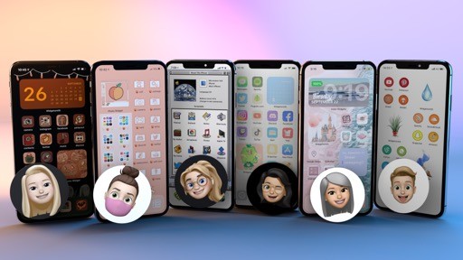
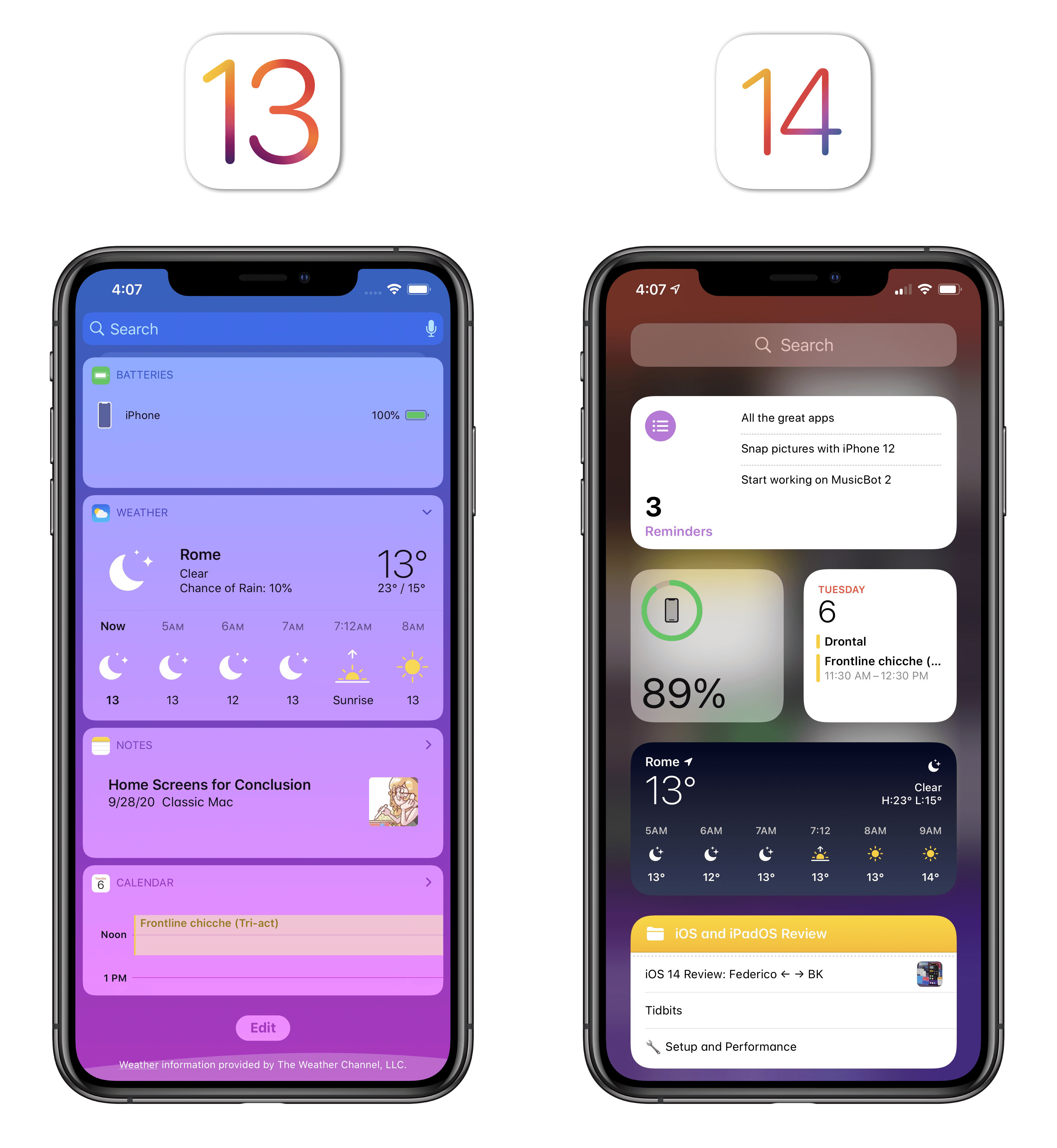
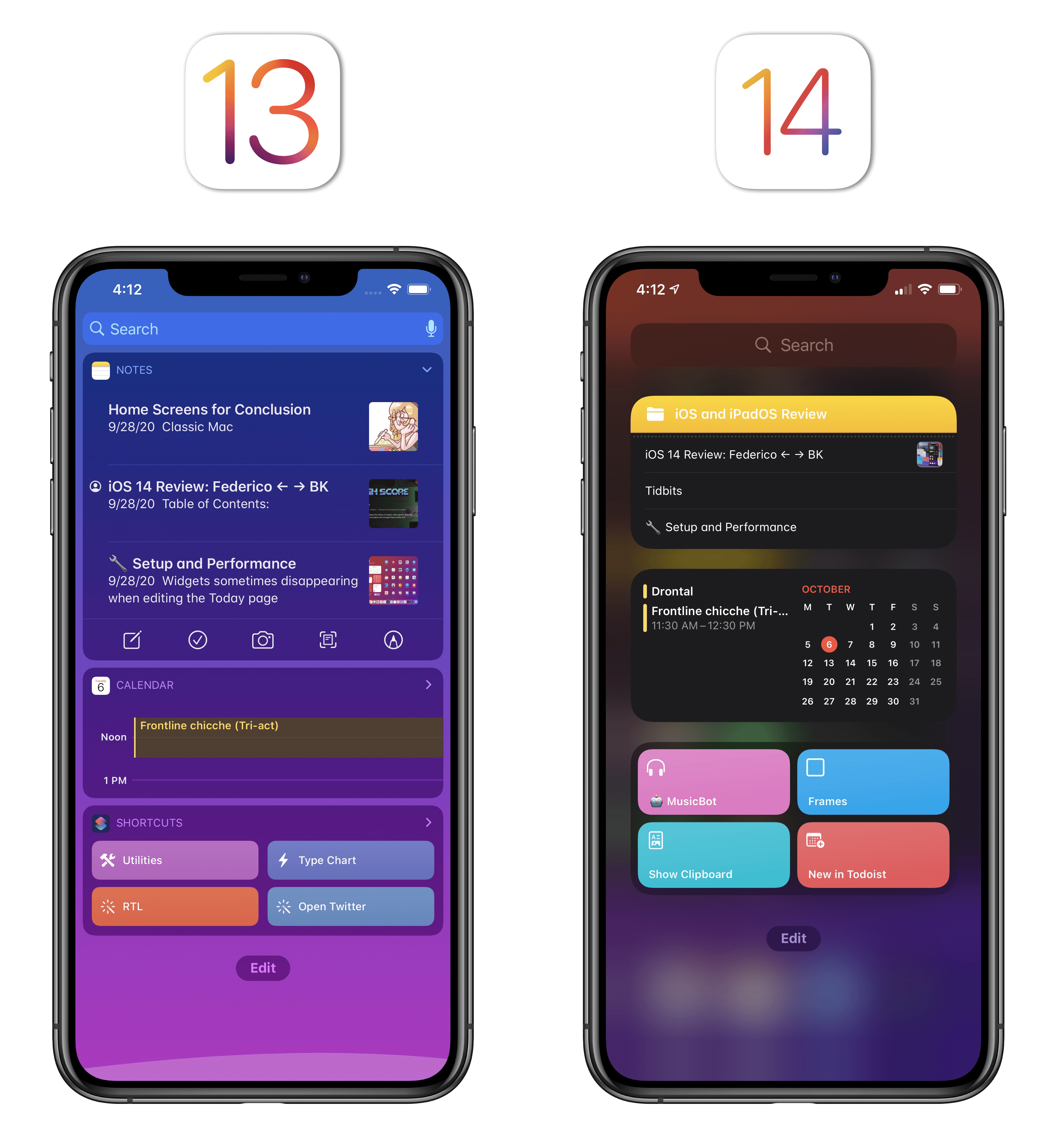
For the first time in over a decade, the Home Screen is fundamentally changing in iOS 14. With the addition of widgets, Apple is bringing deeper personalization to the Home Screen, allowing developers to elevate their app’s content and users to find information they need more quickly. The result is a more lively, dynamic Home Screen that makes any pre-iOS 14 icon grid feel instantly obsolete.
Apple’s efforts this year aren’t devoid of issues – as we’ll see later, the company is only telling one side of the Home Screen story, oddly excluding iPad – but what’s here today is thoughtfully executed nonetheless. And with the addition of the App Library, a new feature that automatically sorts apps for you, the company seems to ask: what if you didn’t even need a grid of icons in the first place?
Widgets
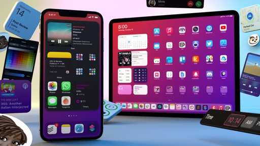
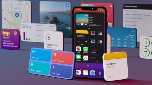
The headline feature of iOS 14 – the one that is instantly recognizable and has likely pushed millions of users to update already – is, by far, the ability to add widgets to the iPhone’s Home Screen as rich, semi-interactive tiles sitting in between app icons.
Clearly reminiscent of Android but deeply different from a visual and technical standpoint, iOS 14’s reimagined widget experience has been designed to look bold and rich, with widgets serving as gateways into app content that let users preview important, timely data on the Home Screen without opening the associated app. The new widget framework, used by Apple for its own apps and available to third-party developers as WidgetKit, is powered by SwiftUI and leverages lessons Apple learned designing complications for watchOS to deliver updates from apps with minimal impact on battery life – all while supporting modern technologies such as dark mode and dynamic type.
Before digging deeper into the design principles and overall aesthetic of iOS 14 widgets, it’s important to frame this discussion around the three goals Apple sought to attain with this feature.
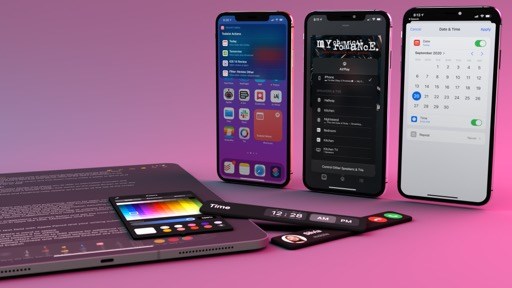
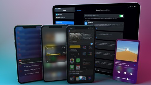
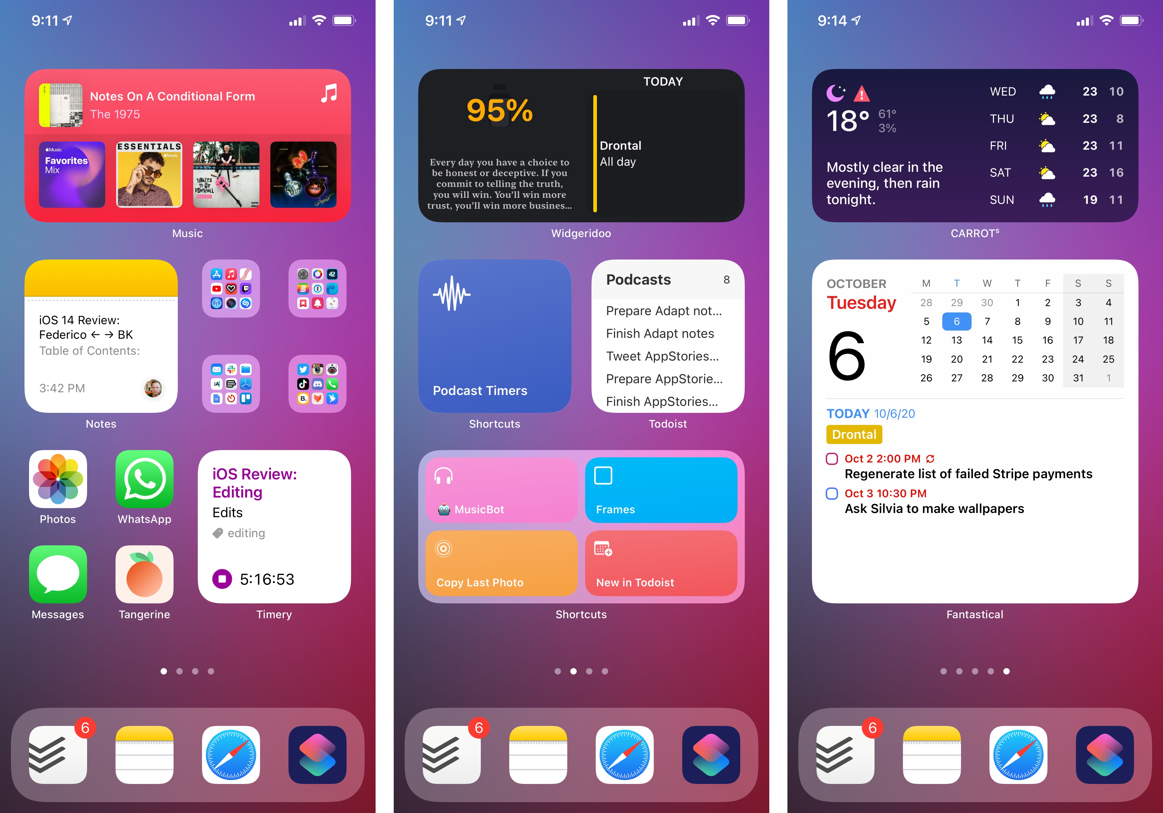
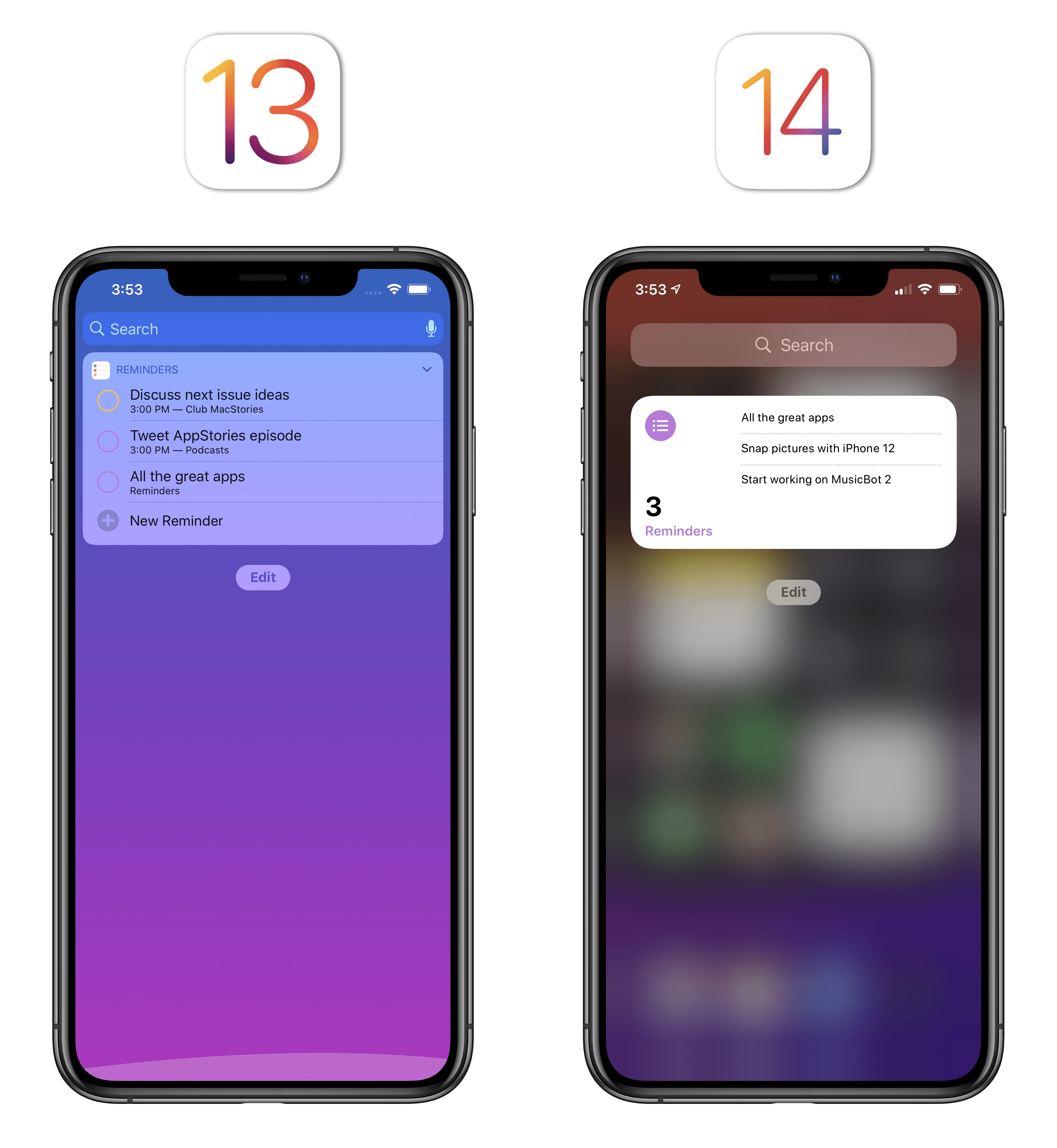
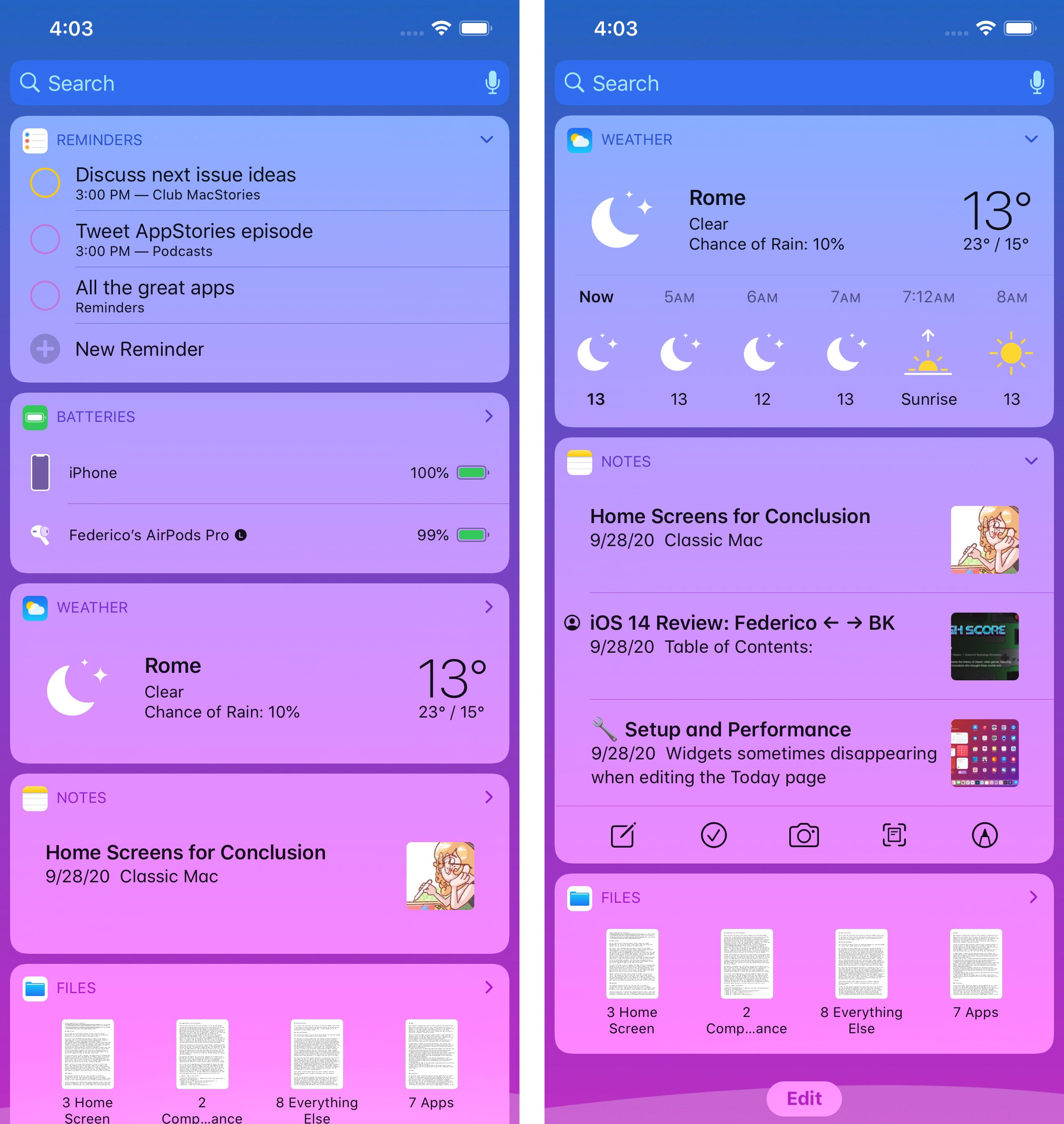
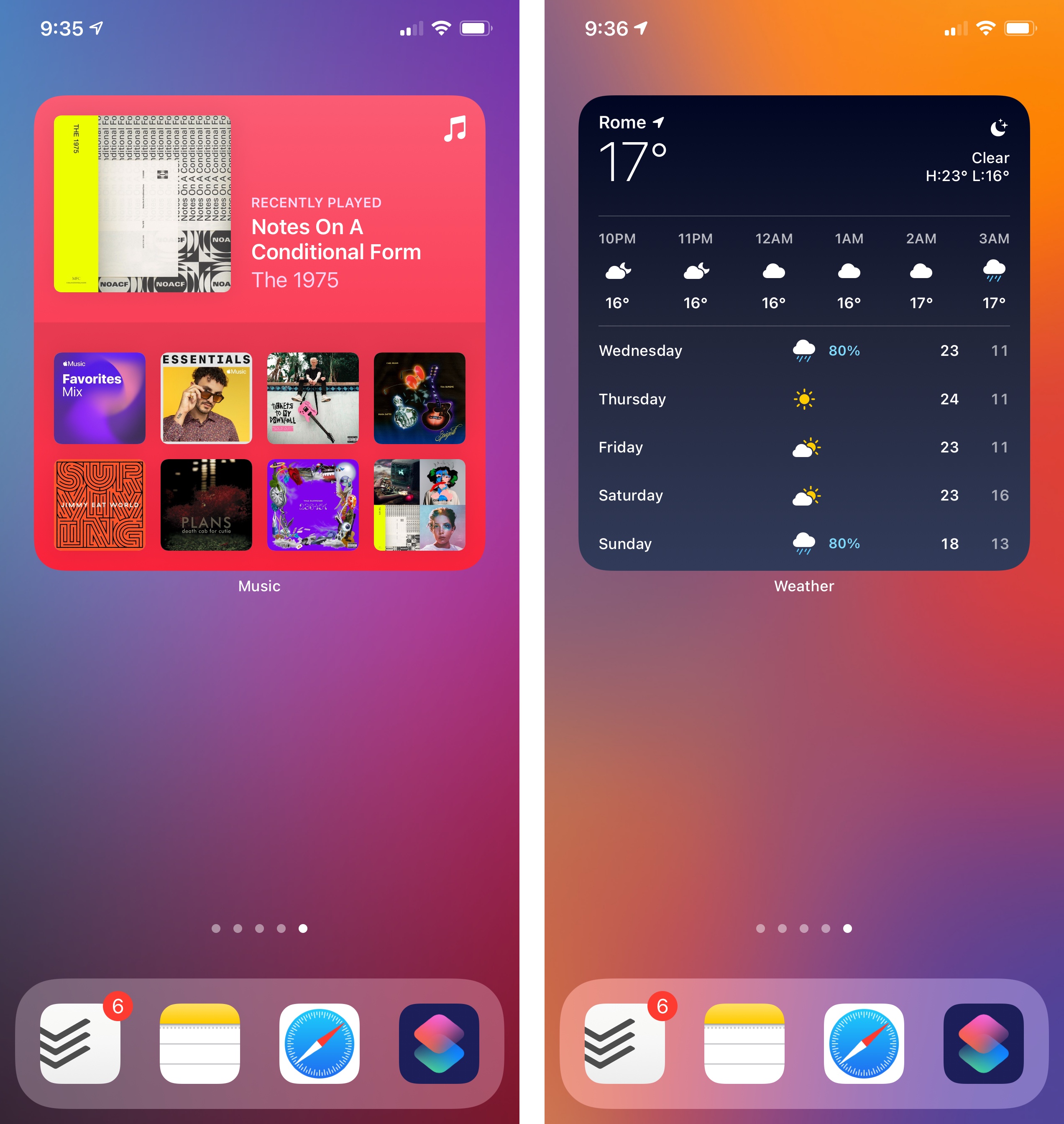
First, Apple stressed at WWDC how widgets were created to provide glanceable updates rather than app-like interactions on the Home Screen. The company succinctly presented this with the “widgets are not mini apps” line in one of their technical sessions, and the description couldn’t fit iOS 14’s widgets and WidgetKit framework any better. Rather than offering a subset of functionalities found inside apps on the Home Screen in the form of interactive elements such as, say, music playback controls or scroll bars, widgets are panels that preview pieces of data at a glance. Instead of following in Android’s footsteps and building a music widget that lets you play and skip songs, Apple’s Music widget in iOS 14 shows you music you’ve recently played; contrary to the company’s old Reminders widget in iOS 13 (which aggregated all upcoming tasks from all lists), the Reminders widget in iOS 14 lets you glance at items from a specific list (including the app’s smart ones) along with a task count.
The updated Reminders widget can be configured to display items and task count from a specific list.
This approach is a drastic departure from the previous way of designing widgets for iOS 13 and encapsulates Apple’s visual direction1 with widgets in iOS 14. According to stats shared by the company at WWDC, the average iPhone user sees the Home Screen around 90 times each day; most people’s interactions with the Home Screen are transient and goal-oriented – users typically return to the Home Screen to tap an icon and open another app. Therefore, in redesigning the Home Screen to accommodate widgets, Apple prioritized the option of only having to take a quick peek at a widget to get some value out of it. As a result, the widgets Apple built – and the framework the company created for developers – share roughly the same objectives as complications on a watch face: presenting content as quickly as possible is paramount, so refresh times have to be minimal and invisible to the user; widgets should always be “ready”, avoiding loading indicators; widgets have been designed with a bold aesthetic that omits interactive elements or other controls that require fine precision.
By saying that iOS 14 widgets shouldn’t be considered “mini apps” anymore, Apple is effectively positioning them as something in between icons and full apps – dynamic tiles that are richer and more useful than icons, ultimately acting as optional jumping points into full apps. They’re like “super complications” with a wider degree of customization.
The second goal to consider is the idea of relevancy and timely updates, which Apple is trying to accomplish in a couple different ways. Without delving into the technical minutiae of the framework, what you should know about WidgetKit is that it’s built upon a timeline-based approach where widgets are views rendered by the system in SwiftUI in a separate process from the main app. Even if a widget is displayed onscreen, each app’s widget extension is not continually active; instead, it only receives data updates (and thus refreshes its contents) at specific times (i.e. the aforementioned timeline); these times can be “suggested” by apps, but the OS ultimately has final say. If this reminds you of complications and the Siri face for watchOS, it’s because it is, in broad strokes, the same system.
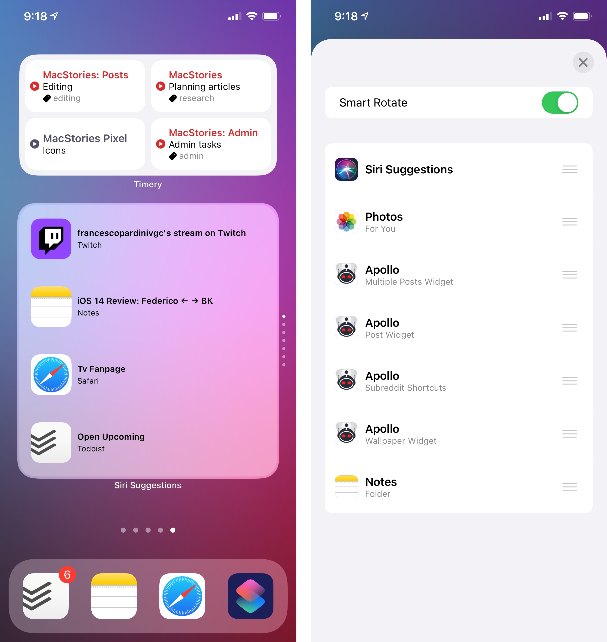
As is often the case with Apple’s operating systems in recent history, when we say “the system”, on-device intelligence is really the conductor of this entire performance. This is most apparent in the stacking functionality for widgets Apple built in iOS 14. As I’ll explain more in depth later, iOS 14 lets you combine multiple widgets in the same slot on the Home Screen (or in the Today page, which is still available) and flip through them manually with a vertical swipe. However, the system can also automatically cycle through multiple widgets in a stack on your behalf thanks to a ‘smart rotate’ option, which takes into consideration the time of day, your location, and other signals captured on-device to present the most relevant widget. But that’s not all: in addition to regular, user-created stacks, iOS 14 also offers a Smart Stack feature that automatically rotates through several available widgets without you having to worry about creating the stack to begin with. I have some reservations about the Smart Stack and the true effectiveness of automatic widget rotation for power users, but I think it’s an ingenious solution to remove friction from the widget experience nonetheless.

Apple’s third and final goal for widgets (and perhaps the most important one if you’re reading this review) is personalization. Besides the ability to customize your Home Screen with widgets and design interesting layouts by mixing and matching widgets of different sizes, widgets in iOS 14 support configuration options that let you decide the kind of data that should be presented on the Home Screen.
Widget configuration options are based on Intents, the same technology behind SiriKit and actions in the Shortcuts app. These settings (which you can access by long-pressing a widget and entering edit mode on the Home Screen) can take many shapes and forms: you can, for instance, choose from a list of notes to display in a widget, pick contacts, enter numbers and dates, or choose a location. By making widgets configurable, Apple has moved past the limitations of the old widget framework: it’s thanks to this system that you can add multiple widgets from the same app to the Home Screen in iOS 14 instead of being limited to a single, immutable widget per app.2 Because of this approach, Apple is also banking on third-party developers to build rich and versatile widget integrations for their apps in iOS 14, allowing different parts of an app experience to become something that can be glanced at and intelligently suggested on the Home Screen. And the best part is: if those developers already put in the work to craft rich Shortcuts actions for their apps, they can reuse the same Intents technology for widget configuration in iOS and iPadOS 14.
With these principles in mind, it’s easy to see what Apple’s trying to achieve in iOS 14: the company is laying the groundwork for a future where app content can be projected elsewhere in the system, with relevant updates delivered in a power-efficient, personalized fashion. The company has taken some of the most important lessons they learned building complications for watchOS and they’re bringing them to iOS and iPadOS, where larger screens let them flex their design muscles and more powerful SoCs can support rich Home Screens featuring multiple widgets of varying sizes. In practice, this approach feels like a 1.0 version of a bigger vision in a few places, but the results are already fundamentally changing the Home Screen as we know it.
The Design of Widgets
Before getting into the experience of using and configuring widgets in iOS 14, I want to cover the look and feel of Apple’s new widgets along with some examples from third-party developers.
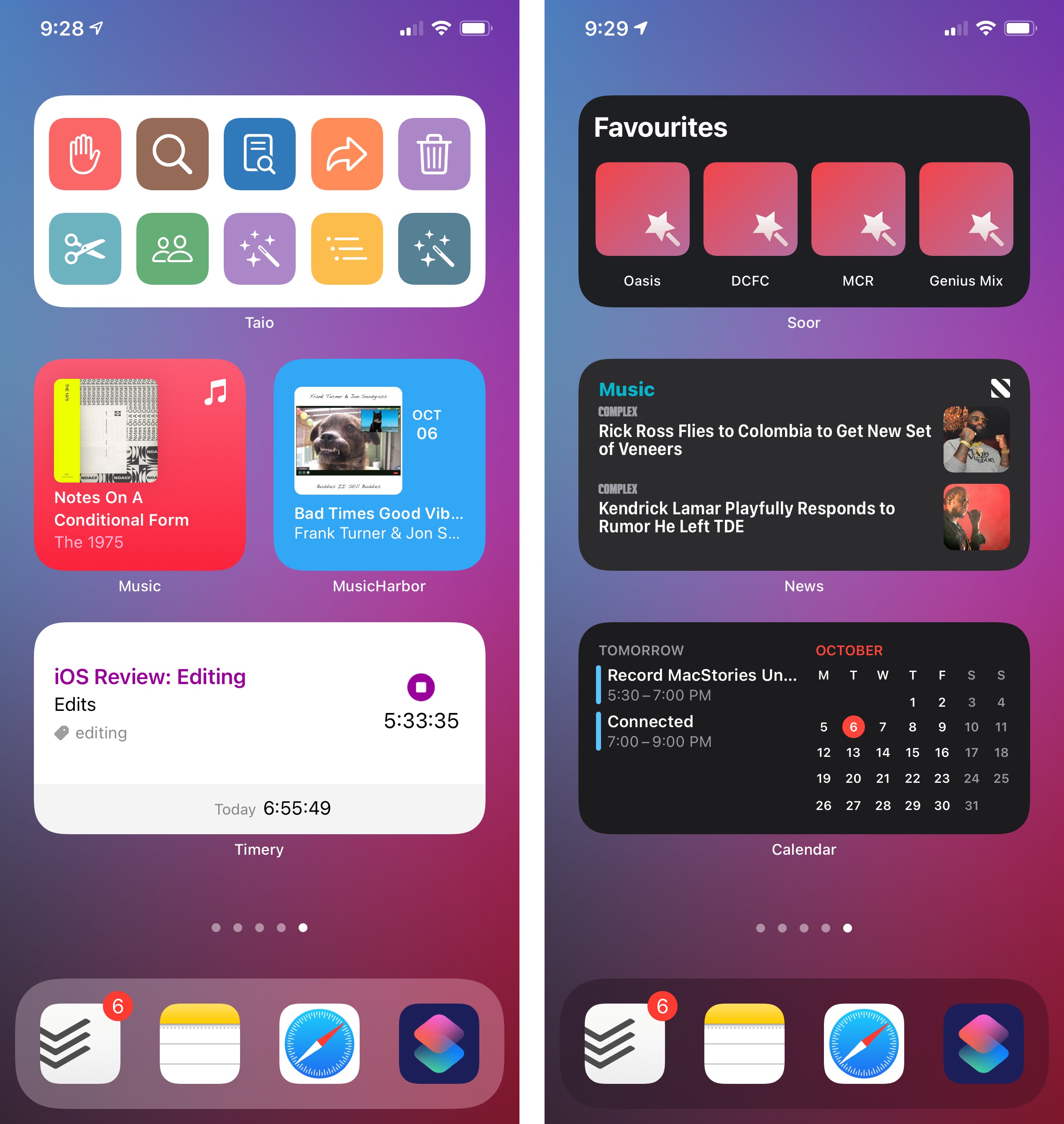
At a high level, widgets in iOS 14 differ from iOS 13 in two key areas: they support three different size options and they showcase a diverse set of UI styles that are no longer limited by a default “container” design.
Starting with iOS 10, widgets supported two size modes – compact and expanded – that could be toggled by tapping a chevron in the upper right corner of the widget. Furthermore, the widget panel itself was always presented as a layer of frosted glass on top of which apps could overlay their UI elements. No matter the kind of visual customization developers opted for, widgets always displayed each app’s icon and name in the upper left corner of the panel; apps could only fill the widget panel with their contents within specific bounds, resulting in a homogenous appearance where every widget had the same color and shape.
With iOS 14 and WidgetKit, Apple has thrown these conventions out the window and replaced them with a system that lets apps bring their personality to the Home Screen. The default background color for each widget tile is gone; now, developers can fill the entire panel with custom UI and colors that match their apps’ aesthetic and brand. As a result, while widgets may not behave like “mini apps” technically speaking, they sure can look like smaller versions of apps that use the same UI themes and visual flairs that were previously impossible to embed into widget panels.
It only takes a few comparisons between iOS 13 and 14 to see that the difference is striking. While widgets could feature custom graphics and colors inside the panel before, their appearance was always dictated by a static background color. In iOS 14, as you can see in the shots above, the Notes widget is immediately recognizable since it employs the same yellow padding and stitching found on the app’s icon; the Weather widget features the same edge-to-edge color gradient for a sunny sky found inside the app (when the weather is nice); it’s impossible to miss the widgets for Music and Podcasts, which have colorful backgrounds that match the primary colors of their respective brands. By getting rid of the old translucent background and its default boundaries, Apple has lifted a giant lid on UI customization on the Home Screen, allowing developers to show off their apps’ aesthetic in a way that goes beyond icons.
In addition to the design freedom granted by a widget framework based on SwiftUI, the other upside of iOS 14’s revamped widget system is support for multiple sizes that can be picked by the user upon installing a widget (but not tweaked after the fact). Widgets in iOS 14 come in three sizes:
The small size is a small square tile, roughly equivalent to the space occupied by a grid of 2x2 icons:
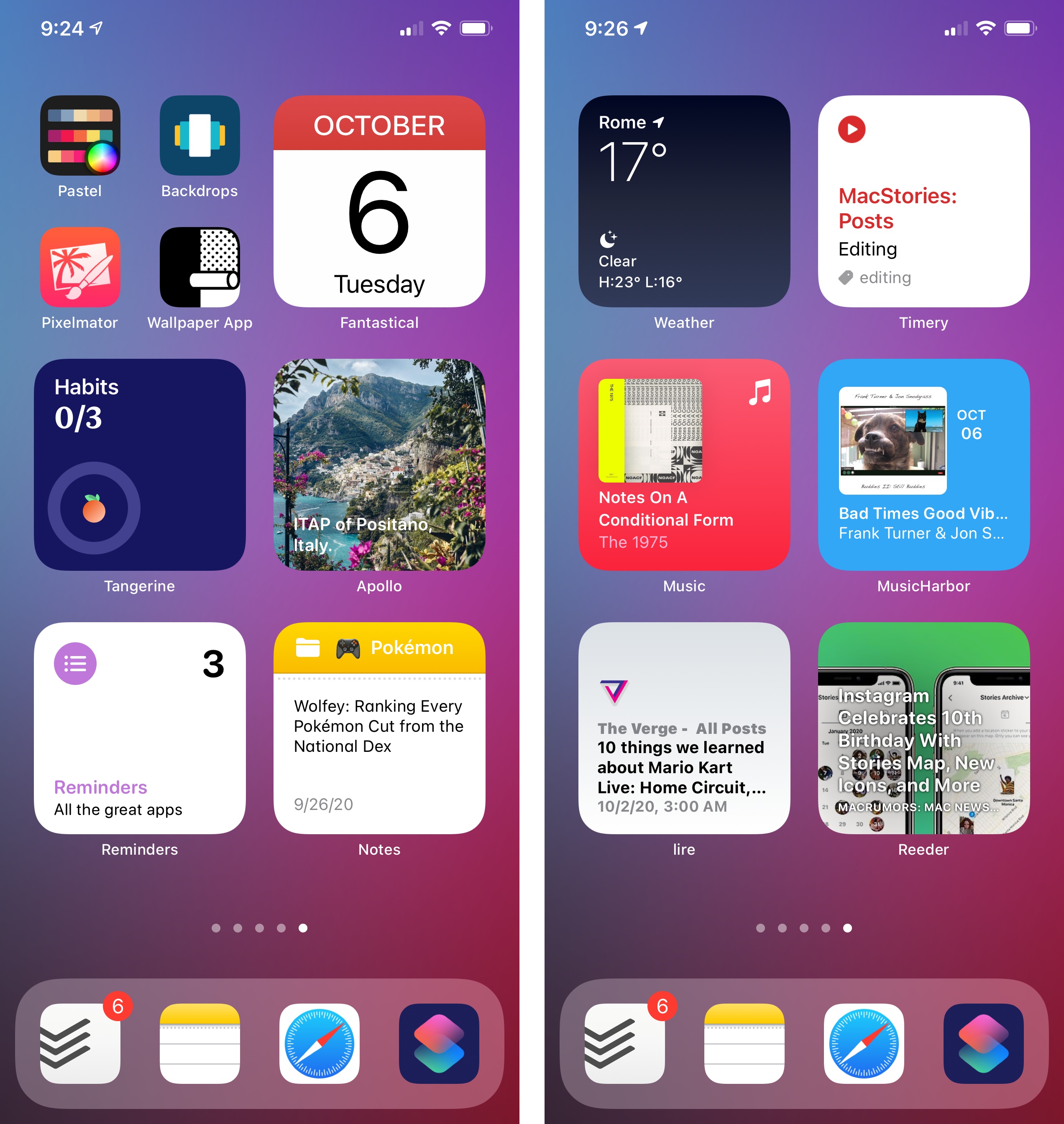
The medium size is a rectangle, the equivalent of two rows of icons on the Home Screen (4x2):
Lastly, the large size is a bigger square, matching the space taken by 16 app icons on the Home Screen in a 4x4 grid:
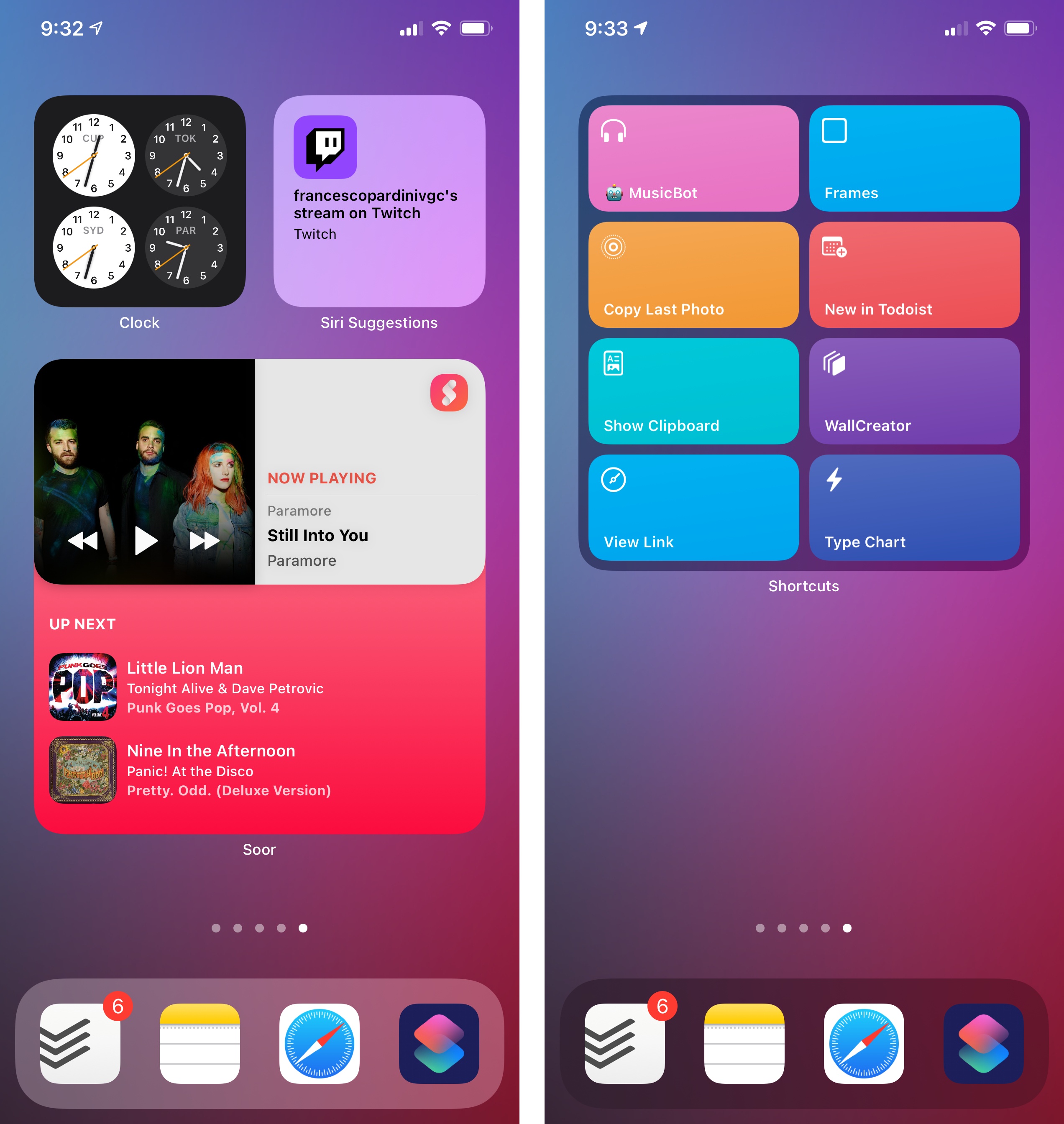
While it is not mandatory for third-party developers to support all the default sizes offered by widgets in iOS 14, Apple is strongly advising they do so to ensure maximum flexibility for users.3 iOS 14 supports installing multiple widgets of multiple sizes for the same app, even in the same Home Screen page or within the same stack; only widgets of the same size can be combined in a stack; unlike iOS 13, there is no longer a way to switch between “compact” and “expanded” layouts for the same widget.
Apple itself has fully embraced widgets in iOS 14 and built modernized versions for all the apps that previously offered widgets in iOS 13, leaving room for some new entries as well. By default, iOS 14 comes with pre-installed widgets for the following apps and system features:
- Batteries
- Available as ‘Status’ in 3 sizes
- Calendar
- Available as ‘Up Next’ in 3 sizes
- Clock
- World Clock (small and medium sizes)
- City (small size only)
- Files
- Available as ‘Recents’ in medium and large
- Fitness
- Available as ‘Activity’ in small and medium
- Maps (3 sizes)
- Music
- Available as ‘Recently Played’ in 3 sizes
- News
- Available as ‘Topic’ (3 sizes)
- Available as ‘Today’ (4 sizes)4
- Notes
- Available as ‘Note’ (small size only)
- Available as ‘Folder’ (3 sizes)
- Photos
- Available as ‘For You’ (3 sizes)
- Podcasts
- Available as ‘Up Next’ (3 sizes)
- Reminders
- Available as ‘List’ (3 sizes)
- Screen Time
- Available as ‘Daily Activity’ (3 sizes)
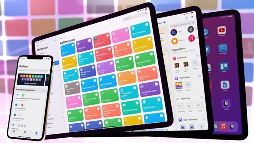
- Shortcuts
- Available as ‘Shortcut’ (small size only)
- Available as ‘Shortcuts Folder’ in medium and large
- Siri Suggestions
- Available as ‘App Suggestions’ (medium size only)
- Available as ‘Shortcut Suggestions’ (3 sizes)
- Stocks
- Available as ‘Watchlist’ (3 sizes)
- Available as ‘Symbol’ (small size only)
- Tips (3 sizes)
- TV
- Available as ‘Up Next’ (3 sizes)
- Weather
- Available as ‘Forecast’ (3 sizes)
If you sum it all together, Apple created widgets for 19 apps/features for a total of 61 differently sized versions. Such widespread adoption confirms how strongly Apple believes in widgets as the marquee addition to iOS this year; more than numbers alone, however, Apple is leading by example here with some fascinating implementations of WidgetKit – both visually and functionally speaking – that should serve as the North Star for third-party developers designing widgets for their apps in iOS 14.
Music and Weather are, in my opinion, the most visually impressive widgets of Apple’s default collection. Music uses the same coral tone seen in the app’s updated icon as the widget’s background color; your most recently played item is listed in the widget’s top half alongside text labels, followed by a compact grid of other recently played albums; in the small size, a single item is shown instead. While album covers dominate the Music widget, the Weather one is packed full of glyphs and text labels: in the medium and large layouts, Weather shows current conditions for the selected location plus a forecast for the next few hours and, in the large version, the next five days.
The Weather widget is the perfect example of the idea of “gateways into apps” I mentioned above: besides giving the feeling that a part of the Weather app has been embedded on the Home Screen, moving from the widget to the full app by tapping the widget reveals a seamless transition from widget to app UI that was impossible to pull off before iOS 14. Just look at the following transition from Home Screen to app and vice versa to get the idea:
The transition from widget to app and vice versa.Replay
Weather is uniquely positioned for this kind of visual effect due to sharing a consistent UI layout with the full app; however, even when widgets don’t look like sections of apps that were pulled out of them and put on the Home Screen, Apple’s animations for going back and forth between a widget and app are tastefully executed. I particularly appreciate the morphing animations seen when transitioning from the Calendar, Files, and Notes widgets into the respective apps:
More transitions from widgets to apps.Replay
As you can tell, these widgets blur the lines between UI seen on the Home Screen and inside apps, which I don’t think is an accident. Going forward, and as you’ll see in some of the third-party examples later, I fully expect this design approach to become commonplace, particularly on iOS where apps always open in full-screen and widgets feel like they’re “expanding” to fill the display and turn into apps.
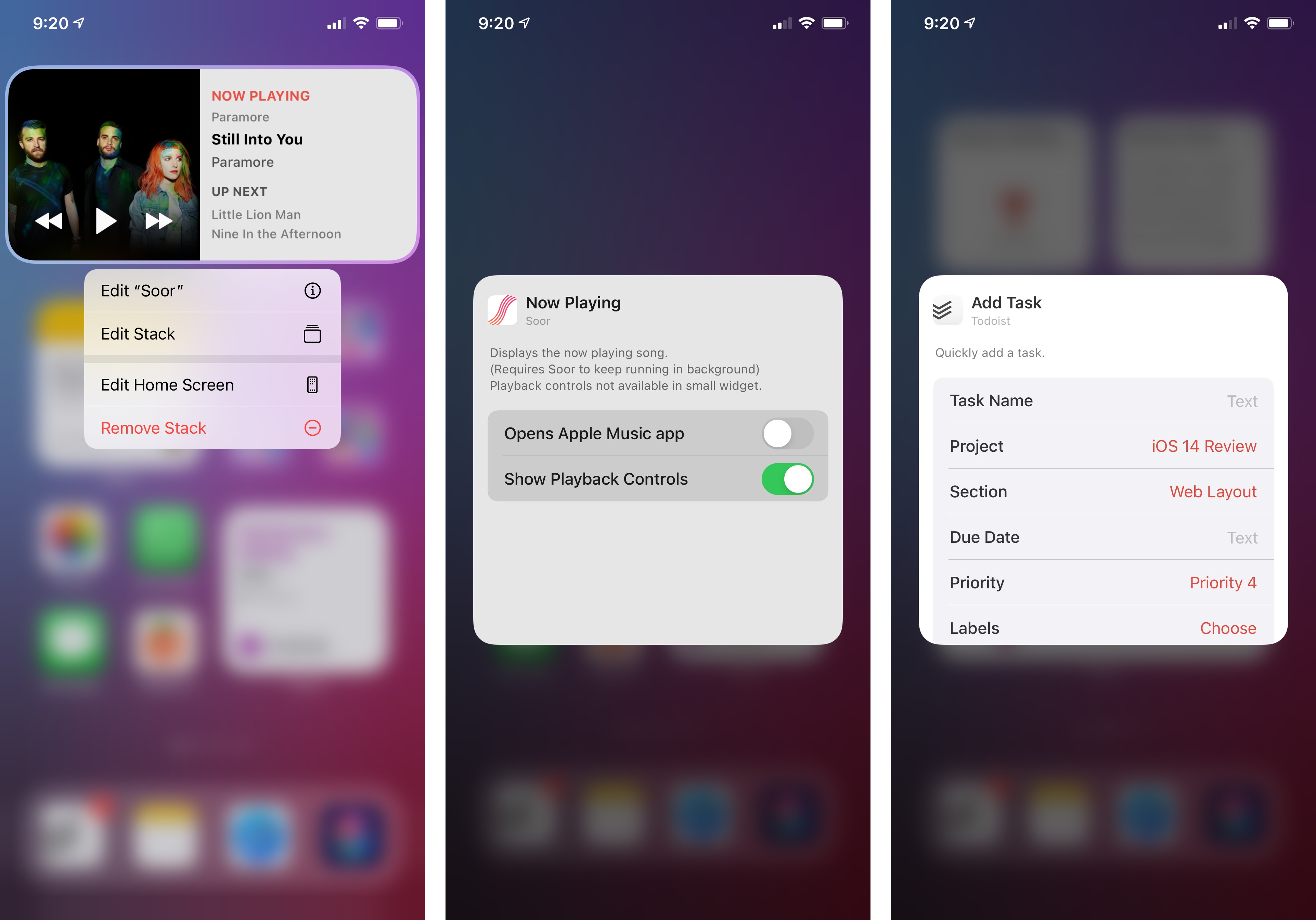
The Music and Calendar widgets also highlight the use of touch targets – the only interaction available for widgets in iOS 14. As I’ll further elaborate upon later, one of the drawbacks of WidgetKit in iOS 14 is its lack of support for interactions that directly affect the content displayed in the widget (think: a calculator widget where you can press digits in the widget itself, a la PCalc in iOS 13). The only user interaction available for widgets in iOS 14 is tapping the widget or an area of the widget to launch the full app into a specific view or mode.
The Music widget supports this by letting you tap individual albums to reopen them; in the Calendar widget, individual events are tappable elements; in Shortcuts and Files, you can tap specific shortcuts and documents, respectively, to open them in those apps.
- Some might say technical limitations. ↩
- Technically, developers could offer multiple widgets per app in iOS 13, but the feature was rarely adopted, and those widgets didn't support inline configuration or multiple sizes. ↩
- Some Apple widgets, such as Files and Fitness, only support two of the three available sizes. ↩
- The Apple News widget is the only one to come with a custom "tall" size that takes up an entire Home Screen page. This widget size isn't available to third-party developers in iOS 14. ↩