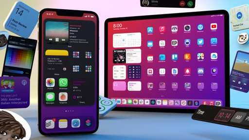
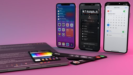
App Library
There’s a recurring gag on AppStories, the app-focused podcast I co-host with John Voorhees, in which I poke fun at the large number of apps installed on John’s iPhone. At some point, I believe the Home Screen pages on his iPhone even reached double digits. The App Library, a new feature of the iPhone Home Screen introduced in iOS 14, was designed for people like John: folks who use their iPhones a lot, have a lot of installed apps and download new ones on a regular basis, but who also fundamentally dislike organizing them. The App Library was designed to fix all this with a simple, elegant interface powered by on-device intelligence.
The App Library sits at the opposite end of the Today view on the Home Screen: it’s the very last page of the Home Screen, which you can reach by swiping left on your iPhone until you see a collection of app “folders” organized in a grid dubbed the App Library. Here’s what the iPhone Home Screen’s horizontal hierarchy looks like with the addition of the App Library:
The easiest way to describe the App Library is the following: it’s a new space that organizes all of your apps in a single view; the App Library automatically sorts your apps into categories, allows you to remove app icons from the Home Screen without actually deleting apps, and surfaces relevant apps that may be helpful in the moment thanks to on-device intelligence. Let’s break these ideas down step by step.
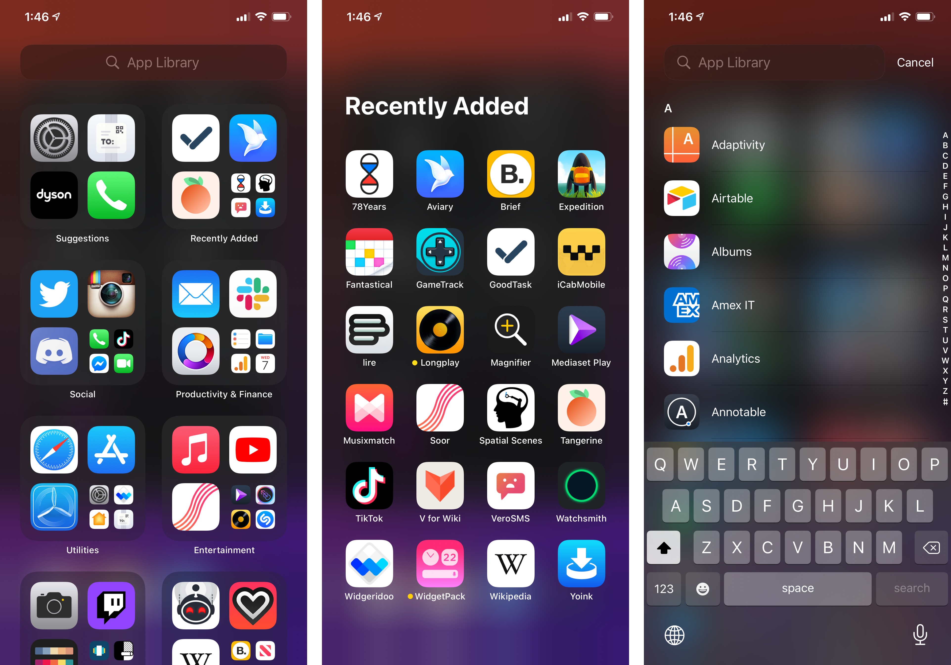
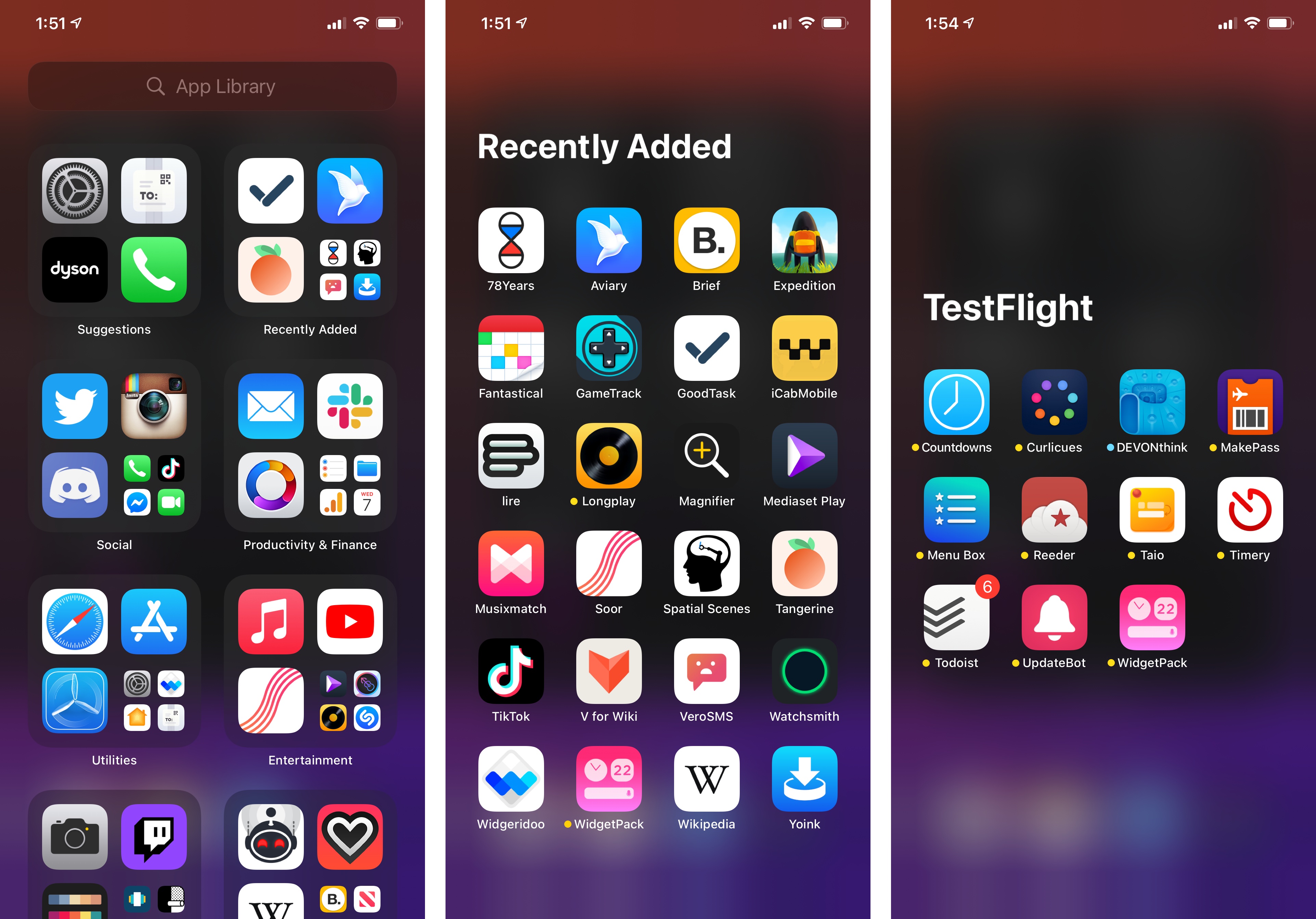
There’s nothing you need to do to get started with the App Library: it is created by default by iOS 14 and there’s no way to turn it off. When you swipe over to the App Library, you’ll notice it automatically sorts apps into (what Apple refers to as) “intelligently curated categories” that look like traditional Home Screen folders, with some key differences. First, these categories are decided by iOS 14 and they appear to be based on the category each app is listed under on the App Store, such as ‘Lifestyle’ or ‘Productivity’; you cannot rename the App Library’s categories, which are also automatically reordered for you based on app use – the idea being that you may find Productivity apps higher in the grid during the day, replaced by Games or Entertainment at night.
Additionally, unlike regular folders, App Library categories support multiple ways of opening apps contained inside them. You can tap a large app icon in a category to instantly open it as if it were an icon on the Home Screen, or you can tap the smaller grid of icons in the lower right corner of a category to expand it and view all apps sorted into that category. I wish it was more obvious, but to go back to the App Library once you’re into a category, you need to tap an empty area of the screen.
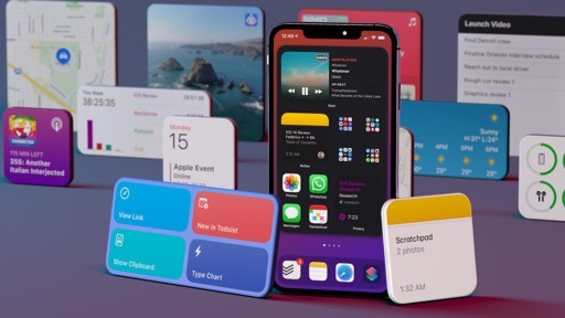
Using the App Library.Replay
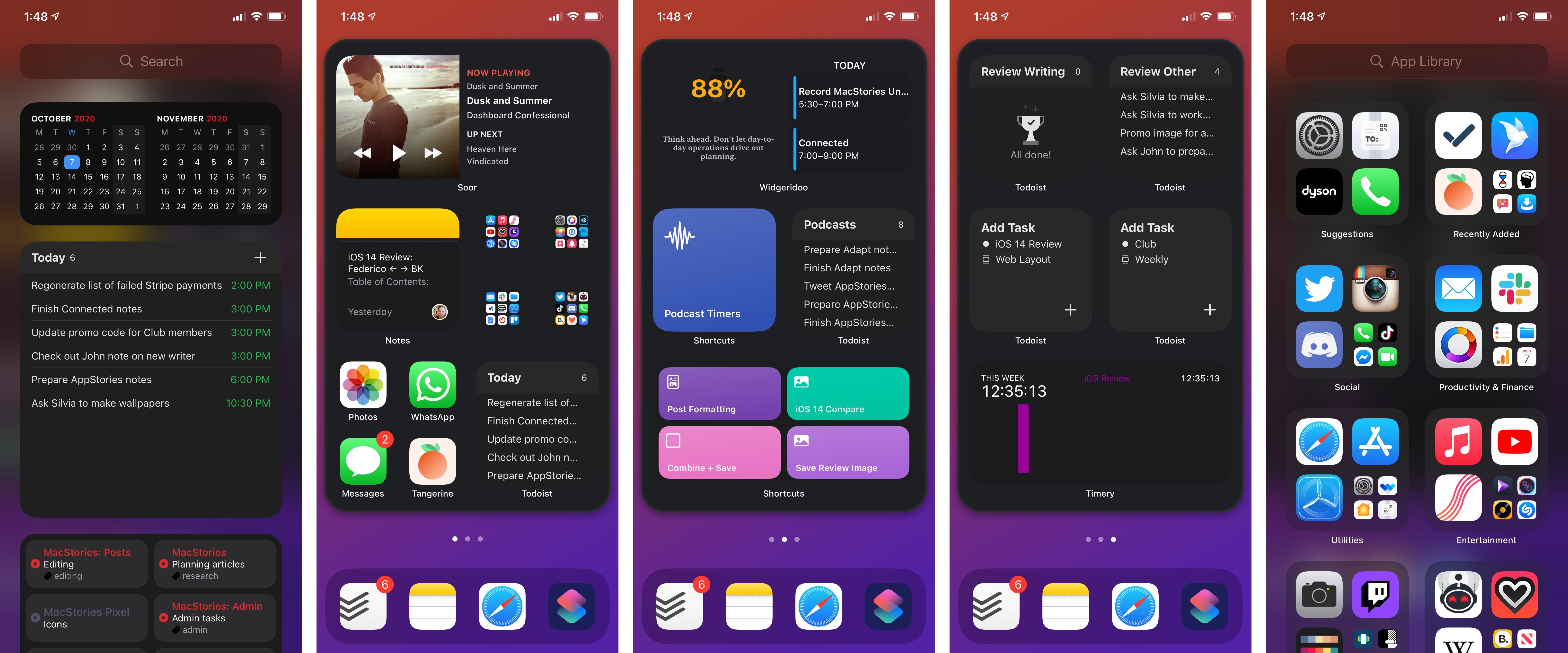
Besides “regular” categories for apps based on their purpose, you’ll also find two top-level intelligent categories in the App Library: Suggestions and Recently Added. The first one is a compact version of the existing Siri Suggestions widget and Search feature, which surfaces apps based on signals such as usage, time of day, location, and activity; Recently Added – one of my favorite details about the App Library – is a handy way to see all apps you’ve recently downloaded on your iPhone. In a nice touch for anyone living the beta lifestyle, TestFlight is another automatic category for the App Library, but that’s only available by scrolling further down the grid.
The App Library also supports a search mode: tap into the search field and you’ll be presented with a vertical list of all apps installed on your iPhone. You can search the list by name, move quickly through the list with the alphabetical scrubber on the right, and drag app icons out of the list to add them back to the Home Screen.
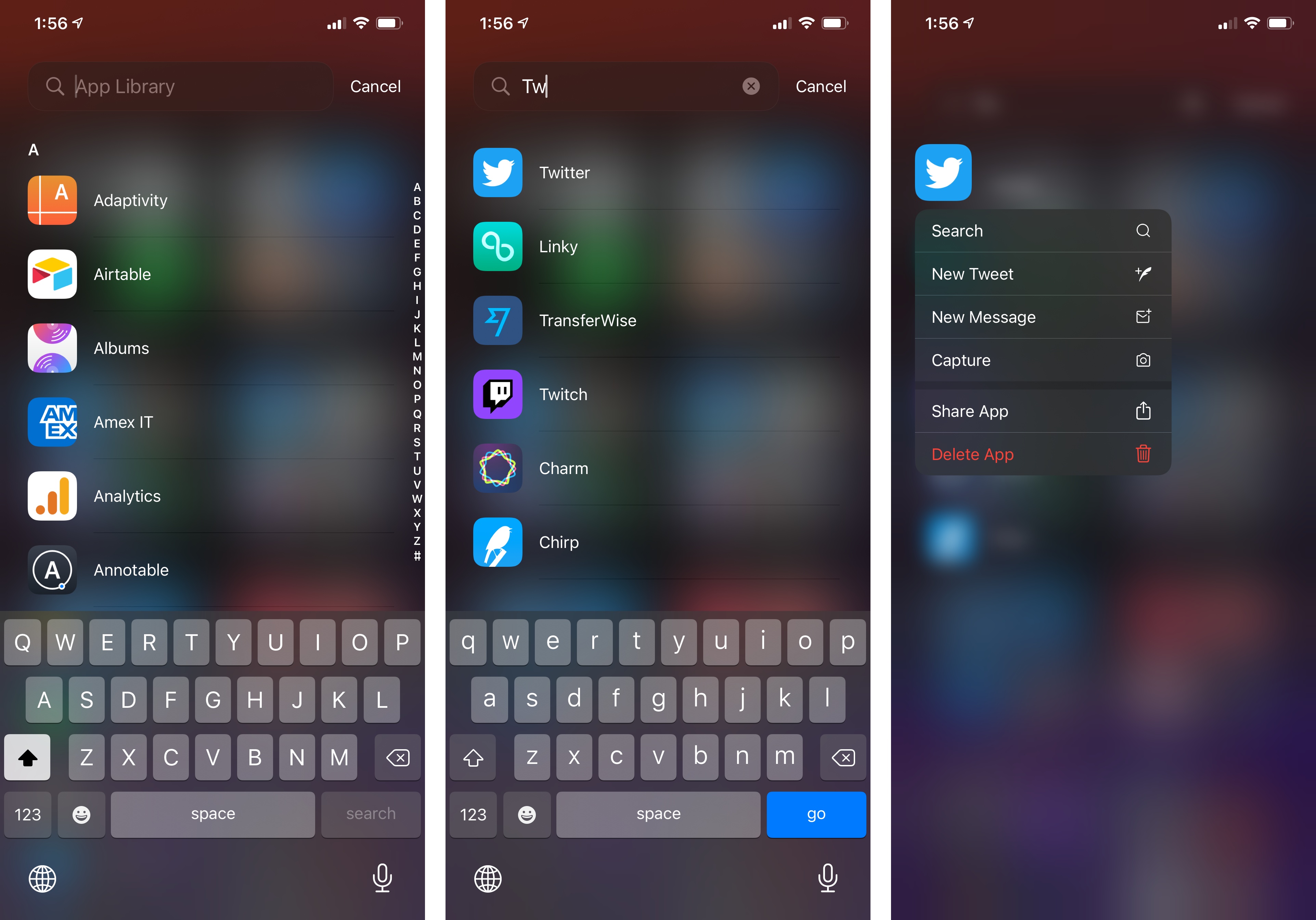
I’m not sure why the App Library needs a search mode: the basic, alphabetical list of apps is a nice addition, but would you really search for apps inside the App Library when you can always swipe down on any Home Screen page and find apps via Search? The only explanation I was able to come up with is that search in the App Library is restricted to apps only, and nothing else.
There’s one key principle to understand regarding the App Library’s relationship with the Home Screen: the App Library is a layer superseding the Home Screen, and it “exists” regardless of whether you decide to show app icons on the Home Screen or not. However, the Home Screen is still considered the primary app launcher in iOS 14: no matter how much you want to use the App Library, you need to keep at least one Home Screen page on your iPhone; you can’t go all-in on the App Library and stop using the Home Screen altogether. The App Library is an accessory to the Home Screen, and the two are linked to each other in terms of how you can manage installed apps and their visibility. Which is why I feel like the integration between Home Screen and App Library is even more interesting than the design of the App Library itself.
With the arrival of the App Library, for instance, the way you can delete apps in iOS 14 has changed. The ‘Delete App’ button that appeared in the context menu on the Home Screen when long-pressing an app icon has turned into ‘Remove App’ in iOS 14: pressing it now reveals an additional menu that lets you delete the app and all its data or only remove it from the Home Screen and add it to the App Library instead.
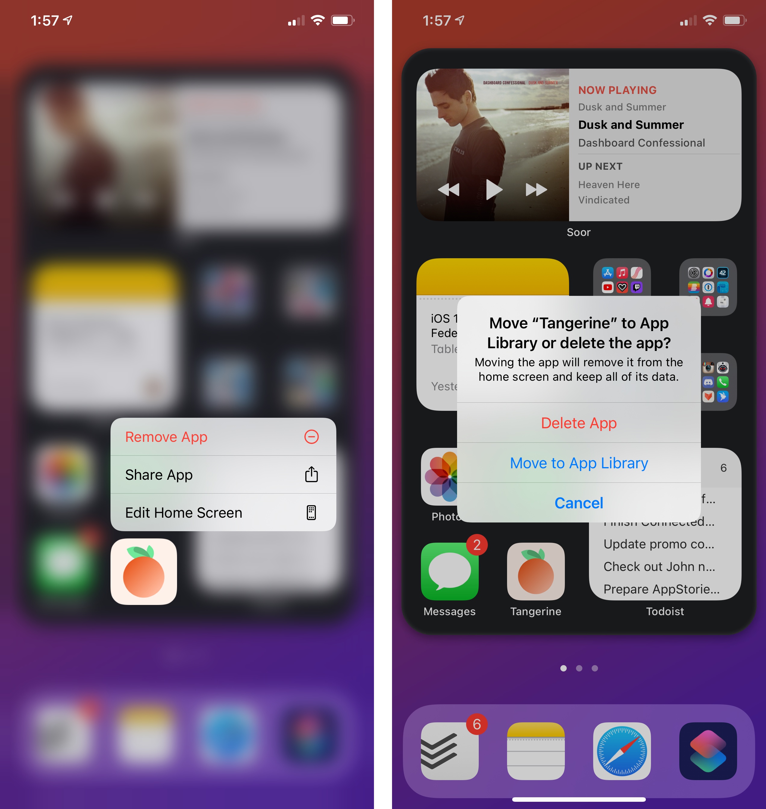
This is an ingenious decision on Apple’s part: if you’re on a spring-cleaning spree and decided to get rid of several icons from your Home Screen, iOS now gives you an easier way to clean up your pages without the “guilt” typically associated with deleting apps. I find this a fantastic addition to the Home Screen experience, and something I’ve done myself dozens of times already over the past few months for all those apps I don’t want to see all the time, but which I don’t want to delete either.
But iOS 14 enables something even more radical than hiding icons from the Home Screen: hiding entire Home Screen pages with just a couple taps. Once again, let’s turn to John: he likely ended up with 300 different apps on his iPhone and dozens of pages where everything’s messy and scattered around after the summer. He doesn’t want to manually create folders for those apps, nor does he feel like hitting the ‘Remove App’ button for each of those 300 apps. If you’re anything like John, you’d be happy to know there’s a much easier way to do this in iOS 14: enter jiggle mode on the Home Screen and tap the page indicators (dots) at the bottom to open the new ‘Edit Pages’ screen. Here, by simply pressing on checkboxes underneath each page, you can hide entire Home Screen pages and rest assured you’ll still be able to launch every app via Search or the App Library.
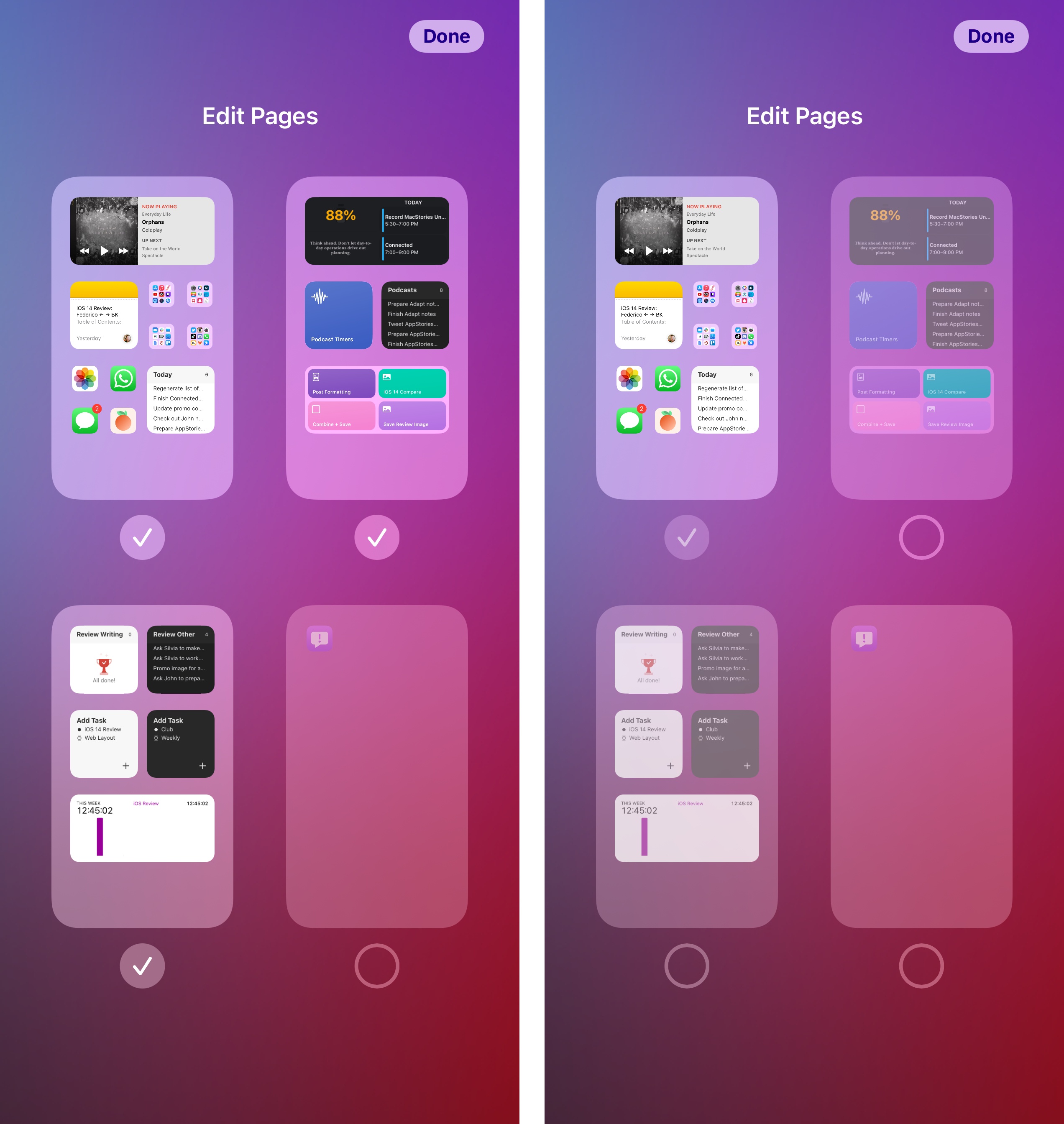
If you feel like your iPhone Home Screen has grown out of control after years of unabated downloads from the App Store, page editing is going to be an amazing time saver to get started with the App Library and hit the reset button on your Home Screen experience. It’s also interesting to consider how this feature could help form new habits such as, say, disabling a “work Home Screen” filled with work-related apps for the weekend, or turning on a “fitness Home Screen” only when you’re heading to the gym. There are lots of possibilities here, and I’m keen to see how the public adopts this feature.9
The integration between Home Screen and App Library extends to the App Store as well. In Settings ⇾ Home Screen, you’ll find an option to choose whether new app downloads from the App Store should be added to the Home Screen (the old default behavior) or only to the App Library, without showing an icon on the Home Screen by default anymore. Offering this kind of control makes sense: if you’re trying to clean up your Home Screen but don’t want to give up on downloading new apps and games from the App Store, this option is the perfect middle ground; furthermore, the Recently Added section of the App Library makes it easy to find and launch newly downloaded apps. This Settings page is also where you’ll find an option to show notification badges in the App Library; personally, because I only care about notifications for apps on my two Home Screen pages, I decided to leave badges off for everything else.
As it stands today, the App Library is a feature of the Home Screen, which remains the primary app launcher of iOS. The App Library isn’t a replacement for the Home Screen (although some users will try to treat it as such): it’s an extra tool designed to remove the burden of organizing apps and pages, using on-device intelligence to sort apps based on criteria we may not normally consider – or perhaps just wouldn’t have the time to manage.
Even though I’m still struggling to leave my old Home Screen habits behind, I believe the App Library largely succeeds in its goal of providing an effortless app launcher and sorting tool. Some of the automatic app categories have…questionable labels (why should a weather app be listed under Reference & Reading?), but they’re usually fairly accurate; the built-in categories for suggestions, recently added apps, and TestFlight betas are great additions, and it’s because of them I find myself using the App Library more each week.
I believe the App Library’s biggest issue at the moment is its placement: in the same year Apple is launching Home Screen widgets and encouraging you to add widgets to multiple pages on your Home Screen, they’re also introducing the App Library, which requires you to swipe all the way to the end of those pages. I’m genuinely surprised the company didn’t come up with a universal gesture to invoke the App Library from anywhere on the Home Screen; had they done that, I think they would have a much stronger case in positioning the App Library as a new kind of dynamic, intelligent app launcher, with the Home Screen becoming a richer area dedicated to glanceable widgets, quick actions, and other compact UI elements.
Is today’s App Library a first step towards such a future? Or is it set to remain a feature of the Home Screen – an optional mode that doesn’t quite replace iOS’ primary app launcher? I don’t know what Apple’s long-term plans for the coexistence of the Home Screen and App Library are. For now, what I do know is that I’m enjoying the ability to clean up my Home Screens, and I hope the App Library continues to evolve.
- What I'd also like to see: integration with Shortcuts to enable/disable specific Home Screen pages programmatically. Just like you can change watch faces with Shortcuts in iOS 14, imagine if you could create automations to turn specific Home Screen pages on and off based on your schedule or other conditions. ↩