iPad Home Screen
Consider everything we’ve seen regarding the updated Home Screen so far: for the first time in over a decade, Apple is rethinking one of its most iconic features; they’re bringing glanceable, configurable, multi-size widgets to the Home Screen; they’re using intelligence to power the App Library, which organizes apps for you and lets you find them more quickly.
Can you think of a single reason why these features should not exist on iPad?
Unfortunately for us, Apple can.
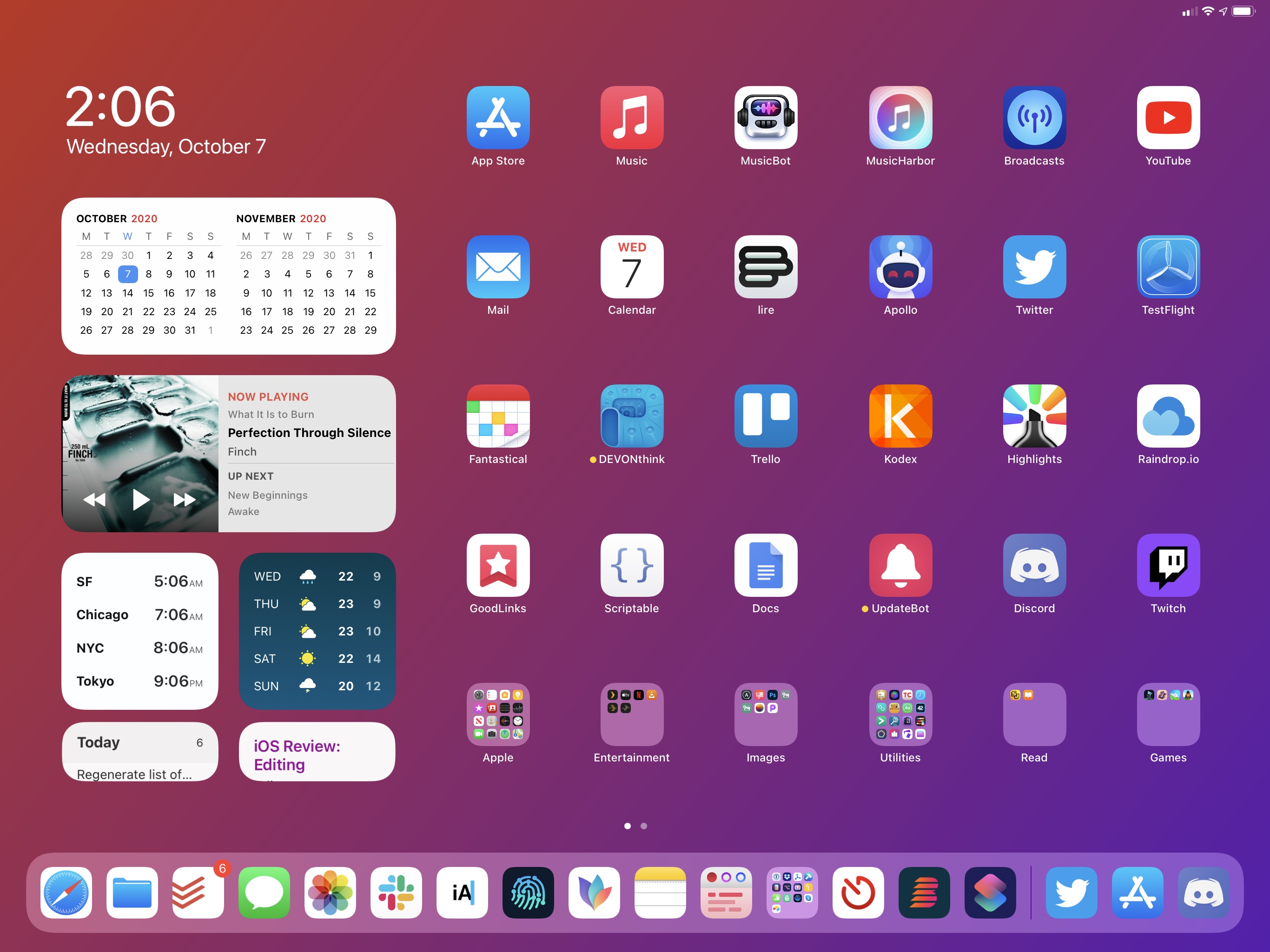
I’m going to cut right to the chase: iPadOS 14 does not offer the ability to place widgets anywhere on the Home Screen in between app icons, nor does it have the App Library. You can install modern widgets on iPad, and you can choose their size and configure them just like on iPhone, but you’ll still be forced to leave them in the left column on the Home Screen. As for the App Library, it’s nowhere to be found in iPadOS 14.
I’ve been trying to reconcile Apple’s muddy explanation of these decisions and my thoughts on the matter for the past few months, and I could only come up with a personal theory that doesn’t really solve anything. The company’s official reasoning for the lack of Home Screen widgets and App Library on iPadOS 14 essentially boils down to the fact that iPad has a dock, a larger Home Screen, and a different design from the iPhone – observations that should, somehow, explain why widgets can only live in a single column on iPad.
Taken at face value, these comments make little sense with regard to the ability to intermix widgets and app icons on the Home Screen. If anything, the opposite is true: because iPad has a larger dock and bigger screen, users would have even more space to place widgets on the Home Screen given that app icons can go elsewhere. One could even make the case that widgets are better suited for the iPad’s larger display than the iPhone, where you can only fit a handful onscreen at a time. On iPad – and especially on bigger iPad Pro models – you could easily assemble a Home Screen dominated by widgets, with your most used apps in the dock, and everything else in the App Library. It makes perfect sense, so why not?
The only reasonable explanation I can think of is, quite simply, time and priorities. It would be perfectly understandable if Home Screen widgets and the App Library came to iPhone first because, due to everything going on this year, Apple had to prioritize one platform over the other and make a decision dictated by time and technical constraints. As much as I dislike seeing iPad in the backseat again, getting new features years after the iPhone did (a story we’ve heard far too many times in the past), it would be acceptable given the circumstances.
The reason why I and other iPad-first users are critical of these omissions from the iPadOS 14 Home Screen is that Apple tried to convince us that there’s a bigger, inscrutable design decision we can’t see behind the lack of changes to the iPad Home Screen this year. It’s the company’s usual secrecy, combined with the disappointment of a wasted opportunity given the iPad’s large display, that stings here. Let me be clear: with this, I don’t mean to imply iPad users are entitled to be let in on every decision Apple makes behind the scenes; but to go on the record and say that “the larger iPad screen lends itself better” to keep pinned widgets in a column feels a bit disingenuous.
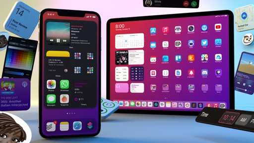
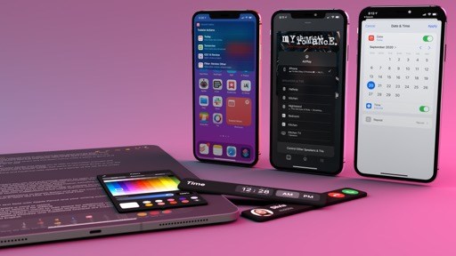
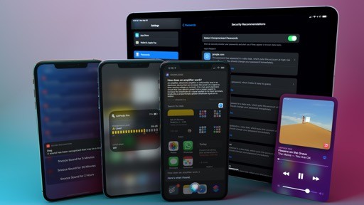
There’s nothing much to say about the iPadOS 14 Home Screen then. Everything I’ve written so far about new widgets applies here as well, only they cannot be moved out of the Today column. Developers can create glanceable widgets of multiple sizes, which you can install from the widget gallery by entering jiggle mode and configure by long-pressing (or right-clicking) them. You can use the Smart Stack or create stacks of widgets manually. These are the same interactions seen on the iPhone, and modern widgets designed with WidgetKit and SwiftUI look fantastic on the iPad’s large display too.
The only difference from the iPhone is, of course, the Today column and the ability (introduced in iPadOS 13) to keep widgets permanently pinned to the Home Screen next to app icons. When entering jiggle mode in iPadOS 14, you’ll see three sections in the Today column: pinned widgets, other widgets, and legacy widgets.
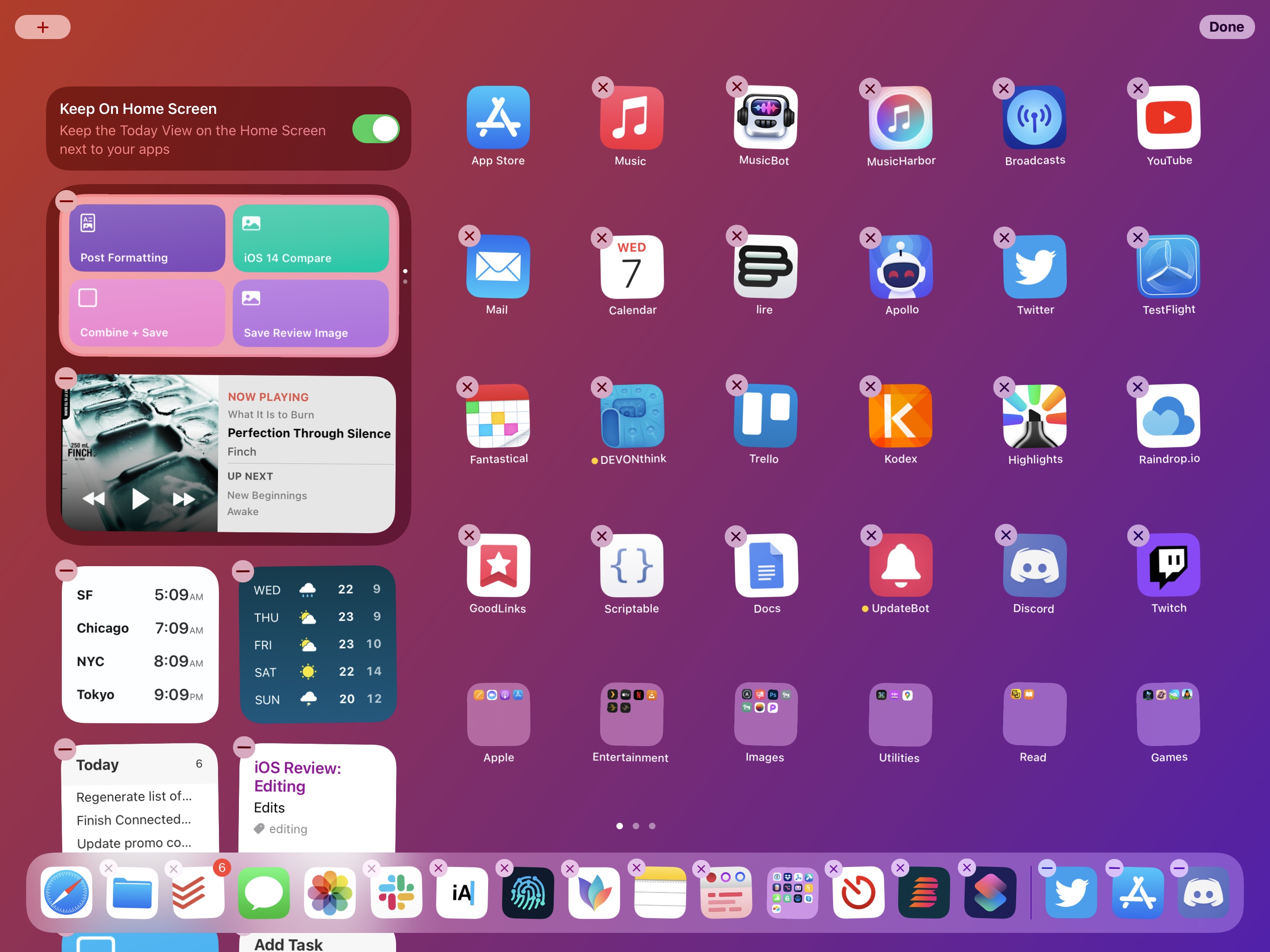
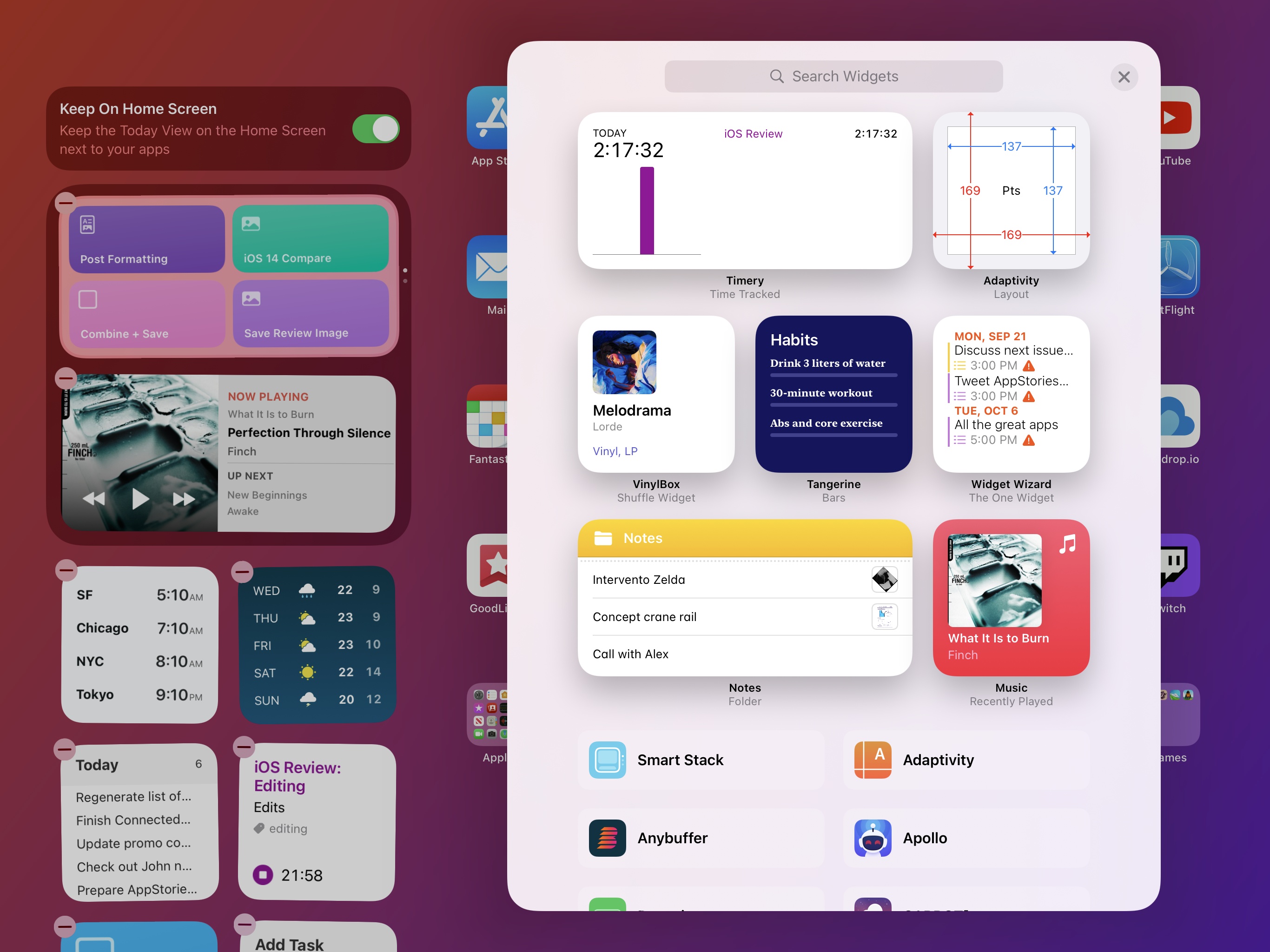
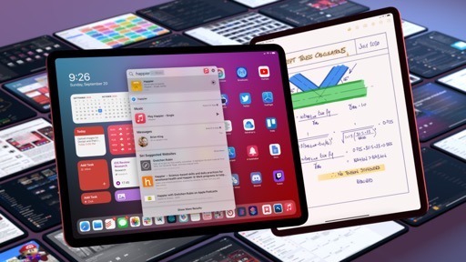
In iPadOS 14, you can install up to four small widgets (or two medium ones, or a single large one) in the pinned area; if pinned mode is enabled, these widgets will always be displayed next to icons on the Home Screen. As with iPadOS 13, you can view other installed widgets by swiping with your finger or trackpad over the Today column.
I use the iPad Pro as my primary computer every day, and I would have loved the ability to place and configure widgets across multiple Home Screens, leaving my most used apps in the dock and everything else in the App Library. Unlike Apple (or at least their public comments), I strongly believe the iPad’s large screen is uniquely positioned to make the most out of a hybrid Home Screen setup where icons and widgets coexist. I hope the company changes its mind on this with iPadOS 15 next year.
A Home for the Future
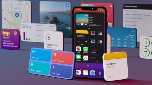
In one fell swoop, the iPhone Home Screen has evolved from an anachronistic app launcher reluctant to change into a fascinating, modern lens through which we can infer where Apple’s software may be headed next.
There are several trends at play in the iOS 14 Home Screen, no one less important or relevant than the other. With the new widgets, Apple is showing us that lessons learned on watchOS, combined with the performance of SwiftUI, can power energy-efficient, glanceable interfaces that work well on an iPhone and iPad today, but which could easily fit other (much smaller) form factors in the future. On-device intelligence plays an important role in the new Home Screen as well: your device can now intelligently rotate widgets during the day and sort apps for you in the App Library; Intents, the same technology behind SiriKit and Shortcuts, has been used as the foundation for widget configuration; with iOS 14, you can ignore the classic Home Screen experience and let the App Library perform intelligent app sorting for you.
In my iOS 10 review from 2016, I noted how we were moving away from the traditional app-centric model, with iOS apps becoming “atomic units” that provided the system with a collection of services. I wrote:
When different features of an app can be experienced throughout the system, the app becomes more of a collection of services, broken into atomic units. They’re pervasive. Providing apps with more extensibility hooks results in moving more interactions away from the traditional app experience and into single-purpose mini interfaces. Whether it’s an interactive notification, a widget, an iMessage app, or a SiriKit extension, iOS 10 has a clear vision of apps as contextual helpers in addition to being standalone utilities. It’s only reasonable to expect Apple to follow this path going forward.
Apple followed such a path with the introduction of parameters in Shortcuts actions last year, and widgets in iOS 14 feel like the logical conclusion of a journey that began with extensions in iOS 8: now you can glance at parts of an app directly from the Home Screen, which is turning into a rich, personalized, intelligent dashboard that goes well beyond app icons.
Regardless of future applications of widgets and intelligent app suggestions, the Home Screen we have today in iOS 14 is – despite a few aforementioned missteps – a success. Apple may be late to the widget party (other companies have done them before, and we’ve all seen the concepts over the years), but the company has the ecosystem, marketplace, and technical foundation to let widgets – and, by reflection, a modernized Home Screen – gain critical mass among millions of users in a way that doesn’t impact battery life or compromise privacy.
The Home Screen is changing, turning into something more personal, versatile, and intelligent than an icon launcher. I’m curious to see if, as a result, our core smartphone habits – actions we’ve performed for over a decade – will change because of it too.