Reminders
Reminders in iOS 14 builds upon the modernized app introduced last year with a series of refinements and smaller additions targeted at improving collaboration, list management, and search. This year’s Reminders update offers little in the realm of power-user options, but the enhancements are welcome nonetheless.
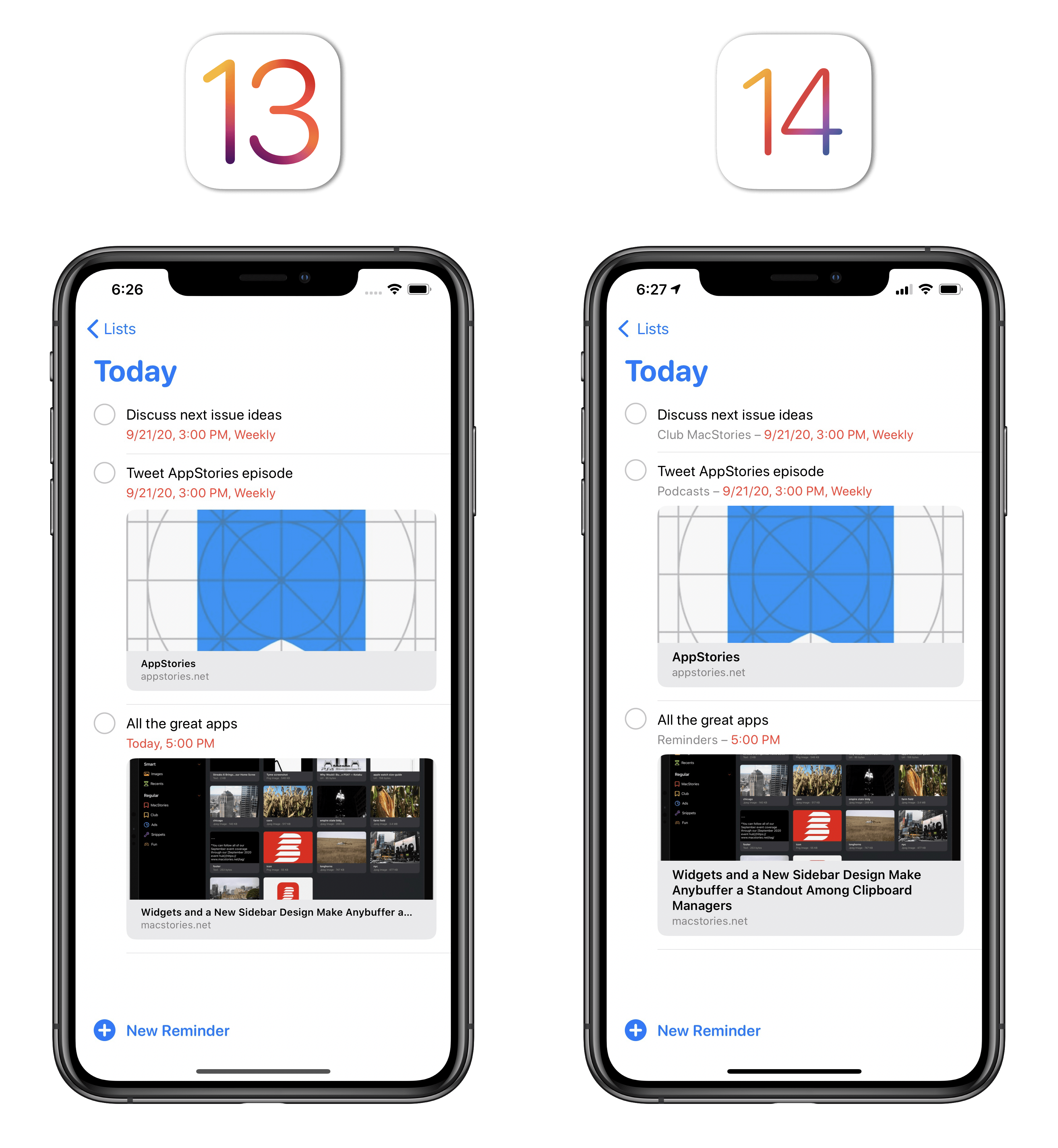
Let’s start with smart lists. In iOS 14, you’ll find a new ‘Assigned to Me’ smart list joining the existing set of Today, Scheduled, All, and Flagged. As the name suggests, this new smart list displays reminders that have been assigned to you in any shared list, which is a new feature of the app this year. With the inclusion of a fifth smart list, you now have the option to rearrange and hide smart lists at the top of the app’s start page: hit ‘Edit’ and you’ll be able to hide smart lists you don’t want to see and rearrange their tiles as well. Alas, you still cannot create your own smart lists based on specific filtering criteria.
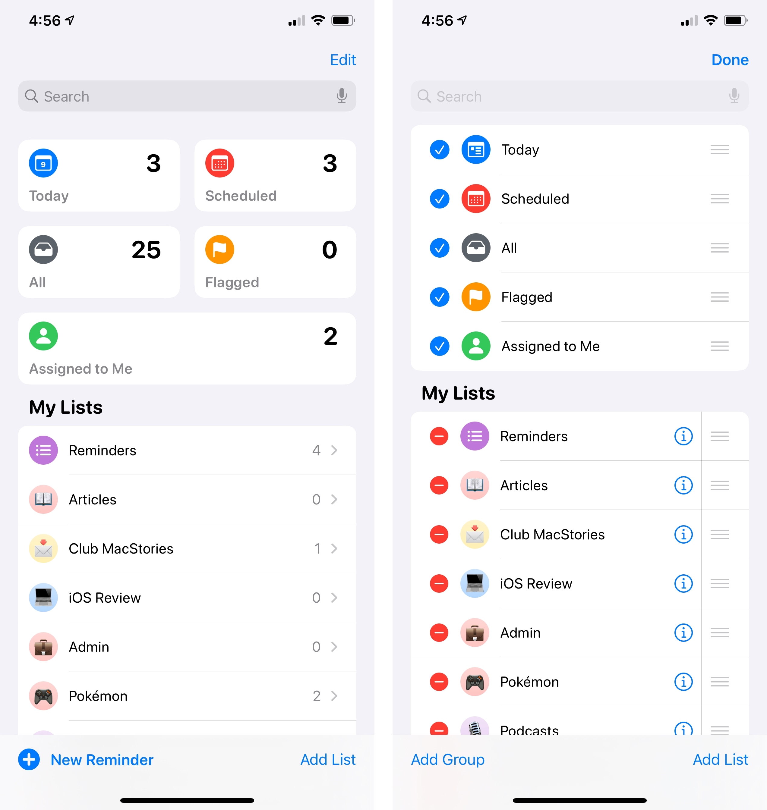
The customization options for regular Reminders lists have grown too. You can now choose from an additional 12 symbols (there are 72 symbols in total); if none of them suit your taste, you can now also use any emoji as a list’s icon. When you pick an emoji, it’ll be displayed on top of the color you set for the selected list. Surprisingly, you’re still limited to 12 color options for lists and you can’t choose any other color with the new iOS 14 color picker. I like the personalization granted by emoji though, and it’s nice to see these cute little characters being used as symbols in contexts other than messaging.
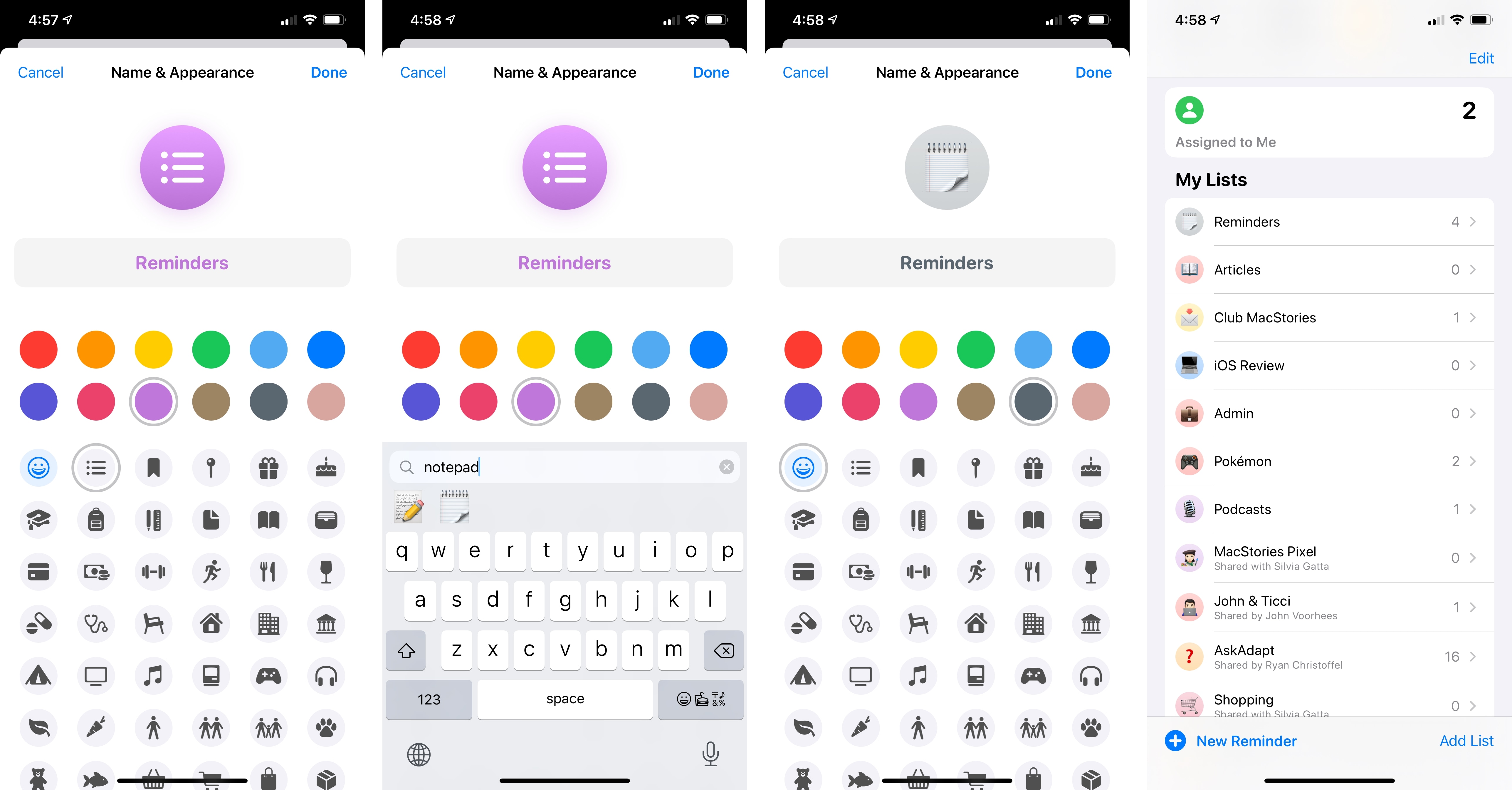
Speaking of the main list view: Apple added a ‘New Reminder’ button to the bottom of the page on iPhone35, which means you don’t have to open a specific list anymore if you want to add a new task. Also, when you’re in smart lists such as Today and Scheduled, Reminders will now show you which list a reminder belongs to in the item’s subtitle; missing this information was among my complaints last year, and it’s good to see it fixed.
As I noted above, Reminders in iOS 14 lets you assign tasks to a person collaborating on a list with you. When you select a reminder in a shared list, you’ll find a new person icon in the extra keyboard row; tap it, and you’ll get an inline picker to choose the person who should be responsible for that reminder. The profile picture of the assignee will also be displayed next to the reminder’s title in the list, and you can tap it to remove the assignment or reassign it to someone else. The ability to specifically assign reminders was long overdue, and this addition makes it possible to use Reminders as a lightweight task manager in a shared environment. It’s especially timely considering the resurgence of remote work this year.
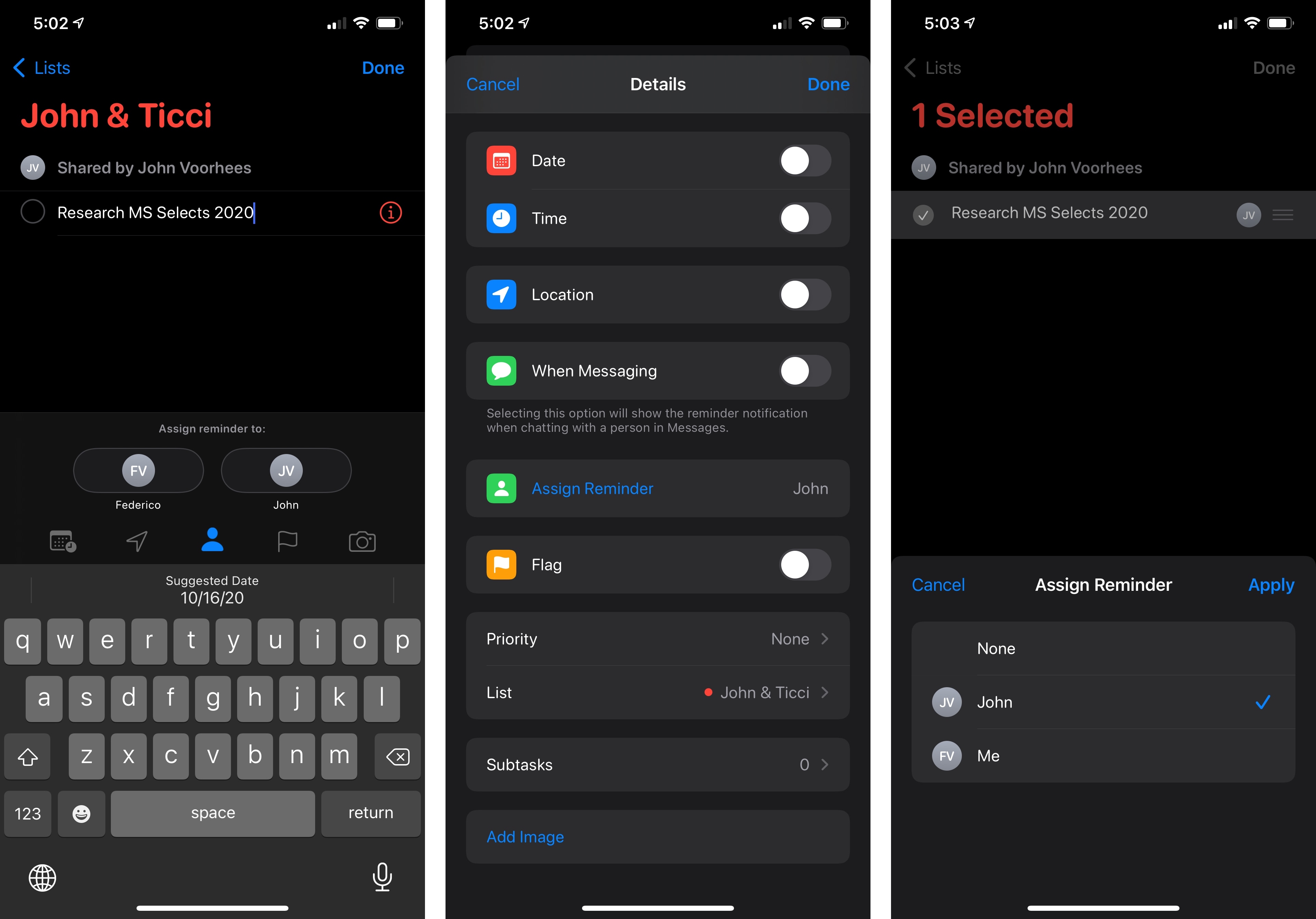
But what if you end up with an eager collaborator who’s really into assigning reminders to you? Fear not – you can mute notifications for assigned tasks in Settings ⇾ Reminders. No more worrying about your spouse clicking that Assign button like there’s no tomorrow.
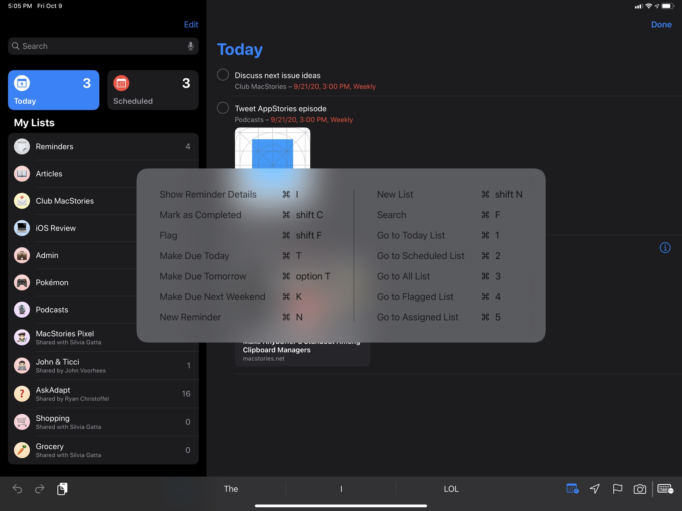
The other updates to Reminders in iOS 14 are pretty diverse from each other, so I’m going to share a miscellaneous grab bag of everything else. There is an expanded selection of keyboard shortcuts on iPad for both lists and selected items, bringing the iPad app close to the Mac experience for managing reminders without touching the screen:
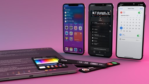
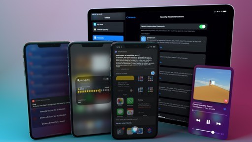
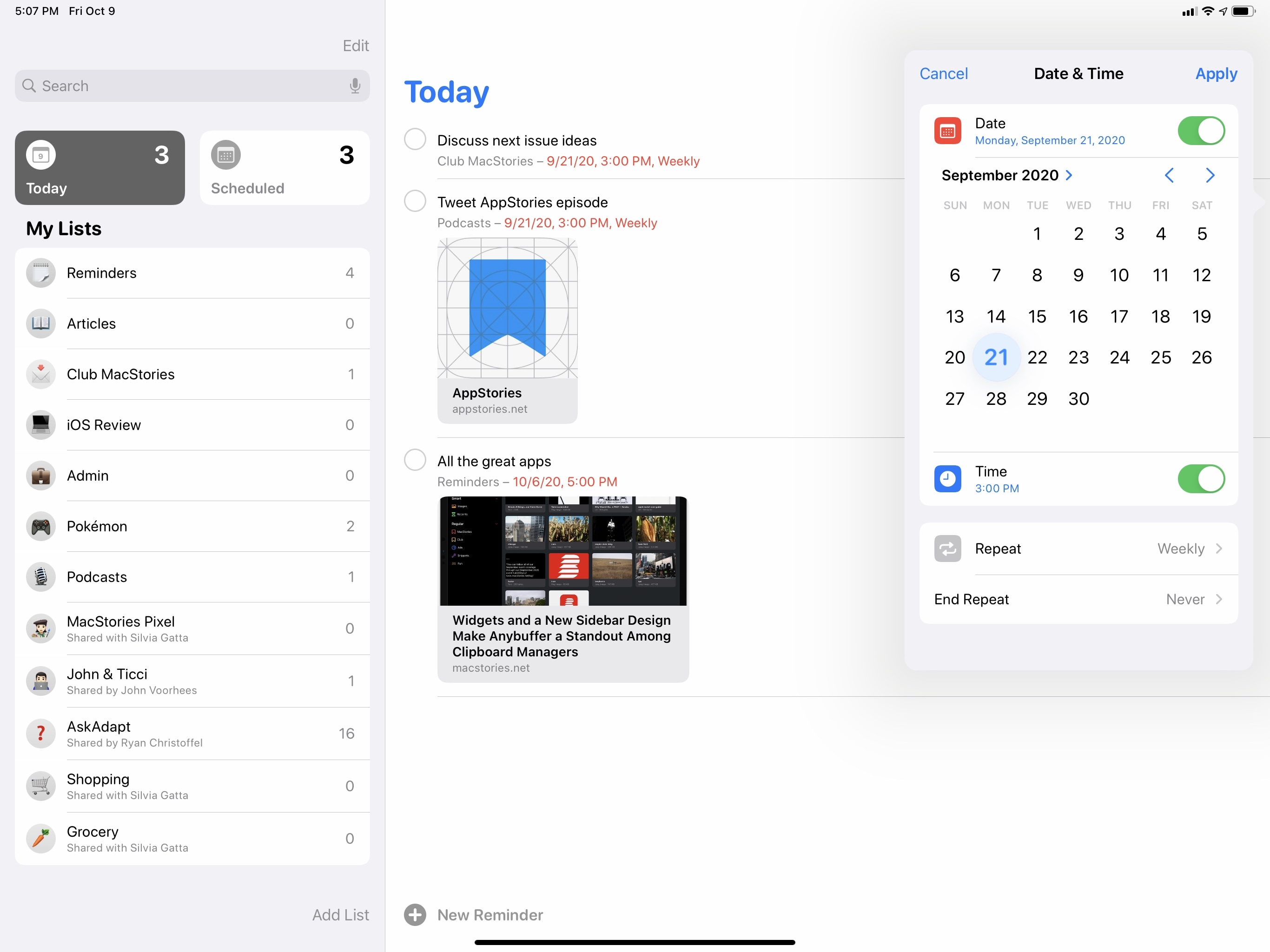
As previously noted in the Design chapter, Reminders now uses the new system-wide date picker for assigning dates and times to a task, which I find handy for quickly rescheduling tasks to a later date:
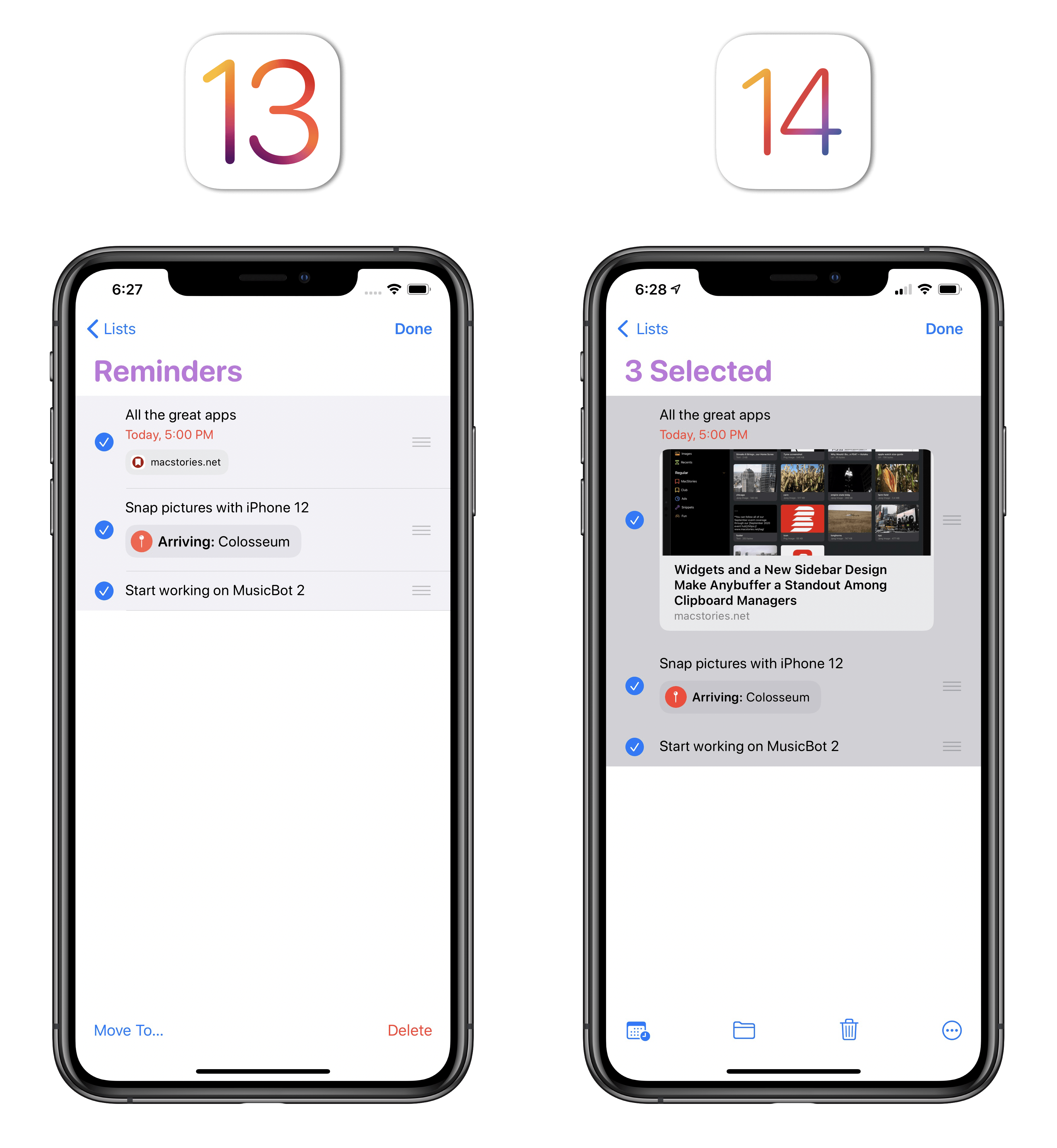
There are new batch actions when multiple reminders are selected at once. Previously, you could only move or delete reminders; in iOS 14, you can also batch reschedule, flag, complete, and assign them with a single action:
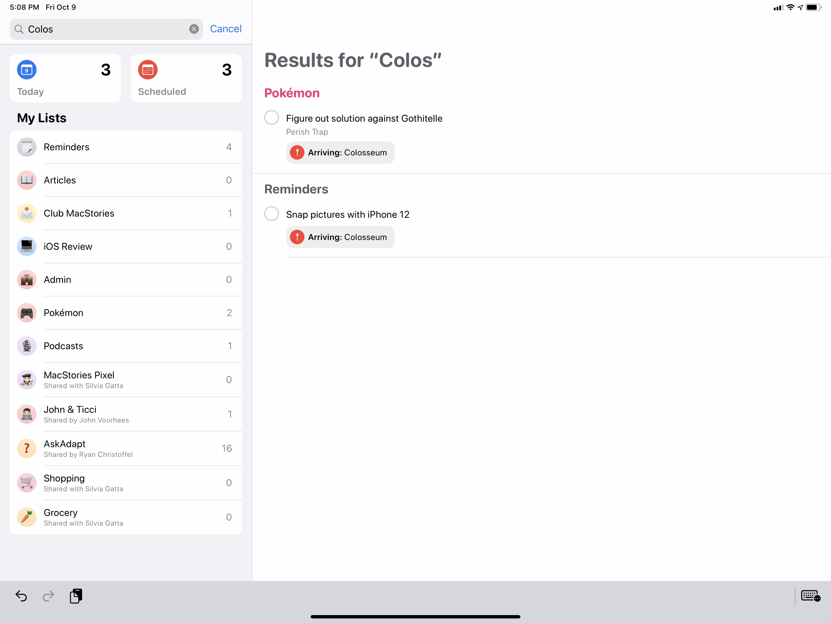
Search has been made more flexible: now in addition to matching reminders by title, search will also find matches in their note, location, and assignee fields:
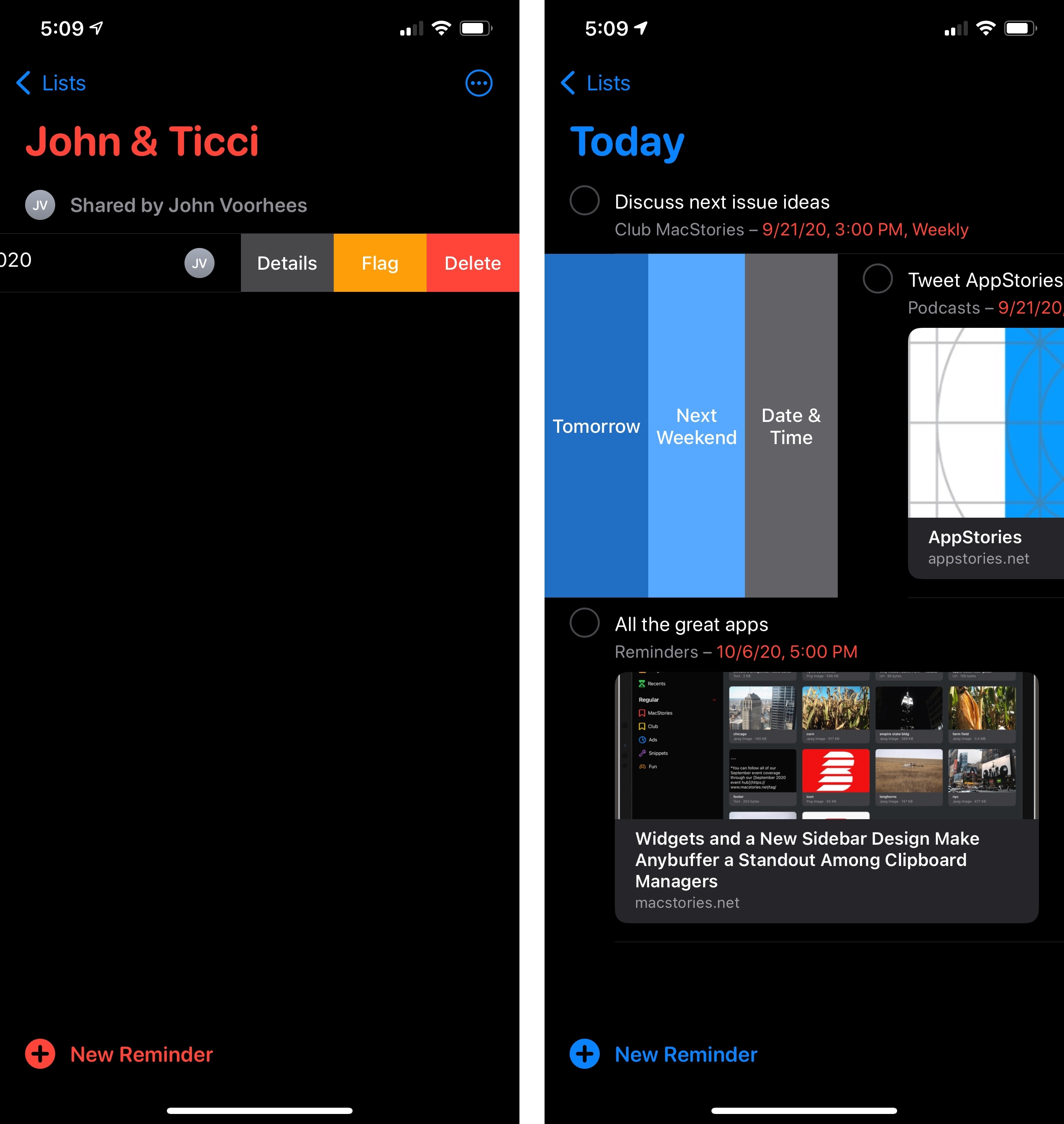
There are some new options when swiping across reminders: if you’re in a regular list, swiping left on a task will reveal a new ‘Details’ button to open the inspector; in the Today smart list, you can swipe right to find a new ‘Date & Time’ button that instantly brings up the date picker to reschedule the selected item:
If you’re one of those iPad users who never wants to put the Apple Pencil down, you’ll be happy to know Reminders is one of the few Apple apps with a custom Scribble implementation in iPadOS 14. You can write down anywhere on an empty space in a list and Scribble will convert your handwriting into a new reminder:

Lastly, Reminders has gained some additional intelligence this year. When you’re entering or editing an item, Reminders will try to suggest lists, locations, and due dates based on signals and patterns previously captured on-device. Additionally, you may come across Reminders suggestions in Mail when reading a message that the system thinks should be turned into a reminder; however, I’ve yet to see this option be offered in Mail myself.
And that’s it for Reminders in iOS and iPadOS 14. While this collection of tweaks and new options is well executed, I hope Apple won’t take its foot off the gas here and instead will continue to grow Reminders’ scope over the next few years. More customizable widgets, true smart lists, and integration with Files should be possible; I hope we’ll see more updates on this front in iOS 15.
Notes
The most important updates to Apple’s note-taking app revolved around new Apple Pencil features this year, which I already covered in the iPadOS chapter. 2020 has been a Pencil year for Notes, and Apple’s engineering efforts primarily went into ensuring an even smoother, smarter drawing and sketching experience.
But what about Notes’ myriad other features? For those, the Notes team has followed the Reminders approach: there are miscellaneous improvements and additions in this release, which speed up common interactions with the app and make managing or formatting your notes easier.
First, allow me to mention the one change everyone will likely notice right away: the paper texture is gone from Notes, which now comes with neutral light and dark backgrounds. It was fun for a while, but I’m not going to miss the look of fake paper in my digital note-taking app.
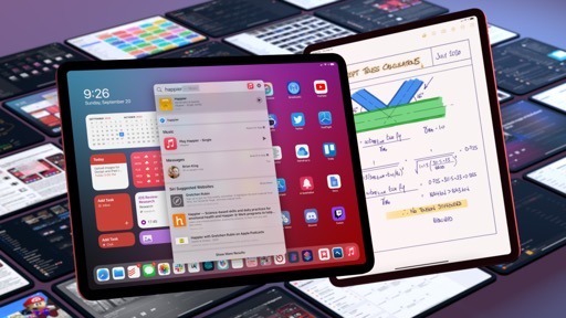
Also quite obvious at first sight is Notes’ embrace of the iPad’s native sidebar and multicolumn mode this year, along with deeper integration with the system pointer. Notes was one of the first apps to support a proprietary multicolumn mode back in the day, but Apple took iPadOS 14 as an opportunity to ensure Notes would behave consistently with other apps receiving iPad updates this year. For this reason, the old sidebar has been replaced with the standard iPadOS 14 one, which carries default behaviors such as the ability to collapse sections (in this case, folders), swipe on items to reveal quick actions, and even long-press them for more options.
Notes, like Mail in iPadOS 14 uses a new rounded selection style for selected items in the middle column, which I find a pleasing visual effect on iPad. Speaking of this column, the ‘Pinned’ section can also be collapsed now, so if you’re anything like me and keep a long list of pinned notes36, you’ll be relieved that you don’t need to keep pinned notes onscreen at all times.
In browsing around Notes for iOS and iPadOS 14, you’ll also notice that the action menu for folders and individual notes has been redesigned with an emphasis on key actions like locking or pinning a note, scanning a document, sharing a folder, or sorting notes. There are two different kinds of updated action menus in Notes: when viewing an individual note, the new action menu replaces the share sheet and is based on a custom layout with large buttons at the top and Notes-specific actions underneath. If you want to show the regular share sheet with other app extensions, you need to select the new ‘Send a Copy’ option.
The Notes app in iOS 14 no longer defaults to showing the share sheet when tapping the ‘More’ button.
When viewing a folder, the action menu replaces the previous action sheet and contains the same options as iOS 13, plus new entries for sorting and folder creation.
I’d normally be against custom implementations of share sheets, but because Apple is only adding an extra step to open the standard share sheet, I think this is fine. Notes has grown into a full-featured, powerful solution for solo and collaborative note-taking over the years, and it could be tricky to find app-specific functions such as locking or in-document search in a share sheet polluted with contact suggestions and other app extensions. I’m not sure what this says about the current share sheet design, but I’m glad Apple has grouped common actions under a new menu.
The next change is available in the iPhone version of Notes only: you can now apply styles to text more quickly by long-pressing the ‘Format’ button (the ‘Aa’ one) to bring up a quick format menu. If you wanted to format your text differently in iOS 13, you had to press the Aa button, then interact with a menu that covered the keyboard at the bottom of the screen to apply styles, such as adding subheadings, turning some text into body text, or entering lists. In iOS 14, all you need to do is select the text you want to modify, long-press the Format button and, while you’re still holding down with your finger, swipe to the option you need and let go to apply it.
The quick Format menu doesn’t have all the options of the regular one (it’s missing indentation, bold, italics, strikethrough, and underline), but it makes formatting a document with headings and lists so easy, it’s a trade-off I can accept.
Notes’ last two changes in iOS 14 are pretty minor, or at the very least hard to evaluate unequivocally. According to Apple, the system scanner built into Notes has been improved this year with superior edge detection and image quality; I haven’t been able to test this functionality in practice since I haven’t scanned anything in several months.
Finally, as also seen in other apps, Notes’ search feature offers Top Hits in search results now, so you should be able to find your notes more quickly. In my tests, searching across ~200 notes was indeed faster than before, with Top Hits containing the note I was looking for most of the time; however, I prefer to navigate Notes by folder or access my most used notes via pins and widgets, so I don’t think I’ll be taking advantage of faster search and Top Hits much.
Home
Updates to the Home app this year involve three main areas of interest: design, automations, and HomeKit Secure Video. A fourth addition, named Adaptive Lighting, was also announced by Apple at WWDC, but it will require firmware updates by third-party light manufacturers that I haven’t been able to test yet.
The underlying structure and layout of the Home app aren’t drastically changing in iOS and iPadOS 14: accessories will still be displayed as tiles and organized in rooms as before. However, there are a couple notable differences in Home for iPad and iPhone this year. On iPad, unsurprisingly, Apple adopted a sidebar layout for Home: the main Home page, automations, and your rooms can now be accessed from a sidebar rather than tab bars, which speeds up navigation and takes better advantage of the tablet’s form factor. As we’ve already discussed with other system apps receiving sidebars this year, the departure from an iPhone-based layout is welcome, and I appreciate how much more quickly I can switch between rooms.
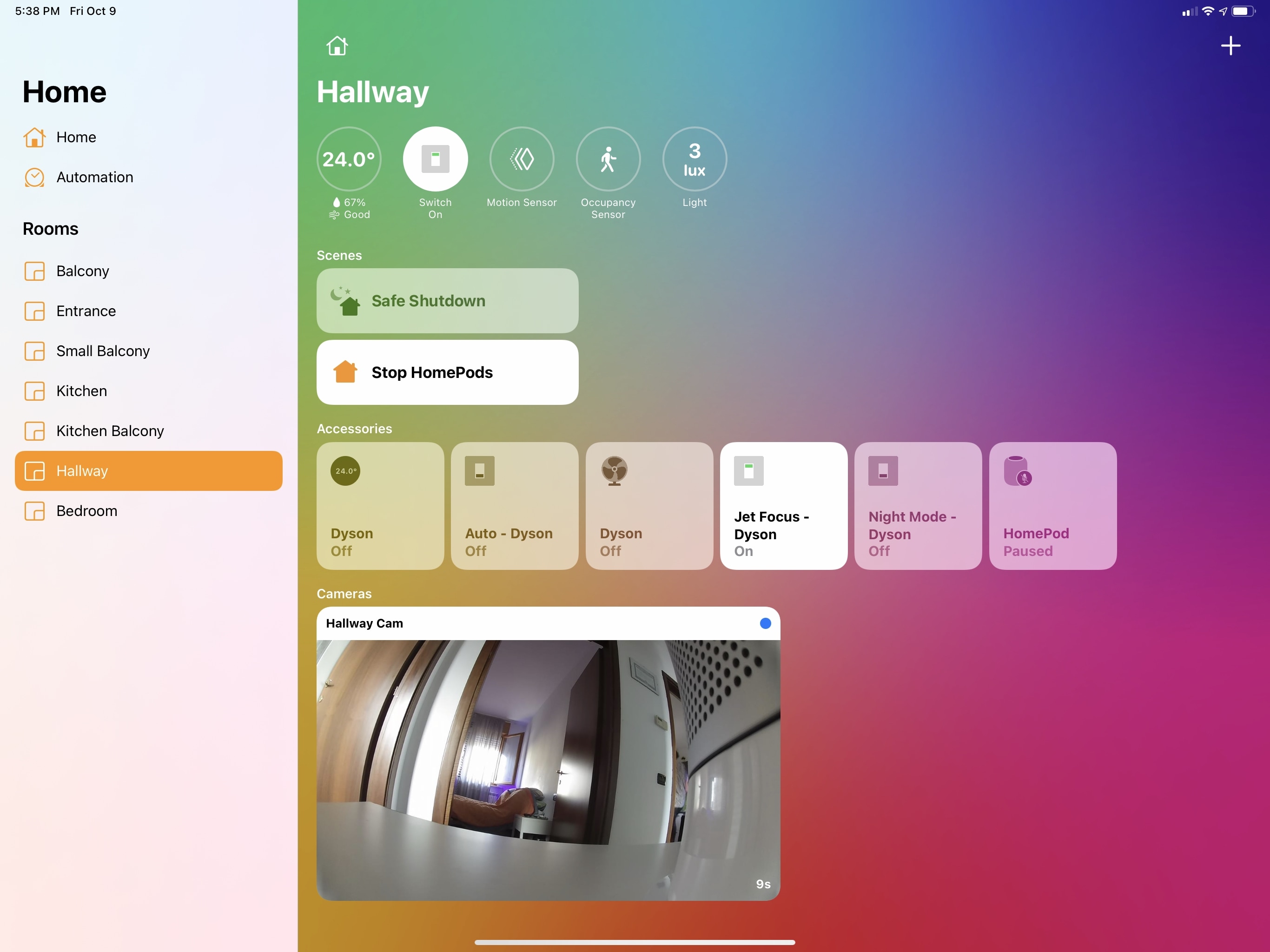
The other UI update in Home this year is available on both iPhone and iPad, and it’s the inclusion of new indicators for sensor data and important status updates at the top of every page in the app. Both in the main ‘Home’ dashboard and in individual rooms, you’ll now see a series of circular indicators for messages such as the current temperature inside your house, how many lights are on, what outlets are switched on, which accessories require software updates or aren’t responding, whether the front door is locked or not, and more.
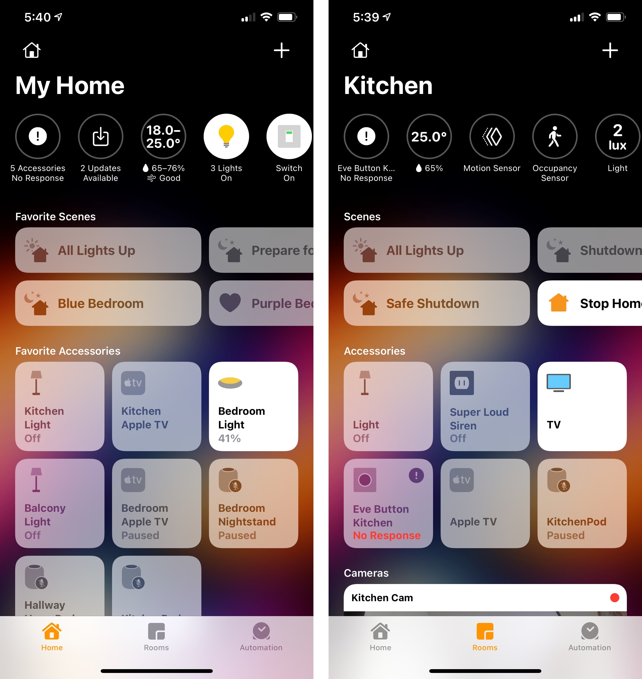
Apple’s goal with these new indicators is to provide you with a glanceable summary of the state of your home and connected accessories, and I think the company did a good job. In the main Home tab, you’ll see updates such as the total number of lights that are turned on and the overall temperature and air quality; in individual rooms, you’ll instead see more specific indicators such as the state of a particular light or sensor located in that room. Home’s new indicators aren’t just glanceable though – you can interact with them to perform actions in one tap, but the behavior changes on a per-indicator basis. If you tap a temperature-related indicator, for instance, a ‘Climate’ page will pop up with an overview of all the temperature sensors in your home or in the selected room; tap a light-based indicator, however, and you’ll be able to, say, turn off all the lights at once. Generally speaking, tapping an indicator at the top of a specific room will open the configuration screen for the selected accessories instead.
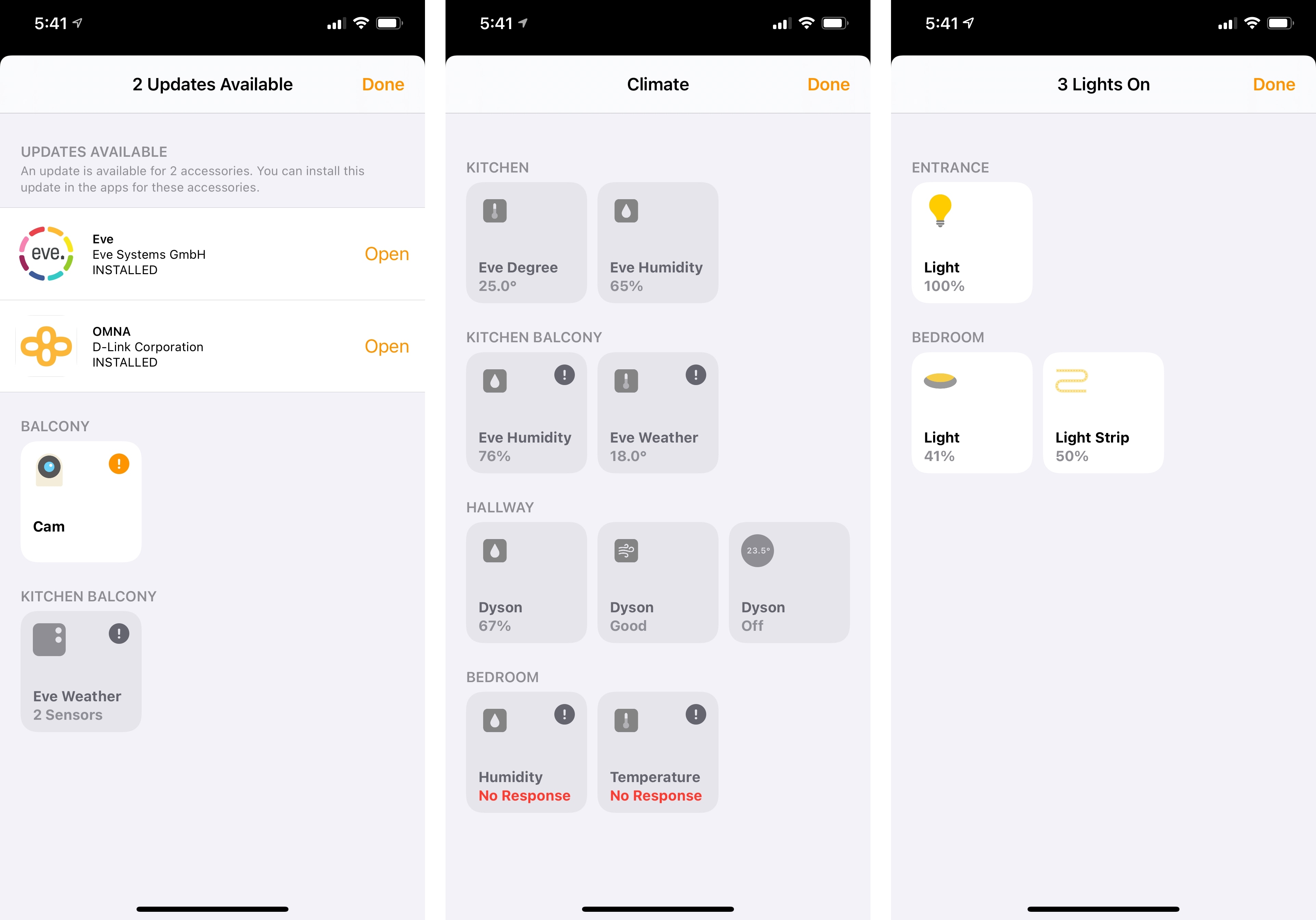
I’ve been pretty critical of Home’s clunky and unintuitive design over the years, but I think these indicators are some of Apple’s best work in the Home app yet. The indicators make good use of rich iconography and colors, they’re glanceable, and they’re effective time-saving shortcuts to control your home with fewer taps. If anything, I’m surprised that these indicators weren’t used as the foundation for new Home widgets or complications on watchOS, which are perplexingly absent from both OS releases this year. I’d love to have the information provided by these indicators available to me on the Home Screen and my watch face next year; in the meantime, I have a feeling third-party developers will step in with their own solutions.
In addition to seeing and controlling accessories, Apple is also making automations more accessible and easier to configure this year. The company must have realized that there can be a steep learning curve to creating automations from scratch for most users, and they’re tackling this issue on two separate fronts: when you add a new accessory in iOS 14, the onboarding process will recommend basic automations for that accessory to set up right away; and automations will also be suggested in an accessory’s configuration page, which you can enable by flipping a switch.
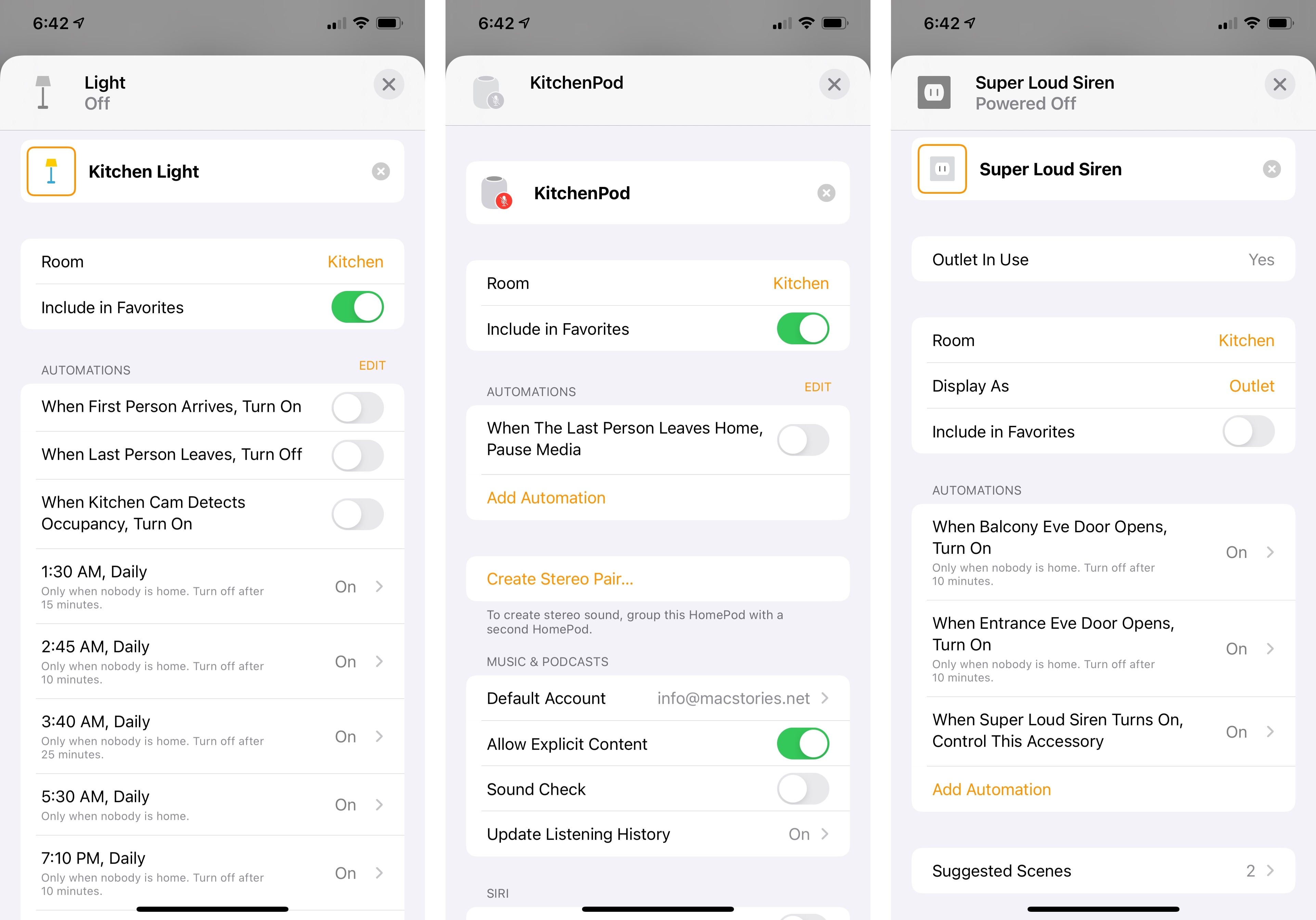
I’m always in favor of opening up automation to people who may find the concept of triggers and actions intimidating, so I’m a fan of Apple’s approach here. Recommending automations during the setup flow (which has also been redesigned with a card-like appearance in iOS 14) is a great way to ease people into the idea of accessories performing certain actions automatically based on specific conditions, and it’s the kind of feature I wish developers could integrate in their apps for actions and Shortcuts too.
In my experience, suggested automations in accessories’ detail screens were also spot-on: one of my Hue lights in the kitchen, for example, offered a suggested automation that would turn on the light when motion was detected by the kitchen camera. So not only has Apple put together a system that recommends accessory-specific automations, but they’ve also made it intelligent enough so it’s aware of nearby accessories that could serve as triggers. Suggested automations can be enabled with one tap and you can also edit them if you want to tweak the defaults provided by Apple; furthermore, all existing automations that involve the selected accessory are now listed in its detail page, so you can easily see all the automations an accessory is already participating in.
HomeKit Secure Video, announced last year and rolled out to a handful of third-party cameras over the past few months, is getting two major new features in iOS 14: face recognition and activity zones.
With face recognition, compatible cameras will recognize familiar faces in your household and display the names of individuals in notifications and recorded clips stored in iCloud. According to Apple, face analysis only occurs on your local network via your home hub(s), and its results are synced across devices using end-to-end encryption without ever reaching Apple’s servers. You can enable face recognition in a camera’s configuration screen; once it’s turned on, you’ll have the option to enable integration with people already recognized in your Photos library, which means “portions” of photos in the People album and their names will be synced (also via end-to-end encryption) with the home hub to help in identifying faces found in camera footage.
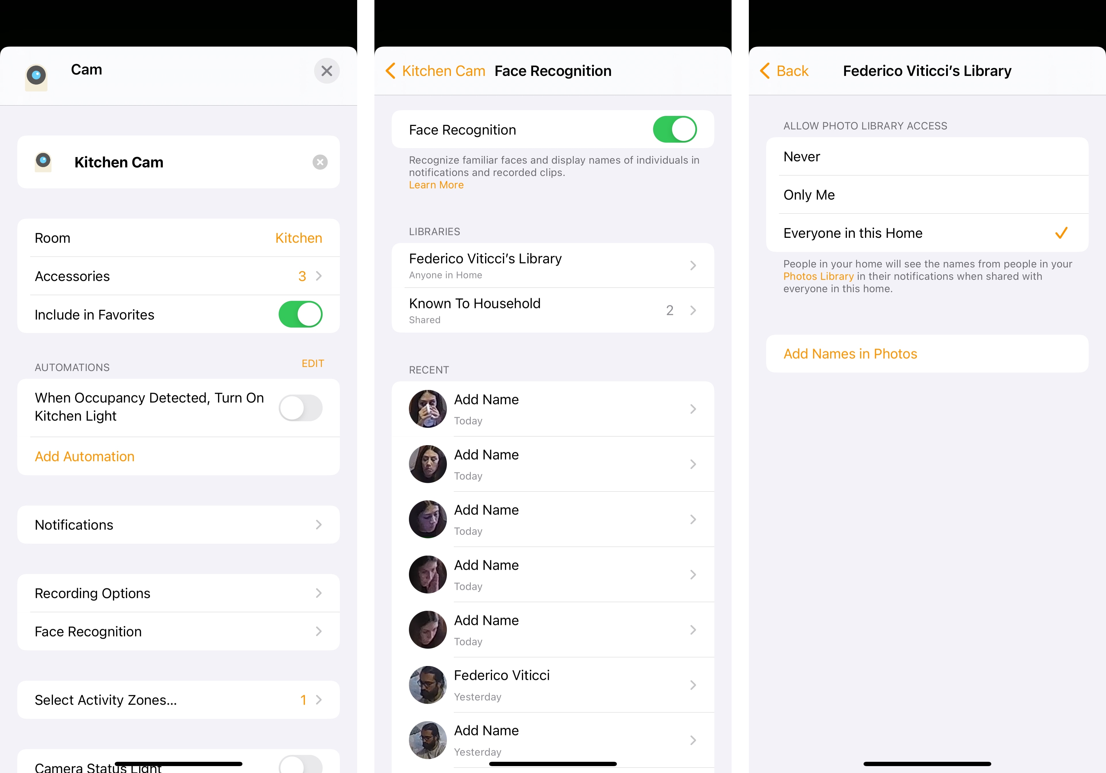
In theory, this sounds like a terrific addition to HomeKit Secure Video: if you’ve set up your cameras to send you motion detection alerts, you should now see from the notification itself that it was a person “known to your household”, as the Home app labels this option; similarly, you should see the names of recognized people in recorded clips saved by HomeKit Secure Video. But here’s my issue in practice: I configured face recognition for all my cameras months ago, and I enabled the Photos library integration for everyone in my household, but in spite of my attentive efforts, the Face Recognition section of each camera in the Home app is filled with hundreds (literally) of untagged face entries for my girlfriend and me.
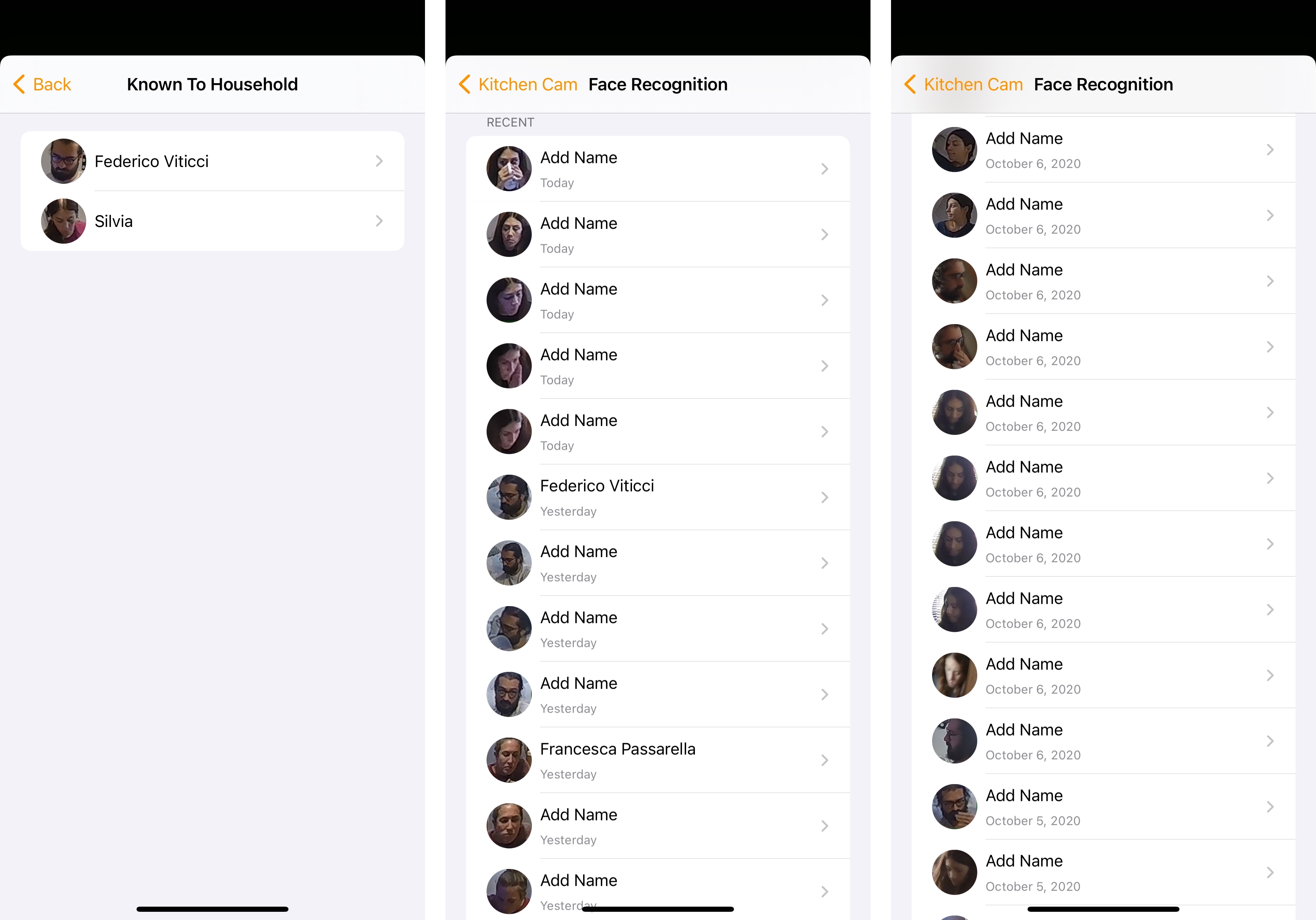
We’re both saved as “known to household” faces in Home, and yet there are hundreds more of us just hanging there, waiting to be “tagged”. I either don’t understand how this feature is supposed to work, or something has gone horribly wrong on my home hubs, or iOS 14’s face recognition isn’t ready yet. My assumption is that this long list of faces is supposed to be a log of recently recognized people, but then again – how is it possible that the system isn’t automatically recognizing the two of us?
For this reason, and because we’ve been trying to take it easy with inviting friends over for dinner now that COVID-19 cases are rising again here in Italy, I haven’t gotten much value out of face recognition yet. I should also note, though, that we’re probably not the ideal household for face recognition: we don’t have kids, and we don’t have any HomeKit video doorbells (which are also getting face recognition support this year as well as integration with HomePod, which will be able to announce who’s at the door), and we don’t leave the house much these days. But from what I’ve seen so far, I’m not impressed with Home’s integration with Photos and face analysis on my local network; hopefully this is going to be improved soon.
Speaking of HomeKit Secure Video: compatible cameras are also receiving support for activity zones this year (as with face recognition, this is included with iOS 14 and your camera will not require a firmware update). With this feature, you can create a zone in the camera’s field of view where activity will be detected; all you need to do is tap anywhere on the camera view to add a series of dots until you create a closed shape that will be your selected activity zone. You can then either choose to detect activity inside or outside the drawn zone.
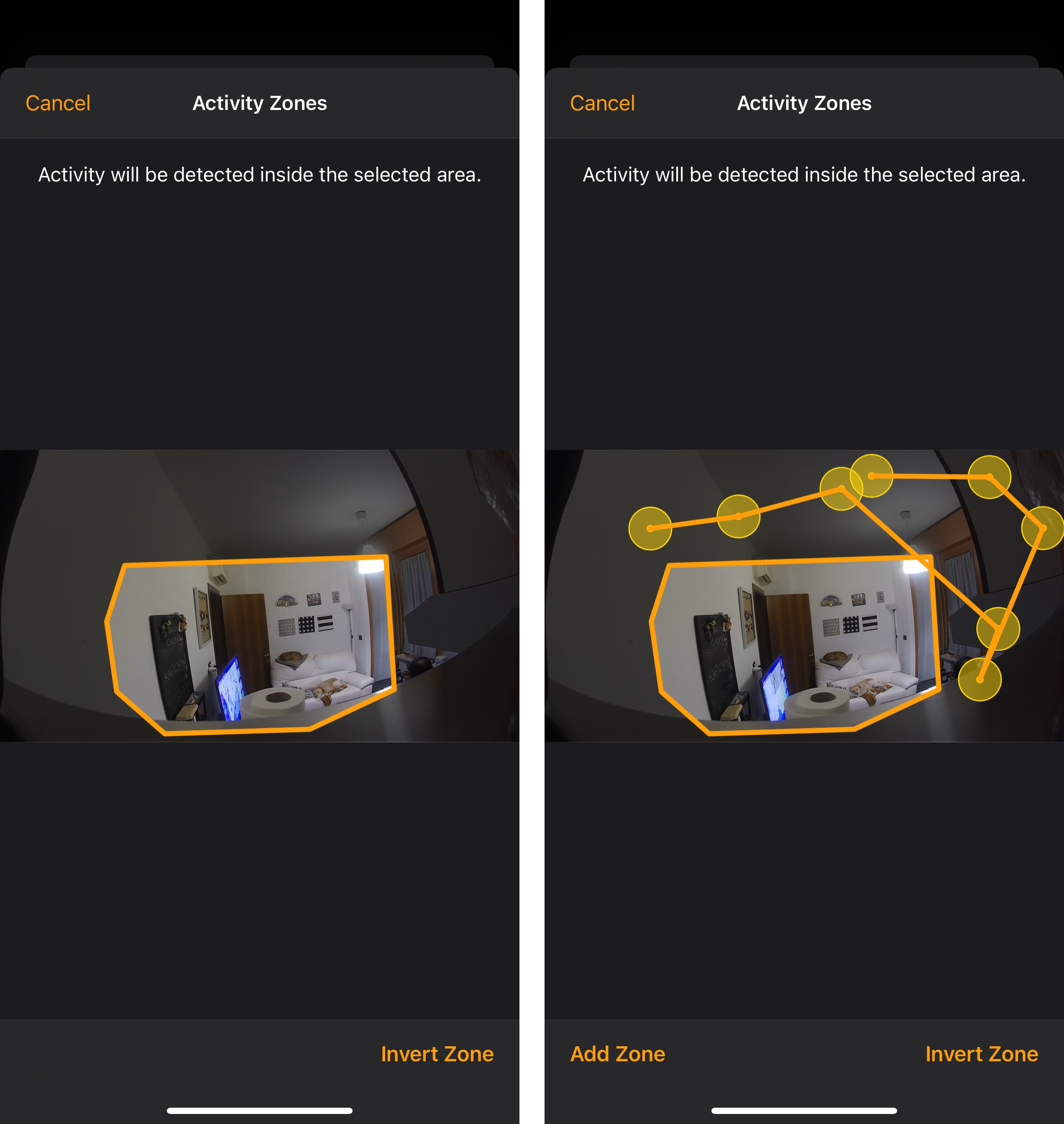
Activity zones, a common functionality of third-party camera systems, are useful for those times when activity that doesn’t relate to your household is picked up by the camera, potentially interfering with motion alerts. For instance, you may have a camera by your front door that also captures a portion of the street outside, and you probably want to exclude that portion of the field of view since you’re not interested in cars or people passing by unless they get really close to your door. You get the idea. Activity zones grant you finer control over what cameras take into consideration when monitoring activity, and I’m glad Apple added this to HomeKit Secure Video this year.
Last, there’s Adaptive Lighting. According to Apple, once enabled this mode will automatically adjust the colors and intensity of compatible lights during the day until you go to sleep to maximize productivity and eventually help you relax. Here’s how Apple describes it:
You can ease into morning with warmer colors, stay focused and alert midday with cooler colors, and wind down at night by removing blue light.
This sounds pretty nice to me, but I’m also the kind of person who disabled Night Shift because I don’t like a computer deciding the color and brightness of its display on my behalf. Perhaps my excitement over this feature is misplaced, knowing my habits. In any case, Hue appears to have confirmed they’ll be supporting Adaptive Lighting later this year, and I plan to at least try it out for a few days.