Pull-Down Menus
In its quest to rid iOS and iPadOS of modality and embrace compact UI, Apple turned to an interface element introduced last year – context menus – and used it as the foundation for another system change in iOS 14: pull-down menus.
The easiest way to understand what pull-down menus are is the following: they’re menus that (roughly) use the same physics and appearance of context menus and have been implemented throughout iOS and iPadOS to replace all sorts of action sheets. Pull-down menus may look and behave similarly to context menus, but they don’t require a long-press to be activated; they’re typically found in toolbars and navigation bars in iOS and iPadOS 14, and they can be displayed with a single tap.
With pull-down menus, Apple leveraged the design and interactions of context menus to rethink menus that used to occupy too much onscreen space. Pull-down menus are generally more compact; they allow developers to use SF Symbols, destructive actions, and nested menus; and they open near the UI element that invoked them, creating an instant visual relationship between item and related actions. It’s not just that they’re smaller though: pull-down menus don’t block onscreen interactions either; scroll outside of a pull-down menu in iOS or iPadOS 14 and it’ll be dismissed right away, without having to select anything in it. And just like context menus, you can swipe with your thumb over multiple options in a pull-down menu, select the one you want, and lift your finger to perform the associated action.
When I say that Apple used pull-down menus throughout the entire system, I mean it. Both iOS and iPadOS 14 have adopted pull-down menus profusely, replacing old action sheets with compact pull-down menus that feel great to use both with touch and the pointer.
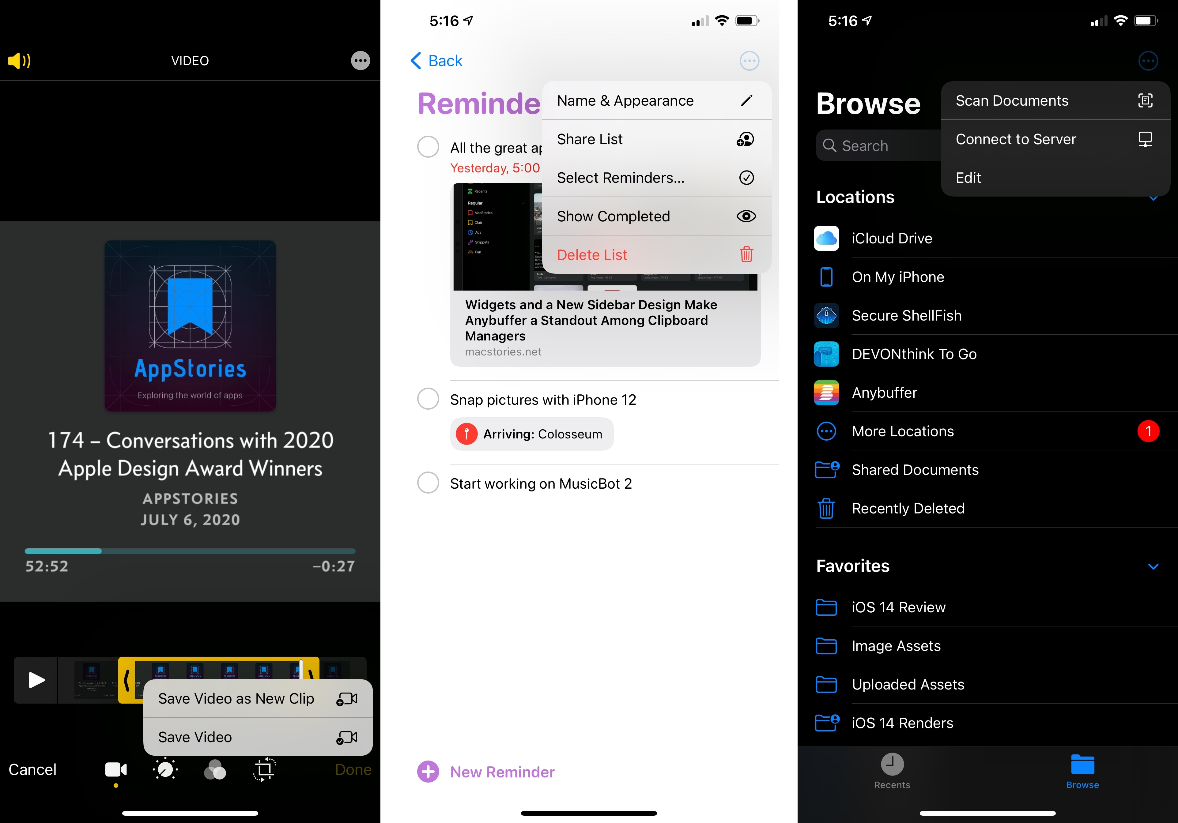
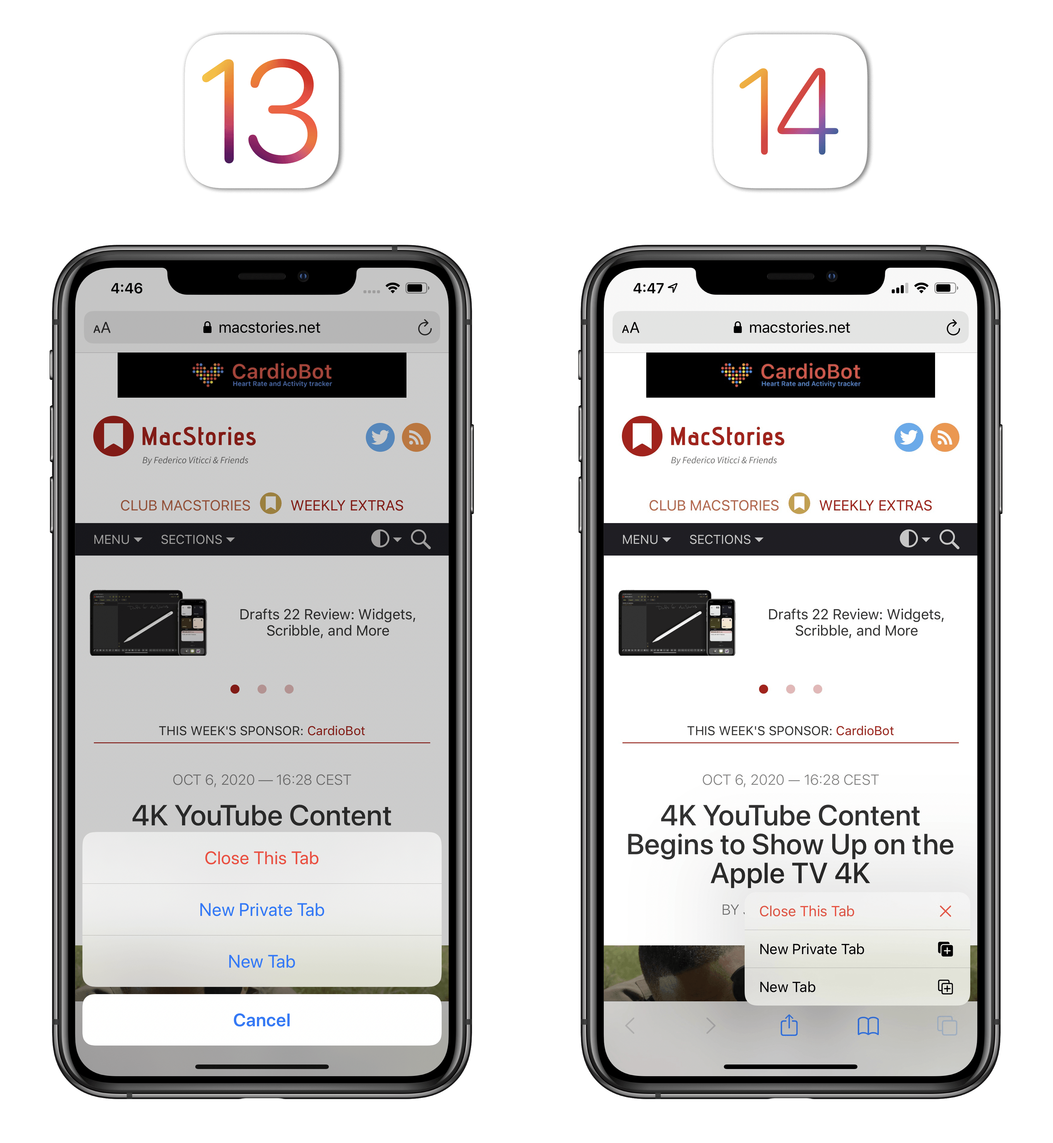
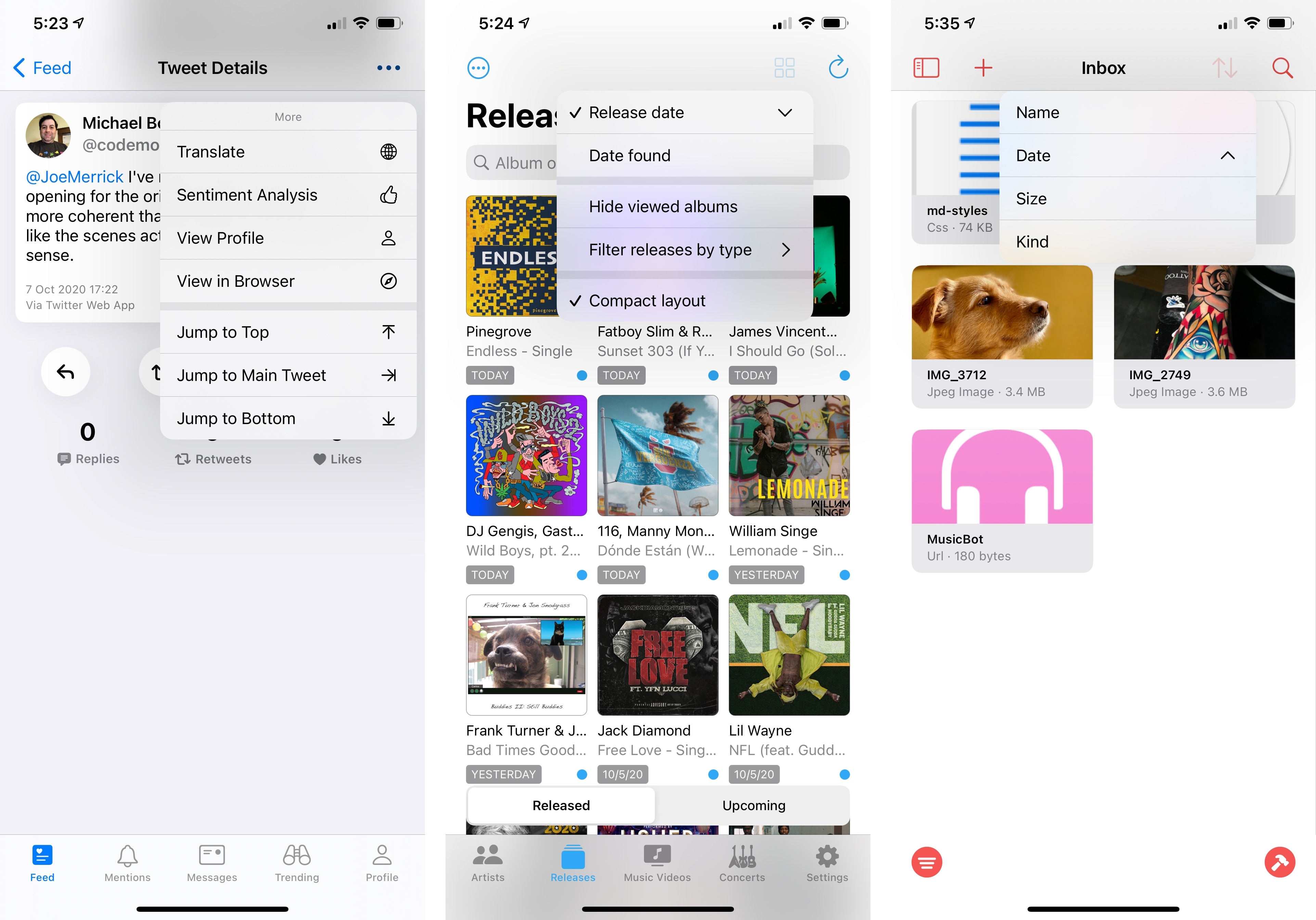
In Safari, pull-down menus have replaced action sheets when long-pressing toolbar buttons or uploading files to a website:
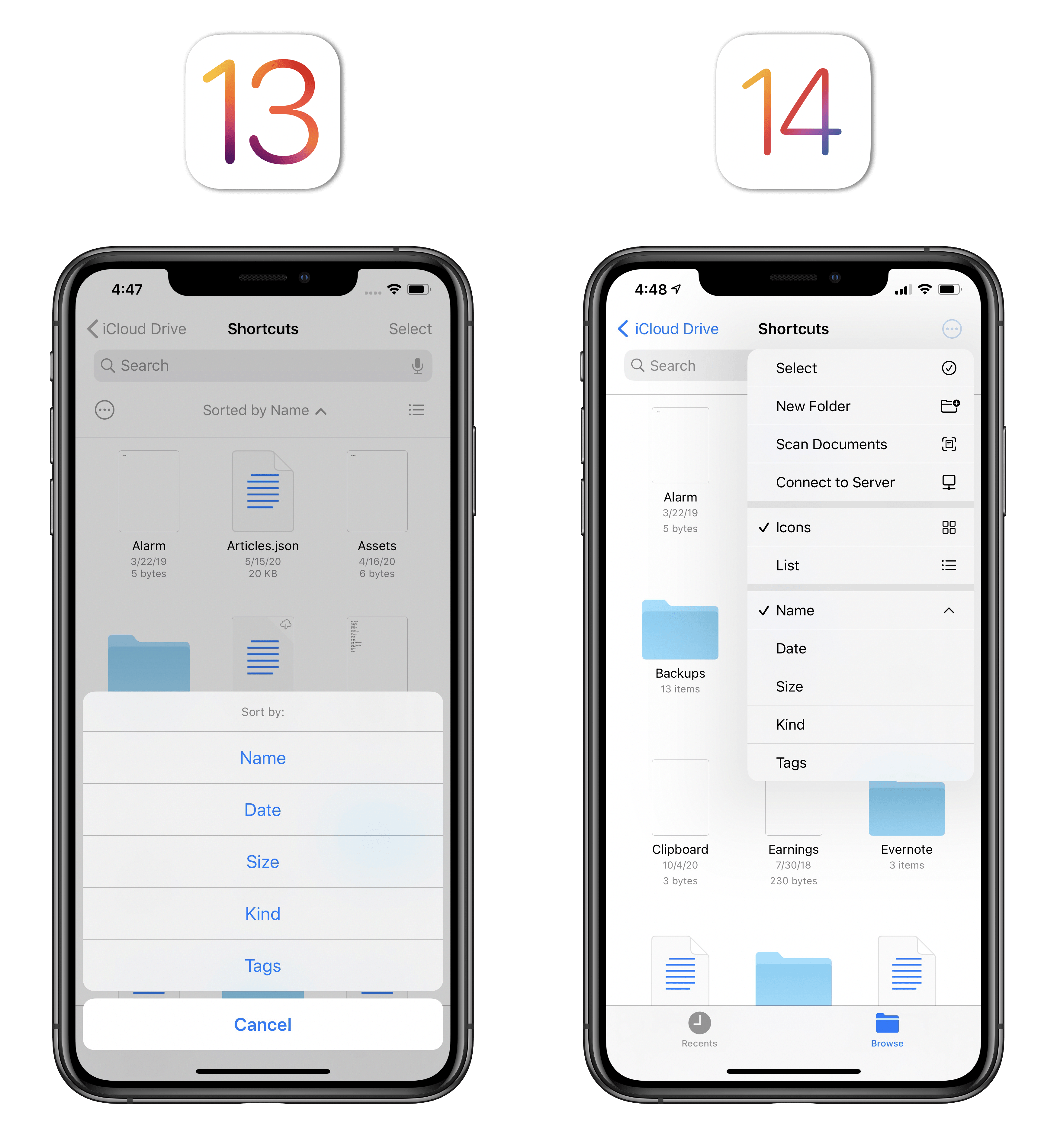
In the Files app, view and sorting options are now clearly exposed via a pull-down menu from the top toolbar:
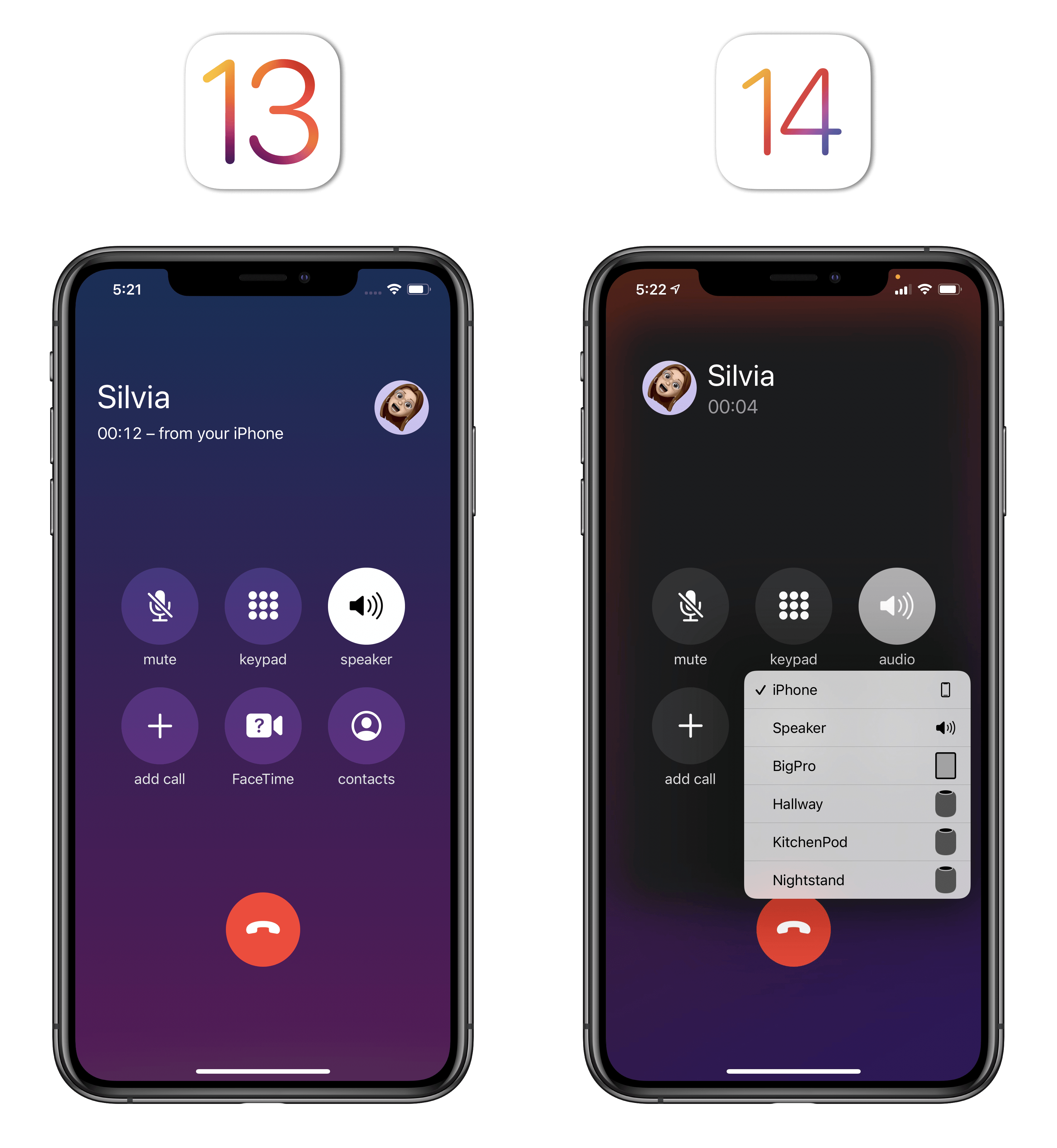
Want to put a phone call on speaker or connect to a HomePod from the iPhone’s call UI? Pull-down menus can also be found there:
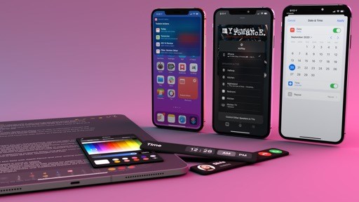
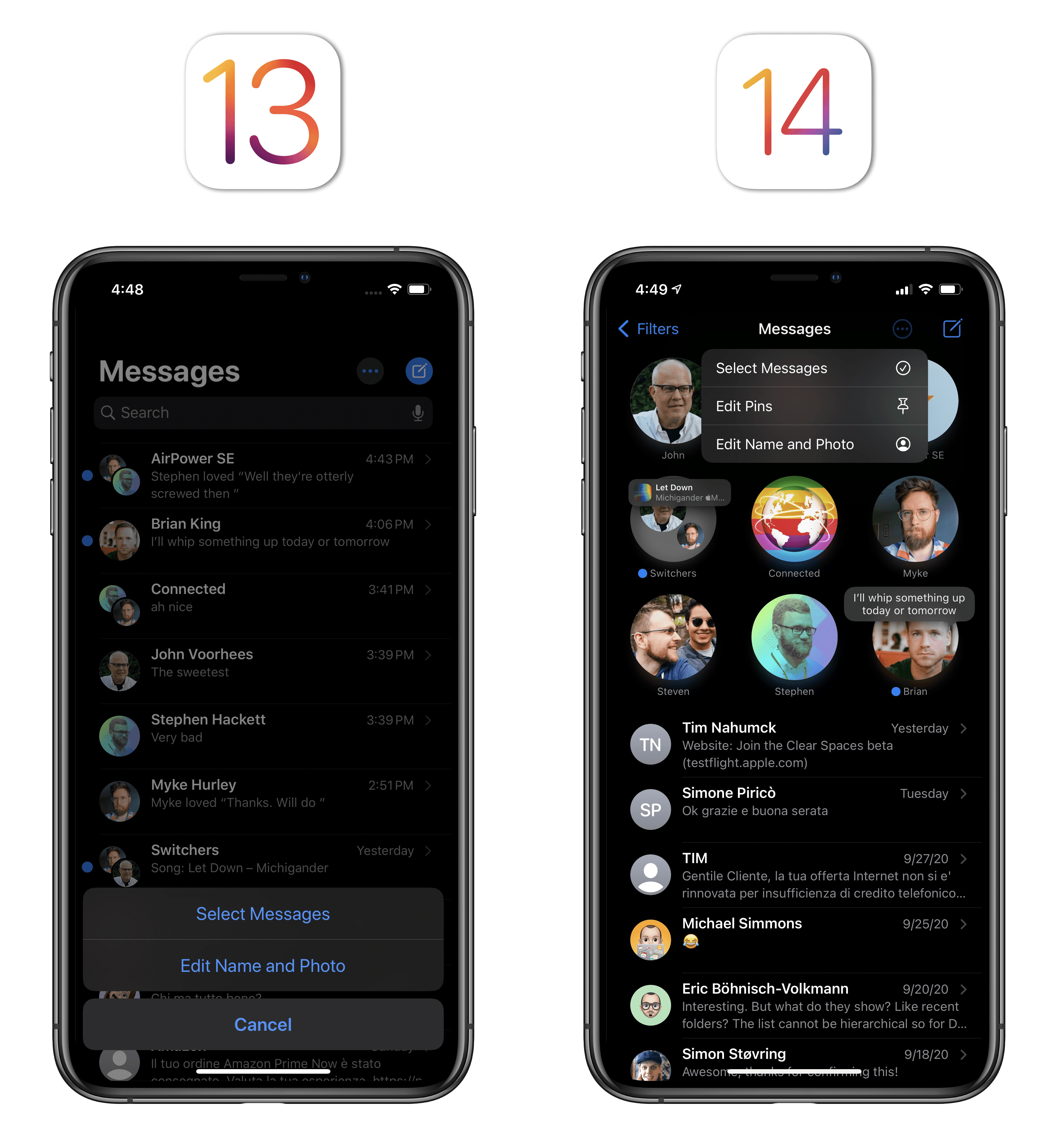
In the updated Messages app, a pull-down menu is used in the main conversation list to select messages, edit pinned conversations, and set a different name or photo:
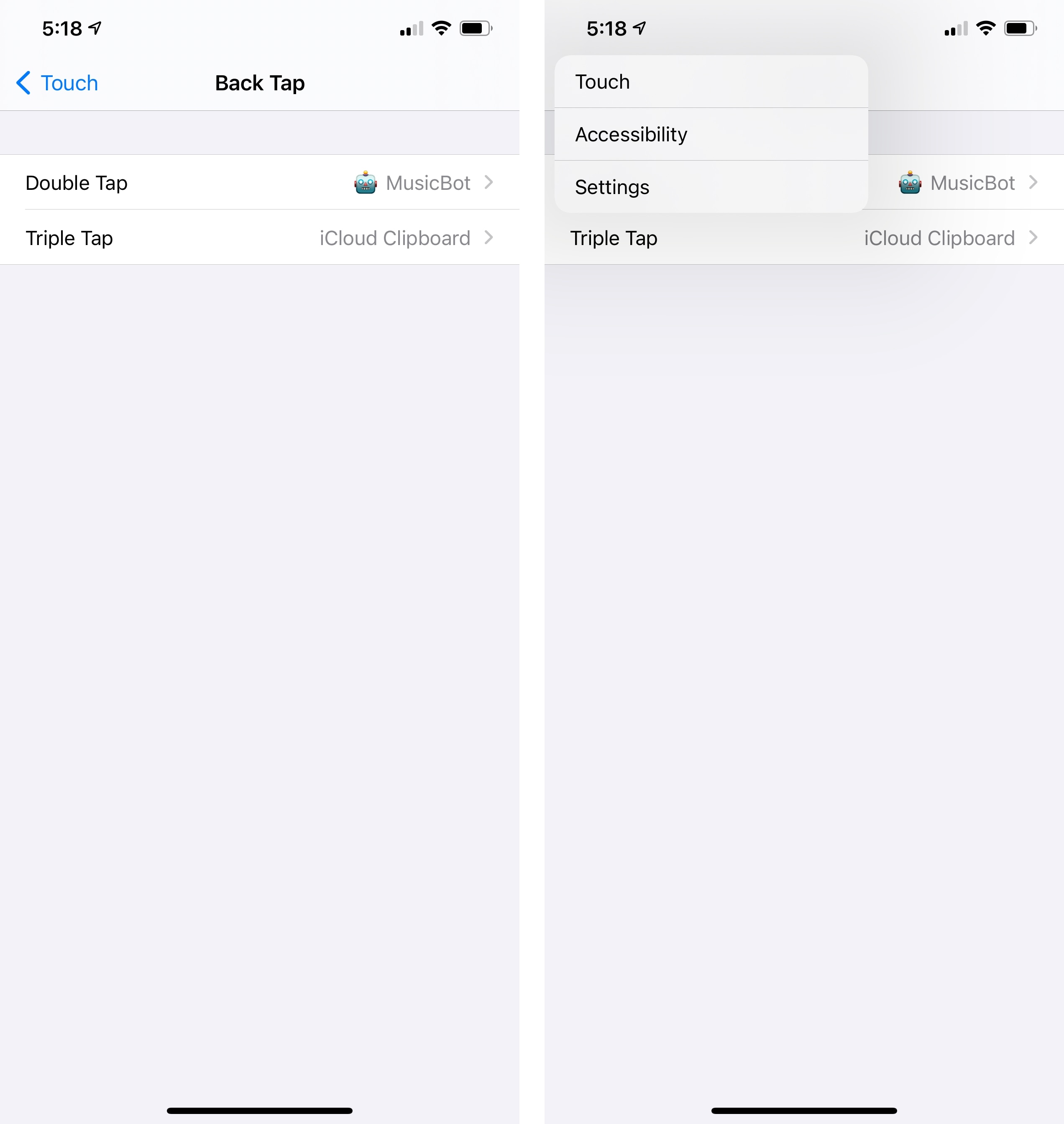
Pull-down menus have even been used for one of the new system shortcuts in iOS 14: in any app that features a native ‘Back’ button for navigation (such as Settings), you can long-press it to show a pull-down menu with the current navigation hierarchy, which lets you quickly jump back to a specific page:
You can also find pull-down menus when sorting your library in Music, adding attachments to a note, trimming videos in Photos, or adding a new accessory in Home. Pull-down menus are everywhere, and I like how compact and consistent with context menus they are.
In my conversation with Craig Federighi back in May, recorded before WWDC, I pointed out how context menus felt like the ideal UI element for the modern iPad platform: they scale gracefully from touch to pointer, taking advantage of haptic feedback on iPhone and hover states on iPad in a way that makes the same UI element feel like a perfect fit for two different input methods. Pull-down menus are based on the same underlying philosophy, with the addition of this year’s compact UI theme: whether they’re used on iPhone or iPad, pull-down menus adapt to each platform’s preferred interaction method naturally; they’re replacing sheets and menus that used to block the UI with modality and a larger footprint; as a result, apps that use them feel faster, cleaner, and more focused. I was a fan of context menus last year, and I appreciate this fork of the same UI element in iOS 14.
Other Changes
In addition to compact UI, new pickers, and pull-down menus, there are other evolving interface elements worth noting in iOS and iPadOS 14.
Refresh indicator. The refresh indicator (seen in apps that use pull-to-refresh such as Mail or when loading results in Podcasts and Music)17 now has fewer paddles and its animation timing has been adjusted. It looks fun.
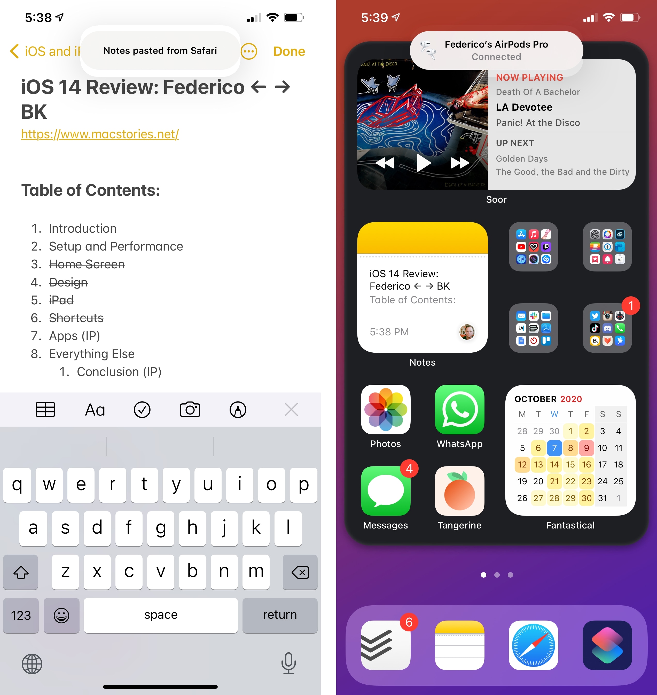
Elements that slide down from the top of the screen. I also mentioned these last year, and the pill-shaped indicators that descend as transient notifications from the top of the screen are continuing to gain a foothold in both iOS and iPadOS 14. New instances of such elements include clipboard alerts (see our Privacy story for more details), AirPods notifications, and Bluetooth device connection alerts. Apple clearly loves this style of compact alerts – too bad it’s not available to third-party apps still.
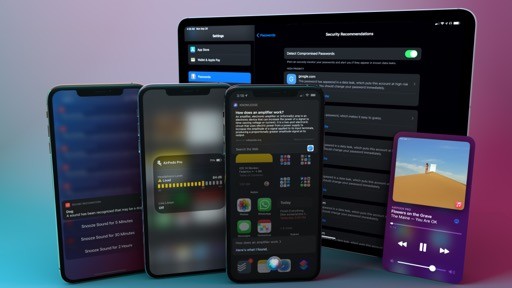
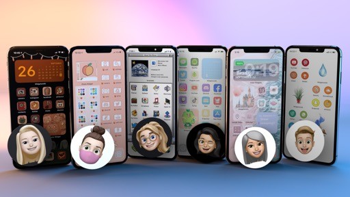
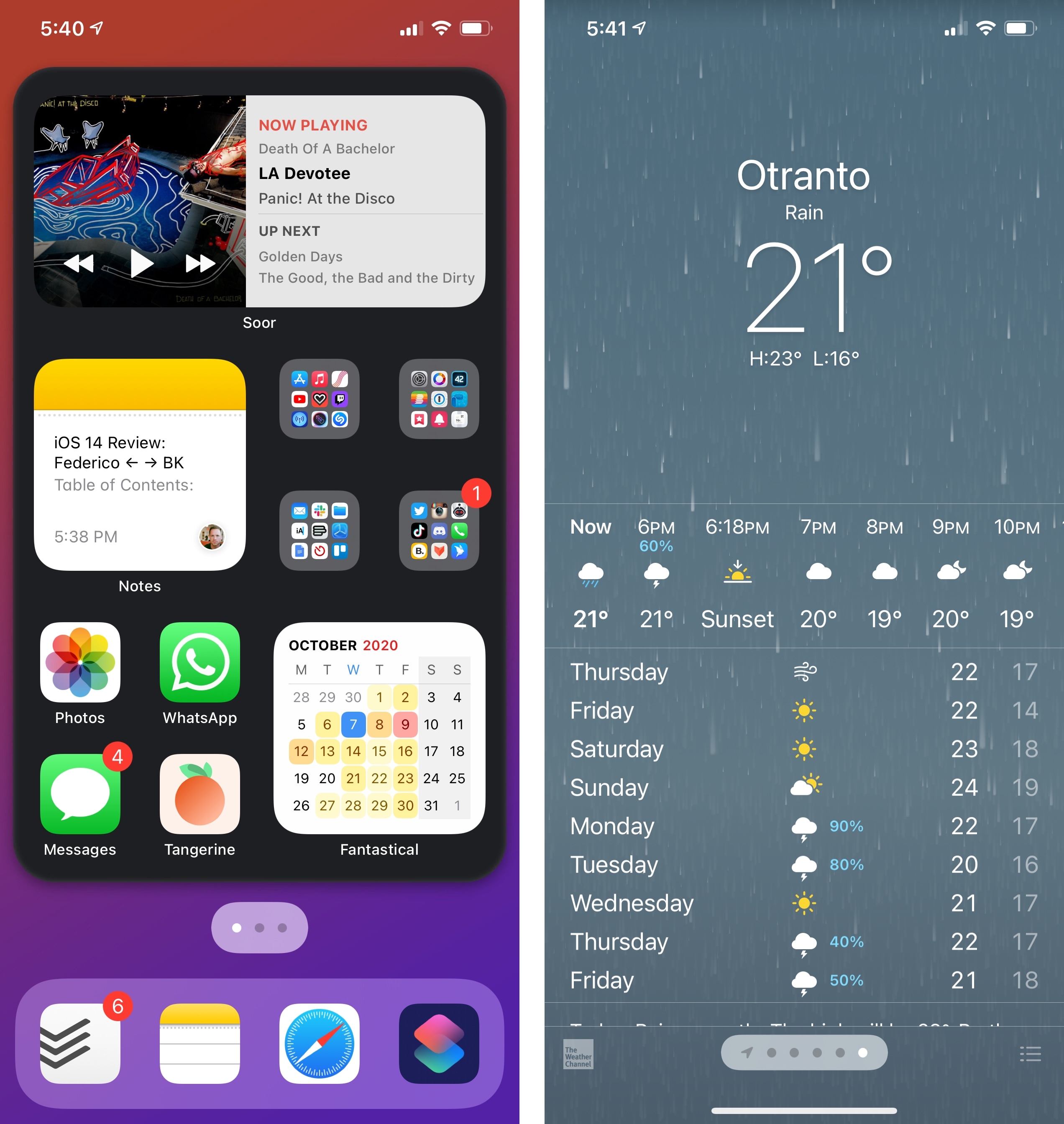
Page controls. As seen on the Home Screen and in the Weather app, the classic page control (UIPageControl) has been enhanced with the ability to offer an unlimited number of pages and a scrubbing mode for quick navigation across pages (long-press and swipe over the control to try it yourself). Additionally, page controls can now use custom images as glyphs and different background styles.
Sliders. In an effort to make iOS and iPadOS (and therefore Mac Catalyst apps) more consistent with macOS, sliders feature a thicker track in iOS 14. Just like on the Mac, you can also now tap or click the track to adjust the knob’s position without sliding it.
Progress bars. In line with sliders and macOS, progress bars are also thicker in iOS and iPadOS 14.
SF Symbols 2.0. Apple introduced SF Symbols last year as a collection of 1,500 glyphs that developers could implement in their apps. What set SF Symbols apart wasn’t just the integration with the system – it was how the set was designed to match the visual characteristics of the San Francisco typeface and how glyphs behaved as fonts with multiple sizes, weights, and embedded baseline values. Some in the design community heavily criticized SF Symbols after WWDC 2019; over the past year, I’ve seen SF Symbols pop up everywhere in my favorite apps, and I’ve appreciated the visual consistency they’ve brought to the iOS app ecosystem.
Apple is back this year with a major update to SF Symbols, which introduces over 750 new glyphs and multicolor options.18 SF Symbols now includes over 2,000 symbols for different categories (which you can browse using the official SF Symbols app for Mac), but Apple decided to offer multicolor versions of a subset of them. As of iOS 14, only 156 symbols support a multicolor appearance, which automatically adapts to vibrancy, different Accessibility settings, and dark mode (for more on color and dark mode, see here and here). These 156 symbols are pre-configured by Apple, and I was able to preview them all on-device using Adaptivity:
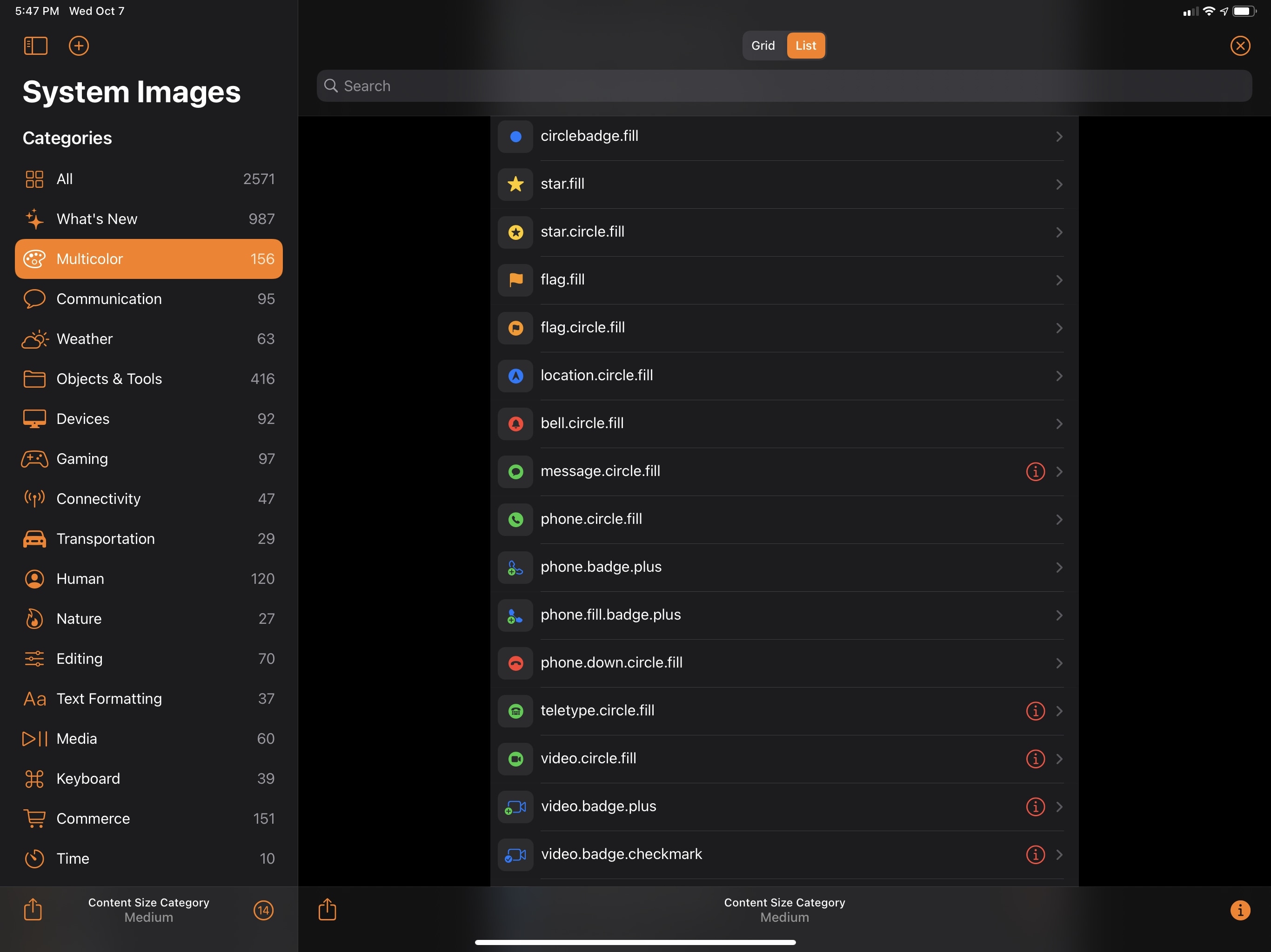
I like the appearance of multicolor symbols since they almost feel like brand new icons instead of new flavors of existing glyphs. However, besides the Weather widget, I’ve yet to see multicolor symbols in any of my favorite apps. Also interesting: in some cases, developers will be able to specify a different color for a multicolor symbol’s specific area; for instance, in the folder.badge.plus symbol, a third-party developer may want to use their app’s accent color for the folder area of the symbol, with the system providing a different color for the badge. This increased flexibility should allow for some fresh takes on SF Symbols this year, and I look forward to seeing how developers will take advantage of it.
One last thing about SF Symbols: you have to respect the Apple product manager who approved this symbol for ‘PC’. We see you, and your work is appreciated.
.](https://cdn.macstories.net/002/Design%20symbol%20PC.jpeg)
The ‘PC’ symbol, as seen in San Fransymbols.
iOS and iPadOS design has been in a state of constant evolution for the past few years. Apple has seemingly moved away from the sweeping redesign approach, favoring instead a judicious iteration that is better suited for a vast audience who doesn’t love the idea of their primary computer fundamentally changing overnight. This is a careful balancing act for Apple, but we can still spot interesting themes and trends emerging beneath the surface.
This year, compact UI and consistency with macOS feel like the overarching principles we should be paying attention to over the coming months. The latter is quite obvious: Mac Catalyst is growing up, and Apple Silicon Macs will soon gain the ability to run unmodified iPhone and iPad apps, so it’s in Apple’s best interest to ensure consistency with the Mac environment, particularly for those iPad apps that will feel right at home on macOS.
As for compact UI, it’s fun to speculate on the underlying motivation behind it: why now, and what’s the subtext? Compact, glanceable, transient interfaces that appear on one side of the screen without interrupting what you’re doing seem awfully well suited for a headset, where screen real estate would be at a premium and you wouldn’t want any UI to completely take over your field of view. I might be way off base here, but I have a feeling compact UI in iOS 14 is but a training ground for a much bigger initiative to follow over the next few years. Let’s keep an eye (no pun intended) on this one.
- Technically, these are two separate elements – UIRefreshControl and UIActivityIndicatorView. The new design and animation applies to both. ↩
- If you're interested in a technical deep dive on all the changes to SF Symbols this year (including renamed symbols and updated versions for right-to-left localizations), check out this guide by Geoff Hackworth. ↩