Pickers
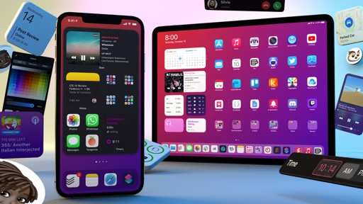
While other design changes in iOS 14 may not have the same impact as compact UI, they are nonetheless noticeable and are poised to improve some of our key interactions with iPhone and iPad. Let’s take a look at four updated system pickers in iOS and iPadOS 14.
Date Picker
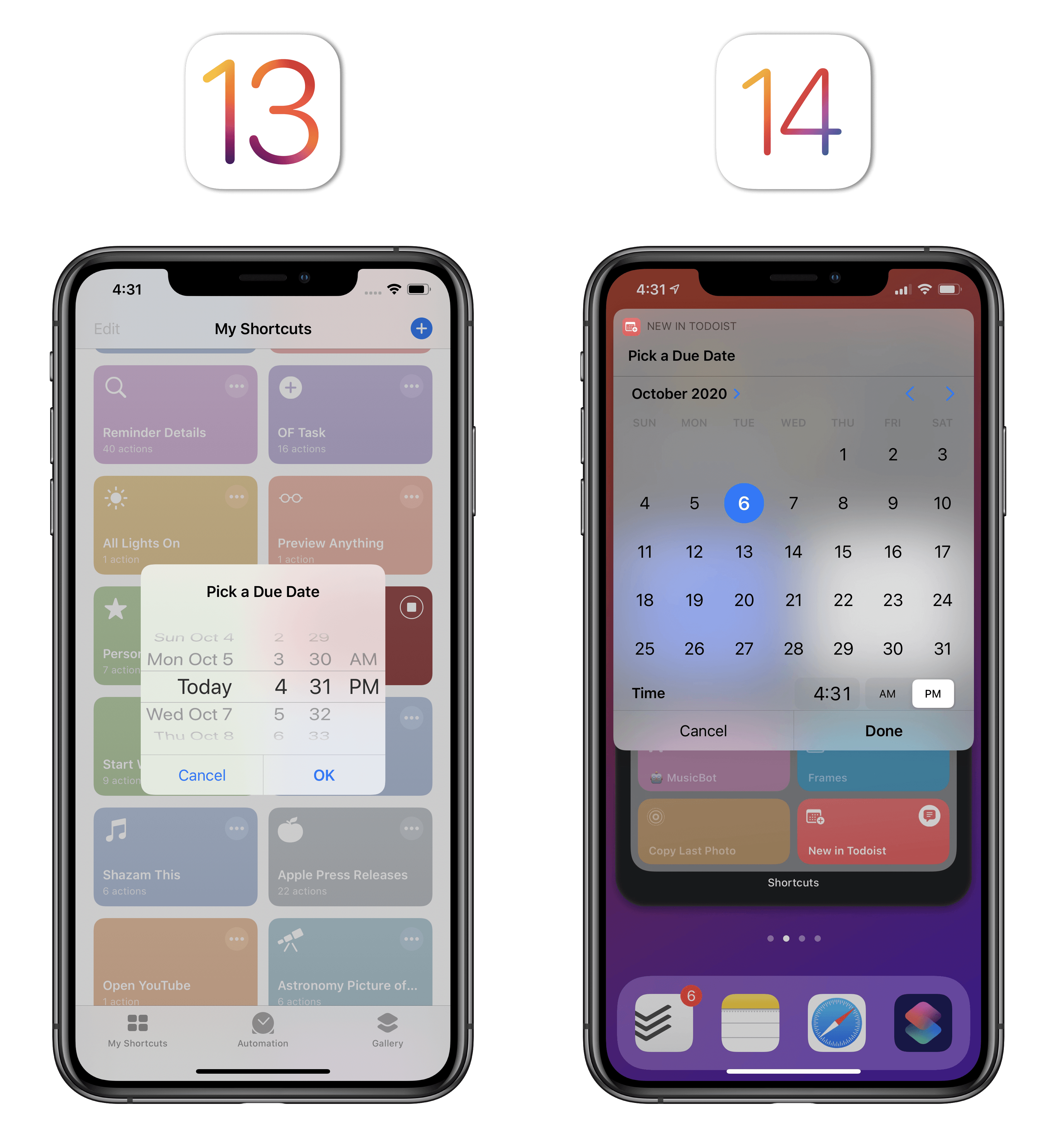
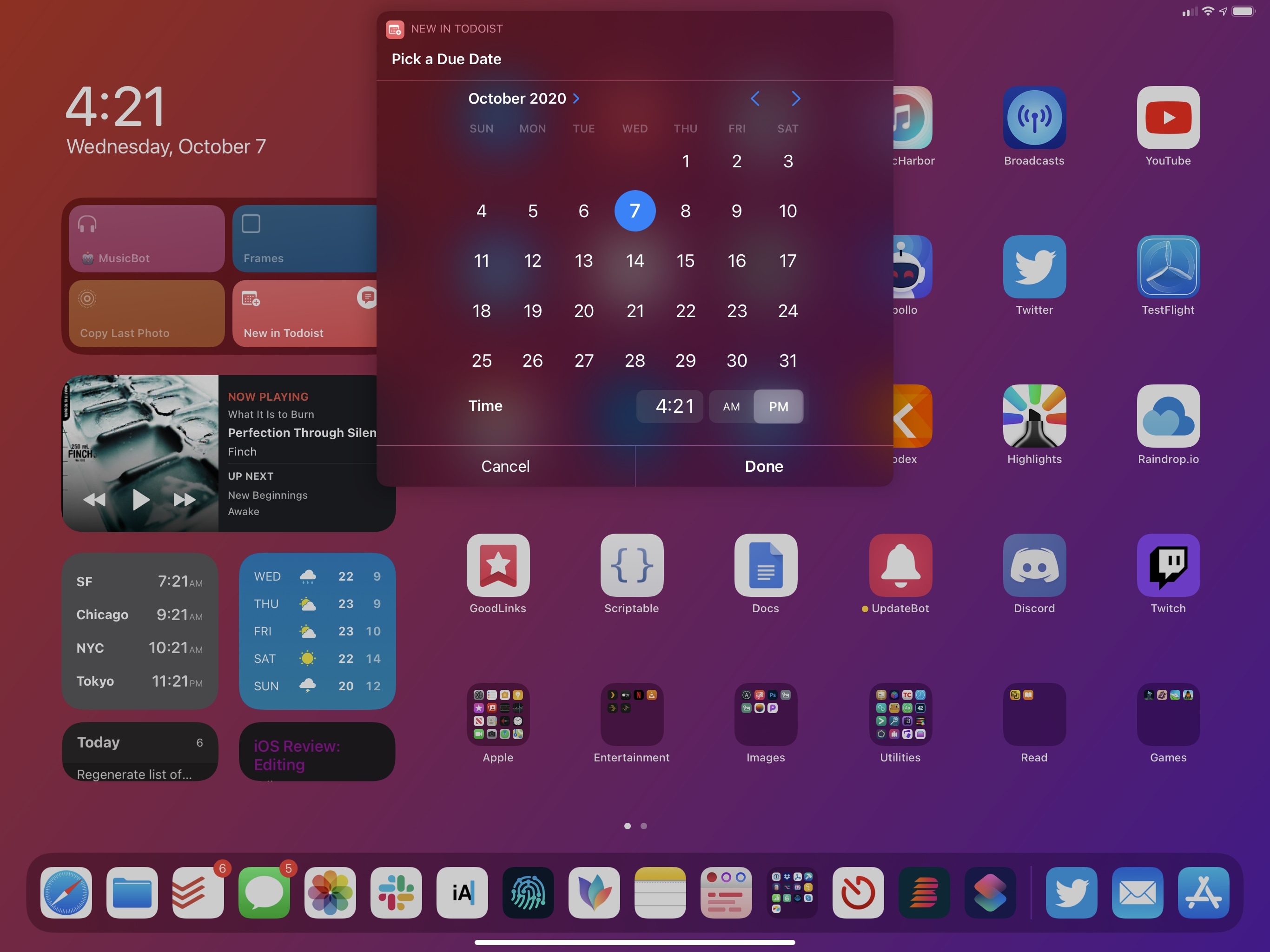
iOS 14 does away with one of iOS’ (nee iPhone OS) historical interface elements: the wheel-based date and time picker is gone, replaced by a more standard compact calendar and hybrid text field/mini wheel for times.
Introduced with the original iPhone in 2007, the date and time picker survived a few major transitions in the Apple ecosystem: first, it was ported to the iPad’s bigger screen; then, its 3D appearance was toned down for iOS 7, although its functionality remained intact; last, it was bafflingly brought to the Mac as well in the first (and highly criticized) wave of Mac Catalyst apps. It’s safe to say the date and time wheel represents an entire era of touch interactions, and it stands as one of Apple’s most recognizable modern UI conventions; at the same time, given current design trends and the evolution of iPhone and iPad, I think it was about time for Apple to let it go.
The new date picker in iOS 14 may not carry the same innovative spirit as last decade’s wheel, but it gets the job done, and I find it faster to use than the UI component it’s replacing. Selecting days is easier than ever: the date picker is a compact monthly calendar, and you can tap any day in the calendar to set a date; weekdays are shown as columns at the top, and the current day is highlighted. With this new design, you can more easily select distant dates since you no longer have to carefully scroll a wheel to pick the day you’re looking for. Furthermore, you can swipe horizontally on the calendar (or tap the arrows in the top right) to switch between months.
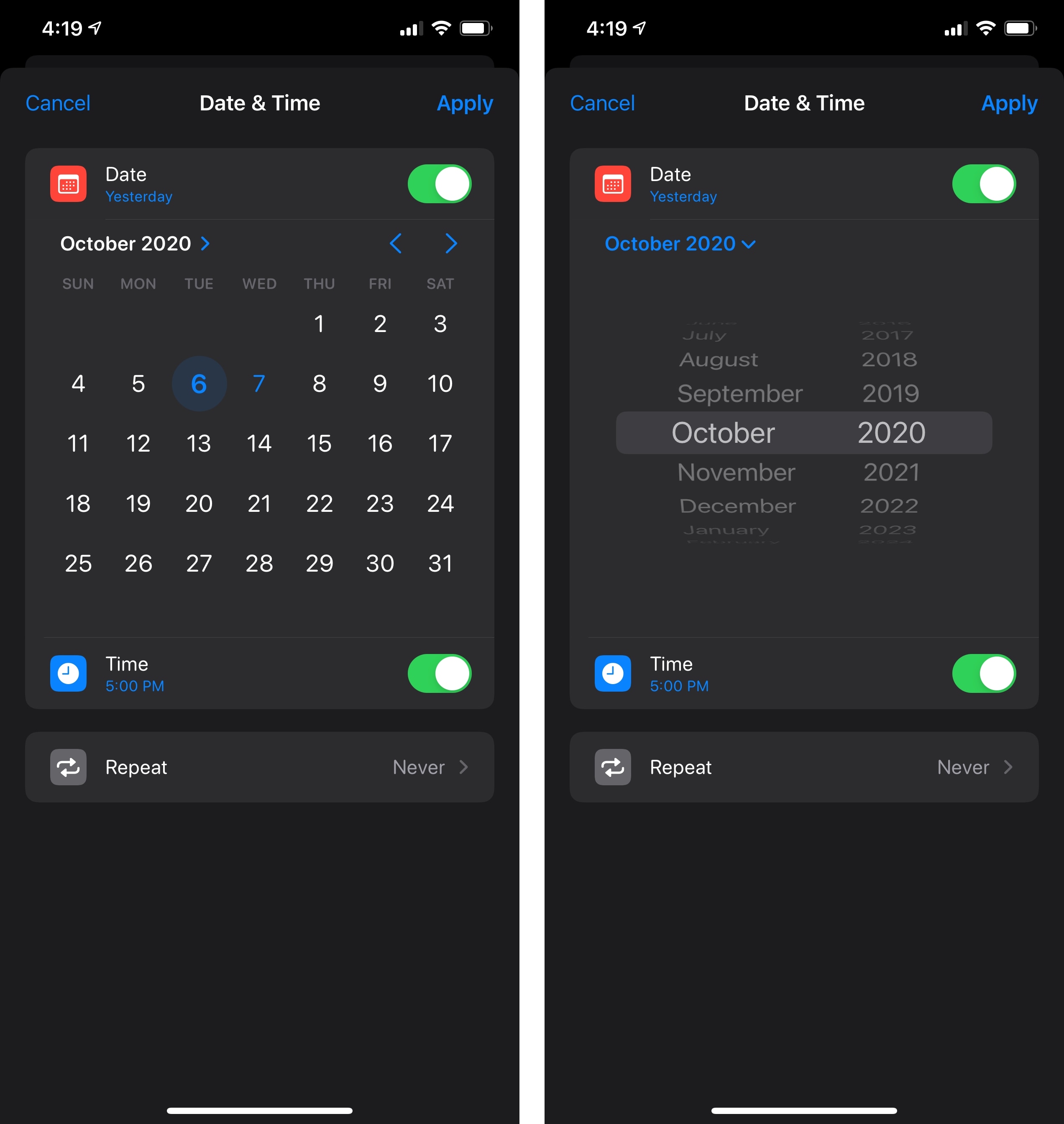
The wheel isn’t completely gone either: if you want to quickly change the selected month or year, tap the chevron next to the month in the top left corner and you’ll be presented with a classic date picker, only limited to months and years. In this context, I think it makes sense to revert to the old interaction since you’re only picking between two sets of items (months and years) rather than four as it used to be in iOS 13 (date, hour, minutes, AM/PM).
Besides the mere clarity of its design (a monthly calendar may be uninspired, but it’s obvious to look at), I also find the new date picker superior to the old one as an interface element that has to work on iPad and Mac (via Mac Catalyst or iPad apps running on Apple Silicon Macs). On iPad, the date picker is optimized for pointer interactions: selected days playfully bounce around as you hover over them; thanks to pointer magnetism, the cursor snaps in-place to navigation arrows or the current month, allowing you to easily click and adjust the date.
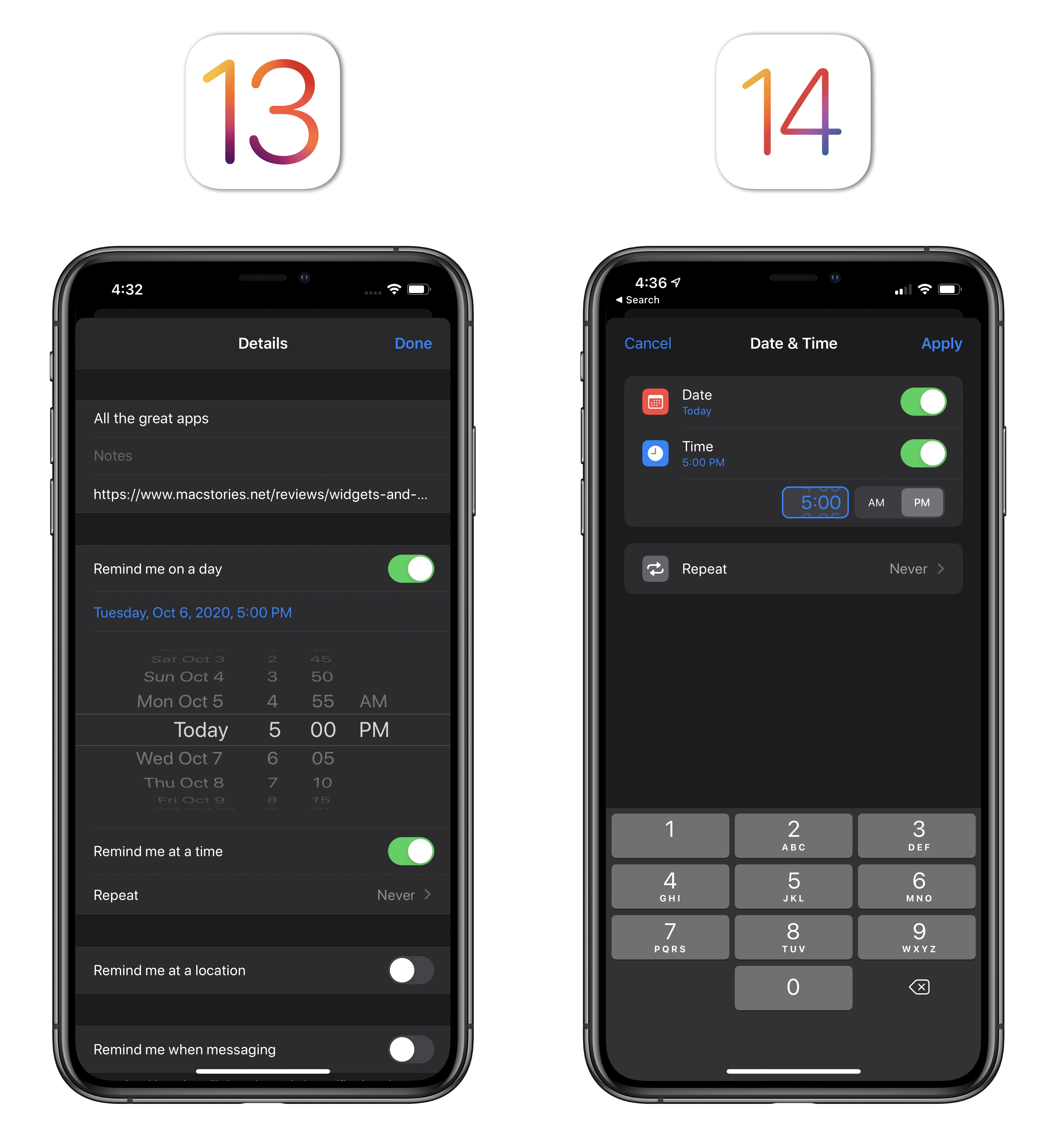
The time picker is going to require a bit of an adjustment period. It is comprised of two separate areas: a segmented control to switch between AM/PM, and a text field where you can enter the time of day. By default, tapping into this field brings up a number pad that lets you type out the time in full by just entering numbers (i.e. you would enter the numbers 5, 0, and 0, then select ‘PM’ to enter the ‘5:00 PM’ time). The wheel isn’t entirely gone from this picker either: it’s subtle, but you can still scroll within the (much smaller) time picker to manually adjust time the old fashioned way. However, the fact that the picker is a small input area and that the number pad comes up immediately seems to suggest Apple would like users to interact with this element primarily as a text field.
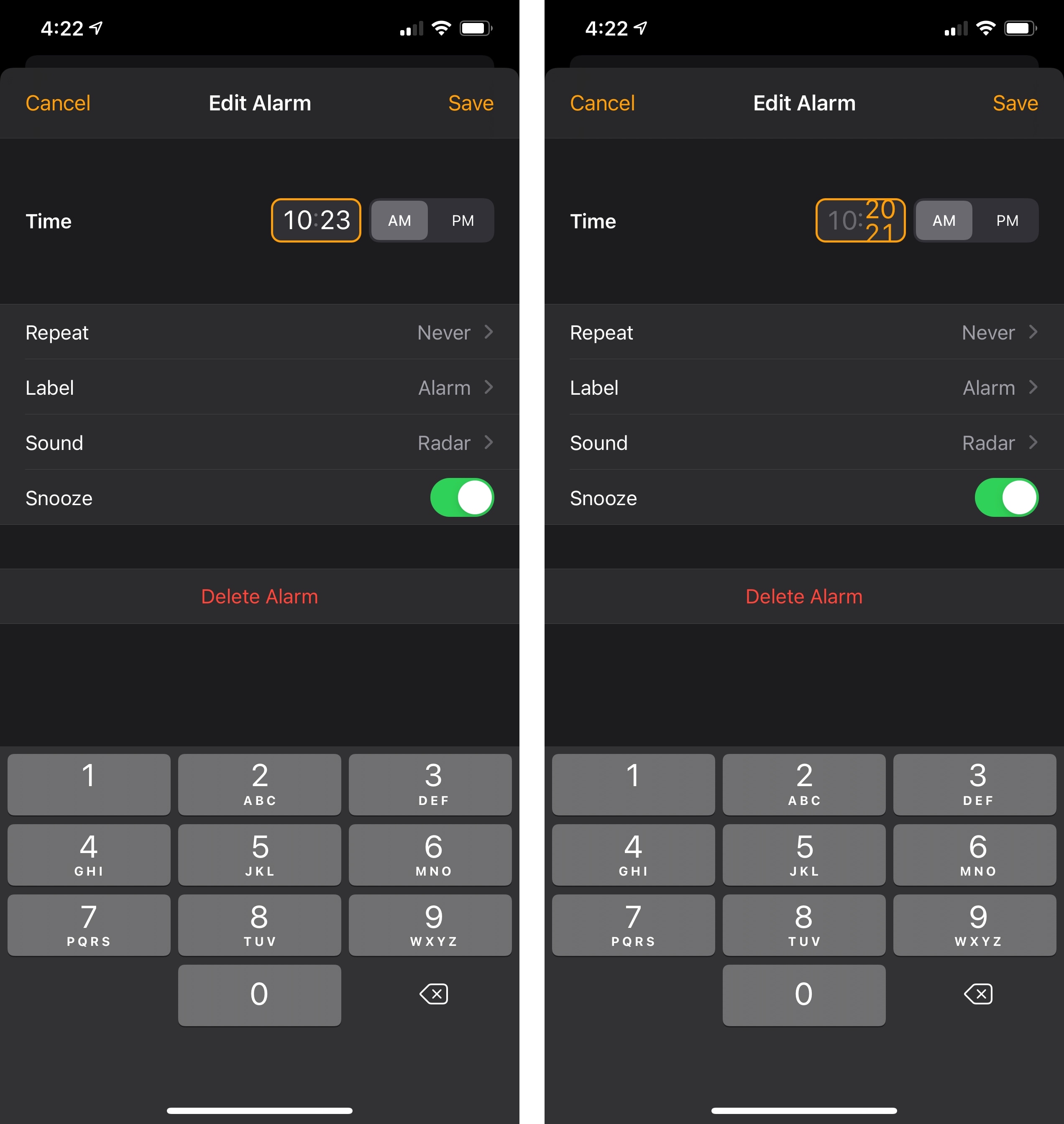
Additionally – and I wish Apple made this clearer in the interface – you can select the hour and minute portions of the time by tapping them. You can tell you’re editing either the hour or minute if only one part of the time is highlighted with a different font color. It’s not immediately apparent you can do this, and I wonder if there’s any way Apple could explain this otherwise “invisible” gesture to less tech-savvy folks.
Using the time picker.Replay
Despite some initial confusion surrounding the time picker, I find the new date and time picking system faster and easier to use than iOS 13’s old wheel. Rescheduling reminders or calendar events can be done more quickly than before, particularly for non-adjacent dates that involve jumping a few weeks or months ahead. The new compact calendar design feels fresh, works nicely on all platforms, and scales from touch to pointer like any modern Apple UI element should. I’m going to miss the wheel for purely nostalgic reasons, but the new date and time picker is better suited for our modern times.
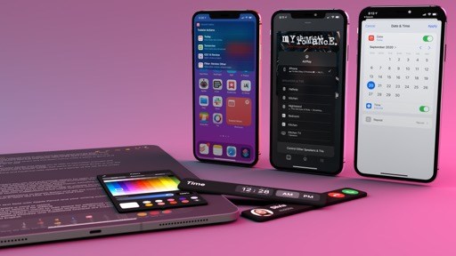
Color Picker
Back in 2018 with iOS 12, Apple added a basic color picker to the palette of tools available in the system’s Markup mode; with last year’s iPadOS 13, they redesigned the palette and made it a floating element that can be rearranged anywhere onscreen with drag and drop. In iOS and iPadOS 14 – and if you’re coming from macOS, this one deserves a unanimous finally – the company has turned the basic grid of 120 colors into a full-featured, system-wide color picker that supports multiple modes and can be implemented by all apps.
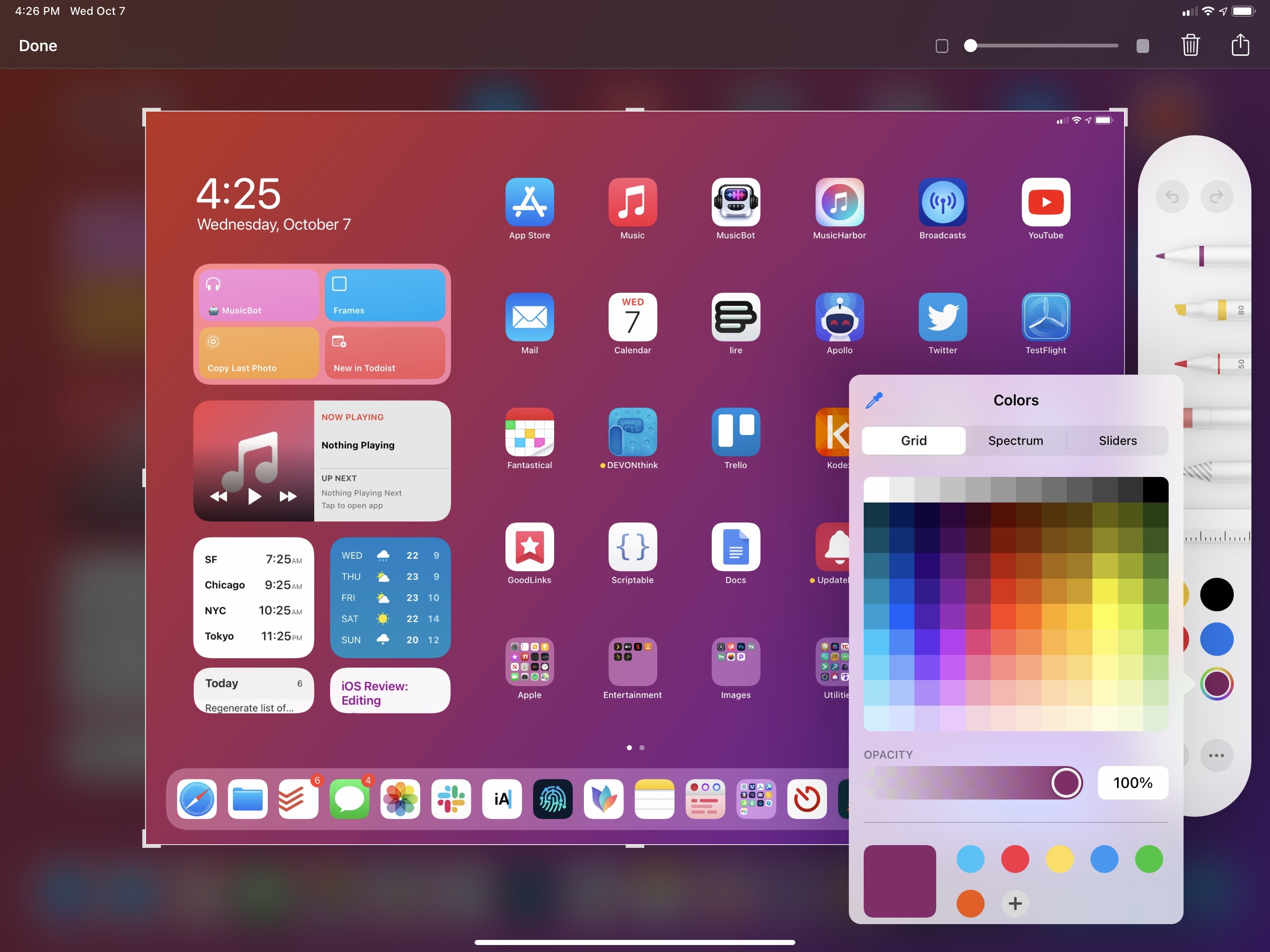
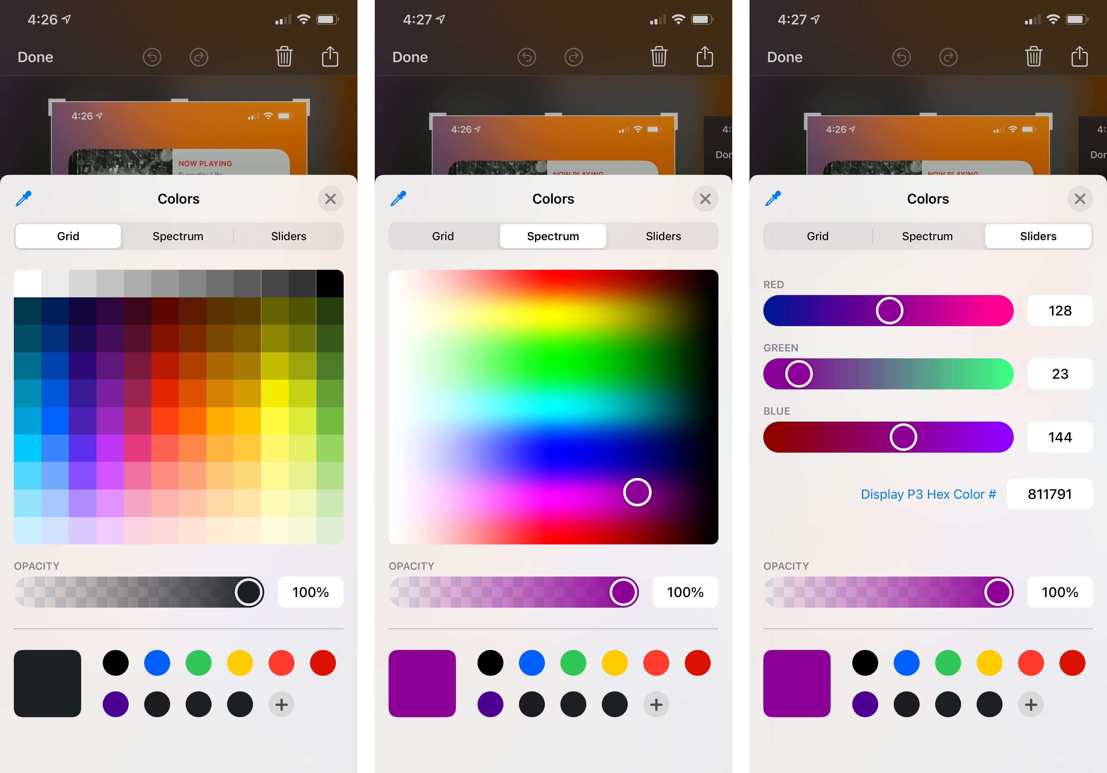
The new color picker – which is available on iOS, iPadOS, and can be adopted by Mac Catalyst apps as well – should feel instantly familiar to anyone who’s ever used the default color picker for Mac or design utilities such as Photoshop and Illustrator. It’s split into three main areas: the grid of 120 colors, which was available before too; a spectrum, where you can move around a color indicator to pick exactly the tone you want; and sliders, where you can set specific red/green/blue levels (with a slider or number pad) as well as enter the Hex code for Display P3 or sRGB colors.16 All these selection modes come with the ability to set a specific opacity level, which you can do either with a slider or by entering an exact amount in a text field.
These new modes alone would probably suffice to satisfy professional users who were seeking a deeper level of color control on iOS and iPad, but there’s more. The new color picker has an eyedropper tool that lets you capture any color currently shown onscreen: as seen in other design apps before, this is a magnifying loupe that zooms into a circular region of the UI and lets you precisely capture colors with pixel-level precision. The advantage of Apple’s native color picker is that its eyedropper tool can capture the entire system UI, not just the contents of a specific app: you can hover over the status bar to isolate the color of glyphs shown there or even grab the color of the divider between Split View apps on iPad. In the video below, for instance, you can see how Curlicues, a new drawing app by Simon Støvring, uses the new color picker to grab colors from an adjacent app in Split View using the built-in eyedropper tool:
Using the eyedropper tool on iPad.Replay
You can also save colors and reuse them across apps. You can save the currently selected color by tapping the ‘+’ button at the bottom of the picker; you can delete a previously favorited color by long-pressing it and hitting ‘Delete’. Saved colors are shared system-wide by the color picker, so if you saved some in Markup, you’ll get access to the same colors in Notes, Curlicues, and all other apps that use the native color picker.
As someone who’s occasionally found himself wanting to capture a color in a specific app and reuse it in another, I’m glad Apple put some effort into the color picker for iOS and iPadOS 14. I like that the color picker is available both for PencilKit-compatible apps and other apps that may just need a color picker without any Pencil integration; the only (minor) complaint I have is that Apple’s color picker doesn’t support drag and drop for colors (a native iPadOS feature), so it won’t integrate with apps like Pastel and MindNode. Overall, the color picker looks good, works well, and I’m glad it’s another item we can check off Apple’s list of macOS features that also needed to come to iPhone and iPad.
Photo Picker
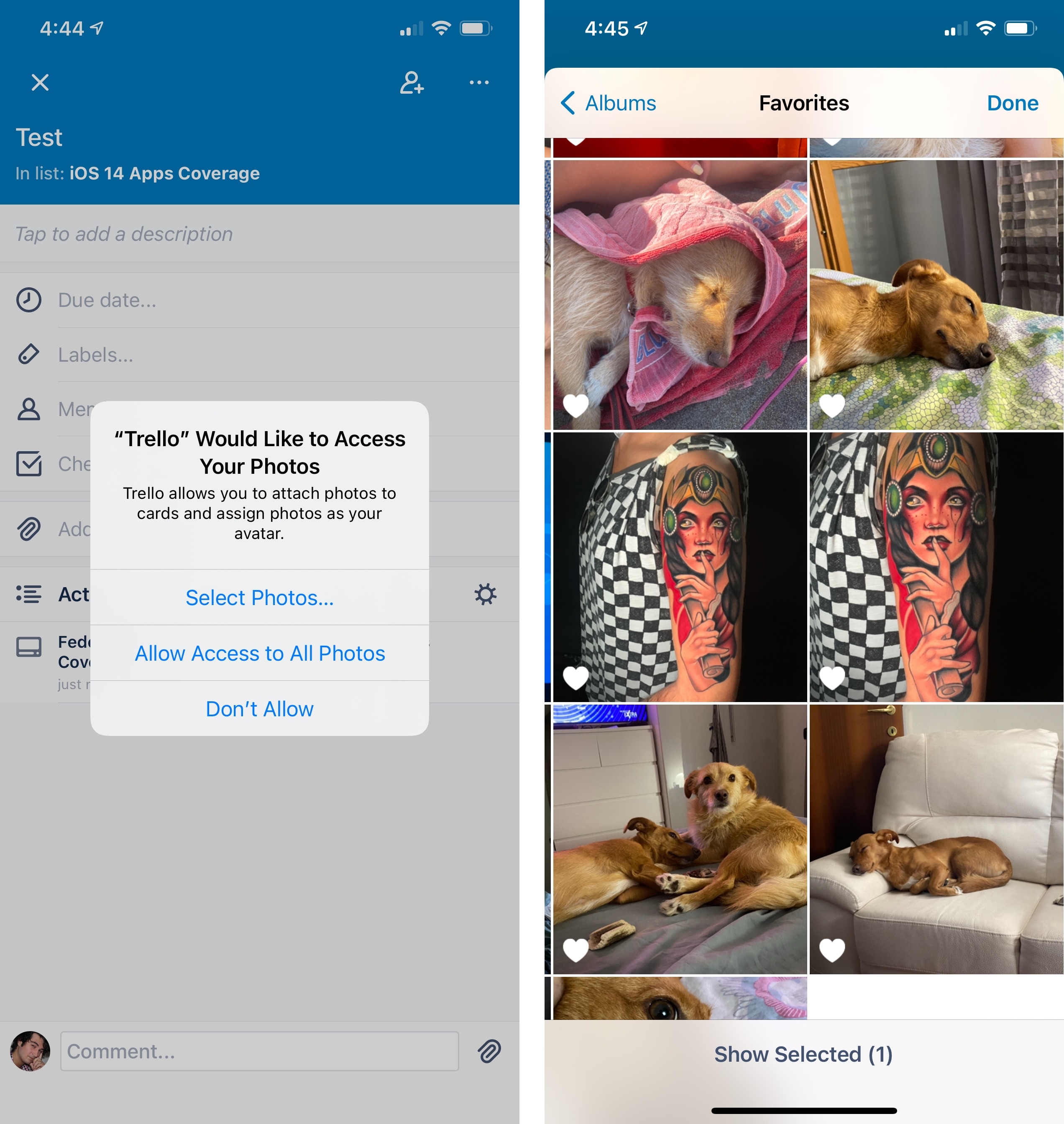
As part of Apple’s privacy improvements this year, iOS and iPadOS 14 come with a modernized photo picker designed to provide you with more control over how apps get access to your photo library. Furthermore, while the rethought photo picker is a new API developers will have to manually implement in their apps, Apple is also adding limited photo library access to all those apps that still use the old iOS 13 photo picker, putting you in control of your photos even when using apps that don’t want to implement the new photo picker.
The underlying principle behind the new photo picker is the following: rather than granting apps full access to your photo library, the picker only lets them access the photos or videos you select. Privacy is built into the new picker by default: it runs out of process from the app that presents it, which means that an app can’t directly access photos in the picker unless you select them; apps cannot even programmatically capture screenshots of the picker, which only provides them with access to the user’s selection. The idea is that while several kinds of apps may want to access your photos for various reasons (such as posting them on a social network or editing them), they don’t necessarily require full access to your entire library; with iOS 14’s new photo picker, Apple has sidestepped the potential issue of apps scanning the contents of your Photos library with an elegant solution that is respectful of the user’s privacy and entirely sandboxed.
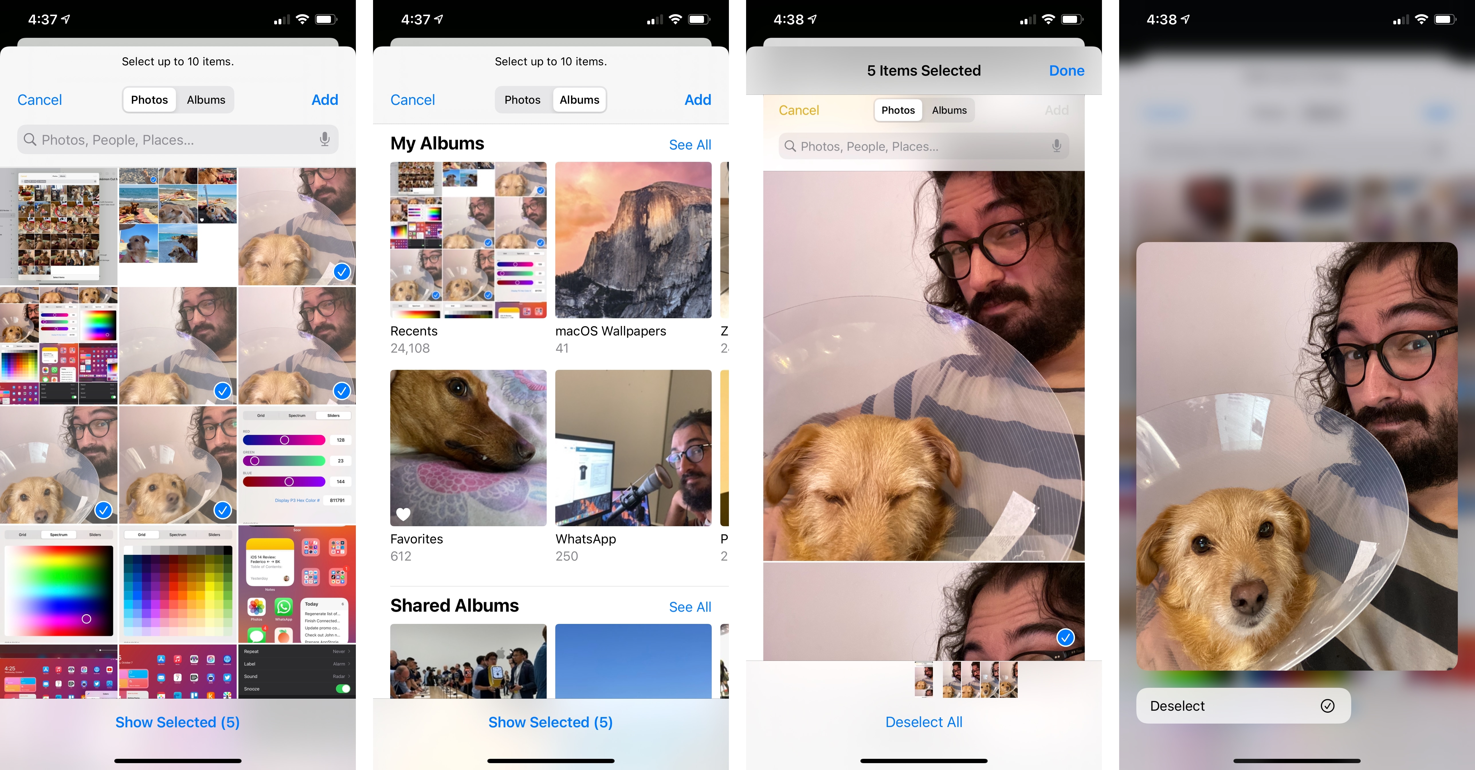
Beyond the privacy angle, what’s also nice about iOS 14’s photo picker is that it features an all-new design that brings many of the conveniences of Photos to third-party apps. For the first time, the photo picker supports the same natural language search as the Photos app and the ability to smoothly zoom in and out in the photo grid; you can find your photos by scrolling the grid, or by switching to the ‘Albums’ tab at the top, or you can just search by photo contents, people, and places as you’d normally do in the Photos app. The same tokenized UI for searches you’re used to seeing in Photos is available in the new photo picker, which means no more back and forth between Photos and apps if you want to pick a particular photo taken a while back.
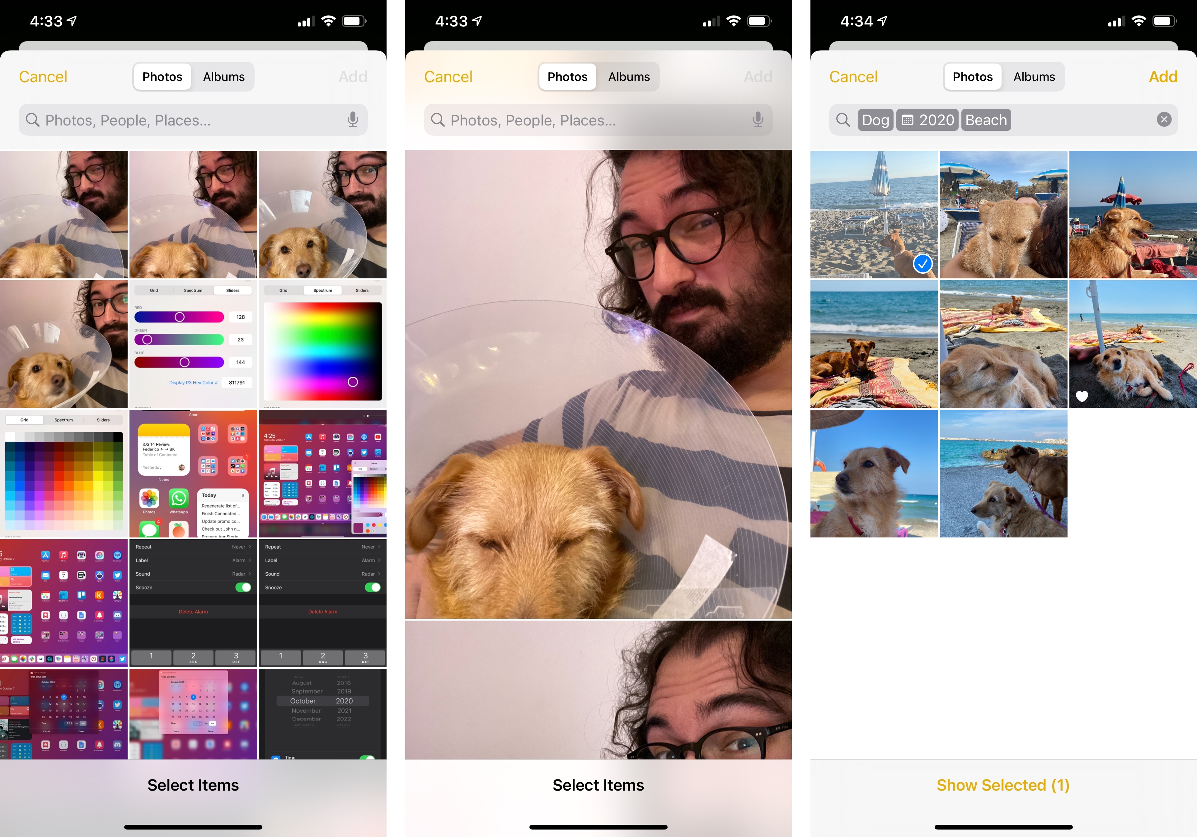
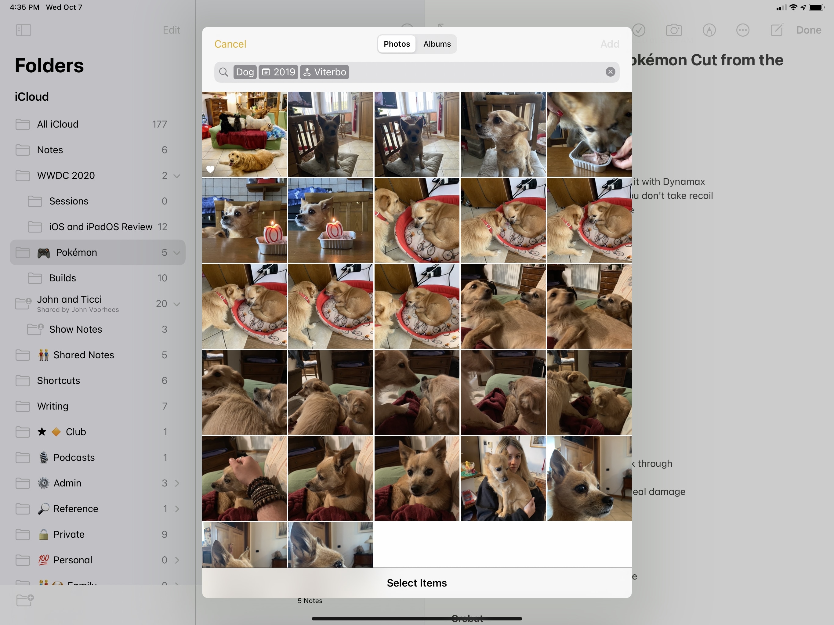
The picker also supports a couple configuration options for developers. First, third-party apps can implement the photo picker so that only certain types of content (such as Live Photos) or combinations of types (e.g. photos and videos) can be filtered and presented in the picker by default. Additionally, developers can set a maximum number of photos that can be selected by users in the picker, which is useful for those services that limit you in the number of media attachments you can post or upload. If an app supports multiple selections in the picker, you can tap items in the picker to add them to your selection, which sticks even if you switch between the Photos and Albums tabs; you can also long-press items to preview them and hit ‘Select’ from the context menu. Once items are selected, you can tap the ‘Show Selected’ button at the bottom of the picker to jump into a separate view that lets you swipe between your selected items in full screen.
iOS 14’s new photo picker is the kind of private-by-design, intelligent feature that only modern Apple can build: it puts users in control of their data, doesn’t compromise the utility of third-party apps, and integrates with Photos, context menus, and pointer control to deliver an experience that works seamlessly everywhere, in all apps that choose to support it.
But what if they don’t? Apple thought about this potential scenario as well. In iOS and iPadOS 14, if an app doesn’t implement the new photo picker and uses the old one instead (UIImagePickerController), the system will automatically add a new option to select a subset of photos to the dialog that prompts you to grant (or deny) access to the full photo library. Even if an app hasn’t been updated to iOS 14 (i.e. it is still compiled against iOS 13), the system will “force” the inclusion of a limited photo library access option in the initial photo permission prompt.
Apple is serious about stopping unfettered access to the photo library by apps that don’t actually need it, and I applaud their decision to retroactively update the old permission dialog with a new limited access option. Choosing this mode, of course, has consequences: if you restrict photo library access to an app that hasn’t been updated for iOS 14, you have a couple ways to update your initial choice or grant the app access to more photos besides the ones you initially selected.
First, you can go to the app’s entry in the Settings app, select Photos, and update access from ‘Selected Photos’ to ‘All Photos’, thereby granting unrestricted access to your library. You can also review the photos you previously granted the app access to by clicking the ‘Edit Selected Photos’ button at the bottom, which will bring up iOS 14’s new photo picker.
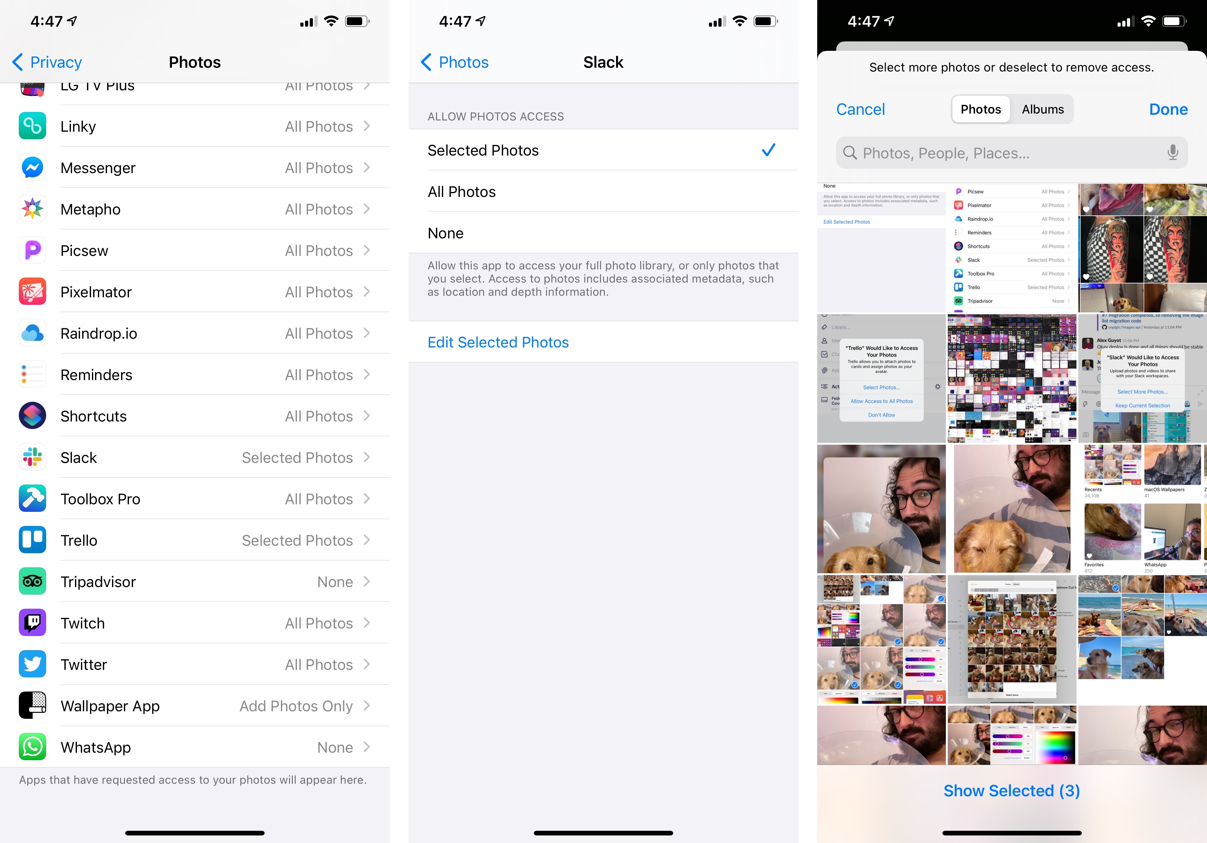
Alternatively, you can select more photos the next time you relaunch the app. Apple made the smart decision of displaying the permission prompt again every time you relaunch an app (or if you manually request access to photos in that app) with options to keep your current selection of photos or select more from your library. It should also be noted that limited photo library access doesn’t support creating or fetching from albums, nor does it support picking cloud-stored assets.
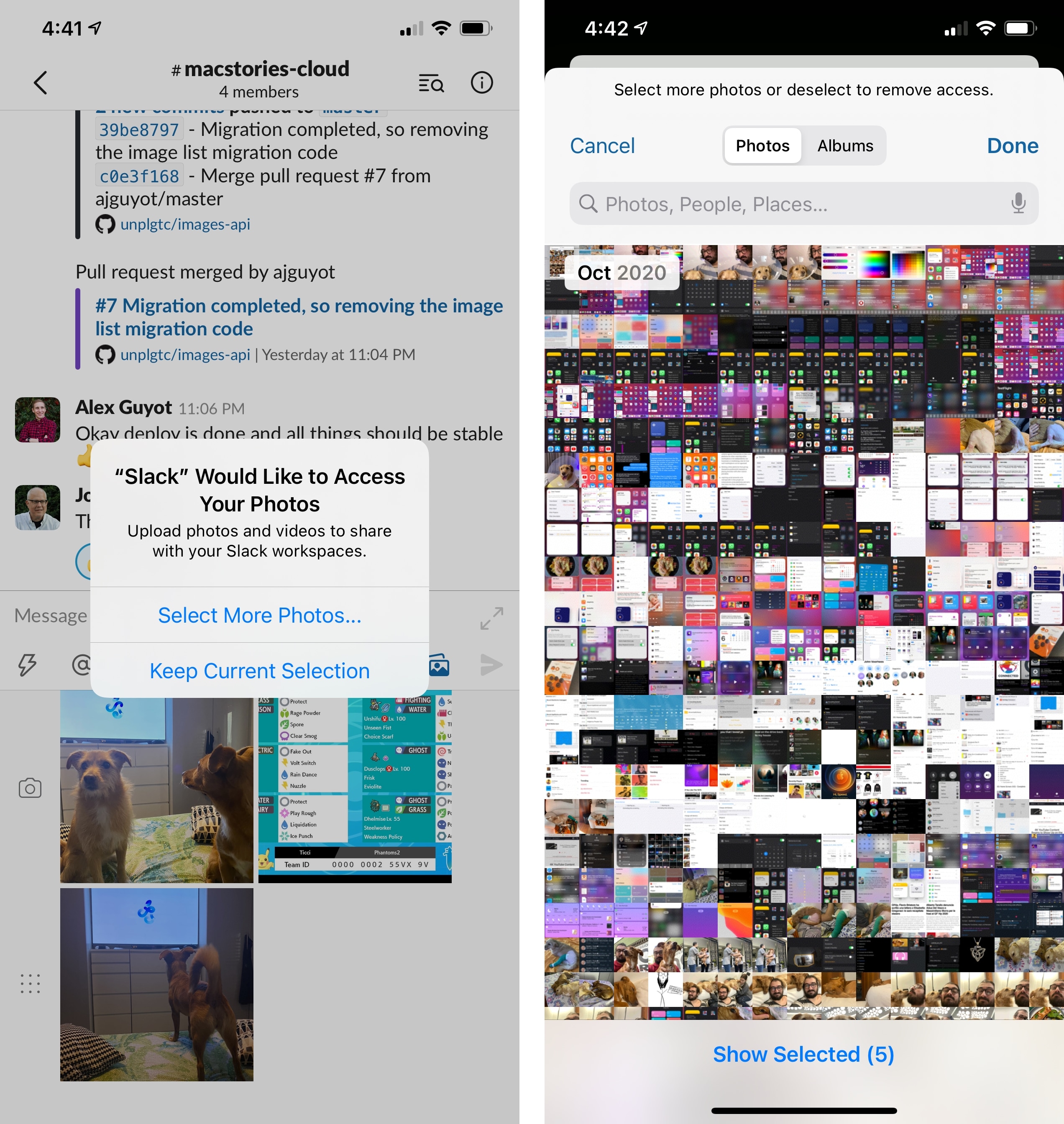
It was a little confusing at first to see the photo permission dialog come up over and over again this summer for apps like Slack every time I wanted to share screenshots with my team, but I understand Apple’s goals now. I think it’s a smart move to bring limited photo library access to apps that may not have updated to iOS 14, even if it adds a few more taps to the experience. Ideally, going forward all apps will just use the new photo picker in iOS 14, so we won’t have to deal with permission prompts and visiting Settings anymore. Ultimately, very few apps actually need full, unrestricted access to my photo library, and I’m glad Apple updated the photo picker to reflect this reality in a secure, privacy-conscious way.
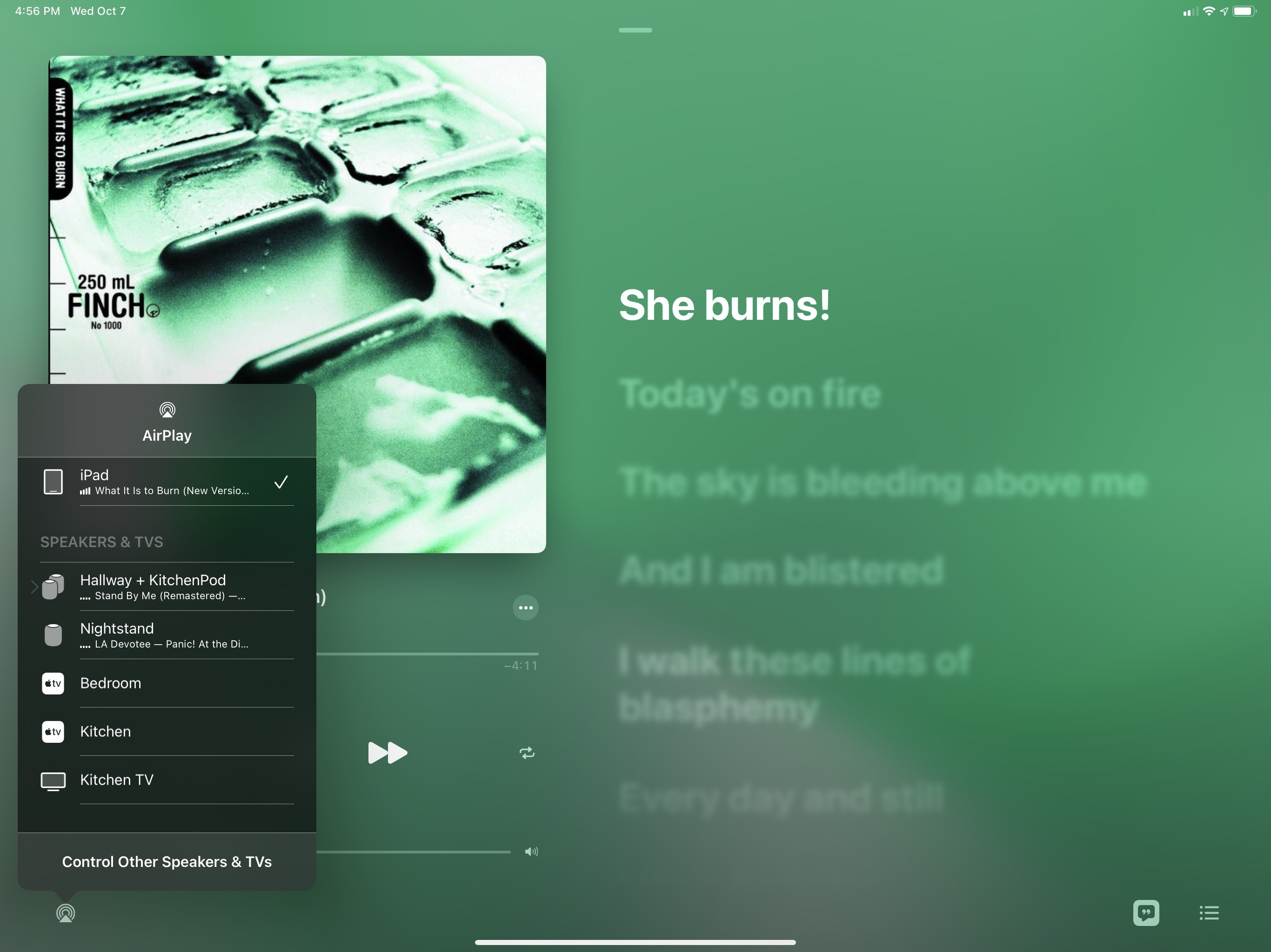
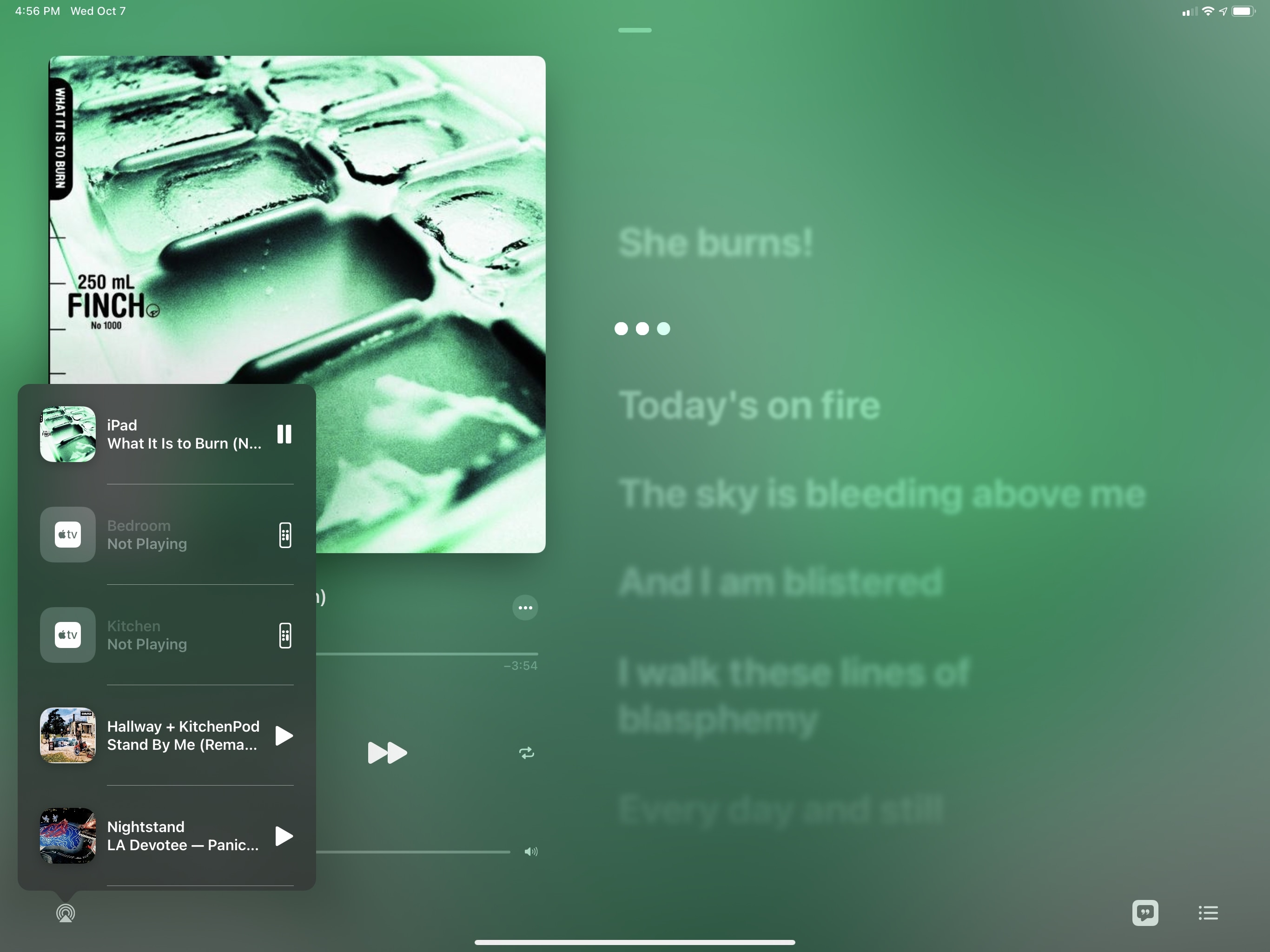
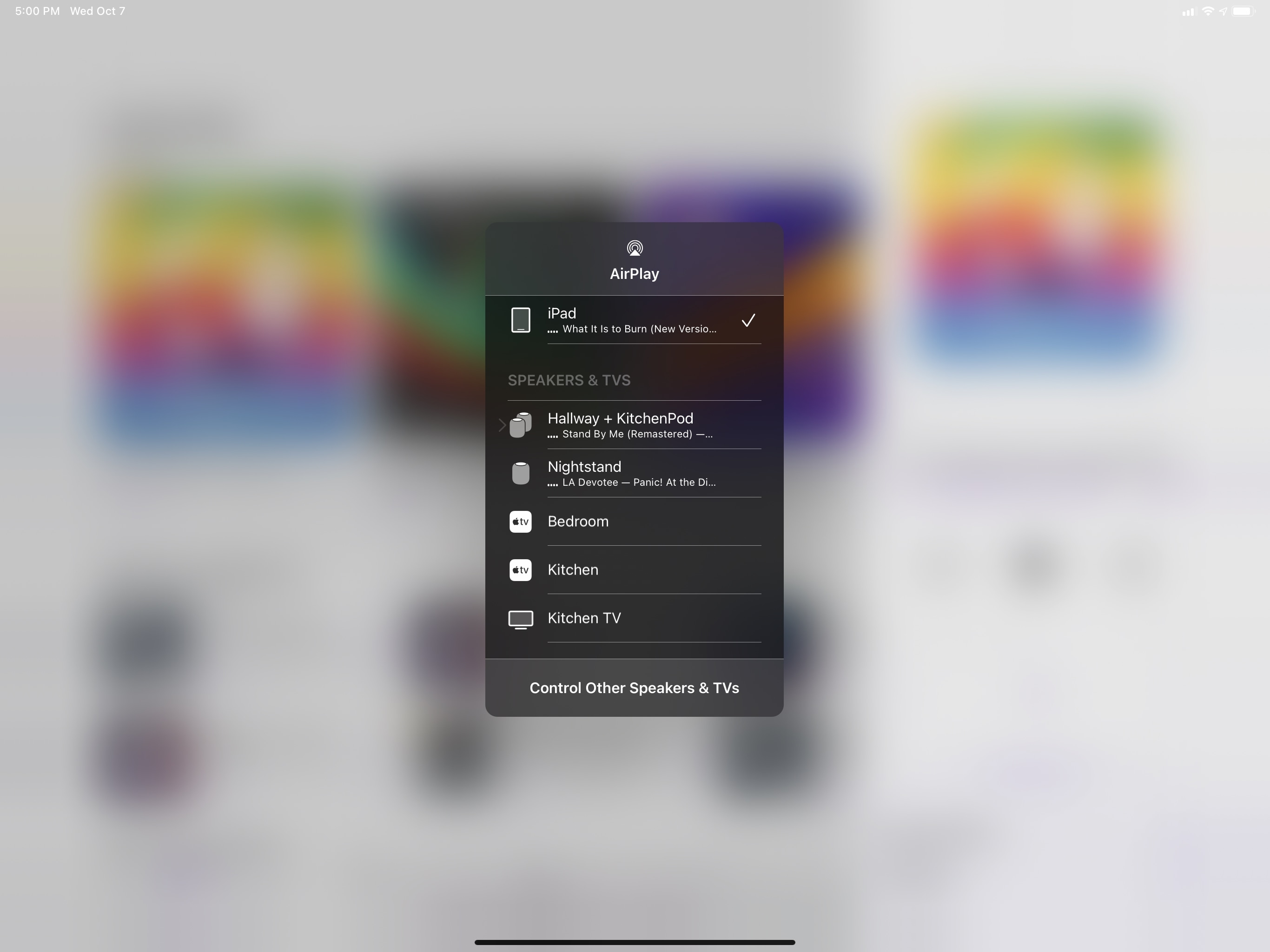
AirPlay Picker
Starting with iOS 14.2, you’ll find a redesigned AirPlay picker in Music. Still available by tapping the AirPlay icon, the menu is now a floating popover that opens on top of the app instead of full-screen.
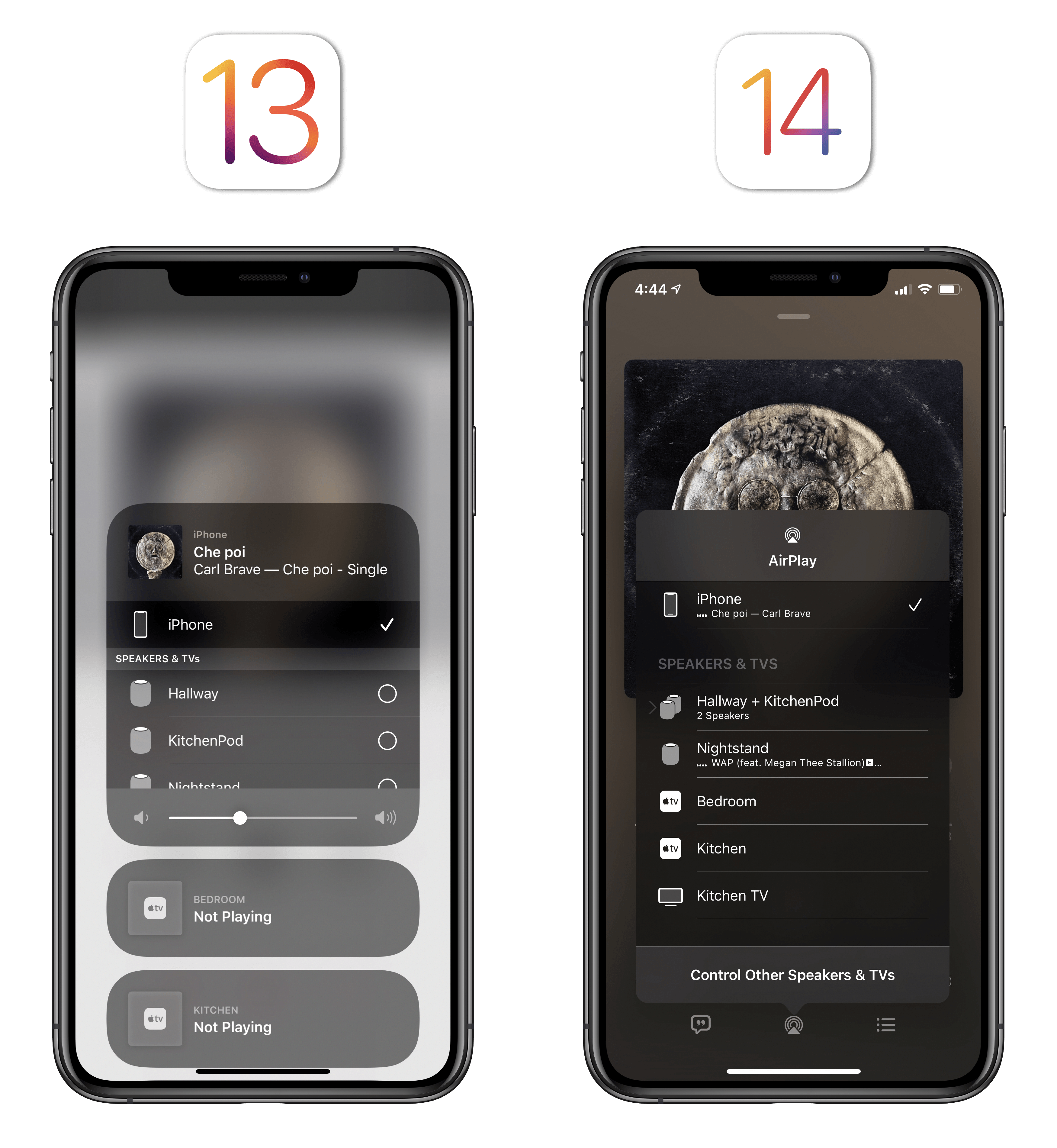
You can tap the ‘Control Other Speakers & TVs’ button at the bottom of the picker to bring up a different view that lets you control playback on other speakers and TVs with play/pause buttons and virtual Apple TV remotes.
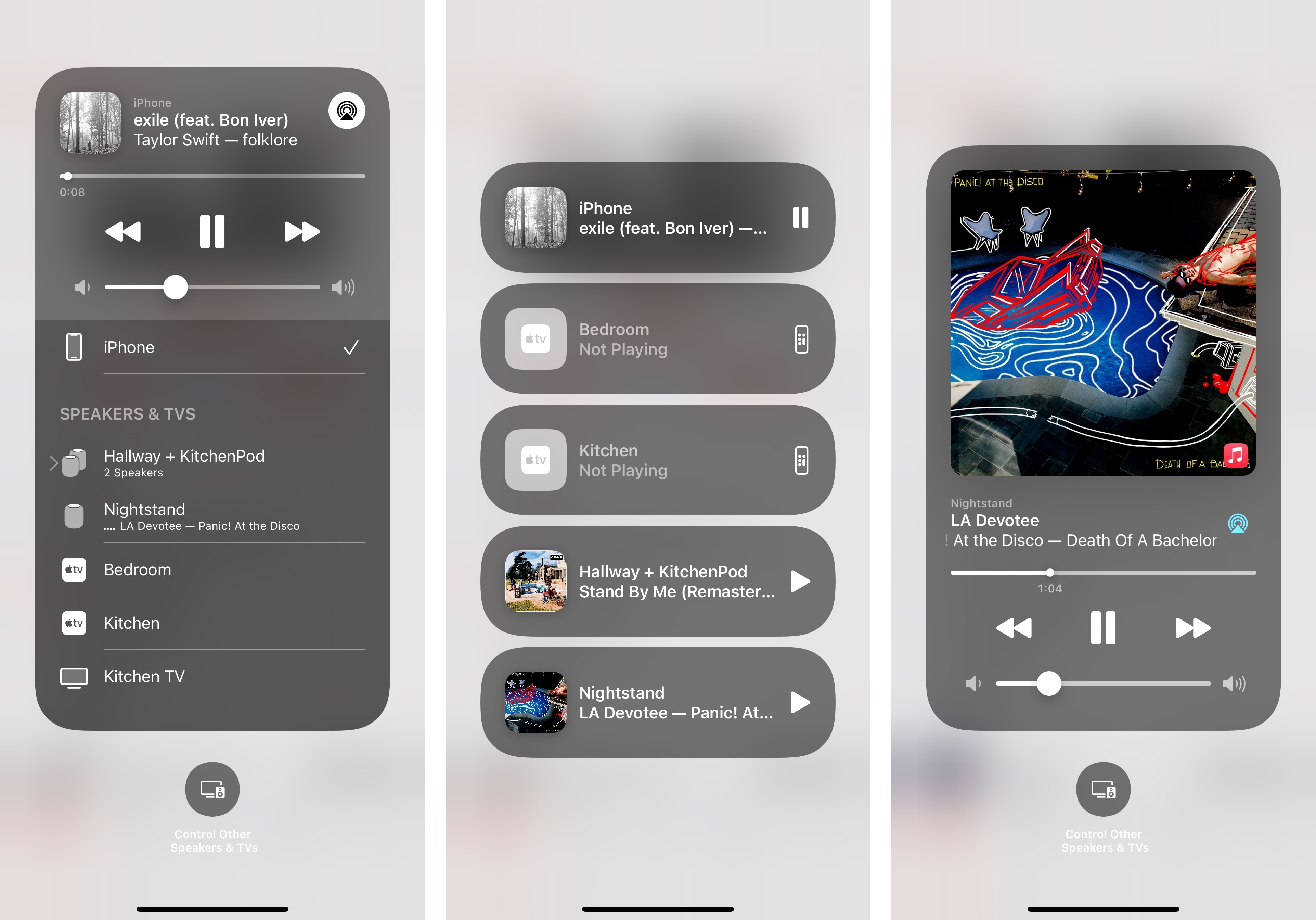
Controlling other speakers from the new AirPlay picker. You can see how multiple speakers get collapsed into a single item if you’re streaming to them simultaneously.
The new popover design also works well in Music for iPad since it doesn’t take over the entire screen anymore:
The move from a full-screen menu to a compact popover isn’t surprising in the context of this year’s UI updates: the new AirPlay picker feels faster because you don’t have to wait for a full-screen animation to finish anymore. Automatic AirPods switching has reduced the number of times I need to interact with the AirPlay picker, but it’s still a feature I use for my HomePods and Apple TVs, and I’m glad Apple is continuing to get rid of leftover full-screen UIs in the iOS 14 release cycle.
Unfortunately, right now it’s unclear whether or not third-party developers will be able to use the same floating design for the AirPlay picker seen in Music. At the moment, not even Apple’s Podcasts and TV apps are using it, and although the picker features a new design, it still opens in full-screen over the foreground app. I hope the new popover design won’t remain exclusive to Music.
- To toggle between the two color spaces, you need to tap the blue text label. ↩