Apps
While Apple’s engineering resources were primarily allocated to the Home Screen and compact UI this year, iOS 14 features an array of updates to its built-in apps, bringing a handful of new features and quality-of-life improvements that positively affect the daily experience. Surprisingly, there’s even a brand new app joining the collection of Apple’s system utilities.
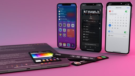
Translate
In any other year, Translate, Apple’s latest addition to its roster of built-in iPhone apps, would have been regarded as the perfect solution for tourists traveling abroad and looking for an easy way to hold a conversation with other people in a different language. Unfortunately, the current pandemic means Translate’s primary use case will have to wait for its effects to be evaluated in real-life scenarios. But that didn’t stop me from holding multilingual conversations with myself and trying to judge Apple’s efforts to the best of my Italian and English knowledge.
Translate is a new iPhone app that lets you translate text between two different languages, choosing from a selection of 11 supported languages32 at launch. The app was designed to help with real-time conversations, and it can be used either in regular text input mode or via dictation. Translate relies on iOS’ intelligence and machine learning to detect languages automatically and perform translations; if you’re in a foreign country without a data connection, you can choose to use Translate completely offline, but you’ll have to download languages on your device beforehand. To set the app to offline mode, you can visit Settings ⇾ Translate ⇾ On-device mode.
Translate is fairly straightforward and clearly inspired by existing alternatives on the App Store. When you open it, you’ll be presented with a large text field in the middle of the screen and buttons to pick two languages at the top. You can start translating between languages by tapping the text field, which brings up an input screen for manual typing mode. Here, you need to select the language you want to type in with a segmented control above the keyboard; when you do, you’ll notice that international keyboards for each language are automatically included in Translate even if you didn’t previously enable them in Settings, which is a nice touch.
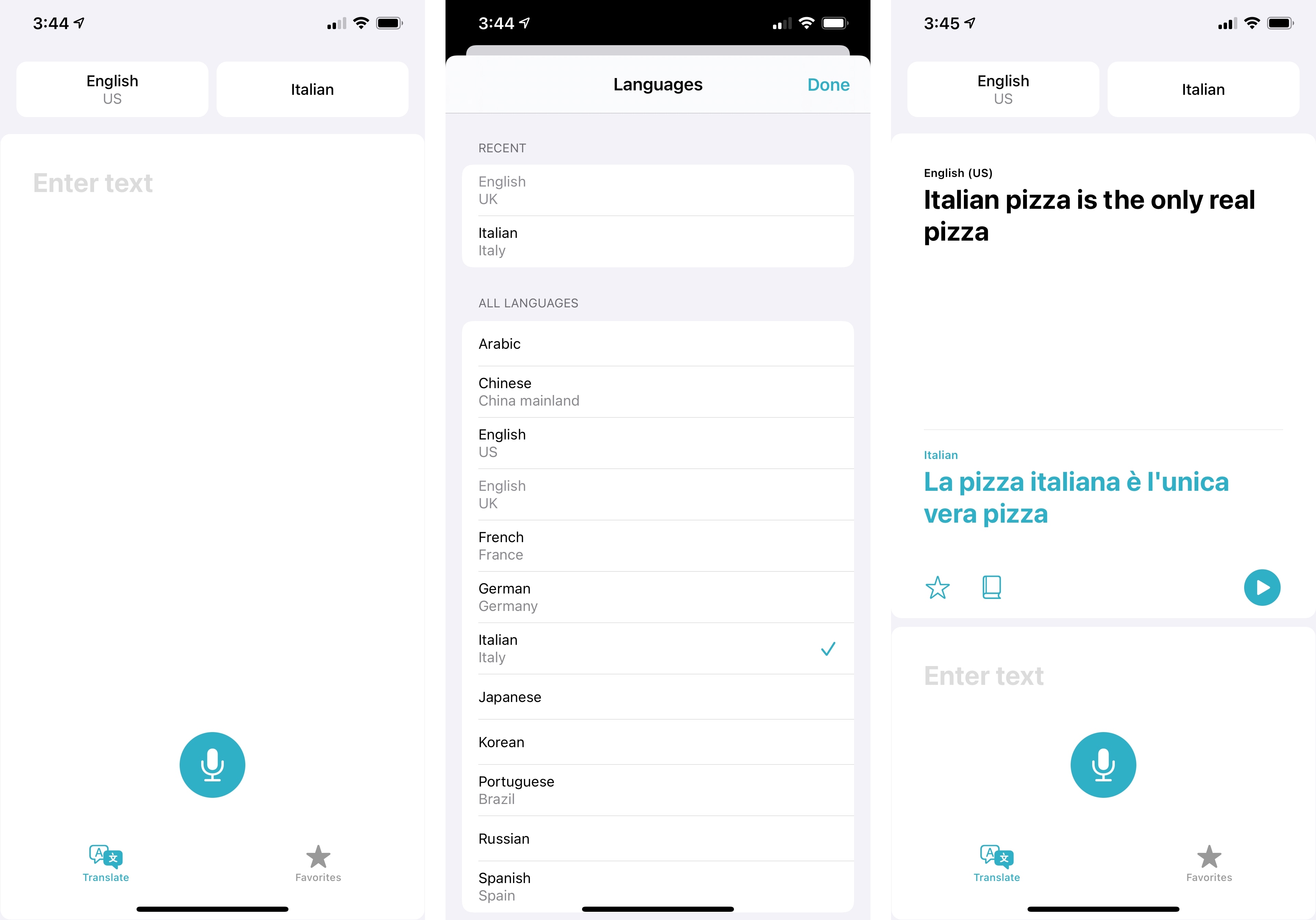
If you’d rather speak your sentence instead of typing, you can tap the microphone button at the bottom of the page. This will reveal one of Translate’s big advantages over most competing apps from the App Store: by default, Translate performs automatic language recognition when speaking, which means the app will automatically detect which of the two languages you’re speaking by simply listening to you. If you don’t want Translate to use automatic language detection, you can disable it in the Languages screen.
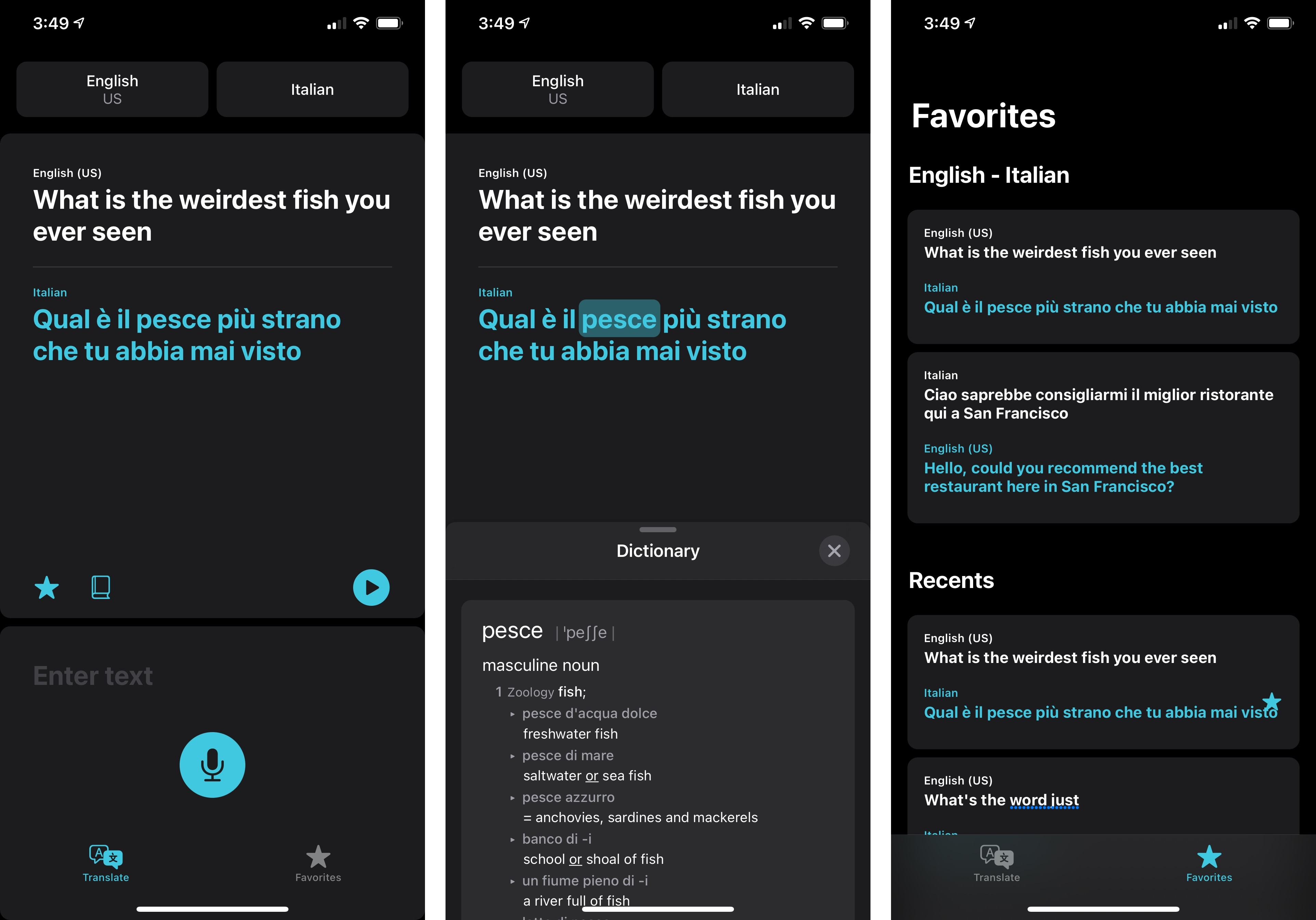
Once a translation has been performed, Translate will display the original transcription and its translation in a split-screen UI. At this point, you can either turn the iPhone’s screen so the other person can look at what’s onscreen, or you can tap one of the three buttons displayed underneath the translation. You can play the translated sentence using Siri’s voice through the iPhone’s speakers; you can mark the current translation as a favorite, which will save it in the Favorites screen alongside a full log of your recent translations; or you can tap the dictionary button to access Translate’s built-in definition feature. In this mode (which you can also quickly access by tapping any word in the translation without hitting the dictionary icon first), selecting a translated word displays an inline definition via the system’s dictionary, which will default to showing the translated definition for the current language pair if available. In my examples below, you can see how Translate shows translated definitions based on the Oxford Italian-English dictionary, which is built into iOS.
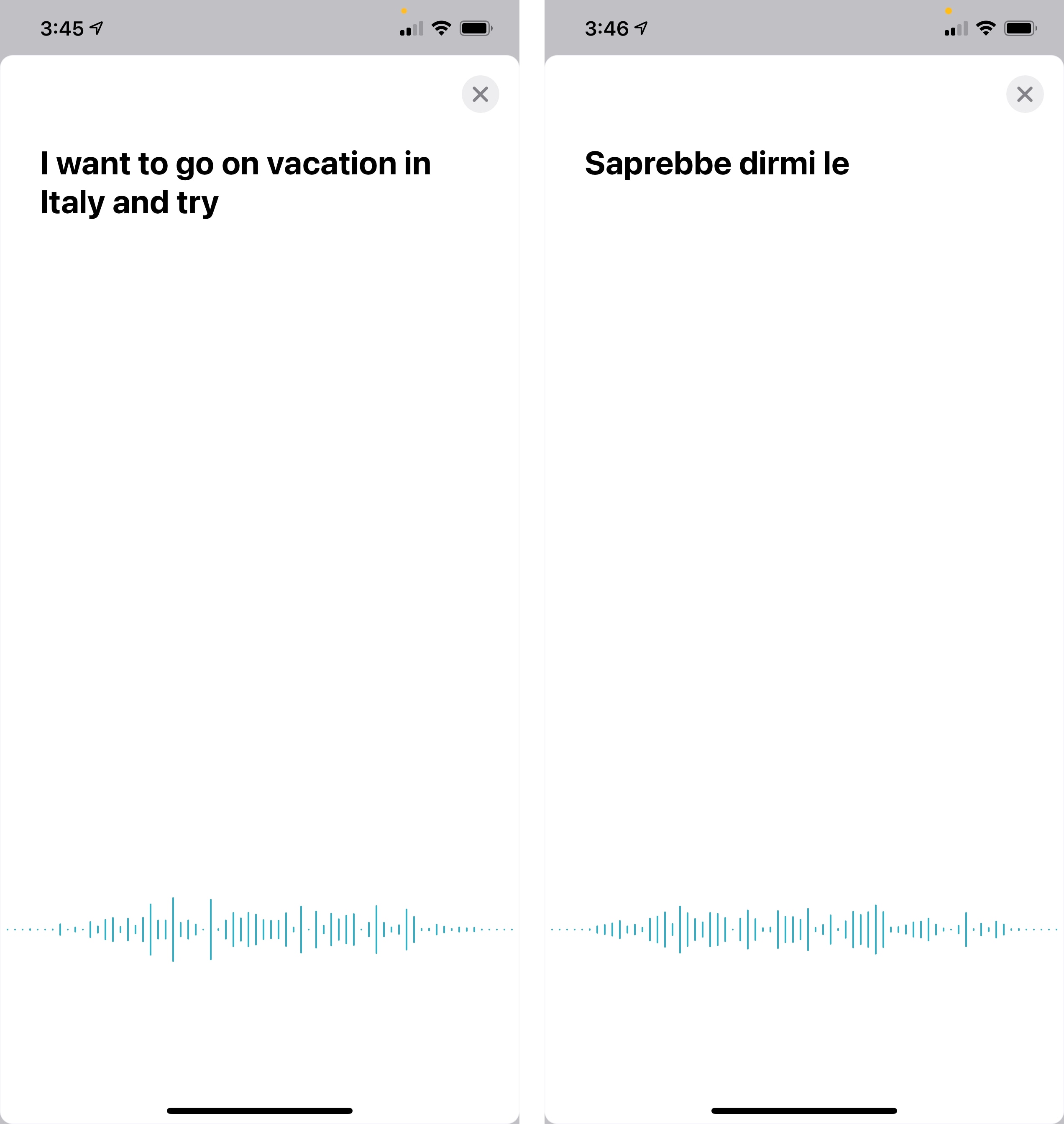
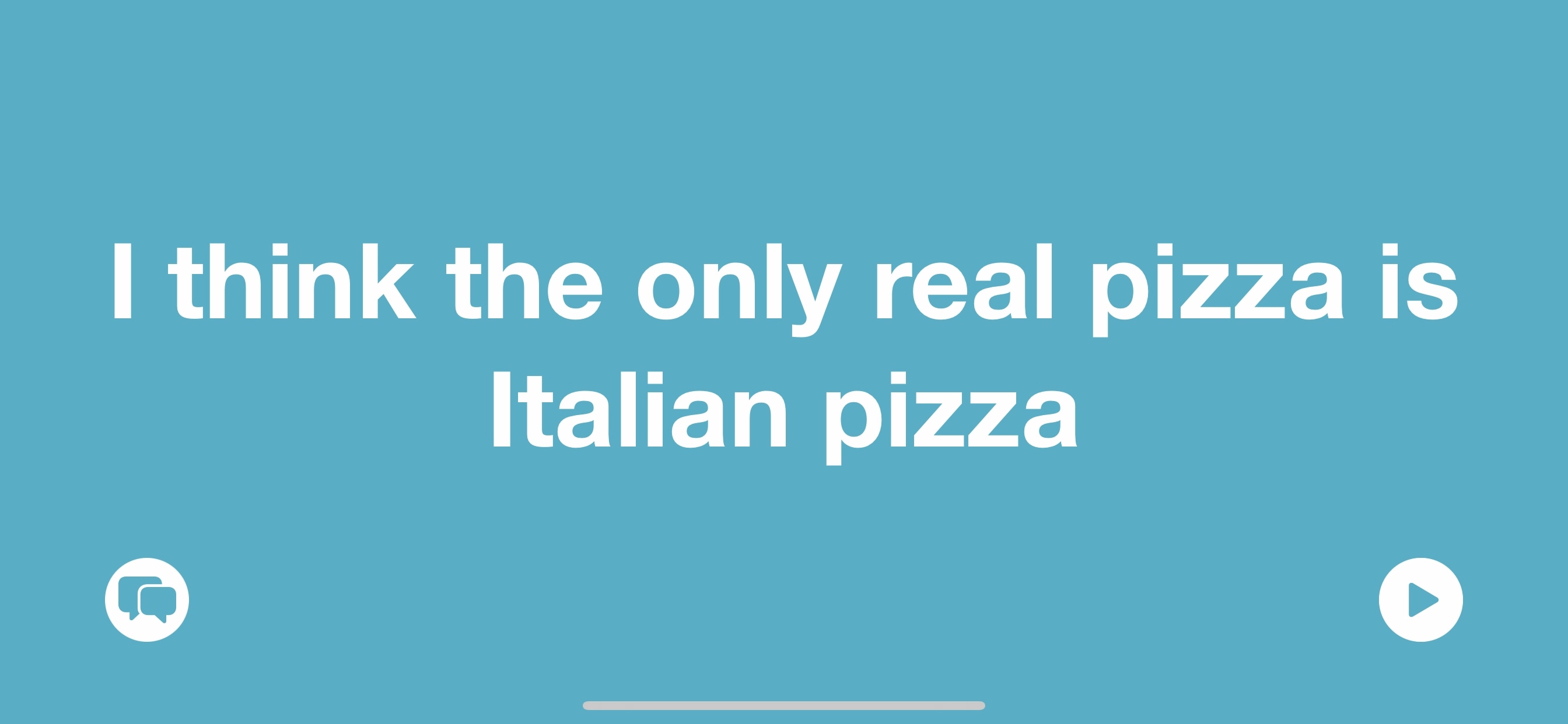
Translate also comes with a special ‘attention mode’ designed to make it easier to have a conversation with someone else using the app as a translator. Turn your iPhone sideways to landscape mode, speak or type the sentence you want to translate, then tap the two arrows in the bottom left corner: the translated sentence will be enlarged to take over the entire display in full-screen, which is ideal if you want to turn your device to get someone’s attention with the just-performed translation. While in attention mode, a play button lets you play the translated sentence via Siri’s voice, and you can return to the app’s regular mode by tapping the conversation button in the bottom left.

As a bilingual person who regularly speaks two languages on a daily basis (if anything, it could be argued that I now speak more English than Italian given my writing and many podcasts), I was uniquely positioned to test the new Translate app and evaluate the quality of its translations. I’m pretty impressed by Apple’s first showing with the Translate app in iOS 14: translations are good enough, and although there’s the occasional “robotic translation” for more complex terms that gives away the non-human nature of these translations, I think Translate does a solid job at preserving the context of conversations and getting to the core meaning of most common requests. There were occasional misgivings, particularly with more colloquial Italian expressions that don’t have an exact English match, but overall, I think Translate produces results that are comparable, and sometimes even superior, to Google Translate – without the need to use Google services or an Internet connection.
I wouldn’t recommend Translate as a study tool to learn a foreign language, but the app wasn’t designed to fill that niche. The practical impact of Translate will have to be judged in the real world, when people are allowed to travel internationally again and if they choose Translate as a utility to aid them in their exploration of cities and locales around the world. For now, based on my tests with Italian and English, Translate works well, has plenty of integrations with the system (in addition to the dictionary, Siri translations are also powered by Translate now), and can work offline, respecting your privacy and data usage. Once the world opens up again, Translate will be a handy utility to have on our iPhones.
Messages
In what shouldn’t come as a surprise given the effects of the global pandemic, Messages – already one of Apple’s most popular apps for iOS and iPadOS – has seen, according to the company, a 40% increase in messages sent with twice the amount of usage in group conversations. With these numbers, and given the underlying importance of Messages, it’s not shocking that Apple took the time to bring some long overdue enhancements to the iMessage experience in Messages this year. The additions in iOS 14 mostly revolve around conversation management and group threads, with smaller tweaks and new Memoji features to round out the update.
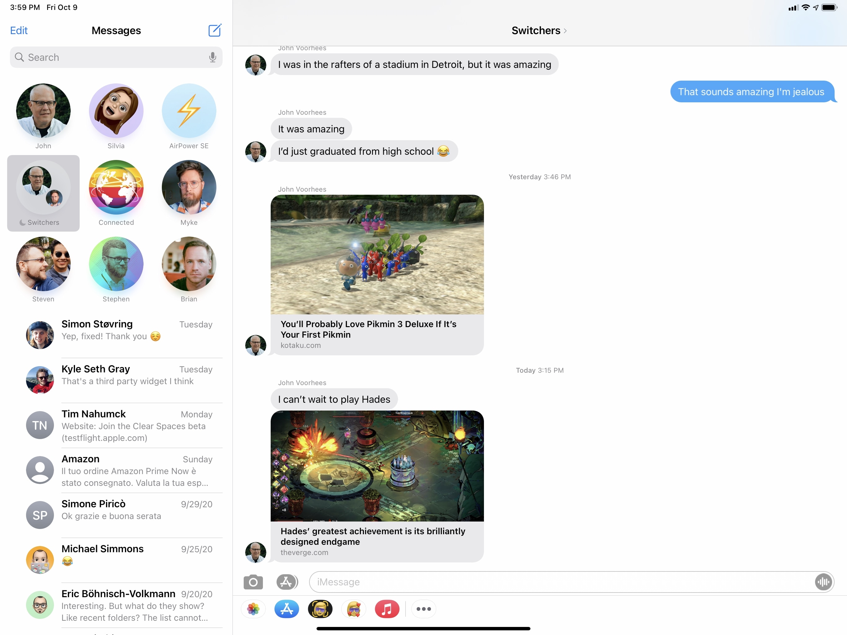
First up is the ability to pin conversations in the main Messages screen. When you pin a conversation in iOS 14, iPadOS 14, and macOS Big Sur (which is also getting a brand new, Catalyst version of Messages this year), pins will be displayed as large profile pictures at the top of the screen in a grid layout. You can pin specific conversations by swiping right on them, long-pressing and choosing ‘Pin’ from the context menu, or using drag and drop. You can pin up to nine conversations, and pins will sync across all your devices via iCloud.
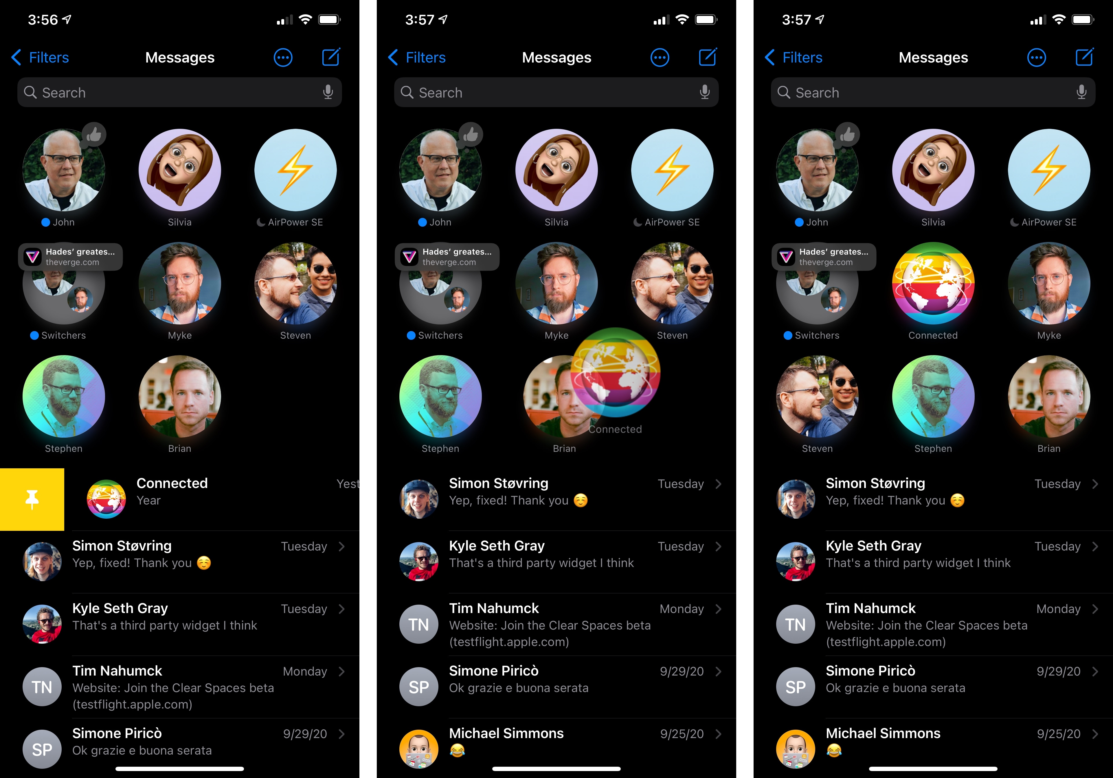
The new pinned UI makes it easy to open your most used threads, and I couldn’t imagine going back to the old Messages app where all conversations were displayed in a list. Pins have become muscle memory for me at this point: I know that my girlfriend is at the top center of the grid and the Connected group thread is right below her. It’s nice to have a clear visual separation between pins and regular conversations, and Memoji avatars lend themselves well to this new design.
There’s more Apple has done to make pins and group threads easier to manage in Messages. Typing indicators are now displayed in the conversation list: whether someone is typing, left a Tapback reaction, or sent a new message, a small indicator will be displayed next to the pin as a preview of what’s happening in the conversation. Indicators are useful insofar as they give you a better sense of what you’re missing in a conversation without having to open it; switching between multiple conversations is also improved now since you can see at a glance who’s typing or has shared something in one of your pinned threads.
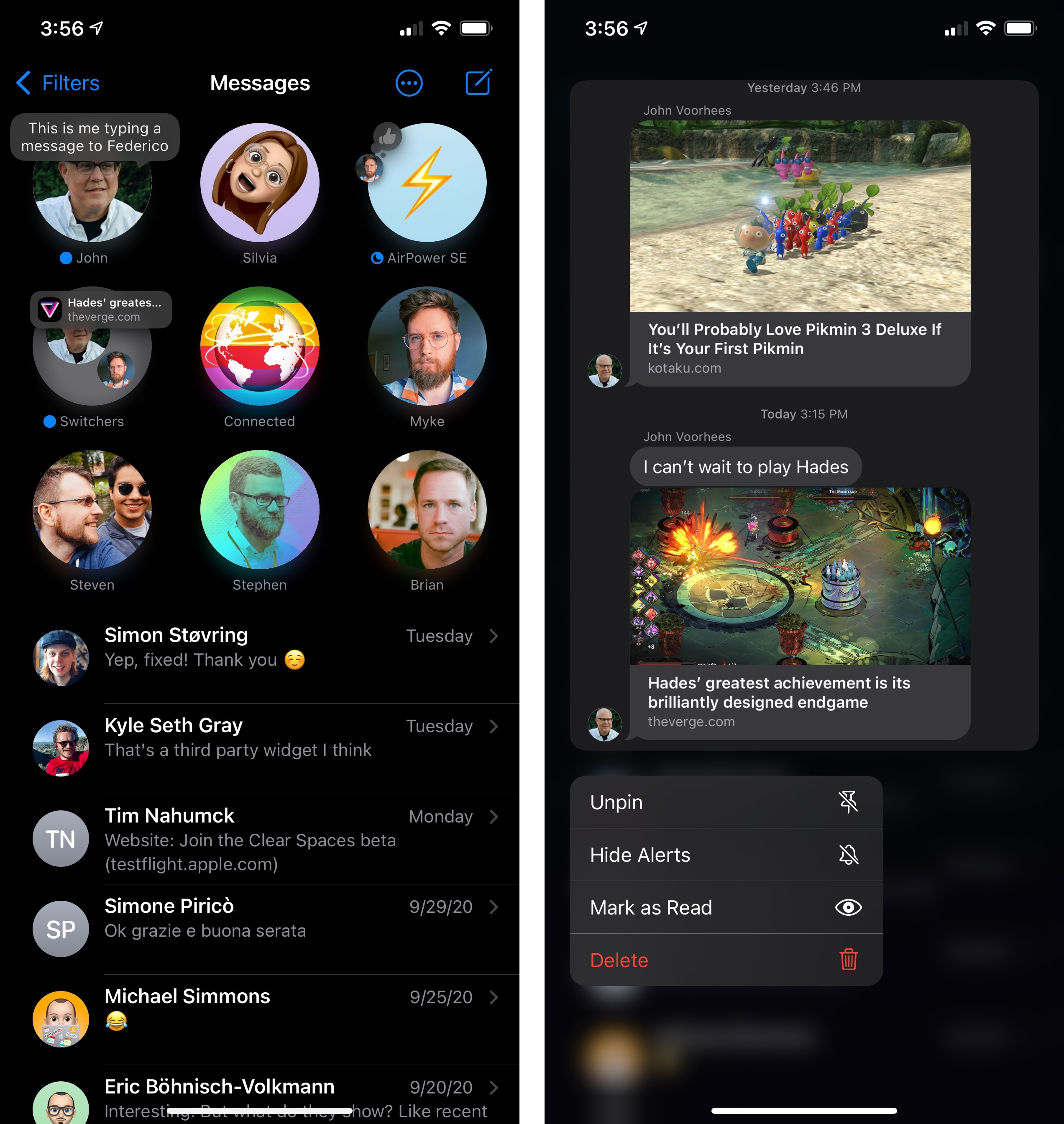
With context menus and more indicators, you have new ways to preview conversations from the main list.
By default, group threads are now displayed in the conversation list with a round picture that contains the avatars of the conversation’s participants – a good design tweak that lets you immediately tell group threads apart from individual ones. The ‘floating avatars’ design also carries over to the title bar inside the conversation itself.
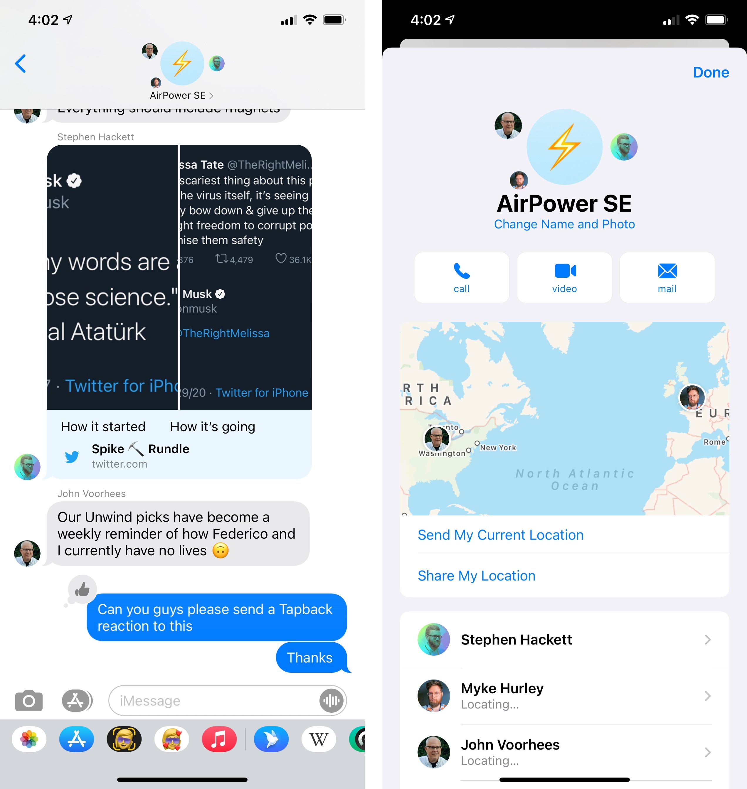
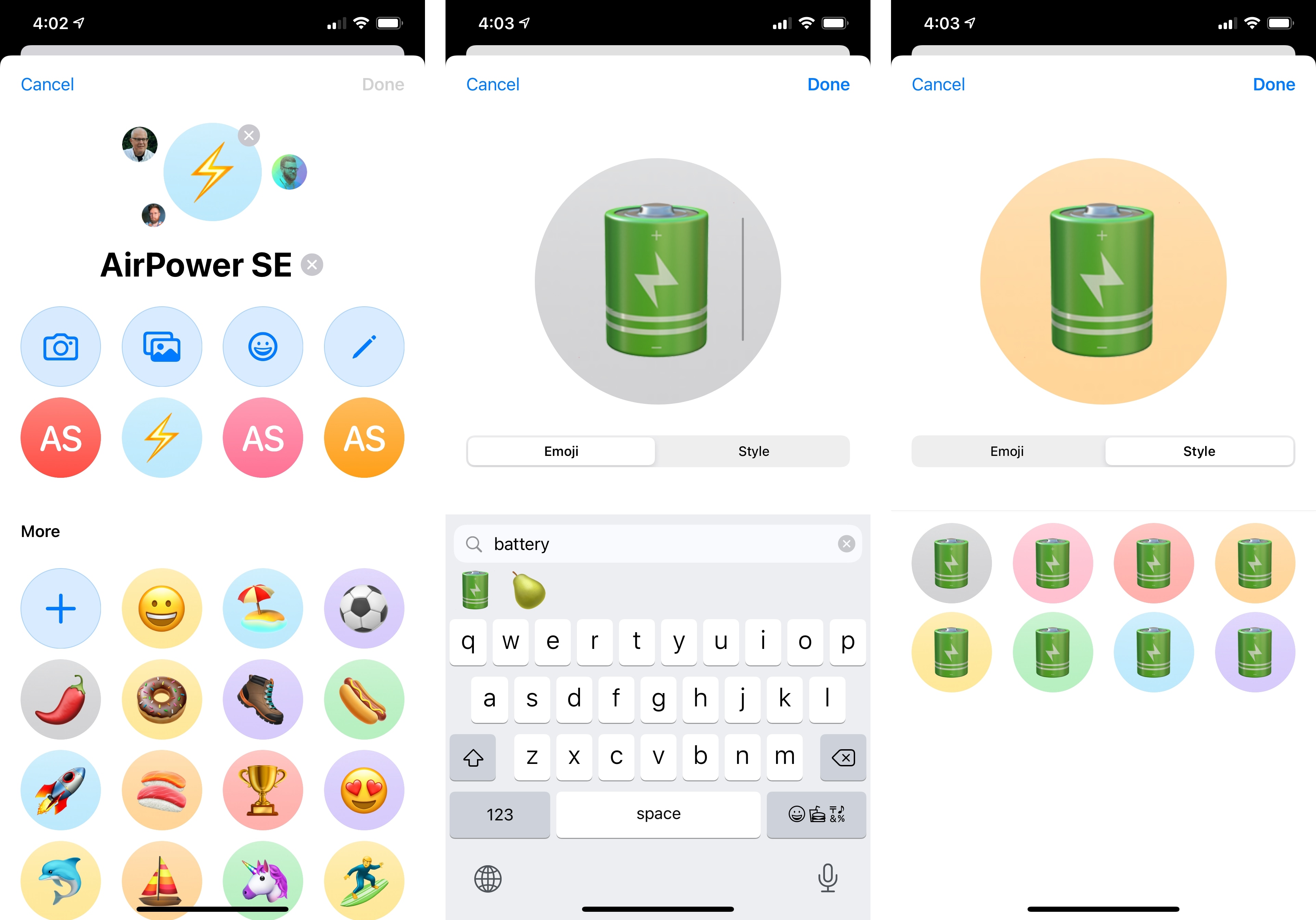
As before, you can rename a group conversation and give it a unique or fun label. In iOS 14, however, you can also set a picture, emoji, or Memoji as a custom group photo: the new editing screen for a group’s name lets you pick different styles and color options for the image you want to use; I’ve had fun picking random emoji characters or funny Memoji expressions as group photos in Messages this summer. If a group has been assigned a custom photo, small profile pictures of its participants will gravitate around it, sort like little moons orbiting around a planet.
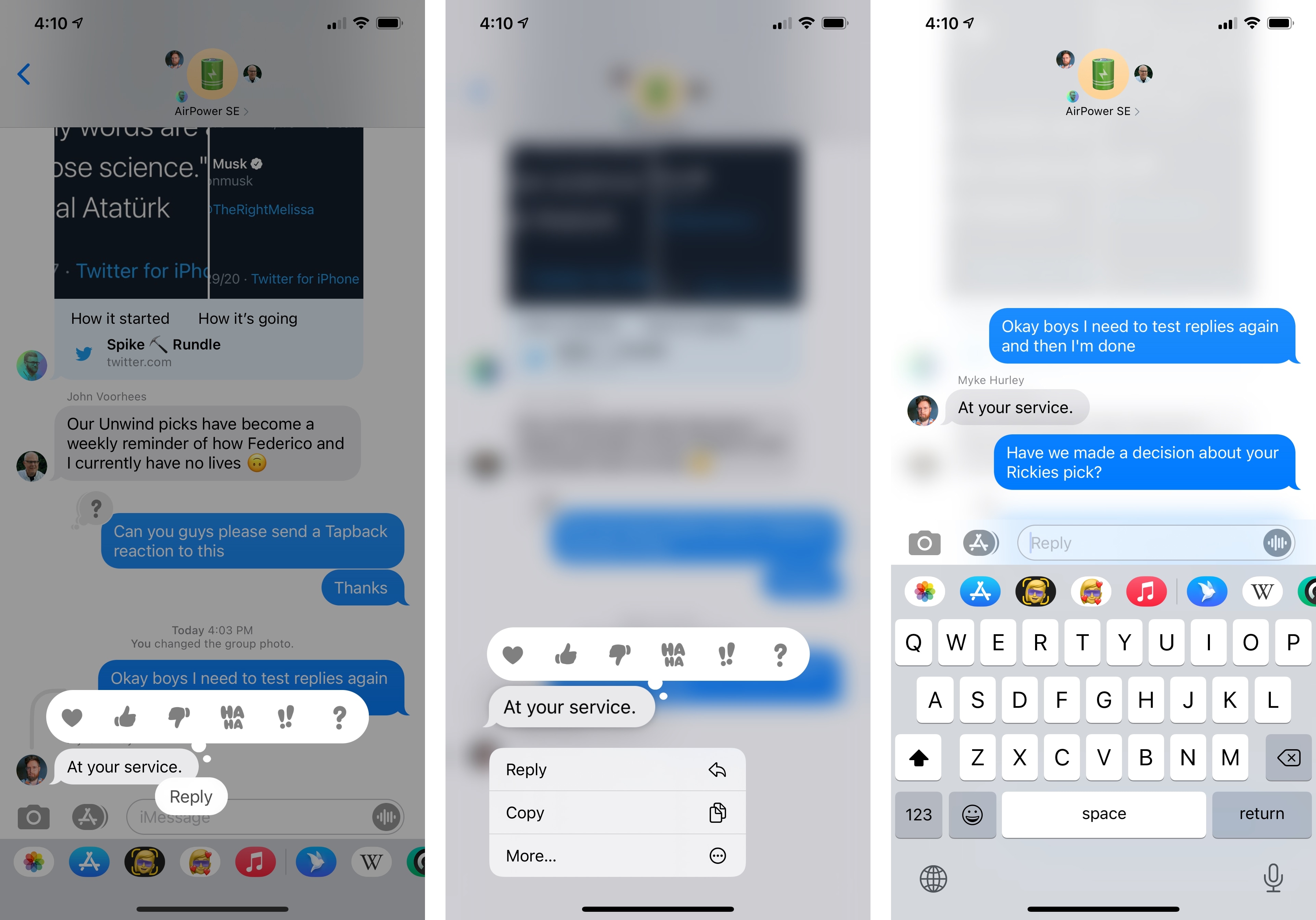
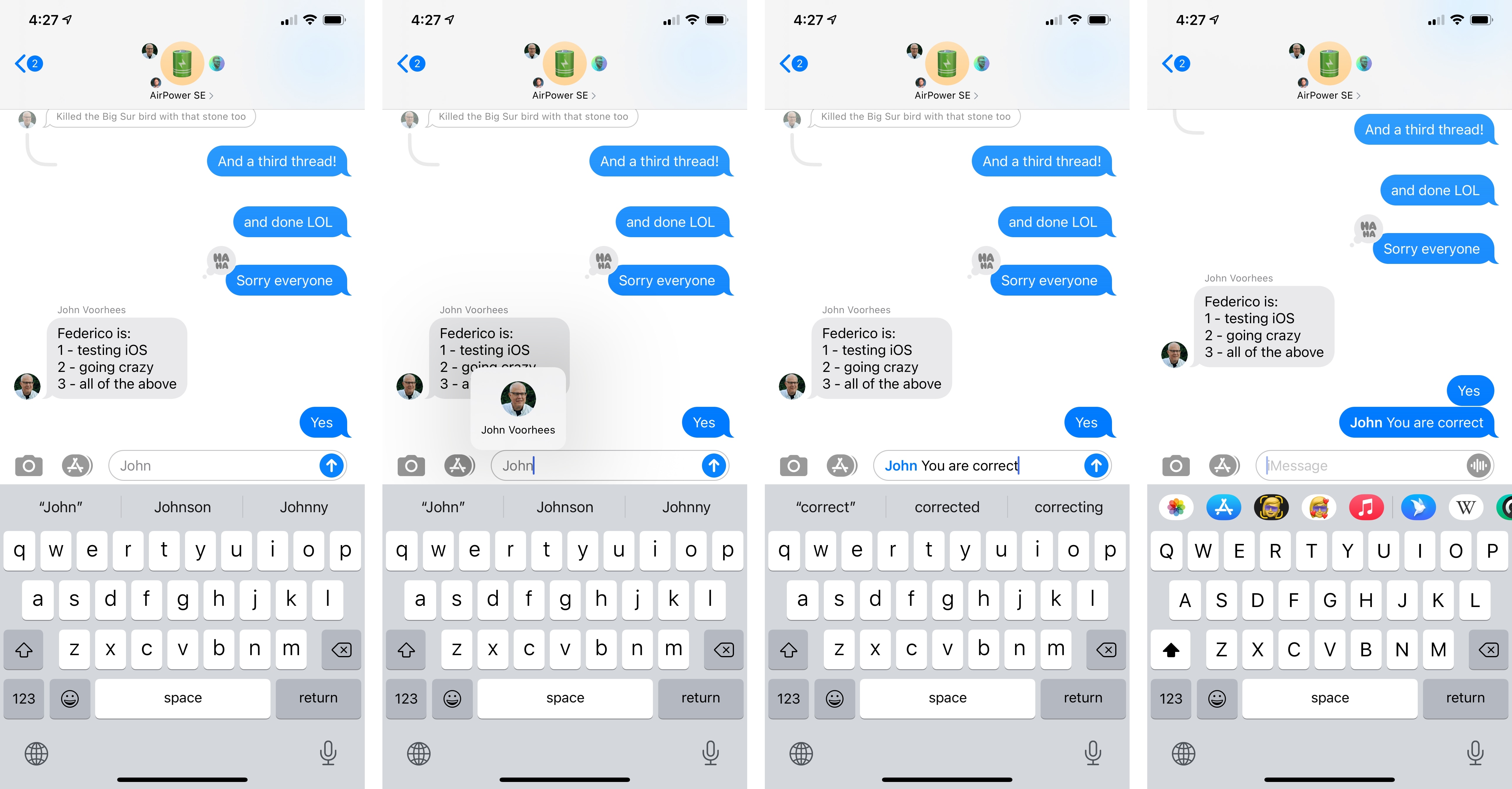
The biggest changes in group conversations, however, come in the form of the long-awaited ability to reply to specific messages and mention users directly in a group thread. Both features were clearly “inspired” by popular messaging alternatives such as WhatsApp and Messenger, but – despite some design missteps – I prefer Apple’s take on this implementation to its competitors. Both inline replies and mentions are available in individual conversations too, but they’ve been obviously created to help in group conversations with more than two participants.
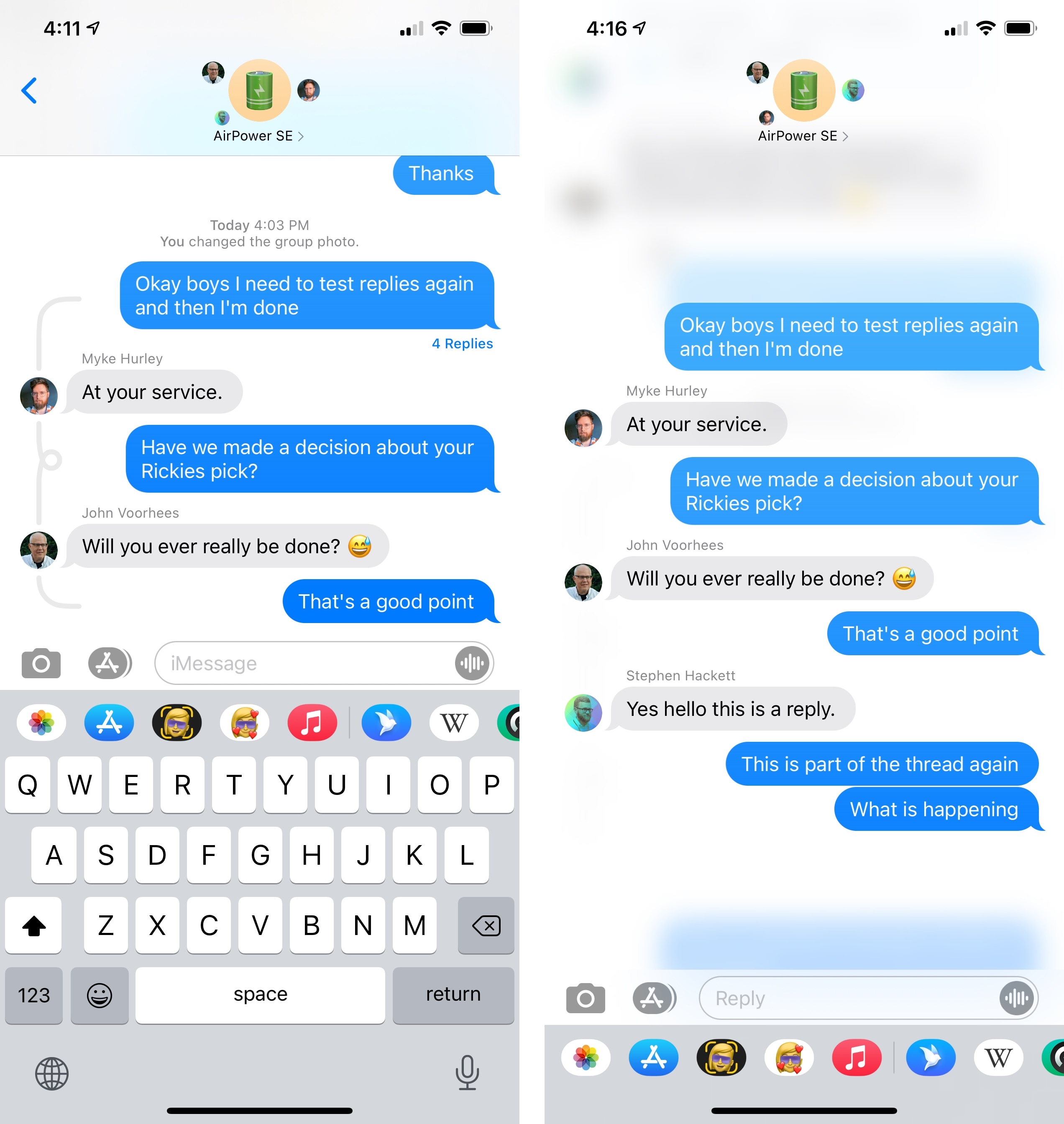
To send an inline reply, you can long-press a message and select ‘Reply’ or double-tap (as if you were adding a Tapback to that message) and press the new ‘Reply’ button there. Doing this reveals Apple’s different direction for inline replies right away: when you reply to a message you don’t just quote the original text in your response (like in WhatsApp), but you actually create an entirely separate thread within the conversation. Inline threads dim the main conversation underneath and the new thread becomes a separate “layer” of the transcript; you can reply once, but you and other participants can also keep sending additional messages that will become part of the thread, which will thus generate its own transcript. It’s much easier to see in practice:
If you think this is more similar to Slack threads than WhatsApp replies, you’re not wrong: rather than allowing users to just reply to a specific message by quoting it, Apple chose to take a page from Slack and allow for the creation of nested threads within the main one. But while Slack went for a more simplistic approach in that you navigate to a secondary page for each thread, Messages in iOS 14 treats inline threads as separate conversations that “expand” on top of the main one.
The problem with Apple’s approach – and where the newfound complexity with threads lies in iOS 14 – is that by not copying Slack’s design, messages belonging to a reply thread also show up in the main conversation. However, only some of them do depending on the length of the thread, which is displayed in the main transcript as an actual thread with curvy lines and “knots” that indicate the presence of a nested conversation. I wish I was kidding with this, but I’m not:
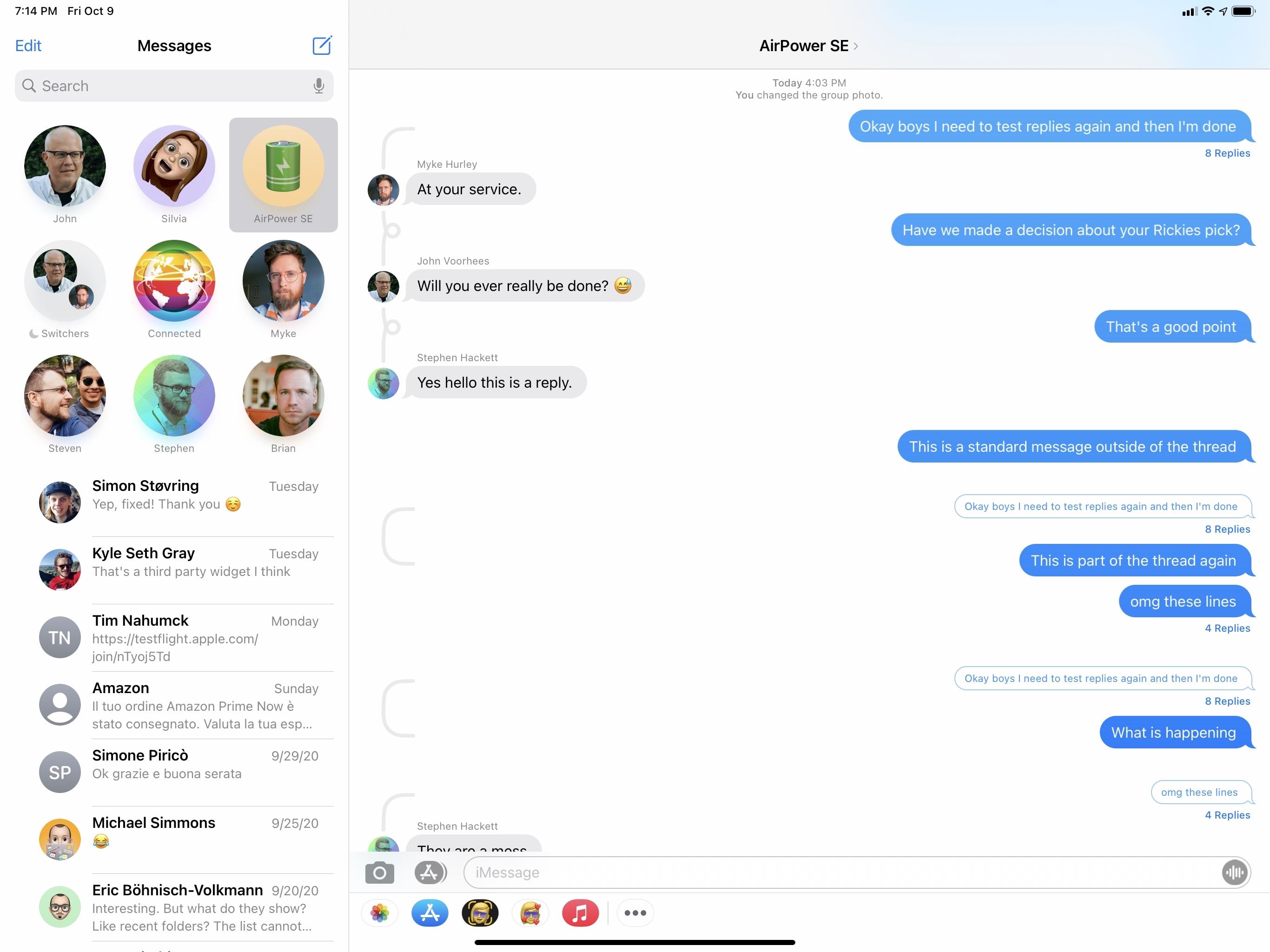
I don’t have a particular issue with the decision to use curvy lines with knots as a visual metaphor for threads – I’m all for adding a touch of whimsy here and there when appropriate. The problem in this case is the inconsistency of Apple’s design with different types of disconnected lines appearing in the main transcript in addition to new, smaller bubbles that indicate the original message in a nested thread. Stay with me here. Most of the time, you should see a “thread line” that closes on itself, encapsulating the whole thread; you can see how many replies were sent to the original message and you can tap on any of these messages within the thread line to open the standalone thread view on top of the main conversation:
Things fall apart when Messages has to display earlier messages from the same thread. Sometimes, you may see the thread line without the knot, which at this point I have to assume means the “closing” of the thread? I’m not sure.
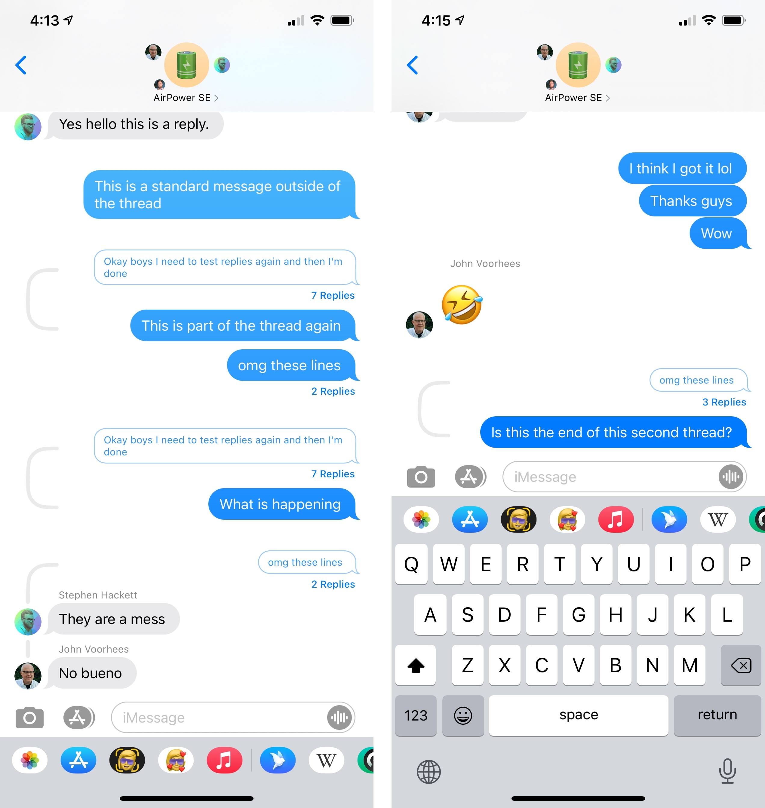
Create enough threads, and you may end up with something like this:
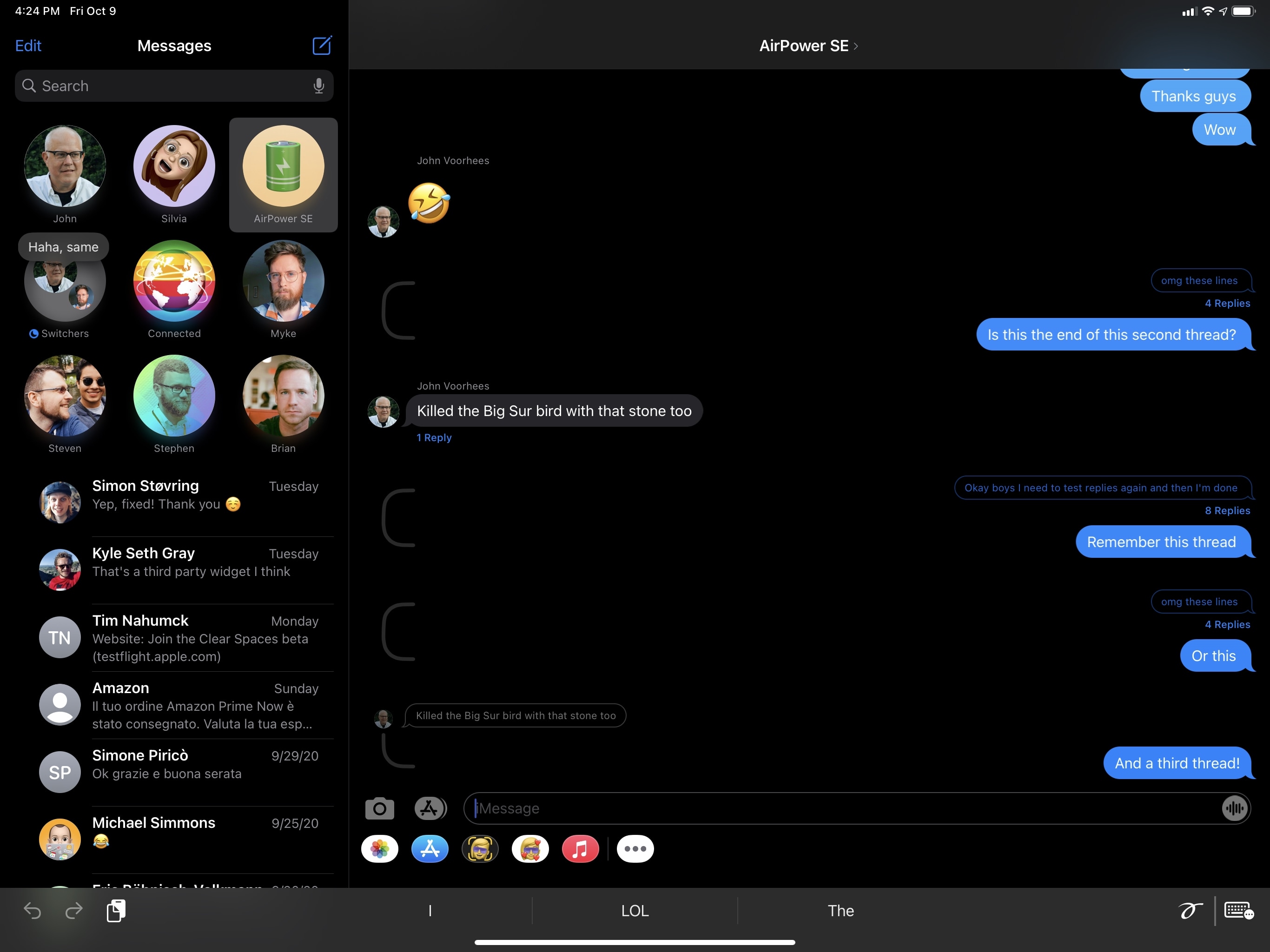
…and you thought Twitter’s UI for threaded replies with different types of lines was confusing. To me, this feels like a good example of “over-designing” a UI that should have been much simpler: the lines and knots may be cute, but they’re not obvious in what they mean; if they were only designed to act as visual flourishes in a conversation, then I think Apple should have opted for more subtle, and perhaps even boring, indicators that consistently suggest the presence of a thread.
I hope Apple will refine or change the design of inline reply threads going forward: I actually prefer full-blown separate threads to WhatsApp’s individual quoted replies, and I’ve been using threads a lot to have separate conversations about a particular topic. The functionality is excellent, but the appearance and integration with the main transcript aren’t good enough. The lines have to go, and everything should be simplified.
Also new this year is the ability to mention users directly in a conversation, which you may want to do to grab someone’s attention. Unfortunately, this is another case of Apple getting a new feature only partially right. You can’t mention users via the popular ‘@’ character used by any other messaging service that deals with mentions: in Messages for iOS 14, you have to write the recipient’s full name and pay attention to the text, which will turn gray; at that point, you can tap the light gray text to display a “mention bubble” for the user; tap it, and the person’s name will turn blue, suggesting you’re going to mention that person directly in the conversation.
At no point during the typing stage is it clear that you need to tap the light gray text to initiate a mention: there are no visual indicators other than the slightly different font color, which is far from accessible. This entire process is so hidden and poorly explained, I don’t think most users are going to realize mentioning others is now possible.
This is a shame since the inclusion of mentions has also brought new settings to control how you’re getting notified by Messages. In Settings ⇾ Messages ⇾ Mentions, you’ll find a new toggle that lets you be notified for direct mentions even if a conversation has been silenced. This is ideal for those busy, high-volume threads that you’d typically set to Do Not Disturb: enable the option, and you’ll only see a notification if somebody wants to get your attention. But what good is this setting if no one actually knows how to send a direct mention? In my opinion, Apple needs a stronger visual indicator than a font color, and they should also add support for ‘@mentions’ with auto-completion for each participant’s name. Right now, the feature is useful, but it’s too hidden.
Last, Memoji. Everyone’s favorite iMessage gimmick has gained 10 new hairstyles this year (including man bun and top knot), 18 headwear styles (including nurse cap and cyclist helmet), six new age options (go update your Memoji, mom), three new sticker options, a revamped facial and muscle structure for more accurate expressions, and, most importantly, face coverings.
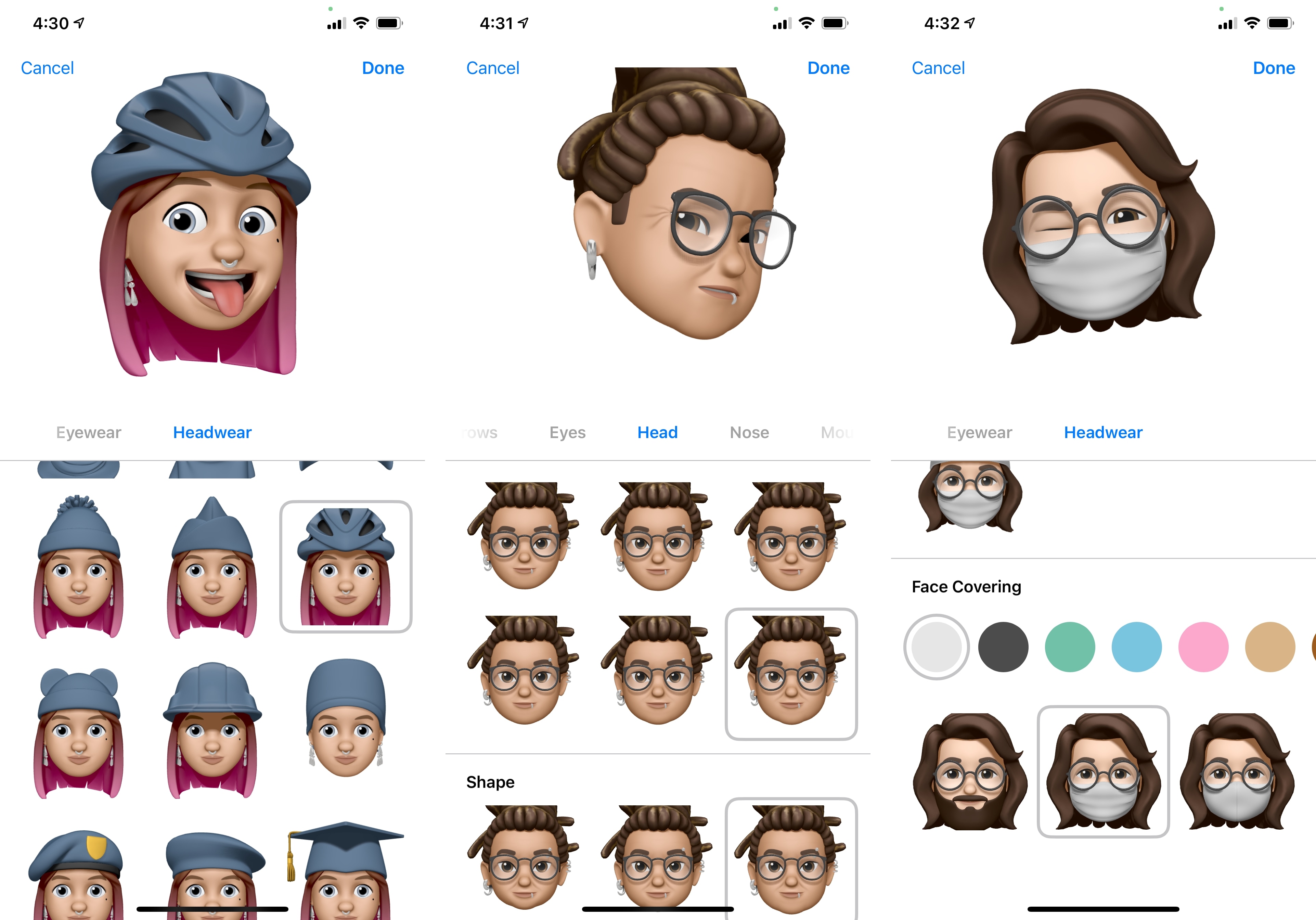
Apple mentions that over a trillion possible Memoji combinations are now supported in Messages for iOS 14. Mostly, I’m happy that face coverings got the attention they deserved, including a nice touch if you want to celebrate something while wearing a virtual mask. You should also wear a mask in real life, and I don’t want to hear otherwise. Please wear a mask and be safe.
Overall, I like the Messages updates in iOS and iPadOS 14. Pins offer a terrific way to switch between my top conversations, group photos and updated Memoji are fun, and inline threads are useful to discuss specific topics in a separate area within a conversation. I just hope Apple can simplify the interactions and design of inline replies before iOS 15 next year.
Music
One of the highlights of this year’s app updates is Music. With a strong foundation of well over 60 million users, Apple Music is gaining an even stronger presence in the Music app with an all-new Listen Now tab, smarter search, and more diverse algorithmic suggestions for users. It’s not just Apple Music though: the Music app itself has been entirely redesigned on iPad with a new sidebar and updated Now Playing screen; a new Autoplay mode keeps the music playing even once you’ve reached the end of a playlist or album; and there are several other cosmetic updates and quality-of-life enhancements that make discovering and managing music a more pleasant experience than iOS 13 regardless of whether you subscribe to Apple Music or not.
Listen Now
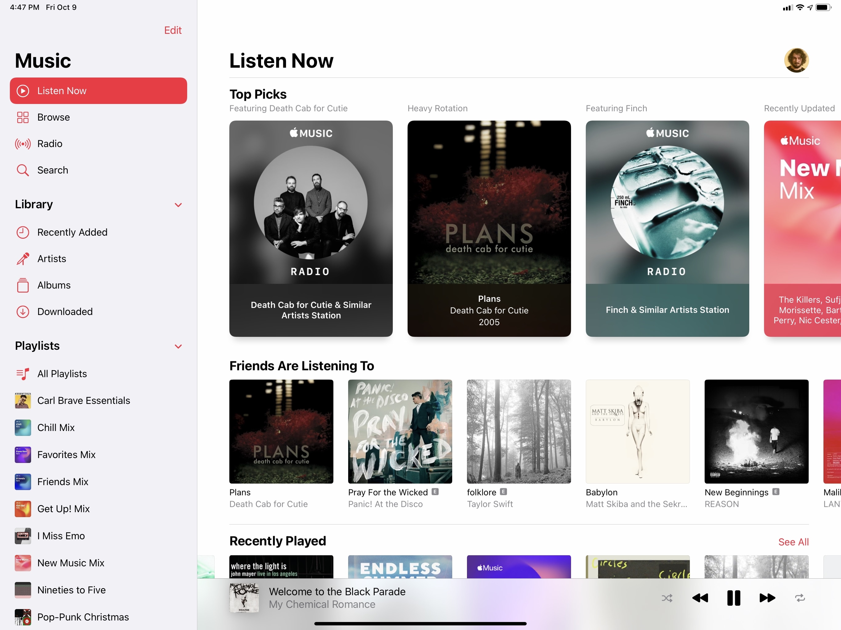
The For You tab, which collected personalized recommendations, recent activity from you and your friends, and new releases, has been relaunched in iOS 14 and is now called Listen Now. The best way to think of Listen Now is as an expanded version of For You that features the same content plus new sections, with a focus on prioritizing personalized suggestions.
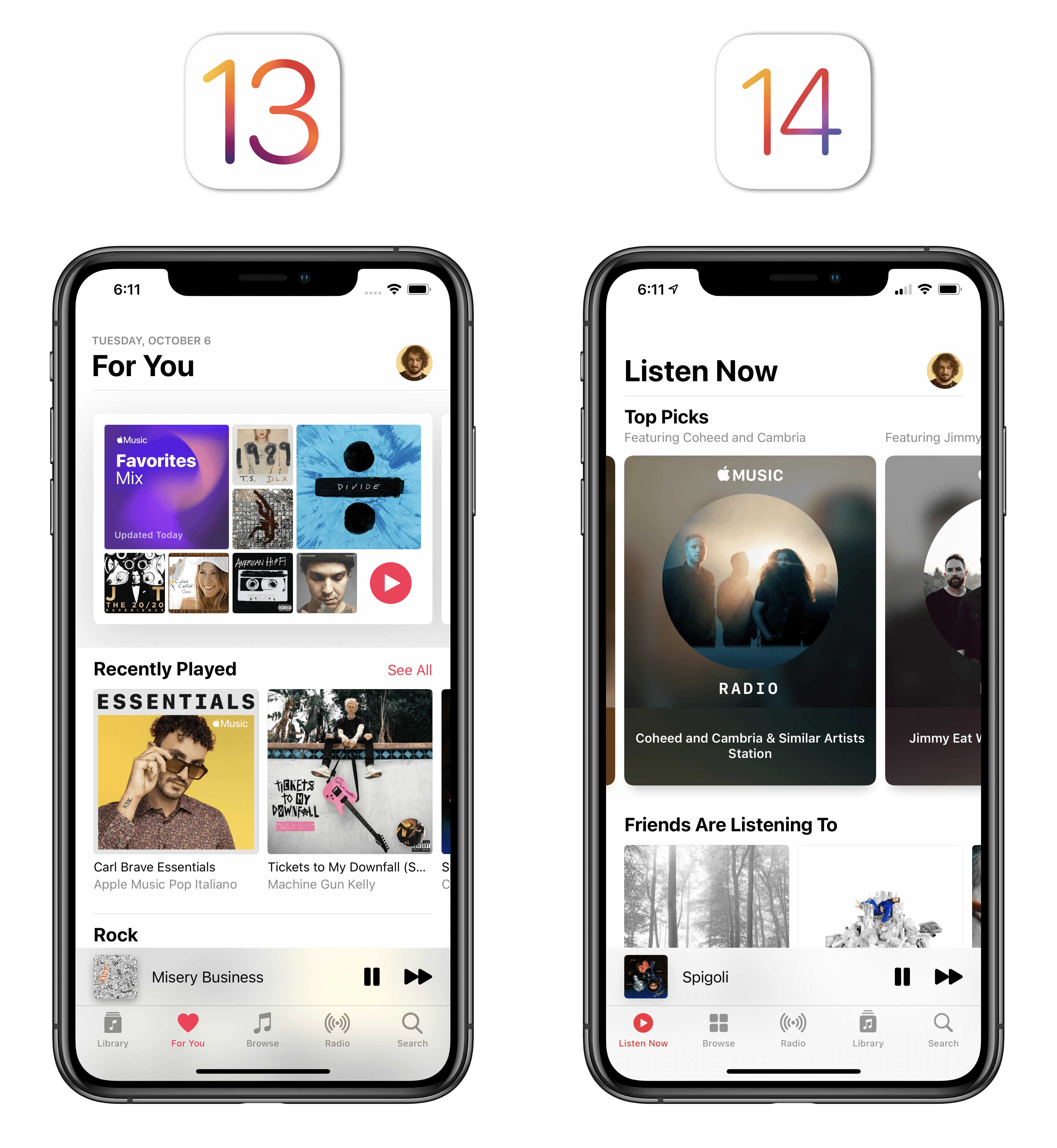
The Listen Now page starts with a summary of your Top Picks, which are displayed as large cards at the top of the screen and encapsulate recommendations across your full range of musical interests. While the old For You page always highlighted Apple Music’s default mixes as the first items in the list, Top Picks in Listen Now go beyond those to include other types of content as well, which will change over time based on what you listen to. You may find radio stations, recently updated mixes, specific albums from heavy rotation, or playlists in your Top Picks. In my experience, Top Picks frequently rotated through different sets of suggestions with a particular emphasis on radio stations, which Apple seems to be pushing quite heavily this year given the rebranding of Beats 1 and the Radio tab now sitting in the center of Music’s tab bar.
Activity from your friends has gained a prominent spot in Listen Now as the section immediately following Top Picks. I like this since my Apple Music friends have excellent taste, and it’s fun to see what they’ve been into lately without having to go find the Friends Mix.
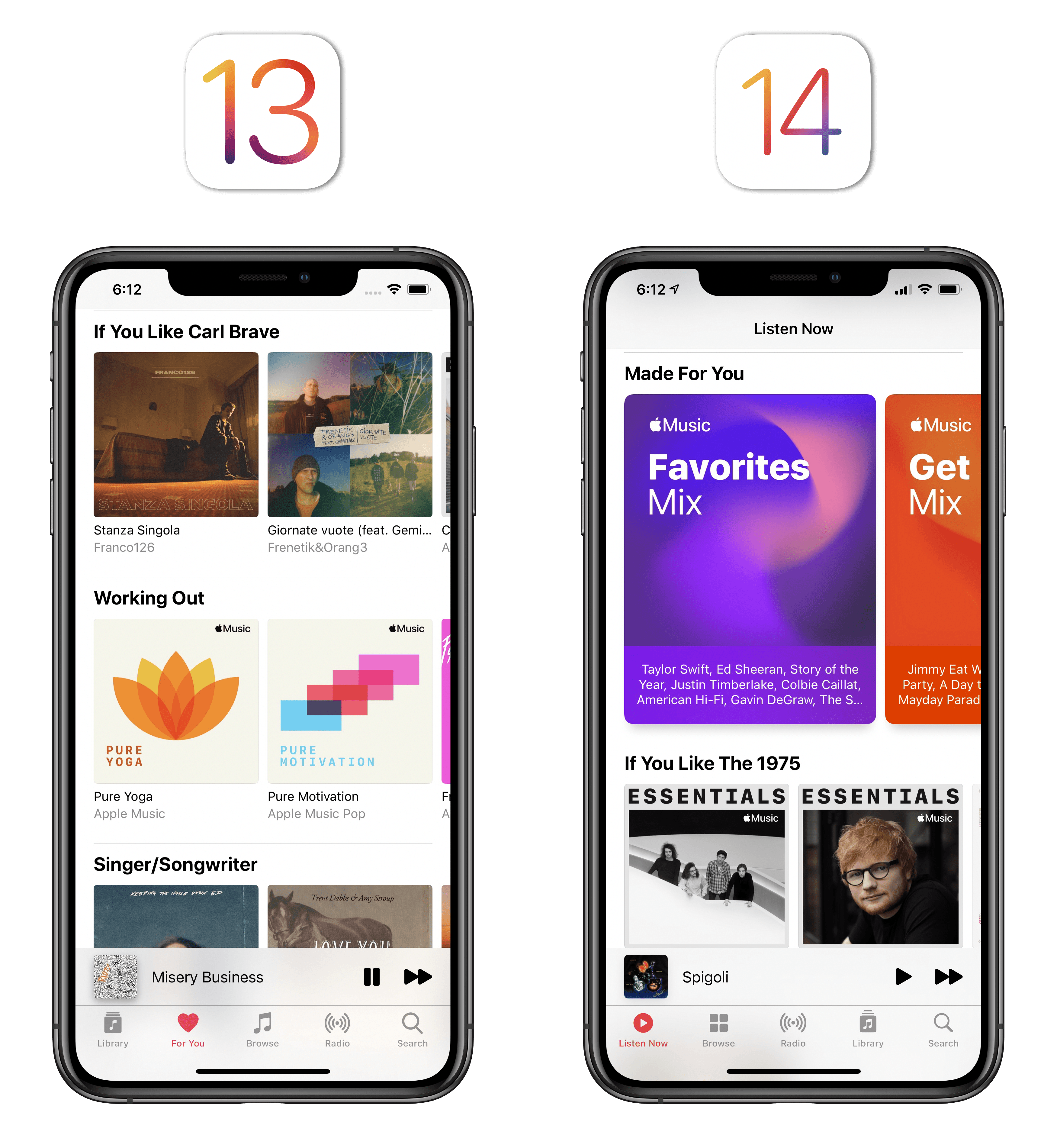
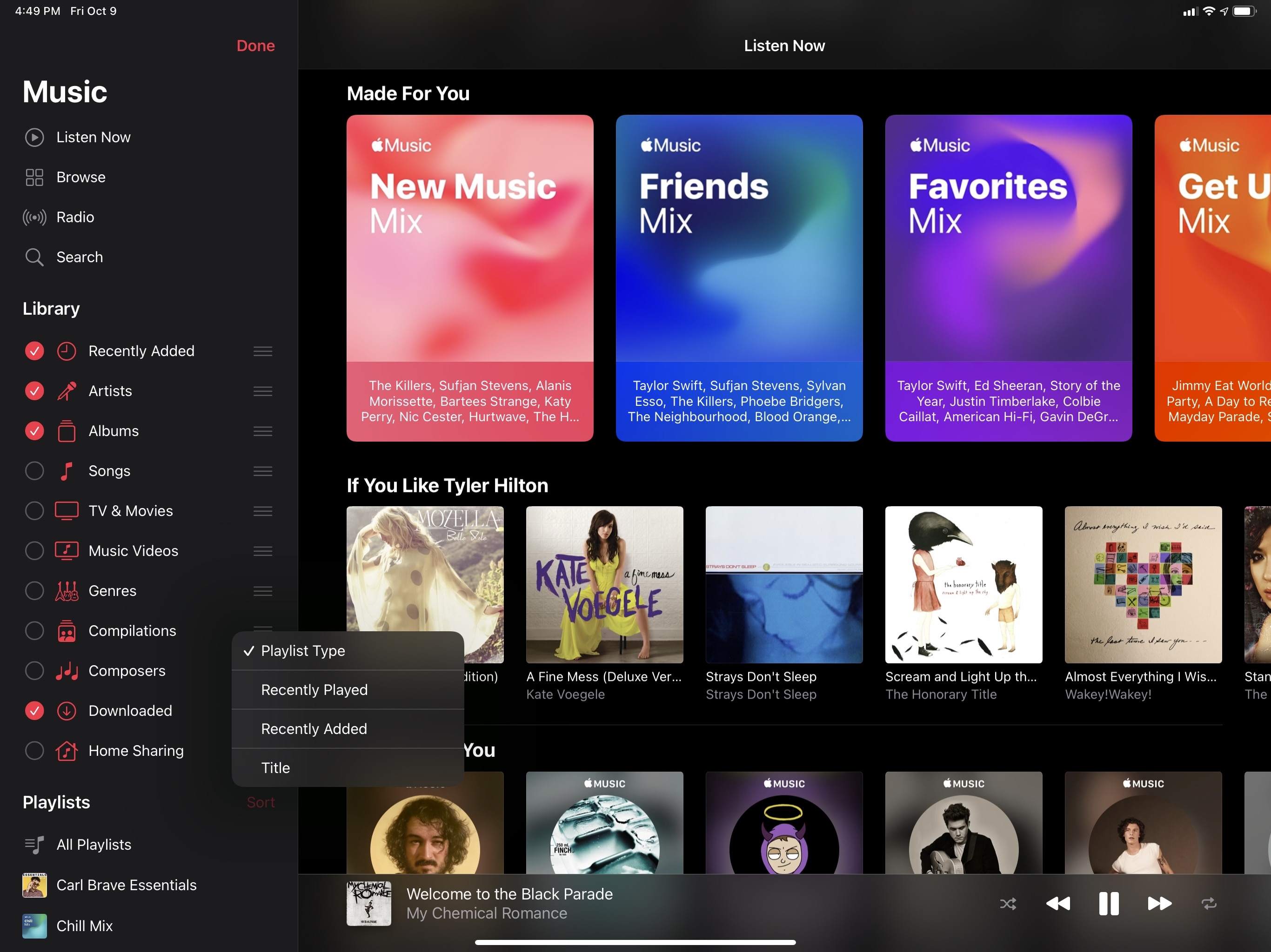
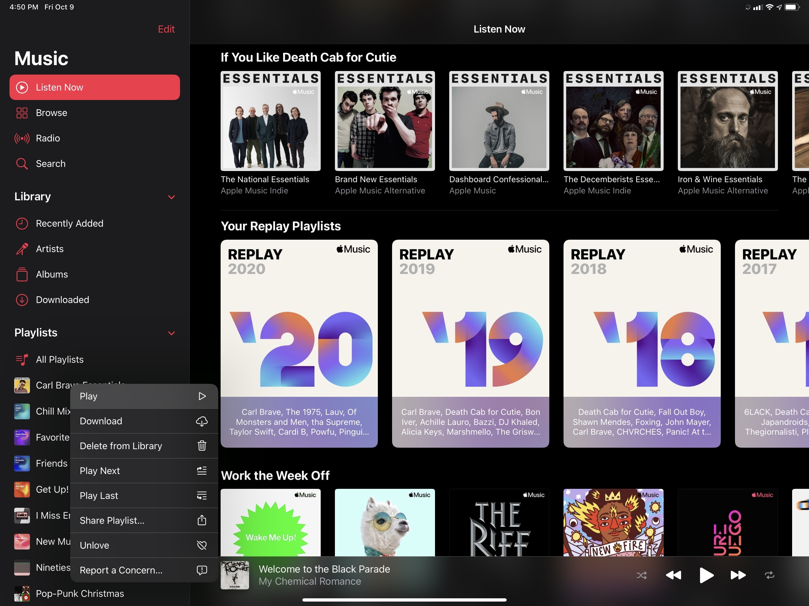
The rest of the Listen Now page includes all the sections and suggestions that used to be available in For You, with some extras. Apple’s algorithmic mixes have become a new ‘Made For You’ section where you can flick though the same large cards seen in Top Picks, which also feature beautifully animated motion covers33 that are fun to look at, plus a written summary of the artists featured in each mix. There are the usual ‘If You Like…’ sections, genre recommendations, and Recently Played sections; new releases have been moved up in the page, and there’s a new section for ‘Stations For You’, confirming my idea that Apple wants to promote Apple Music Radio as much as possible this year. Replay playlists and Zane Lowe’s interviews have also received dedicated sections in Listen Now.
Having used Listen Now for the past few months, it’s clear that Apple’s priorities were to increase the amount of personalized recommendations and put the spotlight on the other types of content exclusively offered by Apple Music, such as radio stations and artist interviews. It makes sense to differentiate the Music app’s start page by highlighting content that’s unique to Apple Music; as a user and avid music listener, I like what the company has done with Listen Now since there’s more to discover on a single page and playing something I like is easier thanks to Top Picks. I’m sure there will be folks who aren’t going to appreciate the heavy-handed approach with curated picks and new sections; personally, I spend more time in Listen Now than I did in For You, so I think the redesign is working.
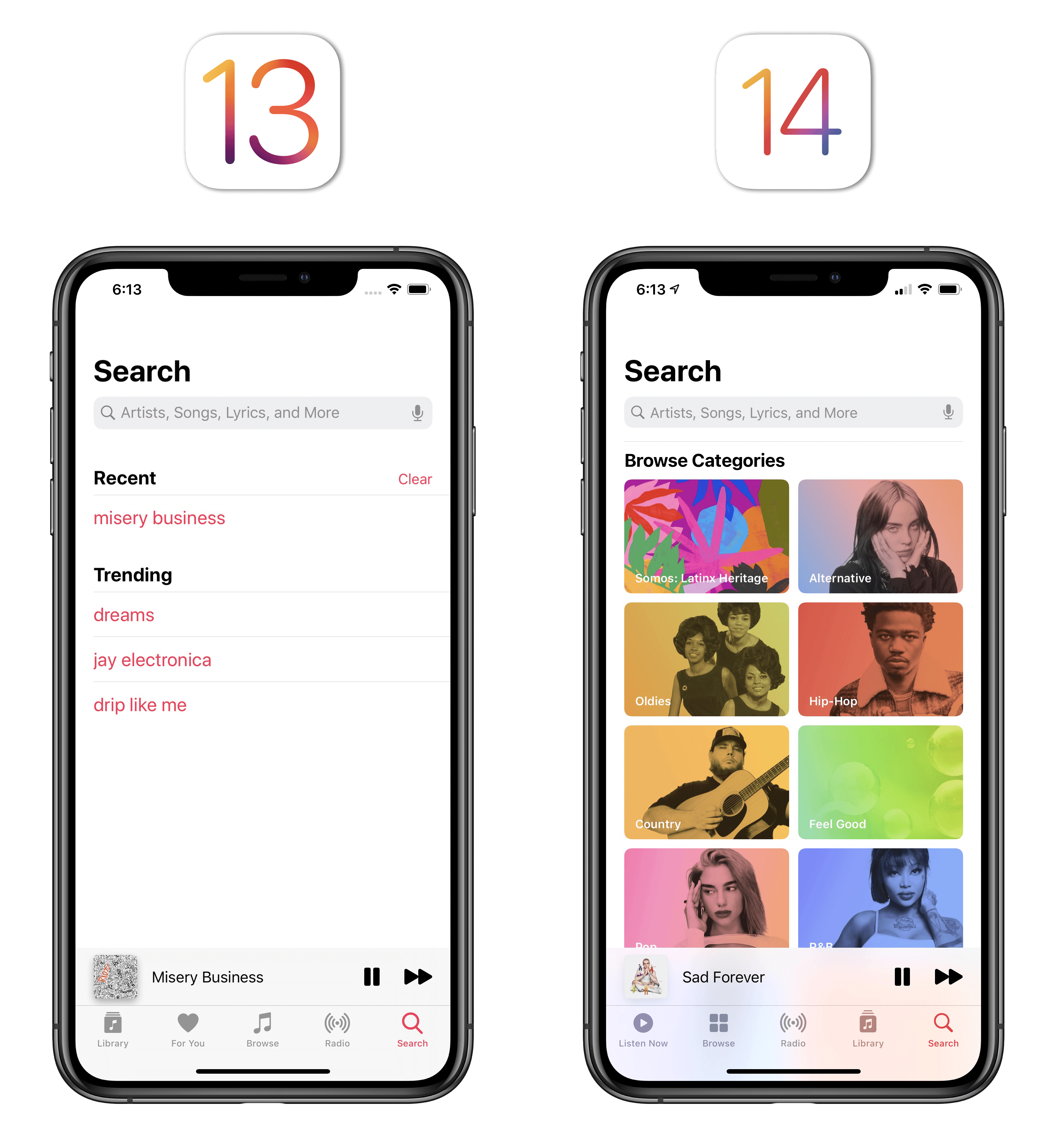
Search
Music’s search experience has been vastly improved in iOS 14 for Apple Music subscribers. When you first open the Search page, even before tapping into the search field, you’ll be presented with all-new music categories for different genres, moods, and activities, which you can tap to explore those sections and find something to play. The difference in the initial search screen between iOS 13 and 14 is pretty dramatic:
Improvements to search extend far beyond suggestions though. As soon as you tap into the search field, iOS 14’s Music app presents you with a list of your recent searches. Unlike iOS 13, recent searches feature the type of item (artist, song, etc.), a ‘+’ button to add songs to your library with one tap, and thumbnail previews – a terrific improvement over iOS 13’s plain text recent searches.
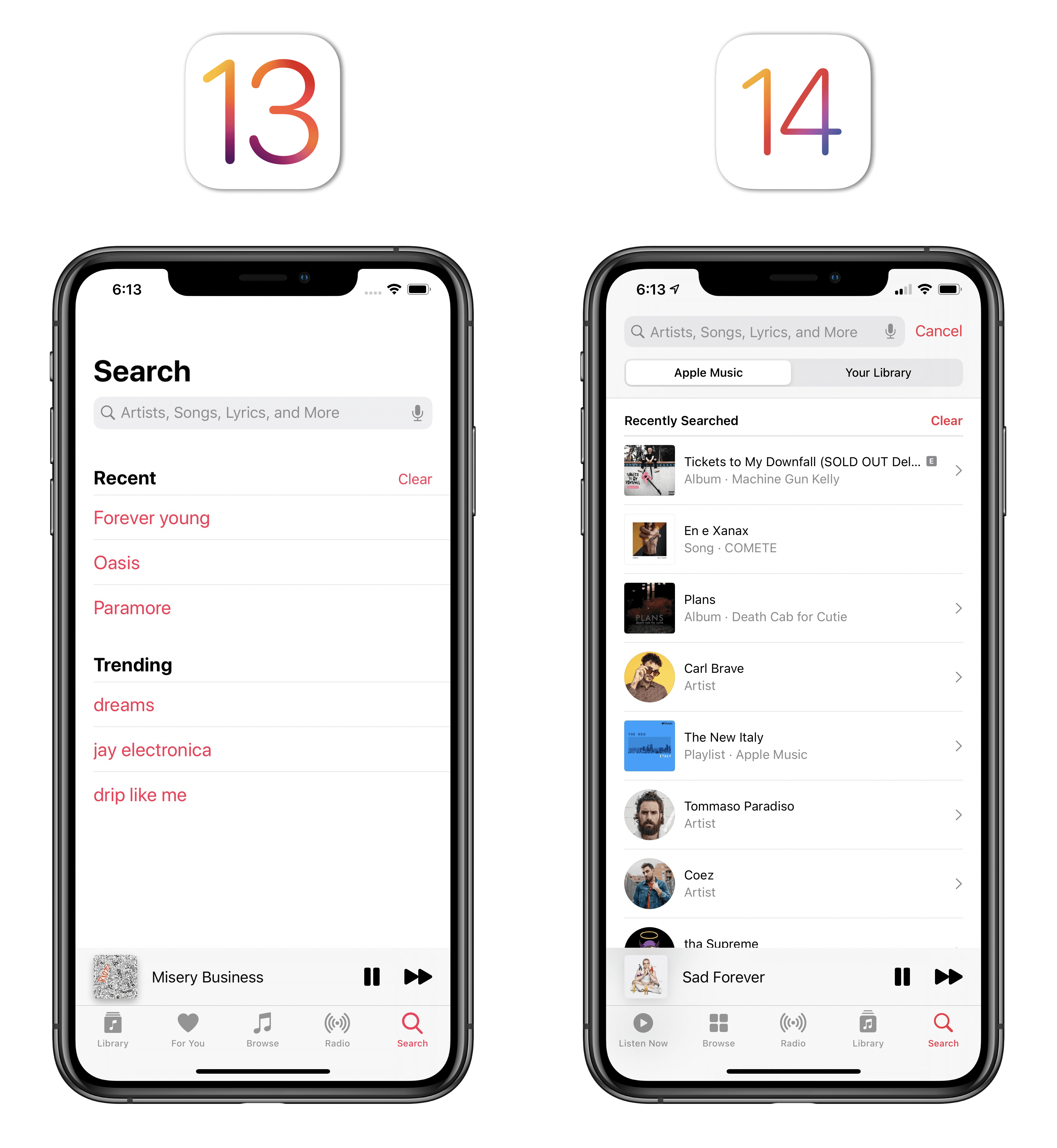
The experience of searching Apple Music’s catalog and your library has been redesigned as well. While you’re typing a search in iOS 14, you’ll have a list of search suggestions underneath the search field followed by richer results for artists, albums, and other media:
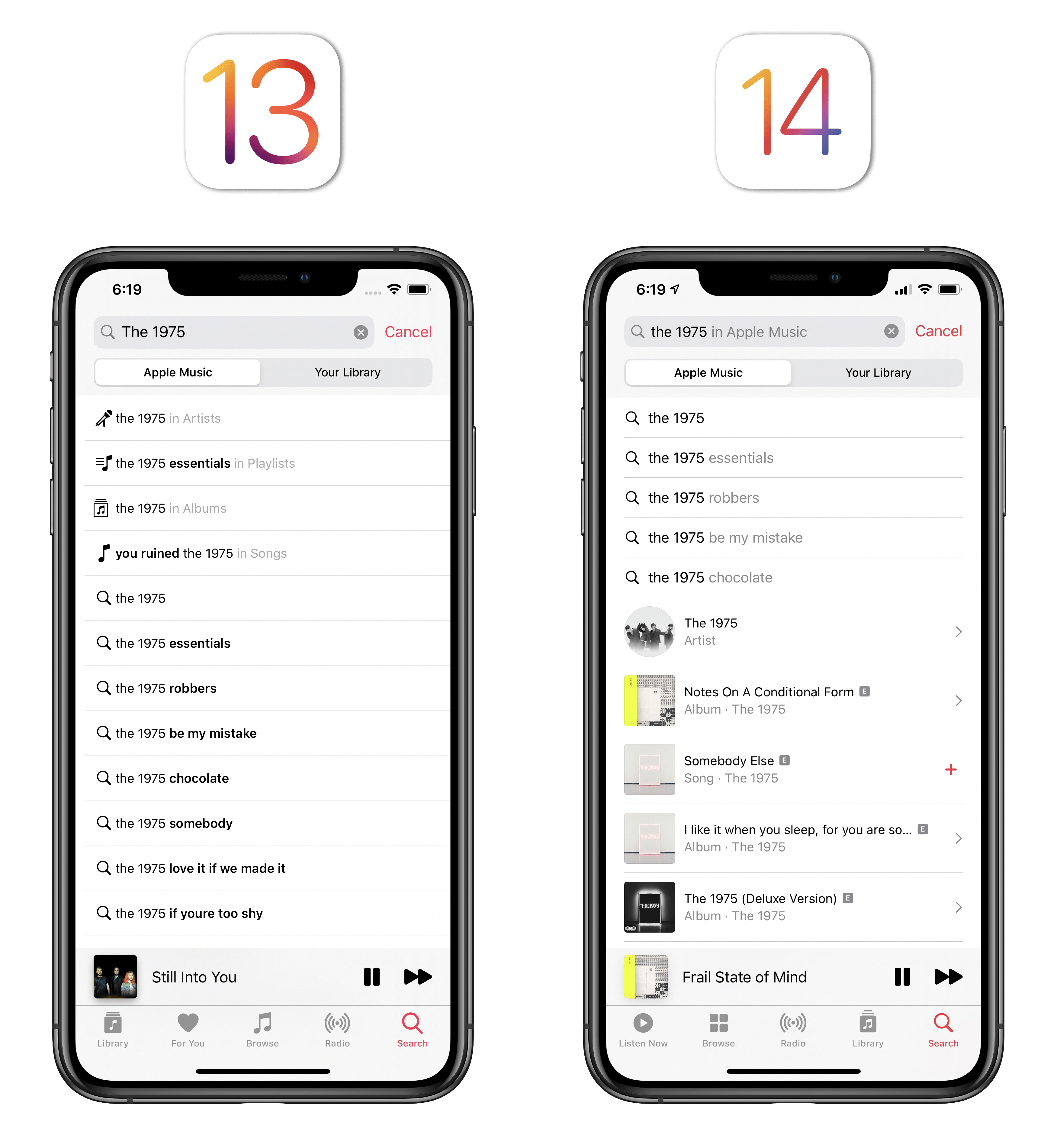
And lastly, after you tap ‘Search’, the results screen now features inline filters so you can easily narrow down search results by artist, album, playlist, and other categories.34
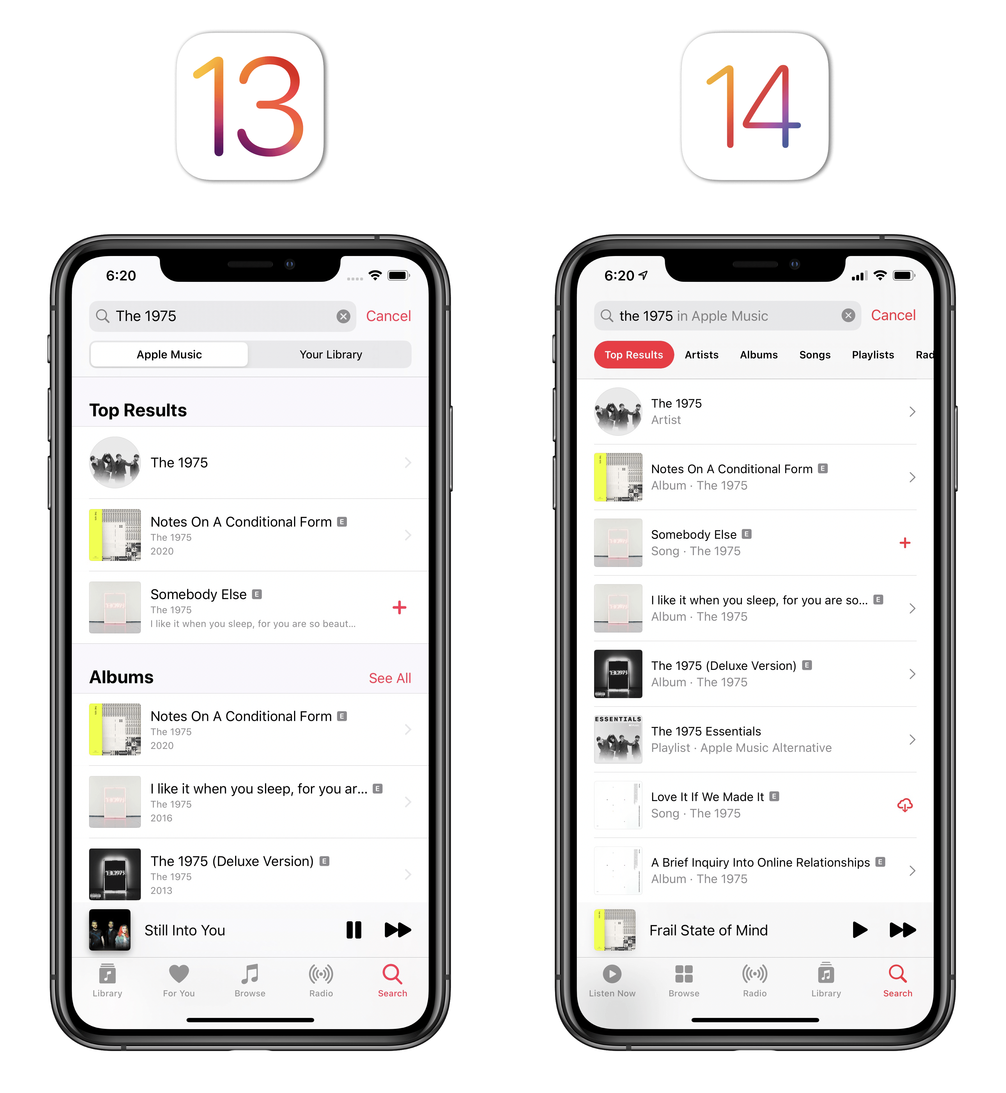
The combination of all these tweaks – search suggestions, thumbnails, and filters – makes searching for music in iOS 14 easier and faster than iOS 13. It’s good to see Apple catching up in one area where its primary competitor, Spotify, has long had an advantage. If you’ve ever been frustrated by Music’s lackluster search feature, I recommend giving it a try again in iOS 14.
Now Playing
Arguably one of Music’s most important features, the Now Playing screen has been redesigned in iOS 14 to be more elegant and colorful, as well as more convenient to use on iPad.
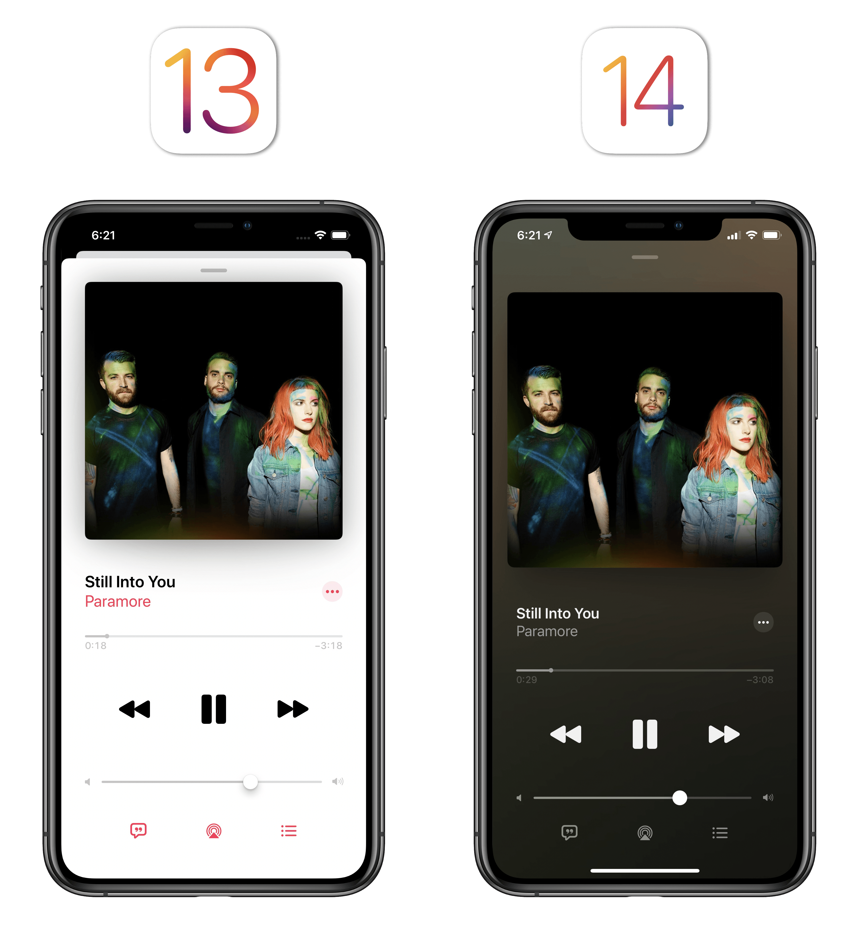
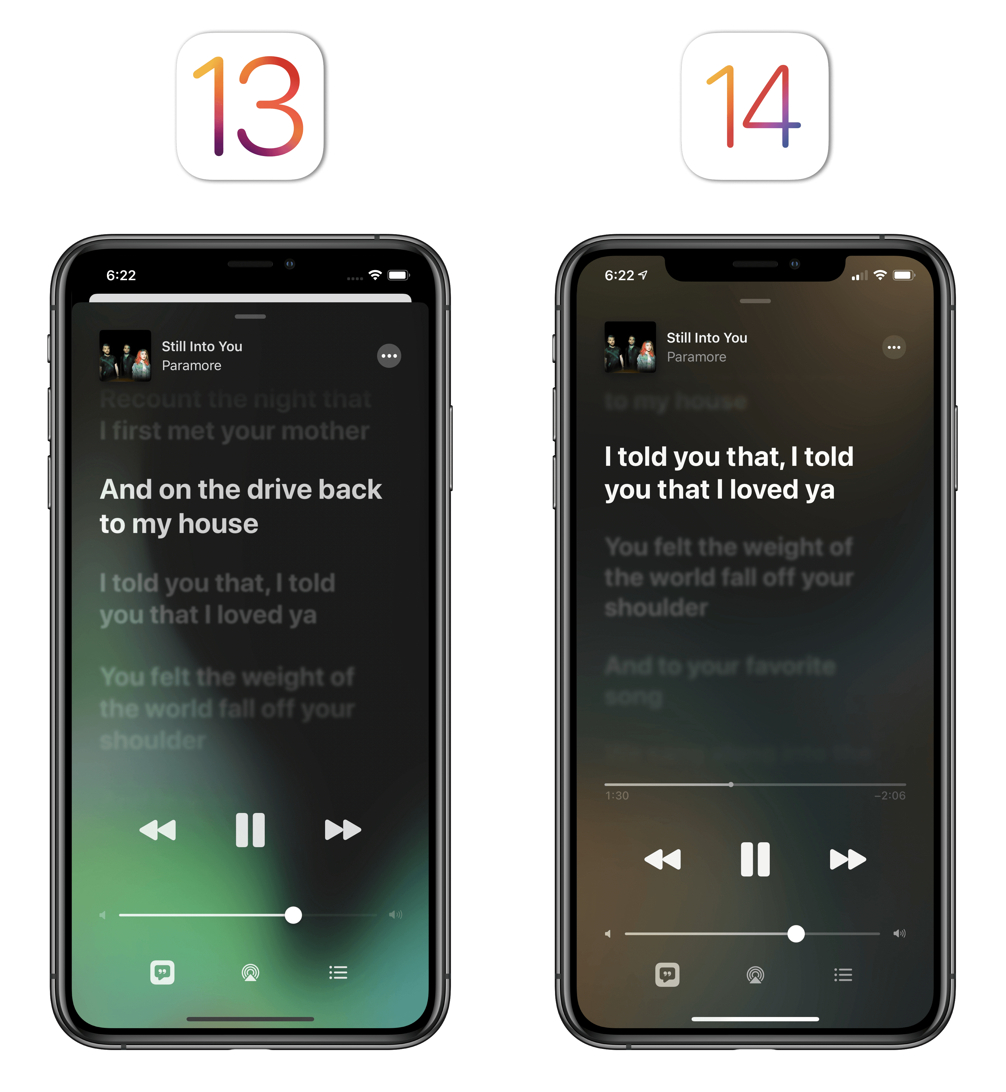
The most visible change to the Now Playing screen is Apple’s embrace of colors intelligently extracted from the current song’s artwork. In iOS 13’s Music app, dynamic colors were only used in the Lyrics view of the Now Playing screen; in iOS 14, artwork colors are also used in the standard Now Playing view, albeit without the fancy background animation seen while reading lyrics. I like this approach since motion effects make more sense for the Lyrics page, which is already an animated view because of scrolling lyrics; the “flat” color suits playback controls best, and it adds a touch of personality (and context) to what was otherwise a fairly boring white screen. With color, each Now Playing screen is now unique to the song currently playing.
You can still tap the artist’s name to bring up a menu to navigate to the artist or album page for the current song.
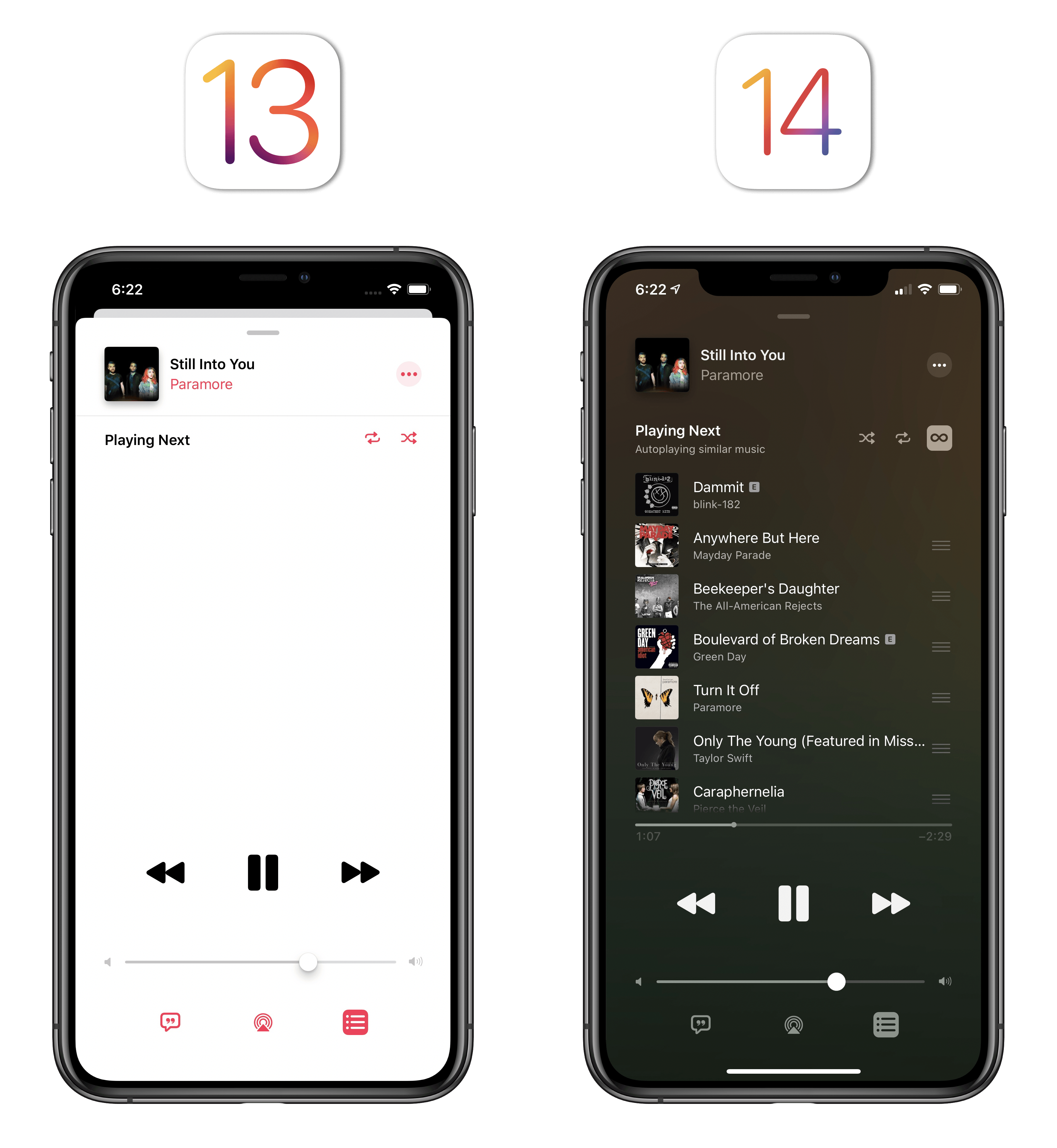
The other addition to the Now Playing screen is Autoplay, available in the Up Next view next to the shuffle and repeat buttons. A feature that’s long been part of Spotify, once enabled Autoplay will keep the music playing when you’ve reached the end of a song or playlist. This works by taking similar songs into consideration; even though I’ve never been an Autoplay kind of music listener myself, in my tests it worked as advertised. I just prefer to fully control what’s in my queue and when the music stops.
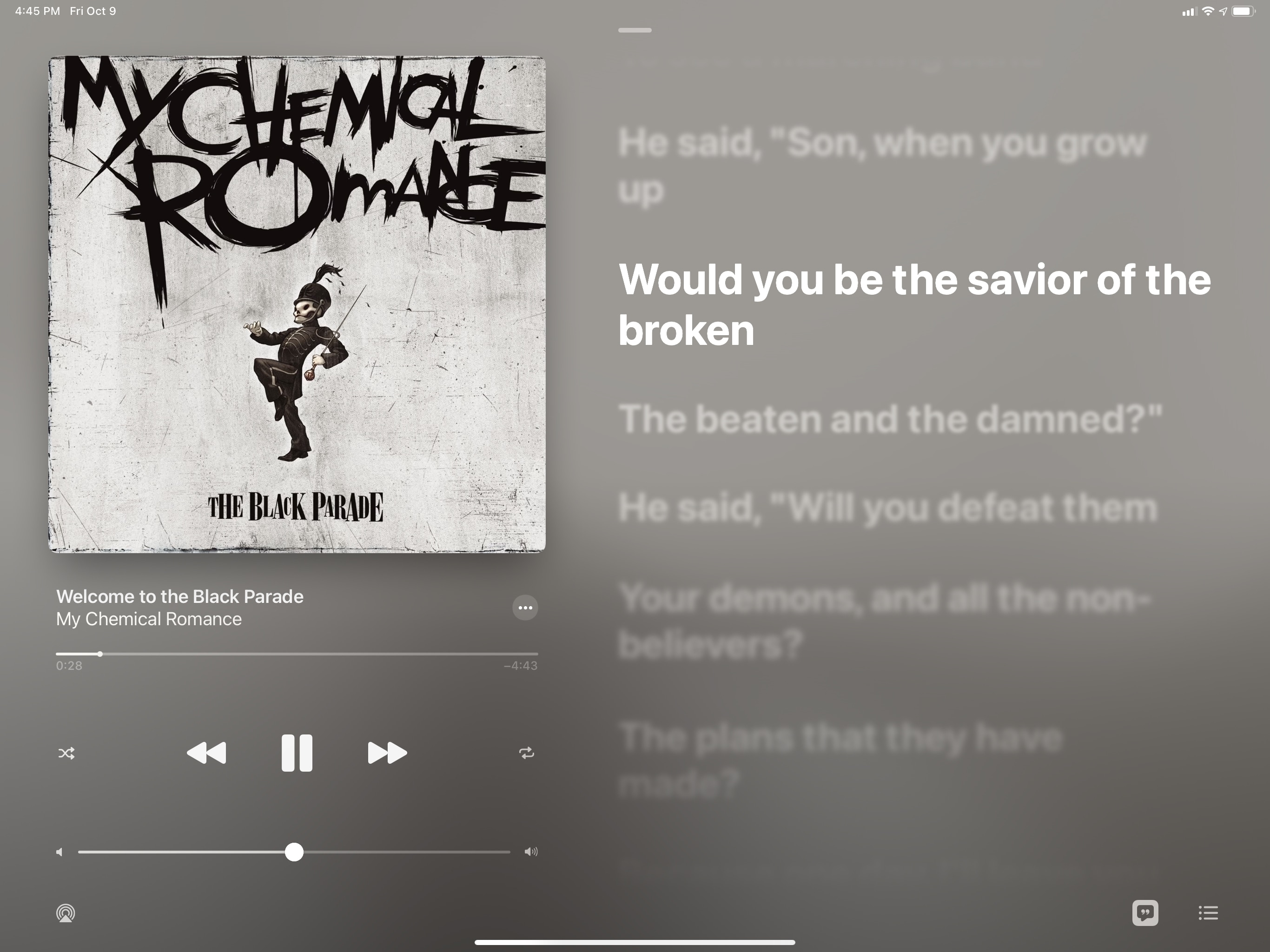
As for the Lyrics screen: nothing much has changed this year, except for the addition of a scrubber so you can rewind or skip ahead in a song while reading lyrics.
The Now Playing screen has received a drastic makeover on iPad. The whole Music app has been redesigned for iPadOS 14 (more on this below), but the Now Playing screen in particular is a solid example of Apple applying their new ‘Made for iPad’ strategy to existing apps on the larger screen. In iPadOS 14, the Now Playing screen now properly takes advantage of the bigger display to display album artwork and either Lyrics or Up Next simultaneously, at least when Music is running in full-screen.
It doesn’t take an expert to see why this is an improvement over the old Now Playing screen for iPadOS 13, which felt like a waste of space in how it only displayed enlarged album artwork in the middle of the screen. With the new design, artwork is still big enough, and you don’t have to toggle between views anymore if you want to read lyrics or manage your queue while still having access to playback controls. I still would like the option to detach the Now Playing window and use it anywhere on iPadOS as a quasi-Picture in Picture floating element, but I’ll take this update for now.
iPad App
In addition to the redesigned Now Playing screen, Music for iPad has received another substantial enhancement this year: a sidebar, replacing the old iPhone-based tab bar layout.
Having a sidebar to browse different sections of the Music app may not seem like a revolutionary invention, and it really isn’t, but it’s good to see Apple following their own iPadOS 14 guidelines in this regard. With the sidebar, you can now more easily navigate between sections of Apple Music and your library since they’re just one click away; the sidebar is also customizable, so you can collapse sections and even edit the options listed under the Library section.
My favorite addition to the sidebar is the inclusion of playlists: not only are they easier to find now (you no longer have to navigate to Library ⇾ Playlists), but you can even long-press one to get instant access to various playback options right from the sidebar itself:
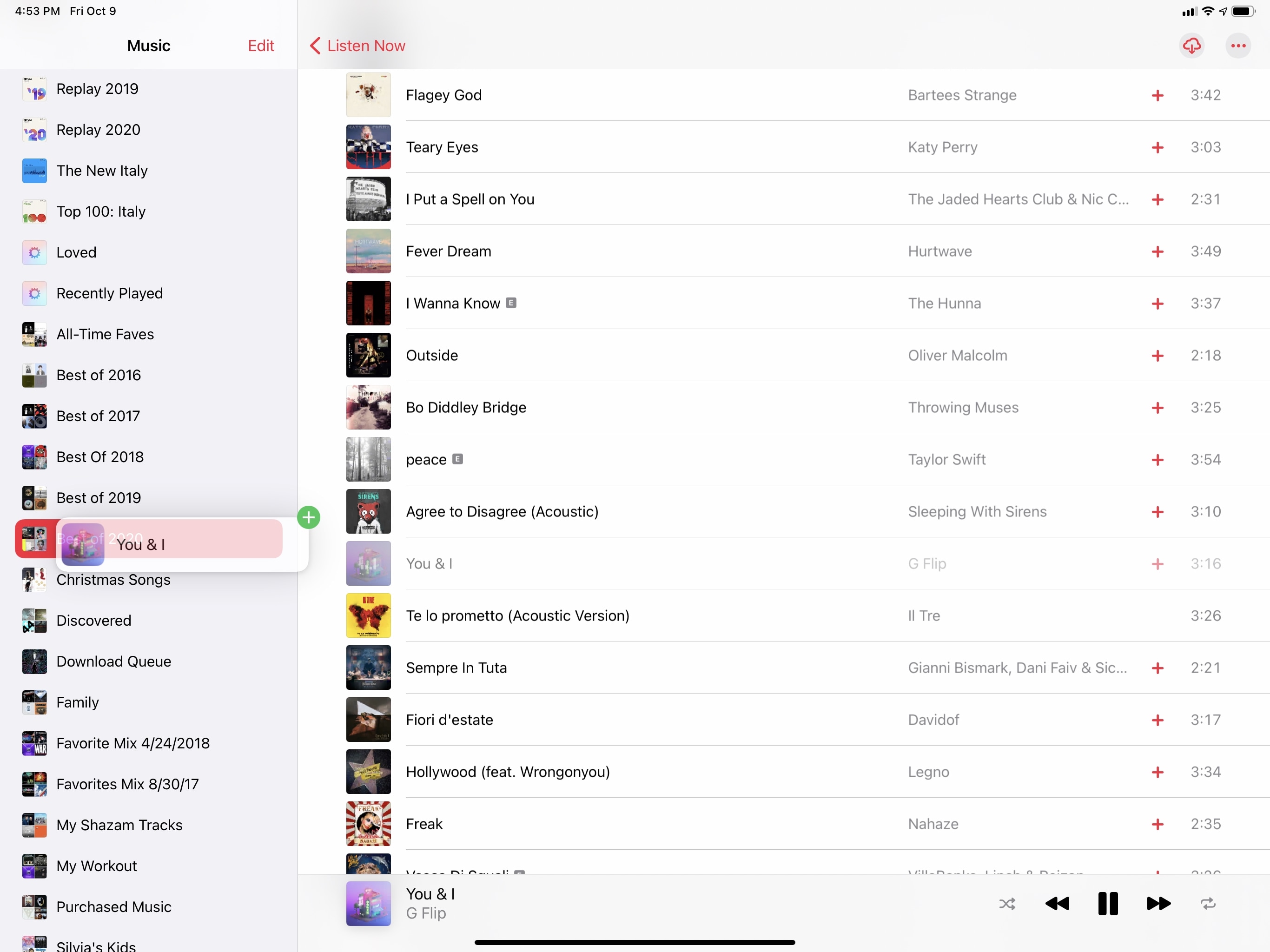
And that’s not all: since your playlists are always shown in the sidebar now, this means you can quickly add a song to a playlist with drag and drop on iPad, which is something that has already become second nature to me:
Thanks to the redesigned Now Playing screen and the new sidebar, the iPad is now my favorite platform to listen to Apple Music and manage my library. If you’re looking for a practical example of just how beneficial the addition of a sidebar can be to an old iPad app, Music is it.
And More
What kind of Music section would it be without a list of other smaller, semi-hidden changes I’ve been collecting over the summer? This year, it’s a pretty short list.
New icon. So, yes, as you may have noticed, the Music app has a new icon in iOS 14. It’s…pink? Coral? Pseudo-orange? I’ve always been bad with naming colors. Still: I’m not a fan, and I very much preferred the old icon, which retained the identity of the Apple Music brand with its rainbow colors. Why go back to the old, boring Apple Music icon now? What’s not to like about rainbows? And again, what’s the name of this color? I look forward to an explanation from the inevitable unofficial Twitter account.
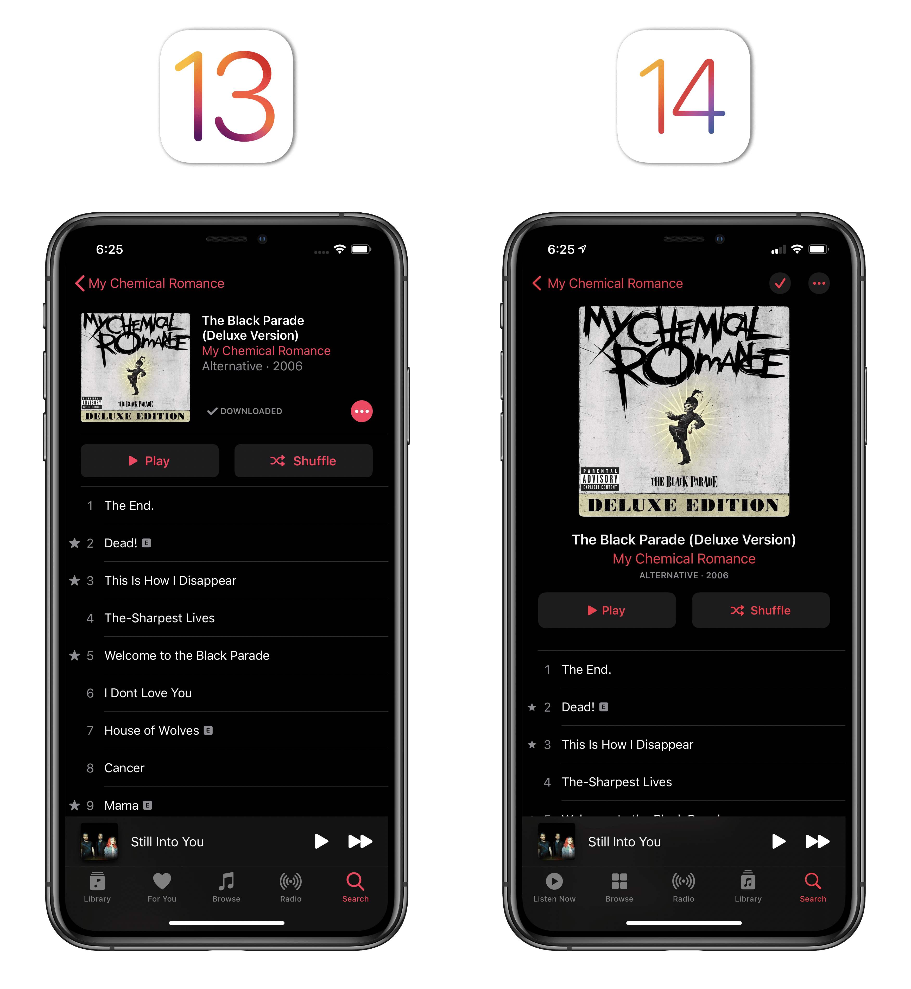
Larger artwork in detail pages. Detail pages for albums and playlists have been redesigned in iOS 14 so that larger artwork is front and center. As a result, the ‘Add’ and ‘More’ buttons have been moved to the top of the page.
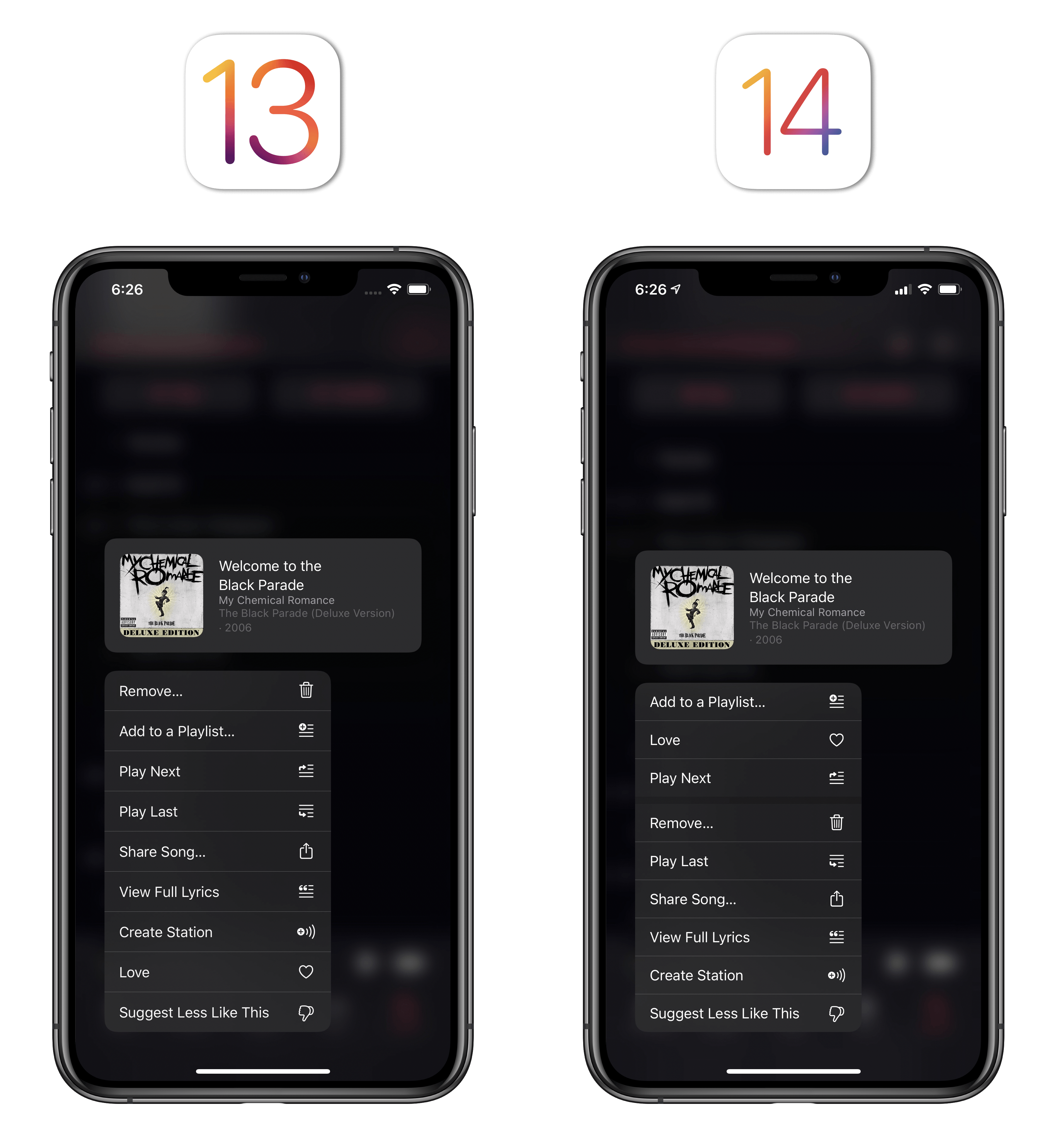
Love, Play Next, and Add to Playlist are easier to find. The context menu that appears when you long-press a song in iOS 14 has been redesigned to make it easier to find the ‘Love’, ‘Play Next’ and ‘Add to Playlist’ buttons, which are now highlighted in a top section of the menu. I’m guessing Apple saw that these were the most popular actions selected by users in the menu, so it’s reasonable they’re pushing them to the top.
I still maintain that Apple Music has a huge opportunity to become a central hub for discovering artists’ upcoming live performances, merchandise, and other projects. However, given the current global pandemic, I’m not surprised Apple isn’t experimenting more in this field for now. Instead, the company has prioritized a variety of app-related enhancements, better search, and an easier way to start listening to music you love via the Listen Now page. The question remains though: is there more Apple could do to surface Apple Music’s catalog of non-music material, such as radio stations, interviews, and music videos? Why can’t you see a full schedule and set reminders in the Radio section? Why is it so difficult to find all of Zane Lowe’s amazing, in-depth interviews? With a stronger app foundation, I’m curious to see where Apple Music the service will go from here.
- The languages are: English, Spanish, Chinese, Japanese, Korean, Russian, German, French, Italian, Brazilian Portuguese, and Arabic. ↩
- If you don't like this visual effect, you can turn it off in Settings ⇾ Music ⇾ Motion. You can also choose to only load animated cover arts on Wi-Fi. If your device is in Low Power Mode, animated covers are automatically disabled. ↩
- Don't miss the subtle animation of the pill-shaped selection transitioning across different filters. It's fun. ↩