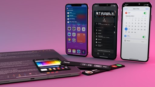
Using Widgets
Allow me to start from the very basics of using widgets: in iOS 14, widgets can live in the Today page (which is still available on the left side of the first Home Screen as an area solely dedicated to widgets), or they can be placed on any Home Screen in between app icons. When you update to iOS 14, existing Apple-made widgets you’ve kept in the Today page are automatically upgraded to their new iOS 14 counterparts; just like app icons, you can long-press a widget, wait for a haptic tap, and drag it away to move it elsewhere. Starting with iOS 14, you can drag widgets out of the Today page and onto any Home Screen; in doing so, app icons will instantly reflow around the widget, allowing you to drop it wherever you want.
Dragging widgets around.Replay
For the sake of historical context (and because I would upset my friend Stephen Hackett if I didn’t mention this), I have to point out how the ripple effect displayed on the iOS 14 Home Screen when you drop a widget is highly reminiscent of the old Mac OS X Dashboard.5
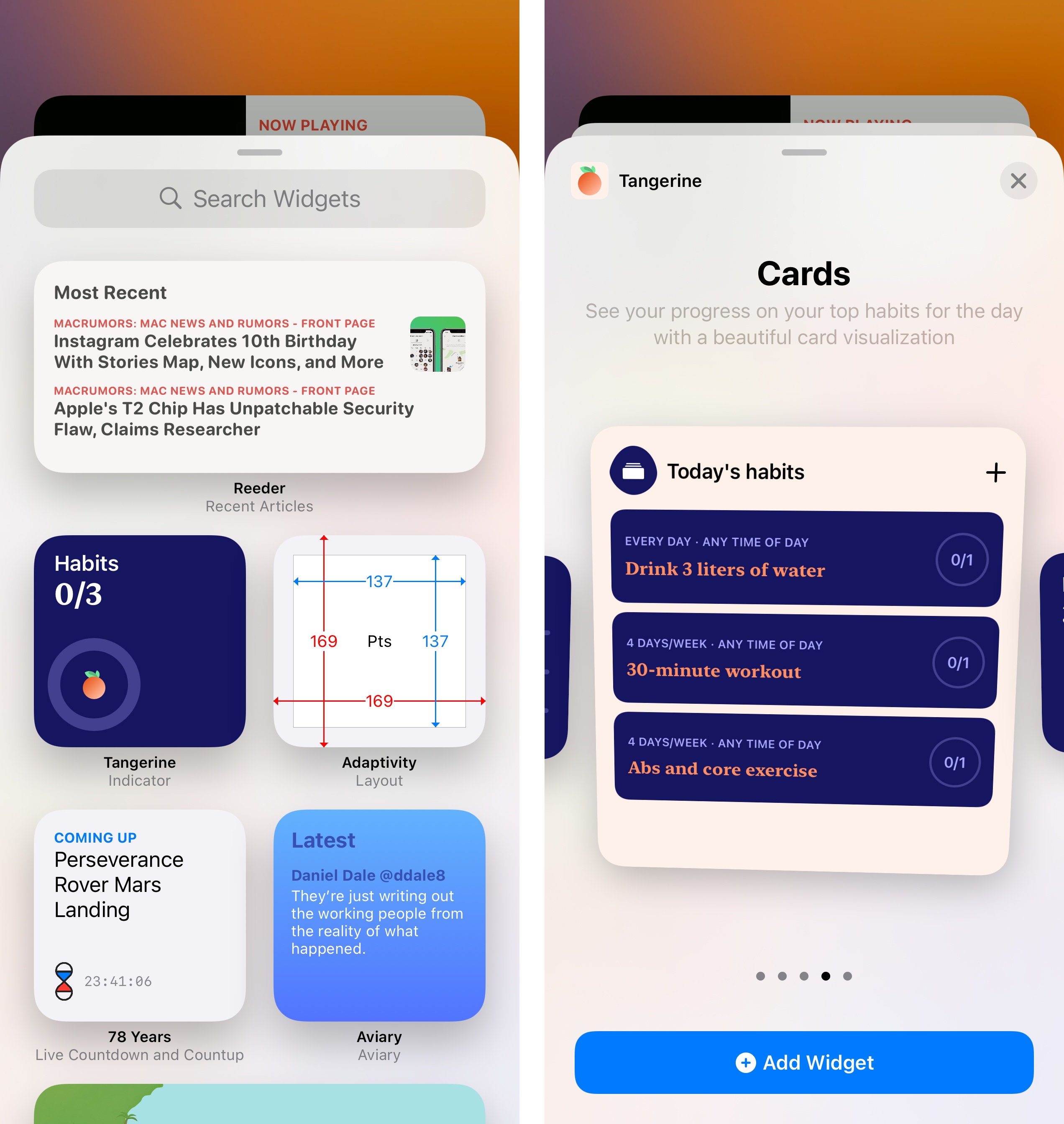
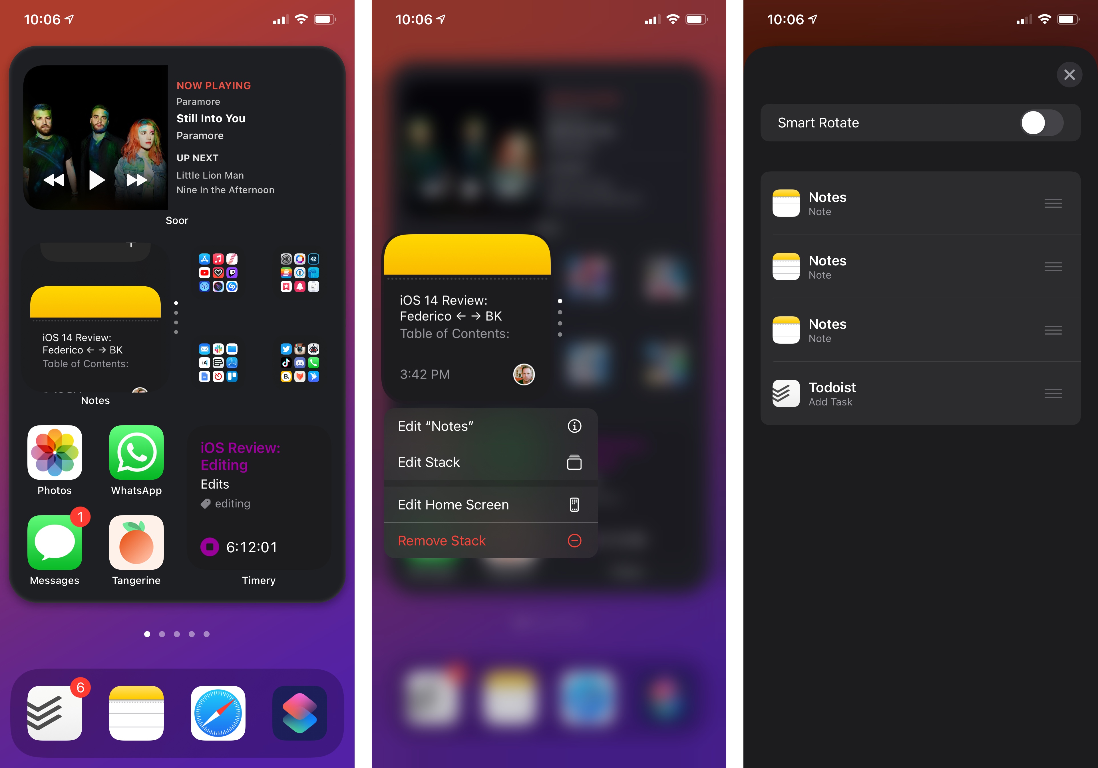
Dragging existing widgets out of the Today view is fun, but there’s a lot more to installing widgets in iOS 14: Apple built an entirely new system for discovering and adding widgets to the Home Screen called the widget gallery. The widget gallery is the central hub for browsing and installing widgets, which you can access by entering jiggle mode on the Home Screen and tapping the new ‘+’ button that appears in the top left corner of the screen.
Opening the widget gallery.Replay
Here’s a fun fact about jiggle mode in iOS 14: you can activate it the old fashioned way by long-pressing icons and holding until they start shaking; alternatively, you can now long-press anywhere on any empty space on the Home Screen to quickly activate jiggle mode. The easiest way to do this is, by far, pressing the empty space around the page indicators at the bottom of any Home Screen.
The widget gallery is a card that pops up from the bottom of the screen (a familiar old friend) with two separate sections: featured widgets and a list of all installed apps that offer widgets. You can also search for specific apps with a search bar at the top of the gallery. If you like one of the widgets you see in the featured area, you can long-press it to drag it directly to the Home Screen; otherwise, tapping the widget once (or selecting one of the apps listed further down in the gallery) will open a secondary page with a list of all the widget sizes and types supported by that app.
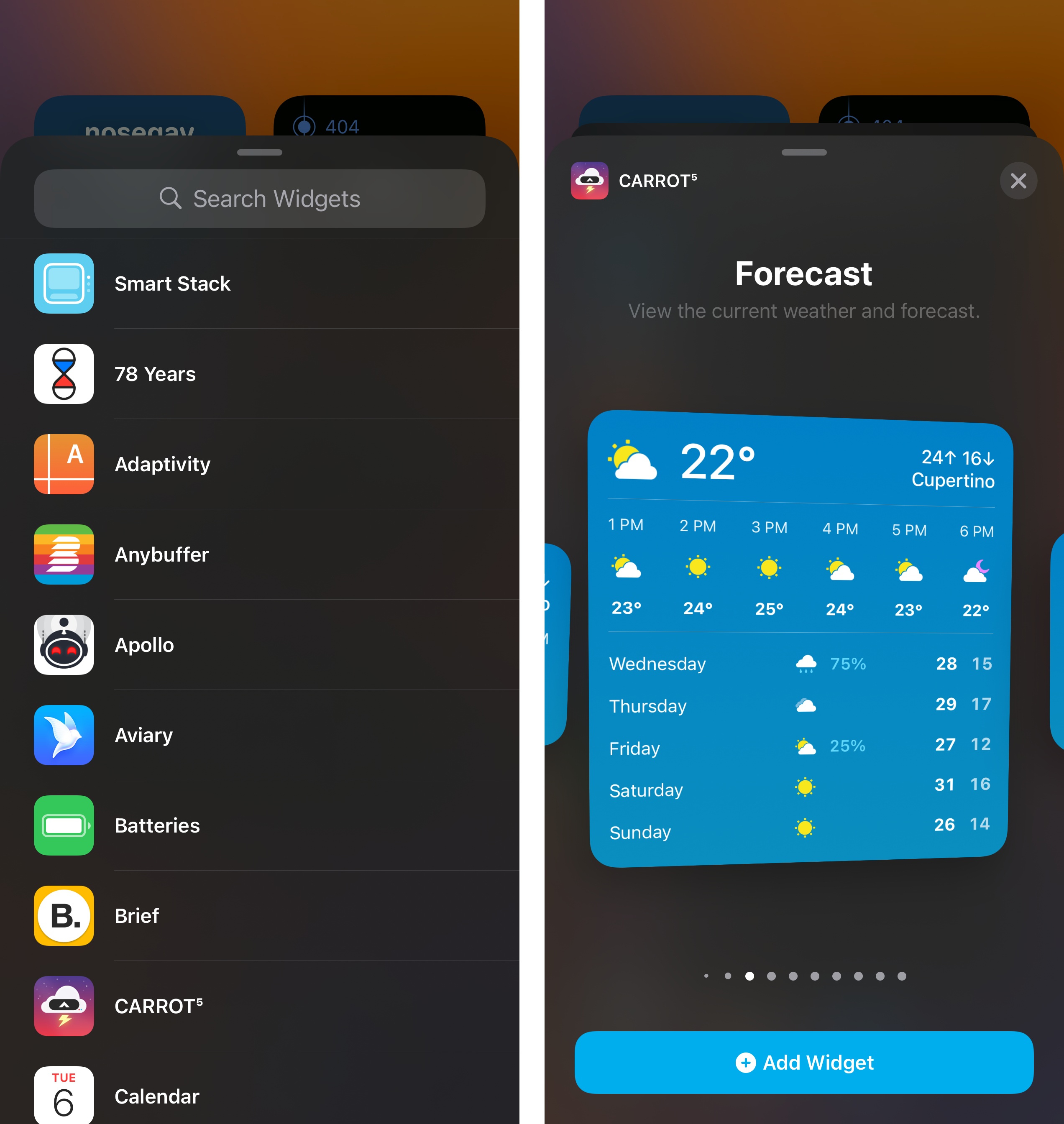
The widget gallery also comes with a list of all apps that offer widgets currently installed on your device.
In the three months I’ve used iOS 14 on my iPhone, I’ve grown to appreciate the design and interactions of the widget gallery. The featured section at the top looks great, and I’ve found the system does, as Apple suggested, intelligently rotate suggestions based on usage and recently installed apps, which makes it easier to get started adding new widgets to the Home Screen.
What’s truly remarkable about the gallery, however, is the fact that, thanks to WidgetKit and SwiftUI, every widget you see in here is a live preview containing actual data from the source app. Because these aren’t static previews based on templates, you can effectively try a widget in the gallery without installing it to get a sense of what it can do for you beforehand. This is vastly superior to the old way of installing widgets in iOS 13, which only provided you with a list of compatible apps with no widget previews whatsoever.
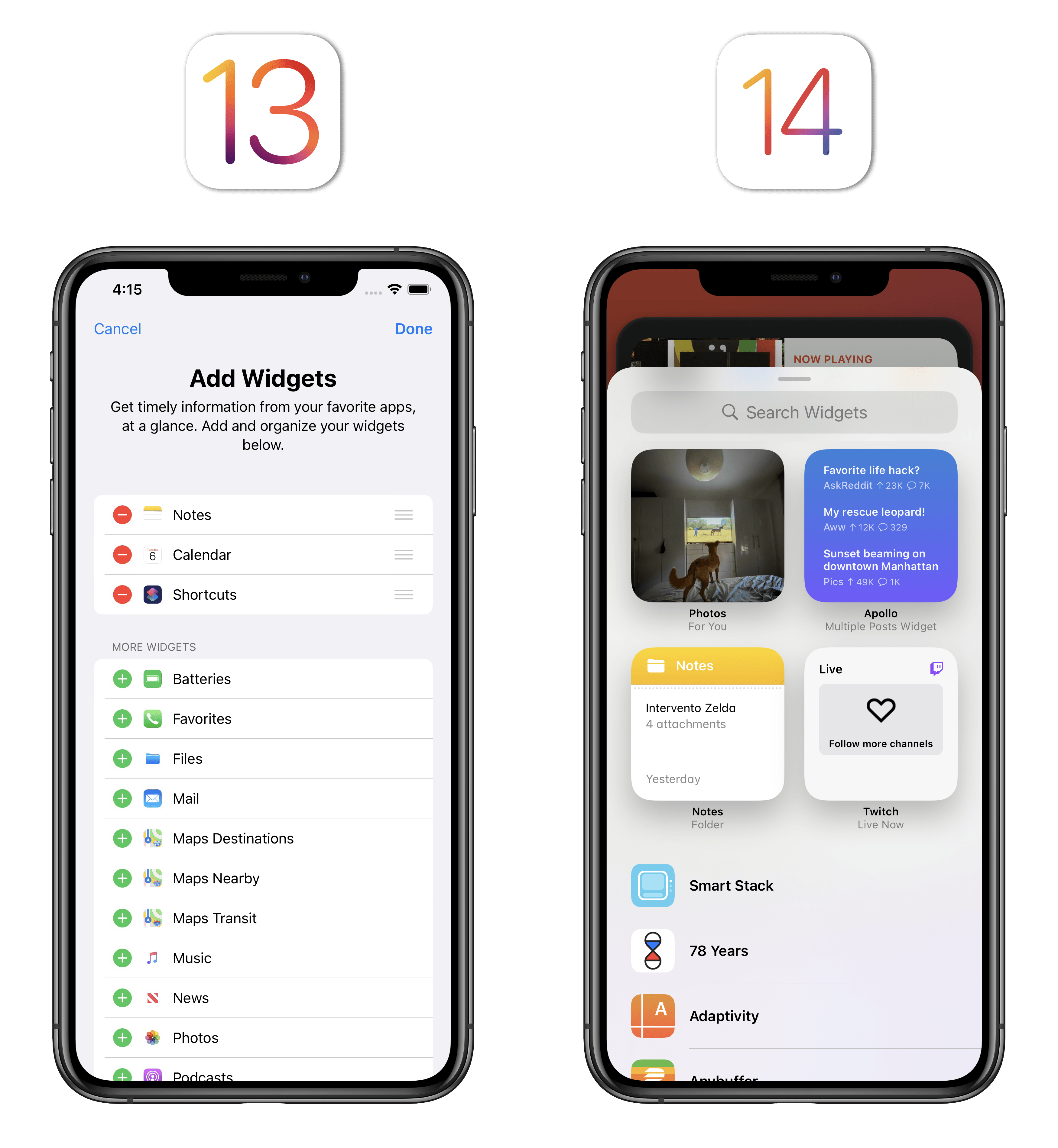
Installing widgets in iOS 14 is a much more visual, contextual experience since widgets contain real data and can be previewed in multiple sizes.
Once widgets have been added to the Home Screen, you can rearrange or delete them just like you would app icons: enter jiggle mode again, grab a widget, drag it around, and icons will move around it. There are some key differences to consider here though. First, unlike app icons, you can’t grab multiple widgets at once by creating a stack of them: you can only move one widget at a time. Second, despite the increased flexibility of the Home Screen in iOS 14, the underlying icon grid still strictly adheres to a basic structure where the smallest unit has to be a 2x2 grid of icons.
Let me show you what this means in practice. Consider the following scenario: you have a large widget followed by a small one and a group of four icons. However, you want the small widget to sit in between the icons – you want a row of icons on the left, the small widget in the middle, and another row on the right side of the screen. Unfortunately, due to iOS 14’s grid structure, you can’t break a group of four icons down to smaller components; no matter how precisely you try to rearrange the widget, the four icons will always end up together next to it.
These limitations also apply to medium-size widgets. As you can see in the example below, you can’t place a medium widget in between two rows of icons:
I believe the reasoning behind this decision is simple: in order to maintain visual balance on the Home Screen, Apple only allowed widgets to be rearranged around clusters of icons of an equivalent size – four icons for small widgets, and eight icons for medium widgets. While I understand the principle behind it, I can’t help but wish for some added flexibility here; after all, if one of the core ideas behind Home Screen widgets is personalization, I should be able to rearrange icons on my Home Screen however I want.
Stacks
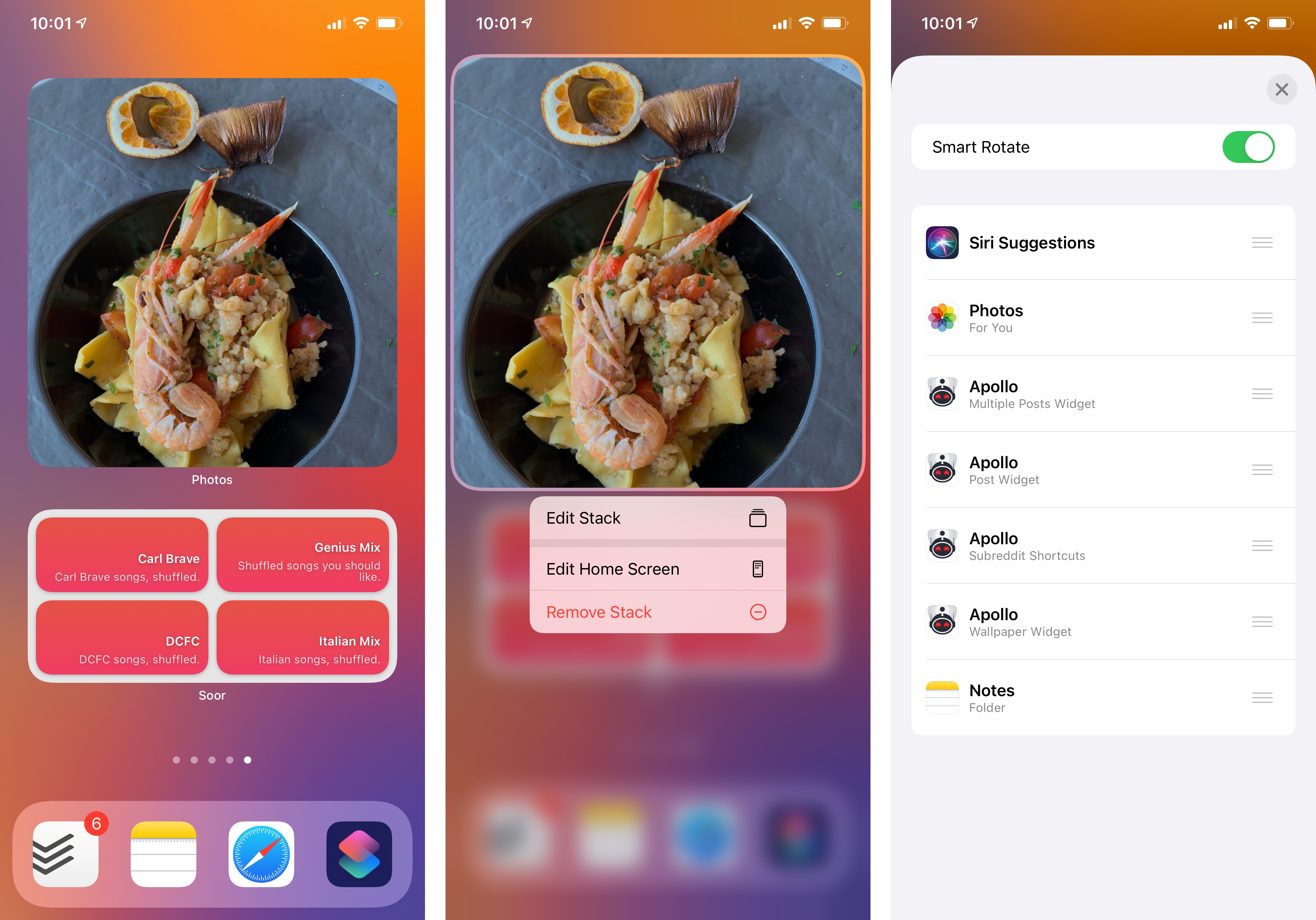
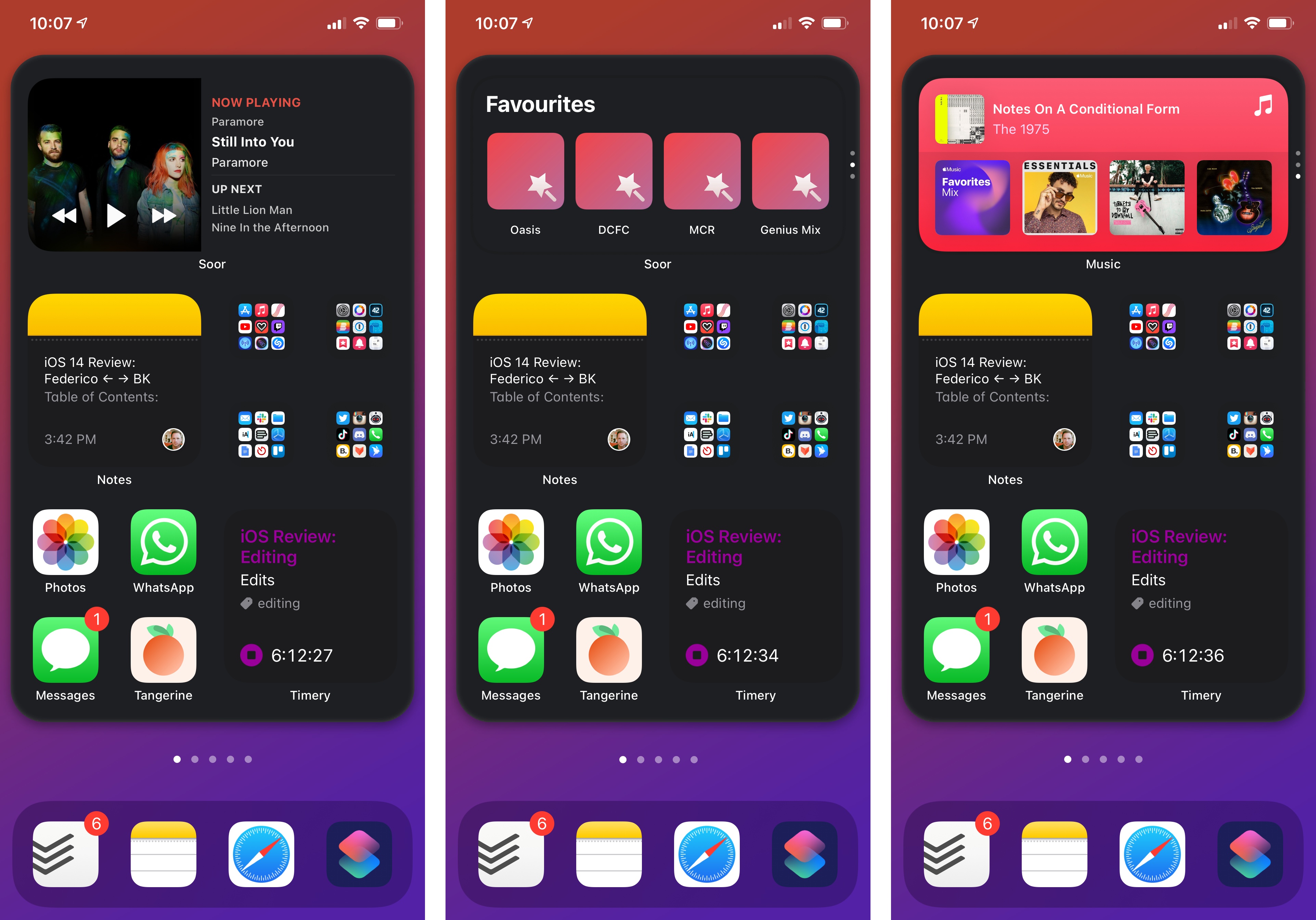
iOS 14 lets you stack (i.e. combine) multiple widgets of the same size in the same slot either on the Home Screen or the Today page. As I mentioned before, there are two ways of stacking widgets: you can let the system take care of it for you with the Smart Stack, or you can create your own stack by manually grouping widgets of the same size together. While there are some differences between the two features, the underlying basics of widget stacks are the same.
From a visual perspective, there is no obvious sign a widget is actually a stack when you’re just staring at a static Home Screen. There’s only one way to tell a widget from a stack without interacting with it: when scrolling pages on the Home Screen, a series of faint vertical dots will appear for a second next to the stack to indicate it is not a single widget, but a group of multiples.
Surprise! It’s a stack.Replay
I don’t like this approach, and I wish there was either a stronger indicator for stacks or, at the very least, an option to always show the dots next to them. Too often I’ve found myself forgetting a widget was actually a stack because I didn’t catch the dots briefly flashing next to it; it’s an unforgiving design that is also not good enough for accessibility.
The vertical dots displayed next to stacks – Smart or otherwise – are meant to suggest you can vertically scroll inside a stack to flip between widgets. When doing so, you’ll notice how stacked widgets are contained within a translucent box and animate with a delightful 3D transition as you scroll. This animation is very nicely done, and I’ve had fun scrolling quickly inside stacks just to flip between widgets like a deck of virtual cards.
Scrolling a stack.Replay
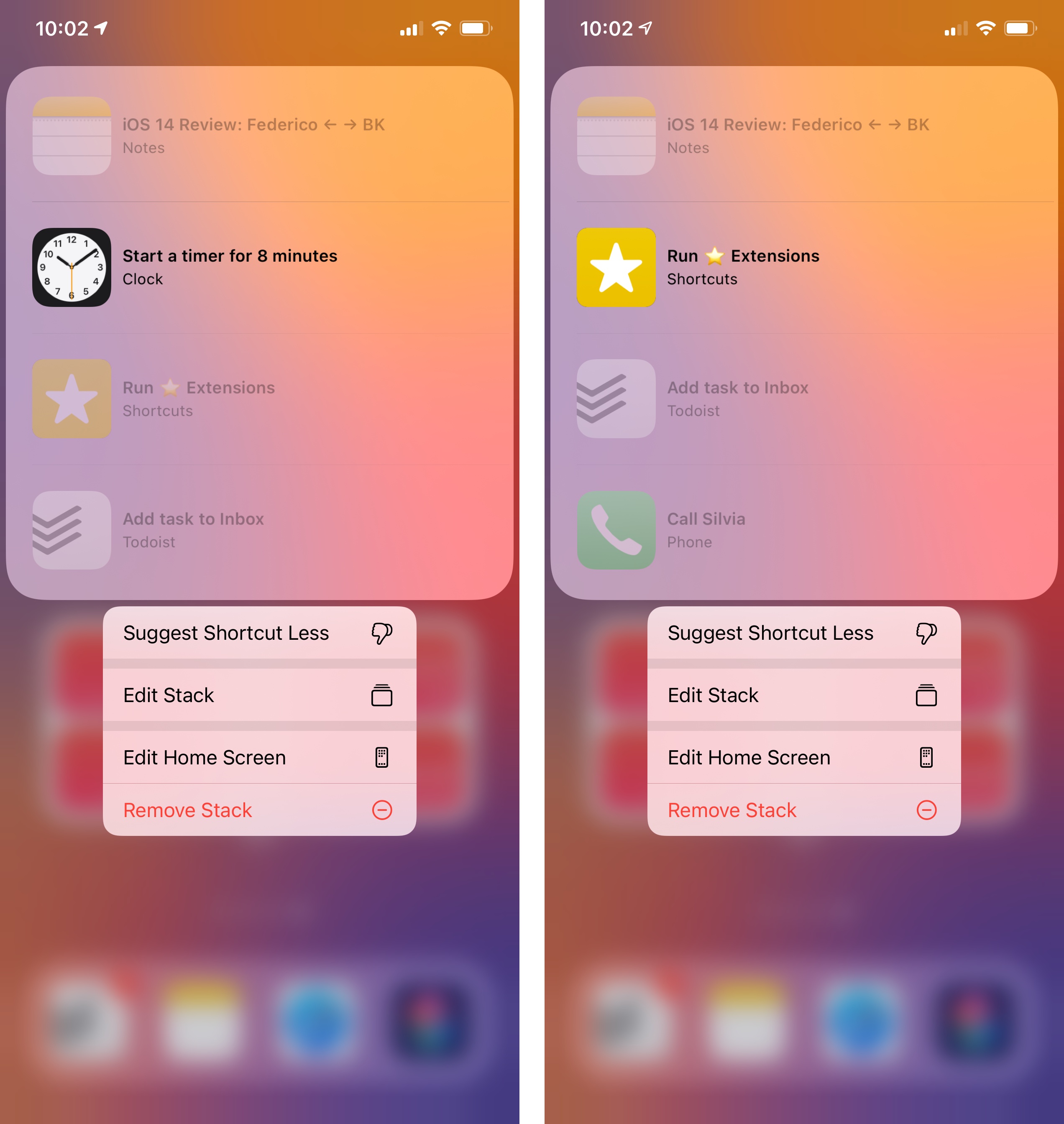
The differences between Smart and regular stacks come into play when configuring the rotation of widgets contained inside them. As far as the Smart Stack is concerned, you can’t modify its contents upon installing it from the widget gallery; once it is on the Home Screen, you can long-press it to reveal an ‘Edit Stack’ button that lets you adjust the widgets offered in the Smart Stack. You can also add more widgets to the Smart Stack after it’s been installed by dropping a widget on top of it; when hovering with a widget over another one of the same size, a translucent outline appears next to it suggesting you’re creating a stack, similarly to when you drag an app icon onto another to create a folder.
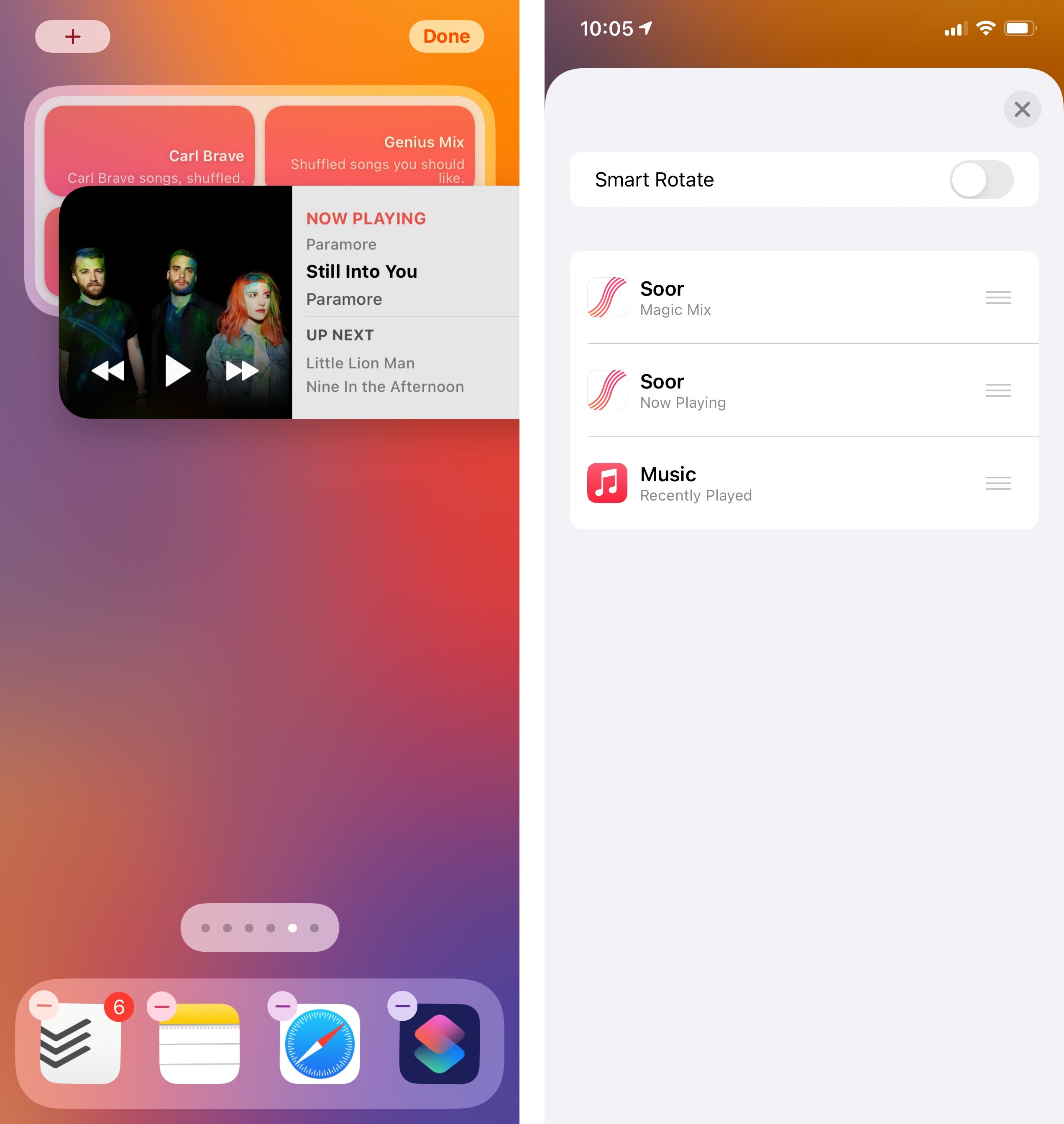
By default, the Smart Stack uses a ‘Smart Rotate’ setting to automatically rotate through widgets during the day based on signals captured by on-device intelligence such as time, location, and user activity. You can, of course, flip through widgets manually any time you want, but if you don’t want the Smart Stack to rotate widgets at all to begin with, you can disable smart rotation and turn it into a regular stack. You can also rearrange the order of widgets suggested in the Smart Stack as well as delete specific ones by swiping across them. The Siri Suggestions widget, which is usually included in the Smart Stack, can also be trained to surface specific shortcuts less by long-pressing it and selecting ‘Suggest Shortcut Less’.
My take on the Smart Stack for iOS 14 is more or less consistent with my experience using other ‘intelligence-based’ features in older OSes such as Siri suggestions, suggested shortcuts, or sharing suggestions: the Smart Stack can be hit or miss, and I’ve found its suggestions generic at best, and downright useless most of the time. Perhaps on-device intelligence always had a hard time suggesting useful shortcuts and content on my device because I have too many apps and shortcuts and there’s only so much the Neural Engine can figure out for people like me; whatever the case, while the Smart Stack sounds like a fun idea on paper, I haven’t gotten much utility from it since June.
On the other hand, regular stacks have grown on me over the past few months. As with the Smart Stack, you can add widgets to a stack with drag and drop. You can put up to 10 widgets in the same stack, and you can also enable smart rotation for regular stacks, meaning you can make your own Smart Stack without using Apple’s default suggestions.
I like using stacks in small doses for similar widgets that I think belong to the same place on the Home Screen. For instance: I find myself often opening two specific notes in Apple Notes; rather than creating separate widgets to reopen each note, I created a stack of two small widgets so it only takes up one slot on my Home Screen. Because the stack is only comprised of four widgets, flipping through them is quick enough and I don’t mind the additional tap required.
Similarly, I’ve allotted a medium slot at the top of my Home Screen to music widgets (based on Soor, Apple Music, and MusicHarbor); as soon as my favorite podcast player Castro adds widget support, I plan to create a “media stack” in that slot so I can flip through music and podcasts.
The small Shortcuts widget is also an ideal candidate for stacks since you can flip through multiple shortcuts (perhaps from different folders in the app) and run them directly from the Home Screen. I’ve created a stack with three of my most used shortcuts on a daily basis and placed it on one of my Home Screens; this way, in exchange for giving up the space usually allotted to four app icons, I can now access three shortcuts that run inline within the Home Screen (more on this later).
Broadly speaking, I feel like stacking works better for “launcher” style widgets (e.g. widgets that run specific actions or open apps into specific views or functions): a stack defeats the whole purpose of glanceability since stacked widgets are hidden from view, but it works quite nicely as a way to group related actions together. Personally, I’m not a fan of stacks that contain more than four widgets since scrolling to find the right one becomes somewhat tedious; I do appreciate, however, that Apple put a relatively high cap on the maximum number of widgets in a stack, as I’m sure there will be folks who are going to take advantage of this in their Home Screen setups.
Configuring Widgets
Unlike old widgets in iOS 13, widgets in iOS 14 can be configured inline – directly from the Home Screen – with a consistent UI based on multiple options. To make this configuration possible, Apple turned to a technology that already allowed users to tweak various parameters: Intents, previously used by Siri and Shortcuts. Specifically, widgets in iOS 14 can be configured by adjusting parameters (introduced in last year’s Shortcuts app) that let you change a widget’s displayed content, appearance, and behavior.
You don’t need to know all the technicalities behind this approach, but here’s the gist of it: developers can build widget extensions with the same Intents framework that’s been around for years now, and they can leverage the same parameter API previously seen in Shortcuts to provide users with visual options to tweak widgets from a built-in configuration screen.
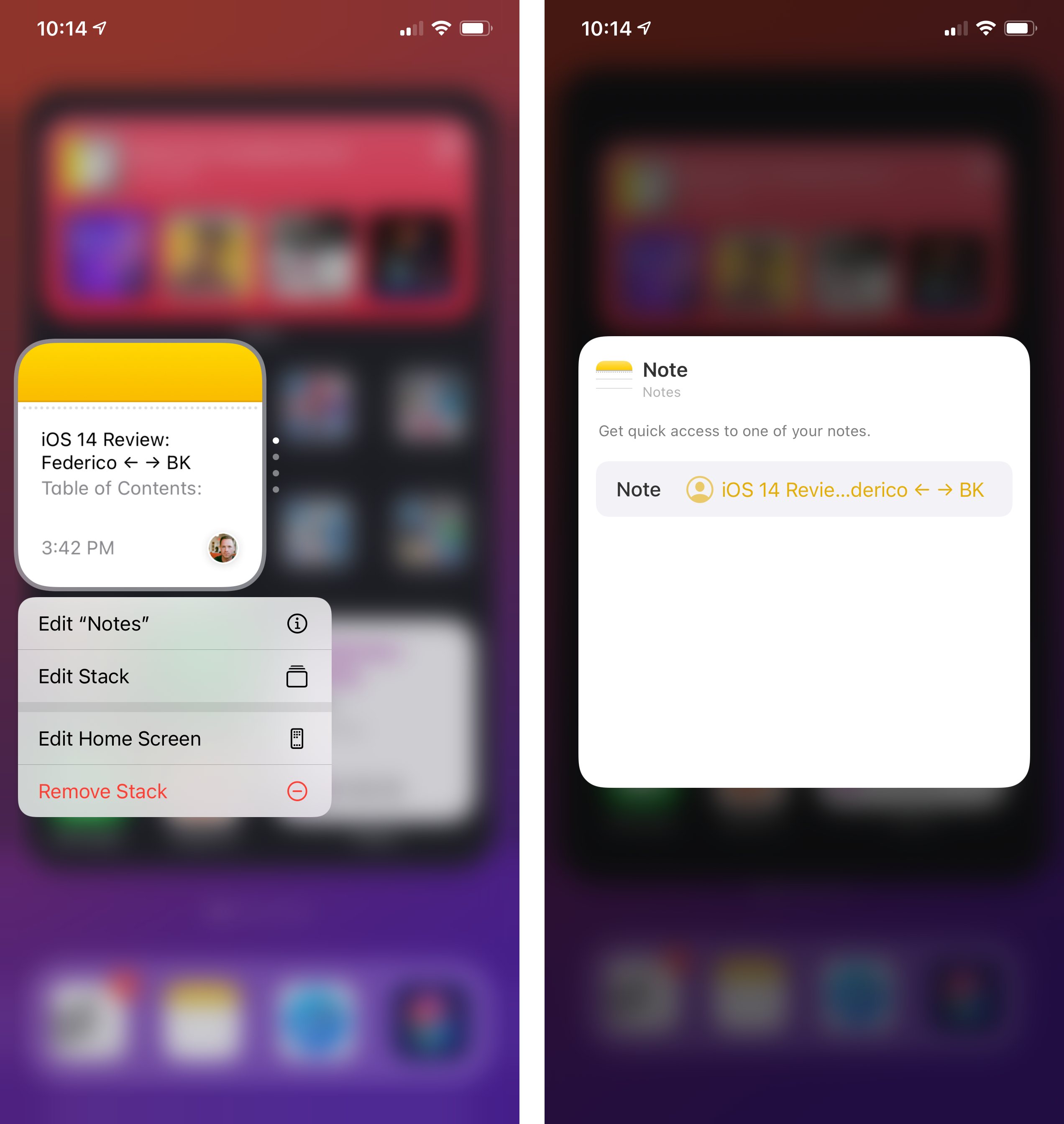
Here’s how this works: when a widget supports configuration, you can long-press it and you’ll find an ‘Edit Widget’ button6; tap it and the widget will flip around7, revealing a configuration page where you can tweak parameters pertaining to the widget.
WidgetKit supports all kinds of parameter types, from lists and text fields to switches, sliders, steppers, currency amounts, and even contact pickers. Related parameters can be grouped together into sections, and developers can even provide default values, which users can later tweak to their liking.
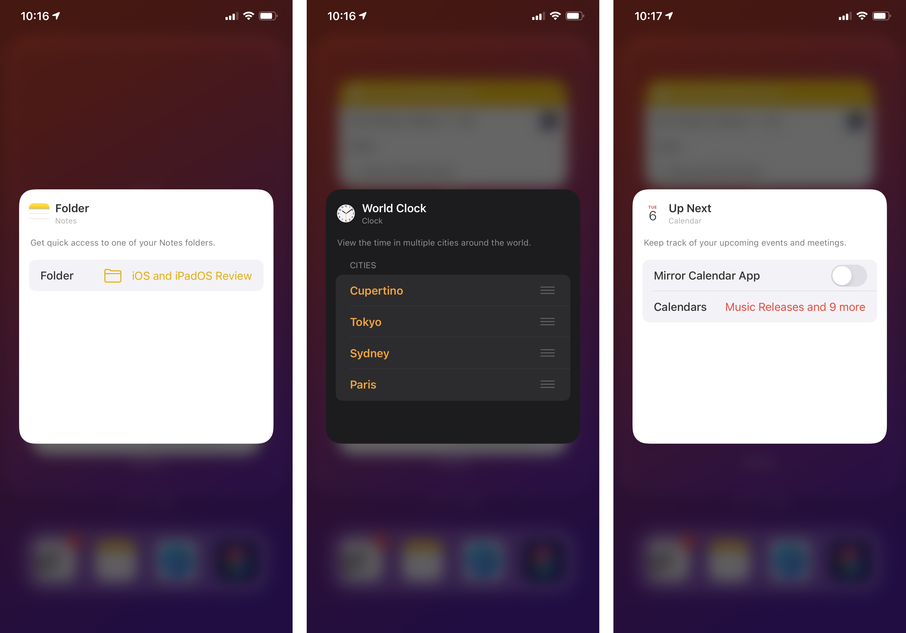
There are some interesting implementations of user configuration in Apple’s own widgets: Notes, for example, lets you pick and search for a note or folder you want to reopen; Calendar has a toggle to mirror settings from the main app, which you can disable to pick different calendars to show in the widget; the Clock widget lets you rearrange cities as well as pick different ones from a list.
If Apple has demonstrated how SwiftUI and WidgetKit can enable the creation of widgets that look and feel like full app components, third-party developers have gone well beyond my expectations in the three months they’ve been able to design widgets for iOS 14, proving how – to abuse an old, but fitting expression – widgets powered by SwiftUI will be the next design playground for a new generation of app makers.
You may now be familiar with the design of iOS 14 widgets: in the weeks since iOS 14 launched with a 24-hour notice, Apple highlighted hundreds of widget-enabled apps on the App Store and we’ve been busy covering our favorites at MacStories. What I want to do here, however, is put the spotlight on my favorite examples of widget configuration in iOS 14 based on Intents and parameters. Consider these the crème de la crème of iOS 14 widgets.
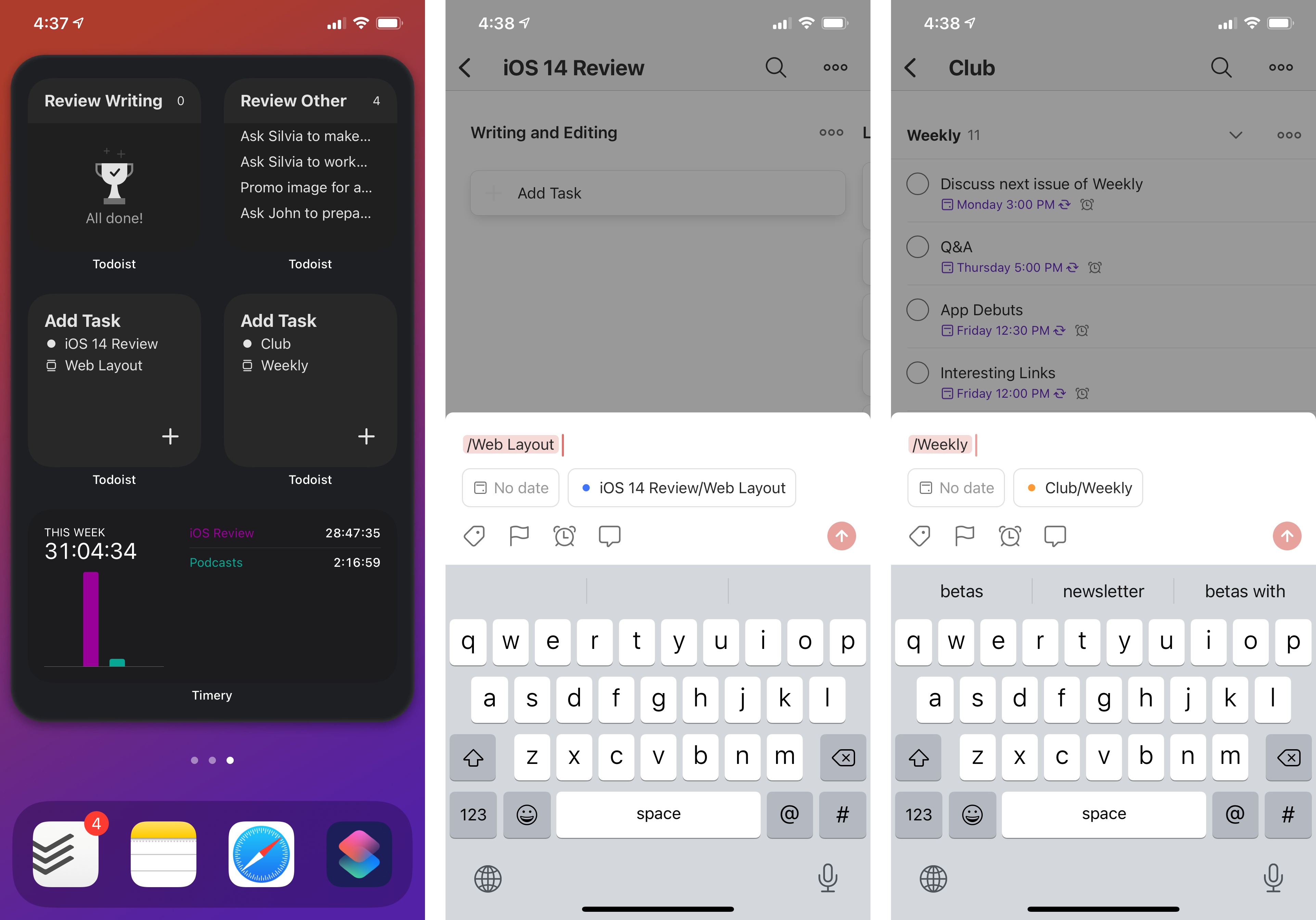
Todoist, the popular cross-platform task manager, added a variety of widgets for iOS 14 to let you visualize your upcoming tasks as well as your productivity levels. I’d like to bring your attention to Todoist’s ‘Add Task’ widget though: this widget lets you open Todoist’s task composer, which in itself isn’t a revolutionary idea, you might observe. But here’s the magic trick: thanks to widget configuration, you can customize each instance of this widget so that the task composer is launched with specific details about the task already filled in. You can, for instance, put in a default title and due date, give the task a default project or section, and even assign labels and priorities from the widget itself. You can interact with all these parameters using aforementioned UI elements such as text fields, buttons, and lists.
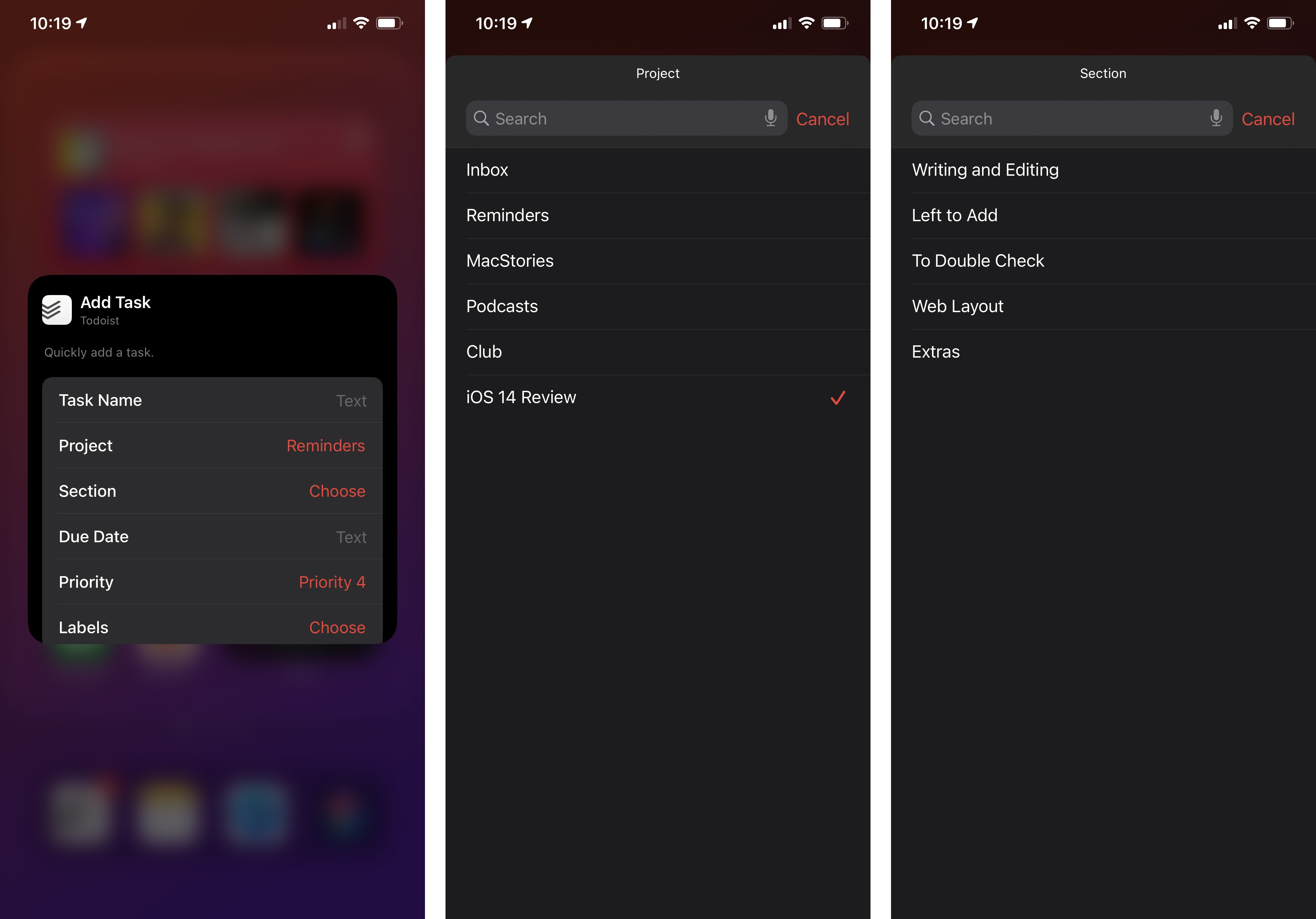
Because in iOS 14 you can install multiple copies of the same widget and configure each one independently from the other, you can effectively use Todoist’s new widgets as task templates that live on the Home Screen. Press one, and you’re taken to the app’s task creation screen, where the options you configured will be already set and you’ll just have to finish entering the rest of the task’s details.
I saved the best detail for last: because Apple based WidgetKit’s configuration on the same technology behind Shortcuts, the ‘Add Task’ widget is based on the same code that powers the ‘Create Task’ action in Shortcuts. In both cases, Todoist relies on a task intent to create a new todo inside the app, and it’s using the same parameters to do so from either a widget or a Shortcuts action. It’s literally the same feature presented differently in two different areas of iOS.
.](https://cdn.macstories.net/001/acf319cd-d290-4655-8ed4-15c1ba32c643.png)
Corporate needs you to find the differences between this picture and this picture.
This consistency is great for developers (if you’ve already put in the work to support rich shortcuts with parameters in iOS 13, you’re halfway there in terms of having a configurable widget), and it’s great for users, who may already be familiar with options they’ve seen elsewhere before.
Consider now Timery, Joe Hribar’s outstanding time tracking utility for iPhone and iPad based on the Toggl web service. Timery’s widgets are some of my absolute favorites for iOS 14, and I’m using several variations of them on my Home Screens: on the first page, I have a small widget to start a time entry; on the second one, I have a stack featuring a widget that reports total time tracked this week grouped by project, plus another chart that only shows me a specific project; in the Today view, I have another Timery widget with a grid of saved timers I can start with a single tap. Timery is the leading example of the freedom granted by multiple widget types and sizes, and developer Joe Hribar has done a terrific job in going all-in with WidgetKit.
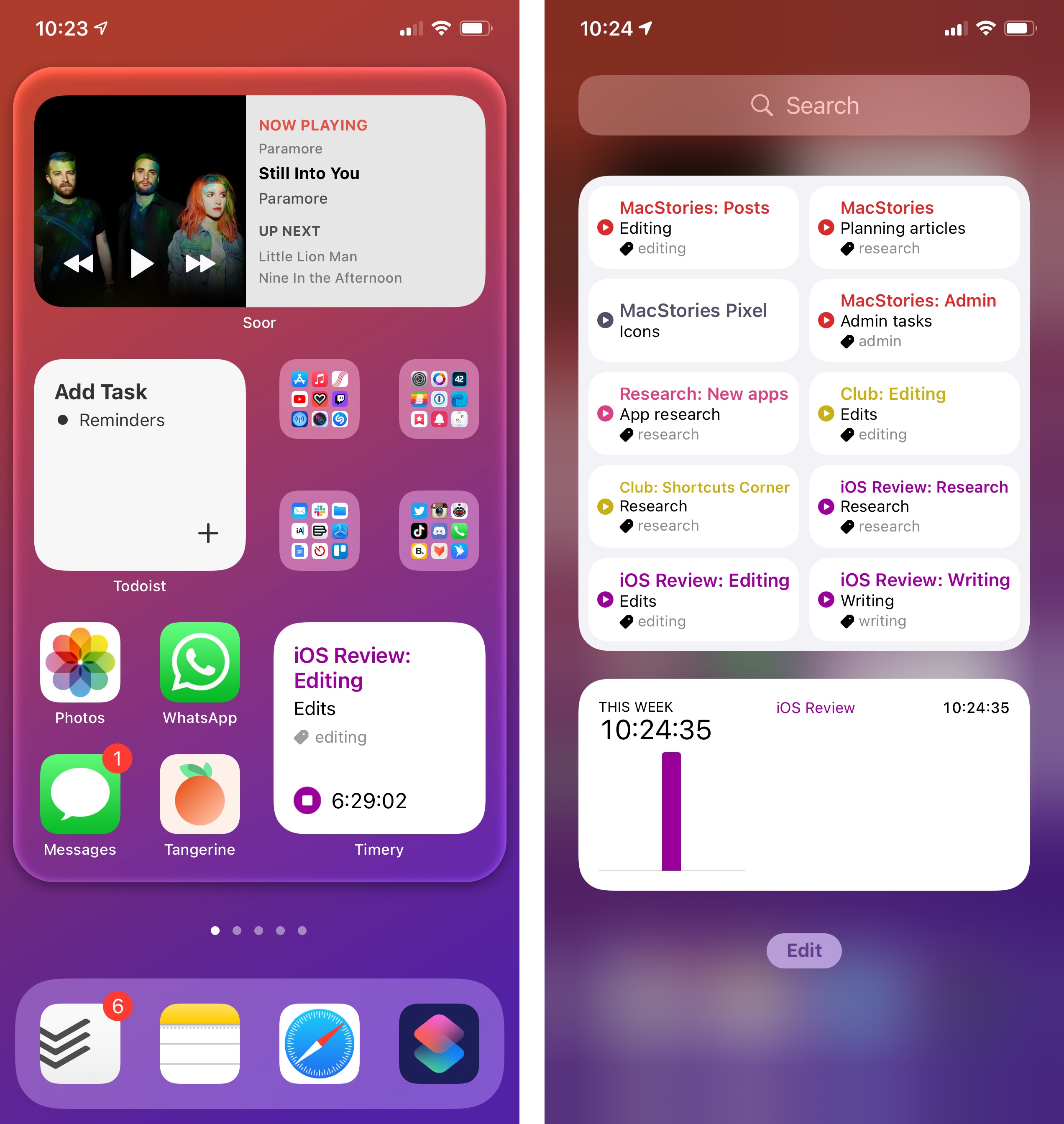
All the Timery widgets that deal with presenting reports about tracked time are configurable so you can tweak different properties for workspaces, clients, projects, and more. I think you know where this is going. The parameters behind Timery’s ‘Time Tracked’ widget are the same ones found in Timery’s ‘Check Total Time Tracked’ action in Shortcuts; they use the same combination of switches, segmented controls, and lists to let you filter timers, and they’re one of the best implementations of parameters you can find on the App Store at the moment.
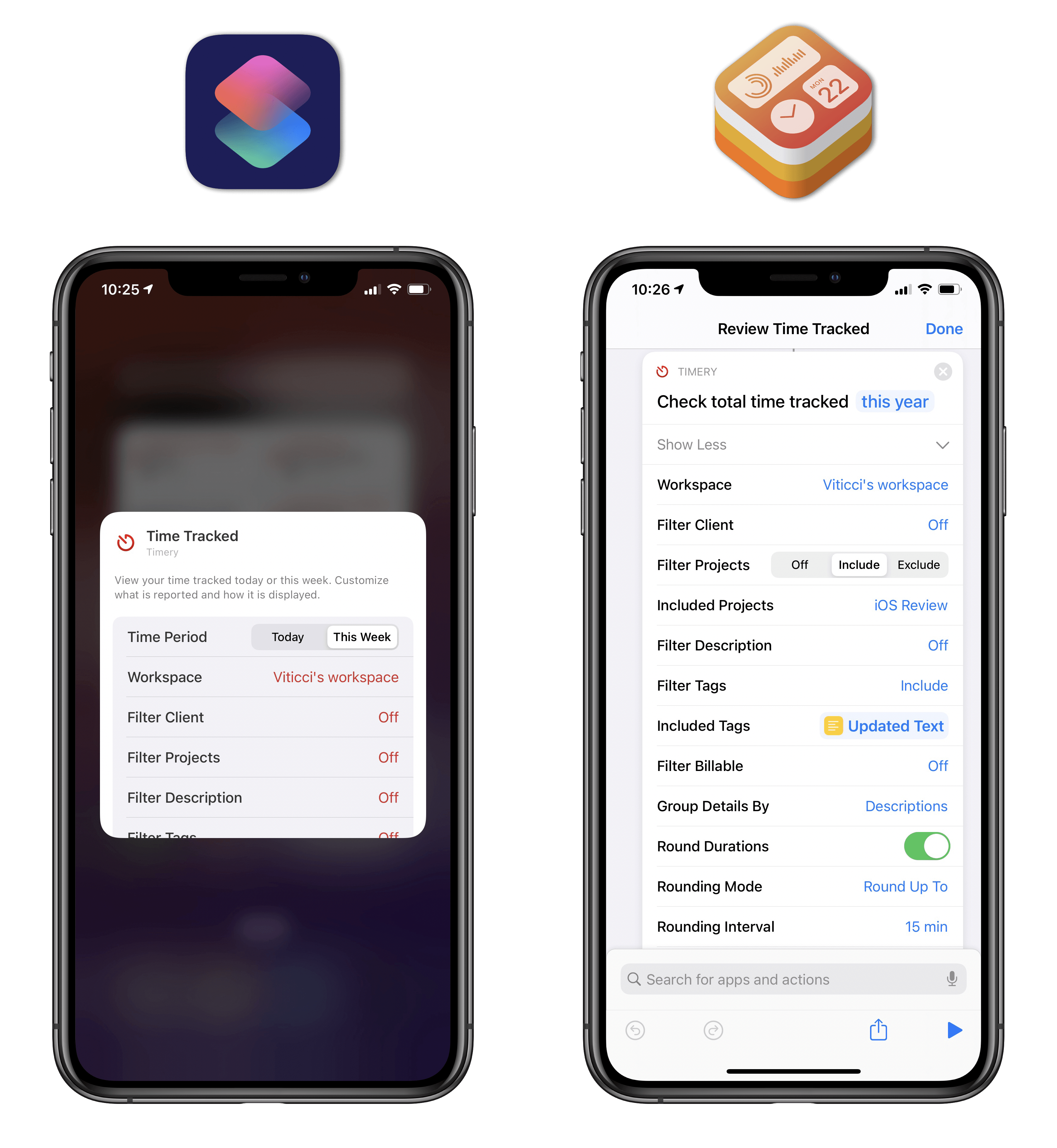
The only difference between the Timery widget and Shortcuts action is the time ranges available for filtering purposes.
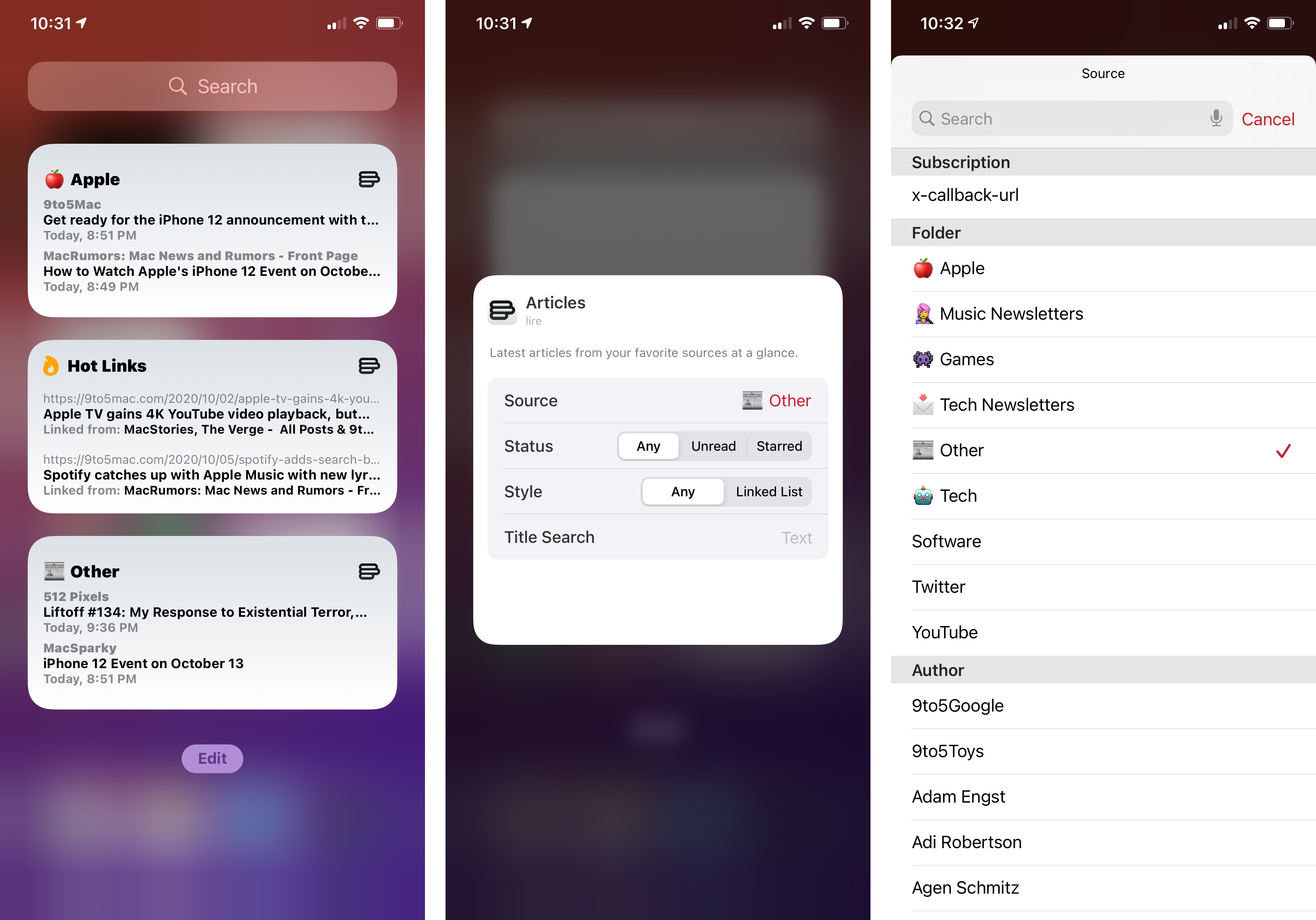
Even when there’s no 1:1 match between a widget’s parameters and its related Shortcuts action, widget configuration is still a powerful enhancement to iOS 14’s widget framework compared to iOS 13. Lire, my favorite RSS reader for iOS and iPadOS 14, offers an ‘Articles’ widget that presents you with a list of headlines from the publications you follow. What I love about this widget is that you can make it your own and customize it to fetch articles from specific blogs or folders, return unread or starred posts, and even search for specific keywords in titles (without having to make a saved search for those beforehand). Want to install a Lire widget for high-volume tech feeds, plus another one for calm feeds restricted to posts with “iOS 14” in the title? You can do this thanks to Lire’s adoption of widget configuration.
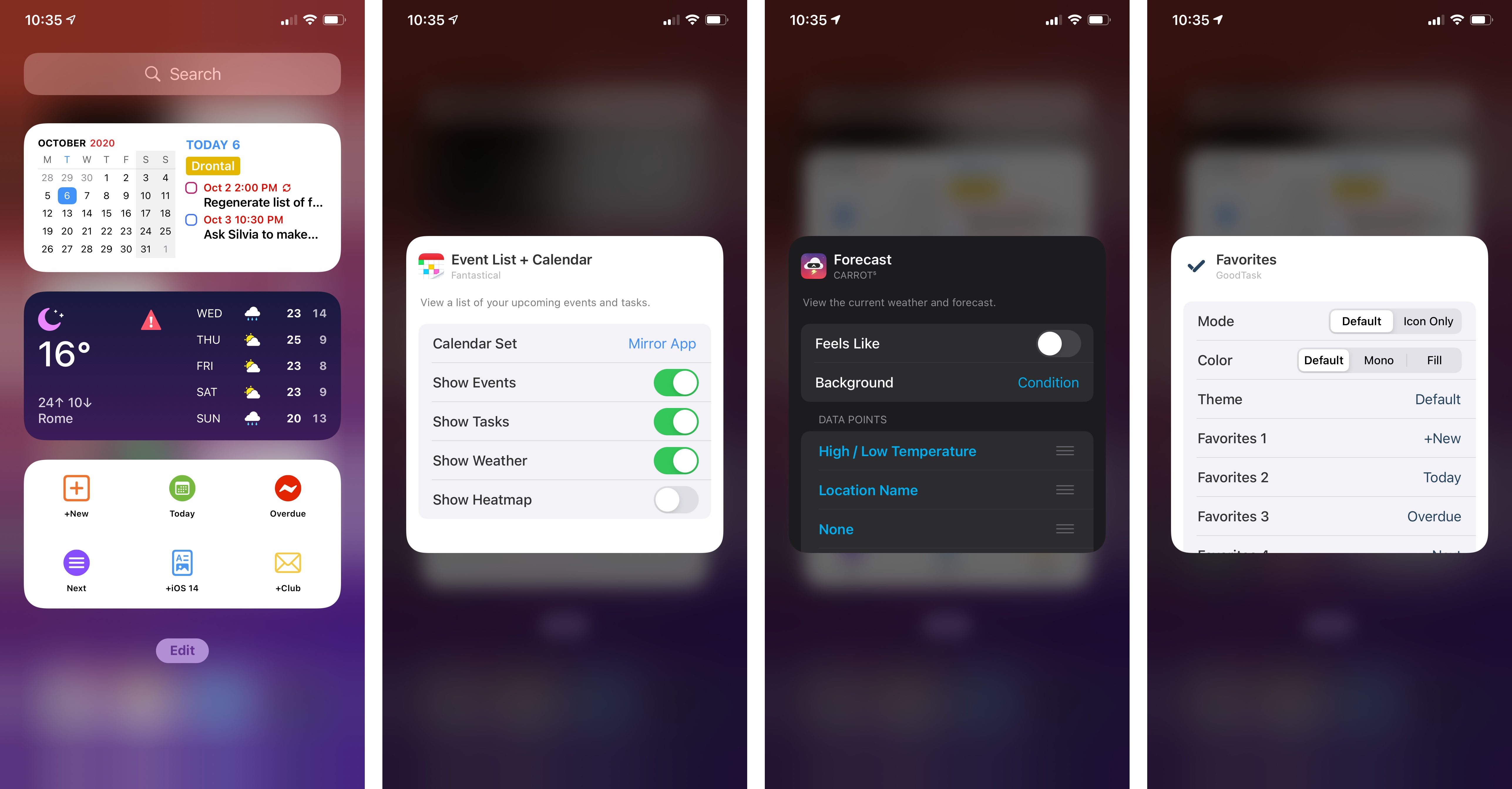
A few other notable examples of widget configuration: GoodTask, the powerful Reminders client, has fantastic widgets to create new tasks based on templates (similar to Todoist) as well as configurable task lists; Fantastical features multiple widgets that can be tweaked to mirror the app’s settings or use specific calendars and calendar sets instead; CARROT Weather now comes with an avalanche of widgets that can be configured with dozens of different data points.
Hopefully, these examples have given you a sense of the possibilities opened by the WidgetKit framework and parameters, which should allow developers to craft rich, information-dense widget experiences for the Home Screen that match the same functionalities previously seen in Shortcuts.
Just like I argued last year that all developers looking to integrate with Shortcuts actions should support parameters, I similarly believe the best widgets for iOS 14 are the ones with deep configuration options that let users adjust them to their needs. The ability to customize widgets inline is one of the greatest advantages over the old widget system of iOS 13, and I hope it’s not overlooked by most developers.
Limitations of Widgets
In case it wasn’t clear, I’ll say this upfront: I’m a fan of iOS 14’s new widgets and I think a clean break from the past with the WidgetKit framework was a necessary step for the Home Screen to evolve in a different direction. The richness of new widgets and flexibility available to developers eclipse the few benefits exclusive to the older widget technology. That said, it’s important to point out the limitations of WidgetKit today and consider where Apple may be heading next.
The main drawback of WidgetKit is that it’s a read-only framework that doesn’t allow widgets to feature interactive elements such as switches, scroll bars, or keypads. As we’ve seen in the examples above, the only “interaction” available in iOS 14 widgets is the ability to tap different areas inside a widget to launch an app. Since WidgetKit is based on SwiftUI snapshots, iOS 14 widgets essentially retrieve data from an app, render it as a static image inside their container, and all you can do is tap a touch target within the widget to launch a URL scheme.
WidgetKit’s approach could be considered a “regression” by developers who built widgets that supported complex inline interactions in iOS 13. Before WidgetKit, it was fairly common, for instance, to find widgets that featured inline calculators, a clipboard manager with scroll bars, music playback controls, or the ability to check off items from a task manager without actually opening the app; all these categories of widgets aren’t supported by WidgetKit at the moment. This means that apps such as PCalc, Anybuffer, or OmniFocus will have to keep their existing widgets around in legacy mode (but users won’t be able to add them to the Home Screen) or offer new widgets with fewer/different functionalities. Furthermore, widgets that updated their contents inline following a user’s tap (such as Timery, which started an inline timer after a selection inside the widget) won’t be able to offer the same functionality with WidgetKit – whenever the user taps a widget, the associated app opens, and there’s nothing developers can do to prevent it.
This is where we have to go back to Apple’s initial presentation of widgets for iOS 14: they’re not meant to be “mini apps” (even though some of them look like it) and they were designed with glanceability in mind. As a user, I can accept the trade-off: after all, we’re getting widgets that are vastly richer, and more customizable, than ever before, and we can finally place them anywhere we want on the Home Screen. I’d rather have these options than interactive widgets stuck in the Today view forever. As a reviewer though, I have to wonder: was Apple’s stance dictated more by current technical limitations than strong internal opinions on the matter? By which I mean: is WidgetKit read-only for now because SwiftUI snapshots rendered on a timeline were the easiest first step8 to bring widgets to the Home Screen, with a deeper, fully interactive mode coming within the next couple years?
I can’t answer these questions right now, nor do I feel like assuming the answer is “yes” should absolve WidgetKit of its de-facto limitations today. Read-only widgets are a compromise I’m willing to accept because I like what they offer today, but I’m also disappointed developers like James Thomson and Joe Hribar can’t build highly interactive experiences with WidgetKit right now. The two statements aren’t mutually exclusive.
My other complaints about widgets are more circumstantial and concern Apple’s implementation in their own widgets rather than the framework itself. Here are some that stood out to me during the beta cycle:
Music: The Music widget is limited to showing items you’ve recently played. Due to technical limitations of WidgetKit, it can’t be an actual Now Playing widget with interactive playback controls, as you may have seen on Android. However, third-party apps like Soor have shown that it’s possible to offer a non-interactive Now Playing widget that updates in near real-time. I’m also surprised by the lack of configuration options: you can’t customize the widget to, say, open specific albums, playlists, or sections in Apple Music. Just like the Notes widget supports multiple modes that let you choose whether you want to see recently modified items or open specific notes, I hope Music will be updated with similar configuration options in the future.
Files: Same as above: the Files widget is limited to displaying files you’ve recently opened. There’s a real missed opportunity here for widgets that let you reopen specific files or folders inside the Files app with a single tap from the Home Screen.
Shortcuts: While there’s lots to like in Shortcuts’ updated widget (as we’ll see later, it’s been updated for compact UI, making widget shortcuts considerably faster to run from the Home Screen), I have an issue with its information density. In the medium size, the Shortcuts widget can only display four shortcuts at a time, and I feel like it could fit twice the amount and still remain comfortable to use. The large widget fares even worse: it only displays eight shortcuts in the same space where 16 app icons would normally fit on the Home Screen. Here’s hoping the compact UI ideology eventually finds its way to the Shortcuts widget as well.
Clock: I once tweeted that I wished the World Clock widget supported a digital mode because I can’t quickly glance at the time with analog clocks, and multiple Twitter users made fun of my education background. Those users are gone from my timeline thanks to Twitter’s block feature; my disappointment with Apple’s analog-only widget remains.
Regardless of my criticisms around WidgetKit and Apple’s built-in widgets, I genuinely believe the ability to customize the Home Screen with widgets is one of the most exciting changes to the iPhone experience for all kinds of users in years.
In the four months I’ve been using iOS 14 on my iPhone, I’ve gotten used to the idea that the Home Screen isn’t just a grid of app icons anymore. Which is also where iOS 14’s other major change to the Home Screen experience – the brand new App Library – comes in.
- Now that's a product name I haven't typed in a long, long time. ↩
- Let's talk about the overuse of 'Edit' buttons in widgets' context menus. There are three separate 'Edit' options listed in the menu: 'Edit Widget', 'Edit Stack' (if it's a stack), and 'Edit Home Screen'. Each one is (thankfully) paired with a unique symbol, but I wonder if Apple could revise the terminology here to avoid repeating the same verb three times. ↩
- Another Dashboard throwback! ↩
- Obviously, performance is a huge cost to consider in terms of concerns surrounding widget interactivity; I wouldn't be surprised to hear Apple had prototypes of fully interactive widgets working internally and decided against them to prioritize performance and battery life. ↩