Three-Column Layouts
For the past few years, Apple’s Mail and Notes apps have offered a three-column display mode that allowed users to quickly navigate sections. As we discussed on MacStories before, the three-column mode was one of the key advantages of the 12.9” iPad Pro over smaller models, which were limited to standard split modes with two concurrent columns. In iPadOS 14, Apple is opening up a native three-column mode to third-party developers with a major update to the existing UISplitViewController API; in the process, they’ve also updated the technology to make it work on more iPads, in more orientations, and with full support for size classes.
In short: between sidebars and three-column layouts, iPad apps are growing up, and you should expect a lot of your favorite apps to look a bit more like their Mac counterparts.
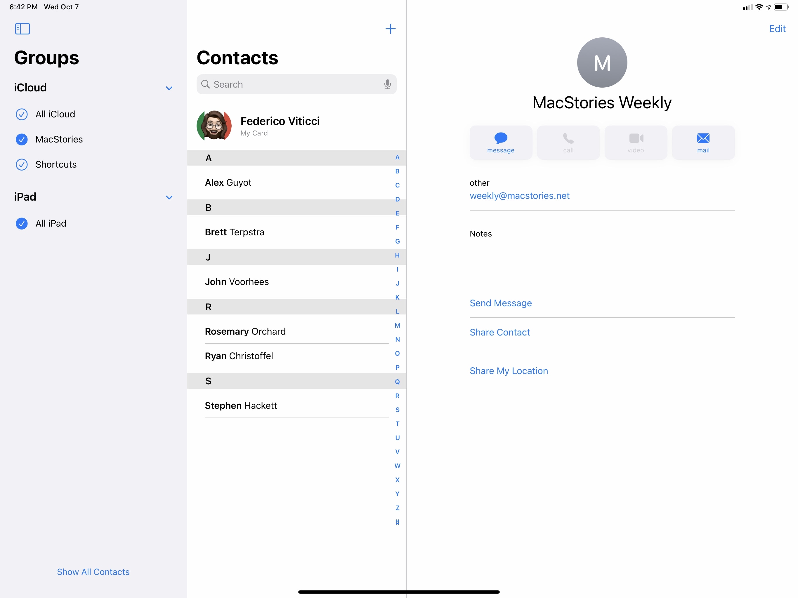
If you’ve ever used Notes or Mail on a 12.9” iPad Pro before, the addition of three-column layouts in more apps may not seem like a big deal. Notes and Mail are now using the updated three-column mode in lieu of their former custom implementations, and a three-column layout has been added to Voice Memos and Contacts as well.
As is often the case in updated view controller APIs (and, I may add, life in general), don’t let appearances fool you: Apple’s modernized split view controller and native three-column mode marks a fundamental shift in designing iPad apps. I don’t want to get too deep into the technicalities of this framework, but I think it’s important to understand what it does to get a sense of where the iPad app ecosystem is going.
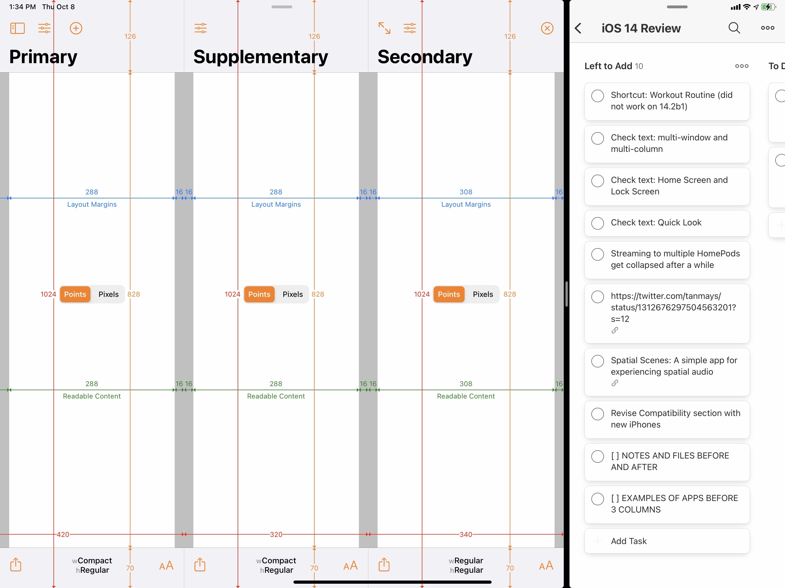
Before iOS 14, Apple’s split view controller system (not to be confused with Split View, the multitasking feature) only supported a classic split interface style with a column on the left (called the ‘Primary’ window) and the content area on the right (the ‘Secondary’ one). For instance, this is what Notes looked like with a classic split view controller before Apple added the proprietary three-column mode in iOS 10. As a developer, if you wanted to offer a three-column mode in your app, you had to build one yourself – which is exactly what the likes of Ulysses, iA Writer, and Fiery Feeds did. In many ways, those apps were ahead of the curve; however, each implementation differed from the other, resulting in a confusing landscape of powerful iPad apps that didn’t share a consistent multicolumn experience. It felt like the days of custom drag and drop before Apple shipped the real thing in iOS 11.
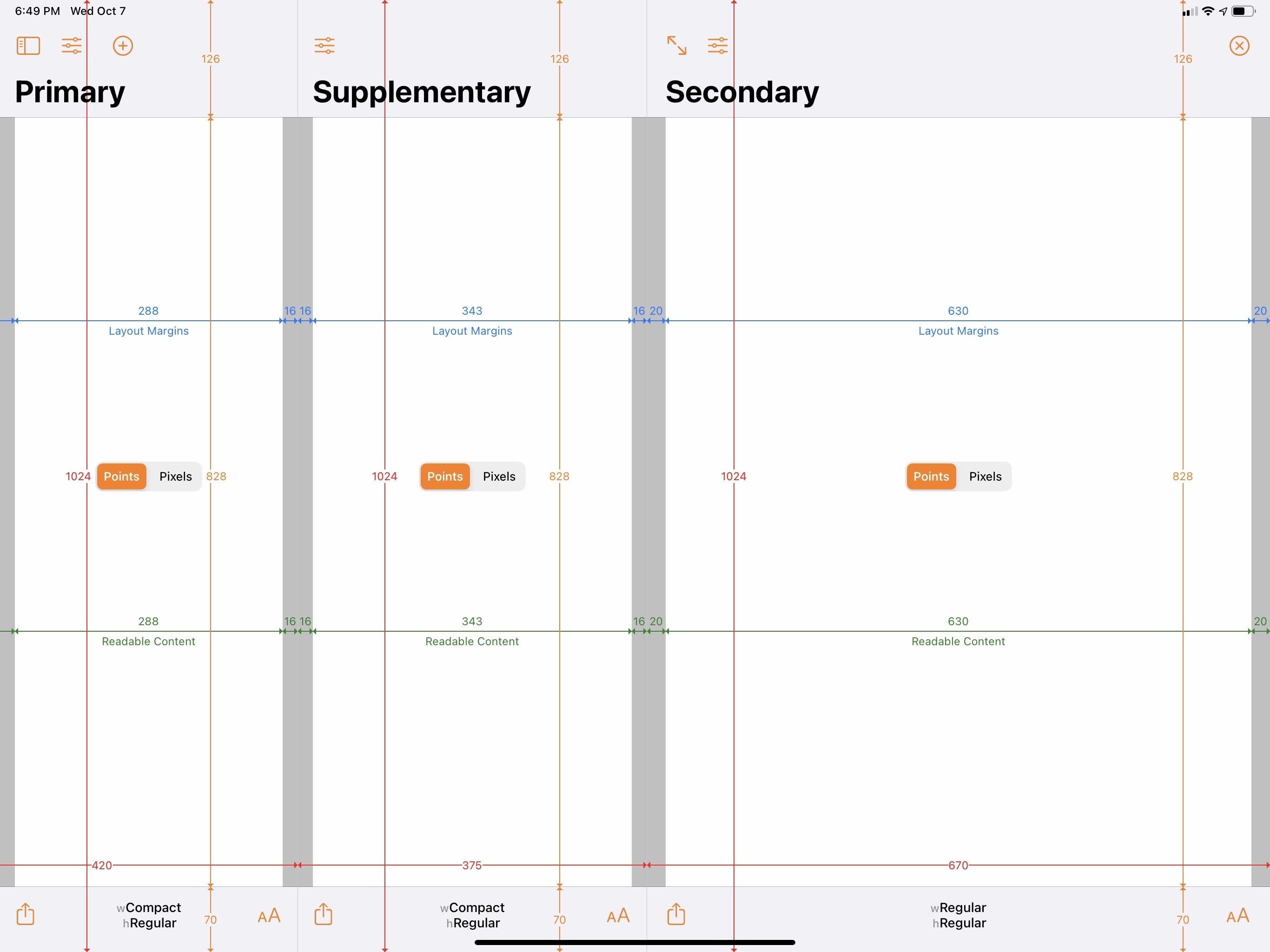
In iPadOS 14, the split view controller framework has gained the option to show an additional column in between the sidebar and content area: the new column is called “supplementary”, and it’s what displays your list of messages and notes in the Mail and Notes apps, respectively. In the two Apple apps updated with three-column mode in iPadOS 14, Voice Memos and Contacts, the supplementary column is used to collect your recordings and scroll lists of contacts.
Much like sidebars, what makes iPadOS 14’s native three-column mode special is its flexibility and multiple options available to developers. Consider, for example, dismissing the extra column: by default, in Notes and Mail, there’s a button to hide/show the sidebar and, as I noted above, you can swipe with two fingers over the title bar to toggle columns as well. The gesture, however, is optional, and developers can choose to disable and override it with something else. There’s also the double-arrow button that lets you expand the secondary window (content area) to fill the screen, which is used in Notes to view any note in full-screen mode. This button can also be implemented by third-party apps now, so they will be able to mimic Notes’ behavior and let you rotate between multicolumn and full-screen layouts.
What’s truly remarkable, though, is the extent to which the three-column framework integrates with size classes and deals with multiple orientations and iPad models. In iPadOS 14, developers can choose different behaviors and modes for their three-column layouts: for instance, they can opt to always tile the primary and supplementary columns next to the secondary one, or they can choose to “displace” the content area, or they can overlay a column on top of another. They can do so by setting specific properties in their apps; they can also set an ‘automatic’ behavior that lets the system take control and lay out columns based on size classes, device orientation, and multitasking conditions.
To give you some practical examples of this technology applied to everyday iPad usage, I turned once again to Adaptivity, the amazing developer utility created by Geoff Hackworth, which I use every year to test new system functionalities in iOS and iPadOS. As you can see below, on a 12.9” iPad Pro in landscape, I can choose to show two columns next to the content area at all times with the ‘tile’ behavior, which allows me to interact with every column at the same time; this is different from Apple’s system behavior, which defaults to hiding the sidebar upon opening an app for the first time – even on a 12.9” iPad Pro. You can try this yourself by force-quitting Notes and reopening it – the app will default to two columns only. However, if you’re a third-party developer and would prefer your app to always display three columns instead, iPadOS 14 gives you the tools to do so.
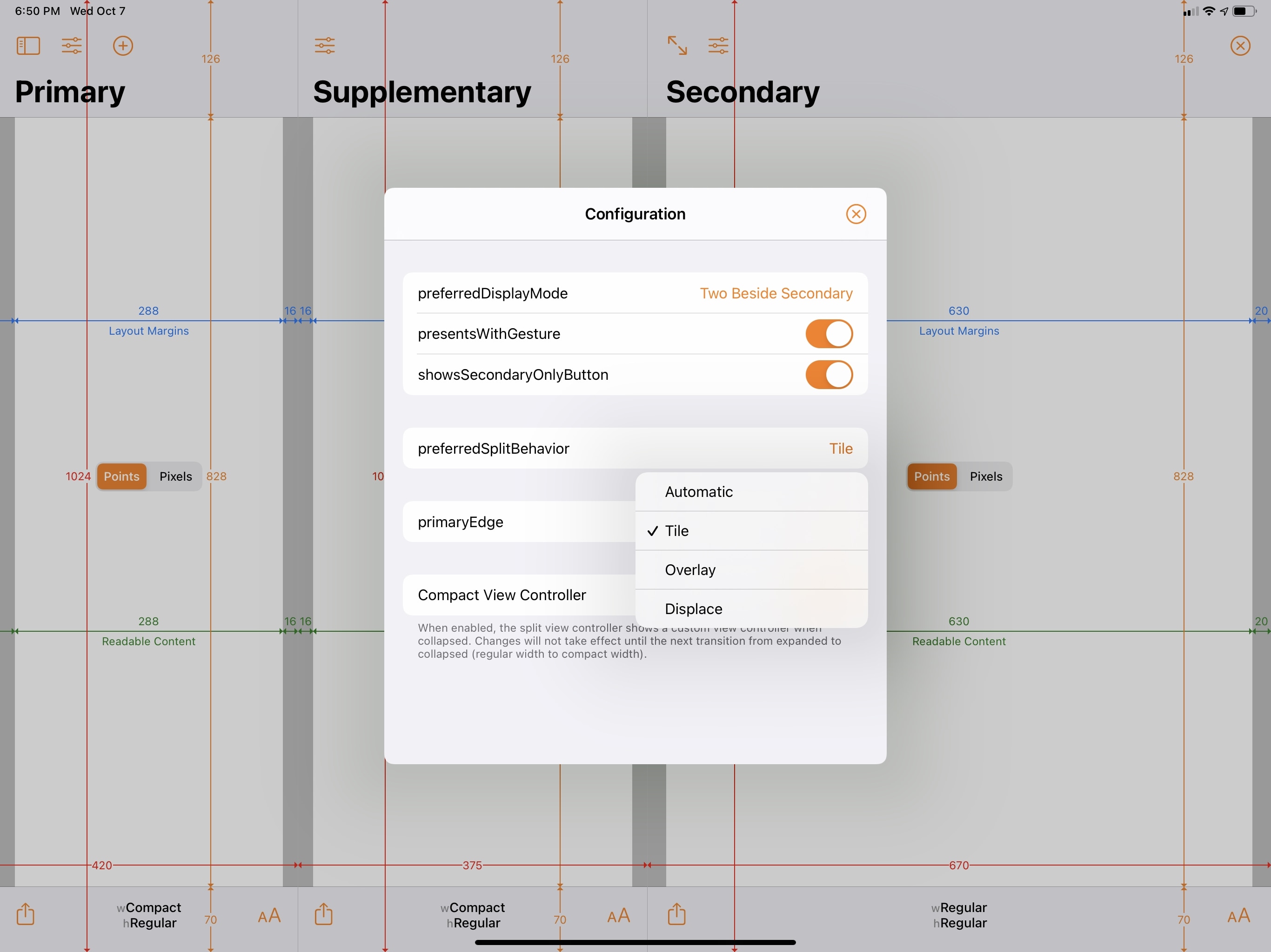
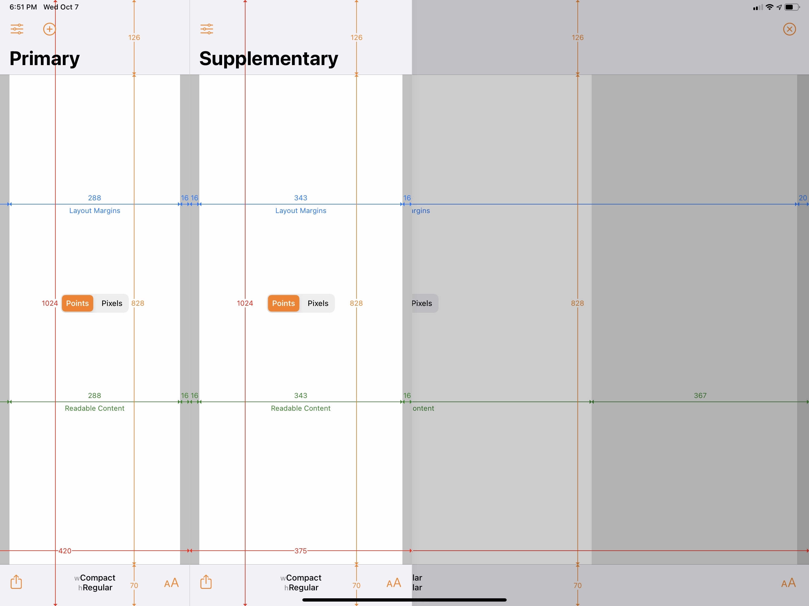
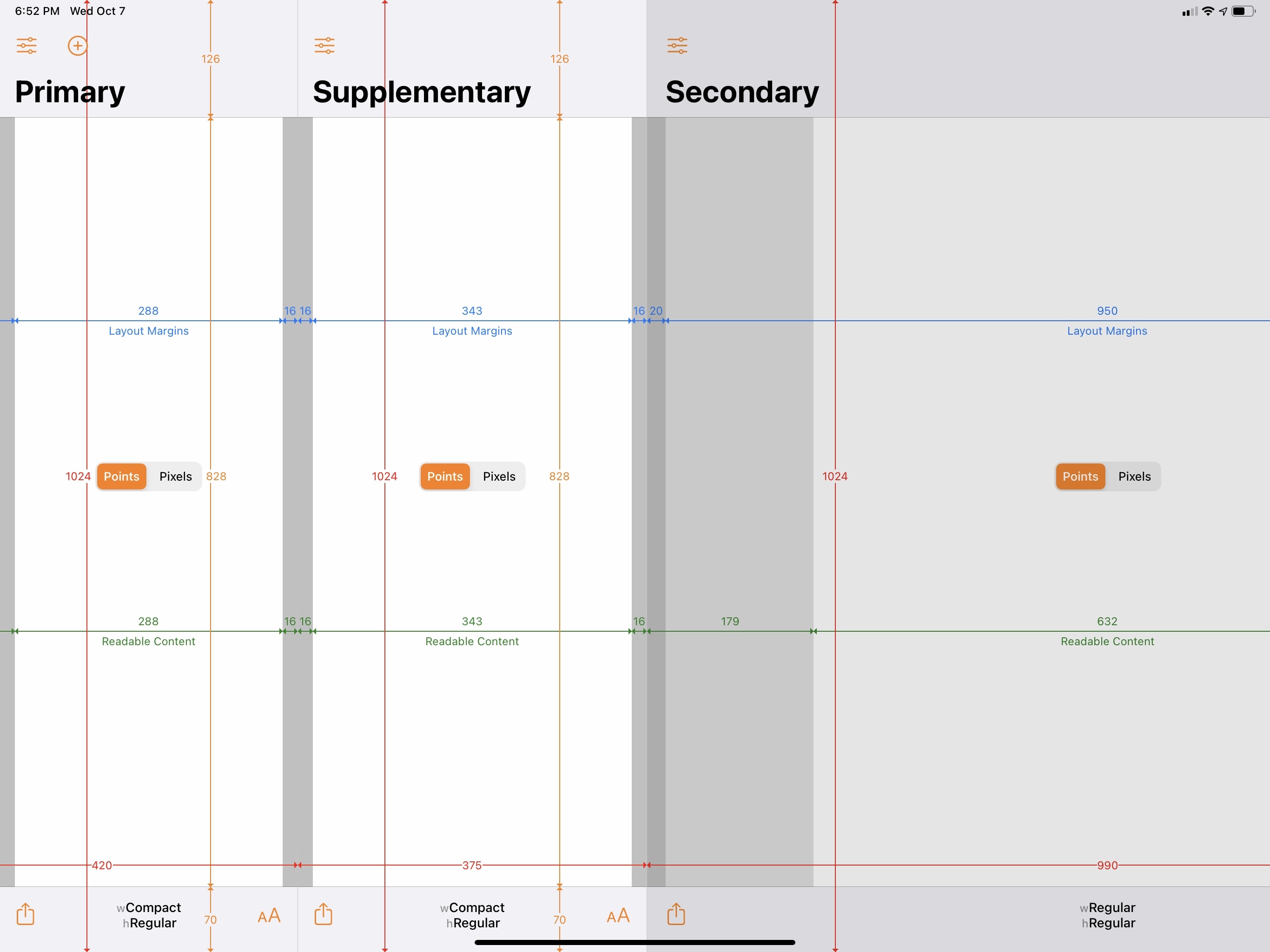
Don’t want to tile the primary and supplementary columns next to the secondary one? iPadOS 14 allows apps to displace the content area (it gets dimmed and cannot be interacted with until you dismiss one of the columns on the left) or display columns over it. Here’s what the “displace” and “overlay” display modes look like in Adaptivity:
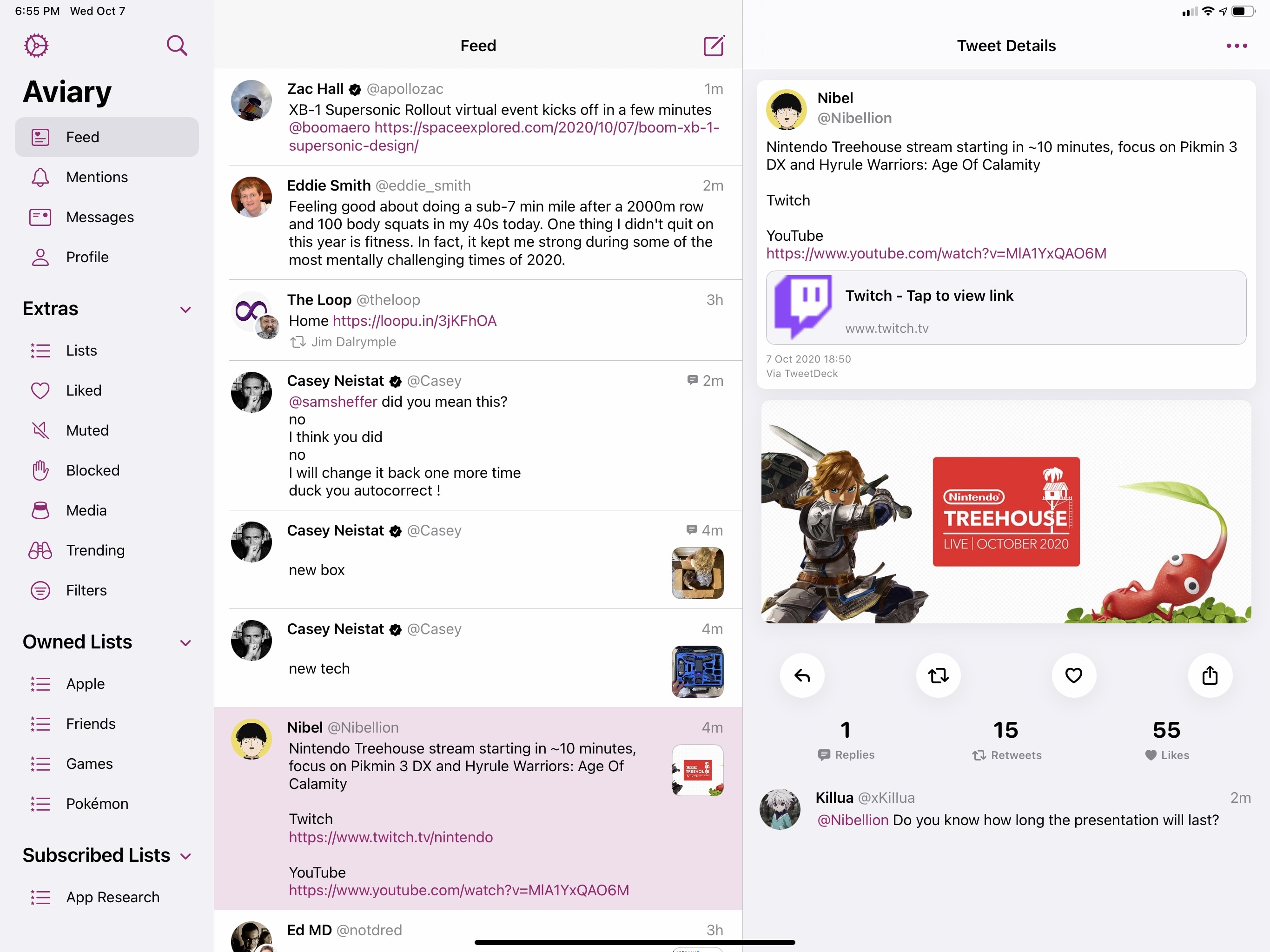
The Twitter client Aviary, which supports multiple columns in iPadOS 14, uses the displace behavior to dim columns on the right when the sidebar and timeline are shown:
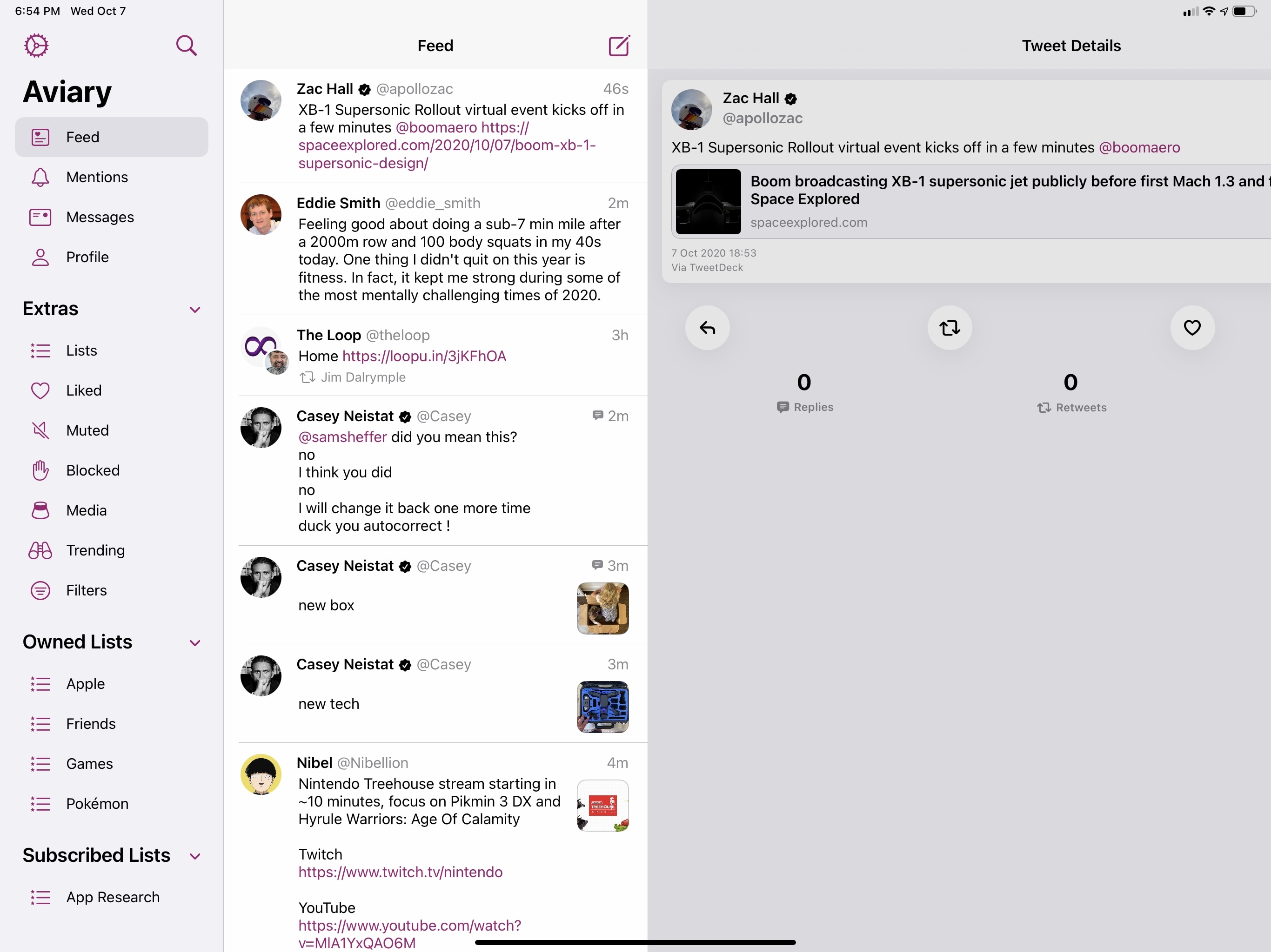
However, there’s also an advanced setting in Aviary to use the tile layout instead and always display three columns in the app:
The options selected by developers in their multicolumn apps are only one part of the equation: ultimately, the system is in charge of deciding how columns should be laid out depending on size classes, which take into consideration both device orientation and multitasking conditions. In simpler terms: the number of columns displayed onscreen is going to change depending on the iPad model you have and its orientation and whether you’re using Split View or not. Let’s go over some examples, which I was able to capture on iPads at two opposite ends of the spectrum: my 12.9” iPad Pro and an iPad mini.
On the largest iPad Pro, VinylBox, like Notes, supports the new three-column layout in landscape mode. Turn the device sideways, however, and the app – again, just like Notes – loses the ability to display three columns simultaneously. In portrait, you’ll be able to see two columns (the primary and supplementary ones) placed over the content area, making it non-interactive.
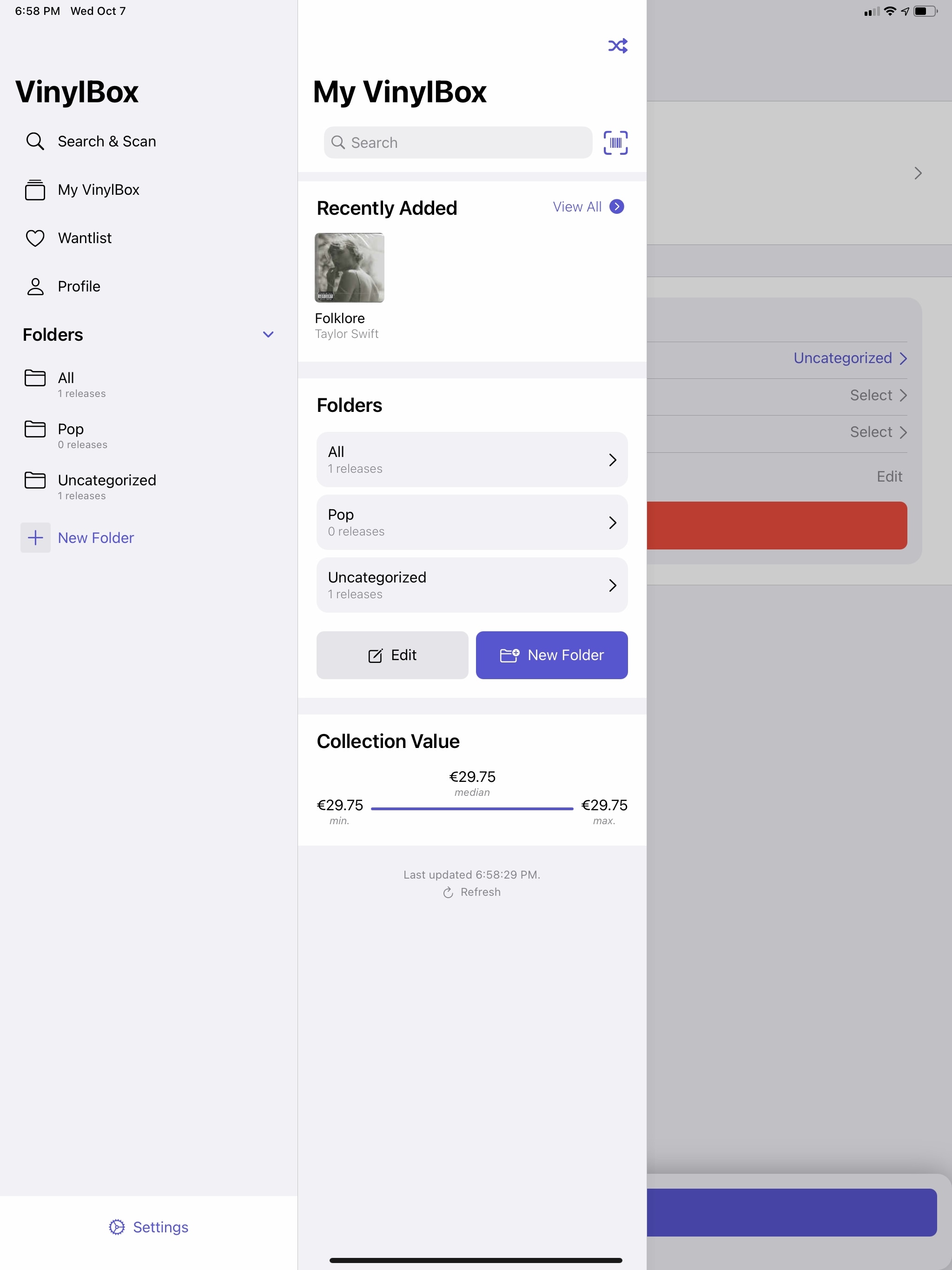
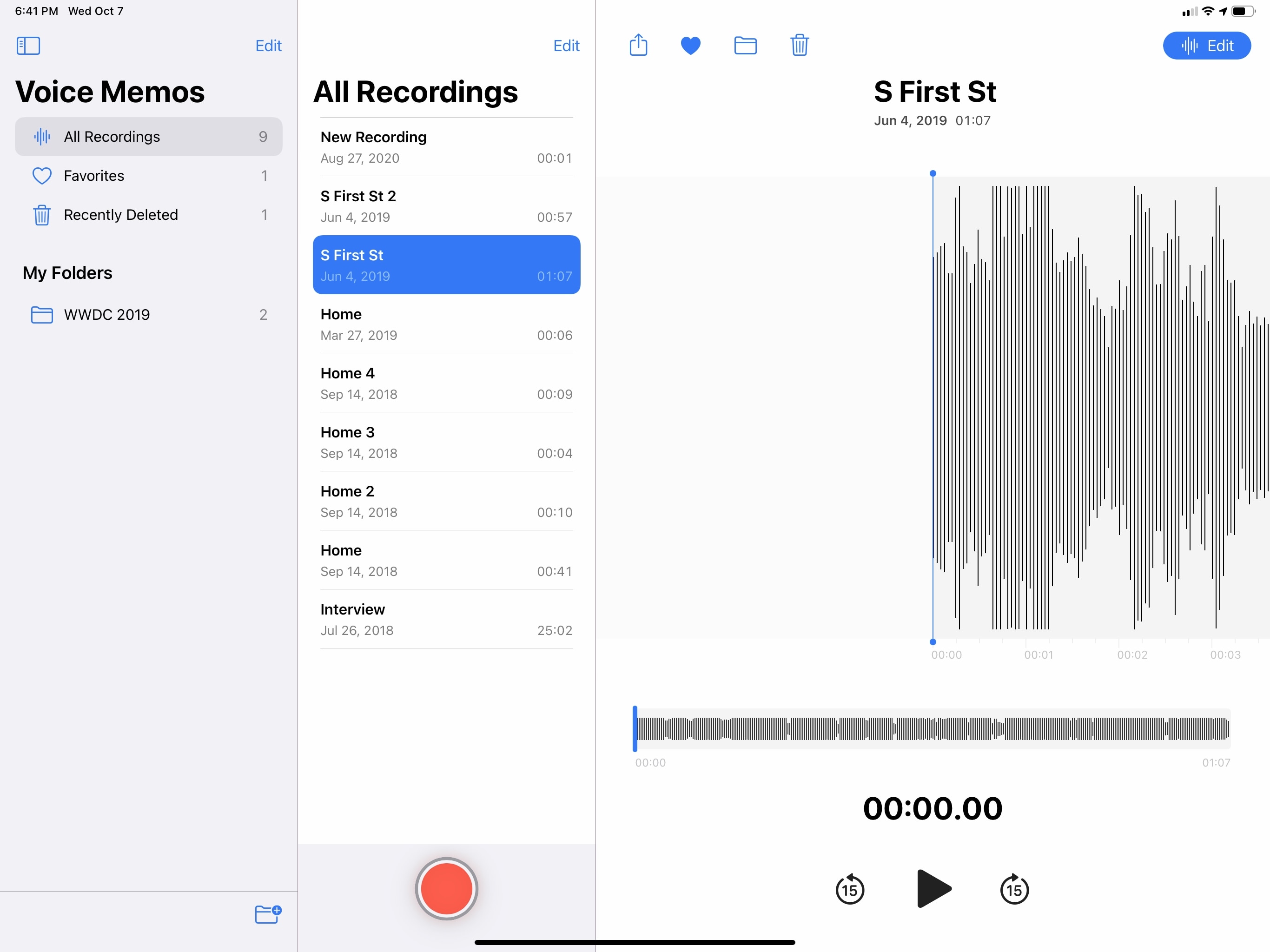
VinylBox shares the same column behavior of Apple’s Notes app; Contacts works the same way. Another Apple app updated this year with multicolumn support – Voice Memos – takes a different approach altogether. In both landscape and portrait, Voice Memos can always display three columns at once:
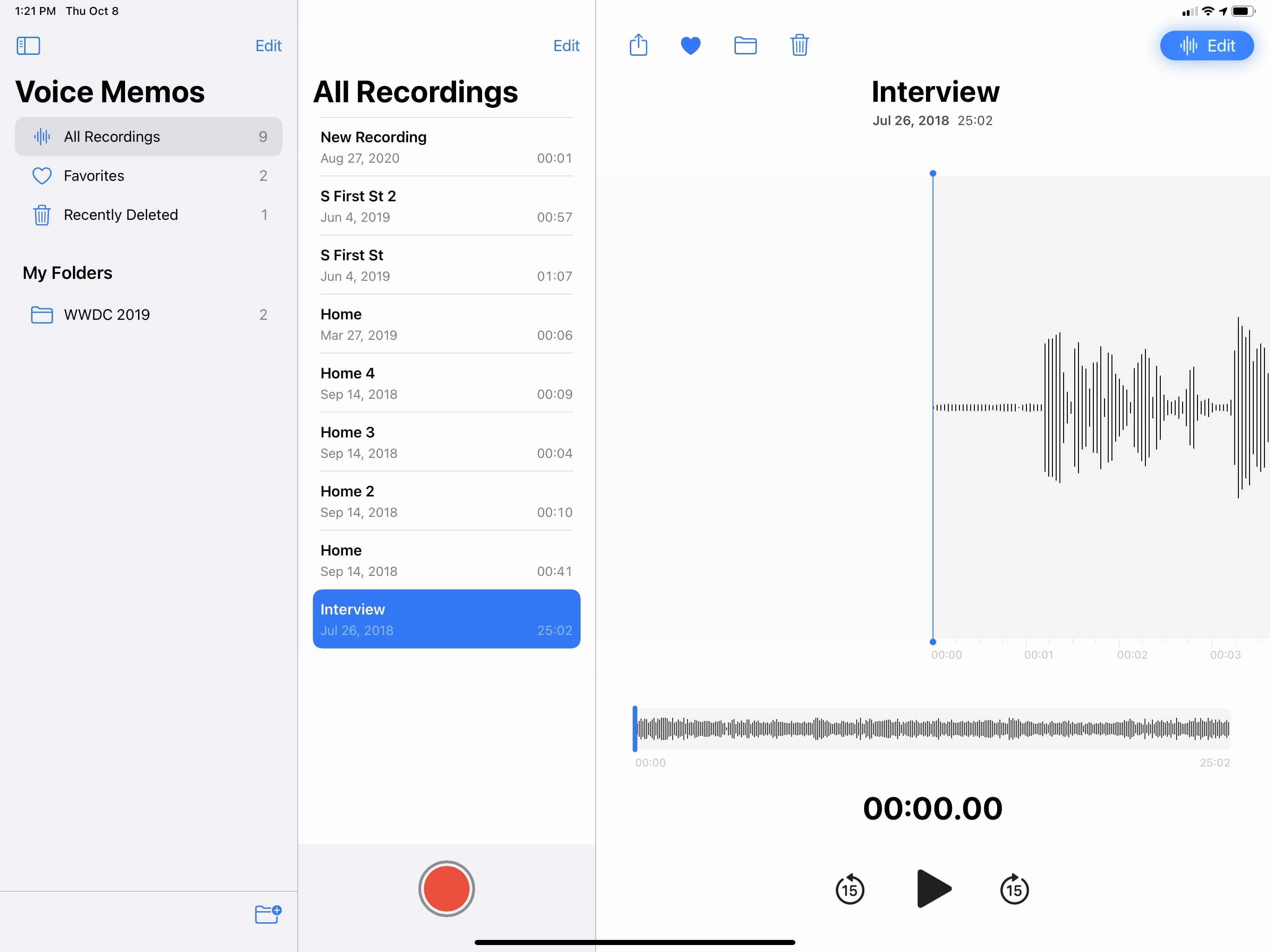
I’m not sure why Notes, Contacts, and Mail don’t support three columns on the 12.9” iPad Pro in portrait while Voice Memos does. My gut feeling says that there isn’t a larger vision behind this – rather, I suspect different teams at Apple chose to implement column behaviors based on what they preferred. I’m struggling to find the deeper, hidden meaning behind extensive multicolumn support in Voice Memos as opposed to Notes or Mail; in any case, I applaud the Voice Memos engineers since theirs is, I believe, the best implementation to offer on a 12.9” iPad Pro, where three columns are perfectly fine to use in portrait mode as well.
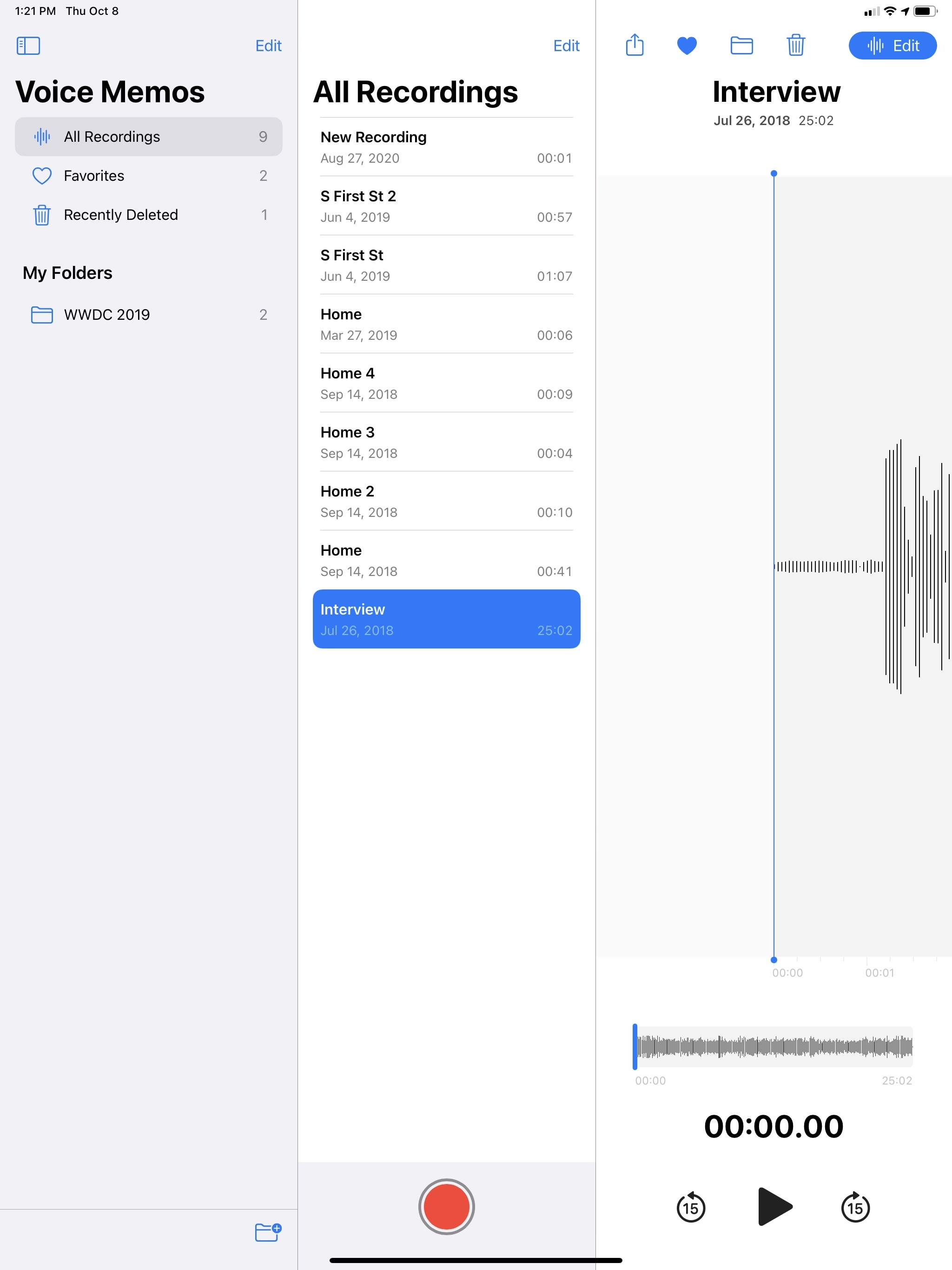
Stay with me, because it gets even better on the iPad mini. On Apple’s diminutive tablet, neither Notes nor Mail support working with three columns simultaneously in landscape at all – the rightmost one gets displaced offscreen. There’s one Apple app in iPadOS 14, however, that comes with a full-featured three-column layout on the iPad mini in landscape mode. You know where this is going.
Here’s, once again, Voice Memos, running on the iPad mini in landscape mode in all its minuscule, yet functional three-column glory:
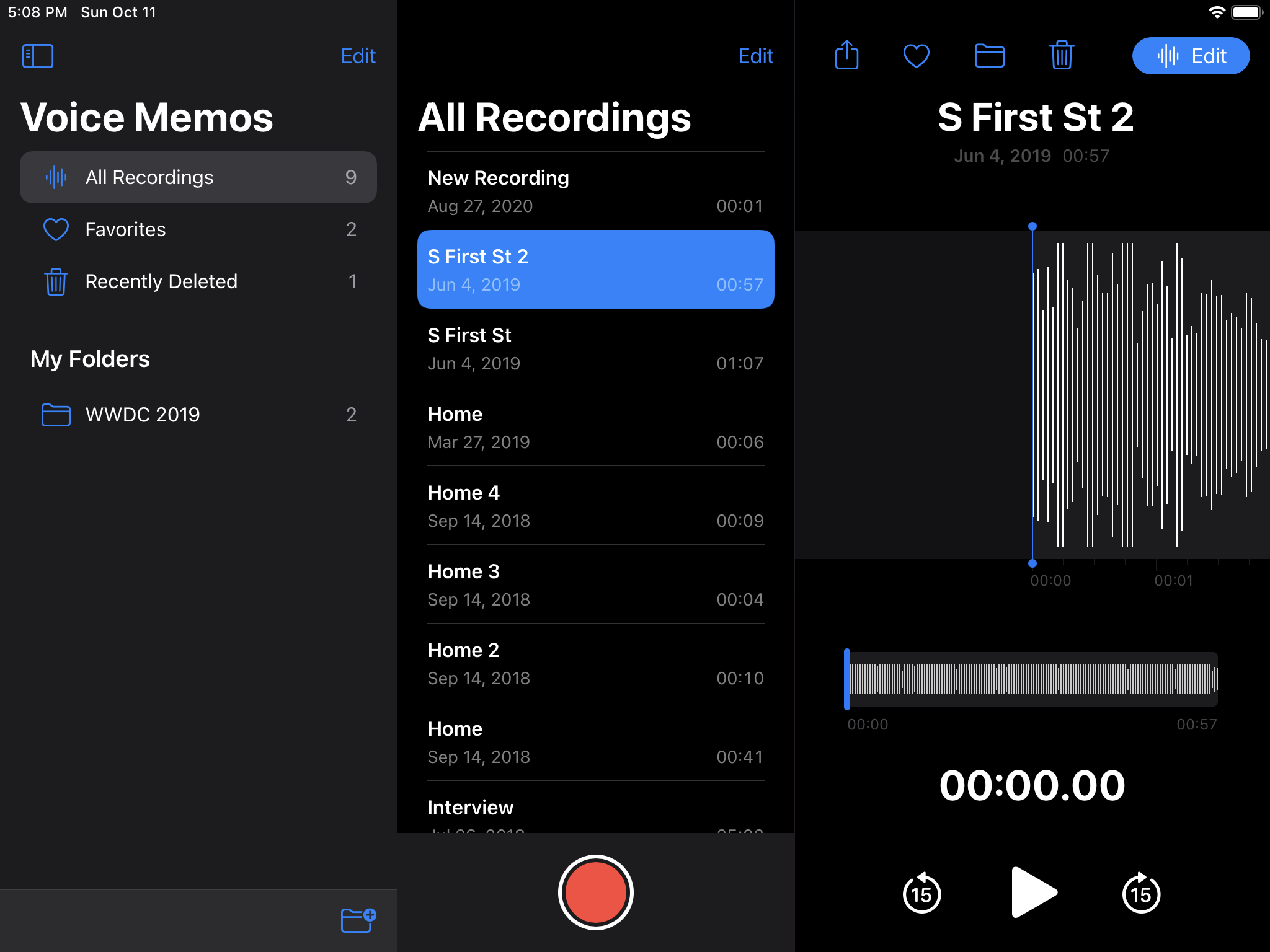
Even on the small screen of the iPad mini, I find Voice Memos’ three landscape columns comfortable to use. It helps, of course, that Voice Memos sports a relatively sparse user interface; I can imagine it’d be more challenging to pack the UI of richer apps like Notes and Mail in a narrow third column, but I’d like to see Apple try nonetheless. It’s also worth noting how, as other developers have pointed out to me, the plethora of options available in the UISplitViewController framework may make it challenging to come up with a consistent application of the technology. Regardless, I wish more Apple apps would behave like Voice Memos on all iPad models; right now, it almost feels as if an app with a strong Catalyst foundation (such as Voice Memos) has an inherent advantage over older apps that were designed before the age of iPad apps turning into Mac experiences.
As I noted above, multicolumn layouts also have to account for changes in multitasking conditions on iPadOS – namely, whether Split View is active or not. Generally speaking, the system follows this automatic behavior: you won’t be able to see three concurrent columns once a second app is added in Split View next to the current one; when you enter Split View – even with the 75/25 compact layout, the two left columns will either displace or be overlaid on top of the secondary one.
When a secondary app is added via Split View, Notes loses the ability to display three concurrent columns.
In this case, I agree with Apple’s choice: once another app is shown, three columns would likely be too narrow for most apps, and it seems reasonable to default to only showing two columns.
That’s not to say it isn’t possible for developers to code their apps in such a way that three columns are always shown, even if Split View is active. As shown below in GameTrack and Adaptivity, iPadOS 14 gives developers the tools to hardcode a three-column layout regardless of Split View. It’s up to a developer’s discretion to make use of this technology, and I understand how it may not be the best approach for apps with complex UIs that involve several toolbar buttons or content that can’t fit in a narrow column.
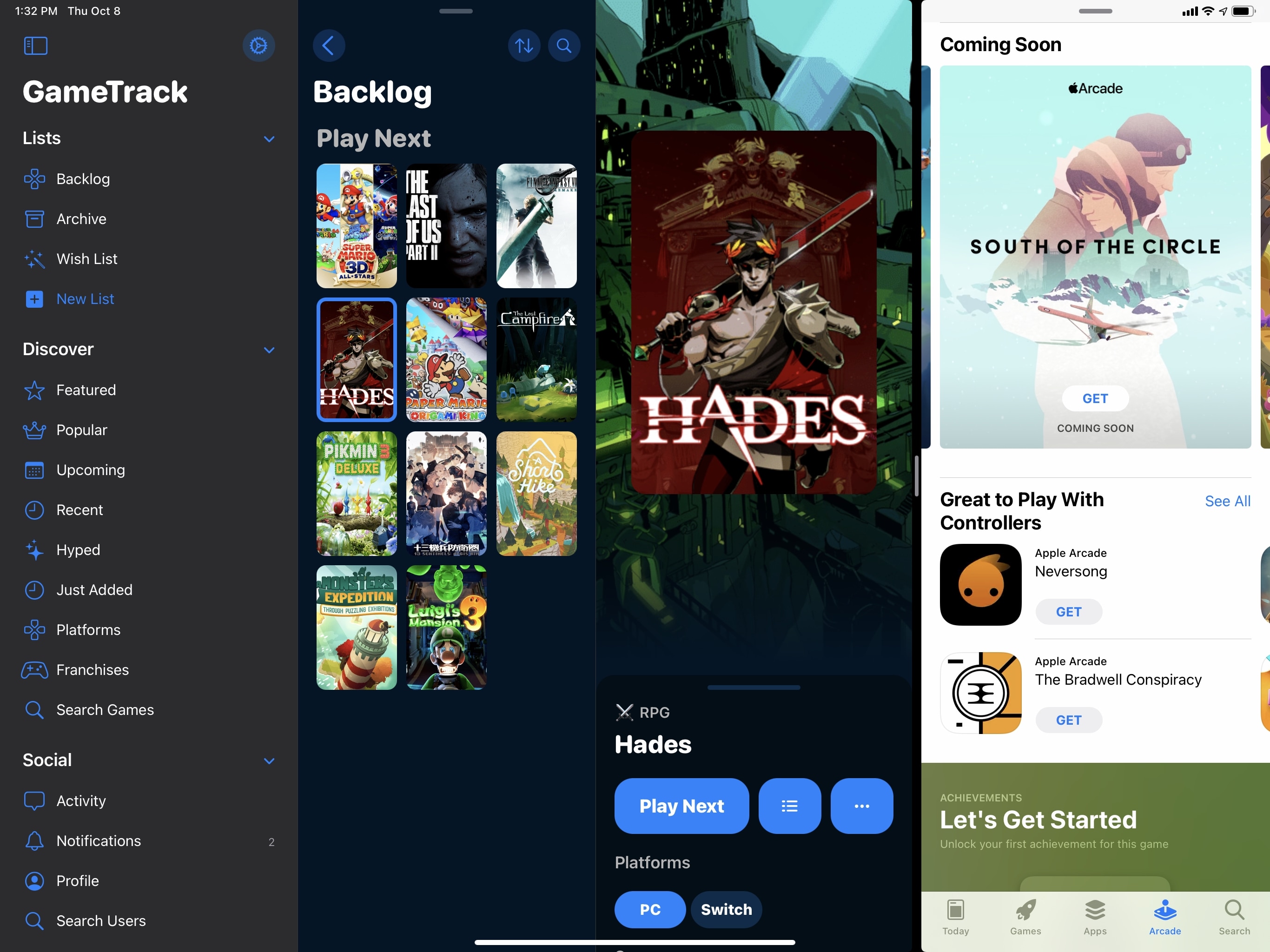
GameTrack can always show three columns at once, even when a secondary app in a compact size class is added via Split View.
In using apps with sidebars and multicolumn layouts on my iPad Pro for the past few months, I’m left with three main takeaways that should inform your experience with iPadOS 14 going forward.
First, developers have a lot of leeway when it comes to implementing multiple columns in their apps. Yes, the framework can be fairly complex to understand at first, but that complexity is necessary to offer a flexible system that can work equally well for simple user interfaces and more elaborate ones. The multiple display modes, paired with customizations for the sidebar and support for size classes, should provide a solid foundation for the vast majority of iPad apps to replace their proprietary flavors of multicolumn in favor of iPadOS 14’s system, which offers sizable advantages such as integration with touch and pointer, multitasking, accessibility, right-to-left languages, and more. Going forward, apps that don’t use the native multicolumn framework are going to stick out as odd leftovers, much like those that still rely on custom share sheets or context menus.
Second, by providing developers with a native solution for multicolumn that also works out of the box once ported to macOS, Apple is removing a lot of friction from app development. We’ve seen this happen before with other built-in technologies like drag and drop, Safari View Controller, and keyboard shortcuts: before those system frameworks became available, developers had to code those features themselves, resulting in more time spent developing options that should have been system features instead of devoting their efforts to app design and new functionalities. If you’re a new developer, there’s never been a better time to design an iPad app: iPadOS 14 provides you with a wide range of tools such as pointer control, keyboard events, multiwindow, and multicolumn that not only are supported system-wide with no additional work, but also make your iPad app ready for macOS “for free” just by virtue of using Apple’s native APIs. Conversely, if you’re an existing developer, now more than ever is the time to reconsider all the custom implementations of sidebars and multiple columns shipped over the years. As a result, I expect we’re going to see a chasm between “old-gen” iPad apps and brand new ones, at least for a while.
Last but not least, using iPad apps with modern sidebars and multiple columns feels like a breath of fresh air in the ecosystem. By itself, a three-column layout with a sidebar is not a groundbreaking invention: desktop apps (and several third-party iPad apps) have offered one for years. What’s important in the context of iPadOS 14 is how Apple, by endorsing a specific approach to laying out and interacting with iPad apps, is signifying a shift in the platform’s role that’s now more tipped toward the Mac end of the computing spectrum rather than the iPhone’s – something we saw coming after last year’s iPadOS 13 and which was further highlighted by the introduction of the Magic Keyboard and system pointer a few months ago.
iPad apps with updated sidebars and multiple columns now feel like rich, flexible experiences that blend the best aspects of “classic” iPadOS, such as multitouch and gestures, with a modular environment that allows for multiple windows, trackpads, and keyboard control. Saying that “Apple just made iPad apps look like Mac ones” is shortsighted: rather, iPad apps now offer the power and versatility of a desktop experience, but they’re still iPad apps at heart, and you can use them with touch, in full-screen, without multiple columns if you want to. On a large iPad Pro, multicolumn layouts are fantastic for managing information-heavy apps with multiple levels of navigation and content areas; I find three columns comfortable enough on a 12.9” iPad Pro, and I’m more efficient at using apps that involve folders and multiple layers of navigation. At the same time, when I don’t need multiple columns, I’m not forced into them: I can always pick up the iPad from the Magic Keyboard, put a full-screen app in my hands, and concentrate on one task at a time.
Having the option of choosing between desktop-class, multicolumn layouts and traditional full-screen apps, all while seamlessly switching modes, is what makes the iPad experience tick. And from this standpoint, iPadOS 14’s multicolumn system absolutely delivers.
Toolbars
Compared to updated sidebars and the new multicolumn framework, changes to toolbars in iPadOS 14 will likely be considered minor enhancements, but they’re still relevant in the context of Apple’s ‘Made for iPad’ initiative.
Apple’s general advice in iPadOS 14 is that toolbar buttons should be moved to the top of the screen in a unified location that follows the Mac’s traditional approach. In an effort to free up space at the bottom of the screen and, once again, move away from iPhone-inspired designs (where it makes more sense to have controls within thumb’s reach), Apple has started embedding buttons in title bars, using sidebars and pull-down menus to expose functionality that was either hidden or hard to access before.
The two best examples of toolbars in iPadOS 14 are Calendar and Files. In the Calendar app, buttons to filter your calendars, view and create events, and check on your invitations have been moved to the top of the window; when pressed, they either load a sidebar or display a popover to add a new event.
I like this design: the title bar always had enough space for extra controls, and putting buttons up there makes sense since the iPadOS 14 button to open/dismiss the sidebar is also at the top. Additionally, by removing the toolbar at the bottom, Apple created more space for the calendar itself, which is ultimately what matters in a calendar client. That said, the Calendar toolbar is also responsive: when the app is in a compact size class, it reverts to the old design with controls at the bottom of the window.
In a compact size class, Calendar returns to an iPhone-like layout with toolbar buttons at the bottom.
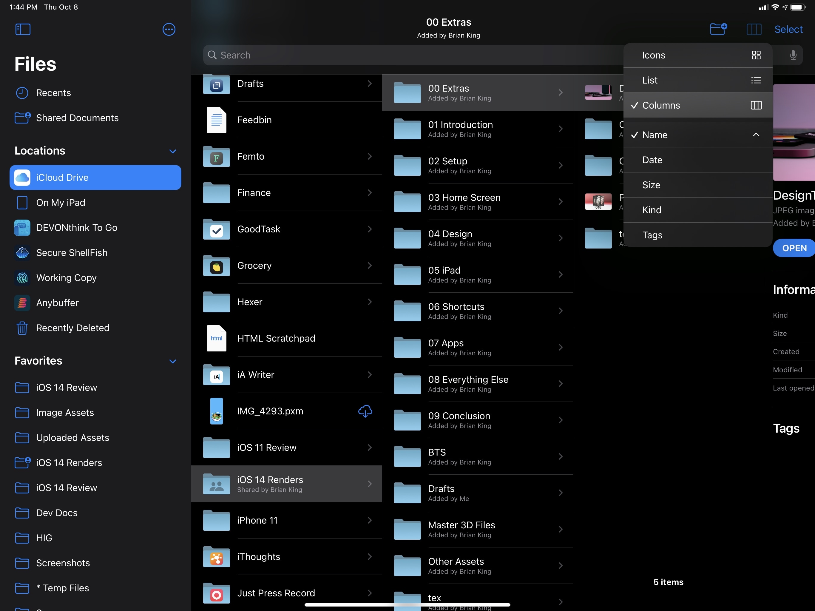
With the Files app, Apple used the toolbar to bring view controls (which a lot of users struggled to find before) front and center. Press the new button in the top right corner of the title bar and you’ll be presented with a pull-down menu to switch between different view modes or sort your documents.
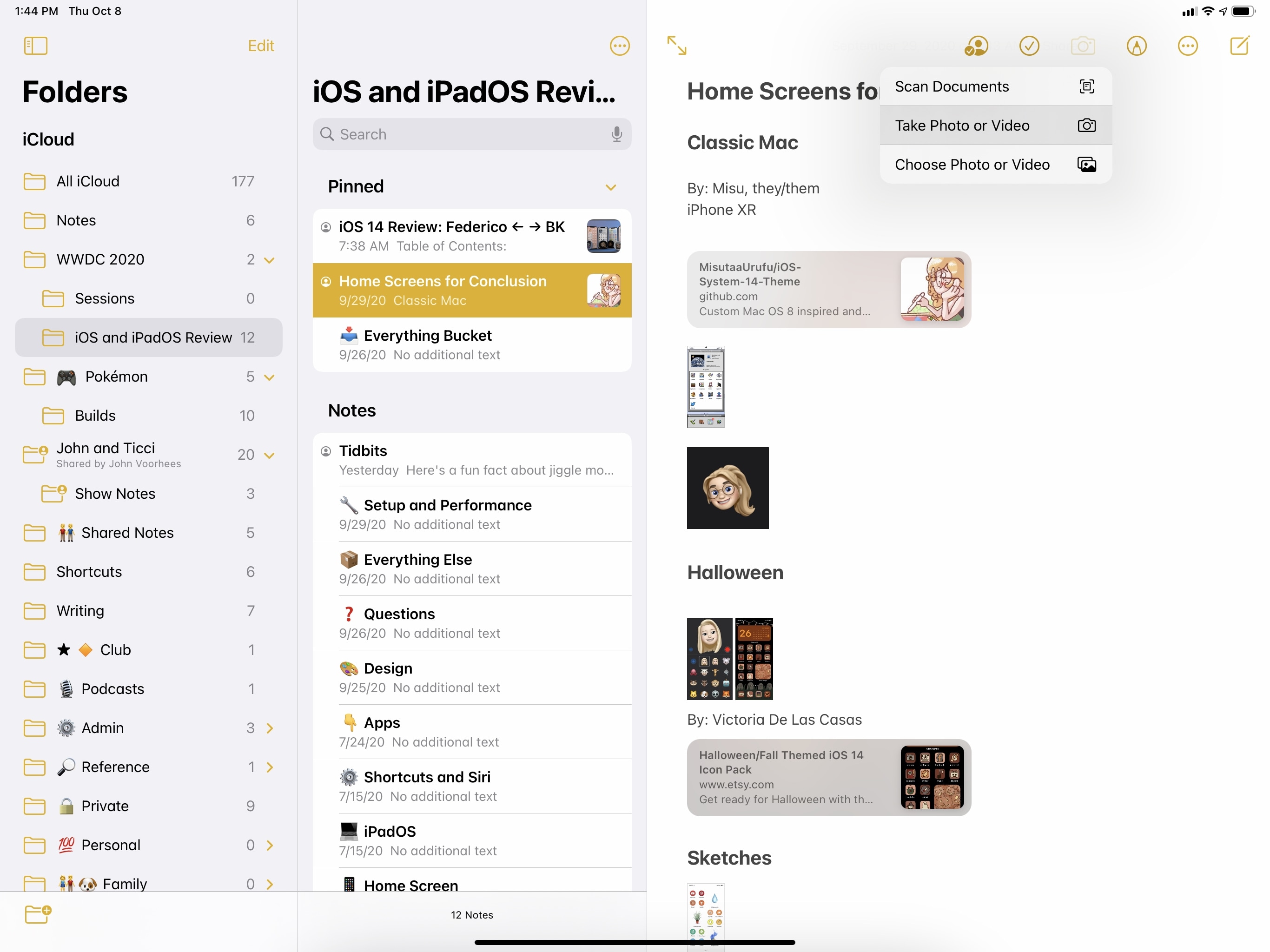
Notes also comes with an updated toolbar now, with the camera button opening a pull-down menu to add attachments to a note:
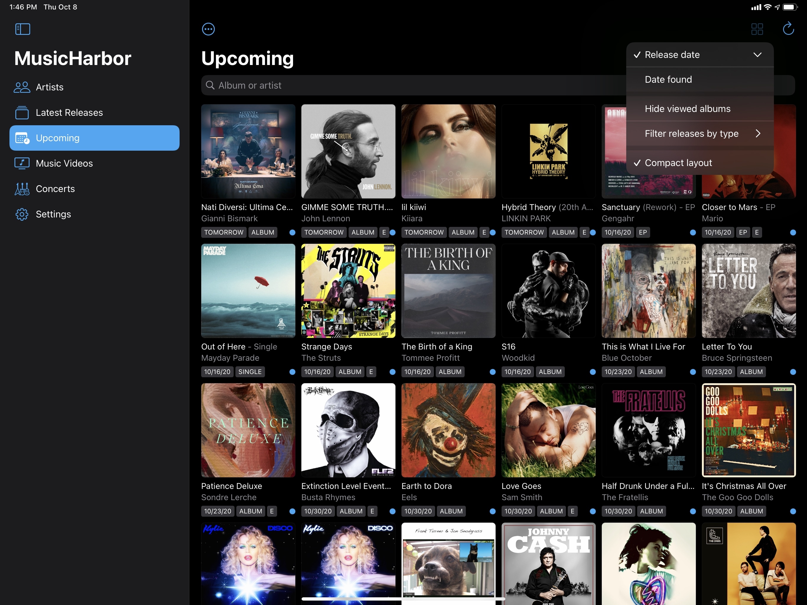
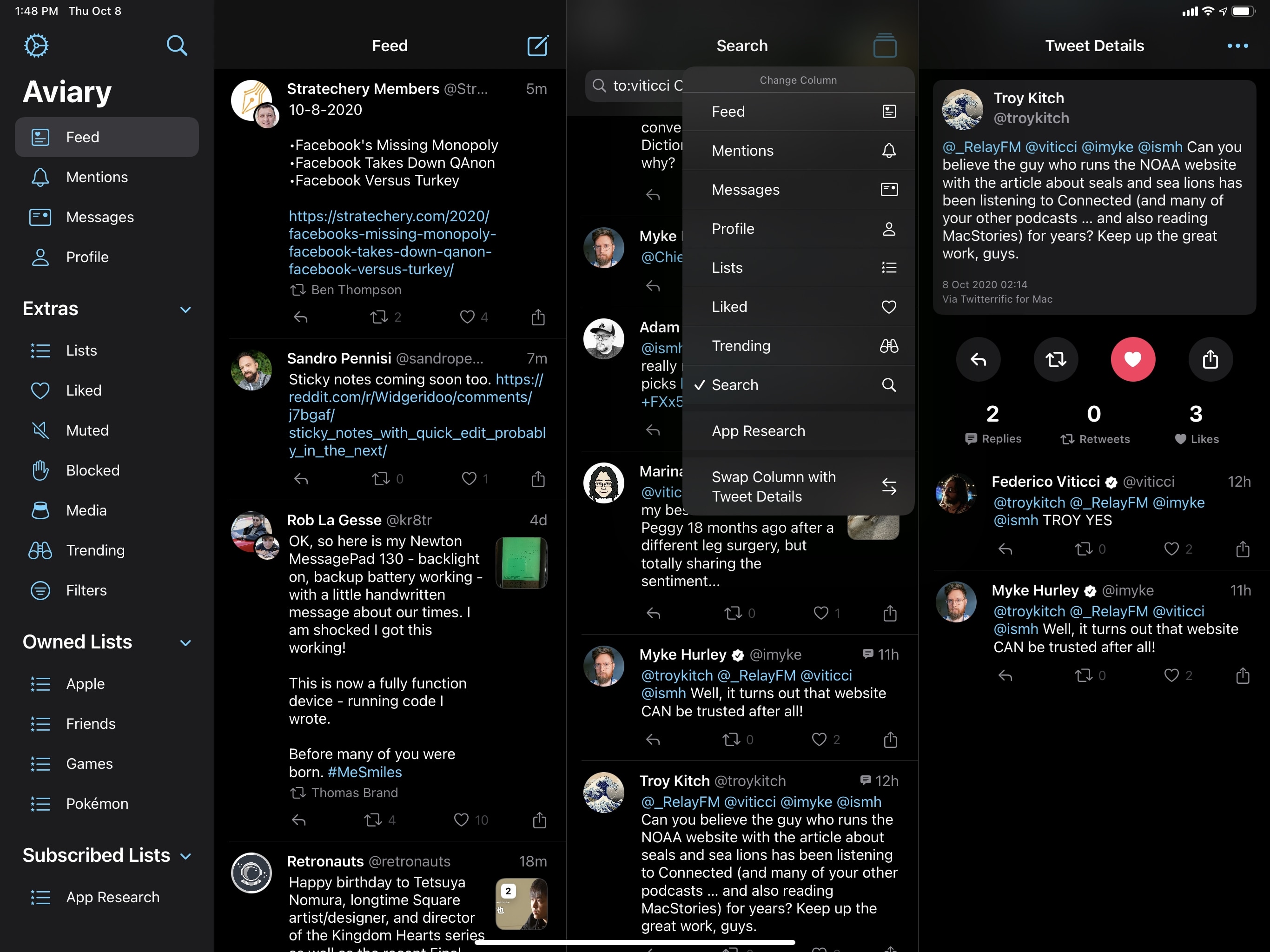
Some third-party developers have been following Apple’s guidance on toolbars as well. In the iPadOS 14 update to the excellent MusicHarbor, the app features buttons to select and sort music releases in the top toolbar; those buttons also open pull-down menus when pressed. The highly customizable Twitter client Aviary was designed for iOS and iPadOS 14 from the start, and it uses toolbar buttons with pull-down menus to handle column management and perform actions on selected tweets.
There isn’t much else to say about toolbars. They fit the underlying iPadOS 14 theme of consolidating UI elements in one place, making more room for content, and preparing iPad apps for an eventual transition to the Mac. The integration between toolbar icons and pull-down menus is particularly apt given how closely the end result resembles a classic macOS toolbar. Just like most iPad apps will be losing their tab bars this year, expect to see fewer bottom toolbars and more UI elements moving to the top of the screen.
Search
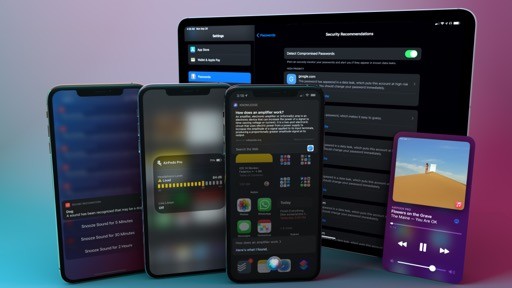
All the changes and improvements to Search mentioned previously – more compact results, instant app launching, and support for web searches, among other things – apply to iPadOS 14 too, with one notable difference: on iPad, Search is now a floating window that appears on top of the app you’re using, without fully hiding it.
You’ve probably seen this Search design before: effectively, iPadOS 14 offers the equivalent of Spotlight on macOS. In another instance of Apple deliberately borrowing from the Mac to make the iPadOS platform more powerful and easier to operate, you can now invoke Search from anywhere (provided you have an external keyboard) and scroll results while continuing to see the app you were previously using.
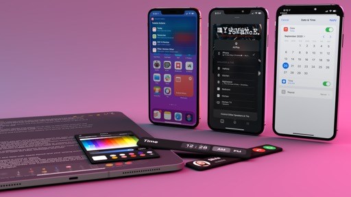
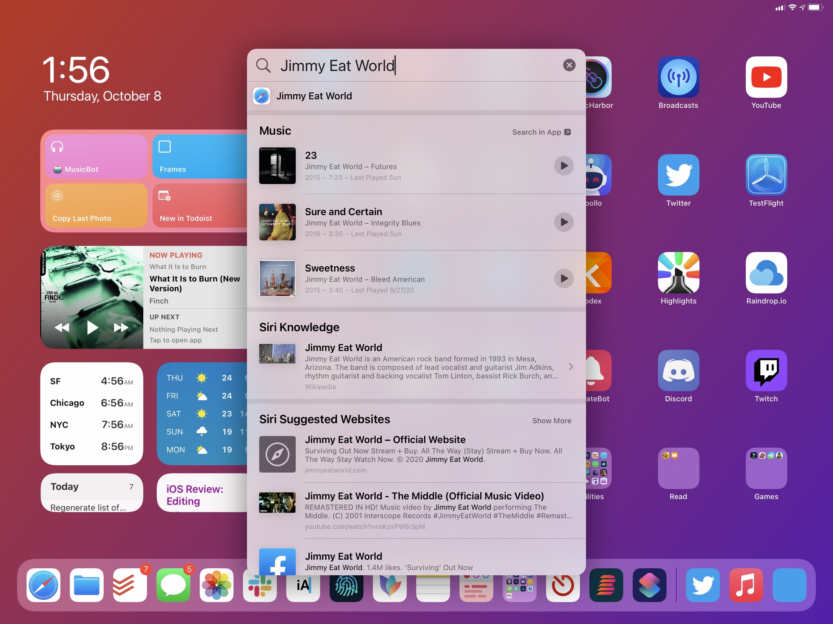
It’s hard to describe how much faster iPadOS 14’s updated Search feels without trying it. Press ⌘Space (or if you’re on the Home Screen, swipe down) and a search box comes up immediately, ready for you to type. At this point, you can either enter a few characters for the name of the app you want to open and press Return to launch it right away, or put together a more complex search query to view results from apps and the web. The search box accepts text input as soon as the ⌘Space shortcut has been triggered, which makes typing out a query and getting results back after an instant a pure joy. Even more so than the updated Search on iPhone this year, Search in iPadOS 14 feels faster, less intrusive thanks to its compact design, and inviting. You’ll only need 30 seconds with this feature to wonder how we ever got by with the iPad’s former full-screen (and much slower) Search.
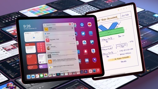
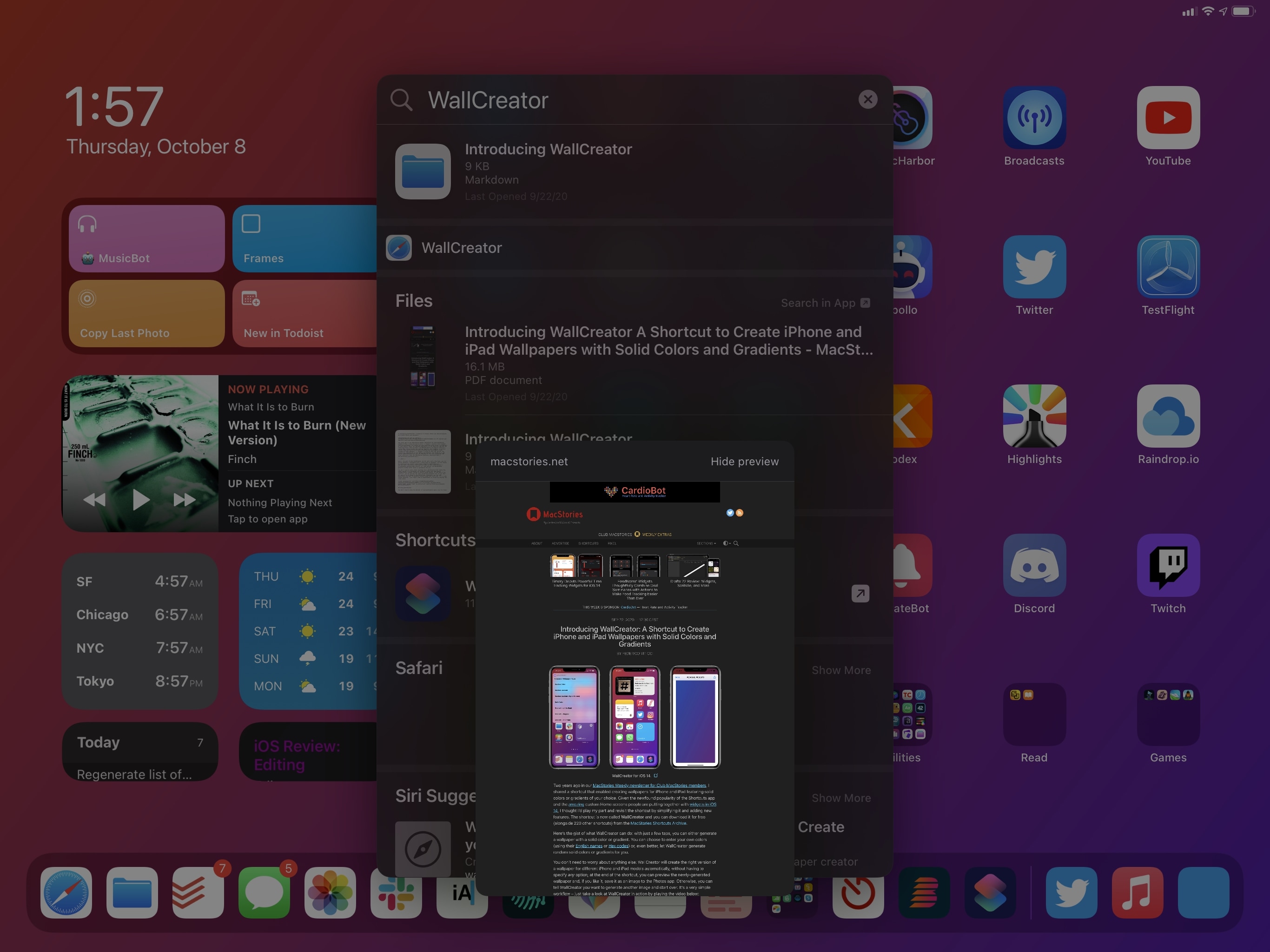
The integration of Search with the pointer and trackpad is fascinating. Right off the bat, when the search box comes up you can hover over the microphone button and click it to dictate your search query rather than typing it. As in iPadOS 13, you can scroll through different sets of results (now more compact, like in iOS 14) with the keyboard’s arrow keys, but you can also scroll and open results with the trackpad. And there’s more: in addition to scrolling and navigating into results with nested pages (such as dictionary definitions or contacts) with the pointer, you can also long-press results to view their context menu previews inline within Search. In the screenshot below, you can see how I previewed a MacStories article – itself one of the new web suggestions in iPadOS 14 – as a small popup inside Search by long-pressing it:
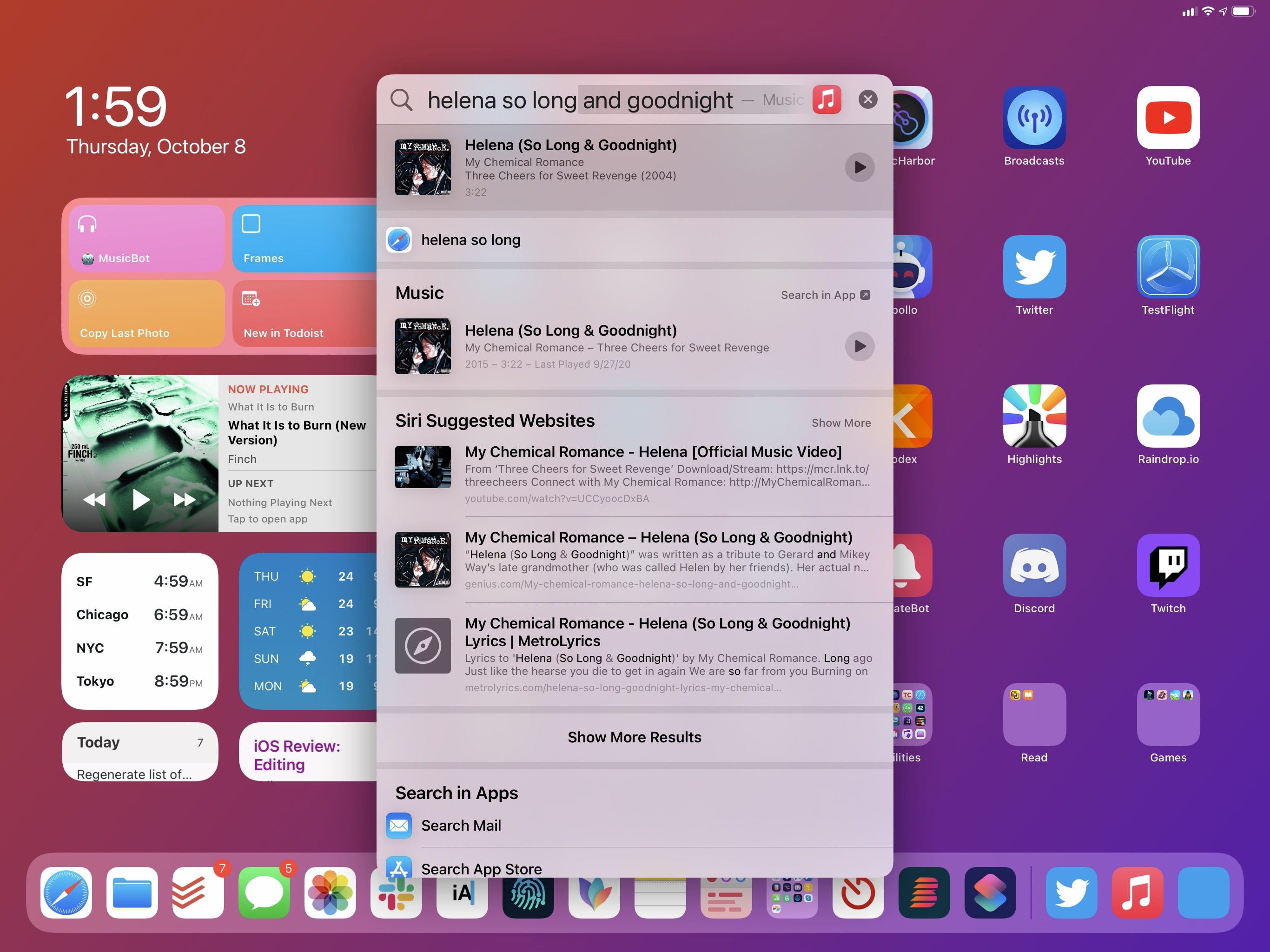
Search results that offer inline actions, such as Music and Contacts, can be interacted with using the pointer right from Search itself. My favorite example: search for a song or playlist, hit the Play button, and the item will start playing in Music, in the background, without leaving Search.20
With the new floating design, it’s also easier to use drag and drop for search results: highlight the result you want to drop into the app you’re using, drag it outside the search results window, and drop it. This works with both the pointer as well as regular touch input. By moving away from a full-screen design, it’s now easier to grab app icons from search results and drop them elsewhere onscreen to activate Split View or Slide Over since Search is quickly dismissed as you start dragging an icon away. I still wish there was an alternative to drag and drop for managing multitasking from Search on iPad (perhaps keyboard shortcuts?), but this is nicer nevertheless.
Using Search to activate Split View.Replay
Just like on iPhone, Search in iPadOS 14 supports compact UI for shortcuts, meaning that Siri shortcuts donated by apps or custom ones you created in the Shortcuts app will be executed atop Search with compact UI without launching another app. Like I said, this is also supported on iPhone, but it’s more impressive on iPad because the floating search bar that can be invoked anywhere with an external keyboard makes for a fantastic way to trigger and interact with shortcuts. It’s almost as if they were native components of Search. Here, for example, you can see how I can now create a new todo in my task manager while using Safari simply by invoking a shortcut from Search, which will run it in compact mode with support for interactions.
Creating a new task while inside Safari.Replay
The ability to run shortcuts inside Search with compact UI speaks to a bigger idea that permeates iPadOS 14: as we’ve seen with other features, Apple’s focus this year was to utilize the device’s larger screen while retaining the user’s context as much as possible. The same design philosophy that gave us sidebars, multicolumn layouts, and toolbars is at the core of the iPad’s new Search. Its compact mode, paired with smarter results, pointer integration, and support for shortcuts makes this the best version of Search the iPad has ever seen, and one I find myself using considerably more than before. Because of these improvements, Search has become an integral part of getting my work done on iPadOS 14.
That being said, Search still isn’t perfect. As I hinted above, its most perplexing limitation is that it can only be activated inside apps if you have an external keyboard and can press ⌘Space. If you’re using the iPad in tablet mode with touch input alone, the only way to open Search is to swipe down on the Home Screen, which severely diminishes the utility of Search for all those who don’t want to pair a keyboard with their iPads. Given Apple’s recent efforts in creating iPadOS features that scale seamlessly from touch to pointer, it’s odd to have a new functionality that’s obviously skewed toward external keyboard usage.
I hope Apple can figure out a faster way to operate multitasking (i.e. adding apps to Split View and Slide Over) from Search without drag and drop, as well as a touch equivalent of ⌘Space, in future versions of iPadOS. In spite of these lingering omissions, I think Apple has struck an ideal balance of compactness and expanded functionality with Search in iPadOS 14, which joins multicolumn layouts and compact shortcuts in the list of my favorite iPad enhancements this year.