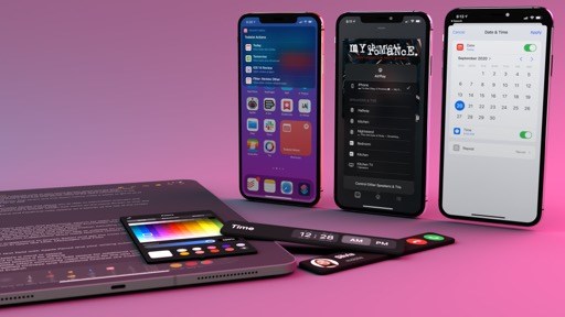
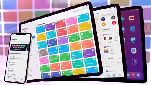
Shortcuts Actions
Following two years of major updates, Apple’s Shortcuts app is having a relatively quieter year with several welcome, if perhaps less groundbreaking, refinements and additions to the core app experience. One such change is the adoption of compact UI when running shortcuts inside the app, from the widget, via the share sheet, or through Search.
The adoption of compact UI in Shortcuts can be boiled down to two key implementation details: shortcuts will run inline without launching the full app as much as possible, even if they require user interactions; and, much like Siri, actions that involve UI will be displayed as compact banners descending from the top of the screen both on iPhone and iPad.
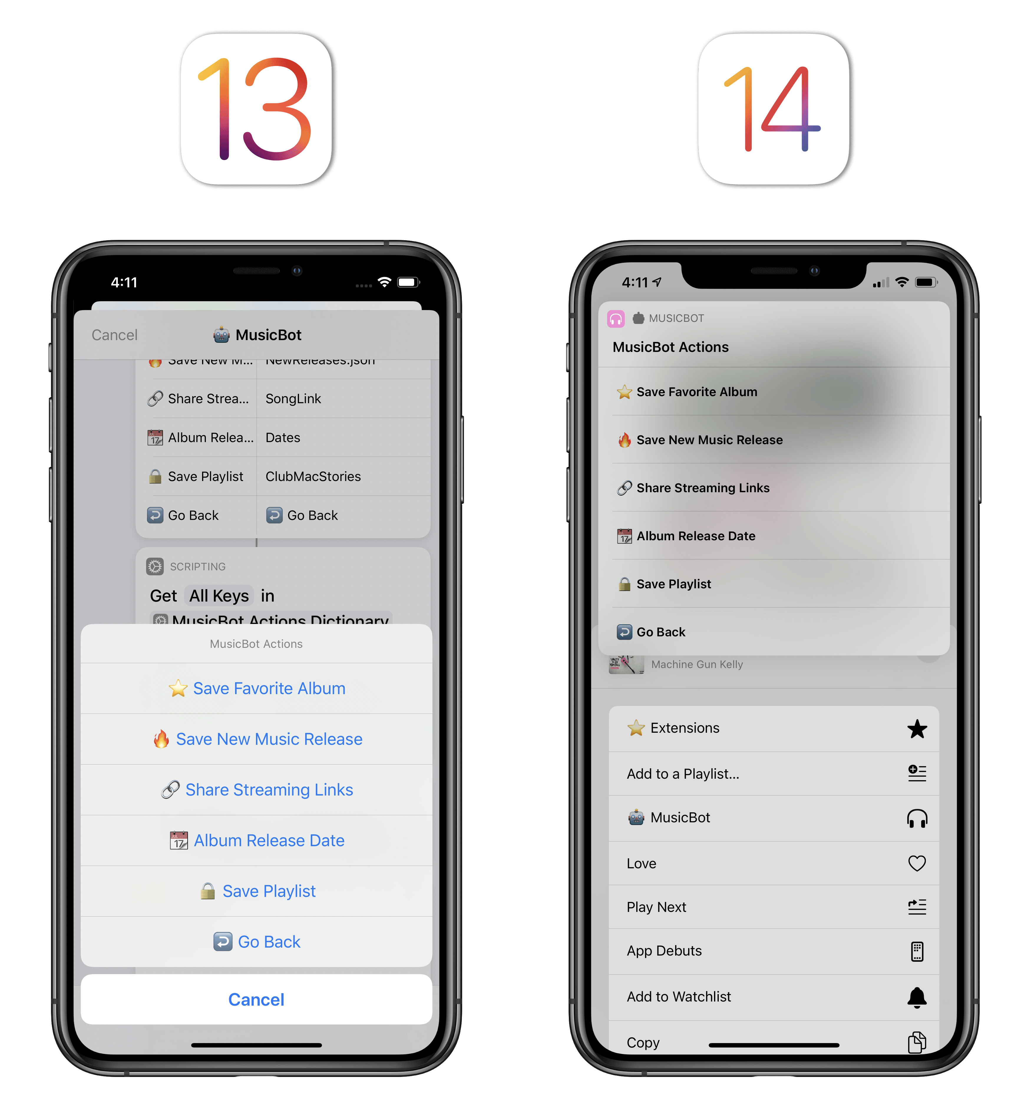
There are several notable repercussions worth discussing here. In order to embrace the principles of compact UI, Apple had to make shortcut execution faster and more contextual. To do this, the company updated all actions that require user interactions (such as entering text, choosing from a list of items, or picking a date and time) or display of UI elements (such as alerts or Quick Look previews) to use a new design that is reminiscent of Siri’s compact mode in iOS 14 (not a surprise given the close ties between Siri and Shortcuts). Where in previous versions of Shortcuts these elements were presented modally in the middle of the screen, they now descend as banners of varying height from the top of the screen. Most of the time12, actions are activated more quickly than iOS 13; you can tap anywhere onscreen to dismiss them.
Along with redesigning actions, Apple also tweaked how shortcuts run outside the main app. In iOS 14, you’ll no longer see the action editor when running a shortcut inside the share sheet: instead of being forced to look at the execution of actions from top to bottom, running a shortcut as an extension will simply result in a banner showing a ‘Stop’ button while the shortcut’s actions are running in the background (and displaying UI elements, if necessary). This is another example of applying compact UI to an existing feature to speed it up, and I think it’s a great approach.
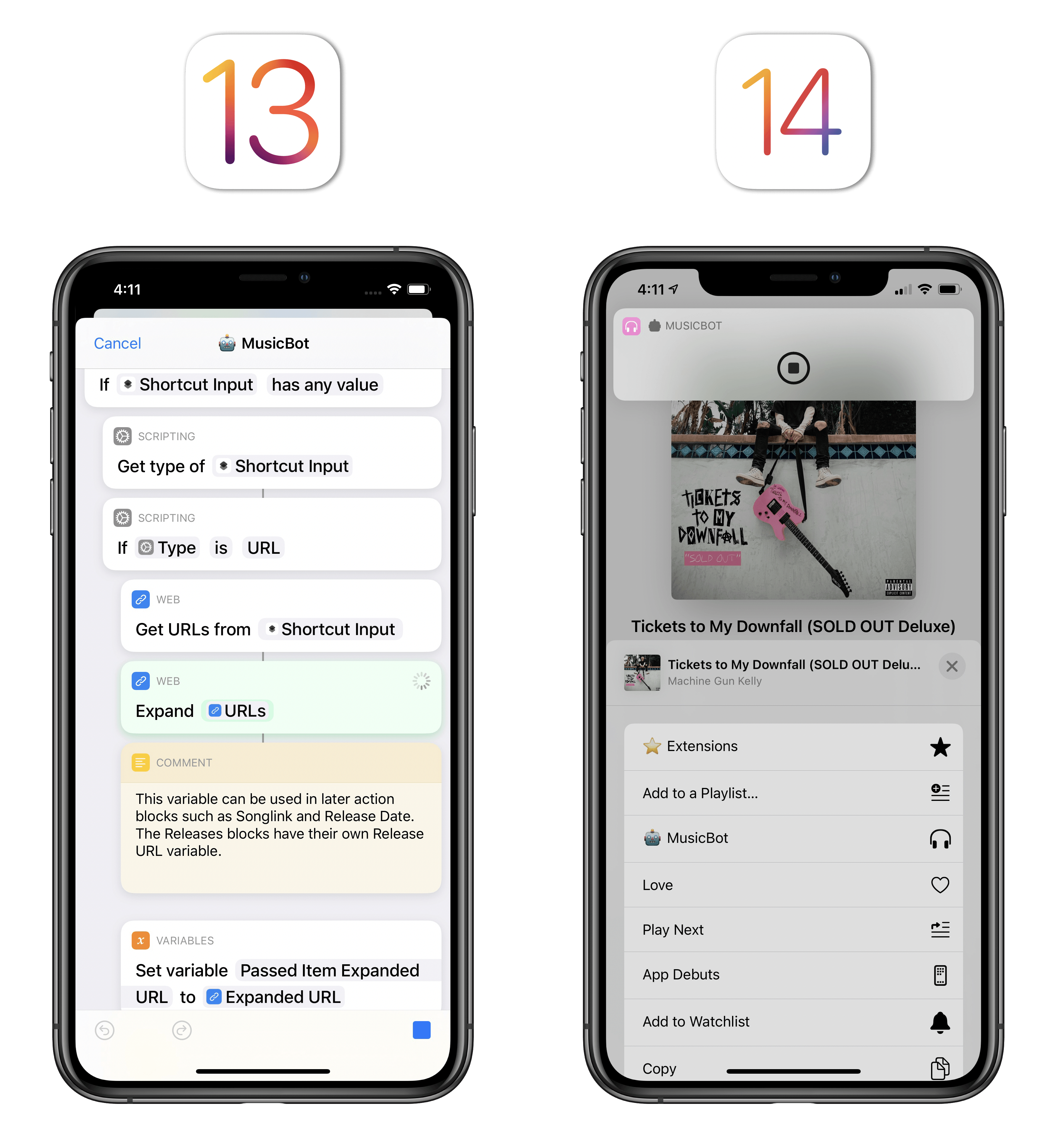
When you started running a shortcut from the share sheet in iOS 13, you’d see the editor and the entire flow of actions from top to bottom. In iOS 14, you only see a compact confirmation banner at the top.
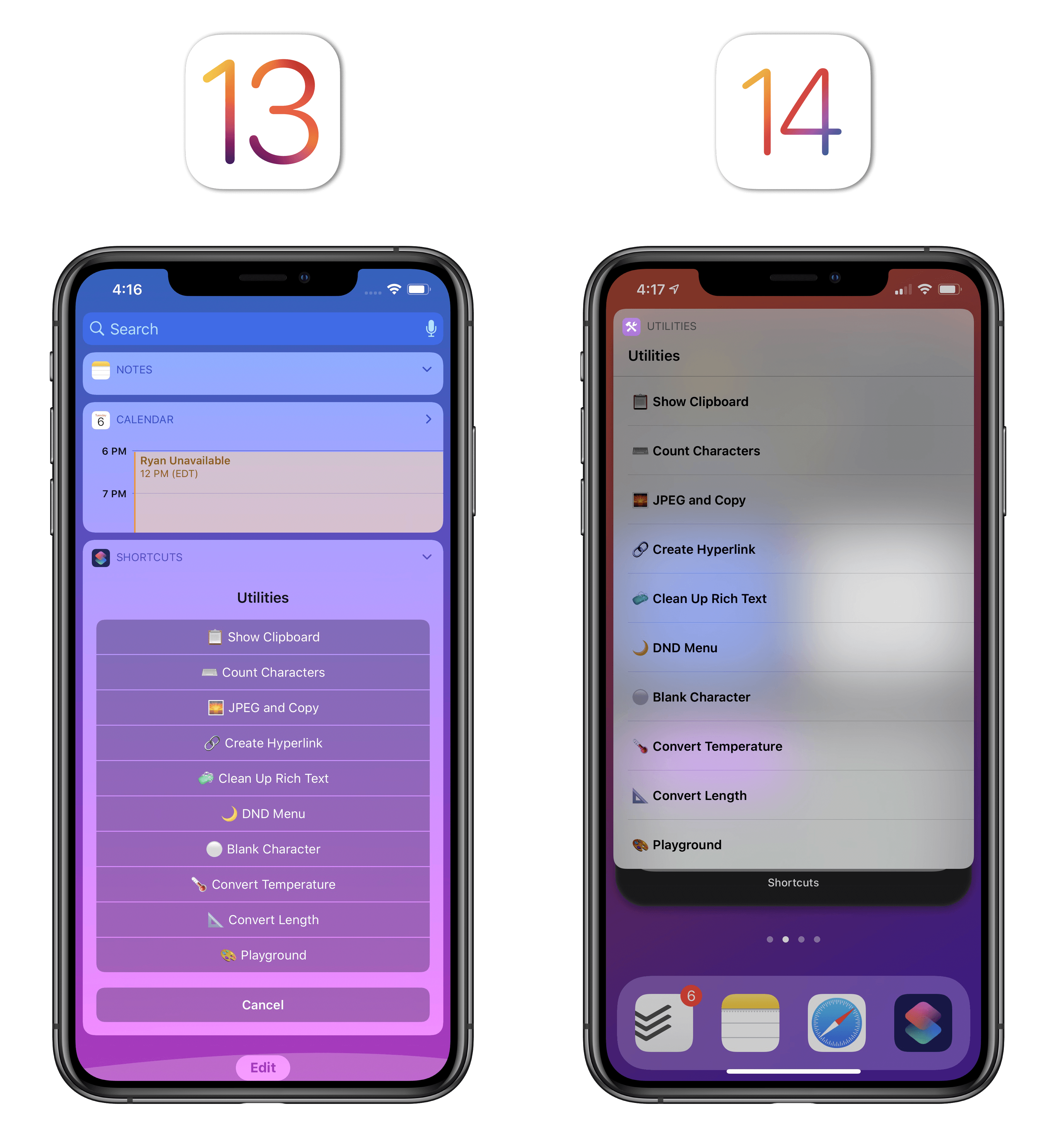
Similarly, shortcuts now always run in compact UI when activated from a widget. In redesigning the Shortcuts widget for iOS 14, Apple got rid of the “special” execution of certain actions in the widget (such as the old custom widget versions of the number pad, lists, and alerts) and embraced compact UI for everything. When you run a shortcut from a widget in iOS 14, it’ll run on the Home Screen by default (without opening the Shortcuts app) and any UI element (including input fields) will be activated on the Home Screen itself, letting you interact with them.
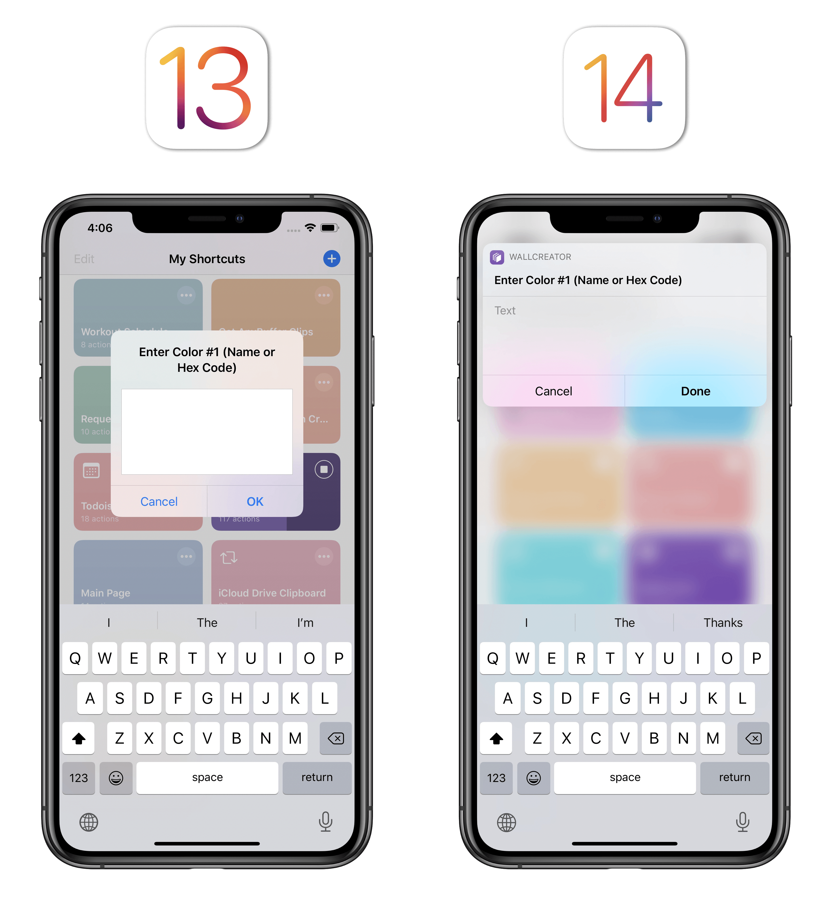
Compact UI for Shortcuts goes beyond an action’s appearance: in iOS 13, if an action’s parameter field was left empty or had the ‘Ask When Run’ mode enabled, every time that action ran you’d be presented with a full action preview and you’d have to manually tap the unassigned parameter field to give it a value. In iOS 14, Apple has removed one step from the process: if an action has an empty parameter, you’ll no longer see the full action upfront, but instead you’ll only have to choose one of the parameter values, resulting in a much nicer and faster experience than before.
Judge for yourself with this comparison showing the same shortcut running on iOS 13 and 14:
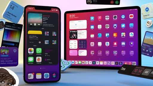
I’ve shown examples of shortcuts running on iPhone thus far, but all this applies to iPadOS 14 too. In fact, Shortcuts’ new compact actions are fully integrated with the system pointer in iPadOS 14, allowing you to hover over buttons and make selections without touching the screen.
Pointer interactions with shortcuts on iPad.Replay
All this brings me to another, arguably more important, point: what stands out with compact UI applied to Shortcuts is how much more integrated with the system the app now feels. Take the updated Search experience on iPad (more on this later), for instance: when you select a shortcut from Search in iPadOS 14 and press Return, the shortcut now runs inline with compact UI; actions and alerts will be displayed on top of the app you’re currently using, so once the shortcut is done, you’re instantly taken back to what you were doing before.13 No more jumping between apps, no more full-screen interfaces interrupting your workflow; everything runs inline, with compact banners that support interactions outside of Shortcuts.
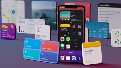
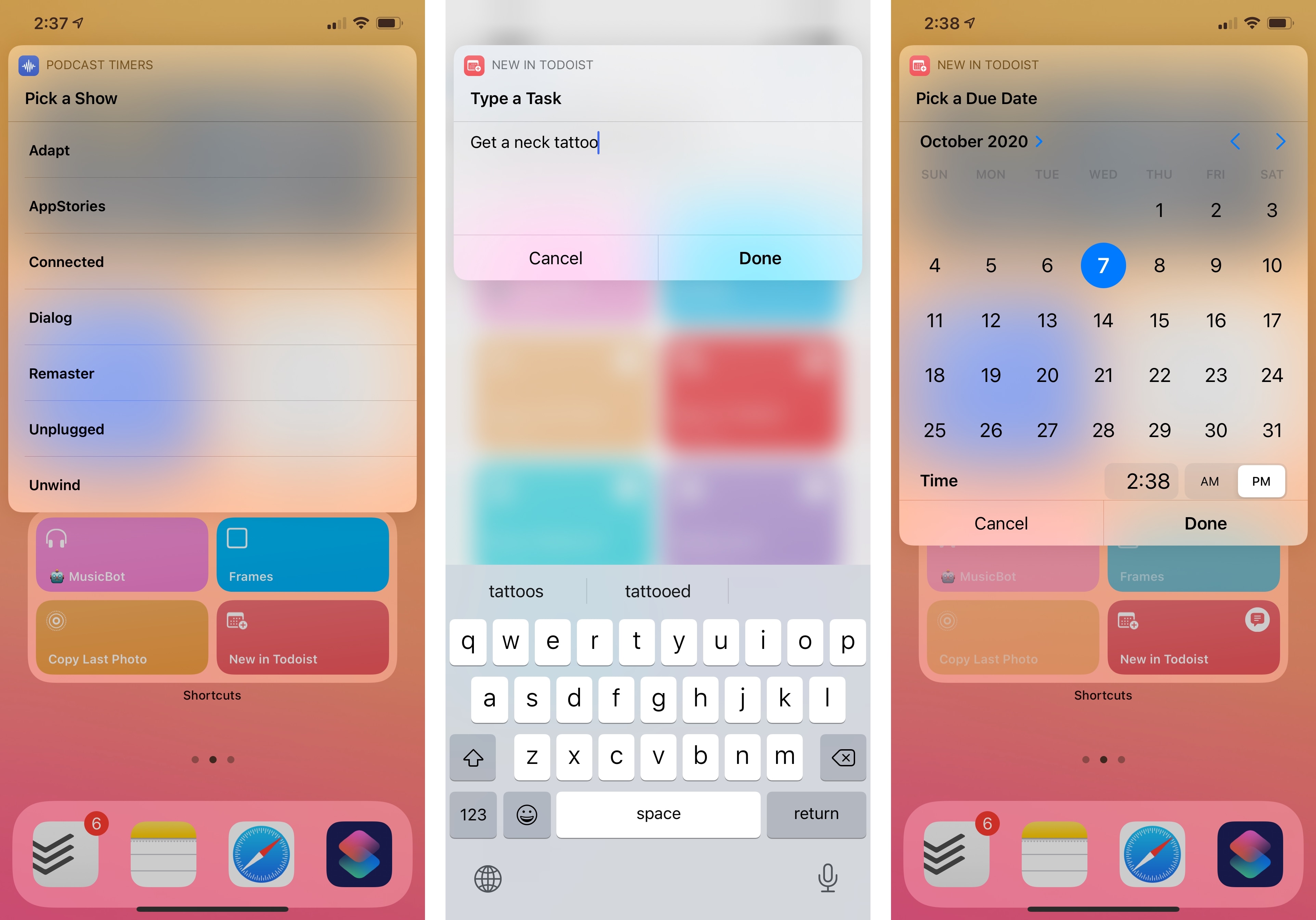
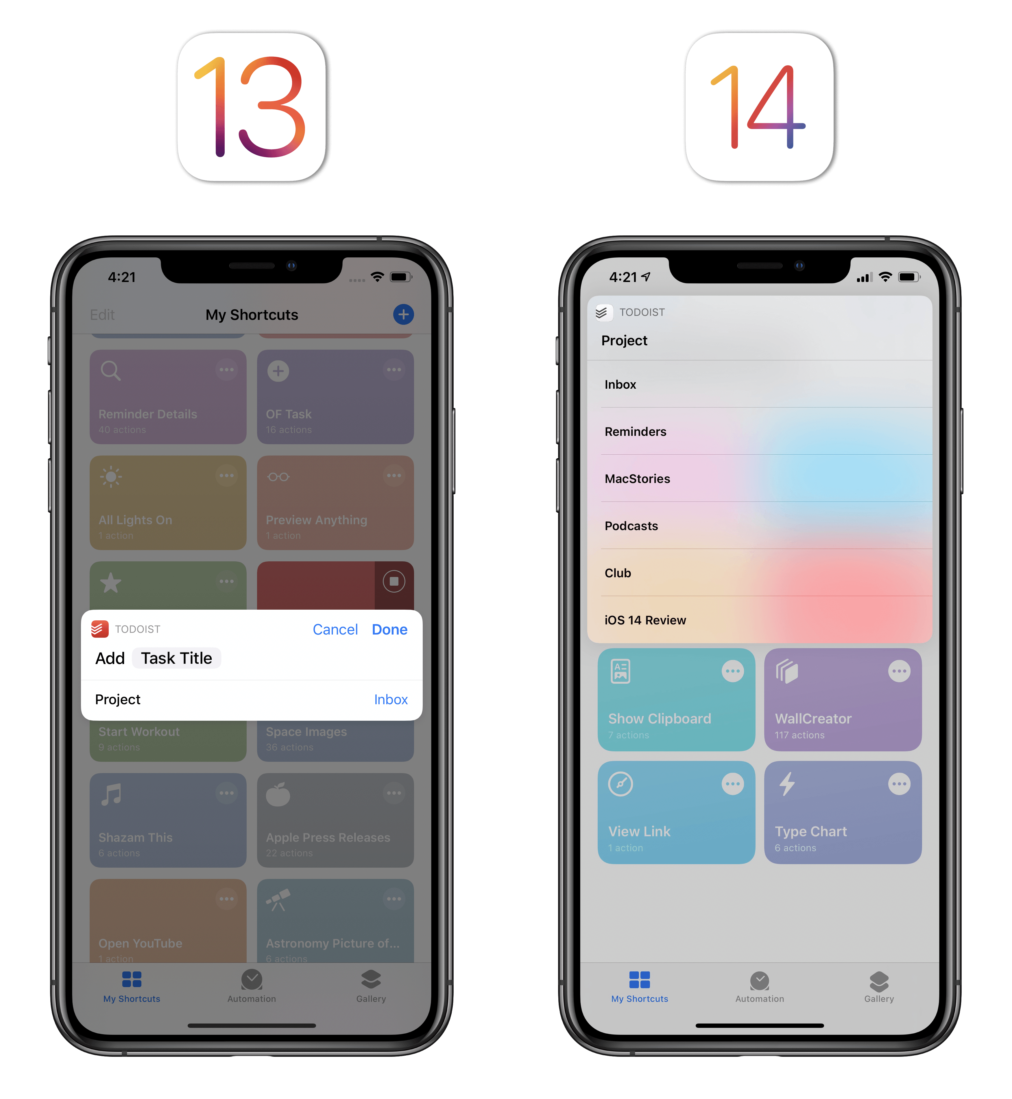
To give you another example of how big a deal compact UI is for Shortcuts this year, I’ve created a shortcut that adds a task to Todoist with pickers for projects, tags, and dates. This shortcut contains multiple actions that require user interactions, including a Todoist one that saves a task inside the app at the end. Here’s how all this runs with compact UI and inline execution in iPadOS 14:
Quick add for Todoist, powered by Shortcuts and compact UI.Replay
While this shortcut isn’t a full replica of desktop tools such as the OmniFocus or Things Quick Entry windows for Mac14, it’s very close to that experience thanks to compact UI and system-wide interactions. In hindsight, it’s easy to see another side of Apple’s long-term plan here: first, they allowed third-party developers to natively integrate with Shortcuts via parameters, which in return made their apps become native actions in the app and Siri; now, they’re expanding those rich interactions to widgets and Search, turning shortcuts into system-wide utilities users can run without having to pause what they’re doing.
By leveraging compact UI and prioritizing the retention of user context, Shortcuts feels even more integrated with the OS, resulting in faster execution of actions and more time saved on a daily basis. Apple has removed a lot of friction from the Shortcuts experience this year, and while their compact UI implementation isn’t perfect yet, I’ve found myself running shortcuts from the share sheet, Home Screen, and Search more frequently than before.
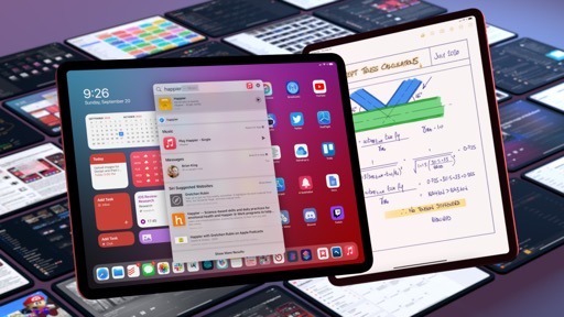
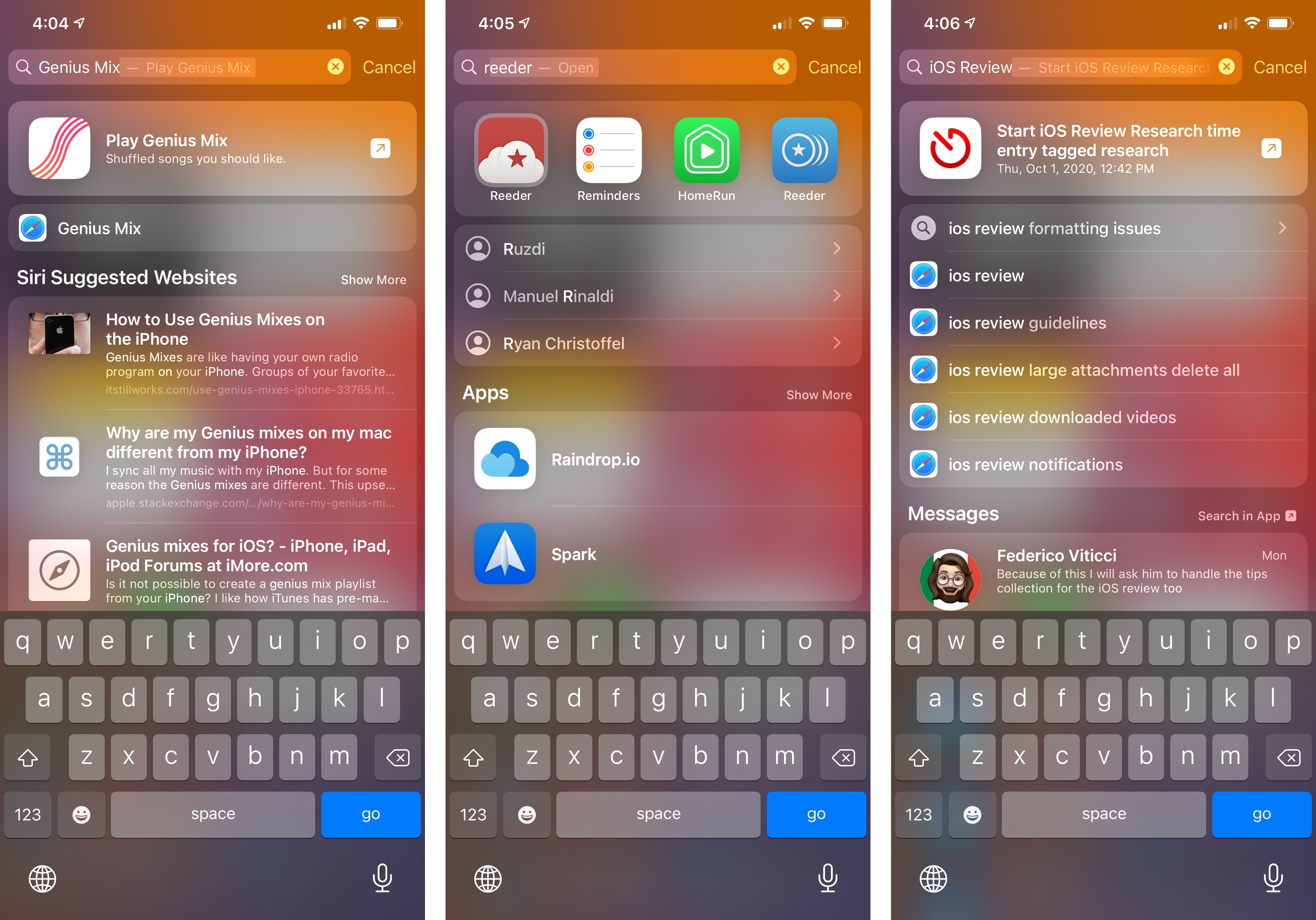
Search
Search has undergone a few substantial updates in iOS 14 (even more so on iPadOS, but I’ll cover that later) designed to speed up common actions (such as launching apps) as well as to better integrate Search with web content and the system’s browser. After a false start early in the iOS 14 beta cycle, I have to say I’m a fan of where Apple ended up with Search, which I find myself using more than before on a daily basis.
The first change you’ll notice is that everything is a bit bolder and more compact (unsurprisingly) when comparing iOS 14’s Search to iOS 13. Apple has adopted a thicker weight of San Francisco for the names and content previews of results, and they’re now using large San Francisco Rounded headings for sections in lieu of iOS 13’s thin, all-caps font. I like these visual updates since they’re consistent with iOS’ overall aesthetic and the thicker fonts make content more approachable and easier to scan at a glance.
The second thing you should pay attention to in iOS 14’s Search is the label of a single button. When typing in the search field, in iOS 14 you’ll see a blue ‘go’ button instead of ‘search’ in the lower right corner of the software keyboard. This may seem like a small, rather inconsequential update; in reality, it’s proof of Apple’s bigger plans for the overhaul of Search in iOS 14 to make apps and websites easier to launch. This is called the quick launcher, and it lets you open the top hit of your search query by just typing a few characters and immediately pressing ‘go’.
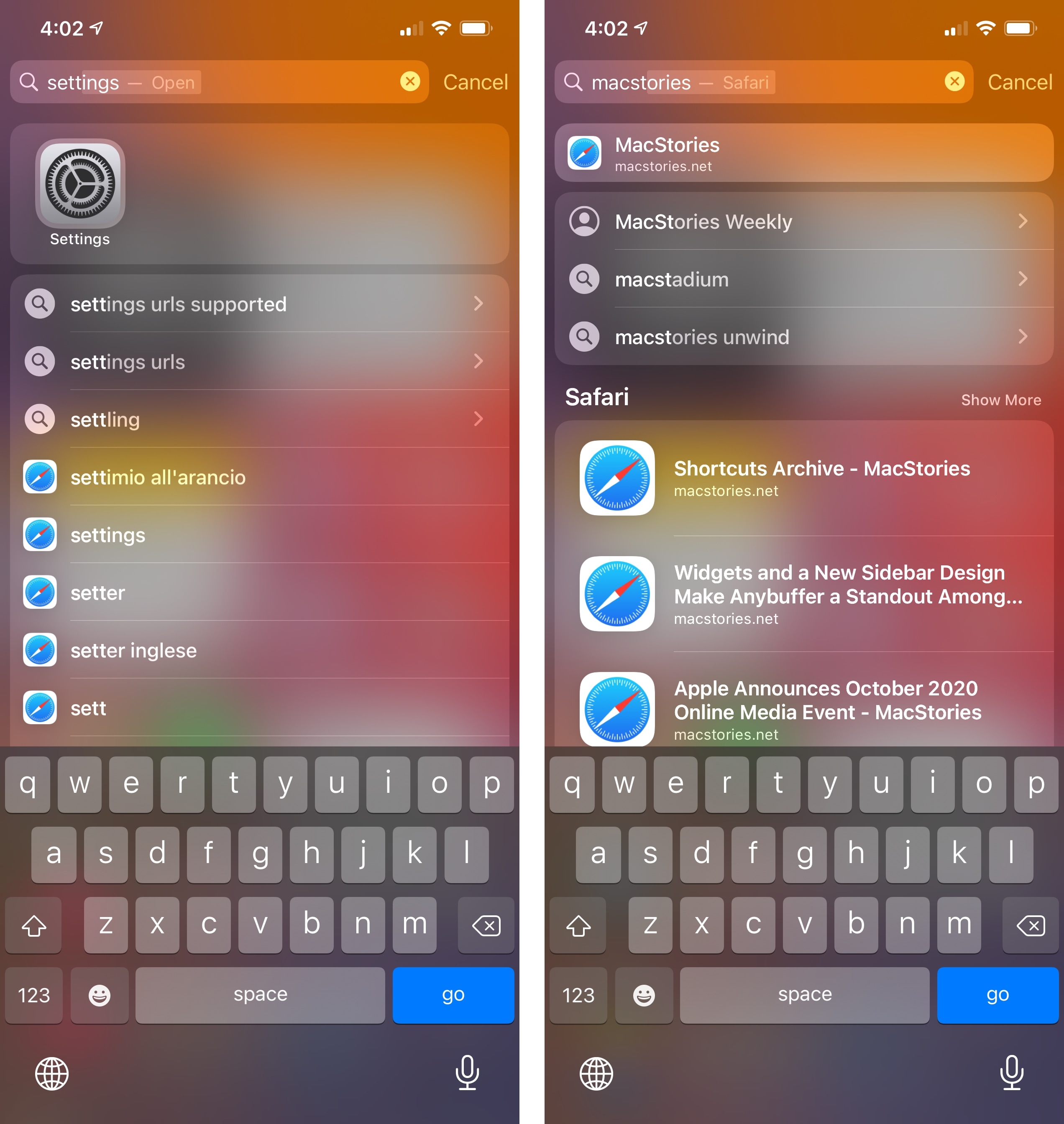
Think about it for a second: what should the ultimate goal of a good search feature be? Finding content across apps, surfacing intelligent recommendations, and sorting results based on different patterns are all important features, but at the end of the day, Search on iPhone should allow you to open apps as quickly as possible. And until iOS 14, Search wasn’t exactly great at doing that. In iOS 13, if you wanted to, say, launch Safari, you had to swipe down on the Home Screen, type ‘Safari’, then either hit ‘search’ in the keyboard or otherwise move your finger from the keyboard to tap the Safari icon in the list of results. Despite its many integrations with knowledge sources and web services, Search was failing at being truly good at the most obvious task people likely used it for: quickly launching apps.
With iOS 14’s quick launcher in Search, this is no longer an issue. As soon as you start typing a few characters, Search will immediately highlight results as Top Hits underneath the search field and display a ‘go’ button in the keyboard for the first Top Hit; tap ‘go’ and you’ll be taken to that app or website without having to lift your fingers off the keyboard. It’s that simple. What’s even more impressive, however, is that you don’t need to “pause” to confirm the selected Top Hit before launching it: if you know you want to open Twitter, for example, you can start typing “twi…” and immediately press ‘go’ to launch the app. The beauty of quick launcher is that it lets you launch stuff faster than it can be displayed in the Search screen, which has never been true for iOS’ built-in Search before.
In my tests, iOS 14’s Top Hits and quick launcher worked well for app and domain names, consistently highlighting the item I was looking for; obviously, quick launcher doesn’t work as well for more complex queries such as long file names, titles of songs, or content stored inside apps. You can still search for those items in Search, but you likely won’t be able to open them with quick launcher, which has been optimized for launching apps and websites.
I also noticed that quick launcher learns from you if you tend to launch one app over another even though they share similar names. For instance, whenever I typed “twi…”, Top Hits would default to Twitch instead of Twitter; after manually tapping the Twitter icon a few times, quick launcher learned from my habits and started opening Twitter by default instead. It’s kind of surprising that it took Apple over a decade to refine the process of quickly launching apps to perfection, but they’ve nailed it with iOS 14’s quick launcher. Switching between apps via Search is a breeze now, and it works just as well on iPad too.
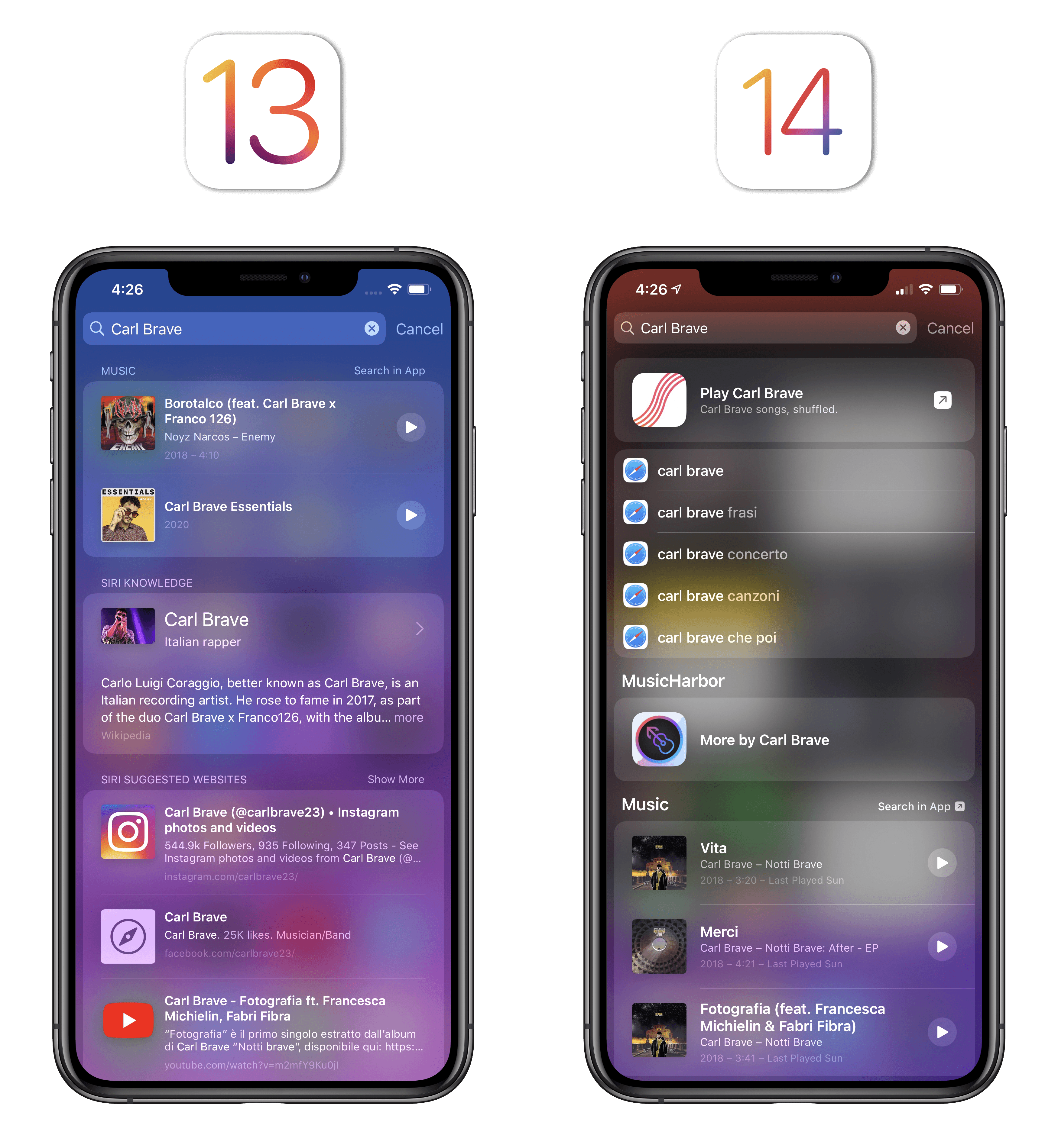
The other big addition to Search in iOS 14 is the integration with web searches and Safari suggestions. Whenever you type anything in Search, you’ll see suggestions for web searches powered by Safari appear underneath Top Hits and search suggestions; if Search can’t find either of those, web searches will be pushed straight to the top of the list, right below the search field. As you can imagine, when you tap a web search suggestion, it opens in Safari using the search engine of your choice.
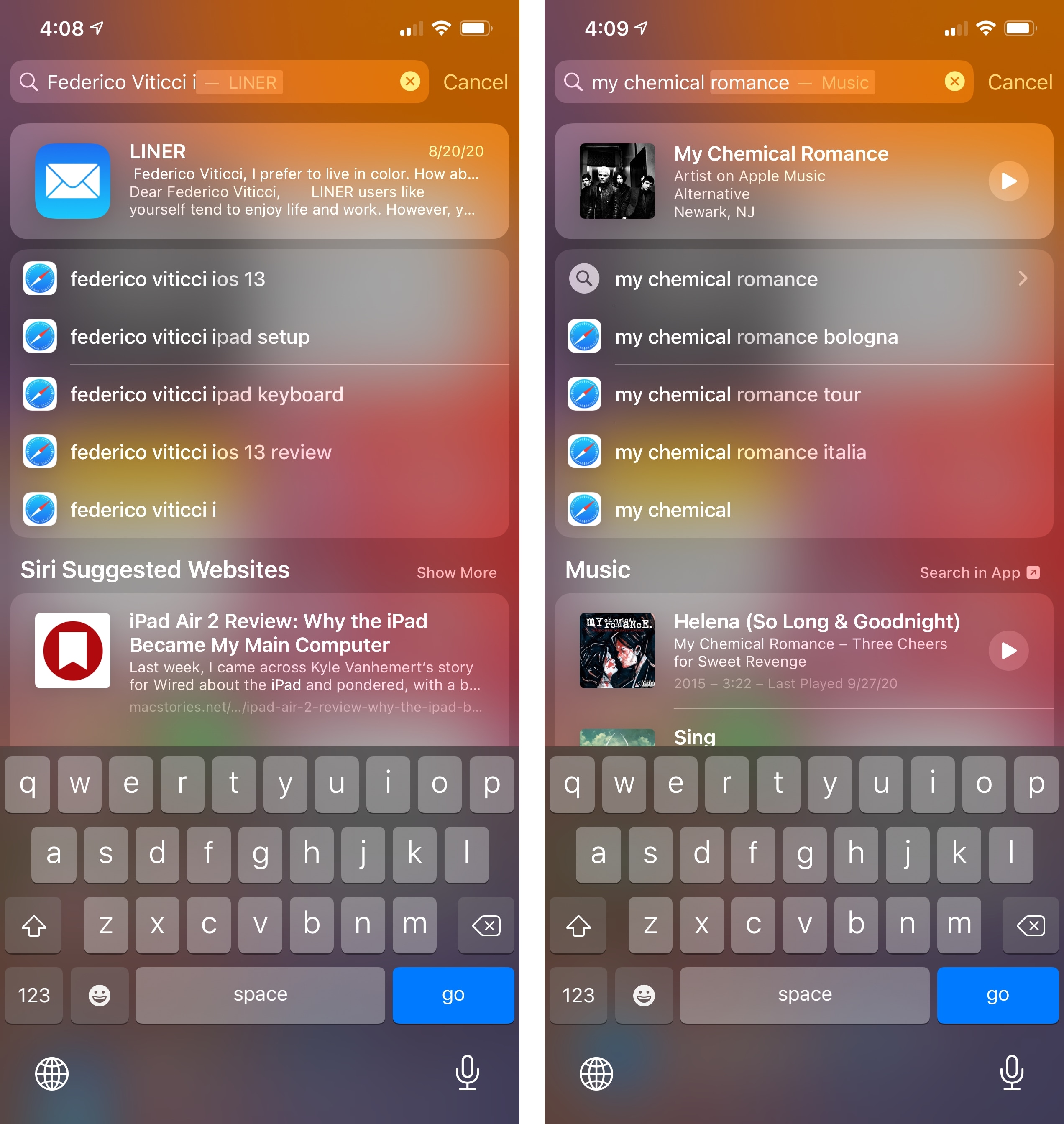
Based on the tweets and messages I’ve received over the past few months, I know that several MacStories readers don’t appreciate the forced inclusion of web search suggestions in Search. Personally, I’ve grown to really like these as shortcuts to open a new Google search in Safari, which is something I used to do manually all the time anyway. Now instead of relying on a custom shortcut or tapping into the Safari address bar to initiate a Google search, I can just swipe down on the Home Screen, type, and select a web search suggestion (which are provided by your search engine of choice). This is infinitely better than selecting ‘Search Web’ at the very end of the Search page in iOS 13.
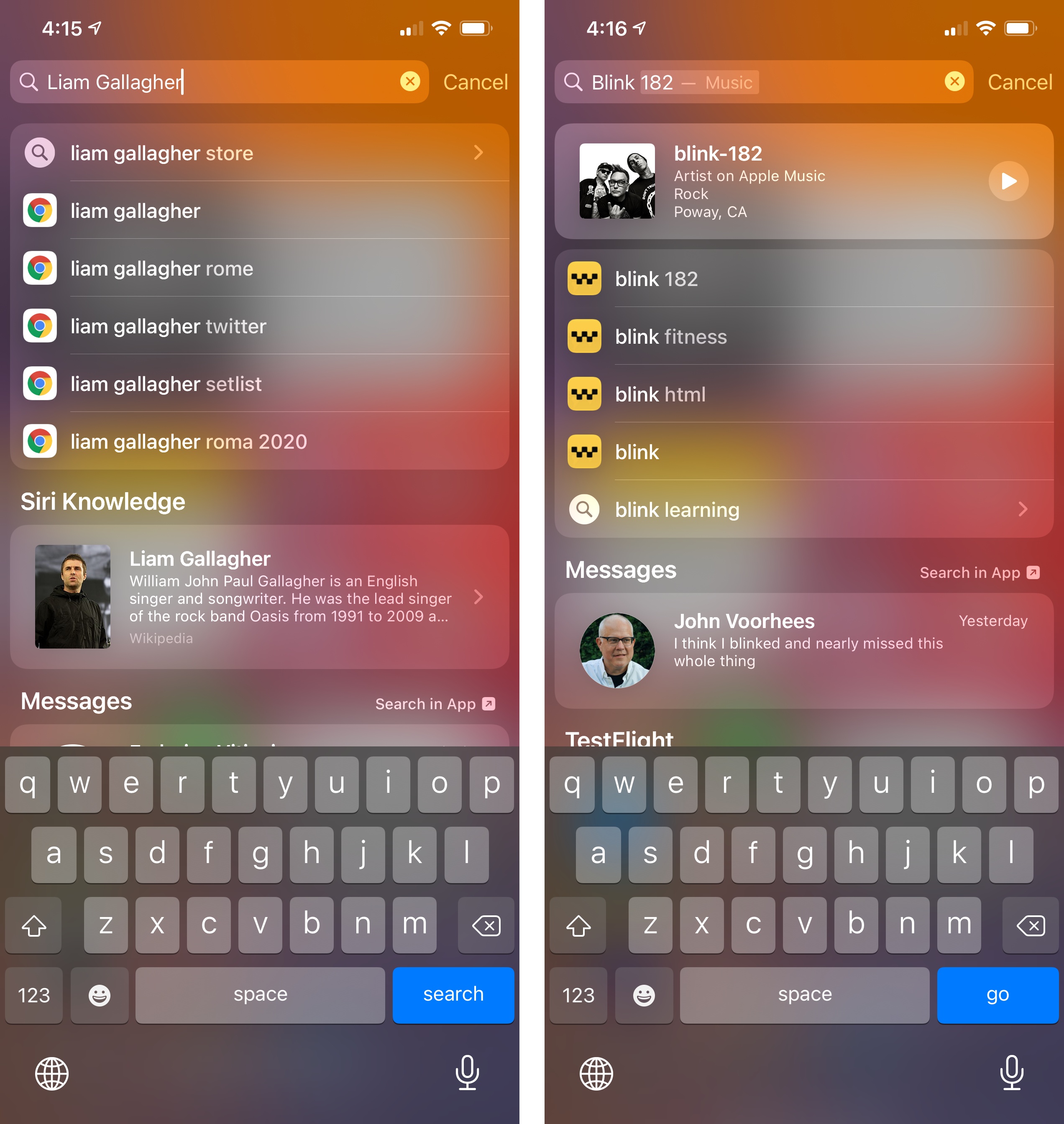
In a nice touch, web search suggestions will continue working even if you set a different default browser on your device, as you can see from the search suggestions with the iCab and Chrome icons in the screenshots below:
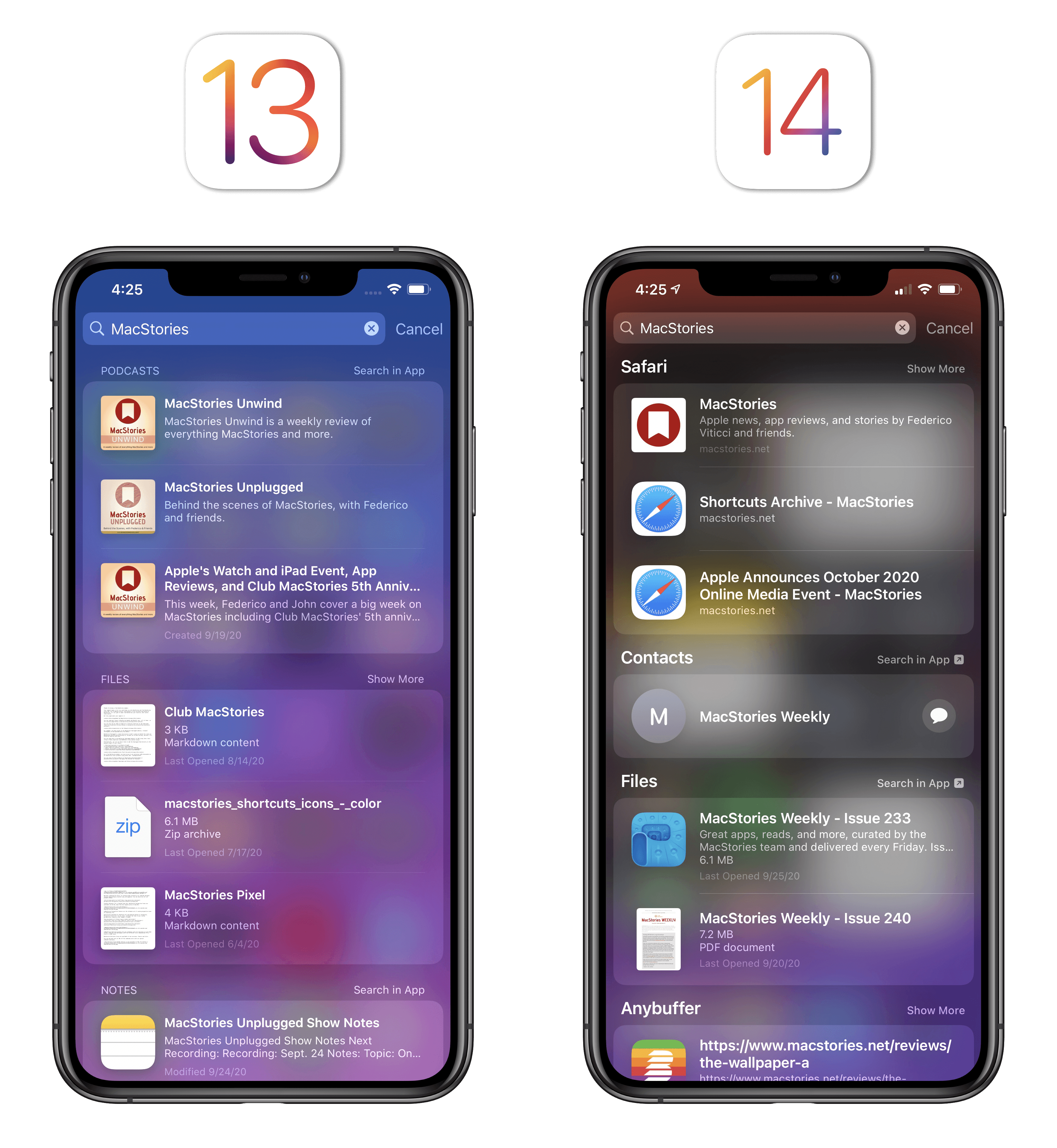
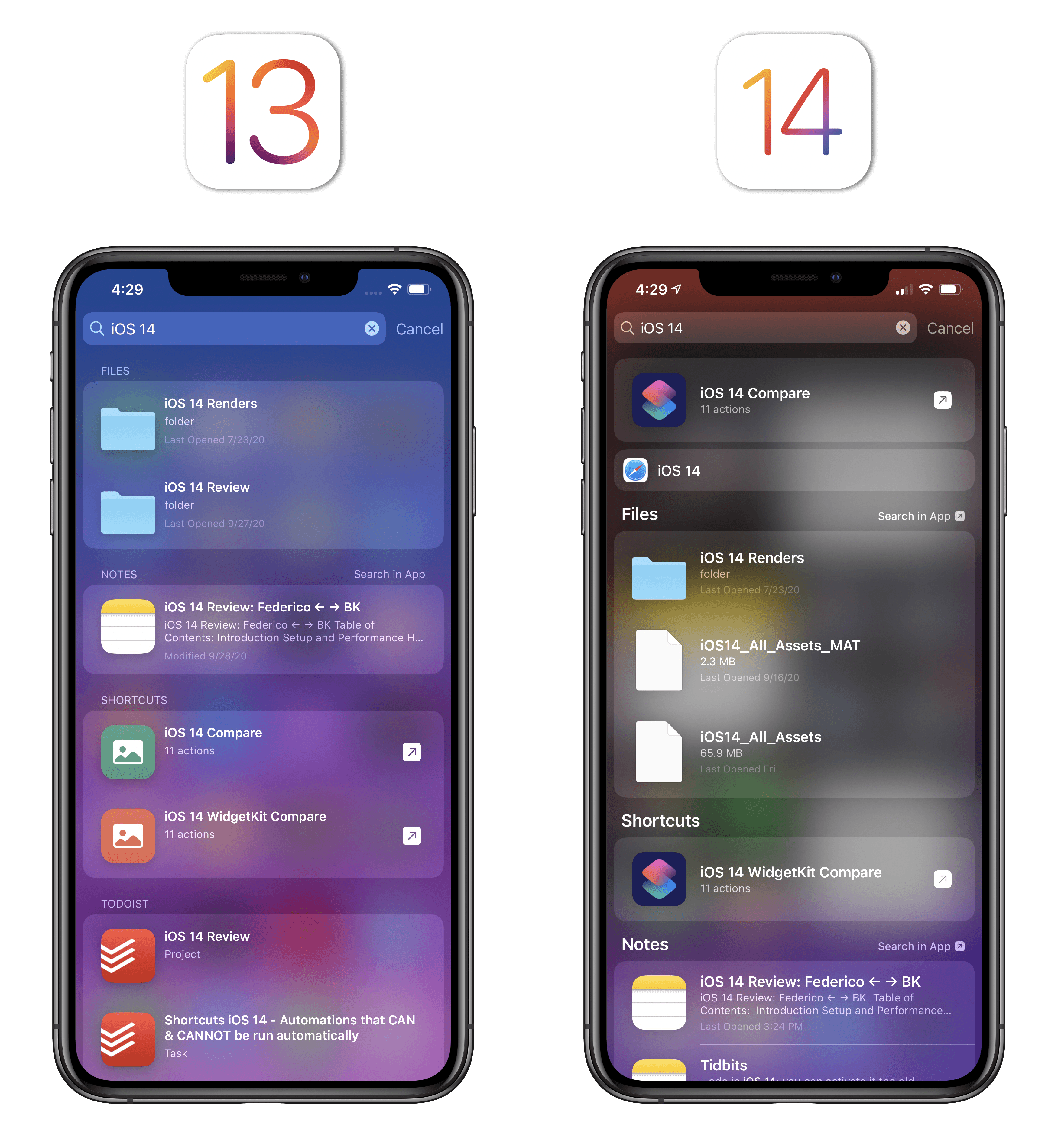
Besides the aforementioned ability to run shortcuts inline within Search thanks to compact UI, other changes to Search in iOS 14 are primarily cosmetic or related to how different sections are sorted. The ‘Search in App’ button displayed next to apps that support this mode has been made more prominent in iOS 14 with the addition of a glyph. Generally speaking, iOS 14’s Search tends to cut off the result sections displayed by default earlier than iOS 13, so if you want to see more results from other apps, you’ll have to tap ‘Show More’.15 Lastly, the ‘Search in Apps’ section embedded at the end of the page now offers more system apps to launch searches into, but it has mysteriously lost the ‘Ask Siri’ option that was available in iOS 13.
It started out rough, but I now prefer iOS 14’s Search to iOS 13’s clunkier counterpart. Apple managed to perfect the most important feature of Search with quick launcher, made Search smarter with Top Hits, and integrated web search suggestions without compromising on the ability to find content stored inside apps. iOS 14’s Search is the richest experience it’s ever been: you can use it to quickly launch apps and websites, open web searches, find documents and contents from apps, play music, read inline Knowledge results, and even interact with shortcuts – all by simply swiping down on the Home Screen. iOS 14’s updated Search allows me to save time every day, and I hope Apple can figure out a way to use Search while inside apps with iOS 15 next year.
In case it wasn’t clear by this point, I’m a fan of Apple’s push for compact and contextual UIs in iOS and iPadOS 14. I find this approach more effective than classic visual “minimalism” as a means to emphasize content; the net result is a series of features and apps that are now faster to use and better integrated with the system. The jury’s still out on the accuracy of Siri responses and Search results; as for everything else though, I have no complaints, and I think Apple is on the right path. I struggle to imagine who would want to go back to non-compact UIs after iOS 14.
- See the aside about compact UI regressions below. ↩
- The same is true for shortcuts activated via Accessibility, such as those assigned to custom keyboard shortcuts (with Full Keyboard Access) or mouse buttons. Just like widgets and shortcuts activated from Search, these will run more quickly than iOS 13 and use compact UI without opening the Shortcuts app. ↩
- It would be so good if Apple allowed iOS and iPadOS apps to offer those kinds of extensions. ↩
- As before, iOS learns from your habits here, so if you select a result from an app that was hidden behind 'Show More', the next time you search that app will be pushed toward the top of the Search page. ↩