Design
I posited last year how the time of sweeping iOS redesigns may be behind us. With nearly a billion active iPhone users out there, the idea of fundamentally altering the design of the operating system they use on a daily basis becomes a tricky proposition, if not downright dangerous: change too much, and you could risk alienating an audience that, incidentally, is also paying for an array of monthly premium services. If you’re Apple, you likely wouldn’t want to upset those precious active customers with an iPhone update they don’t understand anymore; and especially after last year’s buggy iOS 13 rollout, you’d probably want to make sure no further goodwill is squandered in the name of redesigns for novelty’s sake.
The evolution of Apple’s design language in iOS 14 follows the same path traced by its predecessors: the company is refining rather than subverting the experience, making our devices easier to use in key areas such as phone calls and video playback, all while continuing to freely borrow (and remix) well-trodden concepts from macOS.
Amidst these changes, however, there are also the first signs of an overarching idea that may hint at deeper changes for the future of design on Apple platforms.
Compact UI
Apple’s philosophy for visual design in iOS and iPadOS 14 is to decrease the amount of onscreen space dedicated to frequently used UI elements. The goal is to put more focus on content, letting users retain the context of what they’re doing, and make our devices easier to use. Apple’s marketing umbrella for these changes is “compact UI”, and it’s a design principle that’s been applied to various areas of the operating system.
As I’m going to detail below, redesigning key system functionalities for compact UI is a fascinating exercise in restraint: how can you consolidate familiar interactions into a smaller interface element, cutting the superfluous bits, while being mindful of other onscreen UI? For the most part, the results in iOS and iPadOS 14 are superb, and another example of Apple’s judicious design iteration.
Phone Calls
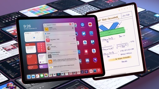
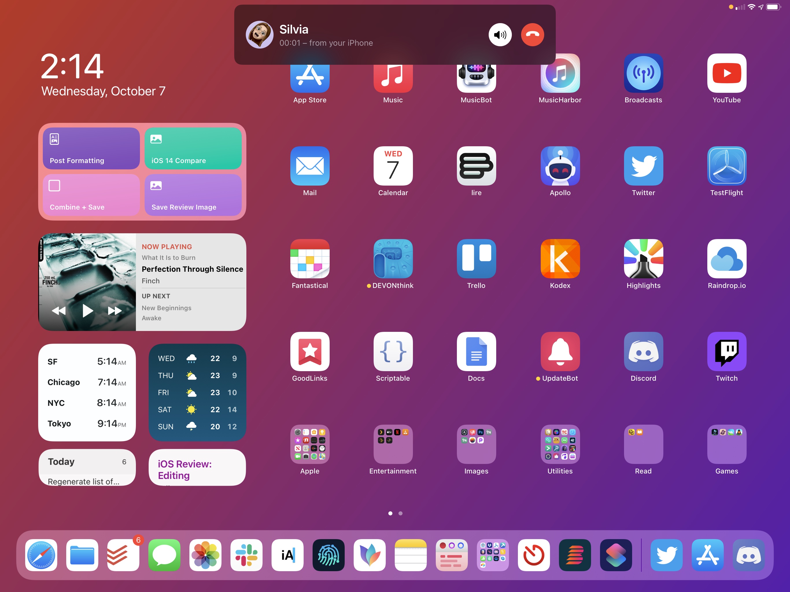
This one deserves a big, unabashed finally: if you receive a phone call while you’re using your iPhone, the call UI no longer takes over the entire screen, interrupting what you’re doing. Instead, phone calls in iOS 14 (the same is true on iPadOS too) are displayed as notification banners that descend from the top of the screen, allowing you to pick up a call, deny it, or ignore it.
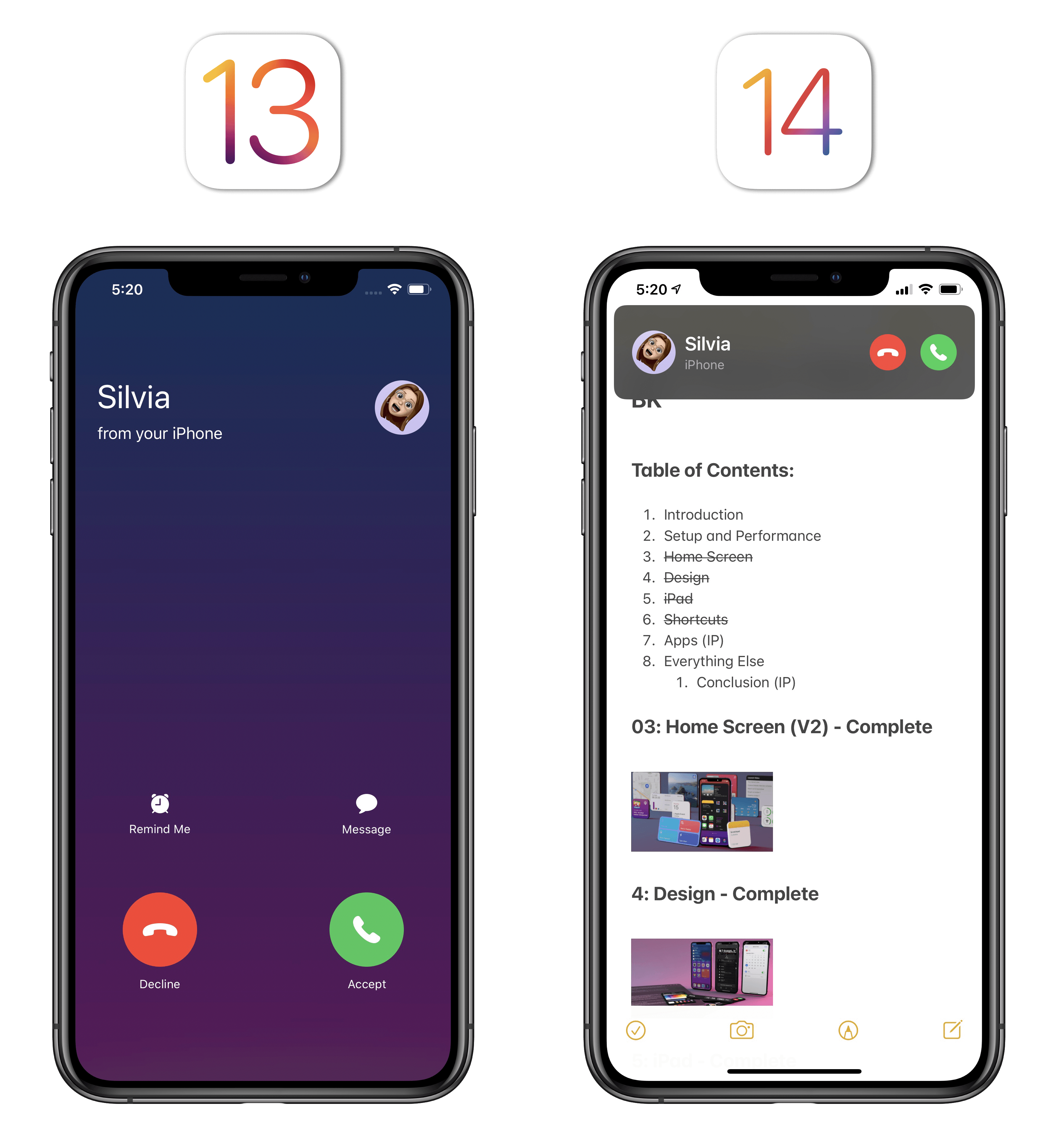
This feature alone may be everything you need to know to sell you on compact UI. Replacing modal phone calls with an alternative design has been one of the most common feature requests by iPhone users in recent years; countless concepts and jailbreak tweaks envisioned solutions similar to what Apple ended up delivering in iOS 14.
Phone calls are the prime example of leveraging compact UI to redesign iOS features so they don’t lose key functionality. When a call comes in, you can answer or deny it with the tap of a button. You can swipe down on the call banner to bring it into full screen and get the usual pre-iOS 14 design, but you can also swipe the banner up and let the call continue ringing in the status bar. This is a fantastic implementation of call management since it leans into a familiar gesture (swiping a notification away) and uses it to rethink how people can ignore phone calls without staring at a full-screen call UI.
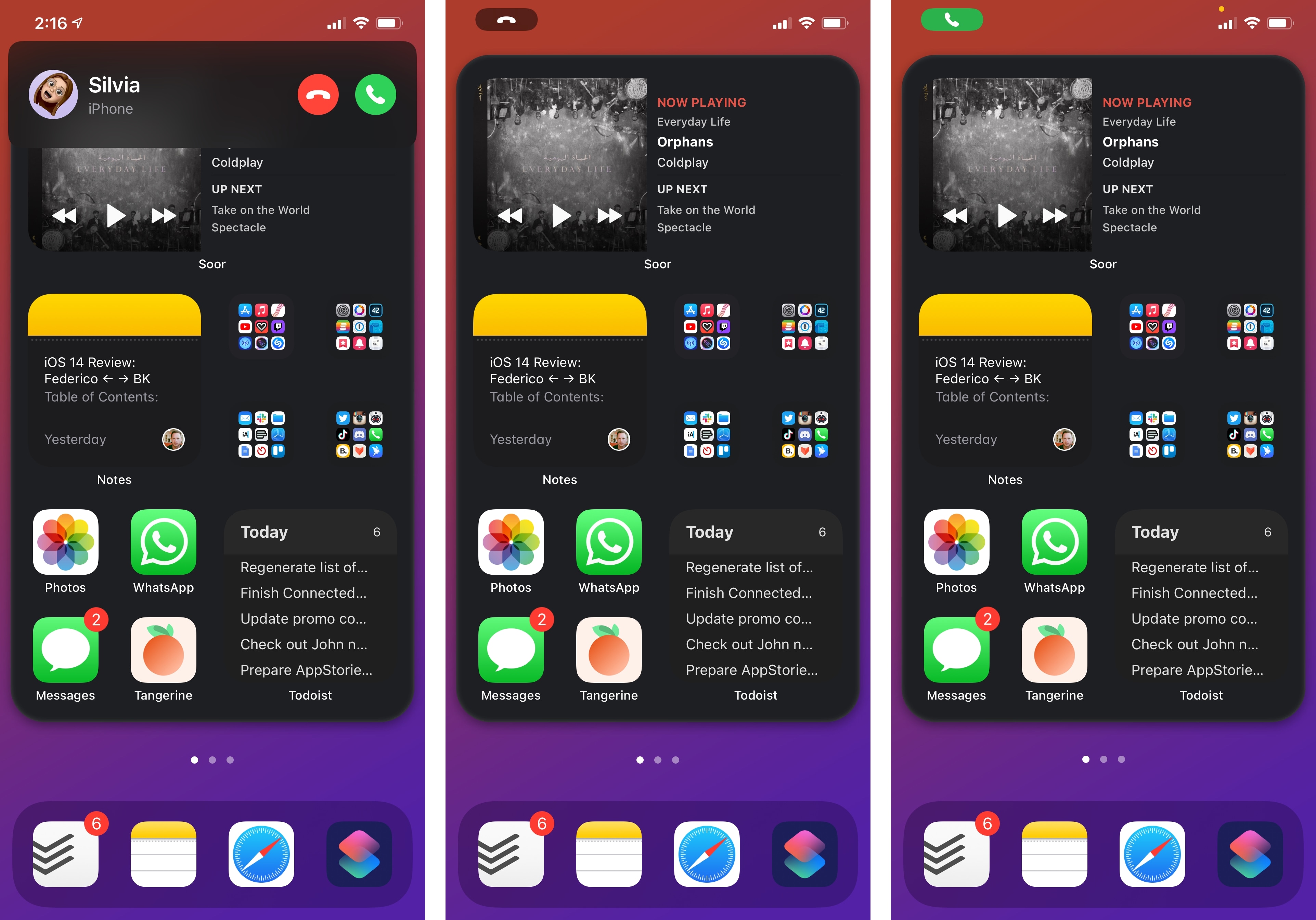
There are settings to control the phone call behavior in iOS 14. If, for some reason, you like phone calls to still be displayed in full screen when your device is unlocked, you can revert to the old iOS 13 design in Settings ⇾ Phone ⇾ Incoming Calls and pick the ‘Full Screen’ option. As explained in Settings, the new phone call design applies to Phone, FaceTime, and VoIP apps; if you’re a developer of a CallKit-enabled app, you get this feature “for free” by virtue of using Apple’s native framework.
I’ve always despised the design of intrusive phone calls that interrupted what I was doing and forced me to wait until the call was done ringing so I could resume my activity. I’ve grown to love the ability to swipe call banners away into the notch, and I can’t imagine ever going back to a full-screen call UI. Good riddance.
Picture in Picture for iPhone
In keeping with the theme of addressing longstanding feature requests and making the iPhone easier to use, Apple brought another welcome enhancement to iOS 14: it’s now possible to watch videos with Picture in Picture on iPhone.
Originally launched on iPad in 2015 with iOS 9, Picture in Picture lets you continue watching videos in a floating window while you’re doing something else on your device. Picture in Picture supports multiple window sizes, can be easily controlled by moving it across the screen (or hiding it in its corners), and supports any video that plays with the system’s native video player, although developers can also integrate it with their own custom players. I love using Picture in Picture on iPad, and I’m glad Apple realized our phones are now big enough to accomodate a floating video player as well.
There’s essentially nothing to explain when it comes to Picture in Picture for iOS: it’s the same iPadOS feature, updated to work on a smaller screen. On modern iPhones carrying a Home indicator, Picture in Picture automatically activates if you’re watching a video that supports this mode and swipe up to exit the current app. The Twitch app, for instance, lets you continue watching videos in Picture in Picture by swiping up on the Home indicator to close Twitch and return to the Home Screen.
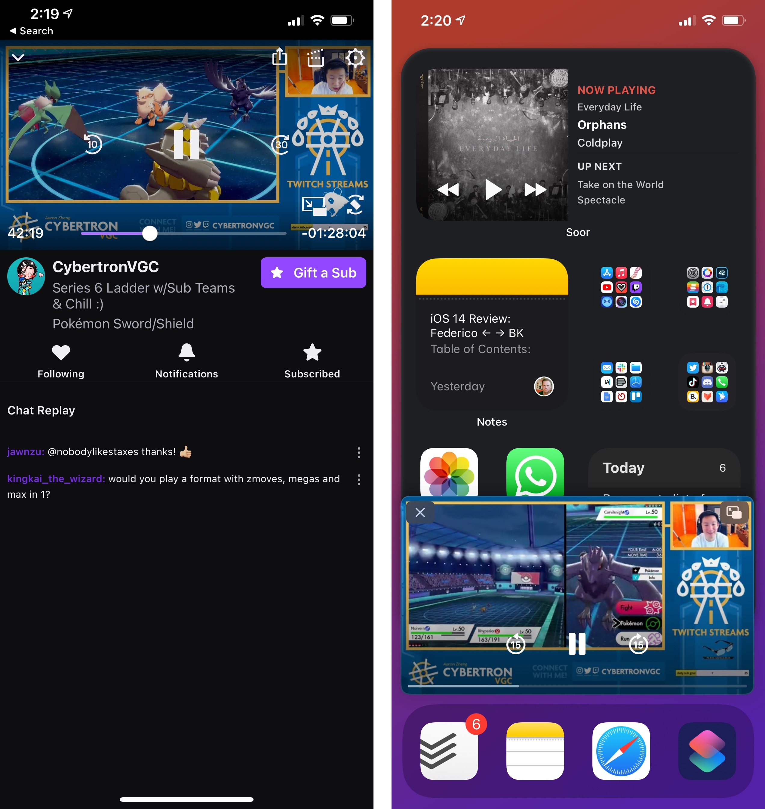
As on iPad, Picture in Picture also works with FaceTime calls, so you can continue having a conversation while checking an iMessage thread, webpage, or something else. In Settings ⇾ General ⇾ Picture in Picture, you’ll also find an option to choose whether Picture in Picture should start automatically after swiping up to go Home or not.
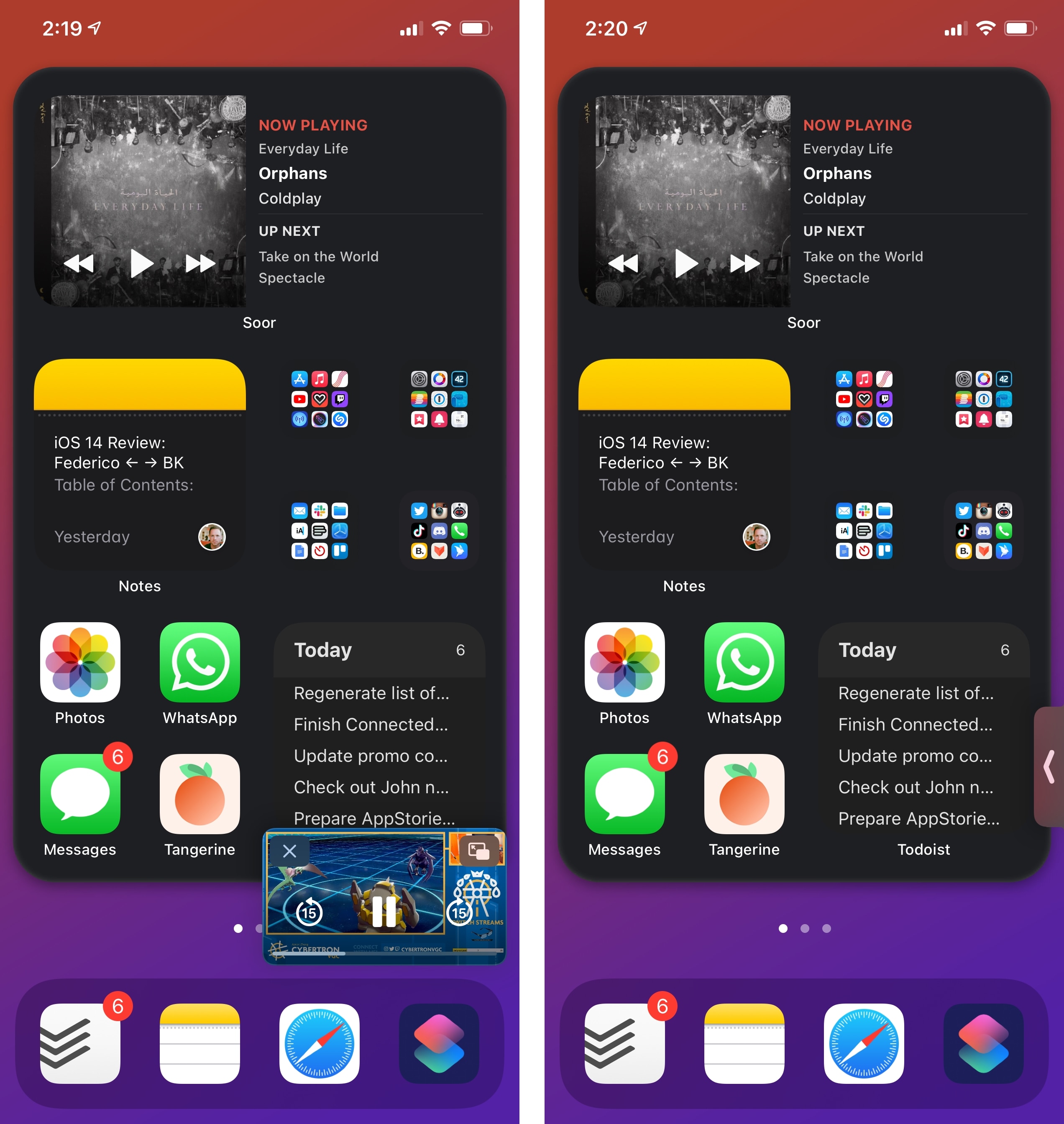
There is one notable addition to Picture in Picture in iOS and iPadOS 14: now, you can double-tap the video player to switch between two different sizes; as before, you can also pinch the video player to make it bigger or smaller.10
Initially, I was somewhat concerned that the Picture in Picture video player wouldn’t be comfortable to use on iPhone. In reality, while I still think it’s preferable to enjoy longer video-watching sessions on iPad, I think Picture in Picture for iPhone is perfectly fine if you don’t want to stop watching a video when you need to do something else in another app for a few minutes. Yes, the Picture in Picture window does feel more constrained on iPhone, even on the larger Pro Max models, but it’s not that bad, particularly if the video you’re watching doesn’t require you to squint at finer details (such as subtitles). In its biggest configuration, the video player feels large enough for most videos on an iPhone 11 Pro Max, and I’ve been using this feature a lot all summer when catching up on videos from my favorite Twitch streamers.
Of course, the question on everyone’s mind right now is whether Apple and Google will put their video agreement to good use and enable native Picture in Picture for the YouTube app. Once that happens – and given that Apple and Google worked out their 4K differences, I don’t see why this can’t be resolved too – I’m sure my usage of this feature will skyrocket.
Siri
Nowhere are the effects of compact UI more visible than Siri. In iOS and iPadOS 14, the assistant is shedding its former full-screen appearance in favor of a notification-like design that displays results inline, without interrupting what you’re doing. As far as the impact of compact UI goes, what happened to Siri in iOS 14 is pretty dramatic:
As before, you can activate Siri by long-pressing the side button or via ‘Hey Siri’. Siri’s compact redesign extends to the activation experience as well: where in iOS 13 Siri would immediately start listening in full screen, in iOS 14 you’ll only see an animated Siri blob float toward the bottom of the screen and wait for your command. The updated Siri indicator feels like an element with a life of its own: it playfully pulses and morphs as you speak, displaying a cute loading animation while it’s processing your requests until it pushes out results in the form of notification-like banners or inline responses. It’s fun, gleeful, and, more importantly, doesn’t hide what you’re doing.
The new Siri animation in iOS 14.Replay
It’s not just iPhone: Siri no longer takes over the entire screen on iPad either, where it’s now displayed with compact UI in the lower right corner of the device’s display. In an amusing instance of time being a flat circle, this Siri design for iPad is effectively the same as the very first version of Siri for iPad back in the days of iOS 5.
The changes in Siri this year aren’t merely cosmetic though. Besides the idea of turning the assistant into a side companion that doesn’t hide the app you’re currently using, Apple also revised Siri’s approach to responses so its results are more concise and contextual.
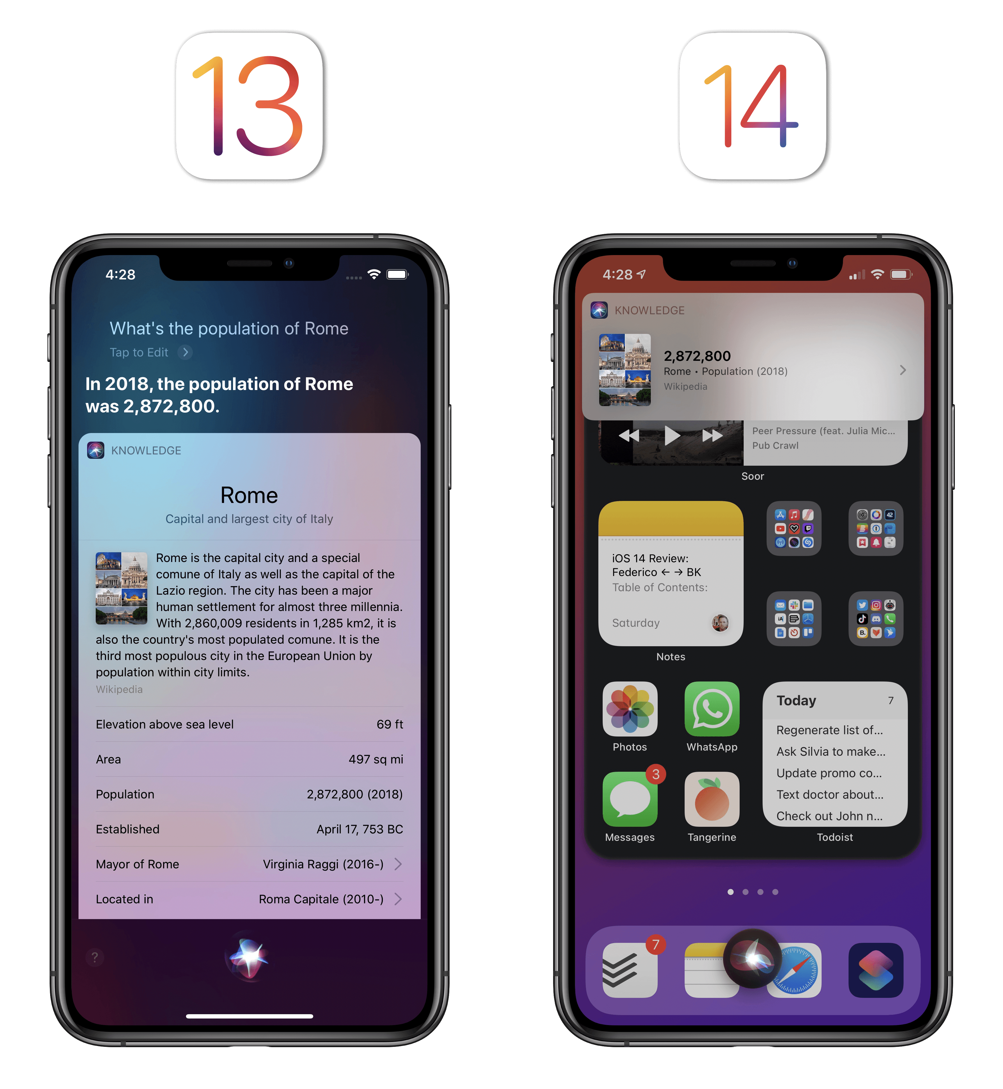
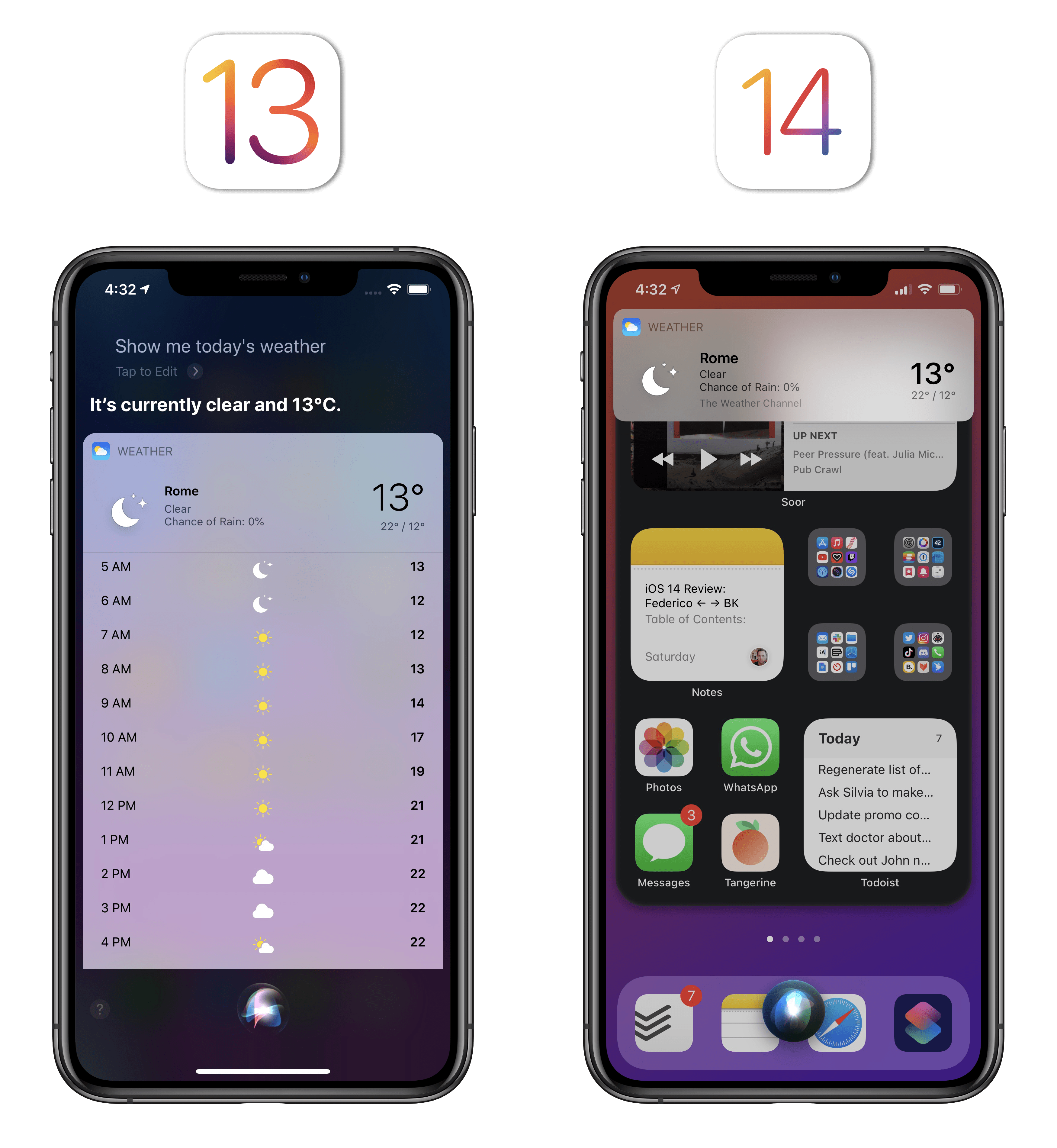
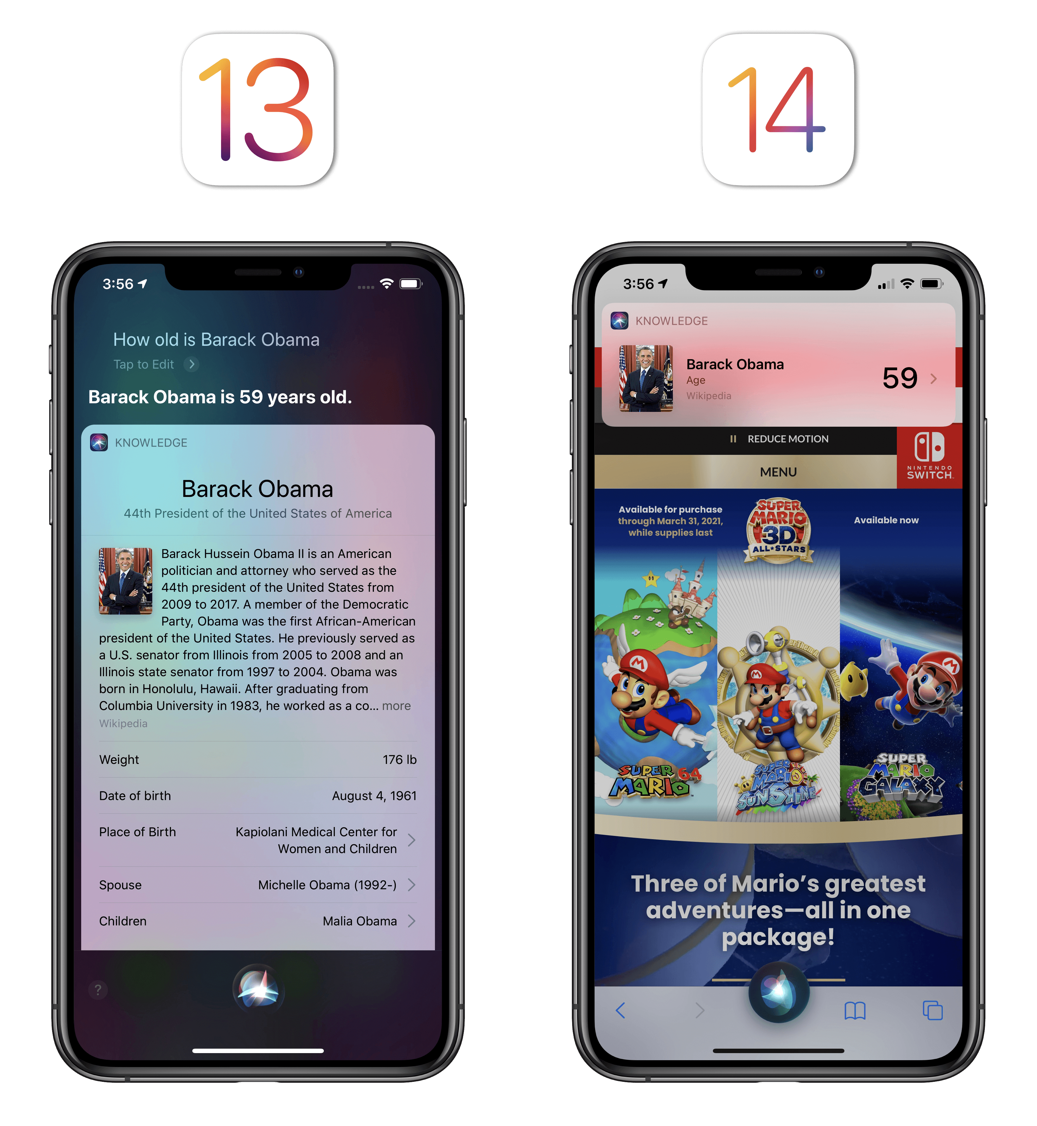
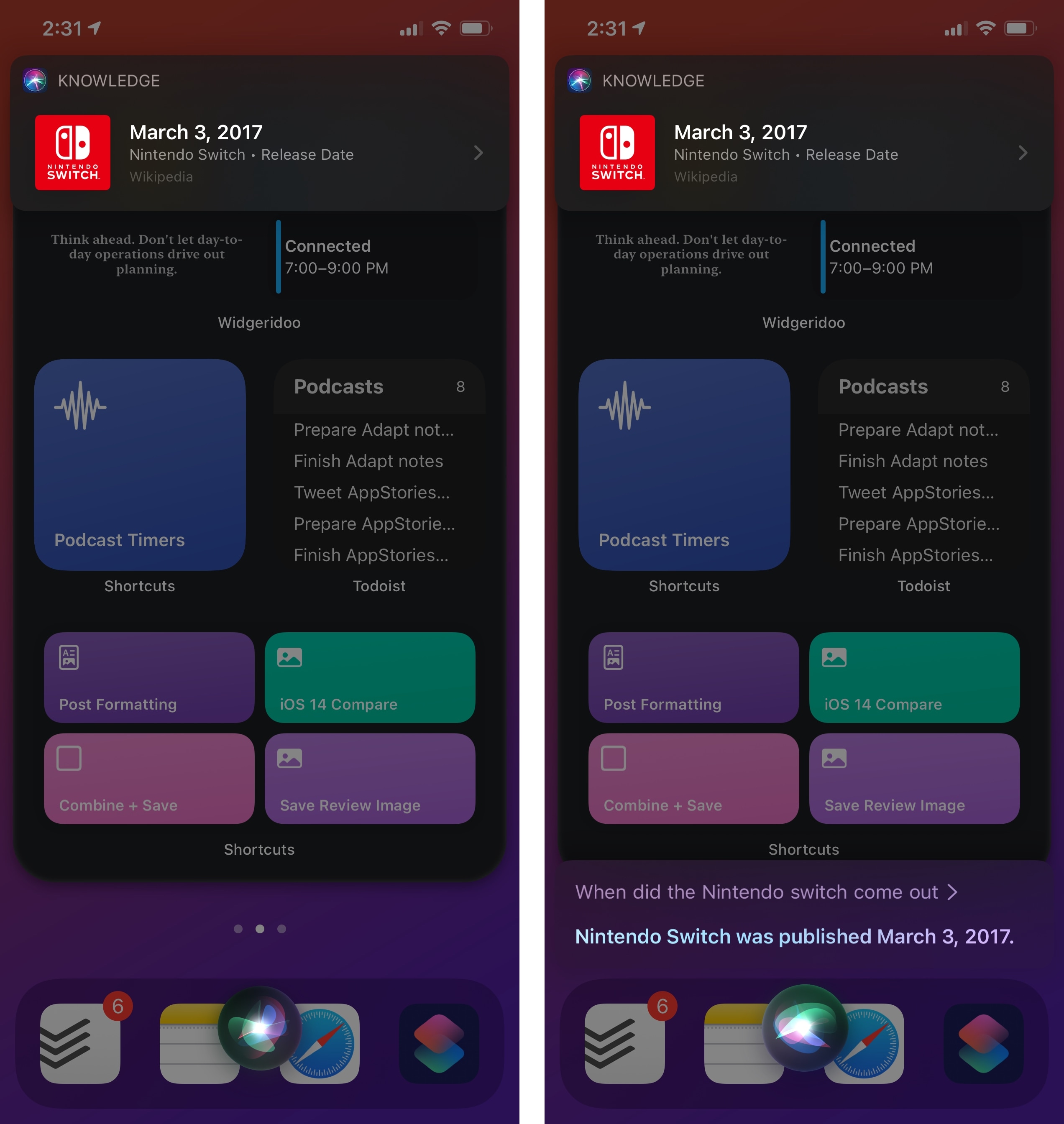
Most Siri results now present fewer options in an attempt to get to the core of a user’s request. Asking for today’s weather in iOS 14, for instance, brings up a compact banner at the top of the screen containing current weather conditions and a high/low forecast for the day; in iOS 13, the same question resulted in a longer card containing a full forecast for the day.
Most of the time, compact UI means getting to the core of the user’s request and ignoring everything else.
Essentially, Apple changed Siri’s default behavior in iOS 14 so that its first response is a compact version that displays key information about whatever you’re asking for. In iOS 13, results were richer by default, but took over the entire screen; in iOS 14, snippets are smaller, and you can optionally drill down into the Siri UI to get an extended version of the result.
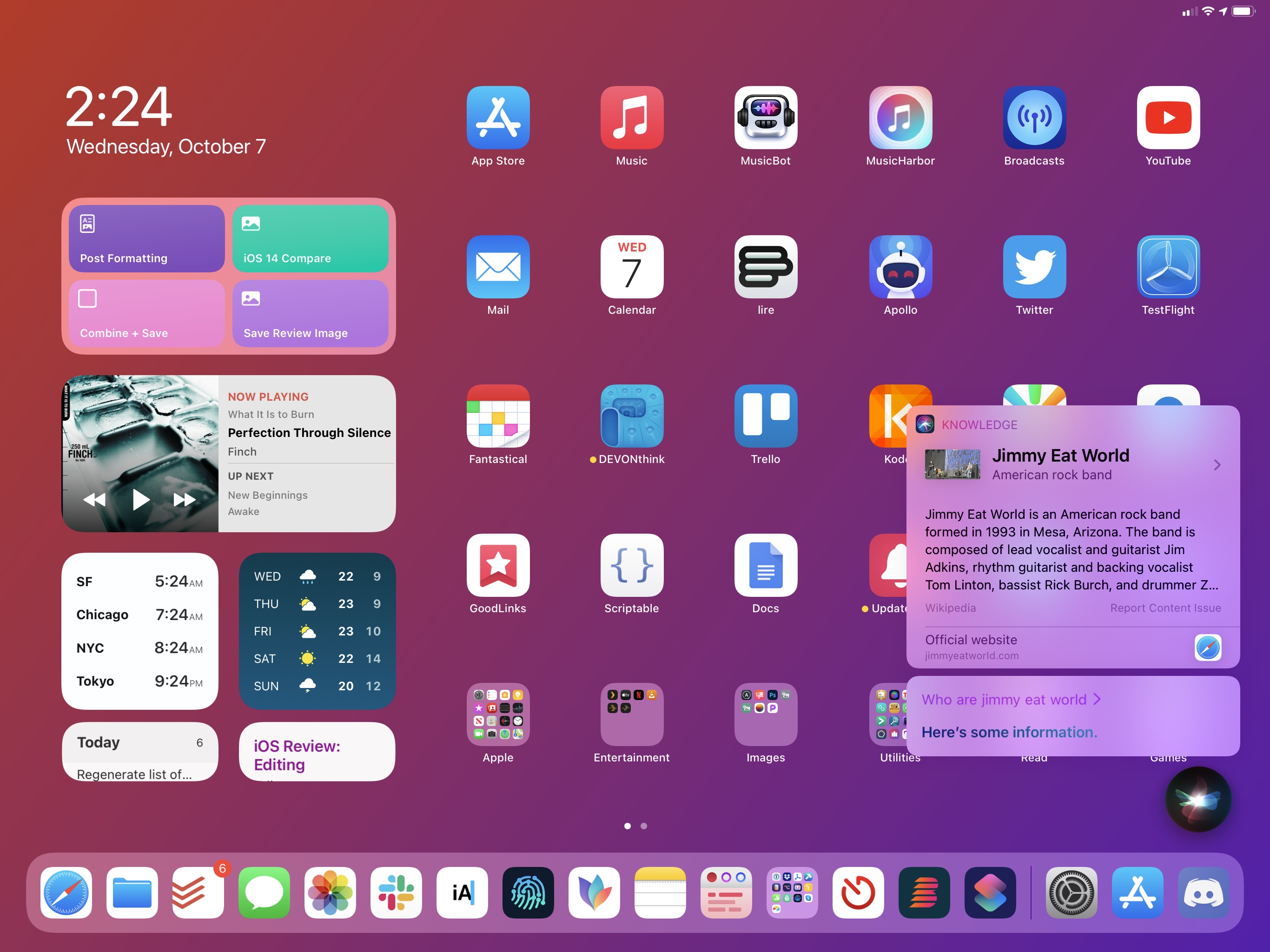
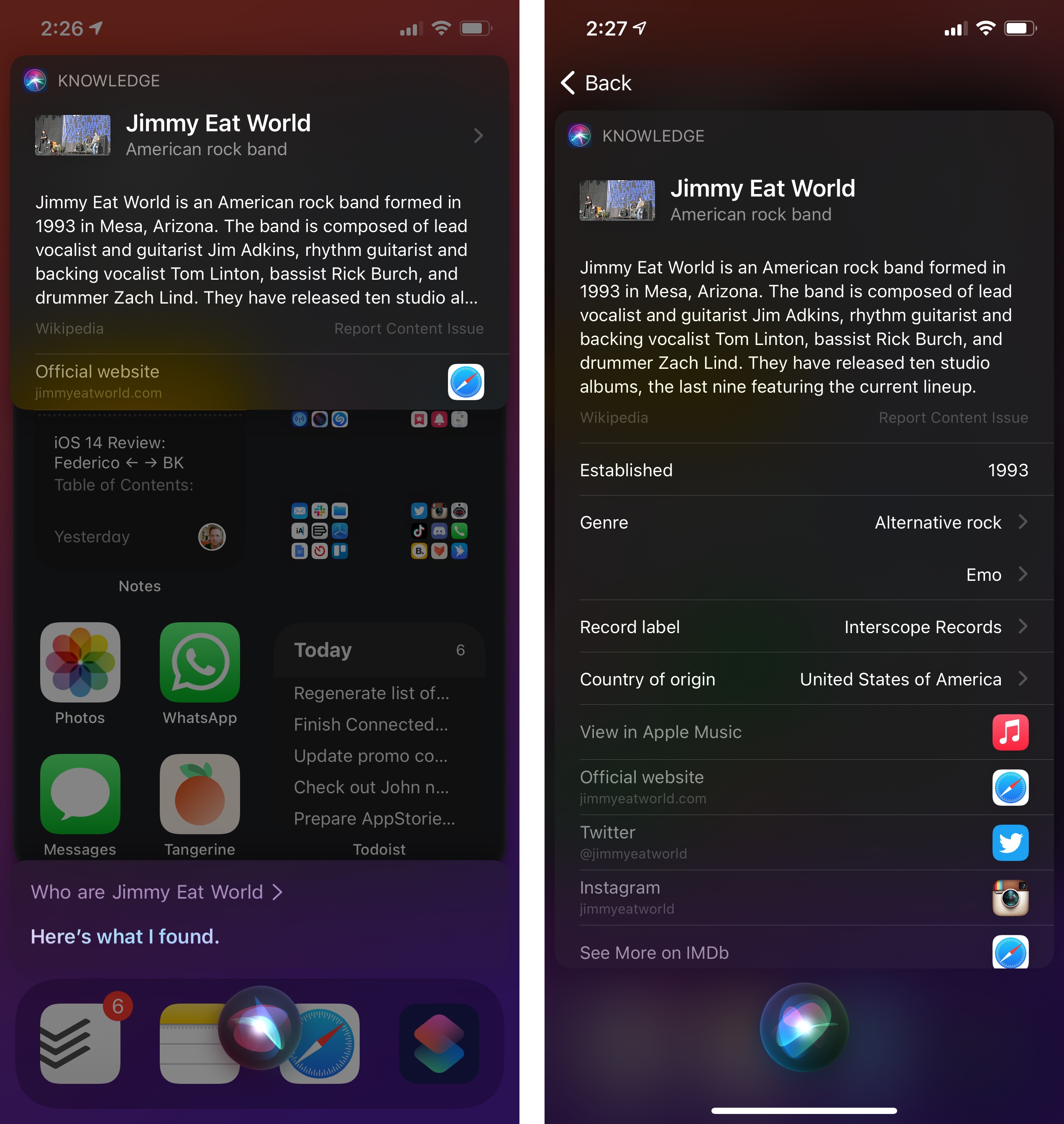
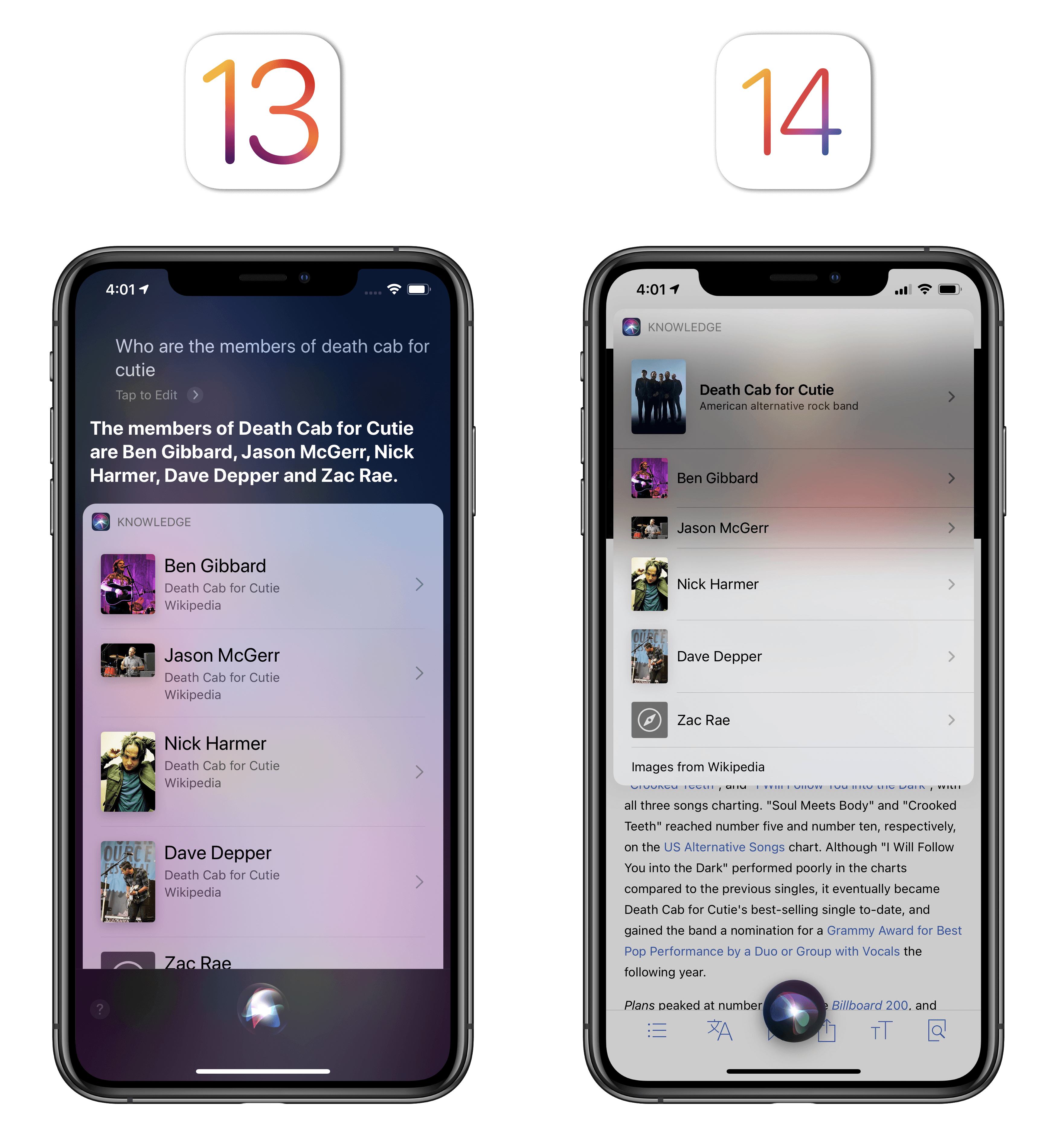
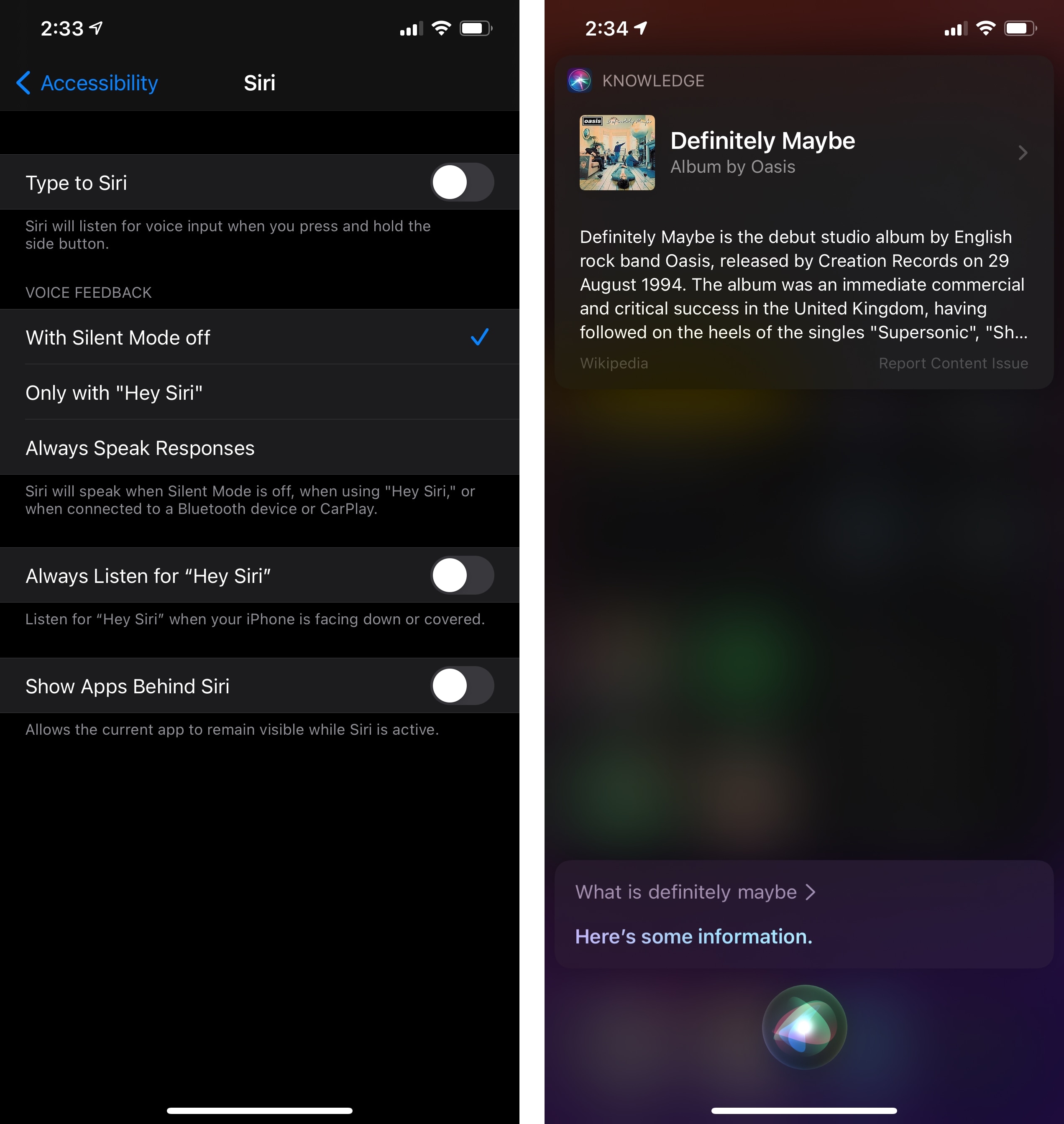
Knowledge-based results make for a good demo of the differences between iOS 13 and 14. Asking about celebrities now pops out a small snippet with key details that doesn’t take up much onscreen space; before, Siri would load the fully expanded knowledge card by default.
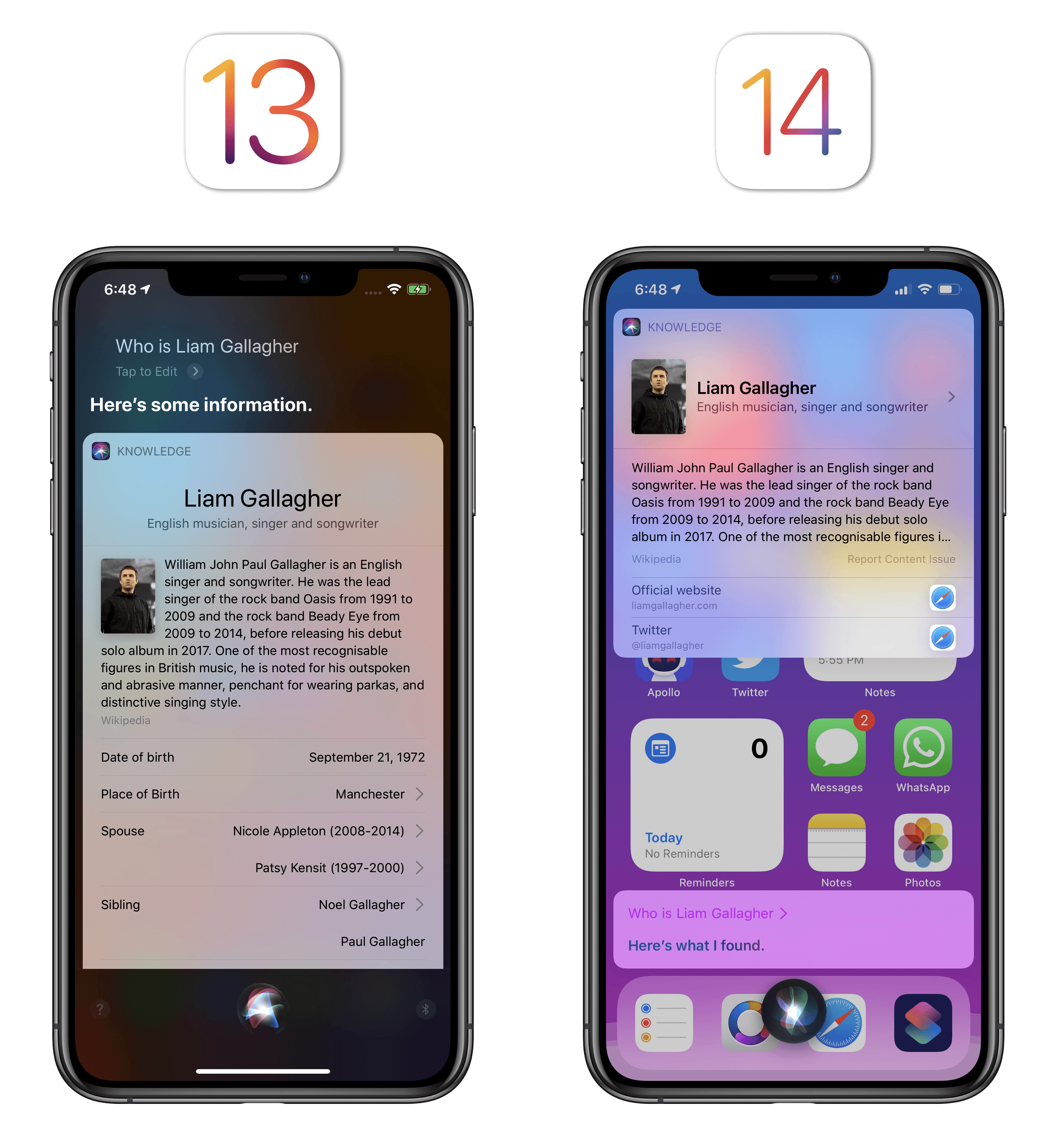
To view more details about the compact snippet presented by Siri in iOS 14, you have to tap and navigate to a secondary page, which looks like the old primary Siri results page from iOS 13.
Having used the new Siri for the past few months, I’m quite impressed with how Apple was able to rethink results and display key information upfront. Whether I ask questions about geography, politics, musicians, movies, or other trivia, Siri now consistently provides me with a compact answer that gets to the essence of what I’m looking for. It may not seem like a big deal – after all, Apple only took the basic details of Siri’s older responses and made everything else a secondary page – but, at least for me, it’s made a profound difference to my usage of Siri. Having a compact snippet appear with just the thing I’m looking for makes the assistant feel more intelligent, and I’m more inclined to use it since I don’t begrudge the Siri UI interrupting my workflow anymore. As a result, I use Siri more and I get more out of it with less time spent looking at superfluous information.
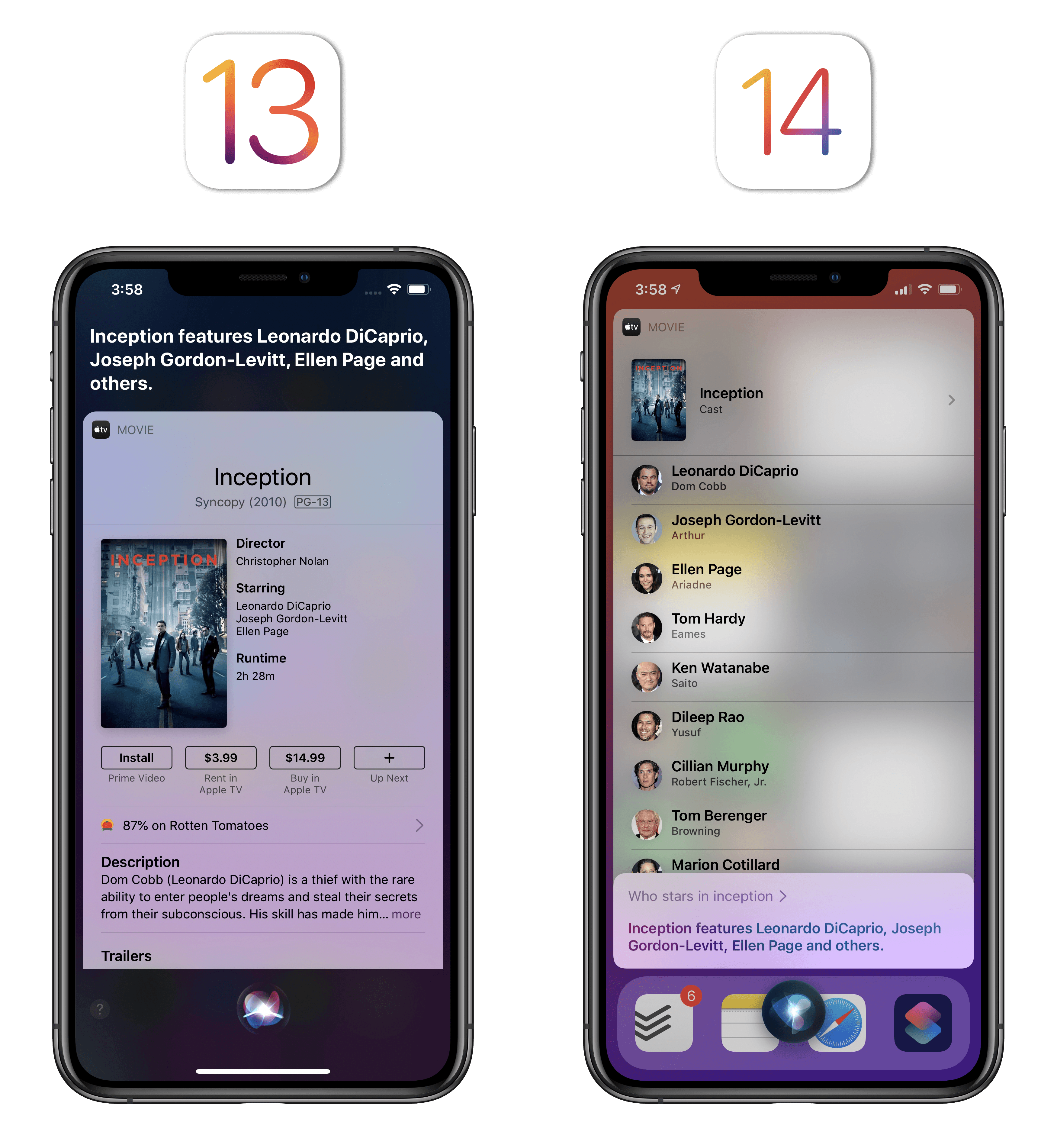
When asking about actors featured in a specific movie, iOS 14’s Siri presents a list of names rather than a generic movie card.
In this case, results are the same, but they’re more compact and Siri doesn’t hide the app you’re currently using.
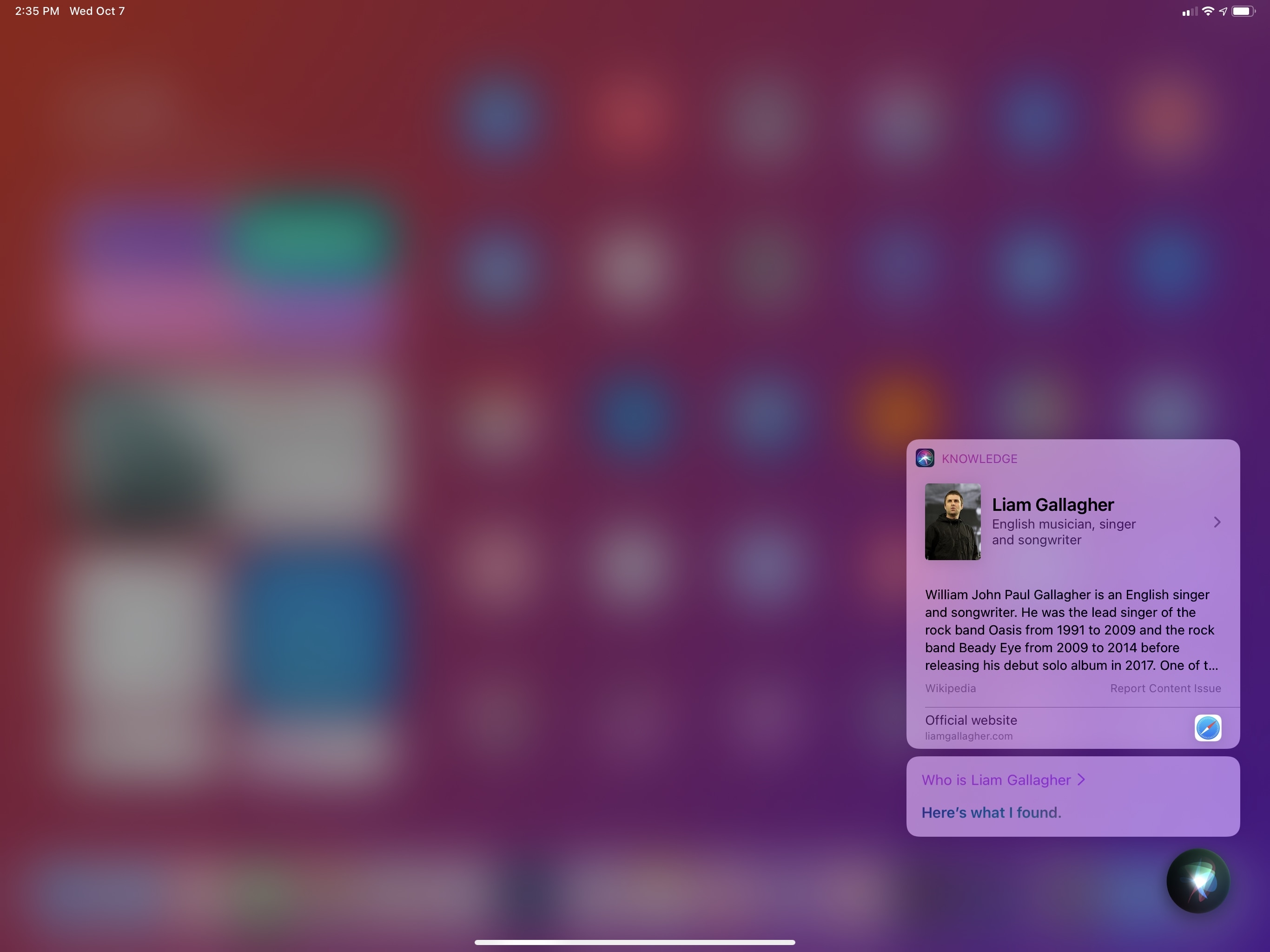
I also appreciate the effects of Siri’s compact redesign on iPad, where results are presented as transient popups on the right side of the screen. Even more so than iPhone, the iPad’s larger screen is an ideal candidate for brief, temporary results. Siri’s compact design on iPad fits the platform’s aesthetic: even longer results, such as the list of events you get by asking “what’s on my schedule this week”, are presented in a sidebar that is no wider than an app running in Slide Over. This extends to how you can dismiss Siri results as well: you can tap anywhere onscreen to close Siri, but just like a Slide Over window, you can also dismiss it by swiping results into the edge of the screen.
Dismissing Siri results on iPad.Replay
There are a few settings to control Siri’s appearance if you’re not a fan of the default compact mode. In Settings ⇾ Siri & Search ⇾ Siri Responses, you can choose to show Siri captions and speech. With captions, you’ll always see a transcription of all Siri dialog; this helps if you, like me, prefer to keep Siri silent at all times but want to see the assistant’s response in addition to the results card.
If you enable the option to show speech, you’ll get a transcription for what you asked Siri. You’d probably want to turn on this feature for two reasons: if you want to make sure you can see what the assistant understood from your request; and to gain the ability to edit the request and make a new one by typing a different command. You can do so by tapping the caption and typing an edited request in the text field that appears, effectively bringing some of the convenience of ‘Type to Siri’11 to the voice-based activation method. Obviously, both captions and speech are presented with compact UI in a bubble floating above the Siri indicator.
Editing a Siri request in iOS 14.Replay
You can also “disable” compact UI for Siri under Settings ⇾ Accessibility ⇾ Siri ⇾ Show Apps Behind Siri. The quotes are necessary since you’re not really disabling Siri’s new compact design as much as you’re preventing the app that’s currently active from being visible underneath the assistant. By enabling this setting, Siri will keep the new compact UI for results and requests, but it’ll use a translucent background to hide the foreground app.
Overall, I’m a fan of Siri’s design direction in iOS 14. Compact results strike a solid balance of utility – providing you with key information upfront and optional secondary details – and visual consistency, fitting the theme of UI receding into the background in iOS 14, leaving more room for app content while preserving the user’s context.
From Apple’s perspective, rethinking Siri around shorter, compact results is probably a good bet should a Siri-dependent, compact wearable device be in the pipeline over the next few years. That’s a broader discussion for another time, but I wouldn’t be surprised if iOS 14 is laying the foundation for that kind of always-on, unobtrusive Siri experience today.
- The pinching method lets you more precisely adjust the size of the Picture in Picture window since you can make it smaller than the default size. ↩
- The UI for the 'Type to Siri' Accessibility feature is unchanged in iOS 14; once enabled, it still takes over the entire screen, bringing up the system keyboard. ↩