This Week's Sponsor:

Kolide

Ensures that if a device isn’t secure it can’t access your apps.  It’s Device Trust for Okta.


Search results for "iOS "The MacStories Review""

AppStories, Episode 351 – iOS and iPadOS 17: The MacStories Review

This week on AppStories, we dig into Federico’s review of iOS and iPadOS 17.

Sponsored by:

  • Setapp – Power up your efficiency.
  • Things 3 – Ready for iOS 17, watchOS 10, and macOS 14
  • Daylite CRM – Spend less time managing your business and spend more time doing what you love. Regain control now!
  • HelloFresh – Use code 50appstories for 50% off plus free shipping.
  • Electric – Unbury yourself from IT tasks. Get a free pair of Beats Solo3 Wireless Headphones when you schedule a meeting.

On AppStories+, Federico takes listeners behind the scenes of his iOS and iPadOS 17 review with a look at the custom Obsidian plugins he used to produce the review that will be available as an exclusive perk for Club MacStories members.

We deliver AppStories+ to subscribers with bonus content, ad-free, and at a high bitrate early every week.

To learn more about the benefits included with an AppStories+ subscription, visit our Plans page, or read the AppStories+ FAQ.

Permalink

iOS and iPadOS 17: The MacStories Review

In the year when the vision is elsewhere, what do you get the OS that has everything?

Well, last year was weird.

For the first time since I started writing annual reviews of Apple’s two mobile operating systems – iOS and iPadOS – I published a review without the iPad part. Or rather: I had to publish it a month later given the mess Apple found itself in with Stage Manager for iPadOS 16 and its half-baked, embarrassing debut.

I don’t want to go over the specifics of that entire saga again and how we got to a shipping version of Stage Manager for iPadOS 16 that didn’t meet my expectations. Spoiler alert: as we’ll see later in this review, Apple listened to feedback and fixed the most glaring issues of Stage Manager in iPadOS 17, striking the balance between “guided multitasking” and freeform window placement that was missing from last year’s debut. Stage Manager for iPadOS 16 will remain another blip in the iPad’s long and storied history of ill-fated multitasking features. There’s no need to talk about it again.

I want to explain, however, why the past 12 months have been different than usual in iOS and iPadOS land beyond the fact that I couldn’t work on my iPad Pro for the first half of 2023.1

Following the launch of iOS 16 with its Lock Screen widgets and after Apple wrapped up work on the last big-ticket item on the iOS 16 roadmap (Live Activities for the Lock Screen and Dynamic Island, which launched in late October), it felt like the entire Apple community only started thinking about one product for the next six months: the headset. What would later be known as the Vision Pro and visionOS platform became the topic of conversation in Apple-related publications, podcasts, and YouTube channels. Leading up to WWDC 2023, anticipation surrounding the upcoming headset eclipsed anything related to other platforms.

And rightfully so. As I explained in the story that I wrote after I was able to try a Vision Pro at Apple Park, the excitement was justified. It’s always a rare occurrence for Apple to introduce a new hardware product with associated software platform; but to do so with a mind-blowing experience unlike anything I ever tried before in my life is truly something special. Apple had been working on visionOS and Vision Pro for years, and we were all thinking about it and waiting for it at WWDC. And the company delivered.

This context is necessary because the visionOS/Vision Pro development timeline explains what’s going on with iOS and iPadOS 17 this year. Both OSes are grab-bag style updates with a collection of welcome enhancements to different areas of experience. I quipped years ago that modern iOS updates need to have a little bit of everything for everyone; that has never been more true than with iOS 17, albeit for a different reason this time: most likely, because Apple didn’t have time to also deliver big, vision-altering upgrades on the iPhone this year.

iOS and iPadOS take a bit of a secondary role in 2023, happily conceding the spotlight to a new software platform that hasn’t launched yet, but which developers around the world are already testing in person.

To be clear, I am not complaining. iOS and iPadOS 17 may not have an industry-defining, obvious tentpole feature, but in their approach to offering miscellaneous improvements, they’re fun and interesting to cover. Of the two, iPadOS is the one that suffered from lack of development resources the most and whose strategy could be easily summed up as “it’s iPadOS 16, but we fixed Stage Manager”. Which, again, given the circumstances, is absolutely fine with me.

While Apple was busy with visionOS this summer, I was having fun exploring iOS 17’s collection of app updates and, as we’ll see in this review, extensive upgrades to one system feature: widgets.

As always every year: let’s dive in.

Read more


  1. Did I ever tell you the story of how I used a Microsoft Surface in secret as my main computer from January to June 2023 until Apple unveiled the new Stage Manager for iPadOS 17 and everything was good with the world again? How I spent six months in computing wilderness and questioned every single one of my tech decisions? And how I ultimately accepted that I prefer Apple platforms because, at the end of the day, they're made by people who care about great design and user experience? I did, and you can listen to the story here↩︎

AppStories, Episode 295 – iOS 16: The MacStories Review

This week on AppStories, we dig into Federico’s iOS 16 review, discussing the all-new Lock Screen, wallpaper creation, Focus modes and filters, App Shortcuts, and some of the smaller changes you might have missed.

Sponsored by:

  • Pillow – Sleeping better, made simple.
  • Memberful – Monetize your passion with membership.

On AppStories+, we take a behind-the-scenes look at the making of this year’s iOS 16 review.

We deliver AppStories+ to subscribers with bonus content, ad-free, and at a high bitrate early every week.

To learn more about the benefits included with an AppStories+ subscription, visit our Plans page, or read the AppStories+ FAQ.


iOS 16: The MacStories Review

Customization is back, and Apple’s having fun again.

When is the last time your iPhone truly surprised you?

The answer to this question is a fascinating Rorschach test that can say a lot about a person’s relationship with Apple’s mobile platform. Some might say it was over a decade ago, when they feasted their eyes upon the Retina display for the first time in 2010. Some might say it happened when the iPhones got bigger – and sales skyrocketed – with the iPhone 6 lineup in 2014. Others might argue that it happened with Face ID on the iPhone X, or the first time they tried Portrait or Night mode, or perhaps when they first took an ultra-wide shot.

My point is: if you ask someone about the last time an iPhone truly surprised them, chances are they’ll reply with a hardware feature. That’s not a shocker: Apple prides itself upon the tight integration they’ve been able to achieve between the iPhone’s hardware and iOS; they’ve successfully managed to turn their design philosophy into a selling point of their entire ecosystem.

People buy iPhones because they know they’re going to work well for a long time, and, usually, because the model they’re getting has a cool new gimmick they want to try. For this reason, it’s not absurd to postulate that, by and large, the iPhone’s software serves to enable hardware sales and subscriptions. I do not mean this pejoratively: I like Apple’s approach, otherwise I wouldn’t be writing annual reviews about their operating systems. But I also recognize that on the iPhone (the situation is the exact opposite on iPad) the software now largely takes the backseat compared to hardware and services.

Which is why whenever the iPhone’s software truly surprises me, I get excited.

Software-related surprises are more rarefied on iOS these days, but the kind of people who are reading this story can point to a few examples in our recent history. Apple buying Workflow, turning it into a system app, and outright claiming that Shortcuts is the future of automation was a surprise. The extent to which Apple integrated dark mode in iOS 13 was a surprise.1 The arrival of two iPad features – Picture in Picture and inter-app drag and drop – on iPhone felt like a surprise. But, of course, no modern feature comes close to the surprise that we all witnessed with iOS 14 two years ago: a renewed focus on user personalization with custom Home Screen widgets and the ability to create multiple Home Screens.2

That’s why, following last year’s welcome (if perhaps a tad uninspired) quality-of-life update that was iOS 15, I’m excited about a new version of iOS again.

iOS 16, launching today for a variety of iPhone models dating back to the iPhone 8, marks Apple’s triumphant return to user personalization, with a twist: while in 2020 customization might have felt like a happy consequence of Apple’s engineering, this time the company has intentionally marketed iOS 16 as an update that will make an iPhone feel truly your own. As we explored in June and July, the first thing you see on your iPhone – the Lock Screen – is fundamentally changing in iOS 16. With the ability to create multiple Lock Screens, choose from a diverse collection of wallpaper sets, and customize each one with widgets, you’ll now have endless possibilities for the screen you always see when you pick up your iPhone.

Sure, there’s an argument to be made for Lock Screen widgets also being developed in service of new hardware, but I don’t think that takes away from the breadth of this feature and how Apple created a whole narrative around wallpapers, widgets, photos, and Focus modes this year. As you’ll see, the customizable Lock Screen will be the main character of this review: I’ve had a lot of fun exploring different permutations of my Lock Screen this summer, and I’ve been able to test dozens of widgets from third-party developers, which I’ll also showcase in this story.

In keeping with my theory that modern iOS updates always need to have a little bit of something for everyone, there’s a ton of other (some bigger, some smaller) features I’ll be covering in this review.3 Messages, one of my most used apps on iPhone, has received a substantial update with the ability to edit and un-send messages, making it, in some ways, even superior to WhatsApp for me now. Mail – of all apps – has gotten a major upgrade with modern features such as scheduled send and, almost unbelievably, a revamped search that actually works. Reminders has officially turned into a serious task manager with even more filters for smart lists and the ability to create and share templates with others.

The new Lock Screen takes center stage this year and everything else pales in comparison to the massive update it received, but, overall, I find iOS 16 a more fun and useful update than iOS 15.

So, as with every September: let’s dive in.

Read more


  1. Then again, wasn't that in service of OLED displays? ↩︎
  2. Perhaps the iPhone 14 Pro's Dynamic Island will be another major surprise for iPhone users. Fascinatingly, it's going to be a unique blend of hardware and software that shows how Apple has been playing the long game with their design strategy for the past few years, which is now paying off. However, the iPhone 14 Pro is not out yet and I haven't tested the Dynamic Island, so that's beyond the scope of this review. ↩︎
  3. That's in addition to the apps and features we've already covered in our annual OS Summer Series on MacStories↩︎

The iOS App Icon Book: The MacStories Review

I’ve eagerly awaited The iOS App Icon Book by Michael Flarup ever since it was first announced in 2018. The book sits dead center among topics that are at the heart of MacStories: apps, app preservation, and design. As a result, my expectations were high, and I’m happy to report that it doesn’t disappoint. If you care about apps, you’ll love The iOS App Icon Book.

The cover of The iOS App Icon Book sets the tone with a large iridescent squircle, the shape that defines every app icon. It’s the canvas on which every app icon is created. The squircle has become iconic in its own right, creating a consistent thread that ties disparate designs together into a coherent whole. The shimmering foil used for the book’s squircle is an excellent touch that hints at the colorful variety of icons between its convers.

The iOS App Icon Book is an art book at its core. The book’s pages are packed with icons of varying sizes, but the book also features essays by Flarup, a foreward by Bjango’s Marc Edwards, a history of iOS iconography by Jim Nielsen, and profiles of a dozen designers and design studios. The focus of the book lies firmly on the icons themselves, but I’m glad the essays and profiles were included. The essays provide an outlet for anyone who happens upon The iOS App Icon Book and wants to know more about the history and design of icons, while the profiles put a face to some of the artwork on its pages.

Of course, the stars of The iOS App Icon Book are the icons themselves. Each high-resolution image is reproduced in vivid colors on high-quality paper that makes browsing through the book’s pages a pleasure. As someone who writes about apps, I enjoyed flipping through the pages, rediscovering the icons of apps from the early days of the App Store alongside the icons of apps I use every day. It’s a careful mix of old and new that blends the context of early app iconography with current design trends.

As you flip through The iOS App Icon Book, you’ll find that the icons are arranged in a number of different ways. Some are grouped by color, while others are organized thematically, like the pages featuring food, games, and photography apps. My favorite part of The iOS App Icon Book, though, is the pages that trace the evolution of specific icons. Each version is dated and connected by horizontal lines to indicate its lineage. It’s fascinating to see the directions that designers have taken app icons over the years.

The one thing that The iOS App Icon Book doesn’t do that I would have liked to have seen is trace the evolution of the icons used for some of Apple’s system apps. That may not have been feasible given the need to get rights to the artwork for printing in a book. However, it would have been interesting to see the extent to which Apple’s design work has influenced third-party designers.


iOS app icons are the first thing that users encounter when they download an app and use it for the first time. Icons set the tone and personality of an app. It’s an important part of the app experience that has a rich history on iOS. The iOS App Icon Book brings that history to life in a way that immediately had me flipping back and forth through its pages, rediscovering old favorites and studying the details of icons I’d never run across before. I highly recommend it for anyone interested in apps and design.

The iOS App Icon Book is still available to pre-order for €60.00 from its website.


AppStories, Episode 241 – iOS and iPadOS 15: The MacStories Review

This week on AppStories, John interviews Federico about his iOS and iPadOS 15 review live in the Club MacStories+ Discord community, covering the challenges of writing this year’s review, Focus mode, Safari changes, Shortcuts, Live Text, the Shelf, listener questions, and more.


On AppStories+, Federico shares what review day is like and how he deals with negativity, John covers MacStories’ eBook production workflow, and Federico discovers an eBook reader that supports Quick Note and annotation.

We deliver AppStories+ to subscribers with bonus content, ad-free, and at a high bitrate early every week.

To learn more about the benefits included with an AppStories+ subscription, visit our Plans page, or read the AppStories+ FAQ.

Permalink

iOS and iPadOS 15: The MacStories Review

A quieter release for even stranger times.

In my career as an iOS reviewer, I don’t think I’ve ever seen a response as universally positive and enthusiastic as the general public’s reception of iOS 14 last year. From the “Home Screen aesthetic” popularized by TikTokers to the incredible success of widgets and the resurgence of custom icons, few iOS updates managed to capture the cultural zeitgeist as globally and rapidly as iOS 14 did. The update broke out of the tech community and, perhaps for the first time in decades, made UI personalization a mainstream, easily attainable hobby. For once, we didn’t have to convince our friends and family to update to a major new version of the iPhone’s operating system. They just did it themselves.

The numbers don’t lie: five weeks after its release, iOS 14 was already set to surpass iOS 13’s adoption rate; in April 2021, seven months after launch, over 90% of compatible devices were running iOS 14. Which begs the obvious question: if you’re Apple, you’re planning to follow up on what made iOS 14 successful with even more of it, right?

Well, not quite.

With the world coming to a halt due to the pandemic in early 2020, Apple could have easily seized the opportunity to slow down its pace of software updates, regroup, and reassess the state of its platforms without any major changes in functionality. But, as we found out last year, that’s not how the company operates or draws its product roadmaps in advance. In the last year alone, Apple introduced a substantial macOS redesign, pointer support on iPad, and drastic changes to the iOS Home Screen despite the pandemic, executing on decisions that were likely made a year prior.

Surprisingly, iOS 15 doesn’t introduce any notable improvements to what made its predecessor wildly popular last year. In fact, as I’ll explore in this review, iOS 15 doesn’t have that single, all-encompassing feature that commands everyone’s attention such as widgets in iOS 14 or dark mode in iOS 13.

As we’ll see later in the story, new functionalities such as Focus and Live Text in the Camera are the additions that will likely push people to update their iPhones this year. And even then, I don’t think either of them sports the same intrinsic appeal as widgets, custom Home Screens, or the App Library in iOS 14.


It’s a slightly different story for iPadOS 15, which comes at a fascinating time for the platform.

As I wrote in my review of the M1 iPad Pro earlier this year, Apple needed to re-align the iPad’s hardware and software on two fronts. For pro users, the company had to prove that the new iPad Pro’s hardware could be useful for something beyond basic Split View multitasking, either in the form of more complex windowing, pro apps, or desktop-like background processes; at the same time, Apple also had to modernize iPadOS’ multitasking capabilities for all kinds of users, turning an inscrutable gesture-based multitasking environment into a more intuitive system that could also be operated from a keyboard. It’s a tall order; it’s why I’ve long believed that the iPad’s unique multiplicity of inputs makes iPadOS the toughest platform to design for.

Apple’s work in iPadOS 15 succeeds in laying a new foundation for multitasking but only partially satisfies the desires of power users. Apple managed to bring simplicity and consistency to multitasking via a new menu to manage the iPad’s windowing states that is easier to use than drag and drop. Perhaps more importantly, Apple revisited iPad multitasking so it can be equally operated using touch and keyboard. If you, the person reading these annual reviews, have ever found yourself having to explain to a family member how to create a Split View on iPad, tell them to update to iPadOS 15, and they’ll have a much easier time using their iPads to their full extent.

But after three months of running iPadOS 15 on my M1 iPad Pro, I can’t help but feel like power users will still be left wishing for more. Yes, iPadOS 15 brings extensive keyboard integration for multitasking with a plethora of new keyboard shortcuts and yes, the new multitasking menu and improvements to the app switcher benefit everyone, including power users, but iPadOS 15 is a foundational update that focuses on fixing the basics rather than letting the iPad soar to new heights.


While Apple is probably preparing bigger and bolder updates for next year, there are still plenty of features to discover and enjoy in iOS and iPadOS 15 – some that could still use some refinement, others that already feel like staples of the modern iPhone and iPad experience.

Let’s dive in.

Read more


    iOS and iPadOS 14: The MacStories Review

    Even with (unsurprisingly) smaller releases, Apple is pushing forward with bold ideas across all platforms.

    How do you prepare a major new version of an operating system that now spans two separate platforms, which will be installed on millions of devices within a few hours of its release, amid a global pandemic? If you’re Apple, the answer is fairly straightforward: you mitigate the crisis by focusing on a narrower set of features, perhaps prioritizing bug fixes and stability improvements, but then you just have to do the work.

    In my time as an iOS (then iOS and iPadOS) reviewer, I never thought I’d have to evaluate an OS update with the social and political backdrop of iOS 14. Let’s face it: when the COVID-19 outbreak started fundamentally changing our lives earlier this year, at some point many of us – including yours truly – thought that, among more serious and severe repercussions, our tiny corner of the Internet would see no new phones, OS updates, videogame consoles, or other events over the course of 2020. Or that, at the very least, changes in hardware and software would be so minor, they’d barely register in the grand scheme of things as tech companies and their employees were – rightfully so – adjusting to a new, work-from-home, socially distant life. Yet here we are, over a year after the debut of iOS and iPadOS 13, with brand new versions of both operating systems that were announced, as per tradition, at WWDC a few months ago. Remove all surrounding context, and you wouldn’t guess anything has changed from 2019.

    Context is, however, key to understanding Apple’s background and goals with iOS and iPadOS 14, in a couple notable ways.

    First, I think it’s safe to assume slowing down to reassess the state of the platform and focus on quality-of-life enhancements and performance gains would have worked out in Apple’s favor regardless of the pandemic. In last year’s review, I noted how the first version of iOS 13.0 launching to the public wasn’t “as polished or stable as the first version of iOS 12”; in a somewhat unpredictable twist of events, managing the iOS 13 release narrative only got more challenging for Apple after launch.

    Late in the beta cycle last year, the company announced certain iOS 13 features – including automations in Shortcuts and ETA sharing in Maps – would be delayed until iOS 13.1, originally scheduled for September 30th. Following widespread criticism about bugs, various visual glitches, and stability issues in iOS 13.0, Apple moved up the release of iOS 13.1 and iPadOS (which never saw a proper 13.0 public release) by a week. Despite the release of a substantial .1 update, the company still had to ship two additional patches (13.1.1 and 13.1.2) before the end of September. Before the end of 2019, all while the general public was lamenting the poor state of iOS 13’s performance (just Google “iOS 13 buggy”, and you’ll get the idea), Apple went on to ship a total of eight software updates to iOS 13 (compared to iOS 12’s four updates before the end of 2018). The record pace, plus the mysterious removal of features that were originally announced at WWDC ‘19, suggested something had gone awry in the late stages of iOS 13’s development; it wasn’t long before a report covered Apple’s plans to overhaul its software testing methodology for iOS 14 and 2020. The pandemic may have forced Apple to scale back some functionalities and deeper design changes this year, but it’s likely that a decision had been made long before lockdowns and work-from-home orders.

    Second, context is necessary because despite the pandemic and rocky rollout of iOS 13 and its many updates, Apple was still able to infuse iOS and iPadOS 14 with fresh, bold ideas that are tracing a path for both platforms to follow over the next few years.

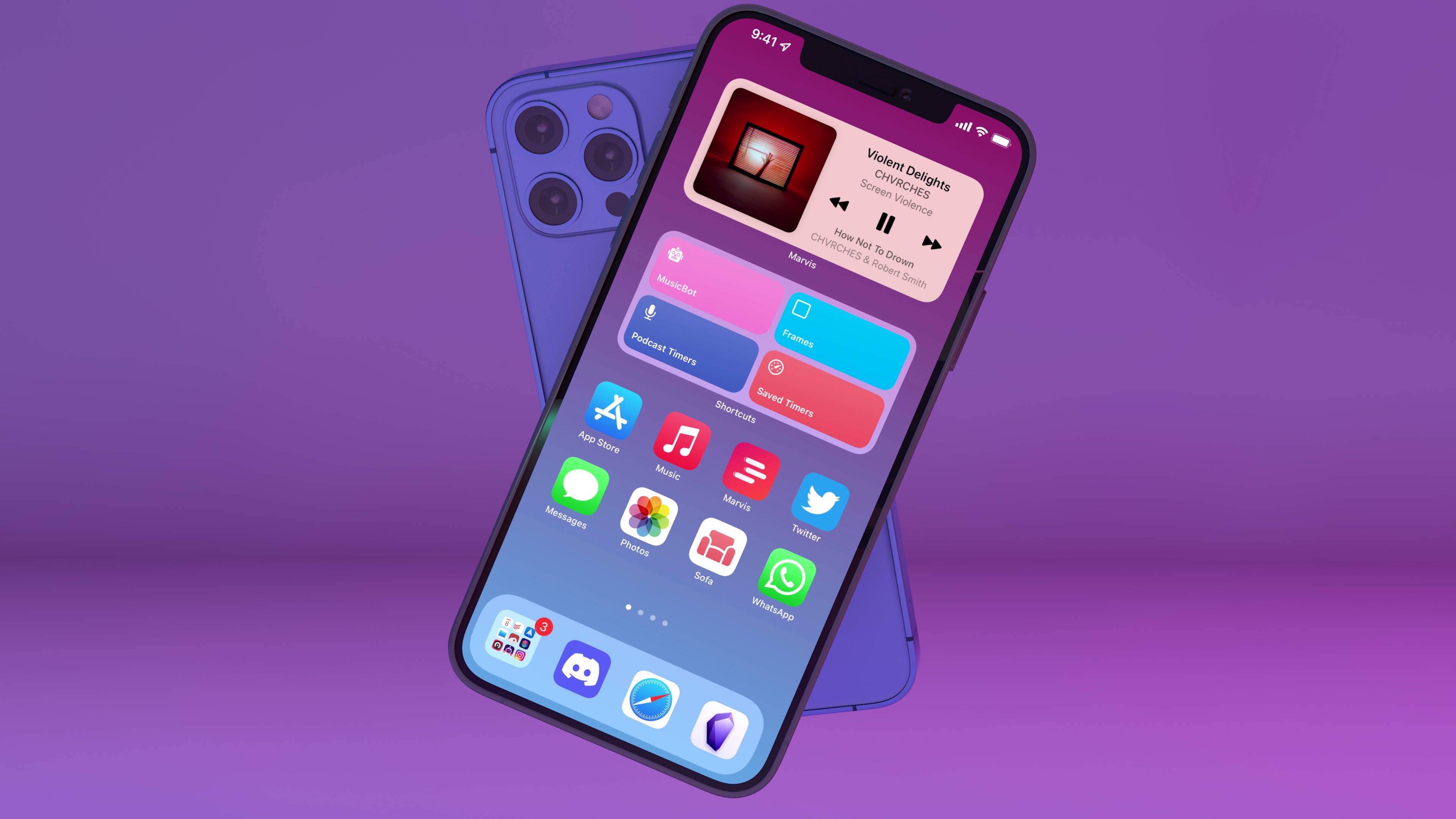
    On the surface, iOS 14 will be widely regarded as the update that brought a redesigned Home Screen and a plethora of useful quality-of-life additions to the iPhone. For the first time since the iPhone’s inception, Apple is moving past the grid of icons and letting users freely place data-rich, customizable widgets on the Home Screen – a major course correction that has opened the floodgates for new categories of utilities on the App Store. In addition to the upgraded Home Screen, iOS 14 also offers welcome improvements to long-standing limitations: phone calls can now come in as unobtrusive banners; Messages borrows some of WhatsApp’s best features and now lets you reply to specific messages as well as mention users; Siri doesn’t take over the entire screen anymore. There are hundreds of smaller additions to the system and built-in apps in iOS 14, which suggests Apple spent a long time trying to understand what wasn’t working and what customers were requesting.

    iOS and iPadOS 14 aren’t just reactionary updates to criticisms and feature requests though: upon further examination, both OSes reveal underlying threads that will shape the evolution of Apple’s platforms. With compact UI, the company is revisiting a principle introduced in iOS 7 – clarity and content first – with fresh eyes: the UI is receding and becoming more glanceable, but the elements that are left are as inviting to the touch as ever – quite the departure from Jony Ive’s overly minimalistic, typography-based approach. We see this trend everywhere in iOS 14, from phone calls and Siri to widgets, new toolbar menus, and Picture in Picture. Intents, the existing technology behind SiriKit, Shortcuts, and intelligent Siri suggestions, is also at the center of widget personalization. Intents already was one of Apple’s most important frameworks given its ties to Siri and on-device intelligence; iOS 14 proves we haven’t seen all the possible permutations and applications of Intents yet.

    Then, of course, there’s iPad. In iPadOS 14, we see the logical continuation of pointer and trackpad support introduced earlier this year in iPadOS 13.4: now that users can control an iPad without ever touching the screen, Apple is advising third-party developers to move away from iPhone-inspired designs with apps that are truly made for iPad…and somewhat reminiscent of their macOS counterparts. We can see the results of this initiative in modernized system apps that take advantage of the iPad’s display with a sidebar, multiple columns, and deeper trackpad integration – new options that every iPad app developer could (and, according to Apple, should) consider going forward. Although some of the iPad’s oft-mentioned ongoing struggles remain unaddressed in iPadOS 14 (see: multitasking and window management), Apple is embracing the iPad’s nature as a modular computer this year, and they feel comfortable leaning into lessons learned with the Mac decades ago.

    The context of 2020 is what makes iOS and iPadOS 14 so fascinating and, to a certain extent, fun to review. On one hand, we have two major OS updates that may or may not have been impacted by the global pandemic in their focus on fewer groundbreaking additions and more consistent improvements across built-in apps; on the other, just like any other year, we have a suite of overarching themes and potential implications to dissect.

    But for all those users still pausing over that ‘Install’ button, pondering whether updating their most important communication and work-from-home devices is worth it, there’s only one consideration that matters:

    Will this go any better than last year?

    Read more