Sometimes I truly have excellent timing with my stories.
As you may recall, a couple of months ago in the lead-up to WWDC, I published an article on my experience with using the M1 Max MacBook Pro for six months. That story was born out of a desire to get to know macOS again after years of iPad-only work; as I shared at the time, my curiosity was also the byproduct of Apple’s incoherent narrative for iPad power users for the past couple of years. Great hardware held back by lackluster software had long been regarded as the core weakness of the iPad platform; I hadn’t always agreed with the Apple community’s “consensus” on this, but an M1 iPad Pro carrying MacBook Pro-like specs with no new pro software features to take advantage of it was, indeed, a bridge too far. So when I published that story just in time for WWDC, I did it because a) that’s when it was ready and b) I wanted to bring some chaotic energy into the iPad discourse and see what would happen.
Like I said, sometimes I do have excellent timing with my stories. And in this case, not even my wildest expectations could have predicted that, in one fell swoop a week later, Apple would reimagine iPadOS around desktop-class apps and a brand new multitasking with external display integration, a new design, and – the unthinkable – overlapping, resizable windows with iPadOS 16.
Today, Apple is releasing the first public betas of all the operating systems that will launch to the wider public later this year: iOS 16, iPadOS 16, macOS 13 Ventura, and watchOS 9. We’re going to have overviews of all these public betas today on MacStories.1 As you can imagine given my annual reviewer responsibilities, I installed both iOS and iPadOS 16 as soon as they became available after the WWDC keynote on my iPhone 13 Pro Max and 12.9” iPad Pro with M1, and I’ve been using them as my daily drivers for the past month.
Obviously, I have some early thoughts and first impressions to share on iPadOS 16: it is fundamentally changing my relationship with the iPad platform and my workflow, which has been untouched for years since the introduction of multiwindow in iPadOS 13. Stage Manager, while still in need of refinements in several areas, is a game-changer for people like me, and it signifies a major course correction on how Apple thinks about iPadOS for power users.
But I should also say that I’m equally intrigued by iOS 16, which marks Apple’s return – after two years – to user customization with a drastic revamp of the Lock Screen, which can now be personalized with widgets, multiple wallpaper sets, and deep integration with the Home Screen, Focus, and even Apple Watch. The new Lock Screen is the proper follow-up to iOS 14 widgets we’ve been waiting for, and it’s going to be the feature that will push millions of people to update their iPhones to iOS 16 right away later this year. Besides the Lock Screen, there are dozens of other quality-of-life improvements to built-in apps and system intelligence that have caught my attention in iOS 16 in the past month, from the welcome updates to Mail and Reminders to system-wide unit conversions based on Live Text, Safari tab groups, and more.
There’s a lot to uncover in iOS and iPadOS 16, and I can’t possibly get into all of it today with this story. All the details and final opinions will have to wait for my annual review in the fall. Instead, below you’ll find a collection of initial thoughts, impressions, and suggestions for aspects of iPadOS and iOS 16 I’d like Apple to improve this summer. As with last year’s preview story, I’m going to include two recap segments at the end of each section with a list of improvements I’d like to see in iPadOS and iOS 16 before the public release.
Let’s dive in.
iPadOS 16
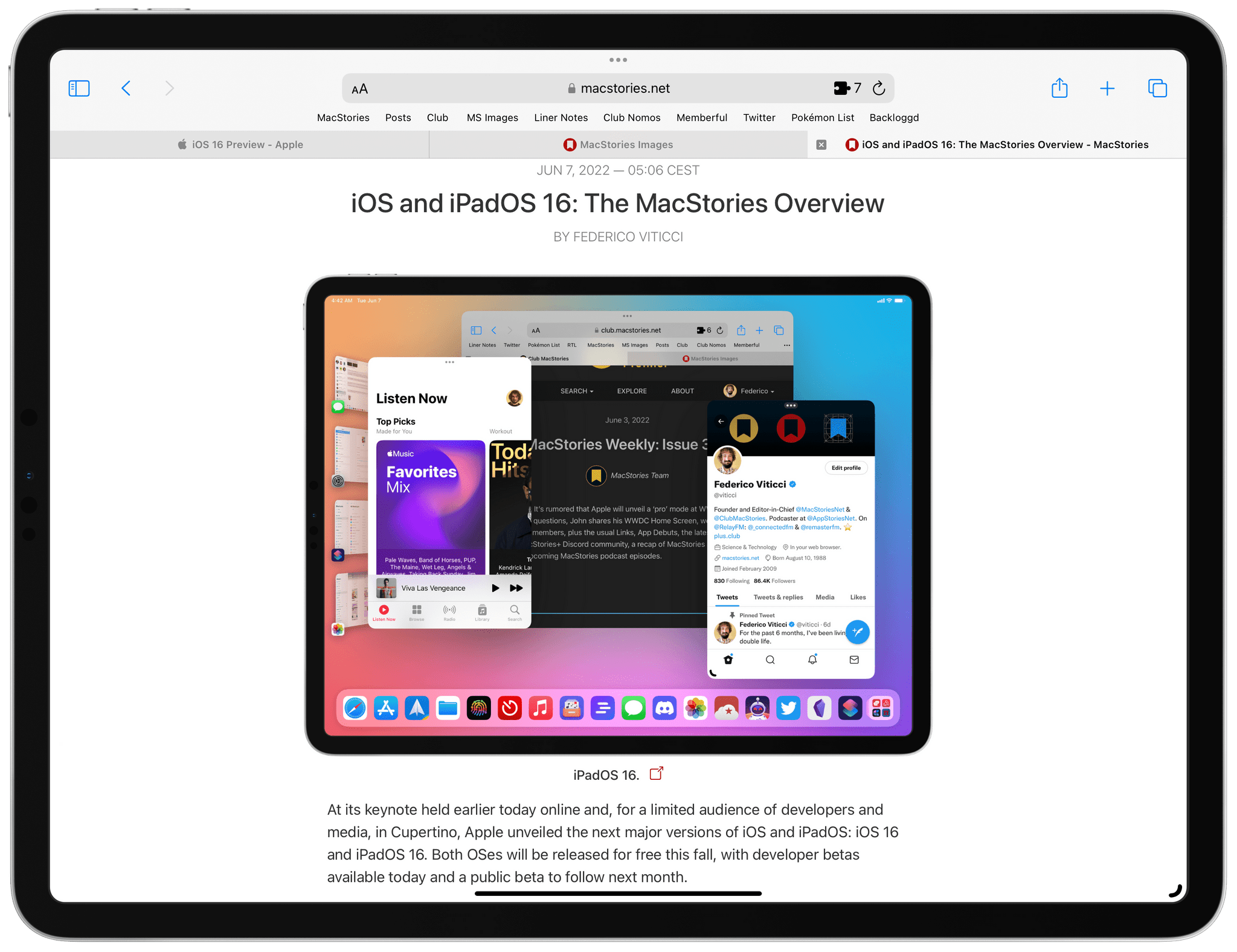
The biggest addition to iPadOS 16 is Stage Manager, a brand new multitasking mode that does not replace the existing Split View and Slide Over systems; instead, Stage Manager is an additional, optional environment that lets you use up to four concurrent, foreground apps. And the kicker: given the iPad’s limited screen real estate, Stage Manager allows you – for the first time in the iPad’s history – to almost freely resize windows shown onscreen and arrange your workspace however you see fit. Those app windows can even overlap with each other.
I’ll be blunt: when rumors were swirling ahead of WWDC regarding Apple’s intention to bring a Mac-like multitasking feature with resizable and overlapping windows to iPadOS, I didn’t believe them; I was concerned Apple had given up on the mission to reimagine iPadOS multitasking as something entirely unique, abandoning the pursuit of a new take on windowing for a dull copy of macOS’ windowing system. As I wrote in my MacBook Pro story, I never really liked overlapping windows; I’ve historically disliked the complexity that carefully resizing windows entails; from Apple, I would have preferred a more intuitive tiling system based on predefined window sizes and gestures.
I was equally right and wrong in assuming Apple wouldn’t – or shouldn’t – bring resizable app windows to iPadOS. Here’s why: for better or worse, Stage Manager is not the Mac’s traditional multitasking system, carried as a 1:1 port to iPad. In keeping with Apple’s modus operandi over the past few years, Stage Manager is the kind of feature that takes the core of an existing macOS idea and modernizes it for a new audience that is used to the iPad’s more approachable and modular nature. This is demonstrated by the fact that Stage Manager also exists (with some variations) on macOS Ventura, where it doesn’t replace the Mac’s standard window management structure but instead adds to it as a new, standalone mode.
In building Stage Manager, Apple sought to combine the objective benefits of multiple app windows shown onscreen (you can do more things at once) with interaction boundaries designed to eschew the typical complexity of window overlap and resizing.
For starters, when Stage Manager is enabled as a mode in iPadOS 16 (you can do so from Settings and a new toggle in Control Center), you don’t suddenly see a desktop underneath your windows; you see your Home Screen, the window of the app(s) you’re using in the stage (the name of the central area of the screen where windows are), your dock at the bottom, and a strip of recent apps as window thumbnails along the left edge of the screen.
If you want, you can hide the dock and strip from Control Center. In that case, Stage Manager will only show you windows. You can still bump with the pointer into the edges of the screen to show them, though.
Unlike macOS, where clicking an app to open it usually spawns a new window somewhere onscreen, in Stage Manager you have to intentionally create workspaces of multiple windows. That’s the first difference from classic macOS: Stage Manager doesn’t force you to manage new windows by constantly throwing new ones onto the stage as soon as you click an app icon; instead, you have to manually add each window to your workspace, signaling your intention to work with multiple app windows at a time. On iPad Pro, Stage Manager supports up to four apps at the same time; as soon as you bring in a fifth one, the oldest one in the workspace gets removed and thrown back into the strip.
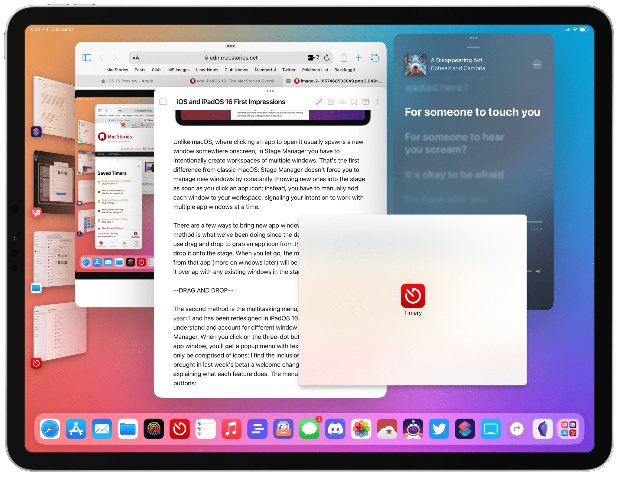
There are a few ways to bring new app windows onto the stage. The first method is what we’ve been doing since the days of iOS 11: you can use drag and drop to grab an app icon from the dock or Spotlight and drop it onto the stage. When you let go, the most recently used window from that app will be placed onscreen, making it overlap with any existing windows in the stage.
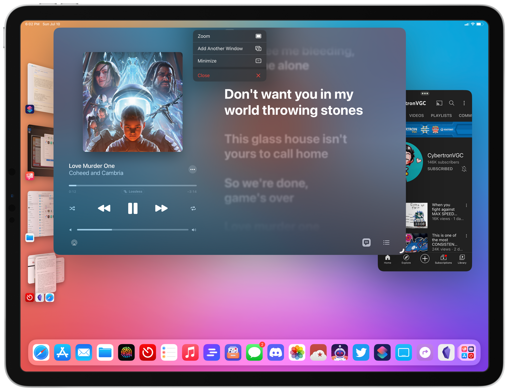
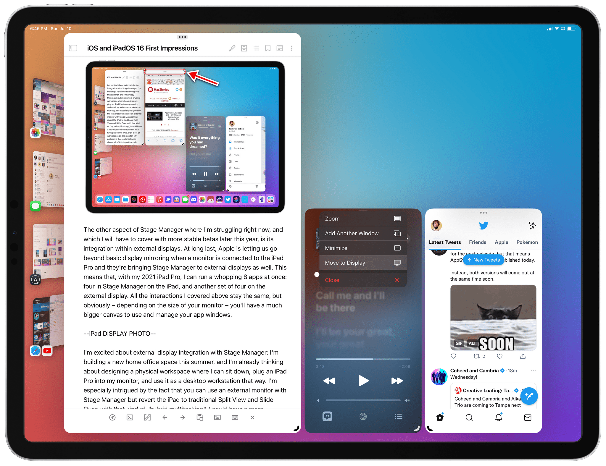
The second method is the multitasking menu, which was introduced last year and has been redesigned in iPadOS 16 to make it easier to understand and account for different window behaviors in Stage Manager. When you click on the three-dot button in the title bar of an app window, you’ll get a popup menu with text labels. The menu used to only be comprised of icons; I find the inclusion of labels (which was brought in last week’s beta) a welcome change that does a better job at explaining what each feature does.
The menu includes the following buttons:
- Zoom: this enlarges an app window to make it full-screen, fitting the available area by hiding the dock, recent apps strip, and other windows in the workspace. This feature can also be activated with Globe+F, and it’s meant to be a way to temporarily focus on a specific app in the workspace without removing other windows sitting underneath it. It is, effectively, a temporary override to re-enter a one-app-at-a-time environment without having to remove an app from the stage. I like this approach, especially since you can keep pressing Globe+F to toggle back and forth between full-screen and the window’s previous size and placement. I do this all the time as a way to alternate between “classic iPad” behavior and multitasking within the same workspace.
- Add Another Window: this is how you can add new apps to your workspace without using drag and drop. In theory, clicking this option should slide the workspace away to show you the Home Screen (similar to iPadOS 15) with the ability to pick an app from there. I say “in theory” because right now this button doesn’t always work and often shows me an error message telling me to use drag and drop instead. I guess Apple hasn’t finished implementing it yet. There is also a hotkey to do this from the keyboard, which is shown in the new Stage Manager section of the keyboard shortcut menu that you can find by holding down the Globe key.
- Minimize: with this button, you can remove a window from the current workspace (without closing the app) by minimizing it back into the recent apps strip. I’m not sure if “minimizing” is the best word for this, but its associated ⌘M keyboard shortcut matches macOS, so I assume it makes sense for consistency’s sake.
- Close: this is the big red button that outright closes a window (if an app has multiple windows open) or closes the window and quits the app (if it has only one window open). This feature can also be activated with ⌘W (again, matching macOS) and it’s what you need to use if you want to remove a window from your current workspace without having it end up as a standalone window in the recent apps strip.
So that’s the new multitasking menu, and I think Apple has been doing a pretty good job so far enhancing it with new options, labels, and associated hotkeys compared to last year. There is, however, a third way to bring windows onto the stage, which is based on one of the core elements of Stage Manager: the aforementioned recent apps strip.
The strip is a fascinating UI element that serves multiple purposes in Stage Manager. At a high level, it’s a quick switcher that displays your four most recently used workspaces2, which you can switch between by simply clicking one of the window thumbnails in the strip. As you do that, workspaces will fly in and out of the strip with a smooth 3D animation, which is one of my favorite aspects of Stage Manager’s design.
The Stage Manager animation for workspaces.Replay
There are other functionalities hidden in the strip beyond previewing and clicking workspaces though. The first one is the ability to add windows to the current workspace by grabbing them from the strip and throwing them onto the stage. The behavior here is similar to using drag and drop from the dock or Spotlight, with one key difference: when you’re grabbing a window from the strip, you’ll see a live preview of the window as you drag it around, and other windows in the stage will try to automatically resize to the left or right to make room for the new window before you drop it.
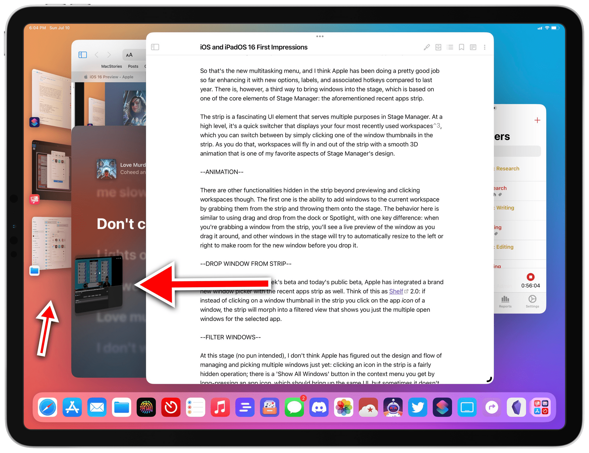
Furthermore, as of last week’s beta and today’s public beta, Apple has integrated a brand new window picker with the recent apps strip as well. Think of this as Shelf 2.0: if instead of clicking on a window thumbnail in the strip you click on the app icon of a window, the strip will morph into a filtered view that shows you just the multiple open windows for the selected app.
…and the strip becomes a window picker. The only problem: this window picker doesn’t have a ‘+’ button to create a new window for the selected app.
At this stage (no pun intended), I don’t think Apple has figured out the design and flow of managing and picking multiple windows just yet: clicking an icon in the strip is a fairly hidden operation; there is a ‘Show All Windows’ button in the context menu you get by long-pressing an app icon, which should bring up the same UI, but sometimes it doesn’t work. As I’ll cover below, I haven’t been able to pick and manage multiple windows when working with Stage Manager on an external monitor either since it always leads to a restart of my iPad Pro in the current beta. However, I do believe Apple is on the right track here. Integrating the window picker with the recent apps strip makes sense from a spatial perspective, and it’s one less UI we have to deal with.
All this brings me to actually working with Stage Manager and going from a system that only supported two simultaneous apps to an environment that lets me use up to four at the same time, with the ability to resize and arrange them onscreen with different layouts.
I won’t lie: Stage Manager is a major paradigm shift for the iPadOS platform, and it took me a while to get used to it. Now that I have, in spite of the issues and bugs that are to be expected at this point in the beta cycle, I can say that Stage Manager is already having a positive impact on how I work on my iPad Pro. It lets me accomplish more things, more quickly, with less friction than before. This isn’t a surprise: by doubling the number of active windows I can see and use at once, iPadOS 16 has halved the steps I need to take to do anything that involves more than two apps.
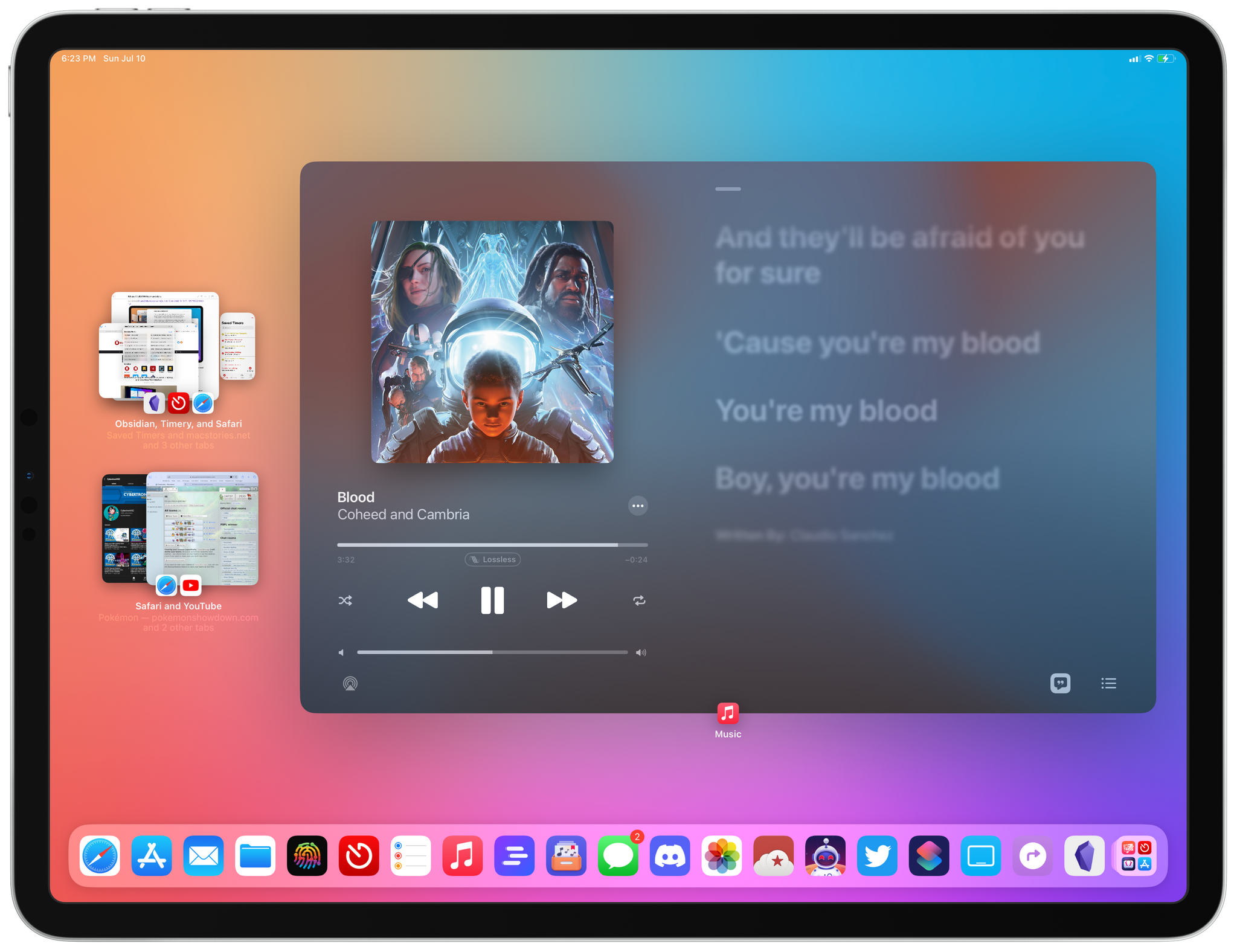
Just the other day, I was writing this article in Obsidian, checking some reference material in Notes, reading some questions about iPadOS from members in our Discord, and viewing some of my liked tweets in the Twitter app about Stage Manager. Before, I would have had to create two discrete Split Views and switch between them, disrupting my writing workflow in Obsidian while jumping between apps. That’s not the case anymore with Stage Manager, which lets me work with four windows – albeit at a much smaller size – in the same workspace. Those four apps are active windows: the power of the M1 can keep them running at the same time without breaking a sweat, and I can seamlessly switch between them by clicking them or cycling through them with a keyboard shortcut; I can even drag and drop files and other content between them. For an iPad user like me, and especially someone who had grown dissatisfied with the lack of pro features on the platform, the productivity gains yielded by Stage Manager are objectively measurable in the time I spend doing more and jumping between workspaces less.
I know what you’re thinking, though. Aren’t you the guy who wrote about disliking overlapping and resizable windows just a month ago? Yes, I am. And what’s different now is what I mentioned earlier in this section: with Stage Manager, Apple didn’t simply slap the Mac’s multitasking system onto the iPad; instead, they took the essence of what users like me wanted (more apps onscreen) and reimagined how that kind of workflow should feel like. This is what Apple has done time and time again with macOS features brought over to the iPad; they’ve done it again with Stage Manager.
This is perhaps the most controversial aspect of Stage Manager at the moment: it doesn’t behave like traditional macOS windowing, and it’s a more “guided” environment where the system takes away some freedom from you in order to make the overall experience more pleasant.
For example: with Stage Manager you can’t place an app window exactly anywhere you want: there are “zones” of the stage where windows “snap” (for lack of a better term), and the more windows you bring in, the more Stage Manager will try to, well, manage them for you by rearranging them ever so slightly so that everything can be as accessible as possible. And let me be clear: I do not personally mind this. In fact, it’s one of the reasons I find Stage Manager more intuitive to use than macOS’ classic windowing system.
When you open a new app in Stage Manager, by default it is placed in the middle of the screen, with the dock and strip shown at the bottom and on the left side of the screen, respectively. If I want, I can start working like this and switch between individual apps from the dock, strip, or Spotlight, or I can resize the window to make it smaller. Resizing windows is where Stage Manager feels more similar to macOS. Windows can be resized by hovering with the pointer over any edge of the window, and the pointer will transform into a resize tool that lets you resize a window vertically, horizontally, or diagonally. Alternatively, since this is iPadOS, you can resize a window using touch by grabbing a new pulling indicator shown at the bottom right or left corner of a window (it’s not clear to me right now why the placement of this element sometimes changes).
Here’s where Stage Manager differs from the Mac: when you resize a window, it’s not a smooth live resize like on macOS: instead, windows are resized using size classes, meaning that a window will rearrange its content and UI elements on the fly as you resize. Visually, the effect may appear somewhat jarring at first, but it’s consistent with how app windows have always resized and behaved on iPadOS, and it makes sense to me now. If I make the Safari window iPhone-sized (which is something Stage Manager lets you do in addition to using iPhone apps alongside iPad apps in the same workspace), I know that its top toolbar will become a bottom toolbar and that its sidebar will be hidden. Here’s what this looks like in practice:
You can see the different size classes Safari uses when resizing its window.Replay
While some might have liked to see a brand new UI layout system more similar to macOS, the advantage of Apple’s approach here is that window resizing requires virtually nothing new from developers to optimize their apps for Stage Manager beyond the APIs they are already supposed to support on iPadOS. Obsidian is a perfect example here: the app is far from feeling native on Apple’s platforms, but because its developers did the work to support Split View, Slide Over, and Auto Layout before, it works out of the box with Stage Manager when you resize its window. Make it very small, and Stage Manager will turn it into the iPhone version of the app, running on iPad alongside three more apps in a Stage Manager workspace.
If you want, you can make every window super small in Stage Manager and use iPad apps that look like iPhone apps. I think I have achieved peak Stage Manager here.
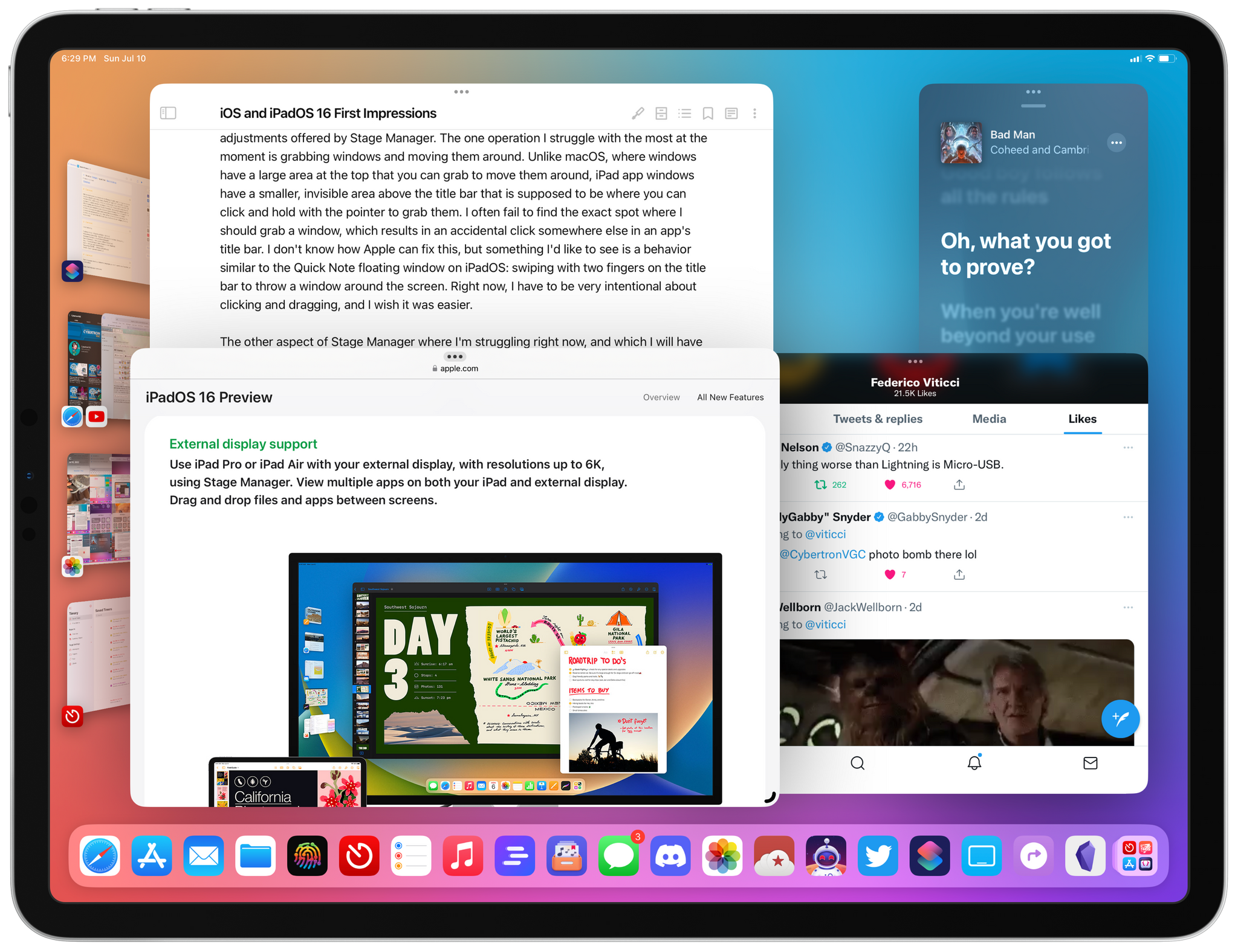
As you bring more apps on the stage, you may want to rearrange them onscreen and design a workspace where every app is at your fingertips. In this case, Stage Manager tries to help by subtly moving other windows to make room for a new one or ensuring that an existing window remains accessible even if one is covering it. Consider the interaction below: I want to drag the Reminders window all the way to the right edge of the display, but Stage Manager doesn’t let me do it. The reason: there’s a Timery window underneath it, and when I let go of the Reminders window I grabbed, the system makes a tiny part of the Timery one peek from behind so that I can click it to bring it to the foreground again.
Moving windows in Stage Manager.Replay
Stage Manager is full of interactions like this, and they’re hard to explain with words – you’ll have to try it yourself to see what I mean. Now, I realize that for many “multiwindowing purists” out there, the idea of the OS moving windows on your behalf may sound like outright heresy. I get it. The way I see it, though, the point of Stage Manager isn’t to achieve pure, fully user-controlled spatial multitasking: Stage Manager wants to help you work with multiple windows and remove some of the burden of placing and resizing windows from you. If that upsets you, I understand. But for someone like me, who literally complained about carefully resizing and placing windows on macOS last month, the “handholding” of Stage Manager is precisely how I hoped Apple could make window management more intuitive in a system where windows overlap.
That said, the complexity of window management isn’t gone completely, even with the adjustments offered by Stage Manager. The one operation I struggle with the most at the moment is grabbing windows and moving them around. Unlike macOS, where windows have a large area at the top that you can grab to move them around, iPad app windows have a smaller, invisible area above the title bar that is supposed to be where you can click and hold with the pointer to grab them. I often fail to find the exact spot where I should grab a window, which results in an accidental click somewhere else in an app’s title bar. I don’t know how Apple can fix this, but something I’d like to see is a behavior similar to the Quick Note floating window on iPadOS: swiping with two fingers on the title bar to throw a window around the screen. Right now, I have to be very intentional about clicking and dragging, and I wish it was easier.
This is the small area of an app window that is draggable. It’s not very comfortable to do with the pointer.
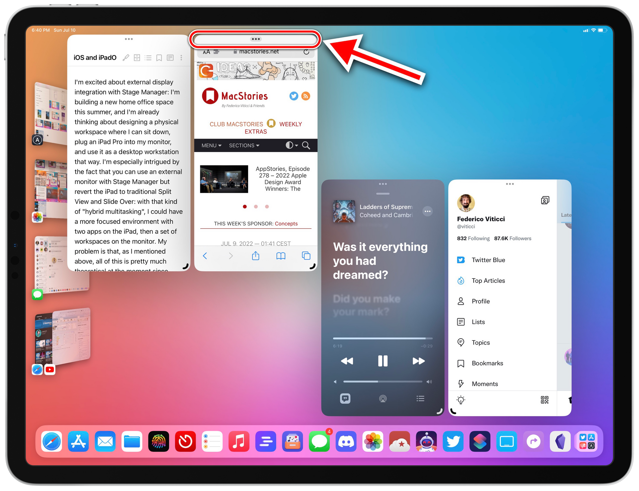
The other aspect of Stage Manager where I’m struggling right now, and which I will have to cover with more stable betas later this year, is its integration within external displays. At long last, Apple is letting us go beyond basic display mirroring when a monitor is connected to the iPad Pro and they’re bringing Stage Manager to external displays as well. This means that, with my 2021 iPad Pro, I can run a whopping 8 apps at once: four in Stage Manager on the iPad, and another set of four on the external display. All the interactions I covered above stay the same, but obviously – depending on the size of your monitor – you’ll have a much bigger canvas to use and manage your app windows.
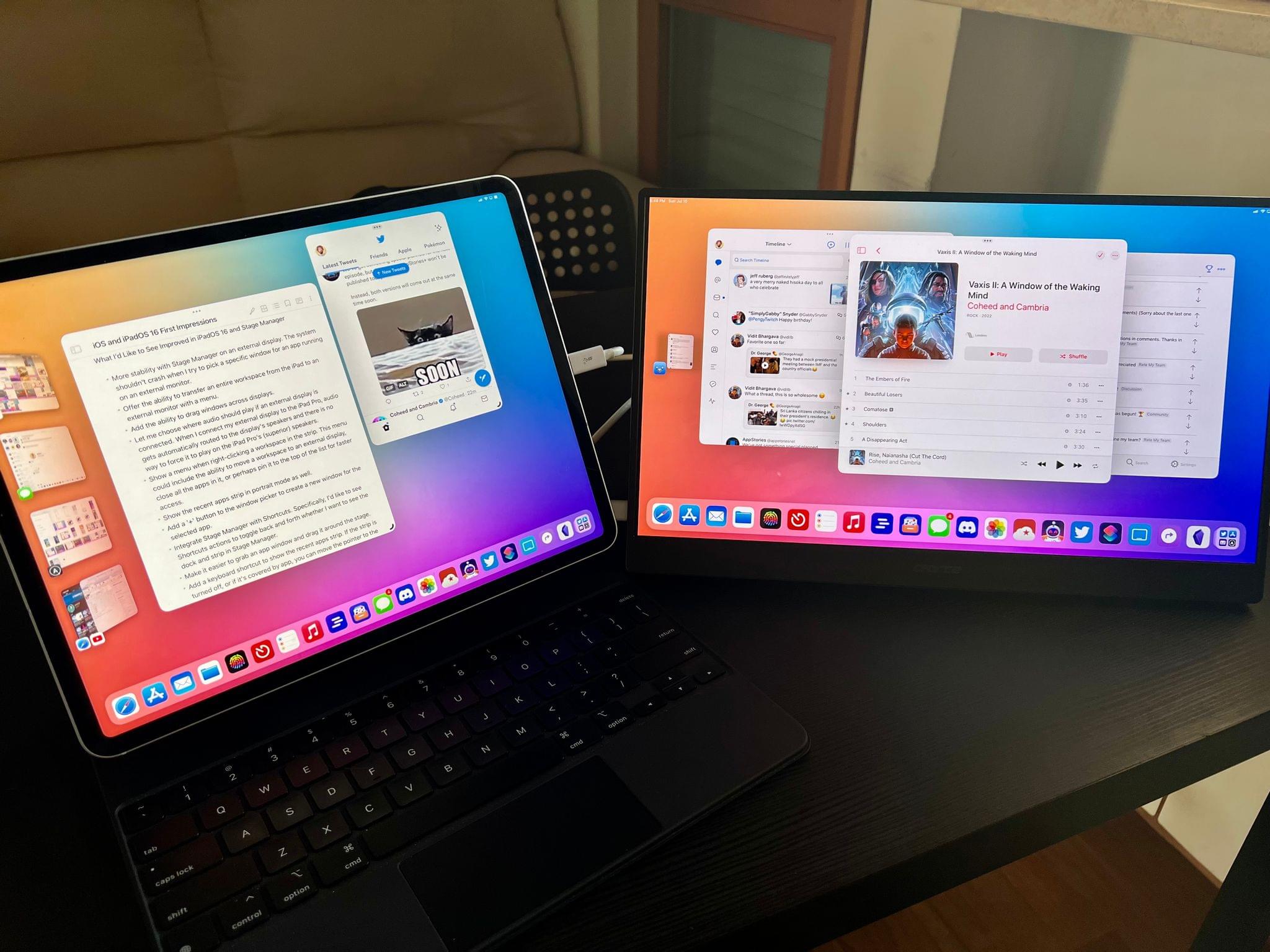
I’m excited about external display integration with Stage Manager: I’m building a new home office space this summer, and I’m already thinking about designing a physical workspace where I can sit down, plug an iPad Pro into my monitor, and use it as a desktop workstation. I’m especially intrigued by the fact that you can use an external monitor with Stage Manager but revert the iPad to traditional Split View and Slide Over: with that kind of “hybrid multitasking”, I could have a more focused environment with two apps on the iPad, then a set of workspaces on the monitor. My problem is that, as I mentioned above, all of this is pretty much theoretical at the moment since external display support has been very crash-y for me in these first three developer betas of iPadOS 16, to the point of being nearly unusable. Whenever I try to pick a window from an app that has multiple windows open and is running on the external display, the whole system crashes and soft-reboots, for instance. I believe Apple is aware of these issues, and I look forward to trying this out again with upcoming beta releases.
As they refine this functionality, I also hope they bring more flexibility to it: right now, you can only move one app window at a time from the iPad to the external monitor; you can do so by clicking ‘Move to Display’ in the multitasking menu. You can’t move an entire workspace at once from the iPad to a monitor, nor can you move windows by dragging them across displays, like you can on a Mac.
I should also note that there are other features beyond Stage Manager that are helping reshape the iPad narrative this year. In fact, there are dozens of these additions that Apple marketed under the banner of “desktop-class features” that are coming from macOS to iPadOS to allow for greater feature parity between platforms. I can’t list them all today, but I want to cover a couple of highlights.
The ‘Display Zoom’ setting has gained a new ‘More Space’ option that makes everything a bit smaller to fit more content onscreen. This option, which I enabled right away, is particularly handy in Stage Manager, where the higher resolution lets you see more of every app window at once. On a device where space is at a premium, you’ll probably want to make sure you can squeeze every pixel out of the Liquid Retina Display to see as much content as possible. The difference with the ‘Standard’ zoom level is quite stark, as you can see below.
The new ‘More Space’ setting. You can see how everything is a bit smaller to fit more content onscreen at once. In this mode, the iPad Pro’s virtual resolution goes from 2732x2048 to 3180x2384.
Then there’s the plethora of app features and advanced options Apple brought from macOS to iPadOS this year to make the lives of iPad power users easier. For the first time, Apple is bringing customizable toolbars to iPad apps: already available in apps like Notes, Reminders, and Mail, this longstanding macOS feature has been reimagined for iPad apps so that you’ll be able to put your favorite controls front and center, or perhaps hide the ones you don’t need. I almost couldn’t believe Apple really brought this very specific Mac feature to iPadOS, but they did, and it works well.
The Files app is getting a big upgrade in iPadOS 16 with redesigned (and Mac-like) open/save dialogs, the ability to rename file extensions (finally!), quick actions, and a new ‘browser’ UI mode (which developers can also use) that integrates a new document menu and navigation in the folder hierarchy. There is a new, system-wide find and replace menu for apps that deal with text searches. The list of desktop-class improvements goes on and on, and I’ll have to revisit it all for my iPadOS 16 review later this year.
As things stand today, I’m still wrapping my head around all the implications of Stage Manager for my iPad workflow, but, if what I’ve seen so far is of any indication, I feel comfortable saying Stage Manager is going to kickstart a whole new era of my iPad story.
More than ever before, I feel like iPadOS 16 shows Apple is fully embracing the iPad’s modular nature: the very fact that Stage Manager is a mode of iPad multitasking is proof of Apple recognizing the iPad’s strengths in its versatility – its ability to be one and many types of computer, to be the ideal machine for average users as well as power users like me. Stage Manager successfully walks the line of making me more productive without leaving my workspace a mess, which has always been the case for me on macOS. And when I want to go back to using my iPad Pro as “just a tablet”, disabling Stage Manager and switching modes is just one swipe away in Control Center.
In just over a month, Stage Manager and all the other desktop-class enhancements in iPadOS 16 have rekindled my passion for the iPad ecosystem.
What I’d Like to See Improved in iPadOS 16 and Stage Manager
- More stability with Stage Manager on an external display. The system shouldn’t crash when I try to pick a specific window for an app running on an external monitor.
- Offer the ability to transfer an entire workspace from the iPad to an external monitor with a menu.
- Add the ability to drag windows across displays.
- Let me choose where audio should play if an external display is connected. When I connect my external display to the iPad Pro, audio gets automatically routed to the display’s speakers and there is no way to force it to play on the iPad Pro’s (superior) speakers.
- Show a menu when right-clicking a workspace in the strip. This menu could include the ability to move a workspace to an external display, close all the apps in it, or perhaps pin it to the top of the list for persistent access.
- Show the recent apps strip in portrait mode as well.
- Add a ‘+’ button to the window picker to create a new window for the selected app.
- Integrate Stage Manager with Shortcuts. Specifically, I’d Iike to see Shortcuts actions to toggle back and forth whether I want to see the dock and strip in Stage Manager.
- Make it easier to grab an app window and drag it around the stage.
- Add a keyboard shortcut to show the recent apps strip. If the strip is turned off, or if it’s covered by app, you can move the pointer to the left edge of the screen to bring it up temporarily. There should be a keyboard shortcut to do this, just like there is already one to do the same with the dock.
- Make the Safari toolbar customizable too. I find it odd that, of all the Apple apps that support customizable toolbars in iPadOS 16, Safari doesn’t let you customize its toolbar and pin your favorite extensions there.
iOS 16
While I’ve spent the better part of last month using and thinking about iPadOS 16 and Stage Manager (which is going to be the focus of my review this year, as you can imagine), I’m also intrigued by iOS 16 and the features it’ll bring to consumers once it launches. Although I look at iOS 16 as one big feature (the new Lock Screen) followed by a collection of smaller, but nice quality-of-life additions, there’s still plenty to discuss on the iPhone side of things, too.
My impression of iOS 16 is that Apple aims to replicate – and perhaps even exceed – the success of iOS 14 by focusing on user personalization on the one big missing area from two years ago with iOS 14 widgets: the Lock Screen. With iOS 16, you’ll be able to take control of the Lock Screen experience and make it your own by customizing four different aspects of it: the wallpaper, fonts and colors, integration with Focus modes, and – the big addition – widgets.
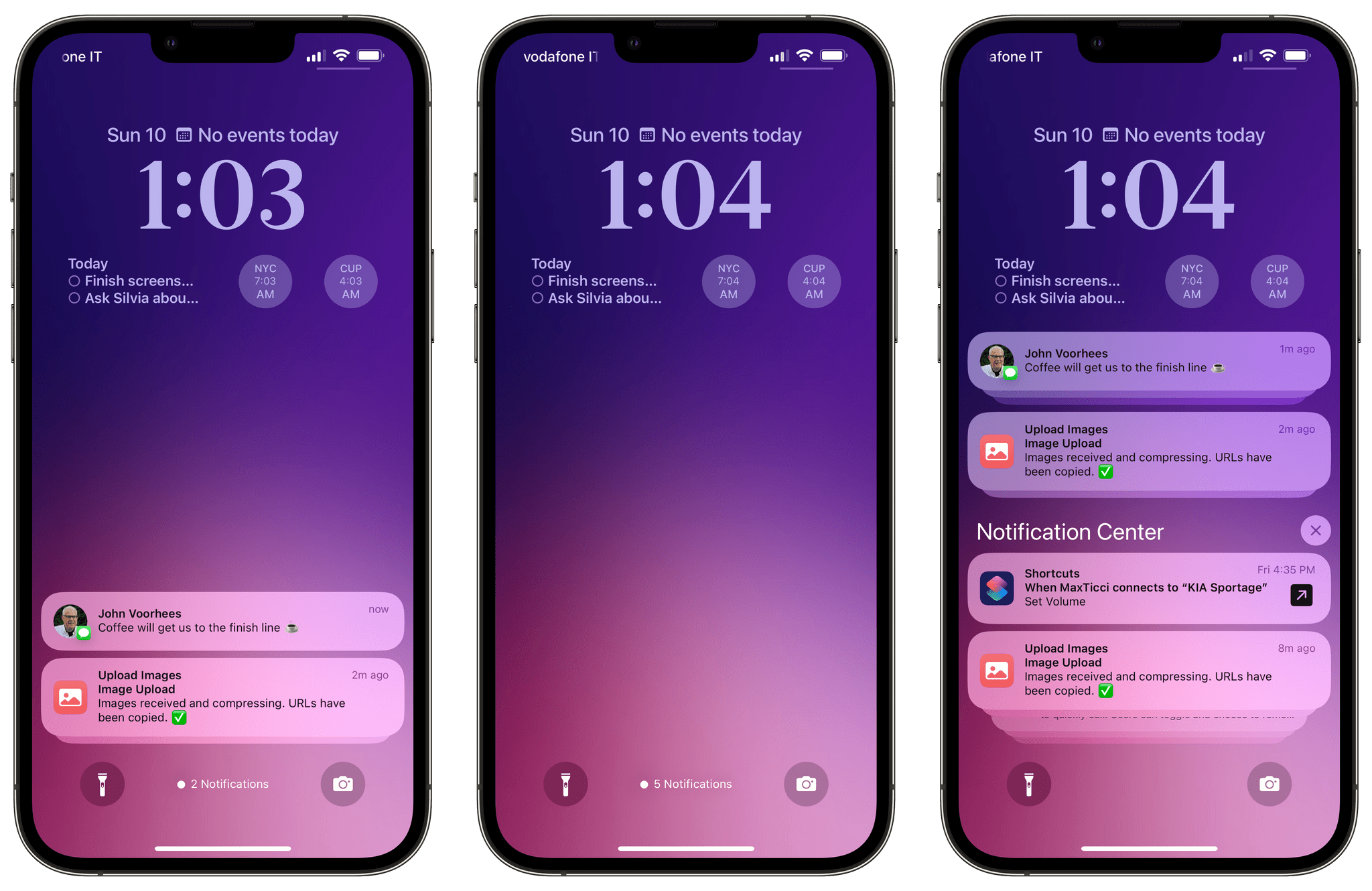
The new Lock Screen in iOS 16. Notifications now roll in at the bottom of the screen (left), can be made more compact with a swipe down (center), and you can still open the full Notification Center (right).
The first thing you’ll notice about the iOS 16 Lock Screen is that notifications have been relocated to the bottom of the display. Incoming alerts now roll in at the bottom of the screen, and although you can still swipe the list to expand it vertically (thus entering Notification Center), I prefer this look since I find notifications less distracting than before. Even better, you can swipe those notifications down and turn them into a compact ‘badge mode’ that only shows you how many unread notifications you have. When you want to see them again, you can tap the label or swipe up again. Swiping notifications down has already become second nature to me and I can’t believe we’ve gone all these years with alerts persistently displayed front and center on the entire Lock Screen. How did we live like that?
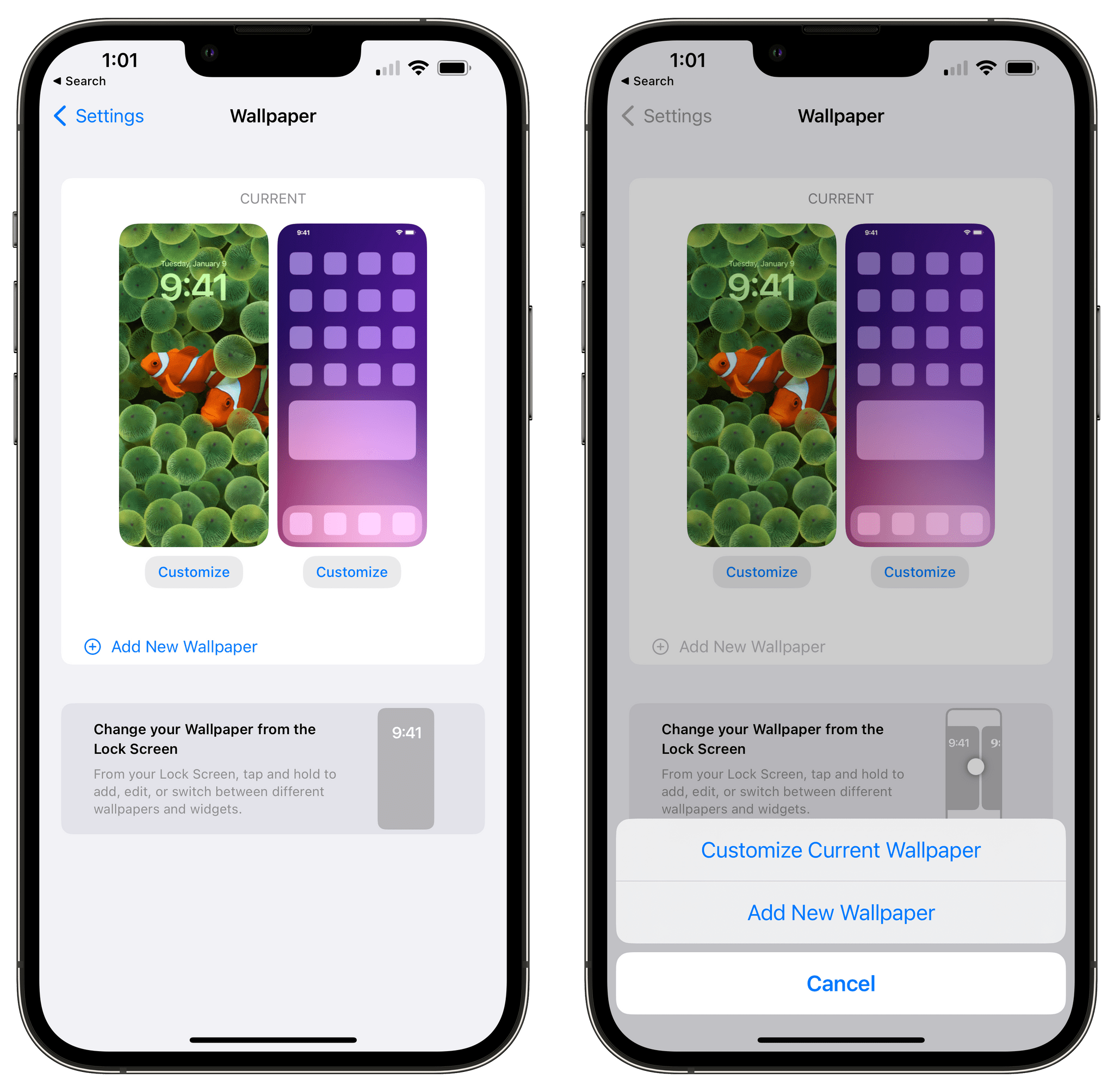
The reason to make notifications less obtrusive is simple: giving the Lock Screen more room to breathe and making the wallpaper and widgets the main protagonists of the first screen you see when you pick up your iPhone. At a high level, there are two main areas you can customize in the iOS 16 Lock Screen: the wallpaper and the upper section with the clock and widgets around it. Entering Lock Screen customization is a new mode that involves long-pressing in the middle of the Lock Screen, which opens a gallery UI where you can create multiple Lock Screens, see the ones you’ve already created, and manage them. If this design reminds you of switching between watch faces on Apple Watch, it’s because the entire system is very much based on that.
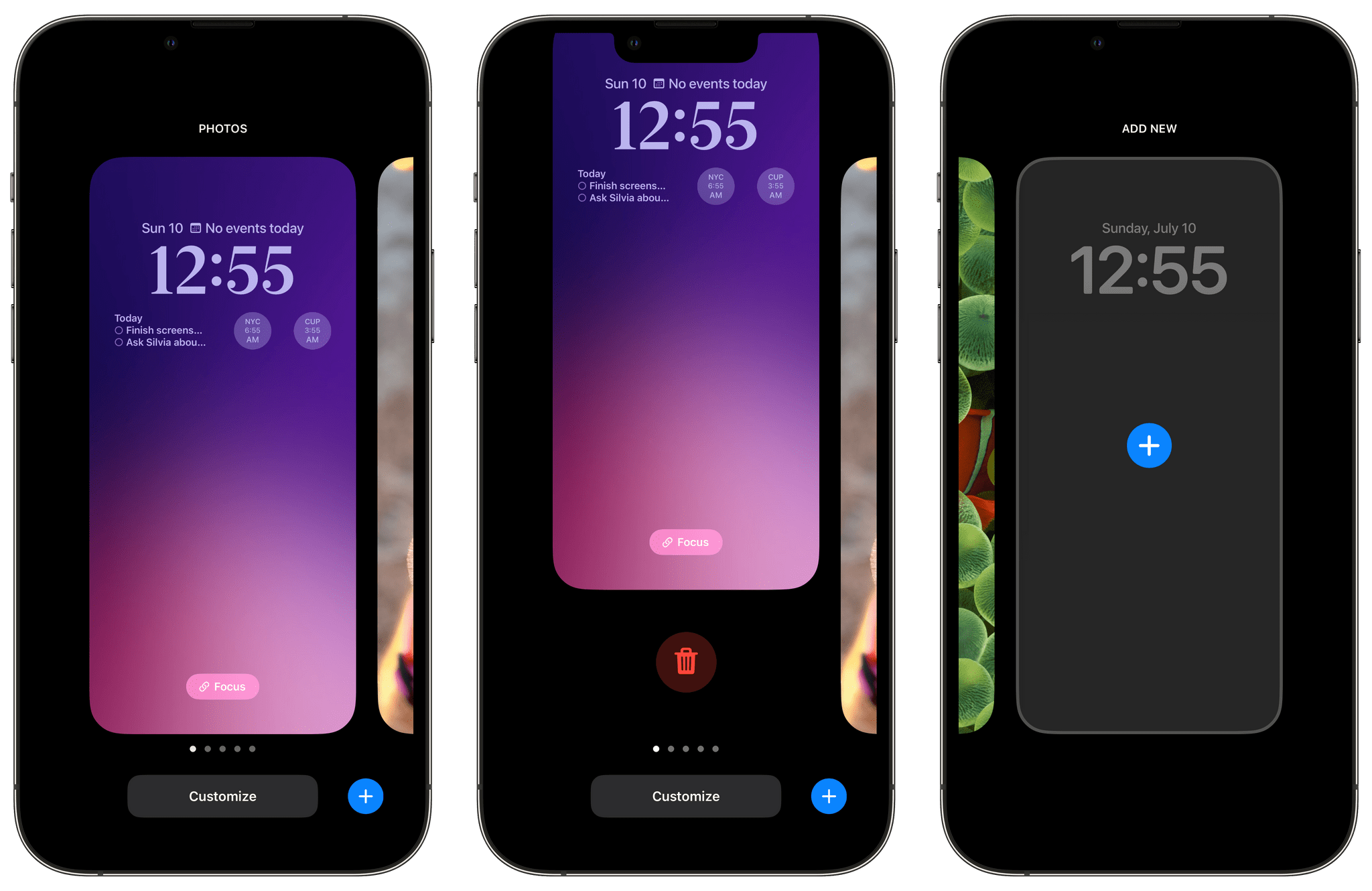
Long-press on the Lock Screen to enter the new Lock Screen customization mode, where you can manage Lock Screens and create new ones.
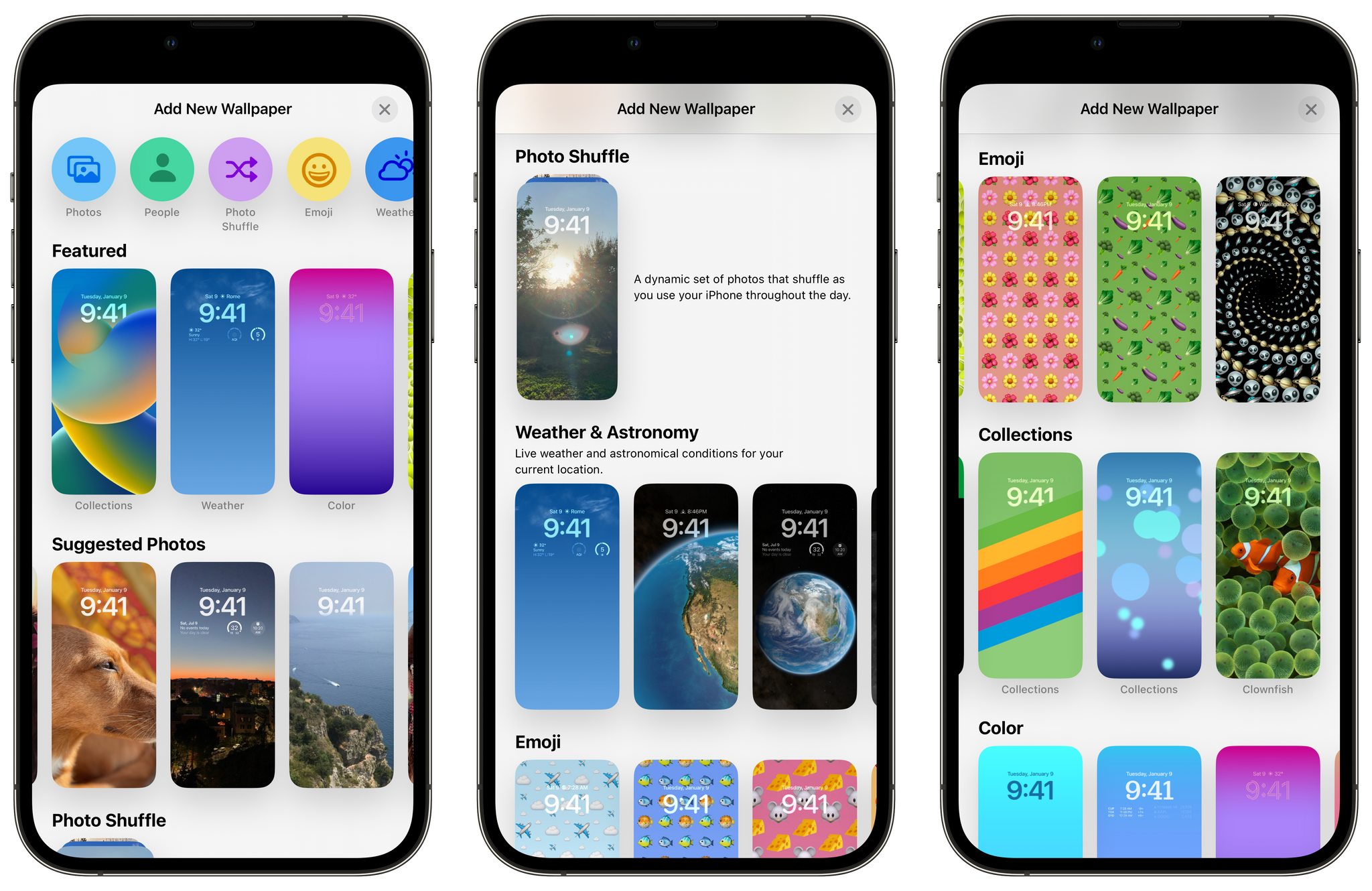
When you create a new Lock Screen, the first thing you’ll see is Apple’s new wallpaper gallery. This page includes a collection of wallpapers created by Apple organized in categories, plus a selection of featured photos from your library, and other color options for gradient-based wallpapers you can create for a more minimalist look. Apple has created a bunch of cool wallpaper packs for the occasion: there are live Weather wallpapers based on conditions for your location; there are Astronomy wallpapers with various shots of the Earth and Moon, including one that zooms in on your current place on Earth; there are emoji wallpapers that let you combine emoji with different, fun patterns, Unity and Pride wallpapers, and more. Even the clownfish are back for this.
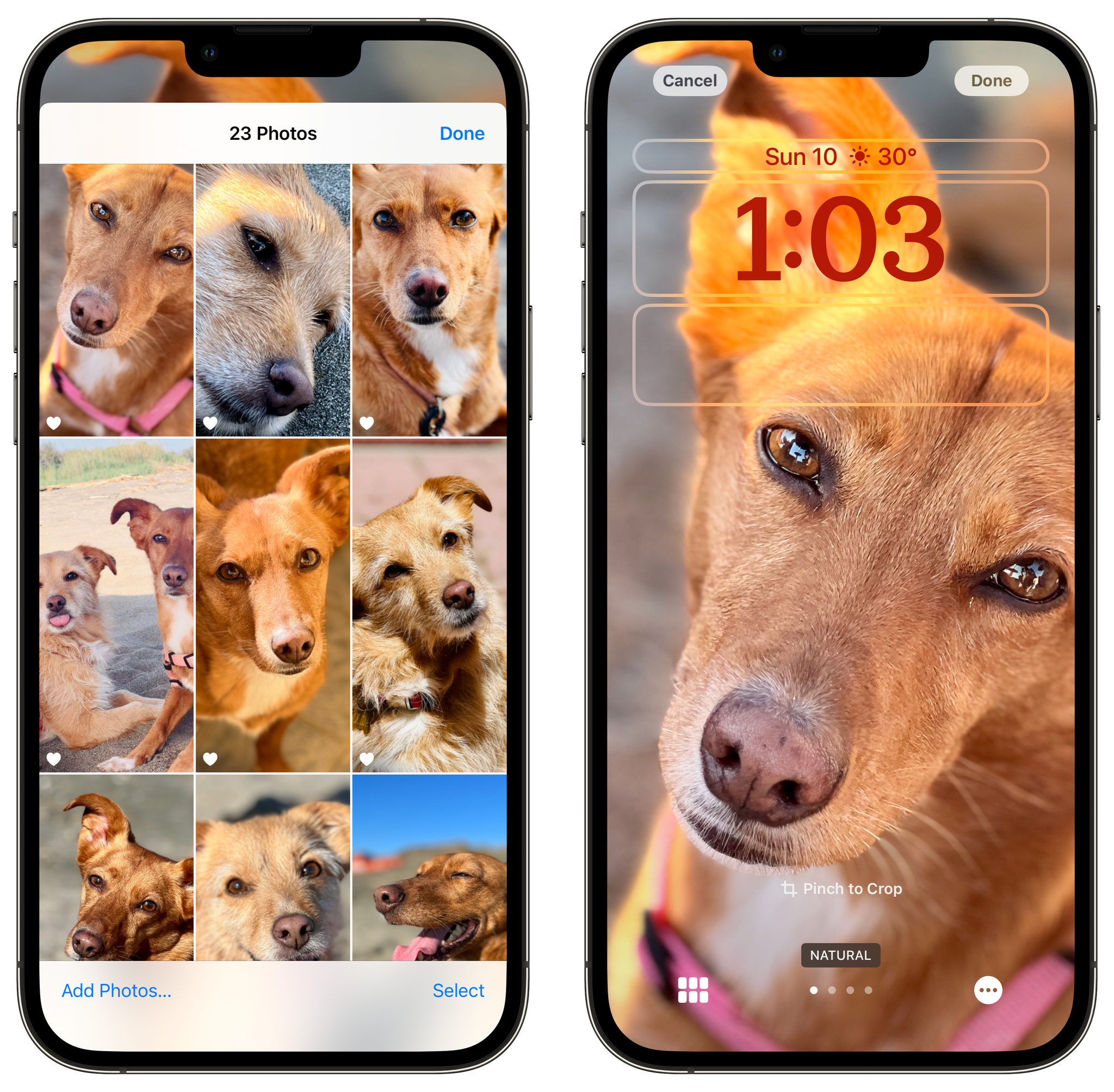
While I’ve never been a photo wallpaper person myself, iOS 16 is making me reconsider thanks to its array of Photos-related options on the Lock Screen. Besides the usual ability to pick any image from your library and use it as a wallpaper, iOS 16’s Lock Screen customization includes a Photo Shuffle mode that can automatically and intelligently shuffle through different categories of photos as analyzed from your library. Once iOS 16 has indexed your photo library, Photo Shuffle will let you choose to shuffle photos of people, pets, nature, and cities found in your library. You can determine the shuffle frequency (including options for hourly or every time you wake your iPhone) or, if you want, avoid the system’s suggestions altogether and shuffle through a group of specific photos you manually select upfront (and which you can tweak over time).
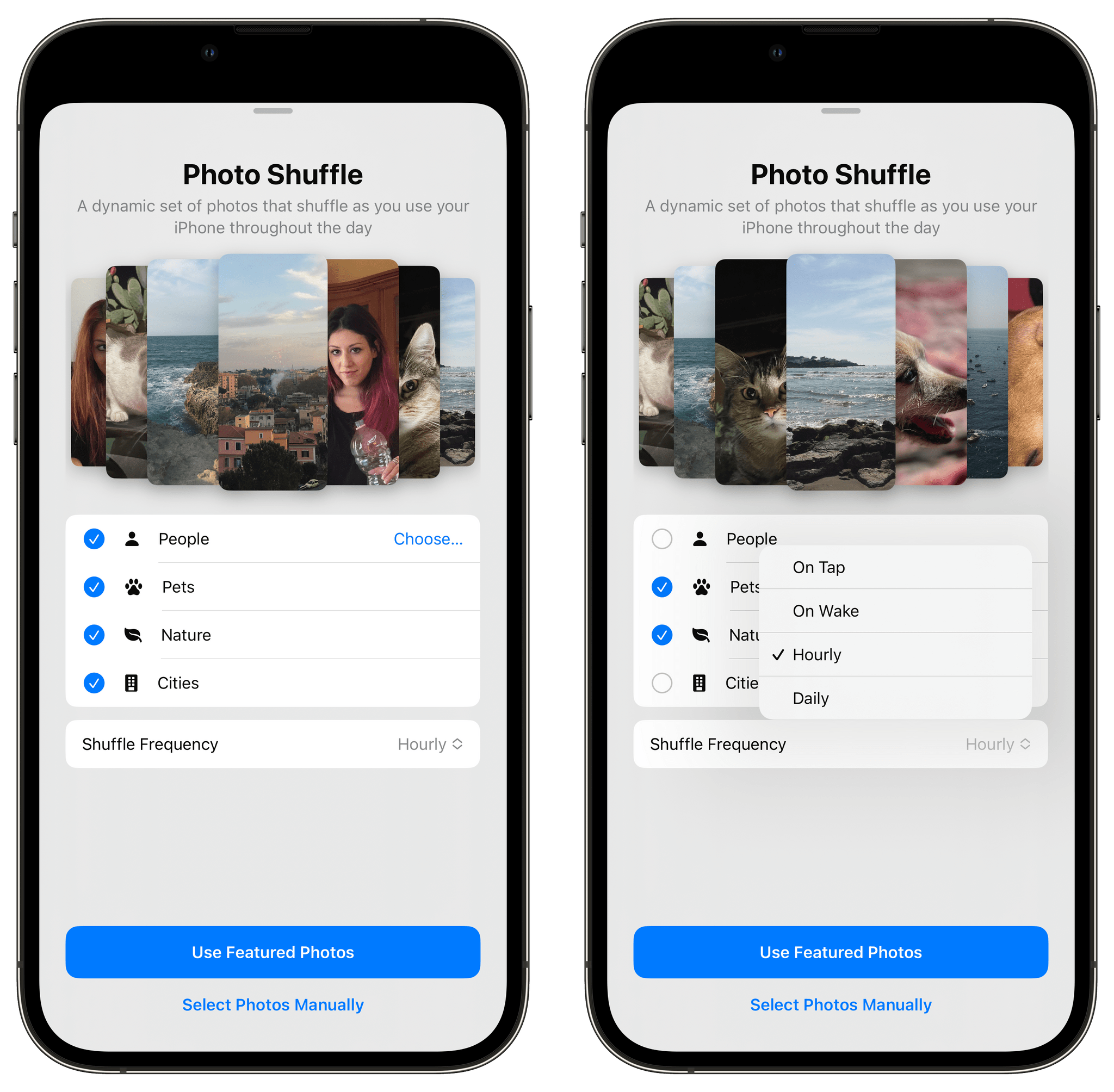
You can set up the Photo Shuffle smart wallpaper choosing from content types found in your Photos library.
What I like about Photo Shuffle is that it’s “curated randomness”: you’re always going to see a subset of your photos, but the system rotates through them, making your Lock Screen feel new and different according to the refresh interval you’ve set. For instance, I went in and selected 30+ photos of my dogs Zelda and Ginger; thanks to Photo Shuffle, every hour I see a different photo of them on my Lock Screen, and it brings a smile to my face every time. You can imagine the potential of this feature for photos of loved ones or particular places and what it does in terms of making the Lock Screen feel alive and personal. Even more impressive: there’s an optional ‘depth effect’ mode that will create a beautiful overlapping effect with the clock for photos where the subject is clearly separated from the background (they don’t have to be portrait shots). I haven’t seen this effect for my photos yet, but as you can tell from the images John sent me, when it works, it looks very nice.3
Lock Screens with the depth effect enabled. You can see how iOS 16 was able to isolate the subject in these non-portrait photos and create a neat visual effect with the clock.
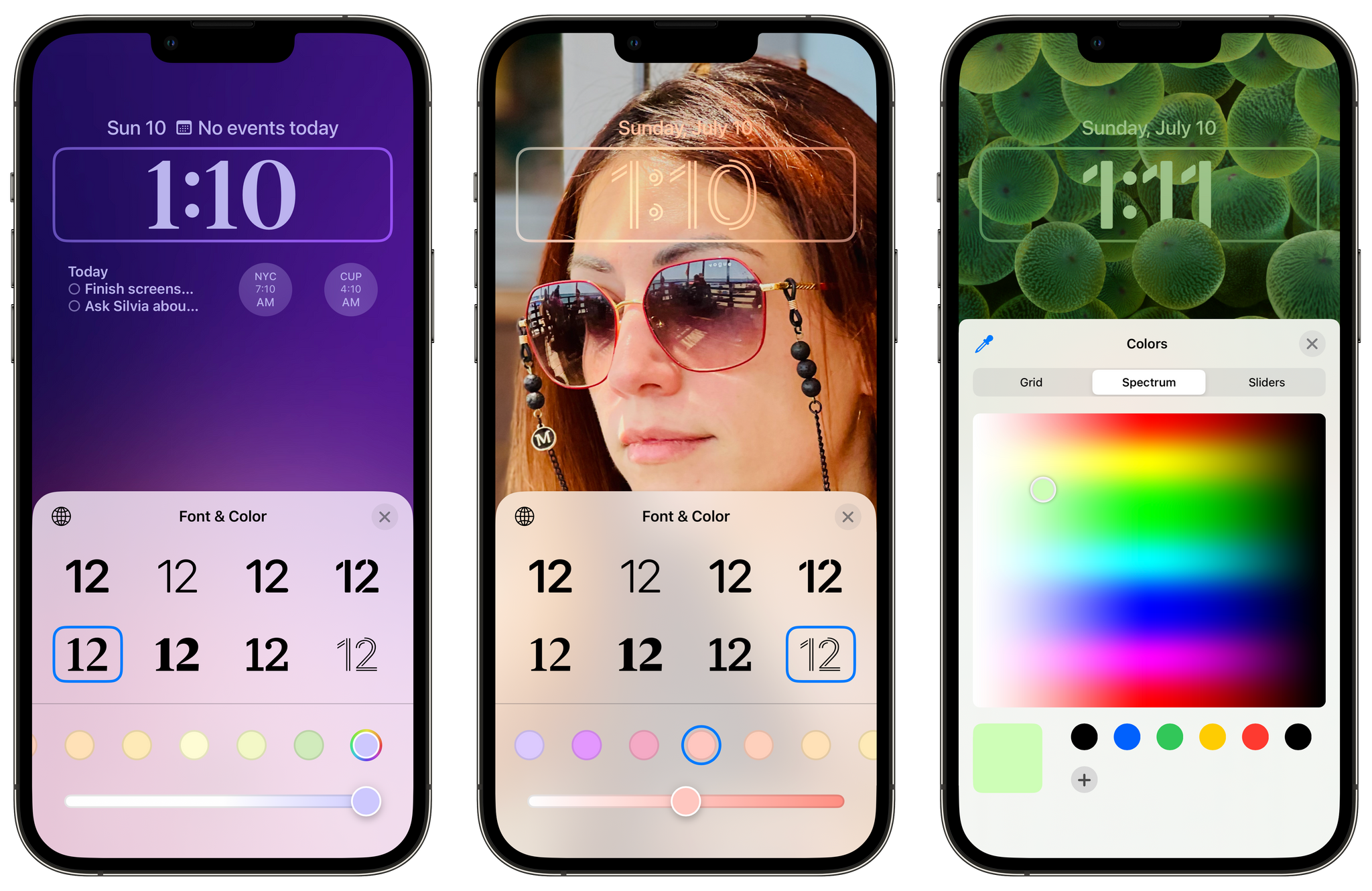
If this new kind of wallpaper customization isn’t enough, wait until you see what you can do with fonts and widgets. Once you’ve set a wallpaper, iOS 16 lets you customize three parts of the Lock Screen: the clock, widgets above the clock, and widgets below the clock. For the system clock, you can now choose between 8 different fonts (I like the chunky serif one) and pick any color you want for it either via a color palette or the system color picker. The combination of different fonts and colors can lead to Lock Screens that feel wildly different from each other by simply tweaking these two aspects. I think a lot of people are going to spend way too much time fiddling around with this, and I love it. That’s exactly the point of personalization.
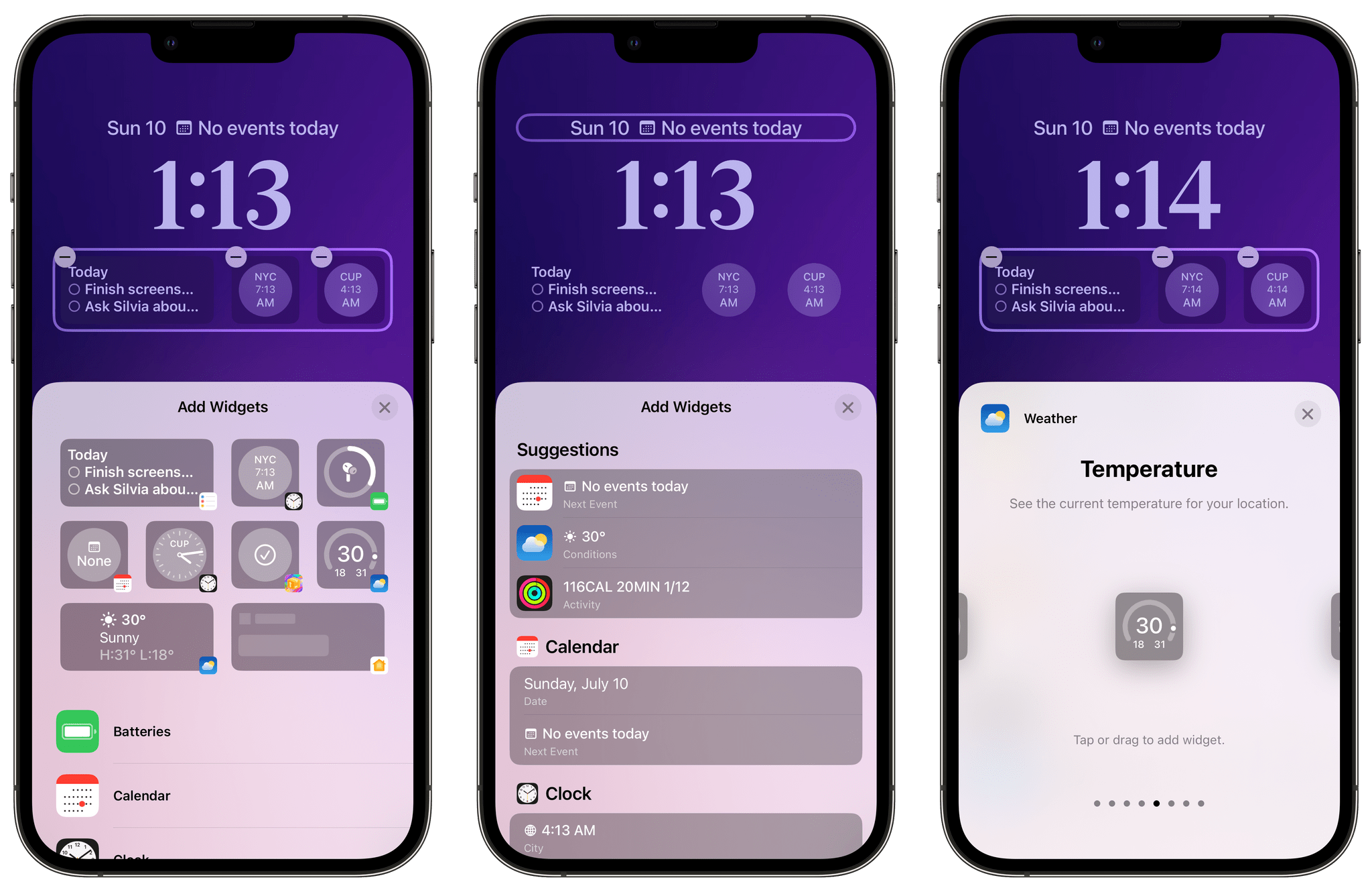
Widgets are going to be the star of the show here, but I think it’s too early to judge them given that, so far, only widgets for Apple apps can be installed; we’ll have to wait for third-party developers to support them in their apps this fall.
Lock Screen widgets are very similar to Apple Watch complications (in fact, starting with watchOS 9, they’re even based on the same WidgetKit technology) in terms of design and size, but they’re installed and configured with the same interactions previously seen for Home Screen widgets. There are three types of widgets: small inline widgets you can place above the clock, rectangular widgets, and small, circular ones that very much look and feel like watchOS complications. To browse widgets, you can use a widget gallery similar to the one seen on the Home Screen, where you can see live previews of widgets offered by each app installed on your iPhone. Once a widget is on the Lock Screen, you can configure it by entering customization mode and tapping it.
Lock Screen widgets will be a big deal in iOS 16, for a couple of reasons.
First, they’re going to bring useful, glanceable information to the Lock Screen, allowing you to see little bits of content without unlocking your iPhone. In my case, I added widgets for Reminders and Clock, so I can now easily see what else is left in my todo list for the day and what the time is in New York without having to open those apps. The whole ‘glanceable’ design and technology pioneered two years ago is, if anything, better suited for the Lock Screen than the Home Screen: the Lock Screen is indeed what I “glance at” the most during the day, and I love that iOS 16 now lets me make it more useful and personal with native widgets. I have no doubt this feature will be a resounding success among developers and users later this year.
The second, perhaps even more important reason why widgets are a big deal: their design and technological implementation under the hood strongly suggests that Apple is working on an always-on Lock Screen for the iPhone 14 Pro line this year. Just like you can always glance at complications on the always-on face of the Apple Watch, you’ll likely be able to do the same with an iPhone too. If I were to guess, I’d say that the iPhone 14 Pro will always show you the clock, widgets, and the number of unread notifications at the bottom of the screen.
I’ve had fun customizing my iPhone Lock Screen over the past month, but, like I said, I’m waiting for the developers of my favorite apps show off what they’ve been working on. I can only imagine what apps like Timery and Apollo will be able to do with Lock Screen widgets, for instance. So far, I’ve only been able to test two third-party Lock Screen widgets on iOS 16: Parcel, the excellent delivery tracking app, and Lock Screen Contact Widgets, created by indie developer Rihab Mehboob. The latter is especially interesting since it lets you pin your favorite contacts to the Lock Screen for fast access to phone calls, and it’s a first example of the kind of utilities we’re going to see on the App Store later this year.
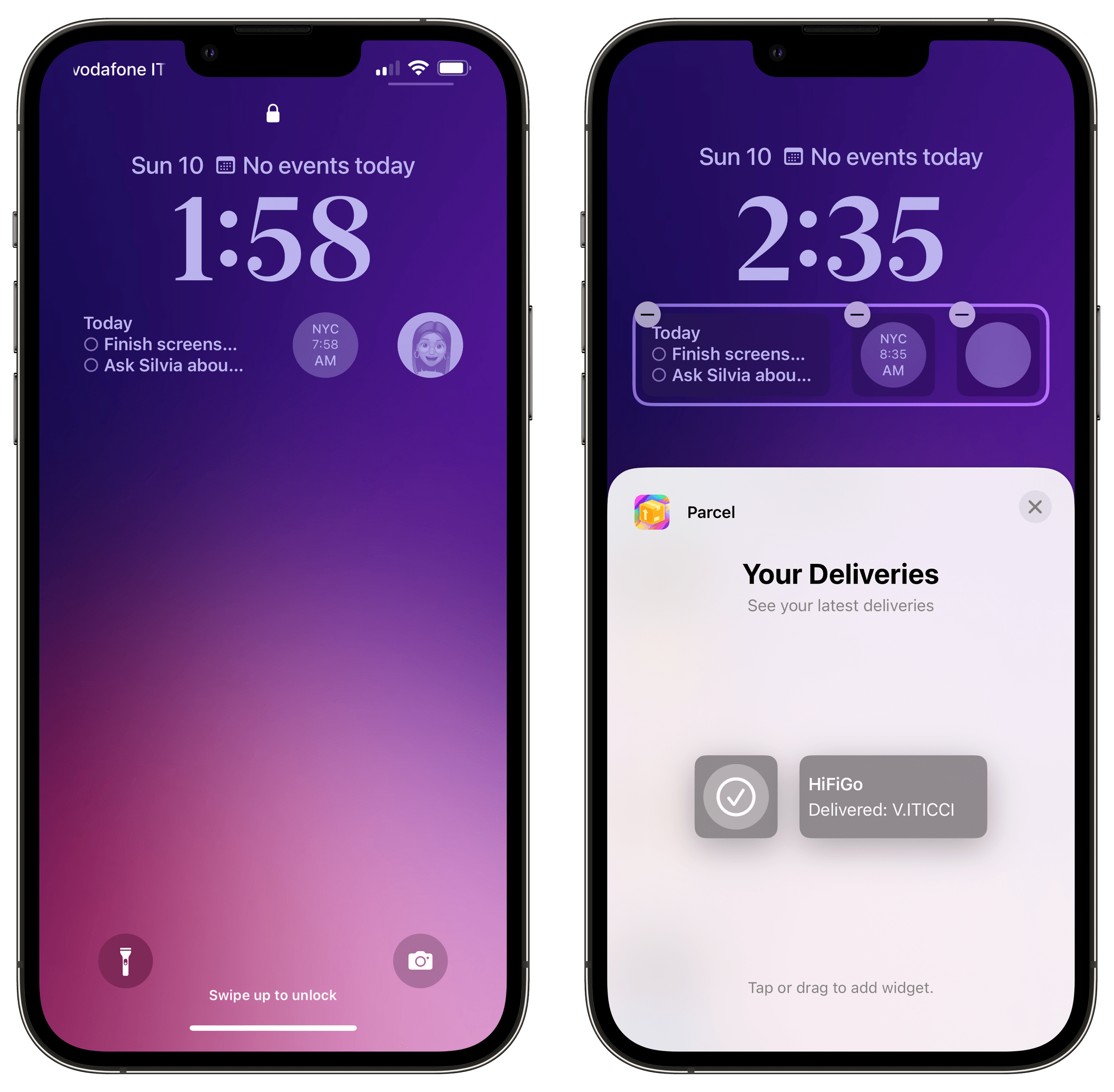
Speaking of developers and the Lock Screen: another feature I’m excited about, but which unfortunately won’t launch alongside iOS 16.0 in the fall, is what Apple calls Live Activities. As I covered last month, these are special, richer-looking live notifications that float along the bottom of the Lock Screen and which are meant to convey live updates in lieu of sending you multiple, standalone alerts. Apple’s examples at WWDC included getting updates for a basketball game or an Uber you’ve ordered in real-time. While there is no developer API for Live Activities at the moment, Apple itself is using them already for the new Now Playing controls and timers on the Lock Screen, pictured below. The only caveat: Apple’s Live Activities are interactive (you can control music or stop timers), but third-party ones won’t be, so I’ll reserve my judgment on this feature for later this year.
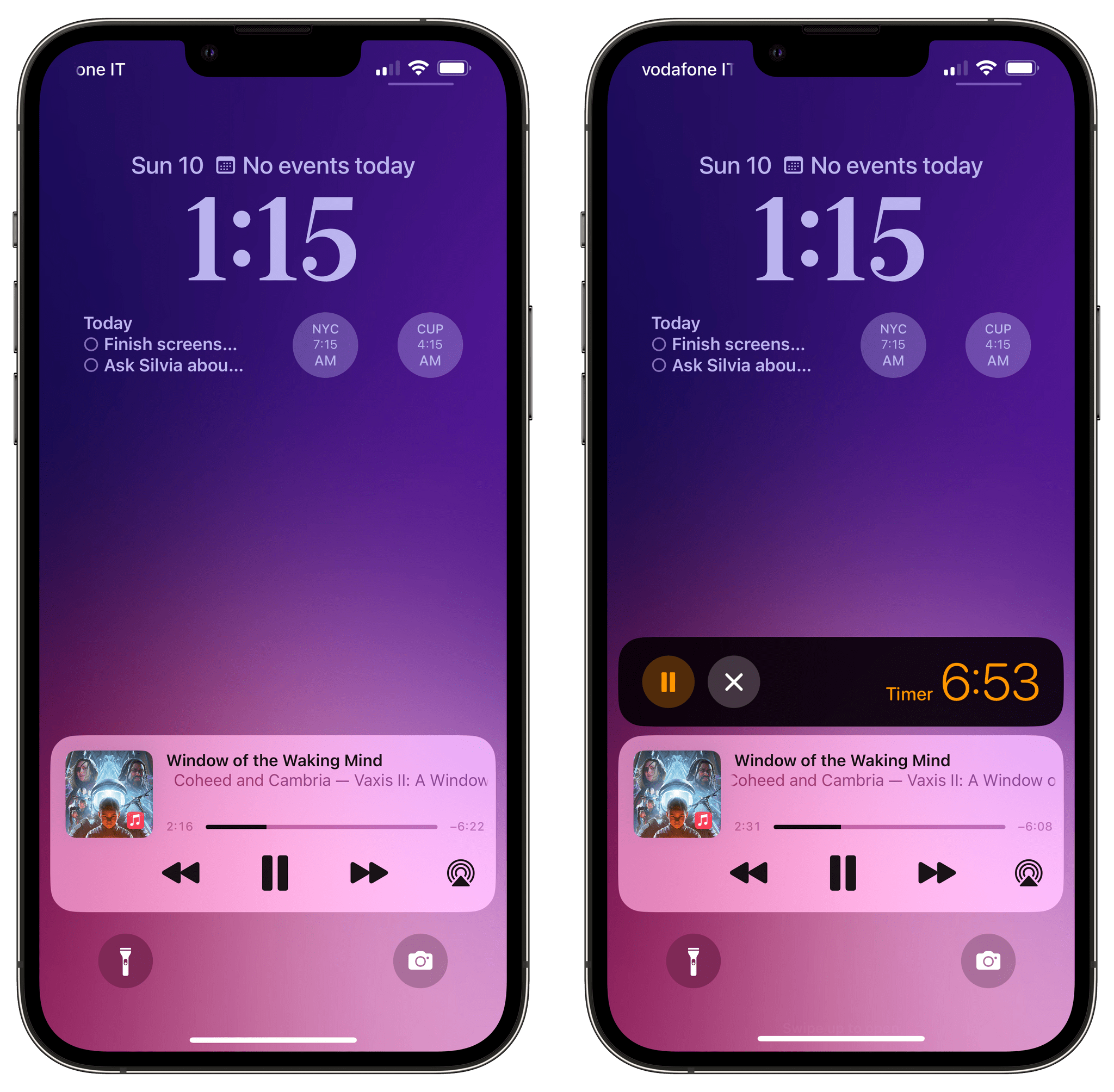
The Now Playing controls and Lock Screen timers have been reworked as special Live Activities in iOS 16.
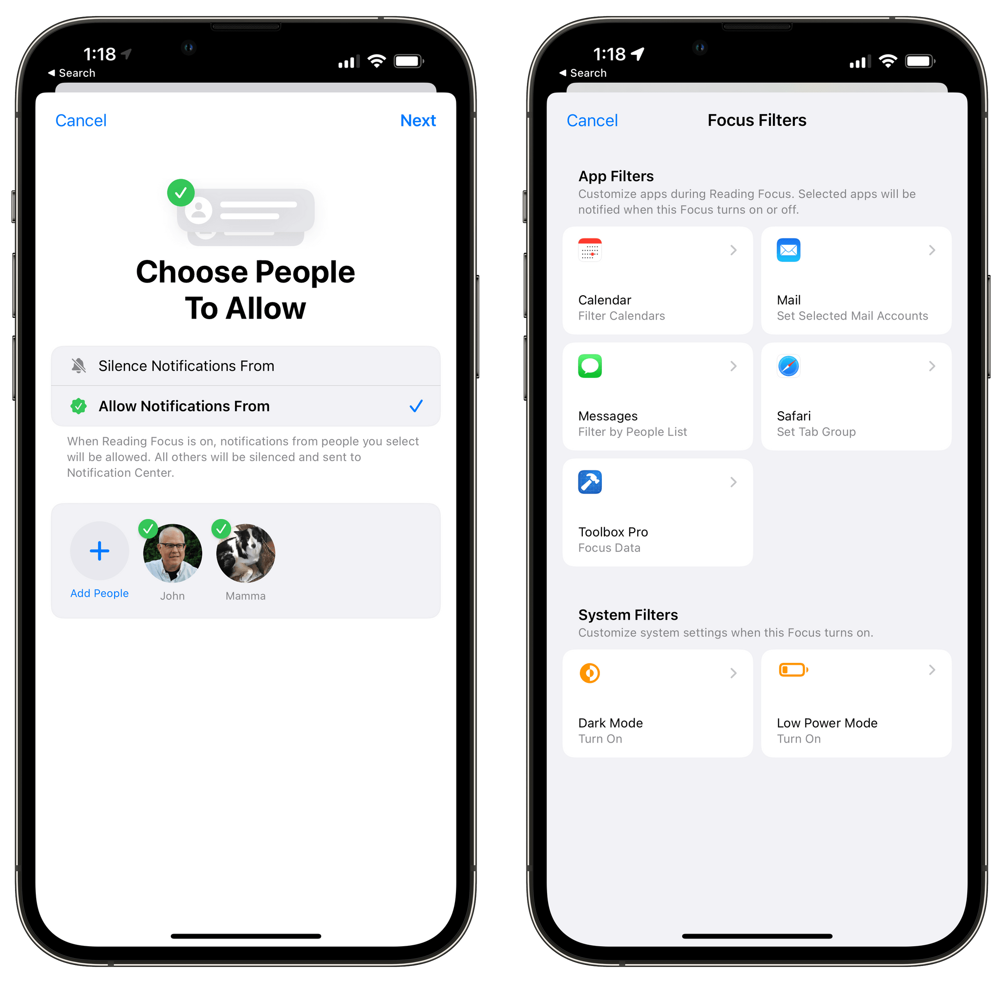
I haven’t been able to find a useful use case for this yet on my iPhone, but all these Lock Screen changes also tie into Focus, which is getting a substantial upgrade in iOS 16. Essentially, each Lock Screen can now be tied to a particular Focus mode, and you can even combine a Lock Screen, Home Screen, and watch face together so they all become active at once when a specific Focus mode is engaged. In addition, Focus itself is easier to set up thanks to an allow/deny list for people and apps (so you can create a Focus that silences notifications from specific people/apps or allows notifications from them) and Apple is rolling out the ability to hide app content when a Focus is active. These are called Focus Filters, and there’s also a developer API for it. I think you can see where Apple is going with this: imagine turning on your ‘Work’ Focus and instantly getting a specific Lock Screen-Home Screen combo with work apps on it, notifications silenced from specific apps, and things like your work calendar or work email accounts in compatible apps. Again, I haven’t found a use case for this yet (also because I don’t work in an office and don’t commute), but I think extending Focus to app content is a natural evolution for this functionality that I’m keen to try out later this year.
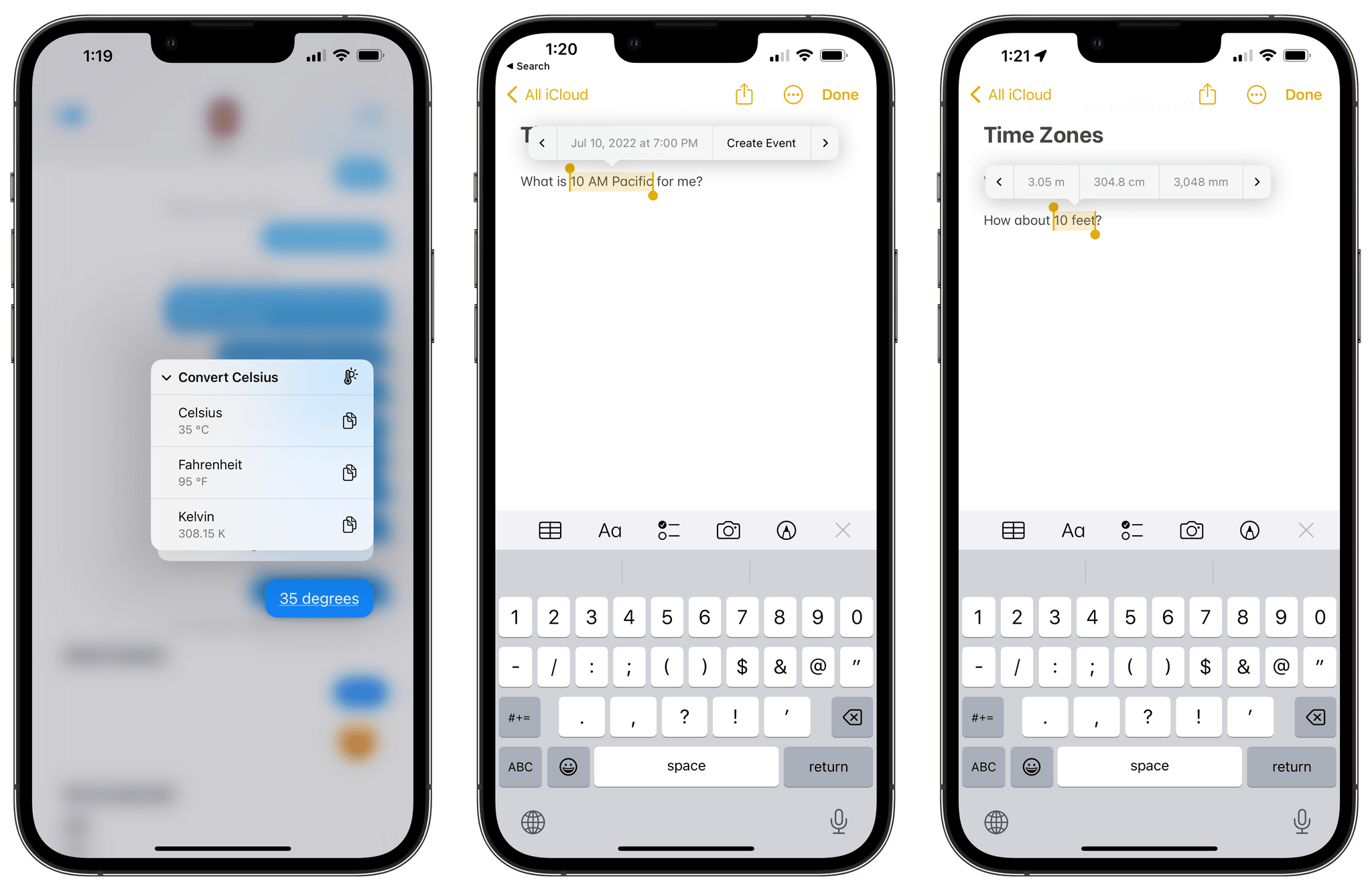
The rest of iOS 16 is best described as a collection of quality-of-life enhancements throughout the system and inside built-in apps that, considered together, make the OS smarter, more versatile, and more pleasant to use. I tweeted about this a few weeks ago: one of my favorite additions to iOS 16 is system-wide conversion for units and measurements powered by Live Text. Now, whenever you get an iMessage that mentions Fahrenheit degrees, square feet, or any other unit, you can tap the recognized data detector right away to get an instant conversion based on your locale. This even works in the copy & paste menu for selected text and supports time zones too; I absolutely love these Live Text additions, and I can’t even tell you how many times I’ve already relied on this feature to convert international times I received in an email or found in a tweet. Units are recognized everywhere, including in photos and still video frames (also new in Live Text).
I’ve been impressed by the updated Reminders app in iOS 16, and I’m glad I decided to switch back to it full-time months ago. In iOS 16, smart lists have been vastly improved with the ability to filter more criteria, have conditions that match any or all filters, and exclude lists or tags from a smart list. You can pin smart lists to the top section of the Reminders sidebar for faster access, and the Today view has been redesigned so that it now automatically groups tasks based on the time of day, similar to how the Things app does it. Something that I also think I’ll spend some time learning and setting up this summer is support for reusable and shareable checklists: Reminders in iOS 16 lets you share entire checklists with other people as templates, and I’m thinking of ways I could use this to, say, share media recommendations or guided itineraries for people visiting Rome. Reminders continues to grow into a very capable and modern task manager for all kinds of people; I think we’re going to see a lot of “Reminders switchers” in our community this year.
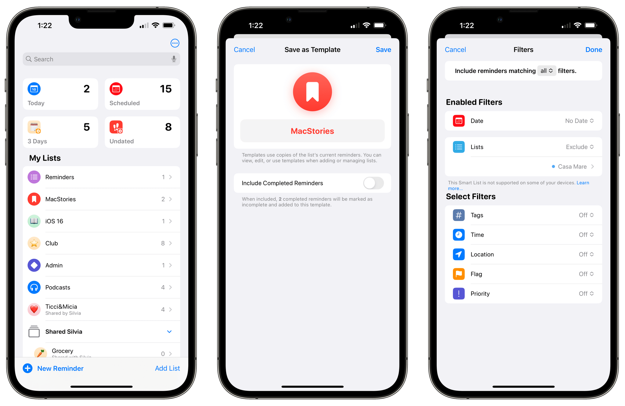
Reminders is getting another substantial update in iOS 16 with features such as templates and new filters for smart lists.
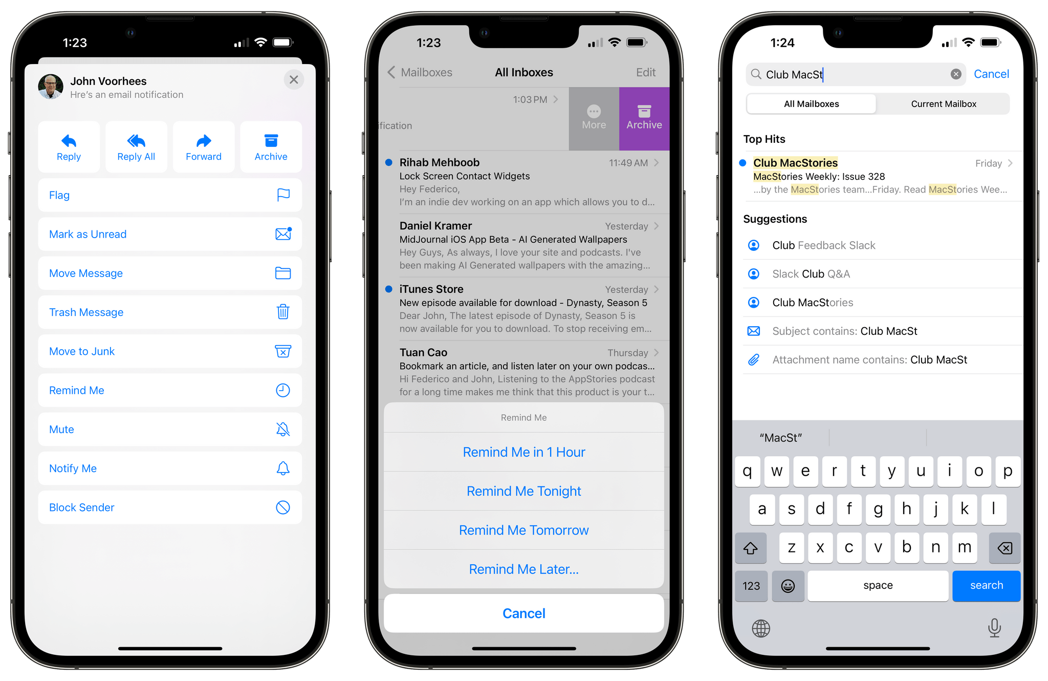
I’m equally glad I switched back to Apple’s Mail app a few months back. Much to my surprise, Apple finally found the time to work on the Mail app this year, and they’ve modernized it with features such as reminders (essentially, snoozing for messages), send later, undo send, and – this one deserves a big Finally – completely revamped search that is faster and more reliable than before. Mail’s lackluster search was the single reason why I couldn’t continue using the app in previous years, and I’m happy to say Apple delivered here: the correct results come up immediately as you search now, keywords are highlighted in yellow in matching messages, and the system even accounts for typos in your search queries and offers helpful suggestions to find what you may be looking for. I almost can’t believe I’m typing this, but Mail is…good now? Smart mailboxes are the only missing feature for me at this point, but given Apple’s newfound love for these options in Reminders and Notes, I have to believe they’ll be coming to Mail eventually as well.
As you can imagine, there are literally hundreds of other new features in iOS 16 I can’t possibly cover today. Medication reminders in Health are great, and they’ve helped me get rid of Due, which I was mostly using to remember to take my vitamins in the morning. Safari tab groups have been improved with the ability to tie a tab group to a Focus mode, a Shortcuts action to open a specific group, and the ability to have tab group-specific favorites (I like this a lot). Shortcuts run much faster than before and its modal alerts and lists no longer block interactions with the rest of the system’s UI. There is support for turning on keyboard haptics in Accessibility, which makes typing feel a lot more fun and Android-like (I enabled this right away and can’t imagine ever disabling it). The Home app has a design that makes sense now, and there’s a proper grid view for your HomeKit cameras.
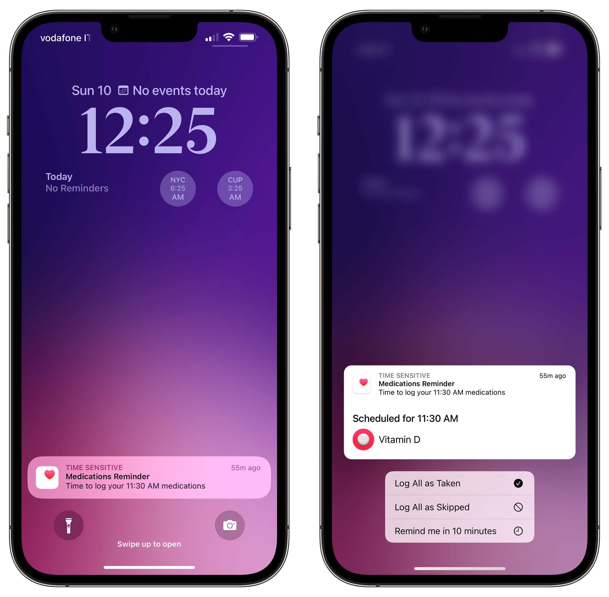
Medication reminders, powered by the Health app, have replaced Due on my iPhone for these kinds of alerts.
The list of these updated features and quality-of-life improvements goes on and on. But like I said, we’re going to have to wait for the fall for a proper review.
What I’d Like to See Improved in iOS 16
- Offer a Shortcuts actions to retrieve the list of tabs from a tab group. iOS 16 adds a new ‘Open Tab Group’ action in Shortcuts, but I’d like to see one to get the URLs of tabs in a group, too.
- Support excluding multiple lists as a filter for smart lists in Reminders. In the updated Reminders app, you can now create a smart list that collects tasks from all lists except one. This is great, but I’d like to exclude multiple lists, not just one. What’s odd is that although you can already exclude multiple tags, you can only pick one list to exclude.
- Bring more fonts to the Lock Screen. Because why not? Give us some weird fonts to make our Lock Screens look extra different.
- Let me use another row of widgets underneath the clock. Apple probably isn’t going to do this in iOS 16, but I’d still love to have a secondary row of widgets to have even more information on the Lock Screen.
It’s Public Beta Time
There’s a lot I haven’t covered today in both iPadOS and iOS 16. And as you can imagine, I still have questions that haven’t been answered today. Will Apple listen to users’ feedback and bring a limited version of Stage Manager to older iPads as well? (I covered this topic here.) What will developer adoption of Lock Screen widgets be like, and how limited will the WidgetKit framework turn out to be for apps that want to push real-time information to the Lock Screen? With Stage Manager now a reality on iPad, will more developers be convinced to modernize their iPad apps with features such as multi-column layouts, multi-window, and keyboard shortcuts? Are we done seeing improvements to Stage Manager or customization options on the Lock Screen? I can’t answer these questions today, but you can rest assured I’ll be keeping an eye on these themes over the next couple of months.
What I do know today is this: on iOS 16, Apple is now telling a much more consistent, cohesive story with the Lock Screen, Home Screen, and Focus, and this is just the beginning before the arrival of third-party Lock Screen widgets and the always-on Lock Screen on future iPhones. As for iPadOS 16: Stage Manager and desktop-class features are exactly what I hoped the powerful M1 foundation of the iPad Pro family would allow Apple to build. And if Apple doesn’t make an even bigger iPad in the future, I’d be shocked. If there ever was an argument in favor of a large ‘iPad Studio’ device, Stage Manager would be it.
The public betas of iOS and iPadOS 16 are available now. Go download them if you’re feeling curious and want to experience the future of the iPad two months in advance. I’ll see you this fall, ready, as always, with my annual review of iOS and iPadOS.
You can also follow our 2022 Summer OS Preview Series through our dedicated hub, or subscribe to its RSS feed.
- If there is a public beta of tvOS 16 as well, nobody told us. Don’t worry, though: I have a tvOS guy to cover the changes. ↩
- On the 12.9” iPad Pro at least, and only in landscape mode; it doesn’t come up in portrait for me at all at the moment. ↩
- My understanding is that for this visual effect to work, the row of widgets under the clock has to be empty; otherwise, it won’t kick in. ↩