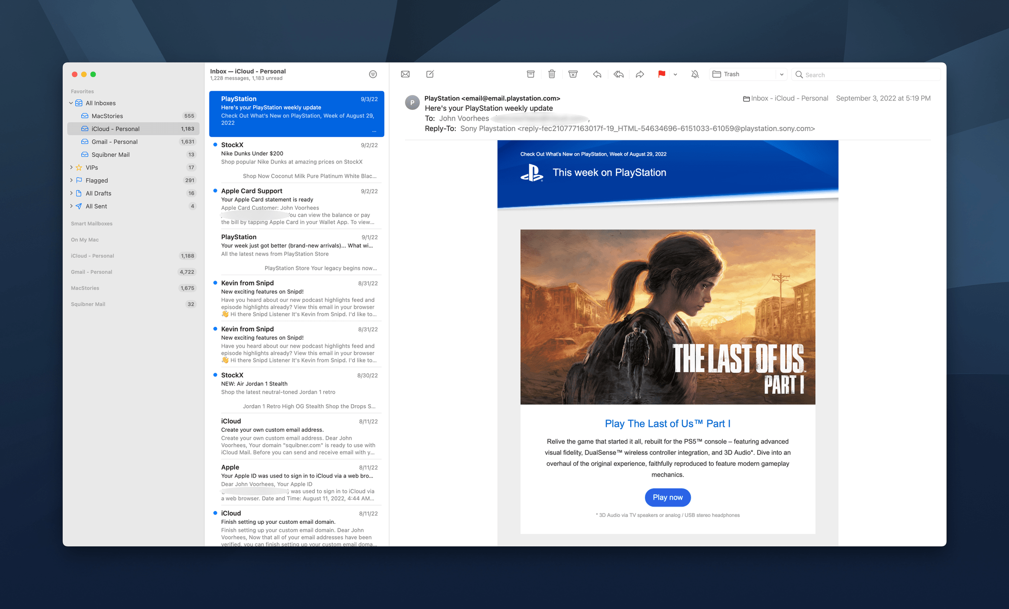
Email isn’t going anywhere anytime soon despite its flaws. Tools like Slack have replaced the lion’s share of internal communications at many companies, and a long list of messaging apps have chipped away at conversations among individuals. Still, email has proven resilient.
One of email’s many problems is how hard it can be to manage the volume of messages so many of us receive. Over the years, developers have come up with innovative tools layered on top of the core email protocols to improve the experience. However, few of them are with us anymore. Remember Sparrow? How about Mailbox or Acompli? Notice a trend? There are still some bright spots, like Mimestream on the Mac and Spark, but with so few survivors, having a strong choice from Apple has never been more important.
That’s why the situation with Apple’s Mail app has been so distressing in recent years. Mail sat, barely touched on any platform for what seemed like forever. However, this fall, across iOS, iPadOS, and macOS, Apple is finally bringing many of the features pioneered by others to its own Mail app. You won’t find every cutting-edge modern email feature in Mail. Message collaboration and back channel chat about email messages among team members, which Spark and other apps offer, is a good example of a feature Apple has left to others. However, I expect most individuals and teams that aren’t looking to use email as though it were Slack will like what they see in Mail, so let’s dig into the details.
A note from Federico: This year, I’ve decided to try some new things for my annual iOS 16 review. Some you’ll see on Monday. One of them is previewing small excerpts from the review in the OS Preview series on MacStories and MacStories Weekly for Club MacStories. Today, I’m posting a preview of a section of the Shortcuts chapter here, and a section of the Everything Else chapter in MacStories Weekly. I hope you enjoy these. I’ll see you for the full story – and more reveals – on Monday.
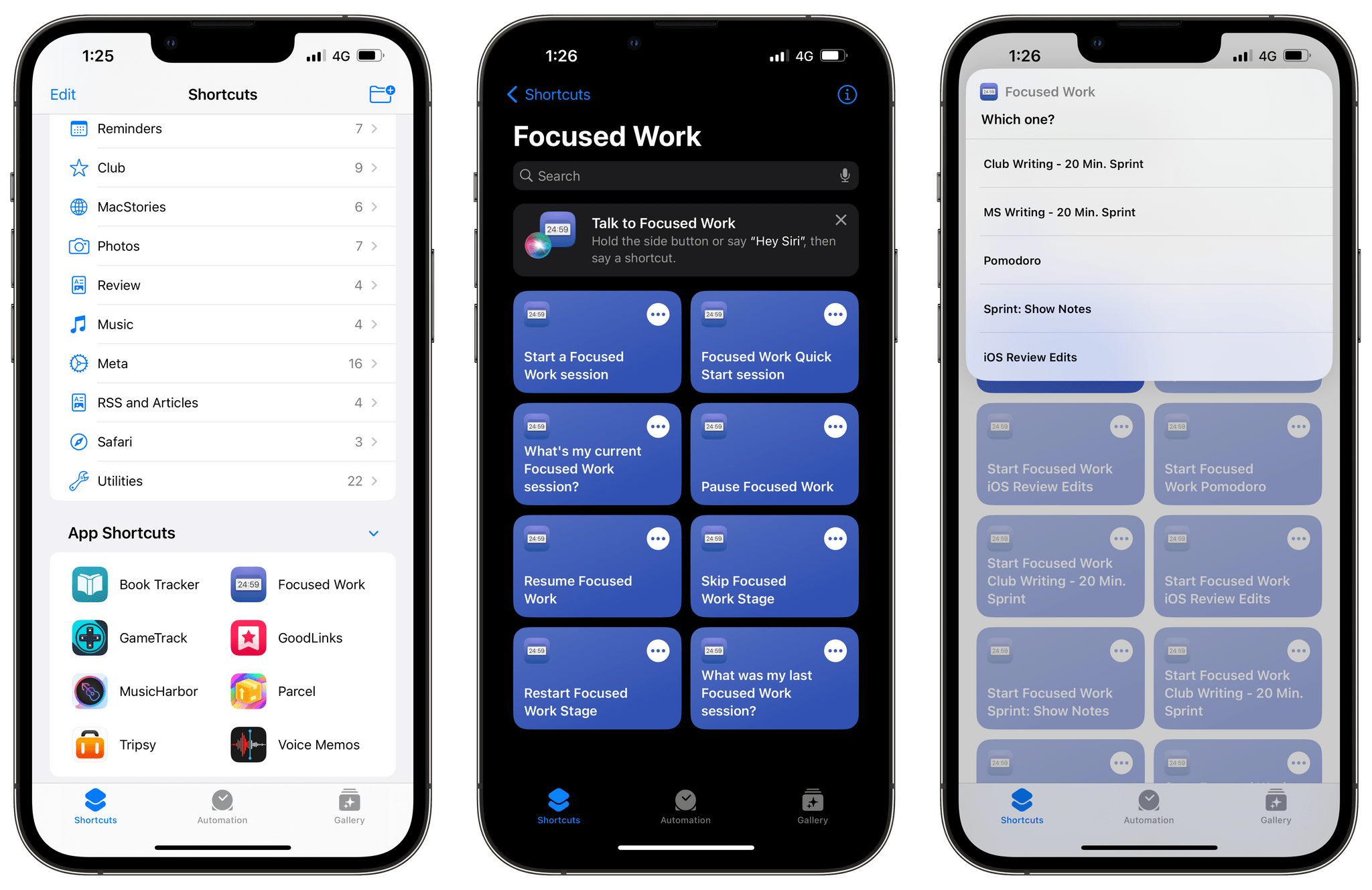
In iOS 16, the Shortcuts app hasn’t undergone a major redesign or technical rewrite; instead, Apple’s efforts have focused on adding more actions for system apps, extending the developer API, bringing more stability, and making Shortcuts more approachable for new users.
The last point is both important and likely the reason why some Shortcuts power users will be disappointed by this year’s update. There isn’t a lot for them in this new version of the app: as we’ll see in my iPadOS review, there’s no integration with Files quick actions, no support for Stage Manager actions, and no system-wide hotkeys still. If you’re an advanced Shortcuts user and were wishing for more system-level enhancements in addition to stability this year: I hear you, but we’ll talk about this later on.
What we do have in iOS 16 is a fascinating new feature to get newcomers started with the Shortcuts app, a grab bag of useful new actions for Apple apps, and some solid developer-related enhancements that will make third-party actions much better than before. Let’s take a look.
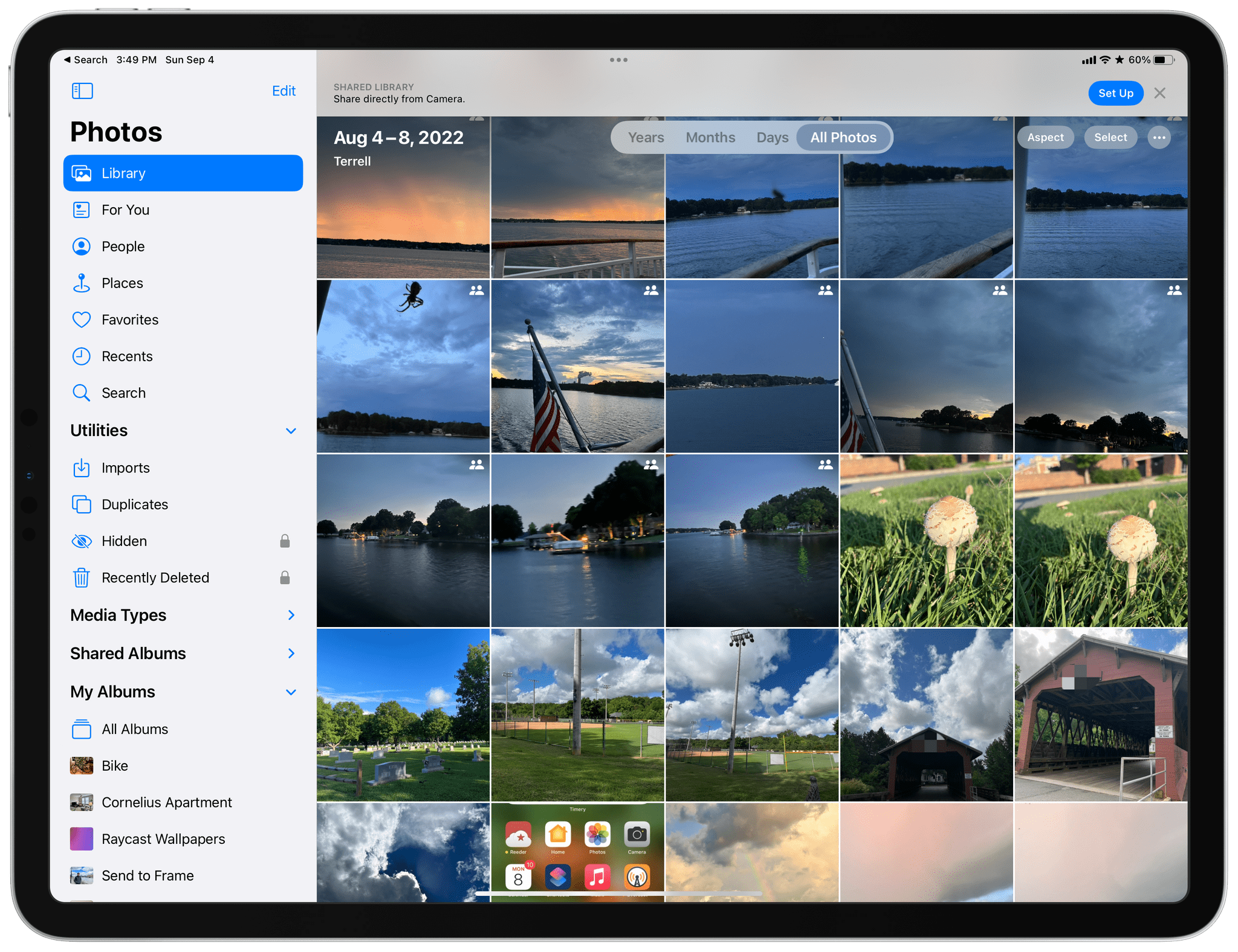
Over the years, I’ve shared family photos with my wife Jennifer in three ways: iMessage, AirDrop, and Shared Albums. However, of those, iMessage won hands down, not because it’s the best way to share photos, but because Messages is an app we already use every day to communicate. Plus, sharing photos with Messages is easy whether you’re already in the app and using the Photos iMessage app or in the Photos app itself and using the share sheet. From conversations with friends and family, I know I’m not alone in my scattershot approach to sharing photos with my family.
It’s into that chaotic, ad hoc mess and all of its variations that users have improvised over the years that Apple is stepping in with iCloud Shared Photo Library, its marquee new Photos feature for iOS and iPadOS 16 and macOS Ventura. And you know what? It just works.
The feature lets anyone with an iCloud photo library share part or all of their photo library with up to five other people. Once activated, a new library is created that sits alongside your existing one and counts against the iCloud storage of the person who created it.
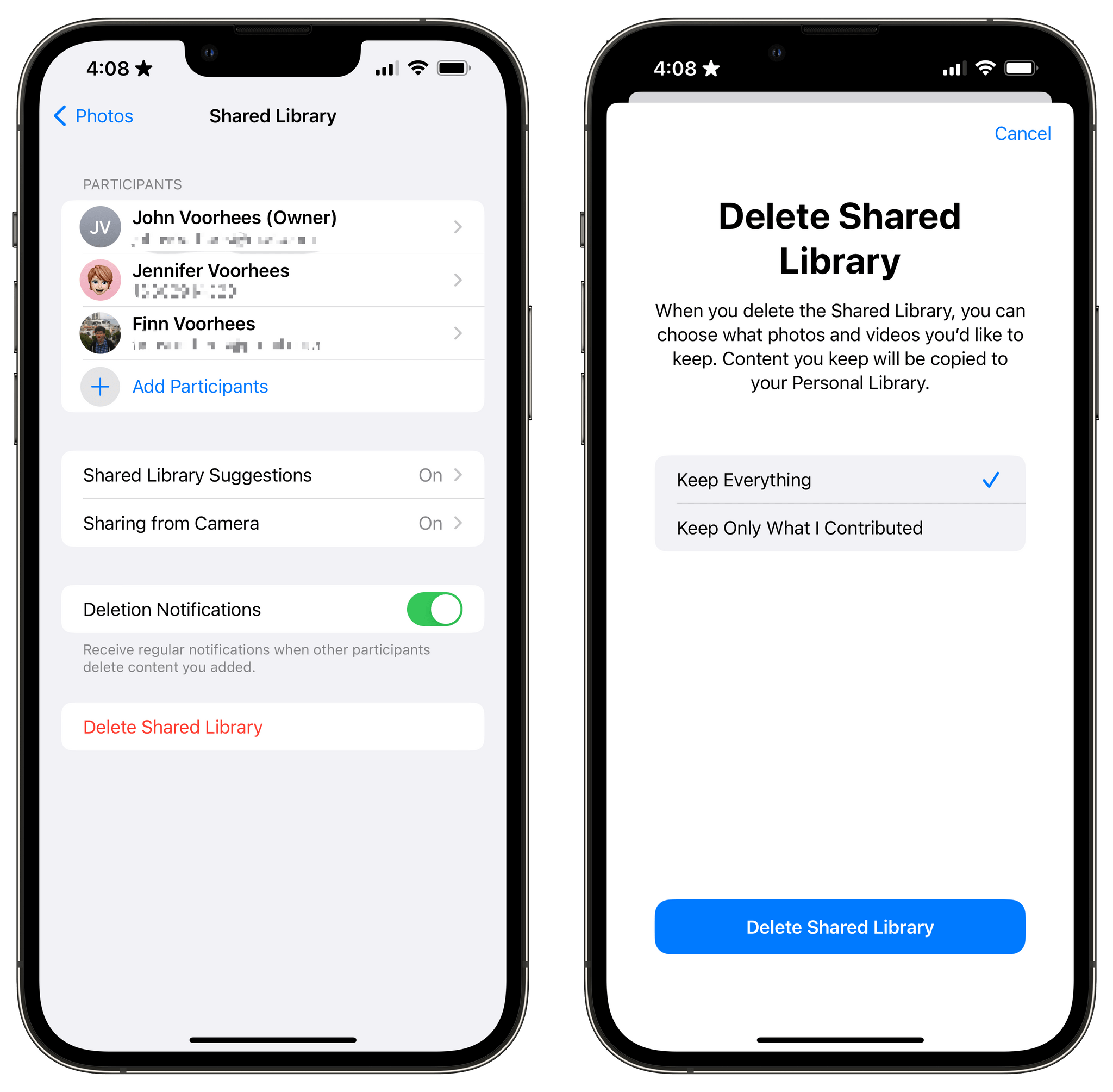
One critical limitation of iCloud Shared Photo Library is that you can only be a member of one shared library, a restriction that is designed to limit the library to your immediate household. That means I could share photos with my wife and kids because there are fewer than six of us, but I couldn’t set up another library with my siblings or parents for our extended families. Nor could I invite one of my extended family members to use the extra slot I’ve got in my family library unless they were willing to forego being part of any shared library their own family created.
Unwinding a shared library.
So, what do you do if you’re in a shared library and want to join a different one? There’s a button in the Photos section of Settings to leave a library, so you can do so with one tap, saving all of the photos in the shared library to your personal library or keeping just those you originally contributed to the shared pool. Deleting libraries is possible too, but only by the person who created them, who is given the choice of keeping all images or just the ones they contributed when they do so.
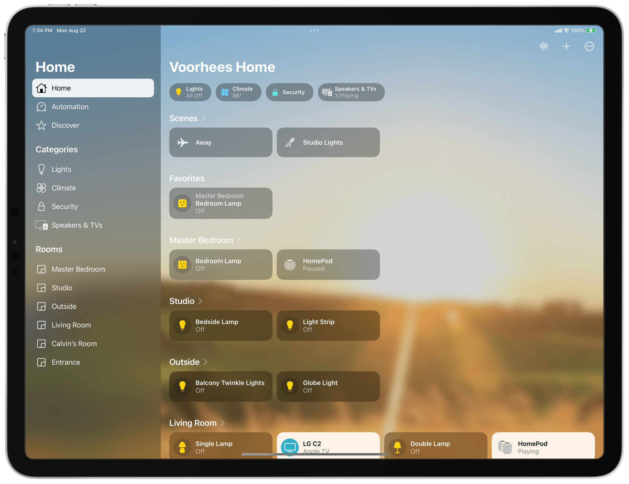
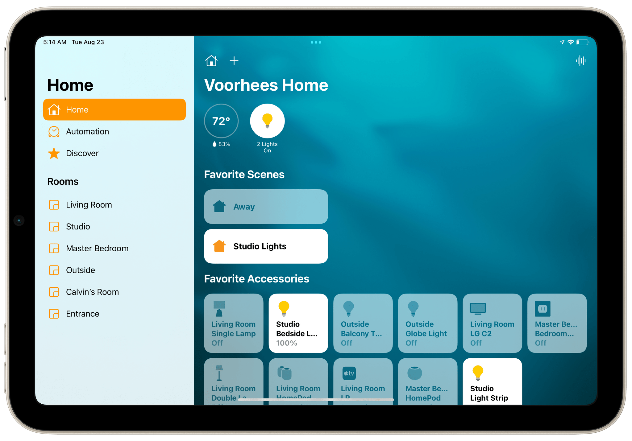
I’ve spent a lot of time in the Home app since moving to North Carolina. I moved right after WWDC, so I’ve disassembled, reassembled, and reconfigured my home automation setup, all in the midst of testing the latest iOS, iPadOS, macOS, and watchOS betas. What I’ve learned is that the Home app’s new design is much better for navigating a large collection of smart devices than before, but the app’s changes don’t go far enough. The app’s automation options are still too rudimentary, which limits what you can accomplish with them. Still, the update is an important one worth exploring because it promises to relieve a lot of the past frustration with the Home app.
One question that’s fair to ask about Home’s redesign is: Why now? The app’s big, chunky square tiles have been a feature of the app since the start and criticized just as long. The issues that I suspect have spurred the change are two-fold. First, the square tiles of the app’s previous design were too uniform, making it hard to distinguish one device from another. Second, they wasted space. That was less of a concern on a Mac or bigger iPad, but no matter which iPhone you used, Home could never display more than a handful of devices. Both issues have been problematic for a while, but with the Matter standard poised to bring more devices into the Home app, the issues were bound to get even worse without a redesign.
Say goodbye to Home’s sea of square tiles.
Since Home was first released, Apple has tweaked the iconography available in Home and added a row of status buttons along the top of the app, but the big space-wasting tiles endured. That led me to control my HomeKit devices with Siri most of the time. That’s not a bad way to control devices, but it’s not as reliable as tapping a button. Plus, the app is just more convenient than Siri in many situations, like when I’m already using my iPhone for something else or when it’s early in the morning, and my family is still asleep. That’s why I was so glad to see Apple rethink how Home uses valuable screen space and the way devices are organized.
I recently moved from Illinois to North Carolina, and I don’t know the area at all. As a result, I’ve been using Maps and CarPlay a lot since I got here. The new features coming this fall to each aren’t as extensive as they’ve been in past years, but there are several small changes that represent the kind of incremental, ‘quality of life’ improvements that I expect users will appreciate.
Maps
Because so much of Apple Maps relies on methodically mapping the world bit by bit, many users are stuck waiting for Maps’ underlying data to catch up with the app’s features. The more detailed maps and 3D models of landmarks introduced last year are good examples. Both came with asterisks because they were only available in certain cities or countries at launch.
This year is a little different. Apple announced new countries and cities where you’ll find the company’s more detailed maps, 3D landmarks, and other changes, but this year, multi-stop routes and tweaks to Maps’ routing UI will be available to everyone at the same time. It’s a nice mix of brand-new features and incremental improvements that includes something for everyone.
To kick off our Summer OS Preview Series on AppStories this week, cover the top new features of iOS and iPadOS 16 and macOS Ventura, that are now available as part of Apple’s public beta program.
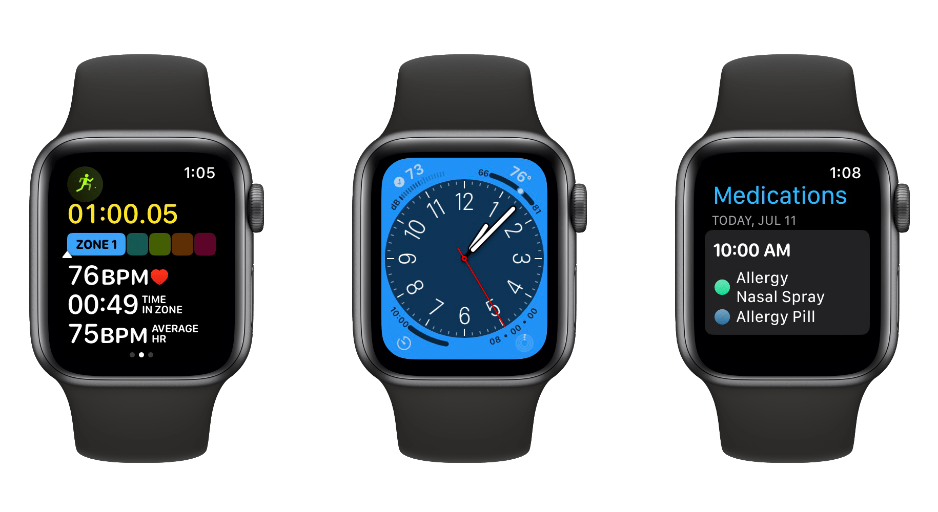
After watching this year’s WWDC keynote in June, my initial impression of the watchOS 9 announcement was that Apple had prepared one of the largest Apple Watch updates in years. While writing my watchOS 9 overview later that day though, it felt like the scope of the changes were less than I originally thought. I needed some hands-on time with the update to know for sure.
I’ve had bad luck installing early watchOS betas in the past, so I’ve been waiting for the public beta to arrive before loading it onto my daily-driver Apple Watch. That said, I installed the developer beta right away onto an extra Apple Watch Series 4 that I’ve kept around, and have been using it as much as possible throughout the past month. I’ve ascertained a good feel for this year’s update, and can confirm that we’re looking at another mild-mannered year for the Apple Watch.
I don’t mean this as an insult at all. Rather, it’s another year of the relentless incremental refinement that Apple has long been known for, but which the company has practically turned into a science for watchOS. The formula looks something like this:
A handful of improvements to the Workout app
One or two new features targeted at health
A handful of new watch faces
One or two brand-new first-party apps
One or two redesigned first-party apps
A system-level feature or improvement
This year’s changes to the Workout app may be more significant than usual, but otherwise watchOS 9 fits this formula quite snugly. While it may not make for the most glamorous year-over-year updates, the strategy has cemented the Apple Watch as the most popular smartwatch in the world — by far. It’s no surprise that Apple sees no need to alter it.
While the formula may have stayed the same, there are still plenty of specifics to dig into. Let’s start with Workout, the app whose changes single-handedly led me to believe that we were getting a bigger-than-usual watchOS update this year.
With the release of the macOS Ventura public beta today, macOS takes another step down the path to syncing up its platforms that began four years ago. Where once the Mac hung out doing its own thing with scant regard for where iOS, and later, iPadOS was heading, today the Mac feels like part of a coherent family of products more than ever. Fewer of the differences among Apple’s product lines are the result of historical accidents than ever before. Instead, they’re intentional differences that speak to the ways the devices are used, not how they were developed. As a result, it’s never been easier for someone to move between devices up and down the company’s computing lineup. The same is true for developers looking to bring their apps to all of Apple’s platforms.
This year, the process of harmonizing the Mac with Apple’s other devices continues with Stage Manager, a new window management system available on macOS and iPadOS that offers users a similar windowing experience on both systems for the first time. On the Mac, Stage Manager is very different from the Mac’s traditional windowing systems, but it’s also very easy to get the hang of, which bodes well for new users coming from the iPad. And, of course, the feature is entirely optional, so anyone with whom it doesn’t click can ignore Stage Manager completely. However, as you’ll read below, I think everyone should give Stage Manager a chance because I’ve been surprised at how much I enjoy using it.
Another thread from Monterey that is even more pronounced in the Ventura beta is Apple’s renewed emphasis on collaboration and sharing. Last year, SharePlay enabled new experiences that connected people with family and friends no matter what Apple device they use. This year, macOS Ventura expands macOS’ collaboration across devices with Continuity Camera, collaboration features in system apps that are also available to third-party apps, the integration of Messages into collaboration functionality and SharePlay, and more. These are features that are available across macOS, iOS, and iPadOS and are serving as a new thread that strengthens the ties between the iPhone, iPad, and Mac.
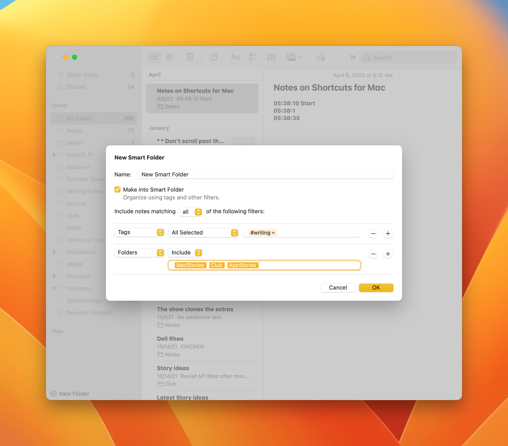
Notes’ Smart Folders are far more powerful in macOS Ventura.
Finally, no macOS update would be complete without updates to system apps. One of the dividends Apple is enjoying from the unification of the technologies on which its apps are built is they have been able to advance system apps across all platforms simultaneously. We saw that most strikingly last year with Monterey, but the trend will continue with Ventura, which includes significant updates to Mail, Messages, Notes, Photos, Home, and more. This year’s crop of updates shows that last year wasn’t a one-off push to synchronize system apps. I think it’s now reasonable to expect simultaneous annual app updates across all platforms going forward.
I’ll have more to say about what Ventura means to the Mac and where Ventura succeeds and fails in my annual macOS review this fall. However, because the public beta of Ventura is available for anyone to download for the first time today, and I know many readers are eager to give it a try, I want to provide a preview of what you can expect to find if you install it along with my first impressions of using it for the past few weeks.
Sometimes I truly have excellent timing with my stories.
As you may recall, a couple of months ago in the lead-up to WWDC, I published an article on my experience with using the M1 Max MacBook Pro for six months. That story was born out of a desire to get to know macOS again after years of iPad-only work; as I shared at the time, my curiosity was also the byproduct of Apple’s incoherent narrative for iPad power users for the past couple of years. Great hardware held back by lackluster software had long been regarded as the core weakness of the iPad platform; I hadn’t always agreed with the Apple community’s “consensus” on this, but an M1 iPad Pro carrying MacBook Pro-like specs with no new pro software features to take advantage of it was, indeed, a bridge too far. So when I published that story just in time for WWDC, I did it because a) that’s when it was ready and b) I wanted to bring some chaotic energy into the iPad discourse and see what would happen.
Like I said, sometimes I do have excellent timing with my stories. And in this case, not even my wildest expectations could have predicted that, in one fell swoop a week later, Apple would reimagine iPadOS around desktop-class apps and a brand new multitasking with external display integration, a new design, and – the unthinkable – overlapping, resizable windows with iPadOS 16.
Today, Apple is releasing the first public betas of all the operating systems that will launch to the wider public later this year: iOS 16, iPadOS 16, macOS 13 Ventura, and watchOS 9. We’re going to have overviews of all these public betas today on MacStories.1 As you can imagine given my annual reviewer responsibilities, I installed both iOS and iPadOS 16 as soon as they became available after the WWDC keynote on my iPhone 13 Pro Max and 12.9” iPad Pro with M1, and I’ve been using them as my daily drivers for the past month.
Obviously, I have some early thoughts and first impressions to share on iPadOS 16: it is fundamentally changing my relationship with the iPad platform and my workflow, which has been untouched for years since the introduction of multiwindow in iPadOS 13. Stage Manager, while still in need of refinements in several areas, is a game-changer for people like me, and it signifies a major course correction on how Apple thinks about iPadOS for power users.
But I should also say that I’m equally intrigued by iOS 16, which marks Apple’s return – after two years – to user customization with a drastic revamp of the Lock Screen, which can now be personalized with widgets, multiple wallpaper sets, and deep integration with the Home Screen, Focus, and even Apple Watch. The new Lock Screen is the proper follow-up to iOS 14 widgets we’ve been waiting for, and it’s going to be the feature that will push millions of people to update their iPhones to iOS 16 right away later this year. Besides the Lock Screen, there are dozens of other quality-of-life improvements to built-in apps and system intelligence that have caught my attention in iOS 16 in the past month, from the welcome updates to Mail and Reminders to system-wide unit conversions based on Live Text, Safari tab groups, and more.
There’s a lot to uncover in iOS and iPadOS 16, and I can’t possibly get into all of it today with this story. All the details and final opinions will have to wait for my annual review in the fall. Instead, below you’ll find a collection of initial thoughts, impressions, and suggestions for aspects of iPadOS and iOS 16 I’d like Apple to improve this summer. As with last year’s preview story, I’m going to include two recap segments at the end of each section with a list of improvements I’d like to see in iPadOS and iOS 16 before the public release.


](https://cdn.macstories.net/banneras-1629219199428.png)