With the release of the macOS Ventura public beta today, macOS takes another step down the path to syncing up its platforms that began four years ago. Where once the Mac hung out doing its own thing with scant regard for where iOS, and later, iPadOS was heading, today the Mac feels like part of a coherent family of products more than ever. Fewer of the differences among Apple’s product lines are the result of historical accidents than ever before. Instead, they’re intentional differences that speak to the ways the devices are used, not how they were developed. As a result, it’s never been easier for someone to move between devices up and down the company’s computing lineup. The same is true for developers looking to bring their apps to all of Apple’s platforms.
This year, the process of harmonizing the Mac with Apple’s other devices continues with Stage Manager, a new window management system available on macOS and iPadOS that offers users a similar windowing experience on both systems for the first time. On the Mac, Stage Manager is very different from the Mac’s traditional windowing systems, but it’s also very easy to get the hang of, which bodes well for new users coming from the iPad. And, of course, the feature is entirely optional, so anyone with whom it doesn’t click can ignore Stage Manager completely. However, as you’ll read below, I think everyone should give Stage Manager a chance because I’ve been surprised at how much I enjoy using it.
Another thread from Monterey that is even more pronounced in the Ventura beta is Apple’s renewed emphasis on collaboration and sharing. Last year, SharePlay enabled new experiences that connected people with family and friends no matter what Apple device they use. This year, macOS Ventura expands macOS’ collaboration across devices with Continuity Camera, collaboration features in system apps that are also available to third-party apps, the integration of Messages into collaboration functionality and SharePlay, and more. These are features that are available across macOS, iOS, and iPadOS and are serving as a new thread that strengthens the ties between the iPhone, iPad, and Mac.
Finally, no macOS update would be complete without updates to system apps. One of the dividends Apple is enjoying from the unification of the technologies on which its apps are built is they have been able to advance system apps across all platforms simultaneously. We saw that most strikingly last year with Monterey, but the trend will continue with Ventura, which includes significant updates to Mail, Messages, Notes, Photos, Home, and more. This year’s crop of updates shows that last year wasn’t a one-off push to synchronize system apps. I think it’s now reasonable to expect simultaneous annual app updates across all platforms going forward.
I’ll have more to say about what Ventura means to the Mac and where Ventura succeeds and fails in my annual macOS review this fall. However, because the public beta of Ventura is available for anyone to download for the first time today, and I know many readers are eager to give it a try, I want to provide a preview of what you can expect to find if you install it along with my first impressions of using it for the past few weeks.
Proceed with Caution
Before getting into the details of Ventura, it’s worth remembering that it’s a beta, and running betas poses risks. So, if you don’t want to deal with something going wrong with your Mac, it’s best to wait until Ventura is released this fall and the majority of bugs have been eliminated before you try it. However, betas are also a manageable risk. I’ve got a beta version of at least one of Apple’s OSes running on devices year-round, and have learned from experience that with a few precautions you can avoid major disruptions to using your Mac.
First, back up everything. Assume you’ll lose data and understand how you’ll recover it if you do. Apple’s public betas are more stable than its developer releases, but something bad happening to an important file is always possible, so have a backup strategy.
Second, have a Plan B. If an app that’s critical to what you do doesn’t work on the beta, know how you’re going to deal with it. For example, Audio Hijack, which I use multiple times each week to record MacStories podcasts, doesn’t work on Ventura. That’s why my MacBook Air isn’t running the beta, except on an external SSD. The Air is my Plan B. If work needs to be done and the beta is fighting against me, I can always fall back on my MacBook Air.
Third, know your own tolerance for hassles. Even if you don’t need to resort to backups or Plan Bs, you’ll encounter bugs that can be frustrating. I work on beta OSes a lot and have a high tolerance for those sorts of glitches, but if you’d rather not have to troubleshoot that sort of thing, it’s best to be patient and wait for the public release of Ventura in the fall.
All that said, I’ve been working full-time using Ventura on my Mac Studio for the past few weeks, and I’ve been impressed with the stability of the betas. It’s not unheard of for subsequent betas to take a step back in reliability, but so far, Ventura has caused very few problems for me. I’ve had to quit apps and restart my Mac here and there, but by and large, the experience has been good, and I haven’t had to fall back to my MacBook Air, except to use Audio Hijack. Everyone’s Mac setup is unique, but hopefully, my experience with Ventura will help you decide whether to take the plunge yourself.
Okay, let’s get into the details.
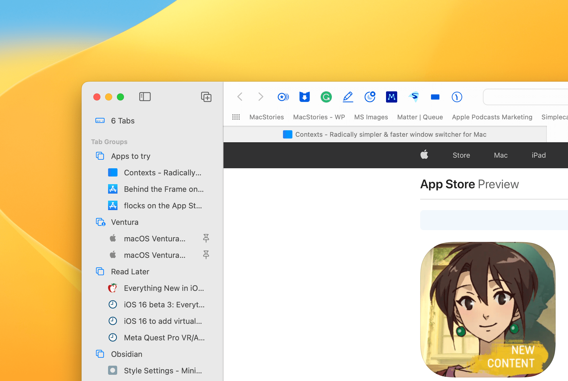
Apps Take the Stage
You can’t tell a bunch of actors to take the stage and expect a carefully choreographed play. They need some direction – a stage manager. The same is true when you open a bunch of apps on your Mac, which is why Stage Manager, the new window management system on macOS, is so aptly named.
It’s fair to wonder whether the Mac needed a new way to navigate and manage apps. There are already more ways to do so than I want to try to list here because I know I’ll miss one. So, when Apple introduced Stage Manager at WWDC last month, I was skeptical. I expected to like it more on the iPad, where window management was missing and sorely needed. However, the feature immediately resonated with me on the Mac.

When I test a new version of macOS, I try to dive into new features and use them as much as possible. So, ever since I installed Ventura a few weeks ago, I’ve been working in Stage Manager mode almost exclusively. What surprised me was that I haven’t felt the tug to return to my old ways of managing windows. Instead, I’ve stayed in Stage Manager mode full time, which I take as a sign that Apple is onto something with the feature.
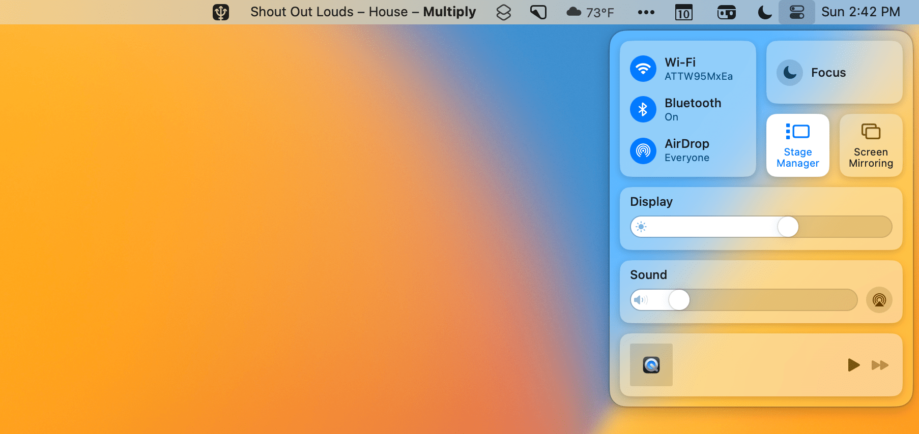
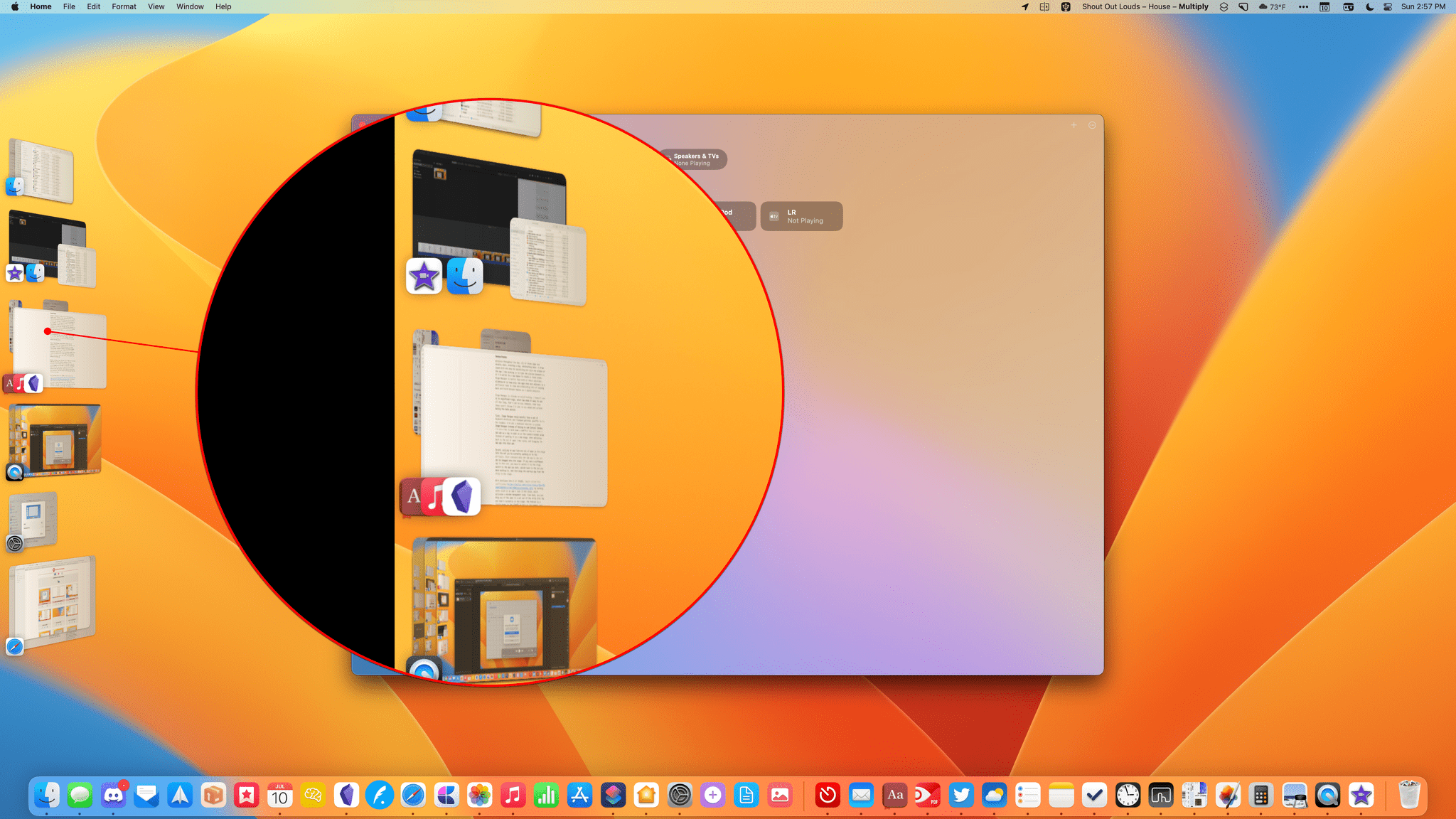
Stage Manager is activated from a new tile in Control Center on in the Desk & Desktop section of System Settings. Once activated, any app you open takes the stage with its window sitting in the center of your screen, surrounded by a healthy expanse of your desktop showing on all sides. Other apps you have open get swept away to the left side of your screen, occupying a vertical strip with the most recently opened apps at the top of the heap. By default, Stage Manager cleans up your desktop, too, hiding any files you have piled up on it.
The effect creates a focused, uncluttered work environment that, most notably, is completely automatic. That’s a point that bears emphasizing because there are a lot of apps available for managing and saving window setups or creating some sort of focused work environment, but they all take planning and work to get them exactly the way you want. By contrast, Stage Manager takes care of everything for you.
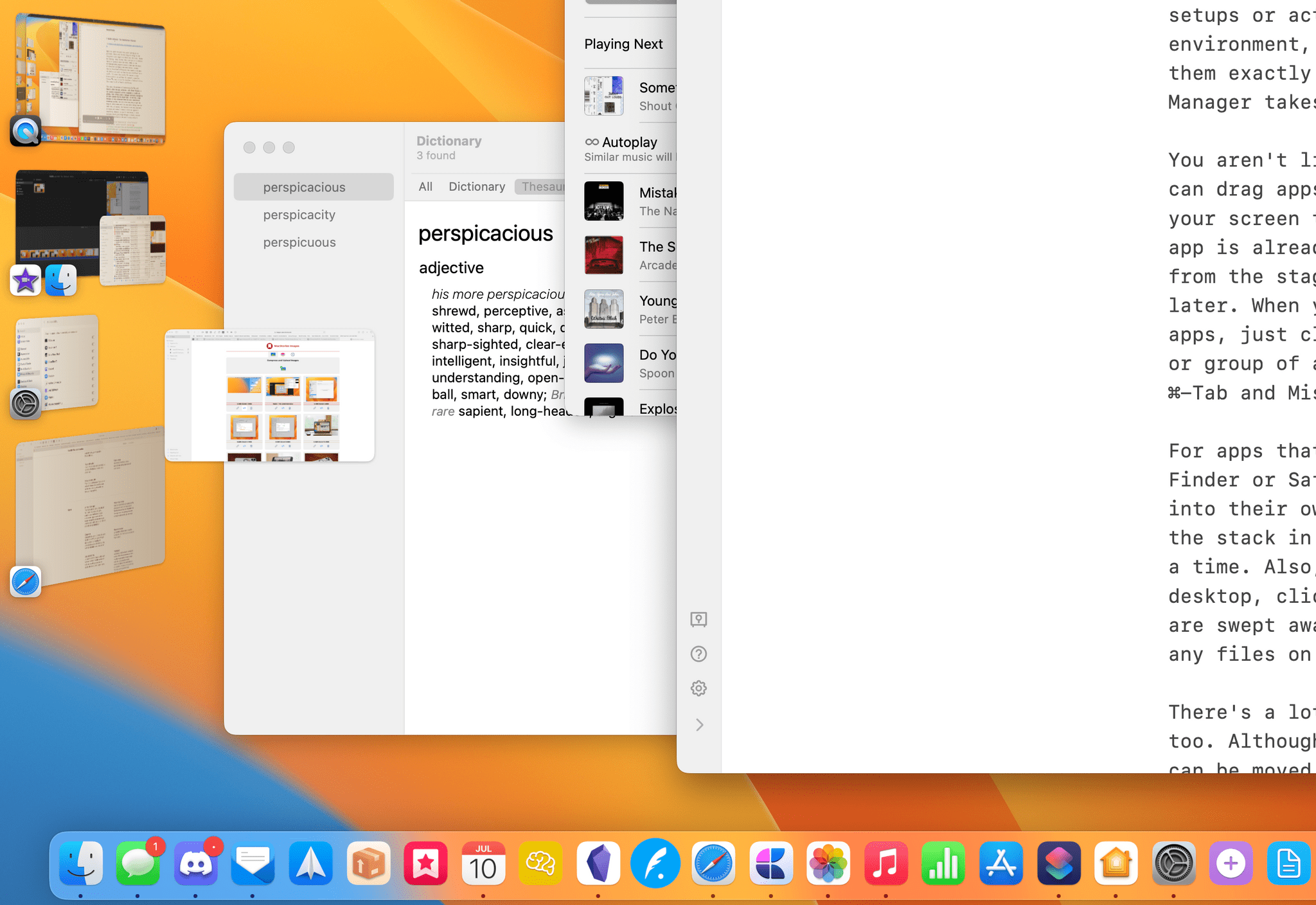
You aren’t limited to using just one app at a time. You can drag apps out of the vertical strip on the left of your screen to add them to the stage, joining whichever app is already there. You can also drag an app’s window from the stage, depositing it in the strip for use later. When you want to switch to another app or set of apps, just click on them in the strip to switch to that app or group of apps. Traditional app switching methods like ⌘-Tab and Mission Control work too.
For apps that support multiple windows at one time, like Finder or Safari, all of their windows get organized into their own stacks in the vertical strip. Clicking on the stack in the strip cycles through the windows one at a time. Also, when you need to grab a file from your desktop, click on the desktop, and the apps on the stage are moved to the strip, exposing your full desktop and revealing any files saved there.

There’s a lot of flexibility built into Stage Manager too. Although new windows open centered onscreen, they can be moved into whatever arrangement you want and even maximized to fill the screen. When a window overlaps the strip on the left side of the screen, it animates out of view but can be easily brought back by hovering your cursor over the left edge of the screen. If you don’t like the strip on the side of your Mac’s screen or the fact that your desktop icons aren’t visible when an app’s window is visible, both can be turned off in System Settings under the Desktop & Dock section. Also, when you exit Stage Manager from Control Center, you’re given the option to hide the other app windows that aren’t part of your current stage, retaining the focused environment you created but outside Stage Manager mode.
What I like most about Stage Manager is that it solves a problem I didn’t know I had. I use a lot of apps throughout the day, but few tasks require more than two or three of them. However, because I switch between projects throughout the day, all of those apps are usually open, creating a big, distracting mess. I usually coped with the mess by maximizing the size of the window of the app I was working in to hide the clutter beneath it, or I’d switch to a new Space to create a clean slate. Stage Manager is better than both of those solutions, allowing me to keep only the apps that are relevant to a particular task in view and eliminating lots of swiping back and forth between Spaces as I switch projects.
Stage Manager is already on solid footing. I haven’t run into significant bugs, which has made it easy to use all day long. That’s not to say, however, that there aren’t things I’d like to see added and refined during the beta period.
First, Stage Manager would benefit from a set of keyboard shortcuts and trackpad gestures specific to it. For example, I’d like a keyboard shortcut to invoke Stage Manager instead of having to use Control Center. I’d also like to hold down a modifier key as I open a new app as a way to open it in the current window setup instead of opening it on a new stage, then switching back to the set of apps I was using, and dragging the new app into that set.
Music is hidden behind Obsidian in the stack on the left and can only be added to the current stage by switching to its set of apps first and making it the frontmost app.
Second, pulling an app from one set of apps in the strip into the set you’re currently working on is too difficult. That’s because only the top app in the set can be dragged onto the stage. If you want a different app in that set, you have to switch it to the stage, select the app you want, switch back to the set you were working in to begin with, and then drag the now-top app from the strip to the stage.
With developer beta 3 of iPadOS, Apple solved this inefficiency by letting users click on an app’s icon in the strip, which activates a window management mode. From here, you can drag any of the apps in a set out of the strip into the one that’s currently on the stage. The feature is a little buggy in the iPadOS 16 beta at the moment, but it’s a solution that would be equally welcome on the Mac.
Notwithstanding the refinements to Stage Manager that I’d like to see, and no matter how finely tuned your window management system already is, I highly encourage everyone on the beta to give Stage Manager a try. It’s already my favorite way to work on my Mac, and I think it’s likely to become a new favorite for a lot of MacStories readers too.
Continuity, Connection, and Collaboration
Continuity is an umbrella term that Apple uses for a wide variety of features that tie its hardware together. We’ve had Continuity features like AirDrop, AirPlay, Handoff, Universal Clipboard, Markup, and others for a long time, but with Ventura, Apple is pushing Continuity into new realms while simultaneously embedding existing app functionality in new ways to facilitate collaboration with others. It’s a renewed focus on how people use Macs and other Apple hardware together instead of alone that I like a lot.
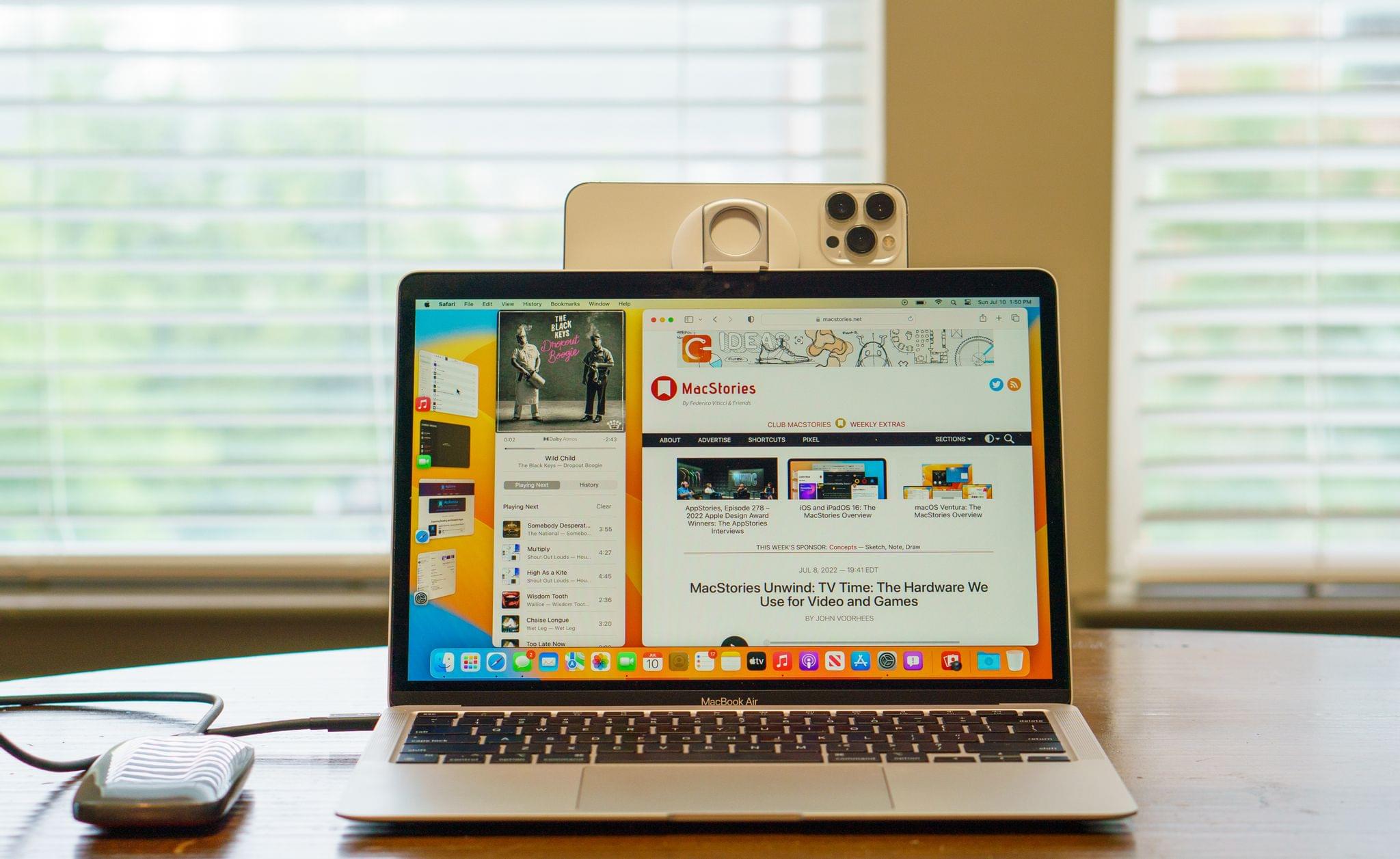
The most notable new Continuity feature in Ventura is Continuity Camera. The term Continuity Camera isn’t new. In prior macOS releases, Continuity Camera was the feature that allowed you to take a photo or scan a document with an iPhone or iPad from your Mac. That’s still possible, but Continuity Camera is also Apple’s new name for the ability to use your iPhone as a webcam.
The new feature will allow anyone with an iPhone XR or later to use their iPhone’s rear-facing camera as their webcam. What’s especially nice about the feature is that it’s dead simple to use.
The feature, which can be used wired or wirelessly, requires WiFi and Bluetooth to be enabled on both your Mac and iPhone. Both devices must be signed into the same iCloud account with two-factor authentication enabled too. When you bring your iPhone close to your Mac, it becomes available as a camera for any app that accepts camera input. That means I’ll see my iPhone as an option in an app like FaceTime, even if it’s in my pocket. However, once the iPhone is stationary and in landscape orientation, it’s selected automatically with a little chime tone, even if it hasn’t been unlocked.
Once your iPhone is connected, you can go to Control Center to enable various camera options. At the top of Control Center are three options under the Video Effects tile: Center Stage, Portrait, and Studio Light. As with the iPads and the Studio Display, Center Stage via Continuity Camera pans and zooms your iPhone’s video feed to keep you centered in the shot as you move around. Portrait, which blurs the background behind you, and in my limited testing, works better than the same feature when using my Studio Display or MacBook Air’s built-in camera, which makes sense since my iPhone 13 Pro Max has the best camera of the bunch. Finally, Studio Light is a new video effect that highlights the subject of the video and dims the background slightly, which looks great.
From Control Center, you can also switch between standard microphone mode and Voice Isolation, which helps pull vocals out from any background noise. Apps like FaceTime will let you choose between your iPhone’s microphone and any other available microphones too.
Although Continuity Camera doesn’t require any special hardware to work, you’ll want a tripod or some other mounting accessory to hold your iPhone stationary in landscape orientation.
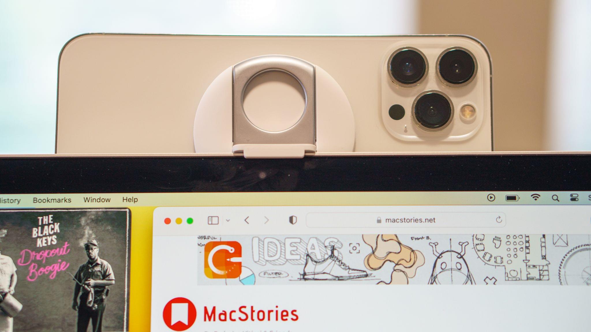
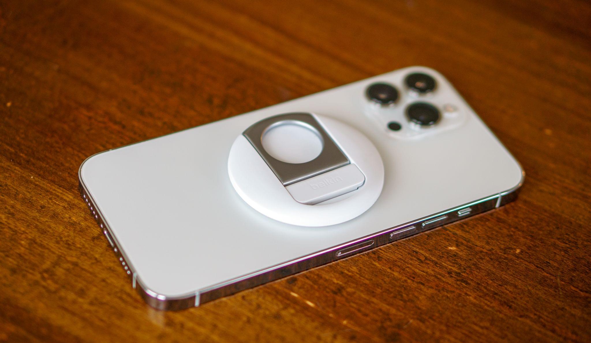
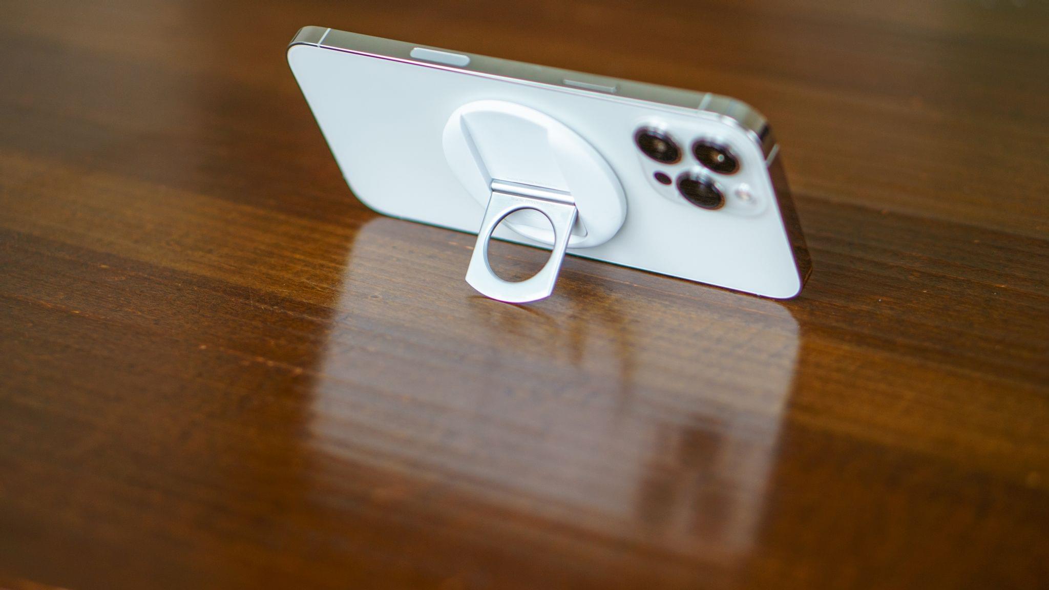
As announced at WWDC, Belkin is working on MagSafe mounts for compatible iPhones to use with Continuity Camera. I’ve had a chance to try a pre-production version of one of the Belkin mounts that was shown off at WWDC that’s designed to work with Mac laptops. It’s a shallow disk made of a soft-touch plastic finish, with a clever two-hinge system that pulls away from its magnetic body.
One hinge is designed to hook to the top of a Mac laptop’s screen with the rear-facing camera peeking out. The other hinged bit is a kickstand that can be used to prop your phone up on a desk or table with the screen facing you at an angle. It’s perfect for watching video as you do something else or playing a game with a controller. What’s equally impressive about Belkin’s mount is how light and shallow its profile is. As a result, your iPhone remains pocketable, allowing it to remain attached to your phone as you move from call to call throughout the day.
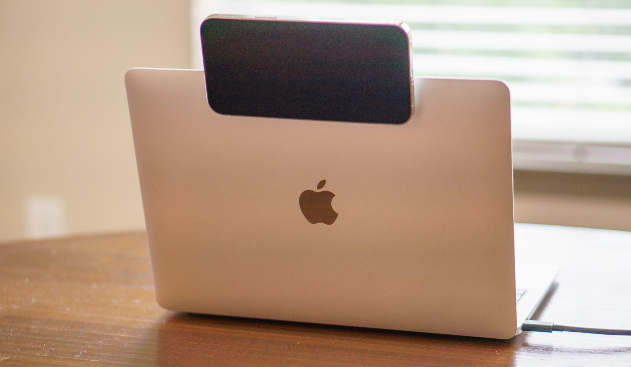
As with any webcam, it helps to prop your laptop up on something to get a more flattering angle of your face when using Continuity Camera. Tilt the screen back too far from a low starting position, and everyone else on your call will get an unflattering look up your nose.
Tilting your screen back too far with an iPhone attached to it can also cross a tipping point where it drags your Mac’s screen back due to its weight. That happened with my iPhone 13 Pro Max and Belkin’s mount. In practice, however, that tipping point is beyond the angle I’d typically use on a FaceTime call, so it hasn’t been a dealbreaker. In fact, the iPhone’s drag on my Mac’s screen has been far outweighed by the portability and ease of setup of Belkin’s mount, which can be tossed in a bag, put in your pocket, or kept close by on your desk.
I’ve also tried Continuity Camera with my iPhone in a clamp attached to a tripod. What I’ve found in my testing so far is that any solution that holds your iPhone steady in landscape mode works well.
Continuity Camera also enables Desk View, which is a separate Mac app that uses the wide-angle lens of the iPhone to display what’s in front of you on your desk. The app can be launched from Control Center under the same Visual Effects tile mentioned above or your Applications folder. There’s some serious on-the-fly distortion correction happening with the image of your desk, which is at 90 degrees from the orientation of your iPhone, but it looks remarkably good.
However, I’m not convinced Desk View is the sort of thing that a lot of people will have a reason to use regularly. Plus, in my limited experience, the camera needs to be further away from the front of a desk than I’d normally place Mac for a video call to get a view of my desk instead of my lap. It’s a fun demo to be on a video call and share what’s on your desk in front of you, but I need to spend more time with the app to decide whether it’s more than that.
Continuity Camera is undeniably the highest profile new feature that ties Apple hardware together, but it’s not the end of the story by any means. Ventura will also introduce Handoff of FaceTime calls between an iPhone or iPad and your Mac in both directions and adds new ways to collaborate and connect with others by making better use of the way most users use the company’s hardware to communicate already: Messages and FaceTime.
As it turns out, SharePlay, which debuted with Monterey, was just the start. Although it hasn’t made an appearance in the macOS betas yet, SharePlay is being extended to Messages, which I’m eager to try. I expect the ability to share without the overhead of a video call will broaden the feature’s appeal, but I haven’t tried it yet, so we’ll have to wait and see.
Shared experiences like watching a movie or listening to music aren’t all Ventura has to offer, though. This fall Apple will enhance its existing collaboration tools in apps like the iWork suite, Notes, and Finder to bring communication to where your work gets done. The company has done so by integrating Messages and FaceTime directly into those apps.
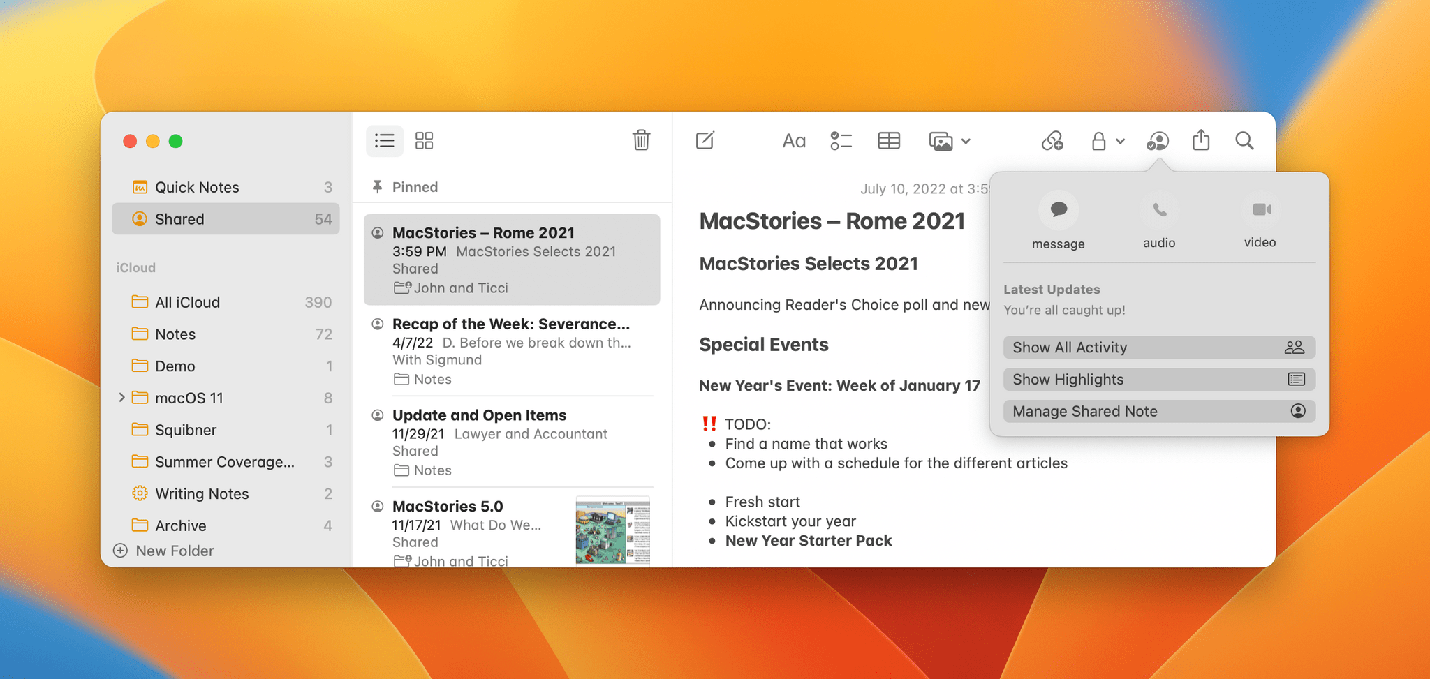
If you’re on a FaceTime call with colleagues or on a group thread in Messages, anyone will be able to start a document in an app like Pages and start a shared session by clicking on the Collaborate button in the app’s toolbar. If you’re on a FaceTime call, the app will suggest sharing with the participants automatically. The process works the other way too. Suppose you’re working on a Keynote presentation and want to get the input of a co-worker. Keynote has had a Collaborate button for a while for sharing your presentation with someone, but now, you can start a Messages thread or FaceTime video or audio call from the same Collaborate button. You’ll also see who is actively participating with the document you shared and get updates on changes made in any Messages thread you have with participants. Messages’ collaboration features are available for third-party developers to build into their apps too.
I’ll cover it in more detail below, but it’s also worth mentioning here that Safari has added its own collaboration tool: shared tab groups, which open up interesting use cases for both personal and work uses.
Ventura’s Continuity and collaboration features are a direct consequence of the work that preceded Ventura. Until the user experience and system apps were synced up across platforms, the sort of tight interoperability that exists in Ventura wasn’t possible. The result is a deep integration across products borne of four years of OS-level groundwork that has torn down hardware silos making the continuum from the iPhone to the iPad and Mac greater than the sum of its parts.
Apps
With Ventura, Apple is continuing the trend we saw in Monterey of introducing new system app features across all of its platforms at once. Very little has gone untouched in Ventura, and I’ll cover it all in my full review this fall, but for this preview, I’m going to focus on two new apps and seven system app updates.
Clock and Weather
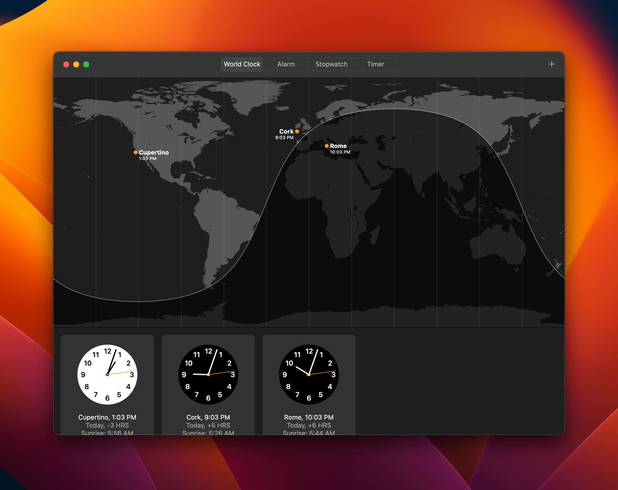
Clock and Weather are the two new apps introduced in Ventura this year. Both have been around since the beginning of the iPhone, and in the case of Clock, is already available on the iPad and, in the case of Weather, is part of iPadOS 16. The designs of both apps are dead ringers for their iPad counterparts, which isn’t surprising given that both were built with Mac Catalyst. The absence of these apps wasn’t a massive hole in the Mac’s app lineup, but it’s certainly good to see both on the platform and that Apple has integrated them with Siri and Shortcuts.
When you open Clock for the first time on the Mac, the main difference you’ll notice is that the iPad’s tabs have been moved into the Mac version’s toolbar. There are buttons for World Clock, Alarm, Stopwatch, and Timer, all familiar features of other versions of Clock. The app also works with Siri, which is handy for setting timers and alarms and includes Shortcuts actions for getting, creating, and toggling alarms, as well as starting timers.
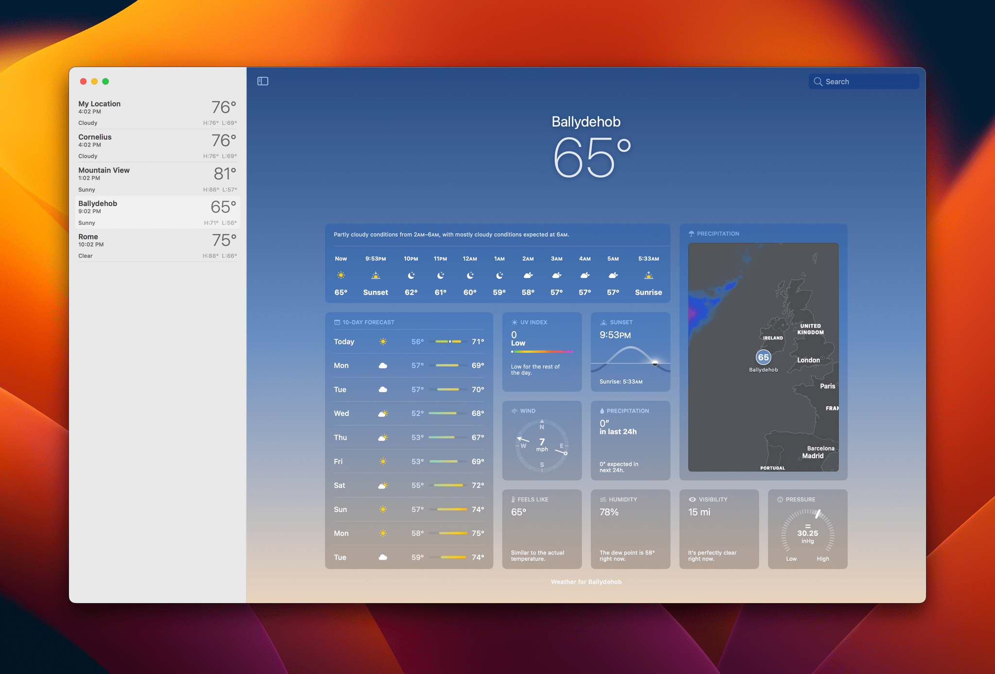
Like the iPad version of Weather, in Ventura, the app presents the current conditions and forecast low and high temperatures against a backdrop animation of the weather for the chosen location. Those locations are found in the collapsible sidebar on the left. The design of the sidebar on the Mac is plainer than on the iPad, foregoing the iPad’s card-like UI for text. Settings are handled differently, too, but otherwise, the apps are the same, including the ability to click on one of the app’s tiles to get more detailed information.
The update to Mail coming in Ventura this fall is the app update I’ve enjoyed most of all. I’ve been using Mimestream on the Mac for over a year. It’s an excellent native Gmail client with strong search and modern features, but it’s not on the iPhone or iPad yet. That’s left me using a different email app on those platforms, which is something I don’t like to do because it adds overhead to checking my email. Since installing Ventura, I’ve been using Mail exclusively, and, although I don’t know if I’ll switch to it full time yet, it’s finally a real contender.
What’s drawing me to Mail is its updated search functionality and a handful of new features that tick a lot of the boxes of what I want in an email client. You’ll still need to use a third-party app like Spark for collaboration tools and some other advanced features, but with the update coming in Ventura, I expect Mail will cover most of the modern email features that users want.
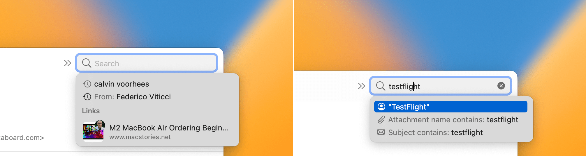
Search has been rebuilt from the ground up in Mail. The moment you click into the search bar, you’ll get suggestions for recent contacts, links, documents, and other relevant information. As you begin to type, the results update in real-time, suggesting matching contacts, attachments, subjects, and the like. Search also corrects for typos and considers synonyms resulting in more accurate results than before. We all have a lot of messages in our email accounts, and search is the single most important tool for finding them, so I’m glad to see so much work has been put into making the experience better and more reliable.
It happens to everyone. You send an email message and immediately realize you forgot something or made a mistake you wish you could correct. Mail is adding an Undo Send feature this fall that gives you 10 seconds to go to the bottom of the app’s left sidebar and click ‘Undo Send’ when that happens. I’d like to see options to pick a different duration before a message is sent, but 10 seconds should work for most people.
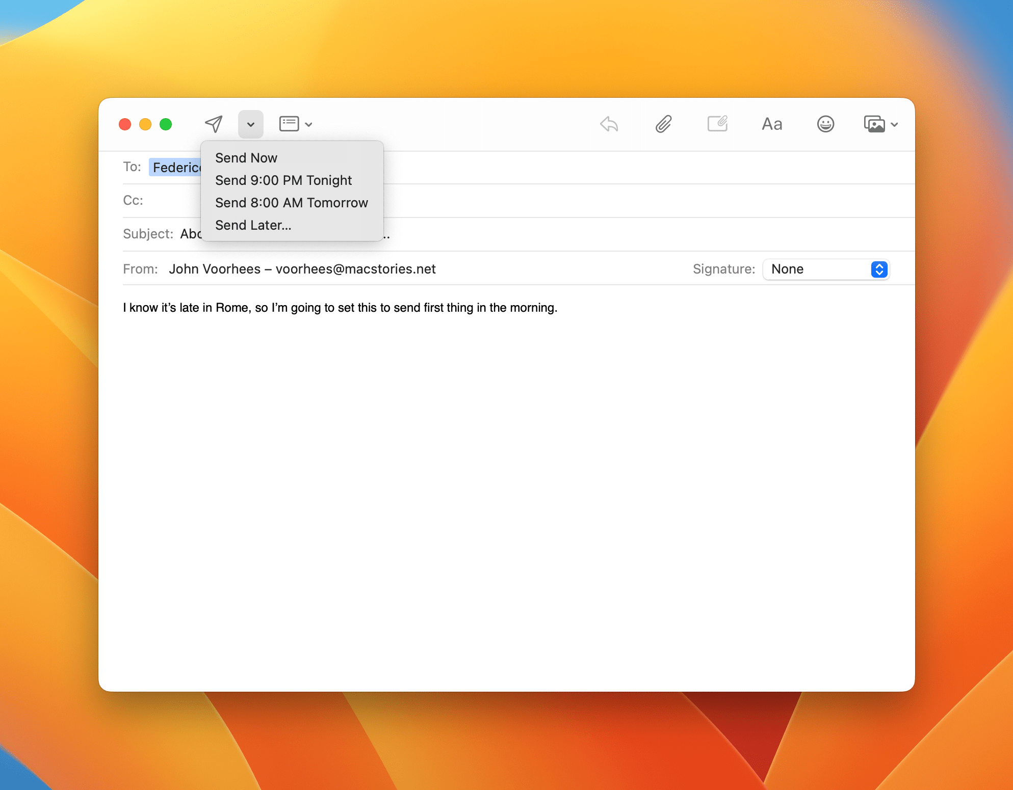
Sometimes the only time I have to catch up on my email is over the weekend or in the evening. I can sit down, respond to people, and send a bunch of my own messages in one focused session, which is great. However, at the same time, I don’t want to get into a back and forth email conversation once I’m finished. I’d rather save that for when I’m back and fully engaged with my work. The ability to schedule when a message is sent is perfect for those situations.
When Ventura is released, you’ll be able to schedule when your email messages are sent. The Send button in Mail’s compose window adds a dropdown option for picking a send time. In my limited testing, it appears the send options change depending on the time and day of the week. On the weekends, for example, I get options to ‘Send Now,’ send at a couple of different times during the current day, and send Monday at 8 AM, which I believe is based on when I have the start of my day set in Calendar. There’s a fourth option to ‘Send Later’ that lets me pick any other date and time too.
The biggest caveat regarding what Apple calls Scheduled Send is that it happens locally on your Mac. As a result, if your Mac is shut down when a message is scheduled, it won’t be sent. I need to do more testing to pin down exactly how putting your Mac to sleep affects Scheduled Send, but anyone who regularly shuts their Mac down will want to stick with a server-side send later solution from a third party.
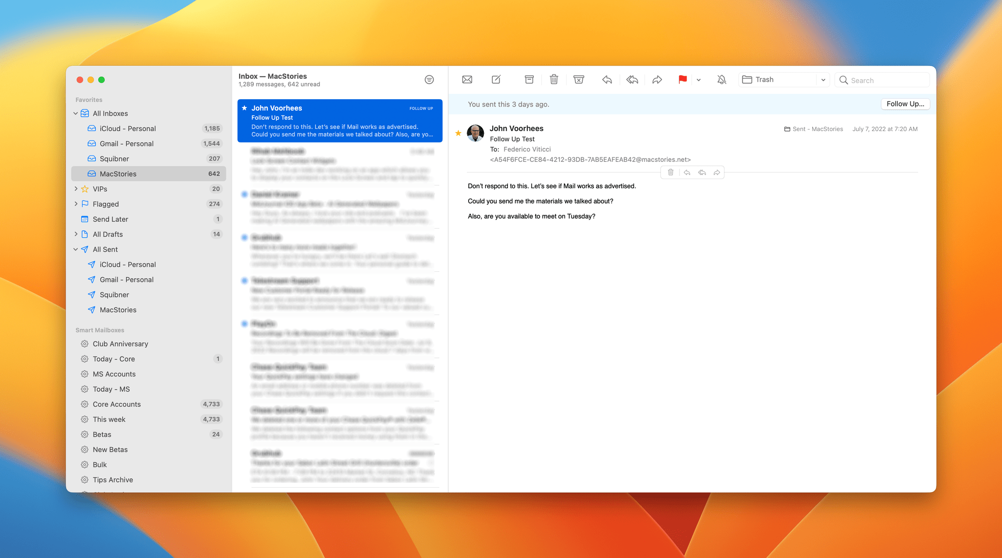
Follow Up is another new feature coming to Mail that looks for phrases like ‘Could you send me…’ to detect messages that require follow-up. If a response isn’t received within a few days, Mail will float the message back to the top of your inbox, so you can reconnect with the recipient. Peaking in my sent folder, it appears that Mail is doing its Follow Up analysis when a message is sent and assigning the message a future date, which is what moves it back to the top of your inbox later.
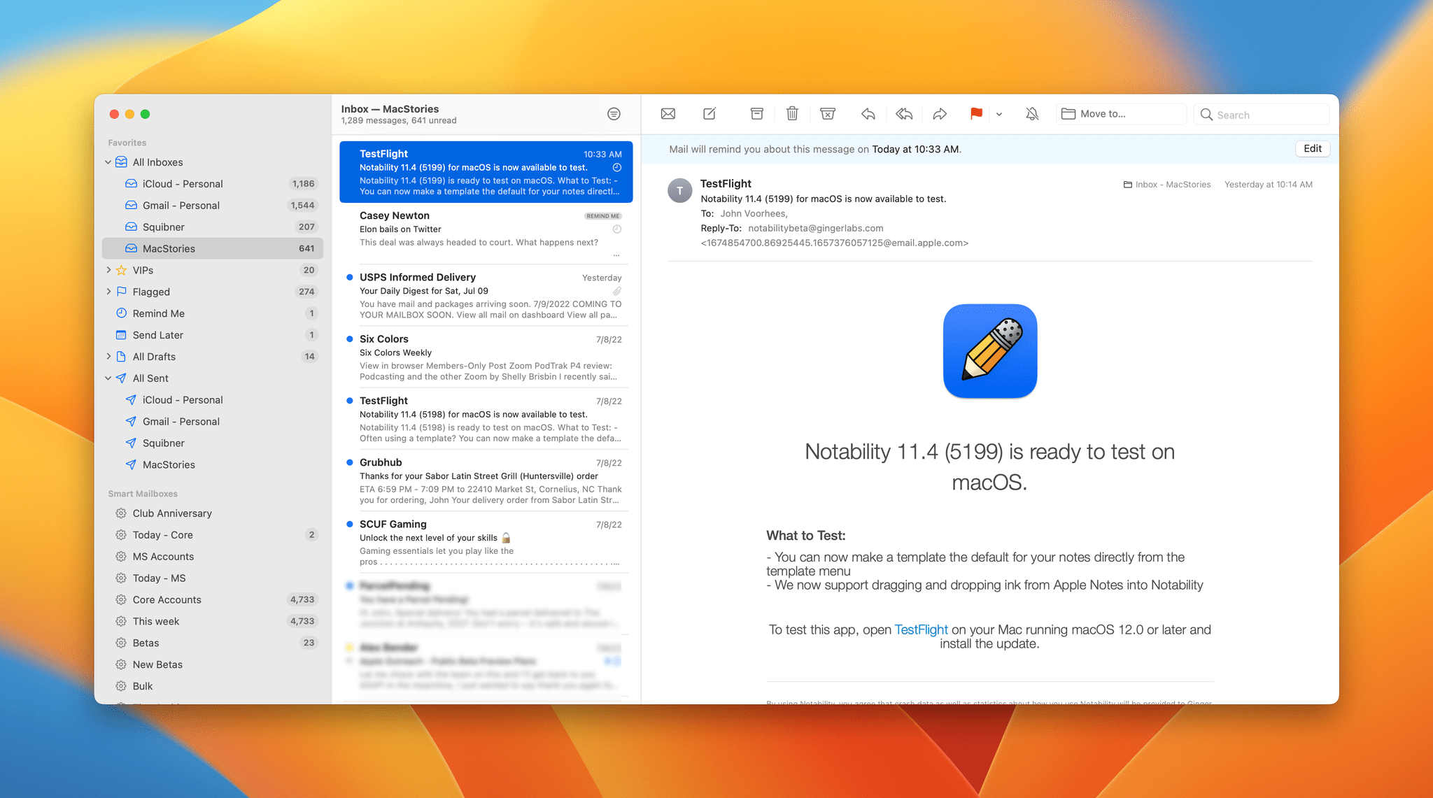
Remind Me is another new feature coming to Mail in Ventura that works similarly to Follow Up but manually. If a message arrives and you read it but don’t have time to act on it right away, it’s easy for it to get lost among the other messages in your inbox. Remind Me lets you resurface messages that you want to deal with later.
Swipe right across a message in your Inbox, and in addition to an option to mark a message as unread, there’s now a Remind Me button. Click it, and options to resurface the message in an hour, tonight, tomorrow, or any other time and date appear. Once you pick a Remind Me time and date, a clock icon appears on the message. File or archive the message, and it will reappear in your inbox at the appointed time with a little ‘Remind Me’ label. It’s worth emphasizing that Remind Me only affects your inbox, so messages remain in strict chronological order in All Mail.
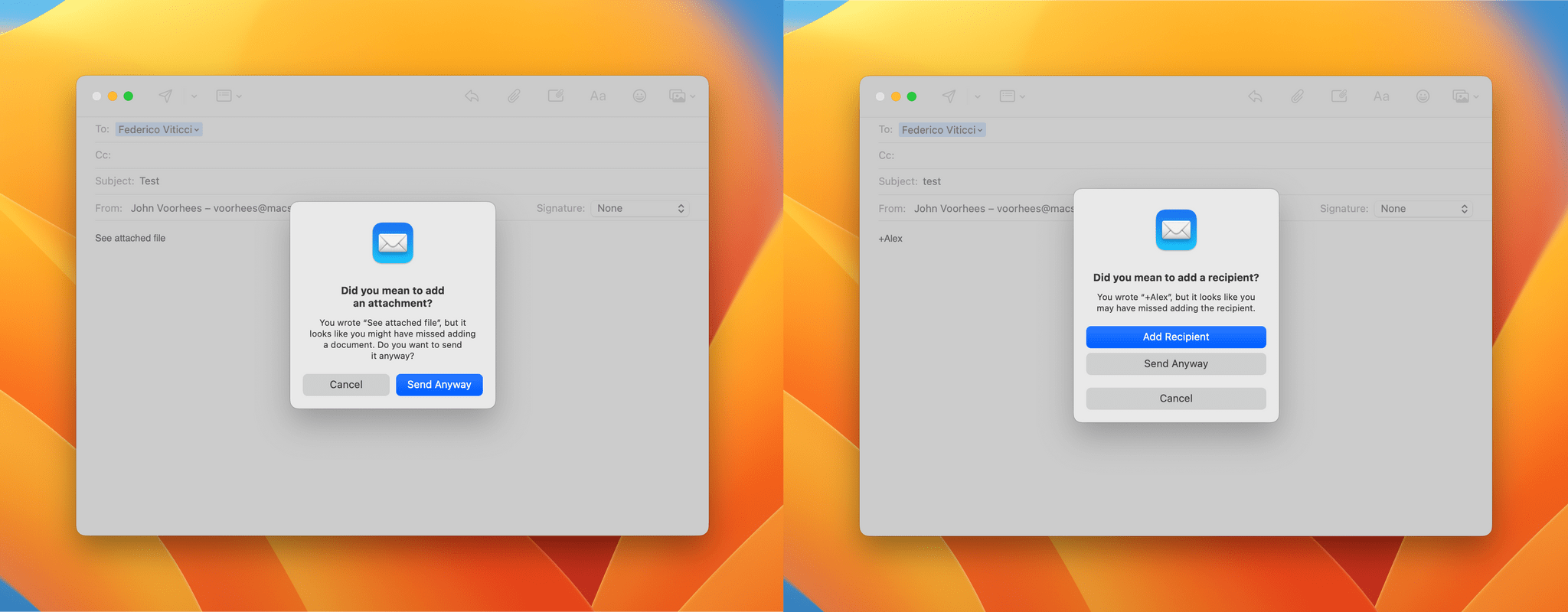
Mail will also remind you of missing attachments or recipients this fall. For attachments, the app looks for phrases that indicate that you meant to attach a file but haven’t, in which case you’ll see an alert before the message is sent prompting you to attach the file. Mail can also prompt you to add missing recipients if you mention them in the body of the message and prepend an ‘@’ or ‘+’ character to their name, which is how mentions already work in Notes, for instance.
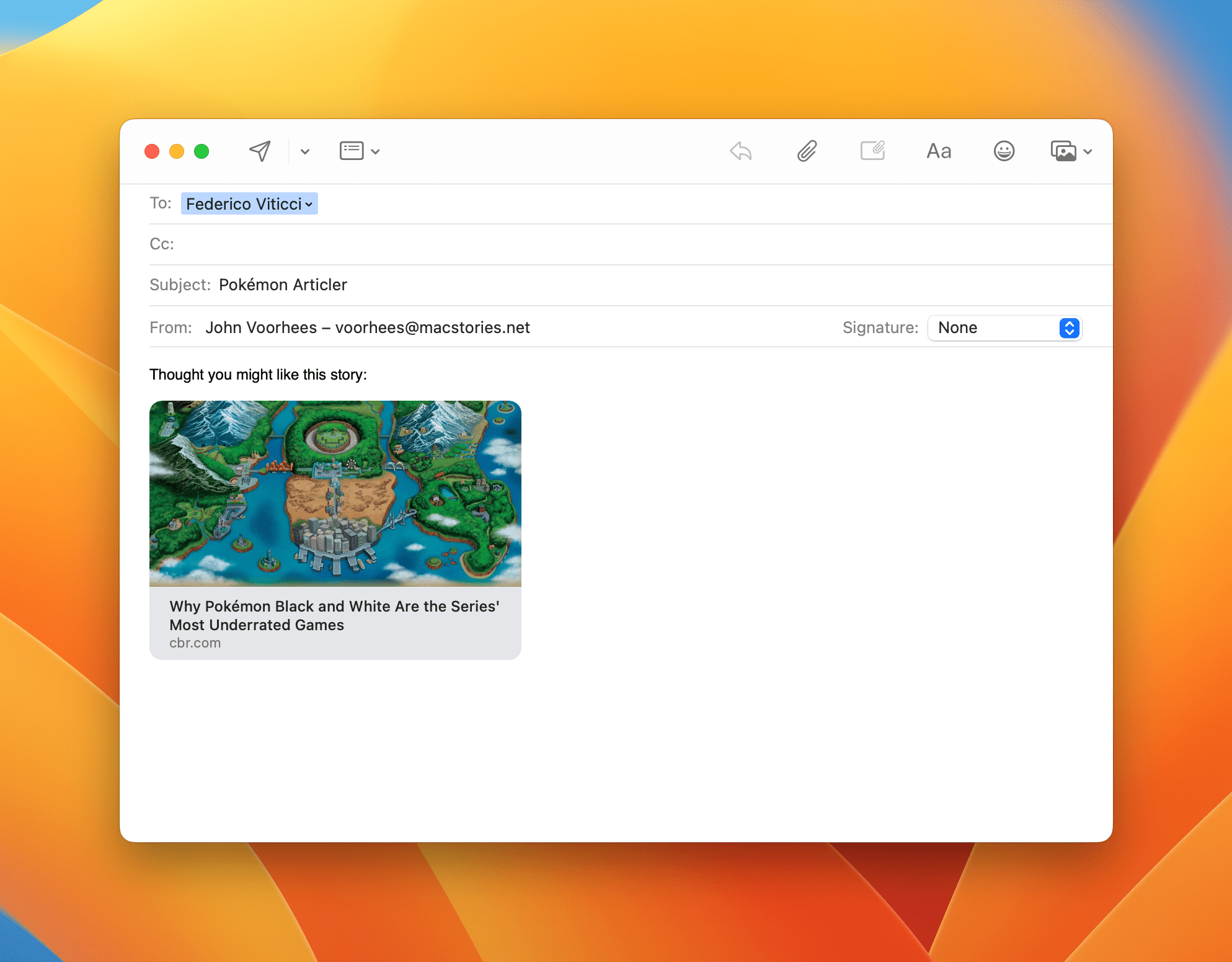
Finally, Mail will also support rich links this fall. Add a link to a message, and by default, it will be rendered as a rich link similar to what you find in Notes and Reminders as long as it’s added to its own line of a message. It’s easy to convert a rich link into its plain text version by hovering over it, which reveals a downward pointing arrow button that offers two options: ‘Convert to Plain Link’ and ‘Open Link.’
Safari
The marquee feature coming to Safari this fall is shared tab groups. Tab groups were a new way of organizing tabs introduced with macOS Monterey, allowing users to move groups of tabs to their own space for revisiting later. With Ventura, the feature can be used as a collaborative tool and includes other useful additions whether or not you’re working with someone.
From the More button that appears when you hover over a tab group in the sidebar or by right-clicking on a tab group, you can choose to share it. Once shared, a collaboration button will appear in Safari’s toolbar that can be used to manage sharing and participate in a Messages conversation or audio or video FaceTime session.
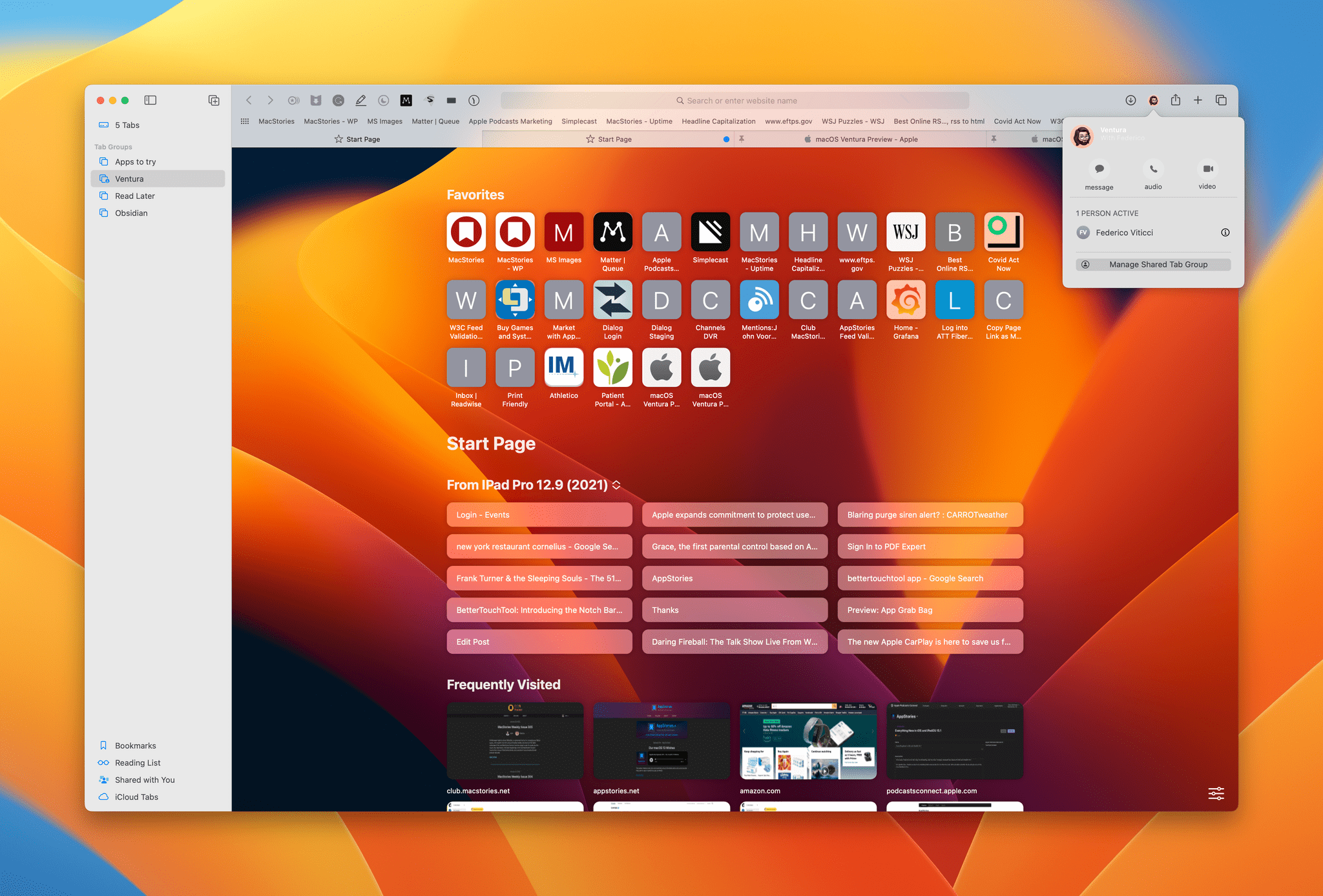
Each participant in a shared tab group can add new tabs, which will appear to other users with a colored dot in the tab, all of which happens in real-time. Also, if someone you’ve shared with is actively viewing a tab, their profile picture will appear in the tab and will replace the Collaborate button in the toolbar.
My testing of shared tab groups has been limited, but I’m intrigued by the possibilities. I can imagine using the feature to share links that I want to discuss with Federico on one of our podcasts. It should also work well for anyone planning a group trip or an event like a wedding, for example.
Beyond sharing, Ventura will add a few other features to tab groups that will be useful whether you’re sharing tabs or not. First, you’ll be able to expand tab groups in the sidebar to see the webpages saved in each group. Second, you can create a custom start page for each tab group, tailoring it to the purpose for which it was created. Third, you’ll be able to pin tabs and assign Favorites on a per-tab group basis.
Taken together, the changes coming to tab groups represent a subtle change in their purpose that I’ll explore more in my review. I’ve experienced some bugginess when two people are active in a shared tab group at once, but I’m excited about the possibilities once Ventura is released. Whereas tab groups in Monterey stuck me as a temporary holding pen for tabs you wanted to return to later, Ventura’s tab groups have evolved into standalone workspaces for individuals and groups that I expect will expand their usefulness substantially.
Beyond tab groups, you’ll also find that in Ventura, Safari will:
- Sync browser extensions and website-specific settings between devices
- Offer to translate text recognized in images using Live Text, and
- Support new languages
Messages
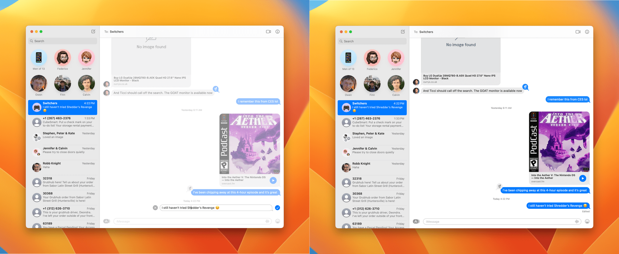
I’ve already covered how Ventura will integrate SharePlay with Messages and has been added to many apps as part of Apple’s expansion of collaboration features, but there’s more.
In Ventura, users can:
- Undo sending and edit messages within the first 15 minutes that they’re sent
- Mark messages as unread, which should be handy to use as a reminder to respond to someone, and
- Recover deleted messages within 30 days
Messages is one of my most-used apps. It’s how I stay in touch with friends and family and where a lot of the management of MacStories’ business happens. The changes coming to Ventura may not put the app in the same league as WhatsApp in terms of its depth of features, but the changes coming are welcome, and I expect users will find them useful.
Photos
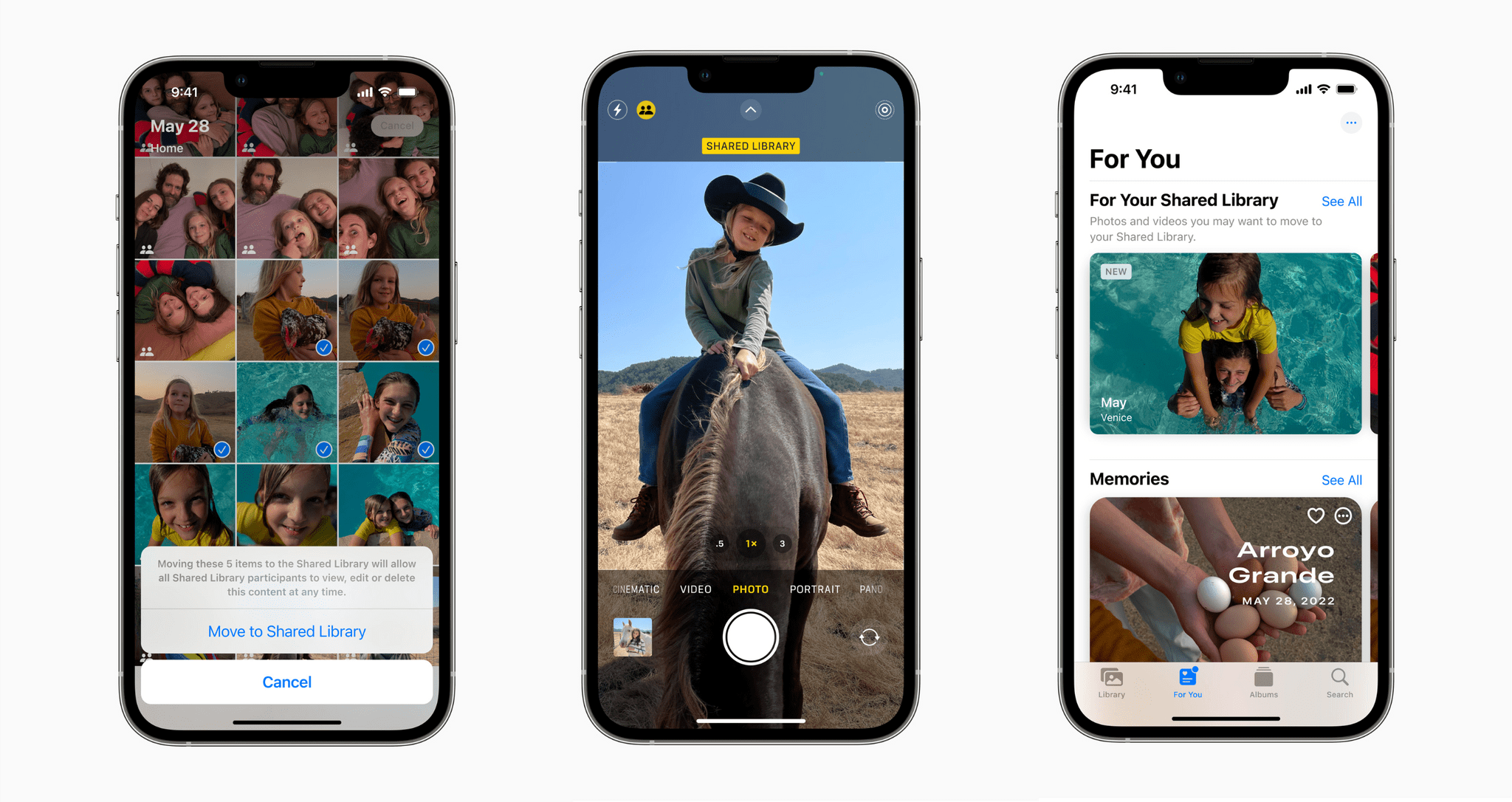
The biggest feature coming to Photos in the fall is iCloud Shared Photo Library, which will let you share some or all of your photo library with up to five people in a separate shared library. The limitations built into the feature make it clear that it’s intended as a way to share photos with your immediate family, not your extended family or friends. In addition to the cap of six total users, you can only be a member of one shared library. For example, I can set up a shared library for myself, my wife, and kids because there are five of us, which fits within Apple’s limits, but I couldn’t also be part of a shared library my brother sets up or create a second shared library myself to share with my parents.
There’s a new tab in Photos’ settings that walks you through the process of setting up a shared library, which offers a lot of flexibility. Each participant can share all of their photos to the shared pool of photos, pick images manually, or setup up time or people-based rules for sharing.
Once the library is created, members can add, edit, delete, and favorite all of the photos and videos in it, and the changes will sync to everyone’s libraries. Photos will also suggest new photos for sharing in a ‘For Your Shared Library’ section that appears in the app’s sidebar. When viewing images in the Photos app, you’ll be able to look at everything at once or just your photo library or your shared library. The shared library will feed into Photos’ Memories feature and widget too.
I haven’t had a chance to try iCloud Shared Photos Library yet because none of my family members are on the beta, but I like the idea of it. I expect some people will be disappointed by the strict limitations on shared libraries, but for extended family and friends, there’s always the option to use Shared Albums.
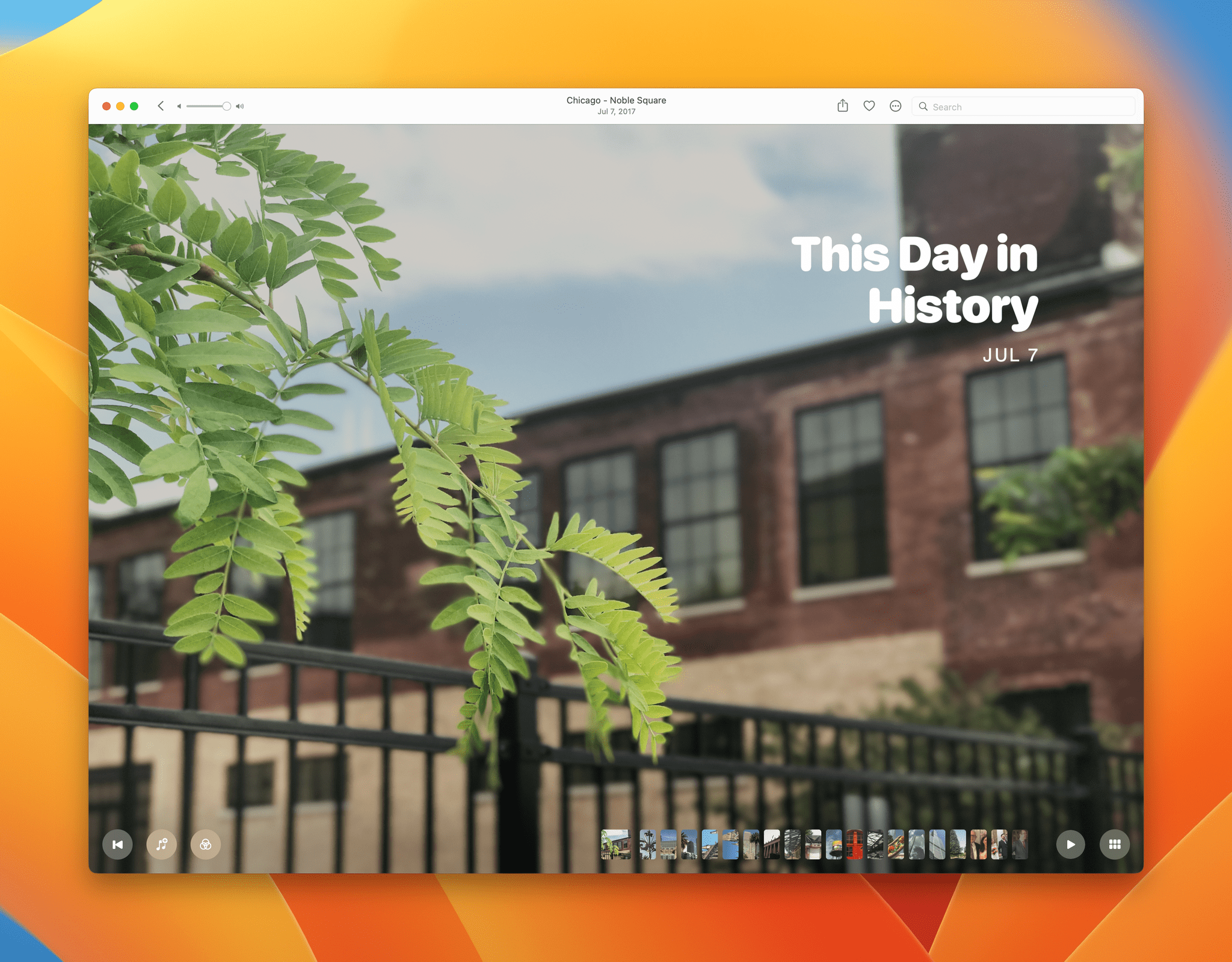
Besides iCloud Shared Photo Library, Ventura will automatically lock your Recently Deleted and Hidden Albums, which can be unlocked with Touch ID or your login password, and will add:
- Copying and pasting of photo edits
- Duplicate detection and deletion
- A new ‘This Day in History’ option in Memories
- An option to skip back to the beginning of a memory without interrupting its music and to add any song in Apple Music to a memory, and
- The ability to turn off Featured Photos and Memories in the Photos app and widgets
Home
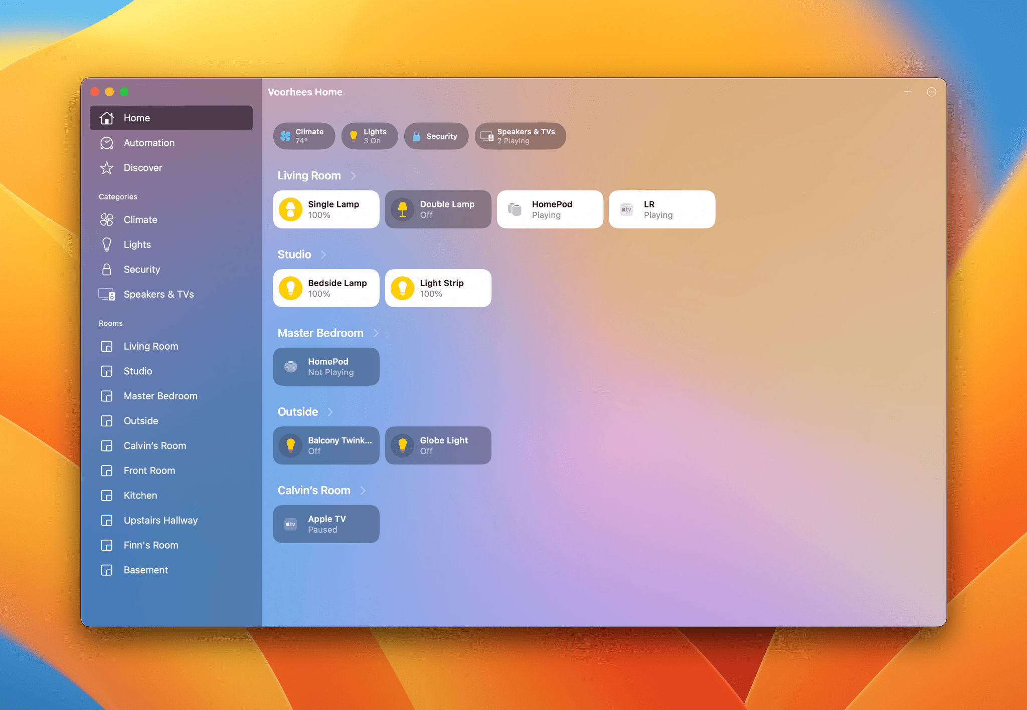
The Home app has been completely redesigned, and I like where the Ventura beta is taking this app already. Since moving to North Carolina, I’m using fewer HomeKit devices than before, but even so, I’ve always thought the uniformity of the tiles used in the Home app was problematic.
This fall, that will change. Tiles can be different sizes, which is accessible by right-clicking on a tile, and the app makes better use of color to distinguish one device from another. The space used by the Home app has always been less of an issue on the Mac than on the iPhone, but even so, the new design makes it easier to get a quick overview of the status of all your devices at once.
The sidebar is divided into three sections with the tabs found in the iOS version of the app at the top: Home, Automation, and Discovery, followed by a new section called Categories that organizes your devices by type and the rooms in your home at the bottom. The Home app will also be able to display up to nine video cameras in a grid in the Home view, but I haven’t had a chance to try that yet.
Apple says a new architecture that will bring performance improvements and support for the Matter smart home standard are coming later this year too.
Notes
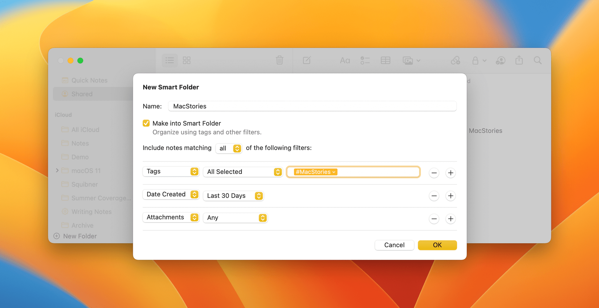
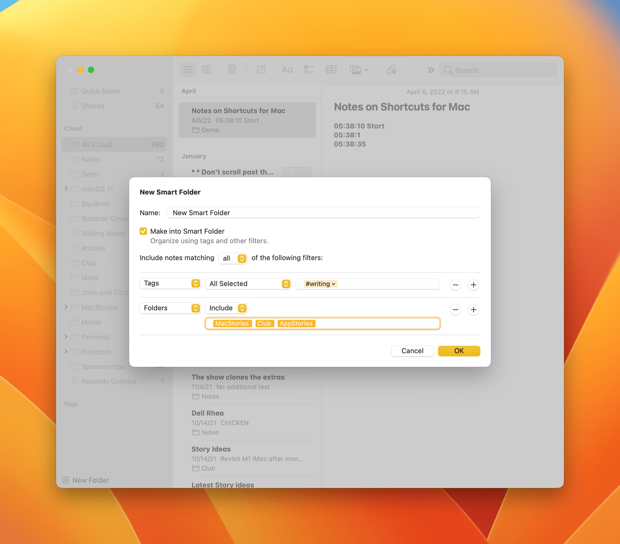
Last year, Notes gained tagging and smart folders but didn’t take the implementation of smart folders nearly as far as Reminders took its smart lists. That’s changing with Ventura. Smart folders extend to all sorts of other metadata associated with your notes, including creation and modification date, a note’s folder, whether a note includes mentions, checklists, or attachments, and shared, pinned and locked status. Add to that the option to specify if a note meets any or all filter criteria you pick, and you’ve got a far more robust and powerful system for creating smart folders that wasn’t possible under Monterey, where smart folders were limited to tags.
Ventura also adds date-based categorization of your notes. You’ll see notes organized by headings like ‘Today,’ ‘Yesterday,’ ‘July,’ and ‘2020,’ for example. It’s a small touch, but one that makes it easier to parse a long list of notes where you’re looking for something from a particular time period.
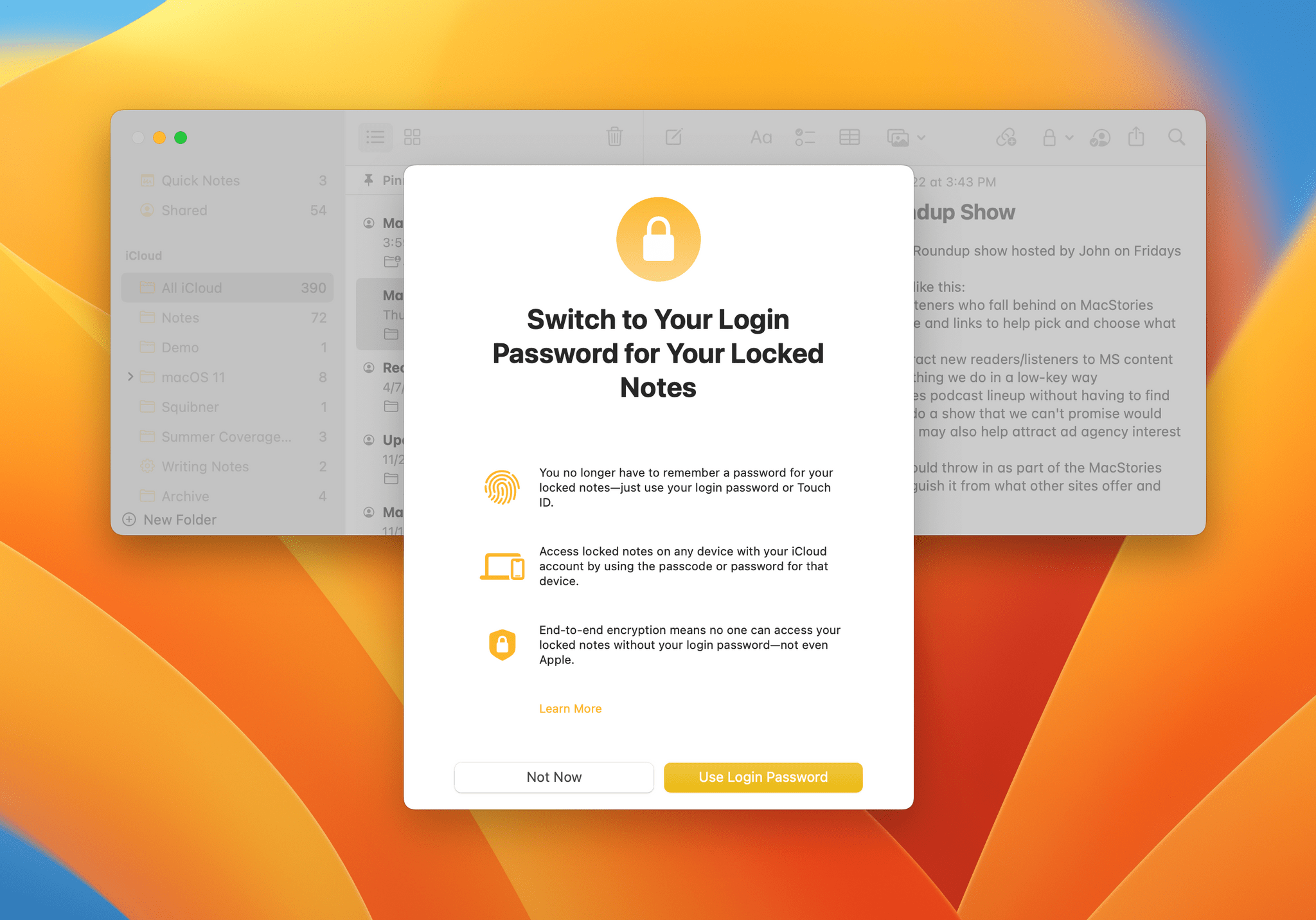
In addition to the collaboration features mentioned above in the Continuity, Connection, and Collaboration section of this story, Apple is adding the ability to switch password-protected notes so they use your Mac’s login instead of a separate password. That will allow you to unlock notes with Touch ID, but if you prefer, you can stick with a manually-created password instead.
Reminders
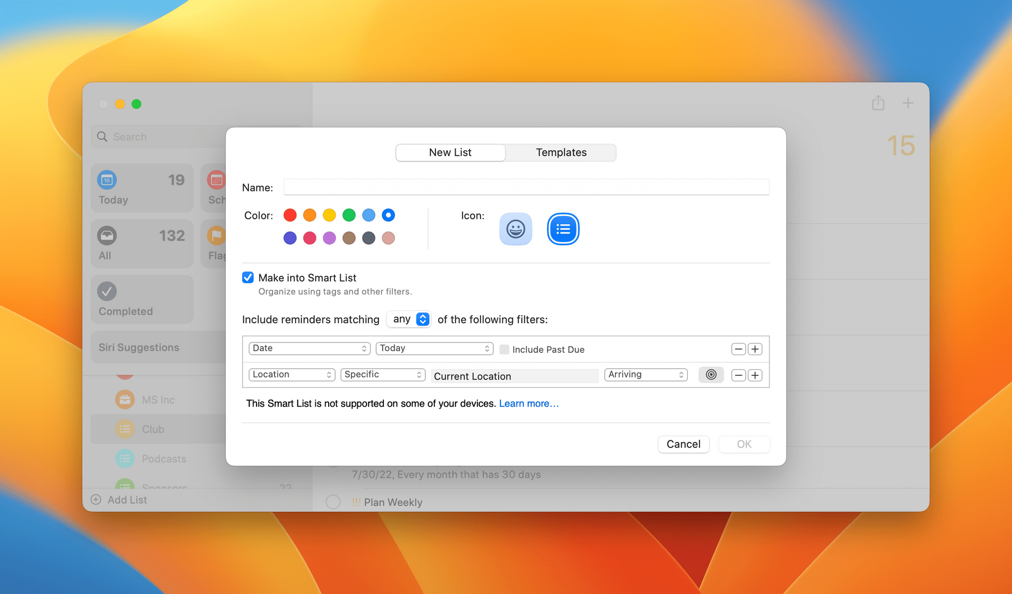
While Notes is catching up with the powerful smart lists feature added to Reminders last year, Apple’s built-in task manager isn’t sitting still. Ventura will add a lot of flexibility to Reminders in the fall. The same any or all filtering option being added to Notes will be part of Reminders, allowing for more advanced smart lists than before.
Ventura will also debut Reminders templates allowing users to create reusable checklists that can be shared with others. There’s a new Completed smart list, so you can see all of your completed tasks in one place, and time and date-based grouping of tasks in the Today and Scheduled lists. Also, selecting a group in Reminders’ sidebar will display all the lists contained in the group organized by list.
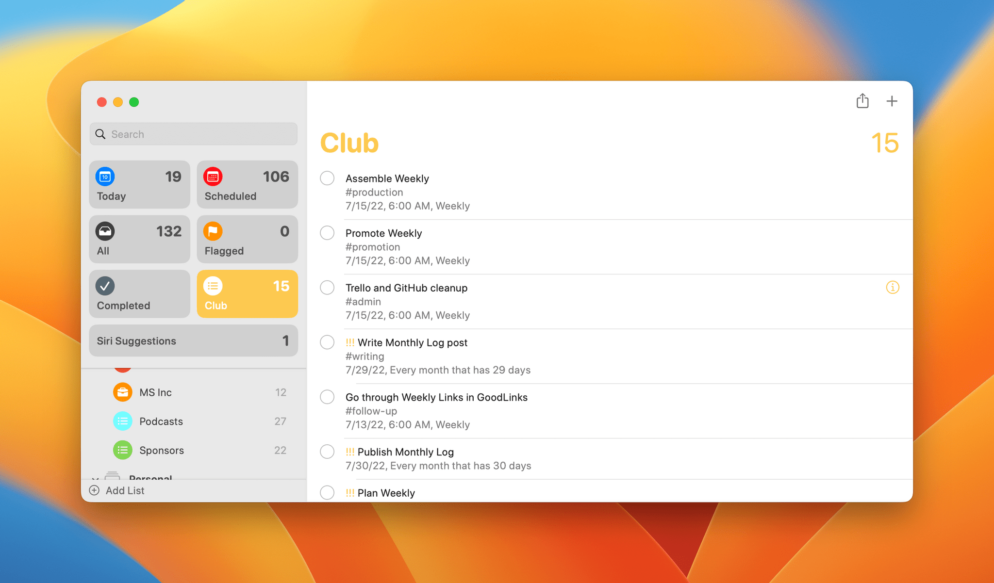
Other new features coming to Reminders in Ventura are:
- The ability to pin your lists to the top of Reminders and remove the default ones Apple provides if you’d like
- Rich text formatting in a task’s notes field
- Notifications when a task in a shared list is added or completed
System Enhancements
Every update to macOS also includes a long list of system enhancements, big and small. For this preview, I’m going to hit the highlights and save the nitty-gritty for this fall’s review.
Spotlight
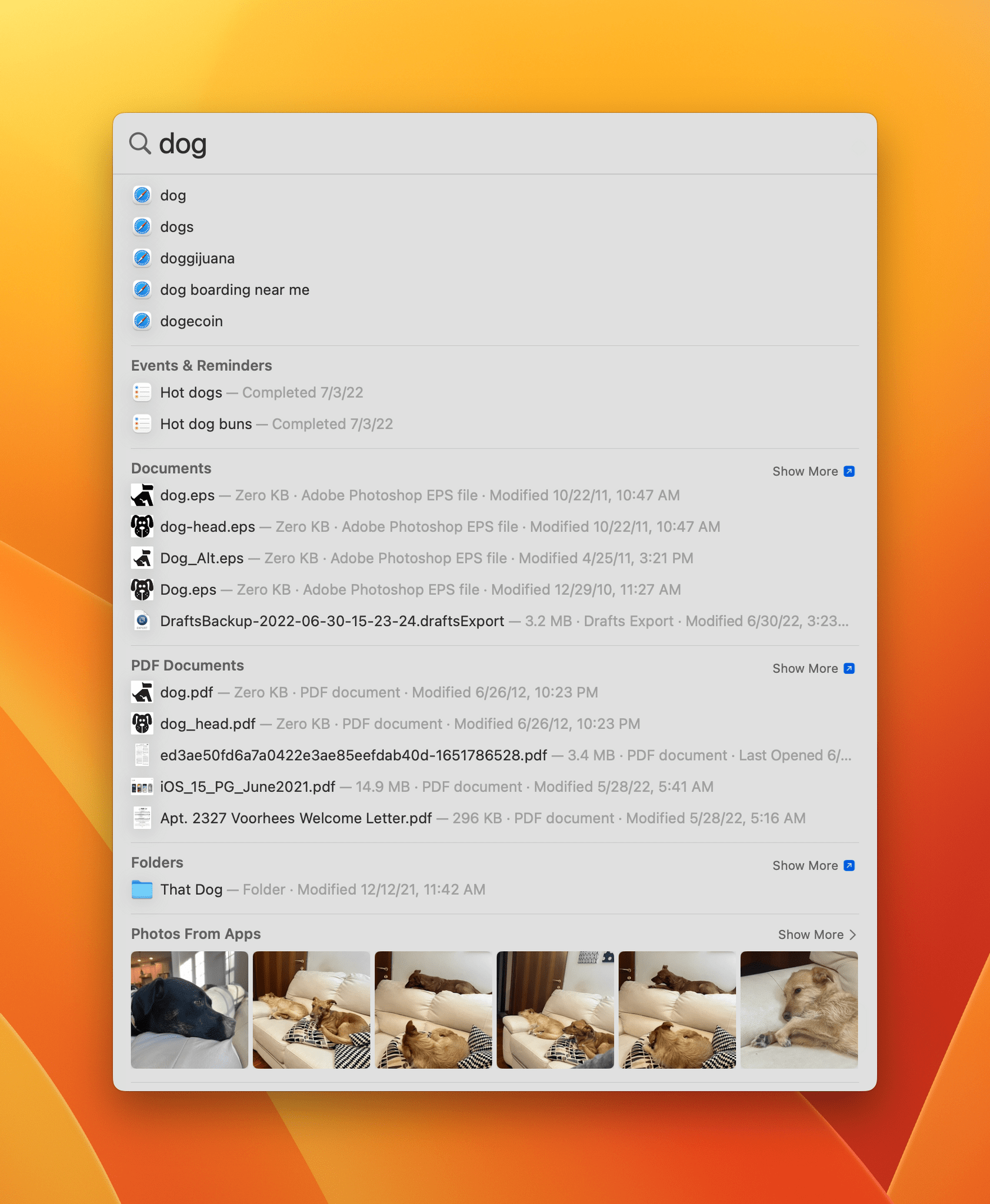
I long ago replaced Spotlight’s default shortcut with an evolving lineup of third-party apps and am currently using Raycast. I don’t know yet whether the improvements coming to Spotlight this fall will change that, but I’ve got it set up with a much easier to use keyboard shortcut for the summer and will be making use of its unique features.
Spotlight has added Quick Look support for a long list of file types, making it easier to peek at results before committing to opening them. Spotlight is also integrated with Photos, returning results based on criteria like location, people, scenes, and objects from images in your photo library, Messages, and Notes. Spotlight will find photos based on Live Text results, and results will include quick actions when an app’s name is searched, offering to create a document or start a timer, for example.
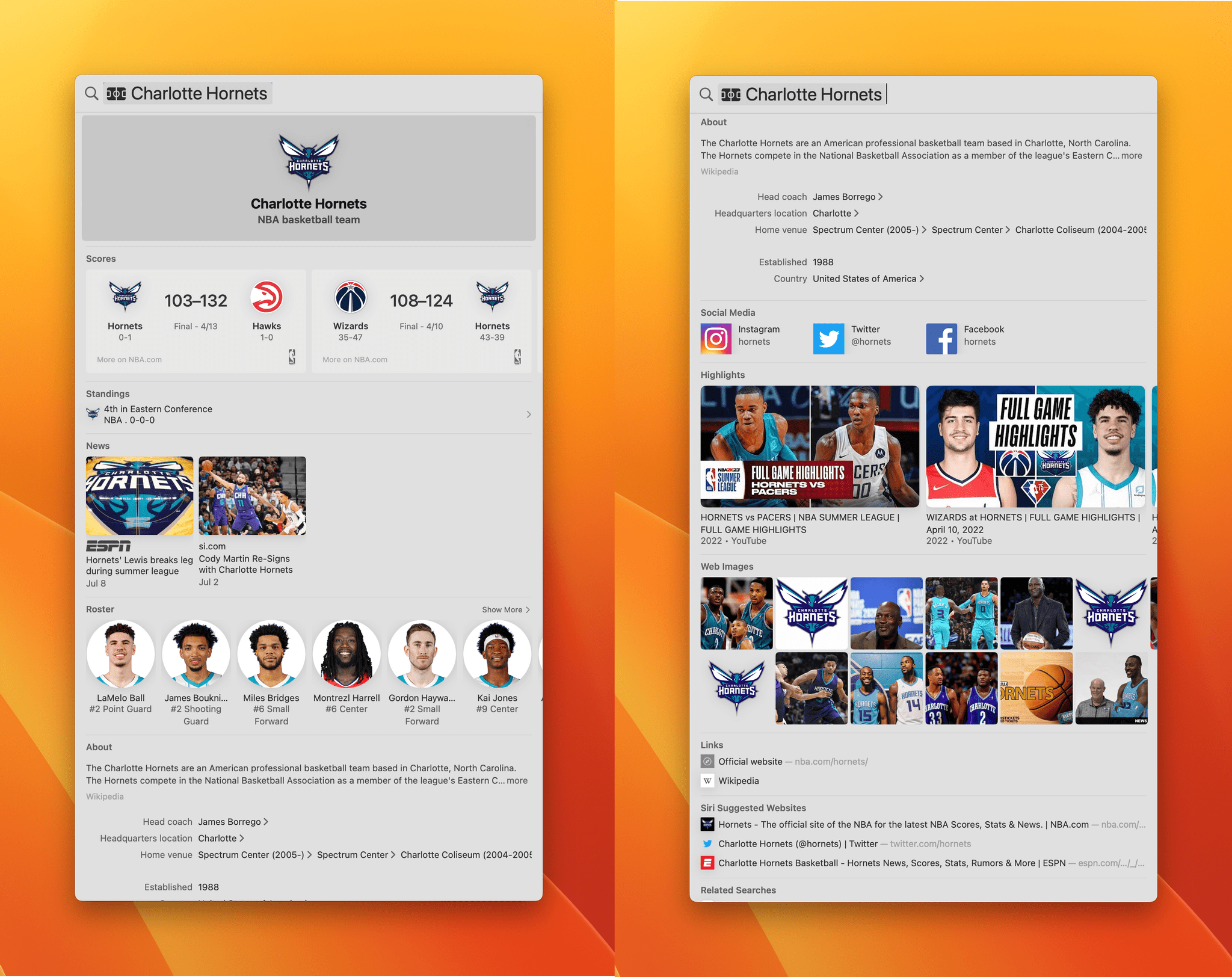
Spotlight results for musicians, TV shows, movies, sports leagues and teams, businesses, and other categories display much richer results too. A business entry may include locations that will open the Maps app when selected, and the results for your favorite baseball team will include game highlights, scores from recent games, and a roster of players, for instance.
System Settings
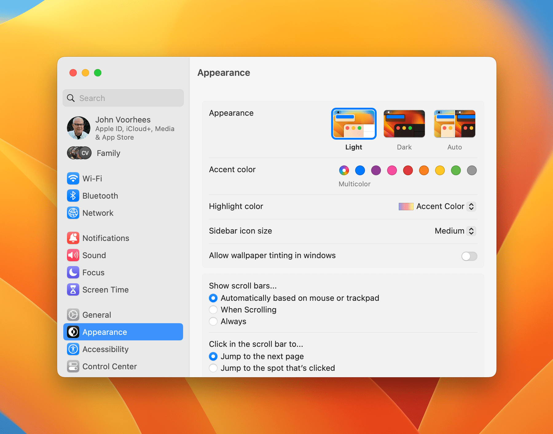
System Preferences is being replaced by System Settings. Instead of a static-sized window of icons for each category found in System Preferences, the new System Settings is a scrollable list in a resizable window that adopts the modern sidebar style found in so many other apps throughout macOS.
The sidebar is divided by subject, with similar entries grouped together, not unlike the way icons were used in System Preferences, but with more room available to break settings down more granularly. Select a category on the left, and the details appear on the right for tweaking. From my testing, the sidebar’s search seems to work better than before too.
The new design shares some similarities with iOS and iPadOS and has already drawn strong negative reactions from some users of the developer betas. It’s too early in the beta period to pass final judgment on System Settings, but based on my experience with Settings in iOS and iPadOS, I suspect that any design is going to have a discoverability issue given how much is included in System Settings. There’s room for the design to be improved, but as long as search works well, which it does, I can’t get too excited about the organization of a settings window.
Focus Modes
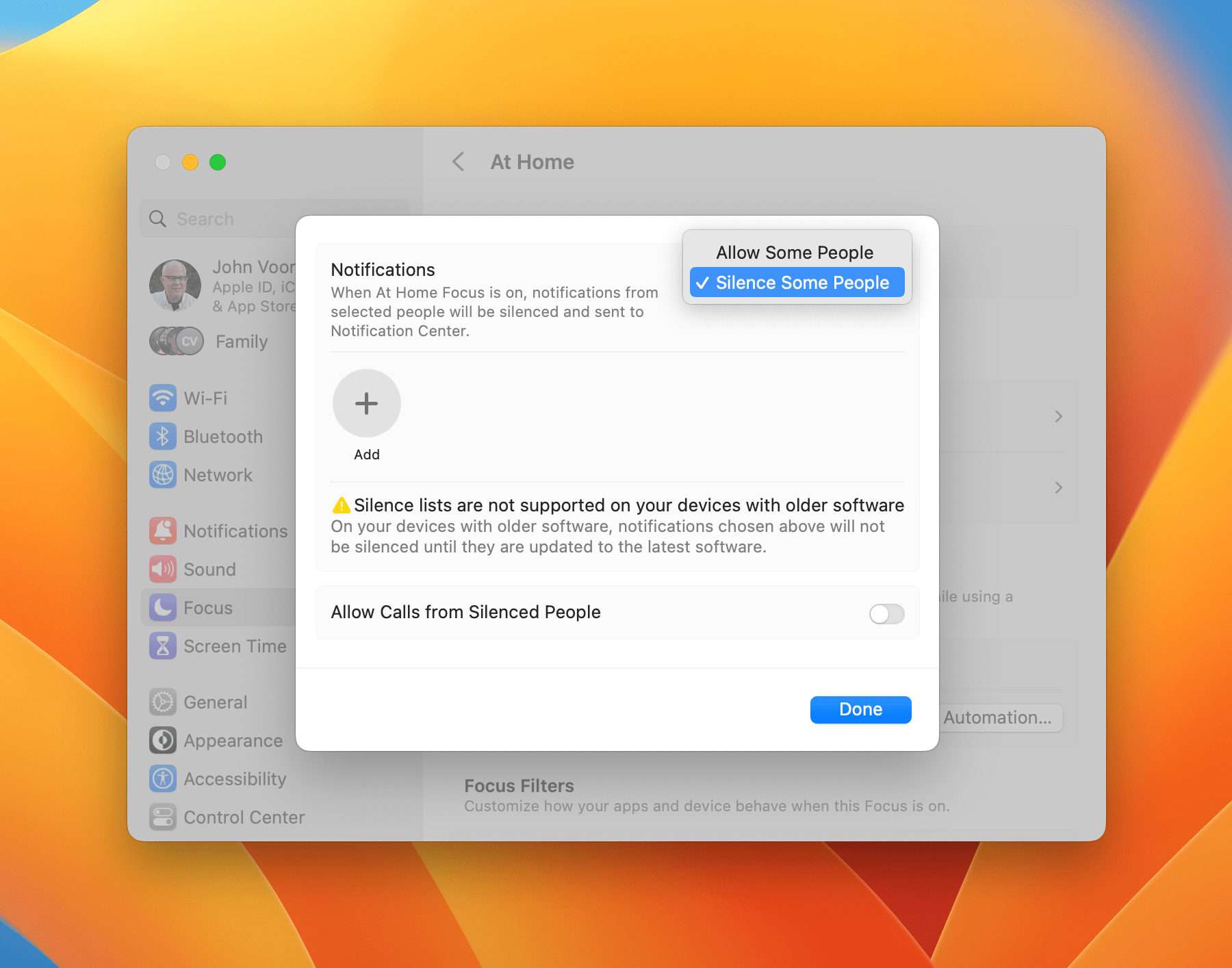
Focus modes are adding greater flexibility just one year after their introduction. With Ventura, you’ll be able to either exclude all apps from notifying you and add allowed apps back one at a time like last year or allow everything and remove them one by one. It’s a welcome change that should make setting up focus modes much easier when you want to let most notifications through.
App-level focus filters have been introduced for apps like Calendar, Safari, Messages, and Mail too. That will allow you to do things like hiding your work email and calendar on the weekend, for example, adding a new level of customization that wasn’t possible before. Apple has created an API for developers, so this fall, you should start to see similar refinements possible from third-party apps.
Passkeys
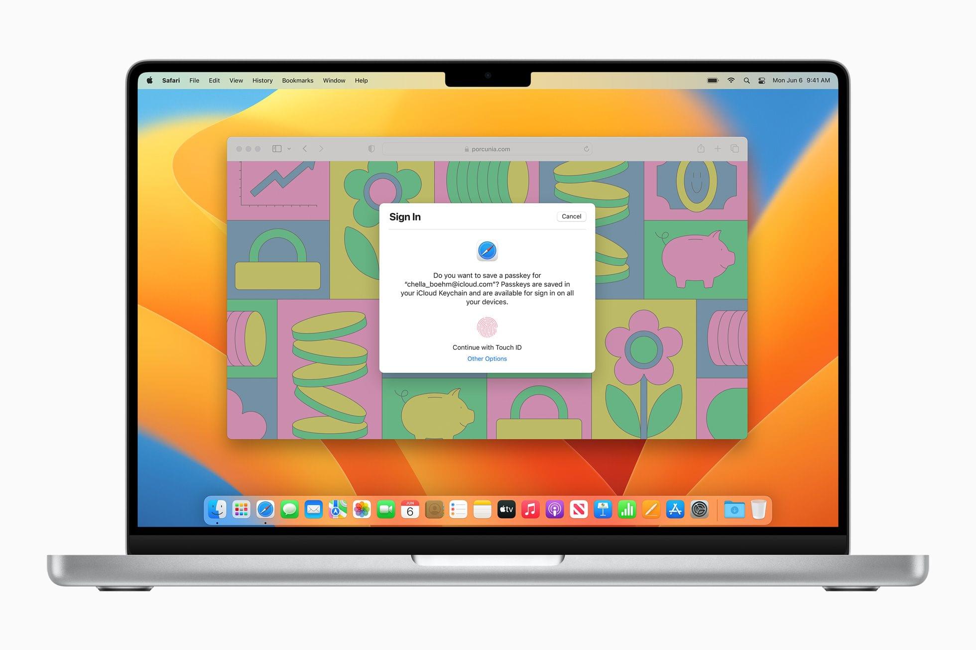
Ventura will include a handful of new security features this fall that I’ll cover in more depth in my review, but the biggest change by far is the introduction of the passkey, a passwordless login system. It’s going to take years for passkeys to replace passwords, but the idea and the fact that other tech industry companies are working on the same goal through the FIDO Alliance is promising long-term.
The basic idea is to use biometric authentication locally on your device to authenticate your website and app credentials. Your passkeys will be stored in iCloud Keychain and synced among your devices. Because you’ll use biometric authentication like Touch ID on a Mac to access them, you’ll never see them. This isn’t something I’ve been able to test yet, but hopefully, I’ll get the chance to report on what the practical user experience is like soon.
Gaming
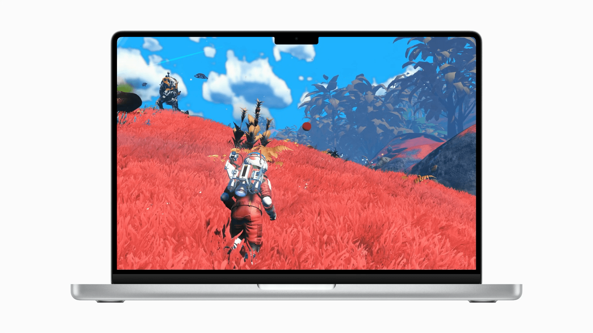
Apple spent a lot of time talking about gaming during the WWDC keynote, which has me intrigued. The company introduced Metal 3, which offers developers new technologies to do things like load game assets and render high-resolution graphics faster. During the keynote, Apple previewed that No Man’s Sky and Resident Evil: Village are coming to its platforms using Metal 3. Those games aren’t available on Apple platforms yet, but the new Metal 3 technologies promise to improve gaming on Apple silicon Macs. The proof will be in how the games announced perform and whether other recent resource-intensive titles are released for the Mac, so until then, it’s something I’ll be keeping an eye on.
Ventura will also support Nintendo Switch controllers, including the Pro Controller and individual and paired joy-cons.
Accessibility
I’ll cover all of the accessibility features coming to Ventura in my review, but the one that stands out most so far is Live Captions, which will transcribe spoken audio system-wide on the Mac in real-time. The feature works with apps like FaceTime, where you can read along in real-time as someone speaks and type back responses, but it also works with other spoken audio.
Coming Later
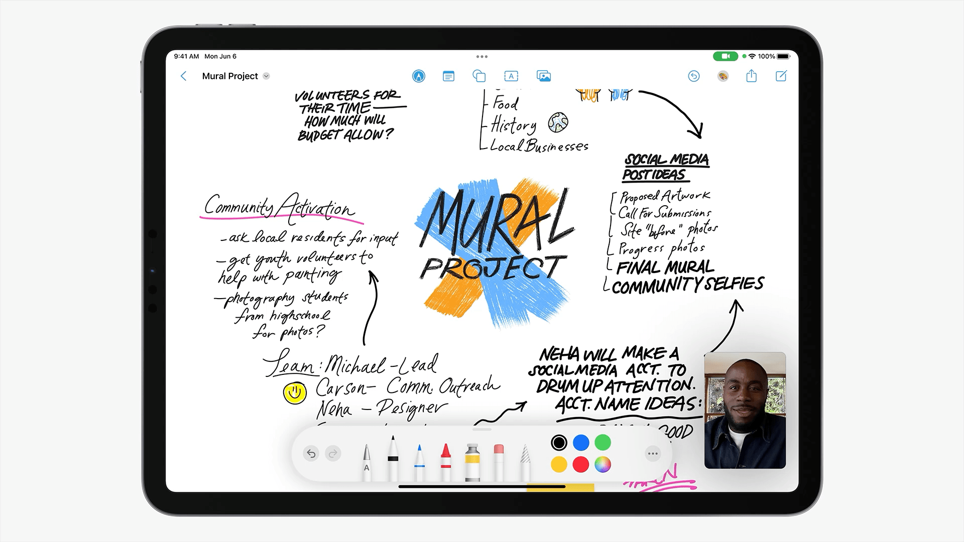
Freeform is an infinite canvas app that will be available later this year on the Mac as well as the iPad. Source: Apple.
I’ve already mentioned that improvements to Home’s architecture and support for the Matter standard are coming after the public release of Ventura, but there are a couple of other things coming later too that I want to preview.
The first is Freeform, a new infinite canvas app that will allow users to add text, images, files, PDFs, audio, video, handwriting, and other elements in a single document that can be shared with others. The app is reminiscent of apps like Muse and our sponsor for this story, Concepts, but it remains to be seen how deep the feature set goes compared to third-party apps because it isn’t part of the beta yet.
Apple is also bringing new features to Game Center later this year, including SharePlay support and Contacts integration.
So, those are the highlights. As I’ve said, it’s far too early in the beta process to judge the success of Ventura, but what I’ve seen over the past month or so is encouraging. Stage Manager has quickly gone from a feature that I need to use for my review to one that I want to use every day, Continuity Camera offers an effortless option for leveraging the best camera most of us own for video calls, and there is a long list of system apps and features that will be updated that should meaningfully improve the experiences of many users.
If you’re thinking of jumping on the beta bandwagon for the summer, scroll back to the top of this story to make sure you’ve got your bases covered in case of disaster. However, my experience has been solid and drama-free so far. That’s no guarantee that your experience will be the same or that things won’t change, but still, it’s a good place to be a month into the macOS beta cycle. If you do take the beta plunge, though, be sure to do your part and use the Feedback Assistant app to let Apple know about any issues you run into.
There’s still a long summer ahead of us and a lot of exploring of the betas yet to do, so be sure to check back in on our Summer OS Preview series regularly. We’ll be covering a number of topics here and on AppStories throughout the summer, breaking down the details of everything you can expect this fall as we work on our comprehensive reviews of each OS that we’ll publish in the fall when the OSes are released publicly.
You can also follow our 2022 Summer OS Preview Series through our dedicated hub, or subscribe to its RSS feed.