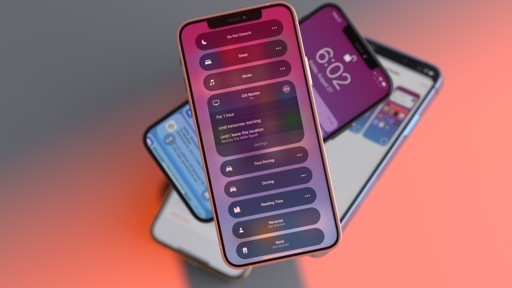
iPadOS
The iPad story in iPadOS 15 is one of consistency and embracing the platform’s modular nature.
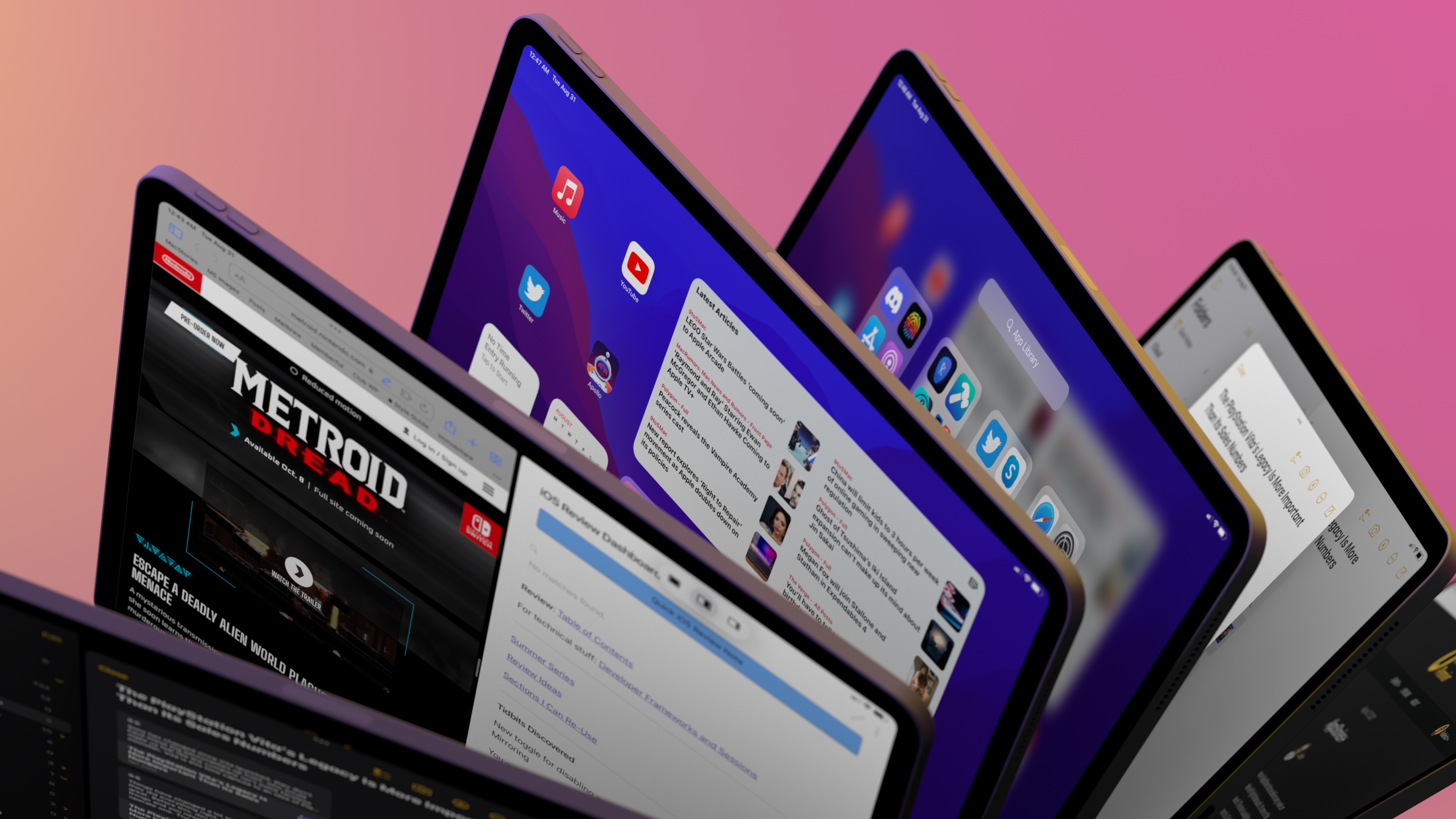
With iPadOS 15, Apple is creating a stronger continuum for Mac Catalyst apps by making key multitasking interactions more consistent with macOS and is bringing the widget-laden Home Screen experience from iOS 14 to iPad. At the same time, the company is now keenly aware of the iPad’s role as a modular computer, and they’ve fully embraced keyboard navigation and shortcuts as means to control the entire OS. Amidst all this, iPadOS 15 drastically simplifies multitasking operations for less tech-savvy users, surfacing options such as Split View and Slide Over while tying them to the Home Screen as a universal app launcher.
For these reasons, iPadOS 15 reveals a two-pronged approach: a small revolution for novice users who never fully understood the iPad’s old drag and drop multitasking; and a variety of smaller, yet important, additions for power users combined with a big focus on keyboard control. Let’s take a look at how well this strategy can scale.
Multitasking
Apple’s refreshed approach to multitasking in iPadOS 15 starts with a simple button at the top of the screen.
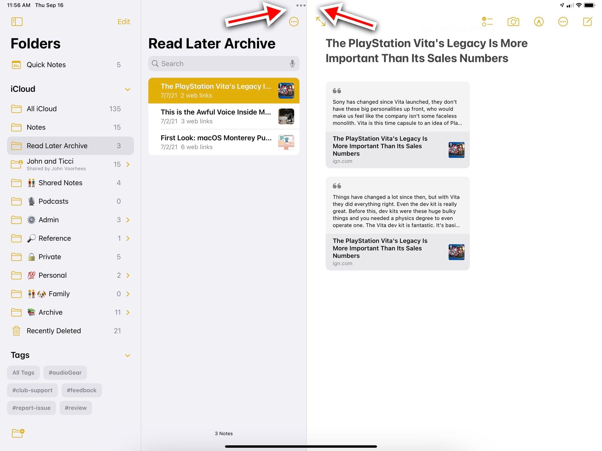
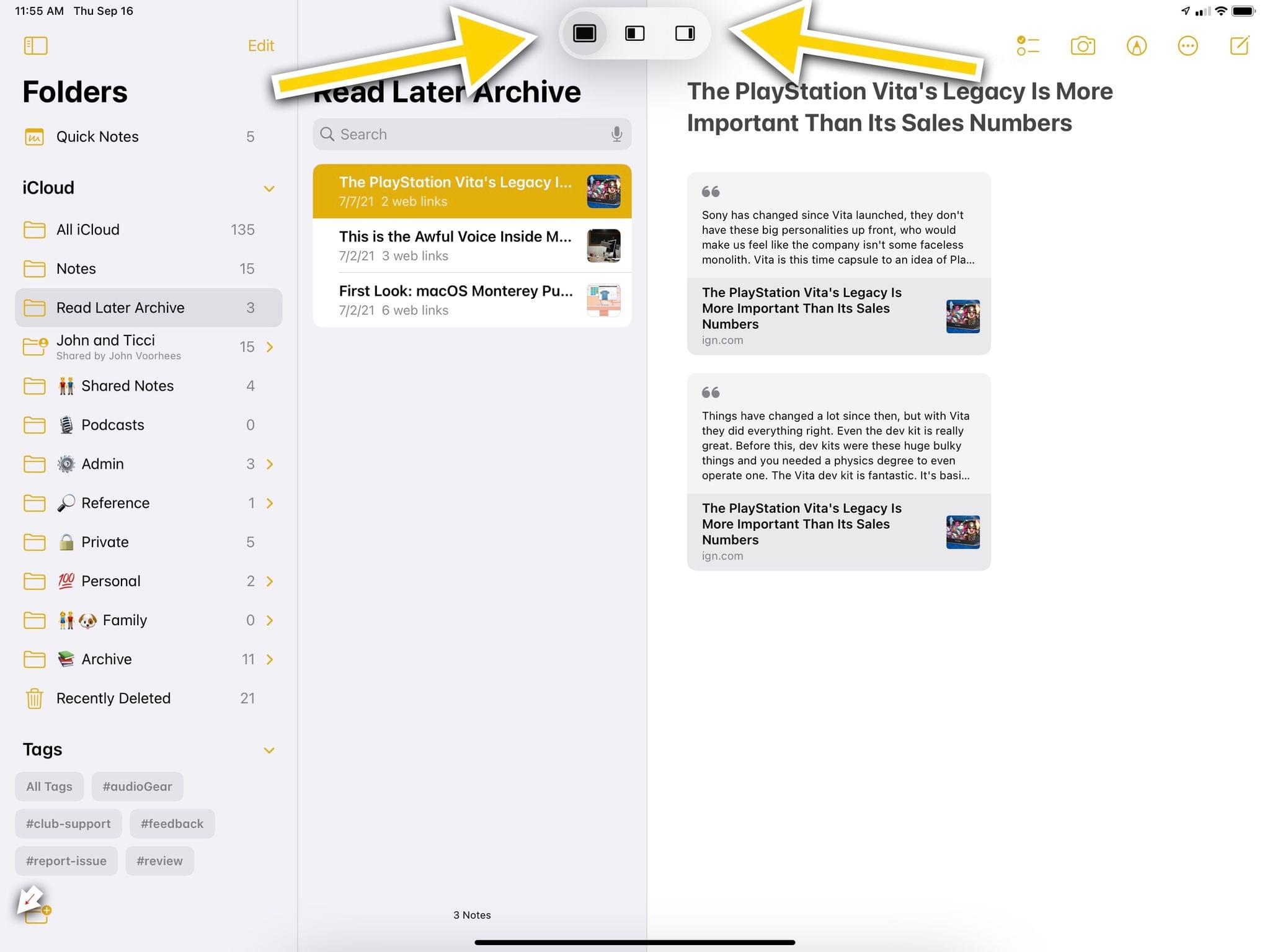
Called the multitasking menu, this button is a familiar ellipsis that, when clicked, reveals multitasking icons for full-screen, Split View, and Slide Over. The multitasking menu replaces the old ‘pulling indicator’ from iPadOS 14, and it’s now an interactive element that serves as an intuitive control system to switch the state of the active app window. The multitasking menu is always displayed at the top of a window (regardless of whether it’s in full-screen, Split View, or Slide Over), and it lets you manipulate multitasking with two clicks. At a high level, that’s all there is to it.
Using the new multitasking menu in iPadOS 15.Replay
It doesn’t take long when using iPadOS 15 to realize this is a much easier, user-friendly way to expose multitasking controls and let people discover them. As I’ve written on several occasions before, the iPad’s former multitasking system was designed in the iOS 11 era, which predated iPads with USB-C ports, the Magic Keyboard, and system-wide pointer; it was designed for a platform that was only meant to be operated via touch.
The new multitasking menu is both a reflection of how iPadOS has evolved over the years and an indictment of iOS 11’s solution, which required hidden drag and drop gestures and was undiscoverable by people who don’t read reviews like this one. iPadOS 15’s multitasking represents the beauty of a button: you see it because it’s always there, you click it, and it does what you expect.
The multitasking menu reflects the current state of the selected window, whether it’s open in full screen, Split View, or Slide Over.
Of course, it wouldn’t be a modern Apple multitasking control if it also didn’t serve double duties via hidden gestures and other implementation details. For starters, the multitasking button also acts as an active app indicator while in Split View or Slide Over to show you which of the app displayed onscreen is the active one receiving keyboard input. As you can see in the screenshot below, the active app on the left gets an enclosed button with darker dots compared to the inactive one on the right:

If you’re thinking, “Apple tried its hand at this design before, and it’s not obvious enough which of the two apps is the active one” – hey, you’re not alone. The company adopted a similar tactic with the pulling indicator in iPadOS 13, and while it’s true that the shape around the ellipsis button is more visually prominent than the pulling indicator of olde, I still think it’s not clear or accessible enough. I wish the company considered a bigger shape or, for users who want it, the use of colors to differentiate between apps. Maybe next year.7
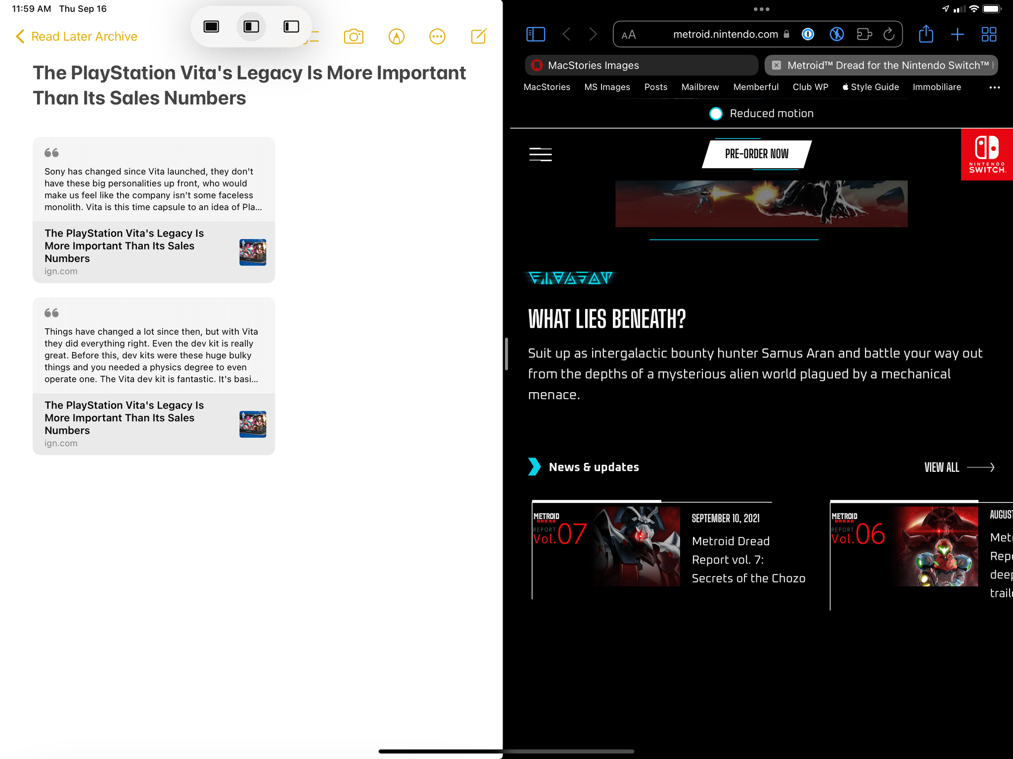
Additionally, you can use the multitasking button as a grabber to either create a new Split View or replace one of the two apps in Split View. If you’re using an app in full-screen mode, you can grab the button and swipe it down to temporarily dock the app to a side of the screen and pick a second one from the Home Screen; alternatively, you can swipe it down while using an app in Split View to replace the active app with another one from the Home Screen.
You can use the multitasking menu to grab windows and create new Split Views.Replay
This, I believe, is the most important structural change to iPadOS multitasking from an interaction perspective.
In iPadOS 14, if you wanted to create a new Split View or replace one of the two apps in Split View, you were forced to use drag and drop from either Spotlight search or the dock. That limitation often resulted in people filling their docks to the brim with folders full of app icons because it was the easiest way to bring apps into Split View or Slide Over. You can still do this if you want in iPadOS 15 (more on this below), but the new default behavior is a much more obvious one. When you want to pick another app, you’re temporarily returned to the place where you already organize your app icons: the Home Screen. Click the icon of the app you want to use in Split View, and that’s it.
When you tile a window to one side of the screen, iPadOS suggests what you can do to create a Split View.
Using the Home Screen as an app launcher for multitasking was floated as an idea by Apple commentators and iPad users before, and I’m glad Apple listened. The new system doesn’t require using drag and drop, doesn’t come with a standalone app picker, and it just works with the basic app launcher everyone is already using. Even better, because Home Screen widgets also launch apps, you can tap on a widget while in this mode and you’ll still create a Split View with the app opened via the widget.
As I suggested above, you can still operate multitasking the old-fashioned way using drag and drop gestures if you want. The multitasking menu in iPadOS 15 hasn’t taken anything away from existing gestures to drag app icons around and turn them into Split View or Slide Over windows; in fact, drag and drop is (unfortunately) still required to take an app from Spotlight search results and put it in either of those multitasking states.
Making drag and drop an optional, secondary mode for multitasking power users was the right thing to do: the new default mode doesn’t break muscle memory for people like me, and I still find myself occasionally dragging icons from the dock because I find it faster and I’m used to it. It feels like this interaction should have always been an optional one; I’m glad it is now.
I’m a fan of the new multitasking menu: it does a fantastic job at making Split View and Slide Over discoverable by inviting users to click on it; pairing it with the Home Screen as an app launcher to modify multitasking spaces makes sense as a way to rid iPadOS of its drag and drop-only limitations. I only have a few reservations about the design of the active app state design and the icons displayed in the multitasking menu; they’re shown without labels, and I have to wonder if some people will get confused by the similarities between the Split View and Slide Over glyphs.
As we’ve seen, the multitasking menu fills a variety of roles in iPadOS 15 already, but there’s one more that deserves a closer look: you can use the button to bring up the all-new Shelf for multi-window apps.
The Shelf
I know what you’re thinking: you hear “Shelf”, and your mind goes to the myriad jokes on Connected, the third-party shelf apps we’ve covered on MacStories, and the long-lost dream of a system-wide clipboard manager for iPad. I’m here to tell you that the Shelf is real in iPadOS 15…only it’s not exactly what I wished it could be for the past few years.
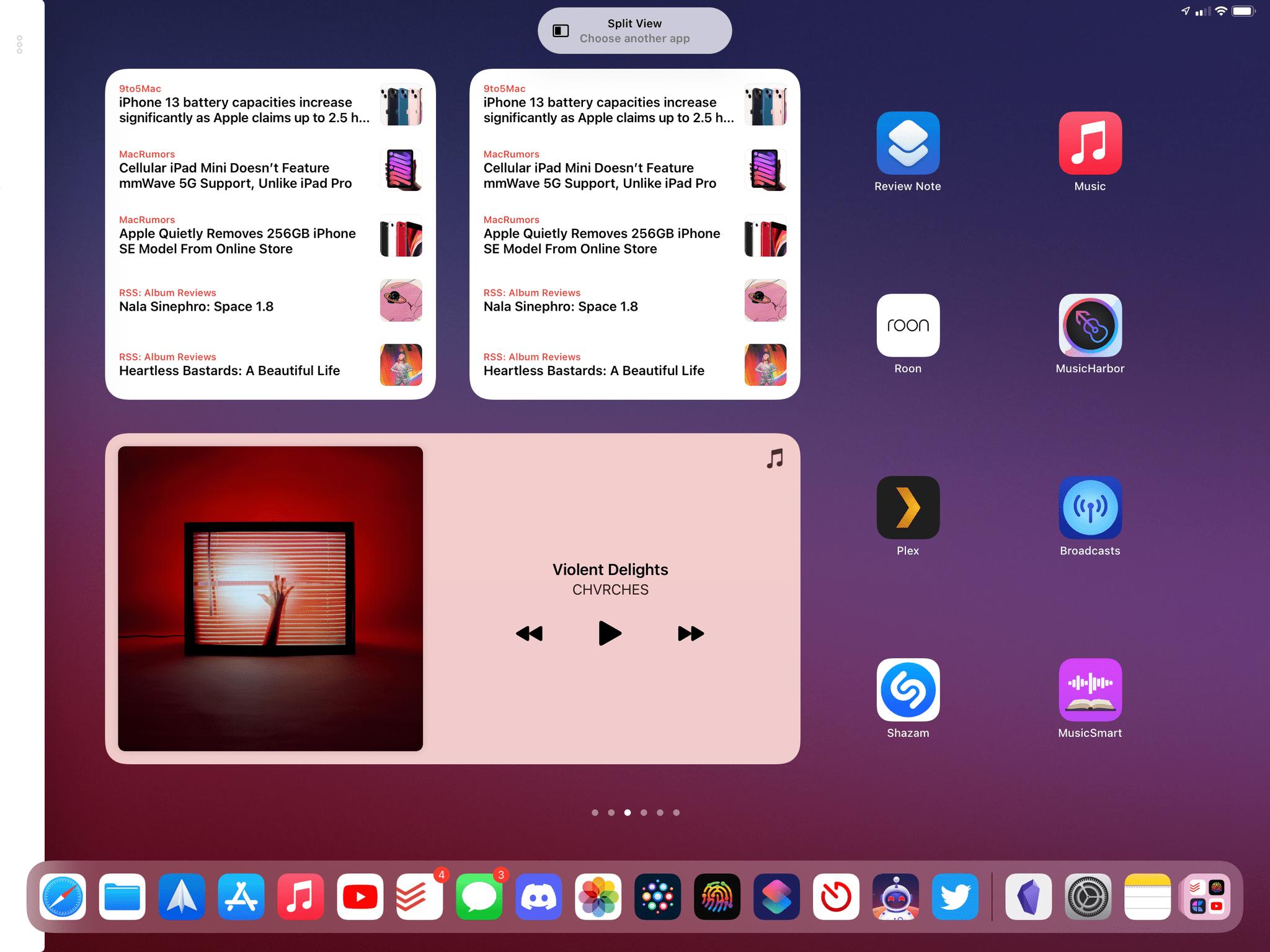
What I’m saying is: forget everything you think you know about a “shelf” feature for iPadOS based on old concepts we discussed on MacStories and Connected. The Shelf is a new multi-window functionality of iPadOS 15 that lets you easily switch between multiple windows from the same app. The Shelf is displayed as – how do I put this – a shelf of open windows at the bottom of an app, and it also comes with a + button to create a new window.
From a functional standpoint, there really isn’t much to say about the Shelf: you can click windows to switch between them, create new ones, or alternatively pick up a window and drag it around to open it in full-screen, Split View, or Slide Over via the usual drag and drop interactions.
Using the Shelf in iPadOS 15.Replay
What makes the Shelf interesting is its activation method, its timing, and what it could mean for the future of iPad productivity.
In iPadOS 15, the Shelf is automatically displayed as soon as you open an app that has multiple windows open. If you don’t click any windows, the Shelf automatically disappears after a couple seconds or as soon as you interact with the app (either by touching something or scrolling).
The Shelf goes away automatically when you start interacting with an app.Replay
There are two additional ways to invoke the Shelf in iPadOS 15: there’s a new Globe + ↓ keyboard shortcut to activate it (more on this in Keyboard Shortcuts and Navigation); and if you click the multitasking menu in an app that has multiple windows open already, the Shelf will be displayed at the bottom of the screen.
It took me a while to grasp the utility of the Shelf and why Apple chose to show it automatically, but I get it now: the Shelf was not only designed to simplify moving between windows, but to encourage iPad users to use multi-window more and take their multitasking to the next level.
Switching between multiple windows from the same app was quite tedious in iPadOS 14: you either had to remember a keyboard shortcut, find them in the app switcher, or long-press an app’s icon in the dock, then click ‘Show All Windows’. These methods are still available (in fact, the old multi-window UI shown in the app picker is unchanged), but because the Shelf is proactively shown to you upon loading an app with multiple windows open, it reduces the friction required to switch between them. As a result, you’re more inclined to taking advantage of multi-window since it’s now easier to manage it. This also makes you appreciate modern iPadOS apps more and, hopefully, will also convince other developers to support multi-window in their apps. The Shelf creates a new kind of virtuous cycle for multi-window in iPadOS that was sorely missing from iPadOS 14.
In my experience over the past three months, the most noticeable impact of the Shelf on my iPad workflow has been the ability to cycle between windows in the same space. For instance, if I’m working with a Split View space, replace the app on the left, and the new app I drop in has multiple windows open, the Shelf lets me instantly switch between them while keeping that app on the left side:
You can use the Shelf to cycle between windows for the active app.Replay
The convenience of the Shelf has worked for me; I appreciate how windows of different sizes are displayed in the Shelf, and I’m using multi-window a lot more because I no longer feel penalized by the system for doing so. Seeing the Shelf pop up when I open an app with multiple windows open doesn’t bother me: the Shelf helps me remember about those windows, which is why I find this feature an ideal fit for the iPad’s current multitasking system. To quote what Apple’s Sebastien Marineau-Mes said earlier this year, the Shelf is one of those features that “[make] the spatial model more explicit in the experience” of using iPadOS 15.
That said, there are a couple of things I wish had been better implemented with the Shelf: as with Split View, I’d like the active window state to be more clear – the thumbnail of the active window is slightly dimmed, and I don’t think that’s enough to recognize it at a glance. Additionally, the Shelf doesn’t have a button to reopen a recently closed window, which was available in the older in-app window picker UI. Hopefully, this feature will be restored in a future update to iPadOS 15.
- Here's another idea: maybe the name of the active app could also be displayed in the extra row of keyboard controls, next to QuickType suggestions? ↩