Design
For the past few years, it felt like Apple was pursuing a new iOS design language while sidestepping the responsibility of undergoing a full-blown redesign. While I wouldn’t rule that out completely (never say never with Apple), it seems increasingly improbable at this point. The company has seemed pretty comfortable slowly iterating on iOS 7’s design with a constant trickling of refreshed elements and returning visual affordances across multiple generations.
In iOS 15, there are barely any design changes worth noting as Apple mostly focused on refining interactions introduced with last year’s iOS 14 and its compact UI revamp.
Table Views
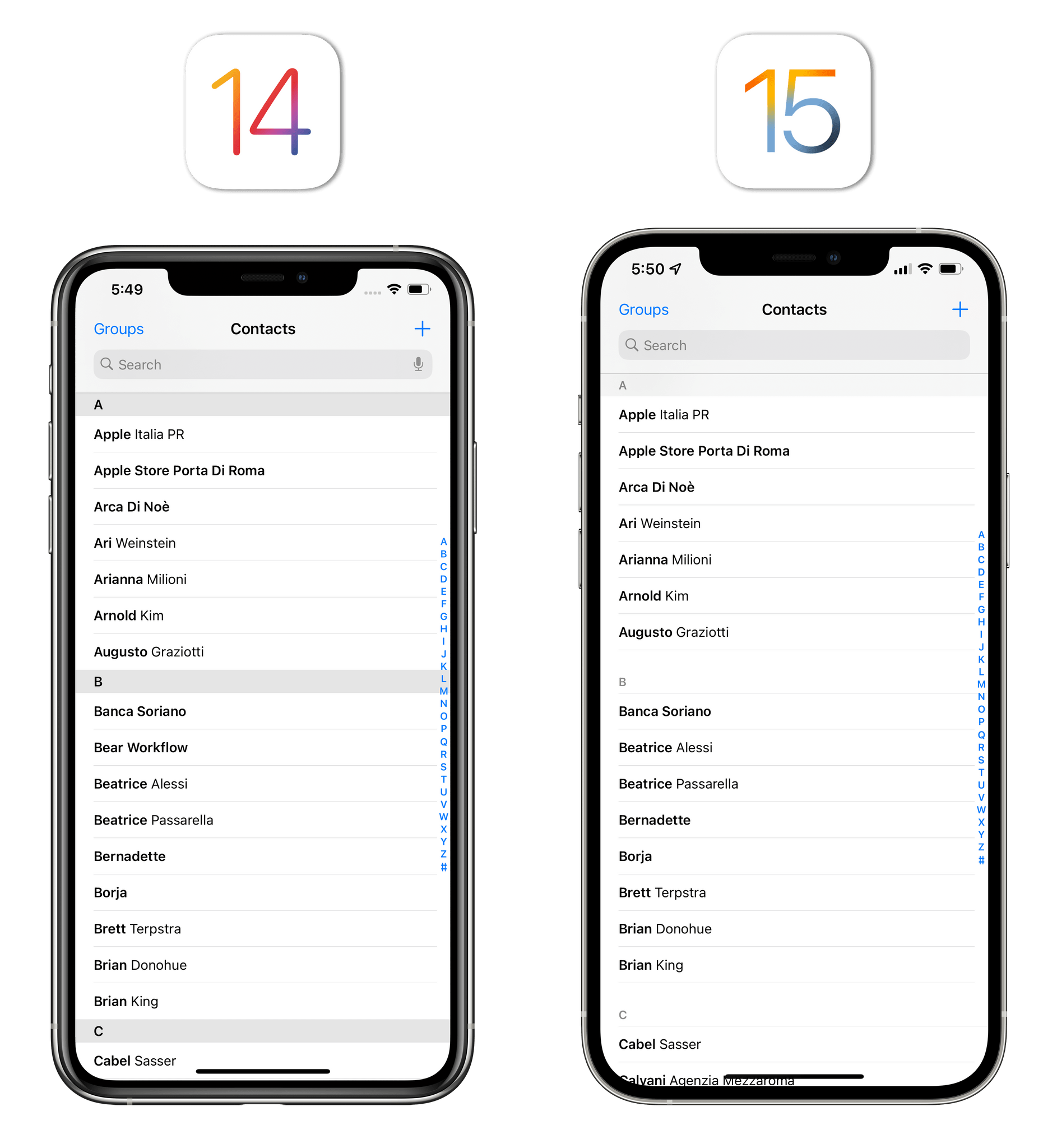
iOS 15 brings a refreshed appearance for table views. Changes are fairly minor on this front, but since the table view is one of the most common UI elements in iOS and iPadOS, chances are high you’ll notice these subtle improvements in several of your favorite apps.
In iOS 15, section headers in table views no longer have a separate background color (unless they’re pinned to the top), and they also feature a different font that isn’t forced to be displayed in uppercase. Additionally, iOS 15 features extra spacing above the aforementioned section headers, giving multiple sections in table views more room to breathe. You’ll likely spot these changes in apps that implement ordered lists of items, such as the alphabetical list of people in the Contacts app:
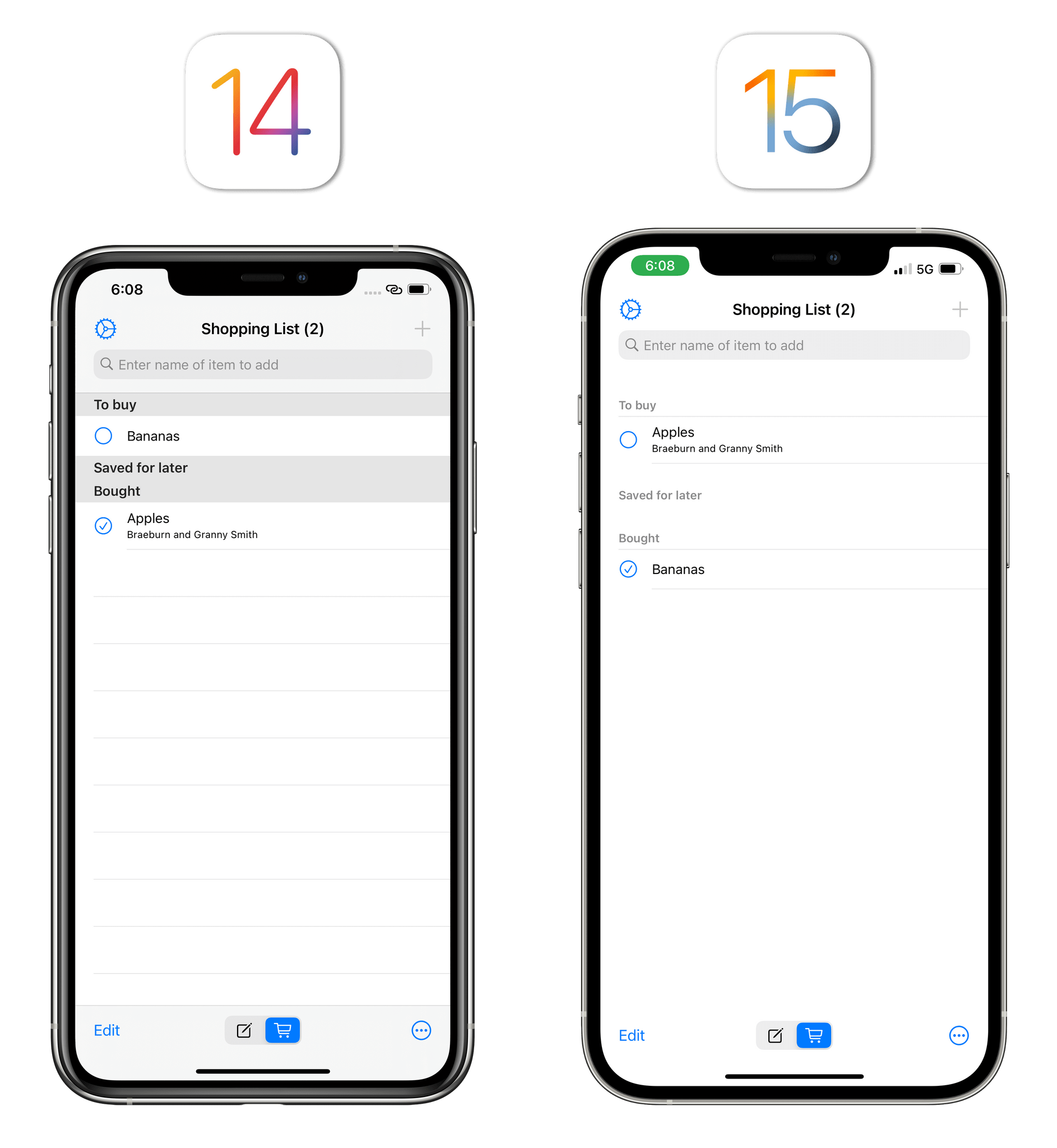
I was also able to compare old and new table views in Geoff Hackworth’s Easy Shopping List app, which uses a standard table view layout to present you with lists of items to purchase at the grocery store. Here, you can also see how the system deals with empty sections now; in iOS 15, toolbars are also transparent (they blend in with the rest of the table view) when content is scrolled to the bottom.
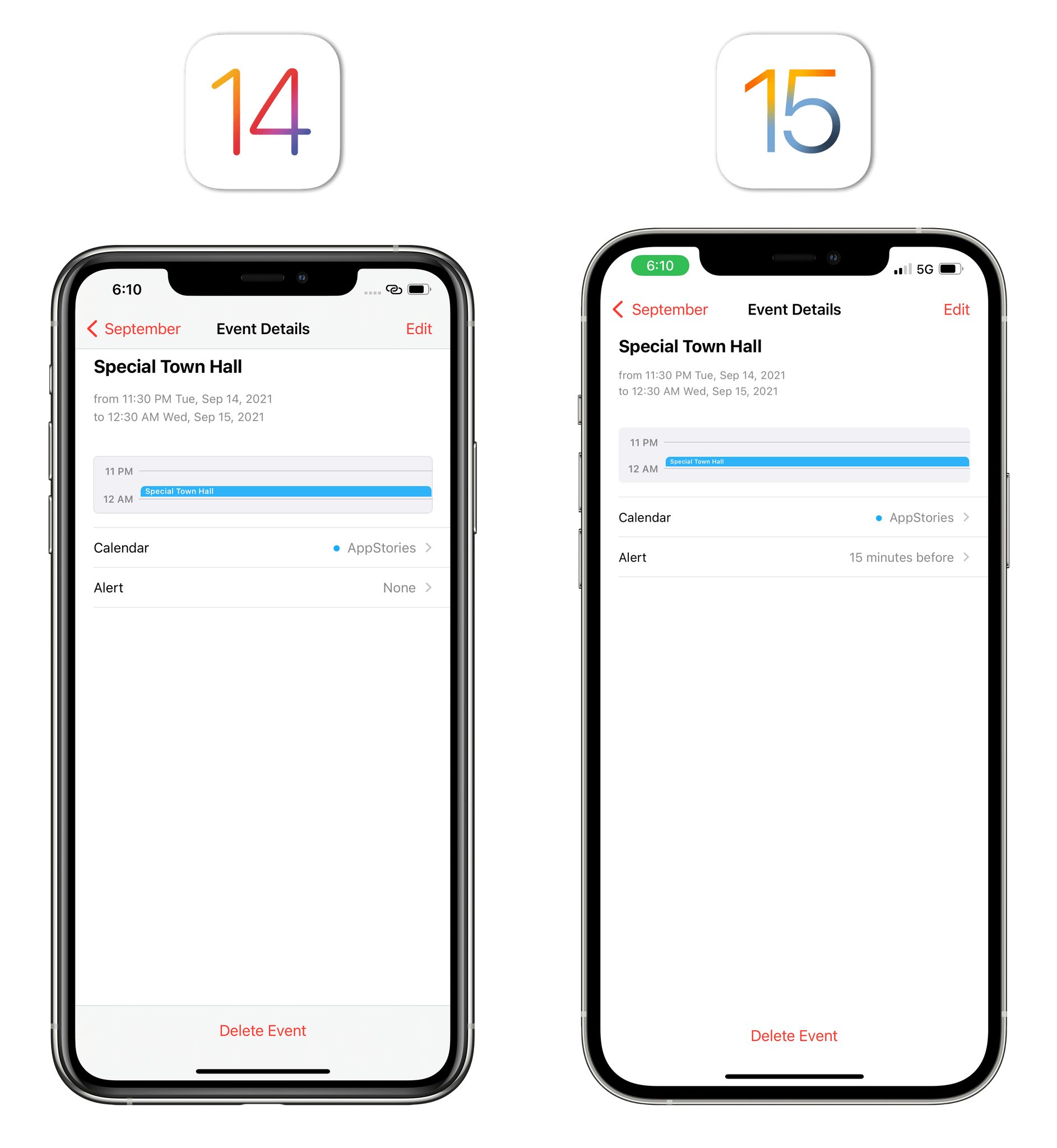
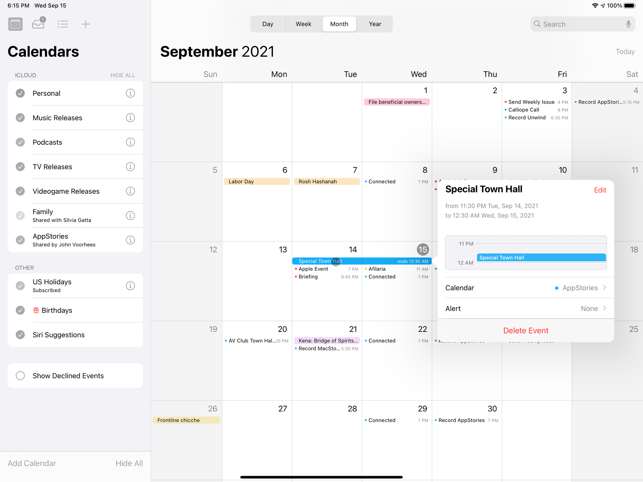
Transparent toolbars (and tab bars, too) can be seen in a variety of system apps; for instance, when viewing an event’s detail page in the Calendar app, you can see how content is no longer separated from the title bar and bottom toolbar containing the ‘Delete Event’ button. They’ve also been implemented in Files, Clock, and Reminders. This change makes the same app feel “bigger” on iOS 15 because certain parts of the UI aren’t sectioned off with different colors anymore, which I can appreciate on a large iPhone.
The same is true for toolbars displayed inside popovers on iPad:
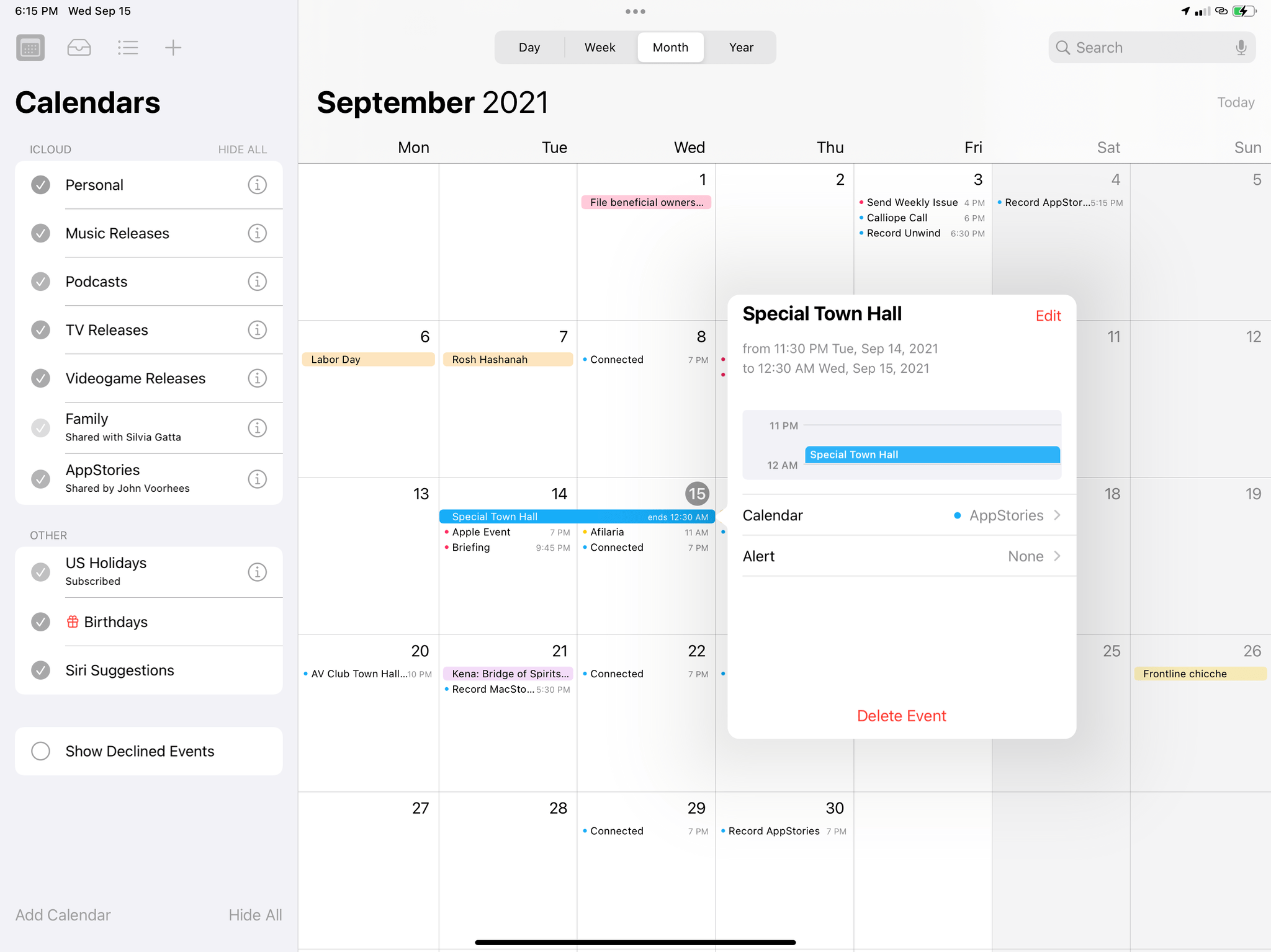
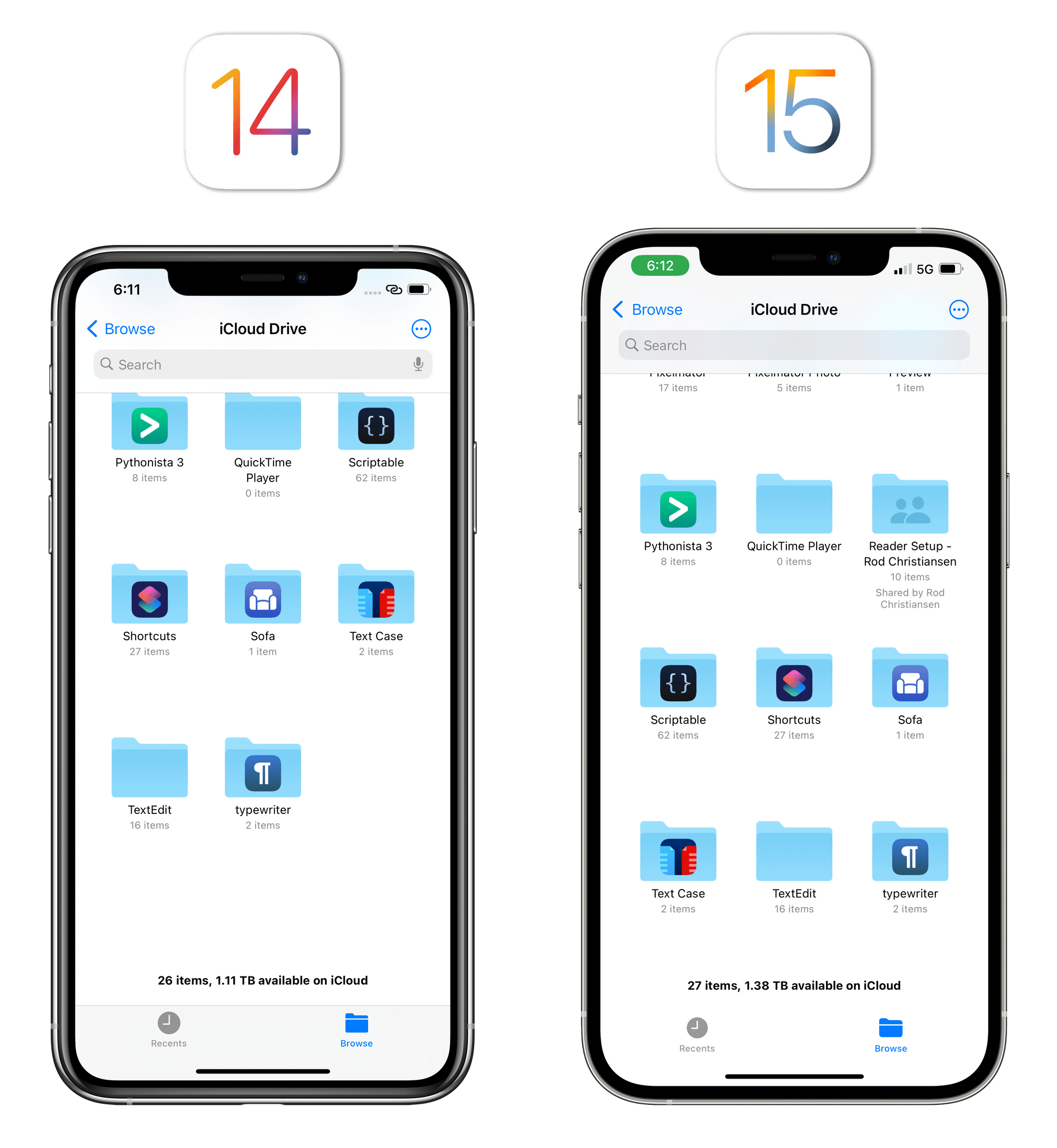
Also related to table views is the adoption of the “inset grouped” style (first introduced in iOS 13) in more system apps. In Settings, Mail’s list of accounts, and Calendar’s event creation screen, you’ll see that Apple switched to the padded style of table views in lieu of the old edge-to-edge one.
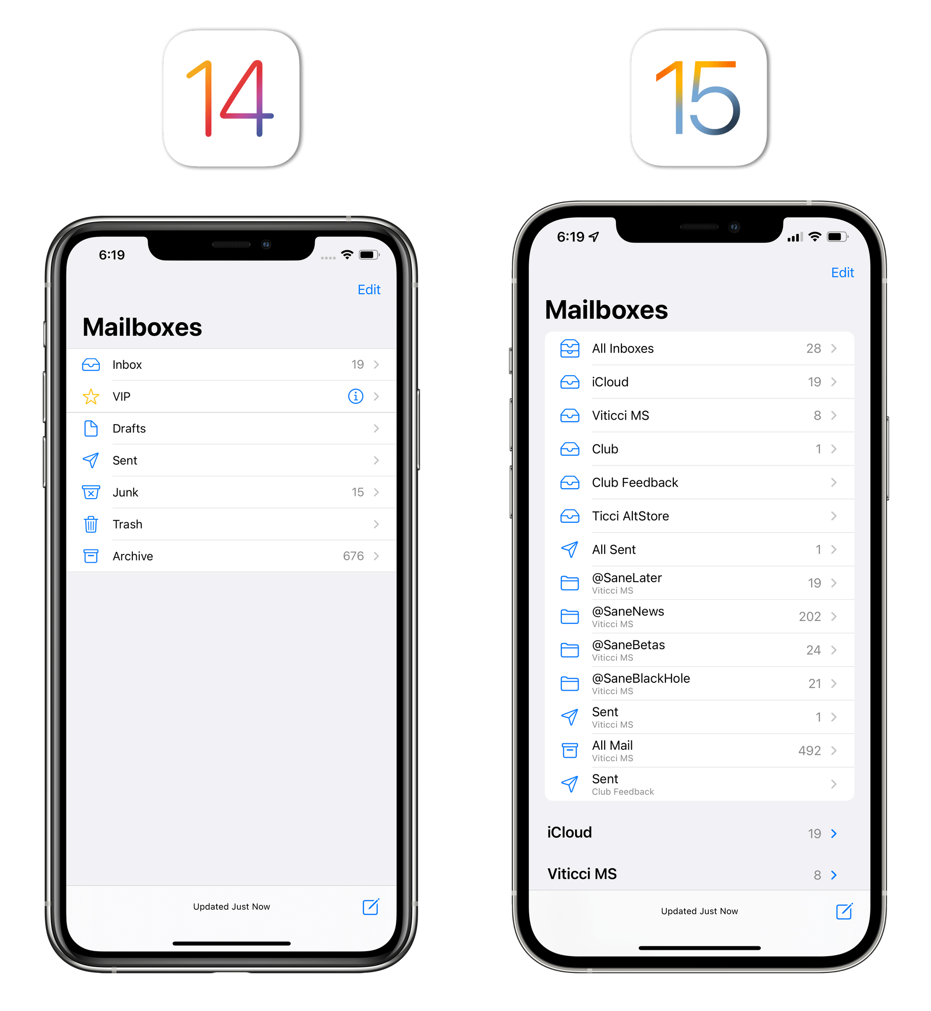
I don’t have anything in particular to say about this other than it looks modern and makes apps such as Settings more consistent with their iPad counterparts (which had already switched to this kind of table view presentation).
Time Picker
Last year, Apple did away with one of iOS’ most popular, longstanding UI interaction paradigms: the date and time wheel. With iOS 15, the company listened to user feedback and largely undid what they introduced last year.
In iOS 15, Apple has reverted the behavior of its time picker and rolled back its presentation style to the old, iOS 13 one: when you open a time picker, the AM/PM wheel is back by default, allowing you to scrub through different times of the day; if you want to type a time manually using last year’s typing mode, you need to tap the wheel to enter an optional, numeric input method.
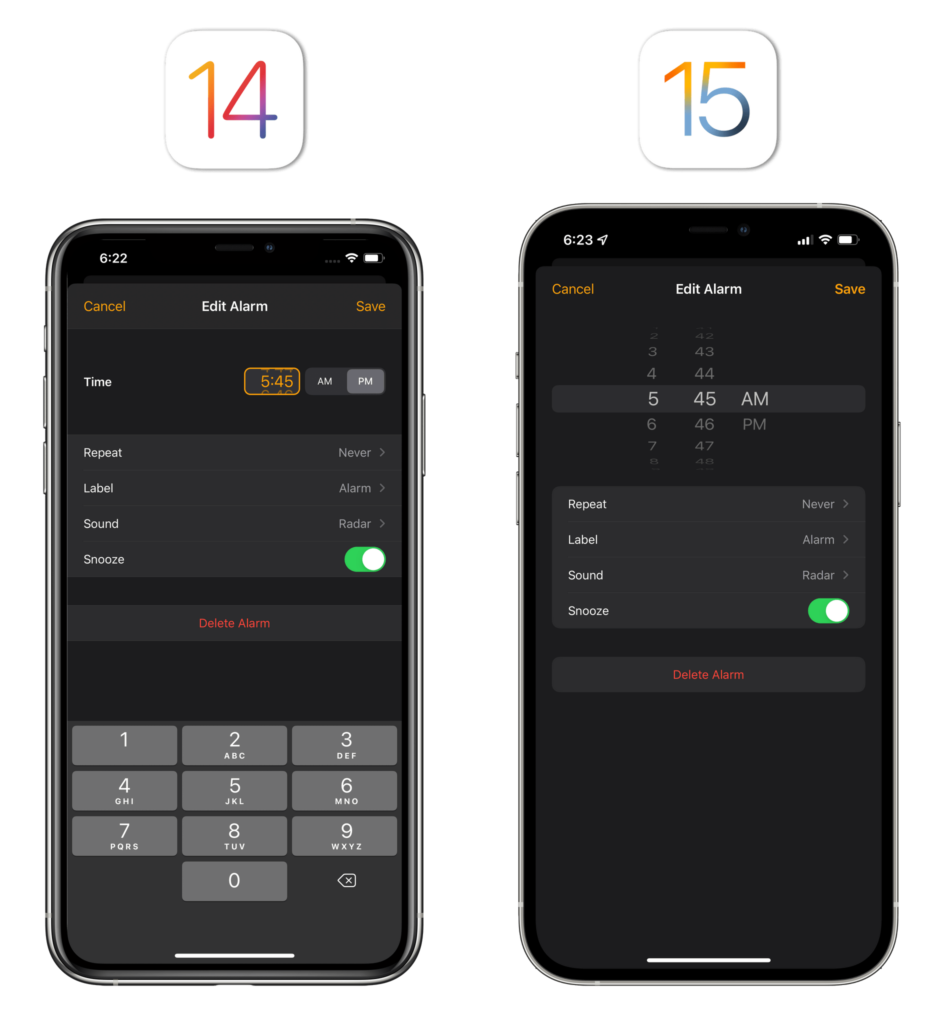
Months spent using iOS and iPadOS 14 on my devices (as well as scheduling lots of calendar events for video calls over the past year) made me realize I was wrong about preferring the manual input method to the tried and true time picker wheel. Particularly on iPhone, the wheel is faster, more intuitive, and easier to discover. I hinted at this in my review last year, but I’m guessing discoverability was also an issue with iOS 14’s time picker redesign: I’ve heard from several users who were confused by the new time picker, which was also so small, they didn’t even know they could scroll the time displayed inside it.
iOS 15 fixes this by returning to an old design that is familiar to everyone, combining it with a typing mode that takes what worked last year and makes it optional. There is value in being able to quickly type out a time after all, so I’m glad the option is still here. The “new” design also makes it easier to select the hour and minute portions of the time by tapping them.
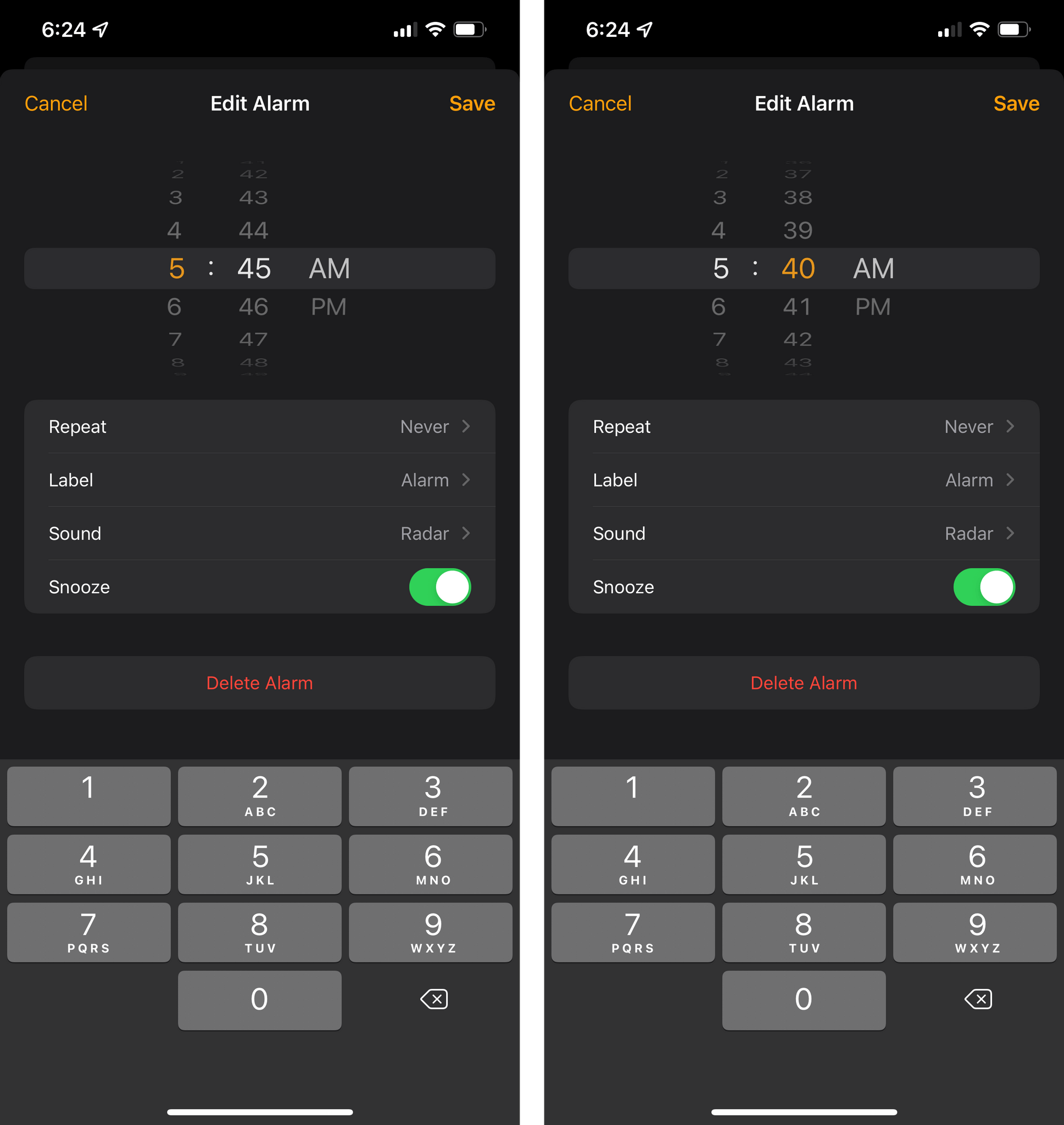
On iPad, the new time picker is also a fascinating example of the system intelligently adapting to the user’s current input method. If you select a time picker by touching the screen with your finger, you’ll see the wheel by default; conversely, if you activate it with the pointer while using a trackpad or mouse, the time picker will be displayed in typing mode as the system assumes you’re using an external keyboard. I find this a clever way to shape the iPad’s user interaction based on the platform’s modularity; I’d like to see Apple do this more often for other iPad UI elements.
The time picker on iPad.Replay
In using iOS 15, you’re going to notice another variation of the time wheel – one displayed as a pop-up inside integrated date and time pickers. For instance, while using the new ‘Adjust Date’ option in Photos, if you tap the ‘Time’ label, you’ll get a compact wheel in a pop-up.
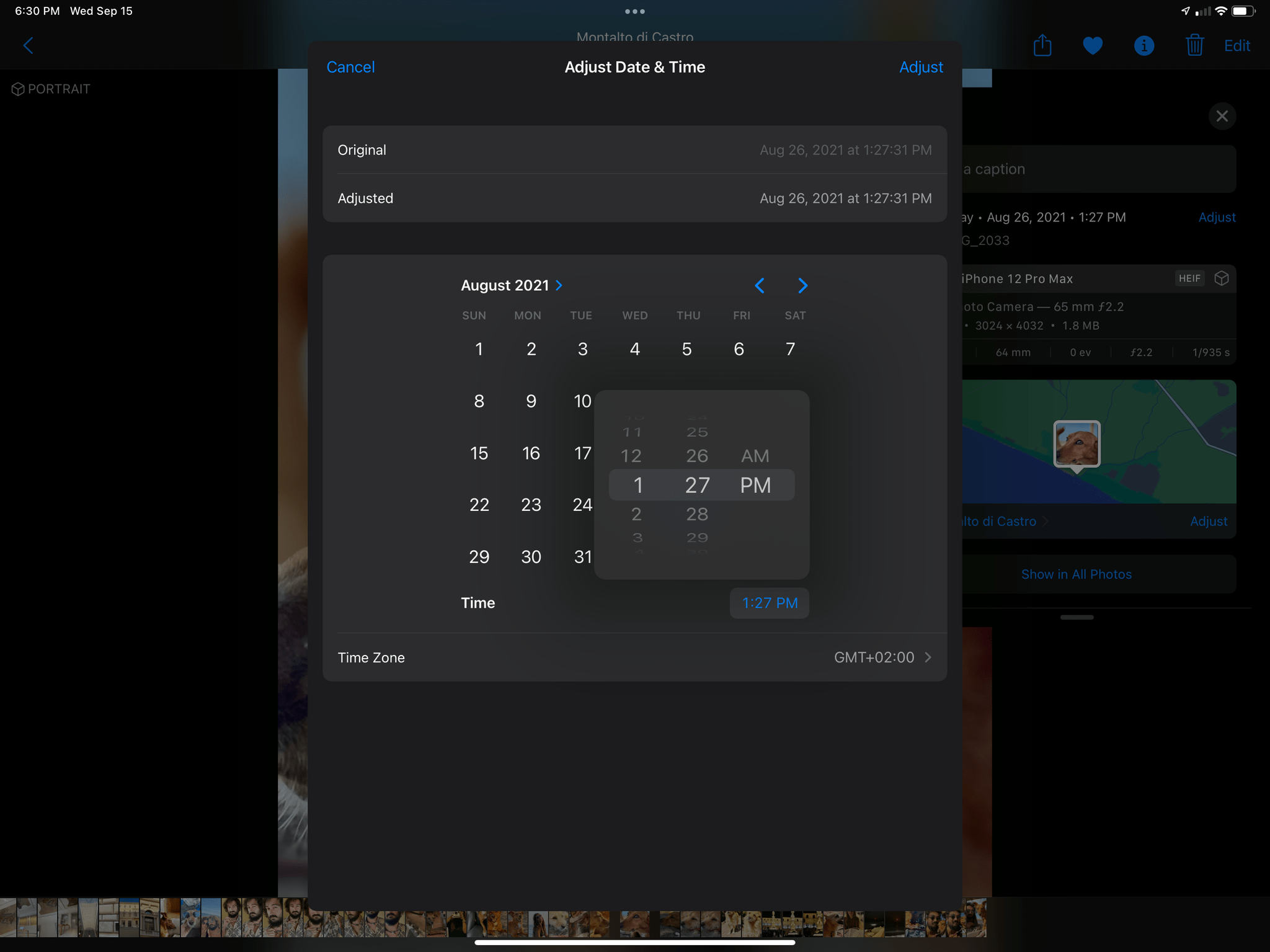
You can still select numbers inside the wheel to type instead, and the same interaction considerations I mentioned for iPad above apply to this version of the time picker too.
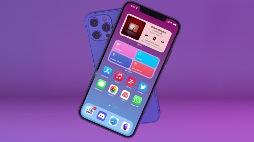
Home Screen and Widgets
Aside from the inclusion of widgets on the iPad Home Screen, Apple hasn’t brought any meaningful changes to the iOS Home Screen following last year’s redesign. Instead, the company has focused on expanding the list of built-in widgets, tweaking stacks, and adding more options for management of individual Home Screen pages.
Let’s start with the new widgets Apple added in iOS 15. A total of six apps/system features offer new widgets in multiple sizes this year:
- App Store
- Available as ‘Today’ for editorial stories (3 sizes)
- Contacts
- Available as ‘Contacts’ (3 sizes; supports XL on iPad)
- Find My
- Available as ‘People’ (small and medium)
- Available as ‘Items’ (small and medium)
- Game Center
- Available as ‘Continue Playing’ (3 sizes; supports XL on iPad)
- Available as ‘Friends Are Playing’ (3 sizes; supports XL on iPad)
- Mail
- Available as ‘Mailbox’ (medium and large)
- Sleep
- Available as ‘Data and Schedule’ (small size only)
Additionally, there are some updates to existing widgets in iOS 15:
- Calendar now offers a small ‘Month Calendar’ widget to view the current month at a glance as well as an XL widget size for iPad;
- Files supports the new XL size on iPad, and it can be configured to display files from specific folders. Furthermore, the widget supports drag and drop on both iPhone and iPad;
- Music, Photos, Podcasts, and TV support the new XL size on iPad.
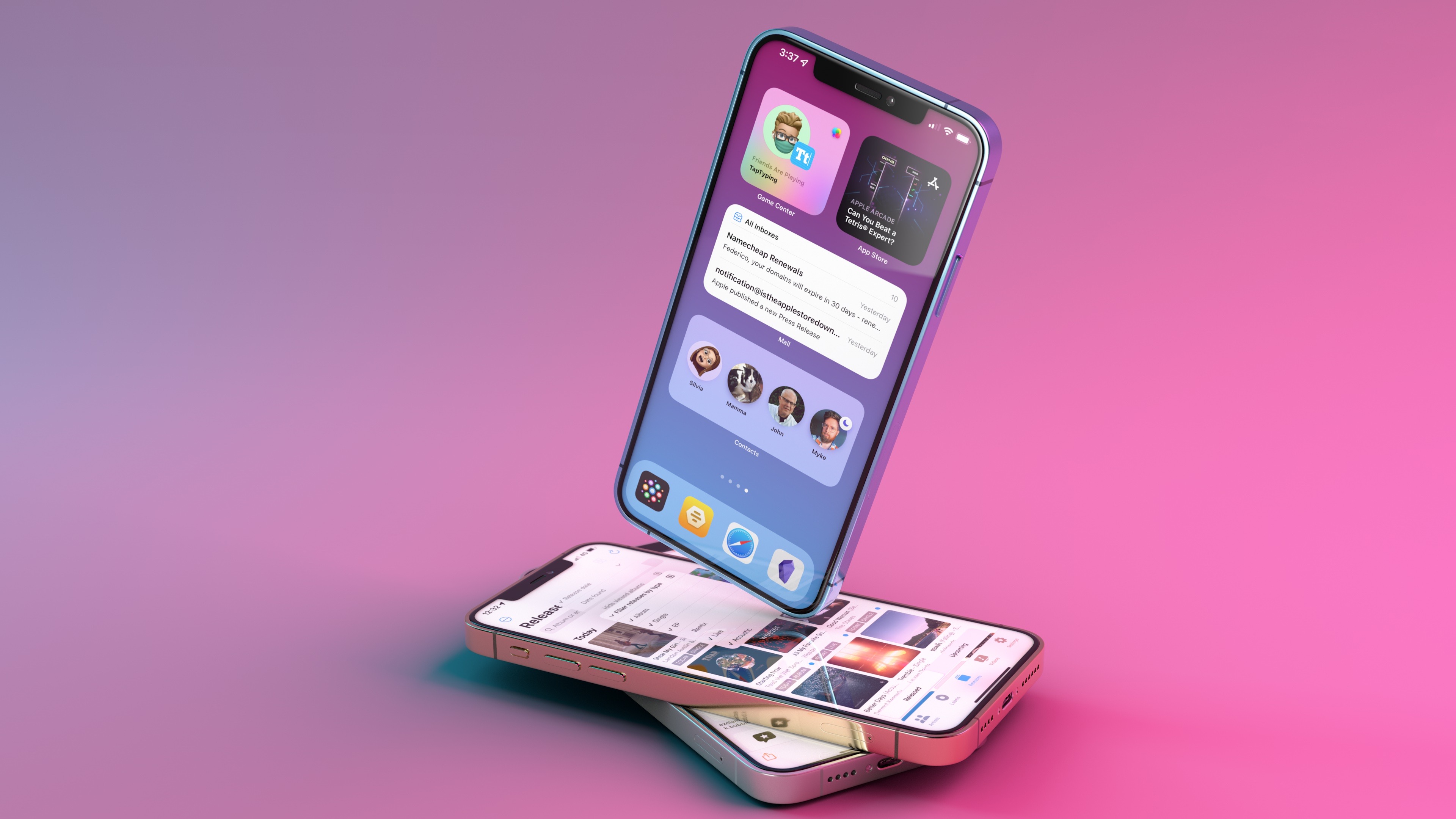
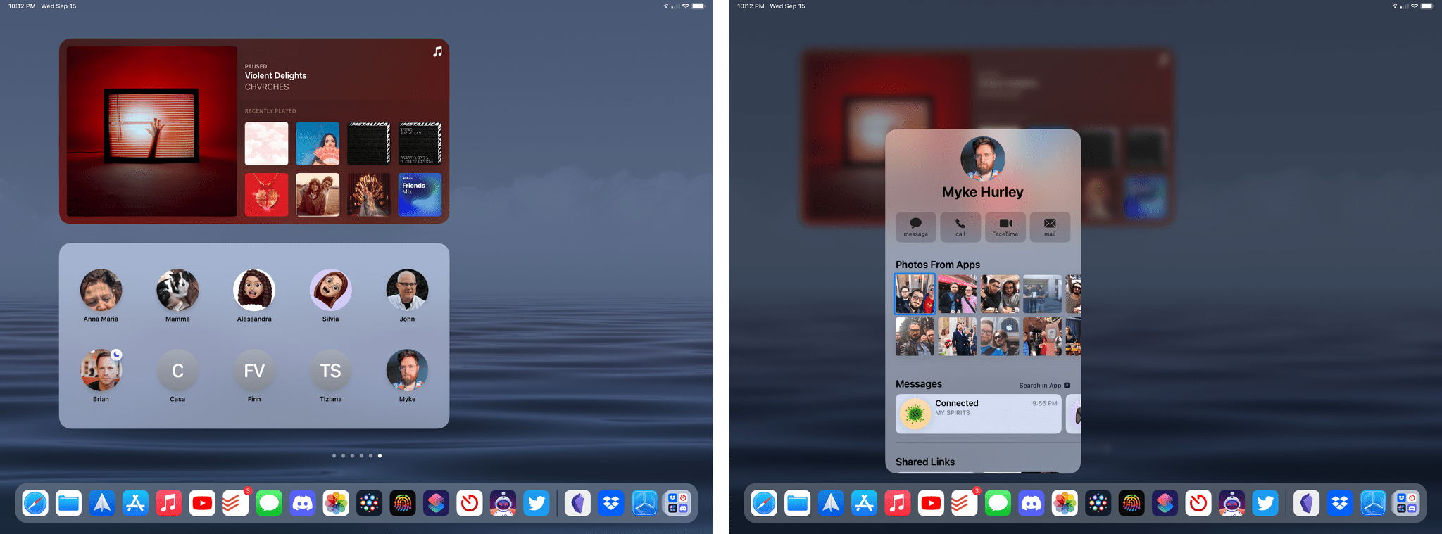
I’m happy Apple is continuing to grow the list of built-in widgets and finding ways to expand existing widgets with new options. Of the new widgets, I’m especially impressed by the Contacts one: like the Shortcuts widget before, the Contacts widget uses private APIs to support interactions on the Home Screen without opening the Contacts app.
You can configure the Contacts widgets to show a grid of your favorite contacts, which will be displayed as profile pictures along with their Focus status and Find My location (if shared with you). When you tap a contact, you’re taken to a special overlay card that collects multiple call and messaging options and all kinds of content that person shared with you, including message threads, notes, links, calendar events, photos, and data from third-party apps. Remarkably, for Myke’s profile card on my devices, the system even displayed episodes of the Upgrade podcast – I assume because it matched Myke Hurley as the creator of Upgrade along with Jason Snell. Indeed, Jason’s profile card listed Upgrade as well, confirming my theory.
Apple also brought a host of improvements to widget stacks in iOS and iPadOS 15. I was highly skeptical of widget stacks last year: I lamented how their stacked design didn’t aid in discoverability, and I didn’t find the system-provided Smart Stack to be all that smart in surfacing suggested widgets throughout the day.
In iOS 15, Apple hopes to make stacks more enticing by simplifying the management of widgets contained within them and going even further with intelligent recommendations. First off, there’s an updated stack editing page that features a ‘+’ button to add a new widget to an existing stack via search (so you don’t have to add it to the Home Screen first, then drag it into the stack) as well as a new live preview of the list of widgets installed in the stack. You can now scroll through live versions of the widgets in a stack rather than seeing a list of names, which is more intuitive than before. Additionally, you can now drag a widget out of a stack and drop it somewhere else on the Home Screen.
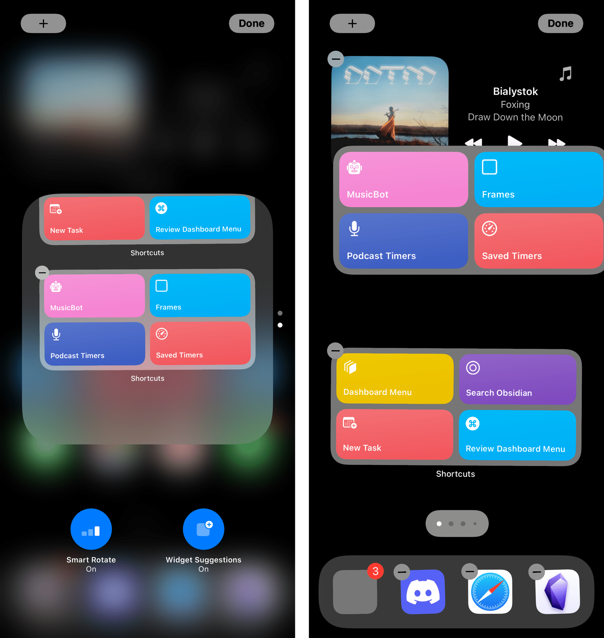
Stacks have a new editing UI, and you can now drag individual widgets out of stacks to put them back on the Home Screen.
There’s a new look for the ‘Smart Rotate’ toggle when you’re editing a stack, which is also joined by a new option this year: widget suggestions. When this option is enabled, iOS and iPadOS 15 will automatically add or remove widgets from a stack based on various signals during the day such as location, time of day, calendar events, and other user patterns. In my experience, this hasn’t been much smarter than the previous ‘Siri Suggestions’ widget (which is still available separately), and it mostly just feels like another name for the same set of “intelligent” suggestions Apple has been trying to make happen for the past few years. I’m not impressed with this option, and I plan to keep it turned off for all my stacks.
Lastly, Apple has added two new options to the Home Screen page management interface (the one you get by entering jiggle mode and tapping the Home Screen page indicators above the dock). In iOS 15, you can reorder pages with drag and drop and, in addition to hiding specific Home Screen pages, you can also delete them.
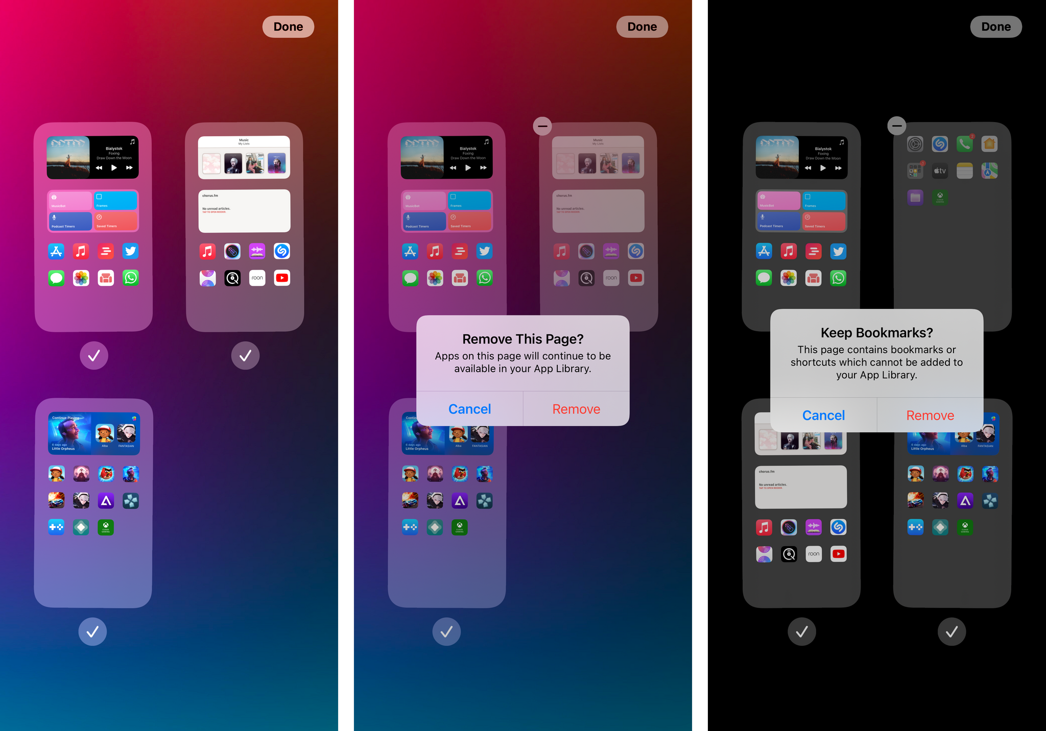
To delete a Home Screen page in iOS 15, hide it first, then tap the ‘-’ button next to it. In doing so, iOS 15 will tell you apps installed on that page will continue to be available in the App Library. I continue to believe it would make sense for Home Screen page management to be more directly tied to user automation (imagine if you could have a ‘Work’ page that only shows up at the office, a ‘Workout’ page for the gym, and so forth); however, as we’ll see in the next chapter, I think Apple’s strategy for this revolves around iOS 15’s new Focus functionality.
SF Symbols
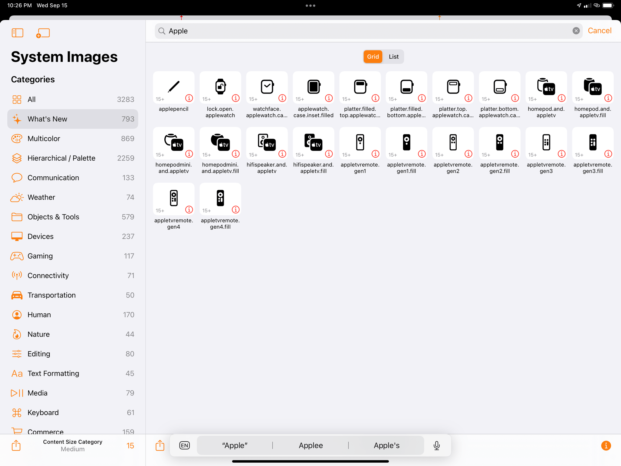
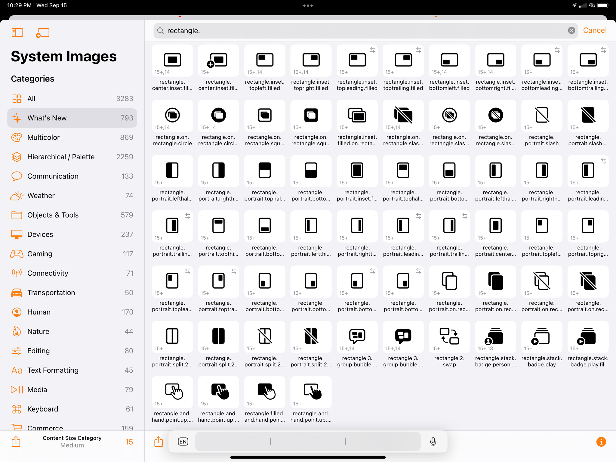
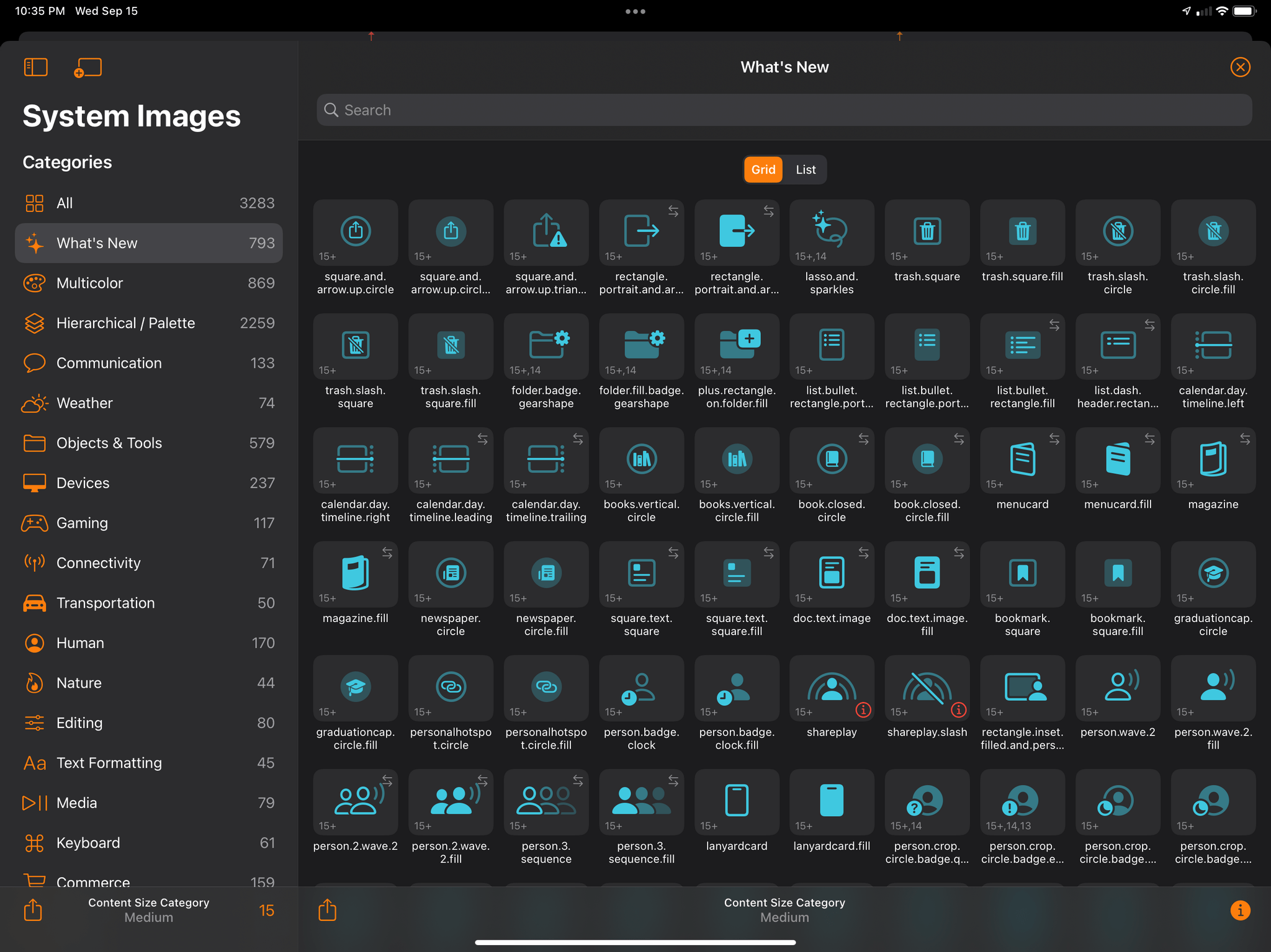
Arguably, the most visible changes in iOS 15’s design department come in the form of a vastly expanded set of SF Symbols, the dynamic system images provided by Apple to developers since iOS 13. Apple updated SF Symbols on multiple occasions over the past couple of years (specifically, in iOS 14, 14.2, and 14.5), and the collection has grown since its original release with the addition of variants such as outlined and filled glyphs, slashed and enclosed versions, and a multicolor mode. With iOS 15, SF Symbols has reached version 3.0 and is gaining over 600 new images, bringing the total number of glyphs to over 3,000.
I was able to check out the updated set of images in SF Symbols 3.0 using Apple’s official SF Symbols app for Mac, as well as the always-excellent Adaptivity app by Geoff Hackworth. In iOS and iPadOS 15, you’ll find an expanded roster of glyphs for Apple products, which include Apple Watch and HomePod images:
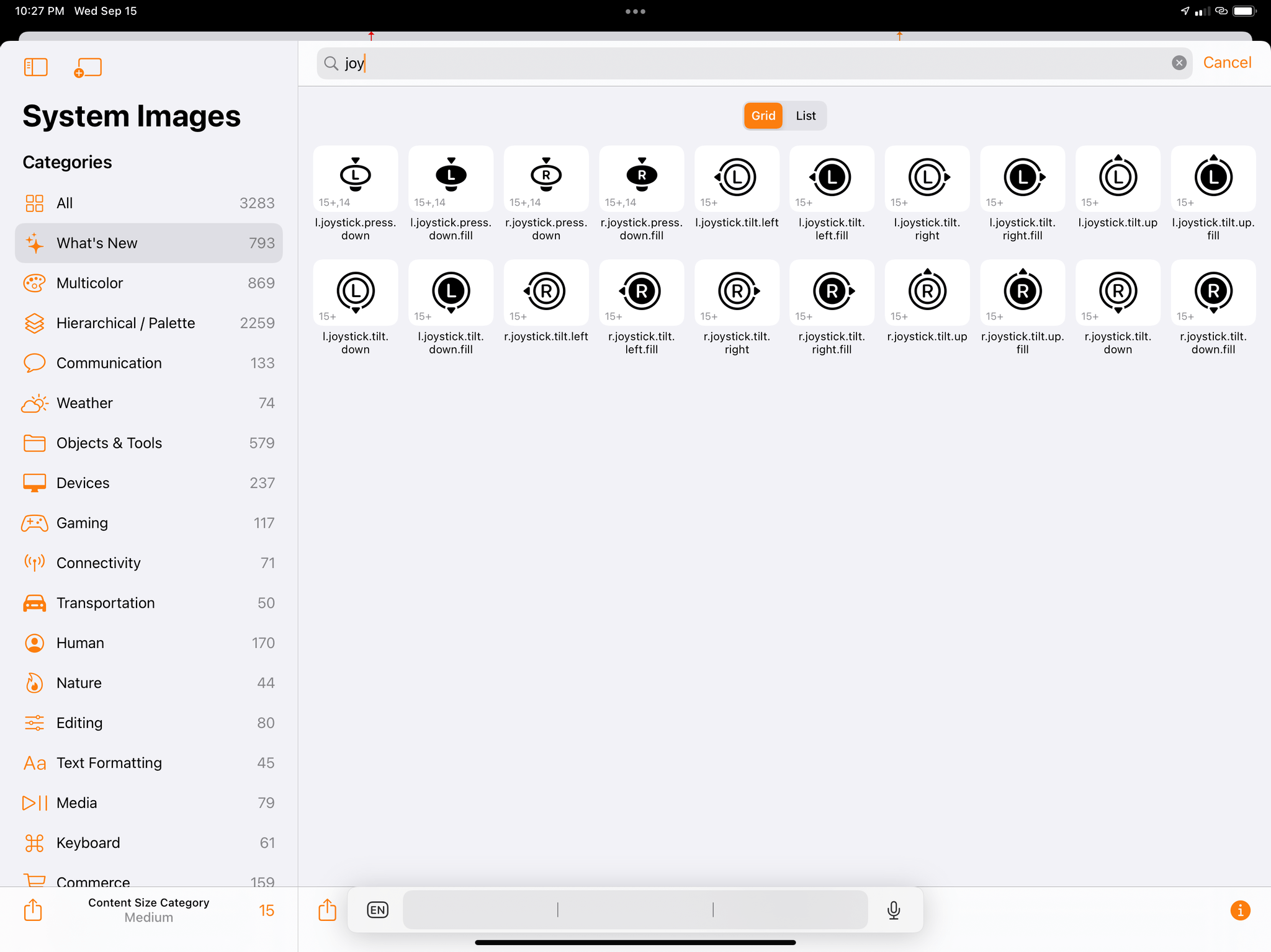
As Apple continues to invest in Apple Arcade and integrate third-party gaming controllers on their platforms (more on this in Game Controllers), SF Symbols is adding new images for videogame controllers and joystick options:
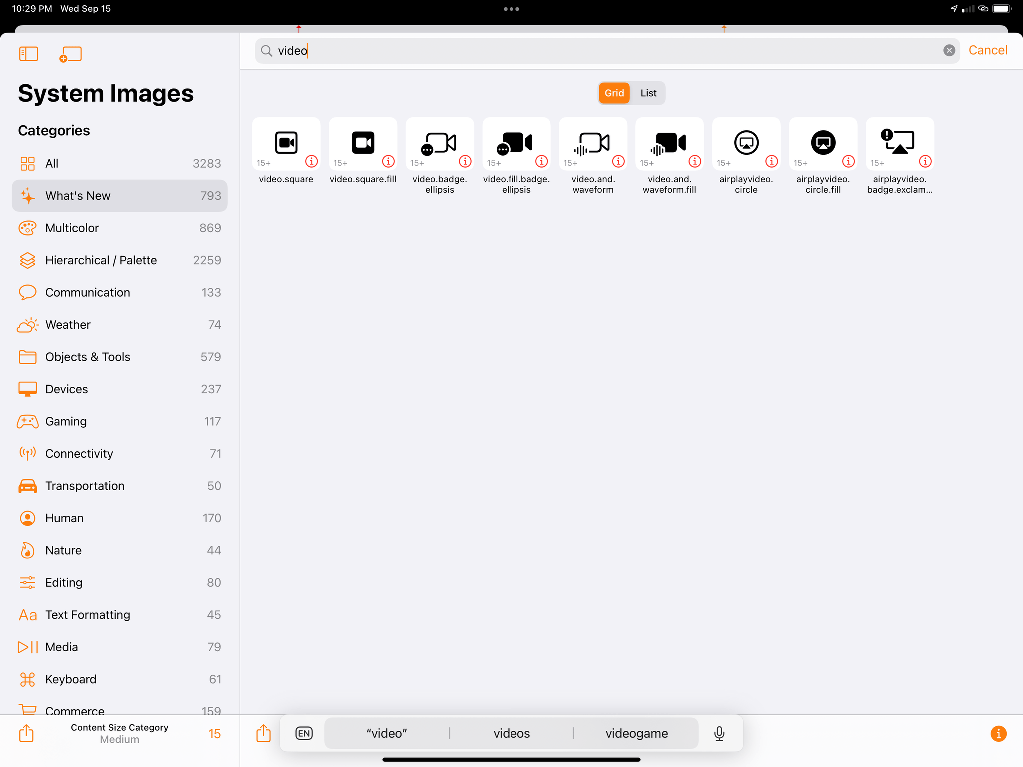
Unsurprisingly given the pandemic and Apple’s updates to FaceTime in iOS 15, there’s a handful of new communication symbols:
SF Symbols 3.0 also includes a variety of interface layout and window management symbols. These are labeled ‘rectangle’ by the system, and they seem to depict different takes on Split View, Picture in Picture, and moving windows across a rectangular display. I understand why these glyphs may be necessary on macOS, where more complex window management is already a reality, but if I were to read the proverbial tea leaves, I’d have to wonder if these could be used on iPad, too, at some point:
Let’s also spare a minute to appreciate this incredible symbol featuring a checkmark with a warning sign. I’m pretty sure this is what you see when your GTD goes horribly wrong:
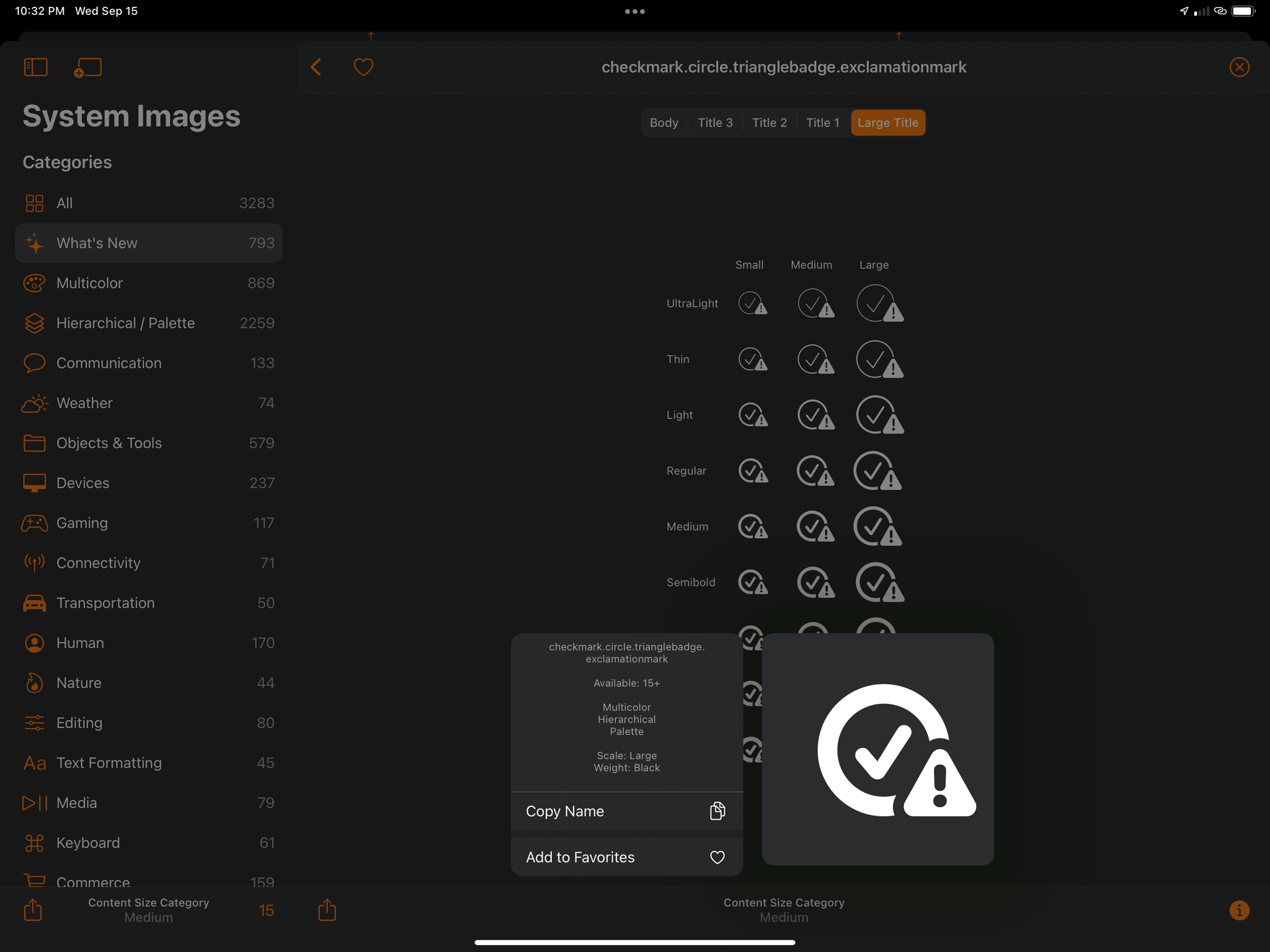
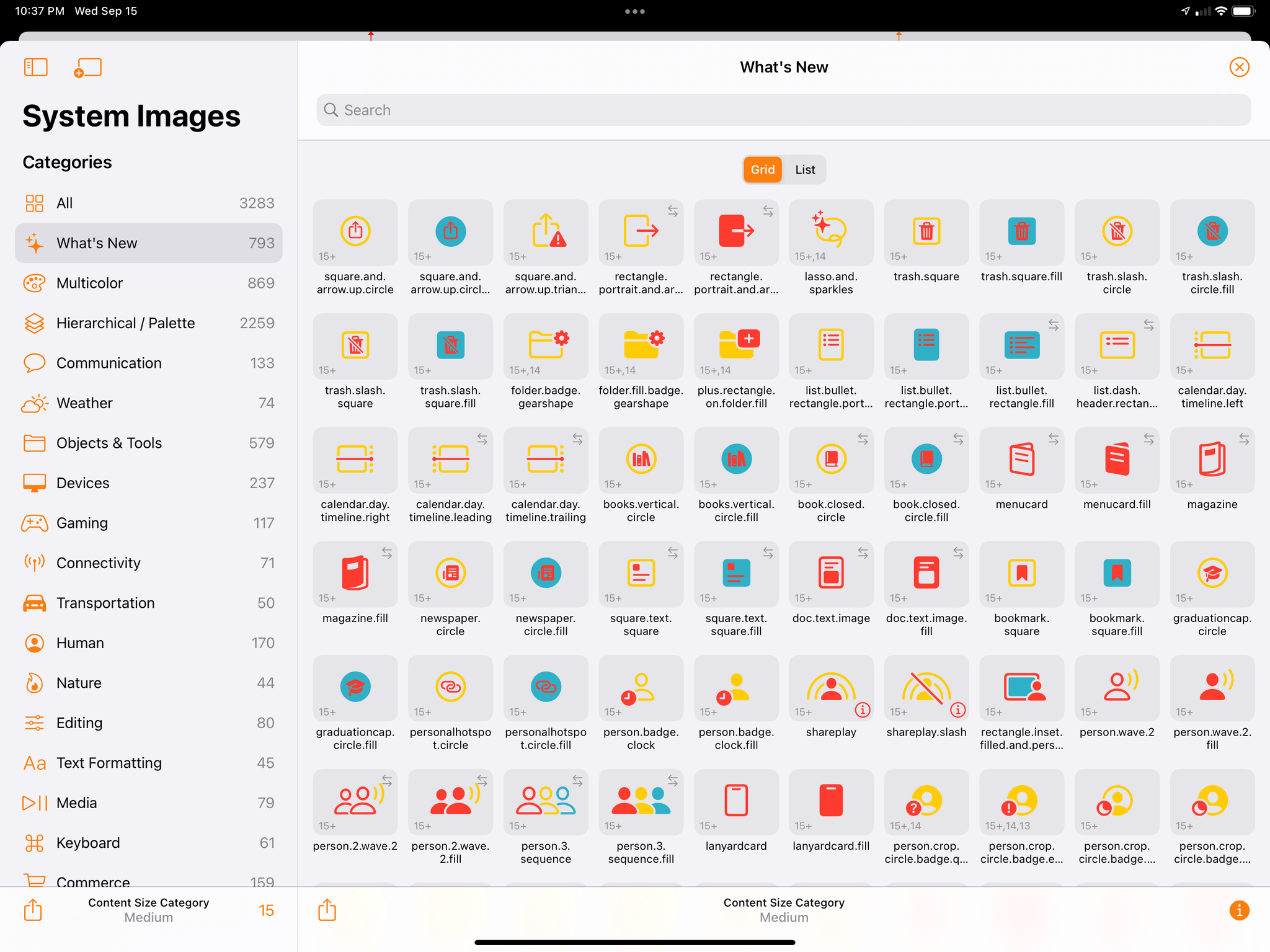
In addition to images, the other big update to SF Symbols this year is the inclusion of two new rendering modes joining the existing monochrome and multicolor ones: hierarchical and palette. The new hierarchical mode is based on SF Symbols’ new built-in structure, which can now be comprised of primary, secondary, and even tertiary layers. This mode uses a single color with varying degrees of opacity to create a sense of depth and emphasis on particular areas of a symbol, all while allowing a single hue to drive the overall aesthetic of a set of images. It’s easy to imagine how this could be used by apps that have UI themes based on specific accent colors.
The palette mode, on the other hand, uses two or more contrasting colors within the same symbol to highlight specific elements of the image. It’s somewhat similar to the existing multicolor mode, but it’s more meant for apps that want to implement a consistent palette (hence the name) while emphasizing contrast between layers of a symbol using colors that can be individually controlled (along with opacity) by developers. Colors in multicolor symbols are also fixed (they’re chosen by Apple), whereas the palette style is entirely customizable by developers.
In an otherwise minor visual update for both iOS and iPadOS this year, there’s a good chance the only new design-related change you spot in your favorite apps is a new SF Symbols icon or rendering mode. I’m curious to see how third-party apps will use the new hierarchical mode, which seems like a great fit for apps that implement multiple ‘themes’ based on tint colors.
More Design Changes
As always in new major versions of iOS and iPadOS, there are a handful of smaller design updates that, while not substantial enough to play a bigger role in the platform’s design language, are still worth covering. Here are the highlights from iOS and iPadOS 15.
A new look for nested options in menus. Menus that contain nested options have a new appearance in iOS 15: rather than replacing the original menu, submenus now expand inline and are overlaid on top of the main menu, which slightly recedes in the background. Submenus are revealed by tapping a chevron next to their label. This change doesn’t require apps to adopt a new API: it’s applied automatically by the system. This design provides a superior sense of hierarchy and works better for navigating long menus with several nested options.
You can see how the interaction differs between iOS 14 and 15 in the comparison below; if you want to try it yourself, I recommend playing around with the context menus seen in the MusicHarbor app.
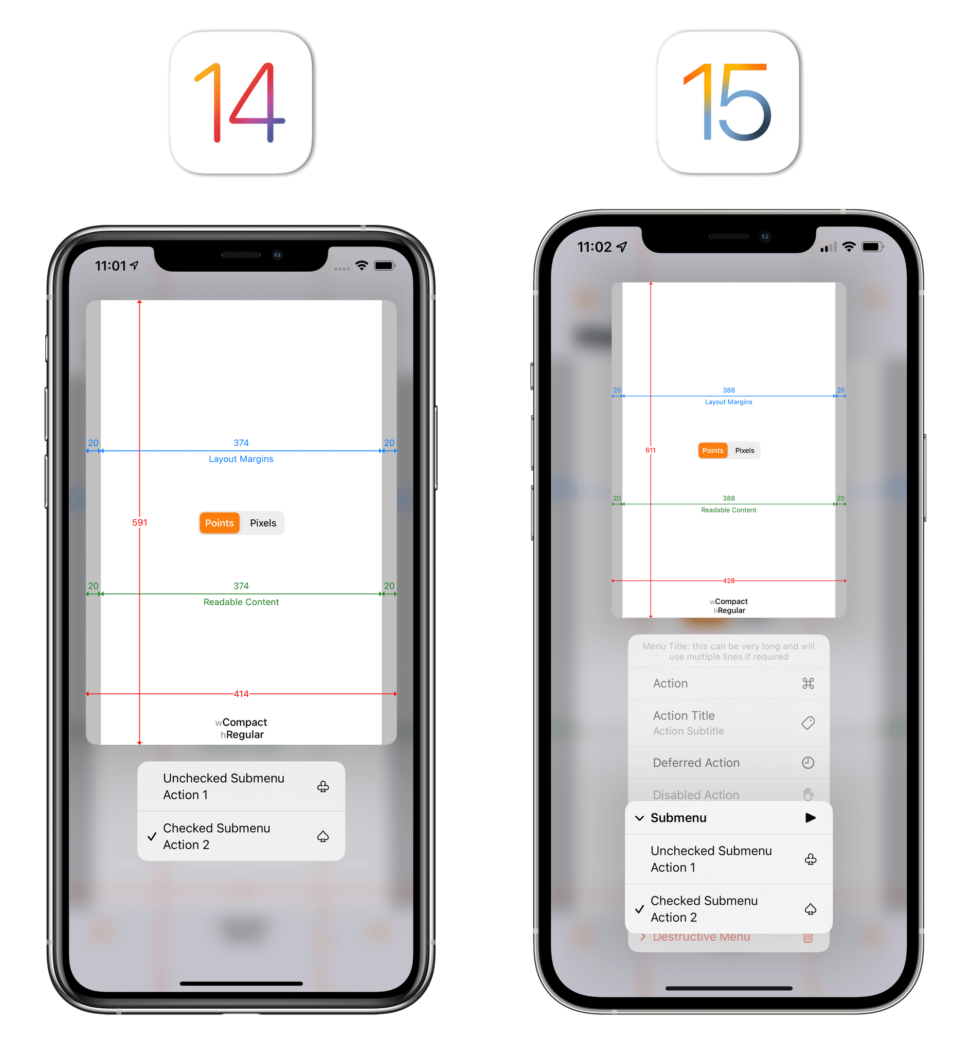
The new look for nested menus in iOS 15.Replay
A native API for Maps-like sheets. Third-party developers have rolled their own custom versions for years now, but Apple is introducing a native sheet controller API in iOS 15 to let apps present Maps-like sheets that can (optionally) only fill half the screen on iPhone.
These new sheets – which Apple is using throughout iOS 15 with Translate, Safari, Look Up, and other apps – can be set by developers to medium size (they cover half the screen) or large size that fills the entire screen.
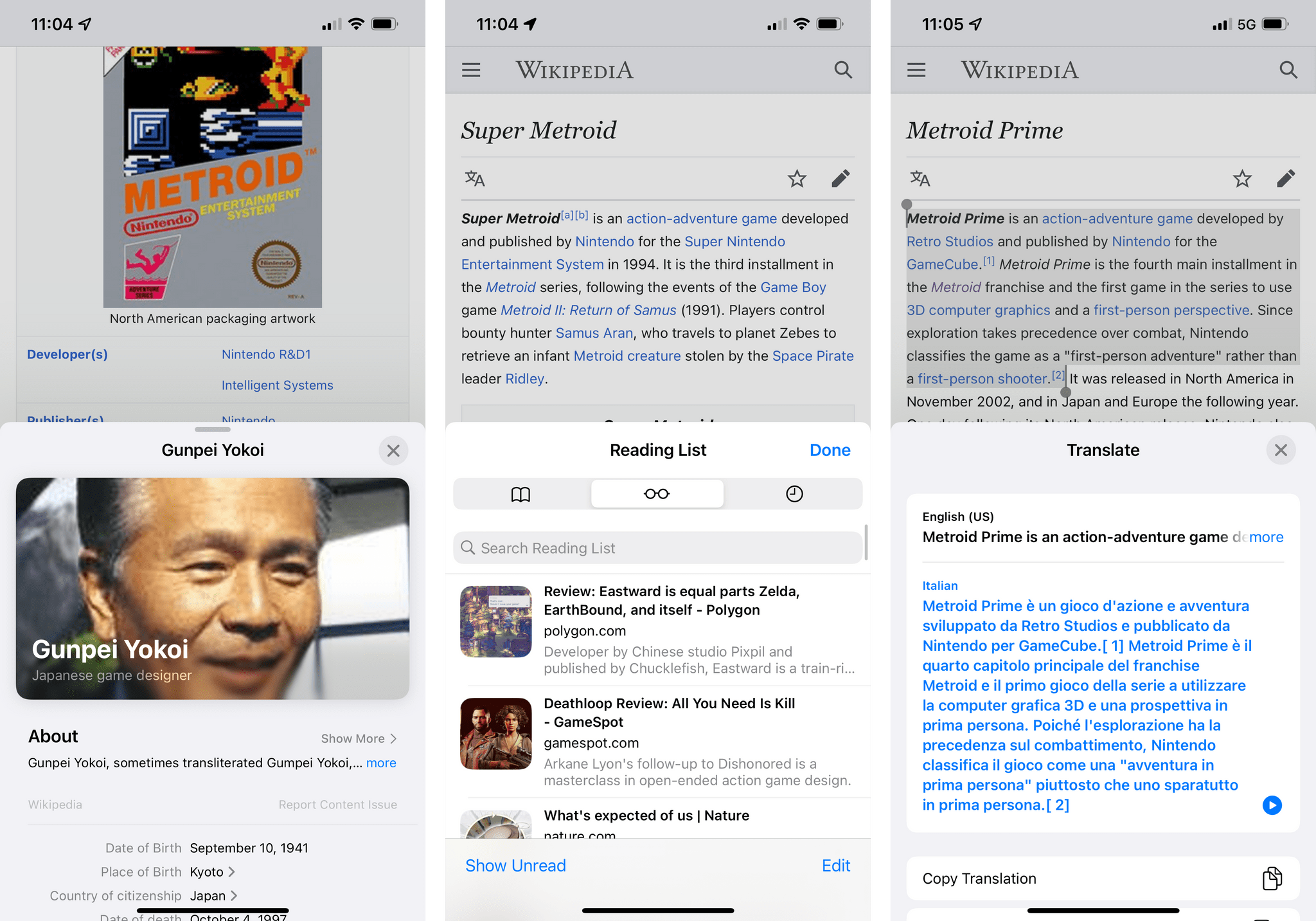
Full-screen sheets aren’t new (Apple started using them all the way back in iOS 13), which means that medium-size sheets are the real stars of the show here, and Apple is aware of this. Medium sheets are packed with options: developers can make them resizable; they can optionally add a grabber at the top of the sheet; they can even customize the corner radius to make sheets fit their app UIs better. Medium sheets support automatic keyboard avoidance (if the keyboard comes up, the sheet expands to fill the screen automatically – a nice transition), and developers can choose to enable a non-modal behavior that lets users interact with content within and beyond the sheet. On iPad, developers can choose to display a sheet as a popover, which becomes an iPhone-like sheet if an app is turned into a compact Split View or Slide Over.
I expect to see these new native sheets in a lot of iPhone apps starting this fall. Developers have been asking for these for a long time, and Apple delivered with a native solution that is highly customizable and multi-platform. Furthermore, medium sheets enable a fascinating new kind of in-app multitasking in iPhone apps: imagine, for instance, being able to pick images from a photo picker in the lower half of the screen and see a bigger preview of the selected item at the top. Of all the design changes in iOS 15, this is the one that intrigues me the most since its implementation may lead to welcome productivity gains in my favorite apps.