Focus: The Details
Let’s round up some of the hidden and interesting details for Focus in iOS and iPadOS 15:
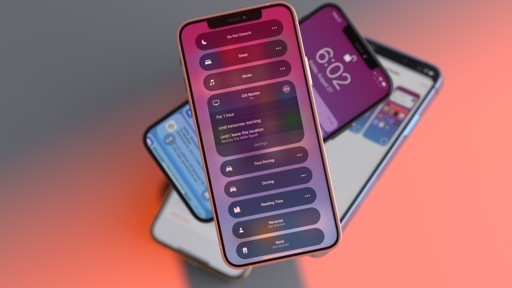
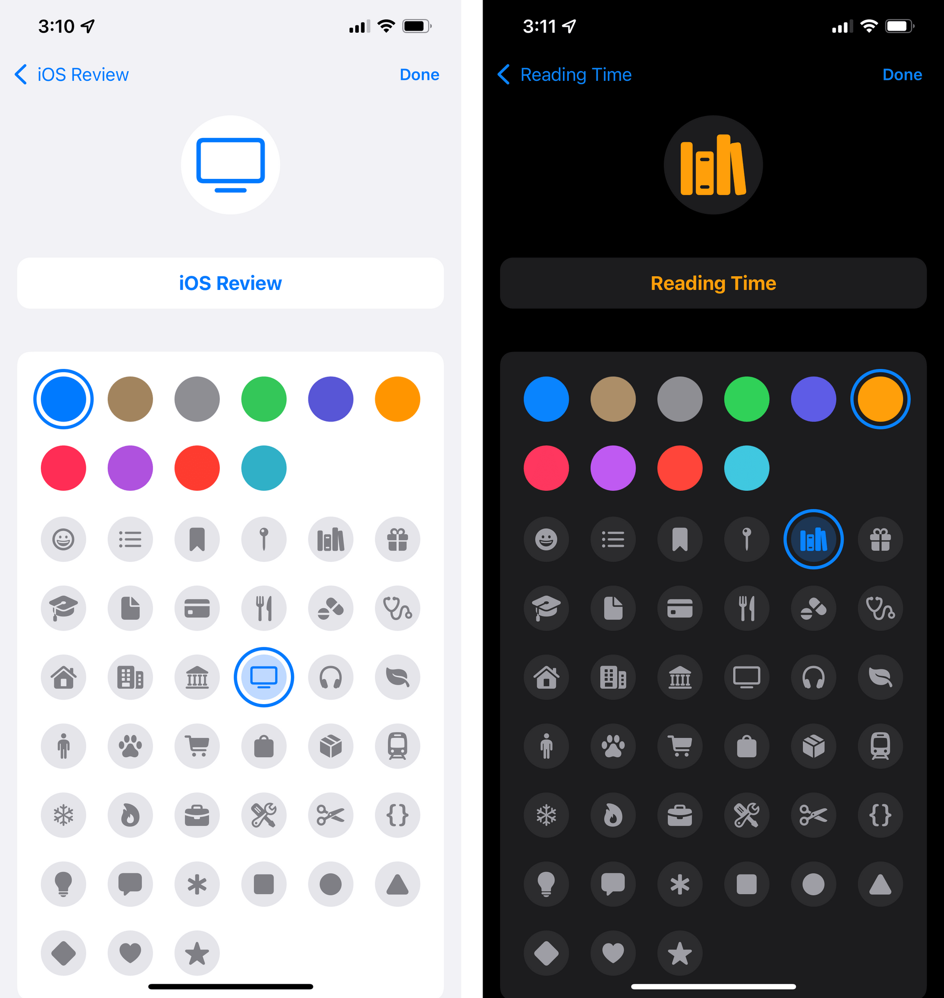
You can pick a custom color and icon for custom Focus modes. When setting up a custom Focus, you can choose from a selection of 10 colors and 39 icons to assign to it. I’m not sure why it’s not possible to pick any color via the system color picker or why the icon selection is limited to 39 options. This screen is reminiscent of the one seen in Reminders to customize lists, but the available icons are different. I don’t understand these limitations, and I’d like Apple to allow any color and any available SF Symbol for custom Focus modes.
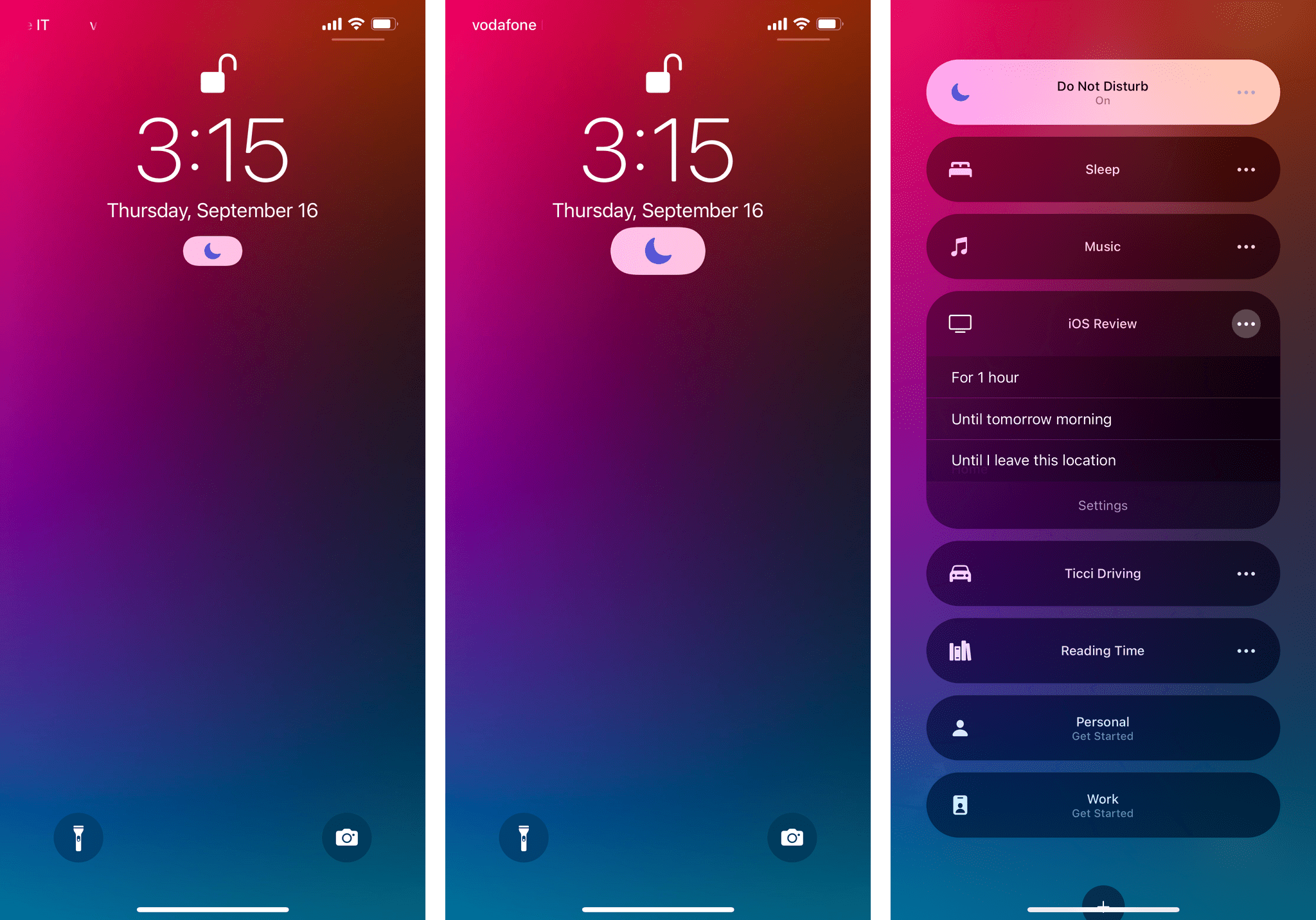
Your current Focus is shown in the status bar. On iPad, you can see the icon for the currently active Focus in the right corner of the status bar, next to the battery. On iPhone, you have to swipe down to see the expanded status bar on top of Control Center.
There’s a setting to hide notification badges while Focus is active. You can find it in Settings ⇾ Focus under the selected mode’s ‘Home Screen’ page. This option will disable badges for apps installed on your Home Screen. I always keep this enabled.
Focus can be disabled from the Lock Screen. Your currently active Focus is also displayed on the Lock Screen as a button underneath the clock. Tapping this button reveals the same Focus UI found in Control Center, which lets you disable a Focus from the Lock Screen.
You can optionally dim the Lock Screen and hide notifications from it. You can find this option in Settings ⇾ Focus under the selected mode’s ‘Lock Screen’ page. I prefer to keep the dimming option turned off, but I like to show silenced notifications on the Lock Screen.
iOS 15 will suggest apps and people for allowed notifications based on your “past activity”. At least in theory. Apple claims that iOS and iPadOS 15 will use on-device intelligence to suggest different sets of people and apps for “work” and “personal” Focus modes. So far, the only recommendations I’ve seen were the ones available when setting up the built-in ‘Personal’ and ‘Work’ modes – and even then, those recommendations just seemed random to me. For context, iOS 15 suggested my mom, a contact in Apple PR, and my favorite seafood restaurant5 in the same Focus.
I should also note that I, like others, work from home, so maybe the system isn’t able to differentiate my activity by location? As with other “intelligent” features of iOS, I usually just ignore these claims.
iOS 15 will also suggest different Focus modes based on your context. Same as above. Apple says the system will rely on “signals” such as time of day and location to suggest different Focus modes. But where? And how? I’ve never seen these suggestions, so I’m not sure.
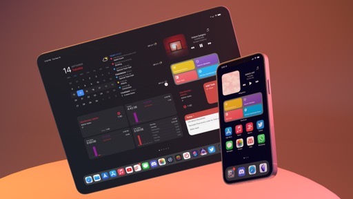
You can “install” multiple copies of the same app for different Home Screens. If you, like me, plan on setting up multiple Home Screens for different Focus modes, you’ll be happy to know you can add multiple icons for the same app in both iOS and iPadOS 15. To do this, simply drag an app from the App Library or Spotlight onto the Home Screen multiple times, and you’ll end up with multiple copies of it. I found this useful when setting a standalone music Home Screen: I wanted to show the Music icon on both my ‘regular’ Home Screen and the dedicated music one, so I installed two icons for the same app and put them on separate pages. Of course, there’s also the meme version of this.
Focus is an obvious evolution of Apple’s efforts and their best implementation of Do Not Disturb to date. The versatility of Focus is remarkable, and the integration with Home Screen and Shortcuts will allow users to come up with creative uses of the feature. While Do Not Disturb was a blunt tool to silence all kinds of notifications, Focus is a flexible filtering system that adapts to the user and their different needs at different times of the day.
In the three months I’ve been using iOS and iPadOS 15, I’ve found myself liking and relying on Focus a lot more than I initially thought; I have a feeling this feature will be a success.
Notifications
The other half of iOS 15’s notification management story involves, well, the notifications themselves. In addition to the time sensitive notifications I mentioned above, Apple refreshed the design of notification alerts and brought new management tools to mute notifications and bundle them up in scheduled summaries. After three months of using iOS and iPadOS 15, however, I feel like Apple thinks these notifications updates are more important than they actually are.
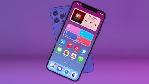
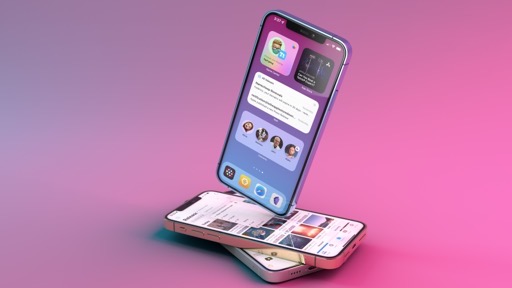
Let’s start with the design. In iOS 15, Apple made notifications more compact and informative by moving their icons (or profile pictures, in the case of message notifications) to the left side and making them bigger, all while applying a bold weight to the notification title at the top of the alert. As a result, it’s easier to see where a notification comes from, and different alerts take up less vertical space in Notification Center and the Lock Screen. I like this change.
There are also new ways for developers to categorize their apps’ notifications, but I don’t fully understand why these new types exist or what they’re meant to do. As we mentioned before, critical notifications are the ones that can break through anything on your device (including the ring/silent switch), and time sensitive notifications are new in iOS 15 and have their own section in Settings, plus a specific label on the notification itself.
So far, so good. But iOS 15 also adds categorization for ‘passive’ and ‘active’ notifications too. According to Apple, passive notifications include information that “people can view at their leisure” while active notifications are the ones people “might appreciate knowing about when it arrives”. These two types of notifications don’t have any special UI, have the same restrictions in terms of breaking through Focus and scheduled delivery (more on this below), and just feel like a technical implementation we can safely ignore.
The new options Apple added to manage notifications are more interesting and applicable to everyday usage. In the Options menu you access by swiping across a notification, you’ll see two new shortcuts that let you mute an app’s notifications for one hour or the entire day. I appreciate the inclusion of these buttons since they’re pragmatic solutions to a common problem. They remind me of Tweetbot’s time-based mute filters – one of the best features of the app.
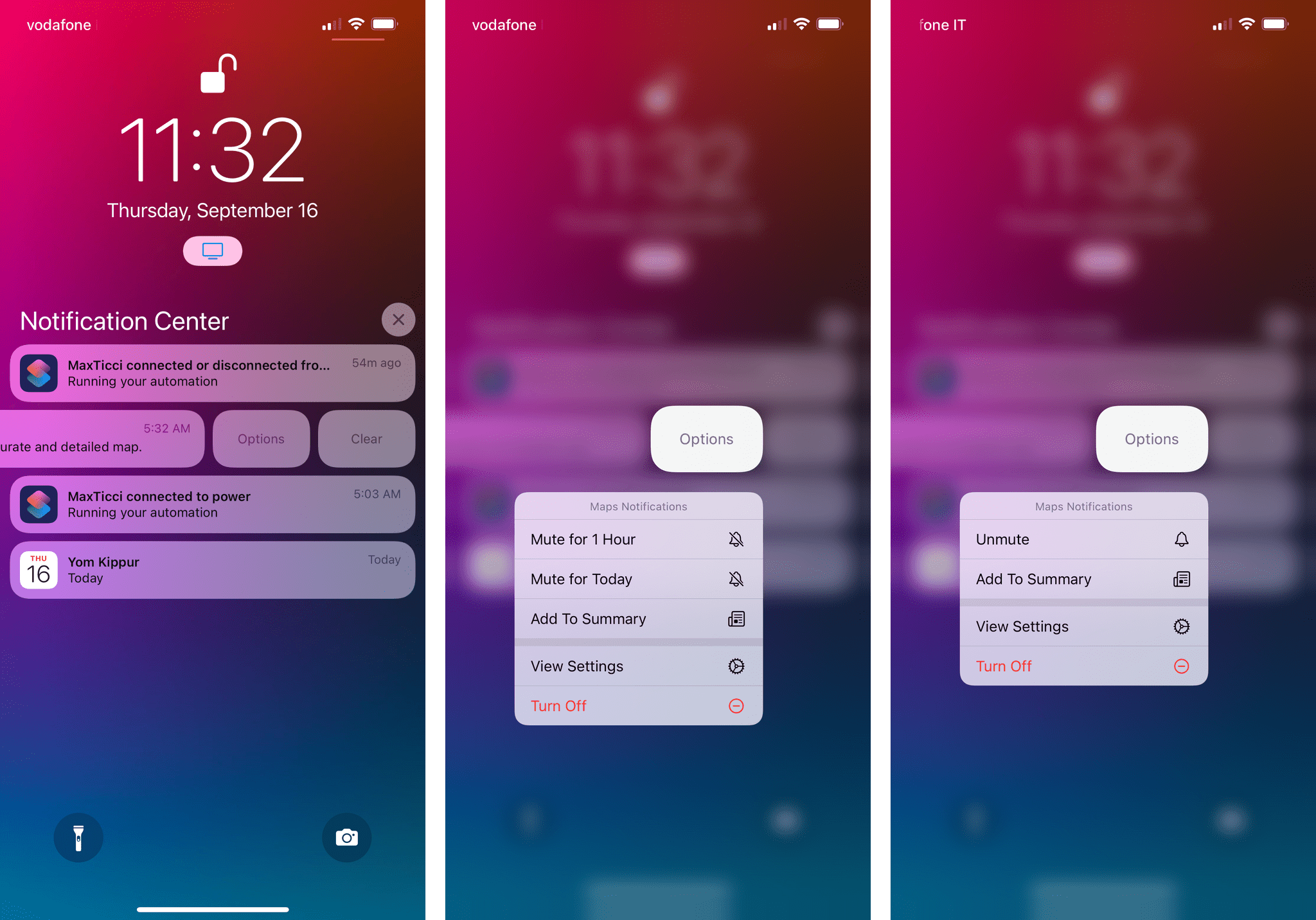
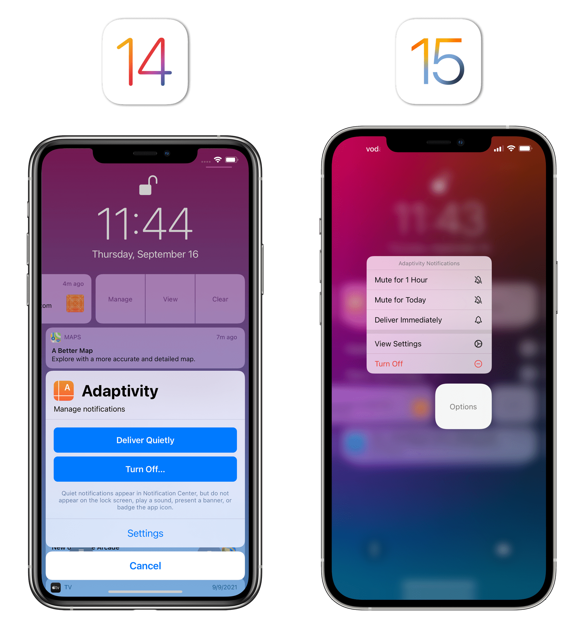
For context, these options have replaced the old ‘Manage’ screen. Quiet delivery has been replaced with the Notification Summary, which I’ll cover below.
These mute options can also be automatically suggested by the system for apps and threads you may want to silence forever or mute for a shorter period of time. iOS was already capable of recommending which notifications to turn off for apps you weren’t engaging with, but now the system can also suggest muting those notifications. I’ve had a few of such suggestions pop up on my Lock Screen over the past few months, and a couple them were spot-on, so I’m happy Apple is taking some proactive measures here.
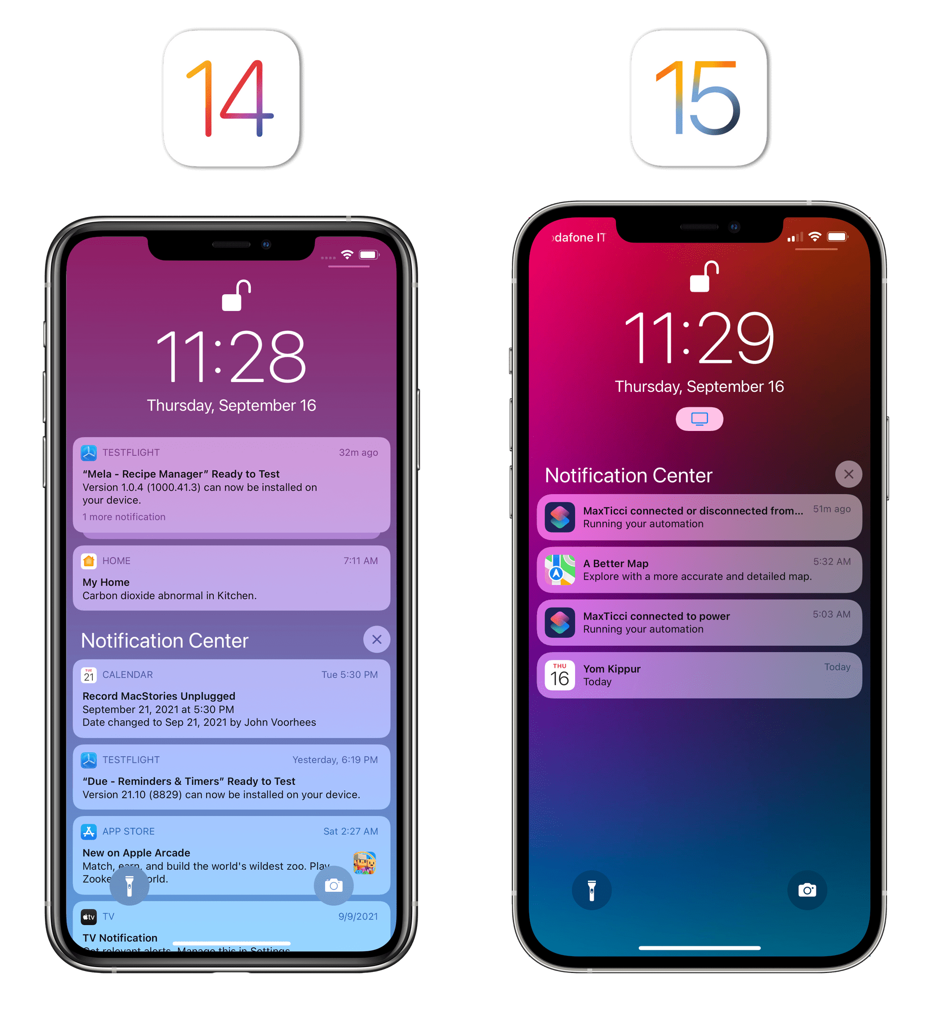
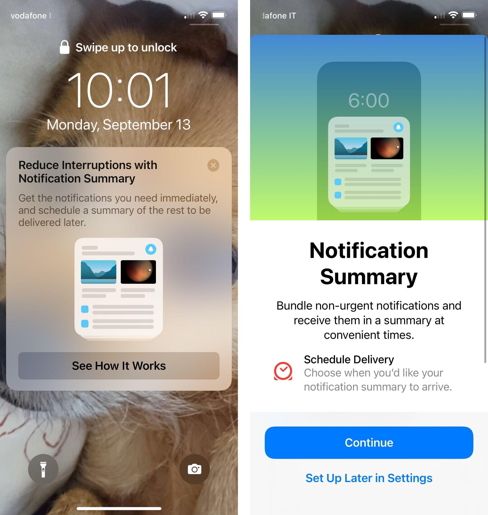
Notification Summary
In the aforementioned Options menu, you’ll also see a new ‘Send to Summary’ button that lets you switch an app’s notifications from immediate to scheduled delivery. The notification summary is, arguably, the marquee addition to notifications this year, which Apple advertises quite heavily throughout the system and in Settings.
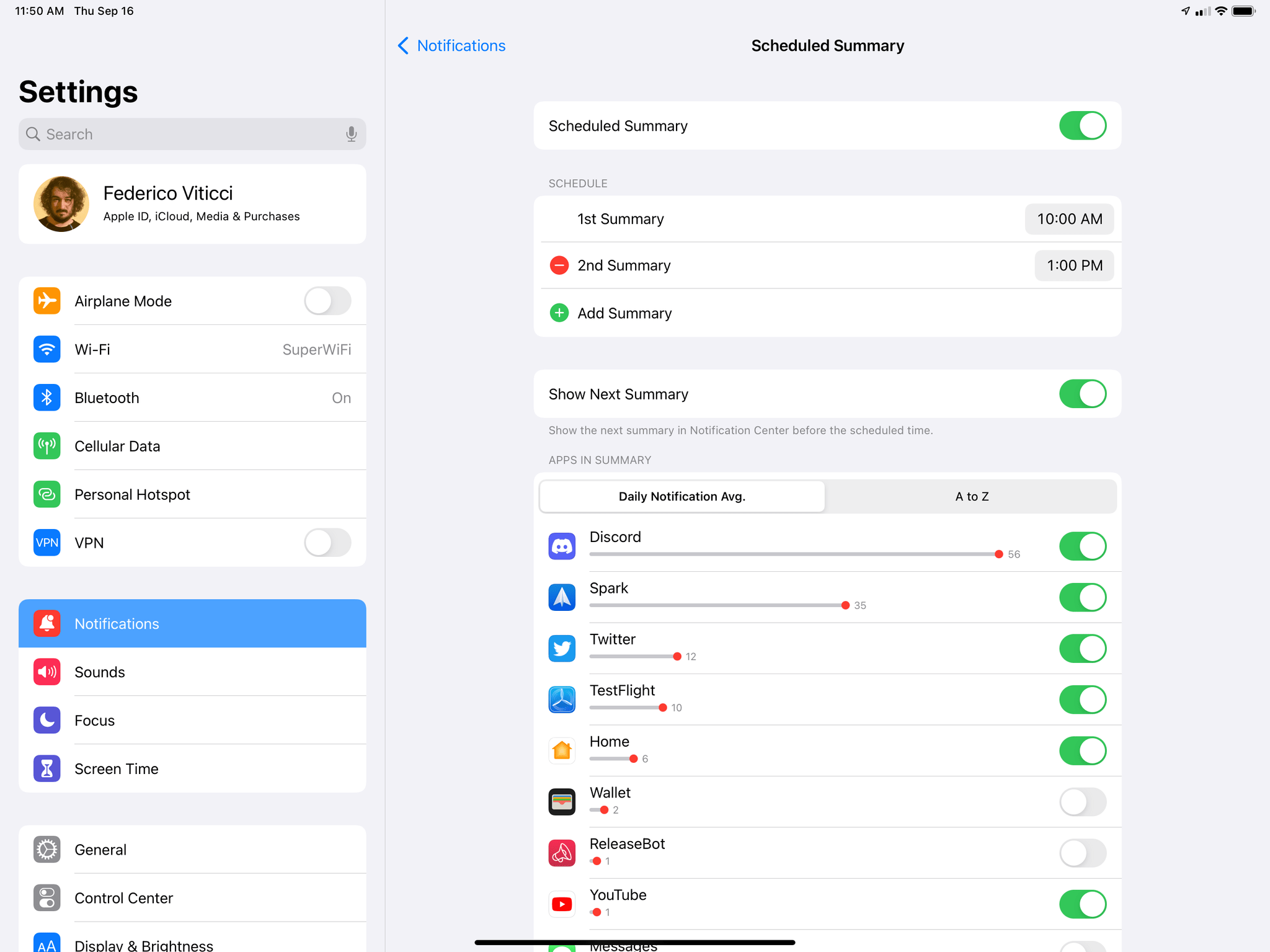
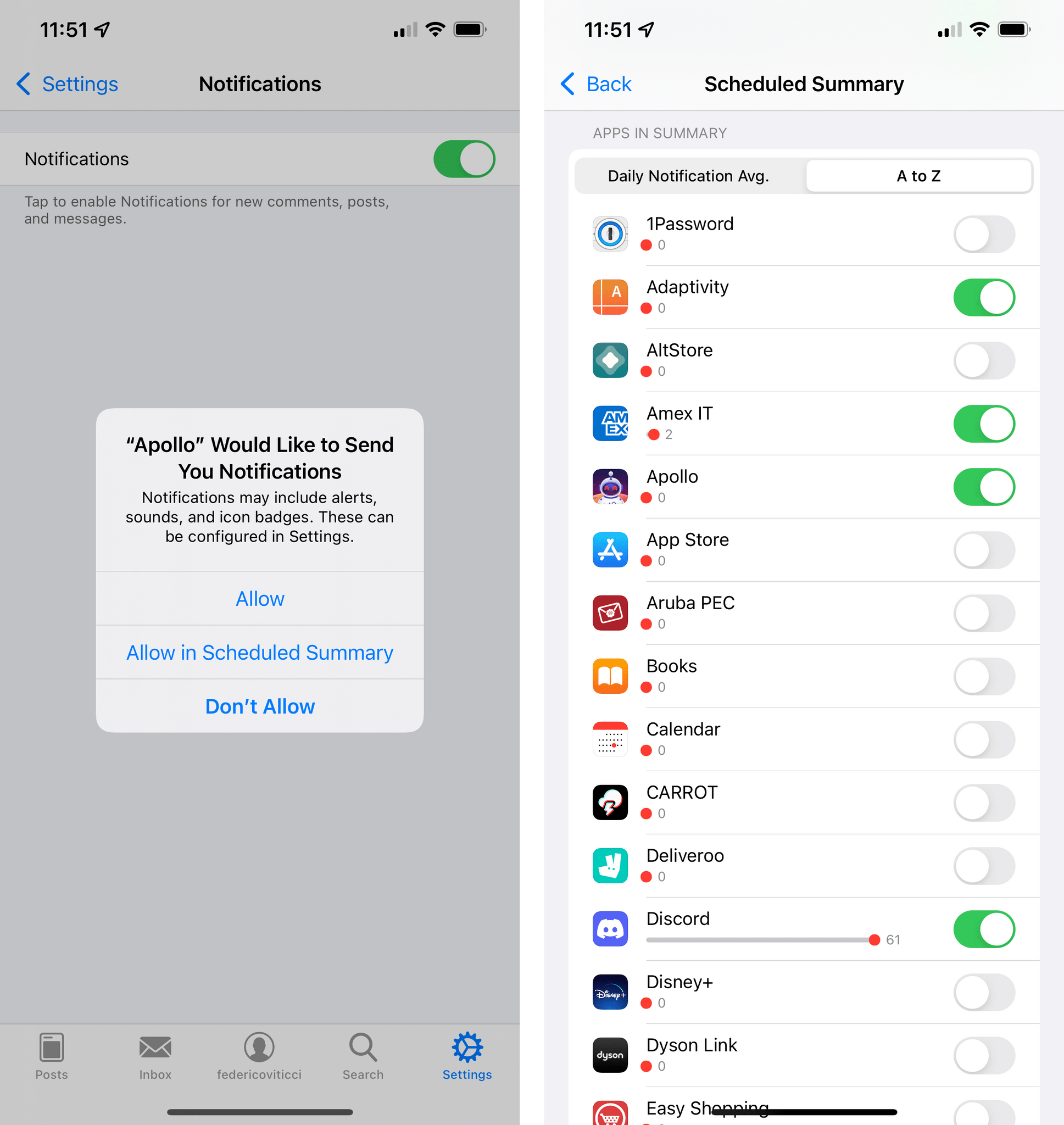
With the notification summary, you can schedule an app’s notifications to be delivered, alongside others, as a bundle at a specific time of day. You can create up to 12 daily summaries and set their schedule in Settings ⇾ Notifications ⇾ Scheduled Summary; from this page, you can also manually assign apps to the summary by picking them from a list sorted in alphabetical order or by the number of notifications sent daily by each app (it’s the same approach used for Screen Time).
Alternatively, besides the Options menu I covered above, you can easily send an app’s notifications to the scheduled summary in the permission dialog that comes up the first time an app requests the ability to send notifications. This provides a nice middle ground between immediate delivery (the classic mode) and denying permission, allowing you to use the summary option as a staging mode for notifications you don’t fully trust yet.
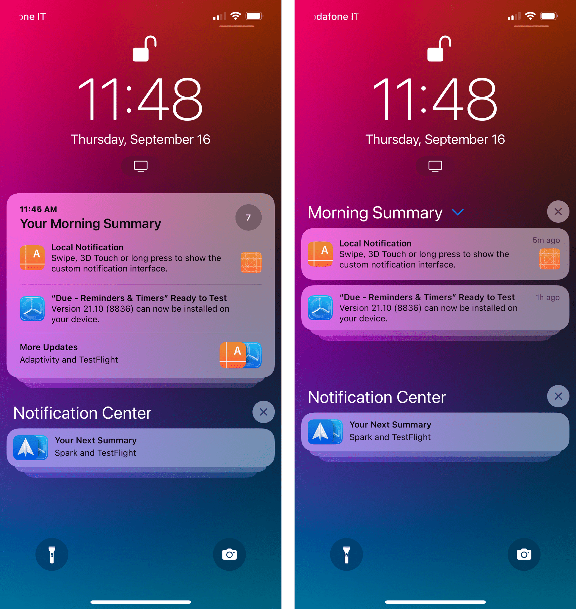
The notification summary itself is, visually and functionally speaking, uninspired: it’s a stack of notifications that has a large title (e.g. ‘Your Afternoon Summary’), a badge for the number of notifications inside it, and a couple of featured slots for notifications the system thinks are the most relevant of the ones included in the summary. After those, there’s a ‘More Updates’ button that lets you “unwrap” the summary and turn it into a list of regular notifications.
Perhaps I’m not the target user for this feature, but after giving the notification summary a solid try for the past three months, my takeaway is that it only helped me ignore notifications more. I don’t like to keep too many notifications enabled on my devices, so I wouldn’t be surprised if this feature ends up being loved by folks who severely struggle to make sense of their Notification Center. But in my experience, I never found myself actively seeking the scheduled summary to see what I missed; instead, I just forgot about it until the next day, when a new scheduled summary rolled in and put the previous day’s notifications into the standard Notification Center.6
My biggest problem is the fact I wish the notification summary was smarter and more customizable. For instance, while you can create multiple scheduled summaries throughout the day, you can’t assign specific apps to a specific summary, nor can you label summaries with unique names. I would have liked to create a ‘News Summary’ with notifications from news apps and a ‘Music Summary’ for music-related updates, but that’s not possible in iOS 15. There’s no way to create manual “categories” of notifications that are delivered to specific scheduled summaries; your summary settings don’t sync across devices either, so you’ll have to recreate summaries separately on the iPhone and iPad if you use the same apps on both platforms. Plus, I find the overall design of the summaries bland and boring; I would have liked to see Apple get a little more creative here, perhaps adding the ability to expand the summary into a larger summary card rather than a basic stack of notifications.
There’s value to the idea behind the notification summary: letting users choose between immediate and scheduled delivery is a good first step to create separate “tracks” of notifications that don’t necessarily interrupt them. However, this first implementation of the summary doesn’t do anything to fundamentally change how notifications are grouped on iOS.
As a result, I expect most people will use this feature as a stopgap measure to hide certain notifications without disabling them completely. The summary could be a lot more than a list of semi-hidden notifications in the future; a good way to achieve that would be to support the same degree of control, personalization, and integrations seen in Focus. Right now, the notification summary feels like an uninspired feature and a problem in search of a solution.