This Week's Sponsor:

Collections Database

A Powerful Database with iCloud Sync


Search results for "iCab"

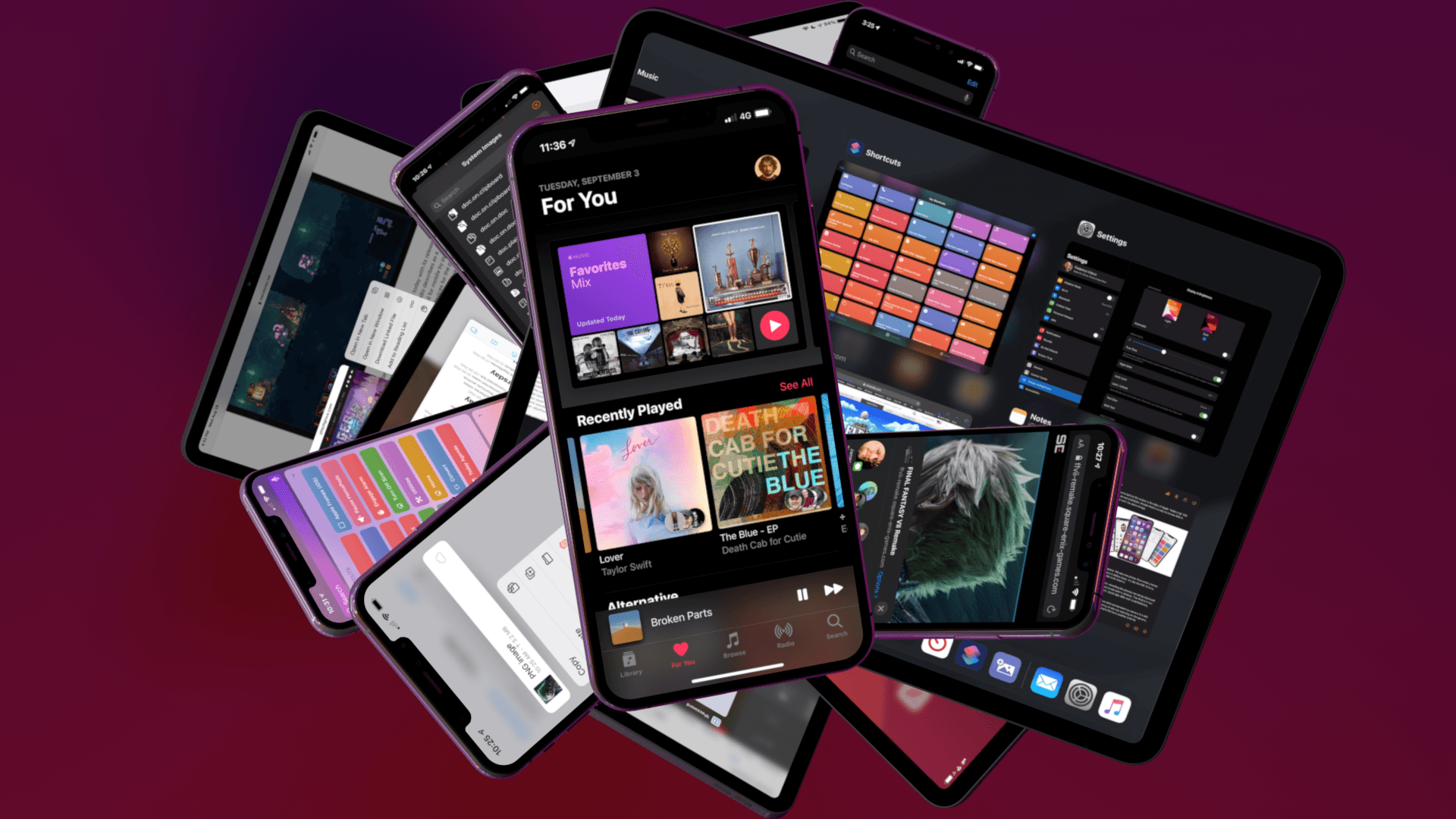
iOS and iPadOS 14: The MacStories Review

Even with (unsurprisingly) smaller releases, Apple is pushing forward with bold ideas across all platforms.

How do you prepare a major new version of an operating system that now spans two separate platforms, which will be installed on millions of devices within a few hours of its release, amid a global pandemic? If you’re Apple, the answer is fairly straightforward: you mitigate the crisis by focusing on a narrower set of features, perhaps prioritizing bug fixes and stability improvements, but then you just have to do the work.

In my time as an iOS (then iOS and iPadOS) reviewer, I never thought I’d have to evaluate an OS update with the social and political backdrop of iOS 14. Let’s face it: when the COVID-19 outbreak started fundamentally changing our lives earlier this year, at some point many of us – including yours truly – thought that, among more serious and severe repercussions, our tiny corner of the Internet would see no new phones, OS updates, videogame consoles, or other events over the course of 2020. Or that, at the very least, changes in hardware and software would be so minor, they’d barely register in the grand scheme of things as tech companies and their employees were – rightfully so – adjusting to a new, work-from-home, socially distant life. Yet here we are, over a year after the debut of iOS and iPadOS 13, with brand new versions of both operating systems that were announced, as per tradition, at WWDC a few months ago. Remove all surrounding context, and you wouldn’t guess anything has changed from 2019.

Context is, however, key to understanding Apple’s background and goals with iOS and iPadOS 14, in a couple notable ways.

First, I think it’s safe to assume slowing down to reassess the state of the platform and focus on quality-of-life enhancements and performance gains would have worked out in Apple’s favor regardless of the pandemic. In last year’s review, I noted how the first version of iOS 13.0 launching to the public wasn’t “as polished or stable as the first version of iOS 12”; in a somewhat unpredictable twist of events, managing the iOS 13 release narrative only got more challenging for Apple after launch.

Late in the beta cycle last year, the company announced certain iOS 13 features – including automations in Shortcuts and ETA sharing in Maps – would be delayed until iOS 13.1, originally scheduled for September 30th. Following widespread criticism about bugs, various visual glitches, and stability issues in iOS 13.0, Apple moved up the release of iOS 13.1 and iPadOS (which never saw a proper 13.0 public release) by a week. Despite the release of a substantial .1 update, the company still had to ship two additional patches (13.1.1 and 13.1.2) before the end of September. Before the end of 2019, all while the general public was lamenting the poor state of iOS 13’s performance (just Google “iOS 13 buggy”, and you’ll get the idea), Apple went on to ship a total of eight software updates to iOS 13 (compared to iOS 12’s four updates before the end of 2018). The record pace, plus the mysterious removal of features that were originally announced at WWDC ‘19, suggested something had gone awry in the late stages of iOS 13’s development; it wasn’t long before a report covered Apple’s plans to overhaul its software testing methodology for iOS 14 and 2020. The pandemic may have forced Apple to scale back some functionalities and deeper design changes this year, but it’s likely that a decision had been made long before lockdowns and work-from-home orders.

Second, context is necessary because despite the pandemic and rocky rollout of iOS 13 and its many updates, Apple was still able to infuse iOS and iPadOS 14 with fresh, bold ideas that are tracing a path for both platforms to follow over the next few years.

On the surface, iOS 14 will be widely regarded as the update that brought a redesigned Home Screen and a plethora of useful quality-of-life additions to the iPhone. For the first time since the iPhone’s inception, Apple is moving past the grid of icons and letting users freely place data-rich, customizable widgets on the Home Screen – a major course correction that has opened the floodgates for new categories of utilities on the App Store. In addition to the upgraded Home Screen, iOS 14 also offers welcome improvements to long-standing limitations: phone calls can now come in as unobtrusive banners; Messages borrows some of WhatsApp’s best features and now lets you reply to specific messages as well as mention users; Siri doesn’t take over the entire screen anymore. There are hundreds of smaller additions to the system and built-in apps in iOS 14, which suggests Apple spent a long time trying to understand what wasn’t working and what customers were requesting.

iOS and iPadOS 14 aren’t just reactionary updates to criticisms and feature requests though: upon further examination, both OSes reveal underlying threads that will shape the evolution of Apple’s platforms. With compact UI, the company is revisiting a principle introduced in iOS 7 – clarity and content first – with fresh eyes: the UI is receding and becoming more glanceable, but the elements that are left are as inviting to the touch as ever – quite the departure from Jony Ive’s overly minimalistic, typography-based approach. We see this trend everywhere in iOS 14, from phone calls and Siri to widgets, new toolbar menus, and Picture in Picture. Intents, the existing technology behind SiriKit, Shortcuts, and intelligent Siri suggestions, is also at the center of widget personalization. Intents already was one of Apple’s most important frameworks given its ties to Siri and on-device intelligence; iOS 14 proves we haven’t seen all the possible permutations and applications of Intents yet.

Then, of course, there’s iPad. In iPadOS 14, we see the logical continuation of pointer and trackpad support introduced earlier this year in iPadOS 13.4: now that users can control an iPad without ever touching the screen, Apple is advising third-party developers to move away from iPhone-inspired designs with apps that are truly made for iPad…and somewhat reminiscent of their macOS counterparts. We can see the results of this initiative in modernized system apps that take advantage of the iPad’s display with a sidebar, multiple columns, and deeper trackpad integration – new options that every iPad app developer could (and, according to Apple, should) consider going forward. Although some of the iPad’s oft-mentioned ongoing struggles remain unaddressed in iPadOS 14 (see: multitasking and window management), Apple is embracing the iPad’s nature as a modular computer this year, and they feel comfortable leaning into lessons learned with the Mac decades ago.

The context of 2020 is what makes iOS and iPadOS 14 so fascinating and, to a certain extent, fun to review. On one hand, we have two major OS updates that may or may not have been impacted by the global pandemic in their focus on fewer groundbreaking additions and more consistent improvements across built-in apps; on the other, just like any other year, we have a suite of overarching themes and potential implications to dissect.

But for all those users still pausing over that ‘Install’ button, pondering whether updating their most important communication and work-from-home devices is worth it, there’s only one consideration that matters:

Will this go any better than last year?

Read more


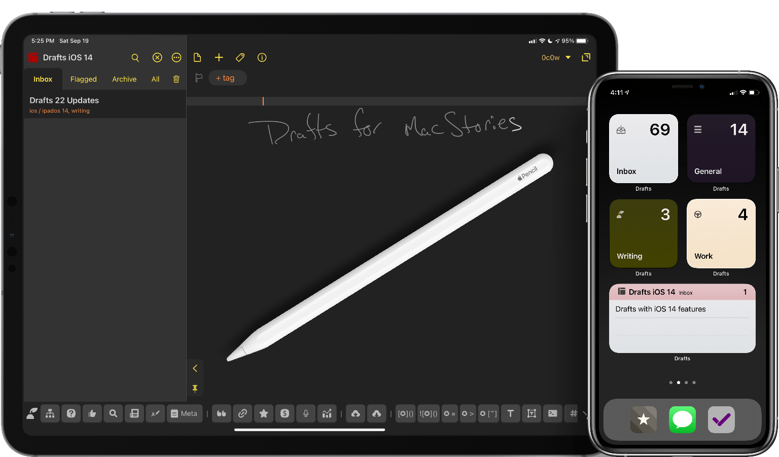
    Drafts 22 Review: Widgets, Scribble, and More

    One of my favorite times every year is right around the beginning of August. Not because of the weather – summer where I live – but rather it’s when beta season is in full swing. Apps are putting polish on features, the full update scope is set, and everything starts to feel stable. And there’s nothing better to me than a new Drafts update to coincide with new OS features, bringing new uses of the app to my répertoire.

    With the release of iOS and iPadOS 14 this year, it might seem on the surface that the updates to most apps are minimal. Widgets are the hot new feature of the operating systems, along with the visual changes of macOS Big Sur. While most apps will benefit from these changes, the productivity category will be greatly helped. And like Shortcuts, Scriptable, and others, Drafts benefits greatly from these new changes. It might take you a bit of time to see how this will fit your use cases, but once you give that some thought, it will open up new opportunities for you to use the app.

    Read more


    WWDC 2020: All the Little Things in Apple’s New OS Releases

    WWDC week is always full of big and small announcements about Apple’s core software platforms. Monday’s keynote only has time for sharing a limited number of details, however, so as the week goes on many new discoveries are made as developers and writers delve into the first beta OS releases themselves. As a result, we always have a roundup of new things to share midway through the week. So today, on top of everything detailed in our overviews of iOS and iPadOS 14, watchOS 7, macOS Big Sur, and tvOS 14, here’s an assortment of extra goodies that will be arriving on your devices this fall.

    Read more


    For iPad, Accessibility Gives ‘It’s Just a Big iPhone’ New Meaning

    Perhaps the most common complaint hurled against the iPad over its first decade of life is that it‘s little more than a bigger iPhone. At a fundamental level, the criticism is certainly valid: by and large, the iPad runs the same software as the iPhone. The penchant for bemoaning this bigness emanates from discontentment over the fact that substantial improvements to the iPad’s software have come at a glacially slow pace. Until last year, meaningful upgrades tailored to the tablet were few and far between.1 As much as Apple has extolled the iPad for being “unlike any computer,” the truth is the product stagnated for quite a while in terms of software.2 For better or worse, the company has been preoccupied with savoring every last drop of mother’s milk from the cash cow that is the iPhone. The iPad was left to wither thirstily when it came to its own growth, and it suffered for some time as a result.

    In actuality, the iPad being more or less a scaled-up iPhone isn’t necessarily an entirely bad thing. The reason is iOS; familiarity breeds comfort – Apple shrewdly created the iPad’s user interface (and to lesser extents, Apple Watch and Apple TV) to largely resemble the iPhone. Especially for less nerdy users, the consistency across devices makes for a seamless, less intimidating experience. From icons to text to features to the touchscreen, the iPad being so similar to the iPhone means acclimating to the device takes minimal time and effort. From an accessibility standpoint, easy acclimation sets the tone for an enjoyable user experience. The foremost reason this is important is that the easier it is to acclimate to a device, the easier it is to find and configure mission-critical accessibility features.

    Thus, it’s not at all unreasonable to look at what was heretofore a pejorative assessment – the iPad is nothing but a big iPhone – and turn it into a positive. One of the unheralded aspects of the device’s success is how its approachable, intuitive nature has made it a hit in accessibility-centric contexts such as special education classrooms and as a communicative aid. Such advances get right at the heart of the oft-cited Steve Jobs quote on the so-called intersection of technology and the liberal arts, when he said, “It’s in Apple’s DNA that technology alone is not enough.” Assistive technology obviously caters to the humanities part of the liberal arts, and it’s not hard to see how the iPad’s roots as ostensibly a bigger iPhone can be an asset rather than a liability. You just have to be willing to keep an open mind.

    Read more


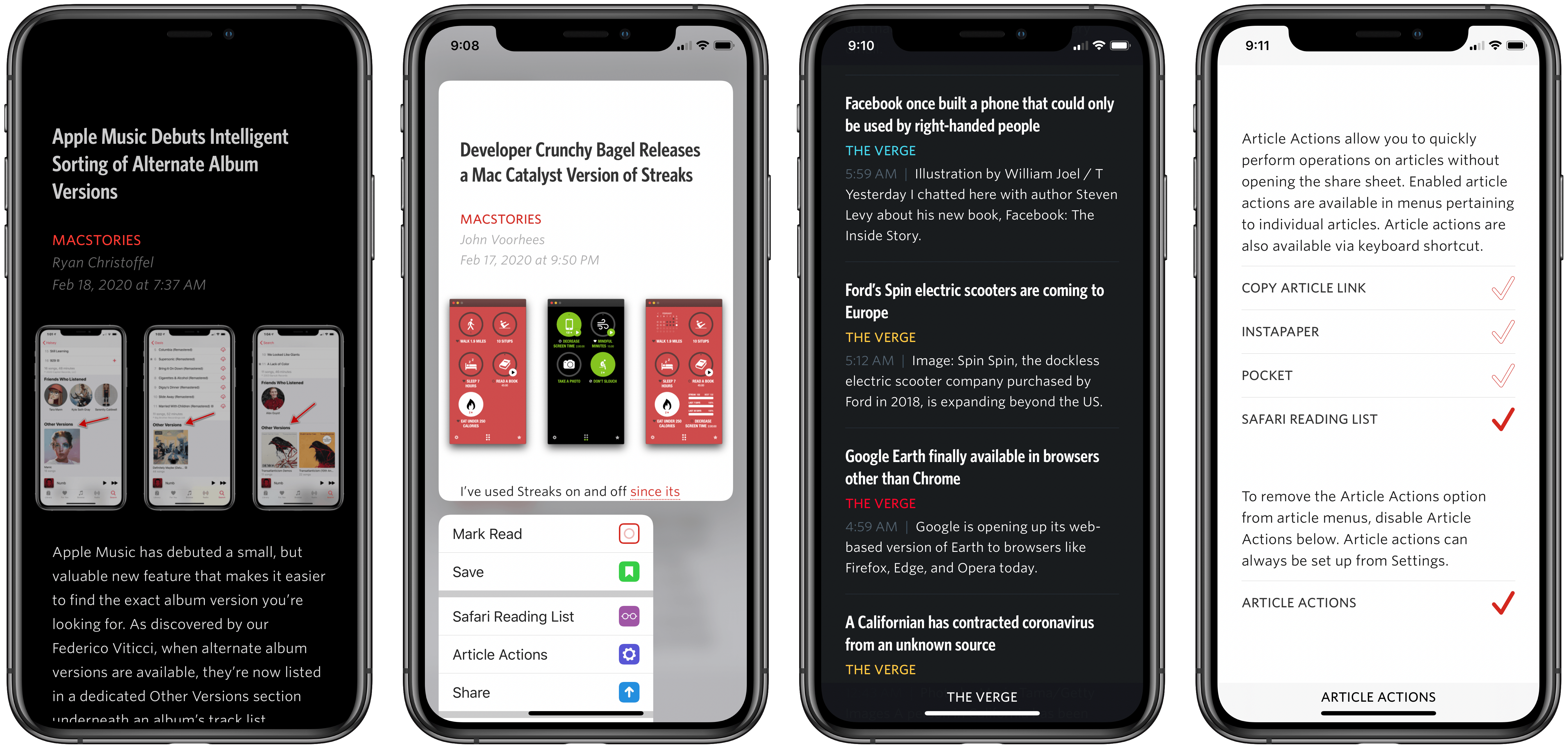
    Unread 2 Review: The Elegant RSS Client Leaps into Modernity

    Unread has always been one of my favorite RSS clients due to its clean, elegant, gesture-based design, but as competing apps have continued advancing at a steady pace, Unread’s development stalled leading up to its acquisition in 2017 by Golden Hill Software. Since that time, the app has received new life in the form of regular updates, but nothing on the level of what’s debuting today.

    Unread 2, on one hand, brings a lot of change and propels the beloved RSS client into the present. It does this, however, with almost no design changes. Unread 2 looks and feels just like Unread 1, but with more power and a roster of modern features under the hood.

    If Unread wasn’t the app for you before, then version 2 almost certainly won’t change your mind. But if you already appreciated the elegant RSS reader, Unread 2 provides a lot more reasons to love it.

    There are so many big and small upgrades in Unread 2, for my review I’ve chosen to break its noteworthy improvements into three different categories: RSS, iPad, and OS features.

    Read more


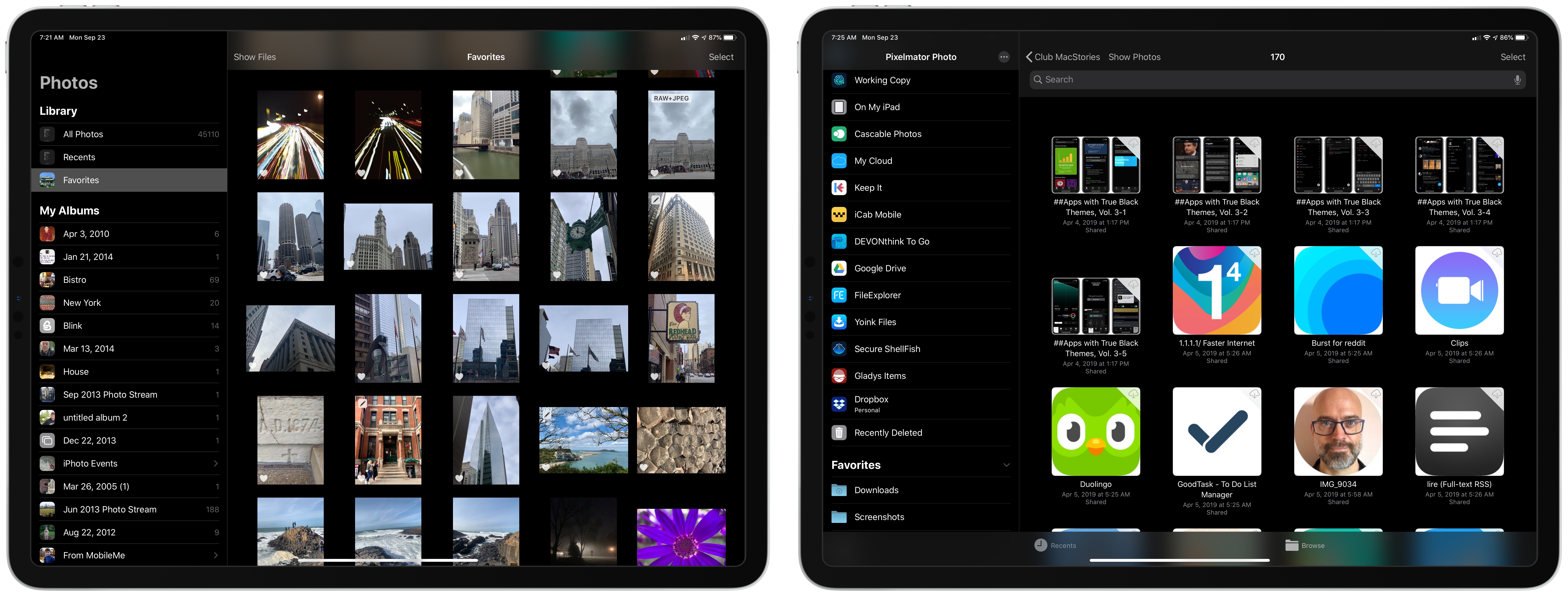
    Pixelmator Photo Adds Direct iCloud Photo Library Access, Batch Editing, and New Export Features

    Pixelmator Photo for the iPad has been released with a trio of new features that greatly increase the power of the app. With the update, you can now now edit images in your iCloud Photo Library non-destructively without creating duplicates. There are also new batch-processing workflows and better options for exporting images. It’s an interesting mix of updates that I expect will appeal to a wide audience even though there remain iPadOS features I’d like to see adopted in the future.

    Read more


    iOS and iPadOS 13: The MacStories Review

    Following years of a judicious union between platforms, it’s time for iPad to embark on its own journey.

    In looking back at major iOS releases from the recent past, it’s easy to see how building and positioning these annual updates has become a careful balancing act for Apple.

    In last year’s iOS 12, we saw the company focus on improving performance, providing users with tools to understand their device usage habits, and adapting Workflow to the modern era of Siri and proactive suggestions. The strategy was largely successful: iOS 12 was regarded as Apple’s most reliable iOS release of late – a reputation that has resulted in a 90% adoption rate a year later; and the Shortcuts app – the highlight of last year from a user feature perspective – is becoming a built-in (and thus more powerful) app in iOS 13.

    For all that Apple accomplished in iOS 12, however, some areas of the experience inevitably had to be put on the back-burner. Besides improvements to Reminders and Files, iOS 12 lacked a long-awaited dark mode (which was rolled out on macOS instead) as well as more substantial tweaks to the ever-evolving iOS 7 design language; chief among iOS 12’s absentee list, of course, was iPad. Even though Apple had trained users to expect major additions to the tablet platform on a biennial schedule (see iOS 9 and iOS 11), the lack of meaningful iPad features in iOS 12 spurred a contentious discussion when it became apparent that new iPad Pro hardware was so far ahead of its software, it legitimized asking whether investing in that hardware was even worth it.

    The annual debate that surrounds which features make it into each major iOS release is symptomatic of a complicated truth: iOS isn’t just the operating system that runs on iPhones anymore, and these annual releases are more than a mere collection of updated apps. iOS is the platform for an ecosystem of devices – from our wrists and speakers to cars and TV sets – and its changes have repercussions that ripple far beyond an updated Reminders app or a new icon set.

    This, of course, has been the case for a few years at this point, but the nature of iOS as an all-encompassing platform has never been as evident as it is today in iOS 13. For the first time since I started reviewing Apple’s annual iOS updates, it feels like the company is now keenly aware that a new iOS version has to cover an array of themes that can’t be pushed back for scheduling reasons. A single area of attention isn’t enough anymore – not for the Apple of 2019 as an economic, political, and social force, and not for iOS, the engine powering devices that aren’t just screens for apps, but bona fide lifestyle computers.

    As a result, there’s something for everyone in iOS 13 and all the recurring themes of Tim Cook’s Apple are touched upon this time around. iOS 13 improves Face ID recognition and promises improvements to app download sizes and performance. Apple is sending strong signals on its commitment to privacy as a feature with a new sign-in framework for apps and enhancements to location tracking controls and HomeKit cameras. iOS’ design language is getting its biggest update in years with dark mode, new tools for developers to express colors and embed glyphs in their user interfaces, updated context menus, and redesigns aimed at facilitating one-handed interactions. We have notable improvements to built-in apps, including the rebuilt Reminders and Health, an overhauled Files app, and hundreds of quality-of-life tweaks that, in big and small ways, make iOS more capable and efficient.

    No stone is left unturned in iOS 13 – and that includes iPad too.

    The iPad experience has always been largely consistent with the iPhone – particularly since Apple unified core iOS interactions around a screen without a Home button – but also distinct from it. iOS 13 makes this distinction official by splitting itself in a second branch called iPadOS, which uses iOS as the foundation but is specifically optimized and designed for iPad.

    It was clear when the new iPad Pro launched in late 2018 that it told only one part of a bigger story about the role of the tablet in Apple’s modern ecosystem. With iPadOS, Apple is ready to tell that full story: while the iPad has always been an extension of iOS, sharing key similarities with the iPhone hardware and software, it’s been evolving – arguably, a bit too slowly – into a different breed of computer that is fundamentally distinct from a phone.

    We’ve been able to observe this divergence starting in iOS 9 with Split View multitasking and Apple Pencil, and the transition continued with iOS 11 and its drag and drop-infused environment. It was only natural (and well-deserved) for the iPad to begin advancing in a parallel direction to iOS – informed and inspired by it, but also capable of growing on its own and tackling problems that an iPhone doesn’t have to solve.

    From this standpoint, there are two sides to iOS 13: on one hand, an underlying tide that raises all platforms, featuring a distillation of themes Apple comes back to on an annual basis; on the other, a fork in the road, opening a new path for the iPad’s next decade. And against this backdrop, a single question looms large:

    Can Apple balance both?

    Read more


      CARROT Weather iPad App Modernized with Multitasking and Expanded Keyboard Shortcuts, iCloud Sync for Settings

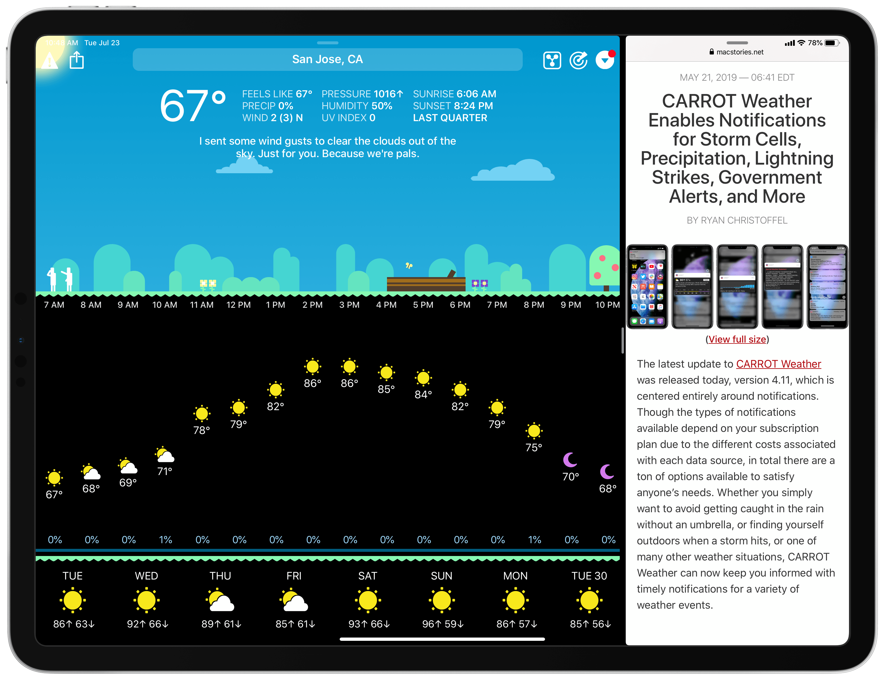
      Today in version 4.12, CARROT Weather debuts a modernized iPad app that takes advantage of the features core to a great iPad experience: multitasking support, more keyboard shortcuts, and a tweaked design that better utilizes large displays. Additionally, since the iPad app is maturing in several key ways, CARROT has added iCloud sync for all of the app’s 150+ settings options, ensuring you won’t need to configure settings on both iPhone and iPad.

      Read more


      Apple Stores Showing Signs of Change Under Deirdre O’Brien’s Leadership

      Michael Steeber reports for 9to5Mac on some interesting developments he’s observed in certain Apple Stores recently:

      Apple is evolving its in-store shopping experience with signage and display fixtures that remove ambiguity and encourage increased hands-on interaction with products. New designs that have been spotted in multiple locations reflect the changing requirements of busy stores and appear to address common customer needs.

      He mentions things like signs indicating checkout zones, a new table guide spelling out differences between iPhone XR, XS, and XS Max, and more customer-friendly Watch displays.

      The new retail design language Apple began rolling out in 2015 brought visual simplicity by deemphasizing signage, logos, and extraneous store fixtures. While more aesthetically pleasing, some customers have found contemporary stores challenging to navigate. These new fixtures and signs show that Apple is willing to fine-tune the balance between appearance and function.

      Normally these changes might go overlooked, particularly since they’re currently only in a handful of stores, but they’re noteworthy for reasons of timing. Apple’s former head of retail, Angela Ahrendts, was recently succeeded by Deirdre O’Brien, and while all signs point to Ahrendts’ departure being amicable, one common complaint regarding her tenure is that Apple Stores became less functional shopping places despite growing unquestionably more beautiful and lavish in design. These few scattered signs of change spotted by Steeber indicate an early priority shift coming from Apple’s new SVP of Retail.

      Permalink