Steven Aquino

13 posts on MacStories since June 2014

Steven is a freelance tech writer and iOS Accessibility expert, based in the San Francisco Bay Area. His work has appeared in The Magazine, Macworld, TidBITS, and more. He also writes for his personal website, Steven’s Blog, and co-hosts a weekly podcast, Accessible.

This Week's Sponsor:

FastMinder

A Simple, Lightweight, and Clutter-Free Intermittent Fasting Tracking Experience


For iPad, Accessibility Gives ‘It’s Just a Big iPhone’ New Meaning

Perhaps the most common complaint hurled against the iPad over its first decade of life is that it‘s little more than a bigger iPhone. At a fundamental level, the criticism is certainly valid: by and large, the iPad runs the same software as the iPhone. The penchant for bemoaning this bigness emanates from discontentment over the fact that substantial improvements to the iPad’s software have come at a glacially slow pace. Until last year, meaningful upgrades tailored to the tablet were few and far between.1 As much as Apple has extolled the iPad for being “unlike any computer,” the truth is the product stagnated for quite a while in terms of software.2 For better or worse, the company has been preoccupied with savoring every last drop of mother’s milk from the cash cow that is the iPhone. The iPad was left to wither thirstily when it came to its own growth, and it suffered for some time as a result.

In actuality, the iPad being more or less a scaled-up iPhone isn’t necessarily an entirely bad thing. The reason is iOS; familiarity breeds comfort – Apple shrewdly created the iPad’s user interface (and to lesser extents, Apple Watch and Apple TV) to largely resemble the iPhone. Especially for less nerdy users, the consistency across devices makes for a seamless, less intimidating experience. From icons to text to features to the touchscreen, the iPad being so similar to the iPhone means acclimating to the device takes minimal time and effort. From an accessibility standpoint, easy acclimation sets the tone for an enjoyable user experience. The foremost reason this is important is that the easier it is to acclimate to a device, the easier it is to find and configure mission-critical accessibility features.

Thus, it’s not at all unreasonable to look at what was heretofore a pejorative assessment – the iPad is nothing but a big iPhone – and turn it into a positive. One of the unheralded aspects of the device’s success is how its approachable, intuitive nature has made it a hit in accessibility-centric contexts such as special education classrooms and as a communicative aid. Such advances get right at the heart of the oft-cited Steve Jobs quote on the so-called intersection of technology and the liberal arts, when he said, “It’s in Apple’s DNA that technology alone is not enough.” Assistive technology obviously caters to the humanities part of the liberal arts, and it’s not hard to see how the iPad’s roots as ostensibly a bigger iPhone can be an asset rather than a liability. You just have to be willing to keep an open mind.

Read more


Hello, Computer: Inside Apple’s Voice Control

This year’s Worldwide Developers Conference was big. From dark mode in iOS 13 to the newly-rechristened iPadOS to the unveiling of the born-again Mac Pro and more, Apple’s annual week-long bonanza of all things software was arguably one of the most anticipated and exciting events in recent Apple history.

Accessibility certainly contributed to the bigness as well. Every year Apple moves mountains to ensure accessibility’s presence is felt not only in the software it previews, but also in the sessions, labs, and other social gatherings in and around the San Jose Convention Center.

“One of the things that’s been really cool this year is the [accessibility] team has been firing on [all] cylinders across the board,” Sarah Herrlinger, Apple’s Director of Global Accessibility Policy & Initiatives, said to me following the keynote. “There’s something in each operating system and things for a lot of different types of use cases.”

One announcement that unquestionably garnered some of the biggest buzz during the conference was Voice Control. Available on macOS Catalina and iOS 13, Voice Control is a method of interacting with one’s Mac or iOS device using only your voice. A collaborative effort between Apple’s Accessibility Engineering and Siri groups, Voice Control aims to revolutionize the way users with certain physical motor conditions access their devices. At a high level, it’s very much a realization of the kind of ambient, voice-first computing dreamed up by sci-fi television stalwarts like The Jetsons and Star Trek decades ago. You talk, it responds.

And Apple could not be more excited about it.

Read more


Why Shortcuts Matter for Accessibility

Since it was announced at WWDC over the summer, the lion’s share of conversation around shortcuts has been about getting things done quickly and efficiently. Apple’s marketing message focuses on how shortcuts in iOS 12 help “streamline the things you do often” using Siri and/or the Shortcuts app. The company also recently put out a press release highlighting top App Store apps that have integrated shortcuts to extend their functionality, touting them for “making [users’] favorite apps even easier to use with a simple tap or by asking Siri.”

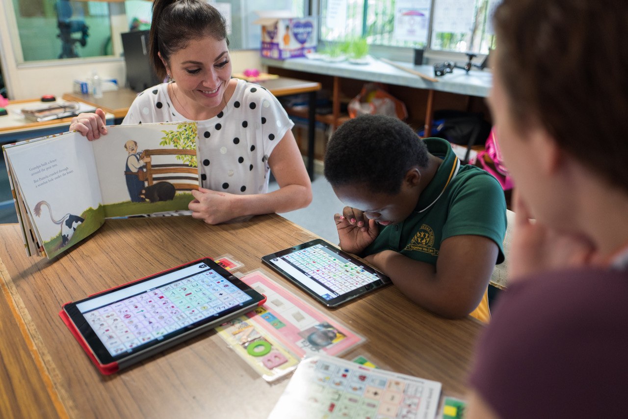
While the convenience factor of shortcuts is appreciated, an important aspect to their utility is accessibility. It’s a crucial aspect of the story around shortcuts, because while everyone loves a time-saver or two, these workflows also have the potential to make iPhone and iPad more accessible. In an accessibility context, shortcuts can be lifesavers in terms of reducing cognitive load, excessive swiping and tapping, and other common points of friction often met by disabled users.

Shortcuts, Past and Present

Before considering shortcuts as an accessibility tool, it’s important to understand their roots in order to properly frame them into perspective. The idea that shortcuts, or workflows, can prove valuable as an assistive technology isn’t a novel one.

Workflow, on which the Shortcuts app is based, was acquired by Apple in early 2017. Two years earlier, however, Apple selected Workflow as an Apple Design Award winner primarily for its integration of iOS accessibility features. Ari Weinstein, who joined Apple to work on Shortcuts post-acquisition, told me in an interview at WWDC 2015 that he and his team received feedback from several blind and visually impaired users who were curious about Workflow and wanted to try it. As a result, the team felt adding VoiceOver support was “the right thing to do,” Weinstein said.

To paraphrase Kendrick Lamar, Shortcuts got accessibility in its DNA.

Given the history lesson, it’s not at all far-fetched to think the Shortcuts app would have appeal to disabled users. Like Overcast and Twitterrific, Shortcuts is an app built for the mainstream, yet it has the care and design sensibility to carry relevance for a variety of use cases, like being fully accessible to a blind user via VoiceOver. This isn’t small potatoes; given Apple’s commitment to the disabled community, it’s certainly plausible Workflow’s ode to accessibility made the app all the more desirable.

More Than Just Productivity

As I reported during WWDC, Apple’s focus this year, software-wise, marked a departure from how they’ve traditionally approached accessibility enhancements. Unlike past years, there were no new discrete accessibility features for any platform. (AirPods with Live Listen is close). Instead, Apple chose to hammer on the idea that the tentpole features (e.g. Group FaceTime in iOS 12, Walkie-Talkie in watchOS 5) can be enabling technologies. The overarching theme of the conference was that the new features were so well designed that they brought inherent accessibility gains.

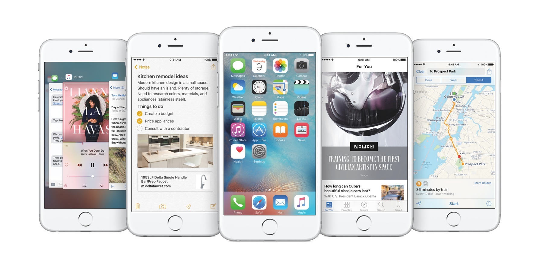
Siri shortcuts is another of those features. In my briefings with Apple at WWDC and since, shortcuts has been one of the first items they wanted to discuss. Like Group FaceTime and others, the company firmly believes in shortcuts’ potential as an accessibility aid. Their enthusiasm is warranted: for many users with certain cognitive and/or physical motor delays, the consolidation of tasks can reduce friction associated with remembering how to perform a task and then doing it. In this way, shortcuts are the inverse of task analyses; rather than extrapolating tasks into their individual parts (e.g. tapping a series of buttons in an app), the Shortcuts app’s automation turns them into a single step. (You break down steps when creating your own workflows, but that’s beside the point being made here.) Lest we forget about Siri; being able to use your voice to activate shortcuts is a boon for people with motor delays, as the “hands free” experience can be empowering.

For disabled people, shortcuts’ focus on speed and accessibility can open up new possibilities in terms of what they can do with their iOS devices and how they do things. Throw in system accessibility features like VoiceOver and Dynamic Type, and the Shortcuts app becomes far more compelling than simply being a sheer productivity tool.

”We see huge accessibility potential with Siri Shortcuts and the Shortcuts app. It’s already making a difference — helping people across a wide range of assistive needs simplify every-day tasks like getting to work, coming home, or staying in touch with friends and family,” Sarah Herrlinger, Apple’s Senior Director of Global Accessibility Policy & Initiatives, said in a statement. “We’re getting great feedback about how powerful the technology is in streamlining frequent tasks and integrating multiple app functions with just a single voice command or tap.”

How I Use Shortcuts

I am far less prolific in my adoption of shortcuts than some people. Others, like Federico and Matthew Cassinelli, are far more well-versed in the intricacies of what is possible and, more importantly, how you chain certain commands together.

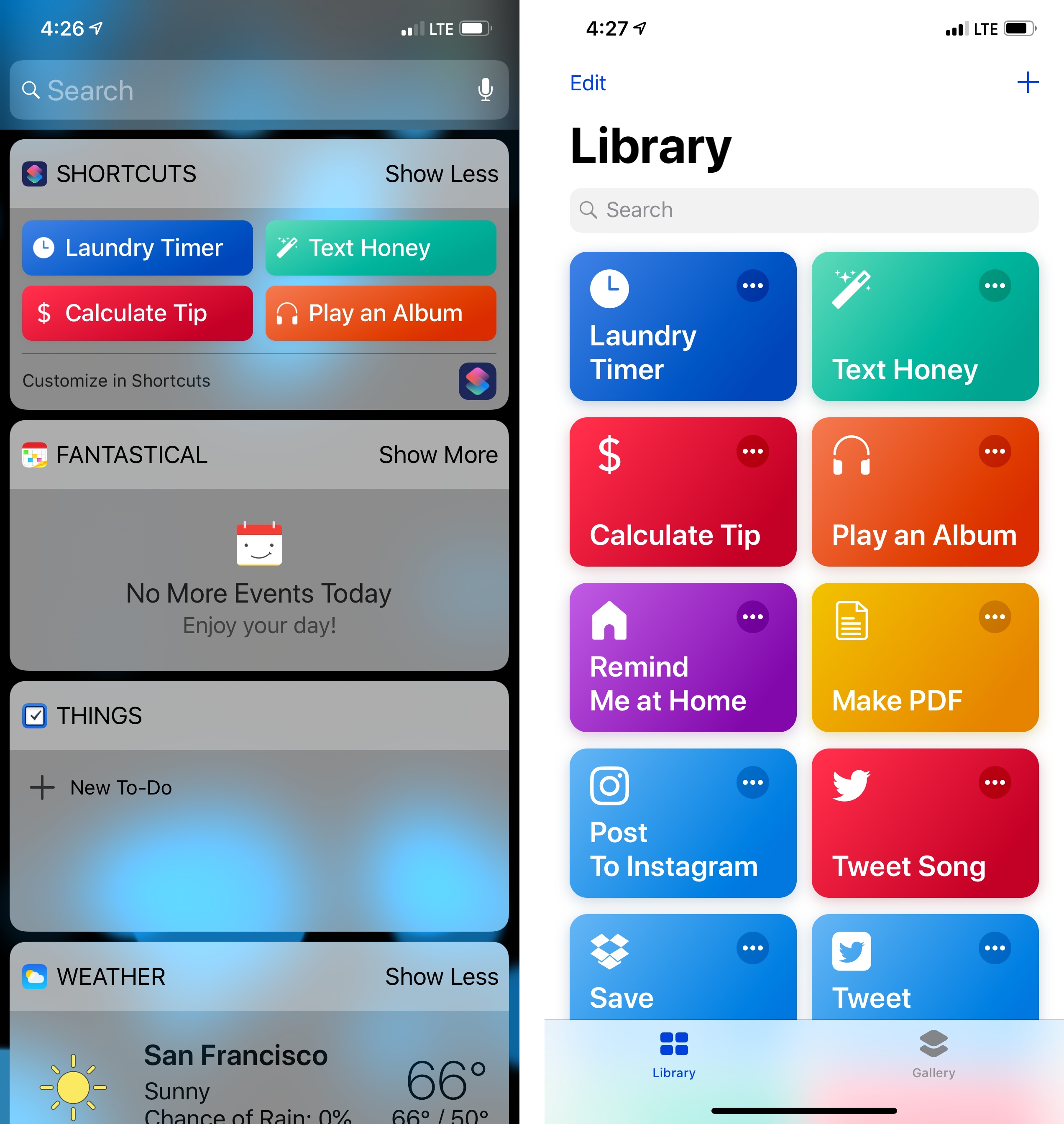
My needs for shortcuts are pretty spartan. The shortcuts I use most often are practical, everyday ones I found in the Gallery section of the app. I currently have thirteen shortcuts; of those, the ones that are the most heavily-used are the laundry timer, tip calculator, and one for texting my girlfriend. While I have enjoyed spelunking through Federico’s work for esoteric, power user shortcuts, the reality is my work doesn’t require much automation. I typically don’t need to do fancy things with images, text, and the like. That isn’t to say these tools aren’t cool or valuable; they’re just not necessarily for me. For my needs, quick access to, say, the laundry timer is worth its weight in gold because I always forget to move my clothes.

Consider another shortcut of mine, Play an Album. I’ve been listening to Eminem’s new album, Kamikaze, virtually non-stop since it came out at the end of August. Rather than manually launch the Music app, find the album in my recently played queue, and hit play, I can utilize the Shortcuts widget to play it with a single tap. The manual method is three steps which, while not tedious for me in any way, is more work. Going back to the task analysis analogy I used earlier, not only is Play an Album faster, it particularly helps me conserve precious visual energy I otherwise would have expended finding the album. For fine-motor skills, the shortcut also saves on potential cramping in my fingers caused by my cerebral palsy. Again, what can take multiple taps can be condensed into a single motion. For many, that’s a huge win.

The same concept applies to sending iMessages to my girlfriend. Using the shortcut, what would normally be a multi-step process is reduced to a single step. The advantage for me is a matter of kinetics, but for others, the advantage very well could reduce cognitive load and increase executive function. Not insignificant.

The Bottom Line

As is the case with stuff like Markdown and Apple Pay, technologies not built expressly for accessibility’s sake, the Shortcuts app is so well considered and approachable that anyone can use it, regardless of ability. There are no complicated settings or special modes; as Apple designed it, it just works as they intended it.

That’s what makes Shortcuts’ star shine brighter. Yes, Apple is pitching it for speed and convenience. Yes, shortcuts can be as pedestrian or as nerdy as you want them to be. Above all, however, the Shortcuts app is accessible. It’s an app that’s reachable to the widest possible audience, turning its utilitarianism into something far greater.


How the iPhone and App Store Have Redefined Accessible Software

Everyone acknowledges the societal and technological effects the iPhone has had on the world. In late 2007, Time named the original model its “invention of the year,” and rightfully proclaimed it “the phone that changed phones forever.” Eleven years on, it is genuinely difficult to remember the world before the iPhone existed. Whatever your platform allegiance, there can be no disputing that the first iPhone pioneered the notion that everyone should carry a touchscreen supercomputer with them wherever they go. In hindsight, Steve Jobs wasn’t exaggerating when he boasted Apple would reinvent the phone.

Yet for everything the iPhone has meant to smartphones and to the world, there is a segment of users for which the iPhone has been truly revolutionary: disabled people. For many people with disabilities, myself included, the iPhone was the first accessible smartphone. The device’s multitouch user interface and large (for the time) display represented a total break from the smartphone conventions of the day. An unheralded ramification of this was how accessible these features made the iPhone. For example, the soft keyboard allowed users to compose text messages and emails without struggling with the T9 keyboards that were commonplace at the time. Likewise, the iPhone’s 3.5-inch display was considered large for the day, which made seeing content markedly easier than on the postage stamp-sized displays that dominated cell phones then. It’s a testament to the original iPhone’s greatness that its fundamental components were so solid that they redefined accessible computing, all without being “accessible” in the traditional sense. Its impact is put into greater perspective when you consider the first two versions of iOS (née iPhone OS) didn’t contain discrete accessibility features. The first bunch, VoiceOver, Zoom, and Mono Audio debuted in 2009 with the 3GS.

Read more


Consistent Accessibility: How Apple Can Make iOS and the Mac More Accessible

Like all Apple products, macOS is an accessible platform. Blind and low vision users can navigate their Mac using VoiceOver, while someone who has physical motor delays can use Switch Control to edit videos in Final Cut. And under the Accessibility pane in System Preferences, there is a multitude of other features one can use, ranging from Zoom to Invert Colors to closed-captioning and more. Whatever your need, the breadth and depth of Apple’s accessibility software spans many domains. This is why Apple is lauded as the industry leader in accessibility: the tools run deep and they’re well-designed.

Still, accessibility on macOS doesn’t quite reach feature parity with iOS. Amidst rumors that Apple is working on a cross-platform set of APIs to bridge the company’s two primary operating systems, now is an opportune time to consider what each platform does and what they offer one another.

In the context of accessibility, the way Apple brings consistency between iOS and macOS is by sharing features and technologies among the two. As such, there are some iOS-first features macOS sorely needs, while the Mac offers things iOS would benefit from as well. Such enhancements would not only improve the user experience across devices, but also would make iOS and Mac software richer, fuller products overall. And most importantly, more accessible.

Read more


How the iPad Pro Made Me Love the iPhone 6s Plus

People talk about how an Apple product such as the iPhone having a halo effect on customers. If you buy an iPhone and like it, the theory goes, you’re more inclined to buy another Apple device, like a MacBook. This theory has certainly proven true in my experience – since buying my first iPhone (my first Apple product) in 2007, I’ve bought numerous other Apple products and subscribed to numerous Apple services in the subsequent years. Put another way, I was entrenched in the Apple ecosystem long before I started covering the company for a living.

Recently, a different kind of halo effect has settled on me. I’ve been using an iPad Pro for the past several weeks, and absolutely love it. Like Federico, the iPad is my computer of choice because of my deep familiarity with iOS and the ways in which working from a touchscreen device makes computing more easily accessible.1 Coming from my old iPad Air 1, iPad Pro has intensified my affinity for the iPad and iOS in general. It has impressed not merely by its technical or software merits, but by one seemingly obvious thing: its screen.

Read more


Understanding Night Shift’s Impact on Accessibility

To my knowledge, the release of Night Shift in iOS 9.3 is only the second time in recent history Apple has updated iOS to include a change or feature that has potential accessibility ramifications. The other occurrence, in my mind, was iOS 7.1 beta 2, released in 2013. In it, Apple added a Button Shapes option to Accessibility as a way to assuage users who have trouble distinguishing an actionable button from a text label. Generally, however, any significant additions or changes to the Accessibility feature set comes included with a major new version of iOS. That is to say, the version Craig Federighi talks about at the annual WWDC keynote.

Before getting into Night Shift’s accessibility merit, it’s worth examining why it exists. The impetus for Night Shift is better sleep. Apple explains in its marketing material for iOS 9.3 that a person’s circadian rhythm can be disrupted by the “bright blue light” emitted from an iPhone or iPad’s screen, making it difficult to fall asleep. What Night Shift does to combat this, according to Apple, is “use your iOS device’s clock and geolocation to determine when it’s sunset in your location.” After gathering that data, the software then “automatically shifts the colors in your display to the warmer end of the spectrum.” The end result is a display that’s easier on the eyes, thus hopefully making it easier to fall asleep. (The display settings will revert to normal in the morning. There’s an option to schedule Night Shift as well.) For more on why Night Shift is important and how it works, iMore has posted a good explainer on the feature.

Read more


iOS 9 and Accessibility: My 5 Favorite Details

I’ve made the case more than once that accessibility, conceptually, is not a domain exclusive to the disabled. Certainly, persons with disabilities will always be the target market for accessibility features, but I think many fully-abled people overlook the fact that accessibility features can help them too. To me, the canonical example is larger text. Yes, something like Large Dynamic Type is a boon to the visually impaired, but it can also benefit someone with aging or tired eyes.

In a similar vein, accessibility isn’t solely about discrete Accessibility features. While a big part of my writing involves reporting on iOS’ (and watchOS’) Accessibility features and how they affect users, I do make an effort to focus and write on the smaller aspects of accessibility. That is to say, I try to find accessibility in less obvious places – for instance, how technologies like Touch ID and Force Touch impact the disabled.

This concept has extended to my testing of the iOS 9 public beta throughout the summer. As I’ve gotten used to the new operating system on my iPhone 6 and iPad Air, I’ve come to notice several details that aren’t intentionally for accessibility, but nonetheless make the experience more accessible (and more enjoyable).

With that in mind, here are five “little things” in iOS 9 that stand out the most.

Read more


The Accessibility of Apple Watch Bands

Last summer, I wrote an article for iMore in which I stress the importance of looking at hardware in accessibility terms. I wrote, in part:

Assessing the kinesthetic, tactile value of using an iPhone or iPad is just as important as assessing the software it runs. Speaking from personal experience, not only am I visually impaired but I also suffer from a mild form of cerebral palsy. What this means is, for me, the strength in my hands and fingers are substantially less than that of a fully-abled person. Hence, it takes much more effort to hold things — in this case, my iOS devices — as well as do things on my devices, like typing. Because of this, my approach to buying a new iPhone or iPad depends not only on 64-bit systems-on-a-chip and improved cameras, but also how the device feels in my hands: the weight, width, thinness, etc.

What applies to iPhones and iPads also applies to Apple Watch. In the context of the Watch, the hardware that is most crucial, accessibility-wise, are the bands. To folks like me who suffer from motor delays, the ability to successfully get the Apple Watch on and off is as key to a positive user experience as the quality of the software it runs.

Read more